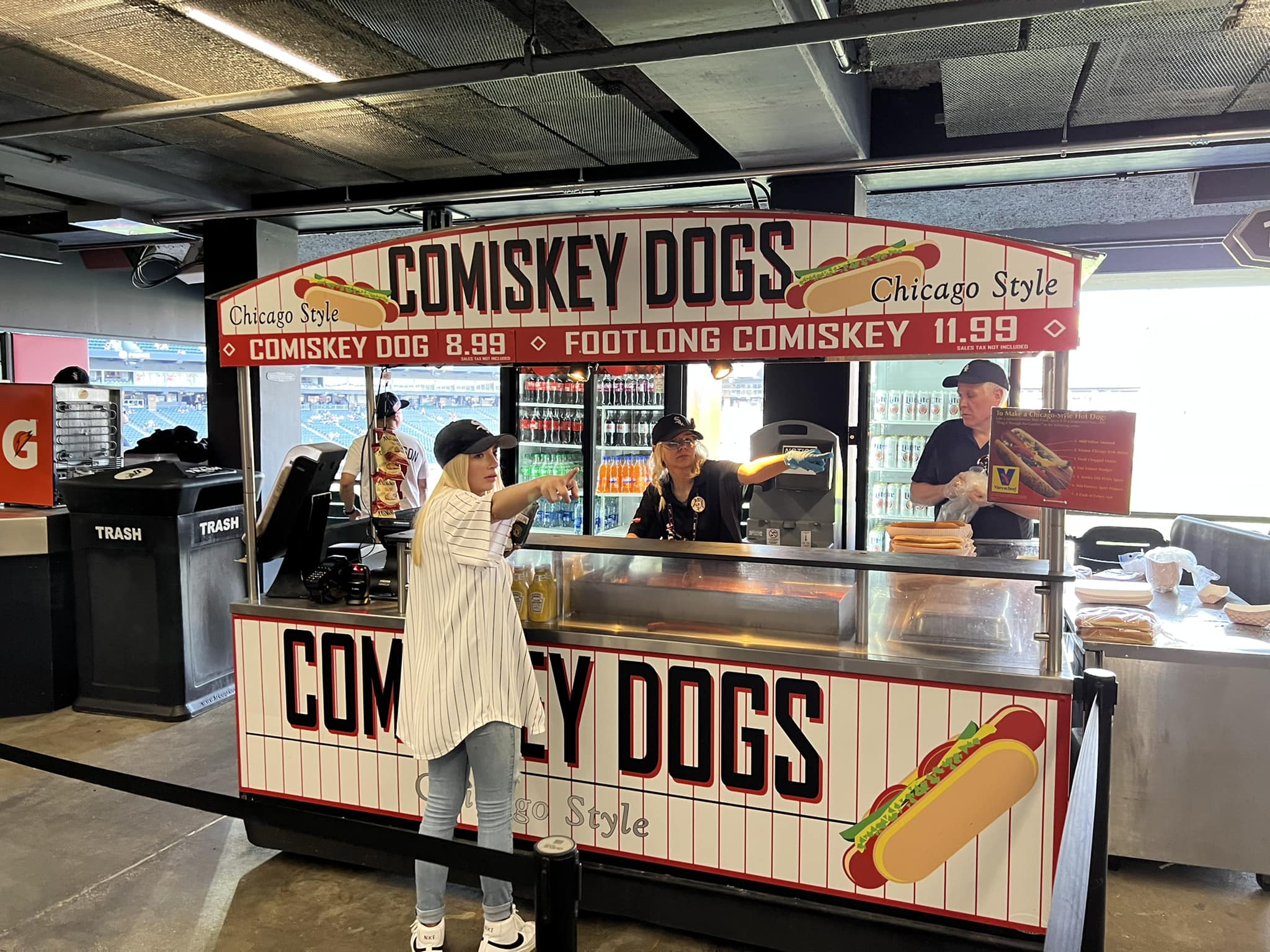
Guaranteed Rate Field
| Setting | 11/20 | 1 Thumb Down |
|---|---|---|
| Locale | 3/5 | Thumb Sideways |
| Accessibility | 4/5 | 1 Thumb Up |
| Neighborhood Local Scene | 4/10 | 1 Thumb Down |
| Architecture & Aesthetics | 37/65 | 1 Thumb Down |
|---|---|---|
| Exterior Design/Aesthetics | 10/20 | 1 Thumb Down |
| Interior Aesthetics/Visuals | 24/40 | Thumb Sideways |
| Concourse Aesthetics | 3/5 | Thumb Sideways |
| Functionality & Essentials | 36/50 | Thumb Sideways |
|---|---|---|
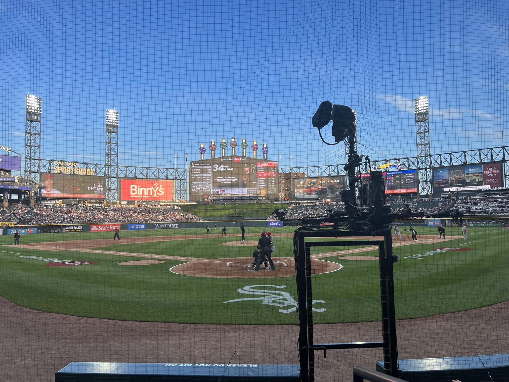
| Sightlines: Field Proximity | 10/15 | Thumb Sideways |
| Sightlines: Seating Geometry | 3/5 | Thumb Sideways |
| Seat Comfort | 6.5/9 | Thumb Sideways |
| Concourse Functionality | 10.5/15 | Thumb Sideways |
| Scoreboards/Tech | 6/6 | 2 Thumbs Up |
| Amenities & Features | 39/50 | 1 Thumb Up |
|---|---|---|
| Concessions: Food Variety | 4/5 | 1 Thumb Up |
| Concessions: Food Quality | 3.5/5 | Thumb Sideways |
| Concessions: Craft Beer/Other Drinks | 5/5 | 2 Thumbs Up |
| Social Gathering Areas/Restaurants | 8/10 | 1 Thumb Up |
| Premium Seating/Clubs | 6.5/9 | Thumb Sideways |
| Historical Exhibits, Memorabilia, Art, & Other Displays | 7/10 | Thumb Sideways |
| Kids Areas/Other Entertainment | 5/6 | 1 Thumb Up |
| Atmosphere, Vibe, & Policies | 6.5/15 | 1 Thumb Down |
|---|---|---|
| Fan Support/Attendance | 3/5 | 1 Thumb Down |
| Ballpark Traditions/Gameday Presentation | 3.5/5 | Thumb Sideways |
| Ballpark Policies/Staff | 0/5 | 2 Thumbs Down |
| Adjusted Raw Score | 129.5/200=64.75=65 |
|---|---|
| Bonus | 2 |
| Curve for All 7 | 7 |
| Final Score | 74 |
|---|---|
| Ranking | #26/30 |
|---|---|
Getting the Most Out of New Comiskey
Despite disastrous start, perennial renovations to U.S. Cellular Field made it a reasonably nice place for a ballgame
By: Cole Shoemaker
Written in 2012, ratings above are up to date for 2024, but this review below may be outdated and will be updated at some point; reviews and ratings are “living pages” updated yearly when necessary
Note: This review refers to Guaranteed Rate Field as U.S. Cellular Field and New Comiskey Park
If Charlie Comiskey was one of baseball’s most frugal bastards when it came to paying his players, then the cheap, disposable looking New Comiskey Park originally yielded one of the worst returns in utility of any ballpark in history.
Widely seen as architecturally obsolete only one year after opening, the White Sox ownership failed to see the obvious tide of integrated urban aesthetics, retro designs, and fan friendly features about to sweep the nation’s baseball cities.
In retrospect, many White Sox loyalists claim that New Comiskey Park really wasn’t all that bad, just underwhelming in comparison to the brilliance of Camden Yards. White Sox officials said New Comiskey was modeled after the modern Royals Stadium (as it was called at the time), so it just seems bad in comparison to the new retro ballparks. I say hogwash. When comparing Comiskey to any other baseball only facility, it’s like day and night. They did everything wrong.
Contrary to most people, I actually believe we underestimate just how bad the original version was. Never had there been a facility so transparent in its cold revenue generating nature, so aesthetically bleak, and so fan unfriendly.
All things considered, my position is that New Comiskey Park was the worst baseball only facility of all time in its original form.
Revenue generating functionality was the only design principle of the project. Good architectural treatment was solely an afterthought, as most of the arches, albeit cheap and concrete, are concealed behind cold ramps. The park was originally designed for suburban Addison in the mid 80s, and was not revised when moved to the Old Comiskey site, signaling standardization is paramount and the aesthetic design didn’t respond to its environment. That’s a far cry from the contextually based Camden Yards we see a year later.
Reinsdorf was going to shove the same symmetrical layout wherever he could get it built. He built a ballpark that turned its back on the neighborhood, somehow managing to turn New Comiskey into a true suburban ballpark, even though it was in the same location as the neighborly Old Comiskey.
They actually had a provision in their lease that didn’t allow local businesses to operate in the area. The White Sox wanted a self-contained stadium without the originality or timelessness seen in the old version. You got there; went into the stadium; and then went home.
How about the lack of fan friendliness and the interior vacuity? The seemingly inviting main entrance wasn’t for the fans, but for the team’s offices. The outfield stands were over 15 feet from the outfield wall; ensuring fans wouldn’t be too immersed in the game, creating a decidedly temporary look. The backstop was further from the batter than the pitcher was. The outfield bullpens were vertically designed and covered toward the top, ensuring fans couldn’t peak in to see who was warming up. It wasn’t just about the lack of a retro design; you could go on and on about the little things that separated Chicago from the rest of the new ballparks.
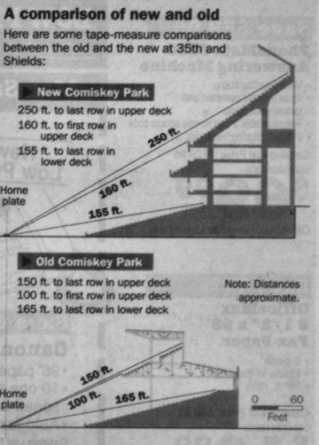
Three decks of premium seating punctuate the interior vibe and separate the average fan from the ballgame. In order to compensate for the vicinity of the upper deck, they made it steeper than ever before (steeper than Royals Stadium), attempting to put fans on top of the action.
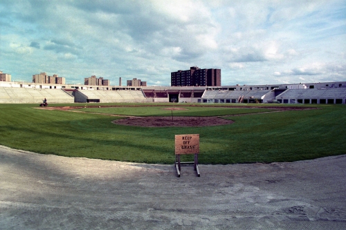
Coming in under budget, it all had an unmistakably cheap feel to it too. Sterile, white concrete characterized most of Comiskey’s interior design. The seats were marked in a disposable Wall-Mart shade of plastic blue. Enclosed from the skyline and the surrounding projects, the bleak white steelwork and blue plastic batters eye characterized the “bathtub motif” of the outfield aesthetics. And you want to compare this to pastoral Royals Stadium?
But at the same time, the air of exclusivity was unlike anything seen before, and arguably since. Of course, it’s been surpassed in quality, but the vibe in new Comiskey was ridiculous. It was the first ballpark where officials advertised that the concourses would be cleaner than your home. The media ran horror stories (seriously, some of this would be unheard of today. No children?! Per Se welcomes children) about the ballpark’s stuffy Stadium Club restaurant, which had a strict dress code and other ridiculous policies. It was the White Sox version of the Yankees’ Legends Suites PR disaster. Luxury suites and club seating was the sole focal point of the presentation. Ticket attendants wore tuxedos!
New Comiskey was the anti-thesis of baseball. Standardized. Self-Contained. Suburban. Sterile. Cheap. Divisive. Exclusive.
While we underestimate how bad New Comiskey really was, I think we also underestimate how different U.S. Cellular Field has become through renovations. The new color scheme, characterized by sea of dark greens and black steel, is a breath of fresh air. While some of the little things made New Comiskey almost unbearable, some of the little amenities of U.S. Cellular Field now make it a great place for a ballpark.
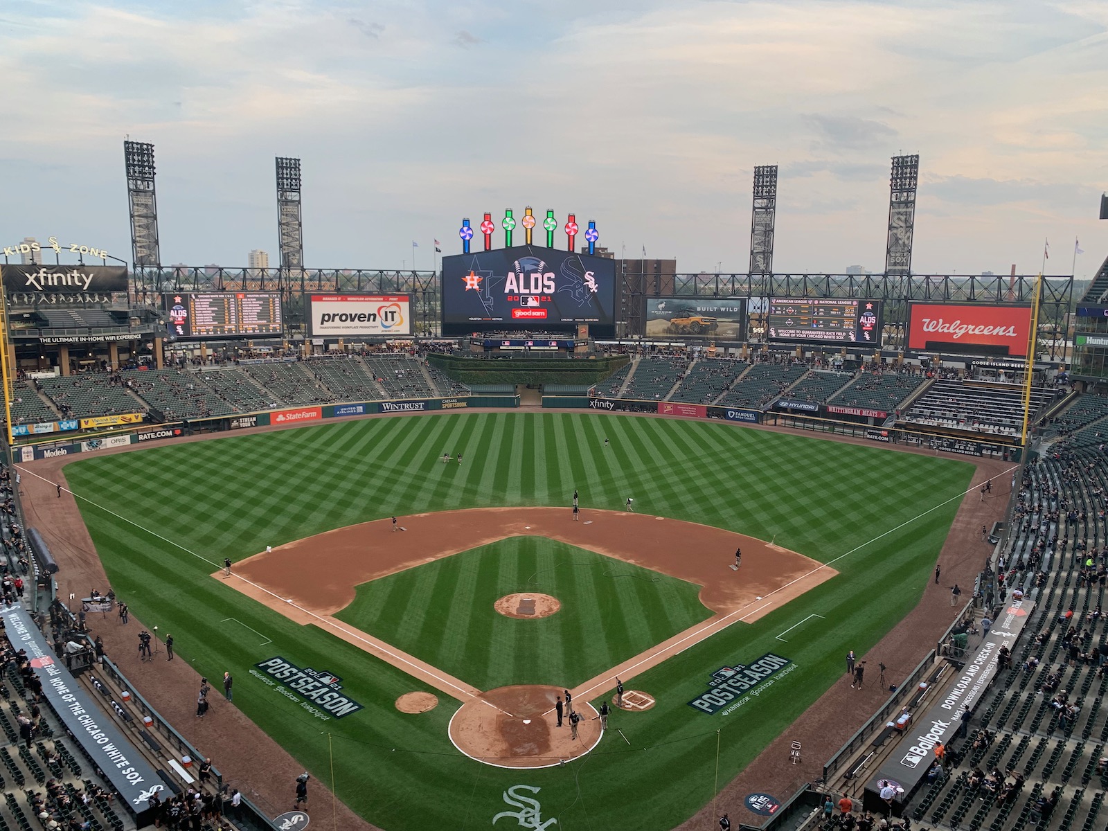
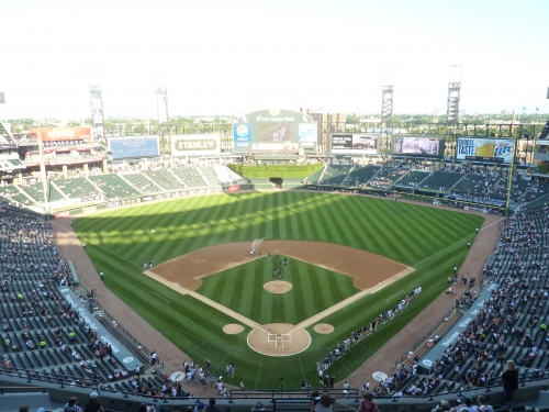
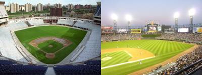
Comparing the before and after pictures, I have to admit I never thought this place could be this good. The White Sox really made the absolute best out of a disastrous situation. The interior design ultimately came out as distinctively minimalist, a step above a couple of the retro cookie cutters.
While the White Sox should be proud of what they accomplished, the structural flaws can’t be fixed. I will say that U.S. Cellular Field is the worst park in the majors for a ballpark trekker that likes to explore all areas and levels. This main concourse is usually restricted to lower box ticket holders, but I had club level tickets, ensuring complete accessibility. But even with this privilege, it’s a ridiculous hassle to explore, as ramps are your only option. No stairs. Escalators are only on the outside. Elevators are only for the disabled.
Irreversible defects aside, the organization deserves immense praise for immediately accepting work needed to be done here. I will provide pre-renovation scores in gray for certain categories. I was amazed by how many positive things I ended up saying about the interior aesthetics as well. They really made something out of nothing.
Setting
Location/Access:
The central irony of U.S. Cellular Field is that it didn’t have to be an insular “suburban ballpark.” We forget that the much derided facility was built right next to Old Comiskey Park, a distinctively neighborhood edifice. Today, when speaking of Camden Yards, Coors Field, or Petco Park, the term “retro neighborhood park” is often applied in allusion to the classic ballparks. But that term is really a misnomer; these are downtown stadiums.
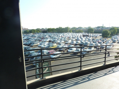
Located west of the Dan Ryan Expressway in Chicago’s Armour Square neighborhood, New Comiskey Park had a chance to be a true neighborhood ballpark had they followed the advice of architect Phillip Bess. But new policies generally discouraged the cultivation of the local area, and many of the houses and establishments involved in the Old Comiskey experience are now nowhere to be seen.
Who knows? If that vision had come to fruition, maybe the “neighborhood ballpark” would have become the new trend. So while little thought has been given into how the Cell fit in with the area, there has been some new gentrification in recent years. Especially with recent renovations, accessibility to the ballpark has always been relatively easy and straightforward. The red line train drops you off a couple blocks from the gates as well.
Score: 2/5
Local Scene:
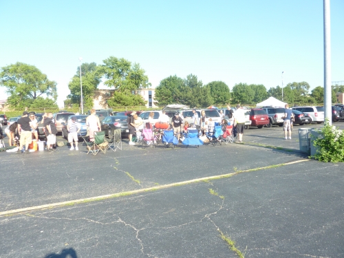
In addition to being the second best tailgating scene behind Milwaukee, the Southside provides some reasonable options a walk away. While the crime in the area has been highlighted, the neighborhood still lives in limited form.
Score: 3/5
Total: 5/10
Architecture & Aesthetics
Exterior Design:
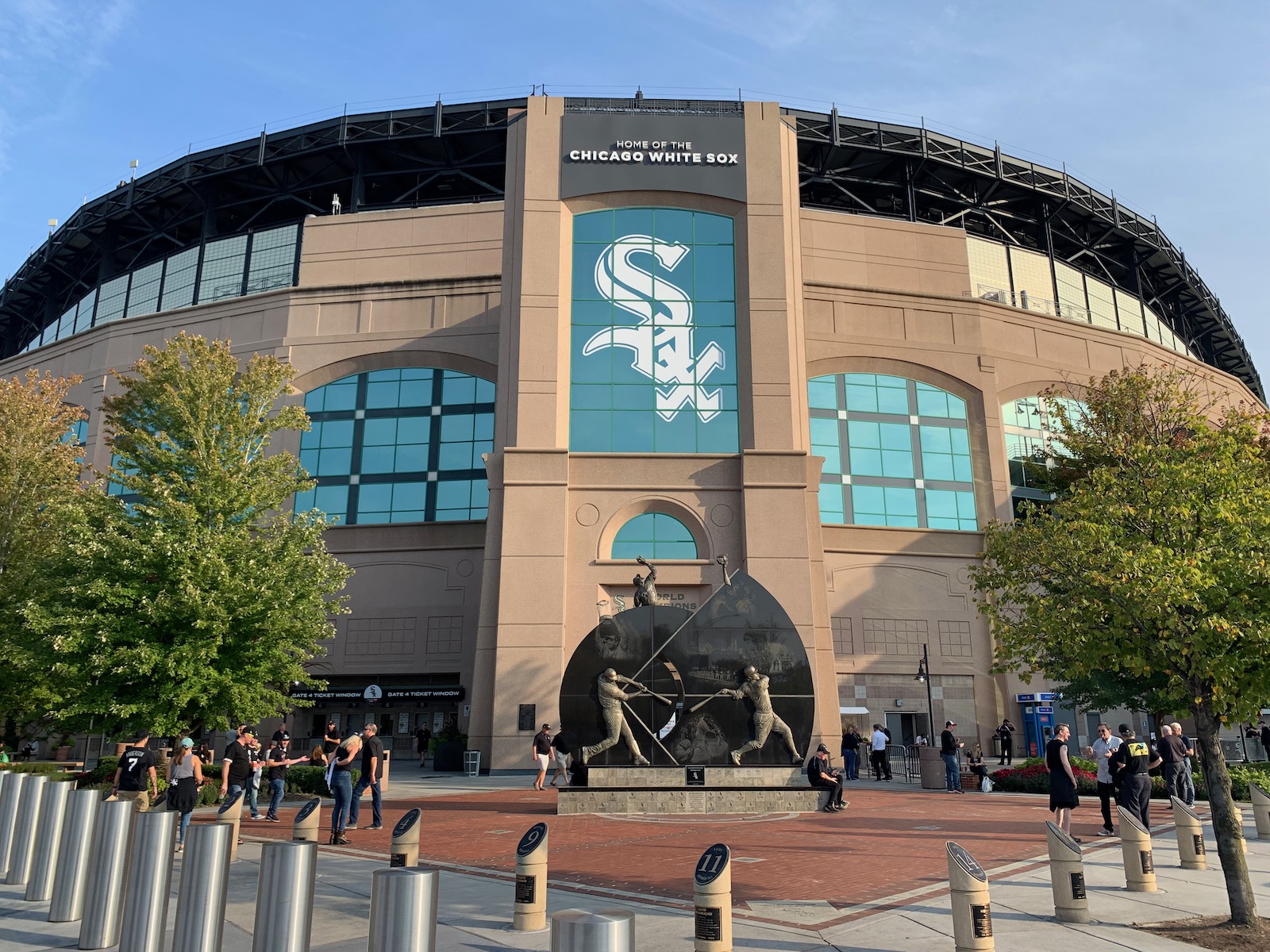
New Comiskey represents a more primitive take on the subsequent trend of warm retro facades that recall the Jewel Box Parks. Characterized by an overabundance of functional ramps and sterile white concrete, The Cell lacks the unique architectural touches we have come to expect today. The renovations have helped a bit though.
U.S. Cellular Field vaguely recalls the white washed version of Old Comiskey Park. Infused with geometric elements of modernism, the glass arch windows successfully emulate those of the old version. Below, subtle square reliefs punctuate this theme in the cream concrete. For 1991, the bottom line was basically successful. But as one would expect, it simply lacks the attention to detail and aesthetic attractiveness seen in the latter retro period.
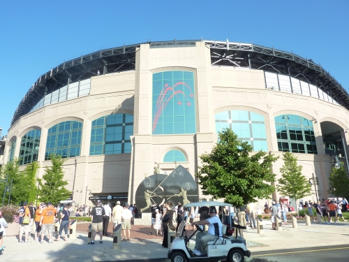
While renovations have separated them from the third base side of the façade, concrete ramps still obstruct much of the exterior. The white concrete doesn’t present quite as well as the warm brick and stonework seen in the newer ballparks. A number of slight renovations have aided the design. U.S. Cellular Field replaced its old concrete canopy-style roof in favor of the exposed black steel seen in many new retro parks. A wall enclosed the upper deck concourse as well, continuing efforts to make the outside feel more intimate. In recent years, green ivy and landscaping has been integrated into the design as well. It’s a nice effort, but still doesn’t compare well today.
Pre-Renovation Score: 4/10
Score: 5/10
Interior Aesthetics:
When the renderings of New Comiskey Park came out in 1989, the media gushed at how much the new version resembled the old one. They bragged about not having artificial turf or a “retractable dome”. The notion that New Comiskey Park was solely a modern ballpark, a la Royals Stadium, is a myth. It was more of a ballpark that didn’t know what it wanted to be.
When it opened, it was billed as an old style park with modern amenities. But as architectural critic Blair Kamin pointed out in the summer of 1991, just wait until the new Camden Yards opens in Baltimore. It will become what Comiskey only claimed to be.
As I devoted a disproportionate amount of time to in the introduction, New Comiskey Park failed in every way in terms of interior aesthetics. The excess of bland white concrete and steel dominated the inside, coupled with a sterile shade of bathtub blue seen in the seats and the batters eye. It was a true disaster.
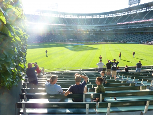
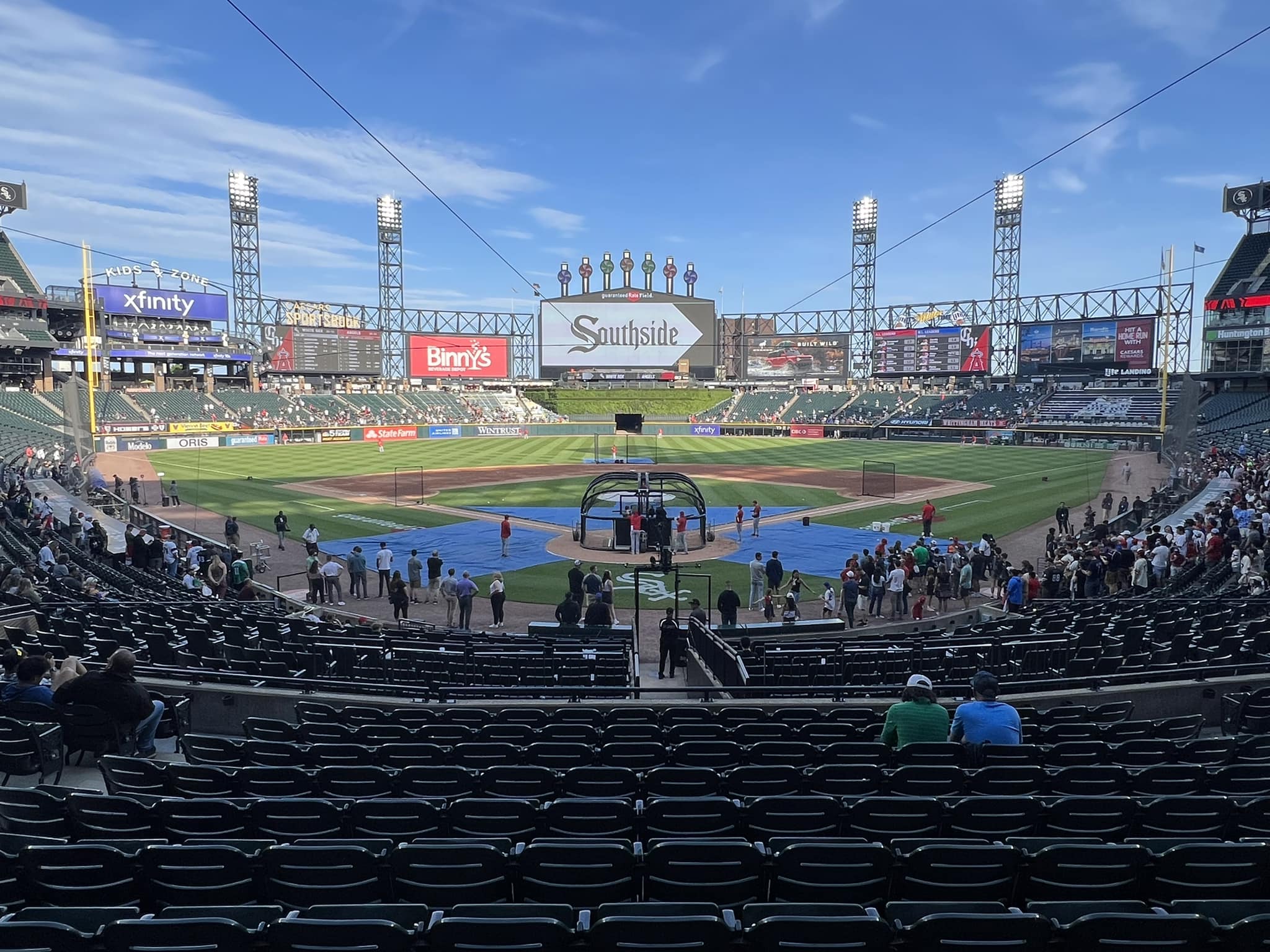
The renovated version is remarkably successful, completely overhauling the color scheme while maintaining a quiet minimalist vibe in its interior lines, infused with a hint of whim and natural flare. Coupled with much welcomed symmetry throughout the cross section and outfield design, U.S. Cellular Field stands out amongst its retro peers.
While no ones going to mistake it for PNC Park or any contextually based retro park, U.S. Cellular Field is more successful than a number of muddled retro facilities, such as Turner Field, Citi Field, or Great American Ballpark. And I never saw that coming, as this is a structure solely oriented for functionality. So while there is a ceiling on high it can score, I was shocked as there was really not much negative to say anymore.
The true brilliance of HKS and the White Sox front office was recognizing that New Comiskey’s primary flaws were based in more subtle issues, not the overt lack of quirks. Many pointed to the park’s lack of charm, deriding the fact that New Comiskey didn’t have the quirky dimensions or playful features seen in the new retro parks.
But the White Sox didn’t take the bait. Realizing that simply adding a few gimmicks would contradict the symmetrical nature of the site, New Comiskey chose to cultivate, not mitigate, the ballpark’s minimalist design, and instead address the underlying sterile atmosphere.
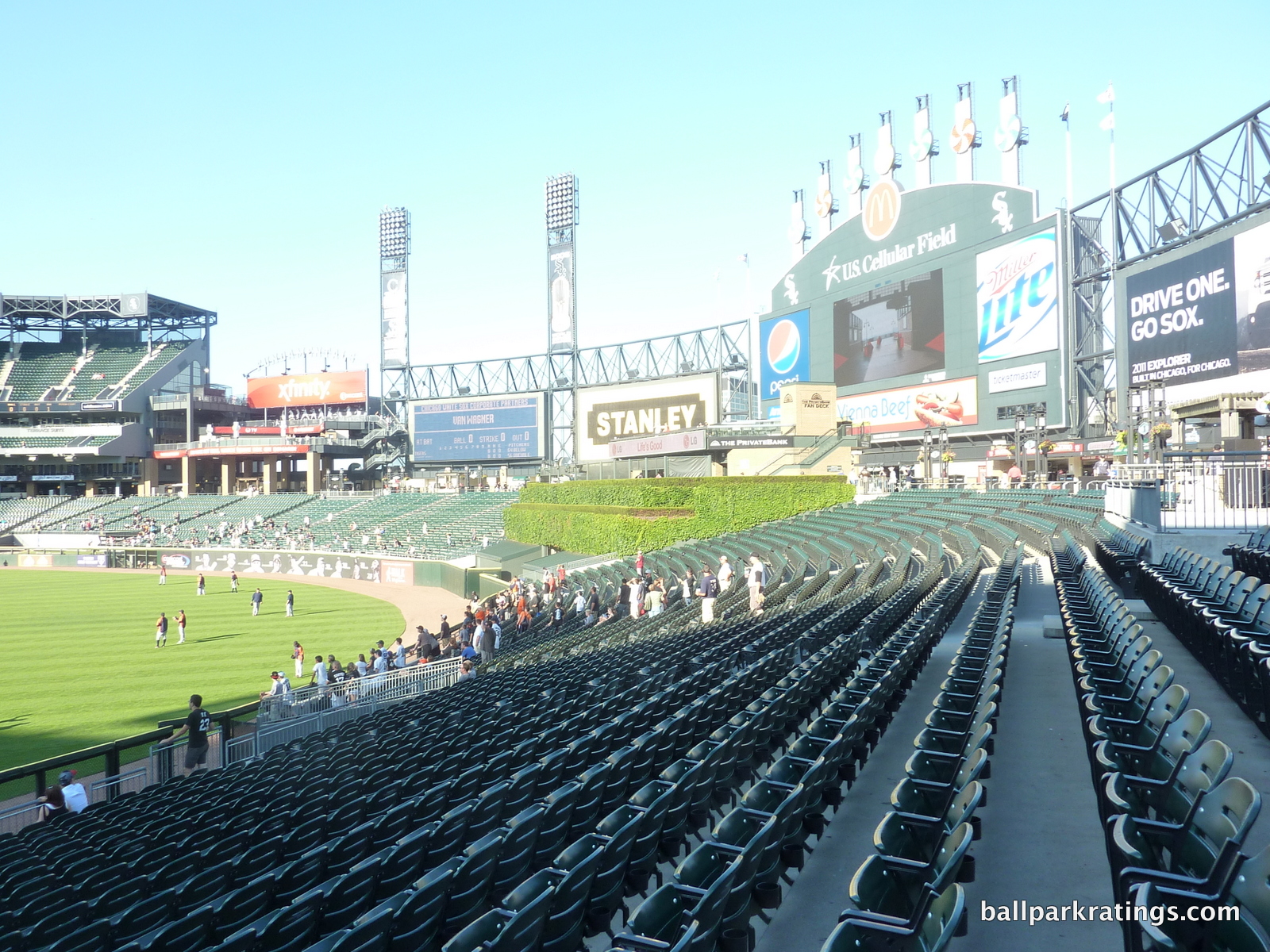
The overhaul was based on the recognition that New Comiskey’s bland color scheme was the ringleader of the ballpark’s aesthetic problems. Darker hues of army gray, dominant black, and dark retro green replaced the bleak, squeaky clean “bathtub motif” of whites and light blues. It’s remarkable that this simple revision made U.S. Cellular infinitely better. The ability to understand that this slight alteration would make a significant difference is actually more clear than people appreciate.
I think the main design principle we see in the renovations is the insistence that the ballpark continue to be different from its retro followers, maintaining a somewhat “modern vibe.” Replaced with a hue of dark gray, the cross section looks unlike any in baseball. Continuing the complete elimination of whites, the outfield steelwork is painted black, along with the centerfield scoreboard. Mimicking the outfield design, the cantilevered white concrete roof was replaced with an attractive black steel columned structure.
It manages to look nice, but at the same time, no ones would mistake it for the “warm” Camden Yards or Progressive Field. The shade of blacks and grays are menacing, but in a unique way, no longer bland and unlike anything seen in baseball. The entire fabric of the ballpark didn’t need to be changed for U.S. Cellular Field to be successful, demonstrating confidence in its simple architectural lines and refraining from much of the retro nostalgia.
U.S. Cellular Field manages to gain the label “minimalist” instead of “boring” because of its impressive attention to balance, line, and detail. A number of aesthetically attractive features supplement the change to grey and black. The outfield wall is painted dark green, and winter green seats replaced the old blue ones.
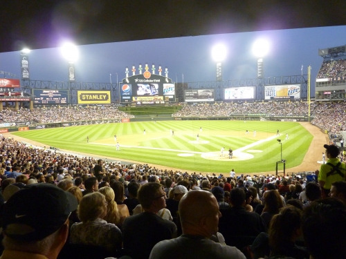
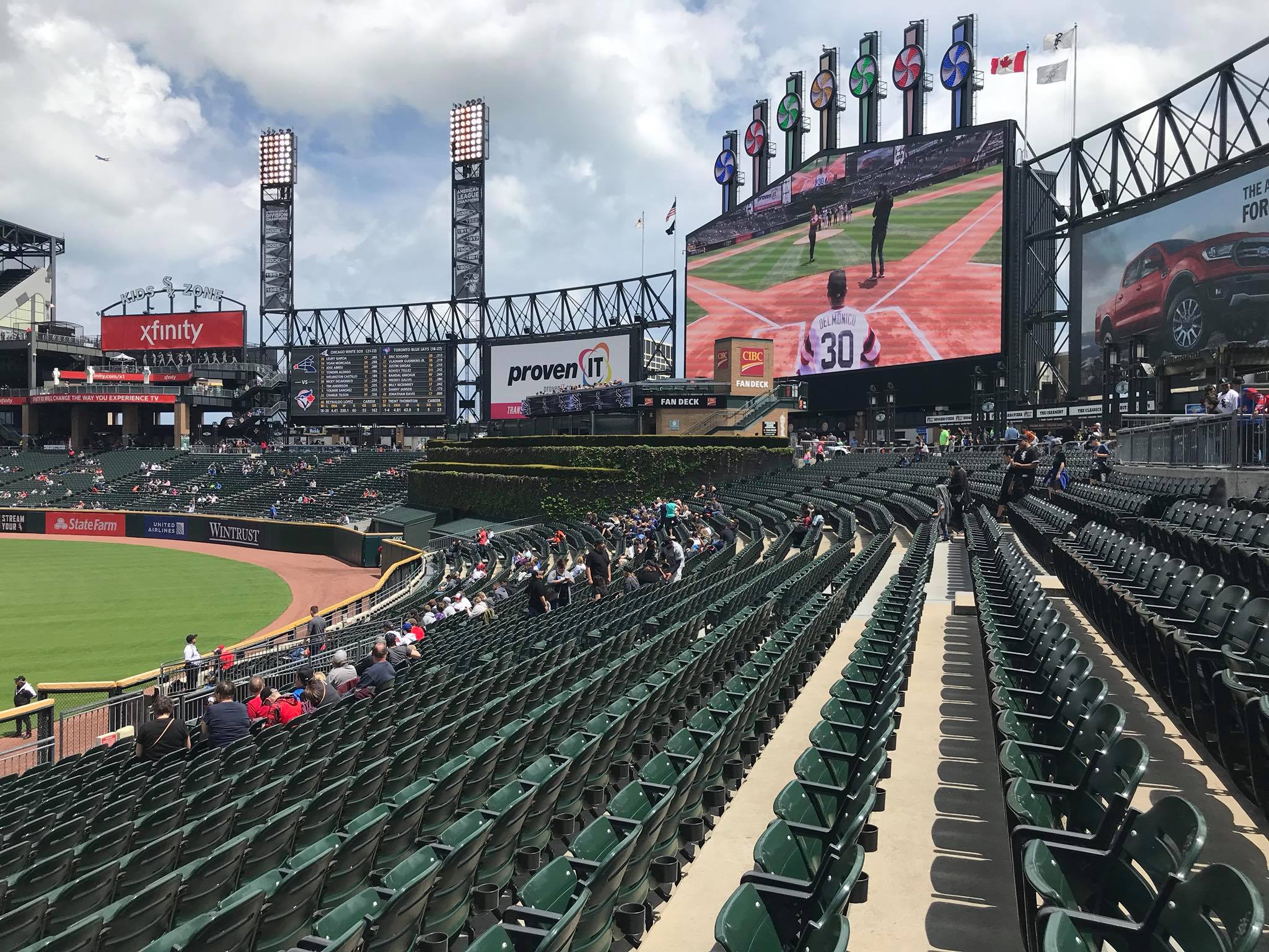
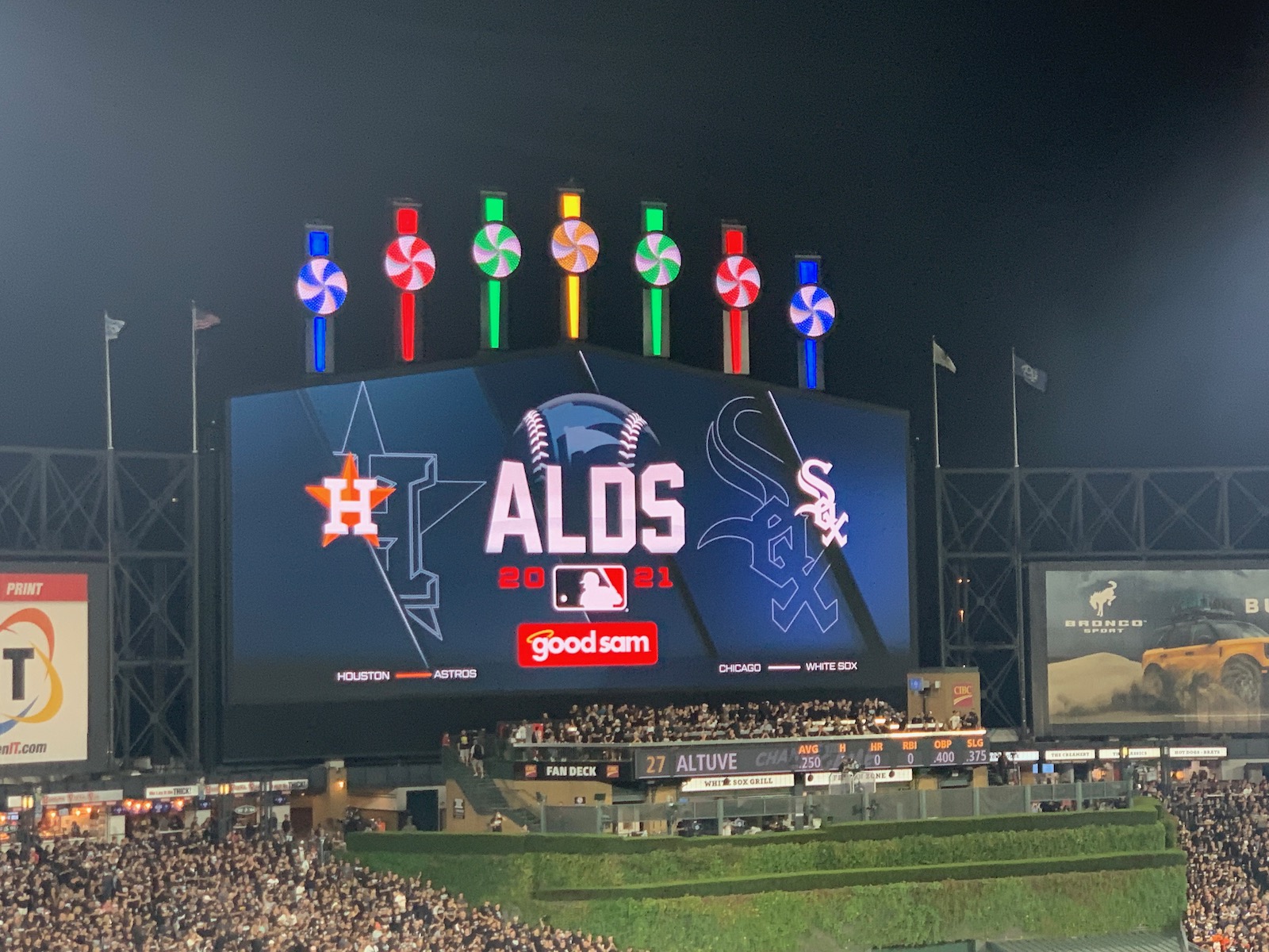
In what is an attractively symmetrical structure, the more whimsical elements seen in center field are juxtaposed with the simple black steel seen to the left and right. The new ivy batters eye is a gorgeous icing on the cake, adding a necessary amount of nature to a very simple, unadorned interior design. The rainbow pinwheel “exploding scoreboard” is charmingly kitschy, adding a small amount of flare to a minimalist ballpark.
It has its aesthetic limitations, but even I am surprised at how many positive things I have to say here. Maybe it’s because you don’t expect much. Obviously, it’s nowhere near any of the retro jewels in aesthetic attractiveness or contextual integration, in a park where function was placed above all else. U.S. Cellular Field is still one of the more insular ballpark in baseball, making no attempt to recognize its surroundings and completely shutting out the neighborhood in the interest of functionality.
But it’s almost distinctive in what it lacks. U.S. Cellular Field looks like it just doesn’t try too hard, but not to a fault. It’s characterized by a certain minimally oriented attention to balance and form seen in few retro parks. The confidently symmetrical curvature of the outfield is elegantly simple, but positively accentuated enough by an attractive color scheme and supplementary features to make it attractive.
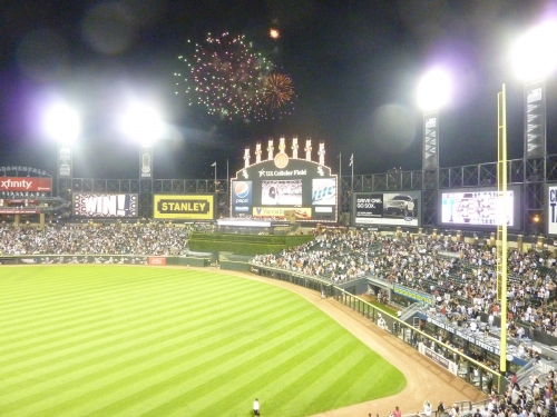
Less is more in what ultimately one of the more unique parks in the last 25 years. They really did the absolute best they could do here.
However, it’s truly remarkable how aesthetically unfocused the architects were when designing this originally derided facility. It’s still a basic structure, with no aesthetic vision in reality, even if we might perceive its honest layout as something much more novel after 20 years of retro mediocrity. The White Sox outdid themselves with the renovations, but the complete lack of imagination in constructing the outfield design boggles the mind.
Only because of a slight backlash against the “post-modern” attention grabbing ballparks, culminating in a desire for unmuddled simplicity, does U.S. Cellular pass for a good enough score.
Pre-Renovation Score: 4.5/15
Score: 9.5/15
Panoramic View/Backdrop:
The enclosure of the interior design in a desire for revenue generating ads meant forgoing any interest in interior aesthetic attractiveness. Unlike other enclosed ballparks, New Comiskey didn’t have a cozy vibe either. The architects not only had an opportunity to integrate the surrounding projects into the ballpark, but also the Chicago skyline if they had oriented the ballpark more to the left. But with the renovations, it works all right. I can’t reiterate enough how the renovations completely altered the schema of this ballpark, to the point where the backdrop score goes up too.
Score: 3/5
Concourses:
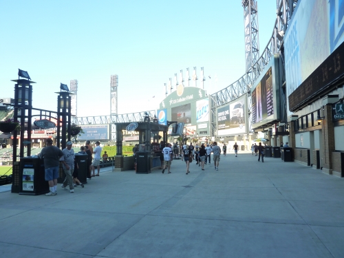
The aesthetic appeal of the concourses has been greatly enhanced by years of renovations. Formerly characterized by the aforementioned icy shades of white and blue, the main concourse now has attractive brickwork. The main concourse appears somewhat claustrophobic because of the low ceiling. Open to the sky, the outfield concourse is the highlight. Note the new attractive signage and flowerpots.
Pre-Renovation Score: 1/3
Score: 2/3
Total: 19.5/33
Functionality & Essentials
Sightlines:
Sightlines have long been one of the primary complaints regarding New Comiskey Park, but as a general theme, it could be a lot worse. Despite the failure to cantilever the upper deck, and the mediocre seating angles, they actually did a better job than Camden Yards or Progressive Field in seating geometry.
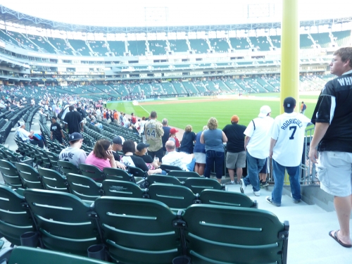
While they claimed to “visually redirect” some of the new green seats down the lines, I didn’t see it, as there are still too many strained necks like way too many retro parks. But due to the curvilinear grandstand, they avoid some of the disastrous seating down the lines seen in Baltimore (left field line) or Cleveland (right field line). In the aggregate, the seating angles here are more or less like the rest of baseball. Adequate, but not as good as they should be. Renovations brought new seating down the lines closer to the field.
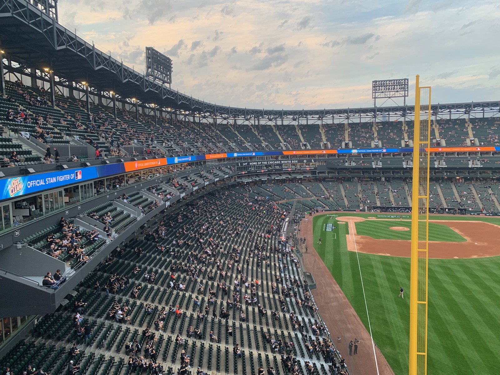
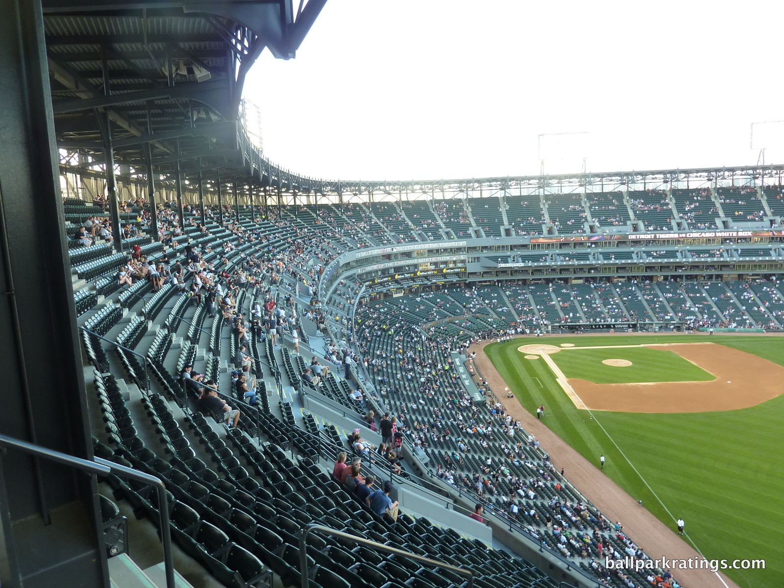
While avoiding the overhang issues seen in Baltimore, the upper deck is simply too far from the action. The much-maligned upper deck is not at all cantilevered over the field of play, despite not being as bad as Texas, Milwaukee, and perhaps some other newer ones. This is the one ballpark in baseball where virtually all of the lower level seats are open to the sky. Note that from really all areas in the upper deck, no part of the field is obstructed below. Of course, fans who complain about Citi Field’s obstructions might like this, but they fail to recognize Citi Field’s upper deck is way closer to the infield from all areas. I personally prefer the latter model because most of the action takes place in the infield, but I have to admit it is pretty cool that you can see all parts of the field here. But the upper decks are too far back from the field, unlike in Citi Field.
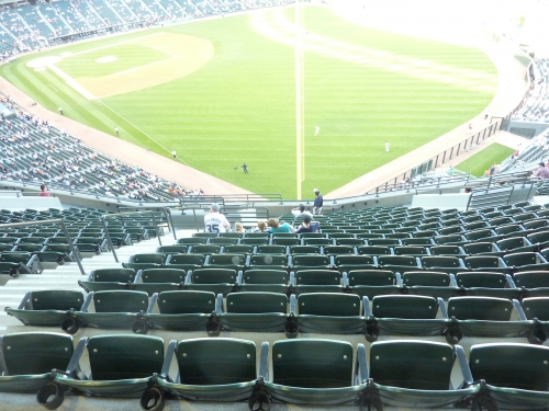
Ironically, the most criticized part of the sightlines at New Comiskey were actually justifiable, but led to a PR backlash and was aesthetically unattractive. Because the upper deck wasn’t over the lower deck like at Old Comiskey, officials attempted mitigate this factor by making the upper deck extremely steep, putting fans right on top of the action like at the old ballpark. With a 35-degree grade, compared to 31-33 degrees at other retro parks, the upper deck was perhaps the most maligned aspect of the Sox new ballpark. Despite being intimating, I actually think this was a good idea, solely from the perspective of viewing the game (you’re closer, despite being higher). Of course, it would have been easier just to cantilever the upper deck.
Pre Renovation Score: 7/10
Score: 7.5/10
Seat Comfort:
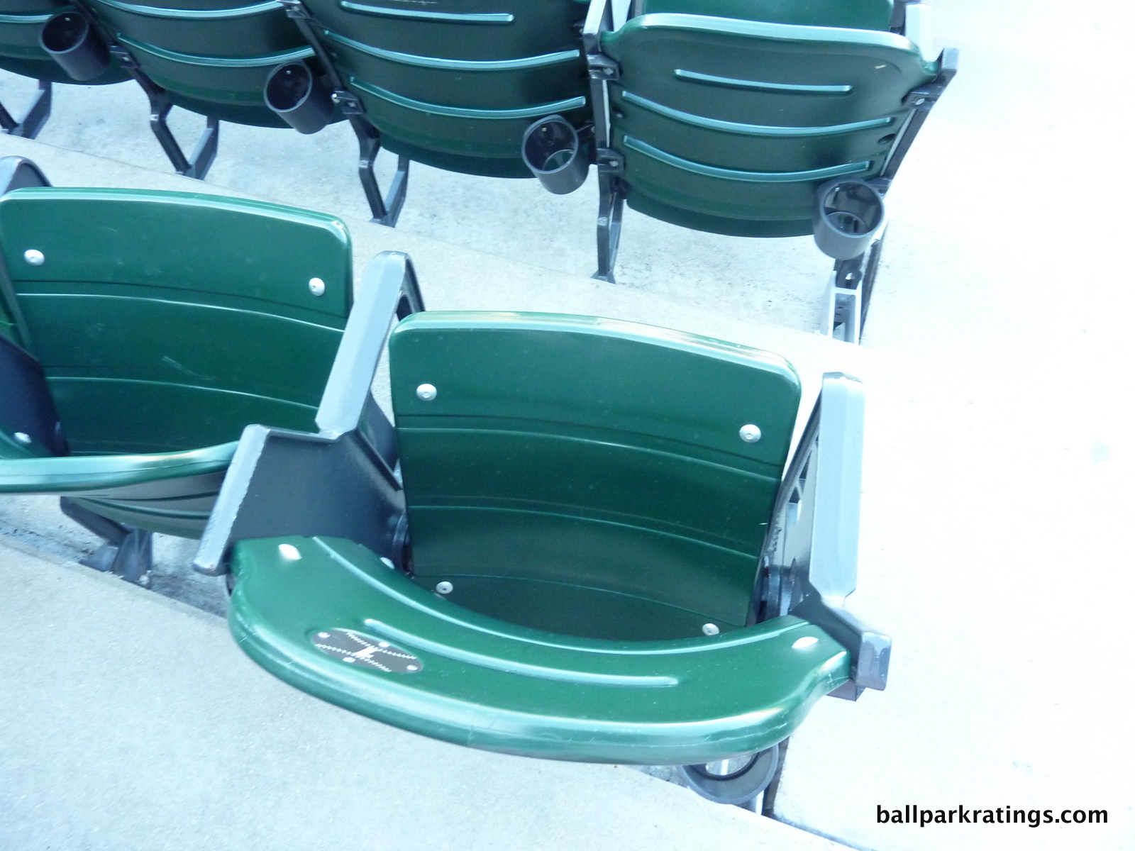
Newly installed in 2006, U.S. Cellular features the same Kelly green seats seen across the majors. With a couple of exceptions, the line is becoming indistinguishable from ballpark to ballpark. 18-19 inches in the seating bowl; too tight in comparison to historical standards (read in criteria). Club seats are padded. All seats have cup holders.
Pre-Renovation Score: 2.5/5
Score: 3.5/5
Concourses:
Critics often overlook that New Comiskey Park had a considerably superior concourse system for its time, offering open views of the field unlike retro gems in Baltimore, Cleveland, and Arlington. Continuous renovations, especially to the aesthetics, have only improved U.S. Cellular Field’s only original advantage.
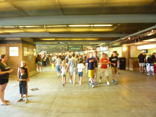
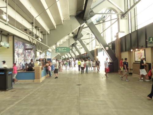
Because of the symmetrical design, the ballpark’s concourses are especially navigable, lacking the annoying obstructions and changes in elevation seen in some of the new retro parks. Everything is circular and straightforward. Concourse width is generally acceptable, if not a bit under average for today’s ballparks. The main concourse sports an open view of the field from virtually every area in the ballpark, even behind the batters’ eye. The upper deck concourse is a bit on the small side and closed from the field of play, but not likely to get crowded.
One flaw is that visibility along the infield concourse is poor due to the low ceiling height. The system of ramps is particularly cumbersome as well. The main concourse is not at street level, so fans need to go one floor up to access the main level. While I’ll expand upon this later, going from one level to another is especially difficult (even if you have access), as elevators are restricted and stairs are nonexistent. Ramps are your only option, which is my ballpark pet peeve.
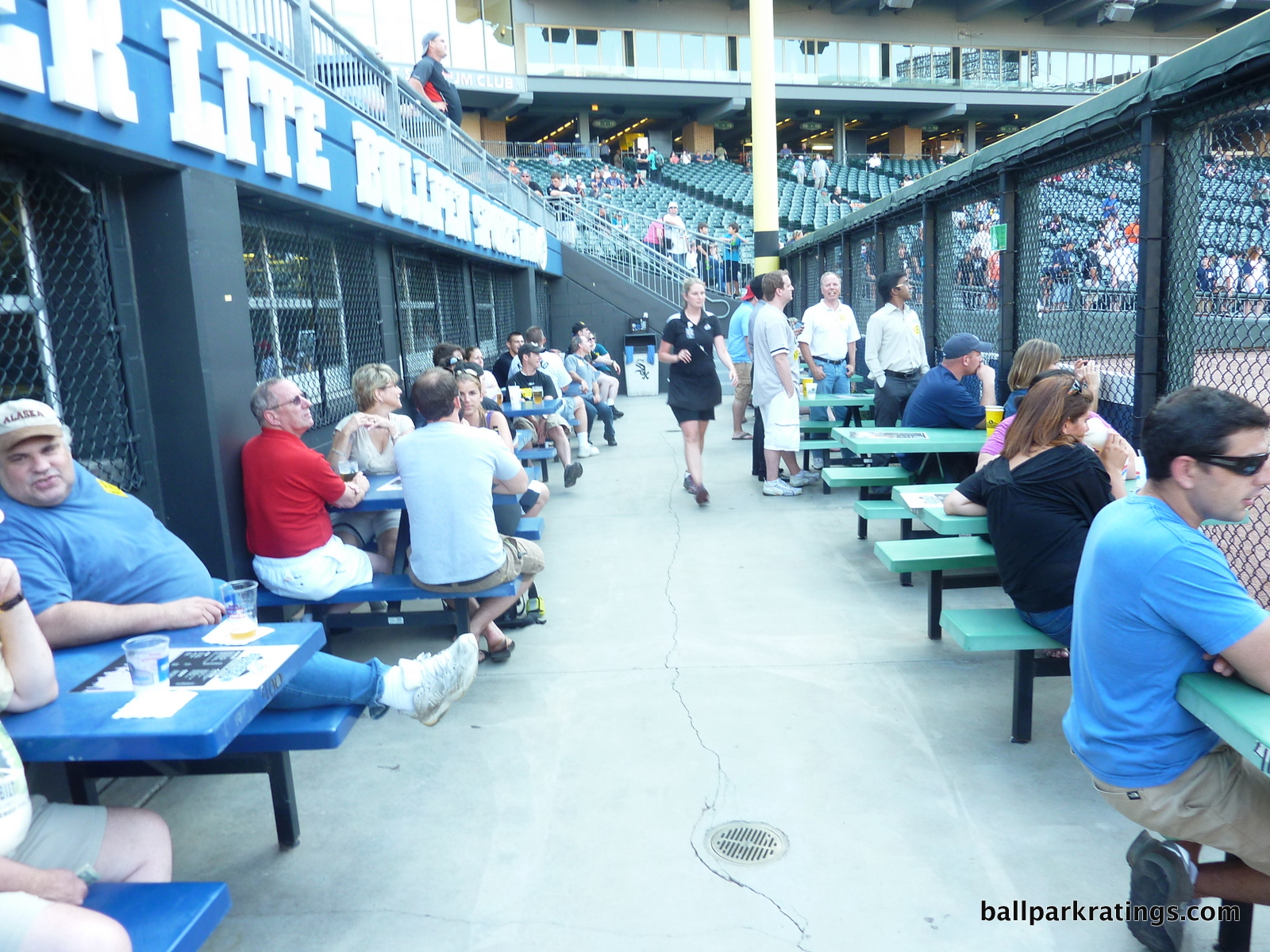
Note how you even have to take a ramp to access the Bullpen Sports Bar (now known as the Craft Kave) at field level, with no stairs or elevators available. What an archaic concept. On a similar but more positive note, an unadvertised area simply called “the patio” in right-center field is one of the more unique standing room areas in baseball, situated right behind the fence. I think it is sometimes used for group ticketing though.
Pre Renovation Score: 4.5/7
Score: 5/7
Scoreboard System:
Throughout the last 20 years, the White Sox have made a series upgrades to their scoreboard system, each of which haven’t really been significant enough to bring them up to standard, until 2016
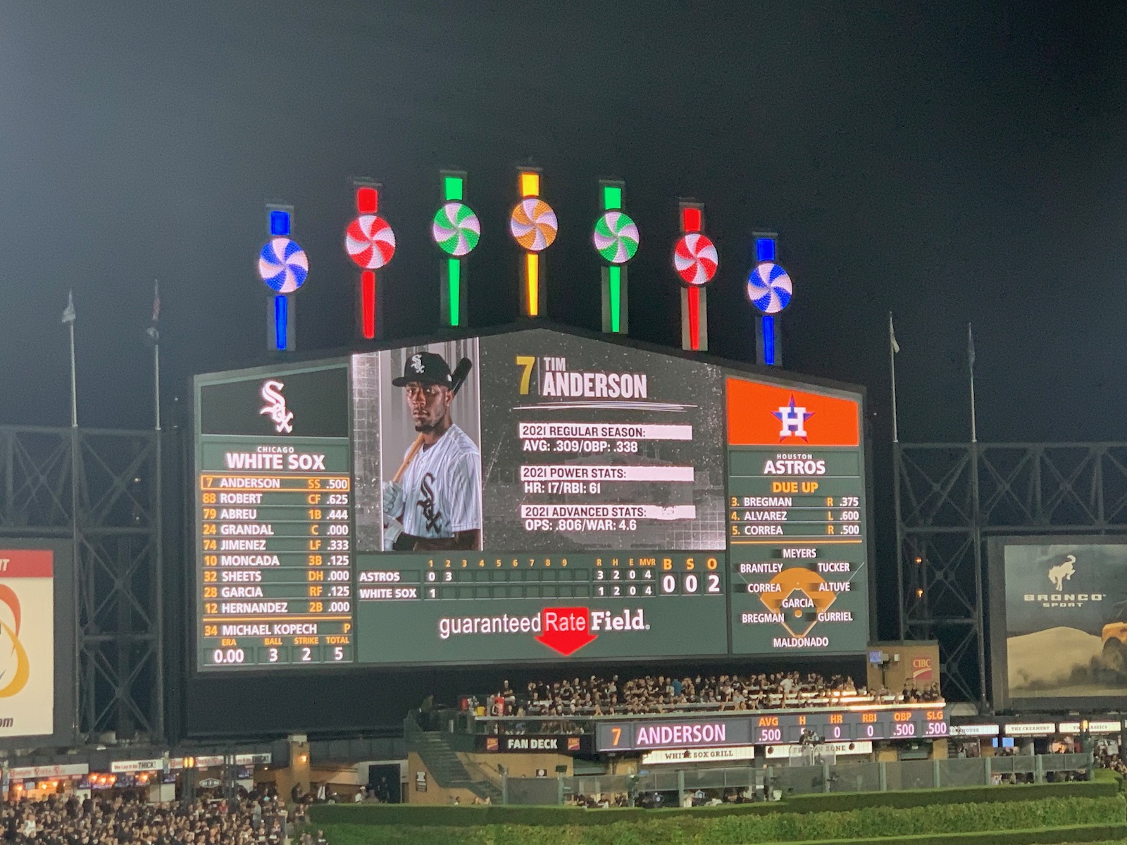
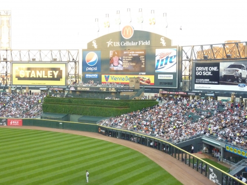
In 2003, they replaced their center field video board with one that is only slightly larger, and it is significantly lacking in size today. In 2009, a large color scoreboard showing both lineups and out of town scores was installed. There is a third matrix board in left field displaying further information and line scores. The system is plenty informative but lacks the flare we expect.
In 2016, the White Sox added a massive 8,000 square foot videoboard in center field, which is the 7th largest in the majors according to the Chicago Tribune. Once you add the boards in left-center and right-center, you have some of the most video square footage in baseball.
Score: 3/3
Total: 19/25
Amenities & Features
Quality and Selection of Concessions:
I’ve read a wide variation of perspectives on the food at U.S. Cellular Field. The New York Times specifically called out The Cell as having the worst food in baseball, suggesting that you avoid “everything.” But at the same time, a Sports Illustrated fan poll revealed the park was 2nd in the majors in fan satisfaction regarding the concessions. The truth probably lies somewhere in the middle. While the White Sox have an above average quality and selection, considering this is Chicago, they probably could do a lot more.
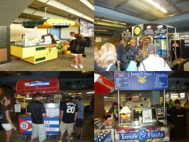
First of all, U.S. Cellular field probably offers the widest selection of Mexican food I’ve ever seen at a ballpark. Regular stands have quesadillas and tacos. Tex-Mex kiosks serve multiple items topped with the works, including nachos and burritos with your choice of beer/pork barbacoa or chicken carnita. There is a separate stand offering Comet’s Cuban Sandwiches. Another kiosk offers house made tamales and flautas. Specialty Mexican fruit cups are included. And of course, to top it off, you have the famous Elotes corn off the cob.
Triple Play Carvery serves a number of deli subs, including turkey and roast beef on your choice of rye or wheat bread. In reference to the nearby Chinatown, a Wow Bao Chinese Stand recently opened. A delicious selection of high quality Chinese fare is available, including Teriyaki chicken, BBQ pork, spicy Mongolian beef, and whole-wheat edamame.
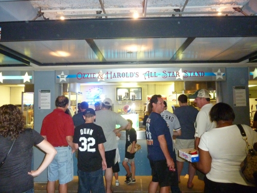
Regular stands are often named after White Sox legends, such as “Ozzie and Harold’s All-Star Stand” or “Eddie Collins’ brats.” Grilled sausage stands seem to be everywhere you look. There is a surprising lack of healthy food in U.S. Cellular field. The usual array of gluten free stands, salads, smoothies, wraps, coffees, ext is nowhere to be found, as the conventional foods seem to be given priority.
While the selection is generally impressive enough, I can’t help but feel they could do even more because this is Chicago. The White Sox need to take a note from Citi Field here. Where are the local eateries or chefs? Plus what’s with the lack of healthy fare?
Score: 4/5
Regional/Signature Concession(s):
Again, this is an area where the White Sox need to improve immensely. For a city so internationally renown for its cuisine, U.S. Cellular disappoints. There’s very little in the ballpark that says Chicago.
The Elotes corn off the cob is definitely their signature food of record. While its certainly unique, its pretty weak in comparison to what we see in the rest of the majors. Corn is served in a bowl with your choice of salt and butter, lime, red pepper, cheese, or mayonnaise.
But to say its weak is just a matter of opinion, even though I might point out that in substance it is indeed weak for a regional culinary heavyweight. The problem with U.S. Cellular Field is that they don’t have any local eateries anywhere in the ballpark. Throughout the major league scene, it’s pretty common to see regional restaurants in the ballpark, but for there not to be one in one of Chicago’s ballparks is pretty egregious.
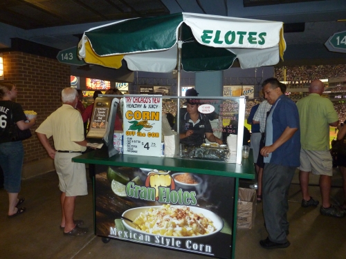
Score: 1/2
Public Restaurants/Bars/Sitting Areas:
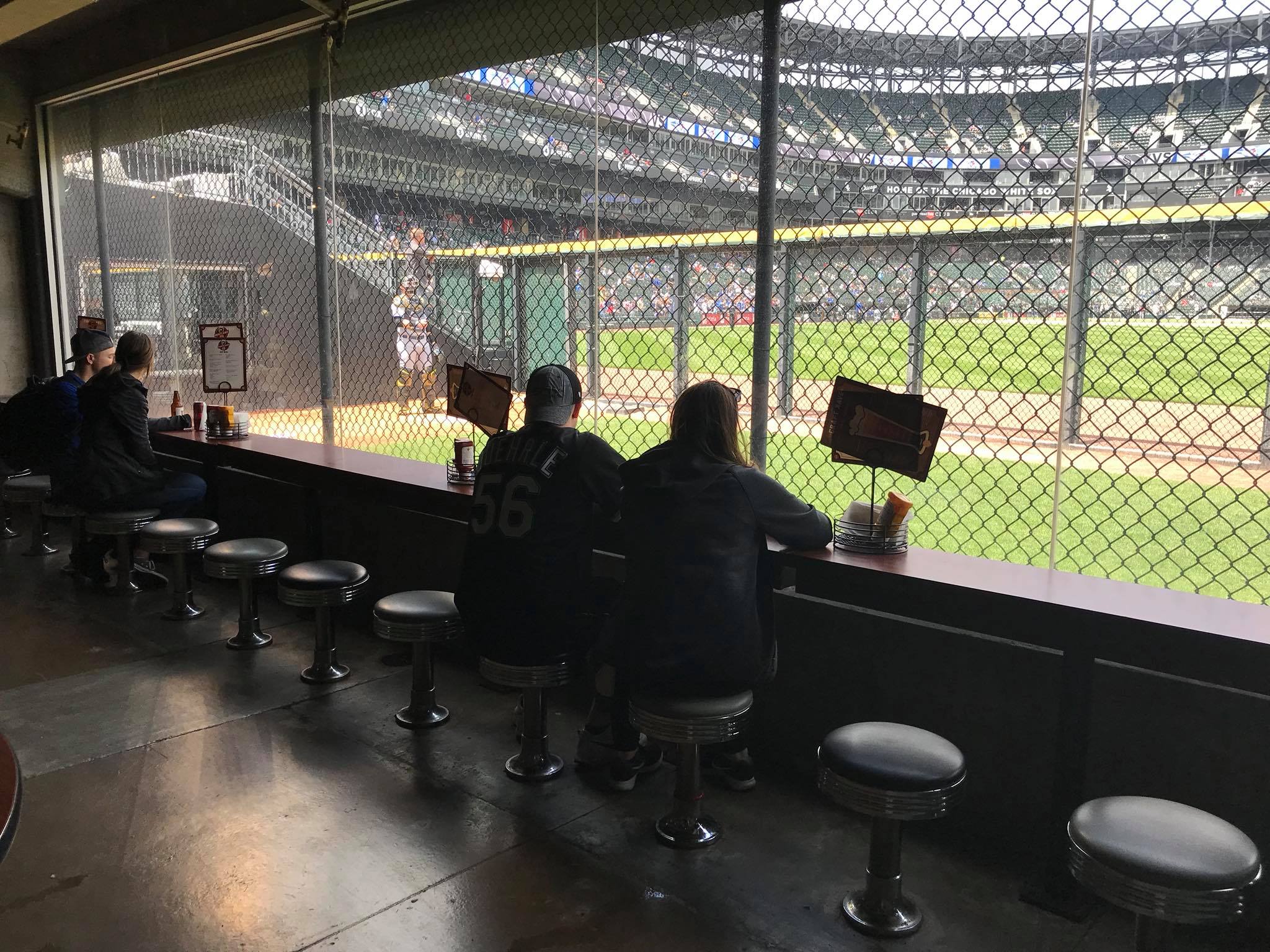
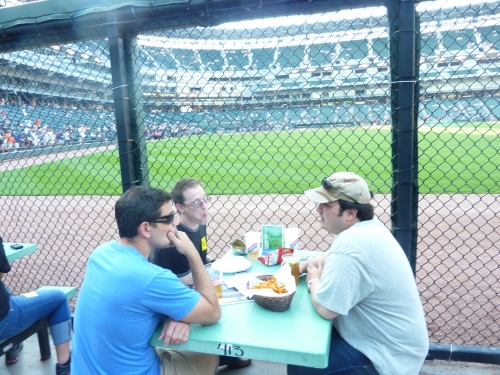
The Bullpen Sports Bar (now known as the Craft Kave) is one of the most fan friendly experiences in the majors. Despite being confined to those only 21 and up, it’s the only public area where you can go outside and dine right up against the fence. Somewhat like “The Pen” in Seattle, you can also sit right up against the bullpen and watch pitchers warm up. The inside features direct views of the bullpen through a chain linked fence. Rebranded for the 2017 season, the Craft Kave now features 75 beers on draft. Fans just wish it was more easily accessible via stairs or escalators, not ramps.
A multi-level restaurant called Bacardi at the Park opened in 2011. Now known as the ChiSox Bar and Grill, it is open to fans with or without a ticket at gate 5.
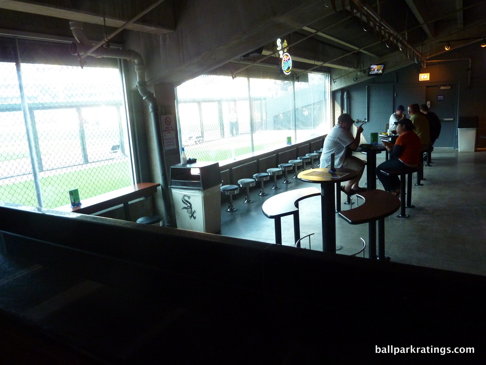
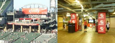
In recent years, the White Sox have opened some additional bars and restaurants on the main concourse. The Xfinity Zone is a 2,200 square-foot space in the right field corner, and the Beggars Pizza Pub is an enclave added on the left field concourse. There’s also a new Casa Modelo Bar in left field.
The White Sox don’t have a legitimate social space like the Rooftop at Coors Field, or even the Scoreboard Walk at Nationals Park or the 416 New Amsterdam Bar at Comerica Park, for example, but these restaurants, bars, and sitting areas are sufficient. In terms of areas accessible to all fans, having two full service bars and restaurants, along with 2-3 other smaller restaurant and bar areas, is more than many ballparks can say.
However, the White Sox get more demerits than other teams for lacking such an area in the upper deck. If you have an upper deck ticket, all you can do it watch the game (the horror!).
Score: 4.5/5
Premium Seating/Clubs:
Upon opening in 1991, the White Sox prioritized upping the ante for premium seating in major league baseball with more suites than ever seen before. While the model based on a heavy inventory of luxury suites and a club restaurant is outdated, unlike Baltimore, Cleveland, and Denver, U.S. Cellular Field has continually upgraded throughout the years to offer some of the premier club experiences in baseball.
While it’s certainly not the nicest club level, probably not even in the top half, U.S. Cellular Field’s club level has gotten better in recent years, even if its still lacking perks and space. Renovated and enclosed from the elements in 2002, the area formerly known as the LG Skyline Club (now without a sponsor) serves as the ballpark’s mezzanine club level. While not as luxurious as some, the club is distinct due to its size: the mezzanine 300 level only features 5 rows of seating around the diamond, creating a more exclusive experience. Assembled in light oak wood and painted with cream yellow, the décor is very pleasing to the eye, despite being a significant step behind others in lounge space and luxury. Be sure to check out the Skyline restaurant in left field, which is easy to miss. But that’s really the only bar, and there are few other concession stands. Seats are padded and in-seat service is included, the latter of which is being discarded at many larger “club levels” across the majors.
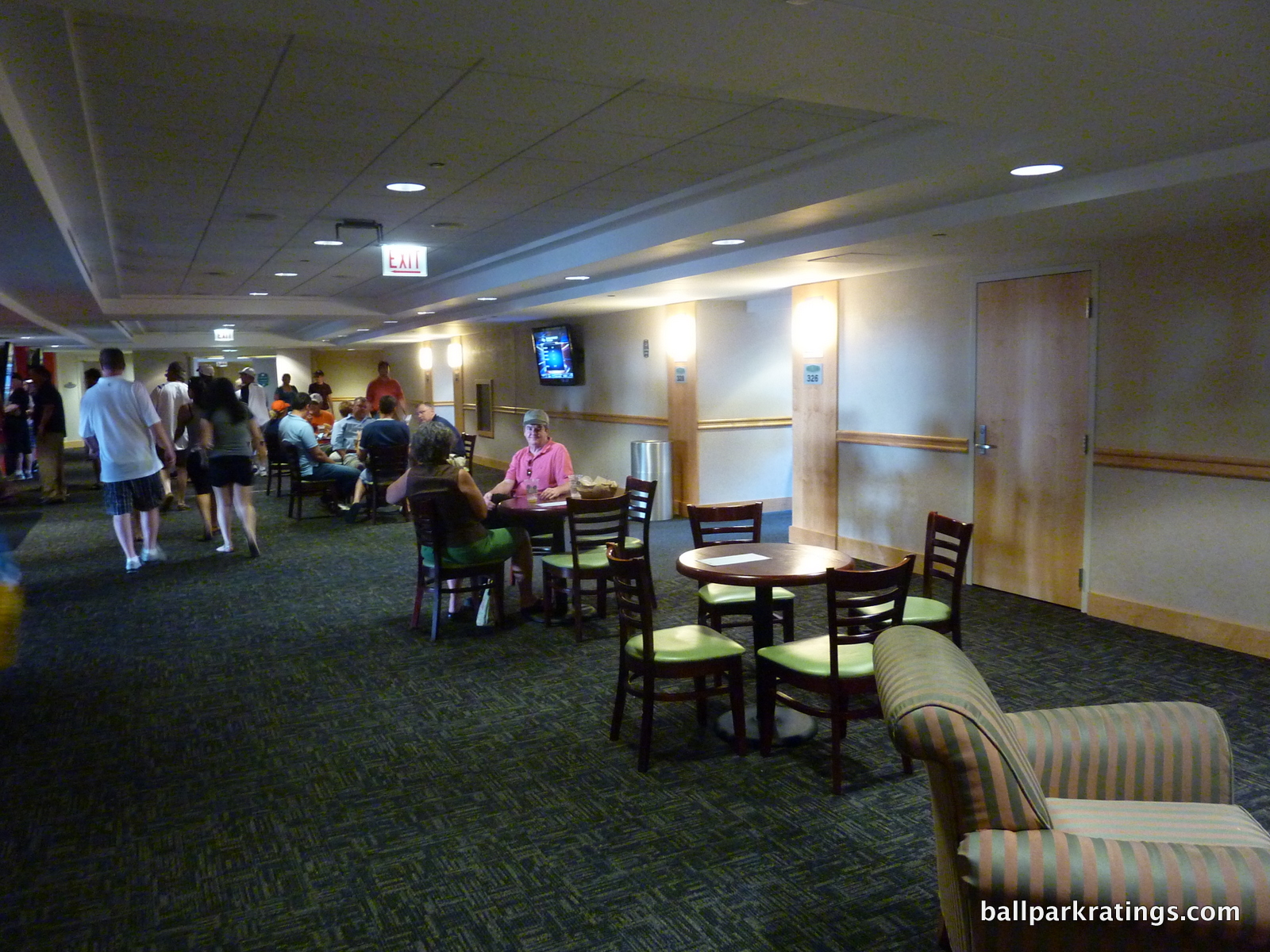
The White Sox added an all-inclusive premium club space behind home plate known as the Magellan Scouts Seats. Because it was added as an afterthought, the club is a bit of a unique experience, where fans have access to part of the service level in order to enter the premium lounge area, which is situated next to the locker rooms. The lounge area is surprisingly lacking in the expected overdone ornate qualities, instead offering a monotony of unadorned wood tables, despite an impressive display of memorabilia. I try to avoid simplified comparisons, but to me, it strongly resembles a college dining hall.
U.S. Cellular Field offers an additional ultra premium experience on suite level behind home plate known as the Guaranteed Rate Club. Unlike some of the hybrid club-suite experiences throughout the majors, those that are added in areas on the suite level where suites where no longer marketable, this one is a legitimately located premium space, offering over 200 seats and great sightlines behind home plate. Both the Guaranteed Rate Club and the Magellan Scout Seats feature their separate private entrances, sometime worth noting for clubs added after the fact.
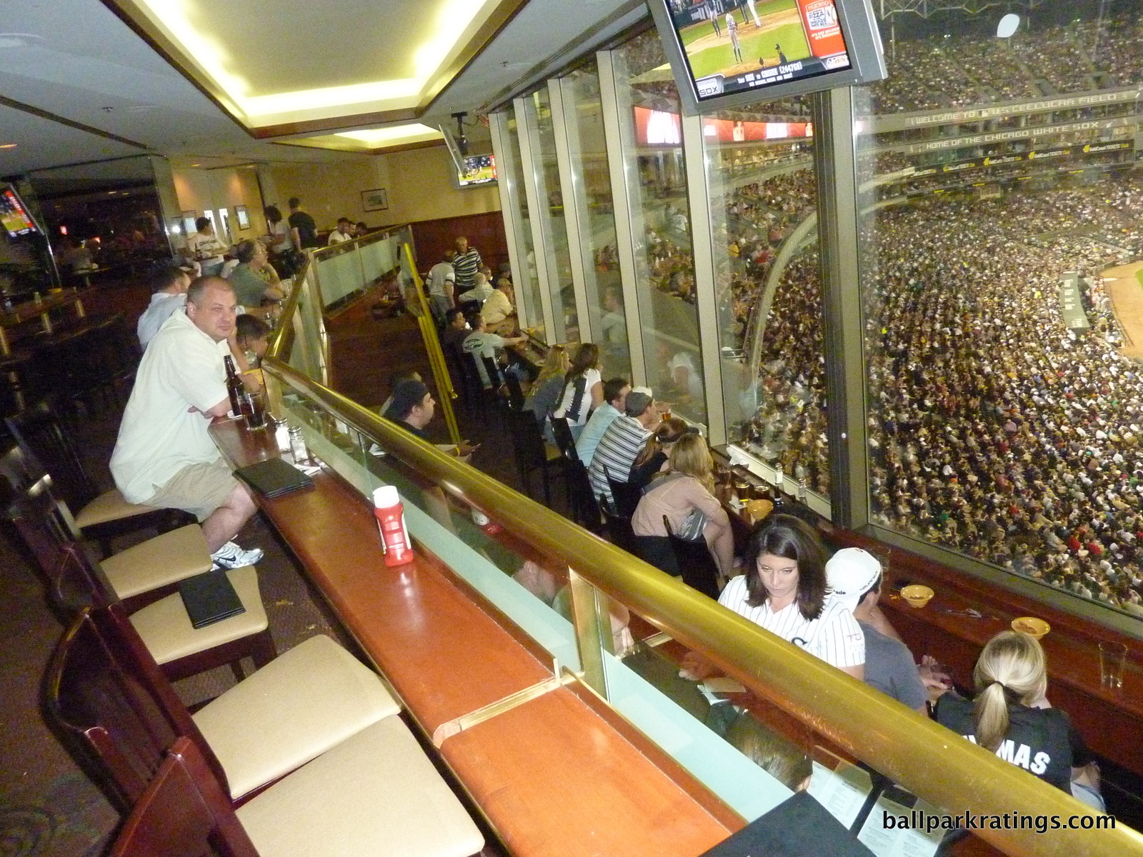
Almost every team has done away with their “stadium club” restaurant concept, but not the White Sox. These are exclusive restaurants, often located in the outfield or down the lines with a field view, offered to season ticket holders that require a membership fee. While seen as the most luxurious concept in sports upon opening, the Stadium Club is a bit worn and outdated today. Evoking a suburban Chicago country club circa 1991, the premium space features a white tablecloth dining room, along with a 30-dollar buffet and a paring of fine wines. Access to an upstairs, more casual bar area is available as well for the $1000 membership. But I’m happy U.S. Cellular Field has kept theirs.
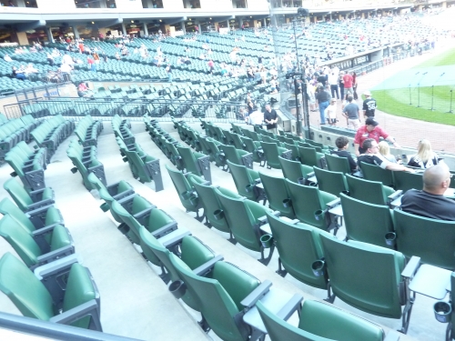
Clubs these days are shying away from the membership-only premium restaurant concept, with ballparks in Detroit and Minneapolis refining the concept in some fashion, while most avoid it all together in favor of more club seating. Teams that offer it opt for a less stuffy vibe. A number of teams, including those in Denver, Kansas City, Cincinnati, and Cleveland have opened theirs to all fans, while some like Texas (and Minneapolis) just give all season ticket holders access with no membership fee. Detroit gives access to their Stadium Club restaurant to all premium ticket holders in lieu of any club level concourse, although membership is still ostensibly offered in theory. So this membership fee season ticket holder concept is unique today (If you count San Francisco’s Gotham Club as its own animal, Milwaukee, NYY, and LAD are the three others, but complimentary membership is given to select season ticket holders, unlike here) . However, Chicago’s version might be the one area of the park that hasn’t been touched since 1991. It’s definitively beginning to show its age. It’s also worth noting that many Stadium Club passes can be bought on the secondary market for under $10.
Overall though, U.S Cellular Field’s premium seating is surprisingly good, and the fact that they still have a private Stadium Club is actually unique and welcome.
Pre-Renovation Score: 3/5
Score: 4.5/5
General or Artistic References to Baseball or Team History/Museums:
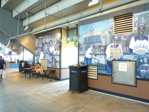
Perhaps the one drawback of the renovations was the replacement of the White Sox Hall of Fame behind home plate with an elaborate team store. The new team store does include some dynamic graphics and historic memorabilia cases. For not having any specific area dedicated to White Sox history, the team does as well as possible in referencing the past, integrating history throughout the concourses.
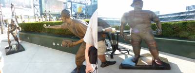
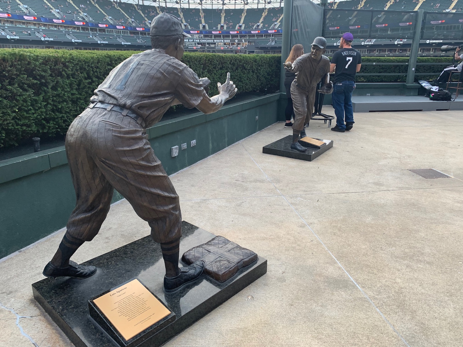
U.S. Cellular Field is perhaps best known for its abundance of statues, and possibility to a fault. The 8, yes 8, statues along the outfield concourse have received some criticism for trivializing the concept of the statue. Some believe it’s not warranted unless the figure truly transcends the sports, or at least the team. And I’ll admit, seeing a Harold Baines or Minnie Minoso statue is a bit odd. And I’m willing to bet many Sox fans have no idea who Billy Pierce is. And where’s Eddie Collins? The double play statues of Aparicio and Fox are the best of the bunch.
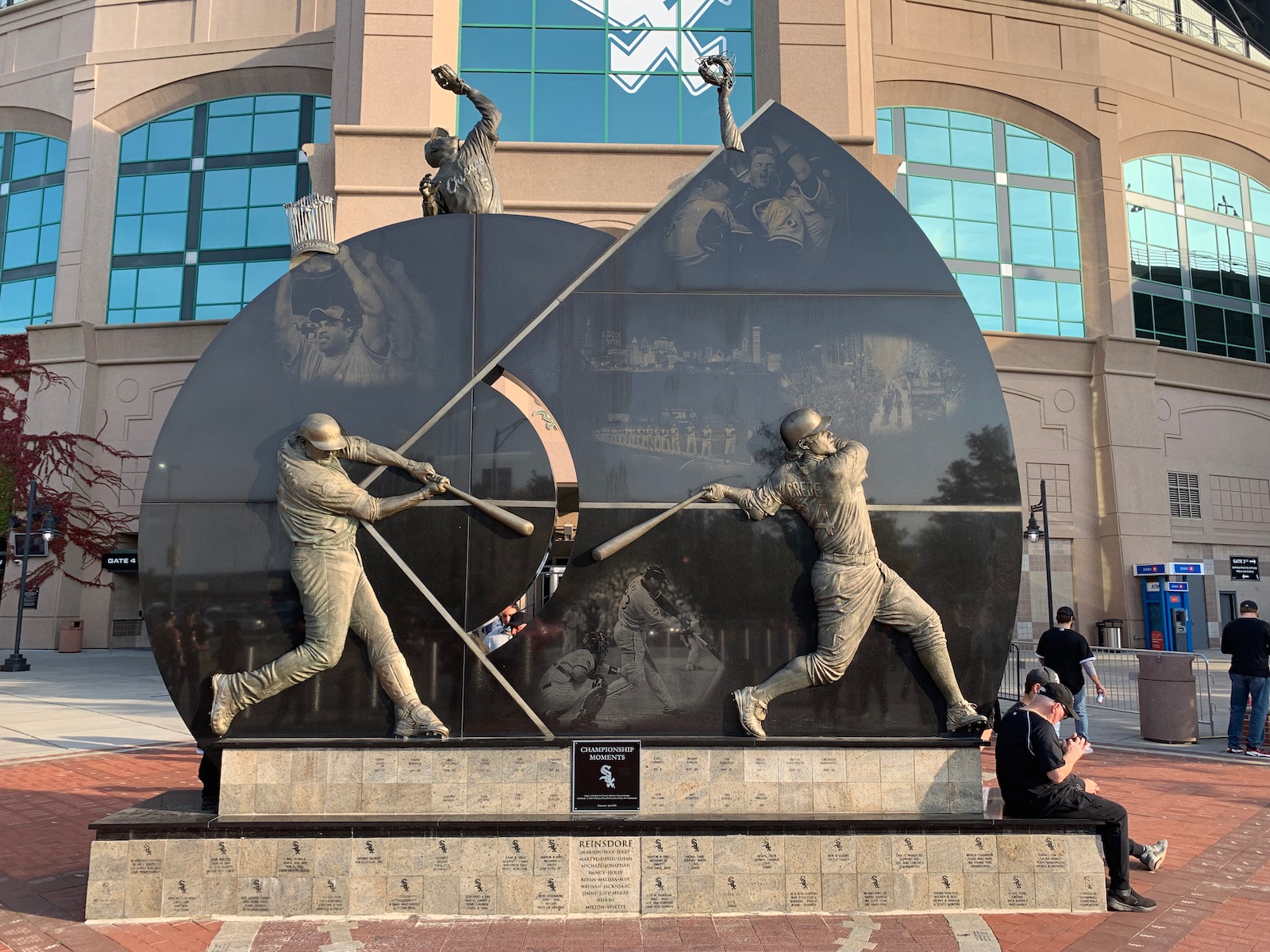
Both the club level and upper deck concourses feature a detailed chronology of White Sox history. The Bullpen Sports Bar also has a number of cool memorabilia items, but I don’t know if that’s been carried over to the rebranded Craft Kave. Outside the main entrance behind home plate, the White Sox Champions Plaza celebrates the 2005 champions. Players on the display include Konerko, Crede, Hernandez, Blum, and Uribe.
Score: 3.5/5
Entertainment/Kids Activities/Other Amenities:
Opening in 2005, the three-level FUNdamentals kids zone is one of the more expansive children areas in baseball. But unlike many across the league, it’s more dedicated to baseball activities than pointless entertainment.
Instruction for kids is offered free of charge in the form of a base running station, speed pitch, and a mini baseball diamond. The 15,000 square foot area also includes specific coaching clinics to improve your game. There’s also a video game lounge on the main concourse.
The Bill Veeck showerhead and rain room is also of note.
Pre-Renovation Score: 1/3
Score: 3/3
Total: 20.5/25
Atmosphere, Vibe, & Policies
Atmosphere/Fan Support:
While the atmosphere at U.S. Cellular Field has been improved exponentially because of the less menacing upper deck, Chicago’s second team has generally struggled in terms of attendance numbers. But fan engagement for those that are at the park is consistently above average.
After drawing on par with the Astros in 2011, despite expecting a division title, White Sox fans appear to be one of the least loyal if you simply judge by attendance. I often measure this by looking at the ratio of average attendance per game to expected team performance. Throughout the duration of the ballpark’s history, the White Sox score particularly bad here. Despite consistently competing for division titles or finishing over .500 from 2000-2004, they annually averaged from 20,000-24,000. After the World Series win in 2005, attendance experienced a considerable upswing, but tapered down continuously despite continuing to compete, with a high payroll over 100 million.
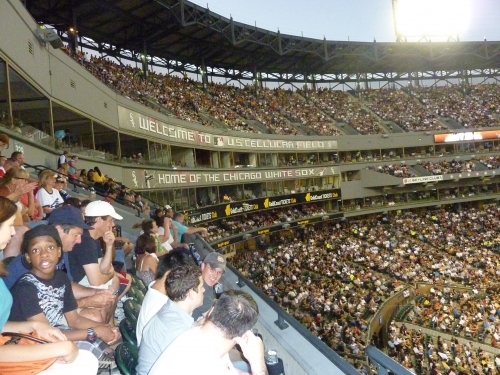
Of course, there are a number of variables not measured here, including the unreasonably high-ticket prices and poor location. Fan that attend Sox games are generally some of the most passionate in baseball as well. But the White Sox have been in the cellar in terms of attendance for more than a decade, and while they have a long playoff drought, they haven’t been as bad as other teams.
Score: 3/5
Policies/Customer Service:
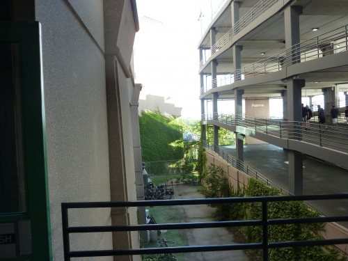
It really doesn’t matter how nice the ushers might be; the White Sox completely fail here with their fan unfriendly policy of not allowing fans in the upper deck to explore the ballpark. You can’t go to the main concourse if you are in the upper deck. I acknowledge they have justifiable reasons, but encouraging fans to walk around the ballpark is one of the hallmarks of the new retro ballparks.
Score: 0/2
Bonus:
For doing the impossible: making New Comiskey Park into U.S. Cellular field, in large part by recognizing that its flaws were rooted in the bleak color scheme +3
For not deviating from the symmetrical look and standing out among all the retro parks +2
For being the first ballpark of the building boom +1
For the famous exploding scoreboard +1
For the Bullpen Sports Bar, one of the coolest experiences in baseball +1
Score: 8
Conclusion
SCORE BEFORE RENOVATIONS: 59
Final Score after renovations 74. Wow, I’ll be honest: I really didn’t expect the score to be this low. This is one of the few examples where I subjectively want to rate this much higher against my “objective” ratings system. If I were to give the Cell a gut rating, it would be about 80. I certainly liked it better than Turner and Miller. But it was more difficult to find bonus points here than at those two, and I’m pretty consistent in doing so. Also, its score in ballpark policies really hurts. Come on White Sox let all fans on the lower concourse!
But you have to look at where it started. I think the main message to take away here is how much the score improved. Because we underrate how bad the original version was, we don’t realize how far this park had to come to even be respectable.
But with its poor location, unavoidably mediocre aesthetics, fan unfriendly practices, and lack of Chicago flare, U.S. Cellular will score in the lower tier of all 27 ballparks I will rate and rank. The good news is it’s now in the same conversation as any retro park today.
FINAL SCORE: 74
RANKING: #26/30
Summary
TL;DR? Here’s the long-form piece in a nutshell:
Just barely missing the retro-classic trend ushered in by Camden Yards (1992), the White Sox stadium (1991) usually falls near the very bottom of ballpark rankings. But as any ballpark enthusiast will tell you, Chicago’s South Side ballpark has gotten so much better after over 20 years of periodic renovations.
Yes, inside and out, little about GRF makes any pretense of being aesthetically attractive. With an enclosed, ad-plastered outfield facing away from Chicago’s skyline, GRF has little character and absolutely no visual sense of place. But compared to some busy, disjointed, gimmicky retro parks, there is a certain coherence and simplicity about its pleasing, symmetrical interior lines that just rubs me the right way.
GTF’s amenities and fan-friendly features compare pretty well: (a) good food, (b) top-5 ballpark for craft beer, (c) The Craft Kave, one of the best social spaces in baseball, (d) multiple lounges and bars littered around the main concourse, (e) statues adorn the outfield concourse, and (f) a kids’ area focused on baseball activities. And don’t forget the exploding scoreboard, now equipped with state-of-the-art tech to match its reputation.
However, GRF is still rife with flaws beyond the nondescript aesthetics, because there are plenty of structural issues that can’t be fixed. The upper deck is still high, steep, and far from the action. Cumbersome ramps are still required for vertical circulation; exploring the park is a chore. And it’s still a “parking lot stadium.”
Finally, while inconsistently enforced, the policy restricting upper deck ticket holders to that level, meaning they can’t access the amenities on the main concourse, is deplorable. And it was back in full force for 2021. There are ways to circumvent this rule, but it’s baseball’s single most fan-unfriendly policy.
But GTF doesn’t deserve to be associated with the two “bad” stadiums in Oakland and Tampa, which I see far too often. Compared to other fans’ ballpark rankings, #25 is a pretty solid showing for GRF.
Defining Features
"Exploding Scoreboard"
Biggest Hit
Craft Kave (aka "Leinenkugel’s Craft Lodge")
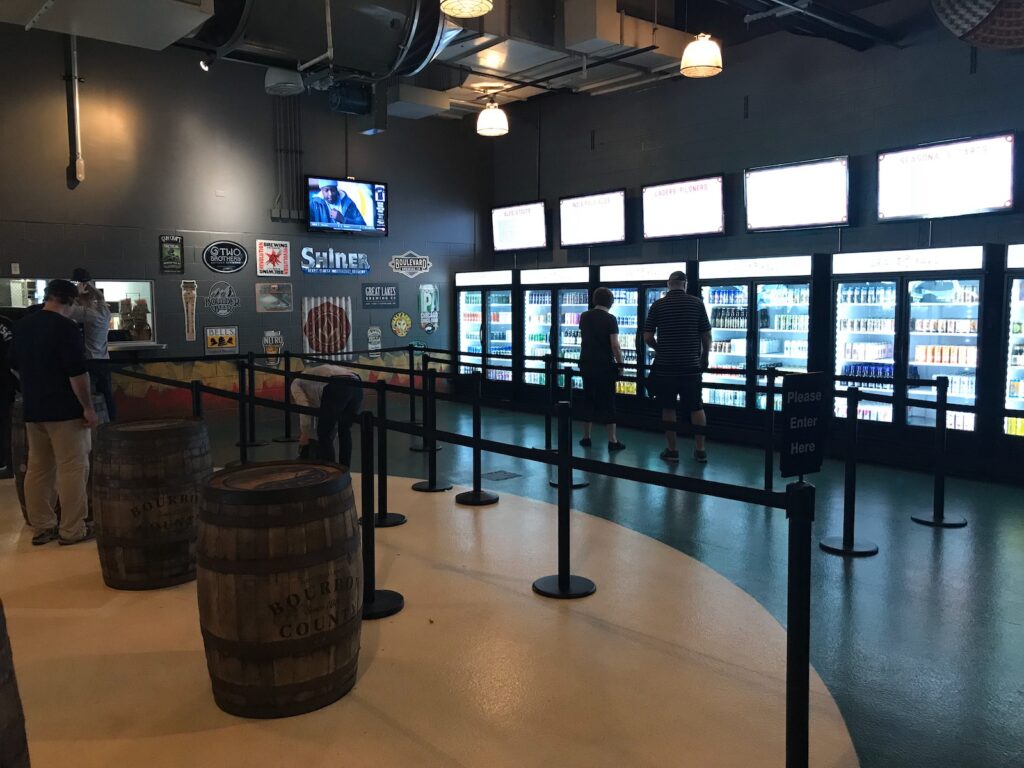
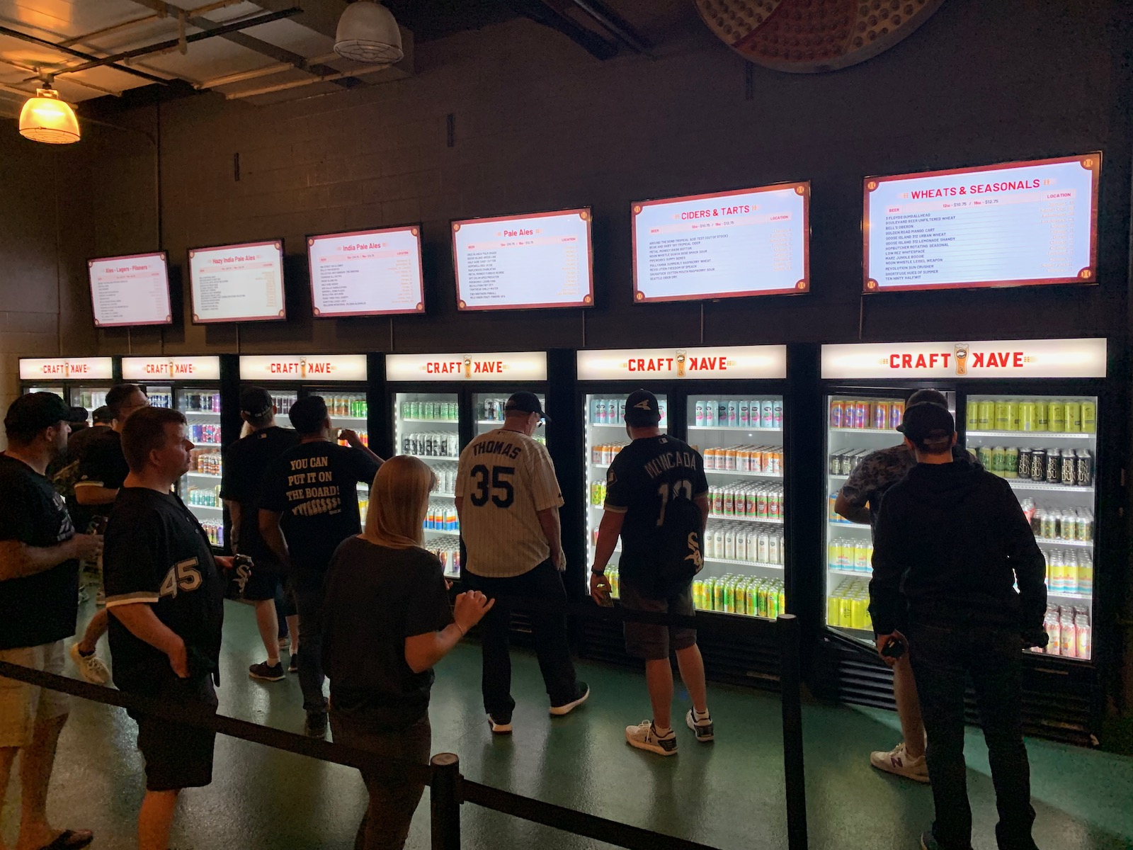
New Comiskey Park has undergone numerous enhancements since it opened, but the highlight is the right field ground-level bar, originally dubbed the Bullpen Sports Bar. It was reborn in 2017 as the Craft Kave, which was nothing short of baseball’s best beer spot. While it was rebranded again in 2022, it still boasts one of the largest beer varieties of any space in MLB. Most than 75 canned choices are available, mostly of the local variety
Even if you’re not an enthusiastic beer aficionado, the Kave is a wonderful space to hang out. Offering a full-service menu and seats looking right into the visitor’s bullpen, this is the place to be before the game.
Biggest Miss
Ramps Galore and Unfriendly Ballpark Policies Make Exploring the Ballpark a Hassle
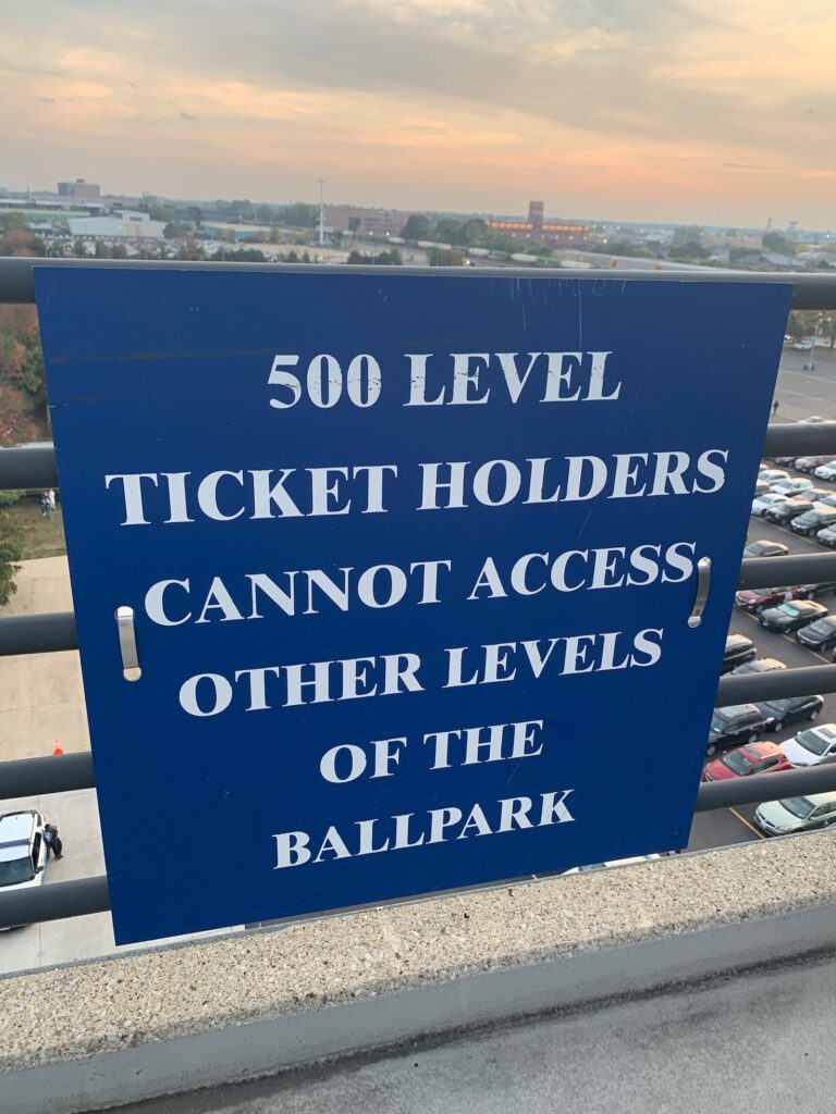
While there are ways to stealthily circumvent this policy, 500-level ticket holders are not allowed to explore the rest of the ballpark. This is the only MLB park where that’s the case. Forget about the Craft Kave. Forget about the good food and choice eateries/bars/lounges on the main concourse. Forget about seeing the outfield statues. The hoi polloi are herded up ramps and forced to stay in the upper deck in sort of a reverse Titanic situation. It’s up there with Dodger Stadium’s traffic, Oakland’s sewage, and Tampa’s catwalks as the worst thing about any MLB park.
Moreover, even if you have “full access,” exploring different levels is difficult. With no stairs, few escalators, and elevators reserved for people with disabilities/VIPs, cumbersome ramps are often necessary for vertical circulation. For a ballpark enthusiast like myself who loves to constantly move between seating levels and explore different areas upon each revisit, this really sticks in my craw. For me, the White Sox park congers up memories of walking up and down ramps!
Other Hits
Interior Simplicity

After navigating through 25 years of “retro” parks with contrived quirks that tried too hard, there is something appealing about the simplicity and symmetry of the White Sox home from a visual standpoint.
Interior Color Scheme Enhanced By The 2000s Renovations Is Surprisingly Flavorful
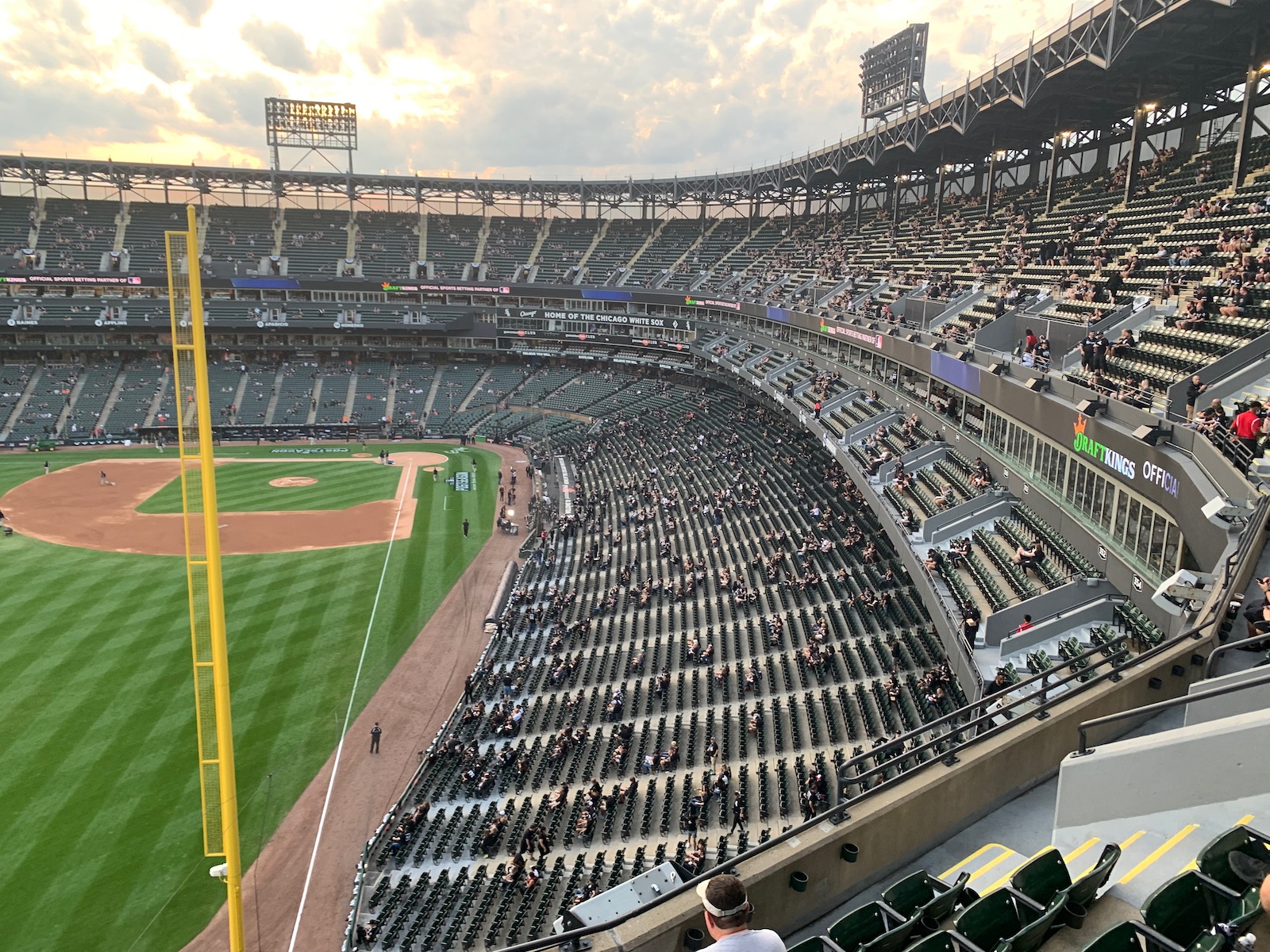
New Comiskey Park opened with a repellently sterile bathtub motif of blues and whites. In the 2000s, that was replaced with a darker shade of greens, grays, and blacks. Not exactly warm, but it somehow works.
Attractive Batter's Eye
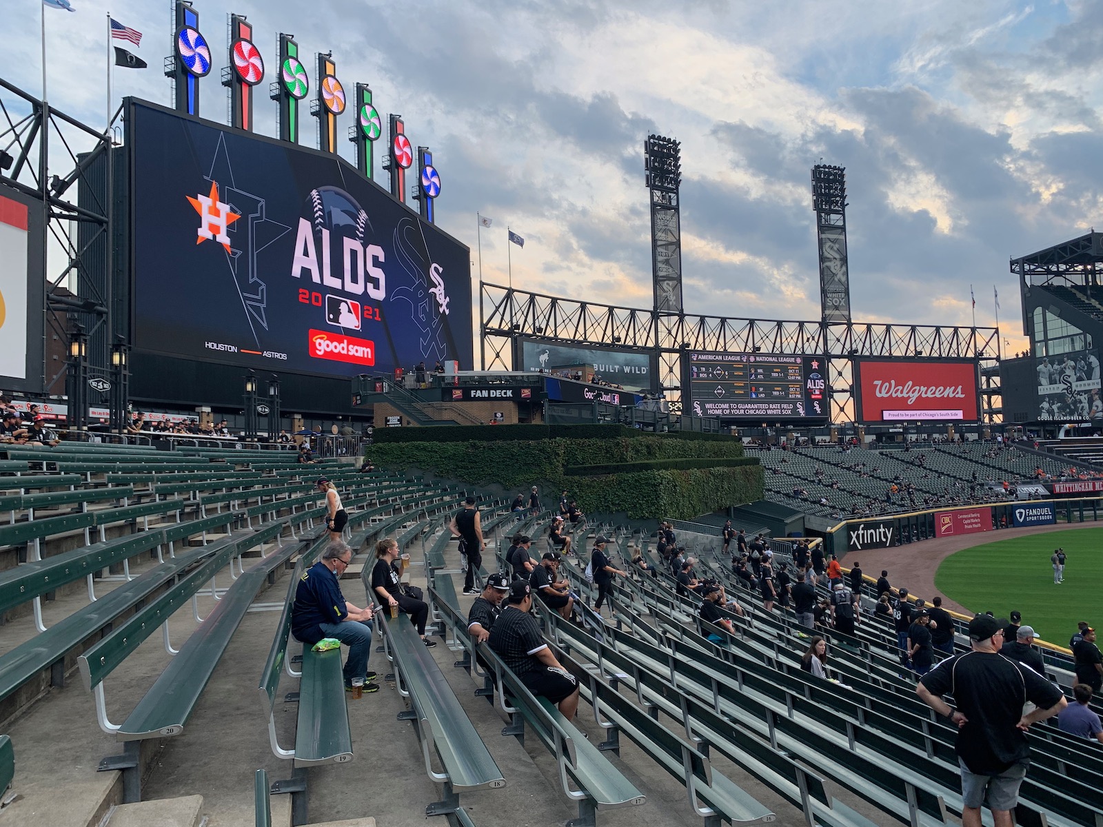
Can’t go wrong with lush green ivy on a multi-tiered batter’s eye, in contrast to those plastic-looking walls that stick out like sore thumbs. It also adds a subtle amount of flair to an otherwise deliberately minimalist structure. Another area greatly improved by the 2000s renovations.
2005 Championship Monument Adds Some Much-Needed Character To The Exterior

The granite and bronze sculpture depicts crucial plays, players, and moments from the White Sox march through October of the 2005 World Series winning season.
Famous “Exploding Scoreboard”
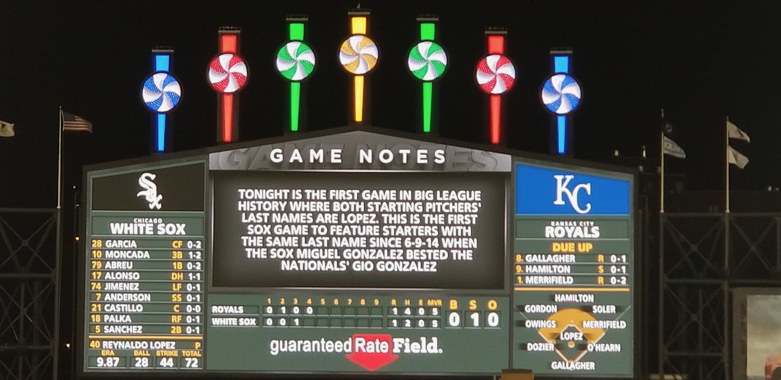
Now bolstered with premier tech to match its historical iconic status, the new video board and pinwheels resemble the shape of the original exploding scoreboard at Old Comiskey Park.
Top-5 Craft Beer Ballpark
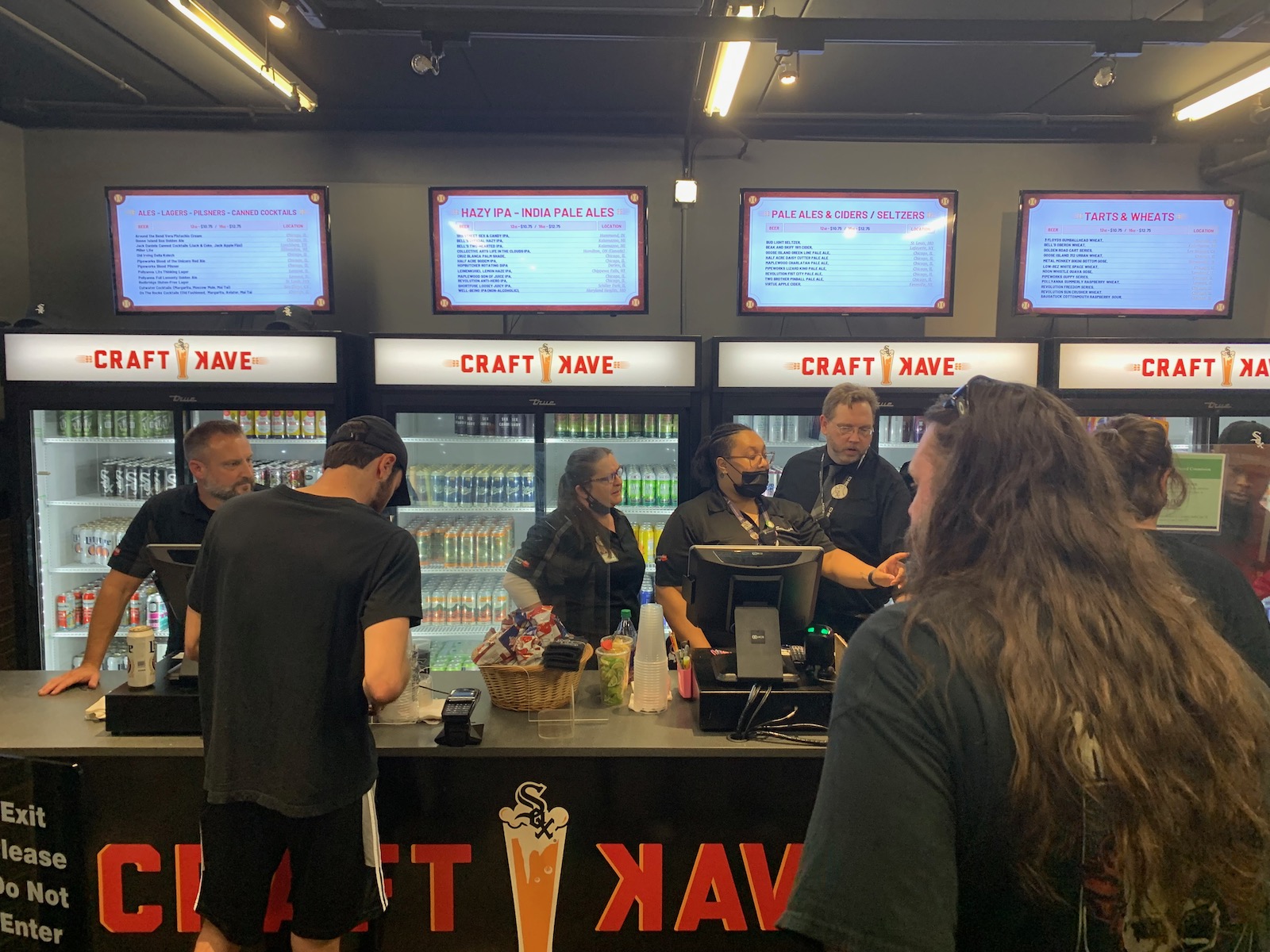
The Craft Kave alone cements CRF as a top ballpark for suds, but the beer is distributed well around the park. Most notably, there’s an extension of the Craft Kave via a concession stand in the upper deck.
Good Food
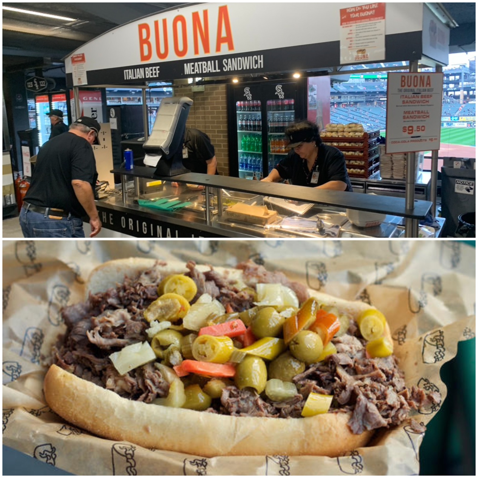
GRF often places near the top in fan polls of best ballpark food. While I don’t rate it that highly — both the variety of cuisine and quality of local eateries just isn’t there — they do the ballpark classics and ordinary grub well. Pictured above is a tasty Italian Beef sandwich from Buona.
Outfield Statues
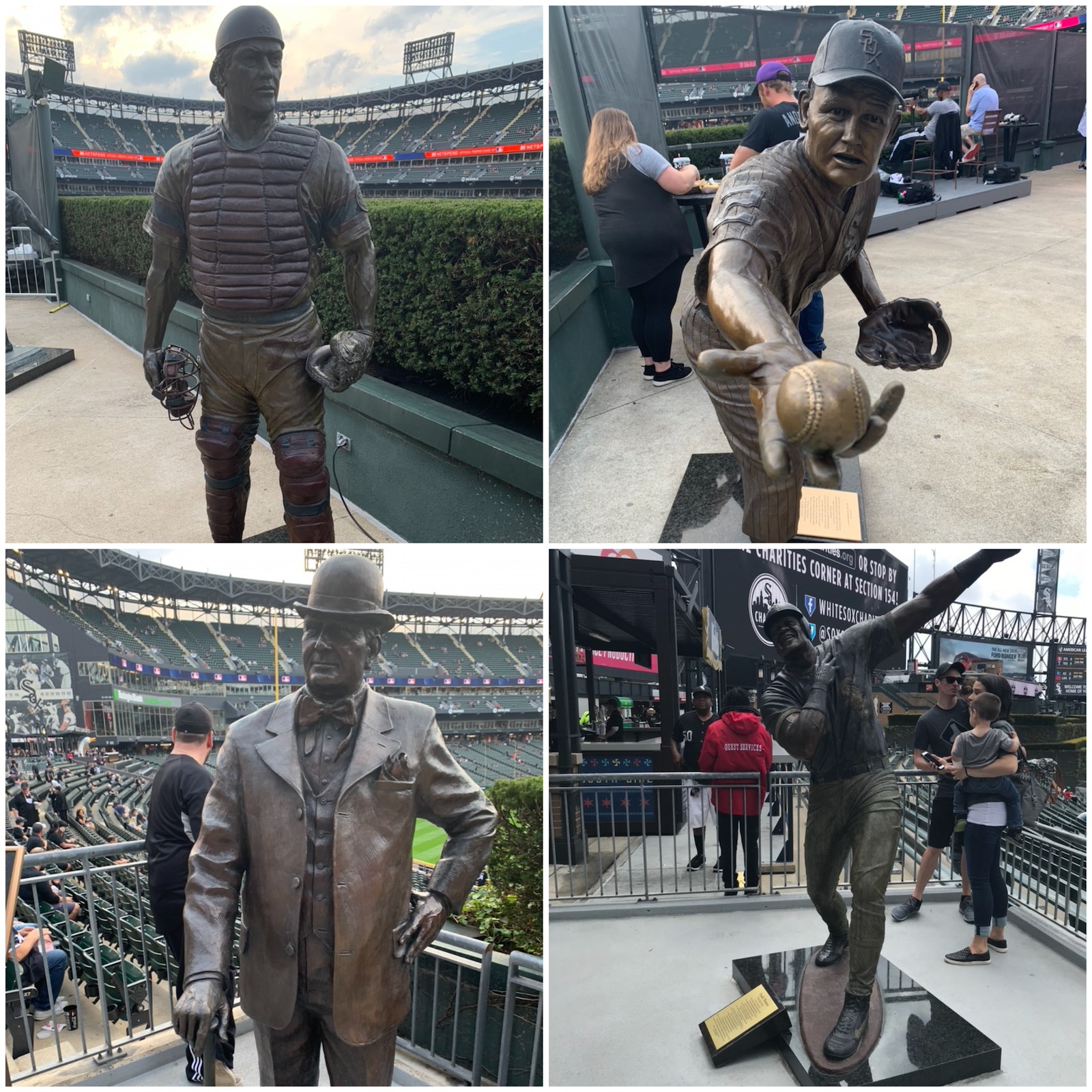
Unless you stretch the definition to include the Reds Museum attached to Cincinnati’s ballpark, GRF has the most statues of any MLB stadium. Nine statues, all to the left and right of the Fan Deck in center field. Top Left to Bottom Right: Carlton Fisk, Nellie Fox, Charles Comiskey, Frank Thomas.
Plenty of Eateries, Lounges, Bars, and Social Spaces Accessible From The Main Concourse
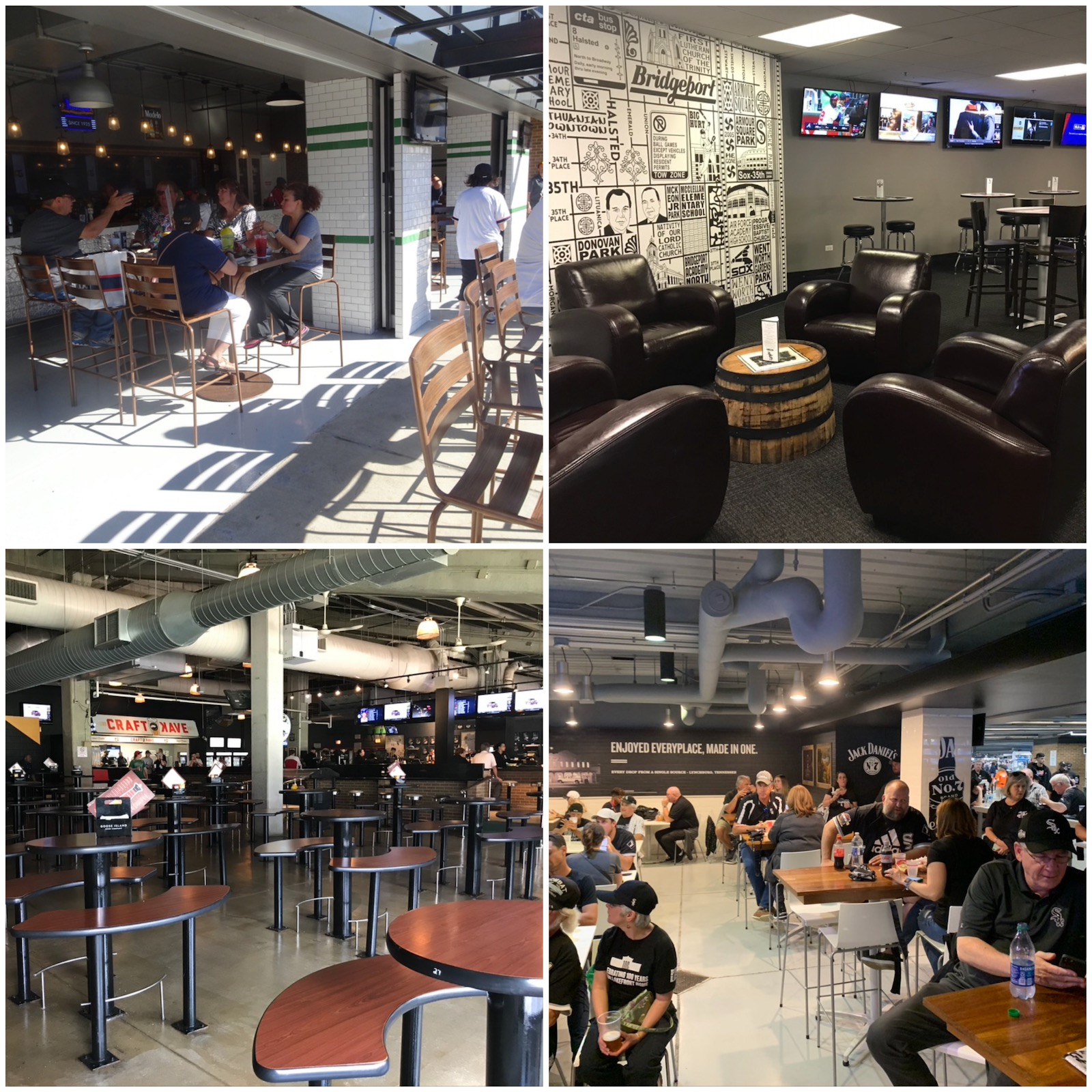
For originally being such an unfriendly place, GRF has a solid array of destination bar and sit-down eateries throughout the main concourses. Left to Right: Beggars Pizza Pub, Vizzy View Bar, tables in the Craft Kave, Jack Daniels Old No. 7 Bar. I love these spots to socialize before games, as opposed to ballpark “bars” that are merely alcohol concession stands.
Old Comiskey Park Shower
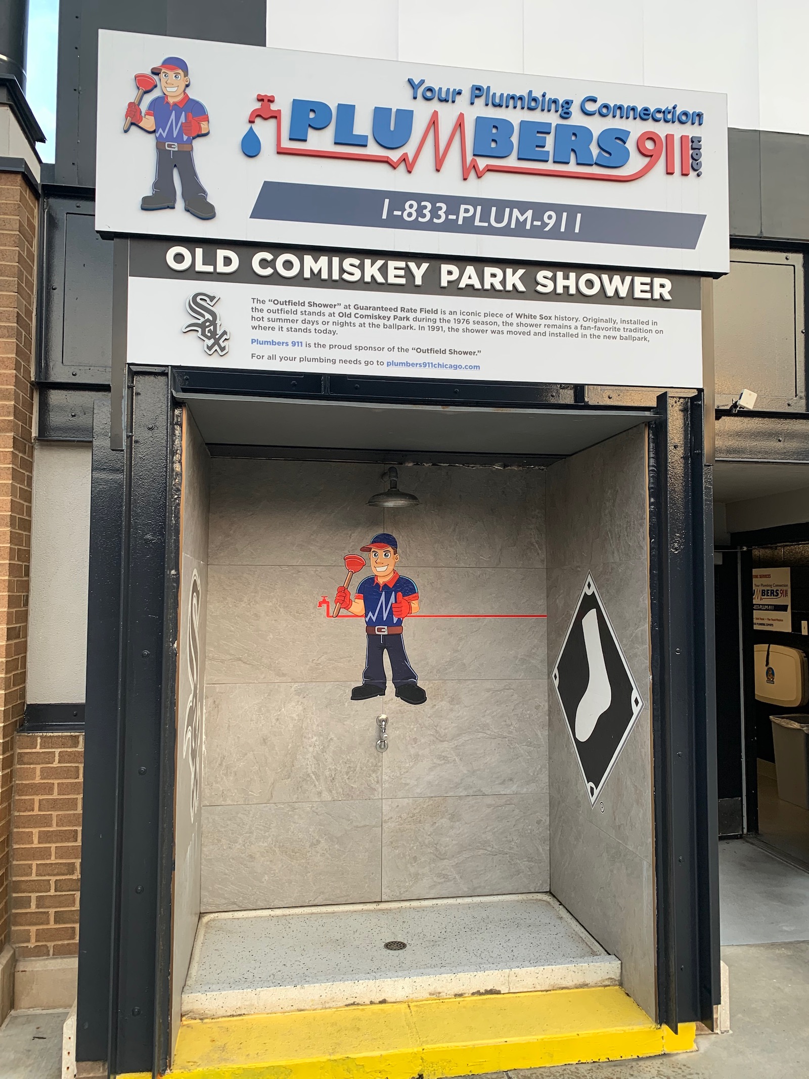
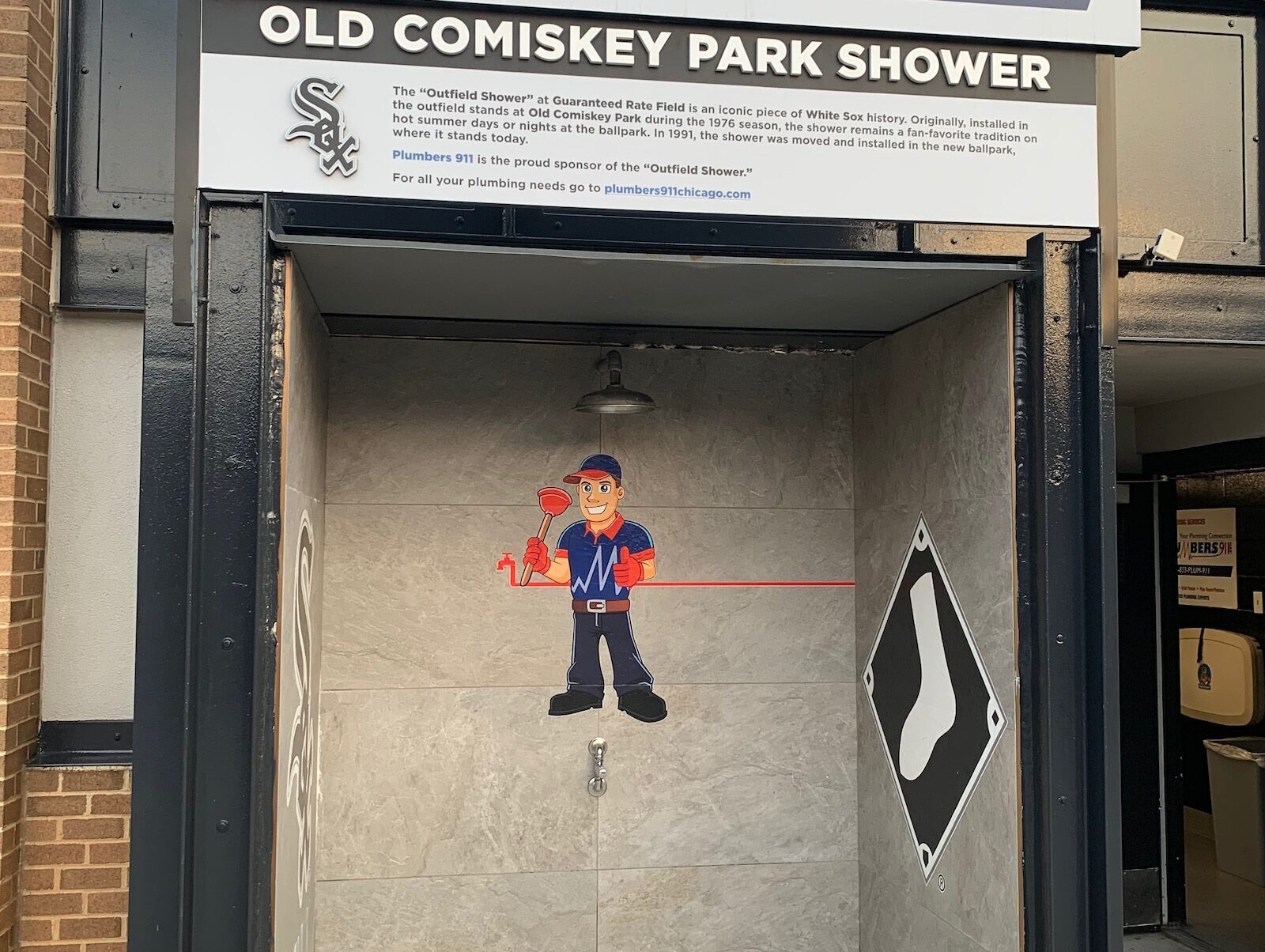
Originally installed in the outfield stands at Old Comiskey in 1976, the shower head was imported to New Comiskey’s outfield concourse in 1991. Don’t mistake this for a decorative gimmick (well, I’ll give you gimmick). Bleacher bums can actually use it to cool off on a hot Chicago day.
Tailgating
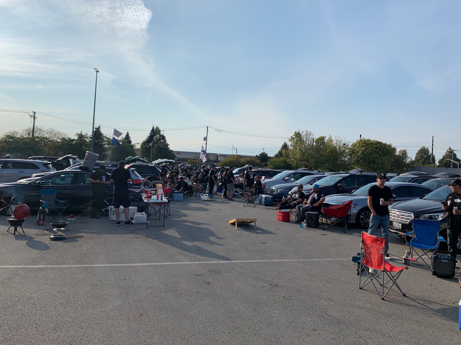
Milwaukee’s Miller Park is the undisputed king of ballpark tailgating, in what resembles a football Sunday atmosphere. But right behind that is the tailgating scene around GRF.
Blue Collar Sensibility
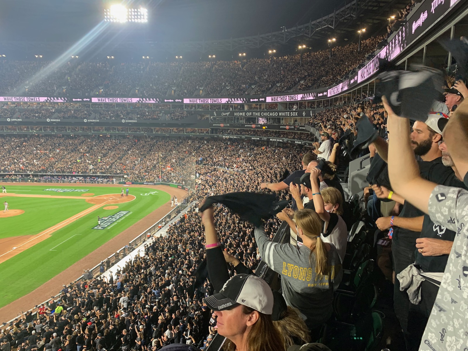
Starting in around the mid 1990s, ballparks underwent a rapid change from fiery social cauldron — think shirtless rabble rousers double fisting beers — to revenue generating corporate venue. I find only Oakland and the South Side have been somewhat resistant to that in the 21st century. CRF is mostly still populated by ordinary baseball fans. No Legends Suite or stock tickers here.
Other Misses
No Visual Sense Of Place In A Great World City
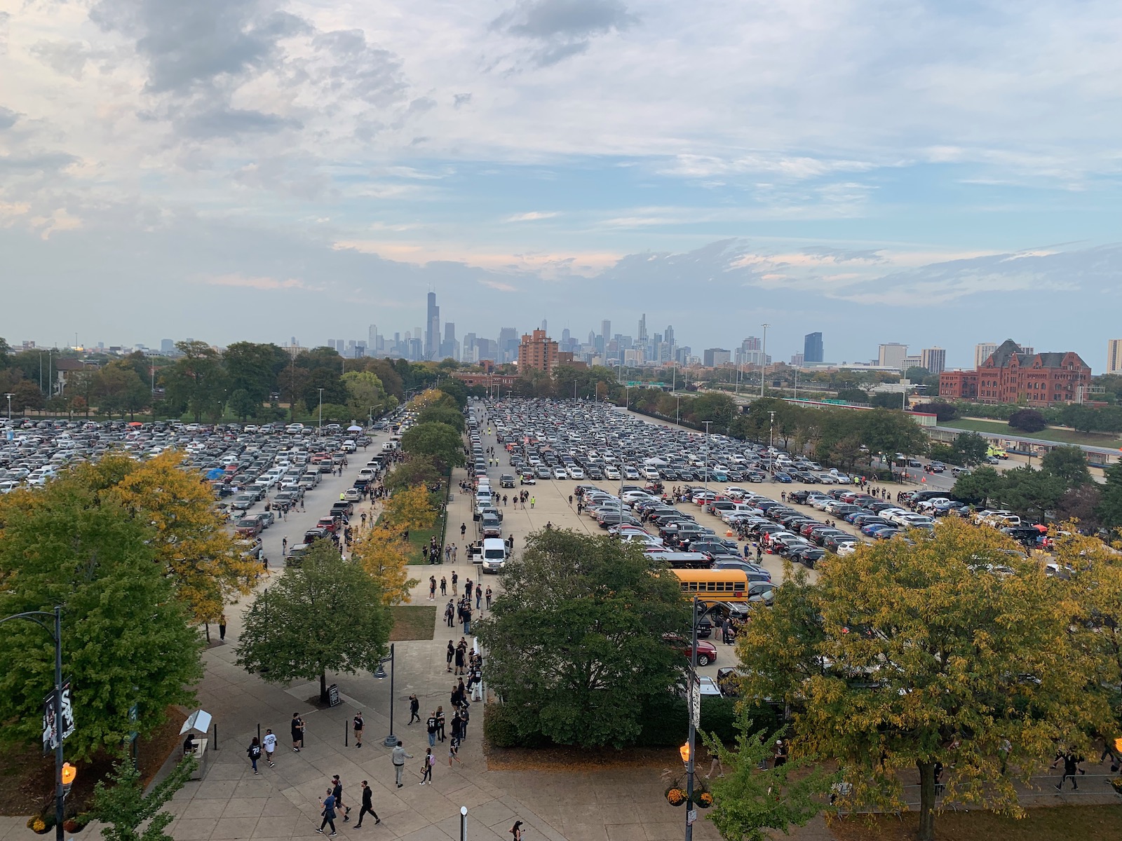
Enclosed by a black steel fencing fronted by ads, you don’t know where you are when in the seating bowl. “Sense of place” cumulated from a variety of factors is what makes ballparks great, and GRF lacks that from a visual perspective. The Chicago skyline (see above) hovers over the left field line, but it’s not visible from the seats. Not facing the city is an unforgivable mistake.
Exterior and Interior Architecture Has Little Pretense Of Being Aesthetically Attractive
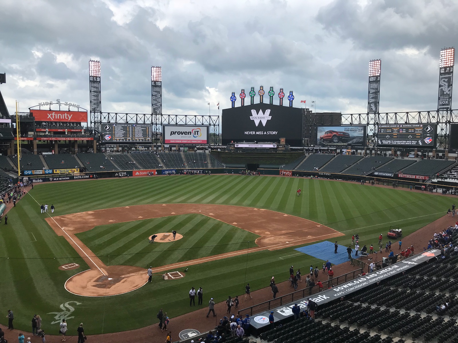
Yeah, I granted that GRF’s simple interior aesthetics hold some appeal compared to some ham-handedly cheesy retro parks, but come on. This is right out of a video game create-a-stadium starter kit! Could you pick something more generic?
While Old Comiskey Felt Like a Neighborhood Park, Guaranteed Rate Field Is A "Parking Lot Stadium"
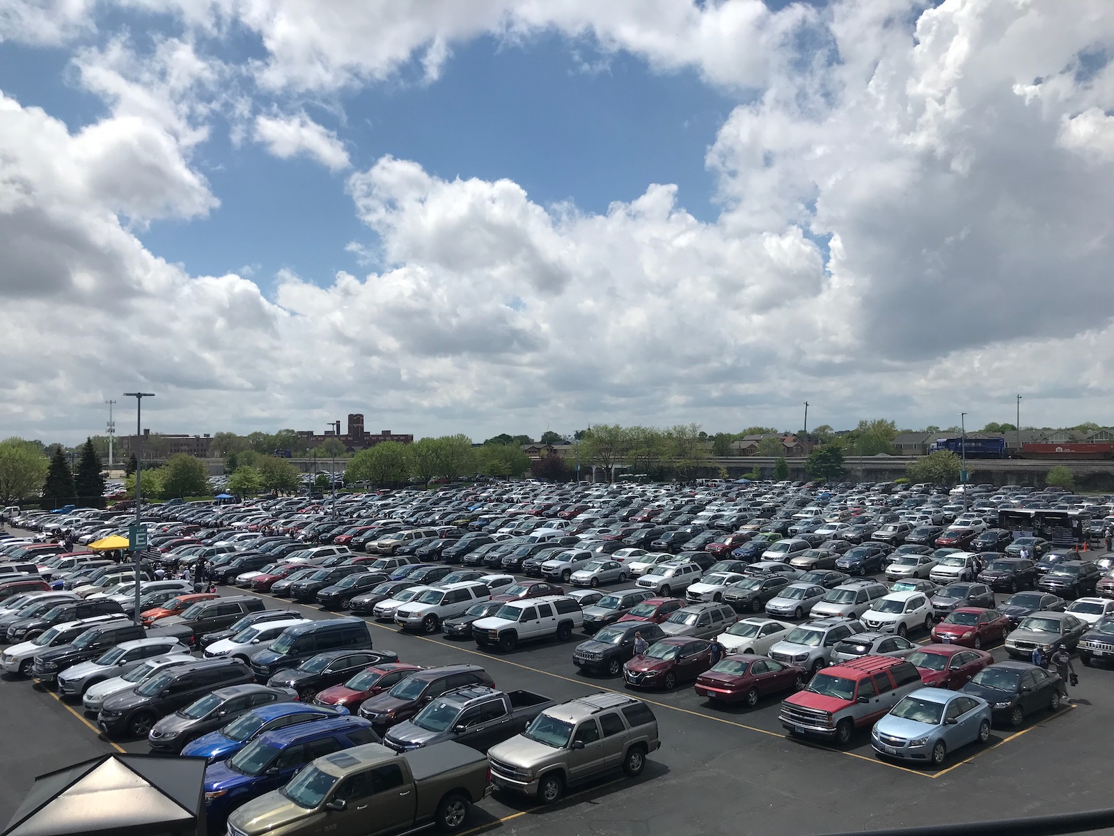
From an urban planning standpoint, GRF’s cardinal sin was that it architecturally, philosophically, and practically decimated the neighborhood. GRF still technically has an urban location, but it now feels like a suburban “parking lot stadium.”
Neighborhood Local Scene Isn't Great
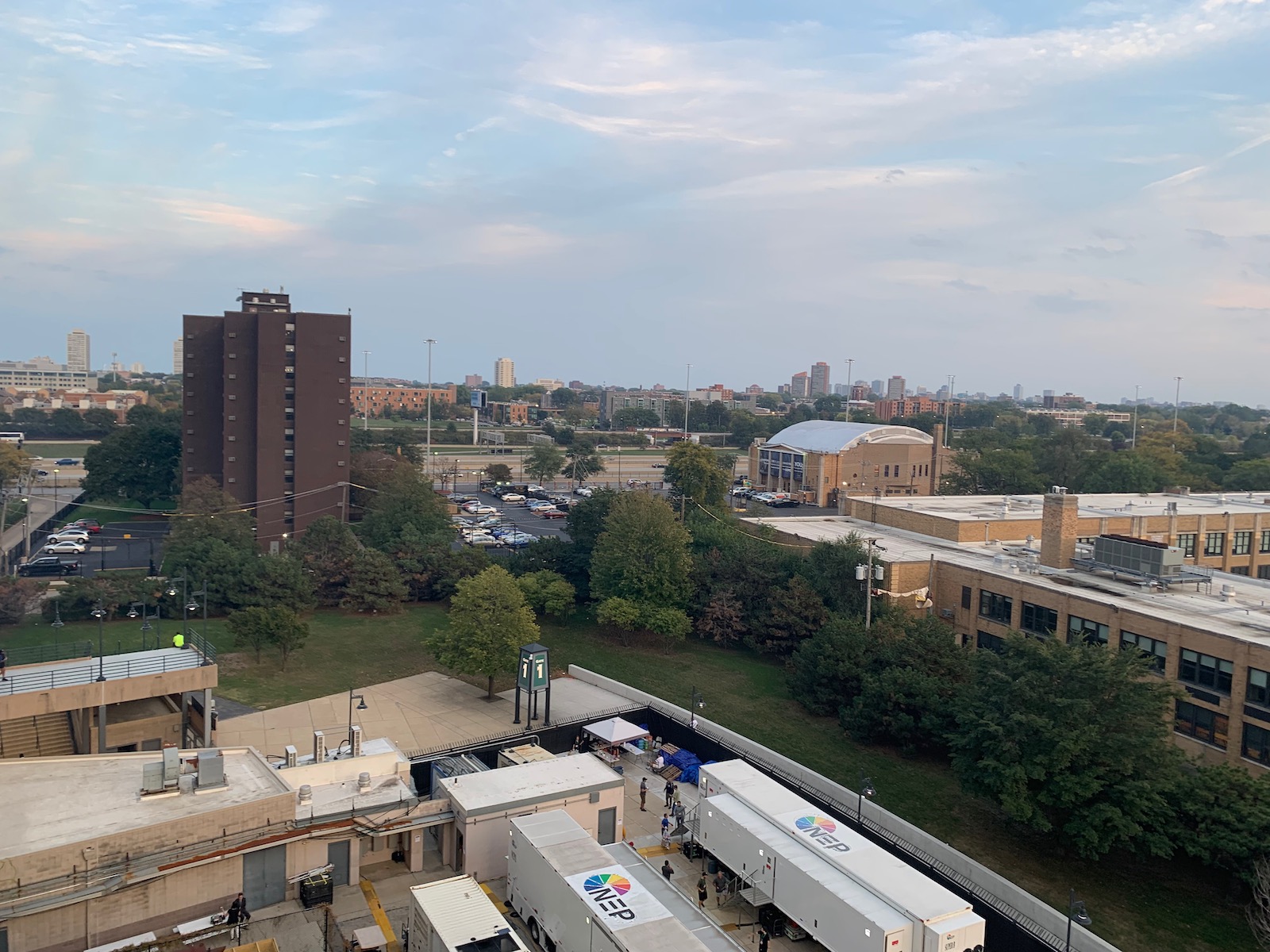
Relatedly, even if you walk a couple of blocks, the pre and post-game scene is bleak, and in some spots, it’s dilapidated bordering on unsafe.
Steep Upper Deck Far Removed From The Action With Poor Use Of Cantilevers
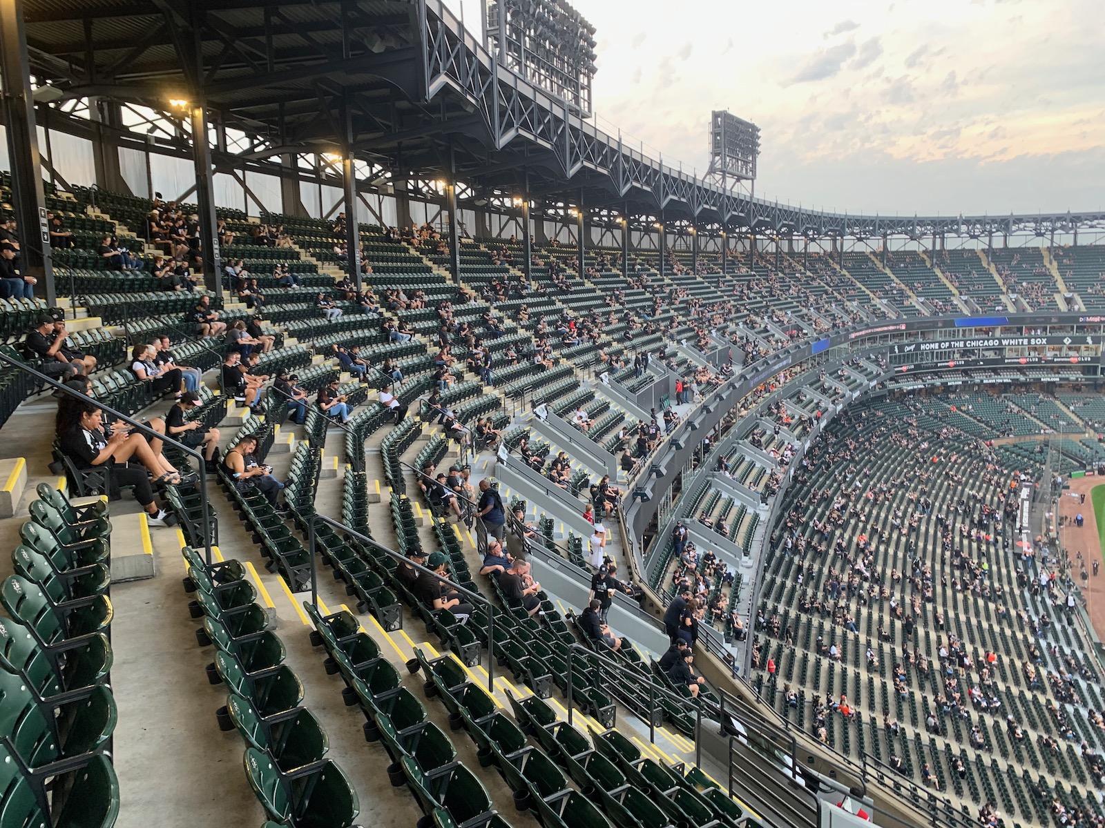
In fairness, GRF gets too much criticism for its upper deck, especially after the White Sox lopped off the eight top rows in the mid-2000s. In terms of vertical height, where it starts is actually average for parks of the era (they’re all bad in this respect). But it is (even comparatively) too far push backed horizontally, as you can see the upper deck is not cantilevered at all over the mezzanine.
Outfield Statues, a Hit and a Miss!
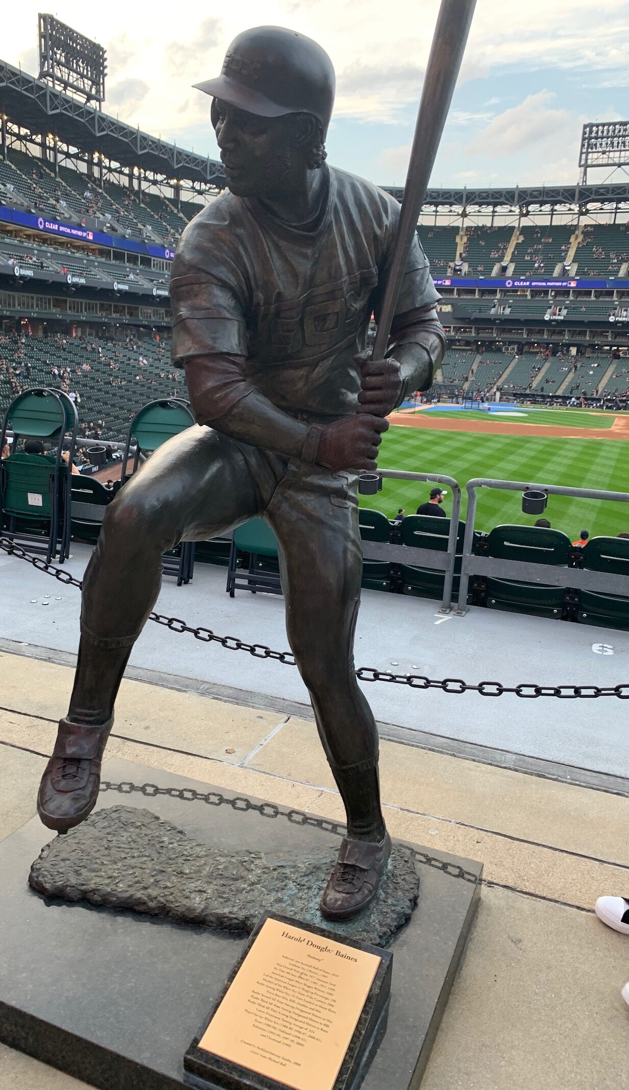
I’m sorry, but for one, nine statues is overkill, especially for the White Sox. Second, the choices don’t even make sense. How do you exclude Luke Appling, Eddie Collins, and Shoeless Joe but have space for Harold Baines and Billy Pierce? Three, the artistic execution is hit or miss. Note how they don’t have permanent bases like a typical stadium statue. Context matters, as these just seem kind of scattered around without any rhyme or reason.
Still, I love me some statues, so I put this in the “Hits” column as well.
Outdated Club Level and Stadium Club
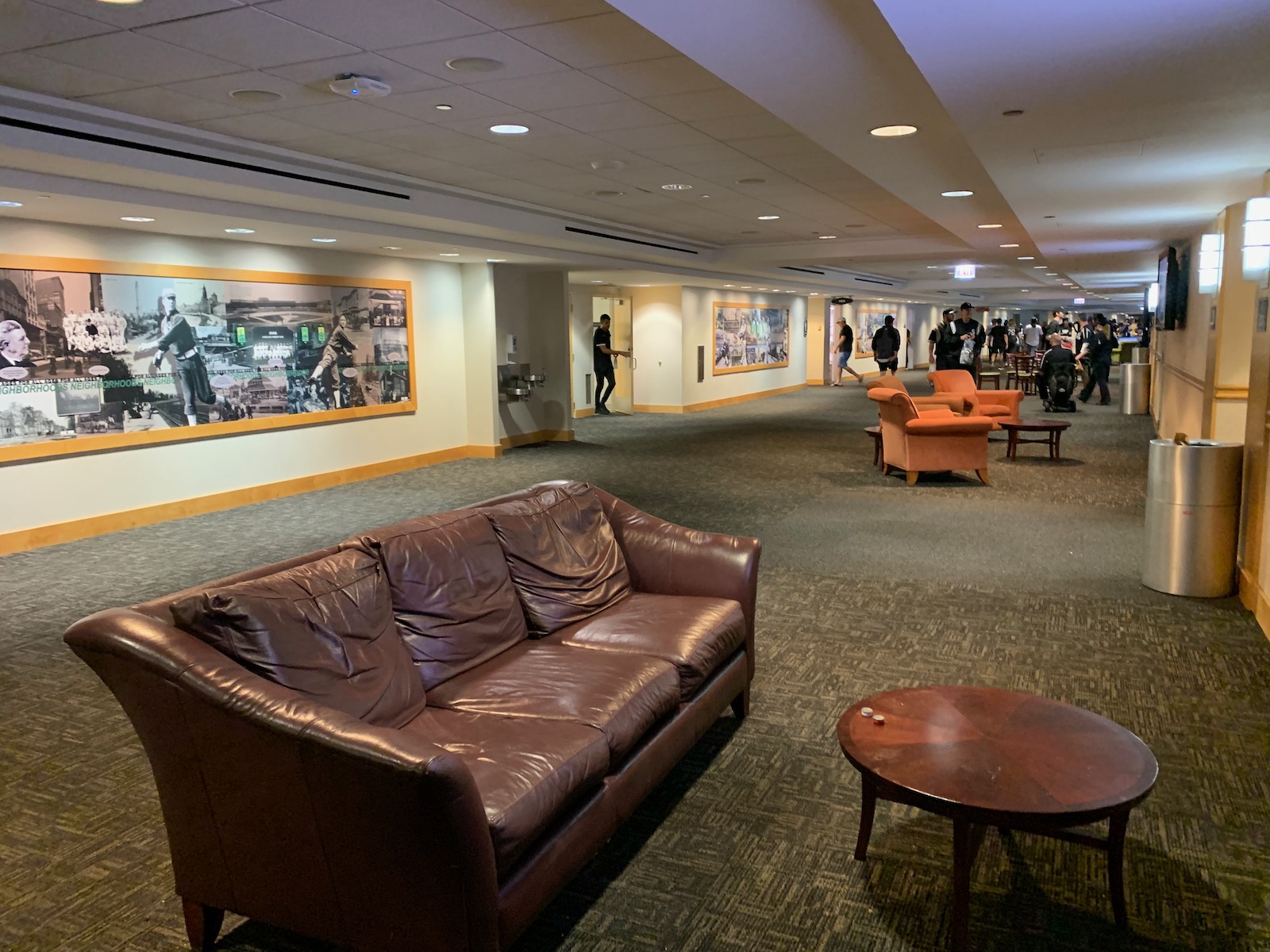
CRF’s most aggressive capital enhancements happened years ago, so some interior spaces are worn. The club level is one of baseball’s worst, with a 1990s waiting room decor, sparse concession stands, and outdated furnishings. The right field “Stadium Club” is from a bygone era where ballparks had outfield white-table clothed dining rooms with dress codes (which is still hilariously imprinted on the glass by the entrance to this day). Both the concept and design don’t hold up well today. Just staying in the division, see what Minnesota and Kansas City did with their outfield stadium clubs.
Poor Attendance Numbers Compared To Others Cities’ Second Teams
I get that the team is often disappointing, but I’d expect better than averages of 19k to 24k (in 2010s) from this market.
Best of
Best Neighborhood Restaurant/Bar: Turtle's Bar and Grill
Best Seats: Scout Seats
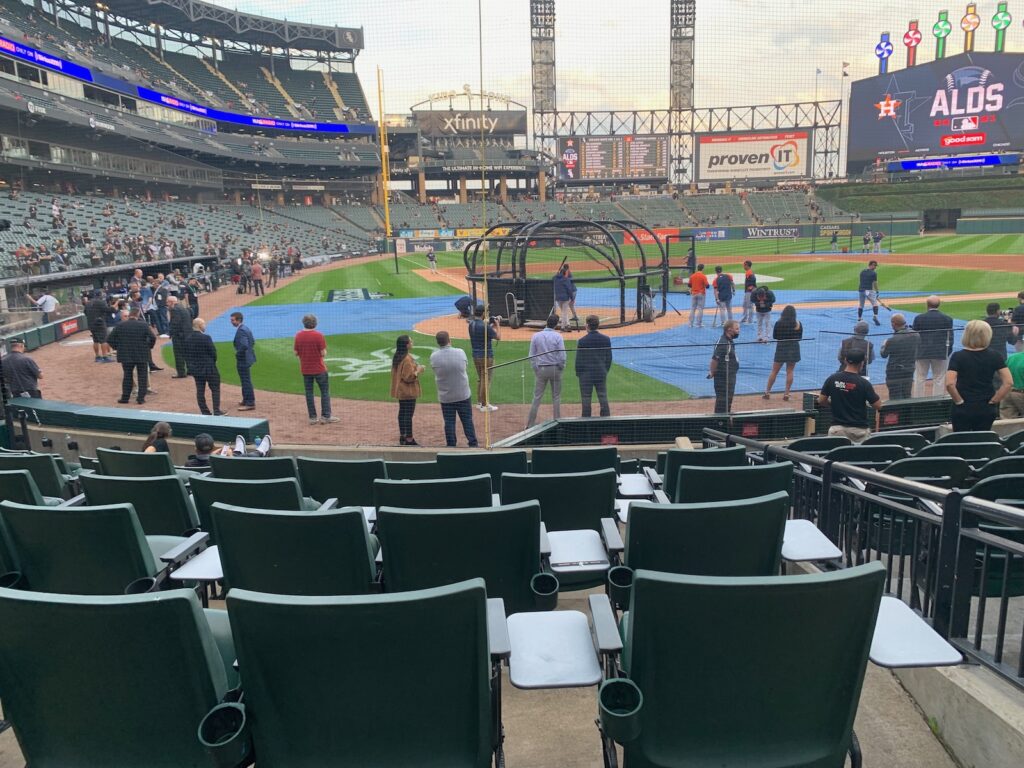
The Scout Seats are the White Sox home plate club seats. As is typical, they come with access to a premium all-inclusive field level club (Wintrust Scout Lounge). One interesting aspect of this one is that fans pass through the service level going from the lounge to their seats, which is probably because the lounge was added after the park opened, like everything decent about GRF. The Wintrust Scout Lounge received a much needed renovation in 2022 (now let’s do the mezzanine club level and Stadium Club), so I’ll be eager to take a look in 2023.
Favorite Seats: Lower Level, Sections 130 to 134, Behind Home Plate
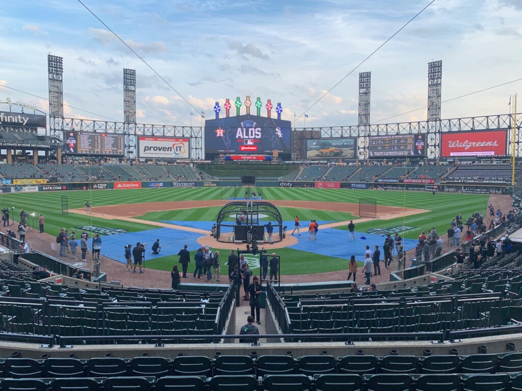
I usually like to be a bit elevated for game viewing, but elevation is not GRF’s strong suit.
Despite this, my usual choice here was a seat on the 300 mezzanine club level. But post-pandemic, the team is not allowing 300-club level ticket holders on the main 100-level concourse, an addition to the already comically unfriendly policy of turning away 500-level ticket holders. With nothing special on the club level and the best amenities on the main concourse, a lower level seat is your best bet for both great sightlines and exploring the park.
Sheesh, White Sox, your stupid and ill-defined access policies make this more complicated than it needs to be! I’ll re-verify this myself upon return in 2023, as again, both these rules and the White Sox enforcement of these rules is fickle.
Signature Food: Elotes Corn off the Cob
Best In-Park Pregame Spot: Craft Kave (aka "Leinenkugel’s Craft Lodge")
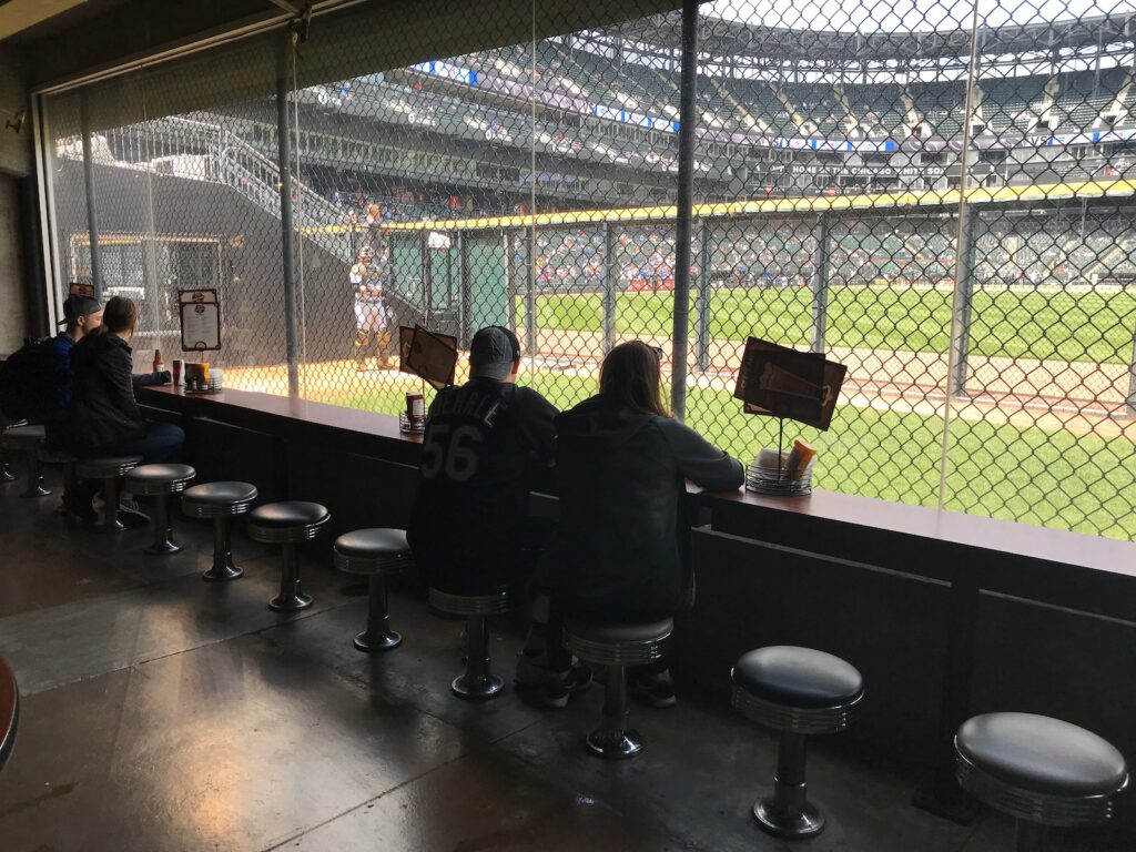
Besides having perhaps baseball’s best beer selection, you can get right at the fence of the visitor’s bullpen. One of the coolest spots in baseball and well worth your (pregame, of course) time.