Citi Field
| Setting | 8.5/20 | 1 Thumb Down |
|---|---|---|
| Locale | 2.5/5 | 1 Thumb Down |
| Accessibility | 4/5 | 1 Thumb Up |
| Neighborhood Local Scene | 2/10 | 2 Thumbs Down |
| Architecture & Aesthetics | 40.5/65 | Thumb Sideways |
|---|---|---|
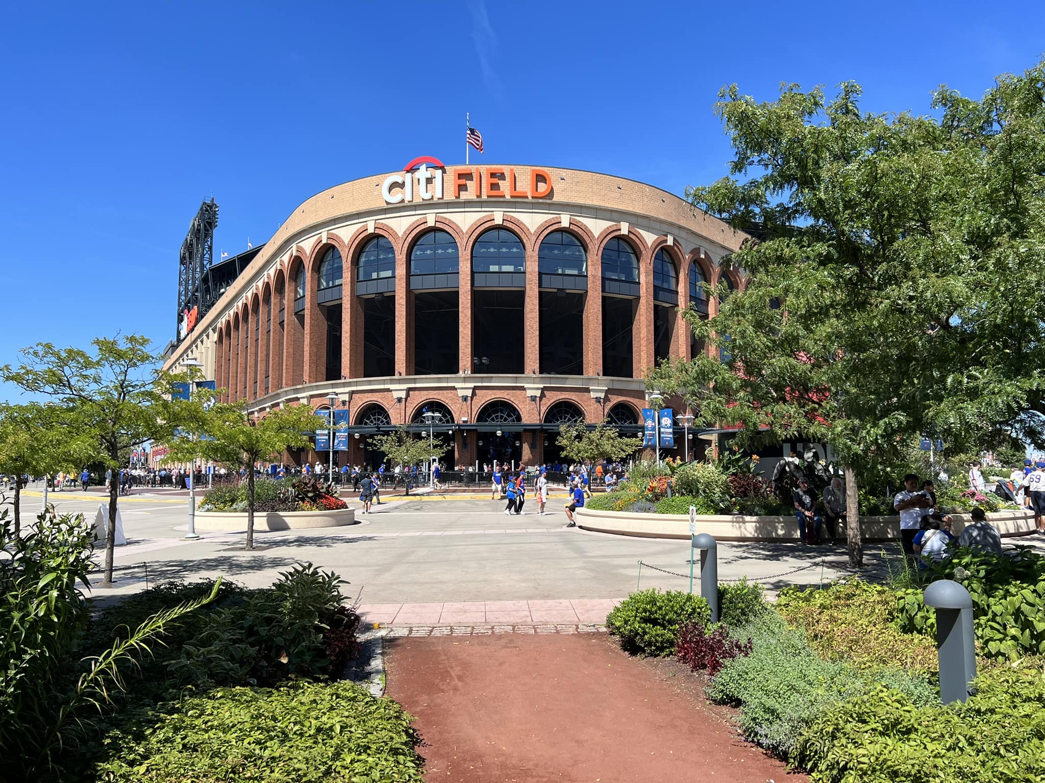
| Exterior Design/Aesthetics | 14/20 | 1 Thumb Up |
| Interior Aesthetics/Visuals | 22.5/40 | 1 Thumb Down |
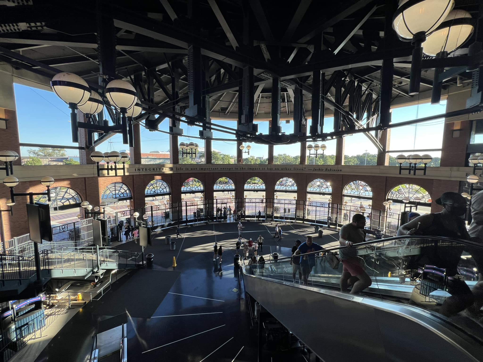
| Concourse Aesthetics | 4/5 | 1 Thumb Up |
| Functionality & Essentials | 39.5/50 | 1 Thumb Up |
|---|---|---|
| Sightlines: Field Proximity | 10.5/15 | Thumb Sideways |
| Sightlines: Seating Geometry | 4/5 | 1 Thumb Up |
| Seat Comfort | 6.5/9 | Thumb Sideways |
| Concourse Functionality | 12.5/15 | 1 Thumb Up |
| Scoreboards/Tech | 6/6 | 2 Thumbs Up Star |
| Amenities & Features | 43.5/50 | 2 Thumbs Up |
|---|---|---|
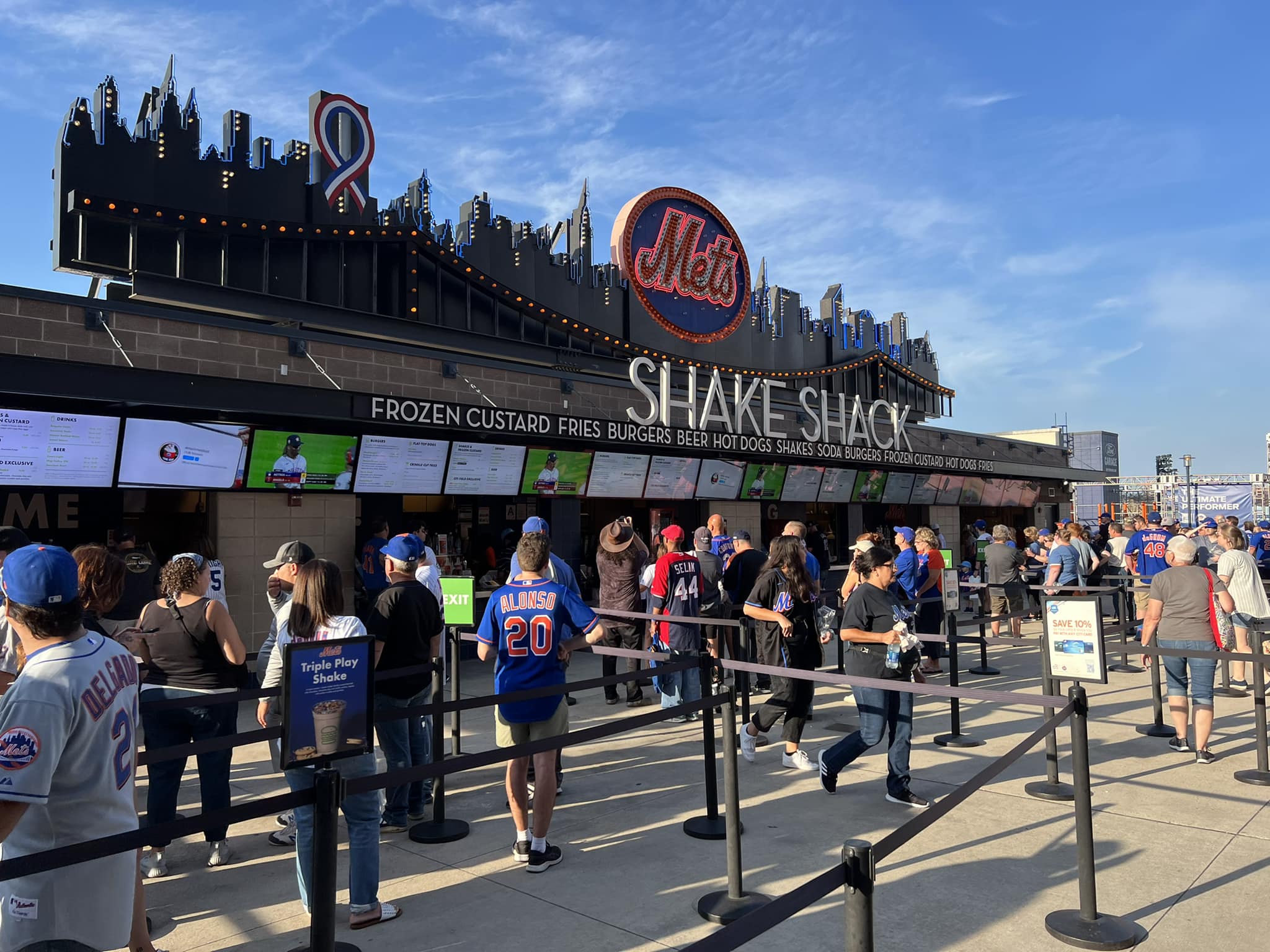
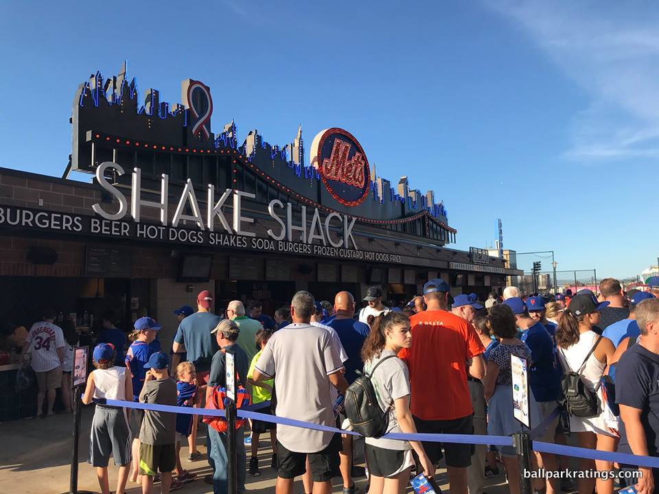
| Concessions: Food Variety | 5/5 | 2 Thumbs Up |
| Concessions: Food Quality | 5/5 | 2 Thumbs Up |
| Concessions: Craft Beer/Other Drinks | 3.5/5 | Thumb Sideways |
| Social Gathering Areas/Restaurants | 8/10 | 1 Thumb Up |
| Premium Seating/Clubs | 9/9 | 2 Thumbs Up |
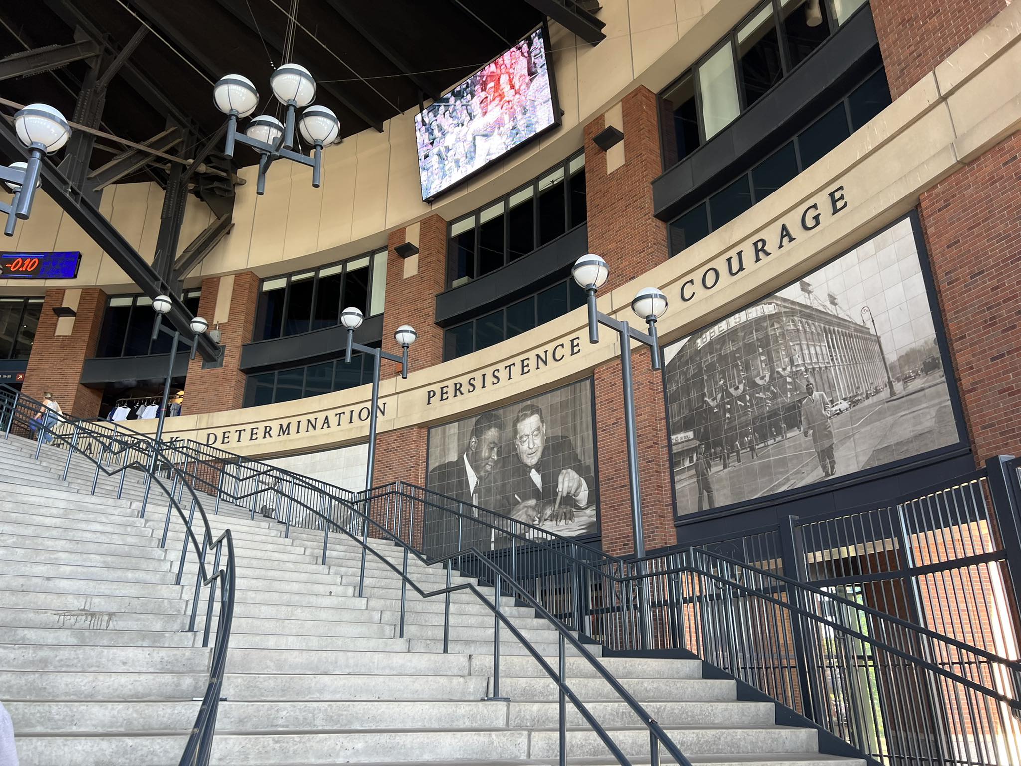
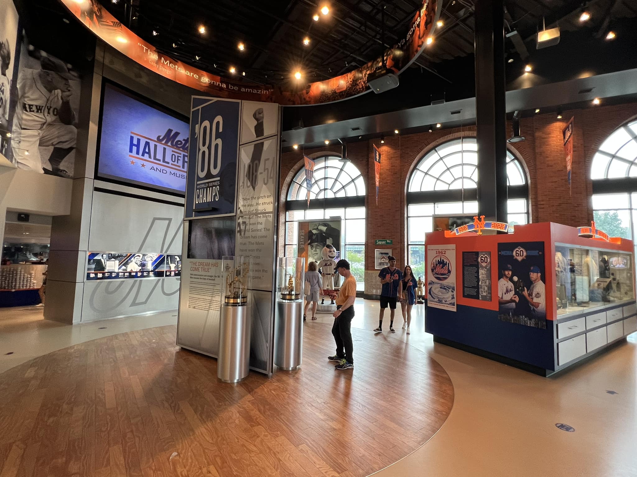
| Historical Exhibits, Memorabilia, Art, & Other Displays | 8/10 | 1 Thumb Up |
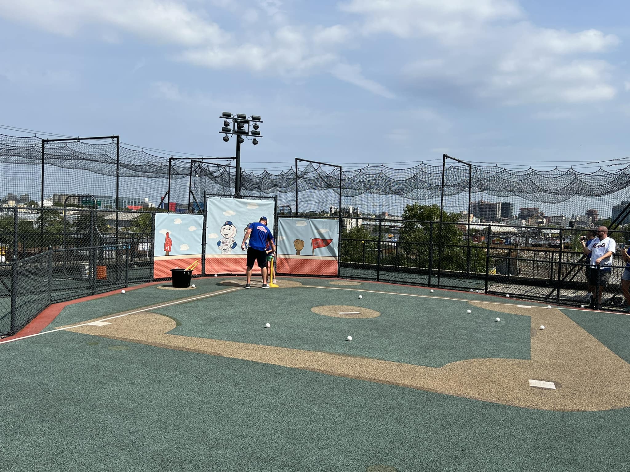
| Kids Areas/Other Entertainment | 5/6 | 1 Thumb Up |
| Atmosphere, Vibe, & Policies | 12.5/15 | 1 Thumb Up |
|---|---|---|
| Fan Support/Attendance | 4.5/5 | 1 Thumb Up |
| Ballpark Traditions/Gameday Presentation | 5/5 | 1 Thumb Up |
| Ballpark Policies/Staff | 3/5 | Thumb Sideways |
| Adjusted Raw Score | 144.5/2=72.25=72.5 |
|---|---|
| Bonus | 3 |
| Curve for All 7 | 7 |
| Final Score | 82.5 |
|---|---|
| Ranking | #17/30 |
|---|---|
The following is an abbreviated review excerpted and edited from our piece Ranking and Rating the ballparks. Take this in the spirit in which it was intended. One of our traditional long-form, full, in-depth reviews is in the works. Ratings above are up to date for 2024, but this review below may be outdated and will be updated at some point.
By: Cole Shoemaker
Somewhat like the park of their crosstown rival, the Mets’ park is quite polarizing among ballpark trekkers. While it’s a fan-friendly place replete with modern amenities, put me in the camp that tends to view Citi Field more negatively. The contrived “faux-retro in a parking lot aesthetic” rarely works in the first place (except above, honestly), but it was especially conditioned not to work here.
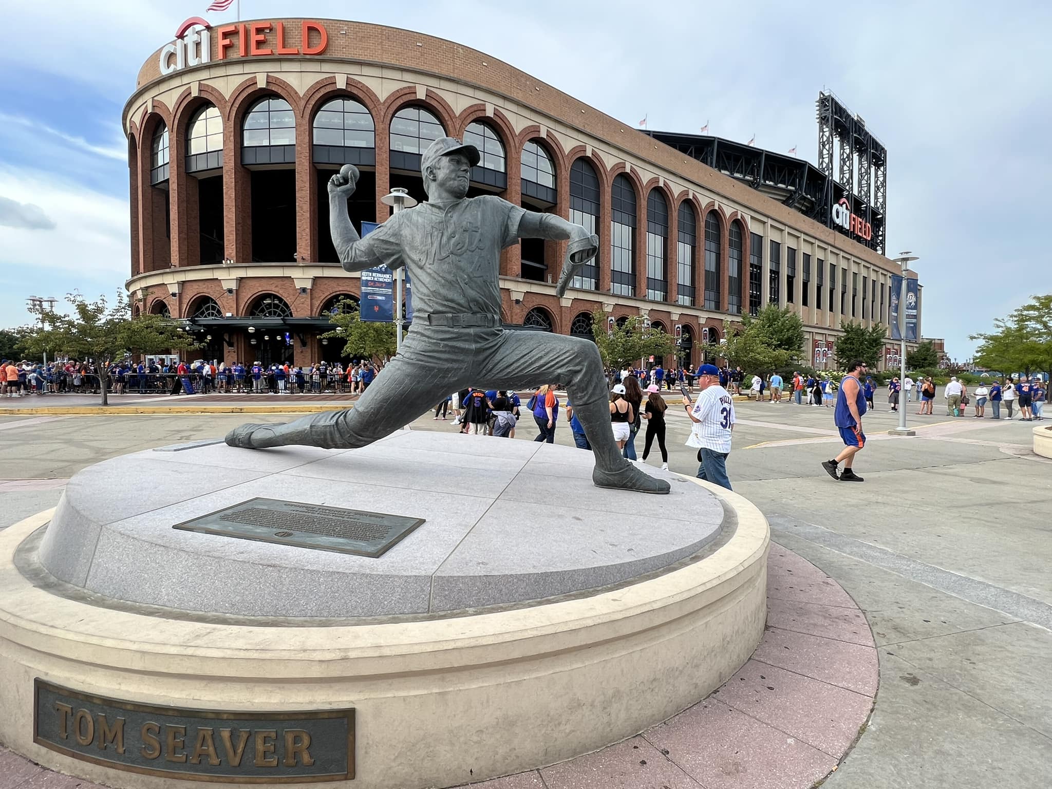
Citi Field always struck me as a ballpark conceived in 1999 that opened in 2009. And if you look at the ballpark’s history, there’s a lot of truth to this. The conception of a new Mets’ stadium dates back to the 90s, when retro was in full-swing. Fred Wilpon was always obsessed–obsessed–with building an Ebbets Field facsimile, and he was going to build it whenever and wherever he could, regardless of temporal or locational context.
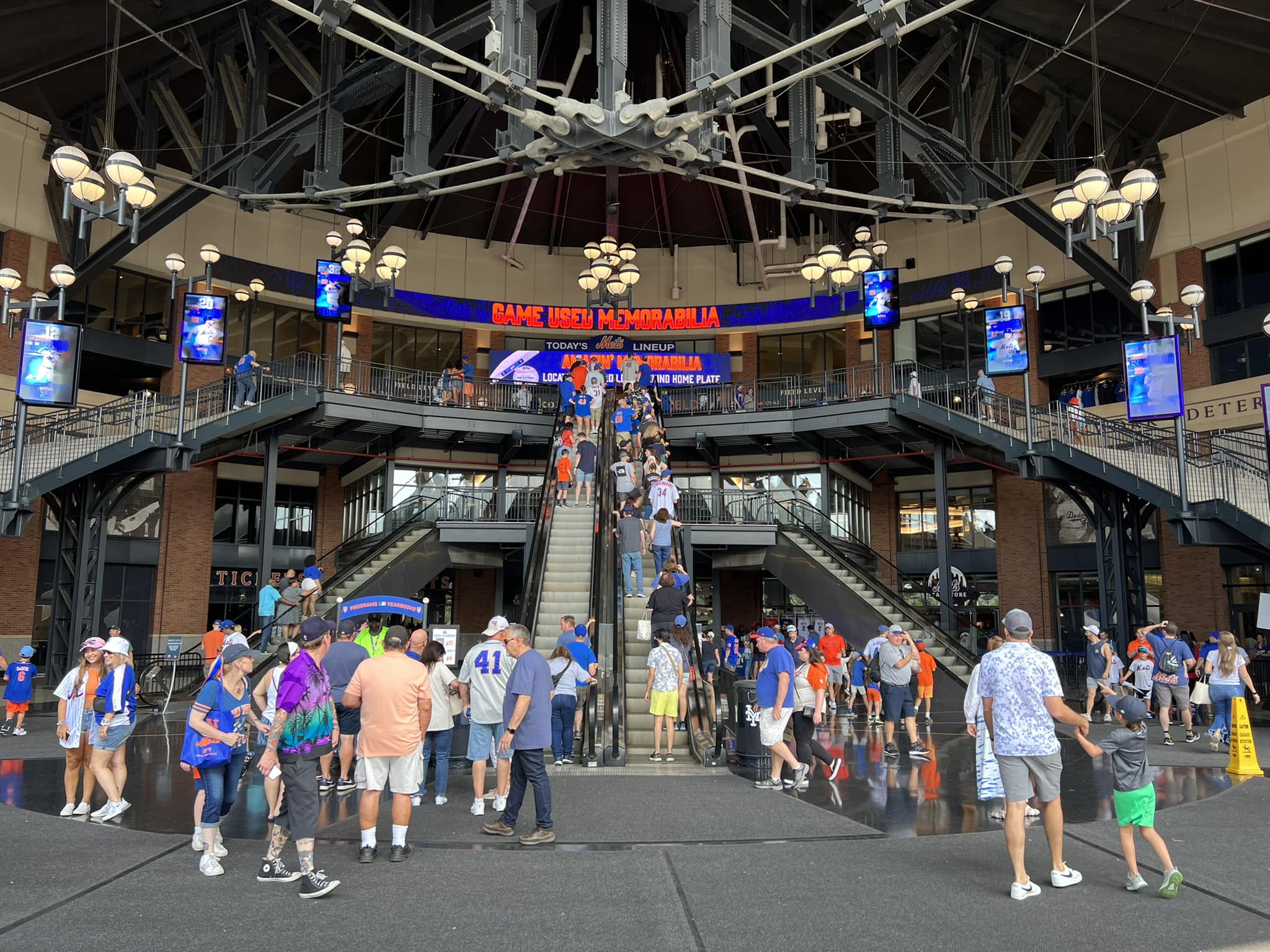
But we had just seen this formula too many times by 2009. The red brick; the wrought iron; the Kelly-green seats; the Ebbets-style Rotunda. We get it.
Whereas Yankee Stadium frankly had an excuse not to build something original (even if they didn’t do an outstanding job in emulating Yankee Stadium I), the Mets could have constructed an innovative ballpark recalling the grand architectural traditions of one of the world’s greatest cities. Instead, they chose to build one of the most formulaic and derivative retro cookie cutters in all of baseball.
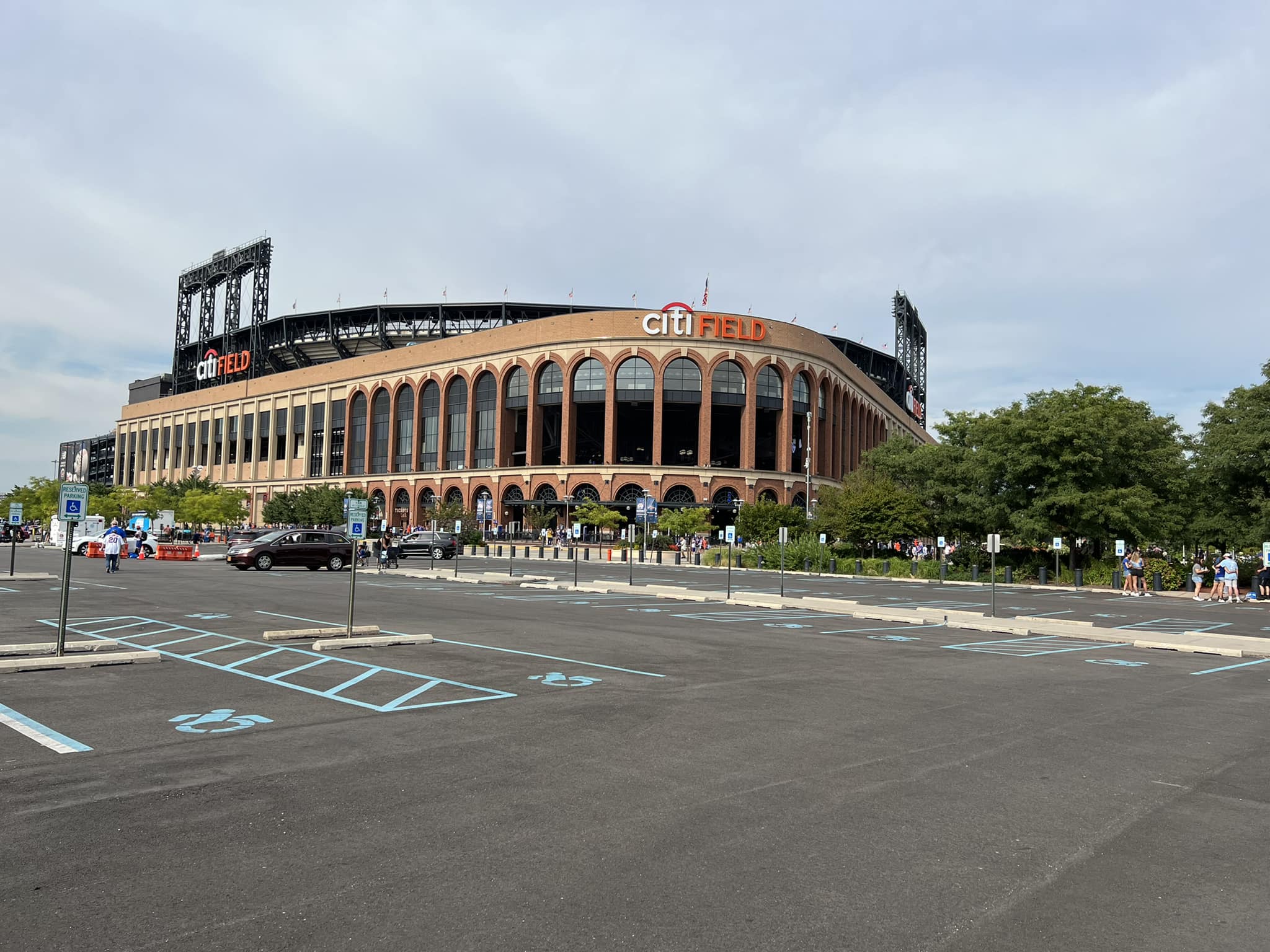
More importantly, Ebbets Field was in part so charming because it was shoehorned into a venerable neighborhood, not dropped from the sky in a Queens parking lot surrounded by ugly auto repair shops, scrap yards, and waste processing plants. Nothing in Major League Baseball is worse than the Mets’ Willets Point, in my opinion. Setting(location/local scene) is paramount in my ratings system because it also has obvious implications for interior aesthetics, so Citi starts off on the wrong foot. And Citi Field’s local scene isn’t just subpar, but overtly awful.
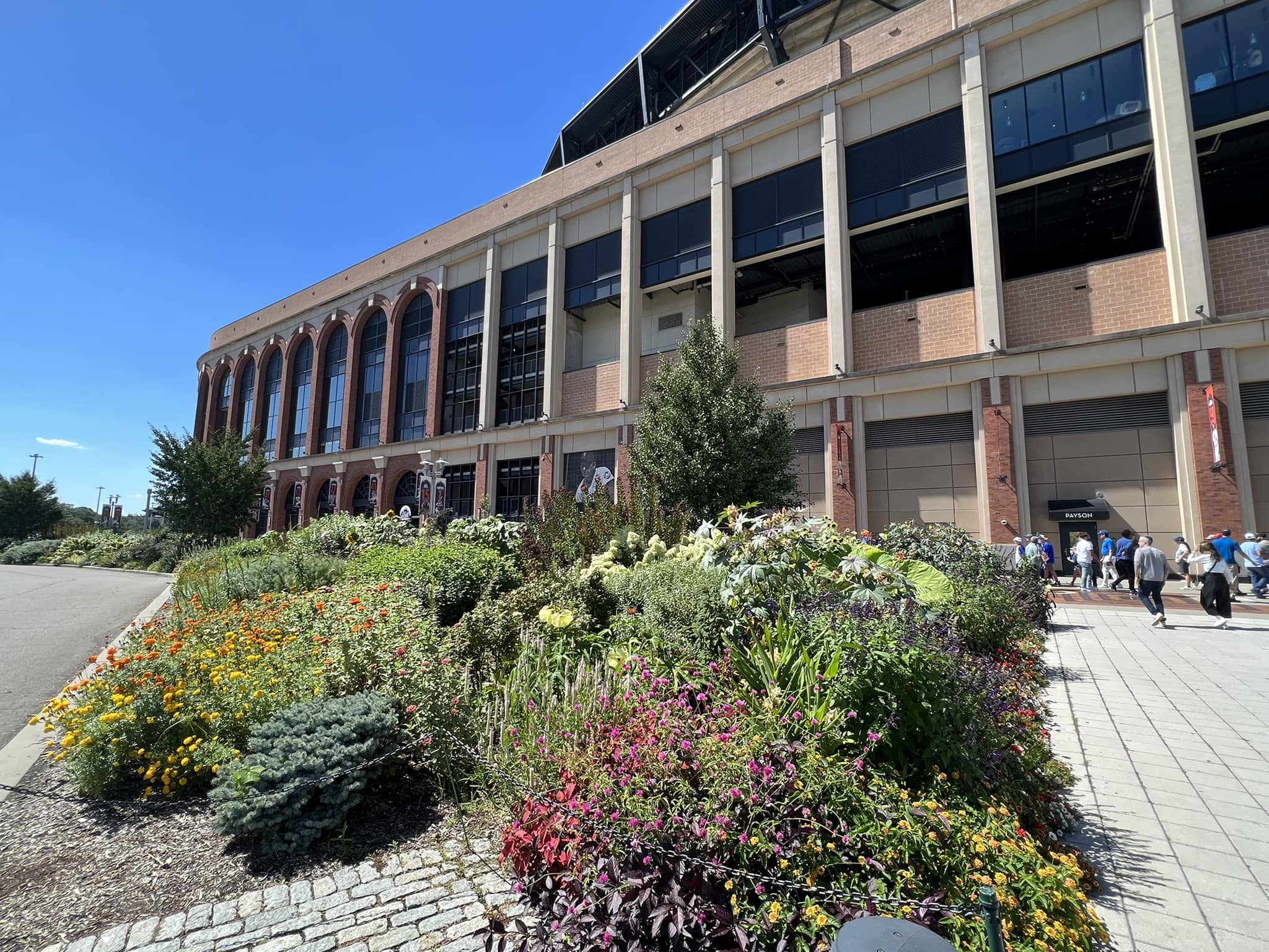
Citi Field’s exterior architecture is attractive, but like I said, it feels out of place. The façade is also stripped of many tasteful accents and regional nuances that made the Ebbets special. Citi feels more assembly-line produced.
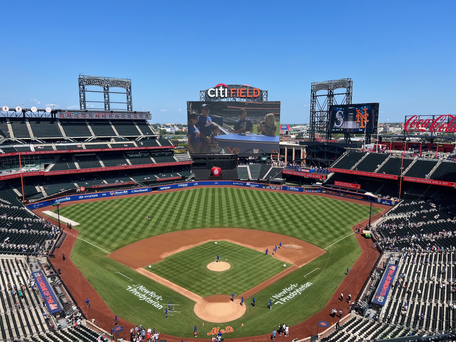
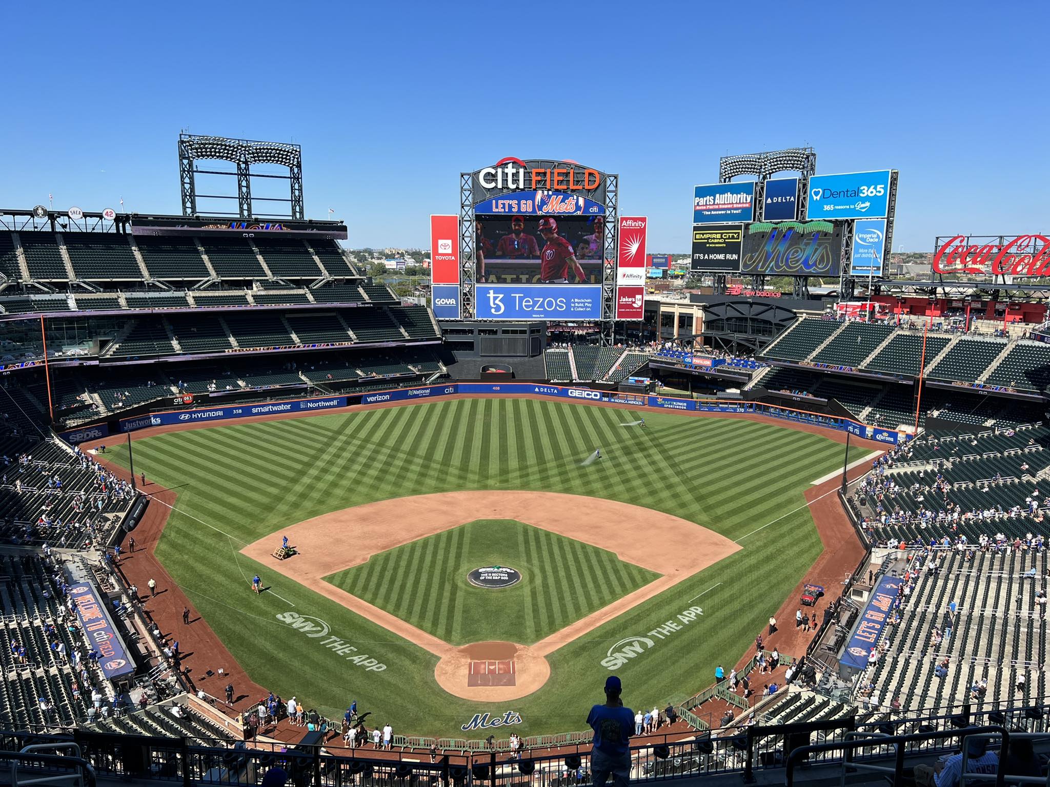
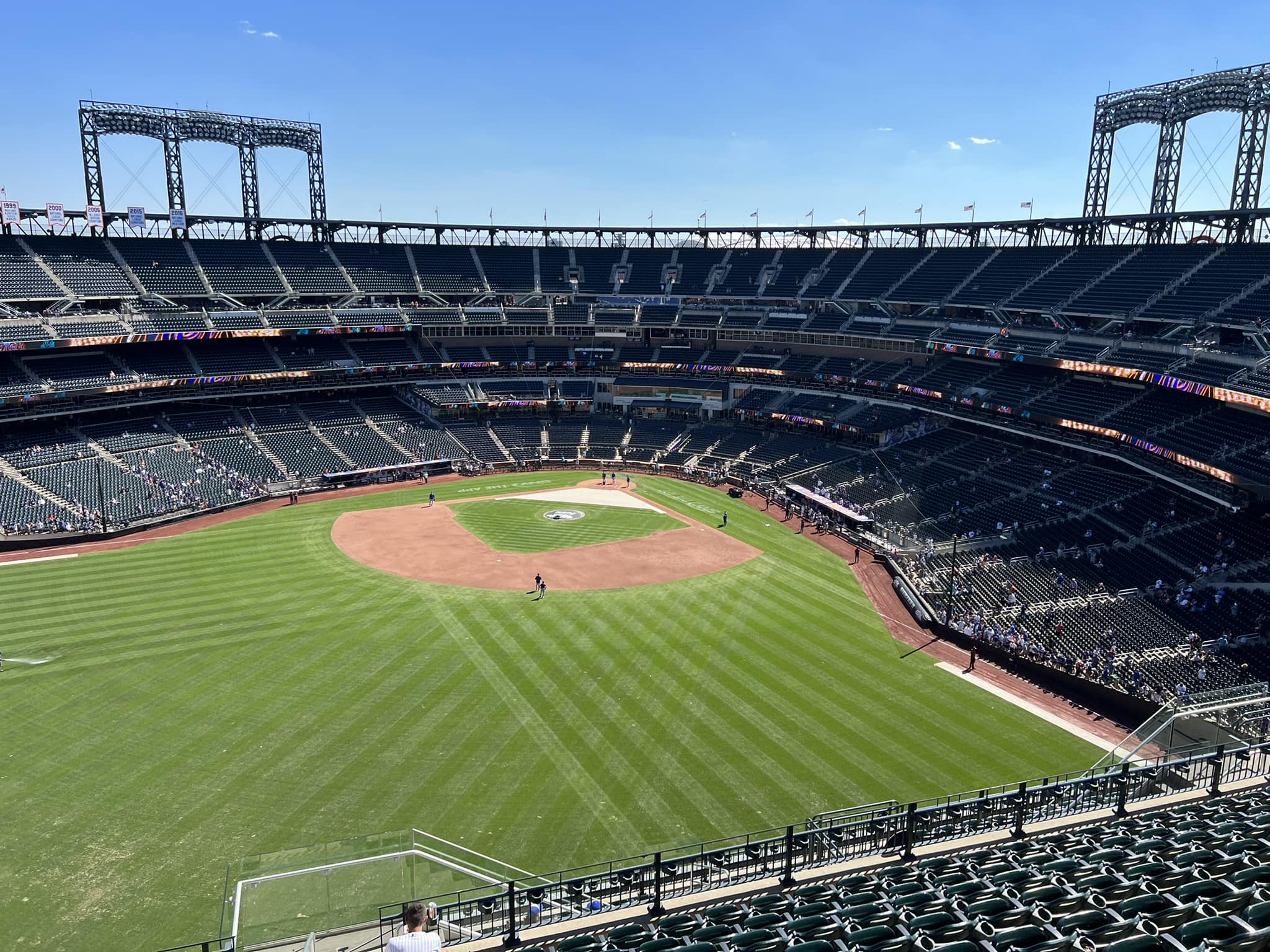
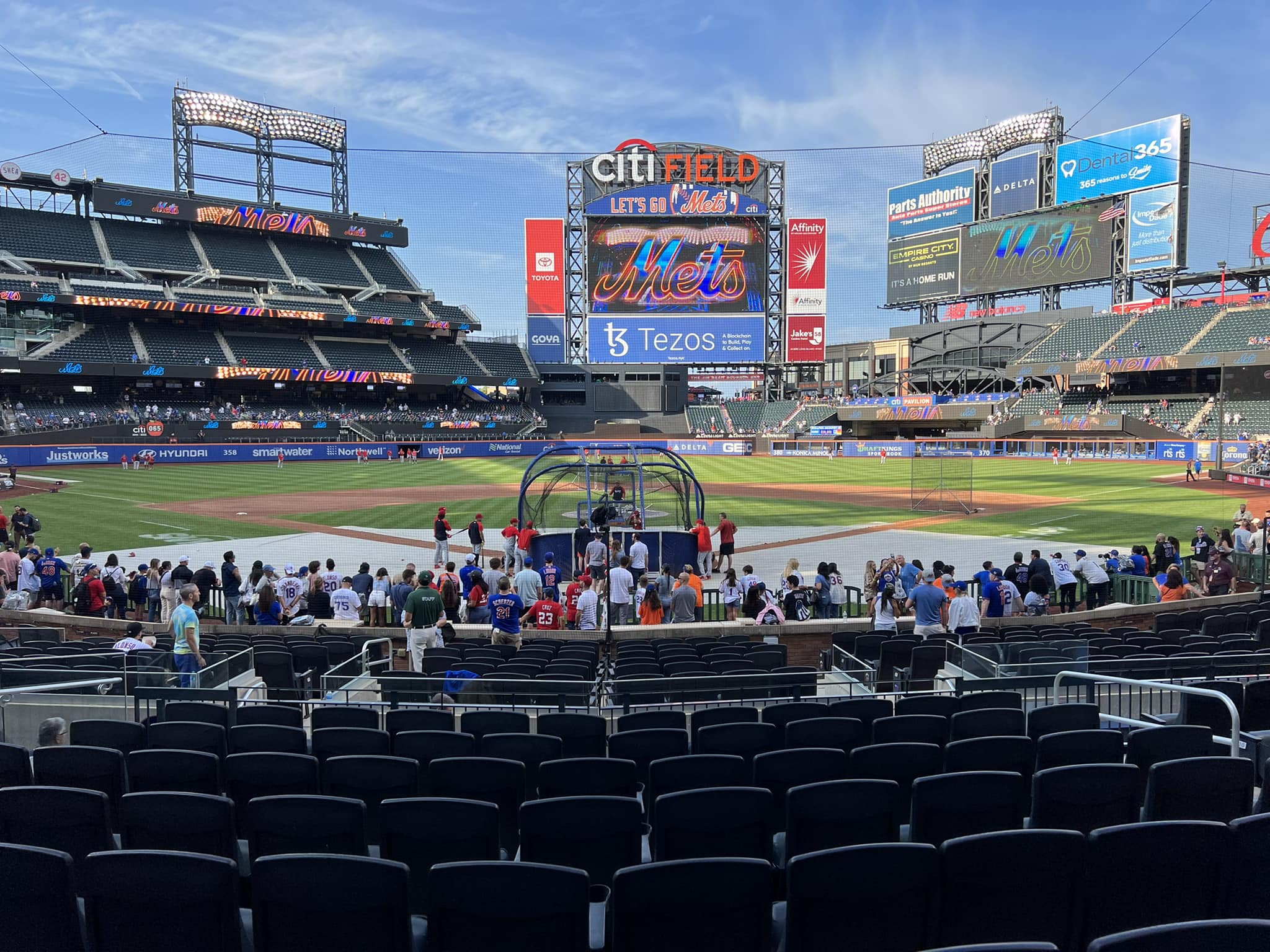
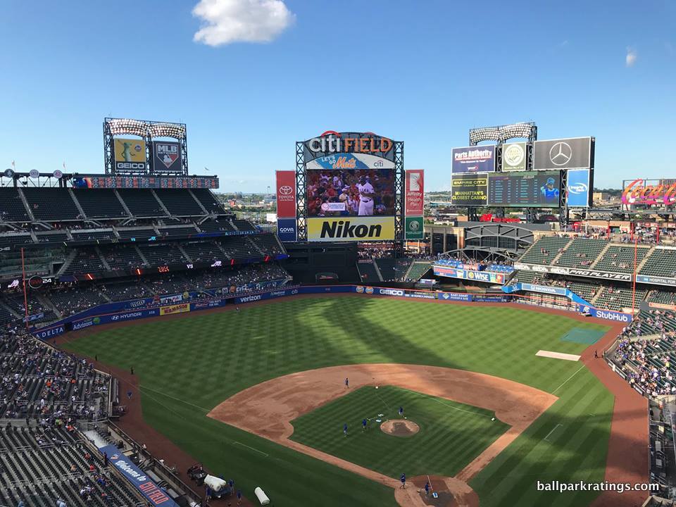
In terms of interior aesthetics, not only is Citi Field the ye olde ballpark 12.0, but it is not a particularly attractive one on the inside, either. I get that the Mets are going for the enclosed, “cozy” Ebbets Field-vibe, but it just doesn’t work for me; it instead comes off as hermetic.
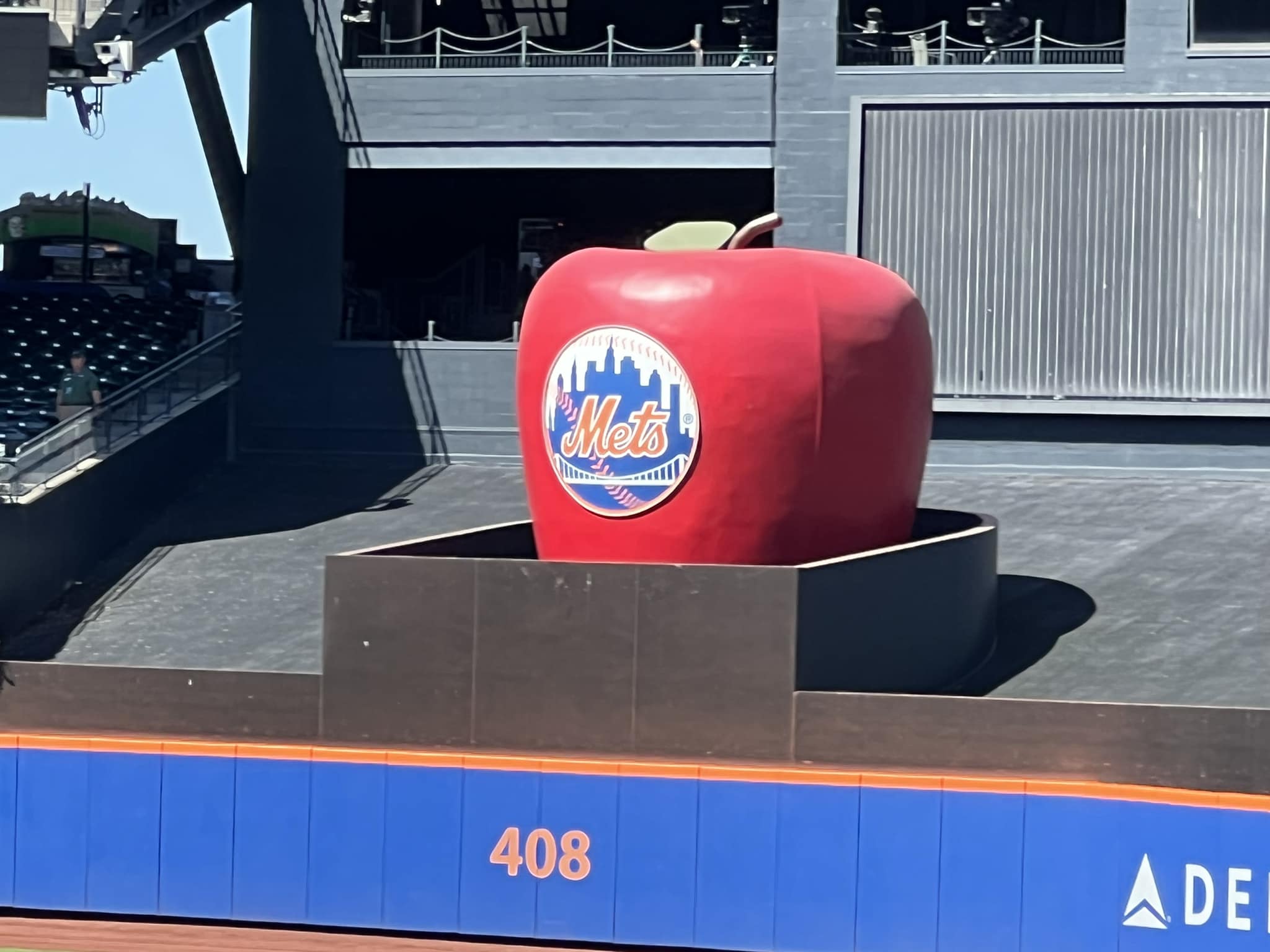
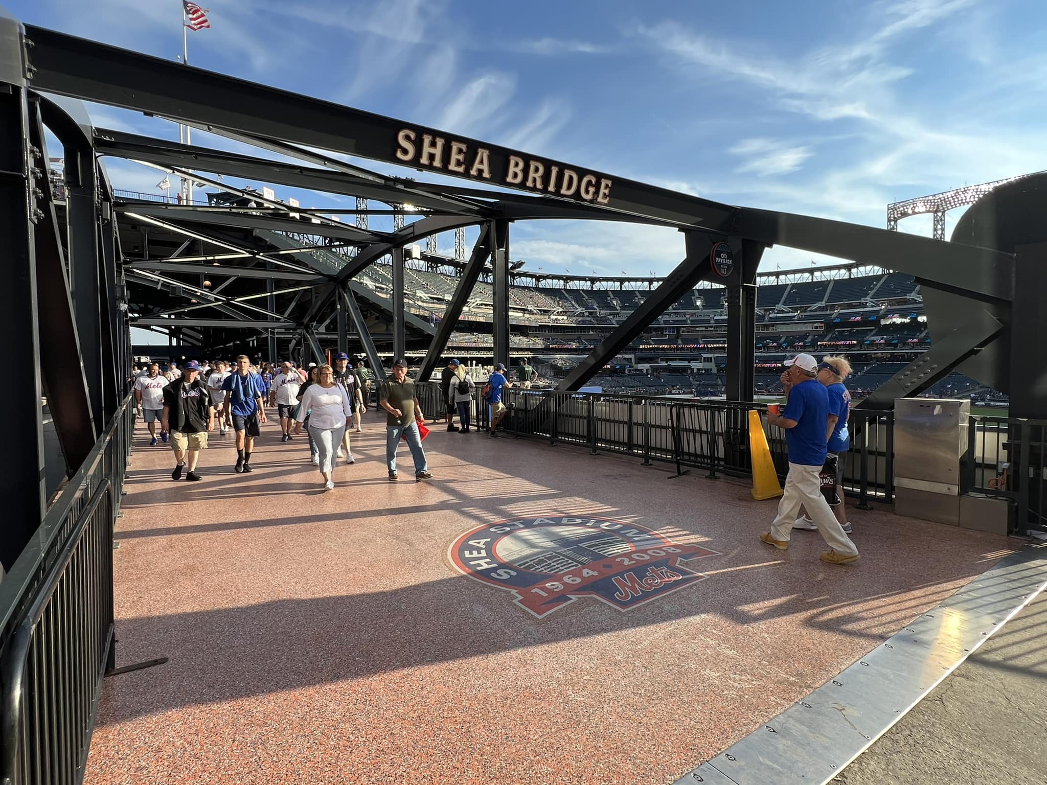
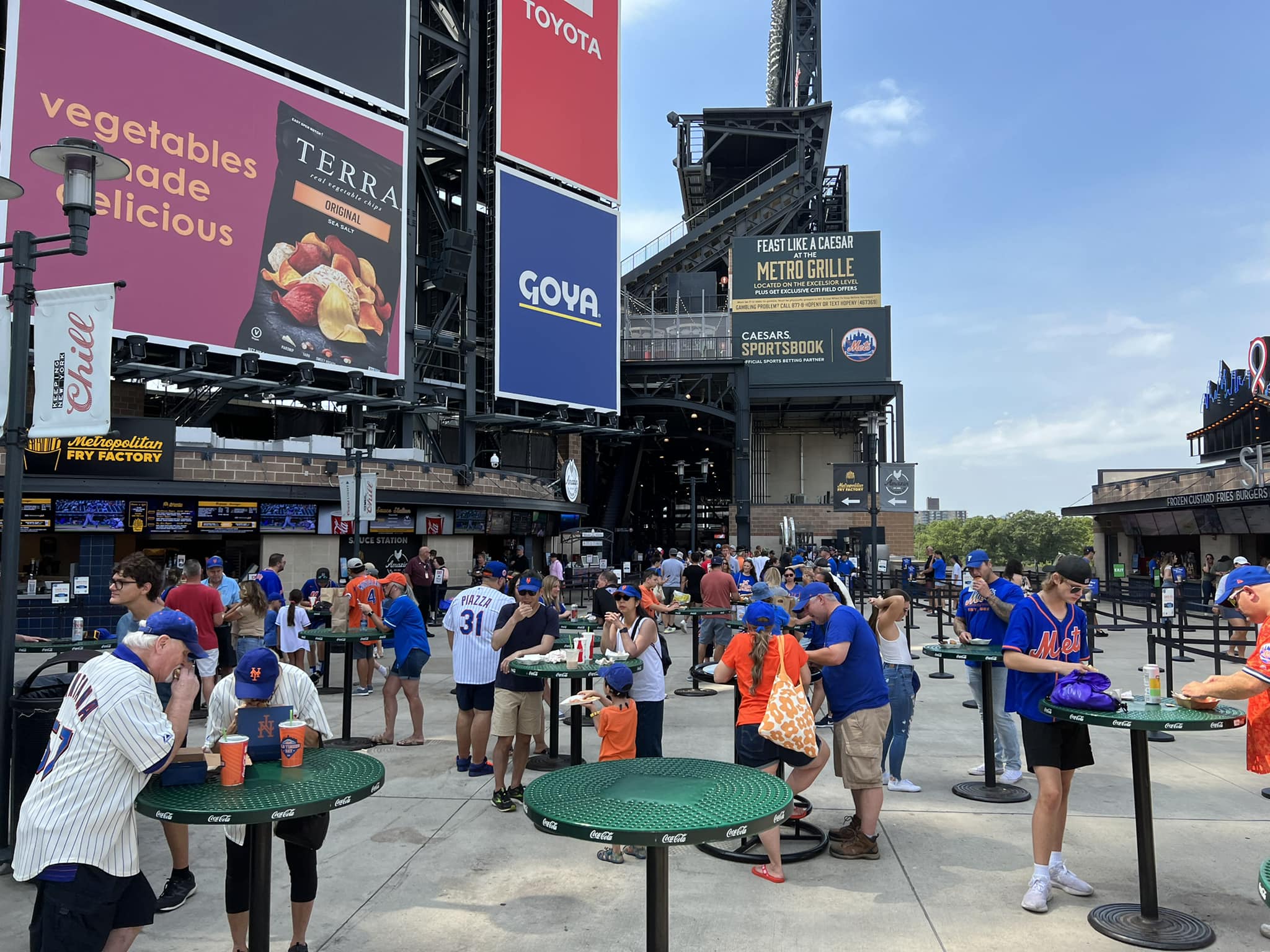
I can only think of one other open-air retro ballpark in baseball with such an enclosed outfield set-up: The Rangers’ ballpark in Arlington. While similarly contrived, those interior aesthetics are much more successful because they have a well-articulated and attractive aesthetic vision. Where Arlington features an old-fashioned home run porch, Citi Field has the “busy” Pepsi Porch littered with ads. Where Arlington has Greene’s Hill and a brick facade, Citi Field possesses a black batters’ eye matching the aesthetic of the muffler shops outside. Where Arlington eschews more explicit gimmicks, Citi has the heavy-handed Shea Bridge just kind of thrown in the outfield scene, lacking any connection to the rest of the interior lines. Where Arlington showcases the white-steel office building as a backdrop, Citi Field has…more billboard style ads. Uff, all these ads! Are the Mets trying to emulate Times Square?
On the whole, Citi Field’s interior aesthetics are the worst of all cards: muddled, disconnected, incoherent, contrived, and gimmicky, conceding that essential contextual connection all while failing to sport any semblance of attractiveness, authenticity, or continuity. Among open-air post-1990 ballparks, only Great American Ballpark is worse in my opinion.
But unlike GABP in Cincinnati, Citi Field has the abysmal setting.
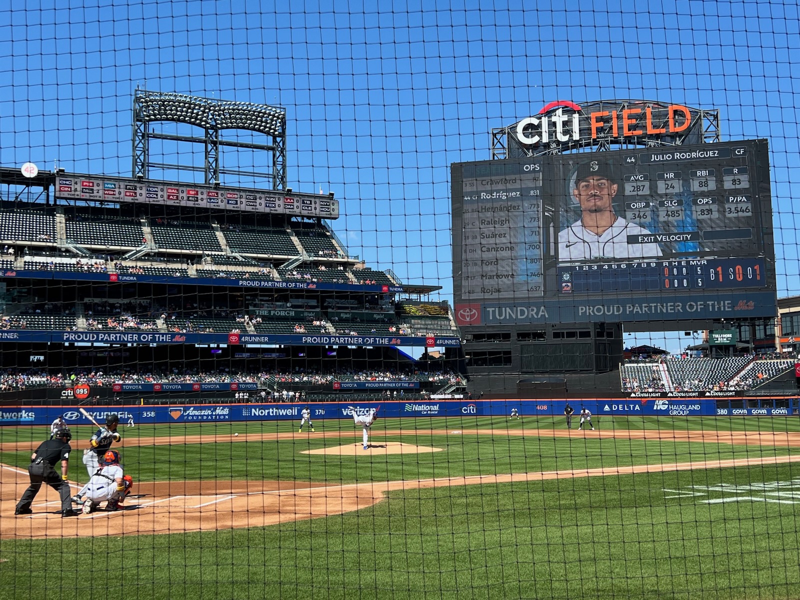
By virtue of timing and money, Citi Field leapfrogs a place like GABP because it truly excels in functionality and amenities. Citi Field features the ubiquitous wide, open 360-degree concourses seen in most modern-day ballparks. The main concourse isn’t perfect–primarily a function of the encumbrances due to its positioning above street level–but it’s well above average. The sightlines are average, maybe a bit above-average for a post-1990 park, contrary to the reaction of Mets fans in 2009.
Moving on to the amenities, Citi Field dazzles across the board. Citi Field is perhaps best known for its outstanding variety and quality of food and beverage options, led by Danny Meyer’s Union Hospitality Group (Shake Shack!). The premium seating is nearly as over-the-top as Yankee Stadium, but with a much more fan-friendly set-up, including a “club access chart” granting club access to many more fans than usual.
The Mets have largely addressed Citi Field’s primary criticism: the lack of Mets historical references. While it’s not as strong as the display at Yankee Stadium or at the parks that integrate memorabilia into the concourse system (Atlanta, Detroit), the Mets Hall of Fame and Museum is a wonderful exhibition. The obligatory caveat is there’s still not much else in the ballpark that screams “Mets baseball!” Citi Field is pretty kid friendly, but (perhaps thankfully) not over-the top. The center field plaza is party central for pre-game festivities.
Anyway, Citi Field is a good ballpark, above that lower tier of post-1990 parks that are merely passable. But that is largely because of the great amenities and decent functionality. Redeveloping Willets Point will improve the score greatly, but the poor interior aesthetics are unalterable (unlike Cincinnati, because the Mets don’t have a backdrop to fall back on) and the design will never be one of my favorites.