Globe Life Field
| Setting | 11.5/20 | 1 Thumb Down |
|---|---|---|
| Locale | 2/5 | 1 Thumb Down |
| Accessibility | 2/5 | 1 Thumb Down |
| Neighborhood Local Scene | 7.5/10 | Thumb Sideways |
| Architecture & Aesthetics | 32.5/65 | 1 Thumb Down |
|---|---|---|
| Exterior Design/Aesthetics | 9.5/20 | 1 Thumb Down |
| Interior Aesthetics/Visuals | 19/40 | 1 Thumb Down |
| Concourse Aesthetics | 4/5 | 1 Thumb Up |
| Functionality & Essentials | 45/50 | 2 Thumbs Up Star |
|---|---|---|
| Sightlines: Field Proximity | 11.5/15 | Thumb Sideways |
| Sightlines: Seating Geometry | 4.5/5 | 1 Thumb Up |
| Seat Comfort | 8.5/9 | 2 Thumbs Up |
| Concourse Functionality | 14.5/15 | 2 Thumbs Up |
| Scoreboards/Tech | 6/6 | 2 Thumbs Up |
| Amenities & Features | 36.5/50 | Thumb Sideways |
|---|---|---|
| Concessions: Food Variety | 3/5 | Thumb Sideways |
| Concessions: Food Quality | 3.5/5 | Thumb Sideways |
| Concessions: Craft Beer/Other Drinks | 3/5 | Thumb Sideways |
| Social Gathering Areas/Restaurants | 7/10 | Thumb Sideways |
| Premium Seating/Clubs | 9/9 | 2 Thumbs Up |
| Historical Exhibits, Memorabilia, Art, & Other Displays | 7.5/10 | Thumb Sideways |
| Kids Areas/Other Entertainment | 3.5/6 | Thumb Sideways |
| Atmosphere, Vibe, & Policies | 9/15 | Thumb Sideways |
|---|---|---|
| Fan Support/Attendance | 4/5 | 1 Thumb Up |
| Ballpark Traditions/Gameday Presentation | 4/5 | 1 Thumb Up |
| Ballpark Policies/Staff | 1/5 | 1 Thumb Down |
| Adjusted Raw Score | 134.5/200=67.25=67.5 |
|---|---|
| Bonus | 2 |
| Curve for All 7 | 7 |
| Final Score | 76.5 |
|---|---|
| Ranking | #23/30 |
|---|---|
There Used to Be a Ballpark
While more comfortable and wholly functional, Globe Life Field embodies a stadium-building philosophy that has abandoned even the slightest pretense of crafting distinctive visuals or original architectural concepts, representing the culmination of the assembly-line “mallpark”; amenities are also not fan friendly
By: Cole Shoemaker
July 23, 2020; updated on October 25, 2020; ratings updated yearly when necessary.
*For the sake of clarity, I’ll refer to the Rangers’ old Globe Life Park in Arlington (1994-2019) by its original name, “The Ballpark in Arlington,” to avoid confusion with new Globe Life Field, the subject of this review
When Texas Rangers fans exited The Ballpark in Arlington (1994-2019) for the final time to Frank Sinatra’s “There Used to Be a Ballpark,” the tune was intended as a tasteful sendoff to a beloved retro classic, not a prophetic sign that the Rangers would soon play in a generic venue with little character and almost no discernible aesthetic intentions.
Typically assumed to be about Ebbets Field, the famous song has been evoked by generations of old-time baseball fans mourning the loss of the authentic classics from the early 20th century jewel box era. A true ballpark traditionalist probably never dreamed of feeling similar emotions toward such overscaled facsimiles that defined the so-called retro era.
The retro ballparks of the 1990s and 2000s, notably The Ballpark in Arlington, sought to tap into this nostalgia by recreating the sensibilities of the classic parks, dramatically departing from the concrete multi-purpose facilities of the 1960s and 70s.
Think red brick, steel, exposed wrought iron, natural grass, asymmetrical dimensions, nods to historic design elements from the dead-ball era, urban (or faux-urban) aesthetics, and a general old-timey feel. Hackneyed and stilted phrases like “intimate, old-fashioned ballpark with modern amenities” became mandatory. The neoclassical spirit of the time is perfectly captured by this 1994 promotional video for The Ballpark in Arlington.
While initially well-received, it soon became fashionable to bash the retro ballpark movement in architectural circles.
Critics commented that architecture by its very nature should be forward-looking. Ballpark enthusiasts noted the general contrivance of these buildings. Their identities were derived through synthetic quirkiness and the self-conscious whims of the PR department, while the asymmetrical dimensions of the classic parks were born from the constraints of a city grid.
Many folks grew to detest these purposefully created eccentricities and viewed forced nostalgic features as too fake and gimmicky. Later retro ballparks recycled elements from previous ones, leading to the term “retro cookie cutter.”
The vast majority of these retro parks also lacked the intimacy of the jewel box structures they claimed to emulate, actually pushing fans farther away from the action. Fitted with modern amenities like food courts, brewpubs, and luxury suites behind the classic architectural cloak, some critics even labeled these “mallparks” in disguise.
By some measures, The Ballpark in Arlington became the poster child for this backlash, called the prototypical “faux-retro” ballpark. Located in a parking lot, all of the quirks, nooks, and crannies were unabashedly contrived, not crafted around an urban context. However beautiful, the retro in Arlington was an unmistakable pastiche, paying homage to Tiger Stadium’s right field porch, Fenway Park’s left field manual scoreboard, Comiskey Park’s arched windows, and Yankee Stadium’s venerable white frieze. It was too big, hardly built on a human scale like the parks it sought to emulate. The Ballpark in Arlington and subsequent retro parks were ultimately derided as theme parks lacking authenticity.
___After the opening of Truist Park in Atlanta (2017) and now Globe Life Field, all of these high-brow critiques now look frivolous and arcane, something I never thought I’d say.
At least the retros stood for something architecturally, however contrived and problematic. At least they made a genuine, good-faith effort to have a modicum of aesthetic attractiveness, charm, and creativity. At least they tried, or at the very least, paid lip service to emulating the classic American cathedral despite their towers of luxury suites. And at least they were ballparks!
As the first new MLB stadium intended for permanent use with artificial turf since Rogers Centre (Toronto, 1989), Globe Life Field’s basic organizing philosophy is a stark departure from the baseball-only parks of the turn of the 21st century. In fact, the Rangers are pretty open about it.
“Operationally, we’ve tried to make it the easiest place in the world to come host your events,” said Sean Decker, EVP of Sports & Entertainment for the Rangers. “We took a stadium, an arena, and a ballpark, and it came together to create this really unique fan experience that’s unprecedented.”
Multiple officials have also likened Globe Life Field more to an arena than a ballpark. Others have boasted that “hospitality” is the venue’s primary theme. Sure, Globe Life Field is still primarily the Texas Rangers’ venue, but it might be better dubbed the “Globe Life Events Center.”
For all of the superficial comparisons to Houston’s Minute Maid Park (we’ll get to that) and other retractable-roof facilities, the organizing principle behind Globe Life Field is most conceptually similar to Atlanta’s Truist Park.
Everything about the design serves the ends of generating revenue by creating a holistic “destination” with separate “experiences” at the expense of original aesthetic flares or exciting architecture. To be clear, Globe Life Field need not be retro like its predecessor (in fact, I prefer modern treatment), but I wish it made even a vague architectural statement.
I’ve always felt that the term “mallpark,” glibly uttered by some ballpark aficionados to describe any baseball stadium with a food court not named Wrigley Field or Fenway Park, has been highly overused in the past.
I think the term is more appropriate when amenities preempt aesthetics and the game on the field to the point where the park is totally rendered as a consumption space, with a design devoid of any notable or attractive features.
Looking chronologically, the most highly acclaimed post-1990 ballparks in Baltimore, San Francisco, and Pittsburgh, along with other well-received ones in Cleveland, Colorado, Seattle, Detroit, and San Diego, were all obviously built with economics in mind and have plenty of diversions to separate fans from their money.
But the flashy amenities didn’t supersede or takeaway from genuine architectural impulses or beautiful interior views. The primary focal point was still on baseball and attractive design. Are these “mallparks” simply because they happen to possess beer gardens, cigar bars, and kids’ playgrounds off the main concourse?
Beginning in about 2008 (think Nationals Park and New York’s two new ballparks), it became fair to say that mall-like amenities were emphasized over aesthetics, but you still saw some thoughtful architectural sensibilities lingering.
It was in Atlanta (2017) that we finally got baseball’s first true “mallpark,” with the sole commitment of serving as a commercial enterprise. Think of a design so generic that it looks like the team picked it out of a box that says, “new stadium,” with every corner inside and out stuffed with some point of sale. Over-the-top amenities are the ballpark’s primary selling point, not visuals or the game on the field.
Globe Life Field is an emphatic continuation of that trend, as the latest true “mallpark” and the newest epitomization of the commercial era of stadium design.
Even looked at most charitably, Globe Life Field’s exterior architecture and interior aesthetics are so “designed by committee” to even lack a describable style. It’s not retro-classic. It’s not retro-modern. It’s not contemporary. It’s not anything.
But notably, unlike in Atlanta, those mall-like amenities at Globe Life Field don’t come close to compensating for the charmless design, because they aren’t outstanding for the average fan even if you’re into that sort of thing. Also, for an industry reputed for catering to the wealthy at the expense of ordinary folks and families, Globe Life Field takes the cake there as well. I outline both of these issues closely below.
Now, let’s get into the specific details.
—(a) First, I examine the four key subthemes I see that further elucidate what GLF does wrong and how it could have been better.
—(b) Second, I look at what I think GLF does right, including the obvious added comfort and the improved upper deck proximity to the field. Some media outlets have overstated the closer sightlines as being better than nearly every other retro park (not true), but this is still a plus compared to the old park.
—(c) Finally, I give my closing thoughts and share where I think GLF probably stands among MLB venues.
Even if you don’t care about the park’s appearance or care about any of the analysis above (read: “I’m just glad to be getting out of the heat!” Fair enough, but I do address why you should care below), some of the latter key takeaways have huge implications for the practical gameday experience for all fans.
Globe Life Field is the first new MLB venue in recent history whose predecessor is almost universally considered more aesthetically attractive.
A new ballpark is supposed to be better than the one it replaced. That’s the entire point. While there is a genuine debate about whether that’s the case in Texas—it depends on what you value—I haven’t seen anyone, not even Rangers fans and team officials, seriously dispute that The Ballpark in Arlington was more beautiful than Globe Life Field.
Now, it’s not always fair to compare a ballpark to its predecessor overall given shifts in design trends and tastes over time. New Comiskey Park (1991) in Chicago was justifiably criticized, but it never even stood a chance with some by replacing Old Comiskey (1910). The criminally underrated Comerica Park (2000) in Detroit never got a fair shake because it followed the beloved Tiger Stadium (1912).
But those situations were fundamentally different because complaints were centered around history and issues with upper level field proximity, not visual appeal. In fact, if you just polled average people with no bias of nostalgia or pleasant memories, they would probably conclude the new (inside and out) was actually prettier than the old (inside and out) in Detroit.
In Arlington, for the first time since the multi-purpose venues of the 1960s and 70s replaced those jewel box classics, the aesthetic superiority of the old is essentially self-evident compared to the new.
The juxtaposition of The Ballpark in Arlington sitting directly across the street from new Globe Life Field is palpable.
Even compared to other retro ballparks seeking to manufacture the nostalgia of an Ebbets Field, The Ballpark in Arlington had “curb appeal” rivaling any ballpark in baseball. Framed by a 12-acre lake, the exterior design took the traditional red brick archways and punctuated them with a flurry of regional accents and local imagery. In remarkable attention to detail for a ballpark, cattle heads, lone stars, and historic Texas bas-reliefs depicting stories of the oil boom, the Alamo, and the cattle industries made for a memorable sense of arrival.
As fans walk down Randol Mill Road looking north to south, they will be disappointed to see no tasteful ornamental cues or sense of place at the ballpark’s successor. And that’s before they will even see the widely panned look of the roof looming over the northeast entry.
It’s a tragedy to go from having one of the very best exteriors in Major League Baseball to one of the worst.
The Ballpark in Arlington’s interior vistas were polarizing to some, but they were beloved by Rangers fans and certainly not lacking in distinctiveness. The ballpark was enclosed by a white steel office building, reminiscent of the Cajun architecture on Bourbon Street or perhaps an old Texas mansion, giving Arlington one of the more unique backdrops in baseball. The old-fashion home run porch in right field accentuated this theme.
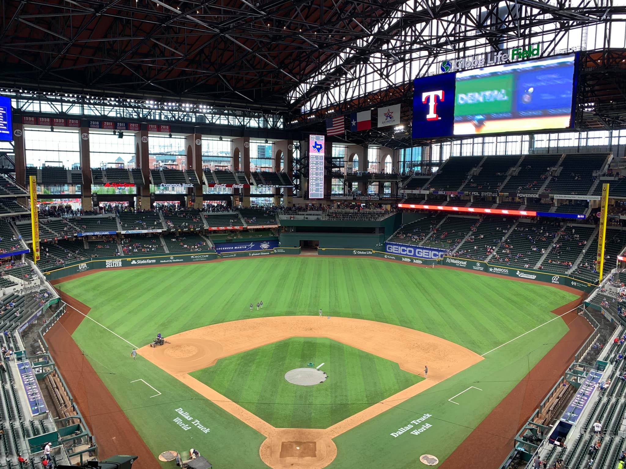
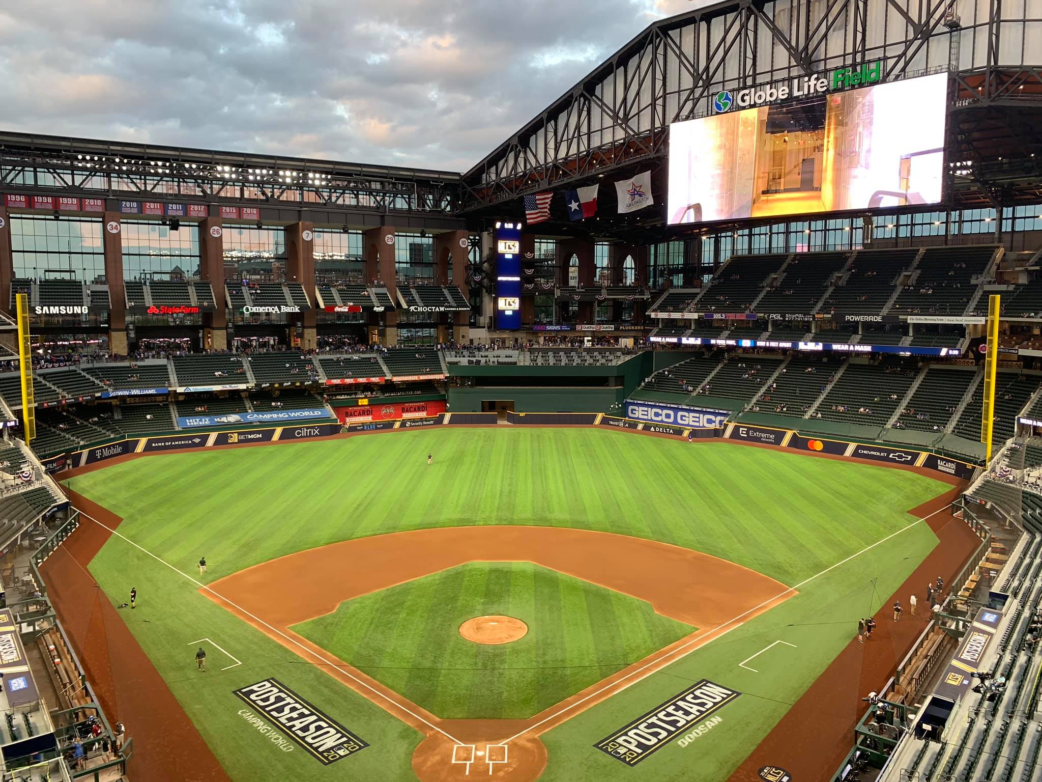
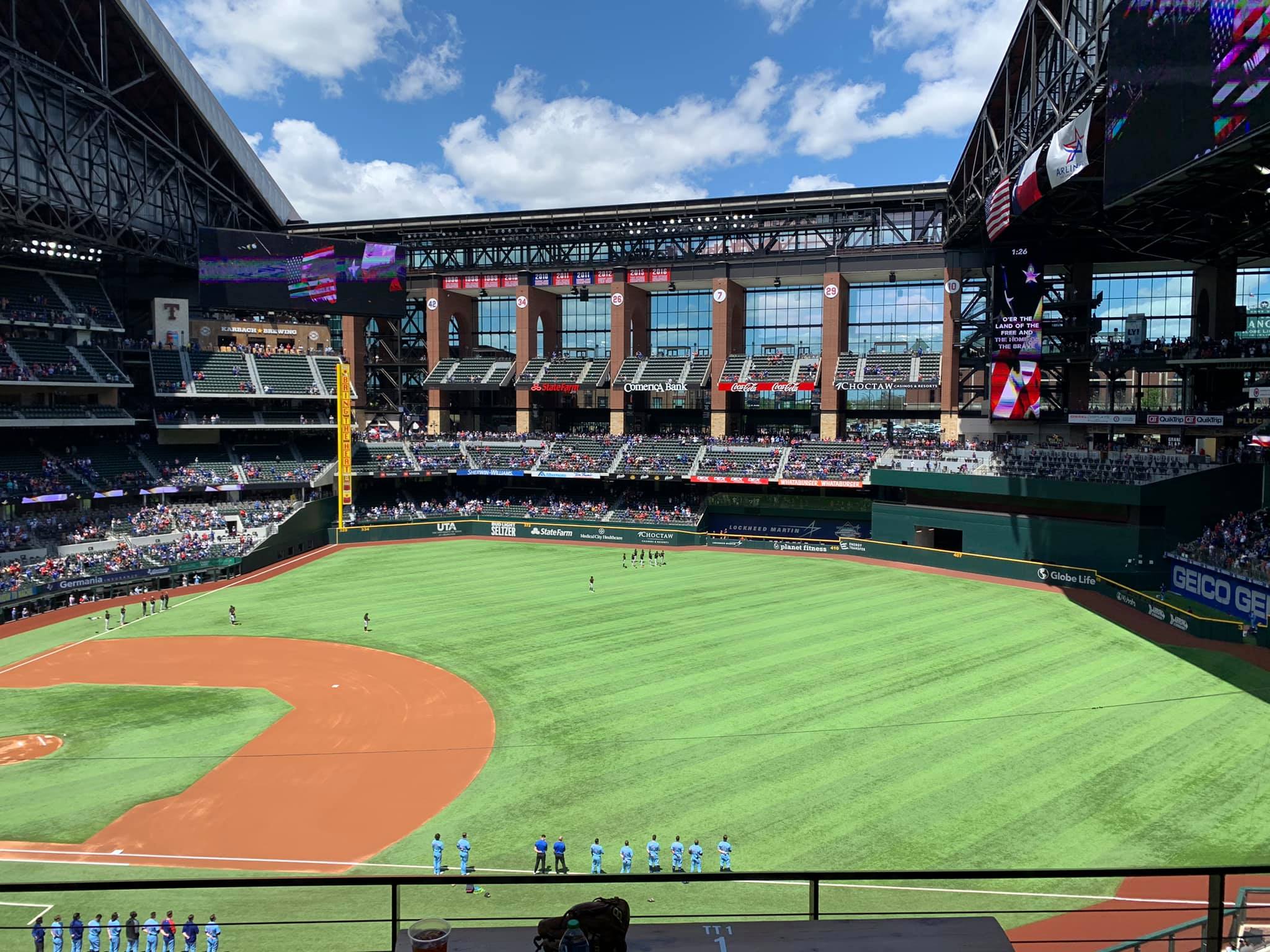
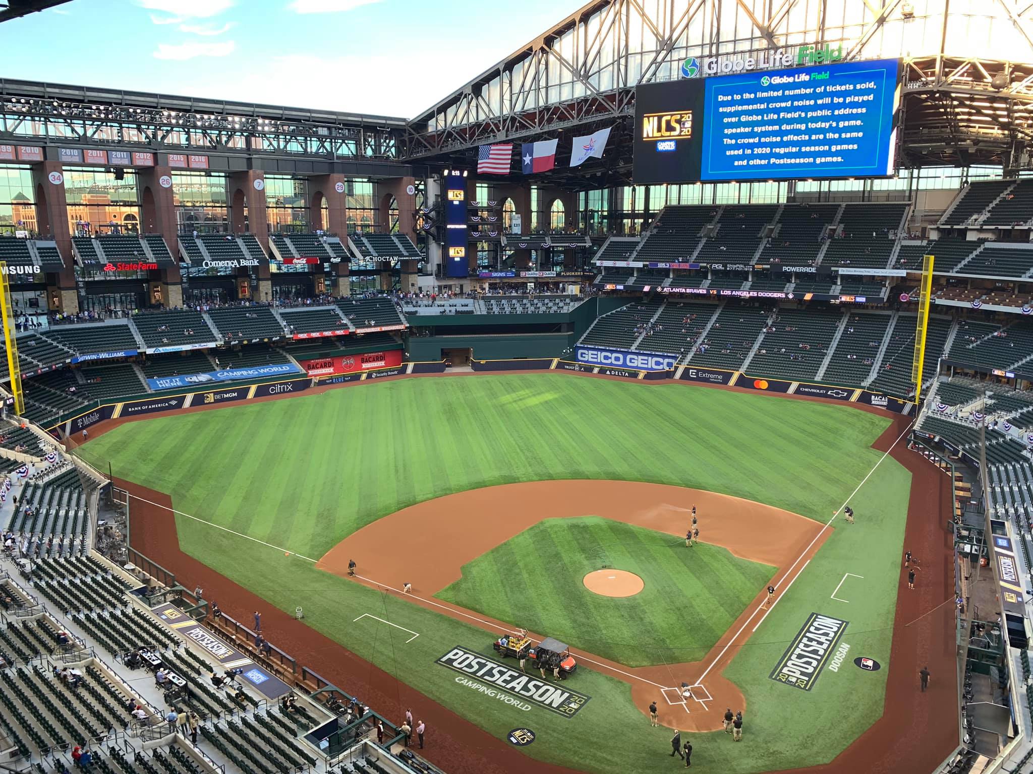
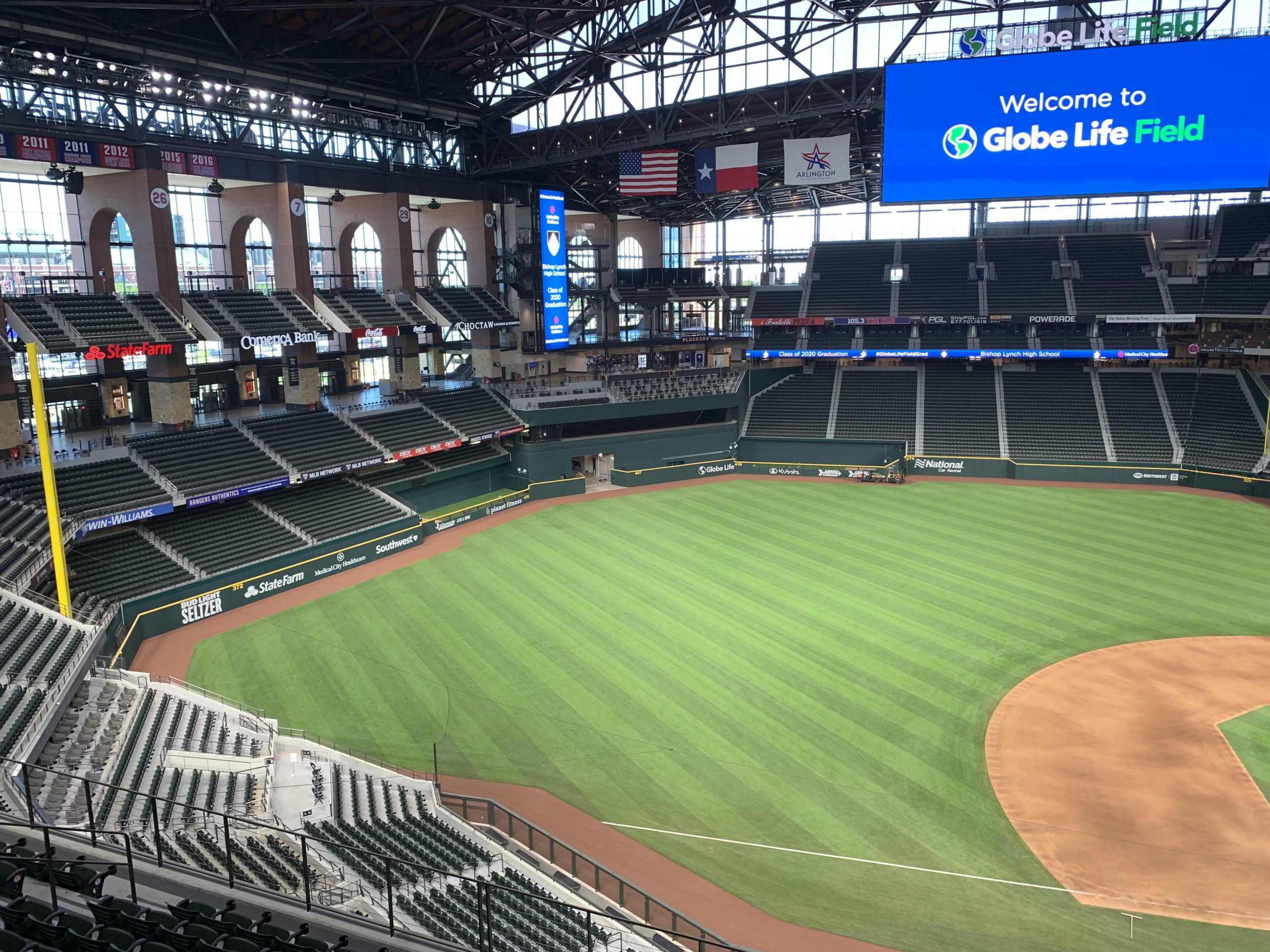
While the archways viewed walking across the “skybridge” have plenty of appeal, new Globe Life Field’s interior seating bowl aesthetics have no such distinctive attributes, in what is one of the most nondescript designs in Major League Baseball. The Rangers don’t even try to emulate the attractiveness of Greene’s Hill for the batter’s eye, which is the least they could do.
___The most common response doesn’t try to rebut any of this, instead simply stating that the Rangers (1) “needed” a climate-controlled ballpark and (2) retractable-roof ballparks by their very nature are going to be less attractive and more formulaic, so deal with it.
The loose use of the word “need” notwithstanding, I actually grant the former point. For years, the Rangers and other architects extensively studied putting a roof on The Ballpark in Arlington, and it was consistently deemed financially and structurally impracticable. Playing in the increasingly oppressive summer heat was probably not sustainable.
However, I do not grant that Globe Life Field’s indifferent and generic design was inevitable. Climate control and attractive aesthetics need not be mutually exclusive.
Forget about comparisons to The Ballpark in Arlington. Ranging from the pedestrian and derivative to the downright ugly, Globe Life Field’s architecture and aesthetics are poorly executed even for a retractable-roof venue.
Granting that the weather required a new climate-controlled ballpark, Globe Life Field’s exterior design and interior aesthetics still don’t fare well by comparison to other retractable-roof venues.
For one, even styles already in existence would have made for a far more pleasing interior environment. Most importantly, the Rangers and HKS architects missed a golden opportunity to construct an aspirational, forward-looking design, as there is no shortage of innovative retractable-roof concepts out there more worthy of $1.2 billion.
It’s 2020. A retractable roof is no longer an architectural dead end resulting in an airplane hangar.
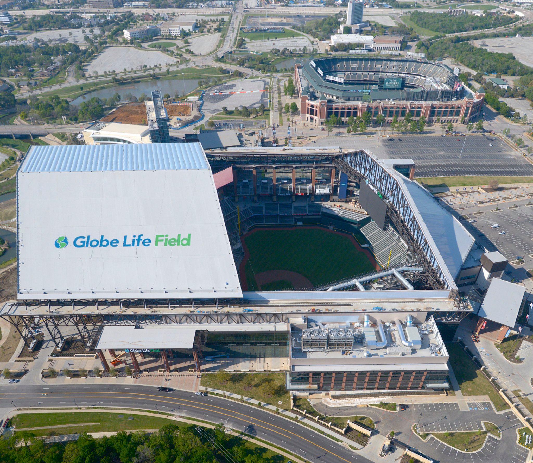
___Let’s start with the Globe Life Field’s exterior design, which has now received so much social media attention even the casual baseball fan is probably familiar with the criticism. A viral post of Globe Life Field’s metallic roof viewed from the sky was met with mockery and vitriol. Fans called it, among other things, “a BBQ grill,” “an aluminum roasting pan,” “a Costco warehouse,” “a talking clam,” “the offspring of a megachurch and a live auction barn,” and my favorite, “a nuclear disaster reminiscent of the Chernobyl Sarcophagus.” I don’t think I need to add anything more.
It is a truly disastrous look, a function of the Rangers first scaling back on their initial proposal for a full ETFE roof and then HKS scrapping the upper glass façade seen in the final renderings. Here’s the final product from that angle. The metallic roof clashes horribly with the more traditional materials below. But after spending time walking around the outside, I’m going to surprise you here: the ridicule is a tad misplaced.
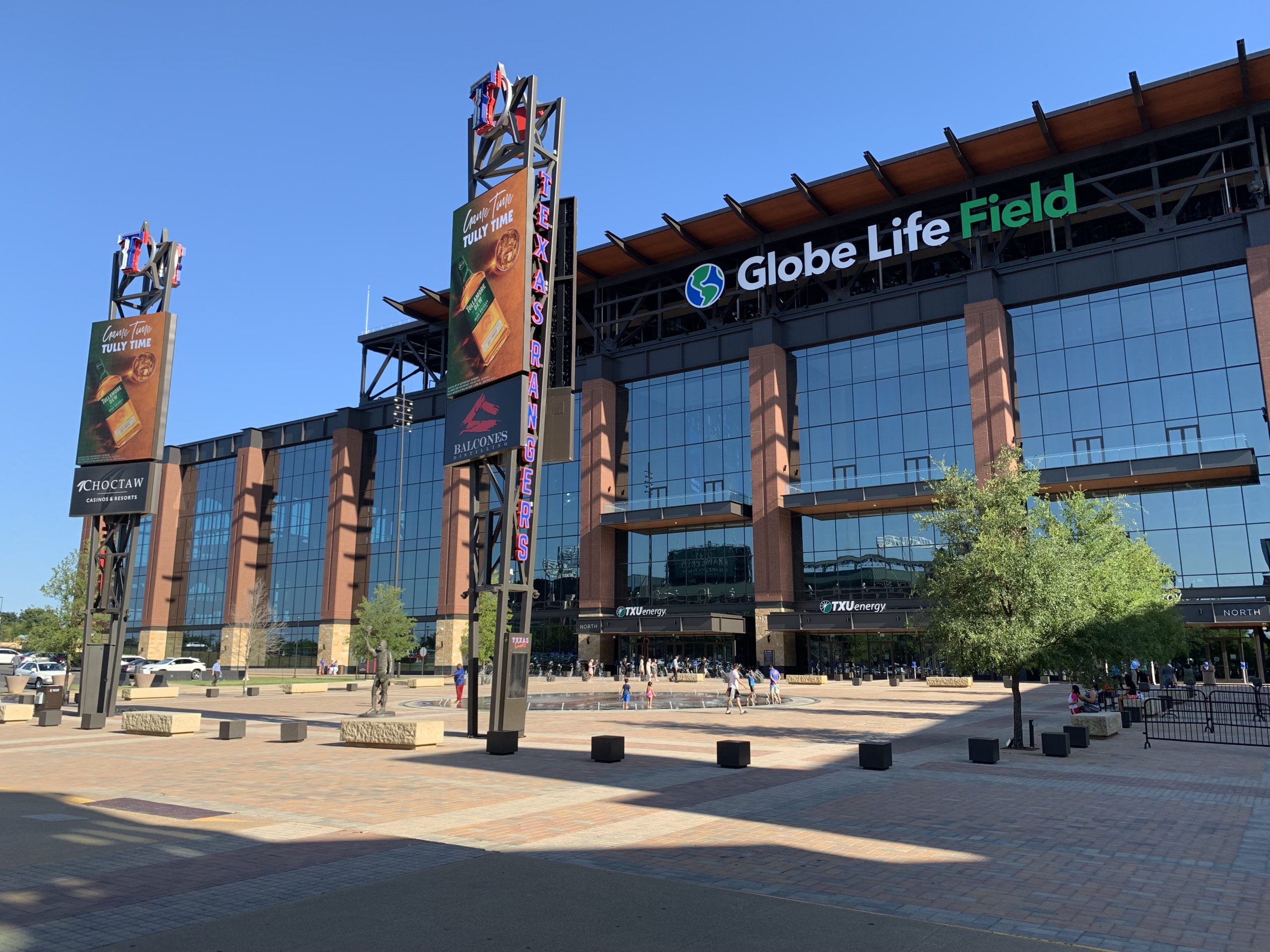
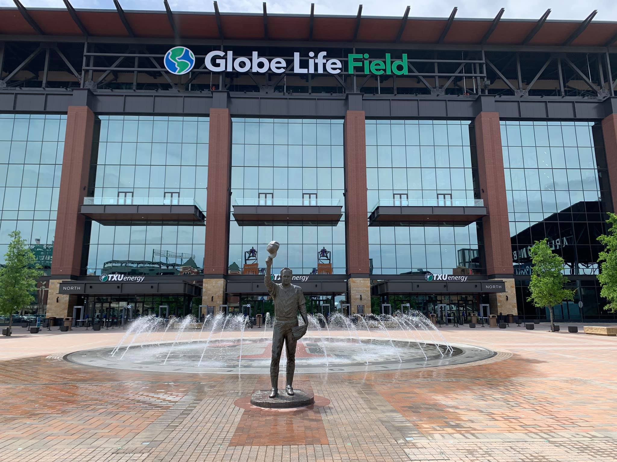
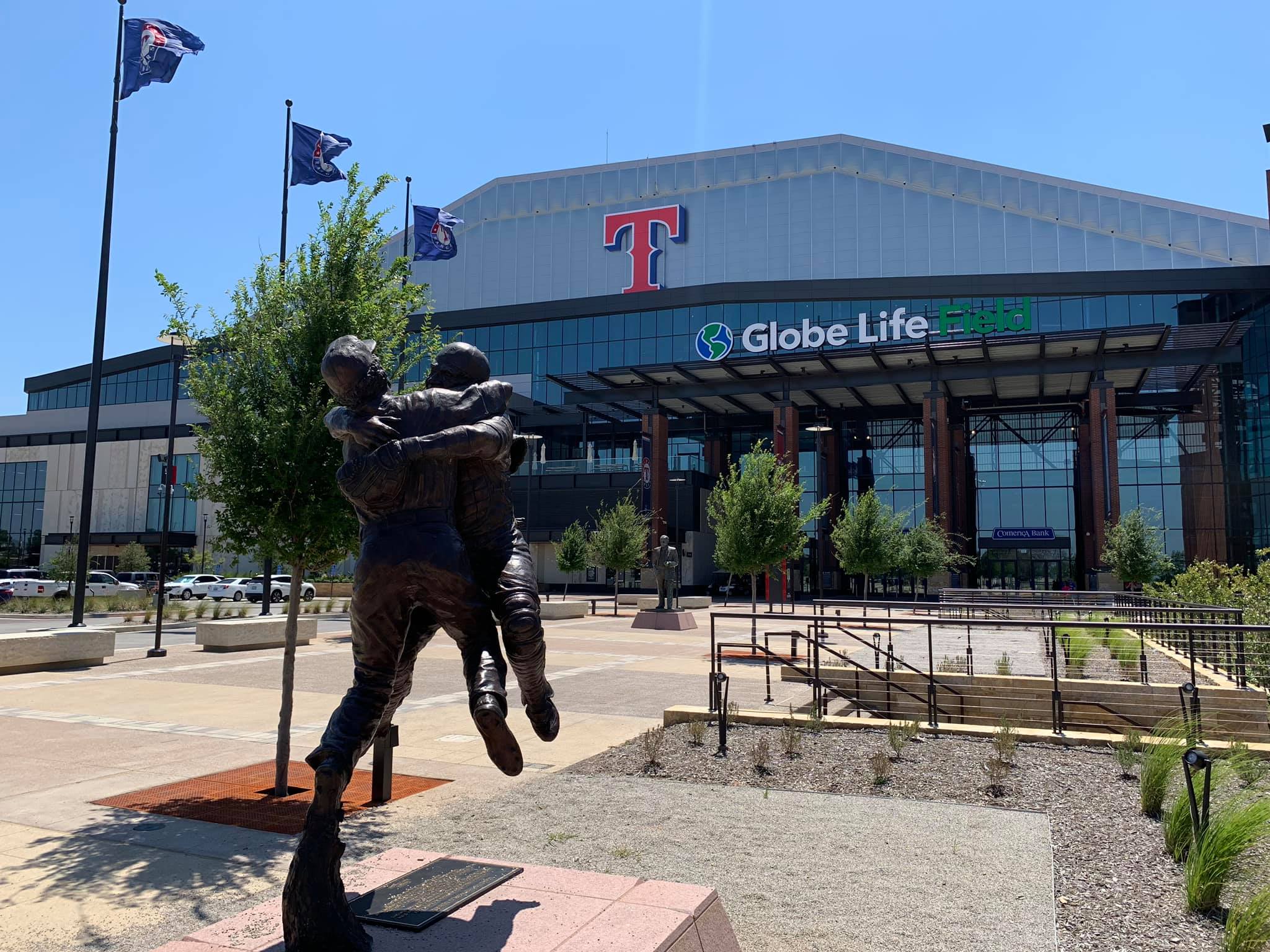
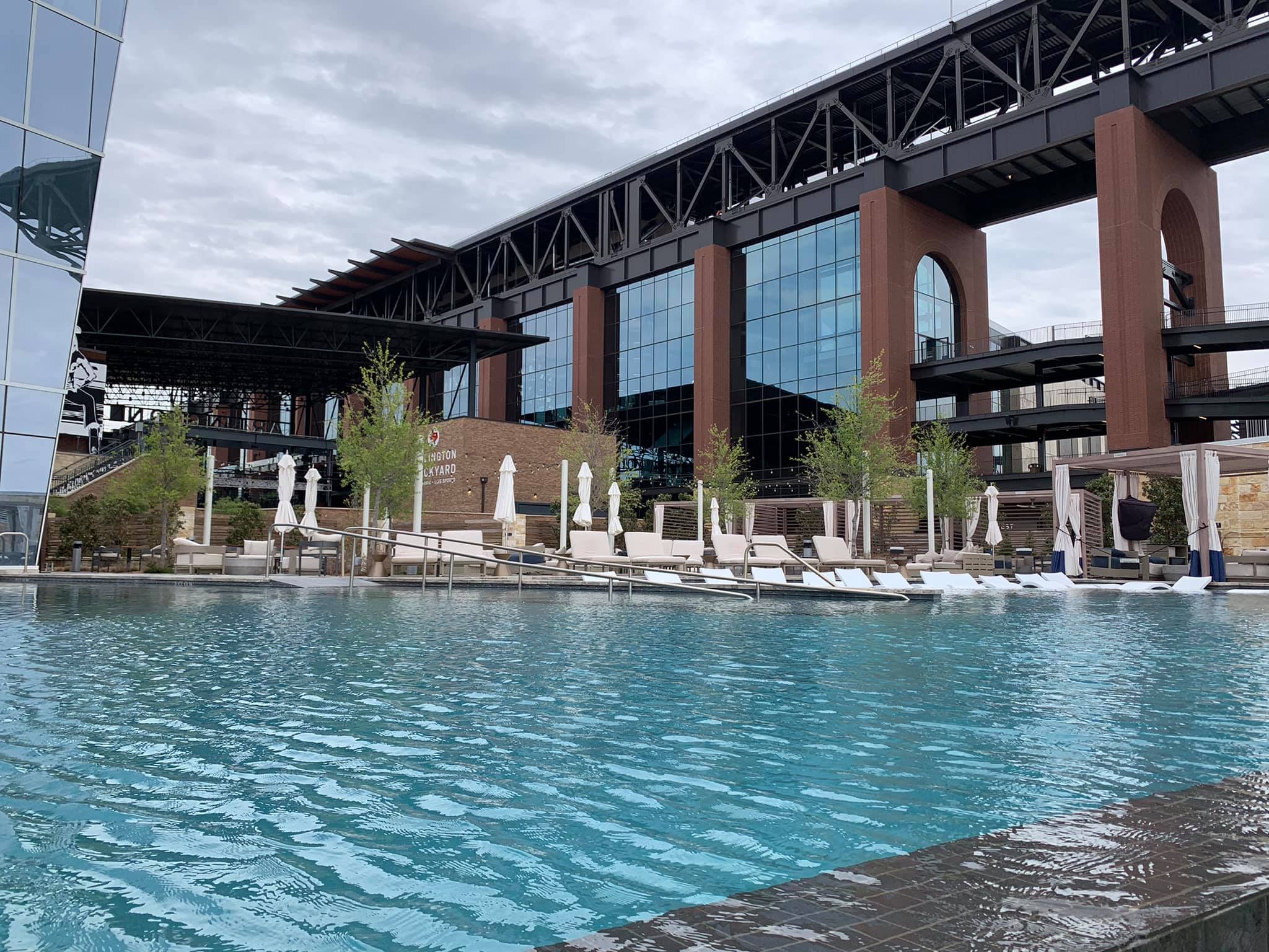
Unless fans are arriving to Globe Life Field by helicopter, they aren’t going to see the park from this unfortunate angle. On the ground, the ugly metal sheet warehouse-look is only apparent from a few angles on the northeast side. That’s not to say there’s much positive about the outside! From eye level, most of the exterior design is pleasant enough but soulless, representative of a typical suburban office park.
Glass, steel, red brick, and concrete precast limestone (not real limestone), all free from any unique accents or regional flares, are utilized throughout the façade. Not necessarily ugly from ground level. Just the laziest possible starting point for a ballpark.
The faux limestone treatment on the northeast and south sides of the ballpark is probably the most interesting part of the exterior, but it also clashes terribly with the roof. The Rangers also like to highlight the park’s “Texas Porches,” the shaded transitional entrances inspired by local architecture. That’s a neat concept, but they resemble the car entrance to the check-in lobby at the Marriott more than anything else.
I might feel better about some of these elements if the traditional materials didn’t conflict with the modern roof technology. Contemporary treatment would have worked better.
In sum, the exterior probably isn’t quite as bad as social media would have us think, but this is still an utterly pedestrian effort, unacceptable for a $1.2 billion ballpark. Even presented with the more attractive initial renderings, it’s telling that city council members were ringing the alarm about the unremarkable design from the start. Ballparks deserve better.
___I actually think the nominally well-received interior design, bereft of any signature elements, interesting views, or an overarching aesthetic vision, isn’t getting critiqued enough.
It’s become fashionable to claim that Globe Life Field is a carbon copy of Houston’s Minute Maid Park on the inside. Like many Rangers fans, I just don’t see many strong similarities. Both have boxy roof designs, but so do other retractable-roof ballparks. GLF shares a passing resemblance to MMP’s right field stands, but that setup is common in many parks. Both have archways in left field, but MMP’s arches are oriented toward the field while GLF’s face the concourse. I won’t go through the myriad of differences, but the main seating structure is different as well. Perhaps the meme stuck because the very early GLF renderings did strongly resemble MMP in its positioning of the archways, which ironically had more appeal.
But debunking the “Mimic Maid Park” meme does not make Globe Life Field look favorable by comparison.
The crucial point of distinction, one that makes MMP (and T-Mobile in Seattle) aesthetically superior in my opinion, is the positioning of the roof rail tracks. When the roof is retracted in Houston, the much lower roof line allows for striking downtown views and a more open environment throughout left field. It’s more akin to a sliding glass door that exposes all of left field to the elements.
GLF’s roof only retracts at the top, so the entirety of the interior feels hermetic even when the roof is open. Simply put, GLF has roof tracks hovering over left field even when the roof is open, while MMP (and T-Mobile) doesn’t, because its roof retracts from a lower position.
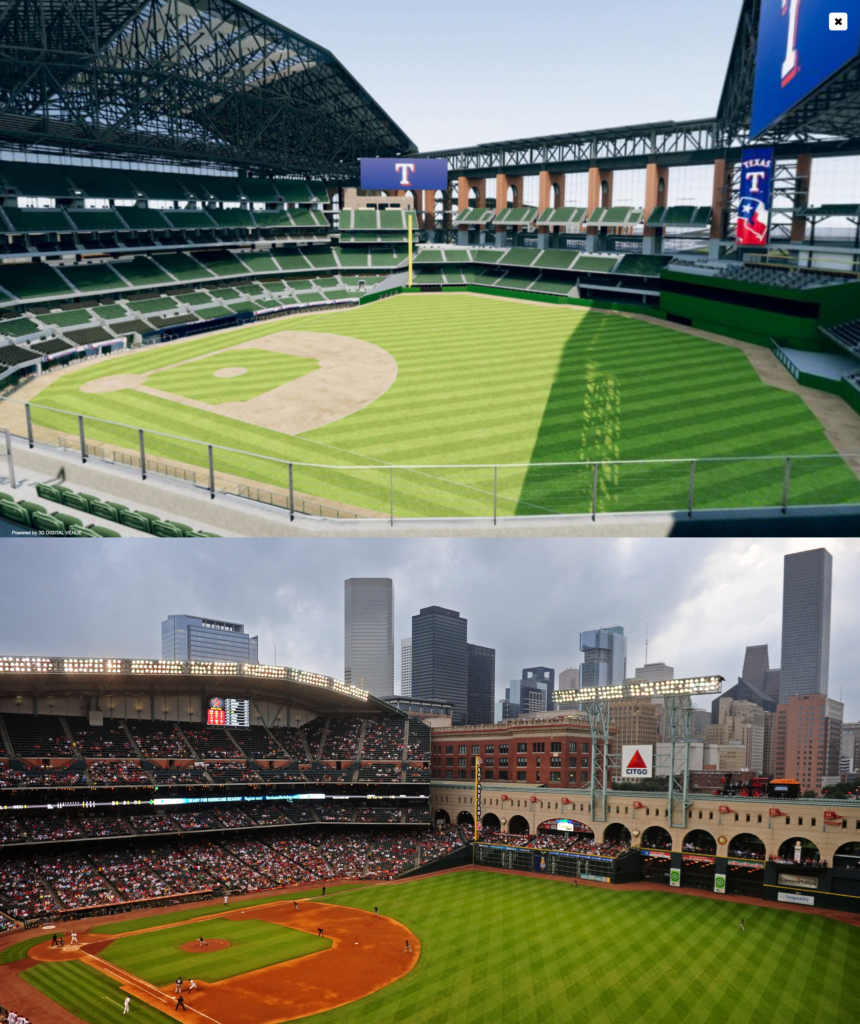
Marlins Park’s retractable roof is a better comparison because it has the same high roof line that opens at the top, but even that setup is more attractive because the panels below the roof line slide open. With its square glass outlines in left field, there’s some resemblance to Chase Field’s center field appearance, but even those square panels fold open. GLF’s outfield panels do not open. Perhaps the best comparison for GLF is one of those warehouse-style NFL stadiums. It feels dark and enclosed at all times, with little visual appeal throughout the outfield.
The natural response is Arlington doesn’t have views of anything, except its perfectly good former home across the street, so why craft a design around views at all?
Well, that’s kind of the point. Virtually every well-regarded ballpark in Major League Baseball is near a metropolis or a neighborhood, intimately interwoven with an urban context. Building around location allows ballparks to have well-positioned skyline panoramas, captivating water views, and sweeping mountain vistas.
Also, the classic ballparks resonated because they were part of a community, something a stadium in a parking lot can never replicate. I’m sure this is controversial, but I would have been thrilled to see the Rangers move to downtown Dallas, despite the downsides. Views and setting aren’t everything, but they are a core ingredient to every recent home run.
Plus, Truist Park (Atlanta) was built in the suburbs, but it at least has views of the Battery Atlanta. GLF could have similar views of Texas Live! from the seating bowl with a better retractable-roof design.
___Discounting comparisons to current ballparks, Globe Life Field’s unimaginative design is all the more upsetting because it comes at a time when retractable-roof technology is making strides. Full ETFE roofs integrating much more natural light are present in a number of proposed ballparks (and apparently wouldn’t cause glare issues for outfielders). The Rangers incorporated this innovation only in certain spots.
Looking at renderings of retractable-roof ballparks under construction (or proposed), we see a lot of progress. Check out this breathtaking concept coming out of Japan, set to open in March 2023. We have use of original architectural materials inspired by the local landscape, natural elements, plenty of light with an open feel, and stunning views through the glass. The punchline: it’s half the cost of Globe Life Field!
I won’t drone on through all of the examples, but here are concepts out of Portland, Arizona, and Nashville. Even the scrapped proposal in Ybor City (Tampa Bay Rays) with a non-retractable ETFE dome (though the outfield panel would retract) was at least interesting. Of course, as Globe Life Field showed us, renderings don’t translate to finished products, but all of these basic design concepts are far more intriguing than even the most visually appealing GLF renderings.
___If you’re scrolling through the end of this portion, you may again be asking “Why should I care? I just want to watch the game in comfort.”
Because you’re paying for it, so I would think taxpayers would want $1.2 billion to go toward something of actual architectural merit generating local pride (not national embarrassment) or better yet, toward something much more useful. This is especially relevant in Arlington because taxpayers got a particularly one-sided deal. “Throw a Billion Dollars from the Helicopter” examines the madness surrounding the financing of Globe Life Field.
Neil deMause has done a great job of documenting the scandal that is publicly funded sports stadiums over the years, but I’ve generally avoided the topic because I have nothing else to add. If anything, public funding has shown to be a fait accompli in states not named California. Even armed with knowledge that the investment isn’t worth it to the taxpayers, people will ultimately fall for the civic pride argument.
What I will say is that as long as facilities are publicly funded, I am going to fight tooth and nail for the next dollar to go to constructing something of architectural merit rather than to the next suite level. I urge the public to demand more.
Overall, maybe the aesthetics will grow on me, but it sure looks like HKS totally phoned it in on a hometown client, with visuals so generic they could be from a video game generated stadium. Just from a design standpoint, it’s the biggest MLB ballpark disappointment in recent memory.
While Globe Life Field is an unabashed “mallpark” in organizing philosophy, it actually isn’t even a fun one for the average fan. Compared to other MLB parks, the amenities for fans without a premium ticket are not particularly impressive.
For all the mockery of millennials who go to stadiums and just “hang out” and not watch the game, the truth is that’s a pretty common phenomenon.
Families with young children, individuals on group outings, employees with corporate-owned seats, common folks dragged to the game by their partners, or just people who got free tickets comprise a large proportion of those in attendance, all of whom are not likely to have their eyes glued to the action much of the time. The days of ballparks filled with only die-hards are long gone.
Starting in the 1990s, venues began to focus on the broader “fan experience,” and that trend has really accelerated in the last 10 years. Varied food options, curated dining experiences, local craft beer, destination bars, social gathering spaces, premium all-inclusive clubs, interactive team museums, and elaborate kids’ playgrounds fill the concourses of MLB ballparks across America. Something for everyone, team officials rationalize.
These are features someone inclined to read this website might not care about, but they have appeal to the average person at a ballgame. I think anything that draws non-fans and simply gets them exposed to the game is a plus! (And as I outlined, whether or not ballparks should be categorized as “mallparks” just for having these features should depend on the organizing principles of construction.)
The conventional wisdom is that ballparks have neglected the average fan, marketing these high-quality amenities only to premium ticketholders. While die-hards and ballpark traditionalists may scoff at these features anyway, that’s not really true. Take Globe Life Field’s revenue-generating model, Truist Park (Atlanta), which has plenty of diversions for the average fan.
Even take Yankee Stadium, a ballpark reputed as cold and only built for the mega-wealthy. Not including the obnoxious sum of premium seating options, anyone with a ticket can access a robust selection of concessions, a Hard Rock Café, a team-branded steakhouse, numerous bars and social spaces on the concourses and in the outfield, Monument Park, the Yankees Museum, and a children’s area.
Virtually all ballparks have a broad range of experiences and some level of amenity for all fans balanced with frills for the high rollers.
___That’s not as true as it should be within the confines of Globe Life Field. Even granting many fans are into this sort of thing, they won’t have options here. Most of the features are geared toward premium patrons and private groups.
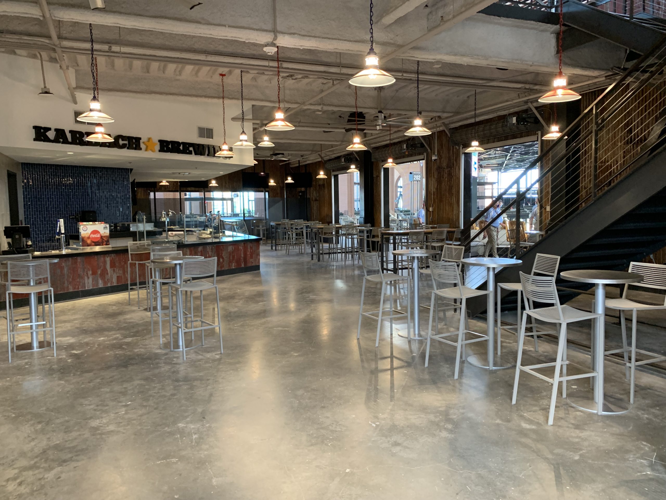
New ballparks love to tout their increased variety of food options, but just looking at the menu, GLF isn’t an upgrade over The Ballpark in Arlington in the concessions department, and it doesn’t compare well to other parks. This comes with the obvious caveat that no fan has yet been able to assess the quality of the food.
Lots of traditional concession items, the obligatory Tex-Mex and BBQ, and a heavy emphasis on “gimmick foods,” little of which are provided by high-quality local restaurants like at the best ballparks. The only regional favorites are Pluckers and Golden Chicken, focusing on wings and tenders. The Rangers missed an opportunity to incorporate more inspired concepts from the area like fans see across Major League Baseball. I understand the audience is a bit different in Arlington, but this is still a disappointment.
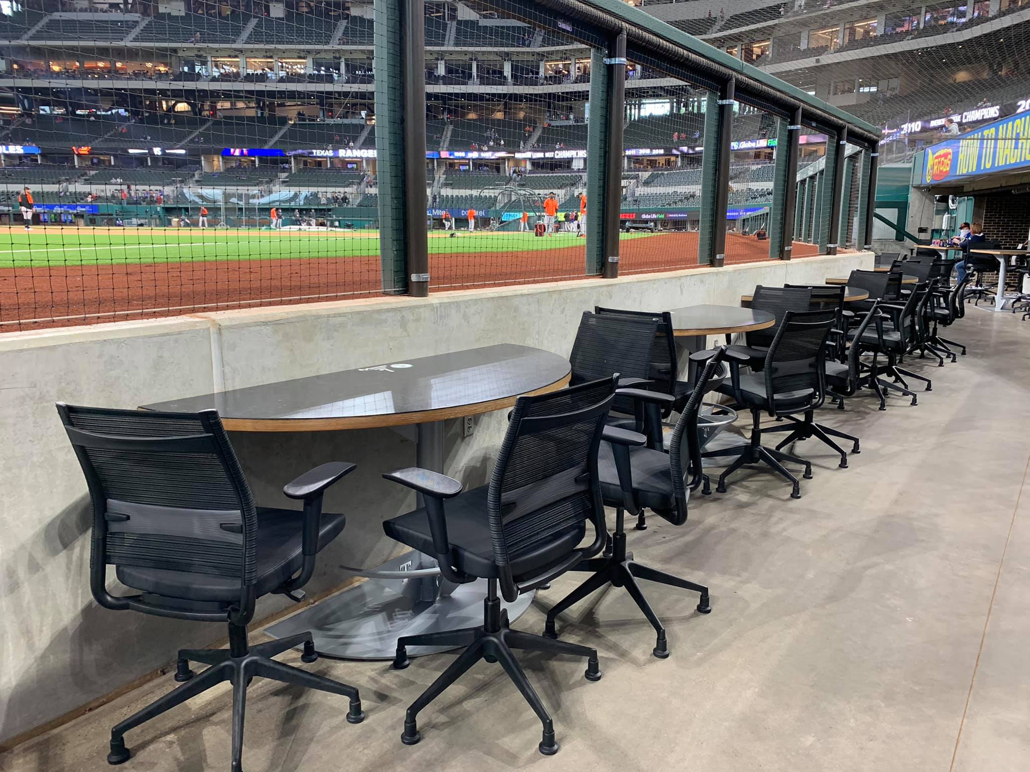
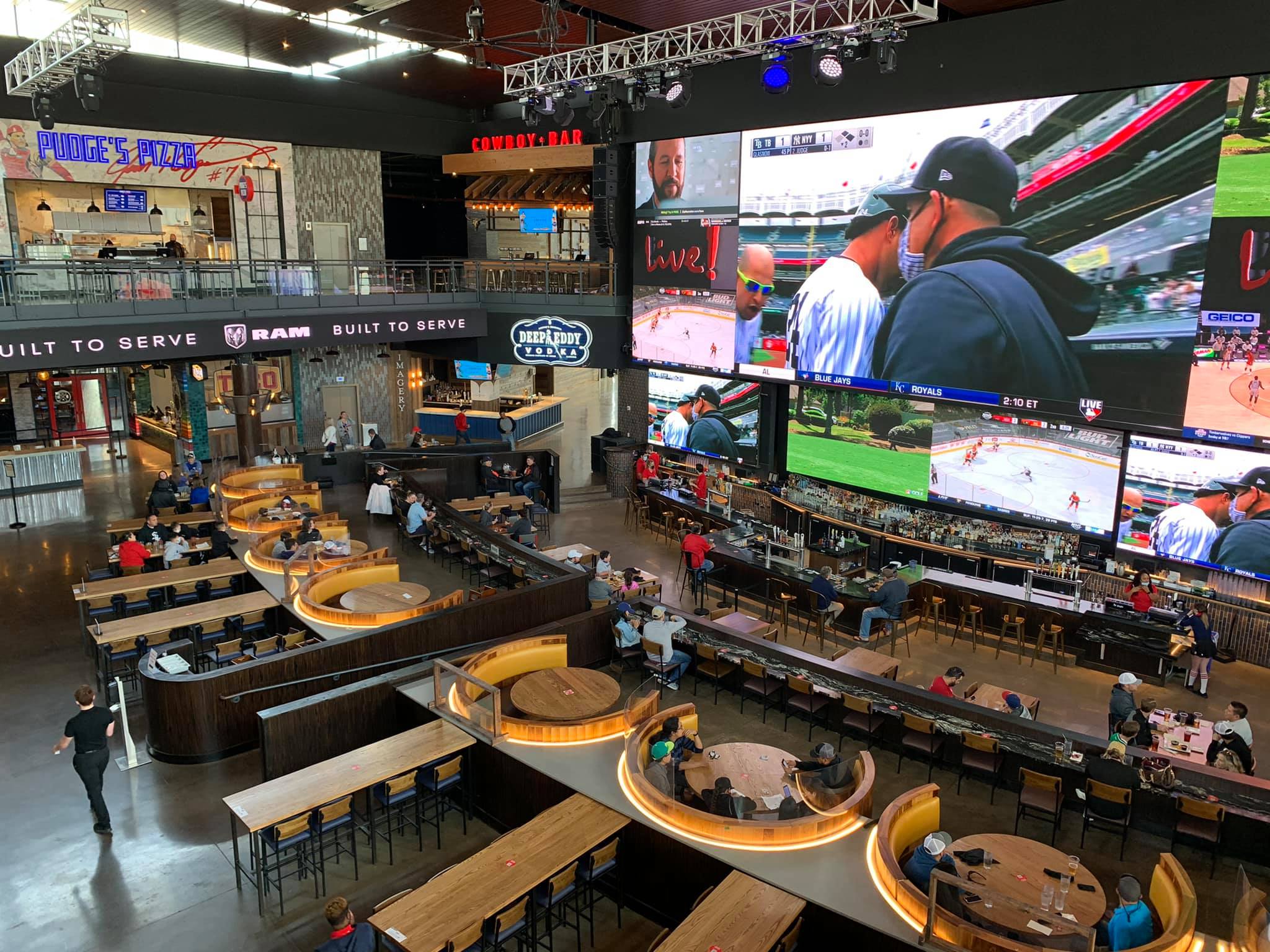
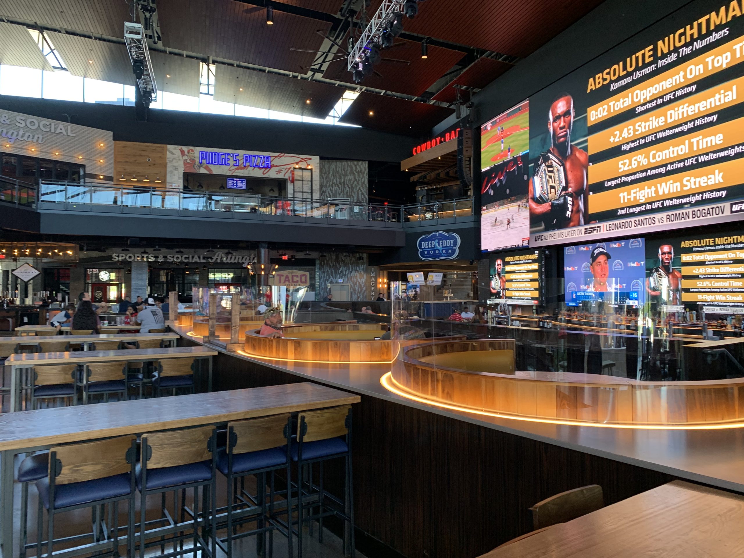
Globe Life Field generally lacks social spaces accessible to all fans on the concourses. Folks will notice an interesting outdoor market concept on the third base side of the main concourse, but that’s reserved for private groups. Those cool tables and chairs on the upper bridge concourse? Private groups.
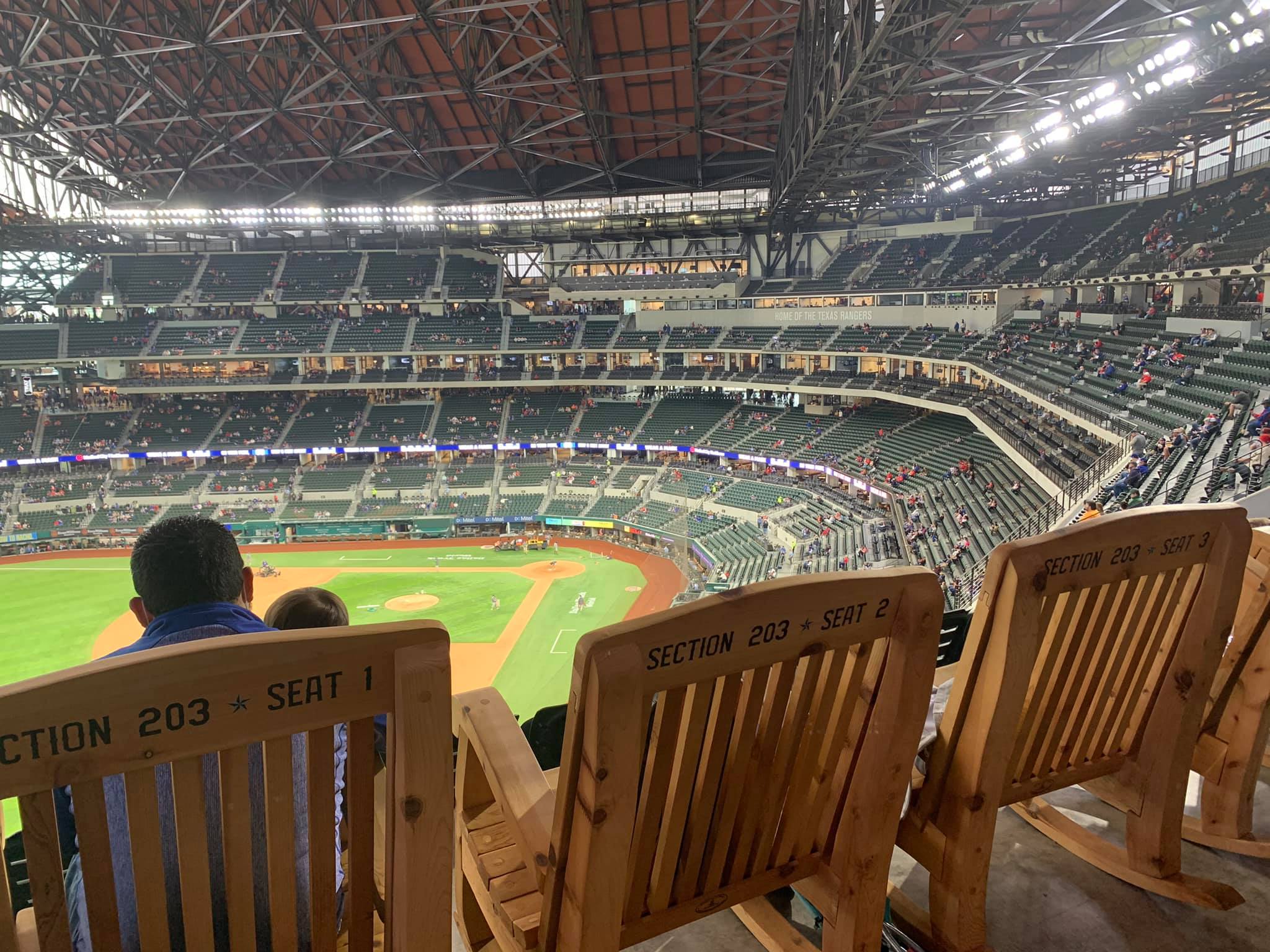
The Karbach Brewing Sky Porch in left field is Globe Life Field’s signature destination, but it’s pretty basic to be the coolest amenity in the ballpark. Those rocking chairs overlooking the field are clever, though. Rangers fans will also be surprised to see no accessible full-service restaurants within the venue’s confines, unlike at The Ballpark in Arlington.
Sure, there’s Texas Live! outside the ballpark, but there’s nothing exceptional about restaurants and bars around a stadium, whether it’s downtown or in an emerging mixed-use development complex like in Arlington. There needs to be more within the ballpark.
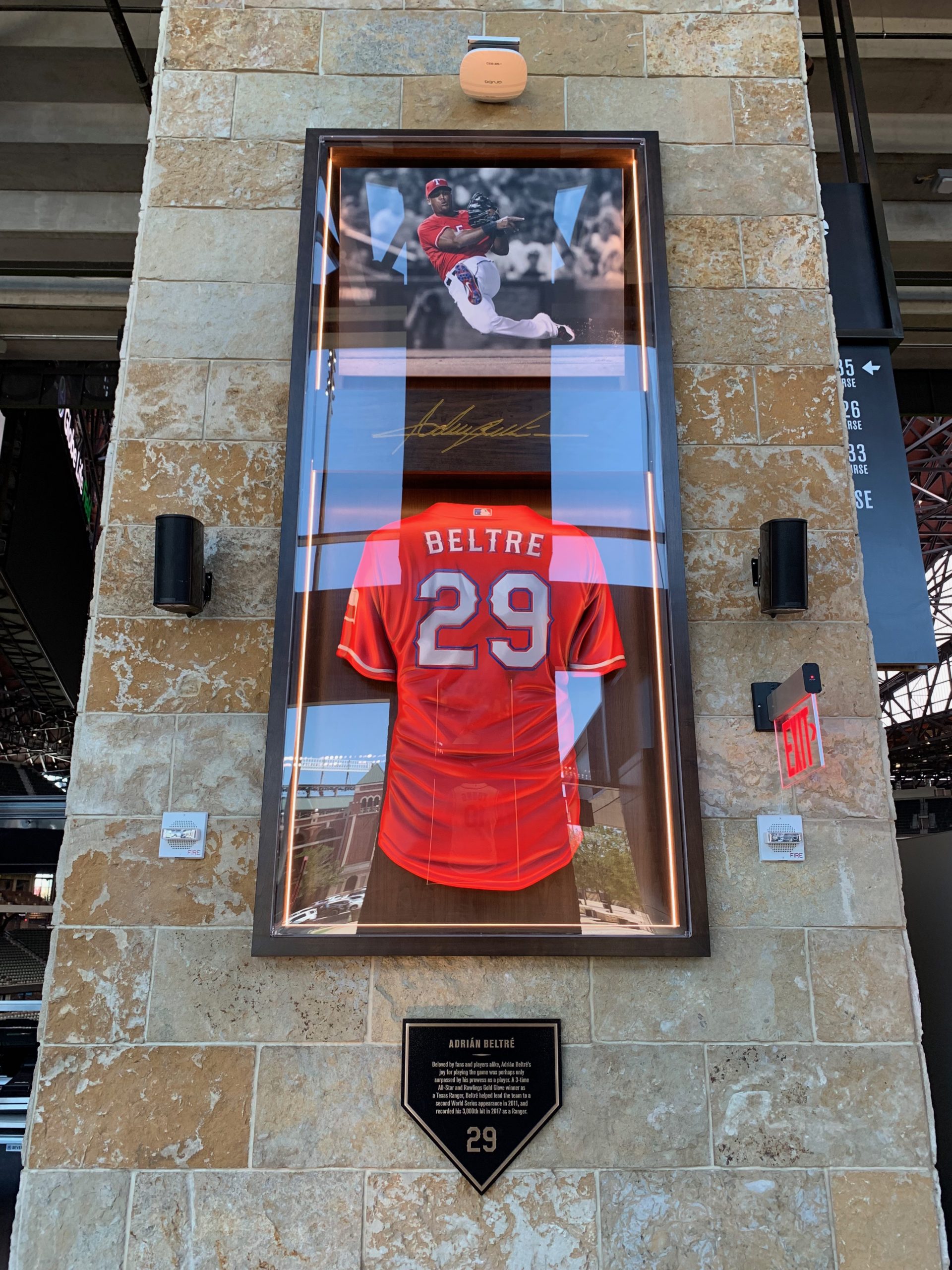
Ballpark museums and interactive historical areas are the one fan-friendly amenity that bucks the mall-like trend. Rangers fans may fondly remember the Legends of the Game Museum on the right field concourse in early days of the old park, once the largest baseball museum outside of Cooperstown. While later scaled down as the Texas Rangers Hall of Fame, it was an impressive area.
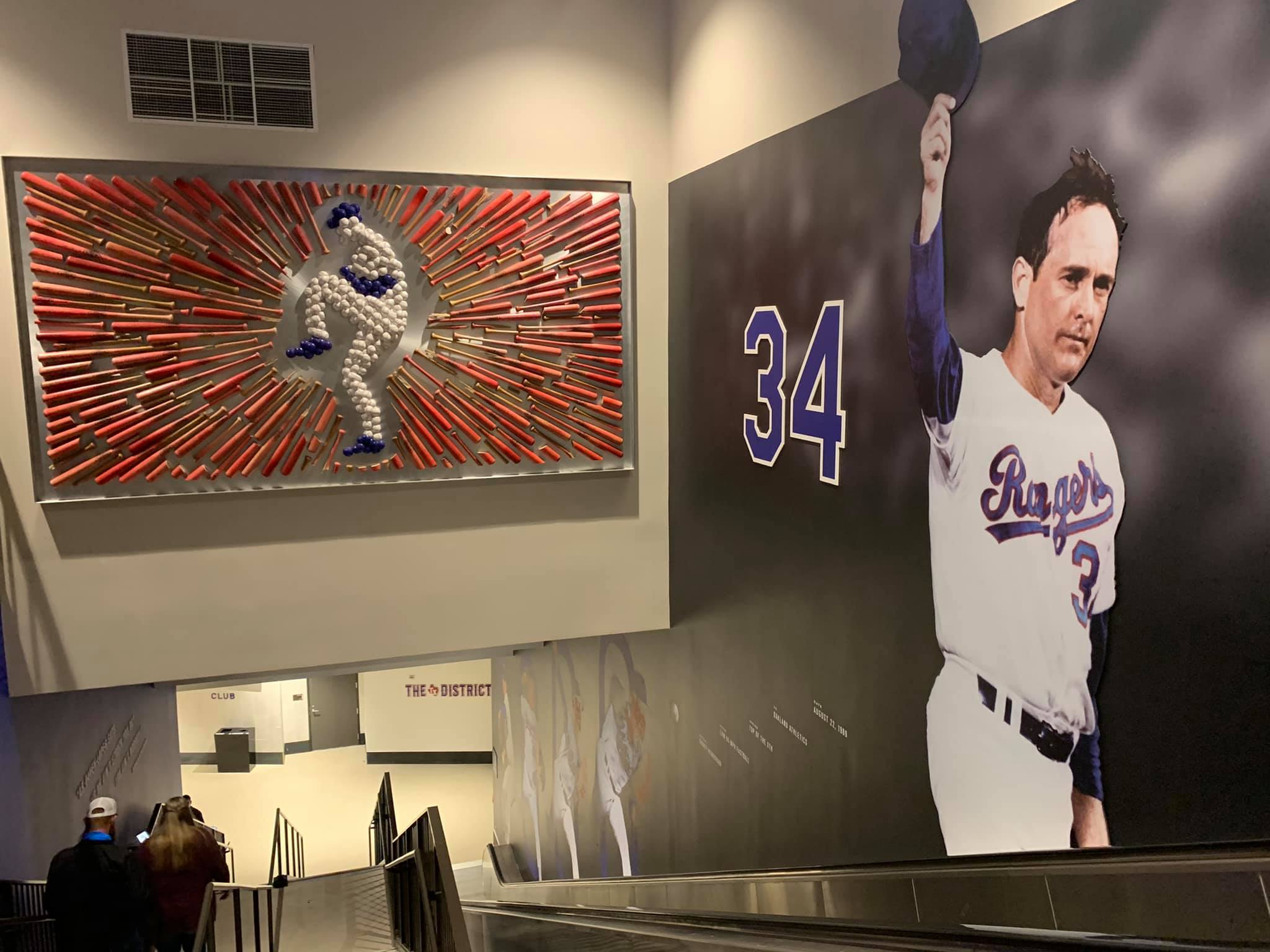
There’s no such dedicated team shrine or elaborate historical display at Globe Life Field. Yes, I appreciate the memorabilia, player murals, and other homages throughout the concourses, but the references to team/baseball history are not as impressive as most other ballparks or The Ballpark in Arlington in its heyday. However, I outline some of the positives here below.
While trivial to many, I was surprised to see no children’s area at GLF either. This is only the case in one or two other venues in all of Major League Baseball.
Now, this all comes with the caveat that no one has actually experienced the full “ballpark experience,” and new ballparks tinker with their amenities as they evolve (for what it’s worth, the Rangers will add a kid’s area). I know the Rangers organization regretted not being able to rollout some features in time (pre COVID), but I can tell you this was going to be the fan experience on opening day in March.
Instead, all of Globe Life Field’s most outstanding amenities (and innovative concepts in general) are concentrated around premium clubs and suites. Maybe that’s fine for some. But in Arlington, that comes with a seating layout that shocks the conscience.
Structurally, Globe Life Field is the most fan-unfriendly ballpark in baseball for getting close to players and exploring different areas unless you have enhanced access. Many new stadiums have garnered reputations of having sharp class distinctions in seating, but Arlington reaches new heights in “ballpark gentrification.”
While the days of handing an usher a few bucks to watch a game down low are long gone, today’s ballparks, old and new, are actually pretty accommodating in letting all fans explore non-premium areas before the game during batting practice.
Want to walk around non-premium areas of the lower bowl to take pictures or just get closer to players warming up before the game even without a lower level ticket? Sure. Explore the main concourse above the lower bowl anytime? Obviously.
Basic assumptions about what fans can access and where fans can go are turned on their head due to the markedly different seating layout at Globe Life Field.
With minor variations, the layout of every post-1990 ballpark (including The Ballpark in Arlington) is straightforward. 1) Event level at field level for team and VIP clubs; 2) Main concourse above the lower bowl accessible to all; 3) Some variation of “club level” and suite level above; and 4) Upper deck concourse. Starting in the 2000s, “moats” were introduced restricting unauthorized entry to some parts of the lower bowl below the main concourse at all times, but the basic formula was the same.
At Globe Life Field, fans enter the concourse above the second level bowl at street level due to the topography, which is labeled the “main concourse,” and the entire first level below that is construed as premium (club access on exclusive lower concourse) or semi-premium (general access to exclusive lower concourse).
Meaning, fans cannot access the entirety of the lower bowl concourse in between the foul poles without an appropriate ticket!
Basically, this makes all of the lower level, both above and below the cross-aisle, an exclusive space. The “club level” is essentially the lower bowl.
With every other ballpark, at least some parts of the lower bowl in between the foul poles are accessible, allowing fans to get a closer glimpse of players before the game. Not here.
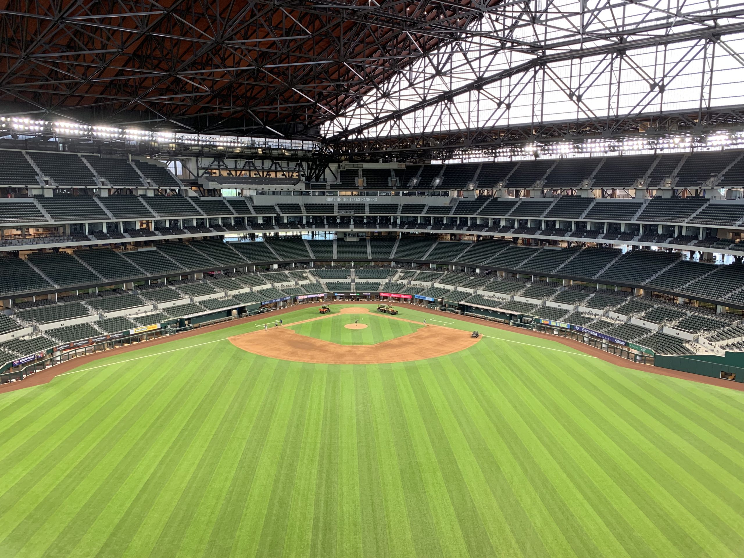
This is unprecedented in Major League Baseball, in what (no surprise) more resembles the layout of any arena or the Cowboys’ stadium next door. Even Yankee Stadium, formerly the most fan-unfriendly ballpark in baseball, allows fans access to the concourse above the lower bowl and has “non-premium” seats in the lower bowl.
Pre-game autographs or selfies with players before the game for those in the nosebleeds at Globe Life Field? Forget about it.
Instead, those paying a pretty penny to sit in the lower bowl get exclusive access to “The District” concourse (which would ordinarily be the main concourse). To further the gentrification, only some within this space get access to discrete all-inclusive clubs on the concourse.
Moreover, even if you do have lower bowl seats, the even more exclusive dugout clubs at field level down the lines make it impossible to get close to players before the game unless you have access to those clubs too!
I’ve always been sympathetic to the idea that premium seating has its place in modern stadia, certainly more so than just about anyone who would take time to write such an extensive piece. In fact, I even “grade” premium services on our scorecard. But this goes too far. It’s the culmination of making every single seat down low an exorbitantly priced premium/semi-premium seat catered for corporate patrons.
Bottom line: complaints about seating layouts creating caste systems among fans have been voiced for years, but Globe Life Field’s complete lower bowl exclusivity is beyond the pale.
…
___For what it’s worth, the quality of Globe Life Field’s six premium clubs and numerous suites is absolutely marvelous. (I’ll let the reader decide whether or not club quality should go in the pros column below).
In fact, going back to that sense of gentrification, the entire ballpark just feels more upscale. Main concourse areas might have passed for a premium concourse 20 years ago. Premium clubs and suites feel more like a space at the Ritz Carlton than a 1990s waiting room, with an unmatched fit and finish for a ballpark.
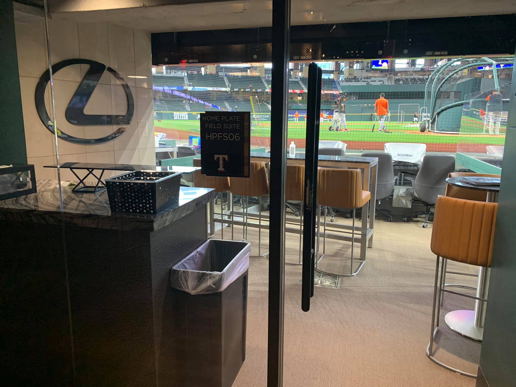
At event level, Globe Life Field brings something new to the MLB ballpark scene with its two open-air dugout lounges down the lines and field suites behind home plate. Parks in Cleveland and Anaheim have field level luxury boxes behind home plate, but not quite of this style.
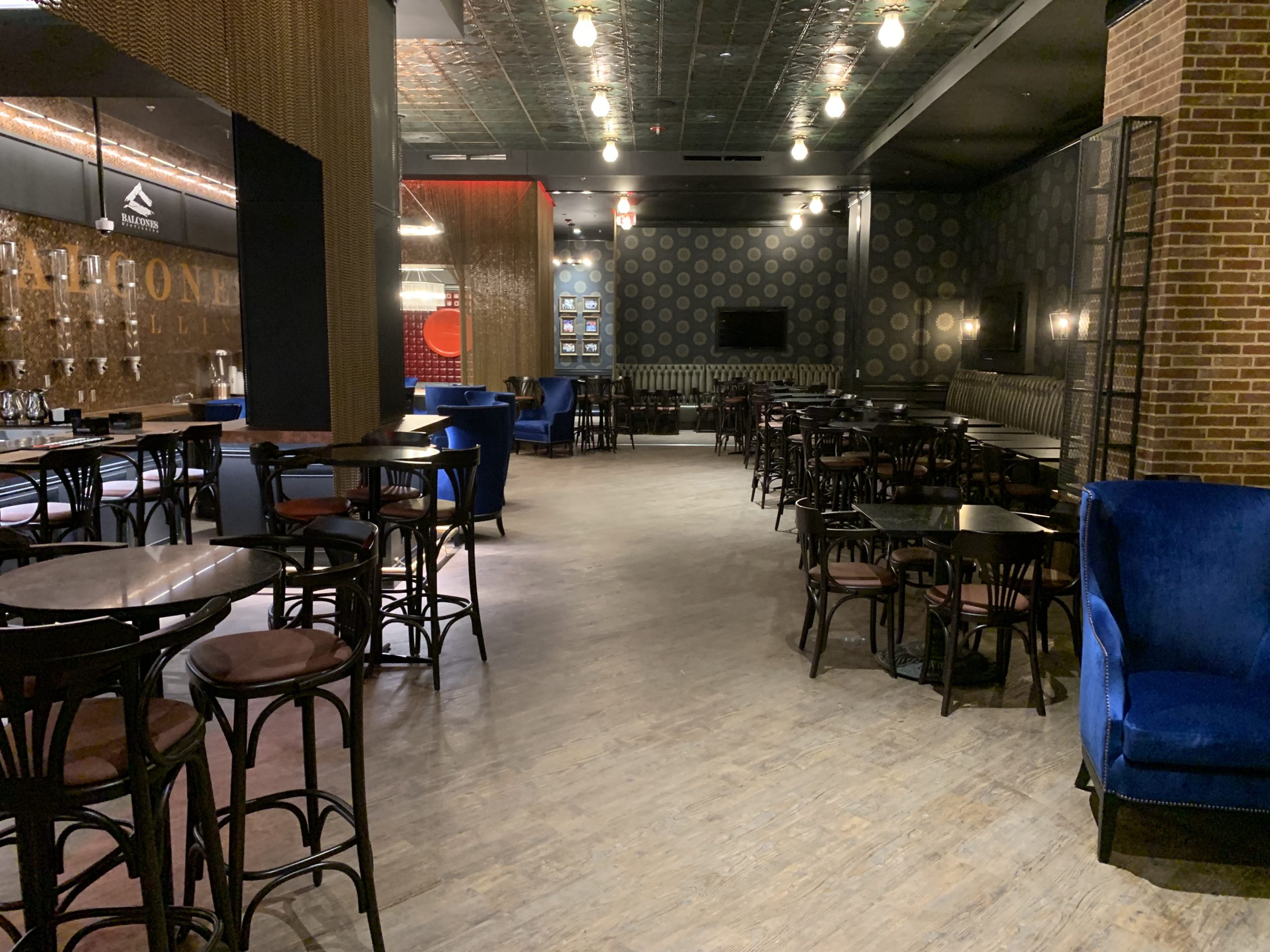
Reminiscent of Jerry World next door, this ring of upscale seating options at ground level is probably GLF’s most notable design feature, full stop. Field suites put fans closer to the batter than any other MLB park. The large Lexus Club behind the field suites offers the obligatory all-inclusive home plate club experience for 900 fans sitting in the closest lower bowl seats.
One level above, the aforementioned District concourse offers a high-end, curated experience reminding fans of Arlington history. The Stubhub Club on that concourse serves all-inclusive food and beverages to designated fans sitting on the first base side. Other fans sitting behind home plate have access to the 1920s-themed Speakeasy, the most exclusive space in the ballpark and a stadium club par excellence. The Founders Suites on this District concourse get access to their own lounge with chic, high-end art from around the Metroplex. There’s more, but I’ll stop here for now.
If you have deep pockets, love baseball, and enjoy entertaining, Globe Life Field offers some of the best experiences in the sport. It’s just not a good sign that the park’s signature features involve premium seating.
So, what does Globe Life Field do right?
Some things! Globe Life Field is far from a total dud. Yes, I don’t think the handful of pluses outweigh the severity of the glaring flaws, but Globe Life Field, for one, nominally advances ballpark design from a functional point of view.
On some level, GLF is just exceedingly functional, and functionality does count for something.
___Along with the given that climate control is a plus, the sightlines at GLF are a dramatic improvement from those at The Ballpark in Arlington. Seating geometry down the lines is superb, and the upper deck is 30 feet closer to the action (which may alone make it a better park).
Now, The Ballpark in Arlington had the very worst field proximity from the upper levels among retro ballparks, so an improvement was almost a given. Do I buy the Rangers’ line that GLF puts fans closer to the action from the upper deck than any other retro park? After scrutinizing blueprints, photos, and Clem’s graphs, I most certainly do not. This is above-average field proximity for a post-1990 venue. Regardless, the enhanced sightlines are a real asset.
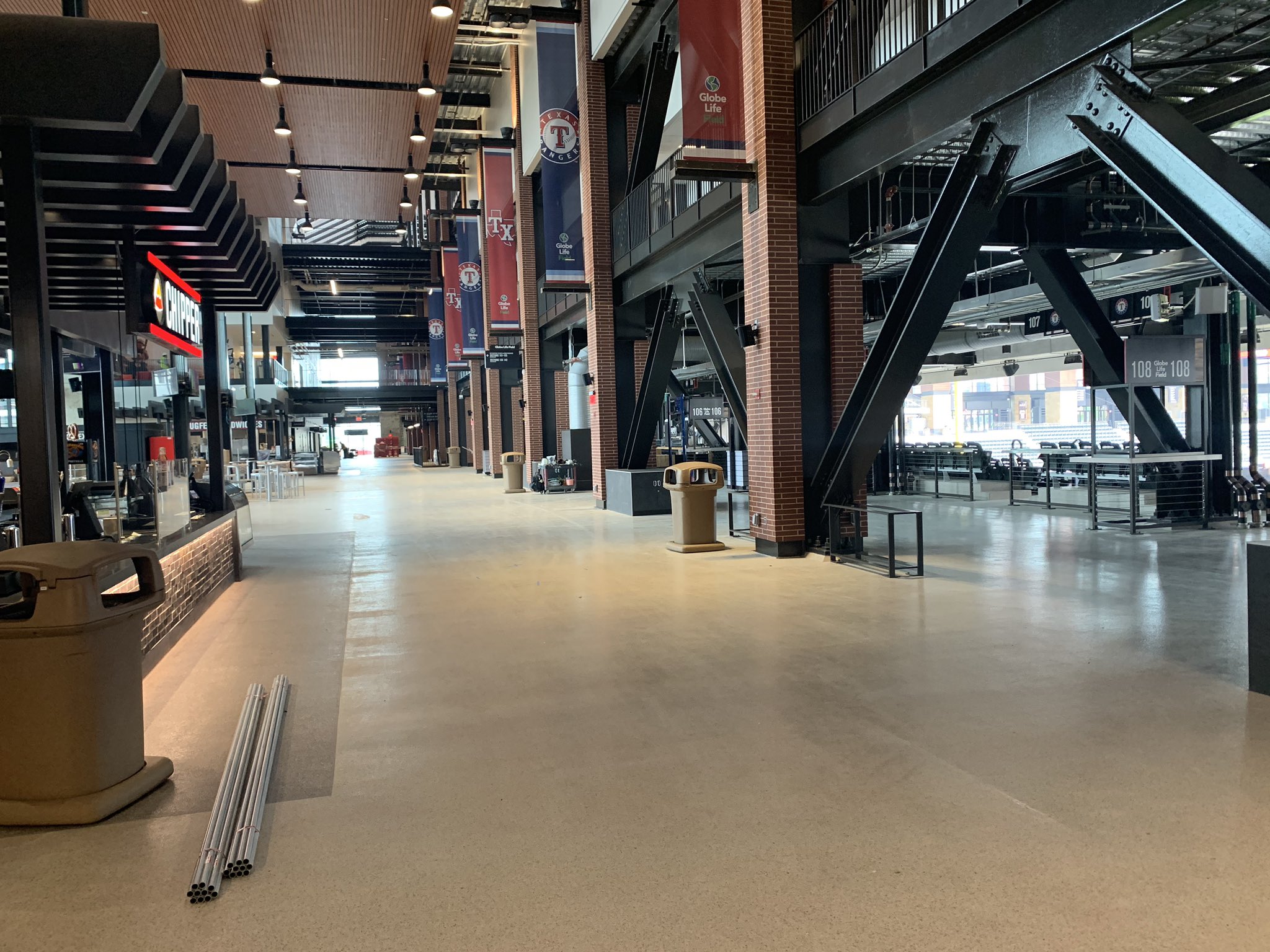
This may not be the sexiest thing, but Globe Life Field’s biggest advancement may have to do with the seats themselves. Retro ballparks actually made things worse for the average fan in this respect, with 18-inch seats traditionally filling out many non-premium areas.
Almost all non-premium seats at GLF are 20 inches, even in the nosebleeds. More foot room between rows as well. All lower level seats in between the foul poles are padded, and even non-premium seats are padded in the home plate mezzanine section. GLF will earn a rare 5/5 on our scorecard for “seat comfort.”
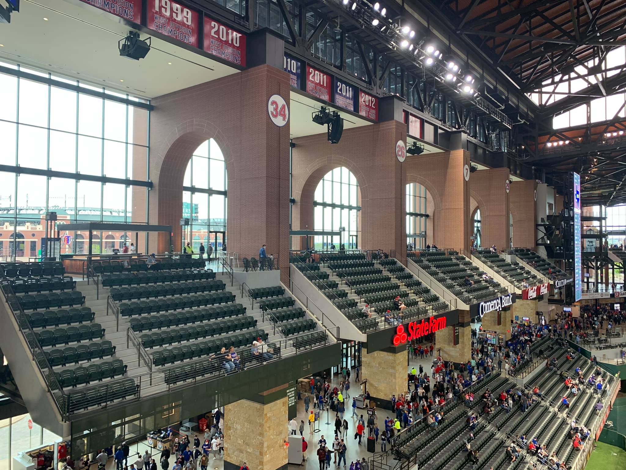
Globe Life Field’s concourse design is aesthetically and logistically excellent. I love that the “main” (second level) concourse maintains the open, airy feel of its predecessor. I wish the Rangers had utilized ETFE more extensively in the seating bowl, but it’s very well done on the concourses.
Unlike other retractable-roof ballparks that can feel dark when walking around, natural light flows into the main concourse from the ETFE panels through openings in the upper level. I think this design is superior to the traditional stacked floors of concourses, which make the main floor feel drab.
While suites block GLF’s premium District concourse, the main and upper deck concourses are open to the field, a popular ballpark feature that was lacking at The Ballpark in Arlington. In addition to the obligatory 360-degree navigability of the main concourse, the upper concourse wraps all the way around as well. This is the first modern baseball stadium to have two 360-degree concourses. The main concourse is very wide, although the upper concourse can get tight in some areas.
Finally, Globe Life Field features the cutting-edge tech and video systems one would expect from a new park. Overall, it’s just a functionally well-designed structure.
___Despite my complaints about the lack of more extensive team historical references, Globe Life Field has a much stronger regional flare than I expected.
The dimensions inspired by Rangers greats, aforementioned “Shadow Boxes” in left field, player murals throughout the main concourse, various pieces of memorabilia, numerous artistic displays, and obligatory statues on the outside at least make an effort to pass the “Where Am I?” test, something you wouldn’t know based on architecture and interior aesthetics that lack a sense of place.
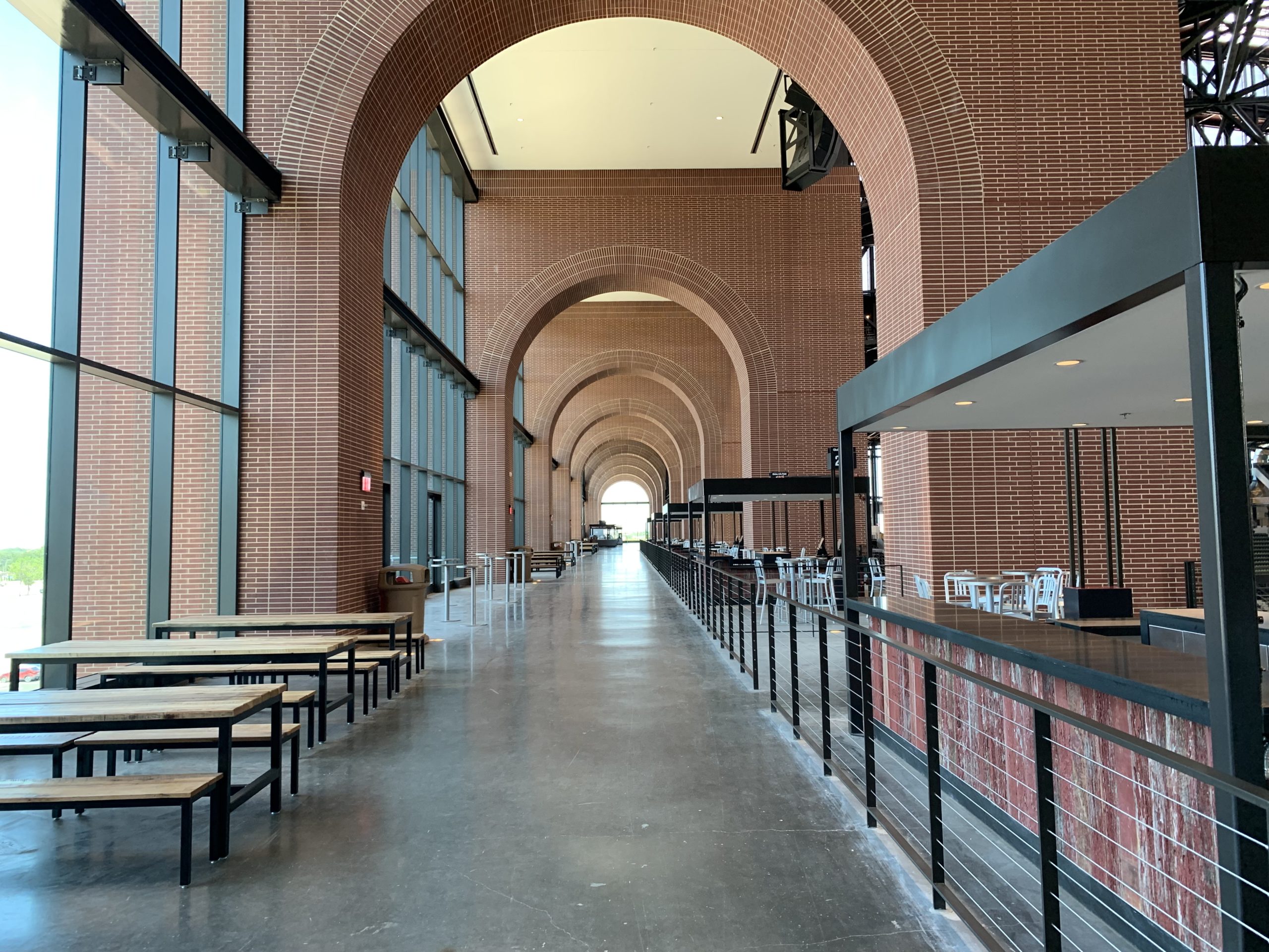
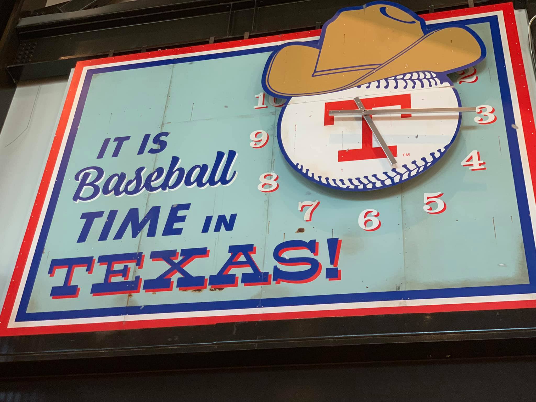
There’s some piece of Rangers branding at every corner. Even with Globe Life Field’s pedestrian design and multi-purpose, event-focused philosophy, you do know what baseball team plays here when walking around.
There are some other positive odds and ends I want to mention.
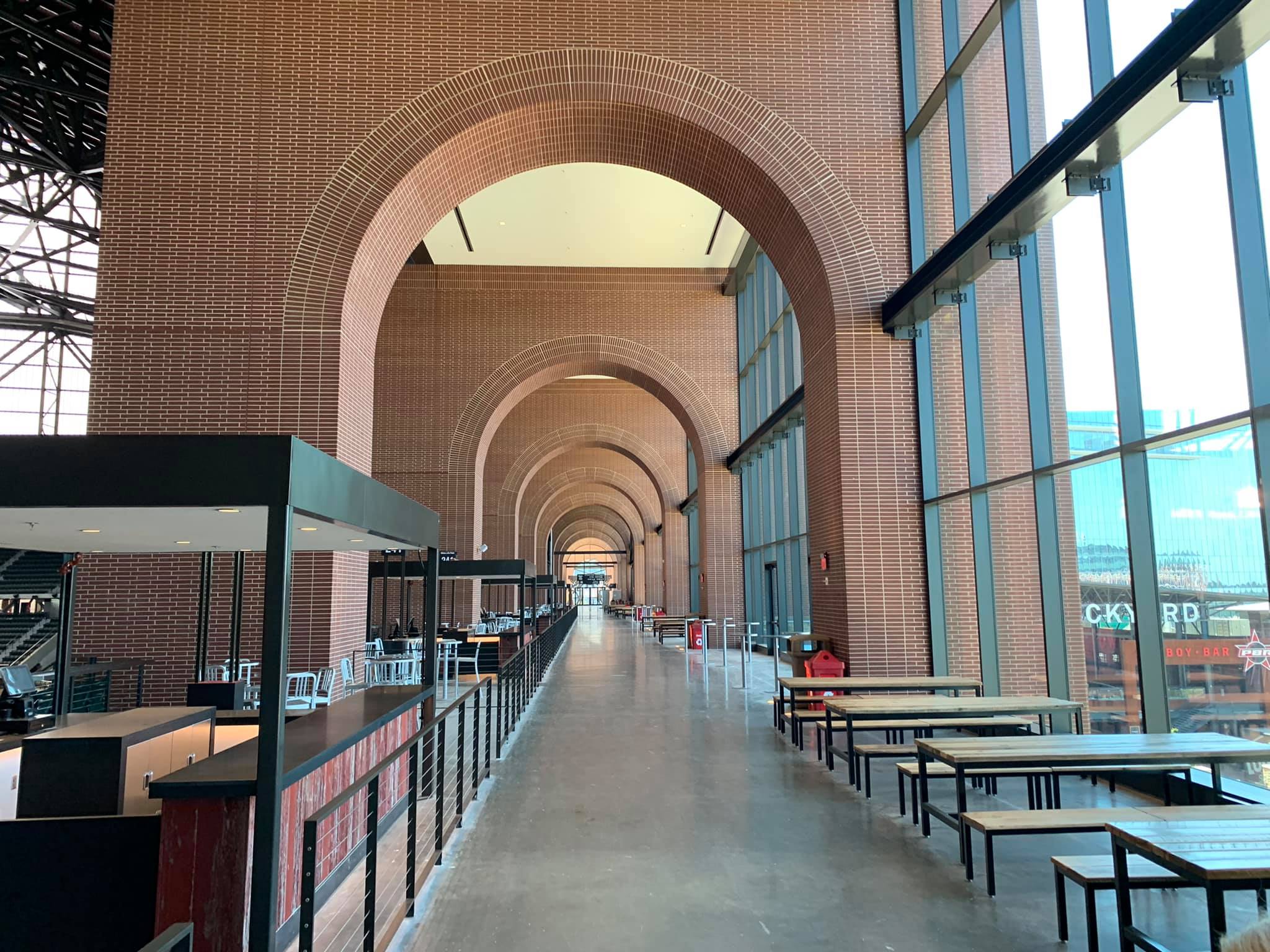
The archways above the skybridge on the upper concourse are gorgeous. The cantilevered left field bridge seats will make for an awesome vantage point. While these privately controlled pseudo-cities popping up around ballparks are problematic, Texas Live! is a lot of fun, even if it’s not yet at the level of a Battery Atlanta, much less an authentic urban scene. All of the first-come picnic seating on the concourses is welcome. The grass may be fake, but it does look real in person. Finally, I love the unusually prominent PA booth on the main concourse for Chuck Morgan, a nice gesture for one of the best in his field.
All of this, certainly the better sightlines, well-designed concourses, climate control, and generally increased comfort, elevate Globe Life Field above the bottom of the barrel ballparks.
How does Globe Life Field compare to other Major League ballparks?
Not well, even after getting the full gameday experience throughout multiple days post-COVID.
Globe Life Field is demonstrably better than the three dilapidated stadiums in Oakland, Tampa, and Toronto. It’s better than the aging and now poorly maintained Angel Stadium. I’m fairly comfortable saying that GLF should rank higher than the three post-1990 venues that I see as merely passable in Chicago (White Sox), Arizona, and Milwaukee (yes, I know, sorry Brewers fans).
That’s where I’d stop. Better than those listed above, but probably slightly worse than the “lower middle of the pack” ballparks like those in Cincinnati, New York (Mets), Houston, and Miami. So, Globe Life Field would probably be placed #20/27 in my rankings as I traditionally do them (I don’t compare the classics Wrigley, Fenway, and Dodger to the 27 others), or #23/30 if I included the classics. You can see our full ratings/rankings piece here as of 2019.
Closing Thoughts.
Considering the price tag and the expectations that come with a brand-new baseball park, that’s frankly pretty bad!
Whenever a new stadium opens, it’s reflexively showered with praise. Mandatory bromides like “state of the art” and “architectural marvel” get thrown around. Newspapers then report that the facility has received “rave reviews.”
Underachieving cookie cutters from the 1960s and 70s were met with critical acclaim too. People forget this, but even the now derided (somewhat unfairly in my opinion) Marlins Park in Miami opened to “mostly fawning architectural reviews” with fans “in awe” of its contemporary architecture.
While industry response has been muted due to much more important coronavirus concerns, perhaps rendering this exercise unfair, that has not been the case with Globe Life Field.
Clouded with financing controversies, Globe Life Field represents the worst trends in modern stadium design: pedestrian (at best) architecture, interior aesthetics so boring and revenue-focused they look like they were crafted in a boardroom, privately-controlled mixed-use development that synthetically manufactures the spirit of an authentic urban ballpark, and a seating structure designed to exclude common fans from the lower bowl more than ever before.
While not completely lacking in redeeming qualities, Globe Life Field is ultimately a $1.2 billion failure of imagination and the most disappointing new Major League venue since New Comiskey Park in 1991.
Let’s hope the Rangers don’t read this review and spend more taxpayer money in 25 years to replace it!
Setting
TBD or N/A. Since I was able to review the full, in-person gameday experience post-COVID, I may import some material from the main page to here or add new material.
Architecture & Aesthetics
TBD or N/A. Since I was able to review the full, in-person gameday experience post-COVID, I may import some material from the main page to here or add new material.
Functionality & Essentials
TBD or N/A. Since I was able to review the full, in-person gameday experience post-COVID, I may import some material from the main page to here or add new material.
Amenities & Features
TBD or N/A. Since I was able to review the full, in-person gameday experience post-COVID, I may import some material from the main page to here or add new material.
Atmosphere, Vibe, & Policies
TBD or N/A. Since I was able to review the full, in-person gameday experience post-COVID, I may import some material from the main page to here or add new material.
Conclusion
TBD or N/A. Since I was able to review the full, in-person gameday experience post-COVID, I may import some material from the main page to here or add new material.
Summary
TL;DR? Here’s the long-form piece in a nutshell:
Let’s get one thing out of the way: I love all ballparks. I did not create this site to hate. I’ve already had great times at Globe Life Field, and it has some redeeming qualities.
But it is the most disappointing new MLB ballpark since New Comiskey in 1991, combining many of the worst trends in stadium design.
First of all, GLF follows the Truist Park (Atlanta) mallpark model of building an almost offensively generic stadium and attaching it to manufactured mixed-use development. Prioritizing utility over charm, dubbed “more Events Center than Ballpark,” GLF has no design goal beyond generating revenue and fabricating experiential aesthetics, with little attention paid to timeless visual aesthetics.
The much-maligned exterior façade ranges from ugly to pedestrian, lacking any distinctive design cues. Think warehouse attached to a suburban office park. Even in its best spots, this could be an expansion team’s ballpark in “Anywhere, USA.”
The interior is totally nondescript, bereft of any signature elements, interesting views, or overarching aesthetic vision. Compared to retractable roof ballparks in Houston or Seattle that sport skyline views when open, or the much more innovative new retractable roof concepts out there, GLF falls short. Zero personality. The sole bright spot are the archways on the left field concourse, but crucially, they not visible from the seating bowl.
The salience of GLF’s lack of aesthetic character and charm is heightened because it replaced the beautiful Ballpark in Arlington, which had curb appeal rivaling any ballpark in baseball outside and a distinctive white steel backdrop inside.
Even for an aesthetically uninspired mallpark, GLF isn’t even a fun mallpark for the average fan, because most of the amenities are concentrated toward premium. That stings.
While improved for 2022, the food options are terrible; the craft beer is below average; the park mostly lacks destination social spaces throughout the concourses; there are no in-park, non-premium restaurants; the team historical tributes aren’t extensive; and the kids’ area is one of MLB’s most rudimentary. I want to emphasize that this was all planned before COVID-19. The Rangers point to Texas Live! outside the park, but there needs to be more within GLF’s confines.
Compare this Atlanta’s Truist Park, where the fan-friendly features inside the park are so elaborate that they offset the pedestrian mallpark structure.
Perhaps most importantly, GLF has the most fan-unfriendly seating bowl design in baseball, where fans cannot access the entirety of the lower bowl and lower bowl concourse in between the foul poles without an appropriate premium ticket! That’s even worse than Yankee Stadium, which has been much-maligned on this point.
On the plus side, GLF is functional, and I don’t mean that as an insult. Climate control. Excellent sightlines. Wide seats. Not one, but two wide 360-degree concourses open to the field. Top-of-the-line tech. And some other bright spots listed in the “hits” column below.
In sum, GLF is defined by 1) its mallpark philosophy, 2) unremarkable aesthetics inside and out, 3) poor amenities for regular fans, and 4) a fan-unfriendly seating structure designed to exclude regular fans from the lower bowl unlike ever before.
Sure, fans are now out of the heat, but at what cost? $1.2 billion, actually! That’s a lot of money for air conditioning and a structure that has less character and is less fan-friendly than its predecessor!