


HoHoKam Park (old Cubs spring park)
| Setting | 6.5/10 | |
|---|---|---|
| Location/Access | 6.5/10 |
| Architecture & Aesthetics | 17/28 | |
|---|---|---|
| Exterior Design/Aesthetics | 5.5/10 | |
| Interior Aesthetics/Visuals | 10/15 | |
| Concourse Aesthetics | 1.5/3 |
| Functionality & Essentials | 16/25 | |
|---|---|---|
| Sightlines | 7.5/10 | |
| Seat Comfort | 2.5/5 | |
| Concourse Functionality | 4.5/7 | |
| Scoreboards/Tech | 1.5/3 |
| Amenities & Features | 14/20 | |
|---|---|---|
| Concessions | 9/10 | |
| Premium/Group Seating | 2.5/4 | |
| Social Spaces | 2/4 | |
| Kids Areas | .5/2 |
| Atmosphere, Vibe, & Policies | 13/17 | |
|---|---|---|
| Ballpark Personality | 7.5/10 | |
| Fan Support | 5/5 | |
| Ballpark Policies/Staff | .5/2 |
| Bonus | 5 |
|---|---|
| Final Score | 71.5 |
|---|---|
| Ranking | AZ: N/A Overall: N/A |
|---|---|
The New Comiskey of Spring Training
While I originally thought replacing a facility that opened in 1997 was absurd, the Cubs may actually have a point, as the bland and sterile HoHoKam simply doesn’t measure up to other parks of it’s time
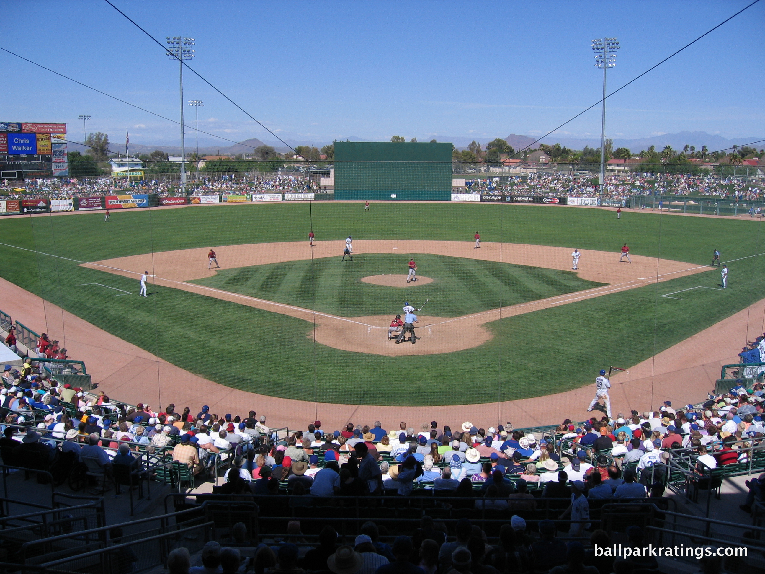
Game in March 2005: Field Box
March 6th, 2011: Field Box
Written in 2011.
***IMPORTANT NOTE: The Cubs trained at HohoKam Park from 1997 to 2013. They moved into Sloan Park in 2014. The Oakland Athletics moved into this facility, now formally called HohoKam Stadium, in 2015. Because of the peculiarity of one team’s old spring training home undergoing renovations for a new team, I have decided to keep this page under “Chicago Cubs”, and create a new page for the Athletics’s HohoKam Stadium under “Oakland Athletics”, even though it is the same park as this one.
Click here to go directly to gallery
By: Cole Shoemaker
I usually don’t review (or go out of my way to see) ballparks that are about to close, unless there is some sort of historical significance obviously. But Hohokam Park, and the situation the city of Mesa was going through, was something I had to see.
I’m not one to complain about wasteful spending on new, unnecessarily ballparks, that in all honesty, likely won’t jumpstart significant economic development in the area. We’ve looked at the research. But I don’t care. That’s not my game (I usually fall for the civic pride argument). Unless there’s significant historical attachment, give me a new ballpark!
But even I found this one ridiculous. Replacing a ballpark built in 1997!?!? Why? (some claim it’s technically a renovated version of the old one, but that’s not really true). I knew spring training ballparks had a historically short lifespan, but these new 90s ballparks were meant to be more economically sustainable and attractive.
I looked at the blue print: It has suites. It has party decks. It has a wraparound concourse with berms. The existing structure easily allows for upgraded amenities and renovations. What’s the beef? The Cubs were being frivolous, unfairly leveraging their large, multigenerational fan base for an unneeded new facility from a cash-strapped city like Mesa.
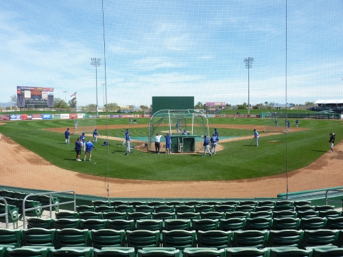
And then I actually went to the ballpark. My answer ultimately fell somewhere in the middle. As ridiculous as I found Mesa throwing 84 million at a new facility, I was just as amazed at just how boring, uninspired, and sterile the entire existing ballpark was, in every single way (save the fans).
The exterior concrete couldn’t be more tasteless and muted, and not in a 80s utilitarian kind of way, but in an imagineless way. The interior is the same, characterized by an oddly lazy and vague southwest sensibility illustrated by the grandstand façade and steel canopy. The seats are as narrow as they come. No cup holders anywhere. The concourses are dark and dingy. The aisles behind the seats and the bullpens all have aggressive, unfriendly “NO STANDING” signs. Circulation is confusing and randomly cuts off a certain points, reminiscent of a jewel box park constructed piece by piece as years went by.
Oh, yeah, and how about the fact that the concourse leading from the grandstand to right field is randomly cut off by a passageway, which is fenced off during batting practice. In fact, you can’t even access the berms during batting practice. And to top it all off, it’s across the street from a f-ing cemetery!
Yet it’s oddly just adequate enough in many ways as well. I couldn’t imagine a place with less character, which is especially salient because the Cubs play here. It’s the perfect storm of banality. Even its namesake screams identity crisis. Hohokam Park and Hohokam Stadium are used interchangeably; the two names even have two different yelp accounts! How does that happen? I’ll take a dump with character over this.
It’s not like this was spring training circa 1985. By now, it had become a big business, not drastically different from now. Ballpark’s didn’t look like concrete ice boxes from the outside anymore. Roger Dean Stadium (1998), Tucson Electric Park (1998), Maryvale Baseball Park (1998), Disney Complex (1997) and Legends Field (1996) all have, or had, a certain aesthetic vision and overarching goal in their architecture. Peoria Sports Complex (1994), the pioneer, tops Hohokam in almost all categories. Even Hammond Stadium (1991) shows a superficial exterior façade can make a park timeless.
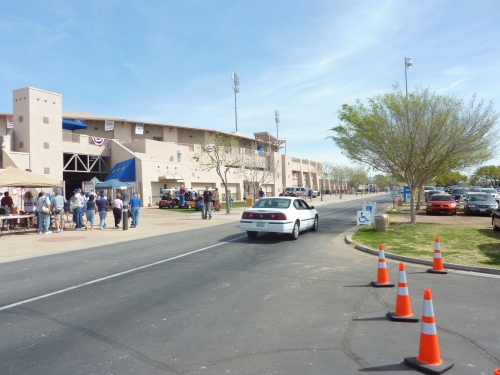
In every single design aspect, from the concourse circulation logistics to the architecture, they were behind from the start. What’s most astonishing is that they built this crap for the Cubs. Who was responsible for building a facility with such a lack of vision and timelessness? I find it hard to believe Cubs fans weren’t somewhat angry when comparing their new digs to others in 1997. I can’t find any negative articles (well at least Shawon Dunston didn’t like it), but I’d like an answer.
During the 1990s, new spring training ballparks replaced predecessors that didn’t have fold down seats (sometimes), suites, party decks, berms, 360 degree concourses, small video boards or even multiple concession stands. The novelty was simply having a ballpark that had a semblance of major league amenities.
The leases of these aforementioned “super stadiums” of the 90s, a term coined by the folks at Digital Ballparks, are now expiring, and teams have the option to renegotiate with the county. These ballparks originally changed the game, featuring attractive facades and major league amenities. But Camelback Ranch changed the game again, and not all of these 90s ballparks will last. The Cubs moving from Hokokam Park/Stadium and the eventual renovation of it shows that rudimentary amenities are no longer enough, as sustainable ballparks must have some sort of design character. As history will tell you, the turnover rate for spring training ballparks is remarkably high, often lasting only 12-15 years.
This latest event shows the 90s “super stadiums” aren’t totally immune to this trend, and a couple of them won’t last. I point this out because it used to be unimaginable that teams would leave any of these fantastic parks in only 15 years like they did with their previous parks (think Disney), as they were deemed more sustainable like the 90s major league retro stadiums. Luckily, I think most of the 90s ballparks did a great job, as teams will renew their leases. But in retrospect, Hohokam Park was clearly the weakest link.
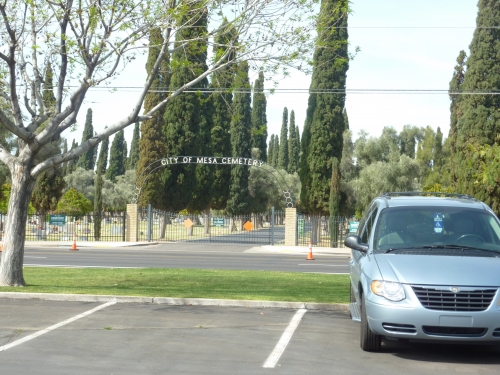 Nothing screams Wrigleyville like City of Mesa Cemetery!
Still, like New Comiskey, they should probably be renovating, not replacing. And it looks like they will be, but for the Athletics. It’s widely acknowledged to be adequate, and after we see the renovations for 2015, the park will be at least functionally superior (there’s talk of building a “grotto bar”!) But after actually attending the game and absorbing the stale architectural vibe, I don’t really care. And while you’re at it, decide on a name.
Setting
Access/Location/Local Scene:
While no one is mistaking Mesa for Scottsdale, the location of HoHoKam Park leaves a lot to be desired. It’s located in a relatively nondescript residential area of the town, most commonly defined by the bleak City of Mesa Cemetery across the street. That’s right, a cemetery. It really sets the tone for an unexpectedly lifeless experience, as you would think the area would want to emulate Wrigleyville.
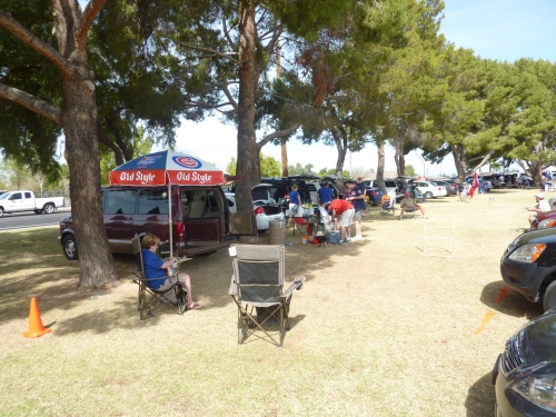
When you park on the stadium sponsored grass area on the left field side, you’ll note that the ballpark is technically in a neighborhood, albeit one that has lost connection with the facility in recent years. While neighborhood parking used to be more common, today signs on local streets indicate parking is not welcome.
Score: 6.5/10
Total: 6.5/10
Architecture & Aesthetics
Exterior Design:
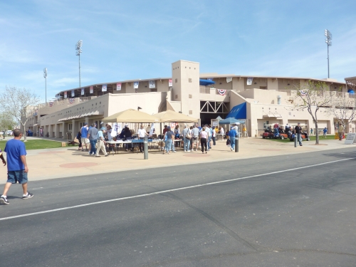
As mundane as Hohokam Park is as a structure, its actually somewhat of enigma that’s difficult to describe. The utilitarian spring training parks of the 80s had no pretense of aesthetic attractiveness, often not even having a façade. After Hammond Stadium opened in 1991, spring training ballparks got more attractive, with varying degrees of success.
Hohokam Park, like the others of era, appears to be self consciously aware of this. But unlike the others, the Cubs spring training facility looks like it did the least work possible to meet aesthetic standards, awkwardly falling somewhere in the middle of the 80s utilitarian ballparks and the 90s attractive ones.
It’s not elaborately executed like the gorgeous Disney complex. It doesn’t have the immaculate Floridian landscaping of Roger Dean Stadium. It doesn’t have the sandstone southwest appeal of Peoria Sports Complex. It’s not minimalist like Maryvale Baseball Park. It’s not spartanly imposing like Steinbrenner Field, which at least has some sort of overarching design ethos. HoHokam has no architectural design plan. It screams, hey look, I’m a brand new spring training ballpark with a nice façade that kind of looks like it’s southwest.

By this time in the 90s, the other ballparks had actual architects (well, debatable, but you know what I mean) design these others ballpark. It looks like city planners designed Hohokam. It looks like it lazily wants to fall in this group, but obviously made no genuine effort to do so.
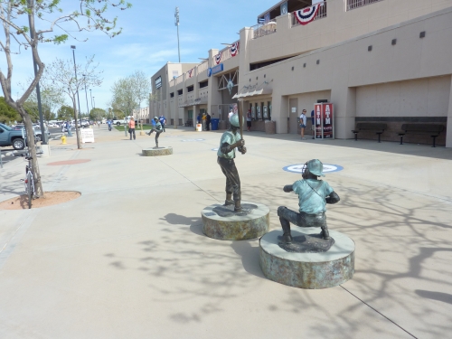
The concrete has a hint of southwest stucco flare, a comparatively sad attempt to capture the regional architecture. It’s simply a straight up concrete façade painted in cream. They do add some random geometric squares periodically throughout the structure, as well as some actual stonework at the bottom of the façade. One relatively nice feature is the obligatory set of statues, which in this case are of kids playing baseball.
Sure this is nicer than something built in the previous era, but the point I’m trying to make is this opened in 1997, the same year this opened. The way it makes a meager attempt to look southwestern actually contributes to its blandness, and almost prevents it from entering campy ugly utilitarian concrete territory. This looks like it was a bland precursor to the more attractive mid-late 90s ballpark, a la New Comiskey in 1991. Ultimately, it’s a mess. A complete failure of the imagination. A faux mimicry of southwestern architecture.
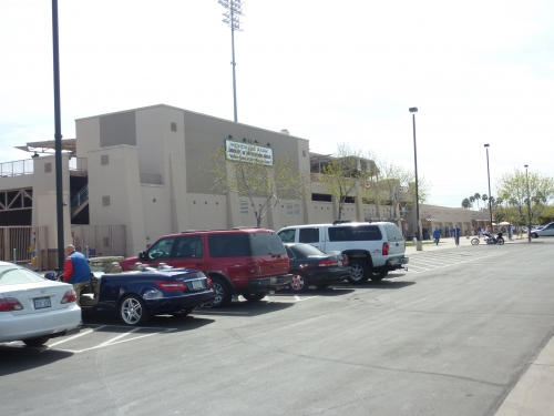 Ugly ice box of a facade melting in the desert.
Of course, a comparatively underwhelming exterior doesn’t make it bad ballpark. But it perfectly represents the ballpark as a whole, which is an undoubtedly soulless experience other than the fans. Compared to other spring training ballparks, it’s a boilerplate monstrosity. And to be fair, this is just a much a testament to how good the other spring training ballparks are of the era.
I probably won’t analyze spring training architecture this much, but this park was unique in what it represented. Also I’ve probably been a bit tough because 1) this opened in 1997, and perhaps more importantly 2) this was built Cubs, and they deserve the best for their great fanbase and high turnout.
Score: 5.5/10
Interior Aesthetics:
While the interior is similar in substance to the exterior, HoHoKam Park’s saving grace is the beautiful mountain views, like many spring training ballparks in Arizona.
That being said, the interior aesthetics simply don’t live up to other current spring training ballparks. I’m not completely sure what causes this, other than the bland architecture, but the interior grandstand always looks muted, perhaps because of the huge crowds.
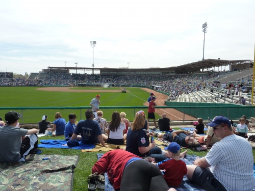
The brickwork on the cross section façade is barely visible, because the second deck is too close to the cross aisle. As outlined at length with the exterior, the beige trellised canopy looks artificial and the southwest motif is poorly executed, lazily trying to look it belongs in the desert, when in reality characterized by painted concrete beams. Compare this infield grandstand to the look in Peoria Sports Complex (common, it’s spring training, the standards aren’t that high).
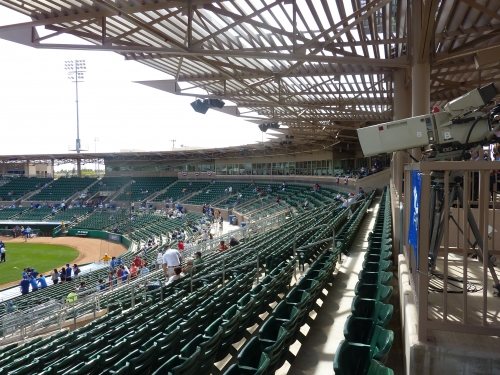
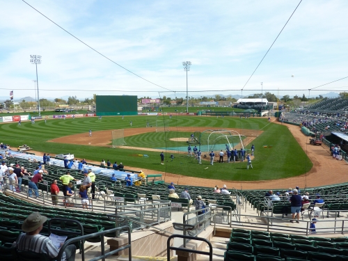
The outfield scene doesn’t look particularly coherent, either. But for a spring training ballpark, I get that sounds kind of arbitrary. But the temporary look of the party deck in right field, the strikingly functional look of the larger than usual batters’ eye, and the numerous adds on the outfield wall contribute to this feel. It is true that from the upper sections the views of the Superstition Mountains are gorgeous, particularly from the first base side in between the scoreboard and the batters eye. Although the views from third base side are similarly nice.
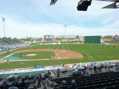
Finally, I was surprised by the cheap use of materials on the interior. And that’s not a tacky statement to add on to a critical review. As noted, the batters eye is maladroitly integrated into the interior, even in comparison to spring training parks. But what I’m talking about is how all of the section number indicators and other ancillary signs are made of disposable materials attached to a metal pole. For a newish ballpark, why is this not permanent? Is section 101 not always section 101?
Aesthetically on the inside, HoHoKam is not a disaster. It just needs an infusion of character (and paint), and the renovations for the Athletics will certainly bring that.
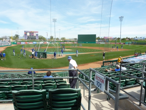
Some may say the Cubs are leaving this ballpark simply because they are the Cubs, and they have the leverage to demand a new facility from Mesa. But as I alluded to earlier, these assumptions (and mine originally) are wrong: not only was this facility not fit for the Cubs, but any team looking for a sustainable 90s ballpark.
Score: 10/15
Concourses:
The main concourse is particularly dark and dungy, especially for a spring training facility. Except for the entry portals, beige brick encloses both sides of the concourse contributing to a claustrophobic vibe. The red ceiling is kind of nice, though.
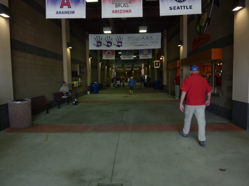
Score: 1.5/3
Total: 17/28
Functionality & Essentials
Sightlines:
There isn’t much differentiation between the sightlines at these small spring training parks, and Hohokam Park is no exception. All of these ballparks have similar seating formulas, most of which are at least adequate.
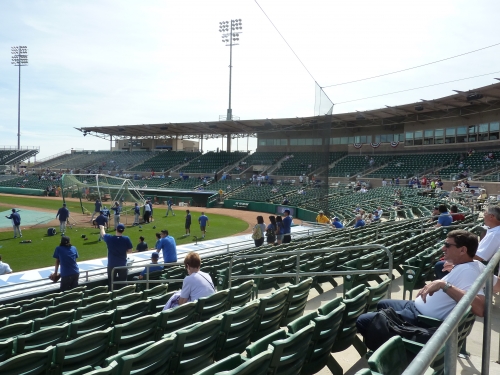
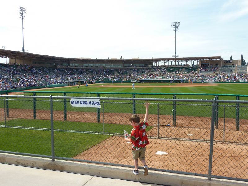
One odd flaw at Hohokam is that the bleacher sections are broken off from the main grandstand down the lines. Also, the seats down the lines are not well oriented toward the playing field, but I guess because they are bleachers, there isn’t much you can do. Unlike some of the newer parks, the berm isn’t steep enough to provide good sightlines.
Score: 7.5/10
Seat Comfort:
Compared to similar ballparks built during the same time period, the seat comfort is surprisingly poor, which is to some extent unavoidable.
First of all, because of the large crowds and the desert sun, the seats are heavily fading and very warped. You won’t see green HOK seats in this condition anywhere else. More seriously though, the seats are extremely narrow throughout the ballpark, perhaps in an effort to increase capacity. These are some of the tightest seats in the Cactus league. Naturally, and unacceptably, all seats are lacking cup holders.
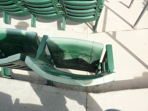
Finally, there is an overabundance of bleachers, even in the infield grandstand. I understand some bleachers in the outfield, but why do sections 213-218 have bleachers as well? Even though I’m always tough on seat comfort, this score may still seem a little low, but when comparing to some of the newer parks, I have no choice.
Score: 2.5/5
Concourses:
A number of different aspects of this park indicate its inadequacy for a spring training facility that opened in 1997, but perhaps no feature is more emblematic of this inadequacy than Hohokam Park’s disjointed concourse system.
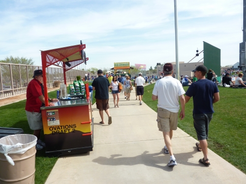
On the surface, it’s not too bad. Of course it’s a closed concourse system without views of the playing field, but it’s also a bit narrower than you might be used to, and especially dark as previously mentioned. But by and large, the system seems average around the infield. Unfortunately, when you walk down the lines on either side, you’ll notice some odd discontinuities. On the third base side behind the bleachers, there is an array of nice concession kiosks, but you’ll note the area doesn’t directly connect to the outfield berm. To encircle the park from the third base side, you have to go in front of the bleachers.
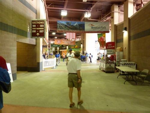
The first base side is even weirder, as the concourse completely ends before the bleacher section. The area behind the bleachers on the first base side is for players only, meaning there is no concourse on half of the first base side. Essentially, the walkway in front of the bleachers is your only access point. If you want to encircle the ballpark, you have to exit through a portal right past first base as the concourse ends and use the cross aisle walkway. How unusual and peculiar for a contemporary facility.
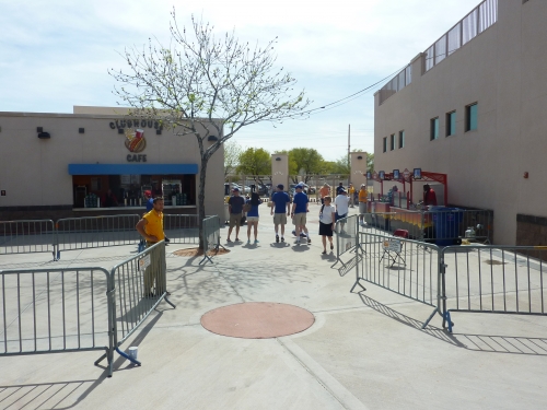
To add insult to injury, once you reach the picnic enclave in the right field corner (where the Rubio’s is last time I checked) after the walkway in front of the bleachers, there is no direct connection to the outfield concourse. You have to cross an odd cement street-like walkway to access it, which can easily be fenced off. As I will mention later, this system allows the Cubs to easily restrict access to the outfield concourse, which they do during batting practices.
There is also a small enclave above the 200s behind first and third base respectively housing a concession stand and a restroom, which helps to reduce constant crowding. While providing nice views of the playing field, standing is not allowed.
Ultimately, the funny thing is the concourse here is better than many in the Grapefruit League, simply because you can walk all the way around the ballpark (technically).
Score: 4.5/7
Scoreboard System:
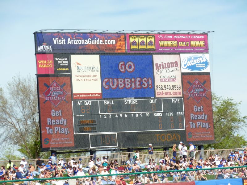
Once touted as the largest scoreboard in the cactus league, HoHoKam Park’s monster is relatively tame by today’s standards. While the structure itself is large, the technology within it isn’t particularly impressive. A small Daktronics video board lies in the middle, flanked by two decorative vertical ancillary boards used for adds to the bottom left and bottom right. The line score below the video board is done with light bulb matrix technology. There is no pitch speed meter.

Score: 1.5/3
Total: 16/25
Amenities & Features
Concessions:
Hohokam Park has an unexpectedly above average selection and quality of food, particularly highlighted by the dazzling display of unique items behind the left field bleachers and the Rubio’s in right field.
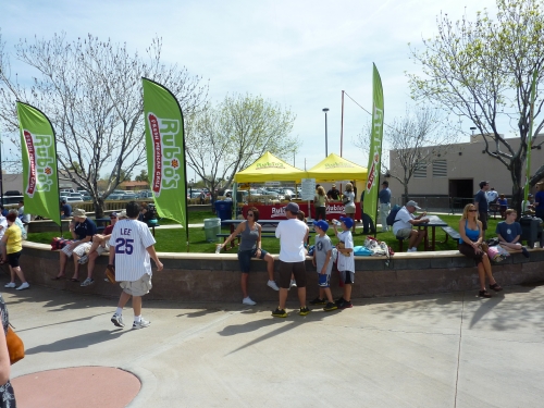
In terms of high quality Mexican food, the Cubs made an excellent decision bringing in Rubio’s as of last year, which is undoubtedly the best of such cuisine in the Cactus League. Grilled chicken tacos, burritos, and quesadillas are served, complemented with chips and your choice of salsa of guacamole. Churros are also available. The highlight is Rubio’s World Famous Fish Tacos, which are served beer-battered baja style with cabbage, mild salsa, and tangy white sauce. Let’s hope they stay at Hohokam in the future.
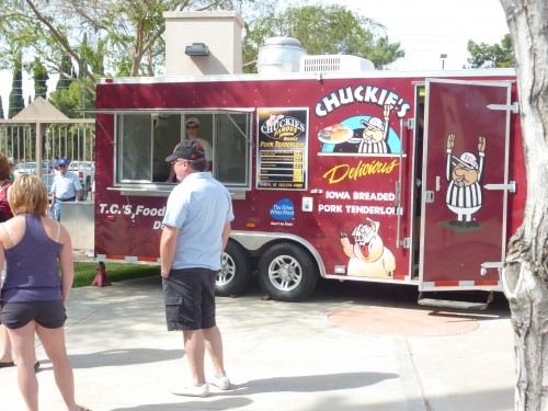
The area down the 3rd base line has some nice options as well. The local Tocabe American Indian Eatery serves bison Indian fry bread, as well as vegetarian and powered sugar fry bread. Chuckies serves their famous Iowa pork tenderloin, served with waffle fries. Now becoming somewhat ubiquitous throughout the Cactus League, the award winning Island Noodles serves wok fired soba noodles at an addition freestanding tiki-like kiosk.
The regular concession stands on the main concourse are fairly standard, but does include burritos and a BBQ pork sandwich. In terms of hot dogs, look for the Chi-Town Dog (onions, peppers, sweet relish, tomatoes and mustard) and the Mesa Dog (chili, cheese, fritos, jalapenos). I got the latter, and it was pretty adequate. There is an excellent selection of cocktails in this ballpark, highlighted by the stand on the main concourse by 1st base.
Score: 9/10
Premium Seats/Party Decks:
While obviously not a serious deficient, the premium seating options at Hohokam Park aren’t particularly creative or high quality. In this era, simply having luxury suites in a spring training ballpark was the novelty, and the Cubs have 6 of these sparsely appointed boxes. True, they are not the rudimentary “skyboxes” from the 80s, but they certainly don’t rival the luxury suites today.
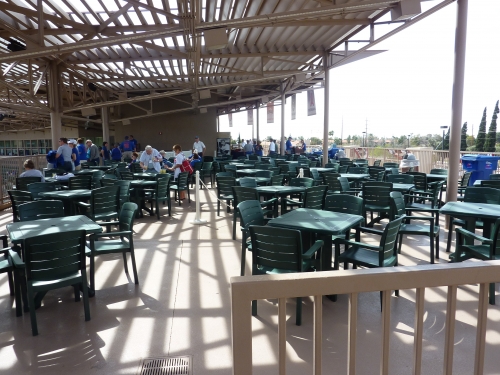
The Cubs also have two outdoor patios on each side of the press box, which look expectedly basic. Fitted with white plastic picnic chairs under a tent, the 250-person Budweiser Party Deck in right field looks like it was added as an afterthought, and doesn’t come close to approaching some of the newer party areas in spring training.
Score: 2.5/4
Restaurants/Bars/Sitting Areas:
For spring training, the Cubs do a nice enough job providing fans with a place to sit down and relax.
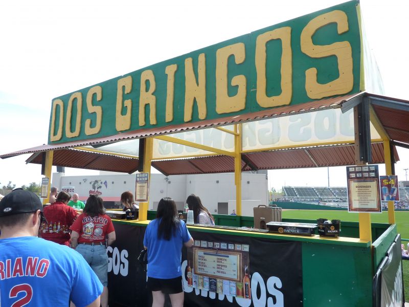
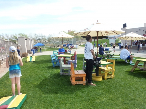
My favorite place is the Dos Gringos Bar in left-center field behind the berm. Serving cocktails, beer, red bull, and shots, the bar includes a sit down picnic area of covered decorative Mexican tables and chairs. The circular grass area with the Rubio’s stand in right field has picnic tables and there are benches on the main concourse.

Score: 2/4
Entertainment/Miscellaneous amenities:
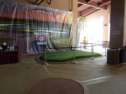
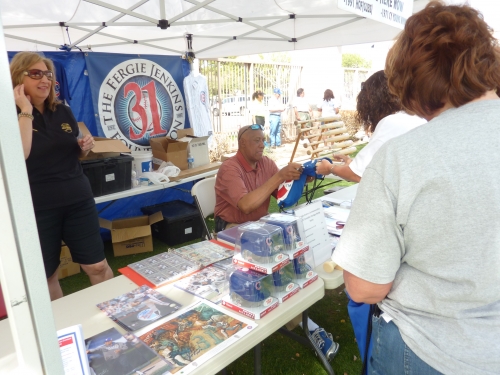
Compared to the newer parks with playground and mini baseball fields, the entertainment at Hohokam is relatively tame, but there are some cool features. Behind the aforementioned Dos Gringos Bar, there is a beanbag toss game. Also, at the end of the main concourse on the first base side, Longbow Golf Club sponsors a mini putting green. In left field behind the bleachers, the Ferguson Jenkins foundation will often sell memorabilia for charity with Jenkins himself signing autographs. Two team shops named “the Cubbie Hole” are located on the main concourse behind home plate and third base.
Score: .5/2
Total: 14/20
Atmosphere, Vibe, & Policies
Ballpark Personality:
This is a particularly difficult category to quantify because while the structure itself couldn’t have less personality, the Cubs do a great job of dressing it up to let you know who plays here. No design features distinguish this ballpark, but there are plenty of aspects that reflect the team.
Cubs’ retired numbers are on the concrete ground outside the ballpark and there’s that relatively nice statue behind the home plate façade. Banners of historic greats are adorned throughout the concourse. Beneath the Cubs’ broadcast booth is a plaque dedicated to Ron Santo. The famous 7th inning stretch is sung every game and Old Style is on tap.
Once the Cubs get a ballpark of their own with attractive design cues fit for the team, they should have one of the best ballparks in spring training.
Score: 7.5/10
Fan Support/Attendance:
While some may say the stench of loserdom permeates the group, there’s no denying the Cubs fans are some of the most faithful in the Cactus League. While attendance has slightly decreased in recent years, the Cubs perennially top the league in this category. Every game, a fan is picked to lead the crowd singing “Take Me Out to the Ballgame” for the 7th inning stretch on top of the 1st base dugout.
Score: 5/5
Ballpark Policies/Fan Friendliness:
Other than the ballpark itself, a number of woefully unfriendly fan policies adversely affect the experience at Hohokam Park.
The ballpark opens 2 hours ahead of time, but the berm is closed until batting practice is over, meaning fans are not able to walk around the ballpark before game time or catch home run balls. Gates on either side at the end of the cross aisle restrict access. What’s the point of this? Being in the outfield is one of the best parts of batting practice.
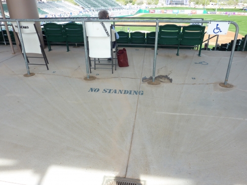
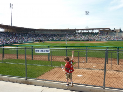
Another thing that bothers me is the general inaccessibility of many areas around the ballpark, particularly regarding standing room areas. For a facility that often has excess capacity crowds, you’d think they’d cultivate potential standing room areas. In front of the box seats in the cross aisle, you see a “do not stand at rail” sign. How about that nice open area above the 200 sections allowing views of the field? No standing! Worst of all, they don’t even allow fans to stand at the bullpen fence to watch the pitchers warm up. Most of this archaic and uncommon in the industry today, as it is common practice to encourage fans to walk around to encourage commerce (economics and fan friendly) and stand as they please at the newer parks.
To top it off, this is a particularly difficult ballpark to get autographs. Food is not allowed in the ballpark, but bottled water is.
Score: .5/2
Total: 13/17
Conclusion
Bonus:
For the wonderful Cubs fans who pack this ballpark every spring +2
For the “Take Me Out to the Ballgame” tradition +1
For being one of the few ballparks not to indulgently name the stadium after the city, but naming it after the HoHoKams, who are a local civic organization that has supported spring training baseball in Mesa for over 50 years +1
For the gorgeous views of the Superstition Mountains, especially from the first base side in between the scoreboard and the batter’s eye +1
Score: 5
Despite the lively atmosphere, HoHoKam Park still isn’t an optimal baseball experience. The great fan base cannot alone atone for the soulless yet streamlined architectural design, weird concourse system, lifeless local scene, fan unfriendly ballpark policies, and other various functional flaws.
The score may seem a bit low, but remember spring training ballparks are naturally going to have a greater variance than the major league ones. When reviewing the post 1991 major league ballparks, I often say there are no bad ballparks, and this is reflected in the rating system, where the lowest is 75.5. I’d still categorize Miller Park and Turner Field (though the tone of the Turner Field review is admittedly disproportionately negative) as good ballpark experiences.
So, is Hohokam Park a “bad” ballpark? Is this the first ballpark review where I would clearly categorize the bad as outweighing the good? First of all, this is a bit unfair, because I usually don’t review the Hohokam Parks of the world. If a ballpark were nearing a large renovation or total replacement, its not really fair to grade it because the ballpark is essentially conceding that it could offer a better experience. I went out of my way to grade Hohokam because I wanted to test this assumption and see if it is actually subpar compared to other facilities. Nevertheless, judging by the score, I would say the answer to the question is probably yes, if at worst subpar. Hohokam Park isn’t overtly inadequate in the sense of Dunedin Stadium, which is at least 2 generations of renovations behind all other ballparks, but it certainly needs significant enhancements.
So my review shows that contrary to my original expectations outlined at the beginning of the introduction, the Cubs do have a case for leaving the facility and the facility should be renovated for the A’s. Parks like Steinbrenner Field (1996), Champion Stadium (1997), Roger Dean Stadium (1998), and Maryvale Baseball Park (1998) will all score anywhere from 6-12 points higher before any significant enhancements, showing that Hohokam Park is unfortunately the black sheep of the era.
