Examining the Criticism
By: Cole Shoemaker
Written in 2011
[Editor’s Note: Click here for a full analysis of all MLB ballpark exterior architecture]
In recent years, it has become popular amongst ballpark aficionados, fans, and architectural critics to bash HOK (Populous) and some of the new retro ballparks, as the style has become more blasé.
First off, it should be noted that the general public is happy with most of these ballparks, and HOK (Populous) has done a great job appealing to the current sensibilities. But critics demand more. Criticism ranges from the fact that they all look too similar in their design, or to the fact that the upper decks are pushed too far back. While I will examine some of the functional complaints in other articles, right now I want to focus on the overall consensus regarding the style and architecture of these ballparks.
By the late 2000s, the general consensus among enthusiasts is that this neoclassical revival in ballpark construction became a tired trend.
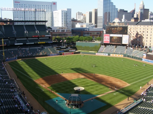
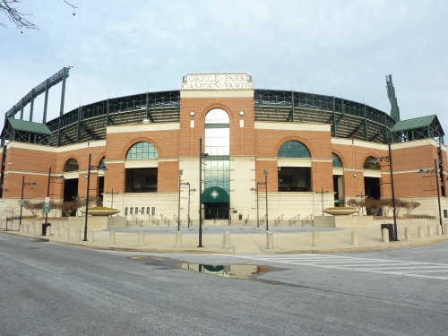
Like many of the cookie cutters, these ballparks will eventually go out of style. There is a general sentiment that some of these retro ballparks are too similar in style and lacking imagination, contributing to the reputation that they are more like the cookie cutters of the 1970s than one might think. Also, many assert that these retro parks lack authenticity and come off as contrived or gimmicky as a method of distinguishing themselves. I elaborate more on that here. The claim is, HOK (Populous), among others, have used the same template since Camden Yards and designed very little that is original.

First of all, it is important to remember that while the movement is a trend, the backlash against it is also a trend, a trend that has developed in theory for some time, but is just now coming to fruition. Time, and solely time, will shape the perception. Right now, it is fashionable in some camps to bash HOK (Populous) and some of the new ballparks.
Objectively, the true 70s cookie cutters were far more formulaic, relying on the same literal cookie cutter-like skeleton every time. Even each red brick ballpark has certain exterior accents that distinguish them from each other. Interior design elements are certainly more distinct, appealing to the regional, sometimes cluttered, tastes of the area. The problem is they sometimes inevitably needed false gimmicks for differentiation. But it’s a ridiculous exaggeration so say the new ballparks are just as derivative.
However, it’s fair to say that both ballpark movements produced “cookie cutters,” in the sense that they both rely on the same respective framework each time. The new retro parks certainly use the same template, which is a problem, but superficially they deviate enough not to be mistaken for each other. The claim that new retro ballparks resemble each other just as much as the cookie cutters resembled each other is pure hyperbole and at best reflects how high are standards have become.
Still, the claim that the retro parks became architecturally derivative is undeniable. The foremost concern is ubiquity, as concerns of quality are often overlooked, simply because the retro parks represent an amazing improvement from the multi-purpose status quo.
So who’s to blame for the similarity and lack of innovation? People are often quick to blame HOK (Populous) for lacking new, creative ideas.
What is more important is that each movement is a reflection of what people want. In the first wave of retro ballparks, HOK proved it could build contextually inspired ballparks. With Jacobs Field, they proved that they have original templates, but people began demanding the standard red brick ballpark. I think the owners and the fans are not demanding anything novel in ballpark design: there is a strong disconnect between the average fan and the critic.
HOK (Populous) sticks to what they know because owners and fans like sticking to what they know.
There is a trend in our society for people to gravitate more and more toward what is popular. Skyscrapers, restaurants, and even the mainstream film industry are becoming more streamlined. With the mass dissemination of popular culture, consumers are becoming more similar, as corporations are able to convey a central message with ease. While the rise of the Internet has given everyone a voice, ironically, people have become more similar to each other as well, conforming to the mass dissemination of information. Trends in society are more easily communicated, meaning trends have a greater influence on the consumer than ever before.

This concept can be applied to architecture all over the country, sometimes with ballparks. Every city suddenly thinks they need a red brick ballpark, regardless of context. So why would HOK do something with true architectural merit? And why would the owners pick another firm or demand anything out of the ordinary?
The ingenuity that brought us Camden Yards ceased to be imaginative as architects applied the same principles all over the country. It’s like teams were ordering their ballpark from a catalog of pre-determined choices in a new culture of standardization; in other words, it became too formulaic. Just because Camden’s red brick embodied Baltimore’s inner harbor, didn’t mean it should be the new standard if it doesn’t fit your city (or your area).
You can blame HOK for some of the subtle functional aspects and technical issues, again which I’ll analyze later, but people are demanding the same style.
Architecture is a product of its time. The 1990s marked a sudden rise in wealth and prosperity, where globalization ruled and aesthetics were dictated by a national sentiment. Again, local architecture is harder to come by as everything is more streamlined. In the 1960s, people embraced imposing structures. With the end of the Cold War, the nation began reflecting on the past, culminating in a new post-modern sensibility, characterized by nostalgia and themed designs.
Ironically, people began to cling to the past in times of unseen ease of tension in post cold war America. It’s almost as if the nation collectively tried to recall something they may have missed due to societal instability. America’s sudden fascination with nostalgia is apparent in all walks of life, from New-Wave music to Pac Man.
At least to me, certain concrete norms and themes come to mind when we mention the 50s, 60s, 70s, and 80s. During the 90s, people were much more steeped in the preceding times when it comes to styles. All of these economic and aesthetic changes are reflected in the modern day ballpark. This nostalgia evolved into its own design trend and attached itself to the perception of the game itself.
On the surface, we would certainly expect history to repeat itself, and this retro sensibility will be labeled as “just another trend,” as society will turn against this post-modernism as a whole. A backlash is possible, but a certain distinction needs to be made when comparing the retro ballpark to the retro sentiment in society as a whole.
While nostalgic parks like Wrigley Field were once considered replaceable dumps, specifically before the neoclassical renaissance in ballpark construction, the sport of baseball is steeped in early nostalgia itself (and always has been to a certain extent).
Is it possible that while retro appears to be a trend itself, it will last in baseball due to an enduring nostalgia? I think retro ballparks will outlast other retro trends in society for this reason.
As long as fans associate the old ballgame with classic American apple pie, it could endure longer than it should. But it is still a trend. And that nostalgia of classic baseball could wear off as well. I find it difficult to believe a country so invested in technology can’t enjoy a modern ballgame in an architecturally cutting edge facility.
Note that when I say the retro trend could endure, I mean that people could continue to consider it an attractive style of architecture. As of 2012, I think its clear we’ll see substantially less new retro parks in the future, but its still an “acceptable” style.
So what are the architectural merits of the individual retro ballpark itself? What about the quality? Which facilities are timeless and how timeless is the movement itself? This is the second most fascinating question I examine on the site, behind the specific ratings for the ballparks themselves. What makes a ballpark timeless as opposed to being good now? I expound more on this here.
Of course, functional merits and circumstance are actually the number one indicators here. Architecturally, the retro movement certainly was good for baseball. You can’t ignore that aesthetics were more highly stressed. For a multitude of reasons, it got the fans back into the game more than ever before, responding perfectly to the demands of the time.
In 80 years, I see 4-6 ballparks lasting, more than doubling the two respective previous era’s lasting output.
Most importantly, it should be noted that any future appreciation of these ballparks wouldn’t derive from phony contrived elements that may superficially identify them, but instead from timeless architectural principles. There are multiple aspects to these ballparks that indicate they could be more timeless than their predecessors, especially the image in which they were built.
All of this being said, nothing architecturally revolutionary was done.
Having already examined its formulaic foundation, it seems extremely problematic that architects look to the past for the fundamentals when designing ballparks, while modern progress in technology passes by. That being said, if you design something based on modern, progressive ideas, it will be obsolete once that technology progresses. Retro, on the other hand, turns its back on the field of modern architectural design in the interest is timelessness. Historically, buildings constructed in a neoclassical image withstand the test of time much better.
In other words, retro is a safe approach, almost like a Band-Aid rather than a solution. Security is exactly what society, especially baseball, wanted at the time. You can connect it to the impending doom of the ‘94 strike as well.
While the movement as architecture is problematic, it will be interesting to see if the identity of baseball itself will change as society will inevitably evolve out of the retro trend, or remain steeped in nostalgia. That will partly determine the long-term perception and viability of the movement.
Sure these retro parks seem nicer than all of the ballparks of the past on the surface, just looking at it objectively. But unlike the previous two ballpark booms, the design concepts aren’t original, but they are simply rehashings of the past. When you adjust for the time period, its trendy design merits and architectural quality aren’t significantly above those of the past, while I will admit critics and ballpark hipsters do overrate the jewel box parks. However, it is unfair to compare these new parks to the modernist structures and others of the past, which were more oriented toward functionality.