Globe Life Park in Arlington
| Setting | 5/10 | |
|---|---|---|
| Locale | ||
| Accessibility | 2.5/5 | |
| Neighborhood Local Scene | 2.5/5 |
| Architecture & Aesthetics | 29/33 | |
|---|---|---|
| Exterior Design/Aesthetics | 8.5/10 | |
| Interior Aesthetics/Visuals | 13.5/15 | |
| Concourse Aesthetics | 3/3 |
| Functionality & Essentials | 17/25 | |
|---|---|---|
| Sightlines: Field Proximity | 7.5/10 | |
| Sightlines: Seating Geometry | ||
| Seat Comfort | 3.5/5 | |
| Concourse Functionality | 3/7 | |
| Scoreboards/Tech | 3/3 |
| Amenities & Features | 16.5/25 | |
|---|---|---|
| Concessions: Food Variety | 3.5/5 | |
| Concessions: Food Quality | ||
| Concessions: Craft Beer/Other Drinks | ||
| Social Gathering Areas/Restaurants | ||
| Premium Seating/Clubs | ||
| Historical Exhibits, Memorabilia, Art, & Other Displays | 3.5/5 | |
| Kids Areas/Other Entertainment | 2.5/3 |
| Atmosphere, Vibe, & Policies | 12.5 | |
|---|---|---|
| Fan Support/Attendance | 4.5/5 | |
| Ballpark Traditions/Gameday Presentation | ||
| Ballpark Policies/Staff | 2/2 |
| Adjusted Raw Score | |
|---|---|
| Bonus | 6 |
| Curve for All 7 |
| Final Score | 80 |
|---|---|
| Ranking | N/A |
|---|---|
An Urban Ballpark in a Vacuum
Despite inescapable phoniness, forced elements, Globe Life Park in Arlington has a coherent, well-executed aesthetic vision; although, amenities and general functionality have not aged well into the late 2010s
Number of games seen: 12, plus 1 tour
First game: August 3, 2002
Most recent game: September 29, 2019 (final game ever)
PHOTO GALLERY at bottom of page
By: Cole Shoemaker
Written in 2011-2014, updated in 2019, ratings updated yearly when necessary
*Classic parks Wrigley Field, Fenway Park, and Dodger Stadium are not ranked or rated for reasons previously outlined in those reviews
It’s always fascinating to look back at how a facility was presented when it opened. In 1994, the Rangers didn’t just build a ballpark. They built a ballpark Mecca. They built a ballpark Disneyland. No ballpark so vehemently claimed they were the best before or since.
“It blows you away. I’ve never seen a ballpark like it, not even Camden Yards,” a fan states in the first opening day program. “The euphoria over The Ballpark in Arlington is understandable,” team officials assured.
They believed this ballpark would truly stand apart in history because it was part of a larger concept. It was the first of the retro ballparks to have extra features such as museums, youth ballparks, amphitheaters, and excessive kid related activities. It was also a piece of art.
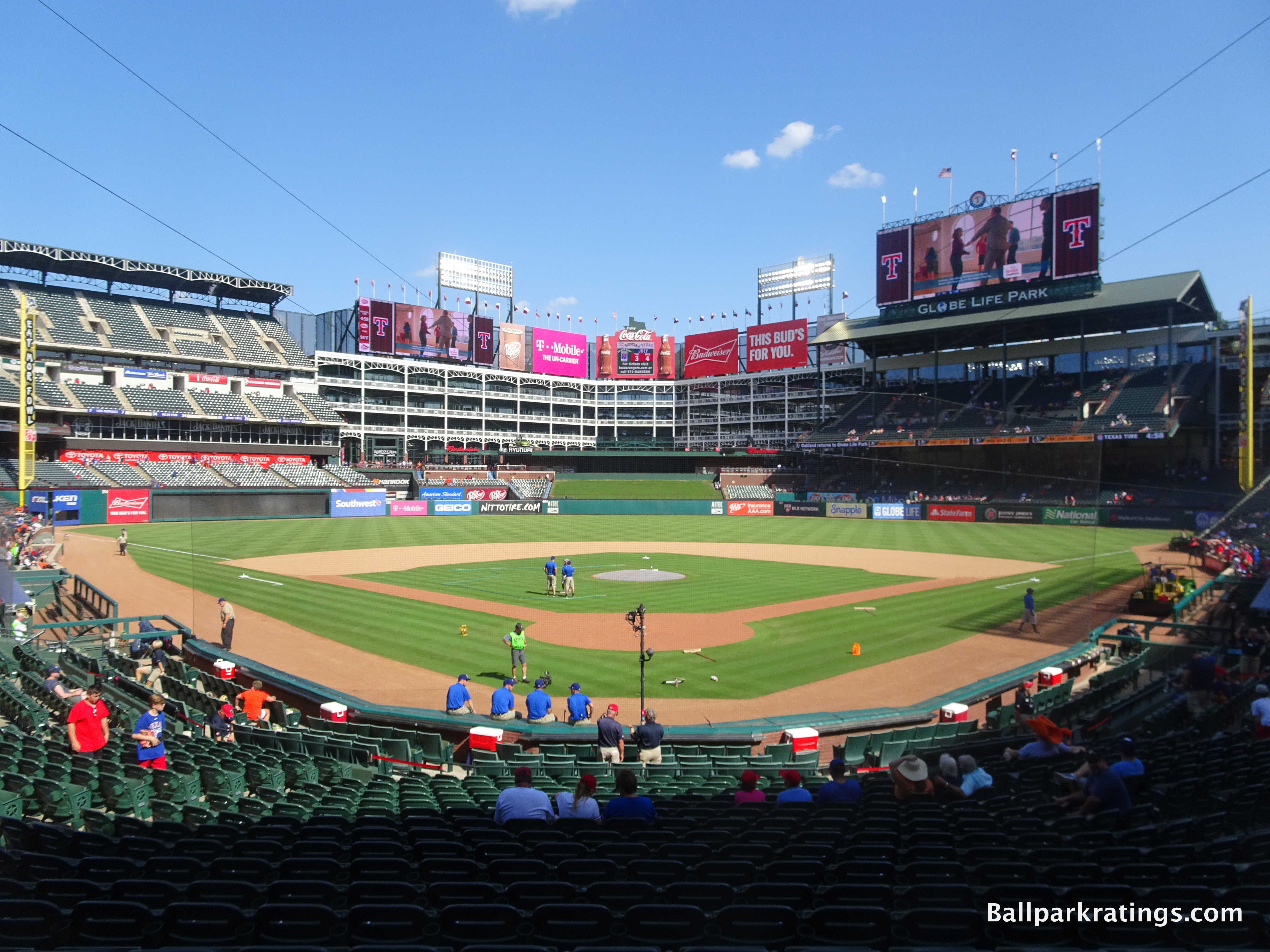
Part of the appeal was that the main “visionary”, David Schwartz, had never designed a sports facility and “wasn’t even much of a baseball fan.” He was simply a great architect.
“We wanted to build a great place to play baseball,” President Tom Schieffer said. “But we also wanted to build something that would become the center of the community.”
But the ballpark wasn’t built into a community. It was going to be a community. They tried to create their own virtual baseball city.
“I kept asking myself what makes Wrigley so special,” Schwartz said. “I finally realized that Wrigley is special because it is part of a neighborhood. If we wanted a Wrigley atmosphere, we would have to add attractions that would draw people to the area.”
So, at least they got the concept down. But after over 15 years of round criticism, I think the consensus is that it hasn’t come close. It was supposed to be more elaborate than Camden Yards, but it is never mentioned in the same conversation. And that’s because the Rangers’ Ballpark has created no ballpark village. And if it wasn’t supposed to create one, it’s just not one. It’s just not the same as Wrigley or any of the urban retro parks. It is a monumental structure in the middle of nowhere without a context.
I always picture Rangers Ballpark as kind of like a theme park on an island. It’s a neighborhood park without a neighborhood. It’s not mentioned with the first retro jewels because it’s an entirely different animal.
Considering the retro movement is all about the context in an urban community, The Ballpark in Arlington is the prototypical “faux retro” ballpark.
Where design quirks and asymmetrical dimensions at Camden Yards (1992) and Progressive Field (1994) are a function of the site, all of the quirks, nooks, and crannies at The Ballpark in Arlington (1994) are synthetic, derived from the whims of the P.R department. Placed in suburbia, the retro architecture and old-fashion features are not crafted around an urban or neighborhood context. There is no escaping the stage-set sensibility of this place, in what has always had a “retro theme park on an island” feel. This is probably the primary reason The Ballpark in Arlington was not as well-received as its 90s contemporaries.
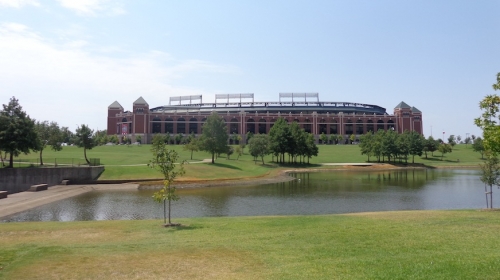
Despite all of this, Rangers Ballpark compensates by having a wonderful, extremely ambitious, architectural design. It’s the only ballpark that attempted to be an aesthetic masterpiece above all else, to the point where much of its phoniness can be forgiven. It’s the only structure in the majors that attempts to stand out as a building first and a ballpark second. At the very least, the ballpark is a piece of architecture worth analyzing in its own right.
The exterior is one of the nicer retro facades, and I actually like the faux urban enclosed interior. The interior design is a distinctive change of pace: its like you are in a self-contained ballpark village, a city separated from all else. It may be contrived, but it feels surprisingly well drawn together and authentic. I’m in the minority here, but I’ll expound on what makes Rangers Ballpark so beautiful a bit later. The truth is, aesthetically, they did build a ballpark Disneyland.
In the early 2010s, the Rangers seem most intent on enhancing their ballpark in the coming years, perhaps because of the team’s success and it wasn’t initially as well recieved as the others. A number of new climate enclosed restaurant spaces opened, the centerfield plaza was renovated, the food got marginally better, and they made small improvements in their premium seating options.
Unfortunately, the oppressive climate won the day, the Globe Life Park will see its last days in 2019, soon to be replaced by a retractable roof ballpark next door.
Even for an open-air park, Globe Life Park is poorly suited for the Texas heat in the first place. The mezzanine club concourse is not climate controlled and there is a lack of shaded seating throughout the main seating bowl.
It is also logistically impossible to fundamentally change a couple of the structural flaws that would lead to a huge jump in the ratings, like the closed concourses, obsolete premium seating model, and the suspect sightlines.
At the end of the day, the functionality and amenities don’t compare well across Major League Baseball, and the Rangers did not succeed in their overarching vision of The Ballpark in Arlington.
But despite my various complaints, including how they replaced the Legends of the Game museum and how the structure is not built conducive to its climate, it is a good ballpark.
Visually, I think the ballpark personifies its Texas culture unlike any other. Representing the region is about all you can ask for in any good ballpark design, and Arlington succeeds in a wonderfully novel fashion, avoiding “Dallas urbanite” aesthetic you might have expected after Baltimore and Cleveland opened, building a distinctly self-contained “Texas” ballpark. Again, in some ways, Rangers Ballpark is the aesthetically one of the most unique parks in baseball.
But did the Rangers’ goal of building a super ballpark village complex succeed in the way they envisioned? No way.
Setting
Location/Access:
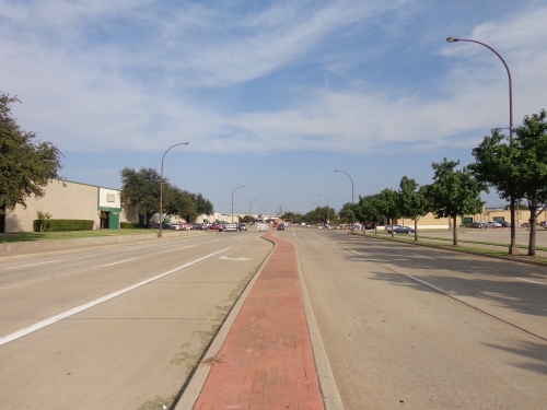
Not only is this one of the worst locations in baseball, the parking is also unnecessarily confusing, as many of the surrounding streets are blocked off at the end of the game, making it difficult to go where you want. Exiting the highway is particularly difficult with conflicting and incompetent signs around the ballpark. Parking is also too limited and pricy considering its suburban location.
For what its worth, Arlington is located between Dallas and Ft. Worth, so at least it geographically connects both communities. But physically, it really is in the middle of nowhere, just as officials intended when they built the first Arlington Stadium. In terms of landmarks, at least it’s right by Six Flags. As you may have read, Arlington is the largest city in the nation in terms of population with no public transportation system, which isn’t very good for access. Overall, the location is the primary flaw to Rangers Ballpark.
Score: 2.5/5
Local Scene:
Other than the strip malls down the road, there’s nothing much going on around the ballpark. It’s not a poor area per se, just extremely nondescript. But that’s a step ahead of some other suburban ballparks (Royals) or ballparks in raunchy areas (Braves and Mets, both are trying to fix that situation, the latter with a concrete plan). Six Flags, along with some random local development, isn’t far away, so you certainly have options. The presence of Cowboys Stadium helps. Unfortunately, that won’t stimulate as much growth as you think, considering the Cowboys trap pre and post game revenues by exclusively providing the services in the area, blocking independent local businesses from getting involved, which would benefit the Rangers’ situation. But that could change in the future.
The Rangers are building a mixed-use development area in 2020 for the opening of their new park next door.
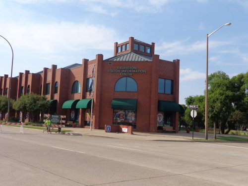
Score: 2.5/5
Total: 5/10
Architecture & Aesthetics
Exterior Design:
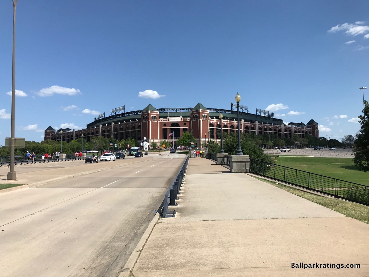
The standards aren’t very high for ballpark exterior architecture, but I have this as one of the best in the majors.
As one of the top exterior designs in baseball, Globe Life Park in Arlington is an outlier at the top of our list, because it possesses that undesirable “faux-retro urban park in a suburban parking lot” sensibility, where the retro architecture and old-fashion treatment are not crafted around an urban or neighborhood context. In the vein of a Citi Field or a Citizens Bank Park, this is an urban-looking ballpark in suburbia longing for an urban setting, something I usually frown upon.
The Rangers’ ballpark spawned a generation of retro clones whose synthetically quirky dimensions and old-fashion elements felt forced and out of place, not in unison with its context like Camden Yards. There is no escaping the stage-set sensibility of this place, in what has always had a “retro theme park on an island” feel.
All of that being said, The Ballpark in Arlington is the one and only faux urban red brick retro ballpark where I grant a lot of leniency, because I just find it so well executed and attractive, with marvelous attention to detail.
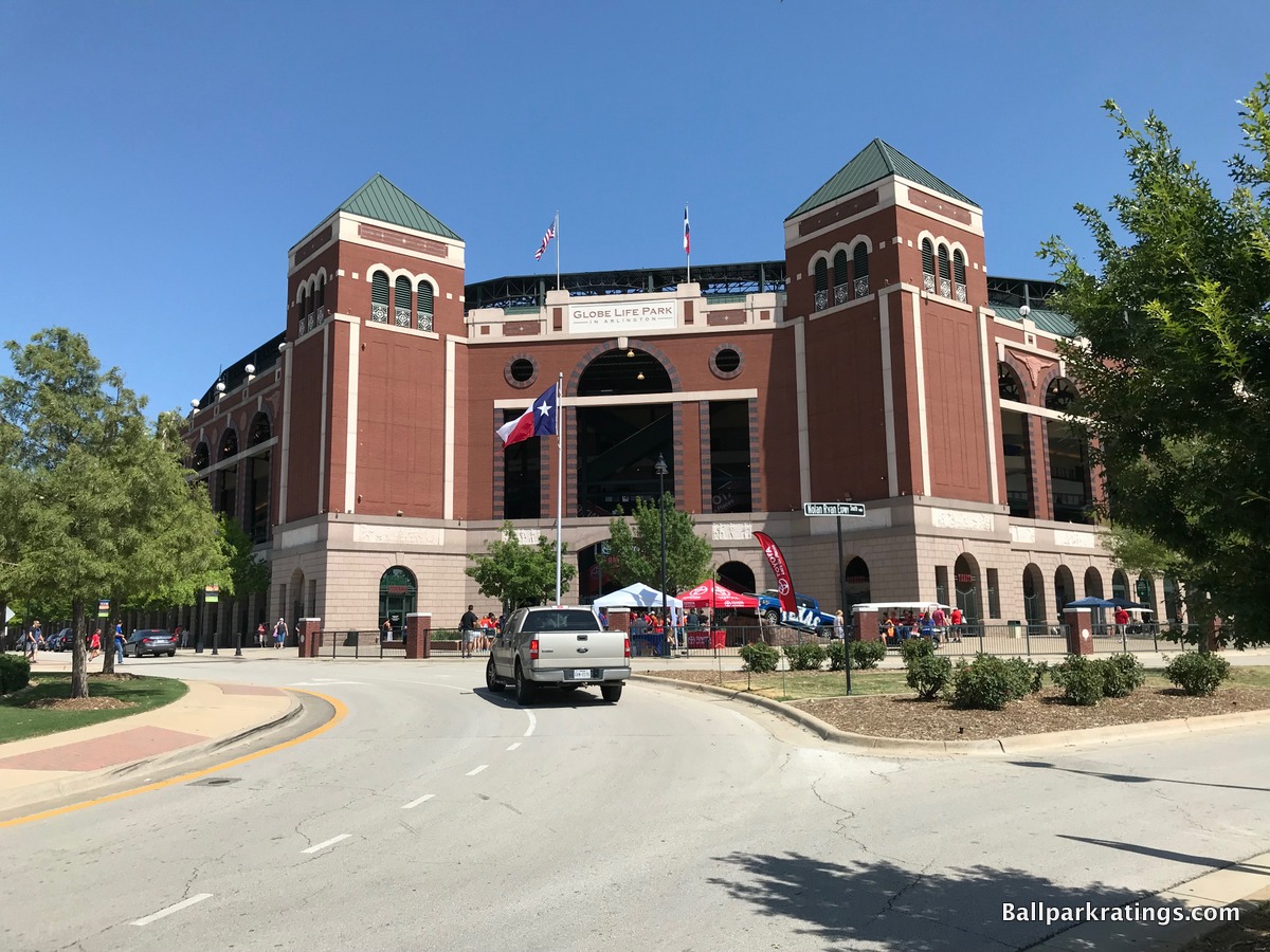
If only looking at the raw aesthetic attractiveness and regional touches on the façade, this is actually my favorite exterior in baseball.
Surrounded by a man-made lake, one of the first things you will notice is the uniformity of the structure, as all four sides have the same design. The monotony of the ballpark reinforces the imposing vision of the architectural design quite well. In a way, the remote location emphasizes a vast, sprawling “Texas” theme. This building wouldn’t have screamed modern urban Dallas. You know what state you’re in just by looking at it.
The sheer size of this imposing edifice, along with the engraved Lone Star pink granite and pointed green triangles, embodies neo-classical Texas architecture, fusing a contemporary local flare with the classic ethos of the underlying treatment.
The larger red brick archways sit on a smaller base of arcaded granite arches, brilliantly reducing the perceptual scale for fans, thus creating a sense of intimacy, while still maintaining the grandiosity of the structure. The arched windows are a nod to old Comiskey Park.
Also note how well the upper deck is sunken into the façade, to the point where all you see is green panels above the façade. Unlike many other parks, you don’t have that awkward upper deck springing upward on top of the facade. Take a look at the pictures of any of the other parks above, where the steel tresses and concrete upper desk encroach on the exterior design to an uncomfortable degree. Not in Arlington. The Rangers do the little things better than anyone else.
Speaking of little things, regional accents and local imagery punctuate Arlington’s red brick façade, in what is my favorite part of the design. The cattle heads, lone stars, and historic Texas bas-reliefs, depicting stories of the oil boom, the Alamo, and the cattle industries, are perfect final accentuates to an already epic structure. The attention to detail is remarkable, especially for a ballpark.
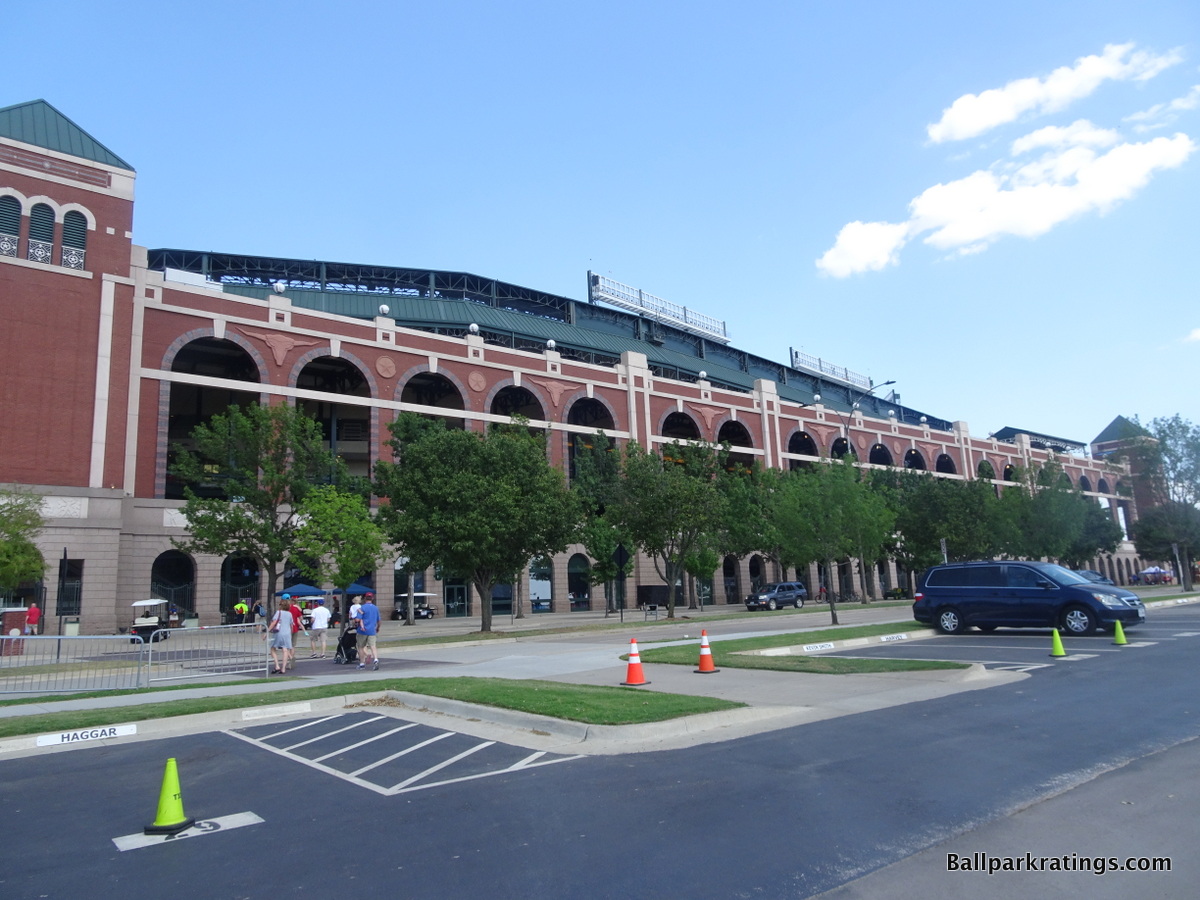
The Ballpark in Arlington’s picturesque lakeside location on a hill is the icing on the cake. You get why the Rangers wanted to nickname this place, “The Temple.”
Given the setting, I still can’t get over how much it ultimately comes off as a theme park, as the architects admitted that the structure takes elements from old Yankee Stadium, Fenway Park, Tiger Stadium, Ebbets Field, and old Comiskey Park.
It’s baseball’s version of Epcot at Disney World, where you visit the commercialized version of each country, similar to the Epcot format.
But the latter point underlines how The Ballpark in Arlington is ultimately a Texas building, just like Disney World is an American building. Because the design is infused with Texan elements, this is Texas’s take on Yankee Stadium, Fenway Park, Tiger Stadium, etc., akin to America’s take on the different countries. I just love that concept.
It may be contrived, but overall, this is one of the best concepts in the majors and the most attractive exterior scene overall, in my opinion. Out of all the soulless red brick facades without a context, we finally have one that works.
All of which makes it even more of a tragedy that this park will be replaced by a new retractable roof facility in 2020. The new Globe Life Field will be the first ballpark in modern history whose predecessor was demonstrably more attractive.
Score: 8.5/10
Interior Aesthetics:
At some point in time, retro stopped being an innovation and became a lazy starting point for any club looking to construct a ballpark. And an unfortunate number of clubs failed to consider that classic ballparks resonated because they were a staple of the community. The Ballpark in Arlington was the first one of these attractions just thrown into the middle of nowhere. It represented a time where retro became a novelty rather than something authentic. Retro parks essentially became theme parks.
But, oh my, unlike its successors, it’s a heck of a theme park, and one that fits Texas perfectly.
I’m the number one proponent that a ballpark should serve as an amphitheater that connects the fan and the players to the physical surroundings of the city. If it fails to do that, the ballpark is usually an architectural failure. Rangers Ballpark is the only exception, because it was constructed with a radically different aesthetic vision.
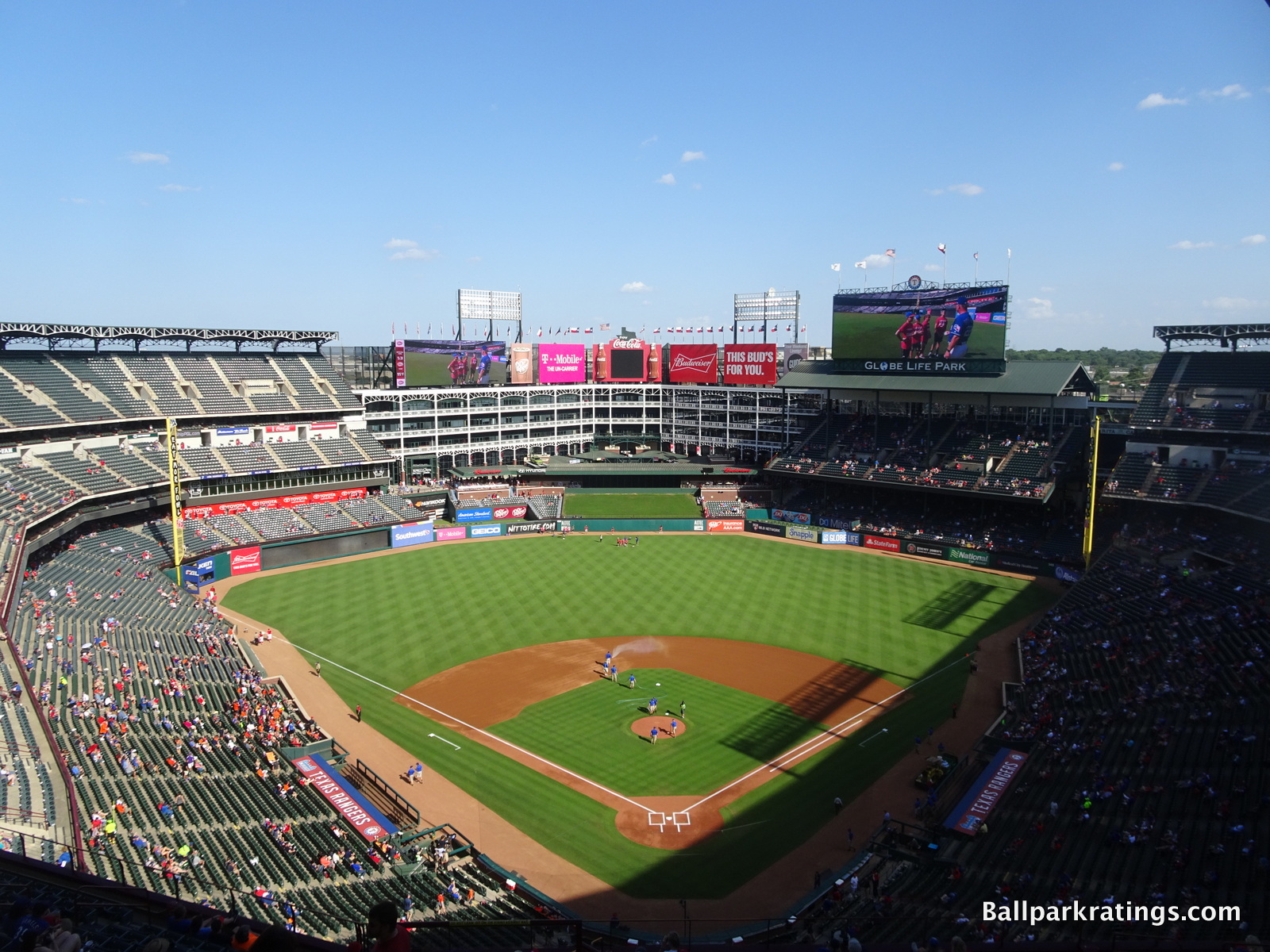
I think the first assertion I would make is that while you can admittedly through out the famous buzzword “contrived”, its not gimmicky. To me, it feels real, like many of the first retro wave parks, because they don’t overdo it. No trains, coke bottles, Lego smoke stacks, etc. They emphasize architecture over all else, and that’s rare for a ballpark.
The interior design has long been a controversial topic among baseball fans. Other than the lack of context, some say it lacks continuity because it takes multiple classic elements from a number of different ballparks. Many also dislike the giant office building in center field, claiming that it would have been better to leave the ballpark open. But you have to give the ballpark this: there’s really nothing like it.
The center field office building is the most ambitious (and visionary) element in baseball. Since there is no backdrop beyond center field, I have no problem with enclosing it if its part of an aesthetic purpose (unlike Citi Field). Reminiscent of the Cajun architecture on Bourbon Street in New Orleans, or perhaps an old Texas mansion, the white steel structure creates a lovely faux urban environment. Note how the interior steel work continues to the right of the home run porch, creating an illusion of complete enclosure by an urban landscape. I think it adds a lot of character to the ballpark, in what otherwise would have been a nondescript landscape a la Milwaukee or Philly. It’s one of the boldest design cues we’ve seen in a park and perhaps the most recognizable element in the majors. Contrived? Sure. It could easily be mistaken for the plastic background of a stage set. Does it look good and unique? I think so.
In a nod to Tiger Stadium, I think that the overhang in right field may be the best retro element in any park today. It accentuates the Cajun “balcony” vibe seen by the white office building. Due to the perceived constraints of the white steelwork, it’s nestled in effectively and doesn’t look out of place like some have said.
Unlike fake rocks or plastic slides, the Ranger’s “signature element” looks like an authentic piece of history.
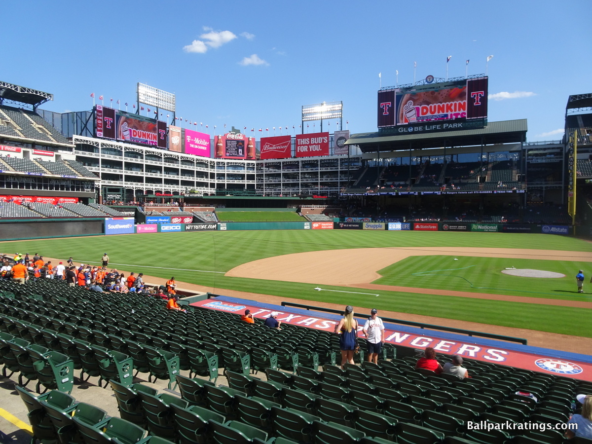
Is it contrived? I guess. It’s technically forced, but it meshes well with the rest of the ballpark. I actually think the overhang provides a nice contrast in cross sections while reinforcing the classic ethos of the building. It balances nicely with the short porch in left field, which was a reference to Fenway Park.
I never really understood the complaint that the park looks disjointed: it’s a relatively simple design that I found to be one of the least schizophrenic, despite taking elements from different parks. There’s a certain understated quality about it that really rubs me the right way. Yet at the same time it’s a very commanding structure on the inside, implying a certain effortlessness that’s hard to accomplish. Throughout the outfield design, space is used very well.
I have spoken out against the aesthetics of outfield upper decks that conflict with the architectural intentions of the ballpark, meaning that it generally leads to the ballpark feeling too enclosed. Rangers Ballpark intentionally went for the enclosed, cozy look and it works. It’s a risky design, but I think it works but its scale creates a sense of cozy intimacy.
When Tiger Stadium got replaced, some fans called for Comerica to be built under the same enclosed intimate vibe. Rangers Ballpark comes the closest to emulating the Tigers’ former park, and is the only retro park that went for that classic enclosed coziness. With skyline views in vogue, Arlington is refreshingly unique.

The ballpark has a coherent theme that is certainly confident in its architectural lines. The simplicity of the brick backdrop and the green hill fit with the design well. The white steel of the center field office building nicely matches the freeze at the top of the grandstand roof, a subtle reference to Yankee Stadium. Sure, its unfortunate so little is original, but it’s an unexpectedly nice mélange.
I will admit the interior is a bit too concrete heavy, especially around the seating bowl. But at least the white, bland concrete of the cross sections matches the white steel motif throughout the park, despite muddling it a bit.
Earlier, I mentioned that I have come to the conclusion that building this out of place, faux urban retro ballpark actually fits Texas quite well. The same goes for the inside. While integrated urban aesthetics are always ideal, I feel like building an urban park in downtown Dallas wouldn’t scream Texas Rangers. Rangers Ballpark is ambitious, massive in scale, and doesn’t really regard anything else except what’s contained inside, just like Texas. It represents its state unlike any park in the majors. I don’t think an authentic suburban Kauffman Stadium in Arlington would have quite the same effect.
So again, I’ll leave you with this: It may lack authenticity, but it’s not gimmicky. If it was contrived and gimmicky, I might feel differently. Gimmicky is if they had a lake in the shape of Texas with an oil derrick that would erupt, like one of the early proposals. But there’s nothing gimmicky about the majestic center field office building, the short porch in right field, or its supplementary elements. The interior comes off as simple, timeless, and beautiful. The park is very uniform in its design, which is a refreshing change from some of the newer parks with heavy-handed elements. But the Rangers Park is still audacious in its design because of its size and vision, but its retro elements are tastefully presented. Bold yet subtle. Cozy yet imposing. It’s a great impression.
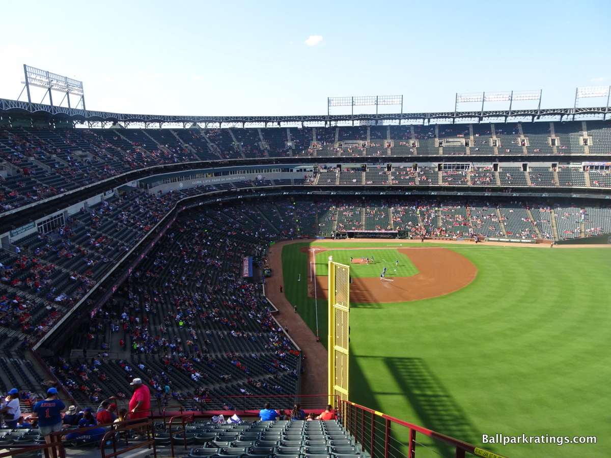
And as for the forced and contrived nature of the ballpark? It’s just not that big of a deal here. And only here. It’s almost like they took the faux retro urban aesthetic full circle, to the point where it feels like a well thought out design cue, not just a phony trend follower, unlike the safer, less coherent, efforts in Philly and New York.
In other words, its in fact incredibly original, making the term “retro cookie cutter” regarding Arlington a bit of a misnomer, in what is only a attribution to the blind adherence to the retro aesthetic, not a formulaic design.
You could even look at it another way, and just give them credit for recognizing the importance of a distinctive urbanized environment, instead of just building a Citi or Turner Field. In other words, the Rangers wanted to build a retro park in a suburban area like some others, and at least they went all out, building a structure with an epic vision.
Score: 13.5/15
Panoramic View/Backdrop:
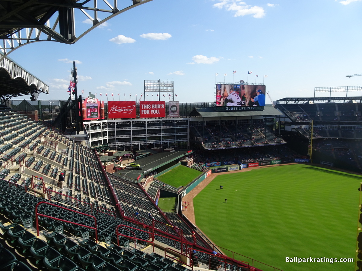
There are a number of offenders whose aesthetics are inherently compromised because of too much outfield seating and lack of an environment. But what do you do when the lack of environment and cozy enclosed exterior is part of the aesthetics, not the functionality (i.e. Citi Field, Turner Field)? Now that takes guts. That’s different. And we applaud that. Also, an enclosed cozy environment was what the old jewel box park was actually like.
So again, I give it a free pass on this category. The office building could be considered the backdrop. The lack of a true environment beyond the outfield is part of the appeal. When its entire visual theme is about not having a panoramic view beyond the structure, how can you take points off? They’re going for coziness. And how can you blame them when it works so well? If the ballpark weren’t enclosed, I wouldn’t give it over a 2.5.
Score: 4/5
Concourses:
While the effort has since been surpassed, David Schwartz elevated the aesthetics of main concourses to a new level of attention in 1994
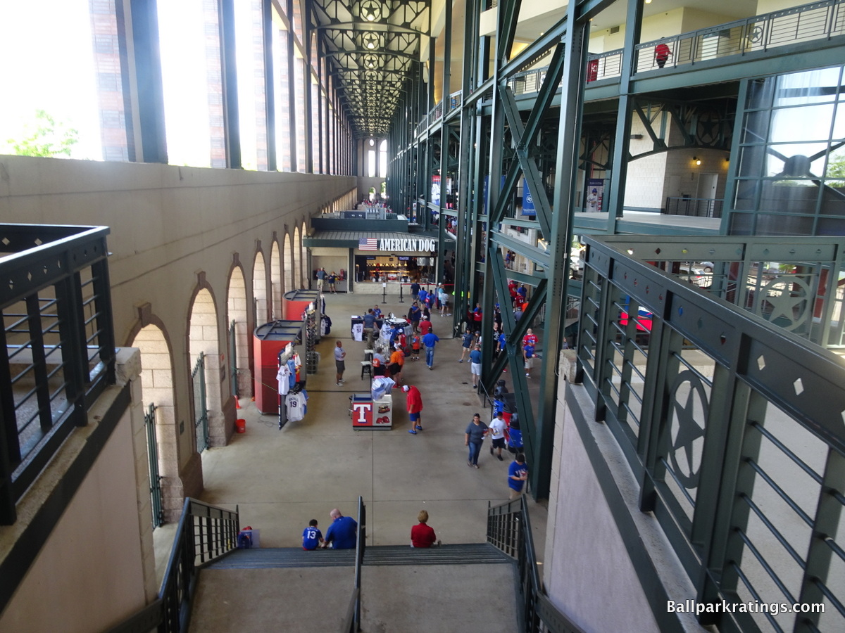
I have always said that the concourses are by far the most underrated and overlooked facet of the modern ballpark, and the Rangers seemed to have picked up on that. The main concourse is adorned with the majestic lacy arches seen in the main building, articulated by steel Lone Stars and a deep “Ranger Green” shade. It’s the perfect culmination in making Rangers Park the closest thing to “capital A” architecture seen in any retro park, despite still being theme park architecture. This exact aesthetic extends to the concession stands as well. No ballpark had so many unique embellishments on the concourses before Arlington.
Perhaps the most unique aesthetic design element is the super high ceilings, which extend all the way to the upper deck concourse. Because the club level is not enclosed, the concourses are extremely high, contributing to a nice, airy feel. The concourses are completely open to the outside, so you have a nice view of those exterior arches. The main concourse also features an open area behind the escalators and kiosks.
It’s loosely similar to the Great Hall in Yankee Stadium.
Score: 3/3
Total: 29/33
Functionality & Essentials
Sightlines:
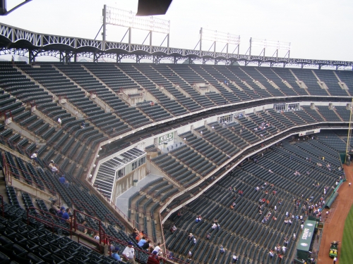
Unlike Camden Yards, each individual seat is adequately angled toward the infield. The Ballpark in Arlington was the first retro park to take a step in the right direction in terms of seating geometry.
Seating down the right field line is surprisingly well directed. There are some instances where seats could be oriented a bit better, but it’s better than many of Arlington’s era. HOK, the architectural firm that designed most of the retro parks, was originally reluctant to aggressively angle the seats down the line toward the infield before the stands break.
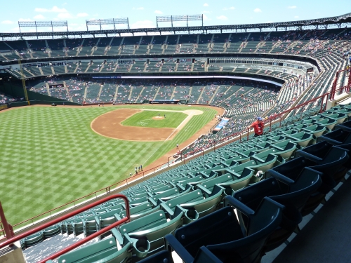
However, it should be noted that the upper deck is among the farthest back in baseball. It’s ironic that they tried to emulate Tiger Stadium in right field, when the main seating bowl is more anti-Tiger Stadium than any park in the majors.
If you think HOK (Populous) is bad, HKS, with this design and Miller Park, is reluctant to use any cantilevers at all.
Rangers Ballpark is the only ballpark with a true “stepped effect” with the decks, to the point where the upper deck has zero overhang over the club level. Now just think how frustrating that is considering the fans are in desperate need of shade! This ballpark could have been built to better deal with the climate.
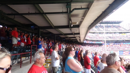
Plenty of shade under the right field porch though, albeit with a high number of obstructions via the support columns/overhang. Since this was done for design purposes, it’s not too big of a deal. With two levels of suites and a club level, the upper deck is among the highest as well, though not as high as it would have been if they had decided to cantilever the upper deck. Because of the lack of cantilevers, the upper deck is deceptively much lower than it appears.
Despite the blatant lack of cantilevers and far back upper deck, the sightlines are better than Arlington’s contemporaries in terms of seating angles. But that really isn’t saying much when you look at Camden Yards and Progressive Field.
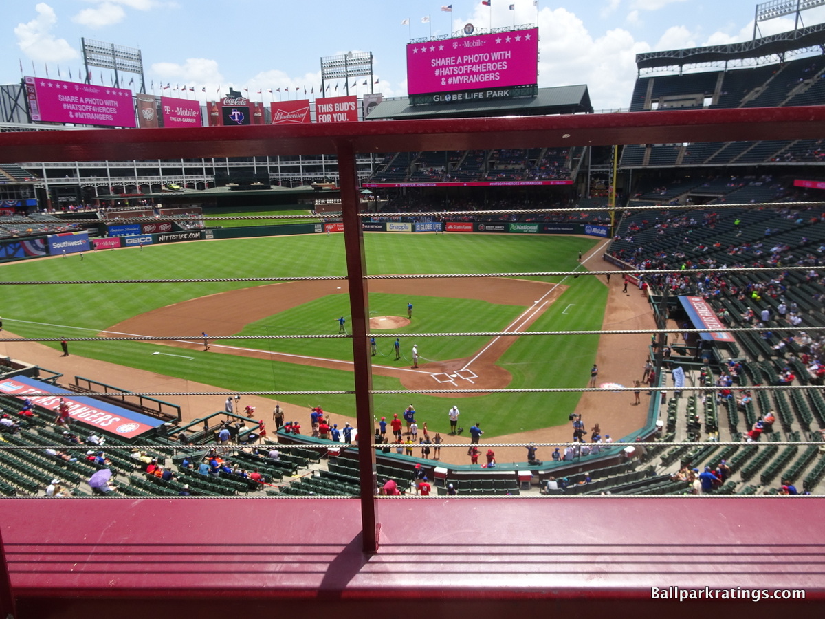
Score: 7.5/10
Seat Comfort:
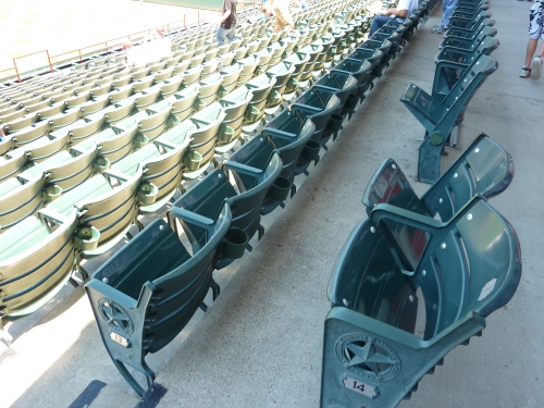
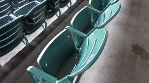
Compared to ballparks around the league, the seats are slightly below par: 18-22 in width throughout the park. 18 inches is too tight for today’s standards, but that’s only in parts of the upper deck. Like Camden Yards, hopefully seat replacements are in order. Renovations have fixed many of the flawed cup holders in the upper deck.
For the 2013 season, the Rangers replaced their old seats with new ones. The aesthetic difference is barely noticeable, but it is a welcome improvement.
Score: 3.5/5
Concourses:
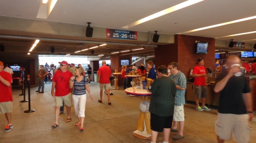
Having opened in 1994, all of Rangers Ballpark’s concourses are completely closed to the field and present a few significant functional issues, despite its aesthetic merits.
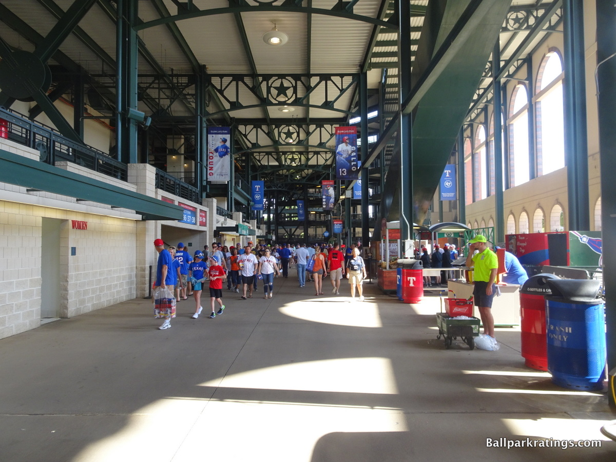
Despite providing plenty of space for fans because of the outer hall, the main concourse has substantial deficiencies. How they designed the lower seating bowl in relation to the main concourse doesn’t make much sense.
To get to the top of the lower deck, above the main concourse, you don’t go through the portal. You go up another set of stairs, leading to an upper walkway behind the top of the lower bowl. This is not the normal formula for a facility with closed concourses. Though it does provide some standing room areas above the lower deck. So I guess that’s the idea.
While it’s technically a 360-degree system, the main concourse gets much too convoluted in left field below the Diamond Club. The concourse discontinues for a short period of time, leading to an extremely narrow hallway behind the left field seating, leading to significant congestion. This certainly doesn’t encourage the fan to get out of his or her seat and walk around the ballpark. While its a minor issue, they fixed it during the 2012 renovations.
The Rangers significantly upgraded their “outfield experience” by renovating the Vandergriff Plaza, especially in terms of standing room only areas. For 2013, they opened up the area behind home plate on the main concourse, but it made little difference from a concourse perspective, as they area is filled with new concessions and tables.
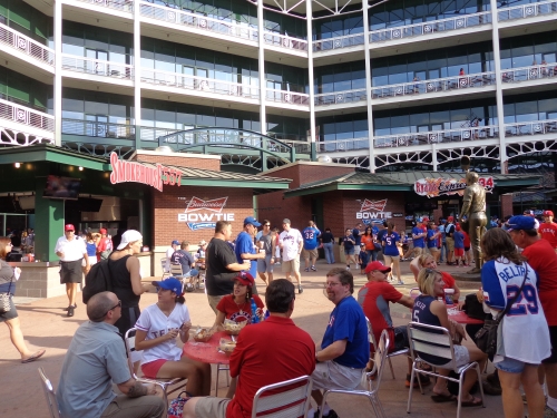
The use of closed concourses was completely unnecessary, especially on the club level. The club levels that have closed concourses are usually closed because they have suites at the top of the seating structure. The idea behind combining the suite level and the club level is to create a more intimate seating structure. But Rangers Ballpark has the worst of both worlds.
We have two suite levels that create a high upper deck and a club level enclosed from the field by ugly white concrete. The club concourse is at the top of the seating bowl, meaning they could have easily found a way to leave it open to the field and enclosed on the other side, albeit at a higher cost. Overall, it’s a lazy design functionally.
Score: 3/7
Scoreboard System:
Before 2011, the video board in Rangers Ballpark in Arlington was historically bad, both in location and substance. Not only was the video board clearly the weakest in the majors, more resembling something from spring training, but the matrix board was so weak it couldn’t show any names. There was only enough room for numbers and positions!
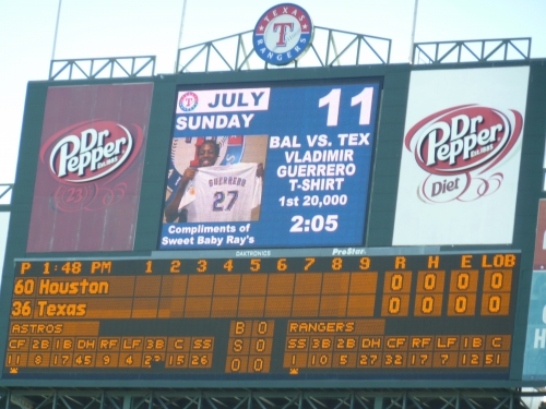
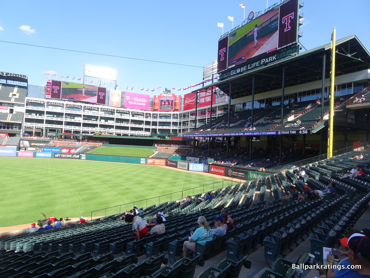
The team finally added a massive state of the art video board system on top of the porch, showing high quality displays and both lineups. There are also supplementary boards in center field and on the left field wall. They’ve also added some nice LED linear ribbon boards in recent years. Believe it or not, as of 2012, the 5040 square feet board is only the 12th largest in baseball. This may seem inadequate for an upgrade, but they had weight restrictions because it is on top of the porch. It’s just as good in quality as any other in the league.
However, the scoreboard placement is still too high for fans on the lower level to see. A large number of fans are unable to view it and many down the right field line can’t even see it.
In the mid-2010s, the Rangers added a second videoboard in left field to fix this issue.
Score: 3/3
Total: 17/25
Amenities & Features
Quality and Selection of Concessions:
Throughout the ballpark’s history, the Rangers’ quality and selection of food has never really received particular acclaim. There seems to be a trend of offering various short-lived gimmicks (fried catfish, alligator po-boy, and now “the boomstick”), than actual high quality food or a variety of cuisines.
However, they have made some strides. In 2012, they opened a number of high quality “open view cooking stations,” and plan to do the same around the home plate concourse for 2013. Ultimately after returning in 2013, the verdict remains the same: they’re offering they same types of foods, just under a different guise or brand. They actual concession stands and presentation look better, but there isn’t a significant enough increase in quality or selection to get bumped up to elite levels.
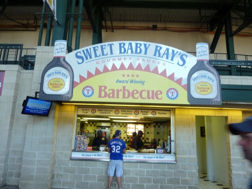
First of all, this is Texas country, so the Rangers focus on a great selection of BBQ with reasonable quality. Smokehouse 577 serves a variety of BBQ, including brisket sandwiches, turkey legs, corn on the cob, and beef ribs. Sweet Baby Ray’s serves BBQ on the main concourse.
In 2013, they added the Home Plate Butcher Block, serving Nolan Ryan’s beef, supplemented by some other attractive stands such as Texas sized 24 and The Chipper. Like I said above, it’s mostly just the same stuff with more attractive signage.
Much of the new items consists of more gimmicks, three more $26 foods like the “sausage slugger,” the “murph-a-dilla,” and the “Beltre buster.” Oh yeah, and now there is a $32 “totally rossome boomstick” to go with the “boomstick.” It’s all very stereotypical Texas unfortunately; a transparently cheap way to separate rubes from their money with huge portions without actually increasing the selection or quality of food.
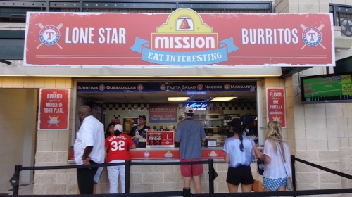
Rangers Ballpark has also improved their selection of Mexican food in recent years, highlighted by a number of new portable kiosks.
The Lone Star Mission Burrito stand serves chicken quesadillas, steak nachos, fajita salads, and or course, a build your own burrito bar. In 2013, they added Casa de Fuego, which expectedly offers little increase in selection and quality obfuscated by improved signage and gimmicky items.
There are also two higher quality kiosks on the 1st base side. Mexican Gordita portable serves spicy beef or chicken fajita gorditas with chips and salsa. There is an Elotes Con Queso Crema stand, serving seamed corn topped with mayonnaise or sour cream and spicy peppers, a la U.S. Cellular Field. Finally, a new Taqueria stand in the outfield provides high quality chicken, brisket, and pork tacos served with the works.
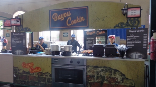
The Rangers also serve a couple of offbeat options. Originally headlined by the alligator po-boy, which was unfortunately eliminated after a couple of months, Bayou Cookin’ serves a couple of unique specialties. Replacing the former item, a shrimp po boy is served with white rice and red beans. There are also kabobs at this stand. Garlic, Cajun, and Sweet Potato fries are also served at the ballpark.
Last year, the Rangers took a significant step forward in offering a nice array of healthy items. First of all, turkey BLT wraps, a chef salad, a turkey and Swiss croissant, and fruit cups are available.
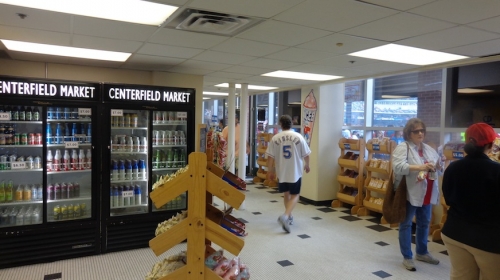
But the new “centerfield market” is the most significant addition, conforming to the new healthy “grab n go” trend in the industry. Numerous snacks, drinks (think Snapple), energy drinks, sandwiches, smoothies, and fruit (individual oranges, apples, and bananas are available). Sometimes packaged salads and sushi (bento box with California rolls and edemame) are served.
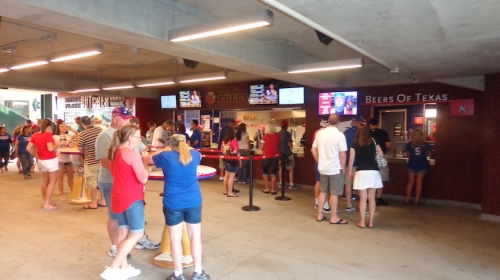
Because there isn’t a lot of variation in alcohol between ballparks, I rarely mention it in depth except on two occasions: with both ballparks in Texas.
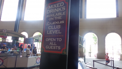
Why? Texas has ridiculous liquor license laws, at least in application to their ballparks. The beer selection at Rangers Ballpark is fine, but you can’t get liquor on the main levels.
Only inside restaurants and in one designated enclave on the club level can you get liquor. So if you have a taste for mixed drinks, this isn’t your ballpark unless you have Cuervo Club access. In truth, that’s probably a great thing because of the heat and risk of dehydration.
They fall short of the high standard set by numerous other ballparks, characterized by hand-made subs, seafood, Asian cuisine, other international specialties.
However, you have to consider the Arlington market just doesn’t demand some of this stuff. But most of all, I’d like to see the Rangers bring in some local restaurants to run some of the concessions, which is a hallmark of nearly all ballparks with great food.
Overall, the Rangers have worked hard to hold their own in this category. However, despite the renovations to the concessions in 2012 and 2013, there is little improvement in quality and selection, just more attractive concession designs, better signage, more cooking space, new branding, and a more gimmicky presentation of food items.
Score: 3.5/5
Regional/Signature Concession(s):
A famous regional food item is the hallmark of any great ballpark that successfully showcases its local personality. Think Coors Field’s Rocky Mountain Oysters in Denver. Over the years, the Rangers have tried, but haven’t been successful. Early in the ballpark’s tenure, they had fried catfish. In 2012, they debuted alligator po-boys, which was abandoned after a matter of months. The point is these novel concepts failed because people didn’t want them. It needs to be novel and the fans need to like it.
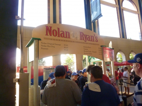
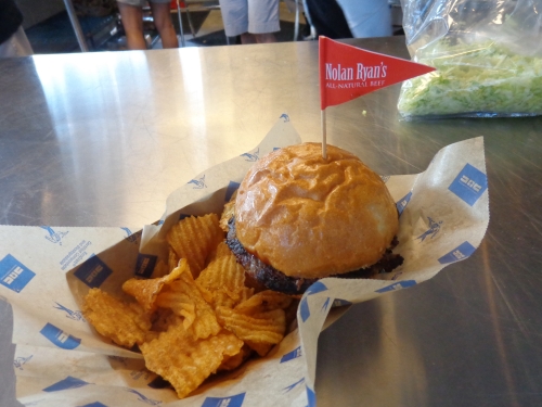
However, the Rangers still succeed to a certain degree. Nolan Ryan’s specialty Angus beef products are sold in the ballpark, giving a local flare to the food. Sweet Baby Rays BBQ and turkey legs are specialties. Again, they need more specialties provided by famous local restaurants in the area.
By the way, note I never give much credence to gimmicky ballpark foods like the $26 boomstick.
Bayou Cookin’ itself is probably their greatest idea here, and if they further develop this concept by providing unique high quality food, the score could go up.
Where is the food provided by local restaurants, as has become the primary focal point in the 2010s?
Score: .5/2
Accessible Restaurants/Bars/Sitting Areas/Social Spaces:
The Rangers have generally fallen behind other teams in providing all fans with access to notable spaces, although they get a bit of a boost because the Lexus Club Level is accessible to all.
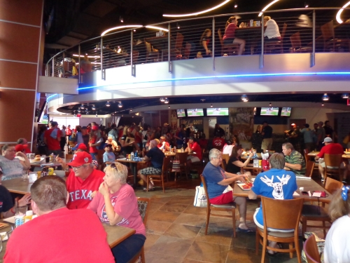
With the Jack Daniel’s Club reserved for season-ticket holders (at least that is the team’s official policy), the Rebecca Creek Saloon is now the ballpark’s sole restaurant. The climate-controlled restaurant/sports bar was added to the area formerly used as office space. It’s open before, after, and during the game and includes studios for Fox Sports Southwest.
What was formerly Friday’s Bar and Grill atop the porch has been turned into an area for the “all you can eat” seats. All fans are welcome into the cooler bar areas on the club level as well.
Score: 3.5/5
Premium Seating/Clubs:
Rangers Ballpark is significantly lacking in premium amenities compared to other modern ballparks. An excessive number of suites (122) were installed in the ballpark as opposed to ritzy club sections, which is now the trend in the industry instead of numerous suites.
Because of the structural manner in which the two levels of suites and club level were constructed, it’s very difficult, if not impossible, to make significant renovations, which significantly compounds the problem. We discuss the 2012-2013 enhancements in this category below, which either came with caveats or made little difference.
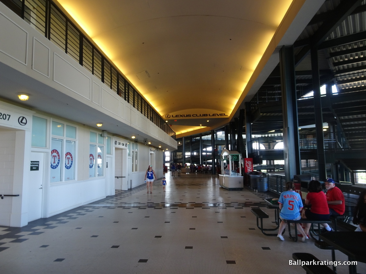
While this ballpark has by far the weakest club level in the majors, but I’ve grown to appreciate its merits. Again, the Lexus Club Level concourse is not enclosed by glass or climate controlled: it’s an open tiled area, exposed to the heat just like the rest of the ballpark.
It’s amazing the one club level in baseball not climate controlled happens to be in the hottest open-air ballpark.
They do have a number of exclusive enclaves located on the field side, labeled corner clubs or pubs. While not too luxurious, the vibe throughout the concourse is actually kind of cool, almost like restaurants and bars on a street corner. Architecturally, they wanted all of the sections below the upper deck to be open to the arches, creating an open and airy feel from the main concourse below.
It’s also open to all fans and has no upgrade in food selection, destroying any sense of exclusivity. This actually means this shouldn’t even be in the “premium seating” category at all.
To compensate, the Rangers built a glassed in restaurant and bar in the last row behind home plate called the Cuervo Club in the early 2000s, which is accessible to premium seat holders. This was replaced in 2013, which I will discuss below. There are also ticketed lounge chair seats in the two front rows of the Cuervo Club. For 2012, they did add a center field batters’ eye club, which is thoughtful, but merely an ancillary option to any hypothetical premium selection.
The Rangers constructed an all-inclusive VIP section behind home plate in 2008. In 2013, more of these home plate seats were added. There is no exclusive club for these seats, other than earlier access to the below mentioned Capital One Club with a free buffet.
In 2013, the Rangers extensively renovated The Cuervo Club into the much more attractive Capital One Club. The new club is expanded by 1000 sq feet and a significant upgrade in luxury. The Capital One Club still includes two rows of padded seats within the club at the front.
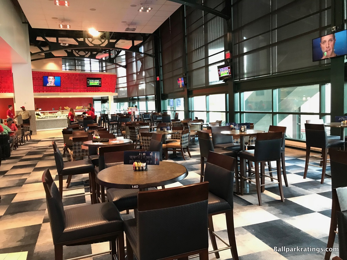
The access and perks of this club are very complicated based on where you are seated. The “VIP home plate” and “premium home plate” seats get game long access with a nice buffet and non-alcoholic drinks included. “VIP infield” and “premium dugout” seats get game long access to the club with the ability to pay for the approximately $35 buffet, along with any drinks. After the 4th inning, “premium infield,” “lower infield,” “Lexus club infield,” and “Lexus club box” seats get access to the club, with the ability to pay for a limited $15 dollar buffet, along with any drinks.
Obviously, all of this is very convoluted. The easy solution would have been to create a bunker club (i.e. underground Diamond Club) for the VIP home plate seats, while giving all the other premium seating Capital One Club access.
To be perfectly honest, this should be a slight downgrade in the ratings, as only 100-200 people get access to any primary climate controlled premium space. I understand accommodating the super premium seats which cost $250-$500, but before, the premium infield, lower infield, Lexus club infield, and Lexus club box seats received access to this space as well. Fans paying for premium seats ($50-$100) deserve game long exclusive access to a premium club.
Of course, if the Lexus club seats (mezzanine) could ever get exclusive access to a climate controlled concourse, that would fix the problem significantly. This further highlights the structural difficulties in creating an ideal premium seating product mix at Rangers Ballpark. For most premium paying fans, the Capital One Club was not the solution.
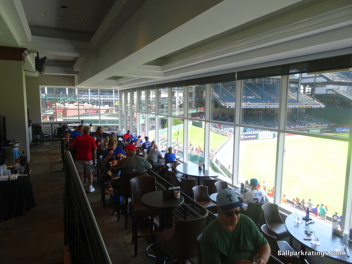
So really, everything is a tradeoff. It’s becoming abundantly clear that it is structurally impossible to add an event level “home plate club” below the main seating bowl for the ultra premium home plate seats. It’s also becoming more clear that it is logistically difficult, if not impossible, to make aforementioned the “Lexus club level” a legitimate climate enclosed luxurious club level. And remember this space is open to everyone.
Both of these features form the minimum standard, which the Rangers fail to meet, meaning whatever changes the Rangers make provide little marginal gain. And don’t even mention all of those outdated suites.
Anyway, it’s obviously complicated, as the Rangers franchise face the unfortunate dilemma of having the ballpark least able to adjust to new premium seating trends in all of baseball.

Score: 3/5
General or Artistic References to Baseball or Team History/Museums:
Careful attention to baseball history, along with an acknowledgement of the region, is the central design principle here. Or at least it originally was. The Rangers built the largest baseball museum outside of Cooperstown. The Legends of the Game Museum (1994-2009) was epic: on the first floor, you will find hundreds of Cooperstown artifacts; on the second floor, there is a presentation of Sporting News’ top 25 moments in baseball history and a presentation of Texas baseball history; and on the third floor, there is a learning center for kids.
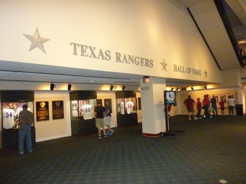
Unfortunately, the Rangers decided to rededicate the area as the “Texas Rangers Hall of Fame.” But make no mistake, that’s double speak for private party room. When its not being used for private events during the game, the space is rather limited in comparison to what it once was, consisting only of one room of plaques and memorabilia of Rangers greats. I suppose that’s worth something, but I am super disappointed about this revenue driving decision by Rangers management.
The Texas Rangers Hall of Fame was converted into a preview center for the new ballpark in 2019. Understandable, so we’re not going to deduct for that.
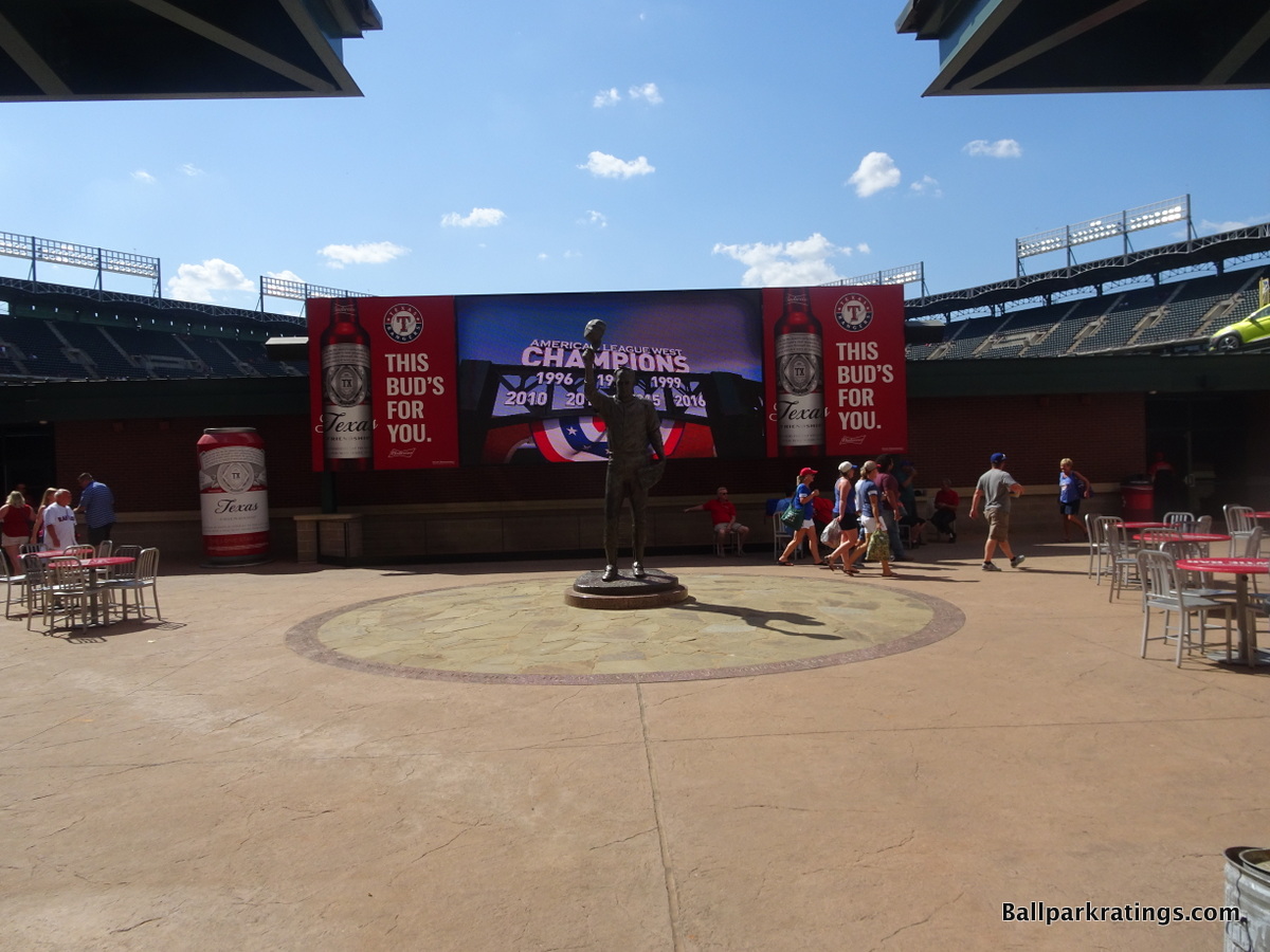
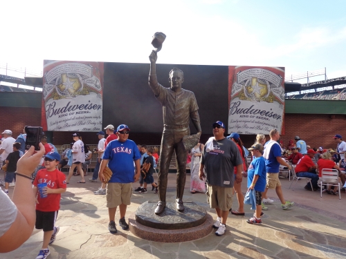
There are two statues in Vandergriff plaza, one of Nolan Ryan and one of Vandergriff himself. Every one of the 122 suites is named after a Hall of Famer and has a rather impressive painting of the respective player outside the suite entrance. They apparently have a Rangers Hall of Fame plaque area on the main concourse somewhere, but its not too visible.
Score: 3.5/5
Entertainment/Kids Activities/Other Amenities:
The area formerly known as the Coca-Cola Sports Park in center field was loaded with fun stuff for fans. The interactive area included a mini kid ballpark, tee ball cages, speed pitch, temporary tattoos, and cooling misters.
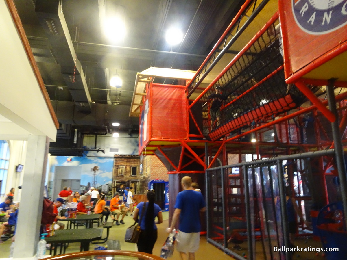
For 2012, the Rangers added an even nicer air conditioned play area. While it cost money to enter, which is unprecedented and extremely irritating for families with kids, the new Kid’s Zone is top notch.
As you can read, the 6,470-square-foot kid’s area features a giant playground, climbing walls, and much more. Demerits for the $10 fee (I can’t fathom how this is attractive to parents who want to watch the game, as these kids areas are usually for 1-2 inning breaks, so is it really worth the fee?), but it’s also the only such area in the majors that is air conditioned to my knowledge. So its a slight upgrade.
There is also a speed pitch near the main concourse.
Score: 2.5/3
Total: 16.5/25
Atmosphere, Vibe, & Policies
Atmosphere/Fan Support:
The Rangers attendance has traditionally been good considering the quality of the team and the complete lack of history. They’ve been around 25,000-30,000 during the 2000s. The 7th Inning Stretch was pretty good here, with all the fans joining in. The song afterward was appropriate because it actually fit the culture, unlike “Thank God I’m a Country Boy” in Baltimore.
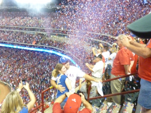
With the Rangers recent success, the attendance has really picked up to 36,000 plus, quieting the argument for a retractable roof. While primarily a football town, Rangers fans can be a particularly passionate bunch, bringing plenty of color to the ballpark.
However, the atmosphere in the park has historically been very lethargic, and I point to the heat as the culprit. I’ve been there in July, and 100 degrees just sucks the energy out of building. Fans trek up to the main concourse at an understandably accelerated rate.
As of 2012, the Rangers are 2nd in the league in attendance with over 43,000. Texas will be an elite baseball town for the next decade, at least in terms of attendance.
Score: 4.5/5
Ballpark Policies/Customer Service:
The ushers are friendly and always lax about checking tickets. If it’s a day game though, you’re not going to be moving up. Heat serves as the primary deterrent, as the unoccupied seats will literally be boiling. Trust me, I tried.
You can pretty much walk wherever you wanted, including the club level, which is generally good for this category. Ushers only check tickets for the Cuervo Club and the suite entrances. I caught one of the ushers sleeping in the upper deck. I also found the venders to be particularly nice, as a lot of them were local kids.
Score: 2/2
Bonus:
For building an epic (and controversial) structure that took a chance architecturally, in what is by far the most distinctive ballpark. There’s no mistaking the inside for any place else. Like the Rangers former owner and U.S. President, it has “that vision thing” (unlike his dad, if you get political references). +2
For one of the few ballparks to constitute a true architectural monument, even acknowledging that does sound like a bit of a stretch +1
For superior ballpark accessibility, as all fans can even go in the club level +1
For so well personifying its culture, fans, and state unlike any other. +1
For having the best and most underrated retro element of any ballpark: the right field home run porch +1
For being the first mega retro ballpark, built with a bunch of other amenities such as museums, theaters, and playgrounds. +1
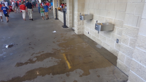
For the hot, unbearable heat in the summer. Ironically, the park wasn’t built very conducive to the heat which is especially irritating. The upper decks aren’t cantilevered over the other decks at all. There’s very little shade other than the porch. Enclosing the ballpark also meant fewer breezes. And this is the ONE “club level” in baseball that’s not climate controlled! Are you kidding me? -1
Score: 6
Total: 12.5
Conclusion
When Globe Life Park in Arlington is replaced in 2020, it will hold the distinction of being the first MLB park in modern history whose successor will be far less aesthetically attractive.
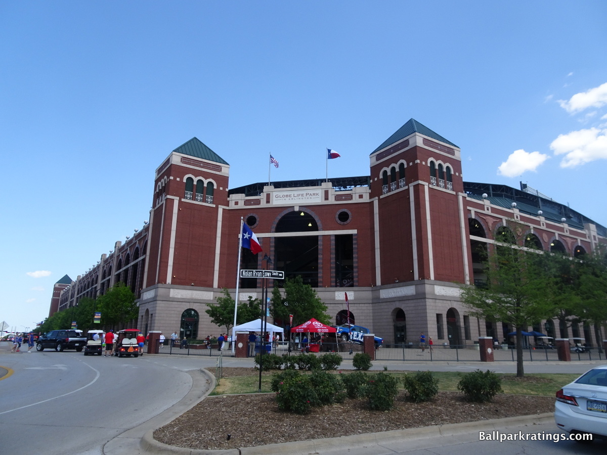
Despite being out of place, The Ballpark in Arlington’s exterior architecture possesses both a certain boldness and attention to detail lacking in other soulless red brick retro exterior designs. Most notably, a host of local imagery further punctuates the exterior. The cattle heads, lone stars, and historic Texas bas-reliefs, depicting stories of the oil boom, the Alamo, and the cattle industries, are the perfect final accentuations to an already epic structure. This is one of the best exteriors in baseball.
Calling the interior aesthetics attractive may be more controversial, but I love it too. While The Ballpark in Arlington may be contrived, it’s not gimmicky, instead exuding a design that is simultaneously understated, coherent, and ambitious. Since there is no backdrop beyond center field, I have no problem with enclosing it if it’s part of an aesthetic purpose (unlike Citi Field). Reminiscent of the Cajun architecture on Bourbon Street in New Orleans, or perhaps an old Texas mansion, the white steel structure creates a lovely faux urban environment.
In a nod to Tiger Stadium, I think that the overhang in right field accentuates the Cajun “balcony” vibe seen by the white office building. The interior aesthetics have always had a grand simplicity that is quite appealing. It’s big and bold, but somehow intimate, because the Rangers didn’t overdo it. The ballpark has a coherent theme that is certainly confident in its architectural lines. It’s not “busy,” like some of the less attractive interiors in baseball.
Unlike some of the new uninspired ballparks of the latter 2000s, Rangers Ballpark had vision and a distinctive design.
In other words, at least they were trying to build the best, most original, most standout ballpark ever, and that’s something most of the newer, more cookie-cutterish ballparks can’t say. Busch Stadium, Nationals Park, and Citi Field are nicer, but can they say that? And aesthetically, they did a surprisingly good job.
All of that said, being one of the first retro facilities, The Ballpark in Arlington has many problems, even compared to others of the same era. Along with a dismal location, some of the objective categories are clearly subpar compared to later modern ballparks in the majors. Despite renovations of $35 million from 2011-2013, only marginal gains are made in the ratings due to the permanent structural/logistical flaws outlined in the intro and throughout the article.
Say nothing of the scorching heat, the concourses, sightlines, concessions, social spaces, bars, premium seating, historical references, and other amenities are all poor compared to other MLB facilities, and parts of the underlying structure made it near impossible to improve some of those aspects.
Overall, Globe Life Park has the enduring qualities of a timeless ballpark, but it is more defined by its poor setting, substandard amenities, and functional problems.
Given these factors, it is understandable that Globe Life Park would be replaced, but I just wish the new ballpark had even half of the beauty of this place, at least judging by the renderings. Globe Life Park grades above a number of other post-1990 ballparks that will be around for a long time, so it is sad to lose this place, even if there is good reason.
FINAL SCORE: 80
RANKING: #19(t)/27*
*Classic parks Wrigley Field, Fenway Park, and Dodger Stadium are not ranked or rated for reasons previously outlined in those reviews