[vc_row][vc_column el_class=”container”][vc_row_inner el_class=”f_title”][vc_column_inner][vc_column_text]
Consensus Ballpark Rankings
[/vc_column_text][/vc_column_inner][/vc_row_inner][vc_row_inner el_class=”pagespace”][vc_column_inner][/vc_column_inner][/vc_row_inner][vc_row_inner el_class=”f_content”][vc_column_inner][vc_column_text]By: Cole Shoemaker
This is a project I completed in 2010 by compiling a series of ballpark rankings/ratings from 15 different sources to statistically reach a consensus. This was originally done for a regression analysis project in sports finance (what variables drive fan attendance?, with ballpark quality potentially one of them) but this is obviously a fantastic tool for this website.
This will give some context for my opinions. A nice mix of fans, critics, and ballpark aficionados were included and first hand knowledge is required. Some opinions are systematically validated, but most of the rankings are just by gut. There is generally a bias towards the present, as I don’t include ratings/rankings done a long time ago. If the rankings strongly take factors like price and team quality into account, I don’t include it, as that is more of a “fan value index” and doesn’t reflect the quality of the ballpark.
National publications include the Sporting News, ESPN, Fox Sports, Forbes, and the Washington Examiner. Ballpark websites and select road trip blogs include the Ultimate Sports Road Trip, baseballparks.com, ballpark reviews, Paul’s Ballparks, Roger Weber, ballpark digest, ballpark pilgrimages, 2010 Road Trip, and Andrew Clem. I think this is a pretty representative sample.
For sources that are ranked, not rated, we’ll simply assign presumed values (95 for best with one point demerit for each following park ie 2nd 94, 3rd 93).
Two websites used ratings system instead of just ranking the parks, so I kept the ratings if it was similar, assuming they were reasonably scaled. My rationale is that the opinions of those that took the time to actually rate the ballpark based on criteria is more legitimate. Not totally scientific, but whatever.
Case in point: ESPN’s highest rated park is PNC Park, at 95. The sharp drop off after PNC, AT&T (93), and Camden (92) in scores should be accounted for in some fashion, as it perfectly reflects the consensus top three. I’ve always gotten the impression that the 123 spots are really set in tone and there are plenty of 6-10s but the 4-5 spots are truly up for grabs. The ratings system at USRT worked perfectly, if you add 20 points to each score, which also starts off at 95.
Three websites I sampled (Charlie’s ballparks, ballpark digest, and ballpark reviews) didn’t rank the parks, but instead graded them on stars or used letter grades. I proportionally adjust for this by assigning an appropriate number.
As for specific ballparks, I factor out Wrigley Field and Fenway Park in each respective list because comparing new ballparks to old ones simply isn’t fair. Similarly, I eliminated Kauffman Stadium because there is a disparity between reviews written before and after the renovations. For some reason, I included Dodger Stadium. Note that I often throw out the U.S. Cellular rankings if they were done before the enhancements. Dolphins Stadium, the Oakland Coliseum, Tropicana Field, and the Metrodome are also not included.
Yes, you can nitpick and find flaws in this system. But it’s definitely a good representation. Loud reminder: this is NOT necessarily my opinion.[/vc_column_text][vc_empty_space height=”10px”][vc_column_text]
Tier One: The Consensus Elite, far above the competition
[/vc_column_text][vc_empty_space height=”10px”][vc_separator color=”black” el_width=”90″][vc_empty_space][vc_column_text]
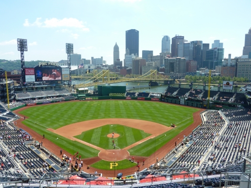
1t) PNC Park (2001):
95 (#1), 94 (#2) , 90 (4/5) , 94 (#2), 93 (#3), 95 (#1), 94 (#2), 95 (#1), 95 (#1), 92 (5/5), 95 (A), 95 (#1), 95 (#1), 87 (#11), 95 (#1)
PNC Park in 2010
Average Score: 93.6000
#1 rankings: 7
Last Rankings: 0
Top 10s: 11
Bottom 5: 0
Standard Deviation (variation from the average): 2.324
PNC Park is generally seen as the best ballpark in baseball (only one outlier rating puts it .0333 below AT&T, so based on perception I list it first). Sporting a picturesque view of the Allegheny River and downtown, the ballpark is well integrated into its environment. In addition to the view, PNC gets high acclaim for its intimate design: with a capacity of only 38,000, PNC has only two decks and minimized outfield seating. The park also introduced a unique limestone façade and dark blue seats, both of which mimic the surroundings and deviate from the retro trend. A few contrarians claim that much of the praise is misdirected at the park rather than the outstanding view, as the ballpark is actually quite basic in reality, with an unusually low budget. Another legitimate qualm is the small concourses and lack of fan support (environment) due to the team. Nonetheless, the consensus generally views PNC as the best in baseball.[/vc_column_text][vc_column_text]
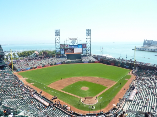
1t) AT&T Park (2000):
93 (#3), 95 (#1), 95 (5/5), 95 (#1), 94 (#2), 94 (#2), 95 (#1), 94 (#2), 91 (#5), 92 (5/5), 95 (A), 94 (#2) 93 (#2), 90.5 (#7), 94 (#2)
AT&T Park in 2011
Average Score: 93. 6333
#1 rankings: 3
Last Rankings: 0
Top 10s: 12
Bottom 5: 0
Standard Deviation (variation from the average): 1.470
Essentially tied with PNC Park for the number one spot, AT&T Park has received high acclaim for its sweeping views of the San Francisco Bay. The outfield design is contextually integrated with the site, as seen by the right field proximity to McCovey Cove. All of its virtues were born of necessity, not faux quirkiness. While a high proportion of the praise is directed at how the interior utilizes the location, AT&T Park is also praised as the king of ballpark food. It really took what Camden Yards did to a whole new level. People have also recognized its vibrant atmosphere and brilliance in capturing the regional feel of San Francisco. Contrarians point out that other than the location, this is just another red brick cookie cutter retro ballpark, breaking no new ground architecturally. The ballpark’s main flaw is that it has the narrowest concourses of all the new parks. AT&T Park has the lowest standard deviation in scores, showing that there is no disagreement that it is an elite ballpark.[/vc_column_text][vc_column_text]
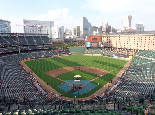
3) Camden Yards (1992):
94 (#2), 93 (#2), 95 (5/5), 93 (#3), 92 (#4), 93 (#3), 93(#3), 93 (#3), 92 (#4), 92 (5/5), 90 (A-), 86 (#10), 93 (#3), 91 (#5), 93 (#3)
Camden Yards in 2008
Average Score: 92.2
#1 rankings: 0
Last Rankings: 0
Top 10s: 12
Bottom 5: 0
Standard Deviation (variation from the average): 2.077
Camden Yards is recognized as starting the retro boom in 1992. 20 years later, many still claim there’s no better interior design: the authentic integration of the warehouse remains unmatched. Located in downtown Baltimore by the Inner Harbor, no ballpark mastered the symbiosis between site and structure quite like Camden. Despite the recent construction of the Hilton blocking skyline views, the ballpark sports a great view of downtown as well. Other than aesthetics, Camden started a culinary revolution at the ballpark by stressing quality regional selections. In many ways, it was just more fan friendly than any existing ballpark at the time. However, being the first retro ballpark came with some unfortunate design flaws. Despite capturing an intimate feel, unlike some of its successors, Camden Yards has been routinely criticized for its sightline flaws, especially down the lines. Unlike ballparks today, it features completely closed concourses as well. Its miscues notwithstanding, Camden still holds its own today and is probably the most influential ballpark of all time. The coming enhancements should help as well.[/vc_column_text][vc_column_text]
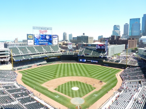
Target Field (2010):
N/A, 87 (#9), 95 (5/5), 89 (#7), N/A, 90 (#6), N/A, N/A, N/A, 92 (5/5), 90 (A-), 90 (#6), N/A, 93.5 (#2), 93 (#3)
Average Score: 91.05555
We don’t have a representative sample yet, but Target Field received rave reviews upon opening. I won’t analyze too much here at this time, but I don’t think Target Field is in the same league as Camden, AT&T, or PNC in perception. Called the most urban park in baseball, it should fall somewhere in tier 2 eventually. In my opinion, we still have a wide gap between the consensus top 3 and the rest. But Target Field is certainly trying to bridge that gap.[/vc_column_text][vc_empty_space][vc_column_text]
Tier 2: Great, mostly flawless, ballparks
[/vc_column_text][vc_empty_space height=”10px”][vc_separator color=”black” el_width=”90″][vc_empty_space][vc_column_text]
4) Coors Field
91 (#5), 80 (#16), 85 (4/5), 92 (#4), 88 (#8), 92 (#4), 85 (#11), 91 (#5), 85 (#11), 92 (5/5), 90 (A-), 93 (#3), 85 (#5), 81 (#17), 86 (#10)
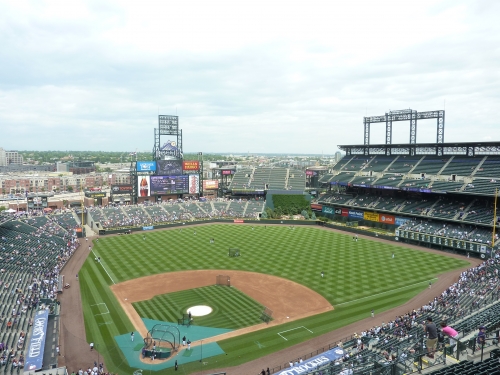
Coors Field in 2011
Average Score: 87.733333
#1 rankings: 0
Last Rankings: 0
Top 10s: 8
Bottom 5: 0
Standard Deviation (variation from the average): 4.120
Coors Field doesn’t have the bells and whistles, or the intimacy of its peers, so I’m sure many are surprised to see it ranked this high. On the surface, it’s hard to see the appeal just by looking at the interior design. I think Coors Field benefits from being the most harmless and least polarizing park in the league design wise. In other words, no one is going to call Coors Field a sub par ballpark; it has no objective flaws. Characterized by simple, clean architectural lines free from gimmicks, Coors Field is generally seen as functionally improving the retro design of its predecessors.
Coors Field is the first retro ballpark to have open concourses. It also corrected many of the sightline flaws of Camden Yards and Jacobs Field. Design wise, Coors is seen as having one of the better red brick exteriors as well. But Coors Field is most often praised for its location/local scene: no ballpark blends in with its surroundings quite like Coors fits with LoDo. Red Brick contextually fits here better than any place else. Despite the supposedly gorgeous mountain views beyond left field, the only criticism I’ve ever heard is completely subjective: the uninspired interior design. Coors Field is a bit too “seat heavy” and aesthetically boring on the inside.[/vc_column_text][vc_column_text]
5) Safeco Field (1999):
92 (#4), 90 (#6), 85 (4/5), 90 (#6) , 81 (#15), N/A, 92 (#4), 85 (#11), 93 (#3), 92 (5/5), 90 (A-), 85 (#11), 81.5 (#10), 82.5 (#14), 82 (#14)
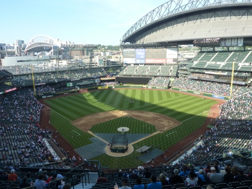
Safeco Field in 2011
Average Score: 87. 2143
#1 rankings: 0
Last Rankings: 0
Top 10s: 6
Bottom 5: 0
Standard Deviation (variation from the average): 4.480
Safeco Field received praise for its innovative retractable roof design that maintains an open feel while still being closed. In other words, Safeco Field is an outdoor facility with an umbrella-like roof that covers, but doesn’t enclose, the ballpark. This technologically advanced feature, along with its expensive price tag, gave Safeco Field a state of the art image to the public. Safeco Field has also been recognized for its fantastic concourse design and art in the park. Like AT&T Park, Safeco has been praised for its exquisite food selection that primarily features local eateries. They also capture the regional feel quite well, but not necessarily through the architecture. A few critics have pointed out the frivolity of the structure; especially considering it has significant aesthetic drawbacks. What about the interior screams Seattle? What exactly is distinguishing about the interior design? Architectural critics have also pointed how disjointed the exterior is a well (retro brick and modern roof). I’ve heard mumblings about some of the functional aspects as well, such as the only outdated video board in the majors. Despite all of this, Safeco Field continues to have an excellent reputation.[/vc_column_text][vc_column_text]
6) Petco Park (2004):
86 (#10), 91 (#5), 85 (4/5), N/A, 87 (#9), N/A, 86 (#10), 82 (#14), 87 (#9), 92 (5/5), 85 (B+), 91 (#5), 80 (#13), 92.5 (#3), 89 (#7)
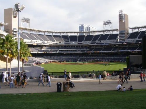
Petco Park in 2009
Average Score: 87.1923
#1 rankings: 0
Last Rankings: 0
Top 10s: 8
Bottom 5: 0
Standard Deviation (variation from the average): 3.816
On paper, Petco Park could and should have been the best park in baseball, not just top 6. Like all of the great new ballparks, Petco Park’s success and positive reception is derived from its fantastic location. The Gaslamp Distinct provides perhaps the best ballpark neighborhood. In terms of architecture, Petco is arguably the first to sharply deviate from warm retro aesthetic inside and out, as an actual architect designed the unique exterior “garden buildings”. Rough blocks of Sandstone, characterized by a rich ochre earth tonality, were imported from India. Natural, contextual tones are used: sandstone mimics the cliffs of Torrey Pines in terms of both color and texture, while the exposed steel recalls the nautical marine motif. On the inside, Petco Park has two of the most unique elements in baseball. In left field, San Diego takes Camden Yards’ warehouse to an entirely new level, by integrating an old building into fair territory. In another thoughtful appreciation of the local area, Petco also features a “park in the park” in center field. The Padres also feature the best sightlines in baseball, with the most cantilevered upper decks in the game. Again, it all looks perfect. While the individual elements are nice, criticism stems from the fact that the interior aesthetics don’t come together well in practice, and the park is too disjointed. Contrived dimensions on the inside have also been chastised. Also, some deride the lack of historical touches, as the structure simply doesn’t “look or feel like a ballpark.”[/vc_column_text][vc_column_text]
7) Citizens Bank Park (2004):
83 (#13), 84 (#12), 85 (4/5), N/A, 85 (#11), N/A, 87 (#9), 88 (#8), 94 (#2), 92 (5/5), 85 (B+), 82 (#14), 85 (#4), 95 (#1), 85 (#11)
Average Score: 86.92307
#1 rankings: 1
Last Rankings: 0
Top 10s: 5
Bottom 5: 0
Standard Deviation (variation from the average): 4.173
Upon opening, it was said by multiple critics that Citizens Bank Park is the best structure in baseball. While that’s a bit of a stretch, the implication is that if it was downtown or in some decent location, it would be the best in baseball. It is true that the poor location is its only objective flaw. The interior design is unique with a flat, not rounded, grandstand characterized by a sleek horizontality. The park has lines, not curves. In terms of amenities and functionality, Citizens Bank Park is tough to top, in what is said to be the most fan friendly venue in baseball. I’ve been here, and even though I haven’t scrutinized it, I agree. Fantastic references to team history, endless entertainment options, and multiple restaurants characterize the some of the amenities, notably in Ashburn Alley. Citizen’s Bank Park is specifically known for its high quality local food establishments, including Tony Luke’s, Planet Hoagie, Campo’s Steaks, and the famous Schmitter. Philadelphia is highly lauded for taking concourse design to a new level, not only providing views of the field from the main concourse, but also the upper deck. Fans are invited to get out of their seats and watch the game from a number of unique vantage points, including Ashburn Alley. For 2011, the Phillies installed the largest video board in the National League, further improving an objectively superior experience.[/vc_column_text][vc_empty_space][vc_column_text]
Tier three: Good ballparks, but some drawbacks
It’s interesting that all 4 (out of 6) ballparks from the 3rd wave of retro ballparks fit in this category, characterized by great amenities, but safe and derivative designs.
[/vc_column_text][vc_empty_space height=”10px”][vc_separator color=”black” el_width=”90″][vc_empty_space][vc_column_text]
8) Progressive Field (1994):
87 (#9), 83 (#13), 85 (4/5), 88 (#8), 95 (#1), N/A, 80 (#16), 89 (#7), 85 (#11), 92 (5/5), 85 (B+), 79 (#17), 81 (#11), 82 (#15), 93 (#3)
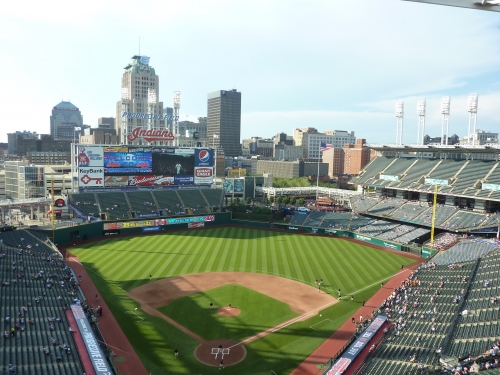
Progressive Field in 2010
Average Score: 86.000
#1 rankings: 1
Last Rankings: 0
Top 10s: 5
Bottom 5: 0
Standard Deviation (variation from the average): 4.946
Specifically note the high standard deviation here, as Jacobs Field is one of the more polarizing retro parks. Upon opening, many didn’t like it as much as Camden Yards because it wasn’t retro in the traditional sense, and as red brick ballparks gained traction throughout the decade, Cleveland’s park didn’t look as good to some. But in terms of contextual integration, appreciation of the city, and general exterior/interior aesthetics, others claimed Jacobs Field was just as good as Camden Yards conceptually. Progressive Field is applauded as one of the more authentic, yet understated, retro ballparks, not accentuated by one distinctive feature, but based on perfect visual balance and perfect connection to its context. People also noticed its unique sharp architectural lines. As the term “retro cookie cutter” was coined in the next decade, Jacobs Field got some new appreciation. In the 90s, some were turned off by the difficulty in getting tickets and the general strictness of the ballpark ushers. Today, some could point to the many objective flaws of this ballpark, including the lackluster concessions, poor sightlines, small crowds, dab concourses, and mediocre amenities.[/vc_column_text][vc_column_text]
9) Yankee Stadium (2009):
89 (#7), 79 (#17), 85 (4/5), N/A, N/A, N/A, 91 (#5), N/A, N/A, N/A, 85 (B+), 83 (#13), N/A, 91 (#5), 84 (#11)
Average Score: 85.875
#1 rankings: 0
Last Rankings: 0
Top 10s: 3
Bottom 5: 0
Standard Deviation (variation from the average): 4.190
New Yankee Stadium benefited from not having to design a truly innovative or original ballpark, but simply emulate the Old Classic Yankee Stadium. While there is some disagreement as to whether they succeeded, there is no disputing it was an inevitably safe effort. Many have also claimed it is more architecturally streamlined than the original when comparing the facades. Like most new parks, Yankee Stadium has been praised for its wide selection of amenities. New Yankee Stadium has primarily been criticized for its fan unfriendly practices and corporate vibe, such as the Legends Suite, which divide the ballpark along hierarchical lines. The “moat” prohibits regular fans from getting autographs. While minor, Yankee Stadium also lacks entertainment and kid friendly options, unlike all other new ballparks.[/vc_column_text][vc_column_text]
10) Citi Field (2009):
81 (#15), 78 (#18), 85 (4/5), N/A, N/A, N/A, 90 (#6), N/A, 89 (#7), N/A, 85 (B+), 92 (#4), N/A, 81 (#18), 88 (#6)
Average Score: 85.44444
#1 rankings: 0
Last Rankings: 0
Top 10s: 4
Bottom 5s: 0
Standard Deviation (variation from the average): 4.720
While the two parks are very different, it’s amazing how similarly received the mediocrity in New York was in this ratings system. Unlike the Yankees, the Mets didn’t really have an excuse not to build an original ballpark. But still, they choose to build another Ebbets Field copycat, well after the retro style had become blasé. For this reason, Citi Field has gotten some criticism in the ballpark community, especially since the design is muddled with a bevy of contrivances and ugly ads. Citi Field was also derided for emphasizing Dodger history over Mets history, and for some isolated sightline issues, but both of these issues have been addressed. The Mets new ballpark got generally good reviews simply because it was new, replete with amenities, especially its extremely broad and high quality food options.[/vc_column_text][vc_column_text]
11) Nationals Park (2008):
76 (#20), 81 (#15), 85 (4/5), 87 (#9), N/A, N/A, 78 (#18), 90 (#6), 91 (#5), 82 (4/5), 85 (B+), 84 (#12), N/A, 89.5 (#9), 87 (#9)
Average Score: 84.625
#1 rankings: 0
Last Rankings: 0
Top 10s: 5
Bottom 5: 1
Standard Deviation (variation from the average): 4.706
In many ways, Nationals Park is seen very similarly to the two aforementioned ballparks. All fail to break new architectural ground and bring the same old ideas to the table, but get good reviews because of nice amenities. Recalling the federal and national mall buildings, Nationals Park got attention for its modern white cast stone exterior design. While not met kindly from an architectural standpoint, it brought something different to the table. On the inside, Washington benefits from an open and airy concourse design. While few critics notice, Nationals Park probably has the highest quality of premium seating in the majors, as all three clubs are the most luxurious in the majors.[/vc_column_text][vc_column_text]
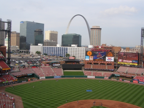
12) Busch Stadium (2006):
85 (#11), 85 (#11), 78 (3/5), N/A, 78 (#18), 91 (#5), 88 (#8), 83 (#13), 83 (#13), 82 (4/5), 85 (B+), 88 (#8), 83.5 (#7), 77.5 (#21), 90 (#6)
Busch Stadium in 2009
Average Score: 84.07
#1 rankings: 0
Last Rankings: 0
Top 10s: 5
Bottom 5: 2
Standard Deviation (variation from the average): 4.301
Other than having a nice downtown setting, critics having generally deemed Busch Stadium a highly derivative ballpark in terms of exterior and interior design, despite benefiting from gorgeous skyline views. While the nice view carries a lot of weight, many ballpark fans have pointed out that Busch suffers from a number of objective flaws, unlike aforementioned three ballparks of the “third retro wave.” A rarity for a new ballpark, Busch Stadium has a concourse closed from the field on the main level. In comparison to other parks, St. Louis is comparatively lacking in amenities, with limited and non-local concessions, small scoreboard, and a lack of historical touches or museums inside. Busch Stadium is also the only ballpark to lack a restaurant. The fans are probably the park’s greatest assets.[/vc_column_text][vc_column_text]
13) Dodger Stadium (1962):
90 (#6), 73 (#23), 85 (4/5), N/A, 83 (#13), 89 (#7), 80 (#16), 87 (#9), 88 (#8), 92 (5/5), 90 (A-), 89 (#7), 82.5 (#8), 72.5 (#24), 75 (#21)
Average Score: 84.000
#1 rankings: 0
Last Rankings: 1
Top 10s: 6
Bottom 5: 3
Standard Deviation (variation from the average): 6.595
I probably shouldn’t have included Dodger Stadium in the consensus, but whatever. Los Angeles benefits from timeless interior architecture, beautiful views, and great sightlines. The main reason Dodger Stadium ranks so low is because people who rank ballparks love to explore the facilities they are at. At Dodger Stadium, there is poor accessibility due to the layout of the seating bowls and strict ushers. You have to stay on the level you are sitting.[/vc_column_text][vc_empty_space][vc_column_text]
Tier Four: Mediocre ballparks that are significantly lacking
when compared to successes, but good ballpark experiences nonetheless
[/vc_column_text][vc_empty_space height=”10px”][vc_separator color=”black” el_width=”90″][vc_empty_space][vc_column_text]
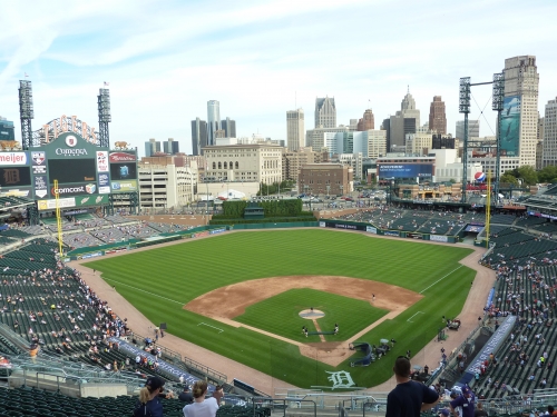
14) Comerica Park (2000):
82 (#14), 92 (#4), 85 (4/5), N/A, 84 (#12), N/A, 83 (#13), 79 (#17), 79 (#17), 76 (3.5/5), 80 (B), 81 (#15), 82 (#9), 91.5 (#4), 80 (#16)
Comerica Park in 2010
Average Score: 82.654
#1 rankings: 0
Last Rankings: 0
Top 10s: 3
Bottom 5s: 1
Standard Deviation (variation from the average): 4.670
Ok, look. I try to be objective when describing the ballparks in this article, but there is no reason for Comerica Park to be this low. It’s interesting to see how more recent reviews gradually became more favorable with this one. I make the case in my review, using simply objective criteria, such as location, sightlines, concourses, concessions, entertainment, and references to history, that Comerica is vastly underrated. And I don’t see how the contextually based aesthetics and gorgeous skyline views could be construed as sub par. Anyway, Comerica Park got flack for being the Anti-Tiger Stadium, characterized by an open, sprawling design. Critics point to the lack of cantilevering in the upper deck and the “spread out feel”, even though the decking isn’t farther back than others (while being lower). Many ballpark reviewers felt that the carousel and Ferris wheel were outrageously excessive, and faulted Comerica for those features. Mostly, Comerica was chastised for being one of the least interesting of the retro parks, lacking any distinctive features. As people have evolved to appreciate authentic designs free from distracting gimmicks, and forget about Tiger Stadium, Comerica’s reputation has gotten better.[/vc_column_text][vc_column_text]
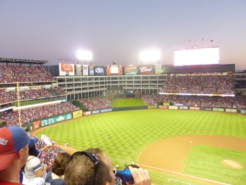
15) Rangers Ballpark (1994):
80 (#16), 88 (#8), 85 (4/5), N/A, 80 (#16), N/A, 73 (#23), 92 (#4), 82 (#14), 82 (4/5), 85 (B+), 87 (#9), 80 (#14), 81 (#16), 78 (#18)
Rangers Ballpark in 2011
Average Score: 82.538
#1 rankings: 0
Last Rankings: 1
Top 10s: 2
Bottom 5s:2
Standard Deviation (variation from the average): 4.875
The Ballpark in Arlington is another park with divided opinions, with some calling it a contrived faux retro theme park in a suburban area, with others praising the enclosed white steel architecture. I think there is no disputing that this is the most unique and identifiable interior design of the majors, separating it from other boring retro parks. The exterior facade is sited as being particularly beautiful. As one of the older retro ballparks, it’s lagging behind in some objective categories and amenities.[/vc_column_text][vc_column_text]
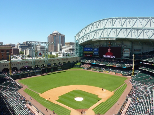
16) Minute Maid Park (2000):
77 (#19), 75 (#21), 4/5 (85), 86 (#10), 91 (#5), N/A, 77 (#19), 77 (#19), 82 (#14), 86 (4.5/5), 90 (A-), 74 (#22), 78.5 (#17), 90 (#8), 81 (#15)
Minute Maid Park in 2011
Average Score: 82. 107
#1 rankings: 0
Last Rankings: 0
Top 10s: 3
Bottom 5: 6
Standard Deviation (variation from the average): 5.891
Minute Maid Park is easily the most polarizing new park in the majors, reinforced by the standard deviation score. This ballpark has a lot of superficial aspects going against it, which people tend to fixate on, such as the gimmicks, the contrived hill in center field, the retractable roof, and Enron. Many ballpark fans specifically deride Minute Maid Park as too over the top in its retro train theme features. On the contrary, the few fans of this park point out that it’s easily the most aesthetically attractive of the retractable roof ballparks, characterized by unusual intimacy, good contextual integration of Union Station, and attractive beige arches. It also reveals the most open air space of all retractable roofed ballparks. It’s generally objectively above average in terms of functionality and amenities, aided by the recent addition of a new HD video board system.[/vc_column_text][vc_column_text]
17) Great American Ballpark (2003):
74 (#22), 86 (#10), 78 (3/5), N/A, 90 (#6), N/A, 84 (#12), 86 (#10), 78 (#20), 82 (4/5), 85 (B+), 75 (#21), 79 (#15), 86.5 (#12), 83 (#13)
Average Score: 82.038
#1 rankings: 0
Last Rankings: 0
Top 10s: 3
Bottom 5: 4
Standard Deviation (variation from the average): 4.867
In terms of design, Great American Ballpark is generally cited as the worst new ballpark from architecturally oriented ballpark fans. Upon opening, the ballpark was met with much criticism from actual architects for being too hokey and unattractive, deeming the effort a complete failure on all levels, lacking any continuity. In terms of interior design, fans generally agreed that there was too much clutter, especially the black box riverboat and the gimmicky smoke stacks, while also failing to effectively acknowledge or integrate the river views. The rhythms have no relation to the context while also failing to be aesthetically attractive. Ironically, if you look at the drawing board in 2000, the Reds at least deserve credit for being unbelievably bold conceptually. Objectively, Great American Ballpark’s saving grace is its wonderful Hall of Fame museum.[/vc_column_text][vc_column_text]
18) Angel Stadium (1998 renovation):
88 (#8), 89 (#7), 78 (3/5), N/A, 89 (#7), N/A, 81 (#15), 78 (#18), 80 (#16), 76 (3.5/5), 90 (A-), 77 (#19), 84 (#6), 78.5 (#20), 74 (#22)
Average Score: 81.731
#1 rankings: 0
Last Rankings: 0
Top 10s: 4
Bottom 5: 3
Standard Deviation (variation from the average): 5.592
I’m actually surprised to see Angel Stadium this low. But the general consensus is while the renovations were nice, they don’t compare to all of the better new retro ballparks around the nation.[/vc_column_text][vc_column_text]
19) Turner Field (1997):
78 (#18), 82 (#14), 85 (4/5), N/A, 77 (#19), N/A, 82 (#14), 84 (#12), 86 (#10), 76 (3.5/5), 85 (B+), 80 (#16), 81 (#12), 77 (#22), , 80 (#16)
Turner Field in 2011
Average Score: 81
#1 Rankings: 0
Last Rankings: 0
Top 10s: 1
Bottom 5s: 2
Standard Deviation (variation from the average): 3.367
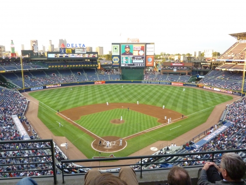
No joke, Turner Field is so forgettable that I completely forgot to originally include it in the rankings. Note that when ballparks start to get this low in the rankings, the standard deviation gets higher. But not here at Turner. I think it’s telling that it’s particularly low with Turner Field, indicating most people don’t really think anything of this ballpark, just uniformly placing it somewhere in the lower middle tier. There isn’t any disagreement as no one ever places Turner very high. When Turner Field opened in 1997, it didn’t really try to outdo Camden or Coors in terms of design, but they did brag that they took the amenities to an entire new level.
Turner Field is mostly a testament to the theme park mallification side of the retro ballpark era. Less focus on true architecture, aesthetically pleasing elements, and regional character, and more focus on making the ballpark a revenue generating entertainment experience. They hooked the nostalgic fan under the guise of retro, but Turner Field is more about large food courts, restaurants, fan plazas, musical entertainment, historic museums, and numerous interactive kids areas.
Unfortunately, other ballparks caught up and past Atlanta in terms of amenities, making Turner Field one of the worst new parks. For an early retro ballpark to still be good, it has to rely on timeless architecture, which Turner Field didn’t attempt to do.[/vc_column_text][vc_empty_space][vc_column_text]
Tier 5: Worst of the new ballparks
with significant flaws that greatly affect ballpark experience, did more harm that good, stand little chance as being timeless
[/vc_column_text][vc_empty_space height=”10px”][vc_separator color=”black” el_width=”90″][vc_empty_space][vc_column_text]
20) Miller Park (2001):
84 (#12), 76 (#20), 72 (2/5), N/A, 79 (#17), N/A, 89 (#7), 81 (#15), 74 (#22), 82 (4/5), 75 (C+), 73 (#23), 78.5 (#16), 89.5 (#9), 76 (#20)
Miller Park in 2011
Average Score: 79.154
#1 rankings: 0
Last Rankings: 1
Top 10s: 2
Bottom 5: 6
Standard Deviation (variation from the average): 5.717
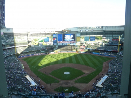
While a few contrarians praise Miller Park for its structural novelty, it’s generally criticized as an obtuse looking structure with a poor enclosed interior design. Even with the roof open, it doesn’t feel like baseball. Objectively, Miller Park is similarly mediocre, but at least manages to bring a regional feel to the table.[/vc_column_text][vc_column_text]
21) Chase Field (1998):
79 (#17), 77 (#19), 72 (2/5), N/A, 86 (#10), N/A, 74 (#22), 75 (#21), 76 (#20), 82 (4/5), 90 (A-), 72 (#24), 74 (#18), 77 (#23), 77 (#19)
Chase Field in 2011
Average Score: 77.769
#1 rankings: 0
Last Rankings: 2
Top 10s: 1
Bottom 5: 7
Standard Deviation (variation from the average): 5.357
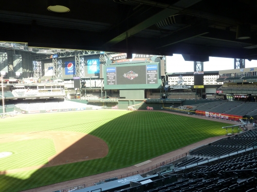
Chase Field is derided for its giant enclosed interior design, a kin to playing baseball in a gym. Unlike Miller Park, Chase Field doesn’t benefit from a unique design, as the exterior has been criticized for having a disastrously schizophrenic feel, trying to fuse modernist and retro elements. Overall, it’s probably a bit underrated, as the amenities are great. But Chase Field is always assumed to be at the very nadir of the ballpark rankings.[/vc_column_text][vc_column_text]
22) U.S. Cellular Field (1991):
75 (#21), 72 (#24), N/A, 82 (#14), N/A, 75 (#21), N/A, N/A, 76 (3.5/5), 76 (#20), N/A, 84 (#13), N/A
U.S. Cellular Field in 2011
Average Score: 77.143
#1 rankings: 0
Last Rankings: 1
Top 10s: 0
Bottom 5: 5
Standard Deviation (variation from the average): 4.259
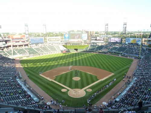
Not a representative sample yet post renovations. The Cell has gotten so much better with renovations, but it’s an uphill battle. At least it’s now comparable to the new retro parks.[/vc_column_text][vc_empty_space][vc_column_text]
Tier 6: Obsolete, multi purpose facility, but unique
[/vc_column_text][vc_empty_space height=”10px”][vc_separator color=”black” el_width=”90″][vc_empty_space][vc_column_text]
23) Rogers Centre (1989):
73 (#23), 74 (#22), 78 (3/5), N/A, 76 (#20), N/A, 76 (#20), 80 (#16), 78 (#18), 76 (3.5), 70 (C-), 78 (#18), 67 (#19), 80.5 (#19), 73 (#23)
Average Score: 75.346
#1 rankings: 0
Last Rankings: 5
Top 10s: 0
Bottom 5: 8
Standard Deviation (variation from the average): 3.891
When SkyDome opened in 1989, it was a modern marvel. After Camden Yards opened, Rogers Centre became “just another stadium.” Well after 20 years of retro ballparks, Rogers Centre is now the “only stadium.” It’s really gone full circle, to the point where SkyDome is now unique again.[/vc_column_text][/vc_column_inner][/vc_row_inner][vc_row_inner el_class=”other_content”][vc_column_inner][vc_column_text]Back to top of page[/vc_column_text][/vc_column_inner][/vc_row_inner][vc_empty_space][/vc_column][/vc_row]
