By: Cole Shoemaker
Written in 2011
In terms of interior design, one of the most common and overused buzzwords we hear from critics is “contrived” or “gimmicky”. As I’ve touched upon in multiple articles, some of the new retro ballparks added gimmicky features to superficially distinguish the design because of underlying similarity.
It can apply to dimensions (contrived) or features (gimmicky) beyond the outfield. People generally decried this as “faux retro:” the quirky dimensions of the Jewel Box parks were born of necessity, while new retro ballparks did quirky things just to be cute. Houston’s hill in center field is considered the poster child.
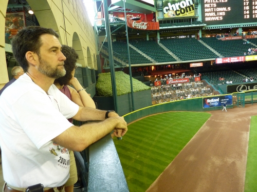
Minute Maid Park’s infamous Tal’s Hill. The irony is Minute Maid Park is architecturally unique enough without the gimmicks.
There are different levels of forced asymmetry, but it can generally apply to any jutting sections or bends in the outfield dimensions, some being sited as okay while others are sited as insulting and stupid (Petco). The general sentiment amongst critics is that contextually based features were good, but the new retro ballparks looked forced and went too far, despite being a nod to history. Go to any website and forum regarding ballpark architecture, and you’ll hear this ad nauseam. It certainly has truth, but here’s my take.
First of all, I will admit that any future appreciation of these ballparks won’t derive from phony contrived elements that may superficially identify them, but instead from timeless architectural principles. Authenticity endures, not overtly themey designs. The green monster wasn’t there just to be the artificially identifying feature, but arose organically.
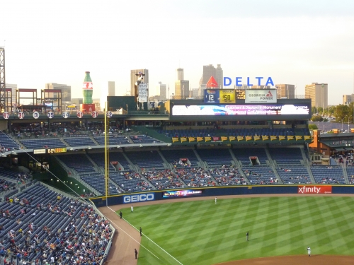
Outfield gimmicks at Turner Field. People often respond by saying, how would removing the Cow (or any other gimmick in another park) make the ballpark better? The point is, the fact that it is there in the first place and the ballpark needs it shows a lack of confidence in the architectural lines. There is a reason you don’t see this kinda stuff at Camden, PNC, Wrigley, ect.
So while we can all agree “contrived” is never good and an unfortunate hallmark of the retro movement, I am getting tired of seeing that term carelessly thrown around.
The primary interest is whether a design feature looks good and has continuity with the rest of the ballpark. Whether it’s “contrived” or not takes a back seat. Not all contrivances are created equal. Does that make me crazy? Of course, a contextually based design that oozes authenticity is ideal, but there are “contrived” features that simply look good and add to the aesthetic value of the ballpark (in the new retro parks). There are also plenty that come off as completely artificial and ugly.
The primary problem is that our use of the term is more shaped by time than reality. How do you define the term “contrived” or “forced” as a negative value judgment in terms of design?
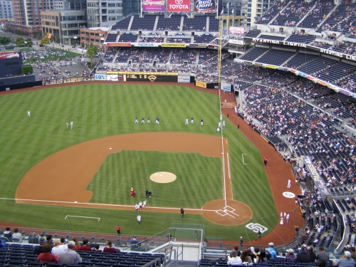
Petco Park’s blatantly contrived notch in right field dimensions by the foul pole. There is no reason to add something like this unless it explicitly adds some sort of aesthetic value.
In 1937, Bill Veeck added ivy to the outfield walls as part of a “beautification plan” for the ballpark (they rationalized its possible padding as a secondary reason, to be fair). Of course, there was no contextual reason to add Boston ivy in the outfield of urban Chicago. It just enhanced the aesthetic value of the ballpark. Is Wrigley Field’s greenery forced and contrived?
Perhaps something is labeled contrived because the new ballparks’ purposely created eccentricities were not original and essentially a rehashing of old ballparks. Maybe it was also because some “contrivances” look more artificial, not natural. It was the novelty and understated beauty of the ivy that made the feature so popular. The ivy, or even Kauffman’s waterfall, is more organic in appearance. But its still “forced”, right?
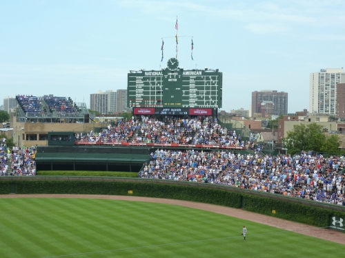
Wrigley Field’s famous ivy.
We don’t criticize Coors Field’s geyser while chastising Great American Ballpark’s “Lego” smoke stacks and model river boat because the Denver’s feature looks more organic and attractive, even though both are “forced,” “contrived,” and out of place.
My point is you can really take the term as far as you want to fit your argument, so it’s really become more of a meaningless buzzword. For example, should we call all brick ballparks “contrived,” just because brick isn’t necessary in modern stadium construction? Or are just those brick ballparks in suburban areas contrived, for example? Or neither?
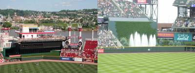
We criticize Cincinnati’s “Lego” smoke stack, because it looks awkward and ugly, but not Coors Field’s phony geyser, because it looks natural.
Today, any design feature can be rationalized as “contrived” as architects have the means and the demand to make anything look distinguishable and attractive, as aesthetics are valued more than ever. So now such features become trite and cliché.
So what we consider “contrived” in the context of the new ballparks is more shaped by (a) a feature’s ugly or artificial appearance, as opposed to something more natural or artistic, like fountains, geysers, or ivy (b) a feature’s lack of novelty, (c) how it fits with the rest of the design, even if it’s not contextual, and (d) the passage of time.