Citizens Bank Park
| Setting | 12.5/20 | 1 Thumb Down |
|---|---|---|
| Locale | 2.5/5 | 1 Thumb Down |
| Accessibility | 4/5 | 1 Thumb Up |
| Neighborhood Local Scene | 6/10 | 1 Thumb Down |
| Architecture & Aesthetics | 45/65 | Thumb Sideways |
|---|---|---|
| Exterior Design/Aesthetics | 11/20 | Thumb Sideways |
| Interior Aesthetics/Visuals | 30/40 | 1 Thumb Up |
| Concourse Aesthetics | 4/5 | 1 Thumb Up |
| Functionality & Essentials | 42.5/50 | 1 Thumb Up |
|---|---|---|
| Sightlines: Field Proximity | 10.5/15 | Thumb Sideways |
| Sightlines: Seating Geometry | 5/5 | 2 Thumbs Up |
| Seat Comfort | 6.5/9 | Thumb Sideways |
| Concourse Functionality | 14.5/15 | 2 Thumbs Up Star |
| Scoreboards/Tech | 6/6 | 2 Thumbs Up Star |
| Amenities & Features | 40.5/50 | 1 Thumb Up |
|---|---|---|
| Concessions: Food Variety | 3/5 | Thumb Sideways |
| Concessions: Food Quality | 5/5 | 2 Thumbs Up |
| Concessions: Craft Beer/Other Drinks | 4/5 | 1 Thumb Up |
| Social Gathering Areas/Restaurants | 9/10 | 1 Thumb Up |
| Premium Seating/Clubs | 6.5/9 | Thumb Sideways |
| Historical Exhibits, Memorabilia, Art, & Other Displays | 7.5/10 | Thumb Sideways |
| Kids Areas/Other Entertainment | 5.5/6 | 1 Thumb Up |
| Atmosphere, Vibe, & Policies | 14/15 | 2 Thumbs Up |
|---|---|---|
| Fan Support/Attendance | 4.5/5 | 1 Thumb Up |
| Ballpark Traditions/Gameday Presentation | 5/5 | 1 Thumb Up |
| Ballpark Policies/Staff | 4.5/5 | 1 Thumb Up |
| Adjusted Raw Score | 154.5/200=77.25=77.5 |
|---|---|
| Bonus | 2 |
| Curve for All 7 | 7 |
| Final Score | 86.5 |
|---|---|
| Ranking | #12/30 |
|---|---|
Location Mars Otherwise Fantastic Ballpark
Citizens Bank Park took ballpark functionality and amenities to the next level, but provides perfect illustration of how setting impacts architecture and aesthetics
By: Cole Shoemaker
Written in 2012, 2017; ratings above are up to date for 2024, but this review below may be outdated and will be updated at some point; reviews and ratings are “living pages” updated yearly when necessary
Upon opening in 2004, Citizens Bank Park was deemed a significant step forward in ballpark design through superior functionality and admirable attention to detail. But the ballpark is more notable in what it lacks: a good location.
The Phillies’ fan friendly pad is an outlier in the ballpark community in two senses. There’s often a lot of difference of opinion in something as subjective and tribal as a baseball team’s home, but the reviews are nearly unanimous in their tune here: this is one of the better ballparks in baseball, but the setting prevents it from being one of the best overall. At the same time, it’s the only post-1991 major league stadium with a poor location and subpar local scene that gets generally good reviews.
Ballparks are products of their surroundings. The true retro movement is about context in a community. When the Phillies’ new downtown location got rejected in the early 2000s, fans groaned and architectural critics denounced the possibility of another “retro” structure without a sense of place. Judging by public opinion from its debut to today, Citizens Bank Park has overcome that, in what is clearly a well-regarded ballpark.
In fact, given its high marks for innovative design, exceptional functionality, and fan-friendly amenities, what’s more remarkable is that Citizens Bank Park doesn’t overcome its cardinal deficit to an even greater degree, failing to enter top-10 territory, which leads me to my central thesis.
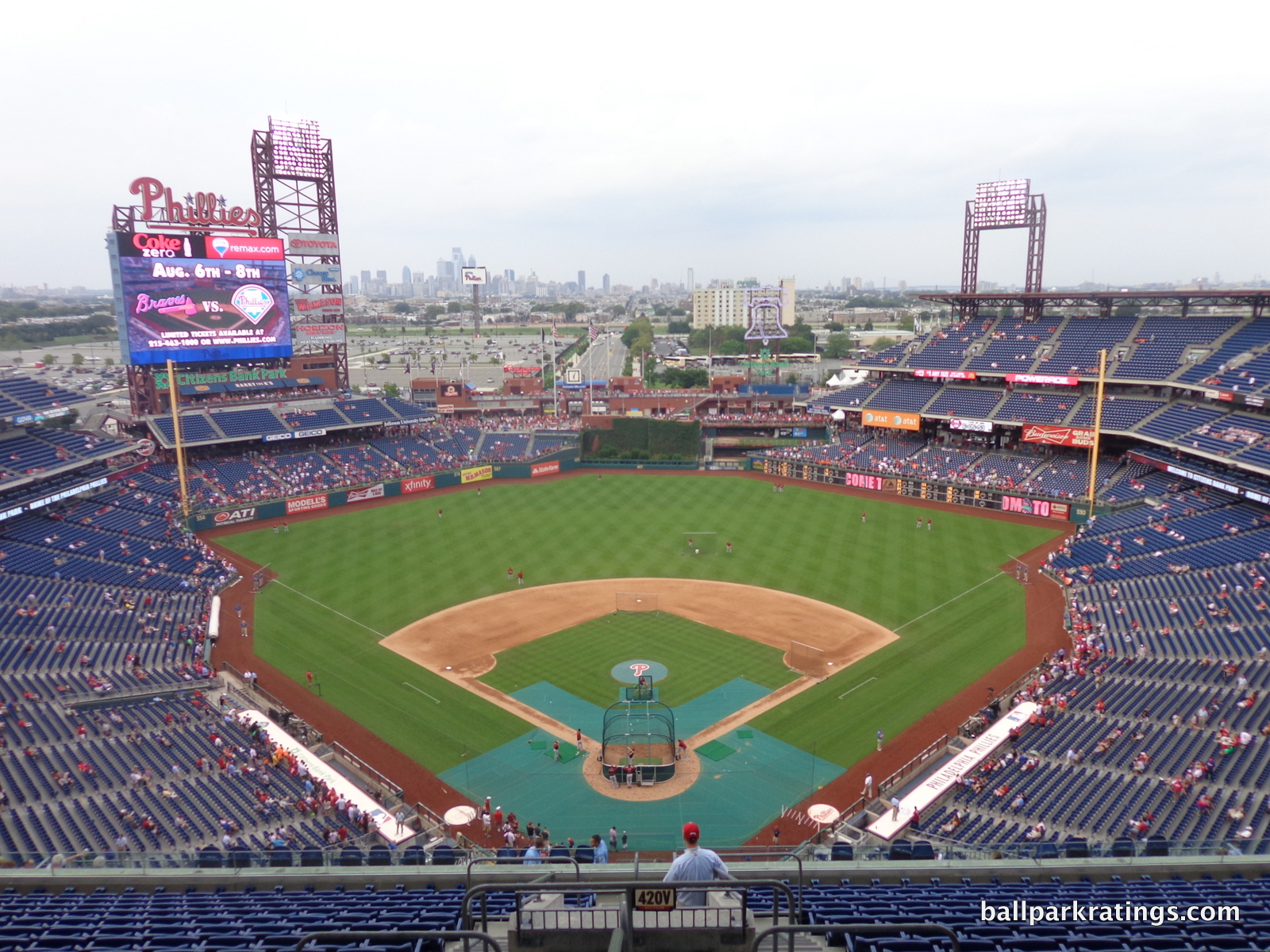
Citizens Bank Park illustrates that having at least a good location is a necessary condition for building a great ballpark. Perhaps not having a roof is the only other necessary condition. Despite excelling in other objective categories, Citizens Bank Park is a tad below the 10-13 other ballparks that could be construed as great, ranging from 84.5-91+. And, you guessed it, the 10-13 other parks are centrally located or have flavorful local scenes.
So, why is a good location necessary for building a great ballpark? Because integrated contextual aesthetics, derived from a good location featuring skyscrapers, urban bridges, rivers, or bays, are the most significant factor of the interior aesthetics.
Also, trendy retro architecture works better if that treatment is derived from a historical urban landscape.
The extent to which the quality of the location correlates with the quality of the interior aesthetics and overall ballpark experience is striking. Ballparks that simply let the local environment take over are often more successful in their interior aesthetics. Formulaic red brick exterior designs may also seem more acceptable when they are tangibly adapting to borders and resemble the local context, while those in the middle of nowhere can sometimes verge on intolerable in their mundanity.
Citizens Bank Park doesn’t have a context, in what is undeniably a suburban park in a sea of parking spots. The contours of Citizens Bank Park are meant to look like they adhere to an urban landscape (more on that later), as great ballparks are sculpted to observe their context with great care, but it comes off as obvious mimicry here.
While urban parks were intended to revitalize decaying neighborhoods with new activity, Citizens Bank Park’s energy dissipates into empty spaces. Despite sharp interior lines with fantastic balance and good interior design principles, there’s a certain vacuity to the whole picture, as the absence of anything beyond center field is palpable.
For a ballpark gazing out into miles of oblivion before reaching the cityscape, the interior aesthetics are as good as they could be, but can’t come close to matching parks in Pittsburgh, Baltimore, and a relatively large handful of others. With these standards, the poor setting and the implications of that poor setting are simply too prominent for Citizens Bank Park to be a top 10 ballpark.
That shouldn’t take away from what has been done here, however. The Phillies had the challenge of making this place function as a self-contained destination, and succeeded masterfully. As I’ve mentioned in other reviews, Citizens Bank Park is the best a suburban park with both a poor location and below average local scene could be.
While older parks like Comerica Park (Detroit) and Safeco Field (Seattle) featured standing-room only areas, Citizens Bank Park was the first major league ballpark that really invited fans to walk around and enjoy the game from multiple vantage points. In the current era where “walkability” and “selfie spots” are key, the Phillies’ park was ahead of its time.
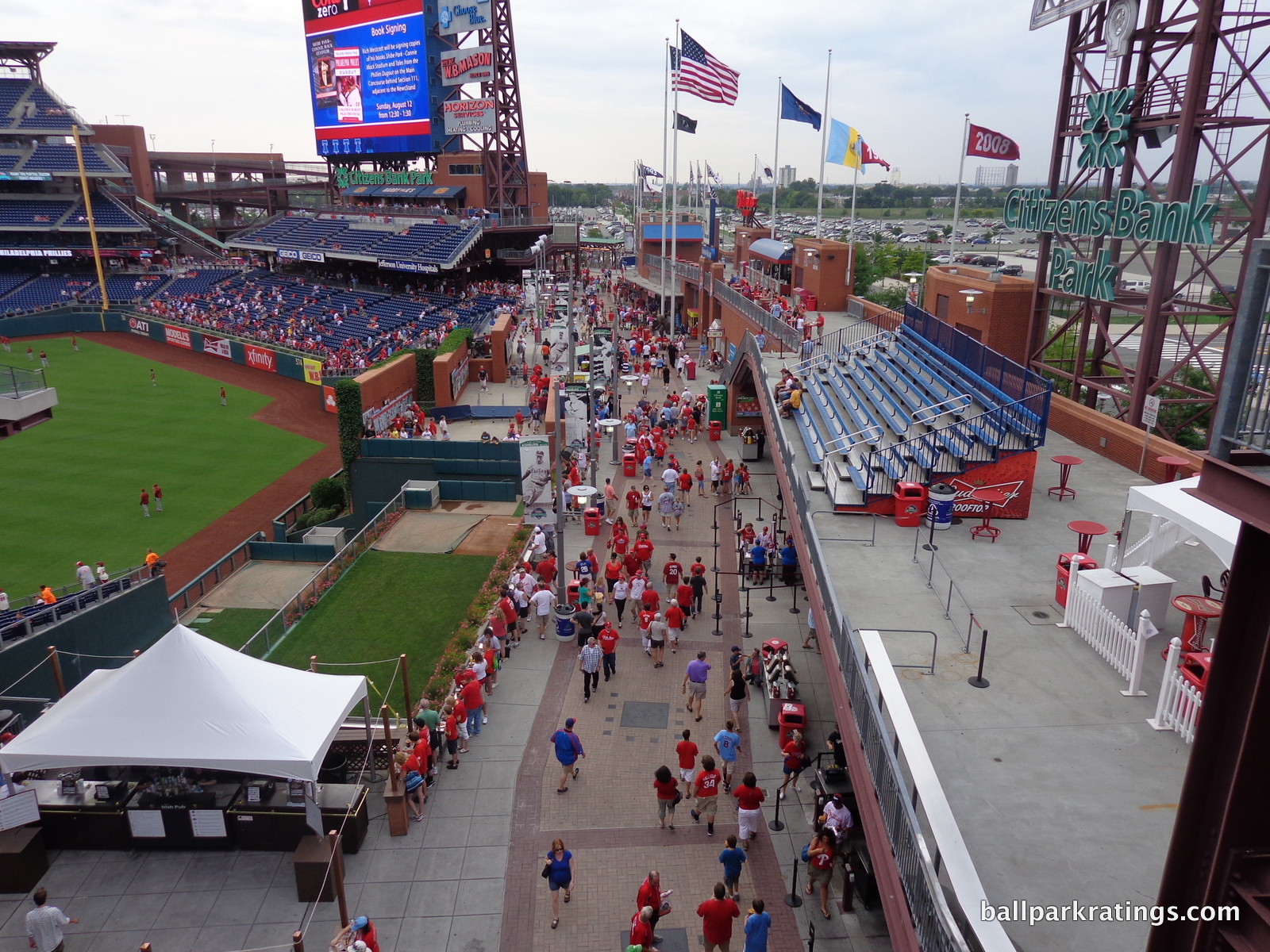
While subsequent ballparks emulated them, Citizens Bank Park has the best concourses in baseball. The theme of openness is emphasized throughout the wide 360-degree system, as your view of the field is almost never obstructed. At similar parks, the view from the main concourse may be obstructed by clubs, suites, or press boxes behind home plate, but not here. Citizens Bank Park also pioneered the idea of open concourses in the upper deck, ensuring fans hanging out in the nosebleeds would also never lose sight of the game (at least in theory). Concourses are open on all three levels. There are so many wonderful places to stand around the ballpark.
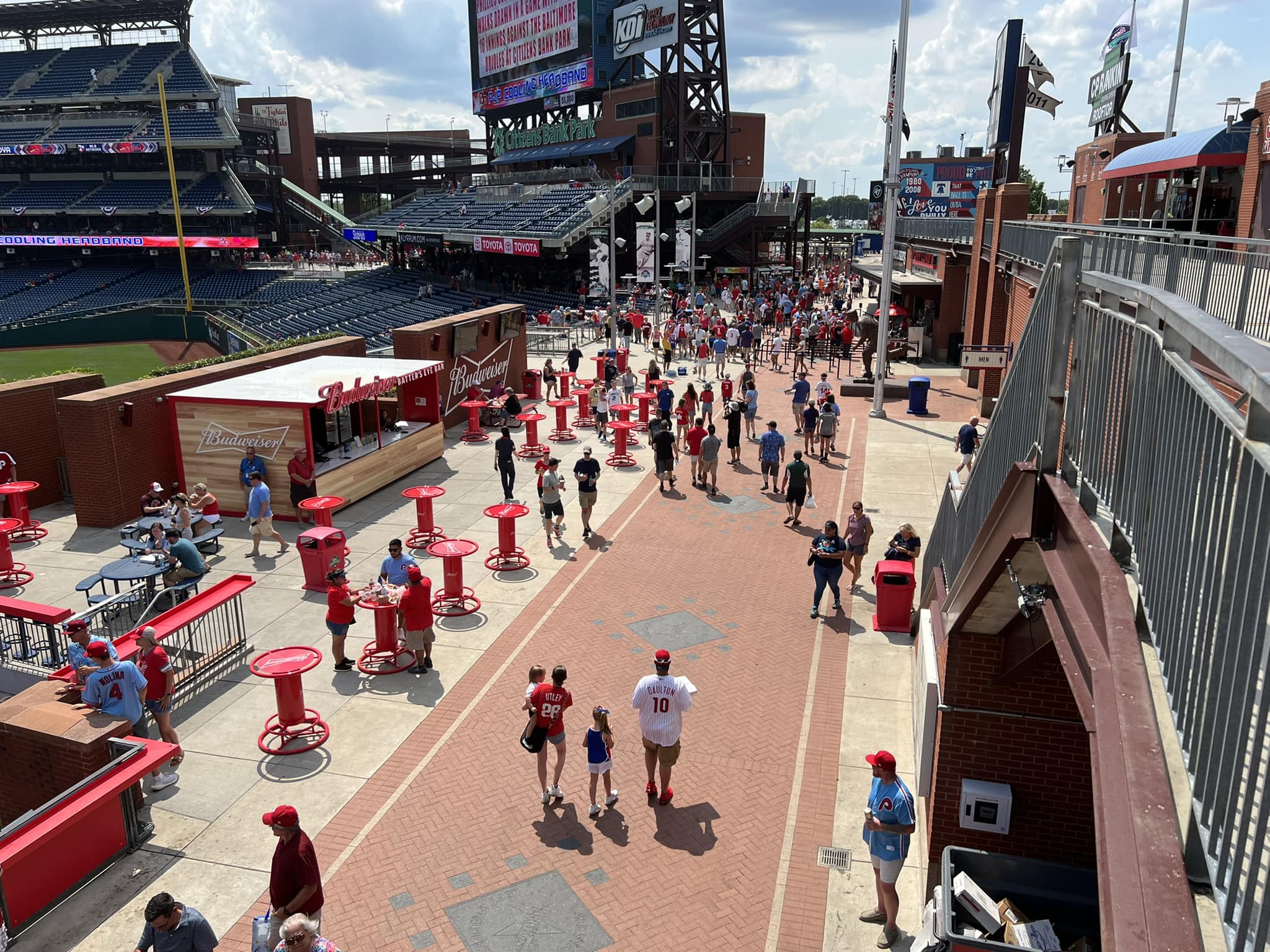
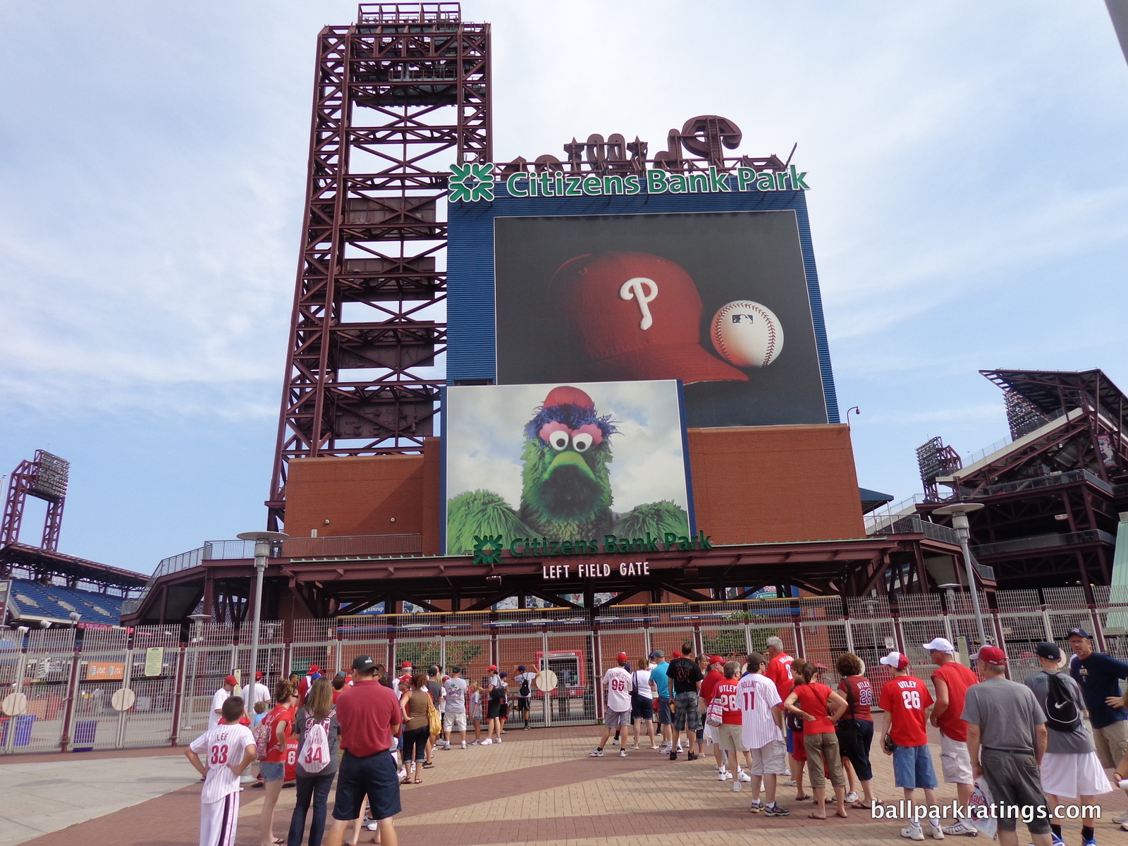
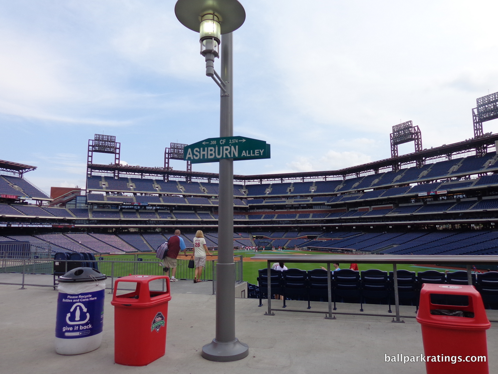
The Phillies’ vision of openness culminates in Ashburn Alley, the center field concourse. Featuring multiple tiers of standing-room only areas, prime bullpen views, local foods, historical references, and kids’ entertainment, you could argue this was major league baseball’s first “social space.” However, “social spaces” have come to mean destination bars (I’d like to see the Phillies add this on the rooftop area). Ashburn Alley also popularized the concept of ballpark “outfield experiences” that open before the other gates.
Architects like Craig Schmidt at EwingCole were among the first to understand that baseball’s leisurely pace with delays and in-between inning breaks required other ballpark features to pacify younger fans looking for instant gratification. While you can still keep track of the game, social spaces would be vital for filling these stops in play.
“The whole group that enjoys hanging out on Ashburn Alley; those people didn’t come to the Vet,” Phillies president Dave Montgomery said in 2010. “We were dependent on hard-core fans there and families. Now we’re benefiting from that 18-to-32 age group.” Similar outfield gathering spaces have been copied at most subsequent ballparks. While often not replicated as successfully (for reasons that escape me), Ashburn Alley is the most influential ballpark feature of the century.
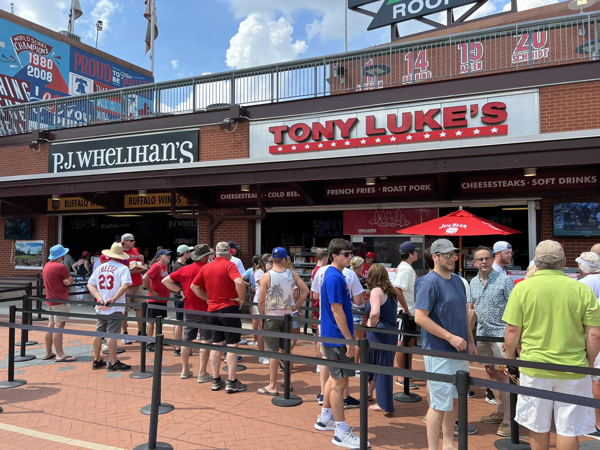
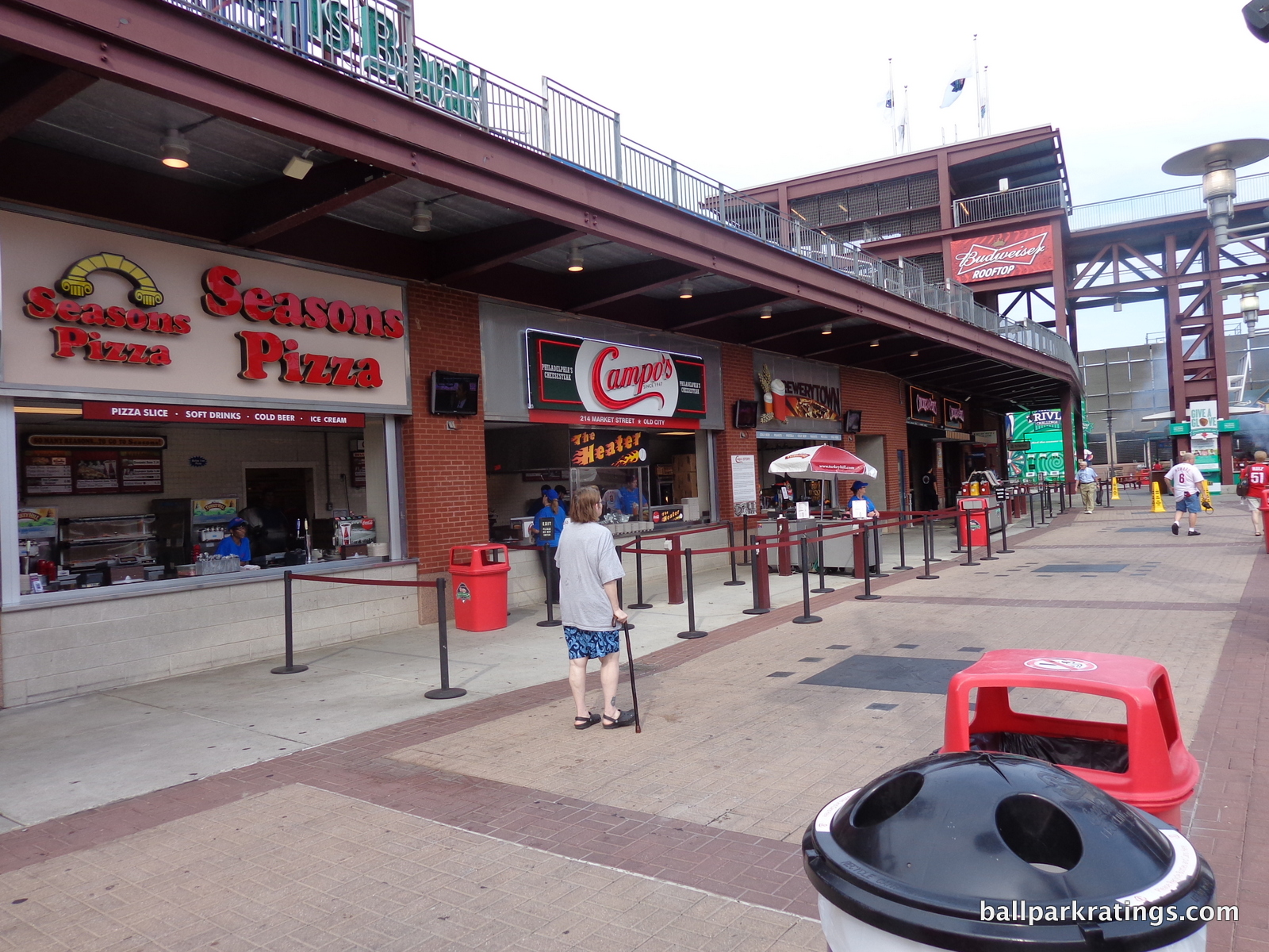
While the Giants’ AT&T Park brought stadium food to an entirely new level, Citizens Bank Park was the first to stress multiple high quality local restaurants and concessionaires within a major league ballpark. Tony Luke’s remains the most memorable staple. Almost every ballpark today tries to showcase a local eatery, not just a regional concession item, with the trend really accelerating this decade.
Little touches with great attention to detail have also come to define Citizens Bank Park. Like Comerica Park, they broke up the upper deck down the right field line, in order to put the farther upper deck closer and lower to the field. The grandstand features an angular design instead of a circular one, which is a nice change of pace. The brick exterior may leave much to be desired, but attractive red brick is omnipresent inside the ballpark, particularly around the batters’ eye, and it really works well.
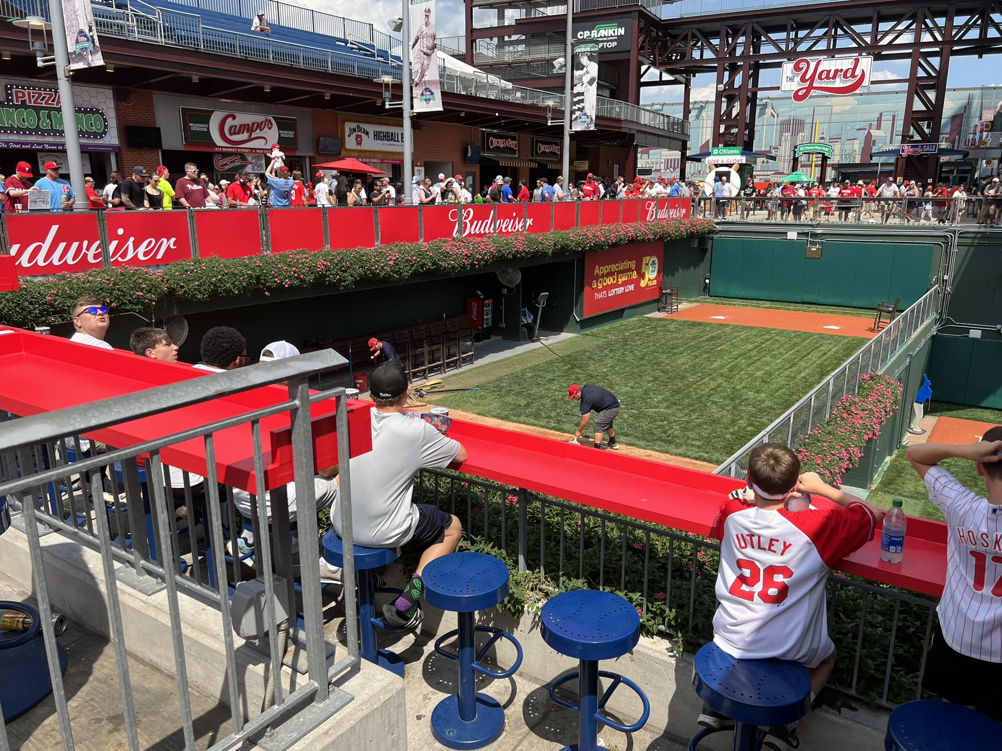
You might note the metal counter tops at the top of open concourses at other ballparks around baseball, allowing fans to put their food or drink down to watch the game from the concourse. Citizens Bank Park started that, and other parks have retroactively emulated it.
“We thought people would gather there, but we had no idea they would gather in the numbers they have,” Montgomery said. “Instead of sitting in the upper deck, people are just as happy to come and stand for an entire game. We could not have predicted that.”
While the setting and its consequences for the exterior and interior aesthetics prevent Citizens Bank Park from reaching the level of the best parks in baseball, the Phillies’ ballpark is still an outstanding place to see a game.
In a way, Citizens Bank Park is kind of like the second Camden Yards in ballpark design, but from a functional point of view. Many of the fan friendly amenities and effective design cues you see here have been copied in subsequent parks.
Setting
Location/Access:
What might be lost in my introduction is that a great location is important in and of itself. Even an enclosed dome wouldn’t be all that it could be with a suburban location. With Citizens Bank Park’s location in the South Philadelphia Sports Complex, Phillies fans don’t know what they’re missing.
There’s something magical about a city’s awakening before and after a game at Wrigley Field or Coors Field. When exiting after a big win, the collective effervescence hits the cityscape, spilling into streets, bars, and restaurants, as the exuberance of the crowd meets the exuberance of the city in a collective rejoicing of victory. Think cars honking and locals wailing in excitement. A city’s familiar spirit of unity is never more on display.
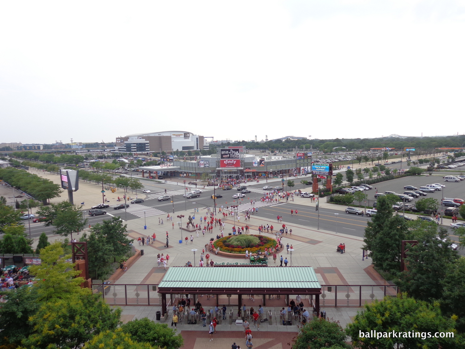
Citizens Bank Park is a quintessentially Philadelphia building in that it was built in the wrong place. This is a city that allowed Disney to carve out a failed enterprise in the prime of downtown and hasn’t been able to develop Penn’s Landing for 40 years.
The Phillies play in what you might call a “stadium ghetto,” reminiscent of the days when stadiums were relegated to the outskirts of the city.
However, there are two mitigating factors that may make Citizens Bank Park’s location seem more reasonable, one more plausible than the other. While most other post-1991 suburban ballparks were also built in a space formerly occupied by an existing stadium, Citizens Bank Park is built in a true sports complex with a very large system of preexisting infrastructure.
All four professional sports teams play here. Parking and mass transit already exist. The site does provide good access to interstates 95 and 76. While it’s a mar on the town that all teams play away from the city center, you can understand how it’s hard for one team to leave.
Second, the Phillies claimed (after the fact) that they couldn’t have built a ballpark like this downtown. They said they wouldn’t have had the extra space to build large concourses filled with fun amenities. While Citizens Bank Park is a staggering 7 acres larger than a spatially constrained AT&T Park, the general implication is incorrect. Plenty of urban ballparks, like Camden Yards or Petco Park (San Diego), have footprints sufficient in space. If the Phillies were referring to a specific site, it couldn’t have been more constrained than the one at Target Field (Minnesota), and the Twins managed to pull off a ballpark with wide concourses and good amenities.
Score: 2.5/5
Local Scene:
With the emergence of Xfinity Live!, Citizens Bank Park is a step above other suburban ballparks in Kansas City, Arlington, and certainly New York (Mets) in this category.
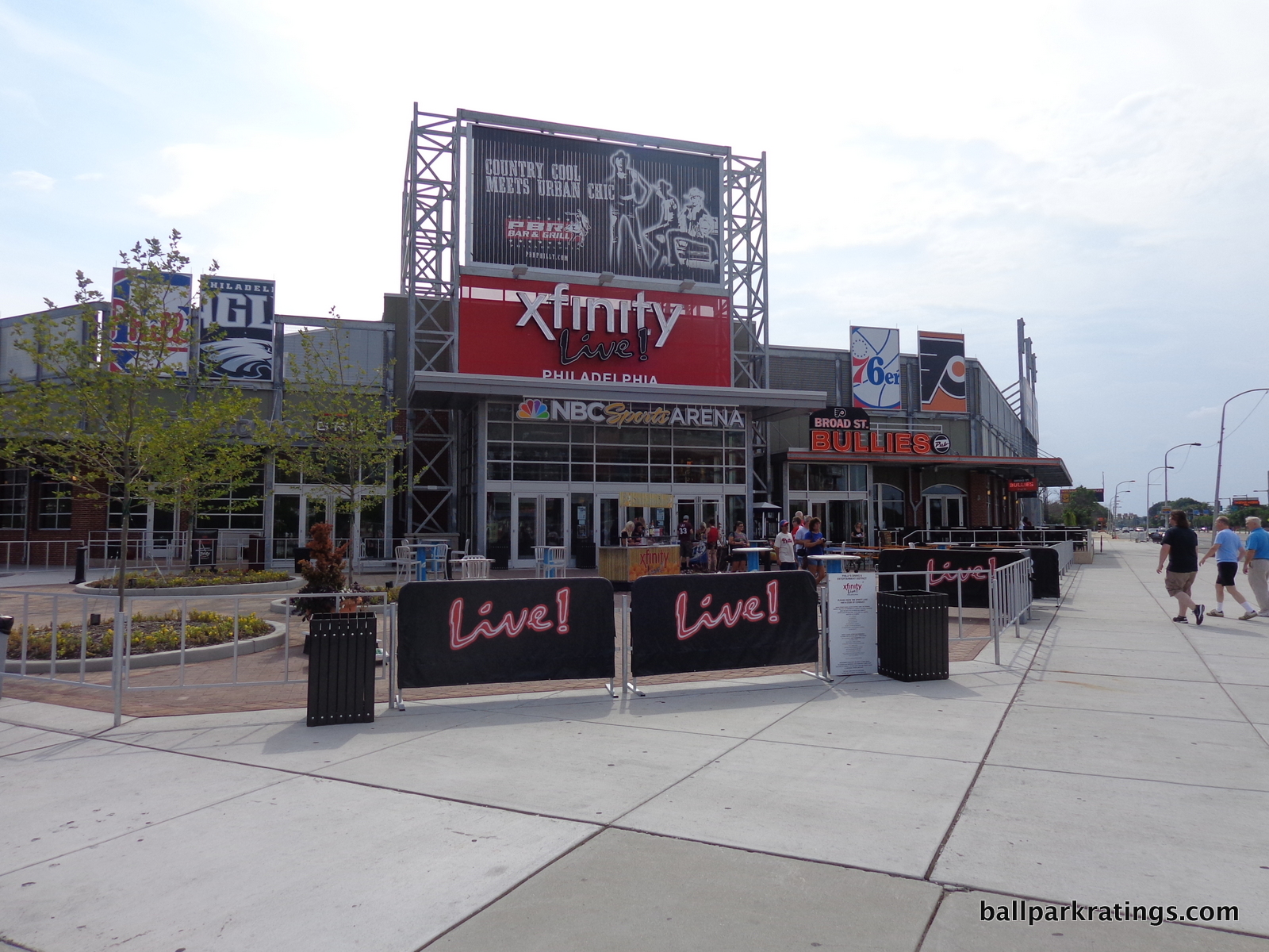
While not anywhere near a sprawling mixed-use development community like in Atlanta, Xfinity Live! is a dining and entertainment complex on the former site of the Spectrum, outside the third base entrance on 11th and Pattison. There are now six bars and restaurants occupying the space, and that’s pretty solid for pre and post game options.
There’s still something self-contained and artificial about it though; something that livable mixed-use development complexes in suburbia manage to avoid. Perhaps it’s because fans entering the pre and post game bar scenes aren’t meeting the city; they are the city, so to speak. You still feel like you’re in the middle of a parking lot, without the sprawling options of an urban ballpark, even in the couple of urban parks that don’t have as many bar and restaurants in the direct vicinity.
Score: 3/5
Total: 5.5/10
Architecture & Aesthetics
Exterior Design:
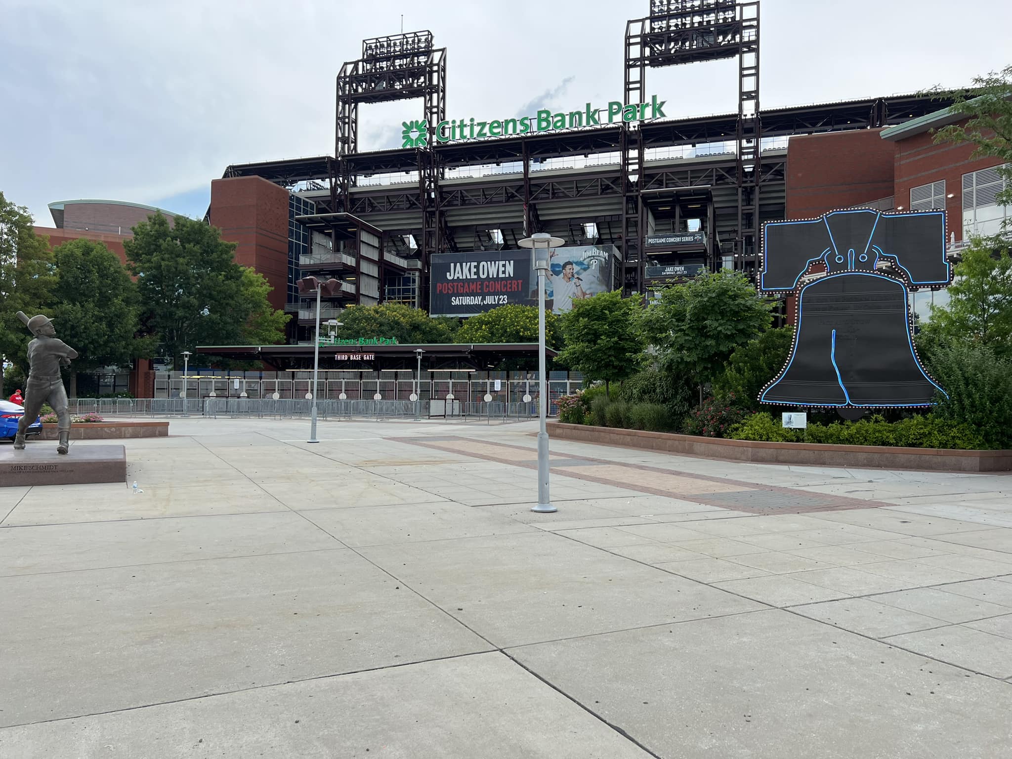
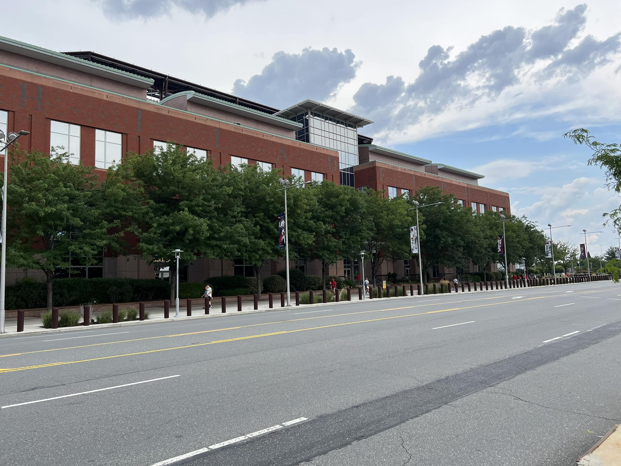
While the conceptual effort is laudable, Citizens Bank Park’s exterior design is again more defined by its suburban location than it would like, without the originality or raw aesthetic appeal to compensate. However well executed any piece of exterior architecture might be in theory, it’s difficult not to end up with something rather prosaic when dropped in a 15,000 car parking lot.
Because I haven’t written many in-depth reviews in a while, it might be instructive to flesh out what I look for in an exterior design. In addition to (1) pure aesthetic attractiveness, I consider (2) structural innovation and novelty, specifically if the treatment was unique for its time, or if it was merely a formulaic rip off. I also consider (3) how well the architectural materials and overall treatment fit in with the surroundings. Even before considering aesthetic attractiveness, this might explain why Camden Yards and Coors Field (Colorado) score much higher in my book.
I know there’s sort of an East Coast ballpark rivalry going on, so for Phillies fans that might be upset, I should note that Citi Field’s (New York) poorly articulated Ebbets Field mimicry (generally considered much more attractive) only scores slightly better in this category. Retro is just too conservative for the mid to late 2000s in my opinion, especially if it’s not contextually derived. If you wear the same dress your nine other sisters wore to the wedding, the attractiveness of the dress can’t be the only consideration.
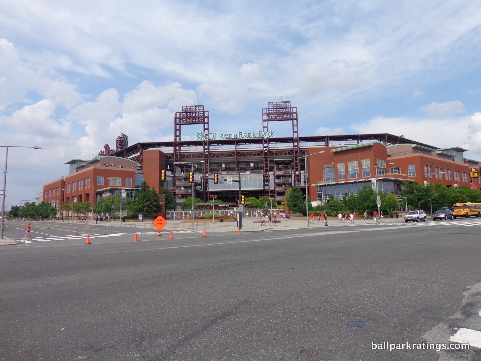
Finally, I look at the ballpark’s (4) conceptual intentions on their own, as there are a few ballparks that are quite conceptually clever, but may not look that great (Progressive Field and Minute Maid Park come to mind). But most, if not all, new timeless ballparks have a conceptual vision on the outside.
While there was some effort put into number (4), Citizens Bank Park fails on all four accounts to differing degrees, with uninspired architectural treatment with a poor sense of place, all while using a formulaic template. I want to strongly emphasize no post-1991 ballparks are ugly on the outside, but this is probably among the weakest red brick retro ones.
Let’s first look at the concept. The architects’ vision was to design the layout of Citizens Bank Park as if it was constrained by urban borders. Philadelphia’s City Hall, which is situated among Washington, Rittenhouse, Logan, and Franklin squares, was said to be the model. William Penn’s city plan, metaphorically representing four points of entry, was the explicit inspiration for creating a ballpark that looked like it was part of a city. It looks like it’s in a square urban block.
Consisting of spacious entry plazas, all four sides of the building are occupied by activity, as if there were city buildings next door. The intention is admirable, but it just doesn’t work. If you have a suburban location, don’t design an urban building. A ballpark’s interplay with its context is just too important. If you are going to go this route, perhaps it’s not self-contained enough, lacking a true mixed-use community to provide the intended faux urban sensation, as the sense of phoniness is inescapable. But at least the Phillies have an exterior conceptual vision, unlike Turner Field and now SunTrust Park (oh, Atlanta, you sadden me once again).
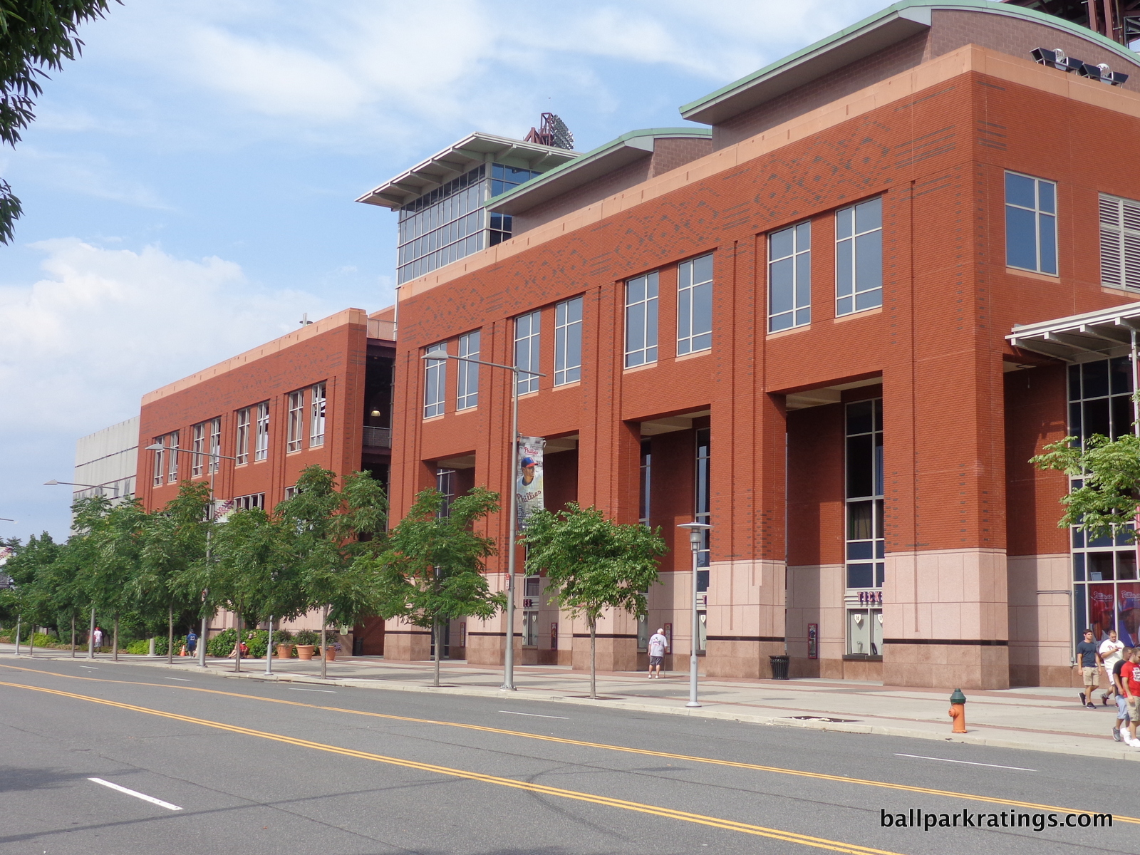
Perhaps this was an instance were retro impulses (especially as late as 2004 when it was getting quite blasé) should have been checked. The suburban Globe Life Park (1994) in Arlington has a similar sense of phoniness, as if it’s on “Rangers’ baseball theme park island”, but it compensates with a pioneering retro look and a strikingly attractive appearance, filled with nuanced regional accents.
For all its lack of place and derivative stylization, Citizens Bank Park also has the intensity of a suburban office park, not an architectural monument meant to celebrate America’s great game. In an era where ballparks are defined by signature entrances giving fans an immediate and memorable sense of arrival, Citizens Bank Park fails to make a strong opening statement.
While effective retro ballparks in Denver, Arlington, and even Detroit are supplemented with unique but architecturally sound regional accents, Citizens Bank Park is the architectural equivalent of off-brand ripped jeans.
The base of the red brick columns receives polished pink granite treatment, but it looks too manufactured and smooth. Parts of the exterior facade look like the headquarters of an insurance company, while other parts almost have an abandoned Philadelphia warehouse motif. Overall, I think the structure is awfully brute and corporate. It’s subtle, but the red brick itself is finished on prefab panels, without the semblance of being personally laid brick. I’m not taking off for that though, as I simply don’t know if that is unusual or not.
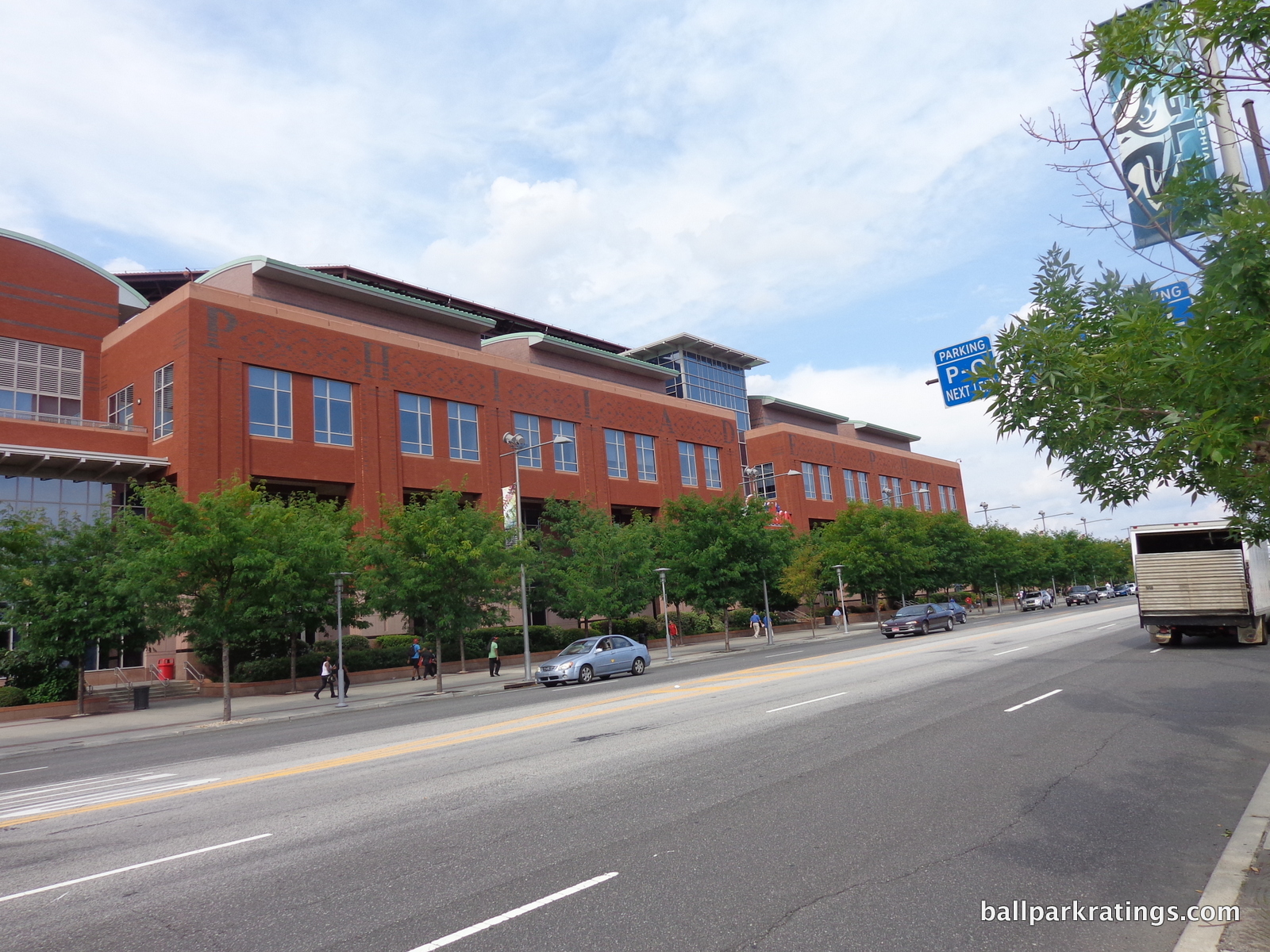
For me, the fact that “PHILADELPHIA” is spelled out in black bricks across the second story of the façade says it all. Because of the underlying similarity of retro red brick treatment, many parks try to add accented brick and distinctive design cues, but usually with at least some architectural merit. In Denver, we have beautiful ornamental terra cotta columbines; Arlington features local imagery with historical Texas bas-reliefs; Detroit is punctuated by Michigan blue and orange pewabic tile; Even San Francisco, which I gave a somewhat mixed review in this department, has bricks emulating the stitching of a baseball.
Citizens Bank Park just says “PHILADELPHIA” in bricks! Subtle. It basically tells me the architects knew retro was banal by 2004, realized they had to superficially distinguish their red brick, and completely ran out of ideas on how to do that. Surely, they could have been more tasteful than that. Can you imagine “BALTIMORE” or “COLORADO” inscribed outside of Camden Yards or Coors Field? Both sides of the façade also have black bricks forming a series of generic baseball diamonds.
All of this underscores the stage-set sensibility of the entire picture.
Citizens Bank Park isn’t totally bereft of merits. The landscaping around the structure is attractive. The maroon wrought iron is a nice change of pace from the usual green we see around the majors, and fits well with red brick. It’s more industrial chic. And the Philly Phanatic sign behind the left field scoreboard adds some much needed whim to the office space-like structure.
In terms of retro designs, it’s not as bad as the clashing exterior designs of Chase Field (Arizona) or Safeco Field, nor the visionless and derivative Turner Field, but it’s near the bottom. Even a park like Nationals Park fits in well with its surroundings. Citizens Bank Park’s concept doesn’t work in the suburban setting, and it lacks the imagination or attractiveness to compensate.
Score: 5.5/10
Interior Aesthetics:
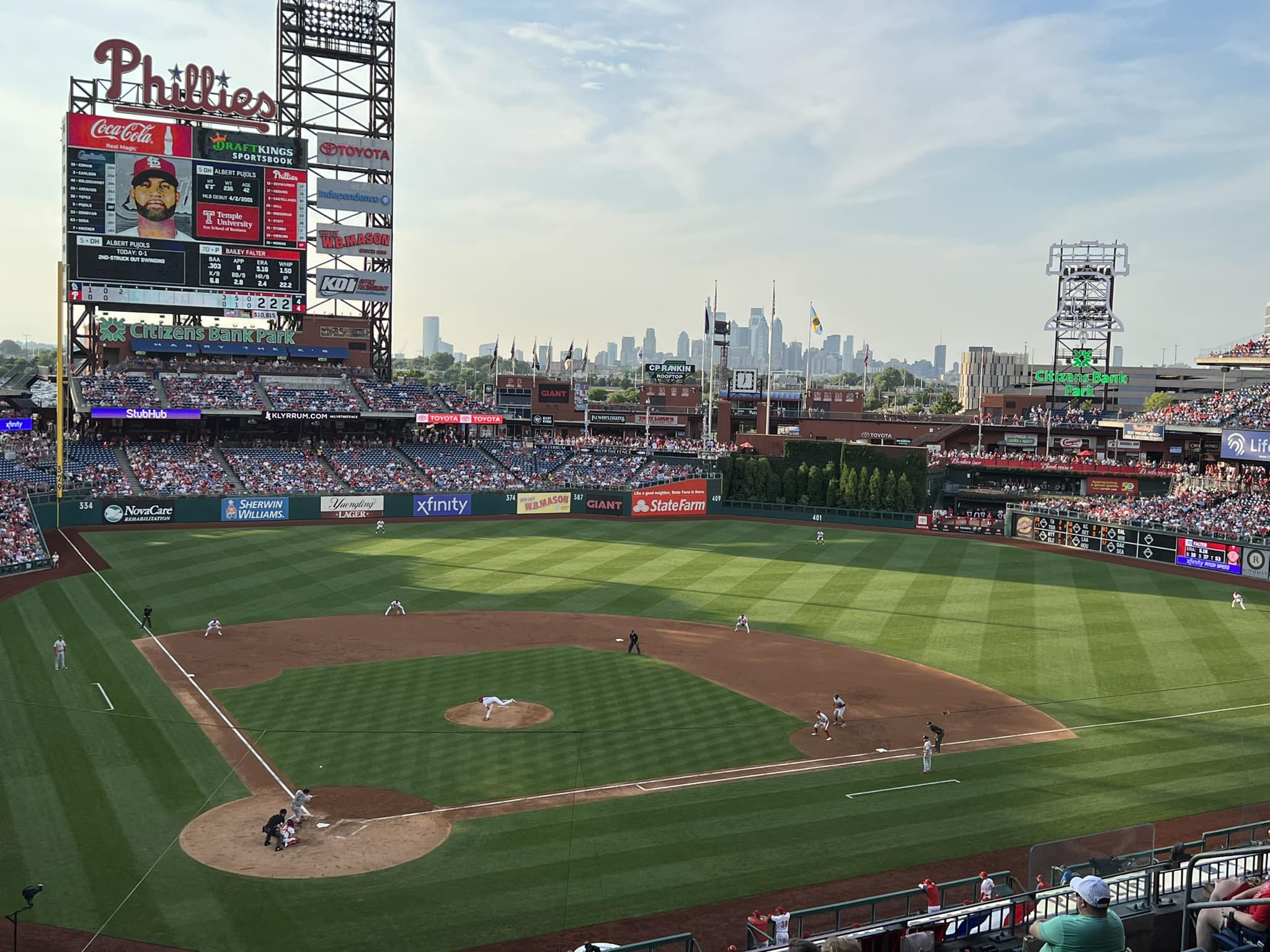
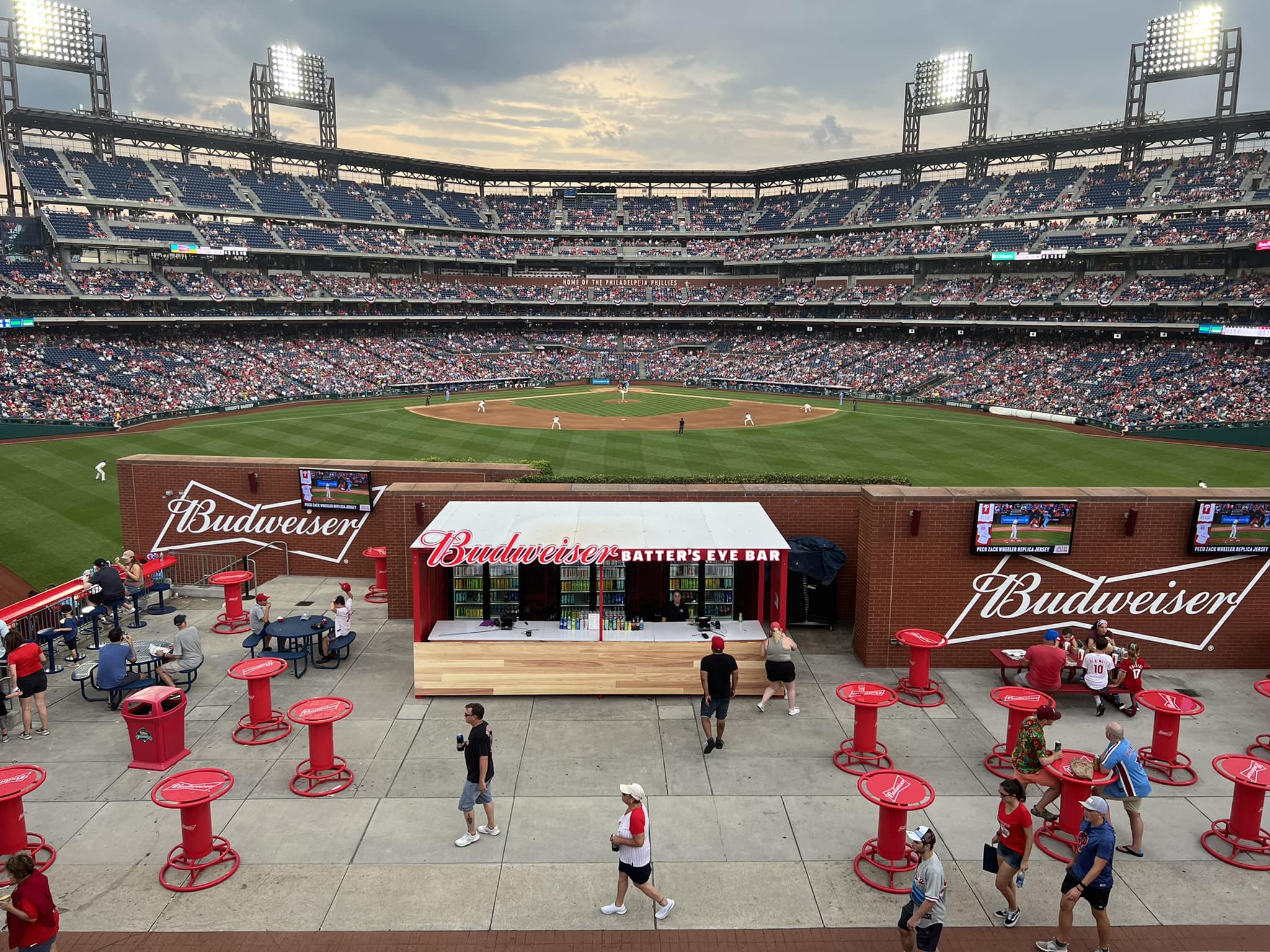
With clean lines, a vibrant color scheme, and great structural balance, the interior aesthetics are a breath of fresh air compared to the exterior. Overall, this is about as good as the interior aesthetics of an open-air ballpark in the middle of a parking lot could be.
When we discuss ballpark interior aesthetics, much of the emphasis stems from how well the ballpark responds to its surroundings. If you look at stadiums across major league baseball, note just how many are designed around their setting, to the point where upper decks are truncated to integrate views and dimensions are sculpted with respect to urban streets. By default, we see none of that here.
With no contextual elements, Citizens Bank Park succeeds solely on its own merits, which in some ways make it more impressive.
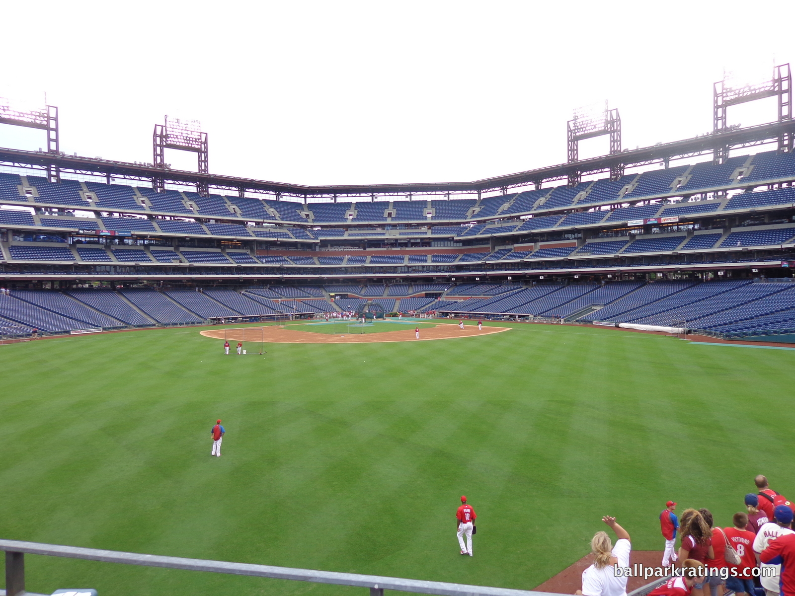
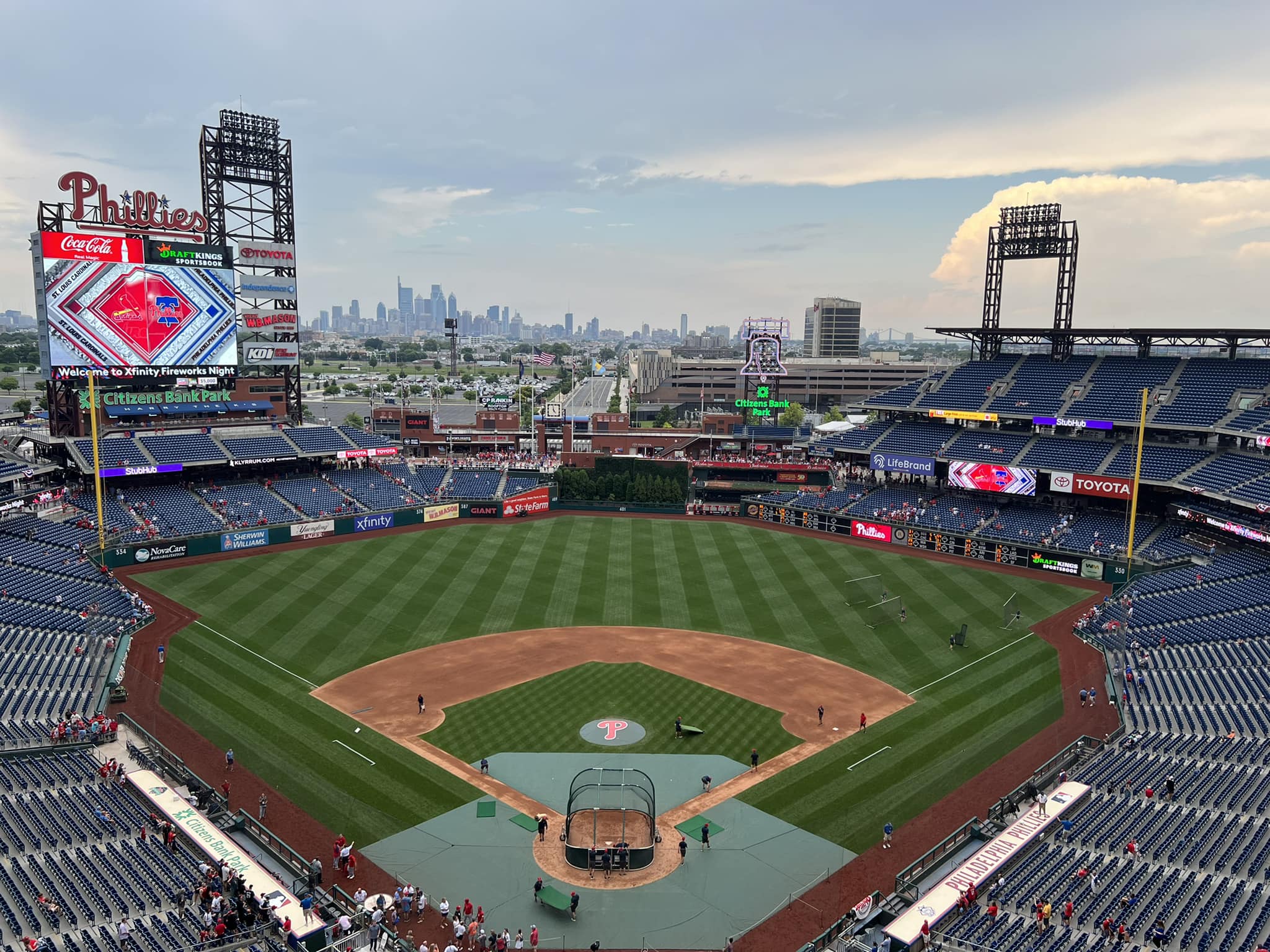
Grandstands in foul territory are relatively indistinguishable from ballpark to ballpark, other than the canopy. Citizens Bank Park is the exception, featuring a unique angular geometric design. Philadelphia has lines, not curves. This sharp linearity is Citizens Bank Park’s defining characteristic. You have to wonder why all other parks went with a boring curvilinear design. With a multitude of formulaic ballparks around major league baseball, Philadelphia brings something fresh to the table.
The crisp linear horizontality extends to the outfield grandstand, where the sharp ends point toward center field. This serves to emphasize the presence of that area, and for good reason.
Indeed, Citizens Bank Park’s outfield scene works so well because of the attractiveness seen in center field. For whatever reason, so many other parks have awkward spaces where the batters’ eye sticks out like a sore thumb. The obtuse batters’ eye in Pittsburgh and San Diego hamper otherwise fantastic interior aesthetic scenes.
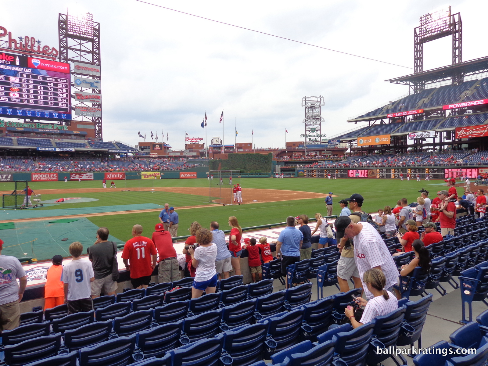
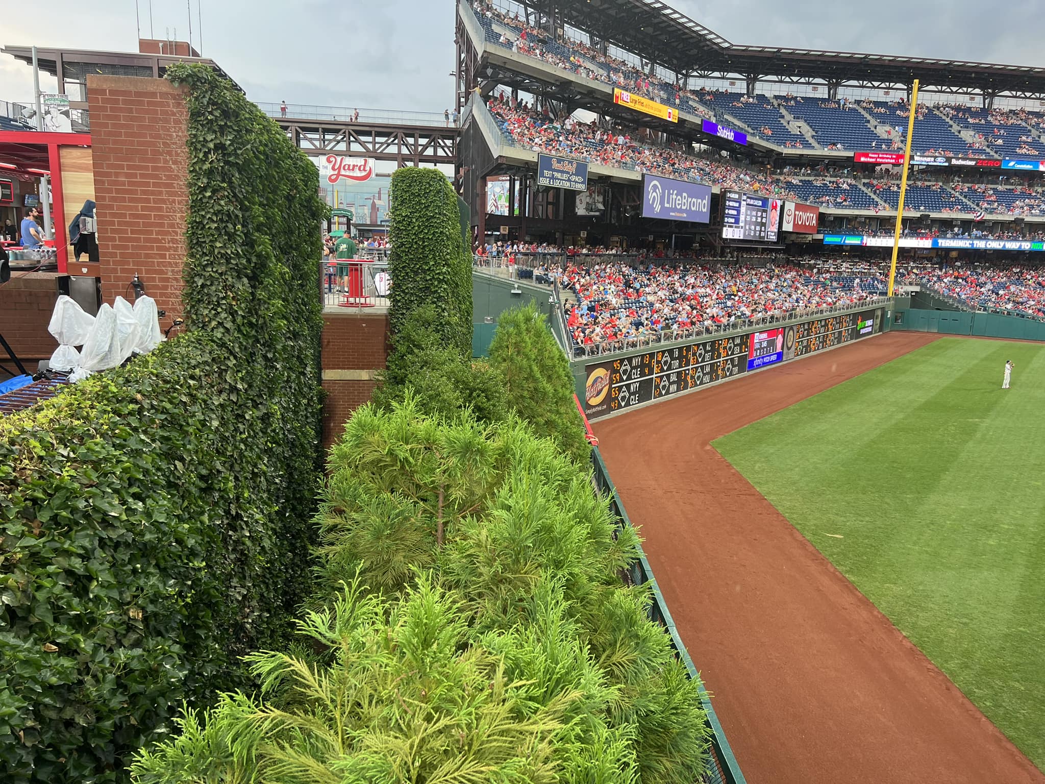
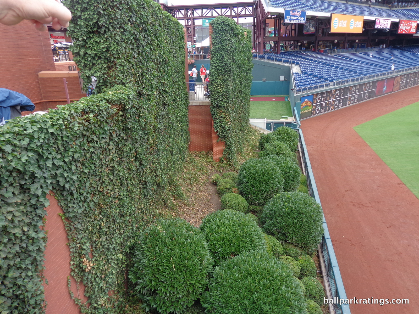
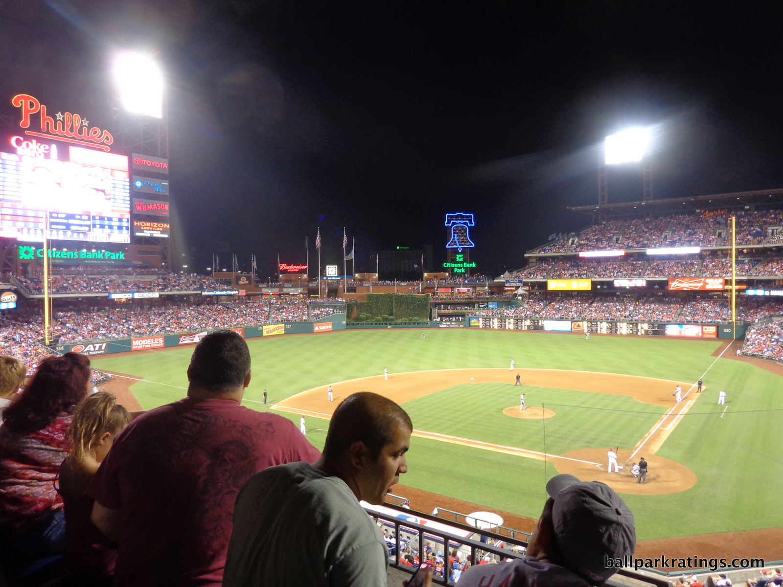
In Philadelphia, it is so well integrated into the overall design. The red brick behind center field is meant to evoke an urban scene and the ivy-covered red brick batters’ eye is perhaps the best in all of baseball. Extending the omnipresence of red brick throughout the ballpark, the batters’ eye fits perfectly. The shrubbery in center field is wonderful too.
Overall, Citizens Bank Park just doesn’t have the dead space seen in other ballparks. We have great balance as well.
Unfortunately, the beauty of the center field scene makes the lack of any sort of activity beyond this space much more palpable. Contextual integration is paramount, so this is an uphill battle. Citizens Bank Park screams to be placed in an urban environment.
You have a park like Busch Stadium (St. Louis), which clearly doesn’t have as good as an interior structure in my opinion, that scores slightly higher here because of the beautiful background. Citizens Bank Park probably has even better interior bones than a park like Comerica in Detroit, but ballparks are built the way they are because of their setting.
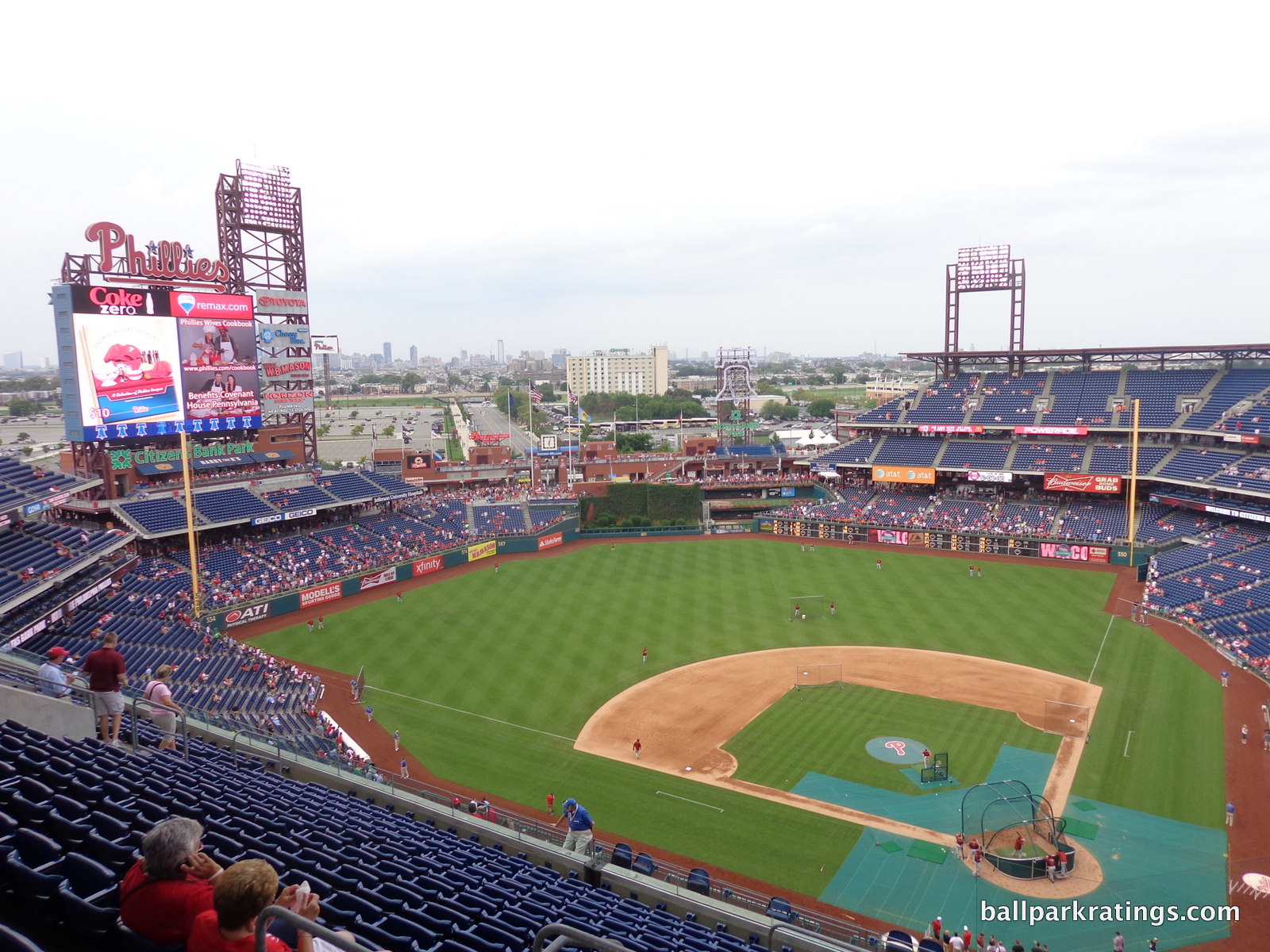
People who say PNC Park (Pittsburgh) wouldn’t be as good without the bridge and AT&T Park wouldn’t be as good without the bay don’t get it; those parks were built for those features. Anything positive to say about Citizens Bank Park’s interior aesthetics only involves self-contained aspects, and most of what’s negative pertains to the vacuity of the scene beyond center field. To clear up some confusion, the “panoramic view” category supplements the most important aspect of the interior aesthetics. The discussion here still largely concerns this aspect as well.
I haven’t addressed the Philadelphia skyline four miles beyond center field. In person, it isn’t visible enough to make a strong impression. Architecturally inclined fans will have a nagging impulse to pick up the ballpark by the light standards and drag it north toward the city center.
If we did have some sort of context beyond center field, even an attractive mixed-use development area, I think we might have an interior aesthetics score at 14 or above, at the level of AT&T Park, PNC Park, and Camden Yards. The structure itself is at a level above other downtown parks, so coupling it with a sparkling backdrop would place it in league with those latter three.
And if it was placed downtown, once you add another 4 or 5 points to the setting score, you would indeed have a ballpark in the top 5, even competing for the best spot overall. This serves to again highlight the main thesis of the review: the location was a huge missed opportunity and affects other aspects of the park.
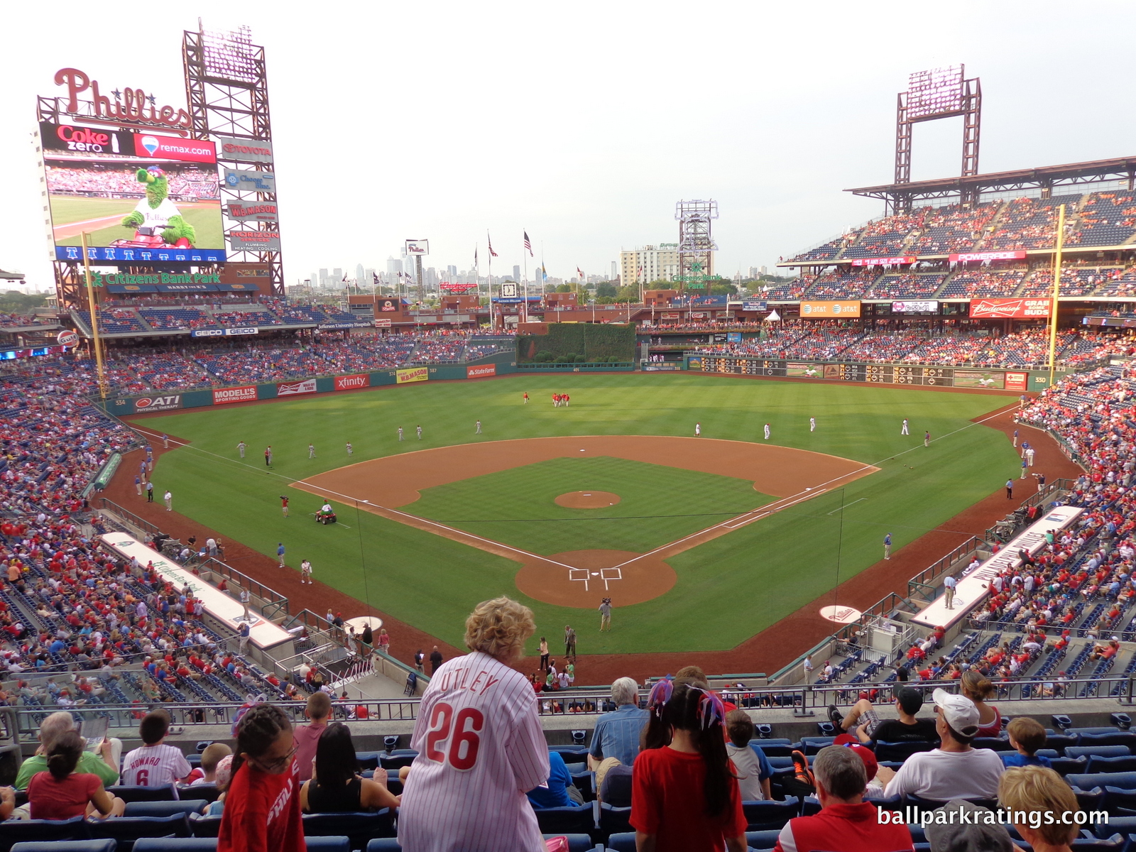
Looking at secondary factors, Citizens Bank Park’s color scheme separates it from others in baseball. The blue seats are bright and welcoming, somehow distinctly more colorful and vibrant than the bland green seats seen across the majors. Also note that the wrought iron of the canopy is maroon, not black. The blue works smashingly well with the dark red wrought iron and the red brick sprinkled throughout the ballpark. Much of Citizens Bank Park’s appeal lies in this unique color scheme.
Many of the supplementary elements function as intended. While I think Citizens Bank Park missed the opportunity for a real liberty bell, the electronic one in right-center field adds an appropriate amount of whim and local flare to the structure. As far as gimmicks go, I think this is both understandable and understated, similar to “Minnie and Paul” at Target Field.
But as I always say, the fact that the park needs a gimmick indicates it’s not quite at the level of PNC Park or Camden Yards, even if you had a good setting. Of course, I’m not using the addition of a gimmick as evidence that they needed it; they did need it. There are parks like Safeco Field that probably needed a little extra flare but did not add it. Parks in Pittsburgh and Baltimore are elite rarities.
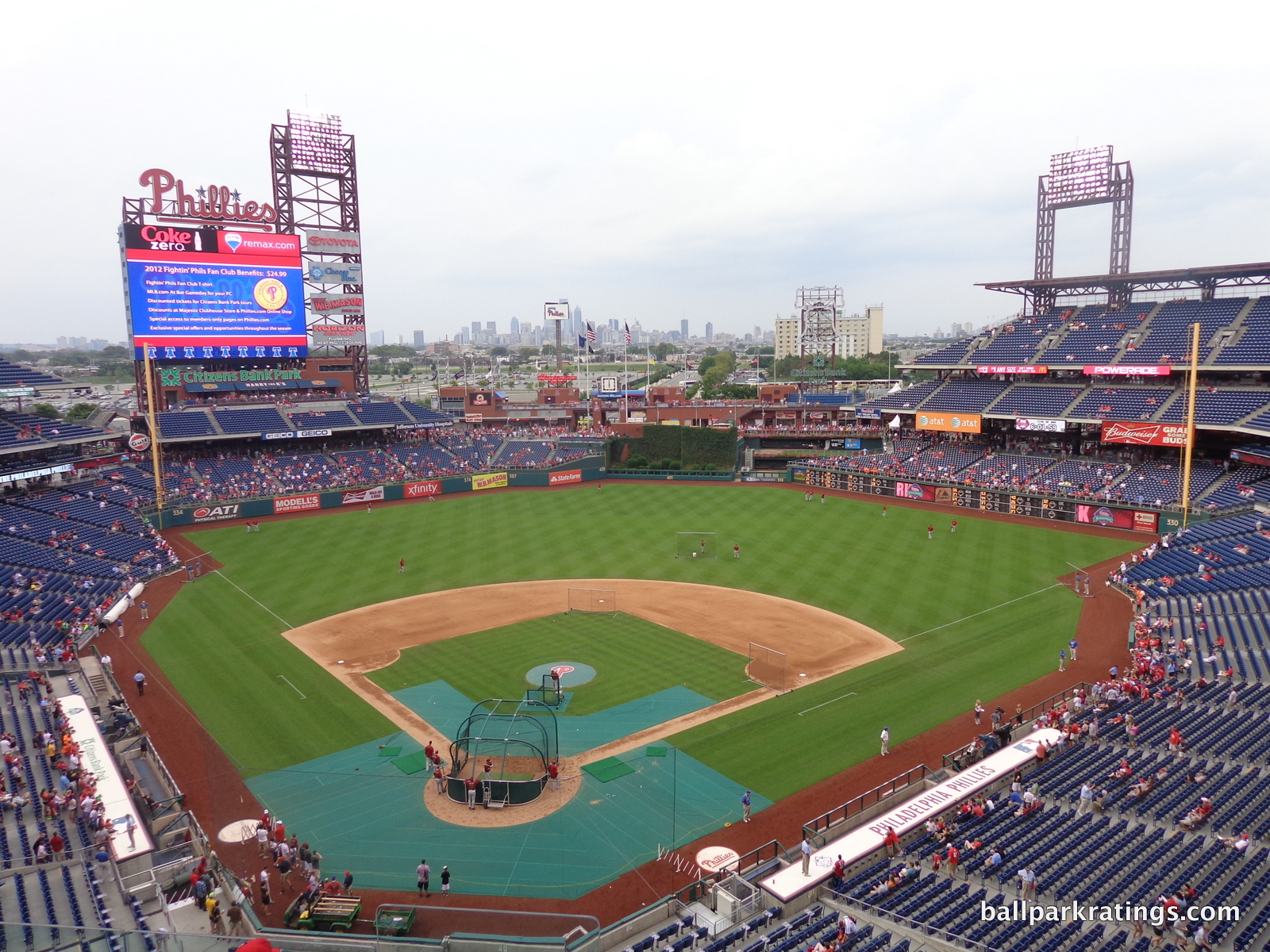
Contrived dimensions are a hot button issue among ballpark (and baseball) purists and architecturally inclined fans. While Citizens Bank Park doesn’t have the most ridiculous dimensions, it might be the worst offender, because the quirks like the notch in left-center field have no contextual basis whatsoever.
At one end, you have something like AT&T Park, where quirky dimensions are derived through adaptation to their environment. They (essentially) have to explicitly conform to the surrounding constraints. That’s authentic and charming, an asset for the interior aesthetics. Somewhere in between, you have a park like Minute Maid Park (Houston), which has plenty of contrived angles, but you can at least understand why they’d put them there. Features like the Crawford boxes are a function of the limits of Crawford Street beyond left field. While not borne of necessity, there’s some contextual basis.
Then you have Citizens Bank Park at the far end, where the dimensions are completely contrived and unnecessary because the stadium is sitting in the middle of a parking lot. This doesn’t factor into the equation too much for me, but this fakery is a deal breaker for some purists.
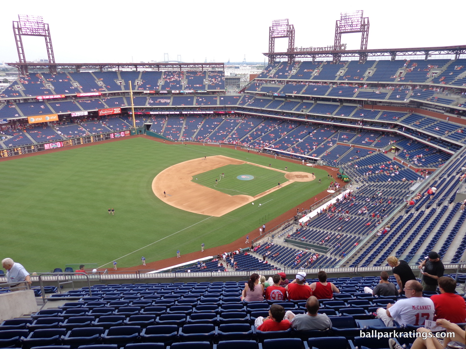
There’s no rhyme or reason for the notch in left-center field. It’s just a function of the self-conscious whims of the Phillies’ PR department. For a lot of people, it’s a message that the game of baseball isn’t interesting enough, so we have to artificially add carnivalesque elements or contrived dimensions to make it look like a place like AT&T Park. But it’s not; it’s fake. Why not embrace your suburban isolation if it’s so obvious?
I get the reasoning behind this critique. Overall though, Citizens Bank Park is generally confident in its architectural lines, but that confidence is slightly undercut by the contrived dimensions. The scene is in no way muddled with ads or overloaded with features like the distracted Citi Field or the busy SunTrust Park. This is a wonderfully clean look.
In sum, Citizens Bank Park’s virtues are a product of its own design, not necessarily how well the design displays its environment like other parks. Strong points include the unique linearity of the grandstand, the unusually flavorful color scheme, and the great balance and clean lines of the outfield scene. You just can’t help but notice the tantalizingly close cityscape.
Score: 11/15
Panoramic View/Backdrop:
We discussed the view of downtown Philadelphia four miles away above, so I won’t further explore the subject. Citizens Bank Park benefits from the simple fact that it’s exposed to its environment, and the view of the distant downtown is a bonus. I’d take this over an enclosed park like Citi Field any day.
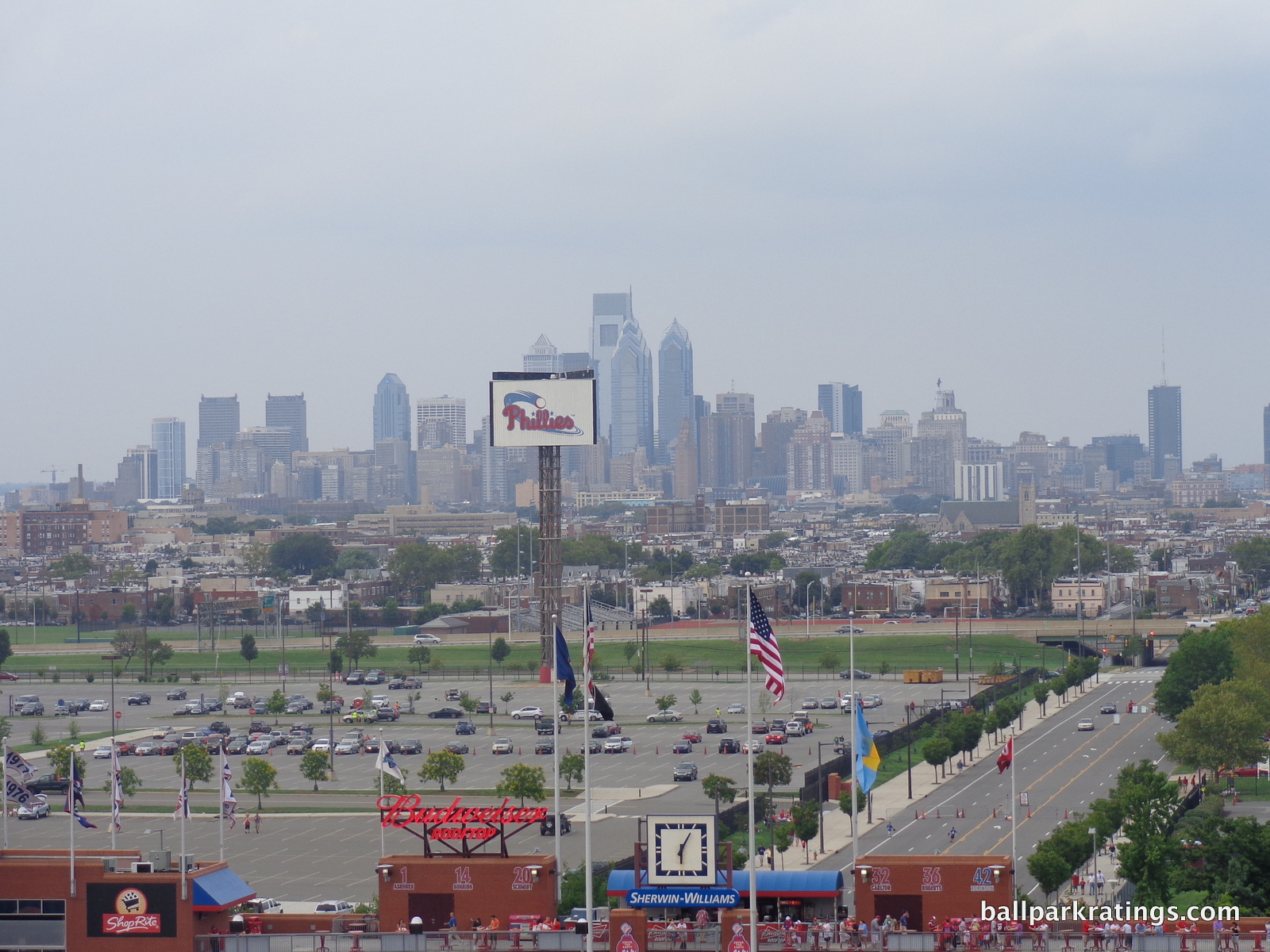
The most common complaint among Phillies fans is the “Phillies” billboard that directly blocks the skyline view. It actually dates back to the Veterans Stadium days, serving as a marquee designed to be seen by traffic on I-76.
In practice, I don’t think removing it would make much of a difference. It might help, but the skyline is distant in the first place. If the Phillies still value its function, they could just move the marquee to the left or the right side of the parking lot, presumably. UPDATE: as of 2017 opening day, it appears to be dormant but still present.
Score: 3/5
Concourses:
Citizens Bank Park’s concourse aesthetics are nearly perfect, in that they are relatively attractive while maintaining that quintessential ballpark vibe. We don’t want ballpark concourses to look like carefully manicured mall plazas with polished ceilings, but at the same time, we don’t want them to be dark and unadorned. Like the better concourses in baseball, Citizens Bank Park manages this balance.
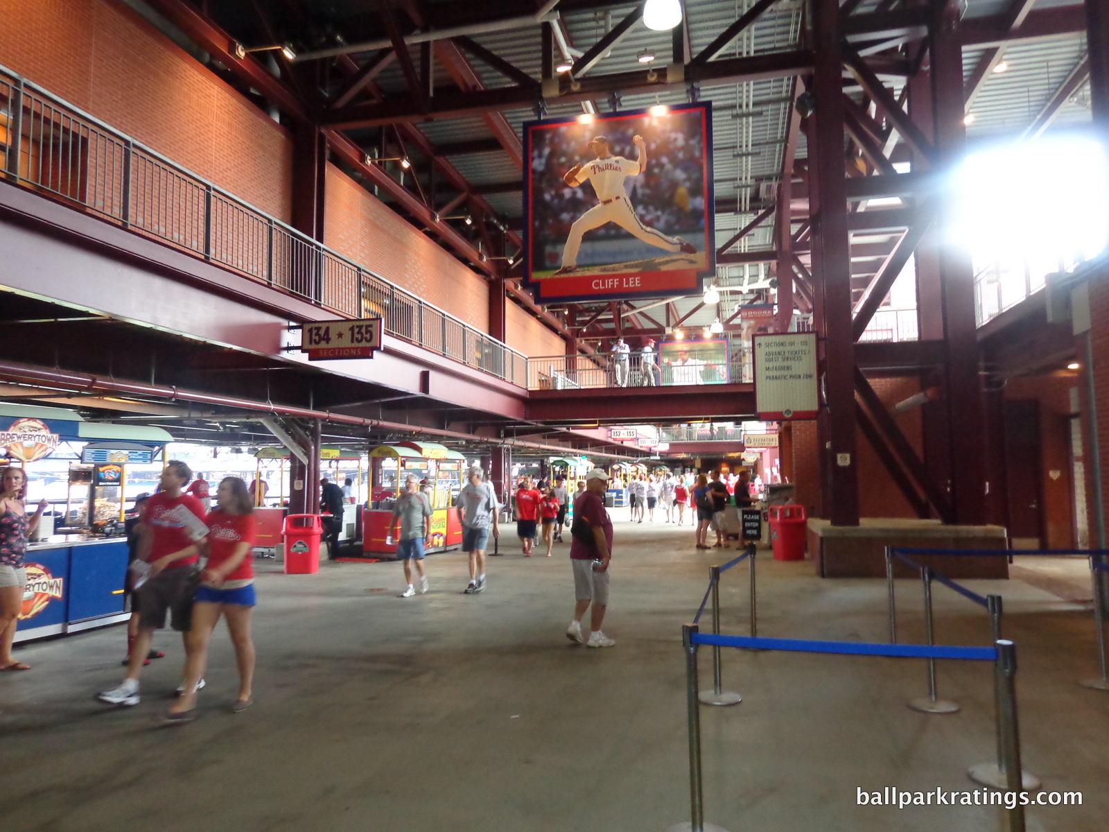
The main concourse features high ceilings, maroon wrought iron, and exposed red brick. It’s subtle, but Citizens Bank Park feels less claustrophobic because the suite level hallway one floor above isn’t enclosed. If it were, it would look like Citi Field, where a glassed-in suite level juts far out above the main concourse only one floor above, eliminating the airy sensation seen here. The effect of the non-enclosed suite level hallway in Philadelphia is most welcome.
Also note the player banners hanging from the high ceilings. It all looks attractive, but still like a ballpark.
The exterior plaza entry points described in the exterior design section bleed into the concourse system. These large plazas are a great place to congregate before the game.
It gets a 2.5 because I save the 3 for the truly beautiful concourses given specialized architectural attention like in San Diego.
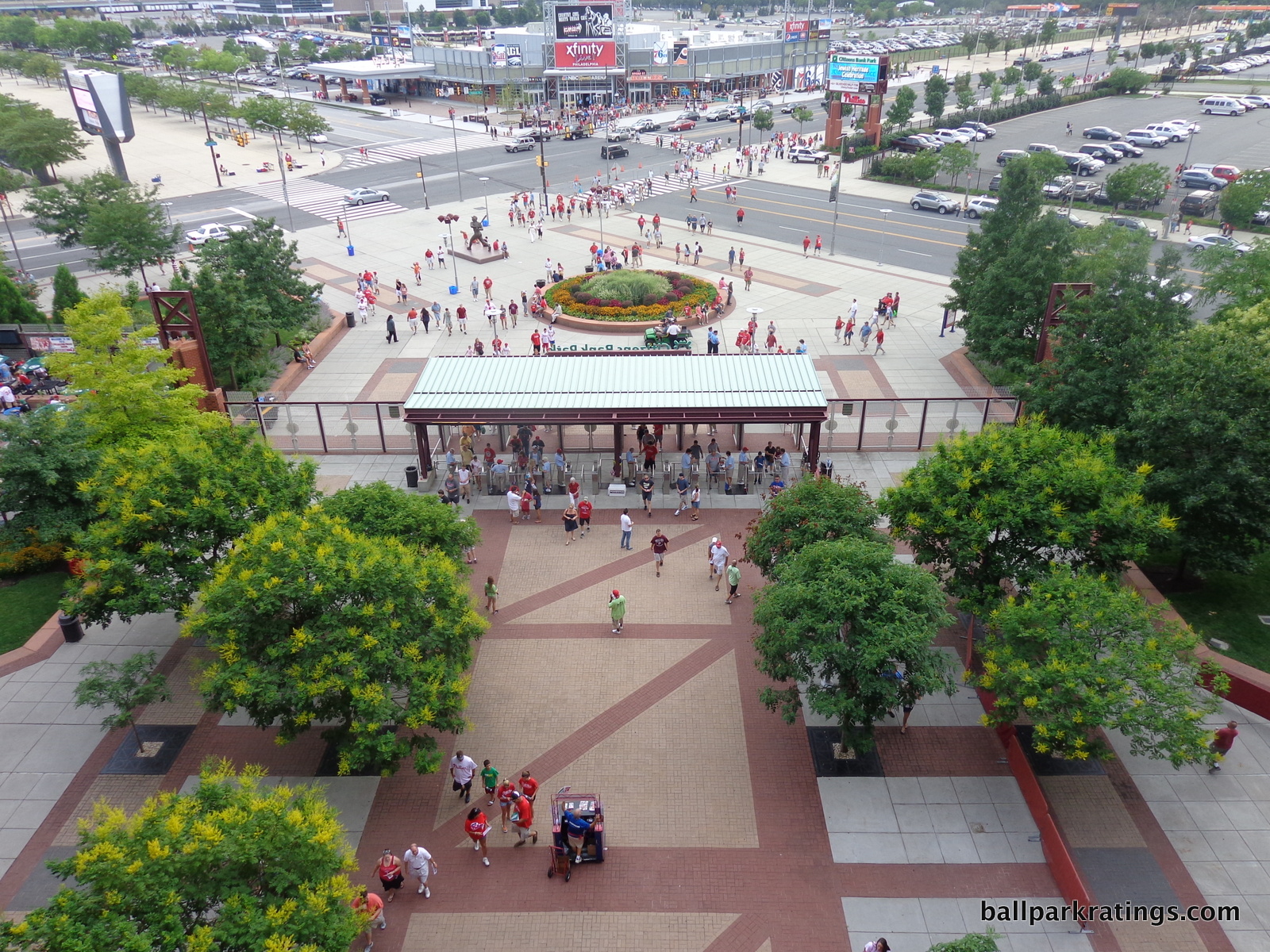
Score: 2.5/3
Total: 22/33
Functionality & Essentials
Sightlines:
Utilizing an angular design in foul territory, Citizens Bank Park has better seating geometry than most post-1991 ballparks, a handful of quirks notwithstanding. In addition, the Phillies’ home has much better field proximity than expected (relatively speaking, as always), all translating to some of the best sightlines in major league baseball.
The Phillies made an effort to reduce the grade of the upper deck compared to Veterans Stadium, but many have noted that they didn’t make an effort to cantilever the upper decks like at Petco Park (also opened in 2004). This is largely true, as the second level only hangs over a handful of rows in the lower deck.
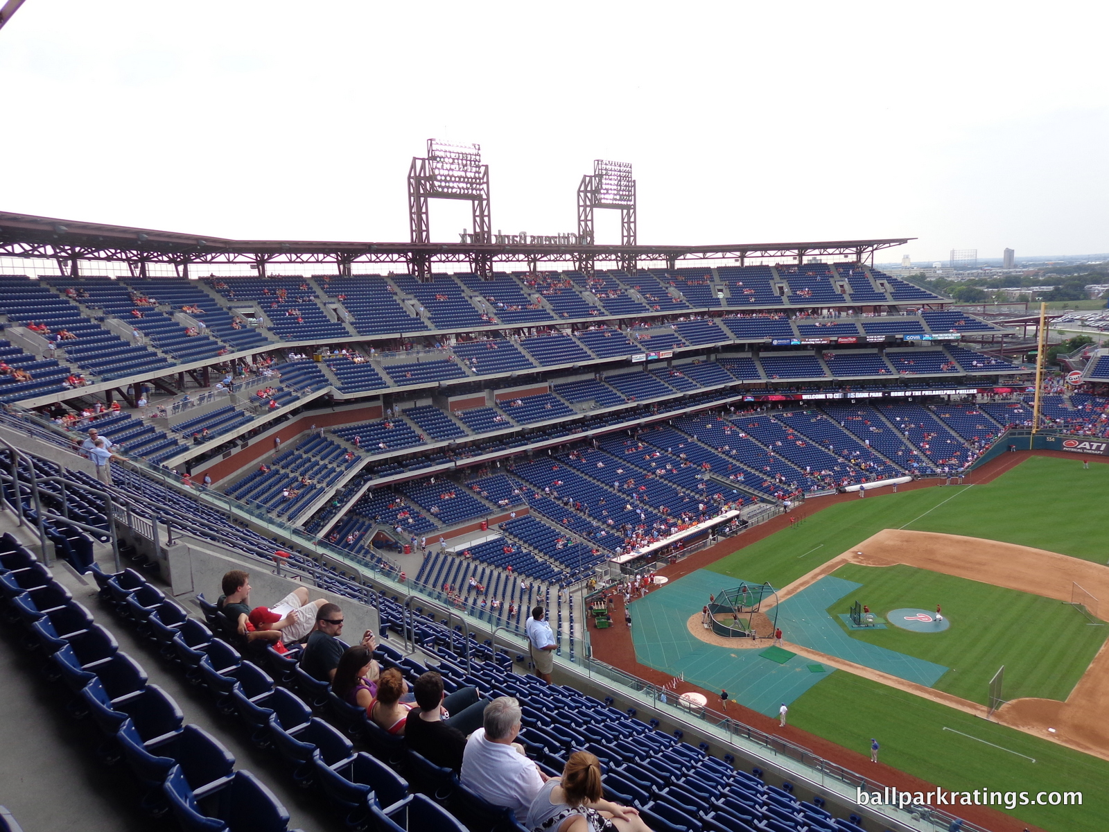
But it’s not as bad as it seems. Unlike a stadium like Nationals Park, the entire grandstand is pushed closer to the field in its totality, something that’s hard to see with the naked eye. Citizens Bank Park’s upper deck extends sufficiently over the club level. All of this translates to slightly above average field proximity compared to other ballparks, closer to the field than it might seem. It isn’t as good as Petco Park, Minute Maid Park, and Marlins Park, but it’s better than a slew of other ballparks using the club/suite sandwich, including Target Field, AT&T Park, Coors Field, and definitely Nationals Park.
Remember, I primarily measure “field proximity” by the ballpark’s horizontal relation to the field, not vertical. I’d sacrifice height for closeness, if I had to. Not that Citizens Bank Park is unusually high or close.
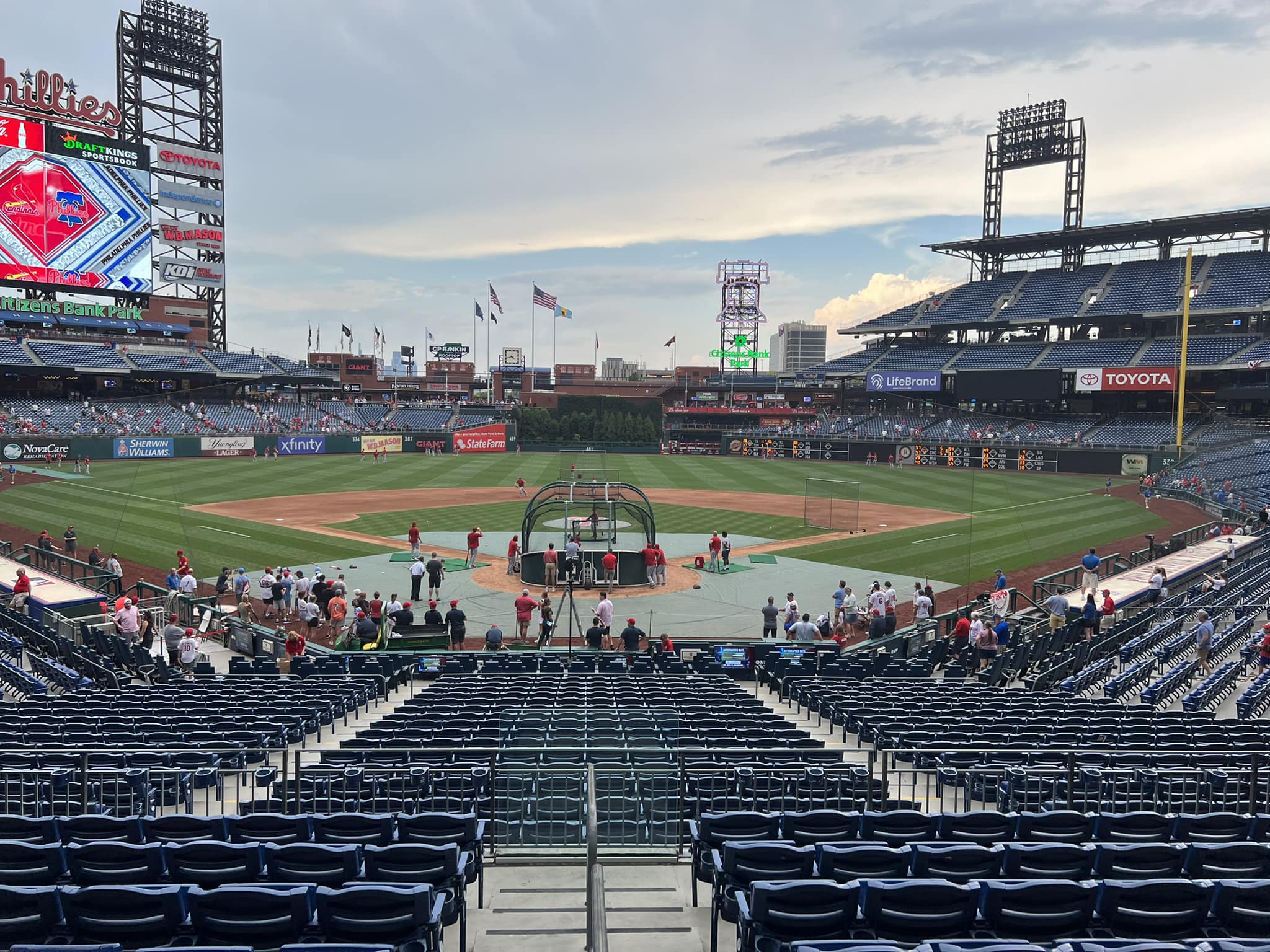
Most post-1991 ballparks feature some sort of angled seating, but Citizens Bank Park really excels in seating geometry because the angular grandstand is already predisposed to good viewpoints down the lines. The seats themselves are angled to an impressive degree, similar to Chase Field and Petco Park, but the grandstands in the corner are already well oriented.
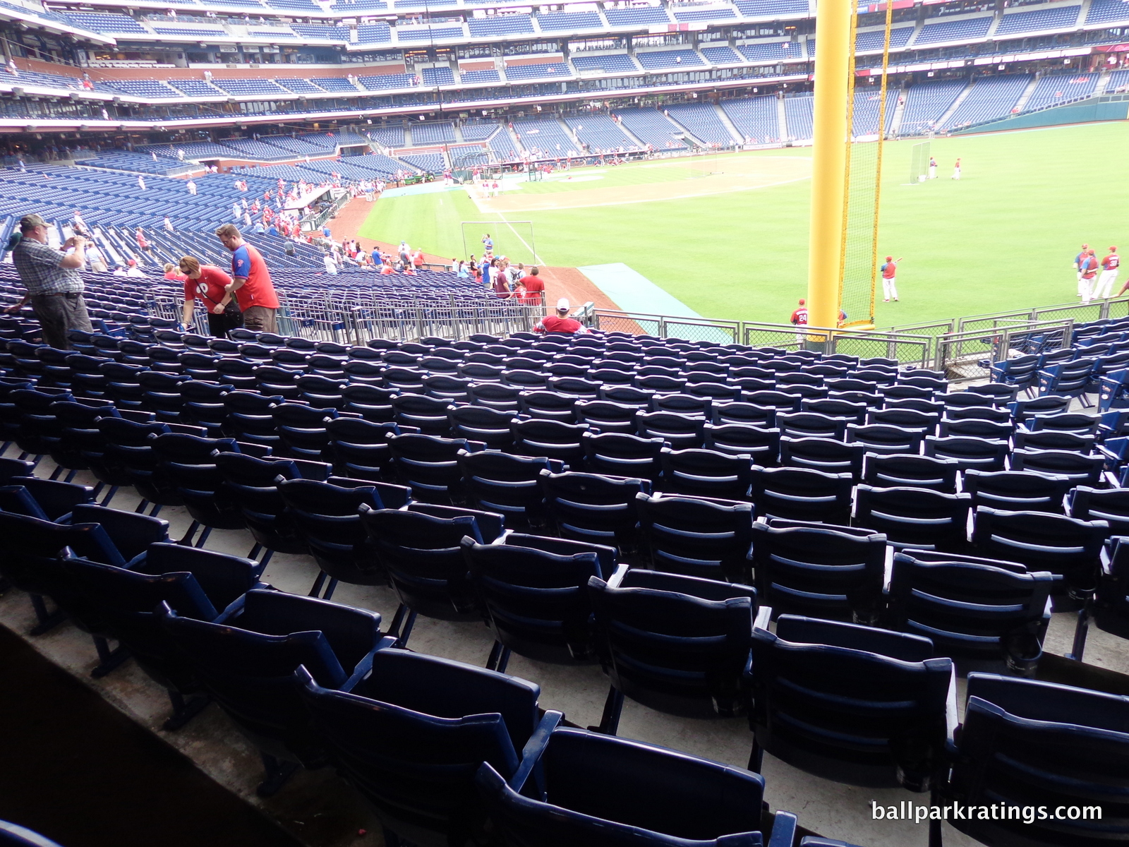
The break in the seating down the right field line aids the viewpoints as well, lowering the upper deck and ensuring that seats are oriented toward the infield.
The unique grandstand design does create some quirky views, but they are minor and isolated. Sections 424 and 423 on the left side, along with 418 and 419 on the right side, point slightly behind home plate. It’s faintly noticeable, and a small price to pay for the unique aesthetics and superior views down the lines created by this design.
Score: 9/10
Seat Comfort:
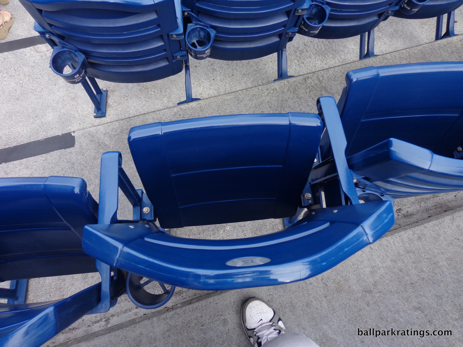
Other than the color, Citizens Bank Park’s seats are as standard as they come. Like most other post-1991 ballparks, they’re sufficient in width in the premium areas and the lower deck, while being too tight compared to historical standards in the upper decks. It’s been completely lost that older parks like Candlestick and RFK Stadium featured 20-21 inch seats throughout the seating bowl, while 18-19 inch seats fill out the cheap areas in “new” ballparks.
All seats have cup holders, and bleachers are absent at Citizens Bank Park. Both the Diamond Club and the Hall of Fame Club level feature thinly padded seats.
Score: 3.5/5
Concourses:
As briefly touched upon in the opening, Citizens Bank Park represented a significant step forward in ballpark design with its concourse system. Wide, open concourses have been commonplace in major league baseball since Coors Field (1995), but Philadelphia was the first to take it to a new level, truly inviting fans to “hang out” and walk around during the game.
The main concourse itself exceeds the standard in width and features good visibility of the field, psychologically aided by the fact that the suite level hallway above is not enclosed. Fans enter at street level, and there are no vertical or horizontal discontinuities transitioning from area to area. Everything is straightforward and fan-friendly.
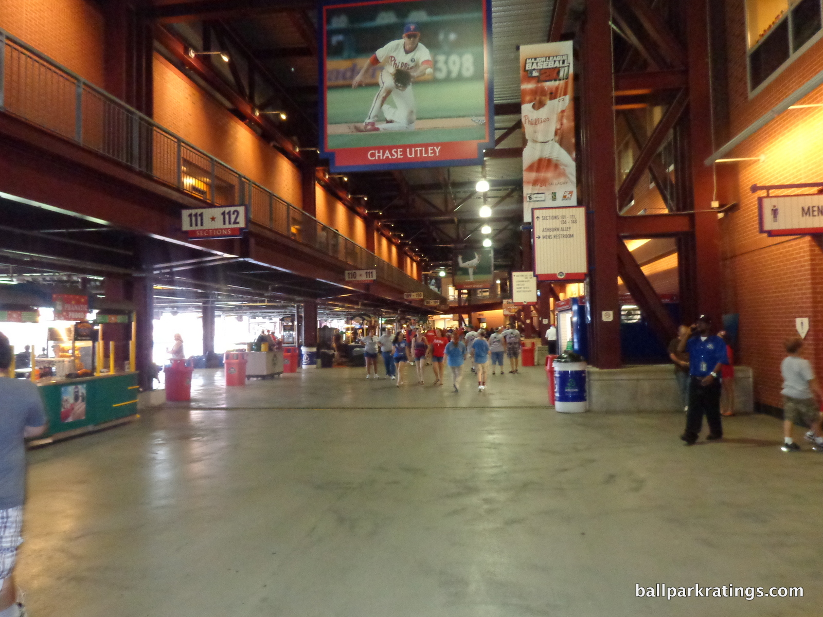
In other modern day ballparks, you’ll see state-of-the-art main concourses that are similarly wide and open to the field, but they are often hindered or obstructed by premium areas, which almost always take priority. In SunTrust Park, Citi Field, and Nationals Park, the main concourse is blocked behind home plate by premium clubs or suites.
But in Philadelphia, you can see the game from all around the infield, something only a few other ballparks can claim. Drink rails stand above the seating bowl, so fans have a place to rest their food and beverage while taking in the game from a different vantage point.
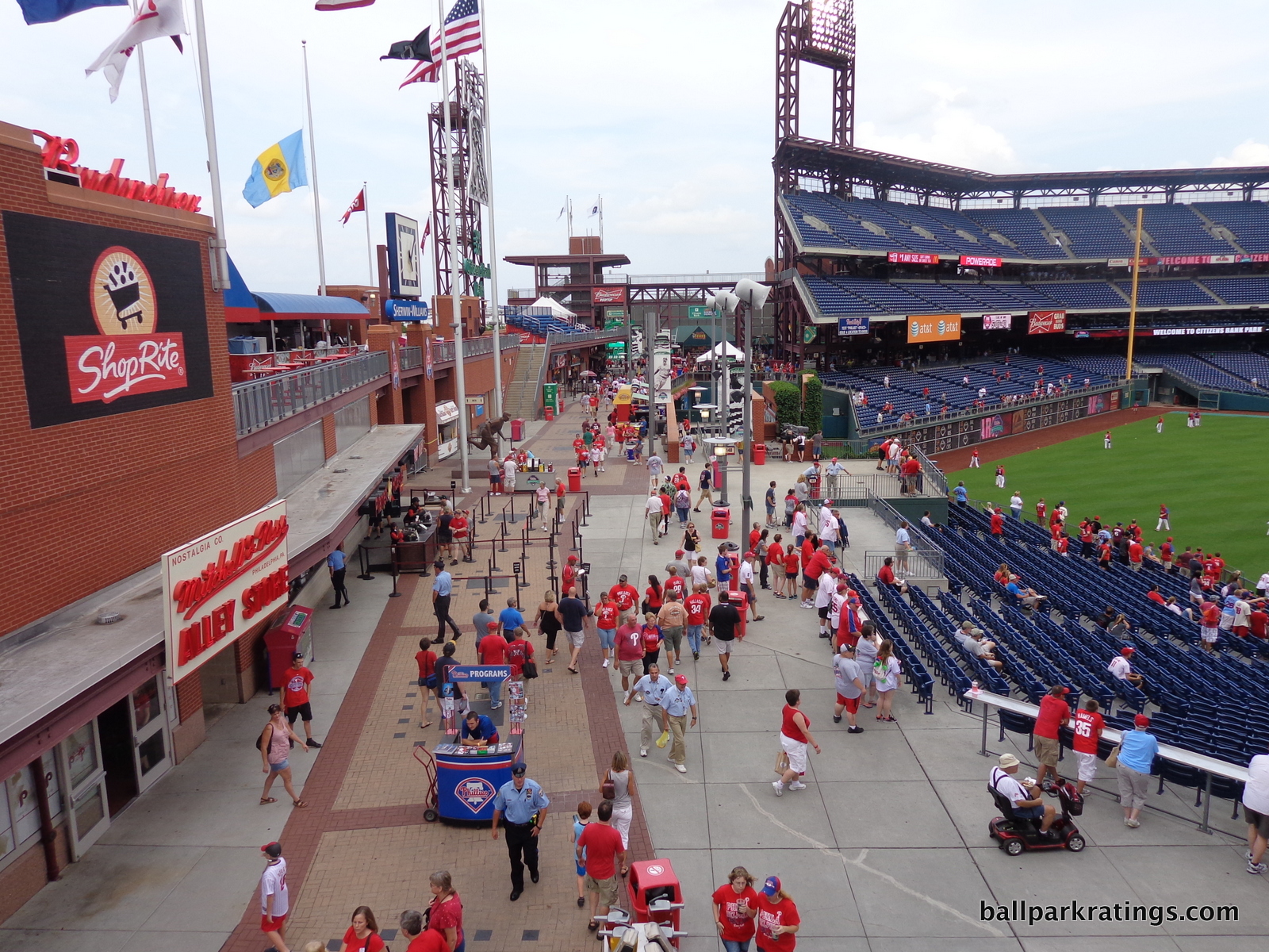
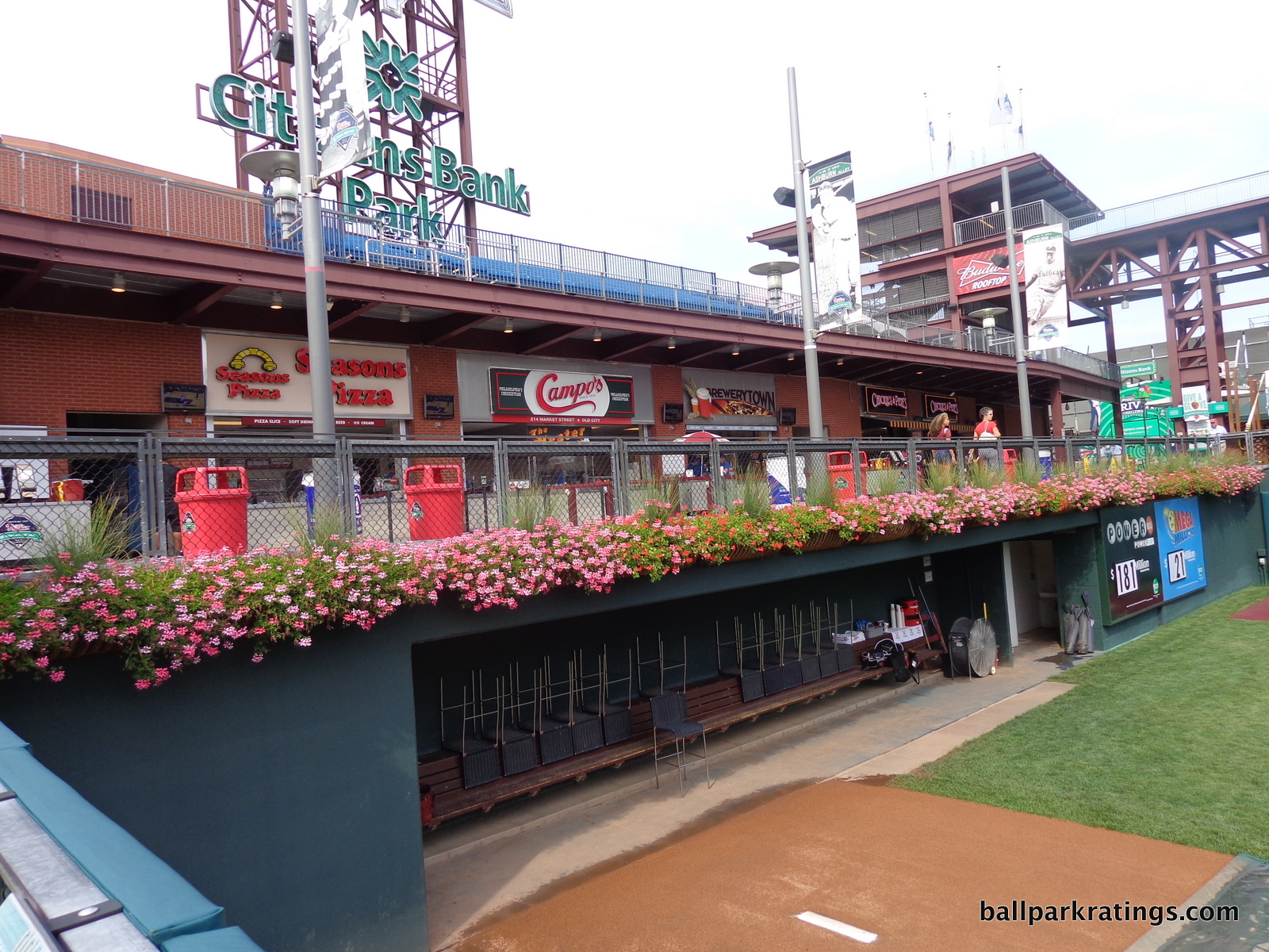
Most of the praise is reserved for the standing room areas and Ashburn Alley in center field. Similar to Safeco Field, you can find a spot to stand and watch the game from all around the ballpark, including two levels in center field. Some of the best bullpen views in baseball are found here. While other ballparks have developed similar “outfield experiences” that open before the rest of the gates, Ashburn Alley has never really been successfully replicated in subsequent ballparks.
It’s hard to pinpoint why this is, but subsequent parks suffered from scenes more cluttered with gimmicks, restaurants, or group areas. The social scene in Ashburn Alley, which will be further referenced in the amenities section, is Citizens Bank Park’s top asset.
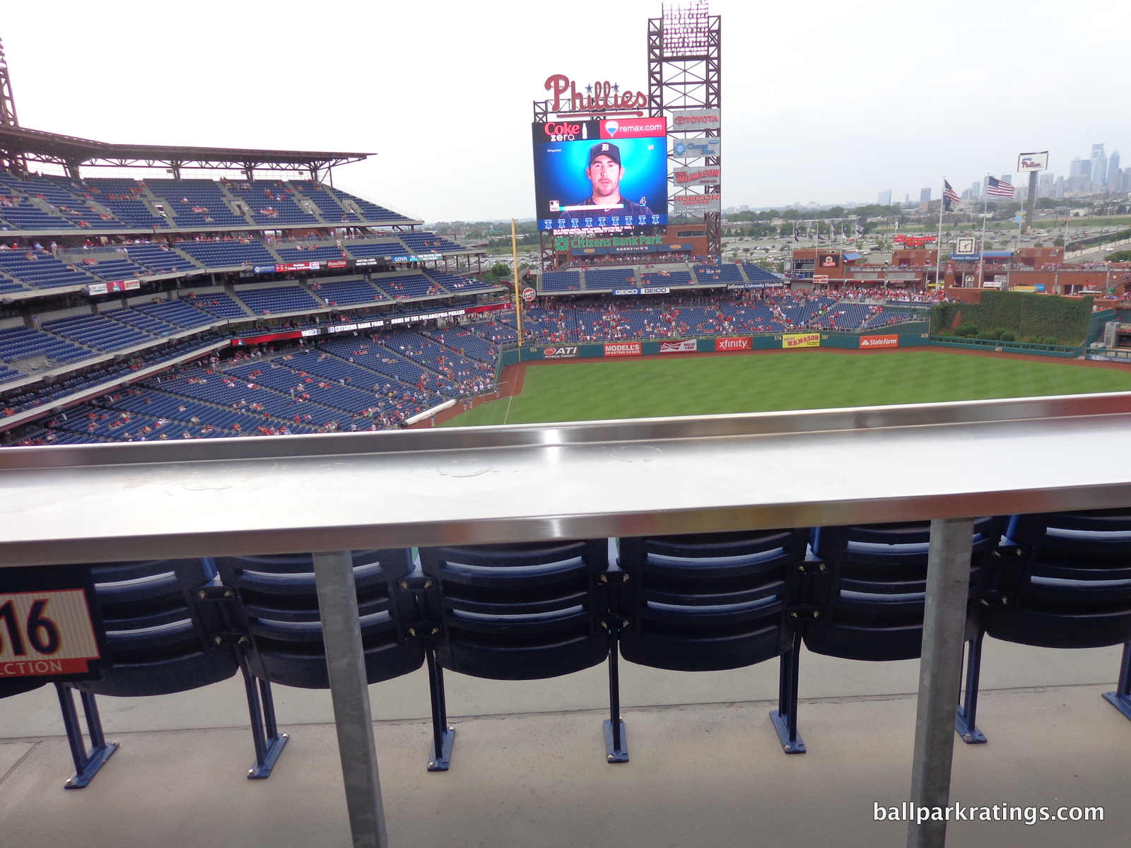
While partially seen in Great American Ballpark (Cincinnati) a year earlier, Citizens Bank Park was the first baseball stadium to feature an open concourse throughout the upper deck. Commonly called a “split upper deck” by ballpark aficionados, this has been a point of contention. The chief complaint is that this pushes the upper part of the upper deck higher, although it doesn’t have to be farther from the field if the upper part is cantilevered over the lower part. It’s also derided as an obvious method of increasing the prices of the lower part of the upper deck.
I mostly like the split upper deck, and this feature has been seen in most parks that opened afterward. It is true that you can’t really see the field from the concourses, but the openness is nice. The upper deck also features these drink rails on the concourse above the seating, and you can see the game from there.
Great visibility, a multitude of dedicated standing room only areas, and groundbreaking concepts characterize the concourse system at Citizens Bank Park. This is probably still the best in all of major league baseball as of 2017.
Score: 7/7
Scoreboard System:
Added in 2010, the videoboard at Citizens Bank Park is the 6th largest in baseball. This is quite impressive when you consider there have been 18 new videoboards added this decade! The board in Philadelphia is large, clear, and informative.
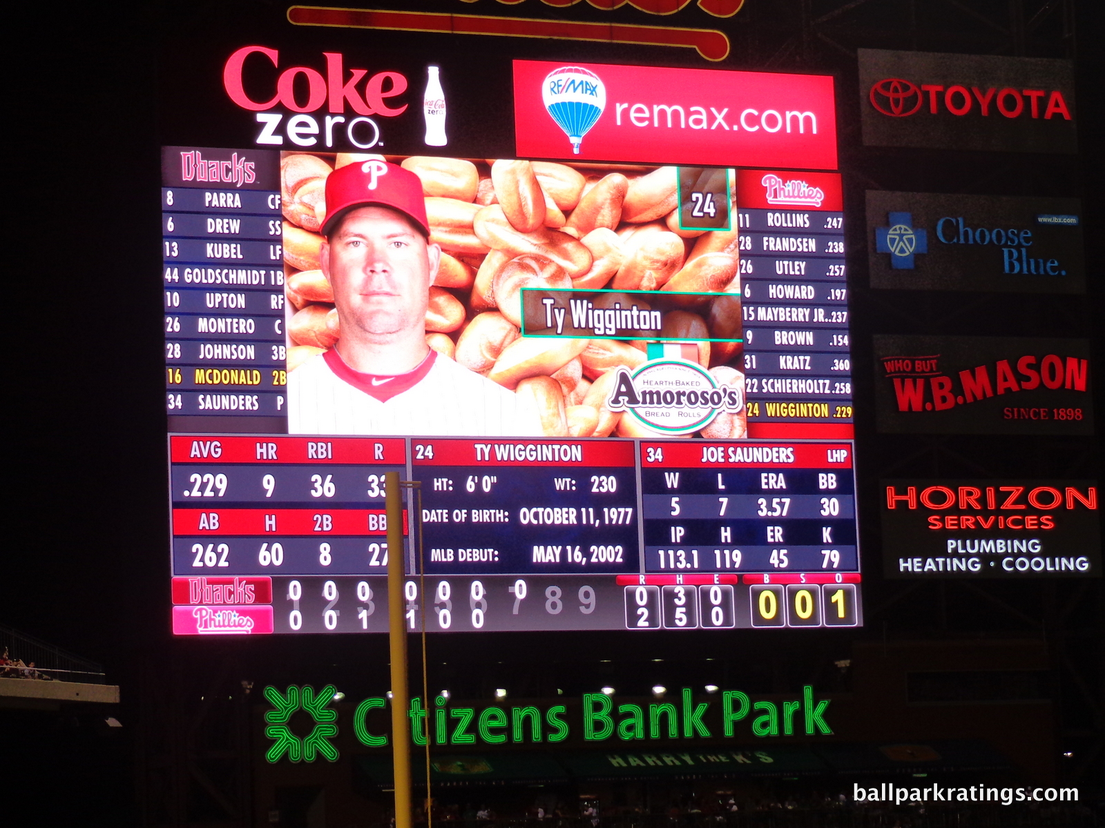
Some fans have complained about its positioning in left field, but this is nothing unusual. Fans sitting down the left field line and in the outfield are unable to see it, but it’s standard to have scoreboards in the corners. In fact, a videoboard in center field is less common.
More recently, the Phillies added a small rectangular video screen below the second deck in right field to address this issue. Fans sitting in left field can now more easily obtain game information.
Score: 3/3
Total: 22.5/25
Amenities & Features
Quality and Selection of Concessions:
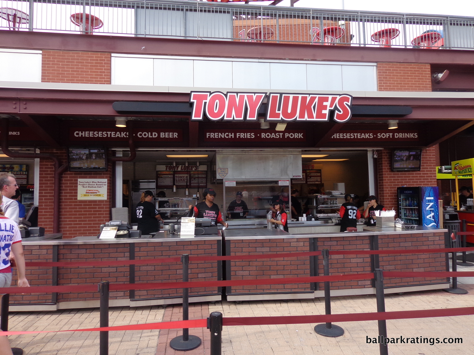
While many have noted Citizens Bank Park lacks the variety of the best ballpark concession providers, the ballpark more than makes up for it through a system of high quality regional foods. It can’t be said enough that the Phillies were the first team to emphasize primarily local eateries.
In other words, this is a ballpark where the first opening day program wouldn’t wow fans and the press with mention of empanadas, sushi, and pierogis, but with local cheesesteaks and specialty sandwiches. Other ballparks sprinkled in a regional food item or two for local flare, but local landmark restaurants anchor Citizens Bank Park’s entire concession presentation.
As “retro” parks are all about representing their cities, this is the logical extension of the retro aesthetic to the concessions category.
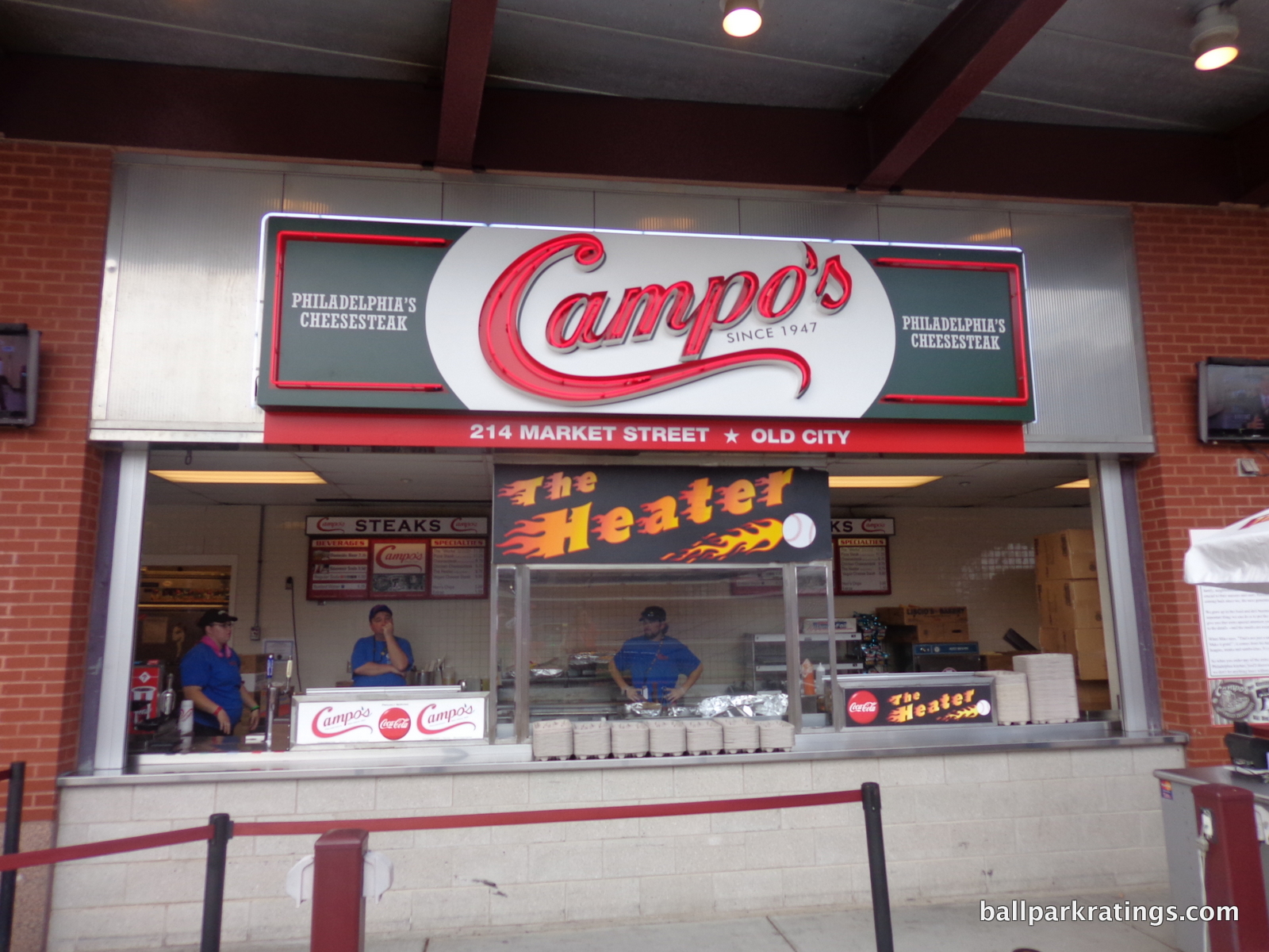
Four sandwich and cheesesteak joints headline the lineup at Citizens Bank Park. New for 2017, Primo’s Hoagies serves a variety of sandwiches, including their Italian, turkey, chicken cutlet, and veggie hoagie. Also look out for the Primo meatball sub.
The two best options in the entire park are Tony Luke’s and Campo’s Steaks. If you had to pick one, Tony Luke’s is probably Philadelphia’s “signature food.” Their famous cheesesteak and roast pork sandwiches are available. Campo’s Steaks has the best selection of cheesesteaks. Their signature cheesesteak (whiz, American, provolone), “The Heater” (hot sauce, buffalo cheddar cheese), “The Works” (mushrooms, peppers, provolone, onions), the pizza steak, the chicken cheesesteak, and veggie cheesesteaks are on the menu.
Finally, Delco’s Original Steaks serves up their original cheesesteak.
Run by legendary Phillies slugger Greg Luzinski, Bull’s BBQ is the ballpark’s obligatory BBQ stand helmed by a former player. Unlike the others, you will often find him serving the fare! They have pulled pork, pulled chicken, BBQ ribs, pit turkey, turkey legs, and a grilled extra-long kielbasa.
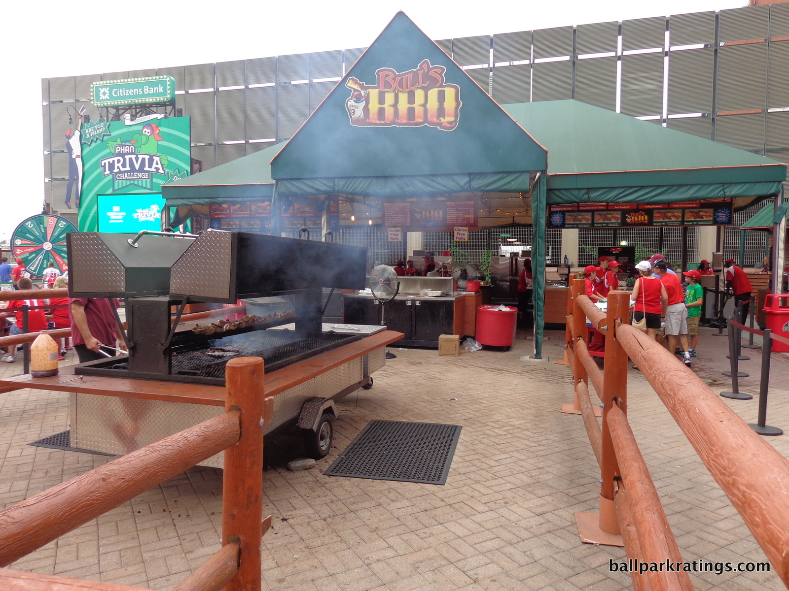
Plenty of other local concessionaires round out the selection. It’s nice to have a local pizza chain in lieu of the uninspired Digiorno’s or Papa John’s. Try Seasons Pizza. Federal Donuts and Chicken replaced The Schmitter (more on that later). No more stadium burgers at Citizens Bank Park. Northeastern fast casual restaurant Wayback Burgers serves typical hamburger restaurant foods such as hamburgers, hot dogs, chicken sandwiches, and milkshakes.
Citizens Bank Park isn’t totally devoid of variety typical at other ballparks. Mexican fare is served at Wahoo’s, including chicken, pork, and veggie tacos and quesadillas. We now have one of those “mac & cheese creation” stands popping up all around the majors. The Phillies used to have a specialty Panini stand as well.
Philly Phresh used to serve healthy fare, but I don’t see much today. In 2017, the Phillies added a specialty farmer’s market grain bowl, featuring toasted red quinoa, brown rice, sweet peppers, cucumbers, radish, herbs, and honey balsamic vinaigrette.
All of this is difficult to grade. The variety is average, maybe below average, more deserving of a 3.5, but Citizens Bank Park is playing a different game here. The quality of the local eateries is outstanding.
Score: 4/5
Regional/Signature Concession(s):
I mentioned in a recent review that the best new ballparks have a great variety that is local/regional, blurring the lines between these two categories. Citizens Bank Park started this.
So, what would be my specific recommendations? If you can only have two items at the ballpark, go with Tony Luke’s roast pork and Campo’s signature cheesesteak. This is doable if you’re a fan from out of town for one game: have one an hour or so before the game, and have the other around the 6th inning.
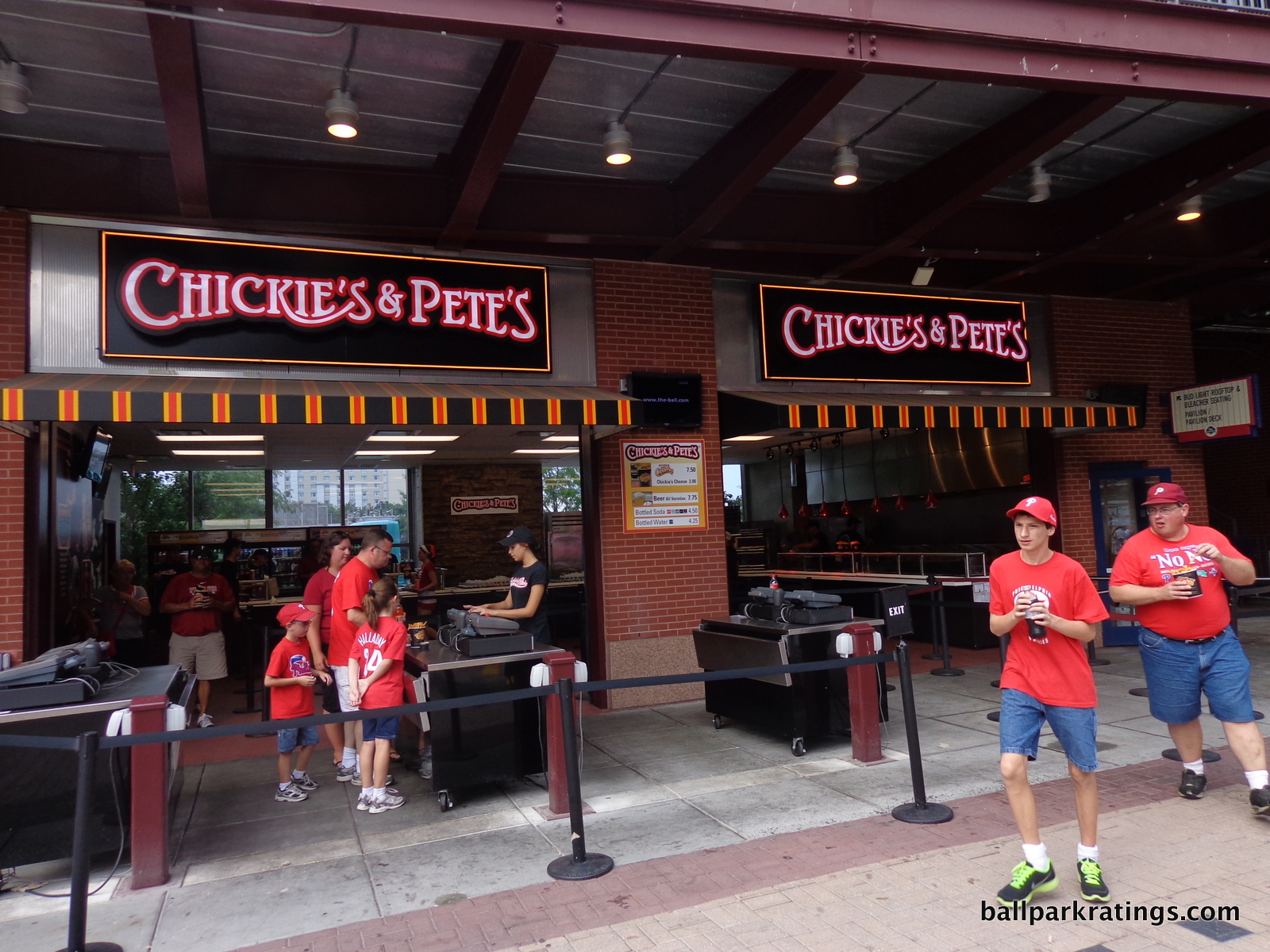
The only local item I didn’t mention above is Chickie’s & Pete’s Crab Fries. These are crinkle-cut French fries with Old Bay seasoning, served with a cup of white cheese sauce for dipping. Yummy.
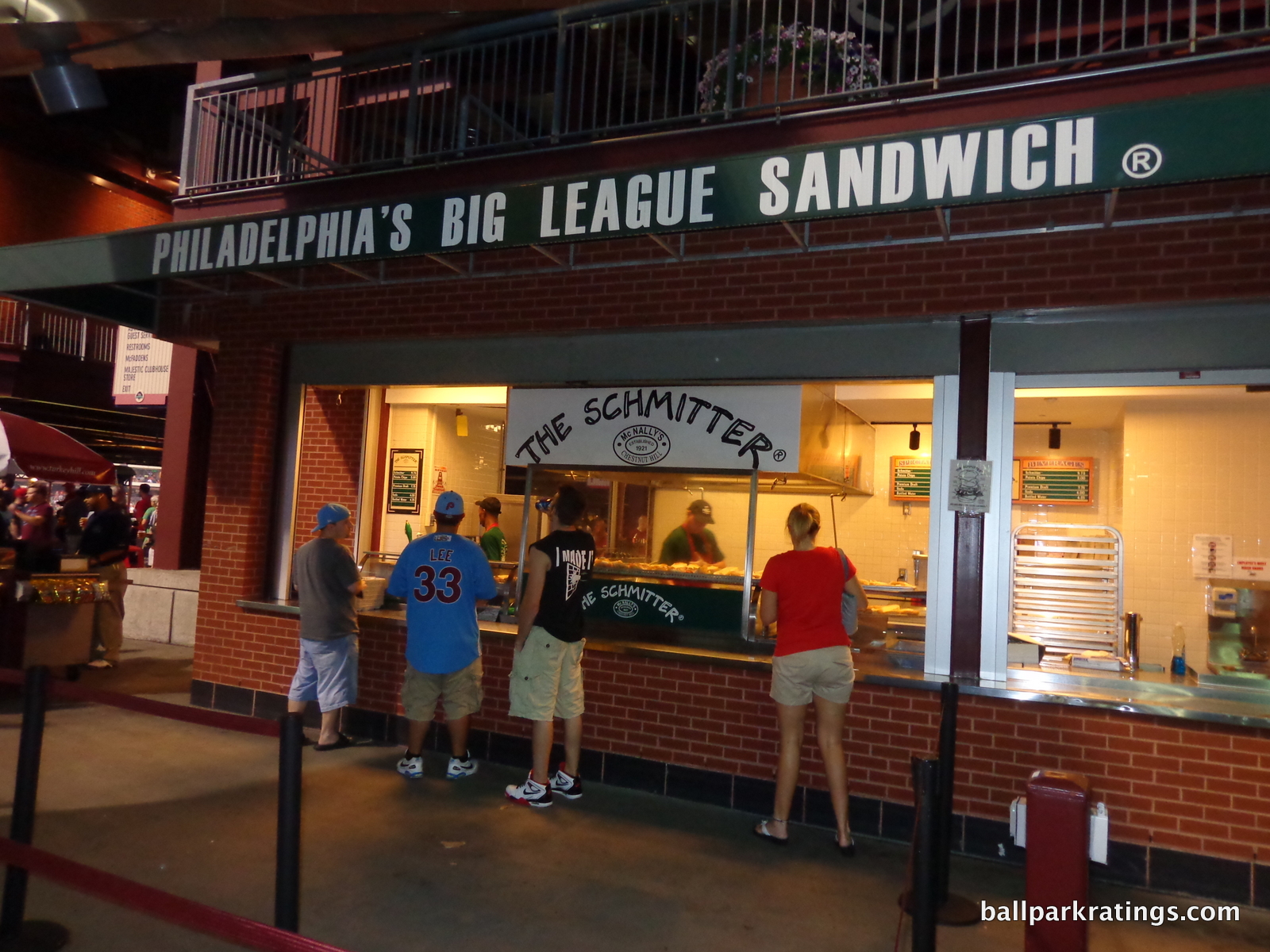
Citizens Bank Park excels in this category and the one above to an exceptional degree, but their best item is now gone. The Schmitter—served by McNally’s Tavern—is one of Philadelphia’s most iconic sandwiches and was a staple at the ballpark. The Schmitter (not named after Mike Schmidt) has captured the imaginations of restaurants across Philadelphia for decades. The sandwich is a marvel: sliced roast beef, American cheese, Hatfield salami, tomatoes, onions, and a secret sauce, all placed on a Kaiser roll.
Apparently, McNally’s thought there was a quality control issue with the new open-air space they occupied near the left field gate. I don’t doubt it. The sandwich’s elimination sparked outrage, but this has largely subsided. Phillies’ fans need to put pressure on the organization to bring this treasure back.
There has always been a pretense of an eventual reunion from both parties, but I haven’t heard any clamoring lately. The petitions seem to have gone dark. We at ballparkratings.com might try have a marketing plan in place to bring attention to this and put some money into a renewed effort, because this was one of baseball’s most premier foods.
Score: 2/2
Accessible Restaurants/Bars/Sitting Areas/Social Spaces:
While relatively great upon opening, this is the only objective category in “functionality” and “amenities” where the Phillies could stand to improve, now comparing unfavorably to the ballparks with large social bars and accessible social spaces. As I detail below, I think the fix is relatively easy.
Right now, the Phillies have a decent but unremarkable selection of restaurants, bars, and sitting areas.
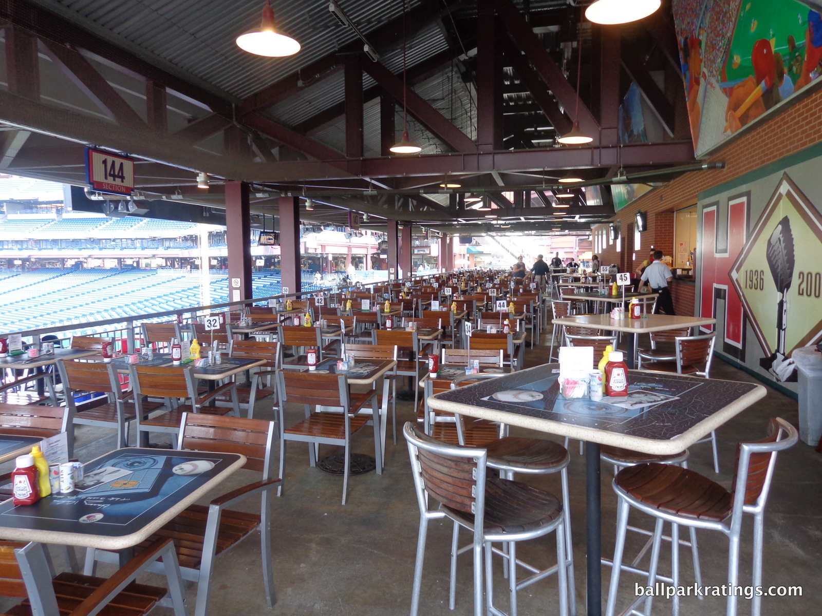
Located below the left field scoreboard, the bi-level Harry the K’s is Citizens Bank Park’s primary full service restaurant. While it is completely outdoors, it does feature covered seating on the first level. Named in honor of the Phillies’ Hall of Fame broadcaster, the menu ranges from finger food to high-end items. Notable foods include mussels, croquettes, and falafels. The restaurant does feature great views of the field from the tables.
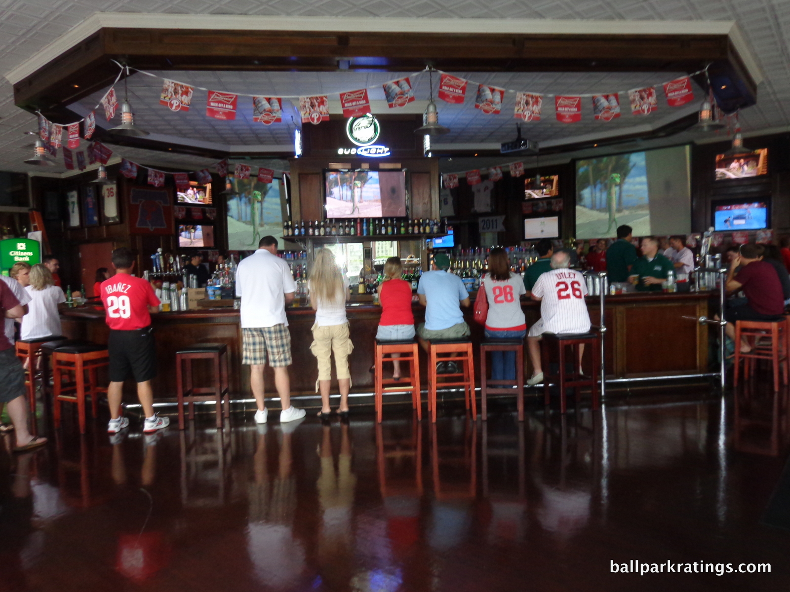
Citizens Bank Park’s other full service restaurant is McFaddens’ Restaurant and Saloon. Serving pub fare by the outdoor plaza near the first base gate, the climate controlled restaurant and bar is very popular despite varying quality and a lack of field views. There is a social standing area outdoors.
Both of these concepts date back to 2004, and the trend has moved away from “sit-down” full service restaurants toward informal social spaces and walk-up eateries. The Phillies need more of the latter, but I hope they don’t eliminate the former in the process.
The High and Inside Pub in the upper deck is my favorite bar at Citizens Bank Park in terms of added value. Located behind home plate only serving drinks, the bar offers a climate-controlled experience for all fans in the upper deck. Only four other ballparks can say this (Coors Field, Comerica Park, Target Field, and the new SunTrust Park are the others). The pub is not an afterthought for fans in the cheap seats, featuring high ceilings, thoughtful historical photos, and tabled seating.
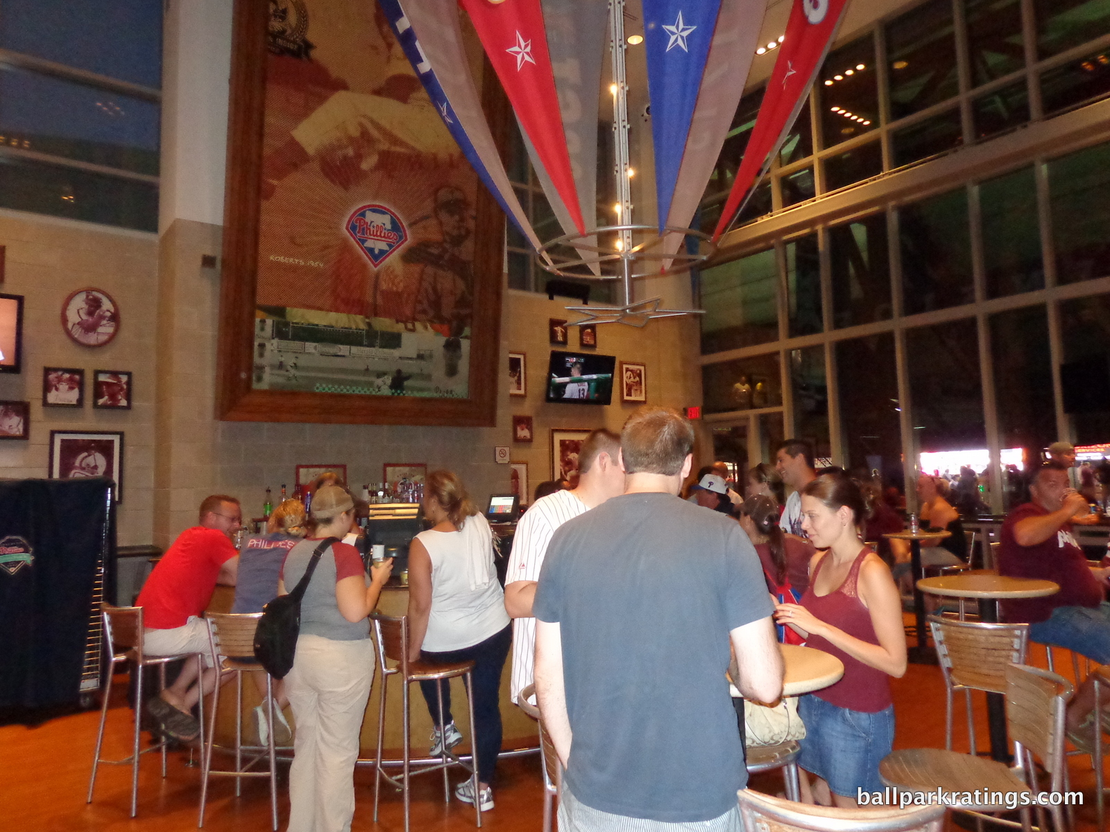
If you need refuge from the elements during a long winter or are simply seeking an adult beverage with friends, this is the place to be. In most parks, if you want to sit down at a bar or are seeking refuge from extreme weather, you have to trek all the way down to the lower concourse. I can’t reiterate enough how much I appreciate a climate-controlled area in the upper deck open to all fans. It’s a minor but welcome amenity.
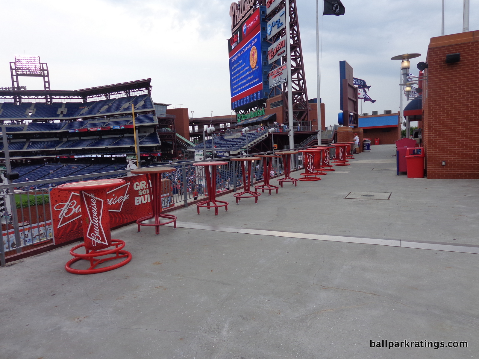
The Phillies lack a true social space in the vein of “The Rooftop” in Coors Field. You can see similar spaces added after the fact in Baltimore, Cleveland, Houston, Detroit, and San Francisco. As I noted above, I think Citizens Bank Park is perfectly designed to implement such a feature. They need not take out a large swath of seats like in Denver.
The Phillies already have a “rooftop” on the second level above Ashburn Alley! Right now, it’s a rather unadorned standing room area with bleachers. It reminds me of the former Pepsi Patio at Comerica Park. Similar to Comerica, the Phillies’ space looks like much more could be done with it. Add a real bar, perhaps cantilever the space above Ashburn Alley just slightly, and renovate the office on the right side that is wasting space. See the before and after photos at Comerica. Citizens Bank Park is ripe for something similar in this area. It’s so obvious, I bet the Phillies do this in the next few years.
Indeed, for the 2019 season, the team also overhauled their presentation of social spaces and sit-down restaurants.
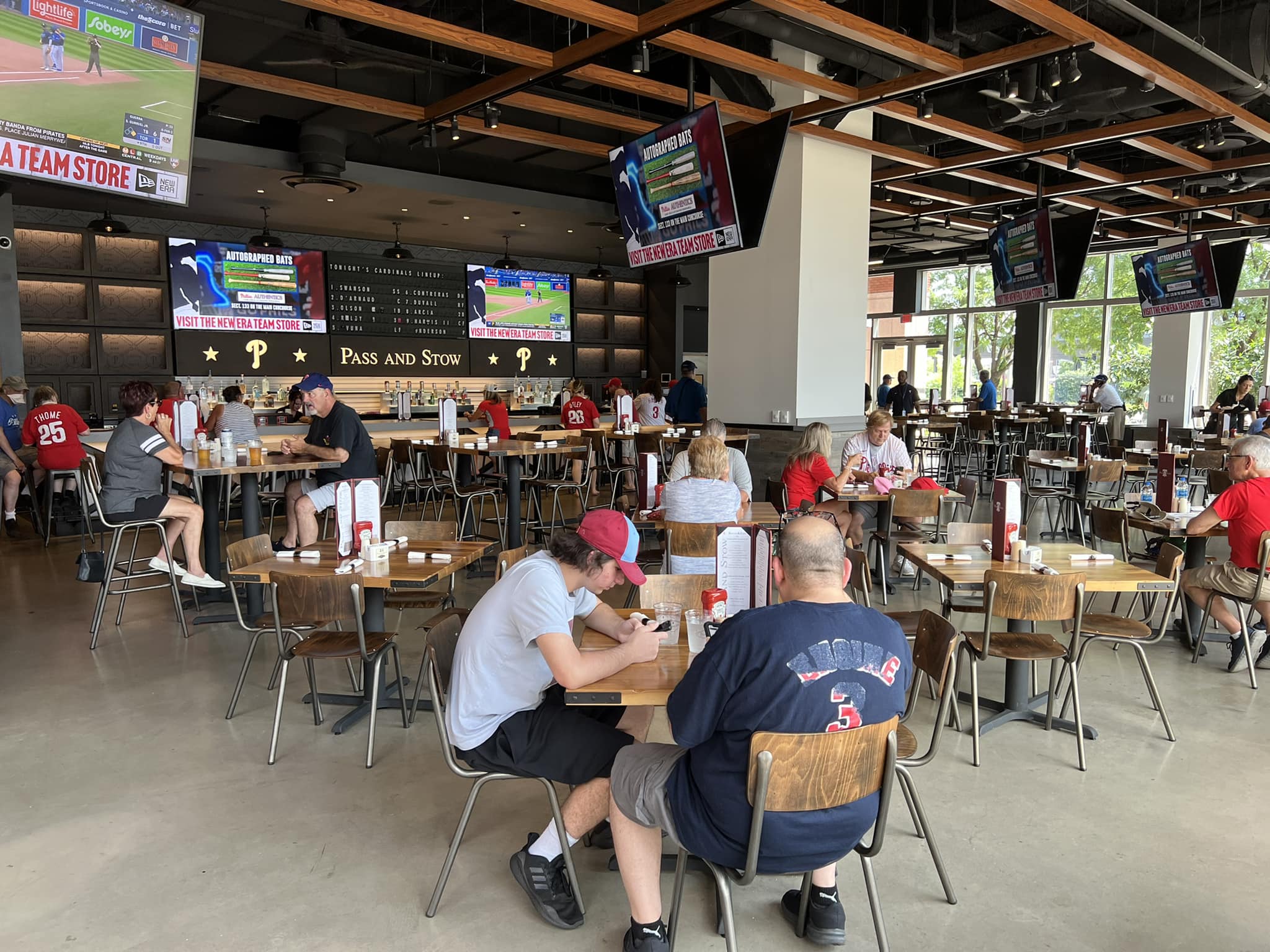
Most notably, the rather stale McFadden’s restaurant has been replaced by a more contemporary concept featuring an open-air beer garden and fan-friendly sports bar. The Liberty Bell that was once a fixture at Veterans Stadium sits outside the new restaurant. Another space introduced the first sit-down Shake Shack restaurant (versus a standalone concession stand) in an MLB ballpark.
Citizens Bank Park has certainly earned a slight boost.
Score: 4/5
Premium Seating/Clubs:
For their time and their market, the Phillies’ kept their inventory of premium seating quite modest. Team officials remarked how much more ambitious and overbuilt the repertoire of suites and club seats was at a few previous parks.
As the great recession rolled around in 2008, the Phillies looked quite wise. It should be noted that the Phillies were successful in selling all of their premium seats, even those in the mezzanine club level, as season tickets well into the 2010s. Other big market clubs in New York and Washington DC were left with a glut during that time period.
While not comparing in the quality or selection to subsequent parks, Citizens Bank Park holds up relatively well today. My complaints about the décor notwithstanding, I’d say this is what average premium seating looks like.
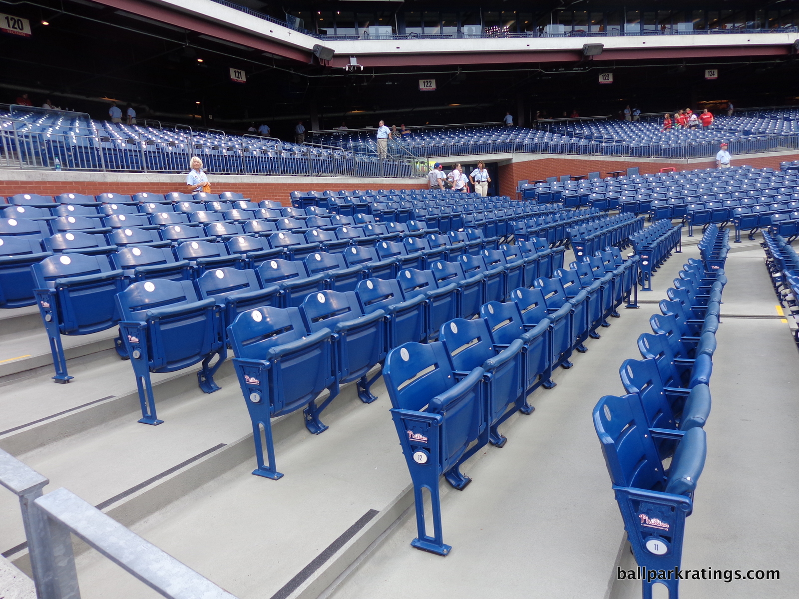
Citizens Bank Park’s Diamond Club behind home plate uses a different formula than most other home plate clubs. Unlike others that seat around 300 fans and provide all-inclusive food and beverage, Citizens Bank Park was one of the first to build a large home plate club that seated over a 1000 fans. Being larger and less exclusive, the intent was to allow for more flexibility.
The vast majority of fans sitting here get access to six a-la-carte bistro stations not included in the ticket price. Other perks included are rather standard for these high-end areas: access to a private climate-controlled lounge, two full-service bars, a private entrance, padded seats, and in-seat service. The terrazzo floors are nice, and the murals by Dane Tilghman provide the ballpark’s best artwork. The Diamond Club is also one of a handful of spaces around the majors to offer batting cage views.
The first three rows (100-200 seats) of the Diamond Club are known as the “Dugout Diamond” Club seats. These ultra-exclusive seats are all-inclusive, featuring an unlimited food and beverage credit per ticket (which apparently means you can use them at regular concession stands throughout the park, which is unusual) and access to a private buffet area within the Diamond Club.
I would have preferred to see the Phillies simply divide the Diamond Club into two: one ultra high-end all-inclusive club for the “Dugout Diamond” seats and one more standard premium area behind it for everyone else. We see this all around baseball to great success: look at Great American Ballpark (Diamond Club and Scouts Club), Nationals Park (Presidents Club and Diamond Club), Citi Field (Delta Sky360 Lounge and Delta Sky360 Club), and SunTrust Park (SunTrust Club and Delta Sky360 Club).
If you are going the route of over 1000 premium seats on the first level behind home plate, this is much more fan friendly, simultaneously increasing the value of both the super premium ($350-$1000 per) and the premium ($100-200 per) seats.
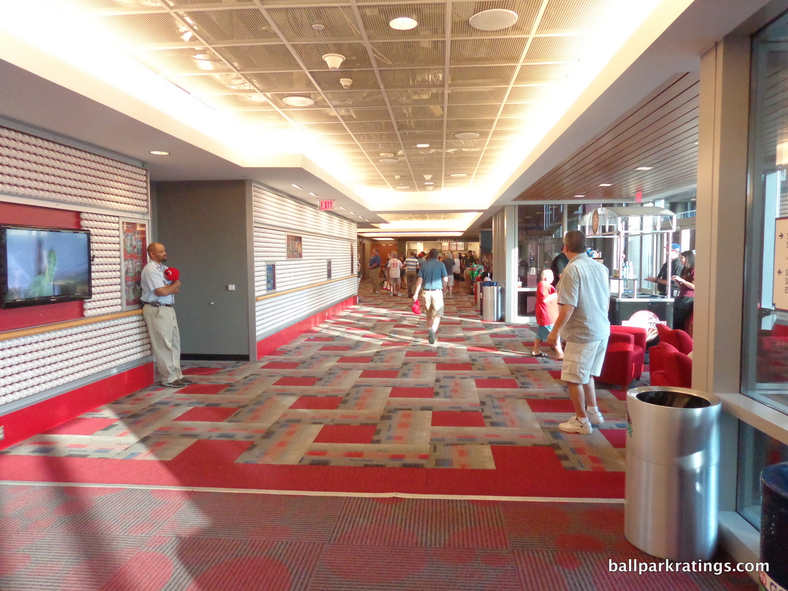
Spanning the mezzanine around the infield, Citizens Bank Park’s entry-level premium option is the Hall of Fame Club, which serves as the park’s de-facto “club level.” The Hall of Fame Club features great sightlines with access to a private concourse, two full-service bars, and multiple lounge areas. In-seat service is not available. There may be a slight upgrade in food options at times.
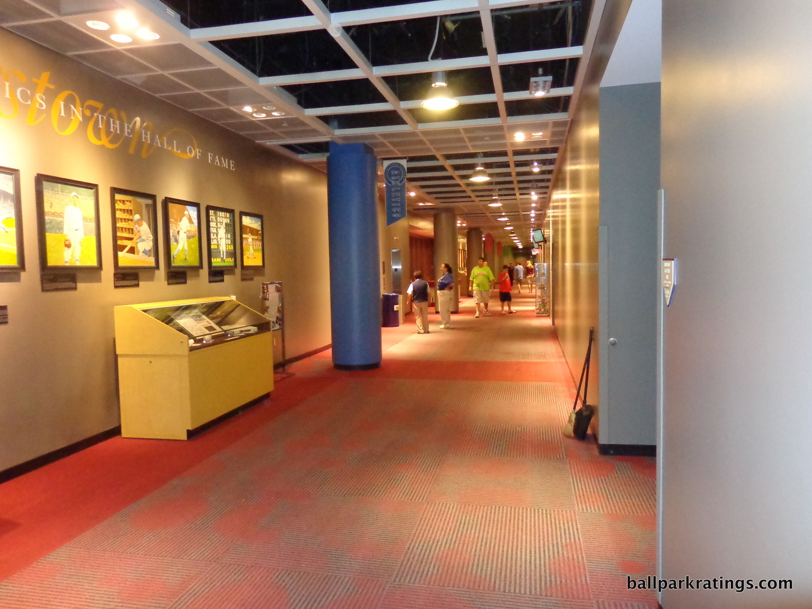
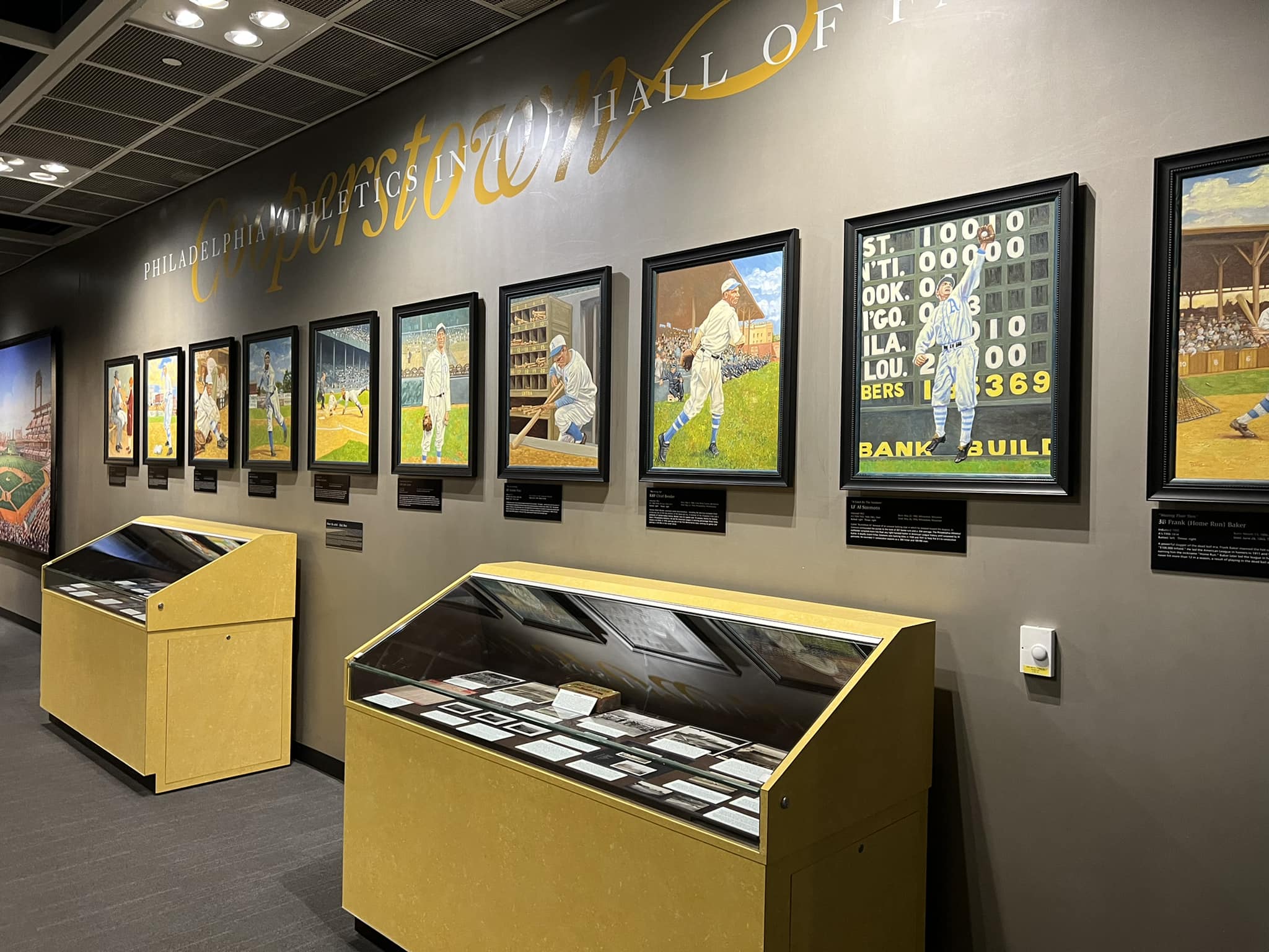
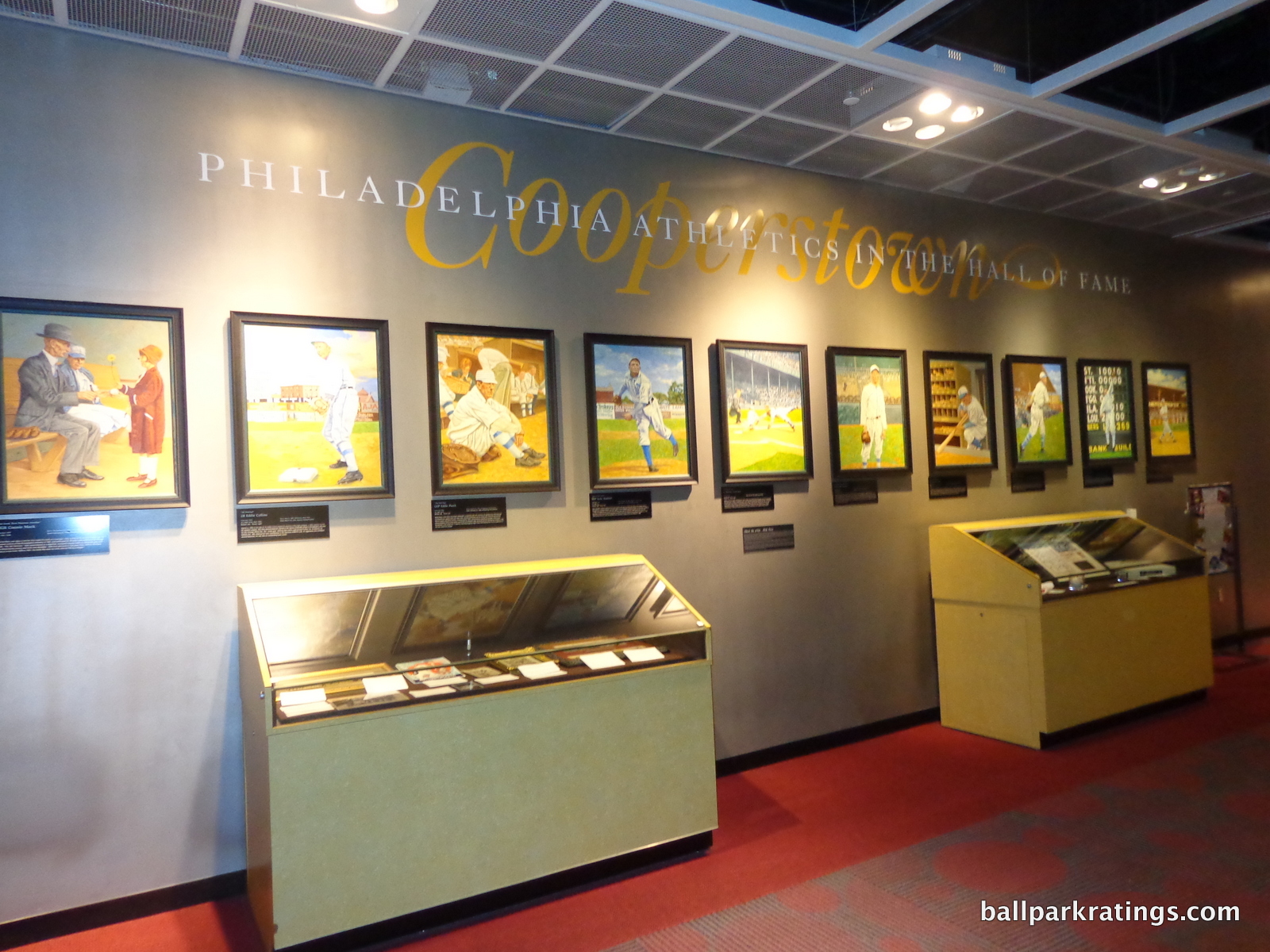
There are two unique aspects to the Hall of Fame Club: an actual private entrance (unusual for a large mezzanine club) and the Cooperstown Gallery. The Cooperstown Gallery features 33 oil paintings of Philadelphia greats enshrined in the Hall of Fame along with other glassed-in historical memorabilia. This is the only true team Hall of Fame exhibit in baseball confined to a premium area, but there is plenty of history sprinkled around the ballpark to make up for it (see below). Take the ballpark tour if you want to see the Cooperstown Gallery on a budget!
Citizens Bank Park features 70 luxury suites, a pretty standard number for 2004. Positioned below the Hall of Fame Club level, these suites feature good sightlines, only a few feet above the main concourse.
My only complaint about all of these club areas and luxury suites is the interior décor. This isn’t something I often take time to remark on. The baseball imagery is just too much. Note the balls littered all over the walls, the bats below the bars and concession stands, and the inscribed bases. Note the tacky bright red lounge chairs in the corner of the Hall of Fame Club. It is something of a caricature of what you might think a 10-year-old kid’s baseball decorated room would look like. There really isn’t anything “premium” about it.
Overall though, Citizens Bank Park does fine in this category. It all feels “newish”, unlike some aging premium spaces from some 1990s ballparks. The décor just isn’t my cup of tea. The Phillies might want to add another club option on the suite level like many other parks around baseball have.
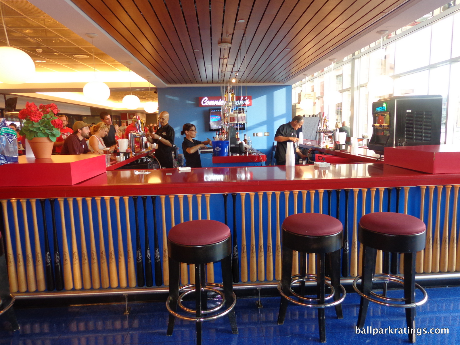
Score: 4/5
General or Artistic References to Baseball or Team History/Museums:
Citizens Bank Park (along with Comerica in Detroit) was one of the first ballparks to create different historical exhibits all around the park, instead of stashing all of the team memorabilia in one team museum or in one dedicated area. You saw this a year earlier at Great American Ballpark. The consequence would be the ballpark itself would have little mention of the team’s history, and only a handful of fans would enter a museum located off the concourse.
You see this at its extreme in St. Louis. The Cardinals’ plan was always to build a massive team museum in Ballpark Village, which took years to open. Even after it opened, you have a ballpark that is lacking historical mention of one of baseball’s greatest organizations. Yes, the museum is great, but how many fans are going to see it?
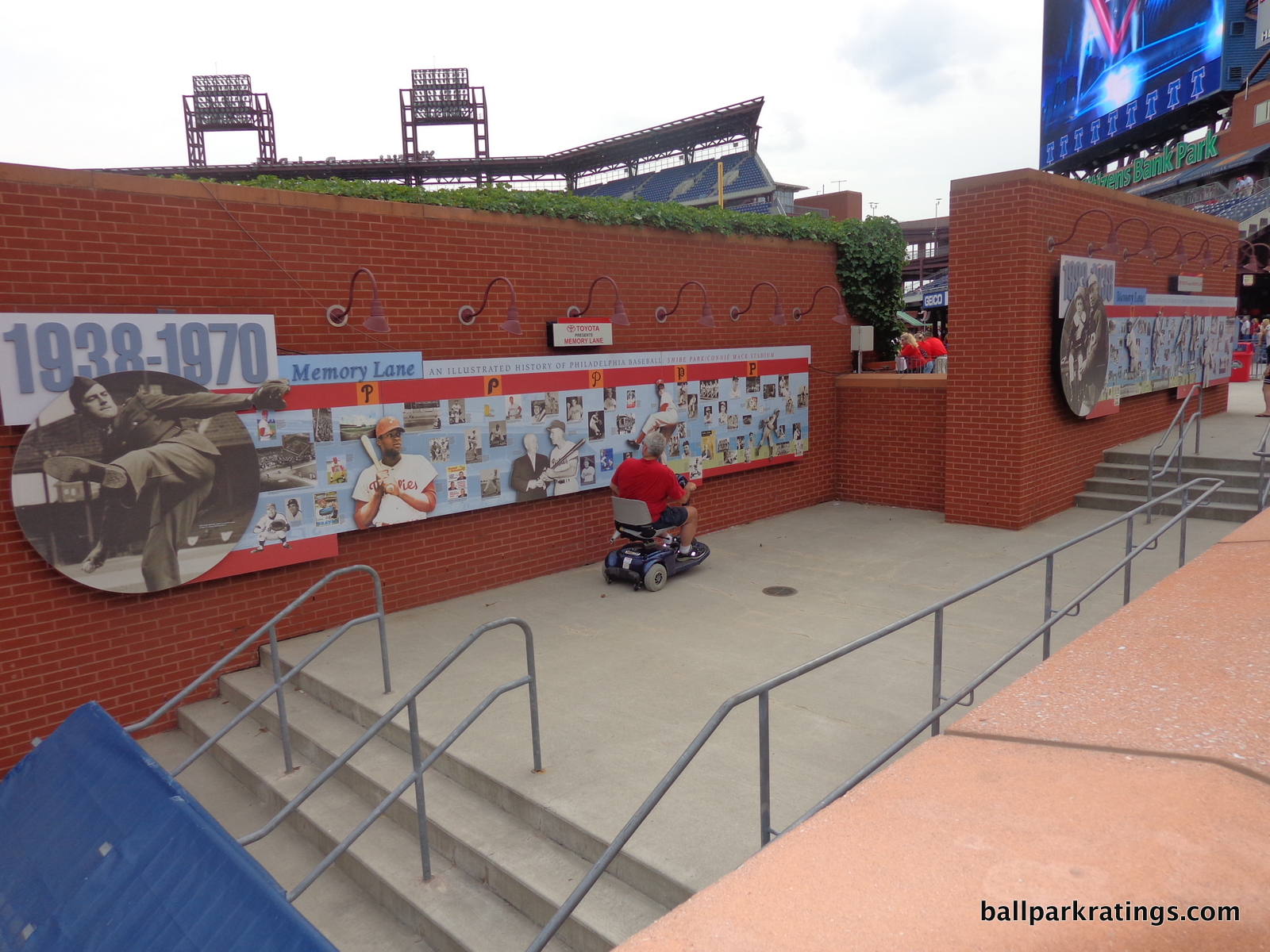
In Philadelphia, the lion’s share of the team historical references are in Ashburn Alley, an area nearly every fan will encounter.
Located on the brick façade behind the batters’ eye, Memory Lane is a wonderful visual illustration of baseball history in Philadelphia. It includes mention of the Phillies, the Athletics, and Negro League teams in the city. The exhibit is divided into three historical periods: 1883-1938, 1938-1970, and 1971-2003. There sure is a lot of history left to illustrate since 2003!
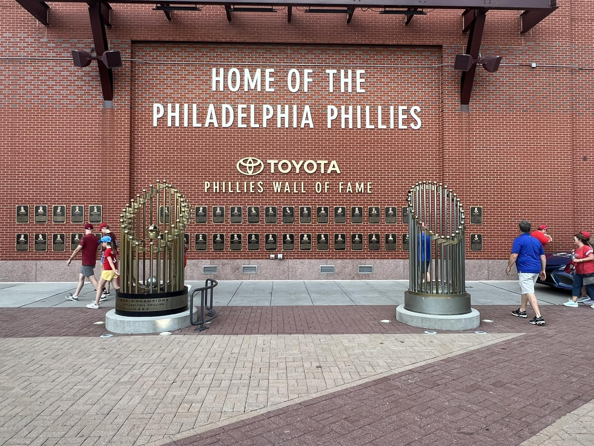
The Phillies’ Wall of Fame is next to Memory Lane. The bronze plaques display every team member enshrined in their Hall of Fame. Make sure to look down when walking across Ashburn Alley. The All-Star Walk features granite markers of Phillies’ All-Stars since the game began in 1933. This has been kept up to date for the most part.
While not near the level of Marlins Park or Safeco Field, the Phillies feature some artwork in the ballpark. Local artist Max Mason has three murals displayed in Harry the K’s. Note the unique tile mosaics on the main concourse. Commemorating the site of Veterans Stadium, the team built a Veterans Memorial outside the park as well. There are a number of artistic pieces in the premium areas.
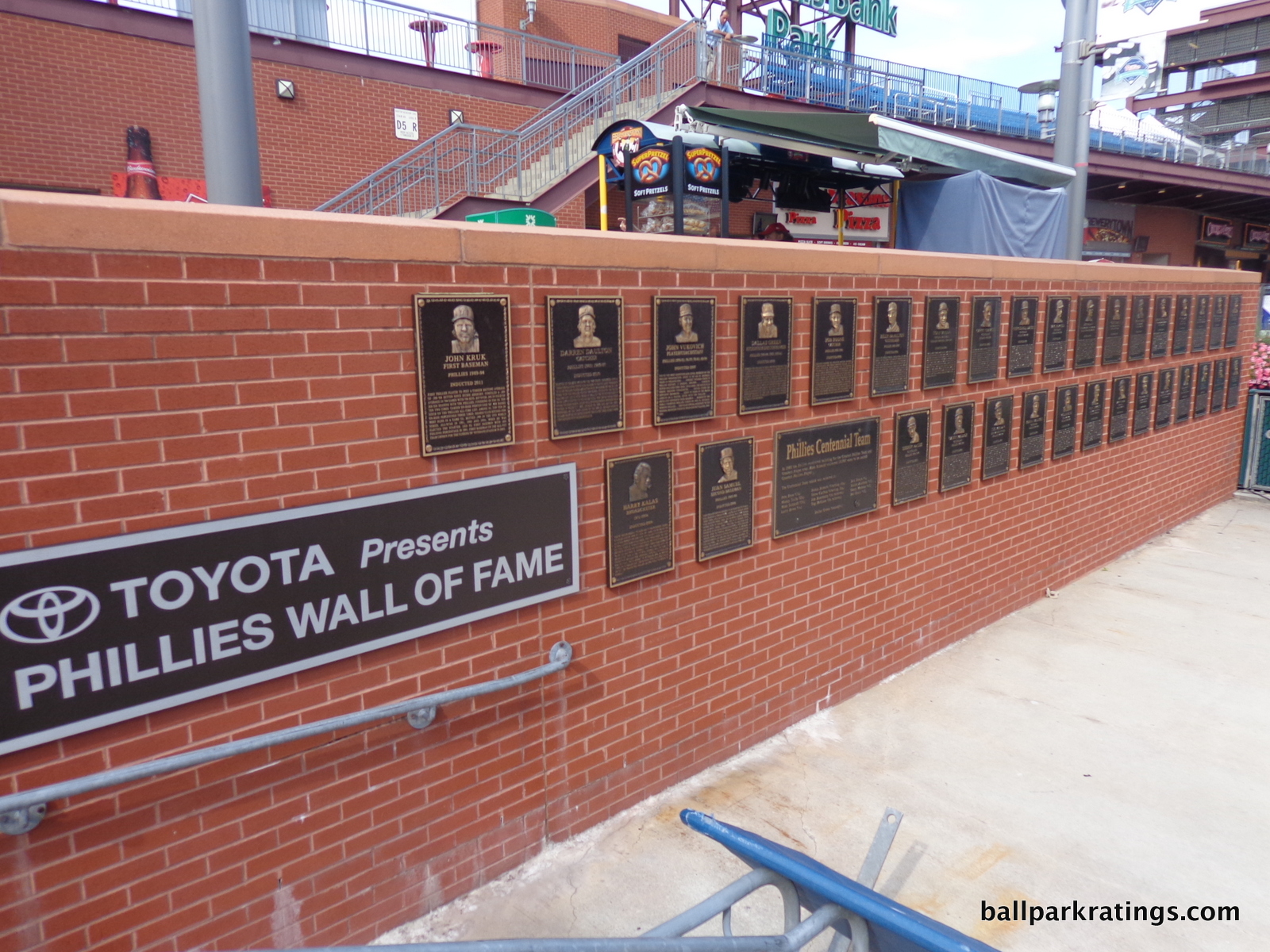
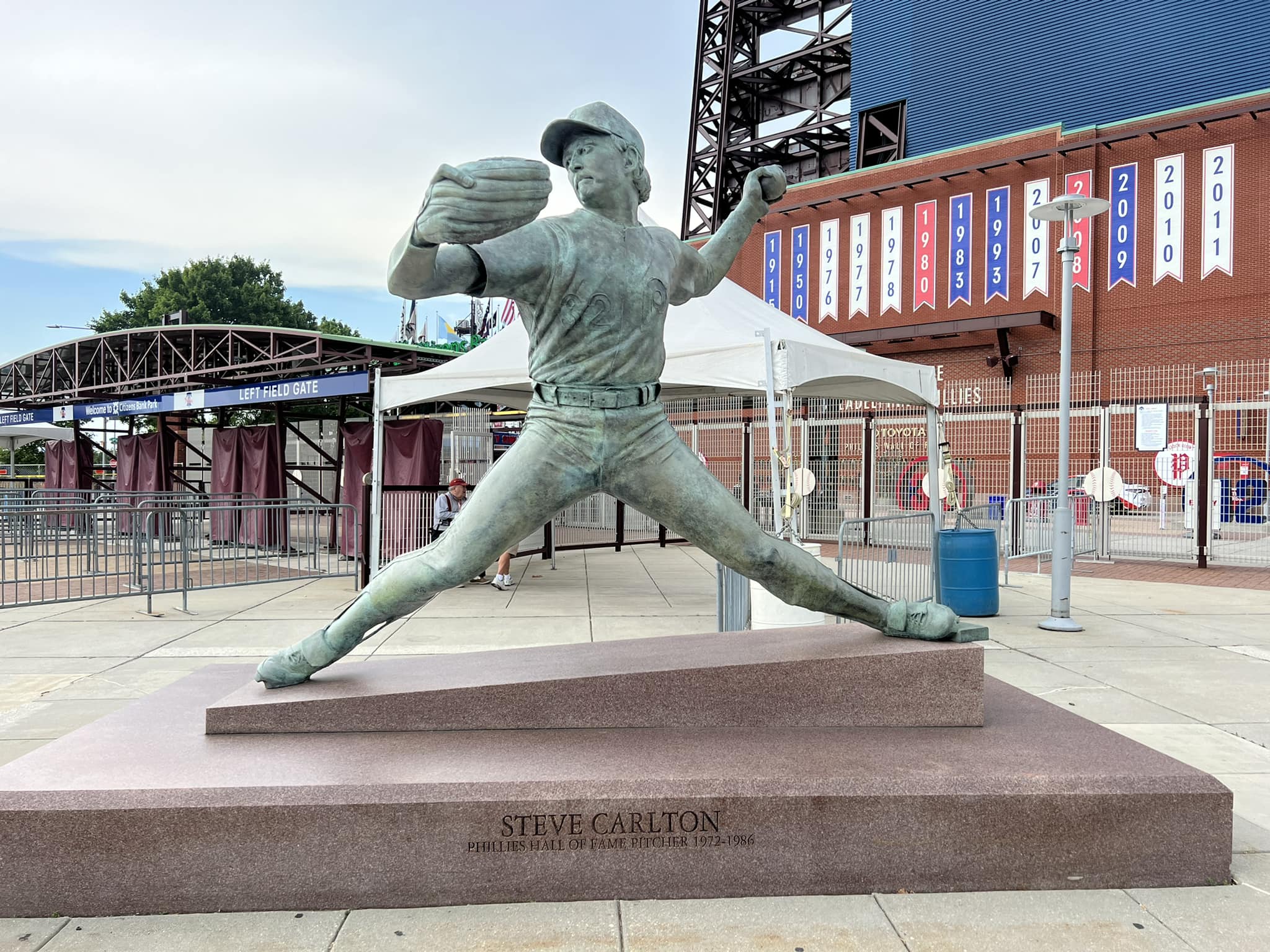
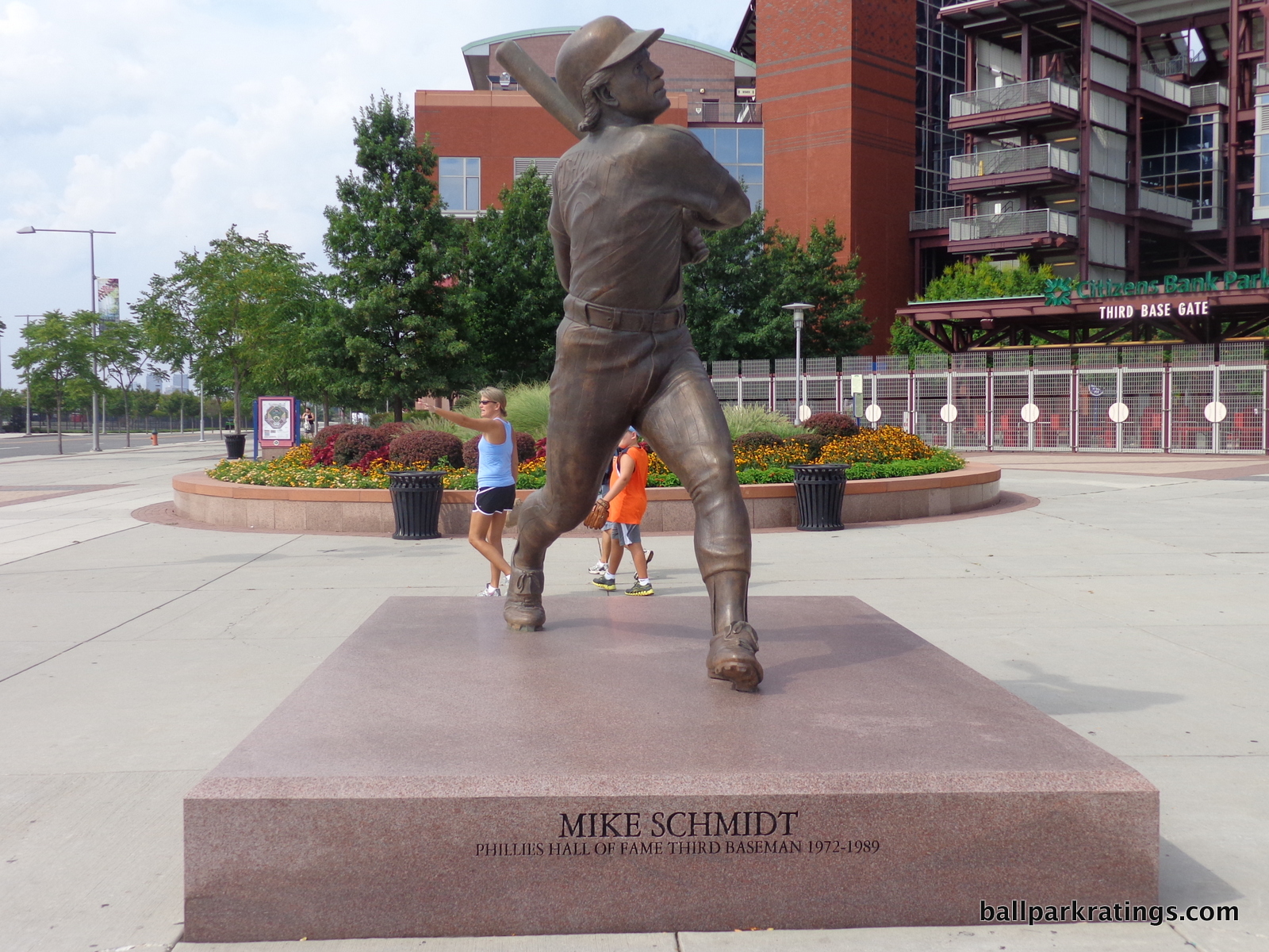
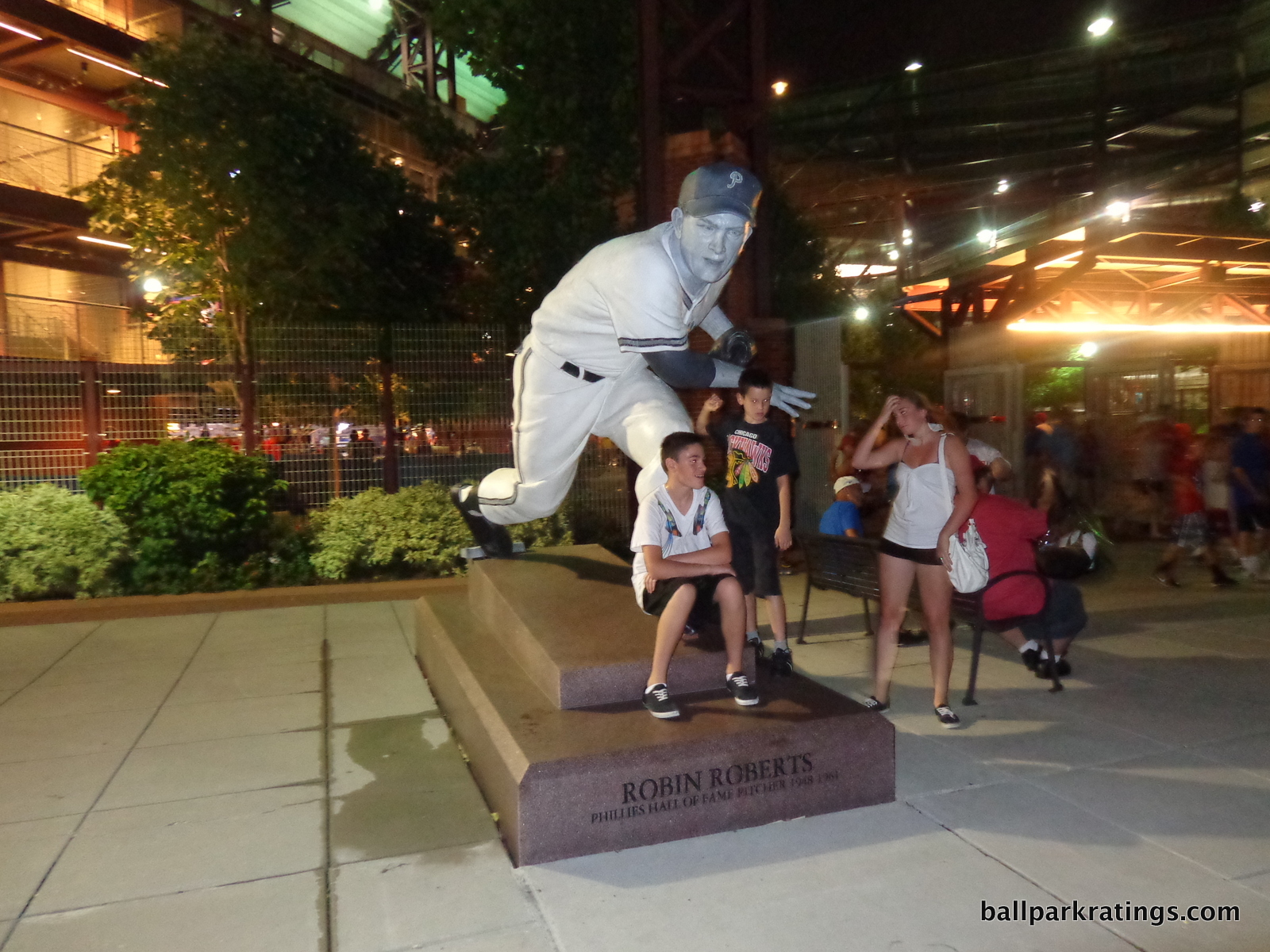
Citizens Bank Park features six statues positioned inside and outside the park. “World-renowned sculptor” Zenos Frudakis created statues of Robin Roberts, Steve Carlton, and Mike Schmidt, all outside the ballpark. The statue of Richie Ashburn is inside the park in the middle of Ashburn Alley in center field. As far as ballpark statues go, these aren’t my favorites. At 10 feet tall, they are poorly proportioned (oddly proportioned statues never seem to go well, with a few of those tiny ones in St. Louis being some of the worst in baseball) and feature generic facial expressions. A generic facial expression may work with Tony Gwynn, but not so much with Michael Jack Schmidt!
The Robin Roberts statue is by far the most unique of the bunch. It looks like it was painted to resemble a 1940s newspaper cutout. I appreciate the novelty.
The other two statues are of Connie Mack and Harry Kalas. Both are better, and the Connie Mack statue may be the best of the bunch. The Kalas statue was added more recently on the main concourse near the restaurant of his namesake, while the Mack statue was brought over from Veterans Stadium (outside the park).
Overall, Citizens Bank Park does well here, perhaps falling short in sheer quantity of memorabilia. I’m still skeptical of the wisdom of putting the Cooperstown Gallery on the Hall of Fame Club level where most fans can’t see it.
Score: 4.5/5
Entertainment/Kids Activities/Other Amenities:
Citizens Bank Park presents a nice array of entertainment options for the kids. Like the relatively new parks in New York and Washington DC, it isn’t too over the top.
Near the Right Field Gate in Ashburn Alley, the Phillies’ feature “Citizens Bank Games of Baseball.” It has speed pitch, beanbag toss, a unique electronic “run the bases” game, and extravagantly presented trivia challenges.
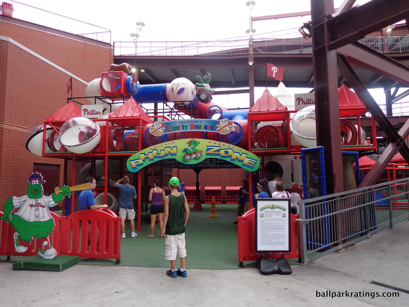
Located near the first base gate, the Phanatic Phun Zone features activities more oriented toward kids under eight. It’s mostly just a standard play area. An especially nice touch that I haven’t seen before is a “junior zone” designed for even younger kids under two.
Of course, there’s the Philly Phanatic himself (herself? itself?), the most recognizable mascot in North American sports!
Nothing at Citizens Bank Park matches the ridiculousness of something like Atlanta’s zipline, Detroit’s Ferris Wheel, or Kansas City’s putt-putt golfing (okay, that goes too far, right? Another sport in a ballpark?), but there is plenty to do if you’re a hyper kid in need of some activity.
2018 Edit: The Phillies revamped their kids’ entertainment
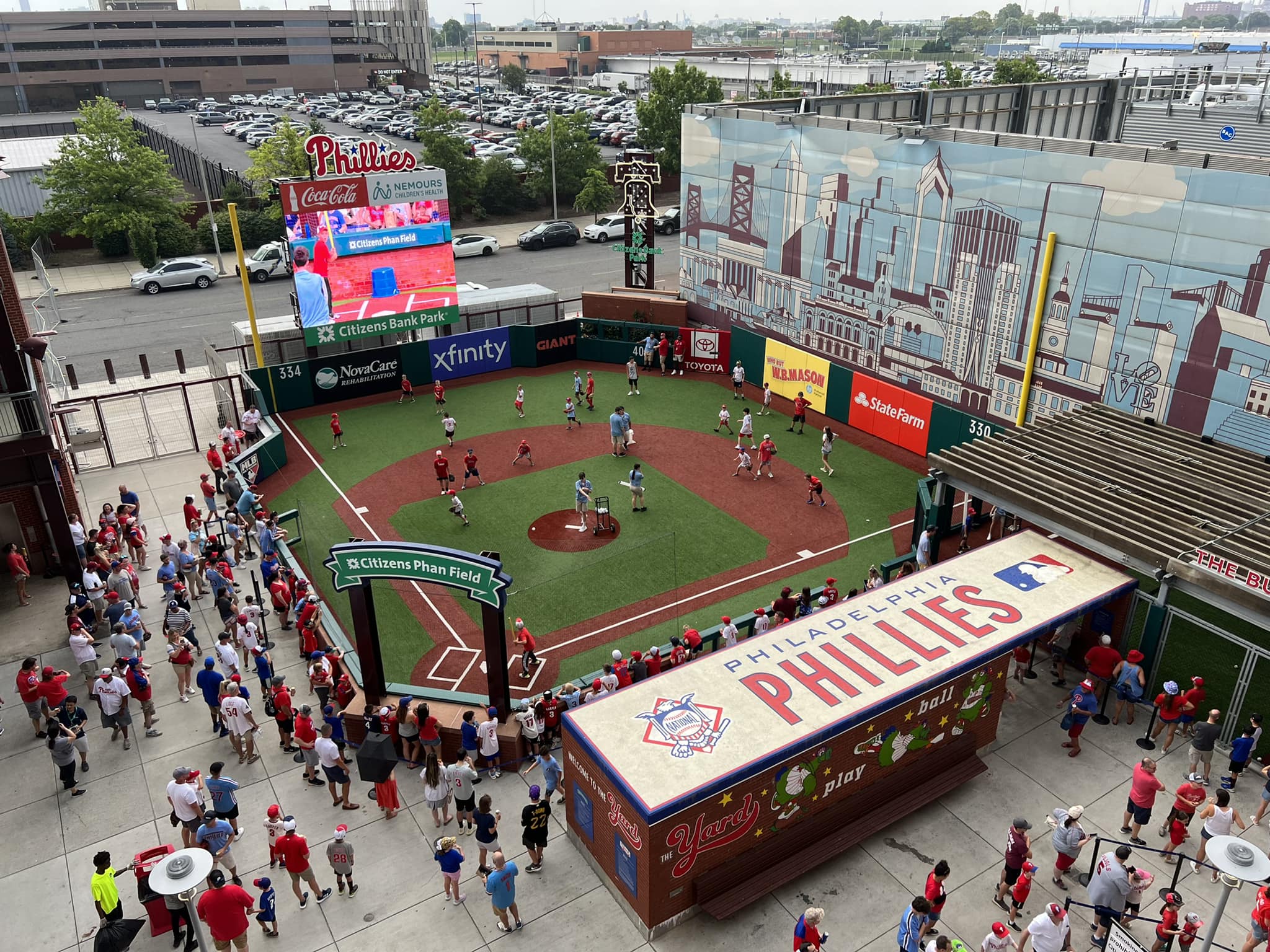
The most notable addition is the Phan Field, a kids’ whiffle ball field modeled after Citizens Bank Park. With a dugout, padded outfield walls, and even the Bank’s scoreboard, I’d say this is a step up from the usual MLB kids’ ballfields. The new entertainment zone also includes a speed pitch and a 30-foot climbing wall.
Score: 3/3
Total: 21.5/25
Atmosphere, Vibe, & Policies
Atmosphere/Fan Support:
At a point in the early 2010s, there was a perception that the Phillies were becoming the New York Yankees of the National League. There was talk that the organization would resemble the Cubs, Cardinals, Dodgers, Yankees, and Red Sox in their perennial success and consistent fan support. At one point, the Phillies enjoyed five straight years of attendance averaging above 40,000 per game.
In truth, the organization proved to be more similar to other upper mid-market teams, with both fluctuating team success and attendance. Similar to the Detroit Tigers after 2017 (presumably), the Phillies have undergone a full-scale rebuilding project since 2013, with payroll eventually falling below $80 million. Dwindling attendance followed.
In the last three years, the Phillies have been in the bottom three in attendance in the National League, bottoming out at 22,606 in 2015. The team still benefits from a strong season ticket base, and gets a bump for their legacy of great fan support in the 2000s and early 2010s.
Score: 4/5
Ballpark Policies/Customer Service:
Citizens Bank Park has generally separated itself from other large market teams on the east coast with its fan friendly policies. Unlike both ballparks in New York, Citizens Bank Park has always resembled that of a medium market team.
As previously detailed, the Phillies don’t have the premium seating of other large market teams that built ballparks in recent years. Clubs don’t encroach upon the regular fan, with no mention of premium seating on the main concourse. Citizens Bank Park doesn’t feature the “moat” behind the dugouts seen in other new ballparks.
Per usual, all fans are free to go down to the lower level before the game to get autographs or just hang out (only the Yankees, Giants, and White Sox restrict this).
Score: 2/2
Bonus:
For Ashburn Alley, an example of a large outfield social area loaded with fun concessions, kid features, historical references, and places to hang out that would be emulated by subsequent ballparks +2
For having some of the best concourses and standing room areas in baseball +1
For the unique geometry of the seating structure, adding some distinctiveness to an interior design not seen in other parks +1
For having some of the best, arguably the best, regional and local food concessions in baseball +1
For the liberty bell +1
For the great atmosphere and the Philly Phanatic +1
Score: 7
Total: 13
Conclusion
I’ll be honest: Compared to the other 29 ballparks in the majors, most of which I’ve been to on more than one occasion (including here), Citizens Bank Park is relatively forgettable in retrospect.
Putting aside just how anecdotal and unreliable personal memories (which don’t impact the ratings, by the way) of any particular ballpark visit may be, Citizens Bank Park shouldn’t be forgettable.
In contrast to more derivative parks like Busch Stadium, Citi Field, and Nationals Park, two of which score very similarly, the Phillies’ home has plenty of memorable features, highlighted by Ashburn Alley. With inspired food options, a functionally groundbreaking design, and other fan friendly amenities, Citizens Bank Park shouldn’t be grouped with other formulaic new parks. But for me, there is a persistent impulse to do so.
I see two reasons why this may be the case, both of which relate to my two main points about the ballpark.
From a functional point of view, Citizens Bank Park is the second Camden Yards. Think massive dedicated standing room only areas, social spaces, split upper decks, completely open concourses with drink rails, local food options, “outfield experiences”, and year-round restaurants.
Unlike Camden Yards, Citizens Bank Park wasn’t really recognized as a pioneer for its contributions, even though subsequent parks emulated nearly all of these features.
So when these subsequent parks implemented these features, Citizens Bank Park was unscrupulously put in the same basket as those copycats. The park is unfairly grouped with the other retro clones. So many other parks copied Citizens Bank Park’s most notable features that the park looks somewhat unremarkable today, and that isn’t fair. First adopters should get the upper hand over copycats.
Looking at the ballpark in a vacuum, you could see how Citizens Bank Park might conceivably fit into the “retro cookie cutter” family, but I hope we can see that’s not accurate on multiple levels given the context. We have to resist the understandable impulse to categorize the Phillies’ park as such.
Second, I still can’t overcome the location. For reasons extensively elaborated on throughout this review, our ratings system really punishes ballparks with poor locations. Personally, I still can’t escape the park’s lack of place and total interior vacuity beyond center field. Location impacts a park in many ways. There is somewhat of a “hard cap” on the ballpark’s “wow factor” because of this.
So while applying the “retro cookie cutter” label and calling it “forgettable” is tempting, appreciation for Citizens Bank Park’s influence on subsequent ballparks, along with its superior functionality and unique angular grandstand design, renders that critique empty. This becomes especially true when coupled with the groundbreaking and frequently emulated amenities.
The location will remain the park’s persistent and unalterable blemish.
FINAL SCORE: 86.5
RANKING: #12/30
Summary
TL;DR? Here’s the long-form piece in a nutshell:
For something as subjective as ballpark rankings, with all their variations based on roots and loyalties, there’s a rare consensus here: fantastic park, less-than-ideal setting.
Philly fans will tout the infrastructure efficiencies, but Citizens Bank Park is almost defined by its South Philadelphia Sports Complex location, because any shortcomings are a function of that location. Drag the park 4 miles north and witness the closer skyline views, much-needed sense of place, and vibrant local scene, and you would have a top-5 park.
Location and views are huge in my book, but CBP does almost everything else right. Leaving the classic Dodger Stadium out of the equation which is a different animal, this is my highest ranked “parking lot stadium.”
Aesthetically, the interior sports clean lines, an engaging color scheme, a unique angular grandstand design, and one of baseball’s most beautiful batter’s eyes. Functionally, CBP’s sightlines are excellent, and the concourse design may be baseball’s very best. The concourses open to the field on all three levels, with no interruptions in visibility throughout the main concourse, numerous fan-friendly SRO areas, and Ashburn Alley.
Elevated by recent renovations, CBP’s amenities are some of the best in baseball. Local culinary staples like Tony Luke’s, Campo’s, and Federal Donuts remain scrumptious. Recent enhancements added (a) a wonderful sports bar with an open-air beer garden, (b) a redesigned historical exhibit in left field, and (c) one of baseball’s premier kids’ areas, among other things. Then throw in the passionate Philly fans, and you’re looking at a memorable experience.
But Citizens Bank Park still feels like a missed opportunity for what it lacks—that all-so-important sense of place provided by a downtown location—given that it’s otherwise so fan-friendly.