PNC Park
| Setting | 18/20 | 1 Thumb Up |
|---|---|---|
| Locale | 5/5 | 2 Thumbs Up Star |
| Accessibility | 4.5/5 | 1 Thumb Up |
| Neighborhood Local Scene | 8.5/10 | 1 Thumb Up |
| Architecture & Aesthetics | 60/65 | 2 Thumbs Up Star |
|---|---|---|
| Exterior Design/Aesthetics | 16/20 | 2 Thumbs Up |
| Interior Aesthetics/Visuals | 39.5/40 | 2 Thumbs Up Star |
| Concourse Aesthetics | 4.5/5 | 1 Thumb Up |
| Functionality & Essentials | 37.5/50 | 1 Thumb Up |
|---|---|---|
| Sightlines: Field Proximity | 13/15 | 1 Thumb Up |
| Sightlines: Seating Geometry | 4/5 | 1 Thumb Up |
| Seat Comfort | 5.5/9 | Thumb Sideways |
| Concourse Functionality | 11/15 | Thumb Sideways |
| Scoreboards/Tech | 4/6 | 1 Thumb Up |
| Amenities & Features | 39/50 | 1 Thumb Up |
|---|---|---|
| Concessions: Food Variety | 2.5/5 | 1 Thumb Down |
| Concessions: Food Quality | 3.5/5 | Thumb Sideways |
| Concessions: Craft Beer/Other Drinks | 4/5 | 1 Thumb Up |
| Social Gathering Areas/Restaurants | 9/10 | 1 Thumb Up |
| Premium Seating/Clubs | 7/9 | 1 Thumb Up |
| Historical Exhibits, Memorabilia, Art, & Other Displays | 8/10 | 1 Thumb Up |
| Kids Areas/Other Entertainment | 5/6 | 1 Thumb Up |
| Atmosphere, Vibe, & Policies | 10.5/15 | Thumb Sideways |
|---|---|---|
| Fan Support/Attendance | 2.5/5 | 1 Thumb Down |
| Ballpark Traditions/Gameday Presentation | 4/5 | 1 Thumb Up |
| Ballpark Policies/Staff | 4/5 | 1 Thumb Up |
| Adjusted Raw Score | 165/2=82.5 |
|---|---|
| Bonus | 4 |
| Curve for All 7 | 7 |
| Final Score | 93.5 |
|---|---|
| Ranking | #2/30 |
|---|---|
Something Different in Pittsburgh
PNC Park highlights local beauty of the Steel City, but intimacy is what sets it apart
By: Cole Shoemaker
Written in 2010; ratings above are up to date for 2024, but this review below is outdated and will be updated at some point; reviews and ratings are “living pages” updated yearly when necessary
Who ever thought baseball’s most beautiful park would be in Pittsburgh?
Who knew anything about Pittsburgh’s beautiful rivers or skyline? In a city known for its industrial working class grittiness, stereotypes recall a dirty image of steel, coal miners, and fat grizzled Steeler fans waving their terrible towels, but not beauty. Until now.
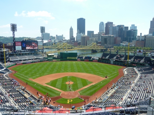
So yes, PNC Park showcases its city unlike any other. Yes, it’s the most beautiful park in baseball. I think if you took the average baseball fan to every major league ballpark, he/she would pick PNC as their favorite, overwhelmingly. You don’t even have to look at the ballpark websites; just look at Yelp. PNC is the favorite.
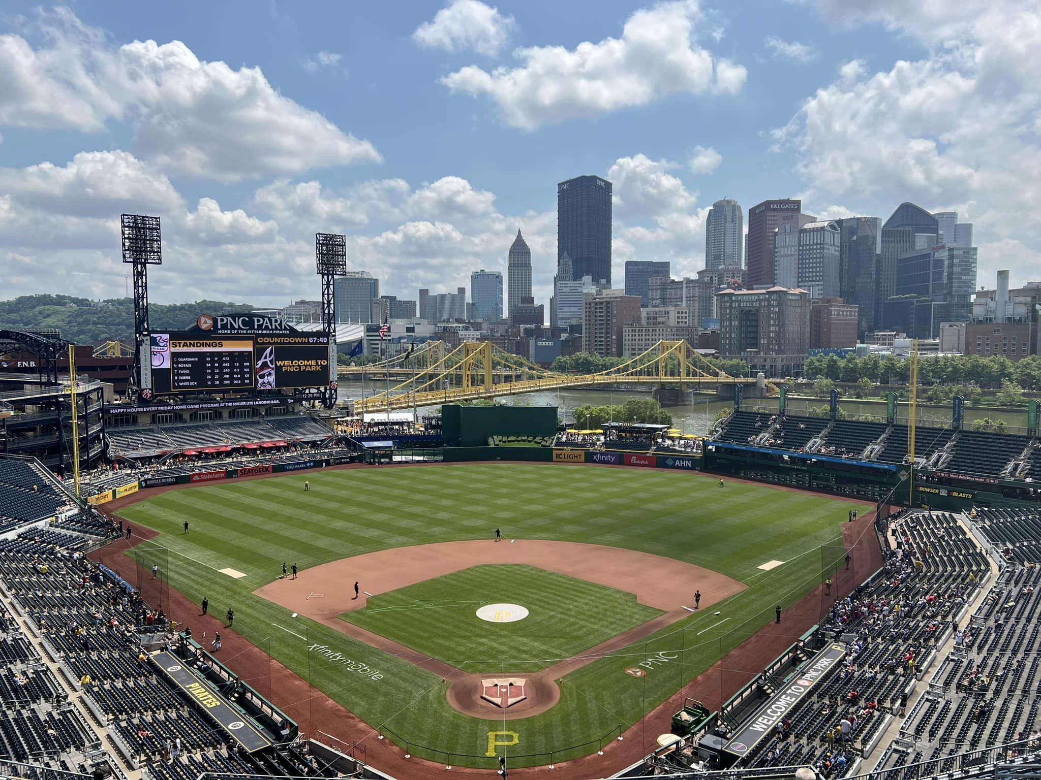
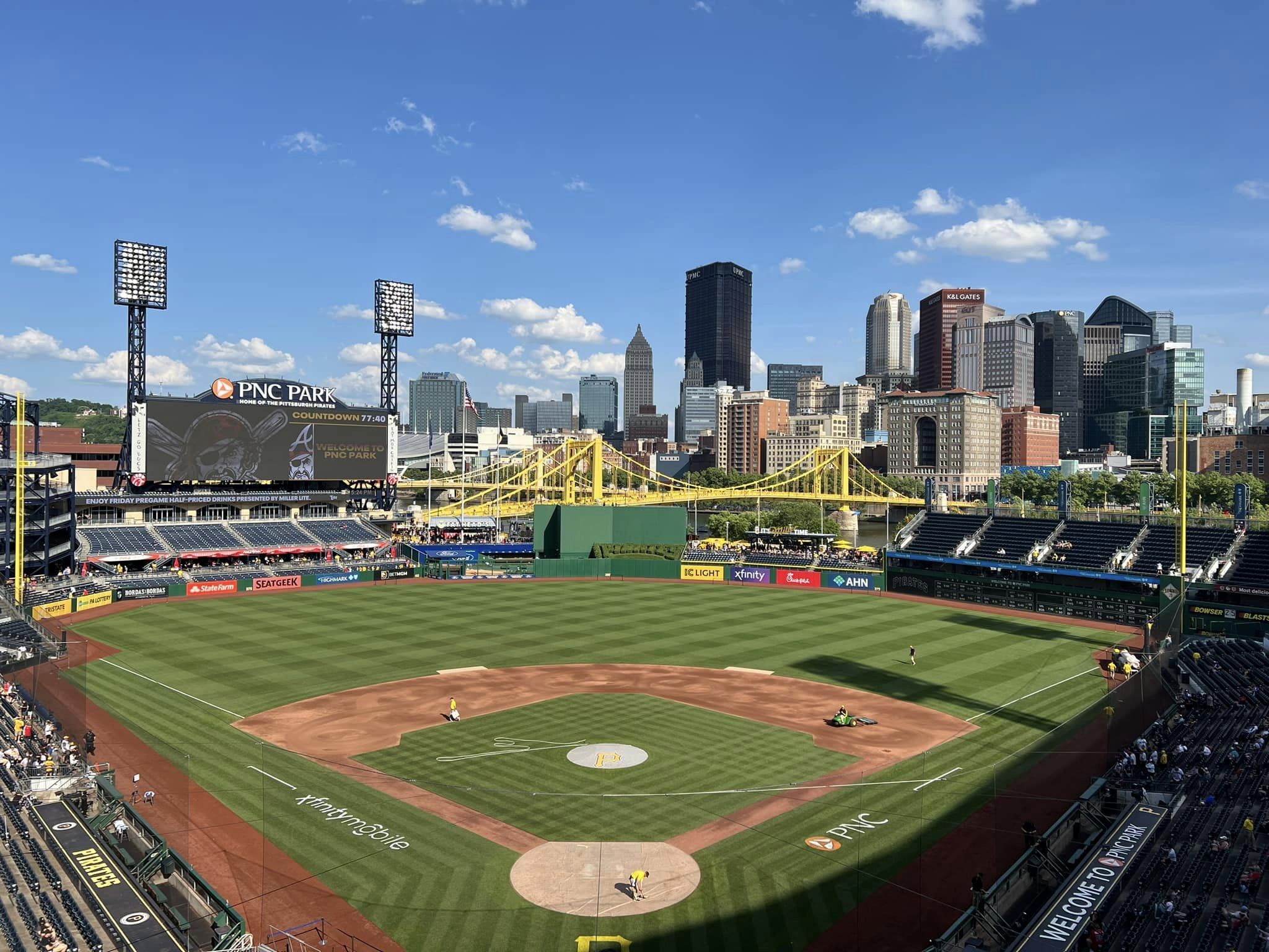
Aesthetically, no one comes close, not even AT&T in San Francisco, if you consider the exterior, interior, panoramic view, and other intangibles. We’ve heard all the press already. We’ve read ESPN call it perfect and compare it to Wright’s Falling Water. And what is most impressive is that its beauty is so locally based. In Pittsburgh of all places!
But it’s not just about the view, or even the aesthetics or the brilliant location.
In an era where owners were demanding all the quirks and gimmicks possible to supplement their massive new ballparks, the Pirates did something different.
Somewhat quietly, around the league prior to the 2000s, sentiments echoed about how these retro parks were actually ornate projects with huge footprints, nothing like the jewel box parks. In scale, these parks had high upper decks that more resembled the cookie cutters they replaced, just with a retro façade and deceptive proportions. In actual size, these parks were not intimate and were nothing like the “classic” ballparks. Until PNC Park came along.
The Pirates decided to build a park that’s actually intimate, not just one that “looks” intimate through sunken exterior landscaping. From the beginning, Pirates owner Kevin McClatchy wanted an authentically low scale “35,000-to-37,000-seat park with natural grass and no roof, bells, or whistles.” Look at all of the kitschy elements incorporated into other ballparks of the era. PNC was visionary in its simplicity for the time.
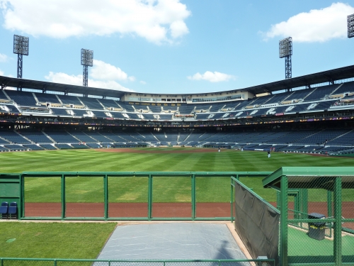
Everything deviated from the retro formula: the intimate two-deck design, the limestone exterior, and blue seats. Little did he know that he was building something that would stand alone in praise, in what appears to be the Wrigley Field of the 21st century.
In reality, that’s what makes PNC the consensus best retro park.
While its functionality and amenities haven’t really faced too much scrutiny (a couple of bad sightlines, somewhat narrow concourses, a lack of amenities, no atmosphere, etc.) until this review, once you add the gorgeous aesthetics, it’s a slam-dunk.
Setting
Location/Access:
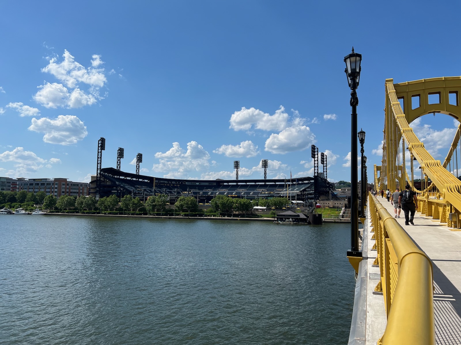
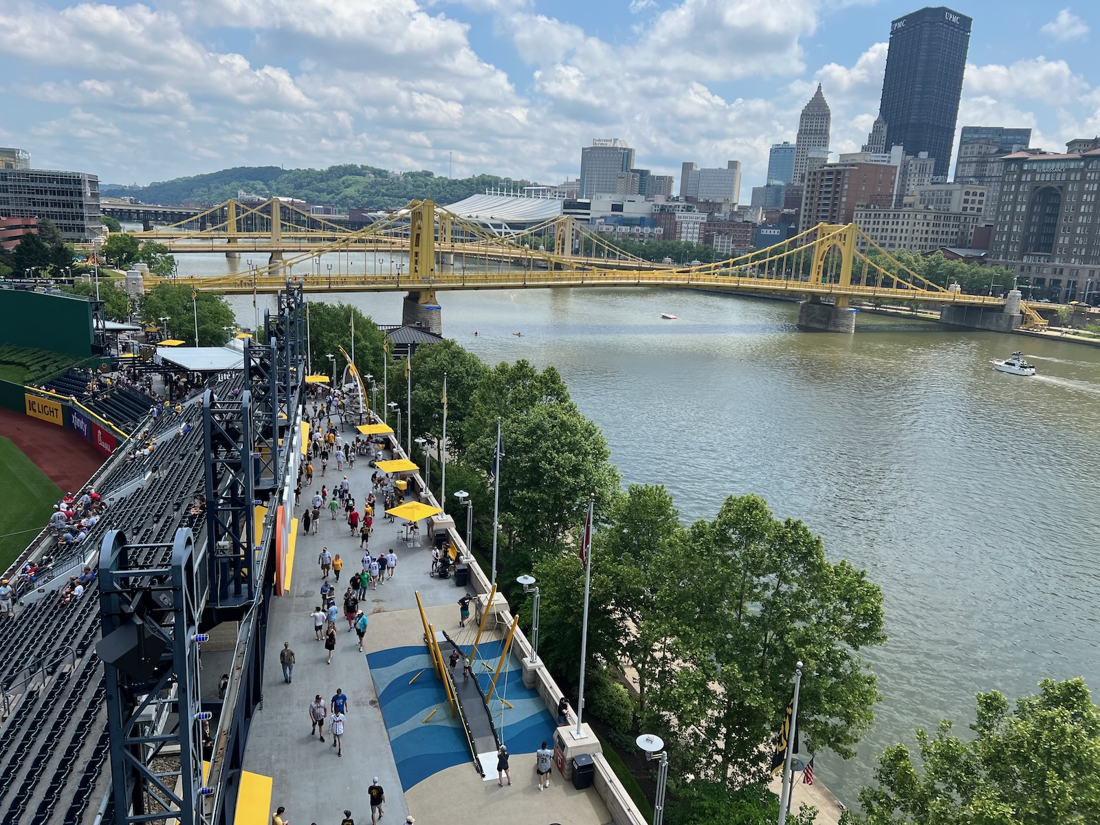
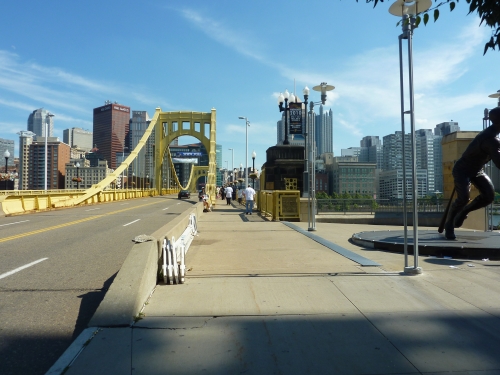
I think we can all agree PNC has about the most ideal location in baseball. The outfield perimeter of the ballpark conforms to the Allegheny River, where the Roberto Clemente Bridge takes you right into downtown. The designers really did a good job combining downtown, the river, and the neighborhood (North Shore, where the ballpark is located), all into one. Contrarians who claim the gorgeous view led to the park being too removed from the city fail to acknowledge that this also led to a unique neighborhood feel around the park unmatched by the urban ballparks.
It’s not only brilliant from a visual perspective. Everything that is Pittsburgh is integrated into the design. Access is easy enough nowadays, especially with the attendance issues. One of the cooler options you might consider is arriving to PNC by ferryboat, which departs from the other end of downtown to the ballpark.
Score: 5/5
Local Scene:
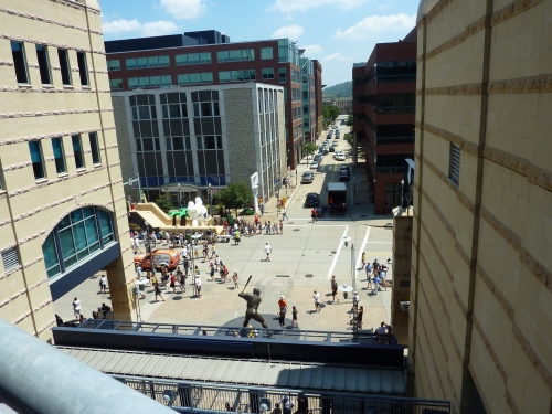
Nestled in the North Shore neighborhood, there are a number of bars and restaurants in the area, particularly on Federal Street. However, North Shore falls well short the high standard set by others such as San Diego and Denver. Even more activity is a short walk away in downtown via the bridge.
Score: 4.5/5
Total: 9.5/10
Architecture & Aesthetics
Exterior Design:
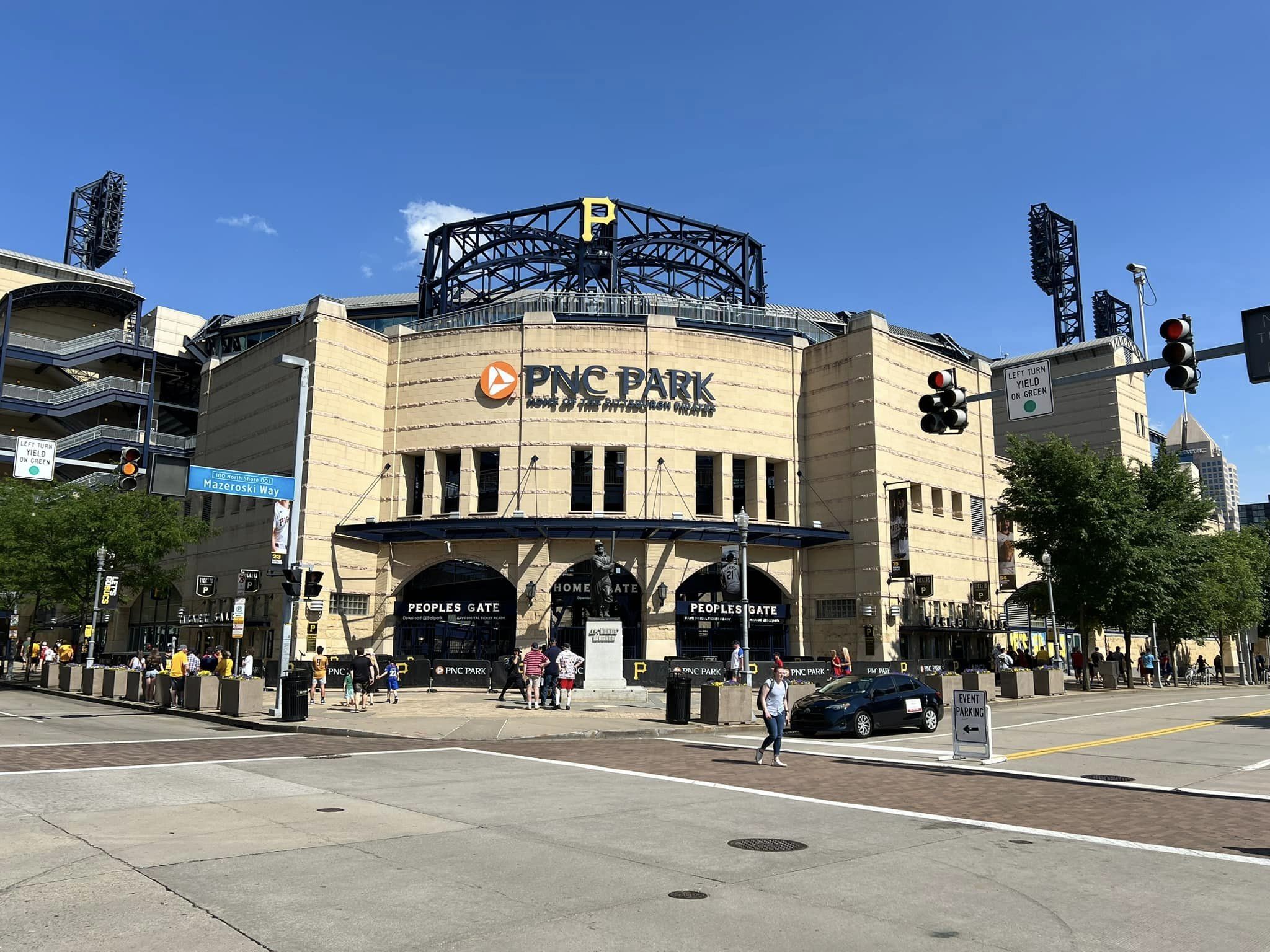
PNC gets high marks simply for using a novel material that is universally considered to look good. But Pittsburgh’s limestone façade is so much more than that.
Context. Context. Context. One of the themes you’ll begin to note is how well everything in PNC Park’s design mimics its local landscape, especially regarding the color scheme. Not only does the beige color mix well with its surrounding buildings on the North Shore, but it also reflects the skyscrapers across the river. The dark blue steel trusses mimic its river environment wonderfully as well.
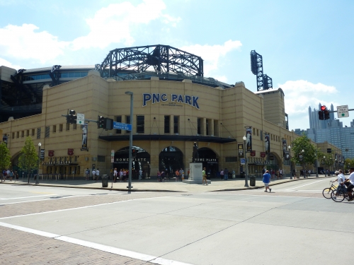
PNC Park uses rugged materials from the area, including Kasota stone and ochre limestone. Forbes Field inspired the park’s light towers. While it mostly recalls North Shore’s 19th century buildings, there are subtle modern elements, such as the aluminum canopy by Federal Street. It’s a flavorful combination.
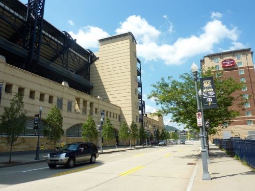
Besides the novelty and perfect contextual appropriateness, I guess you could argue the structure itself isn’t that outstanding or nuanced. It lacks many of the distinctive accents you might expect from something that has become an architectural monument, but it still looks like a neighborhood park. It’s a tastefully downscaled effort in comparison to the mega ballparks of the era.
The small size of the exterior façade significantly contributes to the ballpark’s main theme of providing the most intimate experience in baseball. While many newer ballparks strive for this look, PNC captures it best and takes the intimacy of the exterior to another level, one that even rival’s Fenway.
One small caveat: I don’t really like the glassed in press box at the top behind home plate. It looks like a space ship mixed in with limestone. Someone has to be picky, right!
Score: 8/10
Interior Aesthetics:
Despite being considered the most beautiful design in the country, there are still some misconceptions. The notion that the architects had it easy because of the view is categorically false. The praise is not misdirected at the view: the structure fits both conceptually and physically into its context. It’s part of the urban fabric unlike any other.
Great American Ballpark thought they would put a ballpark by the river, but it can’t hold a candle to PNC. In terms of aesthetic interior design, the Pirates really got it perfect by focusing solely on highlighting the environment. That’s surprisingly difficult to do successfully.
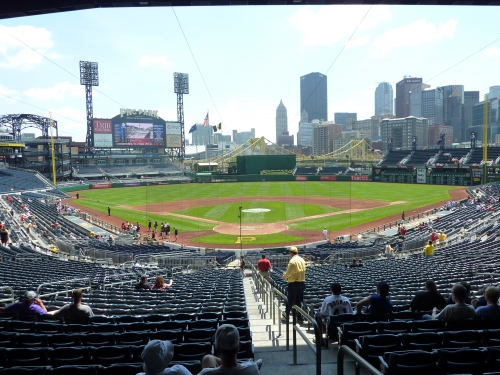
Both AT&T Park and Great American Ballpark don’t provide picturesque views from the lower bowl. Despite all the praise San Francisco got for its retro ballpark, its interior design doesn’t compare to what Pittsburgh did here. Only in PNC, do you have the fantastic open feel from the lower box seats as well.
One of the biggest challenges was finding a way to not only integrate the gorgeous view from the upper decks, but also to allow the environment to seep into the lower bowl as well. While it looks effortless, PNC Park’s greatest design coup occurs in the space between the right field porch and the left field bleachers.
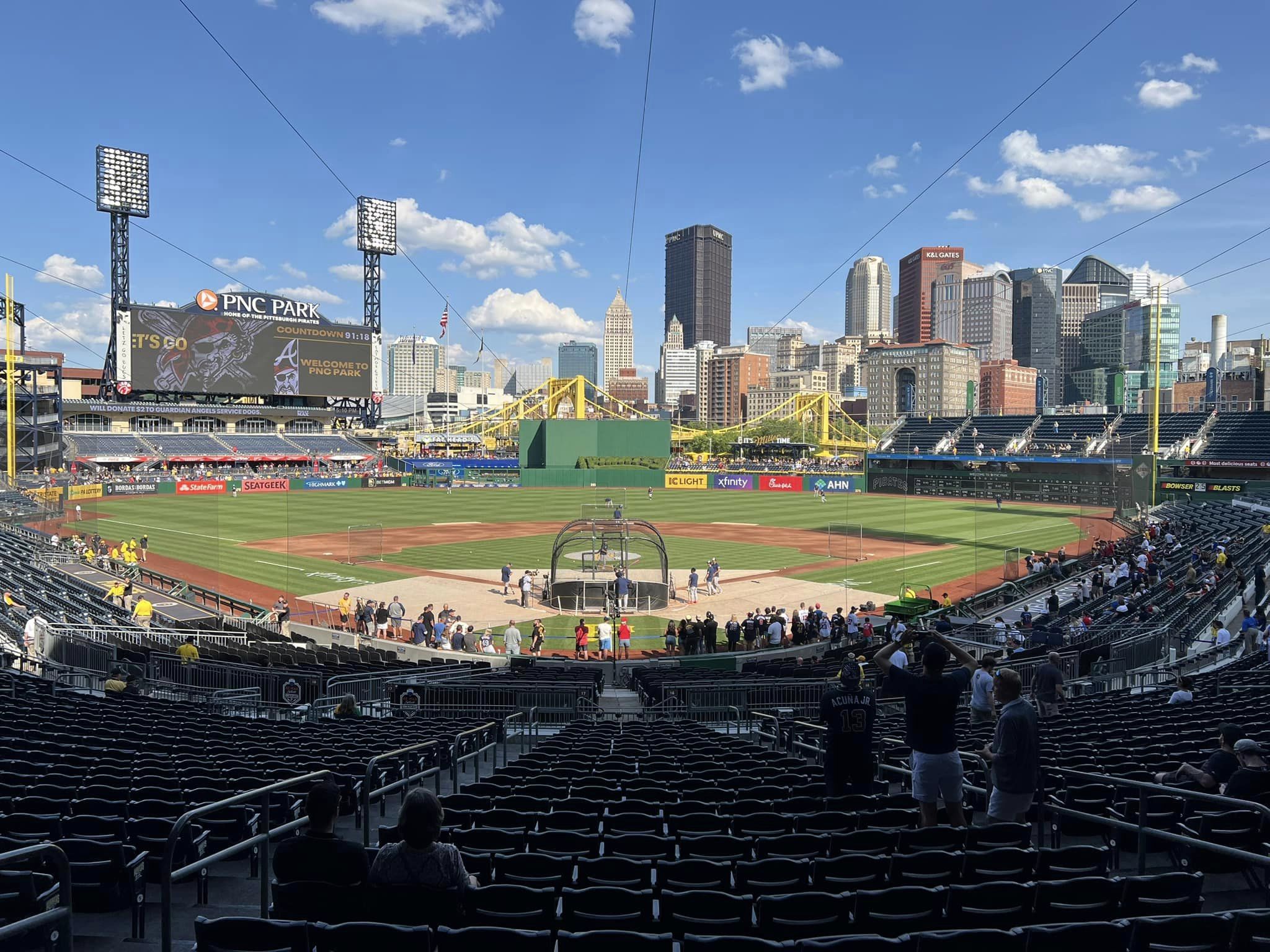
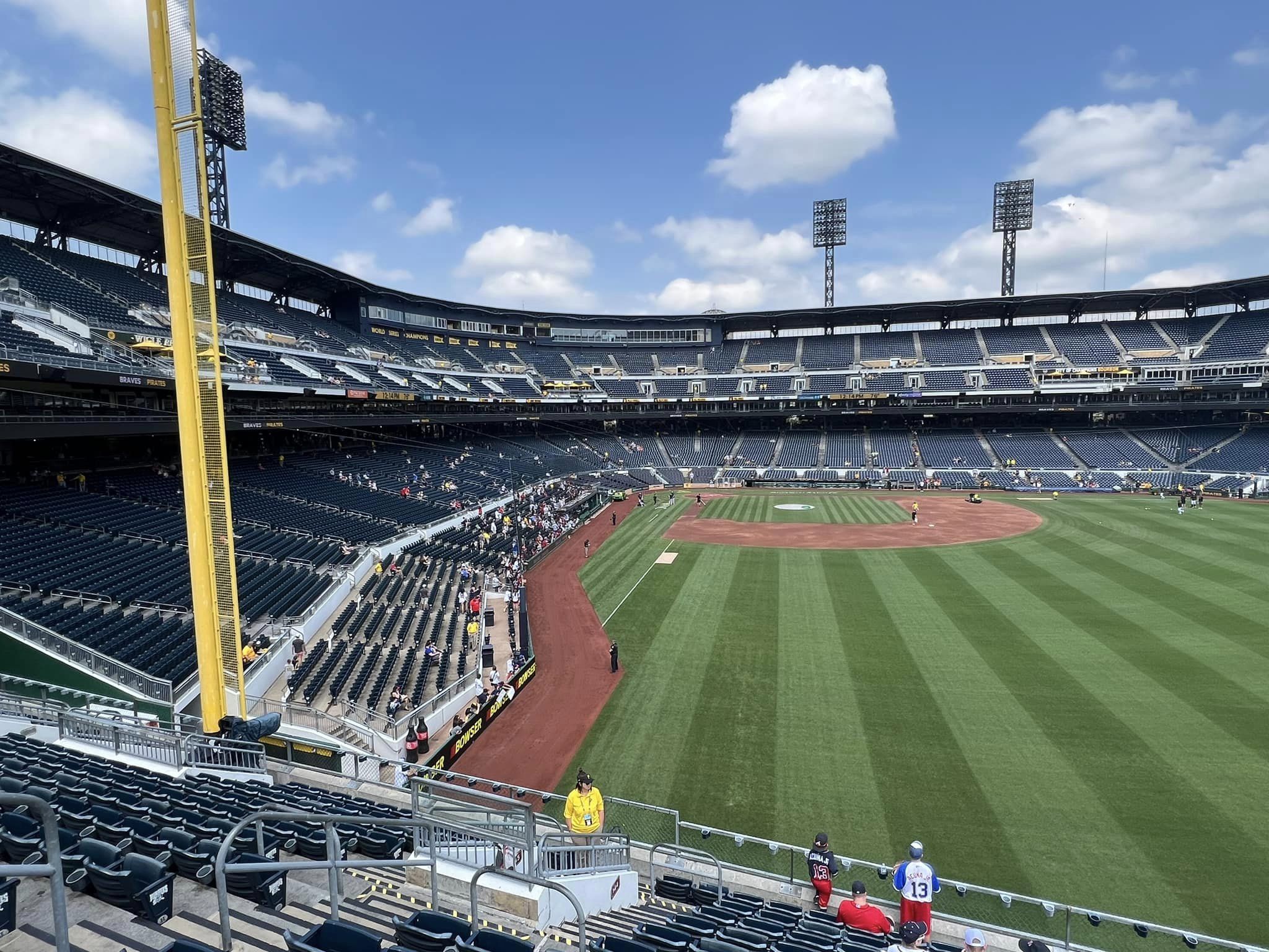
Note how the minimized center field seating opens up the river views. On both sides of the batter’s eye, the Clemente Bridge is seamlessly integrated into the ballpark. By limiting center field seating to less than 7 rows, the entire cityscape can be viewed from the main concourse. This was particularly important in highlighting the water. Note the complete lack of seating to the left of the batter’s eye. Pittsburgh is tops in baseball in contextual integration, and while it looks easy, so many others failed.
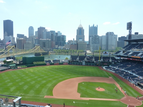
PNC is really the first ballpark to figure out that all of the outfield seating needs to be dramatically minimized. And that’s not only the key to its intimacy, but also its trademark look. Compare the double deck left field bleachers here to Cincinnati, Minnesota, or San Diego. Compare the right field porch next to the river here to Cincinnati’s same version. Regardless of the environment, it’s just a nicer, cleaner look. It all does exactly what it’s supposed to do: let the backdrop take over.
But PNC Park doesn’t stop there. The mini green monster emphasizes the presence of the river effectively. The green batter’s eye, which usually creates a disjointed feel in the interior, feels fine with its “PIRATES” topiary. But it’s not as well done as the one at Jacobs Field, as a plastic wall in center field takes away some appeal. I even like the rotunda in left field visually. They got the outfield seating balance in perfect harmony with its surroundings.
Also, I can’t reiterate enough how PNC was really the only park during its era to make a concentrated effort not to muddle the design with distractions. Can you imagine if they had put a model Pirate ship in center field, equipped with a “home run cannon?” As ridiculous as it sounds, I can guarantee you someone pitched that idea, because that’s really what the sentiment of the time demanded. Perhaps a model riverboat somewhere in the outfield, like in Cincinnati. Please, something to artificially acknowledge the region!
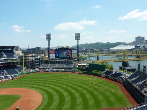
Well someone said no. And looking at all the other ballparks built during this time period, everyone else would have done it. Thank goodness, PNC is confident in its clean, uncluttered outfield design.
The two-deck grandstand design is one of a kind and a welcome deviation from the fragmented cross sections we see today. The novelty of the two-deck design, along with the structural challenges of integrating suites and clubs into it, should not be underestimated. This was a new, bold method of decking organization. We have a nice continuous upper deck that not only oozes intimacy but also is visually refreshing.
But my favorite part about the interior design is how the color scheme is so well connected to its environment. Note the use of the light ochre colors in and outside the ballpark, which meld well with the yellow bridge. Don’t forget that yellow matches the Pirates’ primary color. The blue steelwork and similarly hued seats match the concept of the water. Even the subtle use of greens with the batter’s eye feels right, because it mimics the hills beyond left field and the greenery of the Allegheny.
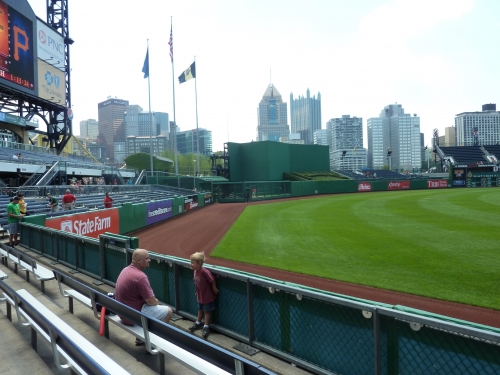
If I had to nitpick, perhaps I’d say the scene and surroundings beyond left field looks a bit cluttered. Note how the scoreboard is off-centered, positioned a little bit to the right of the outfield grandstand below. The combination of the scoreboard, the circular rotunda, the open space above the bullpens, and the left field grandstand is a bit spatially awkward, but that’s a minor quibble.
The press has analyzed it like crazy, and I pretty much agree. It’s nearly perfect. Sure, PNC has the benefit of having the most beautiful backdrop, but it capitalizes on that backdrop as well as it possibly could. So it’s unfair to fault the park for that. Even look at AT&T Park, which is almost perfect, but it doesn’t capture its setting quite like PNC.
Sure it doesn’t have to try too hard, but it gets everything right. What more can you ask for?
Score: 14.5/15
Panoramic View/Backdrop:
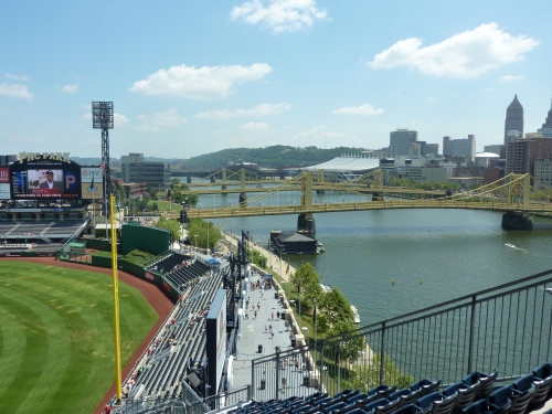
Is Pittsburgh’s view too perfect? I mean getting downtown, the river view, and the unappreciated pastoral grasslands of Pennsylvania all in one? In perfect proportion? And vicinity? From all areas of the park? You couldn’t come up with a better backdrop it you tried.
So which one’s better, AT&T or PNC? Just considering the view itself, you can’t beat San Francisco. But PNC probably does more with its location, as AT&T fails to capture the city or the bay bridge. PNC wins overall in design because the skyline and river are visable from the lower level seating, unlike others. Both are just about perfect though.
Score: 5/5
Concourses:
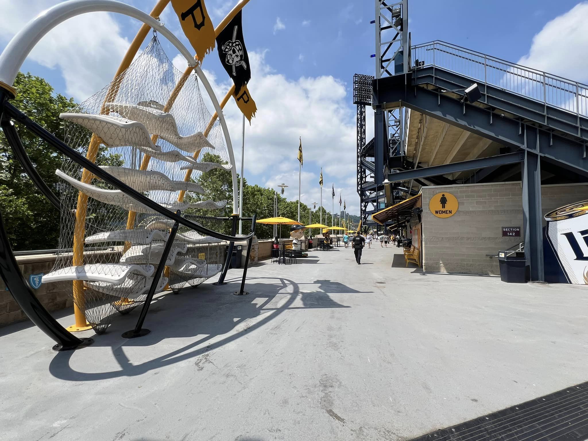
The concourse is nicely designed in the same limestone/blue steel motif seen around the ballpark. You can’t beat the views, either.
Score: 3/3
Total: 30.5/33
Functionality & Essentials
Sightlines:
Everyone raves about how the double deck design is great for PNC’s sightlines, but few realize there are flaws in the design. Its great by default, but it could have been so much better.
By minimizing the vertical height of the ballpark, they were forced to dramatically increase the horizontal footprint of the grandstand to fit 38,000 seats into the ballpark. This results in a lower bowl that is very deep with a rather gentle slope, affecting sightlines. Also, the upper bowl is not cantilevered enough to compensate for the large lower bowl, meaning that seats are pretty far back from the field, despite being low.
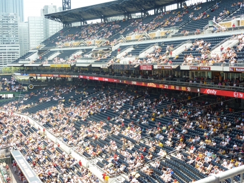
From the view of the top row of the upper deck, you are indeed comparatively closer, but you are farther back than you would expect. Because the second deck is club and upper deck seats smushed together in one large grandstand, you could actually make the argument that you’re farther back here in the last row of upper deck than at some other ballparks. With the lack of pitch, you don’t feel on top of the action, like in San Diego, even though you do feel really close.
Sitting in the upper deck at PNC is more comparable to sitting in the upper deck of Comerica than a higher mezzanine level, like say, Busch Stadium. All of this could have been avoided with a better design, albeit at a higher cost. We forget that the Pirates did go cheap with PNC.
Most of the seats are angled well down the lines throughout the upper and lower deck. However, some of the seats down the right field line, namely sections 105-101/305-303, are not angled enough and can sport some terrible sightlines in some areas.
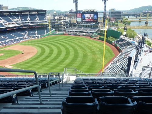
Despite the unpublicized negatives, there’s no getting around that this is an intimate two deck design, and you are going to feel lower (literally meaning closer I guess) to the action here than anywhere else.
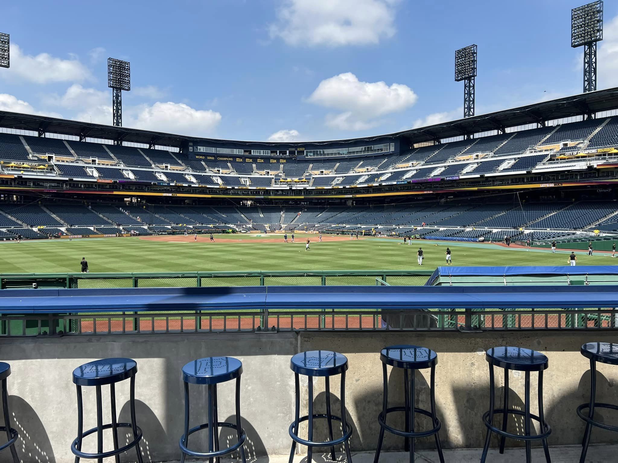
We rave about how well connected the fans are to their surroundings, but they are also ridiculously connected to the action. Note the picture of the left field wall at the end of the interior design section, where the average fan can stand up and have his or her waist at the top of the wall. Ridiculous.
Score: 8.5/10
Seat Comfort:
It appears the designers minimized the seat width in order to fit 38,000 in such a small area. Many field level seats seem slightly under par. Like other parks, it’s not noticeable enough to hamper the experience significantly. Seats in the upper deck lack cup holders, however.
A relatively significant portion of PNC Park seats are padded. All dugout boxes and PBC club seats are comfortably padded, with especially comfortable (newly improved) theatre style seats behind home plate.
Score: 3/5
Concourses:
Despite being open to the field on the main level, there are some substantial deficiencies in the concourses.
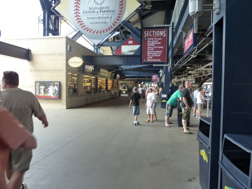
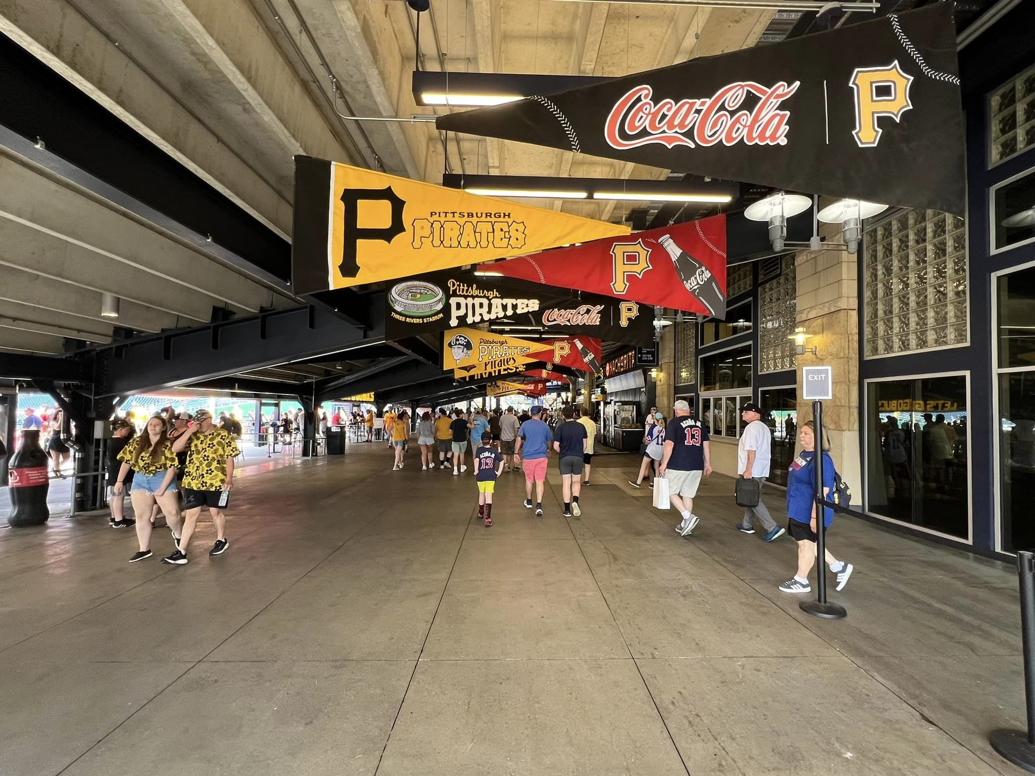
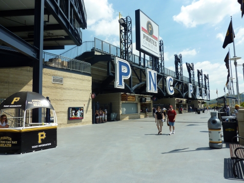
Despite being nicely designed in the same limestone/blue steel motif seen around the ballpark, the concourses are simply too narrow in most areas, especially considering the number of patrons sitting in the lower bowl. PNC has the largest lower bowl of the new parks coupled with one of the more narrow concourses. To be fair, crowding issues are uncommon considering the attendance. There are consequences of the small footprint and low cost of construction. But it is one of the better looking concourses in baseball and perhaps the least “mall like.”
Another small issue is the discontinuity in the 360-degree system on the main level, as the outfield concourse is lower than the one around the infield. This is a major no-no for new ballparks, but something that was understandable in this design. It’s not nearly as confusing as the system in San Diego though. You’ll encounter a small staircase on the right field side and the rotunda on the left field side
Unlike other popular retro jewels, there don’t seem to be many standing room areas in the outfield, with the concourse being closed in left field. For overflow crowds, the rotunda provides a nice perch. The upper deck/club level concourses are closed and on the small size as well. Despite the drawbacks, the concourse’s views and aesthetic merits really help.
Score: 4.5/7
Scoreboard System:
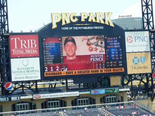
PNC Park has a nice enough scoreboard with its simple, uncluttered look, but it won’t make headlines because of its size. Despite upgrading to a large video board system, it’s not too informative, only showing one lineup at a time. But the replays are of high quality. The manual out of town scoreboard is worth noting. Not only does it show the inning and the score, but it also shows a diamond for the runners on base.
Score: 1.5/3
Total: 17.5/25
Amenities & Features
Quality and Selection of Concessions:
Like its Pennsylvania neighbor to the east, Pittsburgh’s gem offers some of the best high quality regional concessions in baseball, while not offering the variety seen in other ballparks. The food selection seems to have been downsized a bit in recent years, but it appears they are gearing it back up a notch with the recent team success.
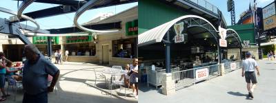
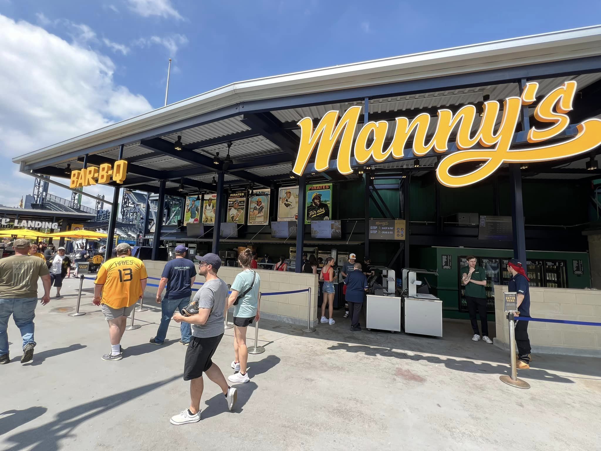
Other than the usual suspects, a decent selection of BBQ (provided by Manny’s) and sandwiches is available. Other than gyros, a number of hoagies are offered, including beef, turkey, and fish. You’ll note that there is an unusual amount of specialty hamburgers, including the Bucco, Phili, Swiss, and Bacon Burger. Just4U is the healthy stand of note, serving wraps, salads, smoothies, and a number of gluten free items. Mexican options are non-existent.
The mediocre selection here is a problem, but I’ve read that they scale back even further when the crowds are small. Remember everything you read on the website menu (or at the particular game I attended) isn’t always offered.
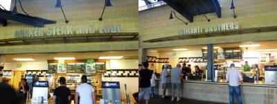
It goes to show you really can’t compartmentalize small crowds as a singular defect, as parts of the entire ballpark can shut down. In 2013, things are beginning to change though.
They recently added Nakama, an asian concept serving a nice array of sushi and other Asian foods. Sashimi and Nigiri, complemented with the usual array of sushi rolls and the like, are now served. Your choice of steak, chicken, and shrimp Hibachi or Udon Noodles are also provided. Egg Rolls and other sides round out the selection.
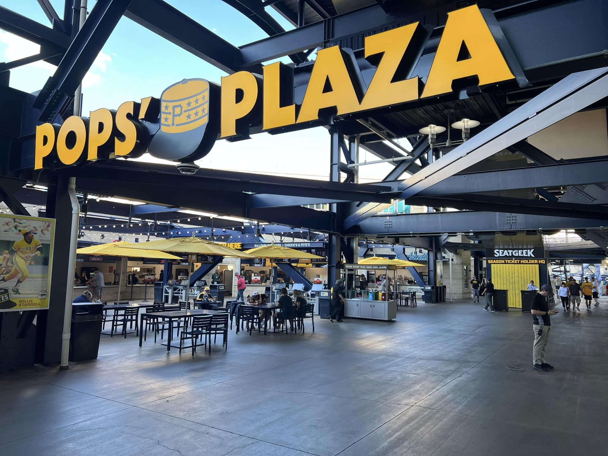
While the variety has traditionally been sub par, the unique regional specialties really stand out. First be sure to check out “Pop Plaza,” named after Stargell. Pop-A-Dukes (Gyros, salads). Primanti Brother Sandwiches, and Quaker Steak and Lube headline the “Smorgasburgh” (taste of the city). Primanti Brother’s cheesesteak is one of the best speciality foods in baseball, while Quaker Steak and Lube offers some over the top chicken wing options. Rita’s Italian ice, soups, and green tea are allegedly available as well. The beer selection is fairly wide as well, led by the Iron City Beer.
Score: 3.5/5
Regional/Signature Concession(s):
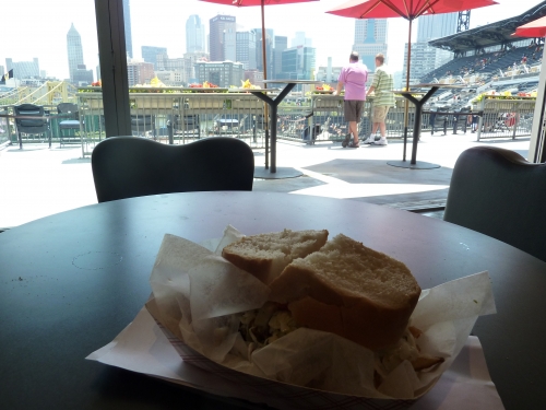
One of the more famous “signature foods” in baseball is the Primanti Brother’s cheese steak, a steel city innovation. It might be the most filling thing I have ever eaten at a ballpark. Roast beef, Cole slaw, cheese, and French fries fill out this hardy offering on a French roll.
Score: 2/2
Public Restaurants/Bars/Sitting Areas:
PNC Park’s Hall of Fame restaurant provides an upscale experience for all ticket holders. Originally designed as a members only club, its décor and atmosphere evokes a premium restaurant, while housing plagues of Pirate greats. While outdoor seating would have been nice, it displays a view of the field.
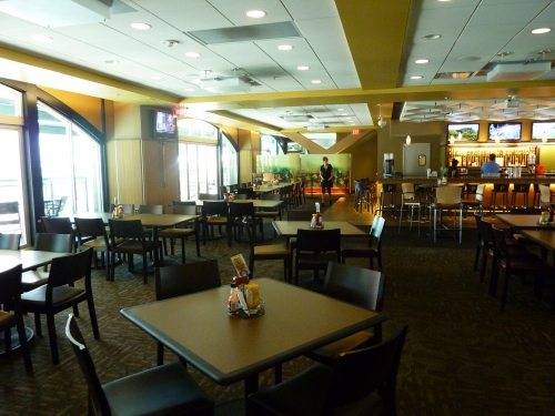
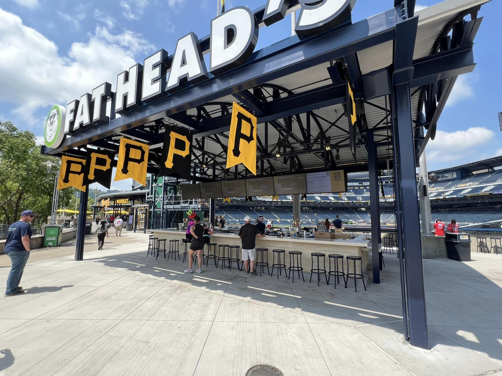
In the right field corner, the Pirates recently opened the Bowtie Bar, a U shaped bar and lounge area serving food and a wide array of beverages in a formerly unoccupied area. But because of the small footprint, the Pirates don’t really provide many other sit down areas throughout the ballpark.
Score: 4.5/5
Premium Seating/Clubs:
Despite being perhaps the most egalitarian ballpark in the majors, how does PNC still score well in this category? Not innovation. Not quantity. But quality and attention to detail.
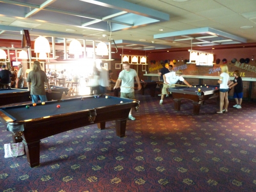
Despite having a closed concourse, PNC Park’s mezzanine club level is one of the best in baseball, not only for its luxury and amenities, but also its historical memorabilia and detailed accents. I would say the club seats here are some of the best seats in baseball, not only because of the aforementioned features, but also the view.
The Pittsburgh Baseball Club features an enclosed concourse and three main lounges with an upscale atmosphere. All have an outstanding collection of historical pictures or other displays. They integrate historical references in every nook and cranny of the club, including the walls of the concourse, the concessions, and even the condiment stands. Retro jerseys, gloves, hats, bats, balls, and whatever you can think of are all presented in a tasteful manner. Even the Asian Wok stand has memorabilia from Japanese baseball history. A lounge of note is Club 3000, an obvious reference to Clemente, which honors all players who have reached 3000 hits.
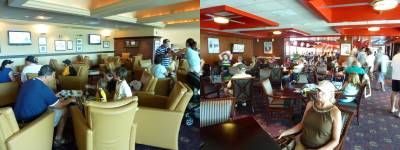
The various authentic decors don’t invoke the generic “country club” atmosphere found in other ballpark club levels, while still being among the most luxurious. Amenities include billiards and arcade games, also a rarity. Another one of my favorite features is the various “patios” that open up the concourse to the playing field and provide outside seating. This does an excellent job in mitigating the effects of the closed concourse.
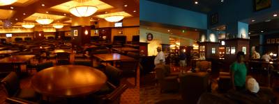
Decked out with a fireplace and multiple leather couches, the ultra premium Lexus Club behind home plate is just as nice as some of the newer ones today. I was actually able to sneak into it, but I’ll get to that later! The Pirates recently built a hybrid club/suite experience on the suite level, known as Club Cambria.
Score: 4/5
General or Artistic References to Baseball or Team History/Museums:
Despite not having a museum or park area to honor team history, the Pirates do a great job of recognizing the past.
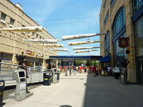
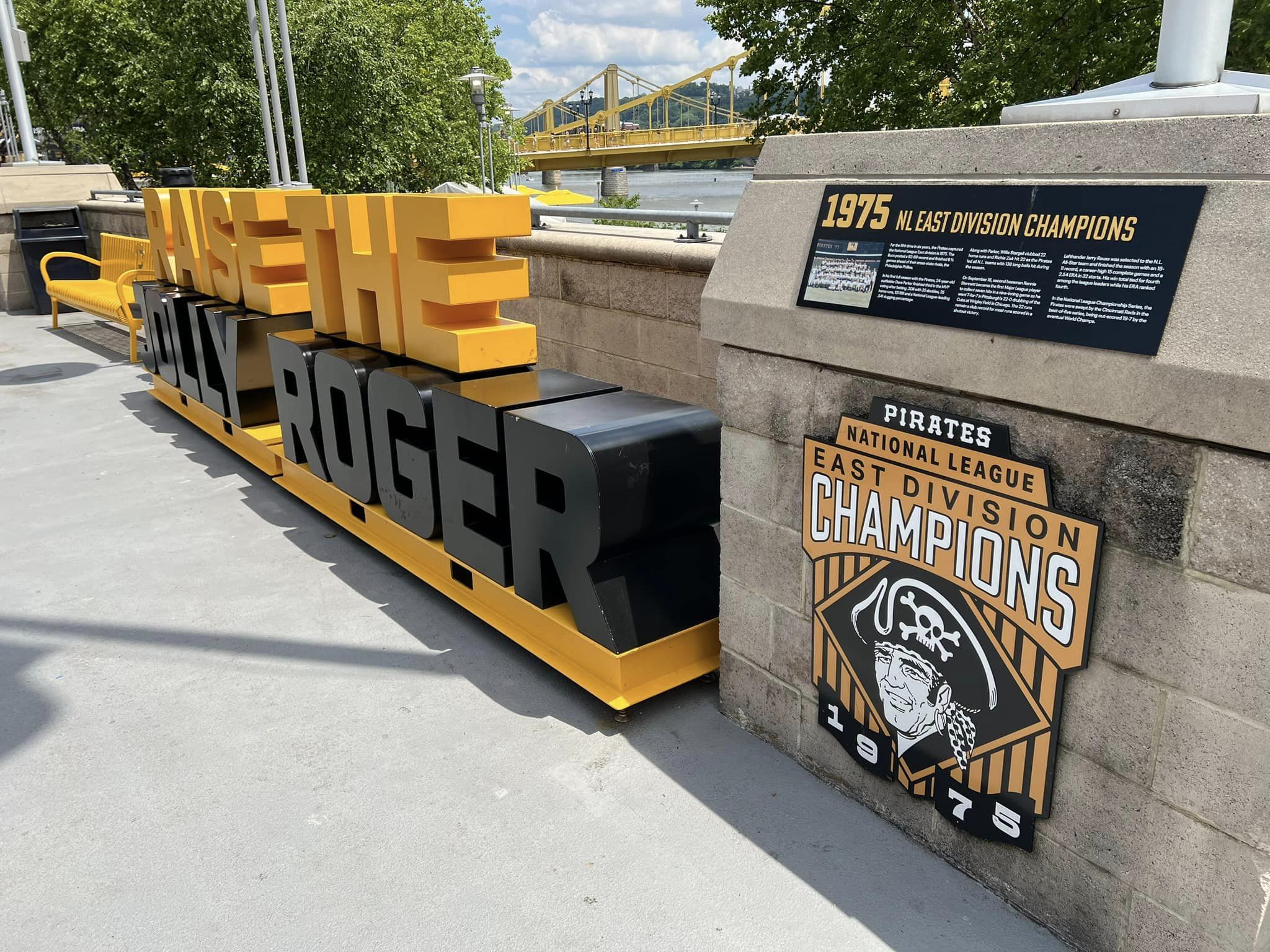
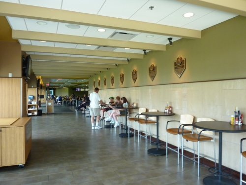
While it should have been more expansive, the Hall of Fame restaurant features plaques of Pirate greats. The most impressive area is the Highmark Legacy Square, which is an interactive exhibit that honors the history of the Negro Leagues and various greats from the Grays and the Crawfords. As many have said, no city is more synonymous with black baseball than Pittsburgh. Not only does the square feature numerous bronze statues, but there are also interactive video systems informing fans on each player’s background and stats. There’s even a movie theatre.
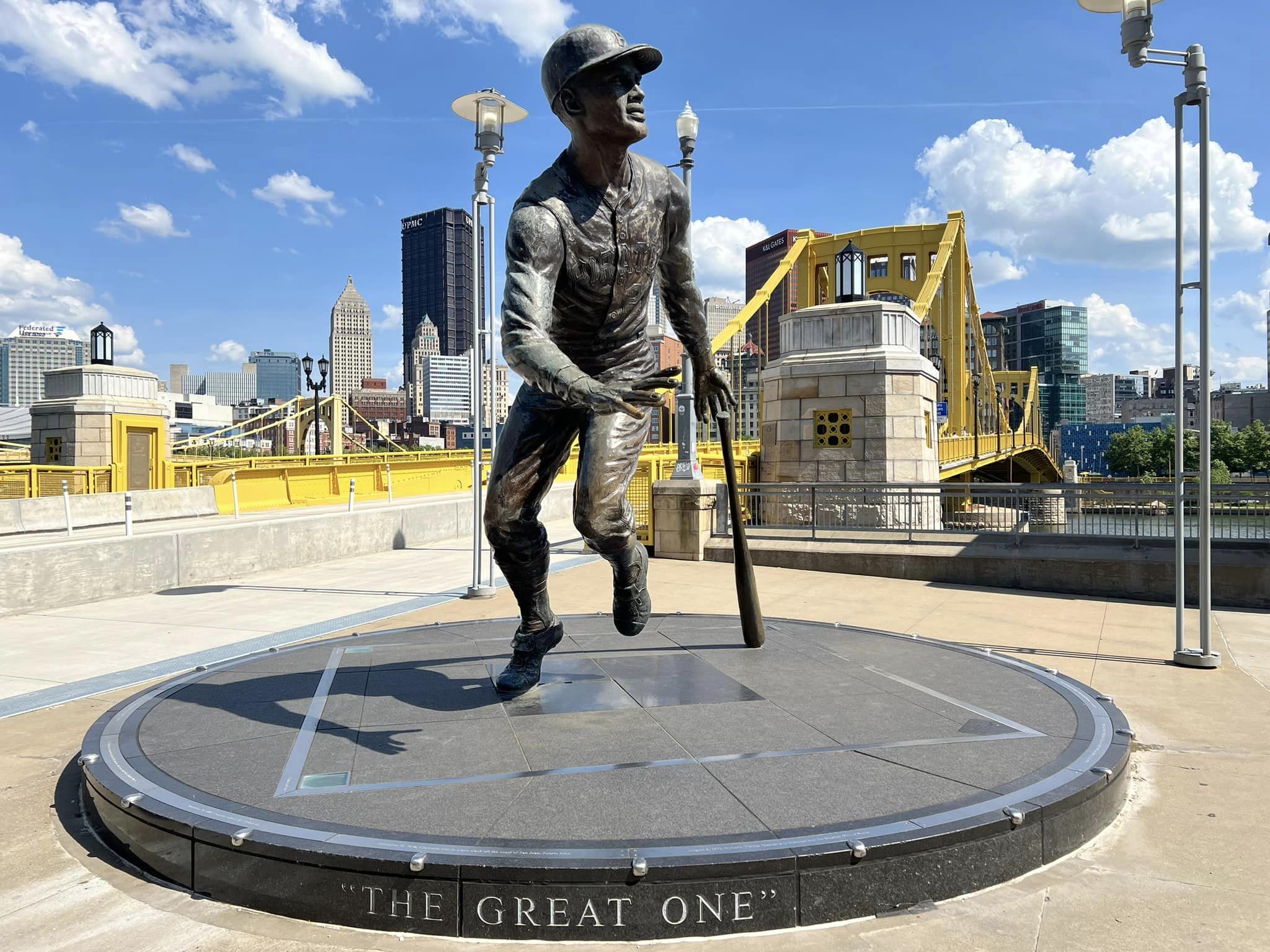
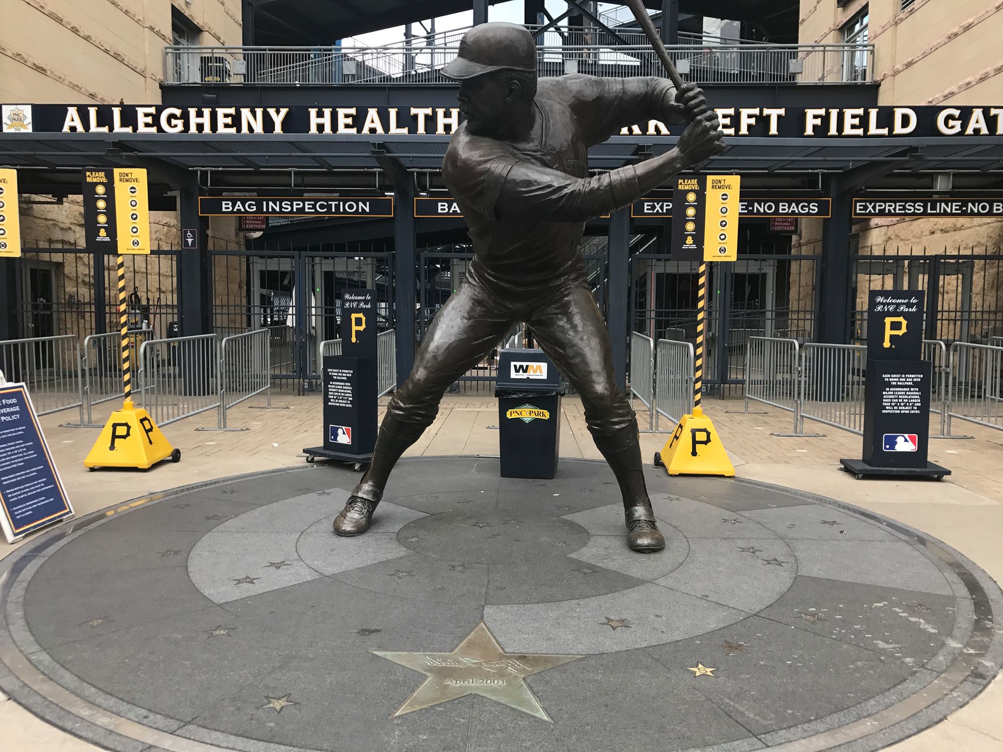
On the concourses, there are various subtle accents, such as the occasional decade banners. The statues in and outside of PNC are some of the more impressive in baseball. Willie Stargell, Honus Wagner (main entrance), and Roberto Clemente (in front of the bridge) adorn the exterior. A display of Ralph Kiner’s hands with a bat is in left field and they are planning on adding one of Maz. Despite all this, it’s really the aforementioned memorabilia on the club levels that take the cake, even if they aren’t accessible to most. And party suites are named in honor of World Series teams.
Score: 3/5
(needs 2018 edit)
Entertainment/Kids Activities/Other Amenities:
The Pirates are below the curve when it comes to providing kids and other fans with entertainment activities, which is particularly unfortunate considering the Pirates are playing.
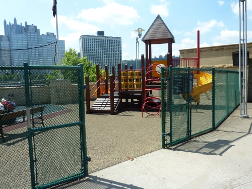
The “Kids Play Land” along the boardwalk is a tiny playground that looks like it’s designed for kids under 5. It also features a model field. They sometimes have activities and entertainment outside the ballpark, but I couldn’t find it. No speed pitch, nothing of that nature inside the ballpark. You’re here to watch the game (and the gorgeous views, they might rationalize). Again, there are some arcade games on the club level.
Score: 1.5/3
Total: 18.5/25
Atmosphere, Vibe, & Policies
Atmosphere/Fan Support:
Pittsburgh actually has some good fans, but you would never know it. If you’re team was this bad for this long, and, I’m talking the worst stretch of losing seasons in the history of sports, would your team still have 20,000 loyalists per night like Pittsburgh? Don’t be so sure.
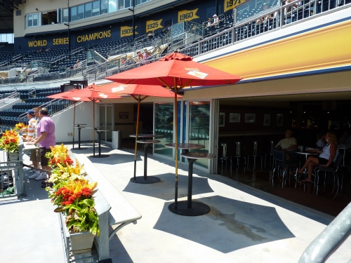
You could probably point to the ballpark as a reason they should be doing better. Three games over .500 after the 2011 all-star break, Pittsburgh experienced a sharp, sudden up turn in attendance, demonstrating the city is indeed in tune to Pirates baseball.
The atmosphere is much better than expected, as fans frequently joined in on chants and claps. We really have to see a good team on the field to effectively measure this. But there’s no getting around it: the lack of fans in the stands is a significant flaw in the ballpark. Again, don’t take the low score too personally. It’s inevitable that PNC is among the deadest ballparks in the MLB, proving that this is really an indirect measure of team quality, not a knock on the fans.
As they look toward a division crown in 2013, we’ll see if the attendance consistently picks up throughout the decade.
Score: 3.5/5
Ballpark Policies/Customer Service:
The ushers at PNC really do a great job in perfecting an already perfect experience. The people involved do matter. When I was walking around on the rotunda, ushers even offered to take my picture just because they saw a camera in my hand. But most importantly, they’re lax about checking tickets.
I could easily move down to the second row behind the Lexus Club behind home plate. Unlike some ballparks, there is an entrance to the home plate club from the main seating area. I just waited for the guard to take a picture of someone and hopped right into the club area (for the purposes of taking photographs myself). I actually felt bad, but it’s pretty easy to sneak around.
Score: 2/2
Bonus:
For not only being the most aesthetically pleasing ballpark in baseball inside and out but for reflecting the city unlike any other +3
For the intimate two deck design +2
For the Alleghany River and the Riverwalk +1
For the Negro League Legacy Square display +1
For the unique and understated limestone exterior +1
For the fantastic club level, possibly the most detailed in baseball +1
Score: 9
Total: 14.5
Conclusion
Coming soon.
FINAL SCORE: 93.5
RANKING: #2/30
Summary
TL;DR? Here’s the long-form piece in a nutshell:
Ballpark aficionados and traveling baseball fans seemed to have settled on a consensus top two among the “modern-day” post-1990 venues: Oracle Park in San Francisco and PNC Park. The appeal is obvious: stunning views.
Indeed, I’ve grown to see PNC Park as the most beautiful ballpark in baseball inside and out, and it isn’t particularly close. Instead of views of just water, a bridge, or a skyline, you get all three. Instead of views only from the upper levels, PNC’s landmarks seem omnipresent throughout the lower bowl.
Moving outside, PNC utilizes a refreshing assemblage of limestone and blue steel in keeping with the riverfront context, not the played out red brick. And the concourses match too. And that approach from the Clemente Bridge. It’s all just perfect.
Beauty aside, PNC’s intimacy also sets it apart. In an era of ballparks with sprawling towers of luxury suites and 3+ levels, PNC famously utilizes a “double deck” design that just feels cozier (although, it’s virtues for horizontal field proximity are misunderstood, which I discuss).
PNC Park doesn’t have any major flaws, but it’s true that it doesn’t have the amenities of most of its contemporaries. There are also quite a few little things (listed below) that could have been done better or don’t compare well to the other top-tier parks. The cumulative effect puts it a notch below Petco Park in competing for the #1 spot. Hey, if you’re self-advertising as “The Best Ballpark in America,” nitpicks are fair game!