By: Cole Shoemaker
Written in 2011
When I look at the 20-plus new ballparks constructed since the opening of Camden Yards, I see three distinct strands. Each strand represents the general sentiments of ballpark architects at the time. From my analysis, when comparing each movement, I see the architectural merits gradually worsen. Of course, this is balanced out by the amenities/functionality getting better. I want to reiterate that this is just a generalization of each movement and ballparks can deviate from the trends within each movement.
1) First Wave of Retro-Modern/Classic Ballparks: “Authenticity of the Retro Movement” (1992-1996)
While parks throughout the new millennium tried to copy Camden Yards, few were able to succeed because Camden was so architecturally original and contextually based.
Camden, along with Jacobs Field and Coors Field, understood that this new movement to build parks that saluted a bygone era would only succeed based on how well their architectural lines connected to the setting. Their foundation was primarily rooted in their physical symbiosis with the area, not simply using Camden Yards as a template.
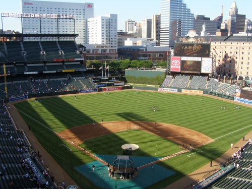
Case in point: I often view Jacobs Field as the crowning jewel of this movement for recognizing the so called “retro parks,” a term that was rejected by Janet Marie Smith and Camden architects, has nothing to do with red brick, but building a park that fits with the city. These parks were authentic and contextual.
Camden Yards’ identity is derived from authentic structural elements, not synthetic quirkiness. It’s asymmetrical dimensions are tastefully understated and a function of the physical plant. Clean architectural lines, limited entertainment features, and large capacities characterize this era.
All of these ballpark featured clean, clear architectural lines that were not muddled with gimmicks and distracting features. Even Rangers Ballpark in Arlington can go into this category, despite being the first “retro cookie cutter”. It’s contrived, but not gimmicky. Its features are contrived because it’s a suburban ballpark, but it looks like the others in its simple architectural lines. Each of these ballparks are confident in their unadorned, classy look and don’t attempt to overload the senses with artificial gimmicks. Baseball is the main event, not ballpark distractions. No breaks or choppy seating arrangements, either.
The idea of the “mallpark,” which treats the fan solely as a consumer and provides many distractions, isn’t yet at full fruition. Kid play areas, massive food courts, and entertainment plazas are limited. Everything’s authentic, or in the Rangers’ case, looks authentic. It may be contrived, but its merits are based on actual architecture and historical features, not artificial gimmicks.
These ballparks, and the ones built before 2000, were also generally much larger than their successors. Camden, Coors, and The Ballpark in Arlington were all originally over 49,000 in capacity. Luxury boxes were generally emphasized more here than in any other period, with The Ballpark and Jacobs Field having over a 120 of them. Now, there is a decreased emphasis on luxury boxes with more focus on premium clubs.
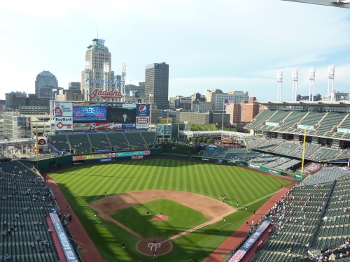
Jacobs Field, characterized by simple interior lines, authentic natural elements, and superior connection to its setting, is a quintessential first wave retro ballpark.
In sum, clean architectural lines, limited entertainment features, and large capacities characterize this era. While each ballpark will be judged on its own individual merits, this will generally be seen as the “golden age of neoclassical ballpark architecture” in the future, judging by innovation, location, interior design, exterior design, and aesthetics.
2) Second Wave of Retro-Modern/Classic Ballparks: “Retro Gone to Far” (1997-2004)
During this period, owners felt pressure to distinguish their new pads: the novelty of just being “retro” wasn’t enough. They knew that all new ballparks were being built in the same fashion: how were they going to be different? They felt they had to push the envelope.
Of course, they never considered taking the view of Jacobs Field or Janet Marie Smith, that these ballparks are derived from their local environments, not some external kitschy architectural treatment (as I said originally, of course there are exceptions). But generally, we saw red brick edifices blindly pop up all over the nation, without regard to whether they fit in with the city. Seven of Eight ballparks built from 1997-2001 basically had the same red brick architecture. We finally saw the treatment deviate with three of the last four ballparks during this era.
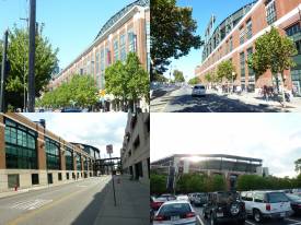
The redundant Ye Olde ballpark. The facades are essentially rehashing Camden Yards. Can you tell which park is which? The bottom left is particularly difficult.
But I specifically pinpoint the time period as 1997-2004 because the era is most characterized by gimmicks and contrivances in the interior design.
While this doesn’t necessarily reflect my opinion, fans and ballpark aficionados generally value simple, uncluttered designs and condemn gimmicky features, despite their merit. While being contrived is never good, my opinion is that the aesthetic value of a feature is most important. In other words, what’s most important is that the features fit with the design and look good.
But anyway, to illustrate the sheer quantity of “gimmicky” features introduced during this period, I will provide an exhaustive list in chronological order: giant Coke bottles, Chick-Fil-a cows, fake rocks (renovated Angel Stadium), pools, giant gloves, Ferris wheels, carousels, giant model trains, slides, smoke stacks, model riverboats, and fake beaches all adorned various new ballparks across the nation. PNC Park was the exception.
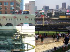
Examples of gimmicks in this era. Train at Minute Maid Park. Coke bottle and cow at Turner Field. Slide at Miller Park. “The Beach” at Petco Park
You see nothing like that during the 1st retro era or the 3rd retro era. Critics saw these new facilities as too busy and a false, contrived attempt to replicate their respective regional sensibilities. In addition, dimensions became even quirkier, highlighted by Houston’s Minute Maid Park and its hill in center field. Critics quickly pointed out that the land restrained classic parks, but retro ballparks did quirky things just to be cute. Everything was too much like a theme park and too forced. Ballparks were too heavy handed in emphasizing their allusions to the past.
Owners and architects began to value distinction above all else, which is ironic because people began calling these the “new cookie cutters” because they all represented the same philosophy. All of these retro ballparks were fundamentally too similar in style, so they inevitably needed false gimmicks for differentiation. Many painted a broad-brush stroke and condemned all of these features.
This is the beginning of what critics have called faux retro.
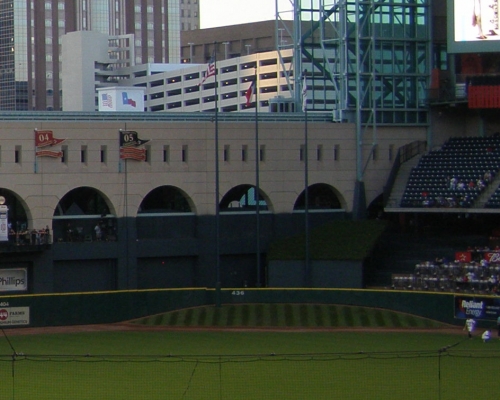
Critics say Tal’s Hill was too heavy-handed in an attempt to be “retro”.
Other trends swept through new ballparks, including an increased emphasis on premium seating with the burgeoning economy. They also figured out that decreasing capacity, thus artificially decreasing supply, would increase revenue and make the ballpark feel more intimate.
Gaps in the seating arrangement and open concourses in the upper deck were also introduced at the end of the period, which faced some opposition as well. In terms of function, this is the beginning of split upper decks and more choppy seating arrangements. This gave rise to the “neighborhood seating” concept.
While some of these ballparks did more harm than good, it is important to look beyond the gimmicks at the building’s overarching merits. This was really a polarizing period that provided some total misses but many successes as well. In sum, this era is mostly characterized by an overabundance of retro gimmicks and contrivances, but also an admirable desire to push the envelope and develop original design concepts.
At least it was an era where almost every ballpark claimed to be the “world’s best ballpark” upon opening, in stark contrast to the uninspired ballparks of the third wave. They were coming up with innovations in design.
Despite criticism in some cases, HOK (Populous) did build some of their most original ballpark concepts during this period, specifically with AT&T Park, Minute Maid Park, Petco Park, and PNC Park.
http://reds.enquirer.com/2000/05/14/red_ballpark_design.html This article is a perfect case study on everything that was both right and wrong with this era. Note the effort to break new ground, but also the effort to be more falsely quirky.
3) Third Wave of Retro-Modern/Classic Ballparks: “The Backlash” and “We’re out of Ideas!” (2006-2011)
Recently, we’ve seen ballparks deviate from the busy look with gimmicks that muddle the overall design. But that doesn’t necessarily make them good structures. This movement could be considered a reaction to the overly themey Great American Ballpark, which received poor reviews from the outset (perhaps the most derided stadium since New Comiskey from a design standpoint).
As a general theme, I see these 3rd-era retro ballparks as the worst in terms of aesthetics and architecture. During the previous period, you saw some overly edgy and controversial ballparks that tried too hard, such as Great American Ballpark, but they clearly had some sort of aesthetic vision. The sheer boldness and innovation in the Reds design concepts in 2000, along with amount of press involved, is very telling.
Great American Ballpark Concept. This is a flawed 2nd era retro park, but you at least saw new ideas. In the early 2000s, original concepts such as neighborhood seating, open concourses in the upper deck, breakup of the stadium structure, and new premium seating options were invented. New ground was being broken. Despite your opinions on the aforementioned innovations, we saw no new concepts during the third era.
Again, take a careful look at the Cincinnati Inquirer and the Reds’ ballpark mission statement. Like many parks from this era, it’s clear that they were at least trying to build the best ballpark ever. They were trying to top Camden, PNC, of AT&T. They’re coming up with new ideas and moving forward. And I think while some failed like Great American Ballpark, most from the era were trying.
I don’t think you can make any argument that the 3rd era retro ballparks, including Busch Stadium (2006), Nationals Park (2008), Citi Field (2009), and Yankee Stadium (2009) were trying to build the best ballpark ever in architectural or aesthetic terms.
We quickly go from unique concepts with Great American Ballpark and Petco Park from 2000-2004, to extremely safe approaches with Busch Stadium and Citi Field from 2006-present. There was no originality.
The previous era introduced innovations in the seating structure and unique designs. We see nothing new here. You see fewer overt contrivances and artificial gimmicks, but more of the same old ideas. At least the gimmicks of the second wave distinguished the ballparks superficially.
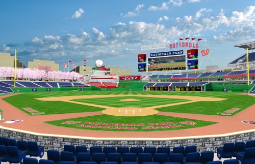
The decision not to incorporate this giant replicate baseball at Nationals Park is an example to go away from gimmicks.
While Busch Stadium has a reasonably clean design integrated into downtown St Louis, the interior and exterior design couldn’t be more derivative, save the skyline. While making a reasonable attempt to go away from the tired retro-classic formula on the outside, the interior design of Nationals Park is as bland as it gets (while over the past year, I have begun warming up to it). Note that the original Nationals Park rendering featured a giant replicate baseball on top of the center field restaurant, demonstrating the ultimate discarding of gimmicks. With its red brick exterior, contrived dimensions, and home run porch in right field, Citi Field is the most formulaic ballpark ever built. The enclosed feel isn’t cozy, but instead gives a corporate bottom line. Why wouldn’t this ballpark be replaced in 30 years?
This era represents a distinct lack of new ideas and a period of strong uncertainty in ballpark architecture. Despite making a renewed attempt to go away from quirks as the foundation of the design, this period represents a nadir for HOK (Populous).
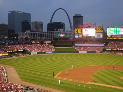
Busch Stadium is a typical third era retro ballpark. It refrains from unnecessary gimmicks, but brings the same old ideas to the table in a very safe effort. It benefits from a downtown location, unfortunately lacking in others like Citi Field.
The lack of gimmicks in the new ballparks after 2004 isn’t a testament to more authentic treatment, but instead more of a function of just running out of ideas and playing it safe.
In 2010, Target Field received rave reviews, reflecting the organic, contextual design in the first wave. Like the aforementioned four in the first wave, it’s free from artificial gimmicks. Called the most urban design in baseball, Target Field is free from contrivances and authentically represents it’s setting. But it still doesn’t do anything new, and it has its aesthetic flaws. While it’s a step in the right direction to the first wave, it’s not original. It doesn’t present any new ideas.
It has to be problematic that when you look at the blueprints of Petco Park and Great American Park in 2000, you see clearly delineated progress in ballpark design. But you see none of that in 2011, or in between for that matter.