A deep dive into all 30 MLB Stadiums
By: Cole Shoemaker
Published: August 21, 2018, updated for ballpark changes on June 12, 2019; so, if you’re reading this in 2023, some information below, including the rankings, is probably outdated. It will be updated soon.
After spending countless hours at major league stadiums across North America for the past 15 years and writing over 100,000 words on the topic, this sure is overdue.
While I’ve attended all 30 MLB Ballparks, this is the first time I’ve outlined the rankings and ratings all at once. My rankings and ratings are from the perspective of the person in the stands (i.e., not players, media), and they mostly align with the consensus view, a few outliers notwithstanding.
For longtime readers, this will finally compile my rankings/ratings into one list. For new visitors, I hope these assessments crystalize the sterling reputation of the greatest ballparks and raise the profile of some underrated ones.
It’s difficult to pinpoint why I’m so obsessed with baseball stadiums.
On its face, it’s hard to ignore the frivolity of this entire exercise. I could have used this time to teach myself another language or learn how to play an instrument. Or just work on my work-related goals. If I was asked in an interview about my website, I would say something like, “this project synthesizes all of my hobbies/passions into one activity, particularly the game of baseball, sports business, travel, architecture, and urban planning.”
That’s all true, but I think the “why” stretches beyond that.
Baseball is a 10 billion dollar a year industry, and I’d argue its venue is central to the game’s appeal, at least for people actually attending the game. And it’s central to the fan experience in a way venues for every other sport are not.
If you consider yourself a die-hard baseball fan, take time to just look around you at a ballgame. Note how many people are just staring out into the scenery at any given time. Note how many people you see exploring the concourses during a crucial inning. Note how many people are just relaxing or talking to each other. Even consider where your own attention is at any given moment and how much you enjoy the game’s leisurely spirit versus the actual action on the field. The experience is just not like this at a football, basketball, or hockey game.
If baseball is America’s national pastime, then the ballpark is America’s sanctuary, the quintessential playground for this country’s taste in sports, architecture, business, and general consumerism.
Honestly, the ballpark, and all it entails ranging from its location and its aesthetics to its functionality and amenities, deserves at least equal attention to the game of baseball itself.
If we can devote our daily lives to discussing the most arcane statistical minutiae surrounding the game, we can devote at least a day to doing the same with the game’s ballparks, as I shall below.
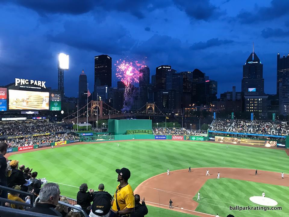
Only with ballparks do national newspapers instruct resident architectural critics to write a review of the new structure. Only at ballparks are interior aesthetics and views paramount to the venue’s reputation. Only at ballparks are features like “open concourses” essential, as spectators are invited to leave their seats and explore the park. Only at ballparks are fans willing to wait a couple of extra minutes for higher quality food because of the slow pace of the game. Only at ballparks do we (this commonly) have team museums or historical exhibits occupying fans’ attention. Only do ballparks have so many random spots to “hang out” and socialize around the park.
I cannot tell you how common it is to hear the layperson say, “baseball is so boring on TV, but I love going to the game!” And they probably spend half the game at a trendy outfield bar. Most of these folks are spending a substantial part of the game not in their seat.
The “ballpark,” which is truthfully a marketing ploy derived from the retro movement, has been transformed into a multi-faceted entertainment immersion experience for the average American. Architects and owners hooked nostalgic fans under the guise of retro, but economics, visuals, and entertainment keep the consumers coming. And anything that gets the average person simply exposed to the game of baseball is a plus in my book!
For any chance this is not already apparent, I am not only reviewing ballparks as structures (although that’s most of the analysis), but the totality of the ballpark experience.
____So, considering the importance of the ballpark to the game itself, I devised a comprehensive ratings system for assessing Major League Baseball’s venues. I grade the parks out of 100, not including bonus points. You can see the full criteria and methodology here, but I’ll briefly outline it below too.
It should go without saying that even when applying an objective methodology to aspects of a ballpark that can be objectively measured, this is still an inherently subjective process, because people value different things. You may not care that a ballpark serves high-quality local food or has the best historical exhibit in baseball, for example.
However, I try to be as comprehensive as possible by evaluating all aspects of a ballpark that may make it appealing to the average person attending a baseball game, with each aspect weighted appropriately. Note the language of “average person” versus “fan.” There are some categories on this list that even I care little about. So, if you want to make your own scorecard at home and throw out some parts of the criterion, be my guest! But the point is I look at the totality of what the ballpark has to offer.
1/3rd of the criteria is wholly subjective: the architecture and aesthetics. It consists of,
–Exterior Architecture: x/10
–Interior Aesthetics/Panoramic Views: x/20
–Concourse Aesthetics: x/3
This probably comprises more than half of the assessment for most people making these lists. Postcard views talk on TV and Instagram. Superior contextual integration, achieved by weaving a ballpark within the surrounding (preferably urban) fabric of the community, is paramount for attaining that essential “sense of place.” I also tend to grade exterior architecture on a very steep curve, as our standards are far too low given the amount of public dollars the taxpayers are turning over. In addition, none of these ballparks compare to the peak of the “jewel-box era” on the outside. The three highest get an 8.5/10.
While my rankings don’t have any headscratchers where ugly ballparks are placed where they shouldn’t be, 2/3rds of the criteria are “objective,” or at least partially “objective” in the sense that I am applying a methodology to a ballpark component that can be objectively assessed.
This is comprised of three broad categories: Setting, Functionality, and Amenities.
Setting: x/10
–Location/Access: x/5
–Local Scene (i.e. surrounding bars, restaurants, development, etc.): x/5
My ratings system really punishes ballparks with poor settings (i.e. suburban locales and/or poor local scenes), and I think that’s appropriate. The classic ballparks resonated with fans because they were part of a community, and new ballparks in a parking lot can never replicate that appeal.
A ballpark’s setting even extends beyond this category, as it has obvious implications for integrated contextual aesthetics showcasing beautiful views. The highest I have a ballpark with both a subpar location and lifeless local scene is tied for 13th.
Yes, every city is different, but for me, that urban-centric factor is the most crucial part of the successful ballpark formula. The best ballparks are intimately interwoven with urban settings.
Functionality: x/25
–Sightlines: x/10
–Seat Comfort: x/5
–Concourse Functionality: x/7
–Scoreboard: x/3
Amenities: x/25
–Selection and Quality of Concessions: x/5
–Regional/Signature Concession(s): x/2
–Accessible Restaurants/Bars/Sitting Areas/“Social Spaces:” x/5
–Premium Seating/Clubs: x/5
–General or Artistic References to Baseball or Team History/Museums: x/5
–Entertainment/Kids Activities/Other Amenities: x/3
Again, you can read more about all of this in the criteria section, but I’ll just add a few quick points of clarification.
Concourse functionality primarily looks at the concourse width, the concourse continuity, and whether the concourses are open to the field. All fold-down style seats should have cupholders. I may only note in cupholders in this feature when they’re lacking.
“Sightlines” mean views of the action on the field (primarily measured through seating geometry and grandstand field proximity), not views of the scenery.
From the perspective of the average fan, field proximity is the biggest flaw of the “new” post-1990 ballparks. In order to accommodate luxury suites and premium club seating, the upper deck is farther away from the action compared to the classic “jewel box” parks and often the multi-purpose “cookie-cutters.” This is hardly a revelation for ballpark nerds, as this topic has been discussed over and over again.
While the problem is more nuanced and the fix is more complicated than critics suggest, poor field proximity is undoubtedly an issue with all of these facilities (even PNC Park in Pittsburgh), and the ratings reflect that. Hence, when I discuss the quality of the sightlines from the upper levels, I’m always speaking comparatively among this generation of ballparks. We all agree the sightlines (or at least field proximity) for the average fan were superior at parks like Tiger Stadium and Old Comiskey. So, price in that caveat.
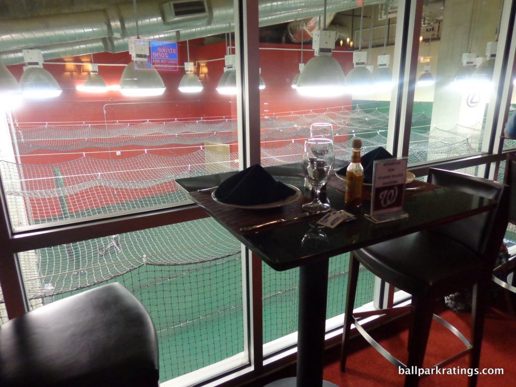
On the flip side, people most commonly ask why I talk about “premium seating.” This could also be read as variety of seating options, which I think is always a plus. Don’t think staid luxury boxes. But the reason is mostly pragmatic: it drove the post-1990 ballpark building boom. The economic drivers of baseball stadiums cannot and should not be ignored. The inconvenient fact is we would not have any of these “new” ballparks without demand (or perhaps the inducement of demand) for suites and club seating. And plus, be honest: if you can pull off getting these tickets once in a blue moon, it’s so much fun. Premium seating has proven to be such an enduring factor in all post-1990 ballparks that it simply cannot be overlooked.
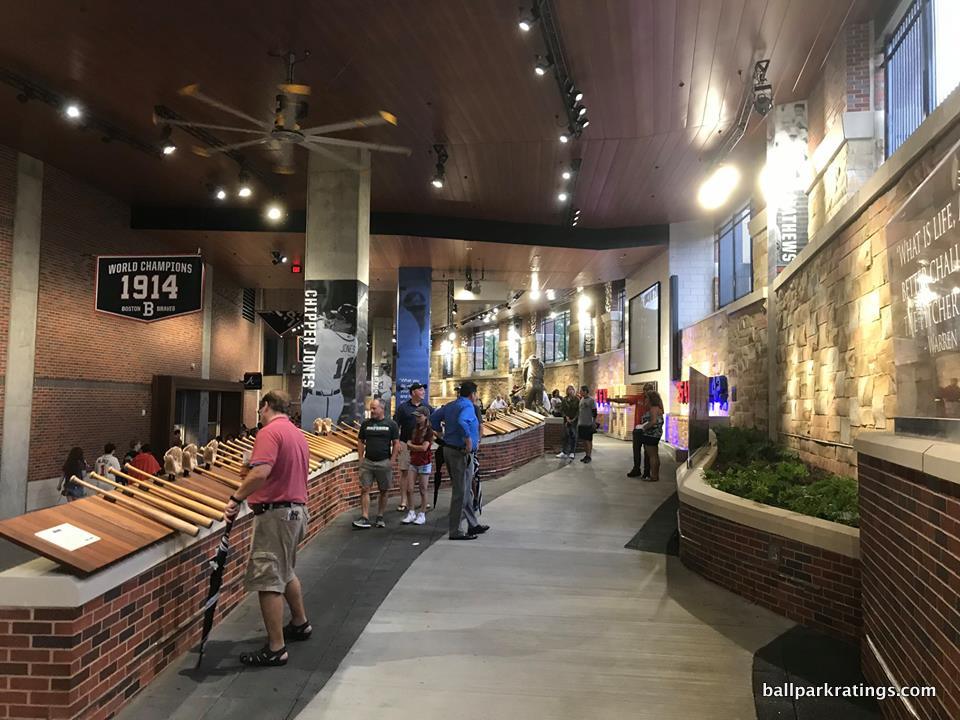
I love ballparks that integrate historical memorabilia throughout the structure, as baseball is an inherently historical game and such references make the “mallparkification” of so many ballparks just a little bit more palatable. In terms of those “extra amenities,” what better way to cultivate a unique ballpark atmosphere than by celebrating your team’s history? Most parks do this to some degree (the vast majority have statues, for example), but some historical references are way more extensive than others. Think sprawling standalone museums or towers of memorabilia lining the concourses.
Kids’ areas are important to the ballpark experience, whether we like it or not. Baseball isn’t dying, but it is aging, so getting families with small children to the ballpark is essential. Finally, the “accessible restaurants” category (i.e. the traditional sit-down restaurant concept) has made a sharp turn toward accessible “social spaces” this decade.
Again, I consider what the majority of people in a ballpark may appreciate, not necessarily the die-hard, scorekeeping traditionalist.
Finally, in the miscellaneous category, I look at:
–Atmosphere/Fan Support: x/5
–Ballpark Policies: x/2
–Bonus: varies from 2-10
If you think any of these categories shouldn’t be here, I can promise you no ballpark has ever hinged on one minor point, and the bonus category usually evens things out. I traditionally use the bonus category to award ballpark aspects where the maximum score is just not enough, like, say, with San Francisco’s bay view.
All of this being said, I think there is one element that encompasses almost all of these categories.
If I could distill the answer to “what makes a ballpark great?” to one aspect, it is that a great ballpark represents its team, city, and/or region. All ballparks should pass the, “where I am?” test. From downtown views and local grub to team historical references and other regionally-inspired amenities, that sense of place is the overarching key.
____Before I start the list, I want to dive into some stray housekeeping items.
While I’ve been to all 30 MLB stadiums, I should also note I’ve been to 28 this decade. The two venues I have not been to recently are the Oakland Coliseum and Rogers Centre (Toronto), for the simple fact that they are multi-purpose facilities. While I have seen a game at these stadiums, I have not been there with the purpose of reviewing them for that reason.
I have also been to 25 MLB stadiums multiple times, as I am always adjusting and reassessing my take. I revisited 8 ballparks (plus the new SunTrust in Atlanta) in 2017, 10 in 2018, and 8 so far in 2019. When I use “we” in my reviews, I am referring to friends and correspondents who attend games with me.
I’d be remiss if I didn’t reveal a little bit about me and where my allegiances may lie. I grew up in Houston, and I have resided in Atlanta for most of my adult life. We all have inherent biases, but I do actually come to this project without any one team that I support. I’m pretty transplanted, so I’ve rooted for teams in cities ranging from the Midwest to Florida. My assessment of Houston and Atlanta’s ballparks are in line with the consensus, and I don’t see any bias there anyway (for what that’s worth). My earliest baseball childhood memories were at the Astrodome!
You may be curious where I sit for all of these reviews. I try to get the best seats in the ballpark, but this should not be interpreted as something that leads to an elitist perspective. I do this in order to get access to all areas of the ballpark, so I can provide my readers with as many pictures and experiences as possible. Getting the best seats generally allows one access to more areas of the ballpark. I always buy these tickets out of pocket or obtain them from friends of the site, not from the team. Teams do not know I am coming to their ballpark beforehand and are not involved in my reviews whatsoever.
At this point, I’ve seen almost every corner of every ballpark.
____The biggest and most glaring caveat is that I don’t rank or rate the three “classic” parks using the same criteria. It’s grossly unfair to compare new parks to old parks. There is no way to objectively measure the unparalleled sense of history and authenticity of these grand cathedrals. I think you can have a conversation about Wrigley Field and Fenway Park (and Dodger Stadium, for these purposes), and then you can have a conversation about the other 27 ballparks.
Rating a park that opened in 1912 or 1914 based on 21st century standards doesn’t really tell us anything about the quality of the ballpark. They must be looked at solely in their historical context.
I also include Dodger Stadium (1962) in this category, because unlike Kauffman Stadium (1973) and Angel Stadium (1966), it has not undergone any comprehensive, one-time renovation project that completely reinvented the park more in the vein of other post-1990 ballparks. While it has received periodic enhancements, Dodger Stadium sits still in time and remains the only modern-classic of its era.
If this seems like a copout, I’ll tell you if I had employed the ratings system, Wrigley and Fenway would have been somewhere in the #6-10 range. For me at least, that certainly does not properly reflect where these ballparks stand among baseball’s greatest cathedrals. If you want to slide Wrigley and Fenway in the top 2 spots in some order, and perhaps put Dodger Stadium somewhere behind that, I wouldn’t argue with you.
But I find it pointless to compare the three undisputed classics that possess so much history to the other 27 ballparks/stadiums.
____Of the 27 that are ranked and rated, we have to remember that they all possess the awesome quality of showcasing people who play professional baseball! I understand that baseball fans have a very special devotion to their home team’s ballpark, and that’s what really counts. As I’ll get to with one ballpark in particular, what really matters is that the home fans love it, regardless of how it compares to other MLB parks.
26 out of 27 ballparks/stadiums have at least a few redeeming qualities to the point where I look forward to returning. 24 ballparks out of 27 are at least “adequate” places to see a game, with more good than bad overall and clearly offering at least a decent experience.
This is a comparative exercise, and with billions of dollars poured into ballparks across America since 1990, the standards are relatively high. I think it’s helpful to focus on the “ratings” and general company that a ballpark keeps rather than where it “ranks”. So, I put the 27 ballparks in different “tiers” in order to paint a better picture of where the ballpark stands, because some of the ballparks are so close together that the “ranking” doesn’t matter as much as the “rating.”
My 8 tiers are as follows: 8) inadequate, 7) mediocre, 6) passable, 5) good, 4) very good, 3) great, 2) outstanding, 1) the best (yes, #1 is clear, something I wouldn’t have expected five years ago). Again, outside of these, I place the three classics in their own tier.
Sure, the segmentation seems like overkill on the surface, but the ratings were actually naturally dispersed in a way that made it sensible to group the parks this way. This was not contrived.
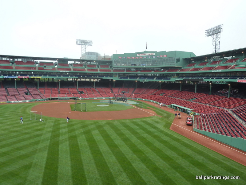
Note that I put “2019 Edition” in the headline. Ballparks go through lifecycles and are constantly renovated/enhanced in the off-season. For example, ballparks from the mid-90’s are naturally at their point where most substantial capital investments have been completed (Progressive Field in Cleveland and Coors Field in Denver have really benefited), while ballparks in the late 90s to early 2000s are due for this in the next few years (so, Seattle, San Francisco, and Detroit are due to get even better). While dramatic fluctuations are rare, I do tinker with the rankings/ratings from year to year.
Finally, I also included a “consensus ranking” with each ballpark so you can gain perspective on how my assessment compares to that of other baseball fans, ballpark enthusiasts, and national publications. This isn’t exactly scientific like my 2010 project, but it is the general sensibility I get after (a) years of Googling “ballpark rankings” and (b) personally talking with people who work in the ballpark/stadium industry.
The “consensus ranking” reflects the sentiment of others who know ballparks well.
Consensus rankings will be categorized as follows: top-2, top-5, top-10, upper-middle tier (10-15-ish), middle of the pack, lower-middle tier (18-22-ish), bottom-10, bottom-5, bottom-2.
There is so much variability when ranking something as tribal as a team’s baseball stadium, so it’s funny that there is a wide consensus on what are the bottom-2 parks and the top-2 parks! In fact, there’s almost universal consensus on the bottom-2 parks, which I align with as well.
____ You can click on each ballpark link to see the “ratings scorecard” for each park and read the full, in-depth review (if posted). Note that as we get further down the list, the brief blurbs will get longer. I’ll start out with a handful of paragraphs for some of the lower ranked ballparks, but once we get into the outstanding tier, I feel obliged to flesh out more information and further articulate my reasoning.
I will also balance the descriptive with the normative when I see an area where a ballpark could easily improve.
The link to part 2 is at the very bottom of the page. This is obviously very long, so I put both my ranking/ratings and the consensus rankings in a simple list format at the bottom of part 2. But please refer to the body of this feature for the reasoning before reacting! Also, remember you can use the “command-f” (or “control-f”) find key to locate a ballpark or city quickly. Remember, most of these parks are decent parks, and while this is pretty close to the definitive ranking to be honest, it’s hardly the final say.
Have fun (ok, argue too), and dear god don’t take this as seriously as I do, starting with the three classics and then going into the rankings:
The Classics, in a League of Their Own:
Parks that simply cannot (and will not) be compared to the other 27 ballparks. These three are not “rated” or “ranked” like the other 27 ballparks.
Wrigley Field (1914), Chicago Cubs: N/A
Consensus Ranking: Top 5
— Games Attended: 3
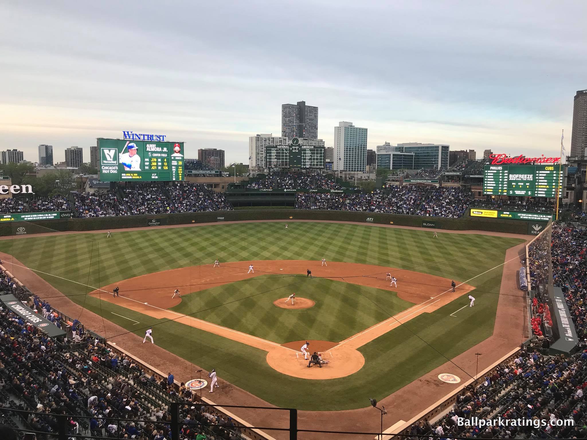
____Now affectionately known as The Friendly Confines, Wrigley Field really shows that it matters more how ballparks evolve than how they are built.
In the 1910s, Shibe Park, Comiskey Park, and Forbes Field were regarded as the irreplaceable greatest parks of the era, as Wrigley Field was overshadowed by other more expensive and grandiose “jewel box parks.” Even a place like Ebbets Field, which is now considered by many to be the greatest jewel box park, benefited more from an accumulation of lore into the mid-20th century.
Circumstances (such as the Cubs decision not to install a second deck in the outfield in the 30s), alterations (namely Veeck’s beautification project of planting the ivy), and Wrigley’s evolving symbiosis with the surrounding neighborhood made The Friendly Confines the historic monument we love today, something we should keep in mind when assessing the wave of post-1990 parks.
The official multi-year renovation project (2015-19) has been completed as well, resulting in amenities on par with the aesthetics and history. A common refrain in the past was that even with all of the beauty and history, Wrigley Field was “a dump.”
Just objectively speaking, this now sure isn’t a dump.
____Considered one of the best local scenes in professional sports, Wrigleyville not only has a vibrant pre-and-post-game bar scene, but also evokes a classic residential vibe, reminiscent of the urban neighborhoods of the early-mid 20th century. As a concept, Wrigley Field’s cozy location has contributed to its venerable and timeless image. It was arguably the first to show us how ballparks are a product of their surroundings.
Compared to the ornate Shibe Park, cast in cartouches and terra cotta with a French Renaissance design, Wrigley Field’s exterior design was (and is) rather simple. The now-famous art deco style marquee was installed in 1934. Renovations in the late 2010s added terracotta finishes and ornamental fencing structures.
Moving on to the interior aesthetics, Wrigley Field really begins to shine.
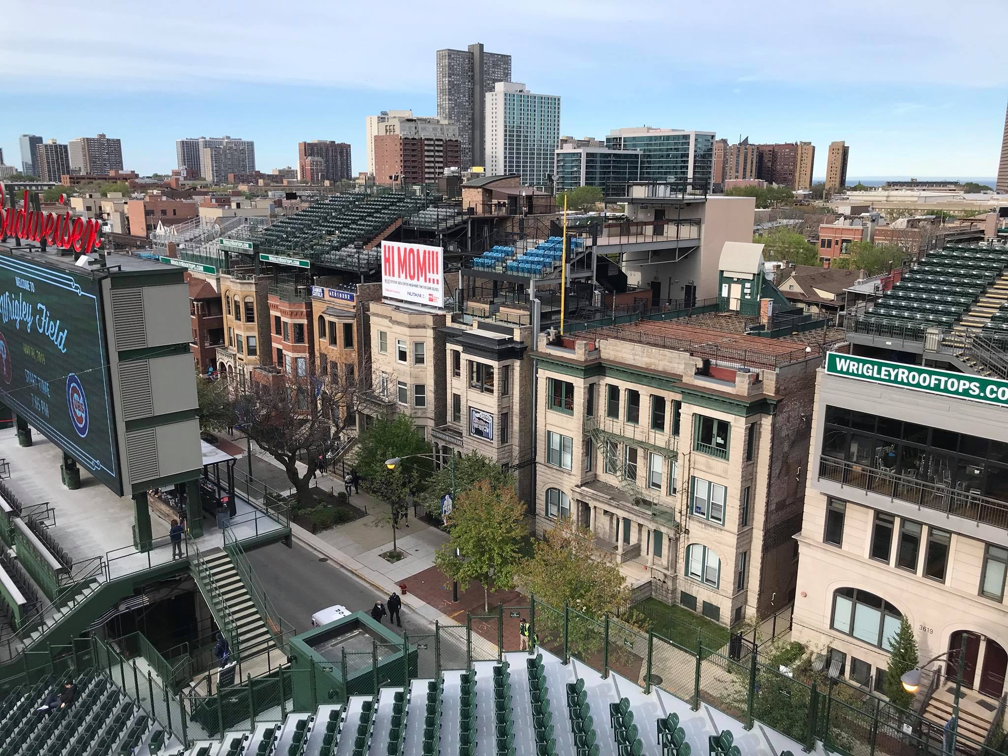
Wrigley Field is the godfather of the retro emphasis on downtown views and integrated community aesthetics. It was the only park from the era to continue to emphasize a connection to the local community throughout the mid-20th century on the inside. Even in the lower level, we see the community seep in through rooftop bleachers and distant skyscrapers. Wrigley Field is aesthetically superior due to its emphasis on vertically limiting outfield seating to better facilitate contextual integration and the green Ivy covering the outfield walls.
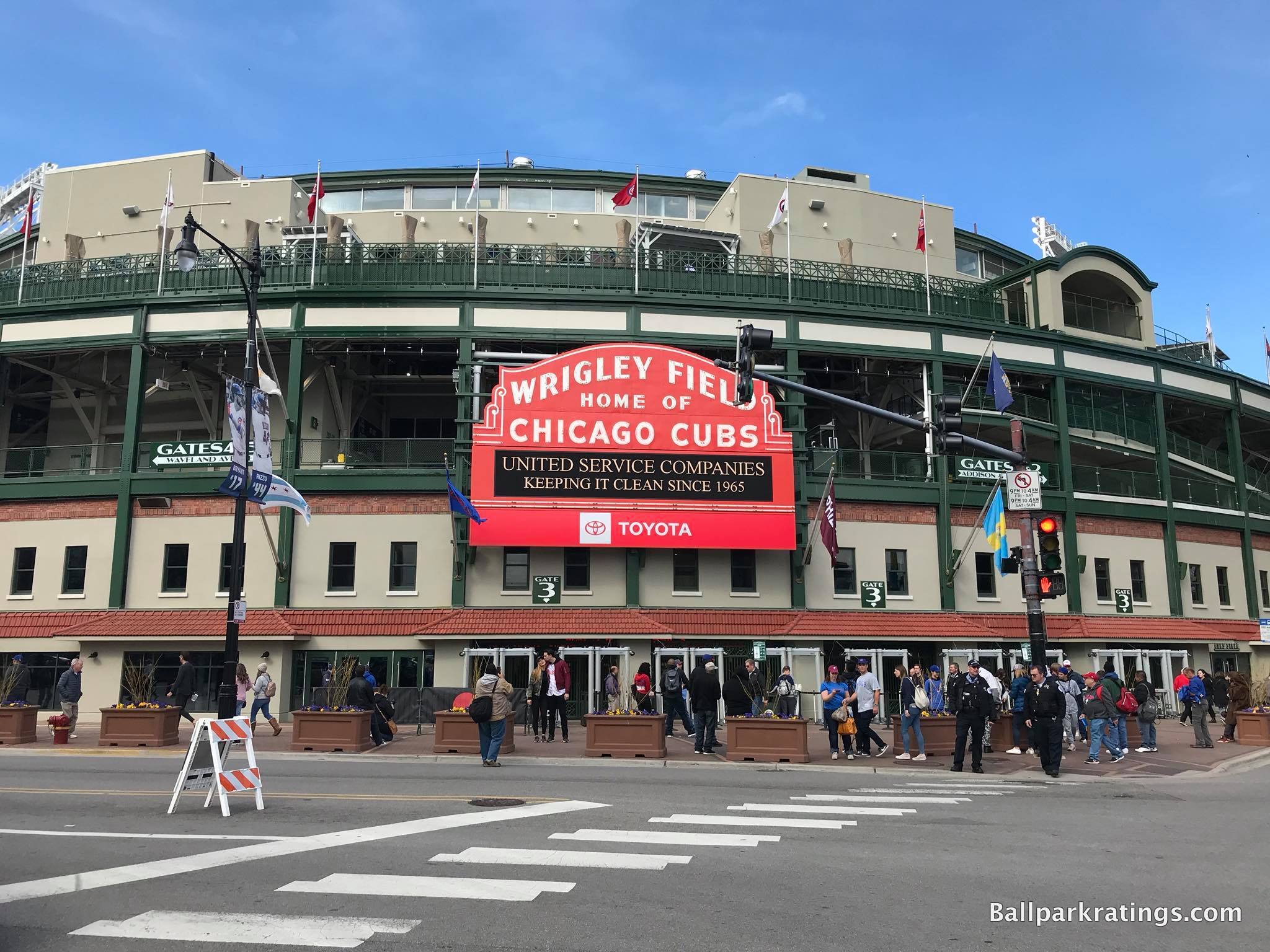
Wrigley Field is beautiful in its own right, not just beloved for history.
____Its decking structure is also functionally superior. Unlike almost every other park of its era, Wrigley avoids the common overhang issues in the lower deck, but the upper deck is still closer to the field than nearly every park in baseball today. It’s the perfect balance, in my opinion.
Unlike Fenway Park, Wrigley’s seating geometry is good as well. All seats in the lower bowl are adequately oriented toward the infield. Old-timer ballpark nerds love to talk about support columns, cantilevers, and field proximity, but angling the seats correctly is just as important, something that Fenway and Tiger Stadium whiffed on. Superior sightlines are Wrigley Field’s most overlooked quality, as it played a significant role in its more timeless appeal.
____Starting in the mid-2010s, Wrigley Field began to upgrade its functionality and amenities. As someone who grades these aspects, this has been more of a mixed bag than you might think.
I almost never object to oversized, state-of-the-art videoboards, but I think the ones at Wrigley Field nullified some of the charming contextual connection that was essential to its timeless appeal. They simply block out too much of the view from the lower bowl.
This is much more subtle, but the upward expansion of the bleachers have a similar effect.
The facades of the neighborhood buildings predate Wrigley, but they were essential in defining the ballpark’s character. The extra rows of bleachers in left-center and right-center field block some of the view of Waveland and Sheffield, nullifying some of that defining contextual character. See before here. Overall, what I said above about Wrigley’s integrated contextual aesthetics still apply, but the look isn’t nearly as nice.
The enhancements to the amenities have been excellent, though.
We have a renovated main concourse with attractive signage, new well-appointed club spaces, beautiful luxury suites, new open-air social spaces accessible to all fans, new historical plaques, and properly maintained statues. Although, the regular concession food and craft beer could still be improved. To the delight of traditionalists, there is still no kids area at Wrigley! It’s appreciated that the amenity enhancements aren’t over-the-top, in keeping with the park’s classic image.
At the beginning of the decade, just on a “gut” feeling, I would say Wrigley Field was the greatest park of all time (and up there with my current personal favorites) due to its superior contextual integration, interior aesthetic attractiveness, natural aesthetic vision, relatively superior sightlines, and excellent neighborhood.
With the out-of-place videoboards and upward expansion of the bleachers muddling the interior scene, I’m not 100% sure I’d give it the edge over Fenway (where the alterations didn’t significantly alter the outfield look) anymore. I’d probably still favor Wrigley, but it’s now a closer competition with Fenway.
Although, there’s no question that these renovations did more good than harm and certainly made Wrigley Field a better ballpark by today’s standards.
Fenway Park (1912), Boston Red Sox: N/A
Consensus Ranking: Top 5
— Games Attended: 1, plus 1 tour
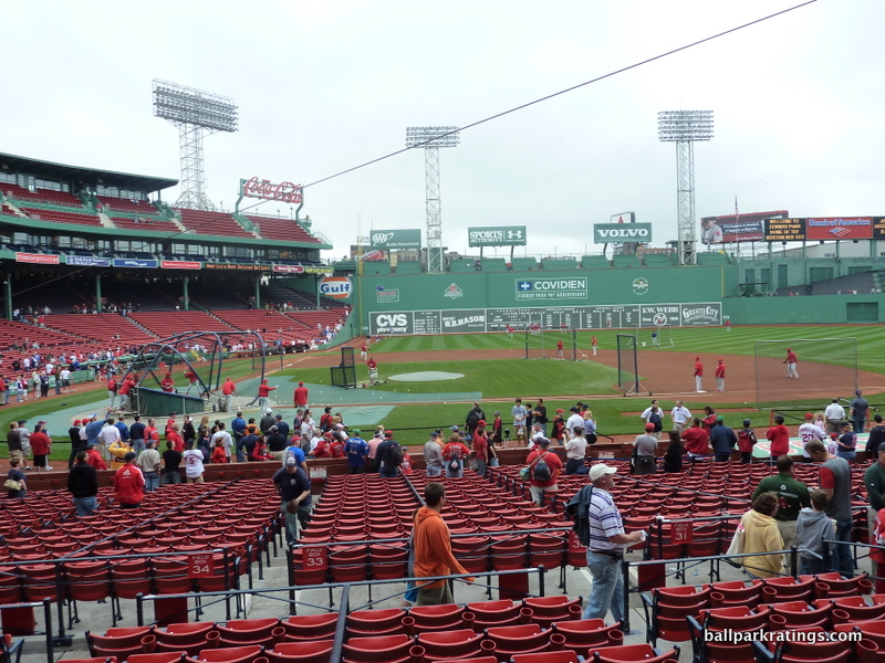
____Before finally attending a game at Fenway in 2010, I was under the impression that a disproportionate amount of its appeal was rooted in nostalgia, and there was little beyond that to signify Fenway as a great ballpark.
Historically, we all acknowledge that Fenway is one of the most significant parks of all time. But is it a good place to watch a game, in and of itself?
Yes, absolutely. My initial impression was wrong. Fenway as a ballpark, from the atmosphere to the architecture, deserves to be on the Mount Rushmore of America’s all-time greatest venues. Even before the 2000s renovations, it should have never been categorized as one of those dumps that was just lucky to still be in existence.
____The neighborhood is right up there with Wrigleyville, as Yawkee Way (or whatever it is going to be called) itself is an event. Bars, restaurants, vendors, scalpers, and kids playing catch fill the streets, in what is akin to a big baseball festival.
Architecturally, Fenway’s red brick exterior façade is better than the streamlined retro mediocrity, which is often lacking in detail, contextual appreciation, or any sense of appropriate scale.
While the classic “Fenway Park” sign on Yawkee Way is the visual highlight, note how Fenway is structurally integrated into the neighborhood, as opposed to some new parks which overpower their surroundings. When walking up to Fenway Park for the first time, you do a double-take, because it just looks like part of the neighborhood, not like some historical cathedral that overwhelms the area as one might imagine. With an intimacy on the outside that matches the inside, the brick looks as if it hasn’t been touched since the years of the Model T. Simply inimitable.
Unlike most of the neoclassical retro quirks derived from the whims of the P.R. department, Fenway Park’s interior lines are borne from the site. From the landmark Green Monster and Pesky’s Pole to the triangle in center field, everything is authentic, without even a trace of contrivance. Even the best post-1990 ballparks can’t do this. Again, just inimitable.
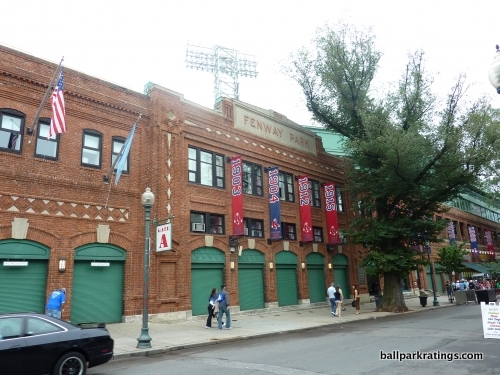
The venerable shade of swamp-like green is something that’s probably not attractive in and of itself, but it’s another factor that makes Fenway Park so special. Evoking a certain timelessness of classic baseball, the color of green looks faded, suggesting it’s been worn in like a comfortable old shoe. The color scheme as a whole, including the red seats, is clean, attractive, and distinctive.
As always, my default persuasion is to favor open interior aesthetics (classic Wrigley and new PNC in Pittsburgh), but Fenway is still a gem.
____Most of all, Fenway Park’s new amenities added as part of the 2000s renovation project fit with the classic sensibility of the ballpark. The two upper clubs, the suite level, the dugout club, the patio seating, the Green Monster seating, the new concessions, and even “Wally’s Clubhouse” kids area, somehow look like they belong, which is obviously difficult to pull off.
Finally, Fenway has something Wrigley doesn’t have: the history. Game 8 1912; 1918 World Series; Ted Williams’ home run in the 1946 All-Star Game; Williams’ final at-bat home run; Yaz and the 1967 Pennant; Carlton Fisk 1975 Game 6 walk-off home run; Bucky Dent; Ted Williams returning for the 1999 All-Star Game; Dave Roberts, along with any other memories related to the 2000s Yanks-Sox rivalry.
What does Wrigley have on this level? The Babe’s alleged called shot? My guess is most Cubs fans would point to Ernie Banks’ 500th home run. Ironically, Wrigley’s greatest Chicago-centric triumph was the Bears beating the Giants in the 1963 NFL Championship Game, which tells you all you need to know.
____Even post-renovations, Fenway Park isn’t perfect, as there is much to be desired from a functional point of view.
In contrast to Wrigley, the seating geometry down the right field line is horrific, with 1000s of seats oriented past centerfield. The concourse functionality is a joke even compared to other parks built in the early 20th century. Forget “360-degree concourses.” It’s hard to make it 90 degrees at Fenway without having to ask for directions!
Like I said above, I probably still give Wrigley the edge over Fenway overall, but it’s now close, because Fenway was able to integrate modern features without sacrificing any of its historic/aesthetic integrity.
**If you didn’t read (or skim) the lengthy preamble: if you want to slide Wrigley and Fenway in the top 2 spots in some order, I wouldn’t argue with you. But again, I’m not playing that game, because these parks just cannot be quantified in the same manner.
Dodger Stadium (1962), Los Angeles Dodgers: N/A
Consensus Ranking: Top 10
— Games Attended: 2, plus 1 tour
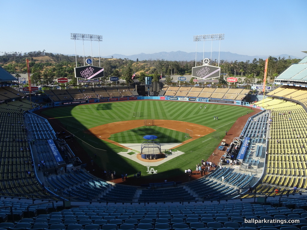
___As I outlined above, Dodger Stadium is a tricky ballpark to categorize, as it’s only slightly more inappropriate to compare it to any post-1990 ballpark (new or renovated) than it is to compare it to Wrigley Field or Fenway Park.
However, judging by the park’s aesthetics and its place in American baseball history, Dodger Stadium stands alone as the Wrigley/Fenway of the 1960s mid-century modern style, as parks like Kauffman Stadium and Angel Stadium have been complicated by renovations that compromised aesthetic integrity for amenities and kitsch.
____Architecturally and aesthetically, Dodger Stadium is a place that really exceeded my expectations, as I would put it shoulder-to-shoulder with the best of the retro parks and the best of the classic ones.
Everything about the interior aesthetic scene is understated yet beautiful. Emphasizing enduring structural assets over attention-grabbing gimmicks or contrived quirks, Dodger Stadium is the ideal combination of light and heavy.
Overlooking the weight of the green-lined hills and San Gabriel Mountains, each deck seems delicately suspected in air, with the wavy roof the perfect, light accentuation. The original pastel color scheme, restored in the mid-2000s, always struck me as the perfect counterpoint to the natural earth tonality beyond the outfield.
Unlike today’s excess, the park works through complementing the game being played, not overpowering it. The new parks attempt to be unique by having kitschy features, mainly because the fundamental structure is more or less the exact same. Dodger Stadium took a normal seating configuration, with clean lines and comparatively nice sightlines, added a single beautiful architectural element (wavy roof above pavilion), and otherwise let the stunning view and baseball do the rest.
Sunken into the landscape and without much of a traditional “facade,” the exterior is mid-century modern architecture at its finest.
The greatest hallmark of MCM architecture is how it can blur the lines between architecture and topography, and Dodger Stadium is primarily defined by a wholescale reshaping of the land. The only ball club to employ a full-time arborist, Dodger Stadium’s exterior is defined by natural elements. Inverted roof canopies, topiaries at the terraced entrances, and the urn-shaped planters define the scene. Pedestrian plazas have layers of drought-resistant palms, plants, and flowers.
It leads to quite an intimate exterior you would not expect from a 5-tiered stadium, as seen when entering the top deck behind home plate.
____If you are being fair in comparing Dodger Stadium to any other ballpark, the setting is just abysmal, mainly because of access issues.
Sure, you are separated from the city center (although, you have a nice view of downtown Los Angeles from the top deck concourse) with no bars, restaurants, shops, etc. in the vicinity, but there’s nothing exceptional about that. It’s bad, but within normal parameters of bad, in what is a typical set-up for the era.
However, access to Dodger Stadium, with its puzzling system of ingress/egress and well-publicized traffic issues, is a world apart worse than any other MLB Stadium. In my experience, it’s an active deterrent, and I wouldn’t come close to saying that for any place else. Perhaps I’m just not used this area of Los Angeles. Or just Los Angeles.
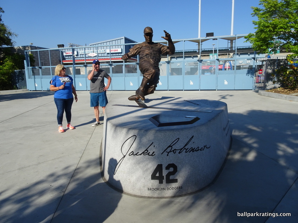
____Dodger Stadium has always been fairly functional, but it has improved in this respect in the last 10 years. Dodger Stadium features terrific sightlines, as even though the seating structure looks high and far away, you feel right on top of the action from the upper decks. Simply because we take poor cantilevering for granted, we just assume a four-deck structure is subpar, but I was thoroughly impressed. The curvilinear seating geometry works here as well.
Dodger Stadium has traditionally gotten somewhat of a bad rap from ballpark aficionados/baseball tourists for one very practical reason: the inability to explore the park.
In what was rationalized due to the topography, fans used to be restricted to the concourse where their seat was located. If you had a seat in a particular deck, you had to stay there. From personal experience, this is no longer an issue, as you can walk all the way around Dodger Stadium on the main, quasi-open concourse system. With a few exceptions, all fans are allowed access to most concourse areas, including the BMW Suite Level to explore the historical memorabilia.
While it hasn’t undergone a renovation project on the scale of that at Kauffman Stadium, Dodger Stadium possesses average amenities. Although the concession quality can be lacking and Dodger Stadium doesn’t have the social spaces of most other parks (despite improvements), the premium seating meets industry standards. Plenty of tasteful Dodger historical references as well, along with a new kids’ area.
____Dodger Stadium has received upgrades in recent years, but like Fenway and Wrigley, not much has been done to nullify its timeless aesthetic appeal.
More extensive renovations to the outfield concourse will be coming in 2020, but it looks like these renovations will also be in keeping with the ballpark’s architecture.
Now on to the rankings and ratings! This goes in descending order, with the “rank” to the left of the ballpark name (i.e. #27-#1) and the “rating” to the right of the ballpark name (i.e. 38.5-89+).
The Three Inadequate Stadiums:
These are relics of another era in one way or another. They are acknowledged as inadequate (i.e. due for replacement/extensive renovations) by their teams.
27) Oakland-Alameda County Coliseum (1966), Oakland Athletics: 40.5/100
Consensus Ranking: Bottom-2
–Games Attended: 1
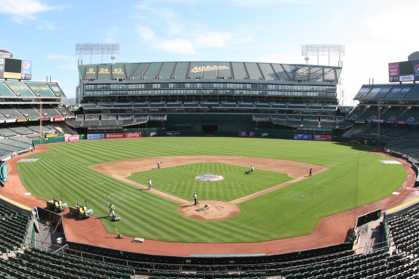
____If I wanted to segment things further, Oakland veers into the dreaded “I’d rather not come back here” territory, because the two stadiums below at least have substantive redeeming qualities.
I haven’t discussed the Oakland Coliseum much on ballparkratings.com, because it is not worth the time. And it is not a ballpark. While the multi-purpose stadium has made some strides in the last two years, the Oakland Coliseum only has two things going for it: (a) people play baseball here, and (b) it is an open-air stadium with natural grass.
By virtue of the latter, the interior aesthetics are better than the dome in Tampa, but that’s about it.
Situated next to Oracle Arena in a classic 1960s-era “stadium complex,” the stadium’s industrial location is terrible. Food trucks have been added outside the stadium in an attempt to liven up the atmosphere.
The Oakland Coliseum has baseball’s worst exterior design/architecture, in my opinion. As the bowl is sunken into the topography, only the meek concrete façade of the third deck is visible from the outside, which lacks the presence of even the typical cookie-cutter. Proudly called brutalist during its heyday, it hasn’t held up well by current standards. The exterior here is as non-descript as it gets. At least Tropicana Field (1990) tries to some degree in this respect, with a well-appointed rotunda and a mosaic-lined walkway.
The Coliseum’s interior aesthetics are defined by the gargantuan monstrosity added for football in 1996, derisively known as “Mount Davis.” Gone are the decent views (people have a tendency to posthumously overrate them, sorry) of the Oakland hills and any sense of intimacy.
And of course, we have the ridiculous surplus of foul territory putting fans even further from the action, as the Oakland Coliseum lacks the functionality for baseball of even the average 1970s cookie-cutter. Poor sightlines far away from the action. Narrow, dark concourses. Aging, narrow seats, with many lacking cupholders. An inconveniently located videoboard.
Moreover, the Coliseum is a standard deviation worse than the derided Tropicana Field and Rogers Centre because of its complete lack of amenities and baseball-related fan-friendly features, which is somewhat of a function of its multi-purpose nature.
For the most part, high-quality local food options, well-appointed restaurants, neat social spaces, wide concourses, extensive Oakland Athletics historic references, competitive premium seating options, and other such features are missing here.
The A’s took a step forward by adding “The Treehouse” in 2018. (That sounds sarcastic, but it isn’t!)
With the Raiders moving out after 2019, the Athletics took further steps to improve the facility this year, adding new premium loge boxes, a kids’ area, and more social spaces. But even with these enhancements, the Oakland Coliseum still rates far below the second-worst MLB stadium in our book.
____If you want to put the Oakland Coliseum ahead of Tropicana Field just because it doesn’t have a dome, be my guest. But looking at all categories cumulatively in appropriate proportion, I have the Coliseum as far and away the worst MLB venue in baseball.
26) Tropicana Field (1990), Tampa Bay Rays: 52.5
Consensus Ranking: Bottom-2
— Games Attended: 2
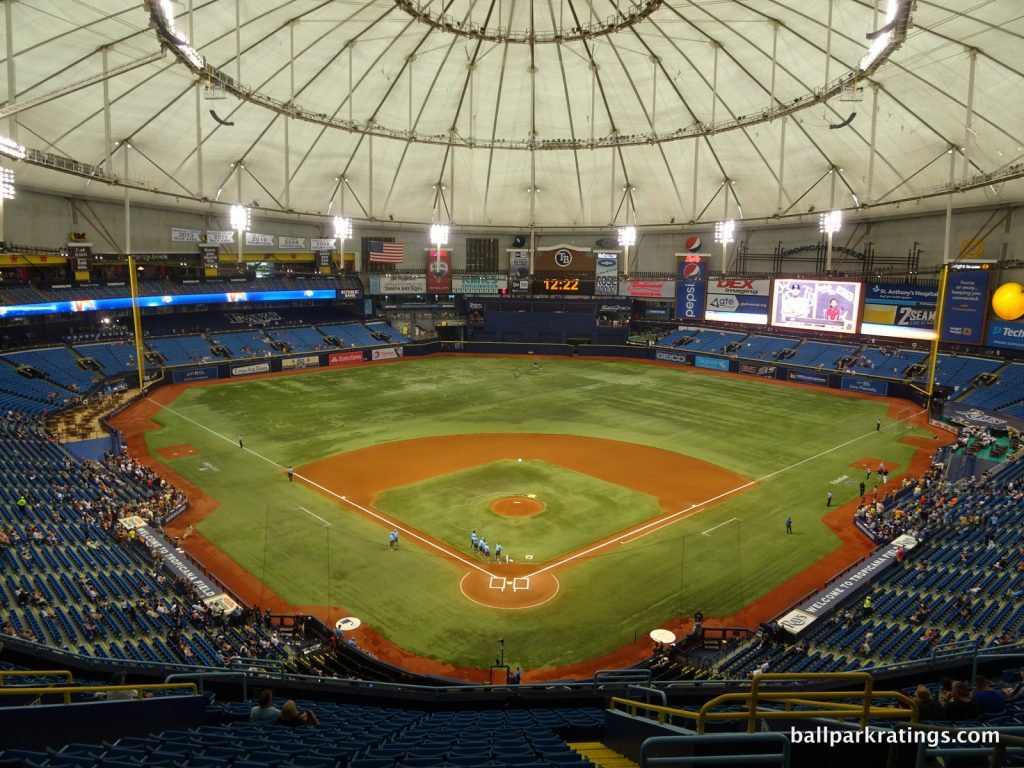
____As the only stationary dome in Major League Baseball, Tropicana Field has the worst interior aesthetics of any ballpark, but it has plenty of overlooked redeeming qualities, with a ballpark operations staff dedicated to providing a solid game day experience to boot.
Tropicana Field’s maligned design has been extensively documented: the plastic-looking exterior, the dome, the catwalks, the artificial turf, the obviously drab interior environment, generally poor functionality, and a location and local scene that makes for baseball’s worst setting (yes, even worse than Oakland).
But it at least now functions as a baseball-only facility, unlike Oakland and Toronto which have much worse sightlines, and it provides plenty of fan-friendly features.
On the outside, Tropicana Field is instantly identifiable by its slanted roof, but the best exterior feature is the long ceramic mosaic tile adorned with Floridian fishes, providing fans with a flavorful sense of arrival in what is otherwise one of baseball’s worst exterior designs.
____While Tropicana Field doesn’t have the amenities of the best ballparks, they are competitive. The Rays organization has generally been diligent in upgrading the fan experience from year to year.
The food selection at Tropicana Field is relatively respectable. BBQ, Mexican, Seafood, and other unique items are available. The empanadas, fried plantains, and chicken paella at Pipo’s are Tropicana Field’s signature food. The original Cuban cafe is a bay area tradition.
Tropicana Field has done an excellent job of enhancing its social spaces in the last 5-10 years. Replacing the centerfield batters’ eye restaurant, the Budweiser Porch is a fun place to hang out. Replacing the Everglades Brewhouse, the lively Outfielder Bar and Grill is Tropicana Field’s primary full-service, sit-down restaurant. It features BBQ and over 30 beer taps serving mostly local craft beers from the Tampa Bay area. Much to my chagrin, the Rays eliminated their Cigar Bar, but they did replace it with a social space better suited to appeal to more fans. The quality of the premium seating options isn’t great, but it at least resembles the set-up of any other baseball-only facility.
The highlight of the amenities at Tropicana Field is the Ted Williams’ Museum and Hitters Hall of Fame. The museum houses memorabilia from Ted Williams’ careers with the Boston Red Sox and with the United States Marine Corps. It also has monuments to the members of the “Hitters Hall of Fame” with memorabilia and a movie theatre. A whopping five statues appear throughout the ballpark museum, including one of Wade Boggs, one of Casey at the Bat, and two of Ted Williams (one fishing and one playing baseball). Yes, the world’s greatest fly fisherman also played baseball.
I love historical baseball memorabilia/exhibits and museums integrated into ballparks, so an extensive set-up like this should alone prevent the Trop from occupying the bottom spot. Finally, the Rays have the “Rays Touch Tank,” which is popular with younger fans.
If you are being comprehensive in your analysis, and don’t place the Trop last solely because of the dome, I think the placement here makes sense. The way I’d sum it up: Tropicana Field is the ugliest venue in Major League Baseball, but it’s not quite the worst!
____The Trop deserves its ranking and rating near the bottom, but this is a place where you can have tons of fun and watch baseball with better sightlines than its maligned brethren above and below. It’s hard to get excited about a stadium like the Oakland Coliseum, but I look forward to returning to Tropicana Field.
25) Rogers Centre (1989), Toronto Blue Jays: 56
Consensus Ranking: Bottom-5
— Games Attended: 1
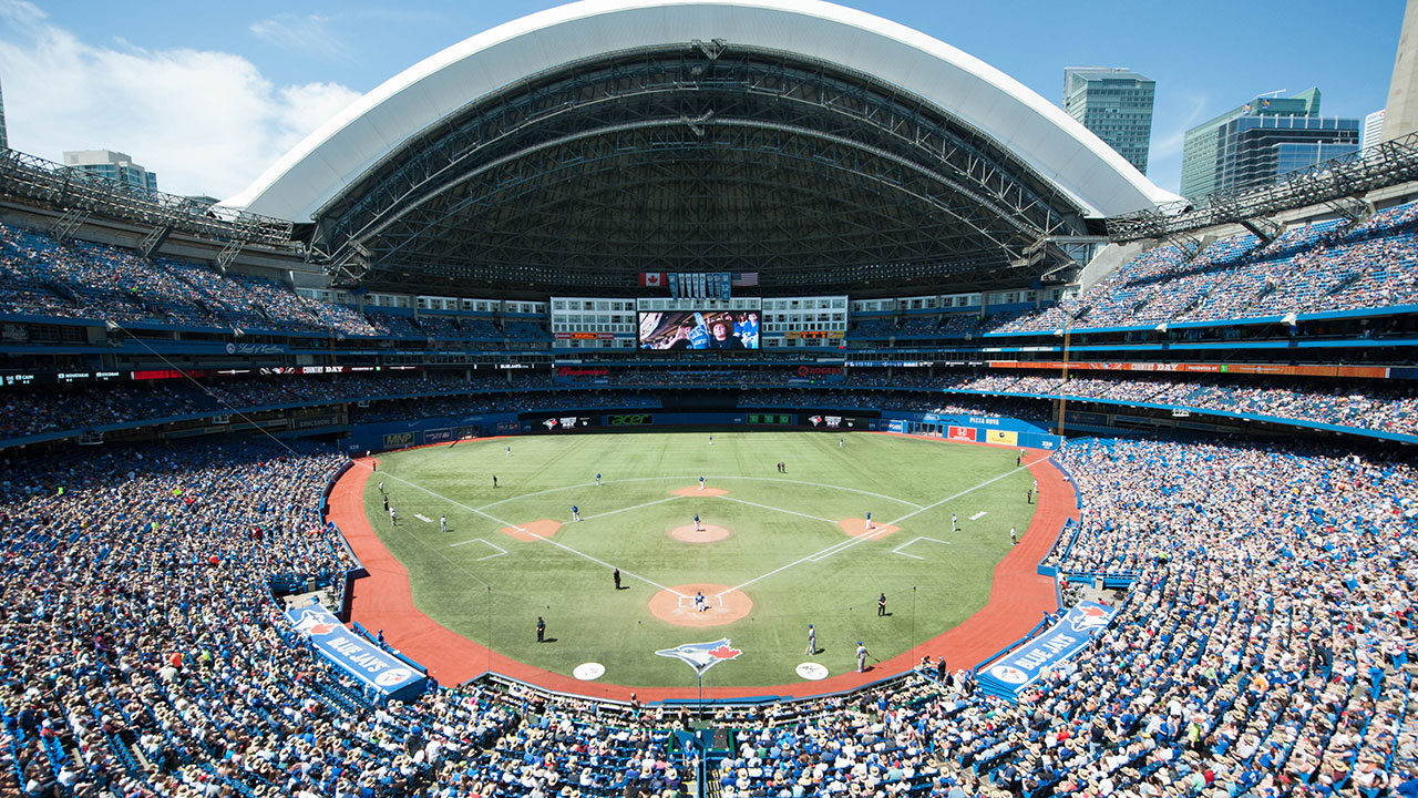
____When Rogers Centre (née SkyDome) opened in 1989, it was a modern marvel. A retractable dome that works! McDonald’s in a stadium! A Hard Rock Café! Fancy restaurants with field views! A hotel in center field! The world’s largest video screen! Hundreds of luxury suites (a record 161, at the time)! Millions of dollars of art!
After Camden Yards ignited a movement toward baseball-only “retro” ballparks in 1992, Rogers Centre became widely regarded as “just another stadium” at an alarmingly hasty pace.
Sure, it’s still a Toronto landmark, but by the mid to late-90s, the consensus was that concrete, multi-purpose venues with artificial turf were unacceptable for Major League Baseball. You quickly saw Rogers Centre on the bottom of ballpark rankings lists even in the pre-internet era. By the early 2000s, there was wide agreement among “ballpark aficionados” that Rogers Centre failed to impress.
____It’s not that most of the features listed above can’t still be cool; it’s that they all haven’t aged well in this particular venue in their particular form.
While it’s hard to build a great retractable roofed ballpark from an aesthetic standpoint, you can still do it relatively well. The focus isn’t on the novelty of having a dome that retracts, but on building retractable structures that maintain an essential open-air, contextual connection to an urban locale.
When the roofs are open, you see this with the beautiful views at Houston’s Minute Maid Park (of Union Station and downtown) and Seattle’s T-Mobile Park (of the Space Needle in the periphery and downtown). Even Chase Field in Arizona has retractable panels in center field showcasing views, while Rogers Centre has the white concrete hotel. Look at how beautiful views of the skyline and the CN Tower could have been with an open outfield design. When the roofs are closed, T-Mobile Park and especially Minute Maid Park emit an abundance of natural light, while Rogers Centre unfortunately feels like a less intimate version of Tropicana Field when closed.
Stadium concession food/beverage has really accelerated in the last 30 years (particularly in the 2010s), but the focus is on high-quality, regional food options, not stadium food corporations and chains. It’s remarkable that a McDonald’s was a bragging point. How was that possible? This was rendered ridiculous when fans and the media raved about “Boog’s BBQ” in Baltimore three years later.
Today, Rogers Centre is far behind other ballparks in the food and beverage department, as even the Oakland Coliseum and Tropicana Field have been more diligent in keeping up with the times in this respect. Rogers Centre probably has baseball’s worst craft beer selection (okay, at least there’s no McDonald’s anymore).
Higher-end stadium dining is still key, but the focus has shifted away from formal restaurants toward clubs and social spaces. Luxury suites are still an essential presence in sports venues, but the industry now values premium seating in the form of club seats and loge boxes. For a point of reference, Yankee Stadium only has 56 individual luxury suites, with the market more geared toward ultra-premium club options. And I don’t know what happened to all of Rogers Centre’s supposed multi-million dollar “art.”
So, even putting aside the fact that this is an enclosed, multi-purpose venue with artificial turf, the claim that Rogers Centre has aged particularly poorly is pretty undeniable. The space formerly occupied by the Hard Rock Café lies partially dormant. The high-end Windows restaurant was replaced by a large standing-room area. The majority of the outdated luxury suites are unsold, as the Jays are leaving a huge amount of money on the table given the size of their market with such a paucity of club options. The rather stale Sightlines restaurant is the only remnant.
____As a multi-purpose stadium, Rogers Centre naturally lacks some of the baseball-related amenities even seen at a place like Tropicana Field. The sightlines aren’t meant for baseball, either.
The saving grace of Rogers Centre is its centralized location near downtown in one of the world’s greatest cities, just southwest of the CN Tower and on the shores of Lake Ontario. One of the best ballpark settings prevent Rogers Centre from ever entering bottom-2 status in my book. While it could have been so much better with an open design, extra points for the CN Tower views. Extra points for the great fans as well.
____With subpar architecture, aesthetics, functionality, and amenities, it’s hard to know what to do with Rogers Centre. Given the stadium’s exorbitant cost, the facility’s fiscal difficulties, and the unusual financing structure that left the impression that the local and provincial governments got boondoggled, it’s very hard to imagine Toronto getting a new ballpark even in the medium-term (like before 2040). I’m not very familiar with the political situation, but it’s telling that the Blue Jays aren’t even broaching the topic.
A large-scale renovation plan has been discussed, but it’s hard to ever imagine Rogers Centre being a good “ballpark.” Rogers Centre quickly became “just another stadium” after the opening of Camden Yards, but after 25 years of retro, retro-modern, faux-retro, and faux-contemporary ballparks, Rogers Centre certainly brings some much-needed novelty to the table, in what is now ironically one of the few “stadiums” left in baseball.
That’s a positive way to look at it.
Anyway, I look forward to returning to Rogers Centre to revisit a landmark in one of the world’s greatest cities and stay in the center field hotel with a field view (one of the few ballpark bucket list items I have not completed!).
Mediocre:
The one and only true “meh,” for better or for worse, I guess depending on your expectations. This park gets its own tier because its “rating” so perfectly straddles the inadequate and the passable.
24) Angel Stadium of Anaheim (1966, 1980, 1998 renovations), Los Angeles Angels: 66
Consensus Ranking: Bottom-10
— Games Attended: 2
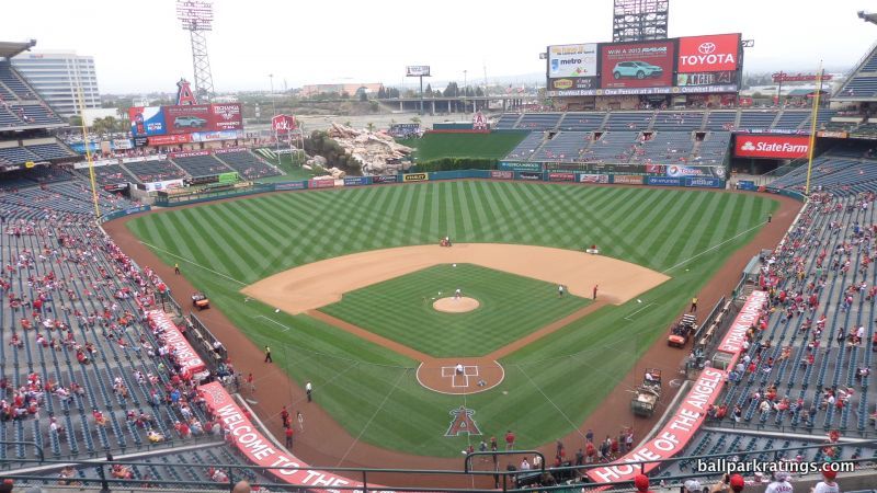
____Opening in 1966 as a facility primarily used for baseball (but expanded to accommodate football during the 80s), Angel Stadium was one of the few relics of the mid-20th century to be renovated instead of replaced during the post-1990 ballpark-building boom. While that deserves credit in terms of fiscal responsibility, two not-so-positive things are clear about Angel Stadium today:
________a) While initially hailed as a success, the full-scale 1997-1998 renovations, which “Disneyfied” the ballpark through an attention-grabbing water feature (the geyser rock pile) and a striking grand entrance, didn’t go far enough. And other than one gimmick, the interior design lacks focus and a unifying aesthetic. The ballpark’s functionality is still littered with underlying design flaws as well. The Angels marketed their park as new upon its “grand reopening” in 1998, but it wasn’t. The park simply doesn’t compare well to those in the post-1990 era.
________b) In now rather stark contrast to other 1990s ballparks, Angel Stadium hasn’t been as properly maintained and enhanced since 1998, translating to poor amenities by today’s standards.
Angel Stadium provides a great perspective for every other facility in baseball. Looking at the “rating,” it clearly, and naturally, stratifies the space between the 23 other passable, good, or great post-1990 ballparks (new or renovated) and the three inadequate older stadiums.
____While its proximity to Disneyland and some chain restaurants gives it a slight boost, the Angels’ ballpark setting is poor, about as suburban as it gets. You feel the sprawl here.
Upon reopening, the architects and team officials admitted the ballpark was something of a pastiche, infused with just a touch of original Californian whim: take the terraced bullpens from Baltimore, the dugout suites from Cleveland, the outfield kids’ area from Atlanta, the open left field concourse from Colorado, and add the outfield geysers with the rock pile, and you get Angel Stadium.
Not only does this fail to cobble together any sort of unifying design vision, but there are too many remnants of the old 1980s football version inside and out.
In terms of exterior architecture, while these other new parks got tasteful retro treatment, Angel Stadium got paint on concrete. The exterior design is still flanked by exposed ramps, while the grand entrance is more of a touched-up version of the old facade than a new one. Looking at the before and after photos of the outside, you realize it’s just a very well done paint job, with the addition of those goofy oversized hats and bats.
Surveying the interior aesthetics, you can still see the shell of the multi-purpose grandstand. While the upper decks were leveled in left field, the old mezzanine was kept in center and right, just with a new scoreboard on top. Click here, here, and here to see how much of the physical plant they retained. The Angels should have leveled the football stands in right field. Overall, the interior aesthetics are characterized by tired, disconnected outfield stands with a poorly integrated rock pile geyser. Perhaps they should have completely started over in the outfield in order to craft a truly original design, unencumbered by preexisting functionality.
____While the terrace concourse features open views of the field, much of that preexisting functionality is not up to snuff with the post-1990 ballparks, particularly the sightlines that have plenty of awkward viewing angles and overhang obstructions. Except for the attractive courtyard plazas flanking the field level concourse, the concourses are generally too narrow as well.
The amenities are consistently below average, from concessions and bars to premium clubs and social spaces. The Angels have neglected to undertake the proper capital investments to maintain a good ballpark (although, at least we finally got big new videoboards in 2018).
Tens of millions of dollars have been spent beautifying the concourses, upgrading concessions, and adding new bars, restaurants, and social spaces to 1990s parks like Guaranteed Rate Field (Chicago), Camden Yards (Baltimore), Progressive Field (Cleveland), Globe Life Park (Texas), Coors Field (Colorado), and T-Mobile Park (Seattle). We see very little of that at Angel Stadium. Beyond failing to upgrade their park, Angel Stadium’s most prominent deficit here has been the relative lack of team or baseball historical references incorporated into the ballpark.
____There’s nothing actively bad enough about Angel Stadium to put it in the inadequate tier, but the effect is cumulative, because the park is below average in every category except fan support.
We’ve been spoiled in the last 25 years by gorgeous ballparks with exteriors of ochre sandstone imported from India, interiors with water views, and concourses with top-shelf local restaurants, brewpubs, cigar bars, premium lounges, museums, and even nightclubs, all of which overshadow the fact that Angel Stadium is a perfectly adequate place to see a ballgame.
It just doesn’t compare well to any of the post-1990 ballparks.
The Passable Ballparks:
These are the three post-1990 “modern-day” ballparks still in use that I see clearly lagging behind the others. However, they are still respectable ballpark experiences. I do not wish to trash these ballparks. They are above the “take it or leave it” status of Angel Stadium. For fiscal prudence if nothing else, I do not believe these ballparks should be replaced. They should be maintained and enhanced well into the 21st century.
23) Chase Field (1998), Arizona Diamondbacks: 72
Consensus Ranking: Bottom-5
— Games Attended: 3, plus 1 tour
____Chase Field hasn’t received much attention from ballpark enthusiasts, and when it does, the reaction is rarely positive. For something as tribal as a baseball team’s home, there’s a pretty wide consensus here, as Chase Field is routinely placed in the bottom-5 of Major League Baseball.
I always enjoy my outings at Chase Field, but I think that’s correct. Not to say that Chase doesn’t have plenty of nice features, as we are now into the tiers of perfectly respectable ballparks. It should not be compared to the likes of Tropicana Field and the Oakland Coliseum.
____Situated on the outskirts of downtown Phoenix, Chase Field possesses a decent location overall, but it has a subpar local bar and restaurant scene for a setting in a major city center (Phoenix doesn’t have a great downtown for a big city, so not too surprising). Regardless, an urban setting downtown is still a plus in my book. Better a mediocre downtown than a parking lot in suburbia.
Chase Field is probably the least architecturally inclined/aesthetically attractive of the “modern-day” post-1990 ballparks. I’ve criticized Chase Field for its clashing architecture, typifying an era where inevitably modern retractable roofed ballparks also tried to be retro. You can’t do both.
Looking at the outside, the red brick and green steel are meant to evoke the classic ballparks. The yellow sandstone represents the Phoenix southwest regional character. The geometric glass windows and sharp, clean lines look pragmatically modern. It all adds up to one of the most schizophrenic exteriors in baseball. Not only does the exterior fail conceptually, but it’s a rather brute, rudimentary structure, lacking the nuances of other facades. It’s not downright ugly like a Tropicana Field, but it’s probably the worst façade of the retro parks.
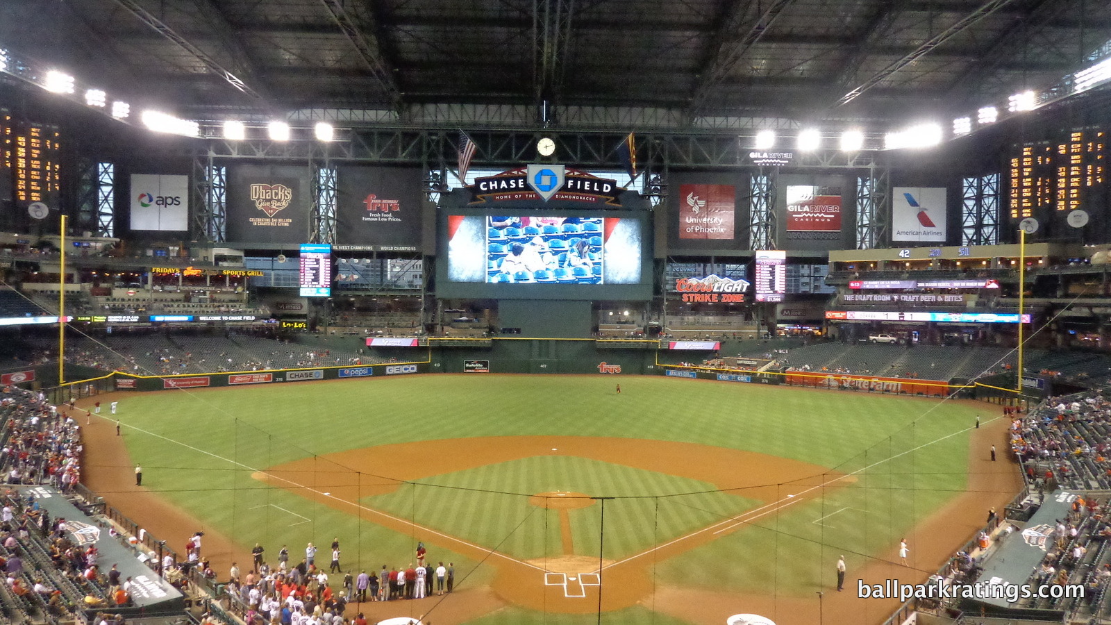
The interior aesthetics are also among the worst of the post-1990 ballparks. People have likened watching a game in Chase Field to watching a game in a giant gym. While panels in the outfield fold open, the roof opens like that of an airplane hangar. Even when the roof is open, you feel like you are watching a game in an enclosed environment. When closed, almost no natural light is emitted into the building. The pool is a total gimmick, by the way.
Further underscoring a lack of emphasis on aesthetics, Chase Field replaced its natural grass surface with artificial turf in 2019. True, this isn’t your father’s ugly carpet surface, but this is a step in the wrong direction.
____Form follows function at Chase Field, and Chase Field is indeed functional. This certainly separates it from the lesser parks above.
Chase Field benefits from a functionally sound concourse system, with 360-degree field visibility throughout the lower bowl. Articulated by murals outlining Arizona’s most beautiful landmarks, the inside of Chase Field’s rotunda is its aesthetic strongpoint.
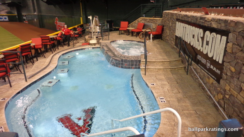
Arizona was one of the first parks to aggressively orient the seats down the lines toward home plate. Most parks since 1995 orient the seats toward the infield to some degree, but here, every single seat, even those at the ends of the dugout, is angled toward home plate. This can lead to some awkward foot room, but it’s definitely ideal for sightlines and particularly seating geometry. The ballpark also features above-average field proximity, without the presence of an extra suite level between the club level and the upper deck.
Overall, Chase Field features some of the best sightlines among post-1990 ballparks.
____With a ballpark that is obviously punting on architecture and aesthetics, but is generally strong from a functional point of view, Chase Field’s biggest missed opportunity is in the amenities category. Like Angel Stadium, Chase Field has not received proper capital investments, a fact the Diamondbacks have been keen to point out.
With a ballpark of this size, Chase Field could do pretty much anything. It’s not necessarily going to be attractive, but the possibilities for amenities are endless. Instead, we have mall-like concessions, a lack of local food options, a poor craft beer selection, few social spaces, two outfield restaurants that look like they haven’t been touched since the ballpark opened, a worn club level, a tired series of “premium” bars at field level, and few Diamondback historical references.
The Diamondbacks have been roundly criticized for demanding a new ballpark due to the county’s failure to upkeep Chase Field, but the inconvenient truth is that the Diamondbacks are right in some sense. No, I’m not advocating for a new ballpark, which isn’t likely to be any more attractive than Chase Field, but regardless of who should pay the bill, Chase Field has not received the extensive enhancements of other 1990s ballparks.
N/A: Turner Field (1997, closed 2016), Atlanta Braves: 73.5
Consensus Ranking: Bottom-10
— Games Attended: 30+
Turner Field closed after the 2016 season, so it no longer qualifies for this list. I thought I’d put this in here just to illustrate that even if Turner Field was among the weakest links of its era, it shouldn’t have been replaced. The rating is reflective of its status in its last year, as it was 77 earlier in the decade. Turner Field was always in the tier of “passable” ballparks in my book.
22) Miller Park (2001), Milwaukee Brewers: 74
Consensus Ranking: Lower-Middle Tier to Bottom-10, High Variability
— Games Attended: 2, plus 1 tour
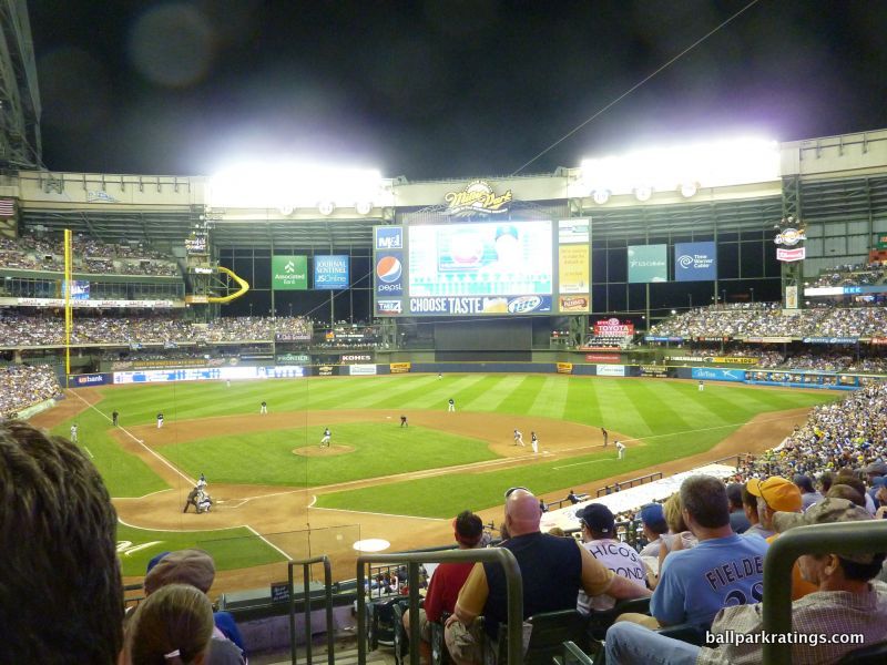
____While my assessment of Miller Park isn’t likely to cause controversy among those who have actually been to all 30 stadiums, this might be the most controversial placement on my entire list from the viewpoint of a ballpark’s home fans. If you took a poll, Miller Park has among the highest satisfaction rate among local fans, right up there with parks in Baltimore, San Francisco, and Pittsburgh. I have never seen a fan base so vigorously defend their ballpark.
Unfortunately, we’re comparing ballparks, and I just don’t see how Miller Park compares well.
____Like I said in the lengthy preamble, I see ballparks as a product of their surroundings in many ways, so it’s not surprising that most of the lower scoring ballparks are in non-urban locations with lifeless local scenes. Engulfed by a sea of parking lots 5 miles from downtown, Miller Park is no exception. Miller’s setting is a slight step up due to the fantastic tailgating scene, but that doesn’t match the vibe of even a mediocre downtown location, in my opinion.
Retro doesn’t work in an isolated parking lot separated from the city center, and Miller Park is certainly no exception here, either. In what may be the most controversial exterior design in baseball, the sprawling roof sticks out like a sore thumb in an otherwise nondescript landscape, in what some say resembles a tarantula. I actually think there’s a certain structural elegance to it, but an Ebbets Field-inspired red brick façade is extremely out of place here. Not only does it not fit in a parking lot, but Milwaukee is known as the “Cream City” for its light-colored clay brick derived from the local area. Retro was a poor design choice for this setting and this city.
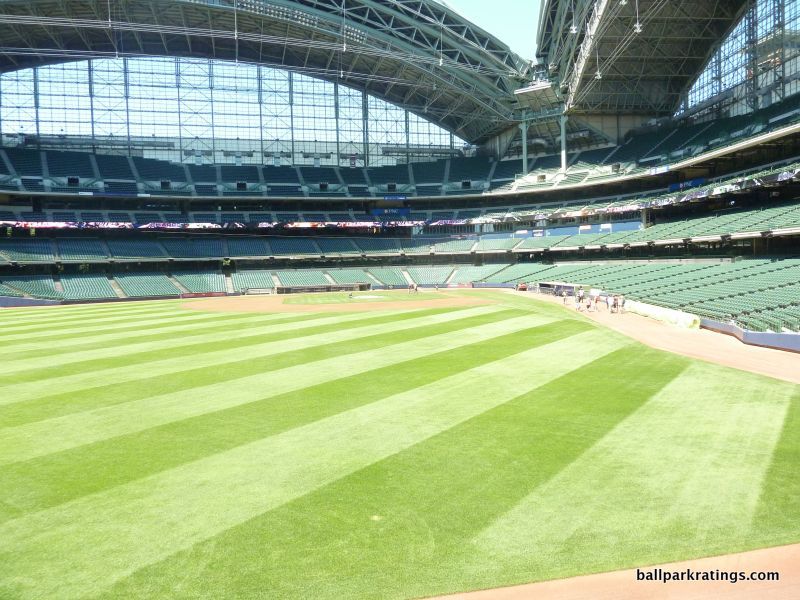
The interior is certainly worse. Again, there is some structural novelty in the towering fan-shaped roof, but it doesn’t make for a good ballpark, in what is the most intrusive retractable roof in baseball. The set-up truly resembles a temporary diamond in a stadium, as the outfield unit lacks any sort of spatial reasoning, appearing haphazardly constructed and disconnected from the main cross-section behind the infield. There is some inherent tension between Miller’s cone-shaped structural design, which facilitates the fan-shaped retractable roof, and the need for an outfield for baseball. This isn’t conducive to Miller’s quirky retro dimensions.
While natural light adroitly penetrates the interior through the glass around the infield, you feel like you are watching indoor baseball even when the roof is open. Miller Park still feels like a traditional dome that just opens at the top.
When the roof is closed, the outfield panels aren’t totally transparent, so they don’t emit much natural light unlike Minute Maid Park in Houston.
Miller Park’s interior aesthetics in the outfield are more similar to Chase Field than fans would like to admit. The park particularly lacks intimacy, and it feels way bigger than its seating capacity (41,900), which is never a good sign. Space isn’t used effectively.
____Miller Park has some relatively serious functional issues (along with some minor ones). Even for a post-1990 ballpark, the upper decks are pushed back way too far, as Miller Park doesn’t make good use of cantilevers. The seating geometry down the lines is below average, particularly in the right field upper deck. Miller Park has plenty of space and mostly open concourses, but the main concourse is difficult to navigate, filled with confusing diversions and horizontal discontinuities. The dead, narrow space beyond center field on the main concourse is unacceptable. Also note the large swaths of oddly dead space in the outfield corners. The upper deck seats lack cup holders, which is also unusual and unacceptable for a post-1990 ballpark.
___The Brewers’ ballpark has some decent amenities, but they don’t come close to compensating for everything outlined above, and none of the features are especially notable. Plenty of good (and some bad), but nothing great or outstanding. 2017 renovations to the concessions and the concourses are one of the highlights, highlighted by some of baseball’s best draft beer selections.
One thing that I don’t like: Miller Park put the Brewers’ historical memorabilia (“Walls of Honor,” “Autograph Alley”) in obscure corners of the ballpark, but put the kids’ playgrounds in the most conspicuous places possible, right in the middle of the concourses. Better ballparks do this backward, putting over-the-top kids’ amenities off the concourse so you don’t encounter them if you don’t want to, while visibly showcasing historical references on the concourses (see Detroit’s Ferris wheel/Carousel and “Decade Bats” memorabilia). I think that set-up is far more pleasing for everyone. Kids areas and other frivolous entertainment features are all over MLB parks, but you don’t want them to be so intrusive that they’re unavoidable like at Miller Park. I reward such features, but I would totally understand a traditionalist’s gripes here.
The facility’s strong point is that it really possesses a Milwaukee flare, seen by the local food, the vibrant atmosphere, and the Sausage Race. Miller Park is also one of those places that excels in many random things that can’t be precisely quantified by traditional categories, so I give it a lot of bonus points. That also stems from a subjective impulse to boost its score (like, come on, it’s not worse than Chase Field! Right?).
____In sum, Miller Park scores toward the bottom of post-1990 ballparks due to its inferior aesthetics, non-urban location, and various objective flaws, but it manages to represent the region and bring some interesting structural novelty to the table.
Milwaukee’s ballpark shows how a fan base drives a venue’s reputation, because Miller Park’s reputation should be even worse than it is, honestly. But that may not really matter. Local fans are the ones attending games at these venues, and if Brewer fans like Miller Park, it will have staying power for years to come. My take may be meaningless to generations of Brewer fans who love Miller Park, although I would encourage them to see what they’re missing some time.
21) Guaranteed Rate Field (1991), Chicago White Sox: 75
Consensus Ranking: Bottom-10
— Games Attended: 4
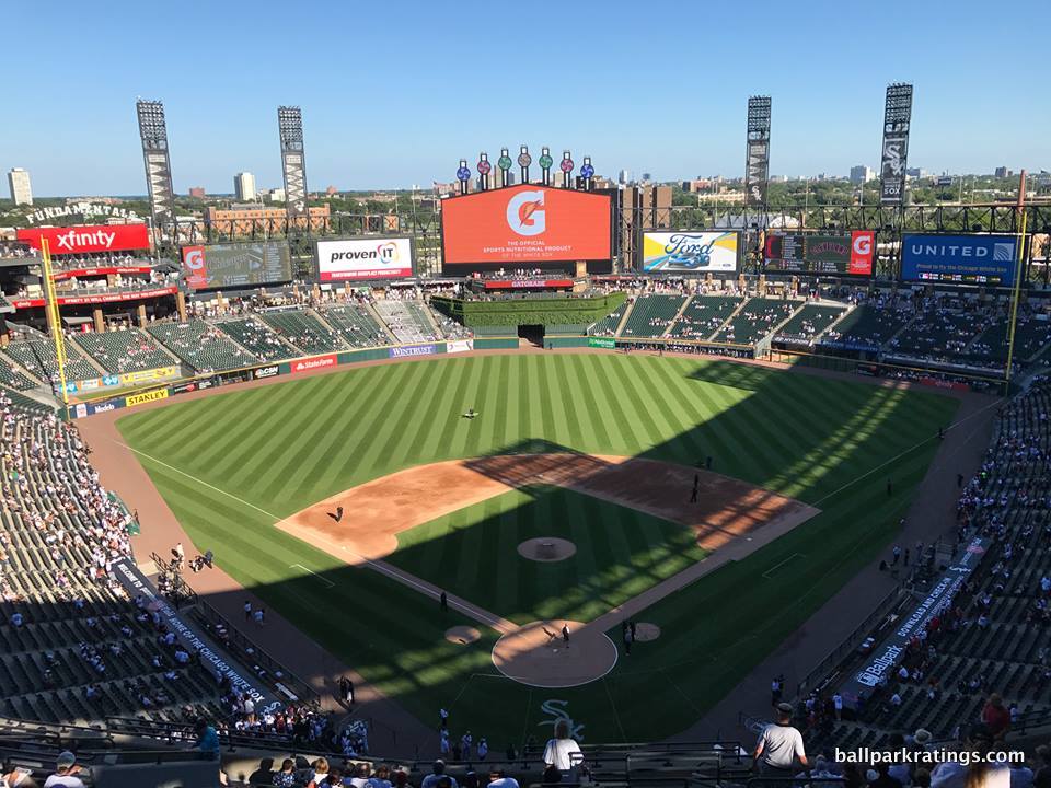
____Just barely missing the retro trend ushered in by Camden Yards (1992), people love to rip on the White Sox park (1991). In fact, when you look at assessments by national baseball writers and ordinary fans, you find Guaranteed Rate Field (née U.S. Cellular Field, new Comiskey Park) near the very bottom, right there with the worst that started my list above. Ballpark aficionados are usually a bit more discerning, but they usually place it in the bottom-10.
With so many respectable places to see a game, bottom-10 is about right, even granting that the park has gotten so much better after 20 years of periodic renovations. But I will emphasize that this is one of two ballparks on the list (we’ll get to the other) where my totally subjective “gut” feeling about the place doesn’t perfectly align with the actual ratings and ranking. Personally, I love going to Guaranteed Rate Field, and I think it is underrated.
After navigating through 25 years of retro parks that are often “busy”, overly thematic, gimmicky, or simply too grandiose and complicated, there is something welcoming about the simplicity of the White Sox home. Everything about it, from the seating levels to the concourse systems, is simple and straightforward.
____On the outside and the inside, little about Guaranteed Rate Field makes any pretense of being aesthetically attractive, placing it below the vast majority of parks in that category if you are being fair. But there is a certain coherence and simplicity about its interior lines that just rubs me the right way.
Forget contrived quirks; the outfield aesthetics are attractively symmetrical: everything is understated, while the more whimsical elements like the “exploding scoreboard” and the ivy batters’ eye add an appropriate amount of kitsch and flare to a very minimalist structure. In addition, the new color scheme of dark greens and black steel is a breath of fresh air compared to the bland 90s look.
It looks effortless, and that’s just refreshing compared to a generation of post-1990 “retro” ballparks that tried too hard.
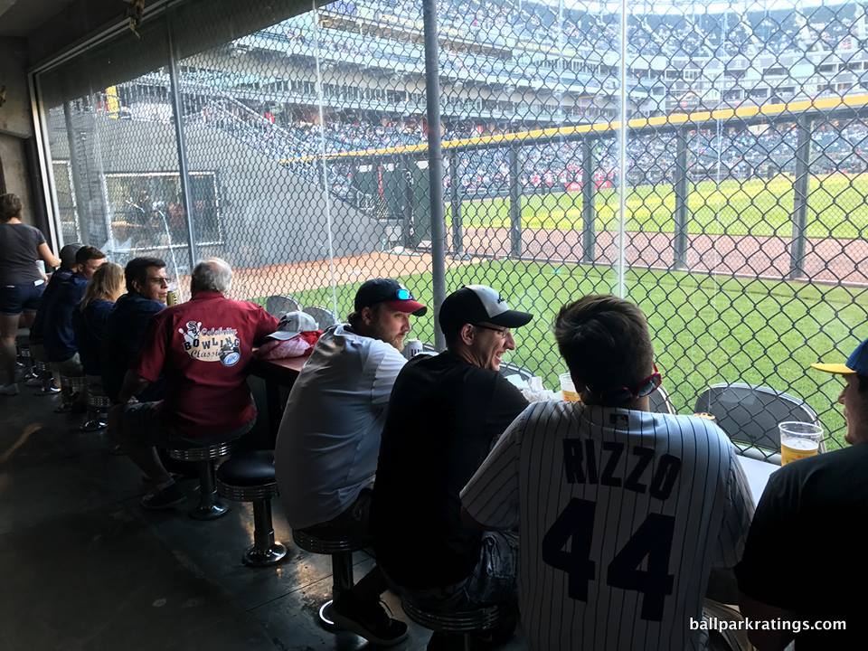
Again, if you’re being fair, the aesthetics don’t compare well to the millions of dollars pumped into the aesthetic scenes of most other parks, and this is an underlying structure with such a distinct lack of place that it could have been dropped in any city, but I’ve kind of grown to like it.
On a similar note, Guaranteed Rate Field doesn’t compare well to other newer parks in terms of setting, functionality, and amenities just objective speaking, but there are some things to like.
____Another ballpark outside of the top tier; another poor location/local scene surrounded by parking lots. This one is particularly tragic because the philosophy behind the ballpark itself neglected the surrounding neighborhood. On a functional level, the sightlines are subpar, with an upper deck pushed too far back from the action even for a post-1990 park. There are some minor seating geometry issues down the lines too.
On the plus side, Guaranteed Rate Field features an open main concourse, unlike more well-received early-mid 90s retro ballparks in Baltimore, Cleveland, and Arlington. The White Sox have also updated their videoboard.
___The park has made some strides with its amenities. If anything, this place should be elevated above the worst laggards simply for its admirable dedication to continually improving the food and beverage offerings.
Guaranteed Rate Field generally gets good reviews for its food and has some of baseball’s best craft beer. The park also provides plenty of new social spaces and restaurants. Multiple lounges and bars are littered around the main concourse. The Kraft Cave on the ground level in right field is the park’s coolest space. Inside the Cave, fans will find what is reportedly the largest beer variety in all of baseball, although Milwaukee and San Diego have more on tap. Statues of White Sox greats adorn the outfield concourse, but there aren’t too many historical references outside of that.
The premium seating checks all of the boxes and then some, but it is a tad outdated throughout. Although, I think it’s kind of neat that the White Sox kept their traditional glassed-in membership “Stadium Club” restaurant on the right field mezzanine, a concept that has fallen out of favor in the industry (think white tablecloth dining at a ballpark). This is the quintessential 90s-era premium space for well-heeled fans, and it looks like it too.
Finally, the White Sox park gets significant demerits for its unfriendly ballpark policy of not allowing fans with tickets in the upper deck (unless you have a season-ticket package) access to the lower concourse. That’s an MLB first and only (although Dodger Stadium officially claims to do the same, but it’s not enforced).
____In sum, the conventional wisdom that Guaranteed Rate Field doesn’t compare well to the vast majority of MLB ballparks withstands scrutiny, but it’s still a decent ballpark that shouldn’t be lumped with an Oakland Coliseum or a Rogers Centre, and one I personally like more than my “rating” would indicate.
The Good Ballparks:
Solid baseball experiences, but may possess fairly significant drawbacks. That said, I thoroughly enjoy going to games at all of these ballparks. Note the very large gap in ratings from above.
19t) Great American Ballpark (2003), Cincinnati Reds: 80
Consensus Ranking: Lower-Middle Tier
— Games Attended: 5
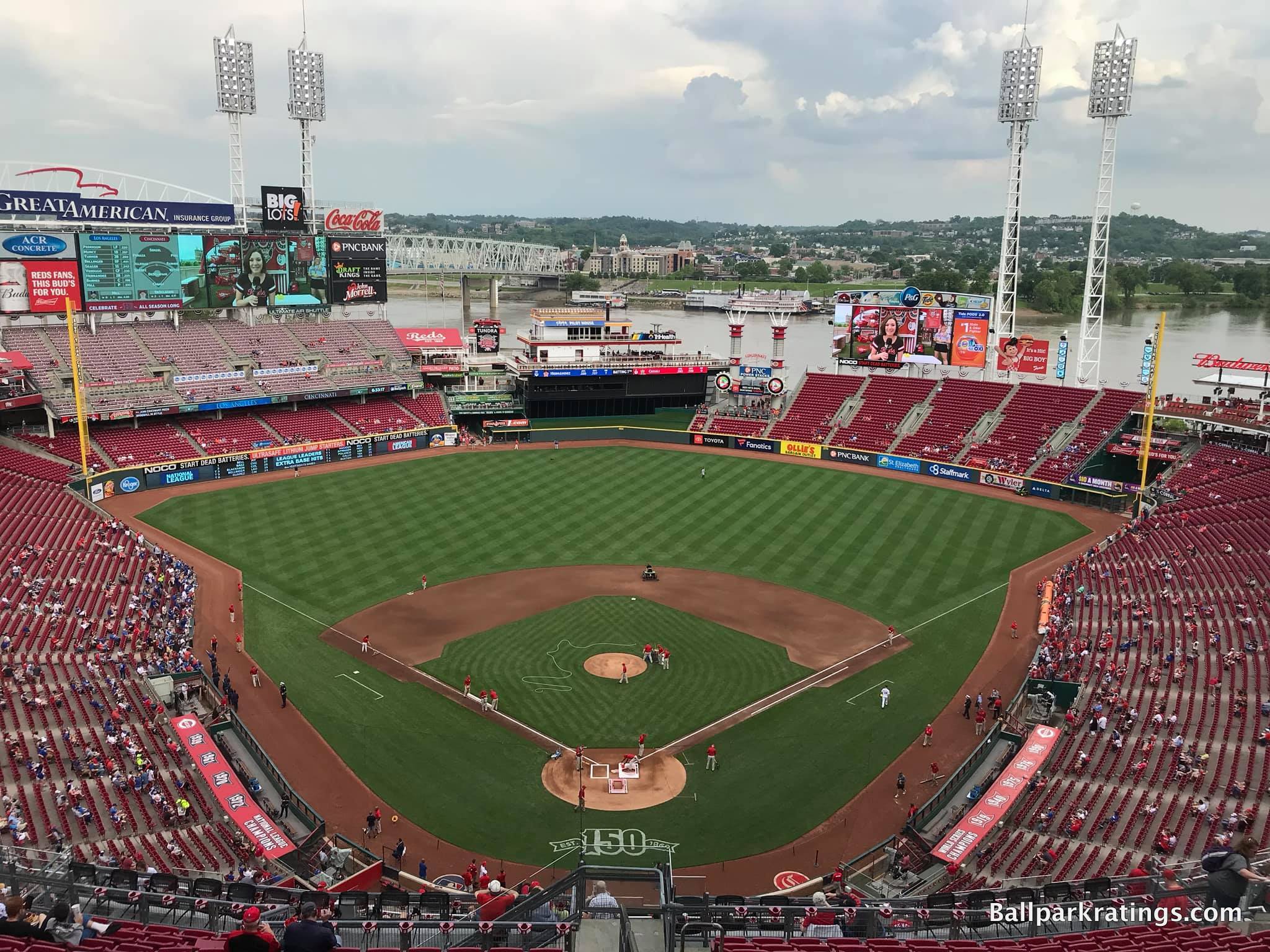
___Speaking of post-1990 parks that tried too hard, we have Great American Ballpark, which represents the single biggest ballpark missed opportunity of our generation.
Great American Ballpark has a vibrant local scene, potential for downtown skyline views, the Cincinnati riverfront, a blueprint filled with fan-friendly amenities, and generally sound functionality. And the Reds managed to screw it all up, largely because of the park’s truly abysmal interior aesthetics. Purely subjective, but I’m hardly alone.
____There’s a perception that GABP was built on the cheap, but that really wasn’t the issue. For downtown, riverfront ballparks, everything PNC Park in Pittsburgh ($215 million) did right, Great American Ballpark ($290 million) did wrong.
Where PNC Park integrates its setting into the lower bowl, GABP’s riverfront views are blocked by oversized seating and clumsy signage. Where PNC succeeds in the most complicated aspects of urban design, you don’t get any sense of place at GABP. Where PNC has clean interior lines, GABP has the ugliest gimmicks in baseball. This is related to the lack of sense of place at GABP, because it’s those very gimmicks that block out views of the riverfront.
Where PNC cultivates contextual space, GABP clutters neutral space with distractions and diversions. Where PNC is authentic, GABP feels contrived. The angles in Pittsburgh relate to the riverside, but the ethos in Cincinnati is totally separated from its context. Where Pittsburgh is confident in its simplicity, Cincinnati is busy. Where PNC has consistency, GABP is disjointed and fragmented, attempting to add too many elements. “The Gap” is well-intentioned, but silly. Where PNC has a nautical and pastoral color scheme, GABP has magenta.
For such a wonderful setting, this is a ballpark with no continuity or order whatsoever, lacking a consistent design vision where the design vision should be obvious: integrate the riverfront scene and/or the urban context into the ballpark. They failed on both accounts.
There is so much junk here without any attention to that. The kitschy stuff distracts from the original concept.
Can you imagine a fake riverboat or gimmicky smokestacks in Pittsburgh and San Francisco? Can you imagine those parks installing an extra videoboard blocking the water views in right field?
It’s all just awful, in what is perhaps the worst interior aesthetic design for a post-1990 non-retractable roof park in baseball. Even some of the uglier parks are at least simple. It doesn’t just compare poorly to the nation’s best waterfront parks (i.e. Pittsburgh/San Francisco). It compares poorly overall.
Take out all of the visual garbage, namely the charred black batters’ eye box, the set of Lego smoke stacks, the fake, plastic riverboat, and the extra videoboard above the right field seating, in order to simply let the setting take over, and we’d be in business. GABP is never going to have the captivating views of the best parks, but it could be much better.
What is sad, where Great American Ballpark tried to improve, it only compounded the park’s aesthetic chaos: the fake riverboat and the extra videoboard were added after the ballpark opened.
The exterior architecture is rather haphazard yet aggressive, lacking consistency in proportion and use of materials. Like with the inside, the architects tried to please too many people at once. The inner facade embraces an industrial theme with exposed glass and white steel echoing Ohio, while the “outbuildings” utilize an interesting mix of Midwestern Art Deco and International Style. There are some nice features, but it simply doesn’t form a cohesive picture.
___Luckily, architecture and aesthetics aren’t everything! And totally subjective!
Many of my aesthetic criticisms have been echoed by others, but that shouldn’t constitute the totality of the analysis, in my opinion. Independent of that, Great American Ballpark is actually quite underrated. If I made a ranking of parks only based on “fan experience,” separate from the aesthetics of the structure, Cincinnati’s park generally gets high marks.
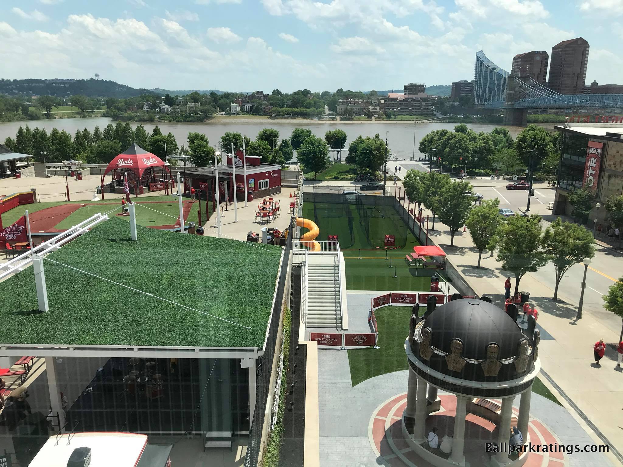
For one, Great American Ballpark’s downtown setting and local scene get better and better every year. Plenty of vibrant bars and restaurants right next door, and this increasingly excellent local scene is key to GABP’s appeal given some of the aesthetic problems within its confines.
Beyond the architecture/aesthetics and features outside of its confines, Great American Ballpark is pretty solid across the board, including an outstanding feature or two.
____Although, if I had to pinpoint the other overarching flaw, independent of our misgivings regarding the aesthetics, it’s that Great American Ballpark is such a complicated structure from a functional point of view. Exploring the concourses here is like walking the Mall of America, with a twist and turn at every corner. So many horizontal and vertical discontinuities. Levels within levels, on every level!
Regardless of its confusion, the main concourse in Cincinnati is mostly wide and open to the field. The upper deck is a bit higher than usual (but that’s par for the course at our post-1990 ballparks, even if it’s a bit worse here), but the seating geometry is superb.
Natural given its “split personality,” Great American Ballpark utilizes a curvilinear grandstand design down the right field line, and a more traditional one down the left field line. Down the left field line, all seats are aggressively oriented toward the action, something that earlier ballparks (see Cleveland and Baltimore) somehow didn’t get right. Regardless of the fading color, the seats at Great American Ballpark are fine from a functional point of view. The video systems are also solid.
___Other than the poor food selection, the ballpark’s amenities range from above average to outstanding.
Throughout the 2010s, ballpark food has undergone a quantum leap in improvement, but I am consistently disappointed in the quality and variety of the regular concessions at Great American Ballpark. Mostly just the standard stuff at the accessible stands. However, Great American Ballpark does do a fantastic job in bringing a taste of Cincinnati to the ballpark, highlighted by the Skyline Chili, a quintessential ballpark “signature food” item. The craft beer selection is also terrific.
Other than the pedestrian concession stand food, everything is solid across the board. Great American Ballpark doesn’t reach the level of a Comerica Park (Detroit) or Coors Field (Denver) in accessible restaurants, bars, social spaces, and sitting areas, but it excels to a respectable degree in this category.
Located in the left-field corner on the mezzanine, the Machine Room Grille is perhaps Great American Ballpark’s signature restaurant and bar. Dedicated to the Big Red Machine of the 1970s, the space has a blue-collar feel, much like the Reds team of the era. Brick and steel finishes, with an exposed ceiling, set the tone.
Plenty of sitting areas and destination bars are littered throughout the main concourse, most notably in the Kroger Fan Zone. A new bar was added in the upper deck left field corner in the late 2010s. Especially impressive for such a small market, Great American Ballpark has plenty of decent (or unique) premium seating options as well.
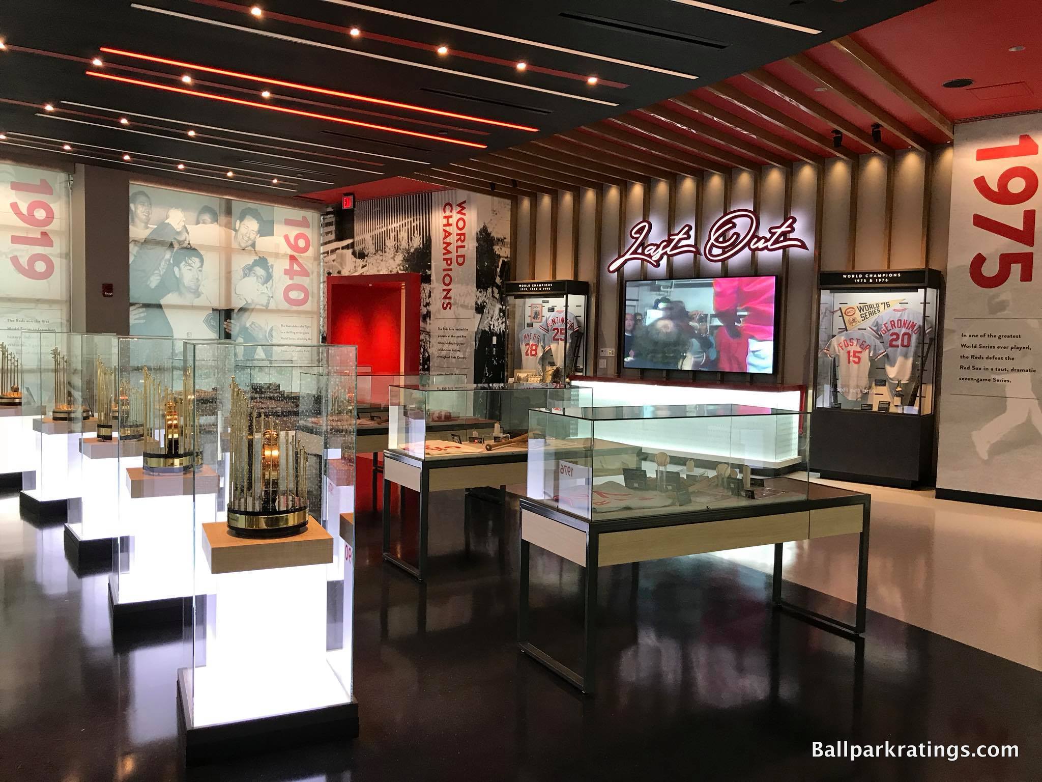
Great American Ballpark’s strongest suit is its kids’ entertainment features and historical references. The latter of which is most notably displayed in the newly renovated Reds Museum and Hall of Fame.
Celebrating inspiring and compelling characters, amazing athletic achievements, pennant wins, and world championships, this Hall of Fame is the best of its kind at an MLB ballpark. While I prefer team history more explicitly integrated into the ballpark footprint, the multi-level complex connected to the home plate facade is the best museum at a major league ballpark. The statues outside the ballpark’s main entrance are great as well.
Located off the main concourse behind first base, the Kroger Fan Zone is one of the best entertainment areas in baseball. Featuring a festive pre-game atmosphere with plenty of elaborate but tasteful kids’ activities, this is a great place to hang out for regular folks and younger fans alike. Numerous sitting areas, a destination bar, a whiffle ball field, a playground, a multi-level slide, carnival games, and a concert stage highlight the Fan Zone.
Anyway, I thought I owed it to readers to be more exhaustive than usual (at least for a ballpark this early on the list) about the good parts of GABP, because my aesthetic criticisms are especially stinging, and it cannot be reiterated enough that there’s more good than bad here all things considered.
____In the end though, my misgivings about the interior aesthetics are strong enough to put Great American Ballpark decidedly in the bottom half of our ballpark rankings. Given how solid the amenities are, Great American Ballpark is a huge disappointment in my book. The fix isn’t easy, but it’s doable: completely overhaul the busy, inconsistent, disorienting interior aesthetic scene, particularly in the outfield.
19t) Globe Life Park (1994), Texas Rangers: 80
Consensus Ranking: Bottom-10
— Games Attended: 10, plus 1 tour
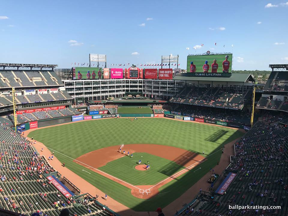
____When Globe Life Park in Arlington is replaced in 2020, it will hold the distinction of being the first MLB park in modern history whose successor will be far less aesthetically attractive.
The Ballpark in Arlington, as it was originally known, is the prototypical “faux retro” ballpark. Where design quirks and asymmetrical dimensions at Camden Yards (1992) and Progressive Field (1994) are a function of the site, all of the quirks, nooks, and crannies at The Ballpark in Arlington (1994) are synthetic, derived from the whims of the P.R department. Placed in suburbia, the retro architecture and old-fashion features are not crafted around an urban or neighborhood context. There is no escaping the stage-set sensibility of this place, in what has always had a “retro theme park on an island” feel. This is probably the primary reason The Ballpark in Arlington was not as well-received as its 90s contemporaries.
All of that being said, The Ballpark in Arlington is the one faux red brick retro ballpark where I grant a lot of leniency, because I honestly find it so damn attractive.
____Despite being out of place, The Ballpark in Arlington’s exterior architecture possesses both a certain boldness and attention to detail lacking in other soulless red brick retro exterior designs. Most notably, a host of local imagery further punctuates the exterior. The cattle heads, lone stars, and historic Texas bas-reliefs, depicting stories of the oil boom, the Alamo, and the cattle industries, are the perfect final accentuations to an already epic structure. This is one of the best exteriors in baseball.
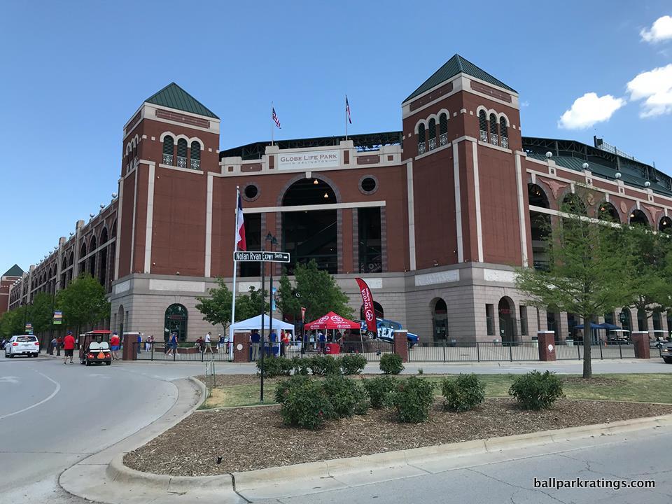
Calling the interior aesthetics attractive may be more controversial, but I love them too. While The Ballpark in Arlington may be contrived, it’s not gimmicky, instead exuding a design that is simultaneously understated, coherent, and ambitious. Since there is no backdrop beyond center field, I have no problem with enclosing it if it’s part of an aesthetic purpose (unlike Citi Field). Reminiscent of the Cajun architecture on Bourbon Street in New Orleans, or perhaps an old Texas mansion, the white steel structure creates a lovely faux urban environment.
In a nod to Tiger Stadium, I think that the overhang in right field accentuates the Cajun “balcony” vibe seen by the white office building. The interior aesthetics have always had a grand simplicity that is quite appealing. It’s big and bold, but somehow intimate, because the Rangers didn’t overdo it. The ballpark has a coherent theme that is certainly confident in its architectural lines. It’s not “busy,” like some of the less attractive interiors in baseball.
____However, when looking at only “objective” categories, you can see how Globe Life Park would rank near the bottom. It’s kind of the opposite of the park above and below on this list, as I love the architecture and aesthetics but the everything else is subpar.
In contrast to nearly every MLB facility, the upper level is not cantilevered, at all. I don’t know if Globe Life Park has the highest upper deck, but the upper deck is the furthest back in Major League Baseball. Like most other early-mid 90s “retro” parks, Globe Life Park’s concourses do not have a view of the field (i.e. not “open”). Like its contemporaries, Globe Life Park is not an especially functional place.
On the amenities side, Globe Life Park doesn’t excel in any particular aspect. Along with its comparatively pedestrian food/drink selection, Globe Life Park lacks the regionally inspired, locally-run food options of most other parks. I know some readers may not care about this, but Globe Life Park’s premium seating is near the bottom of baseball. The non-climate controlled Lexus Club level is particularly pathetic, perhaps the weakest club level in baseball (in the one place where you needed a climate-controlled mezzanine concourse!).
The primary reason for the Rangers’ departure from Globe Life Park is their desire for a retractable roof, but even for an open-air park, Globe Life Park is poorly suited for the Texas heat.
After it replaced the marvelous Legends of the Game Museum in the late 00’s, the Rangers Hall of Fame has always been a disappointment. It has now been converted into a preview center for the new Globe Life Field. Globe Life Park also lacks the social spaces of other post-1990 ballparks.
____Overall, Globe Life Park has the enduring qualities of a timeless ballpark, but it is more defined by its heat, poor setting, substandard amenities, and functional problems. That being said, it’s madness that Globe Life Park is being replaced. It grades above a number of other post-1990 ballparks that will be around for a long time.
The new Arlington ballpark will offer the first genuine discussion in our lifetime of whether a predecessor ballpark was “better” than its successor (Chicago and Detroit classic and new ballparks were different animals, and not even comparable to each other, much less to this situation). New Globe Life Field will offer far better amenities, not to mention a climate-controlled viewing environment in Texas, but I predict even the vast majority of Ranger fans will admit the old place was more beautiful than the new one.
18) Citi Field (2009), New York Mets: 80.5
Consensus Ranking: Middle of the Pack to Lower-Middle Tier, High Variability
— Games Attended: 2
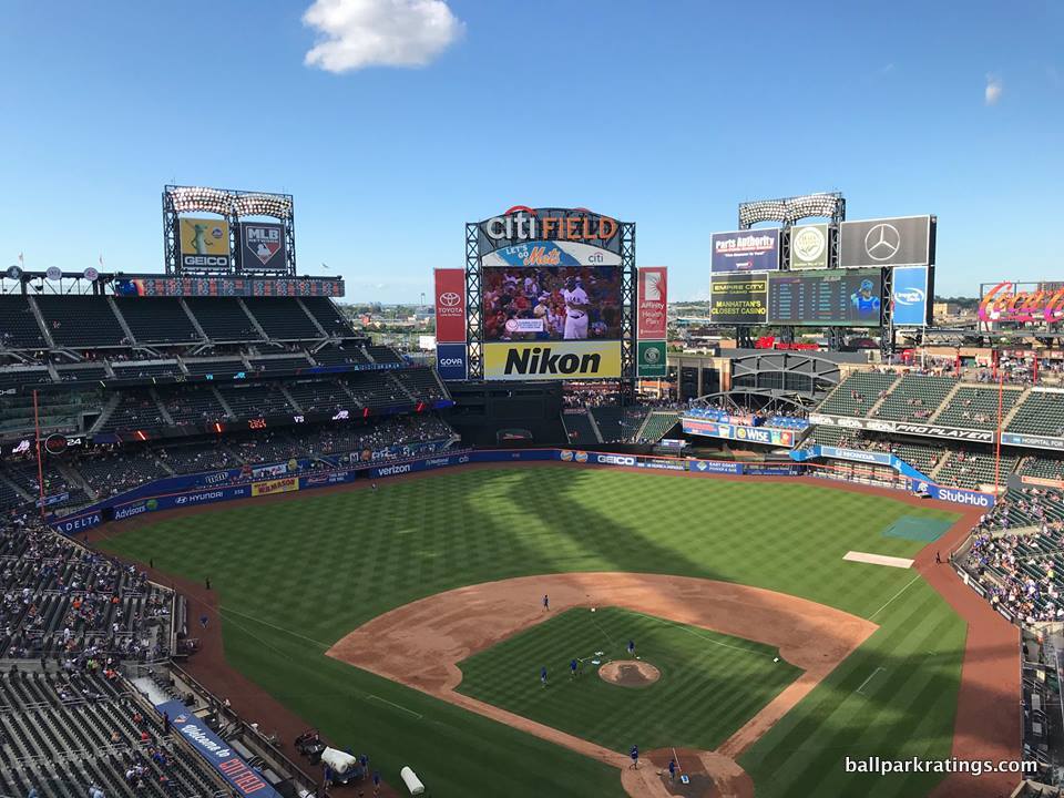
____Somewhat like the park of their crosstown rival, Citi Field is quite polarizing among ballpark trekkers. Most everyone agrees that Citi Field is a major upgrade over Shea Stadium, but many view it as heavy-handed mimicry of an authentically classic park that has no relation to the team, while a few others see Citi as the model “retro” ballpark.
While Citi Field is a fan-friendly place replete with modern amenities, put me in the camp that tends to view the Mets’ park more negatively.
The contrived “faux-retro in a parking lot aesthetic” rarely works in the first place (except above, honestly). Why build a faux-urban ballpark longing for an urban setting? But it was especially conditioned not to work here, given 1) the redundancy of the design (one that had already been emulated by a dozen clubs), 2) the lack of connection to the team, and 3) a self-contained location in a Queens parking lot that is even worse than that of your run-of-the-mill suburban retro cookie-cutter.
How can you explain this design choice? Citi Field always struck me as a ballpark conceived in 1999 that opened in 2009. And if you look at the ballpark’s history, there’s a lot of truth to this. The conception of a new Mets’ stadium dates back to the 90s, when retro was in full swing. Fred Wilpon was always obsessed with building an Ebbets Field facsimile, and he was going to build it whenever and wherever he could, regardless of temporal or locational context.
But we had just seen this formula too many times by 2009. The red brick; the wrought iron; the Kelly-green seats; the Ebbets-style Rotunda. We get it.
Whereas the Yankees frankly had an excuse not to build something original (even if they didn’t do an outstanding job in emulating Yankee Stadium I), the Mets could have constructed an innovative ballpark recalling the grand architectural traditions of one of the world’s greatest cities. Instead, they chose to build one of the most formulaic and derivative retro cookie cutters in all of baseball.
More importantly, Ebbets Field was in part so charming because it was shoehorned into a venerable neighborhood, not dropped from the sky in a Queens parking lot surrounded by ugly auto repair shops, scrap yards, and waste processing plants.
Nothing in Major League Baseball is worse than the Mets’ Willets Point, in my opinion. Setting (location/local scene) is paramount in my ratings system because it also has obvious implications for interior aesthetics, so Citi starts off on the wrong foot. And Citi Field’s local scene isn’t just subpar, but overtly awful. The design just doesn’t work with this context, even if I had nothing but positive things to say about the design.
____To that point, Citi Field’s exterior architecture is attractive, but it feels out of place. To put it in a nutshell, Citi Field’s retro architecture comes off as hackneyed and stilted, totally ignorant of its temporal or locational context, while simultaneously lacking the nuances or attention to detail of other historic or current day facades. The façade is stripped of many tasteful accents and regional flares that made the Ebbets special. Citi feels more assembly-line produced. This is a hot topic, so I encourage you to read more here if you are interested the architectural analysis.
In terms of interior aesthetics, not only is Citi Field the ye olde generic ballpark 12.0, but it is not a particularly attractive one on the inside, either. I get that the Mets are going for the enclosed, “cozy” Ebbets Field-vibe, but it just doesn’t work for me; it instead comes off as hermetic.
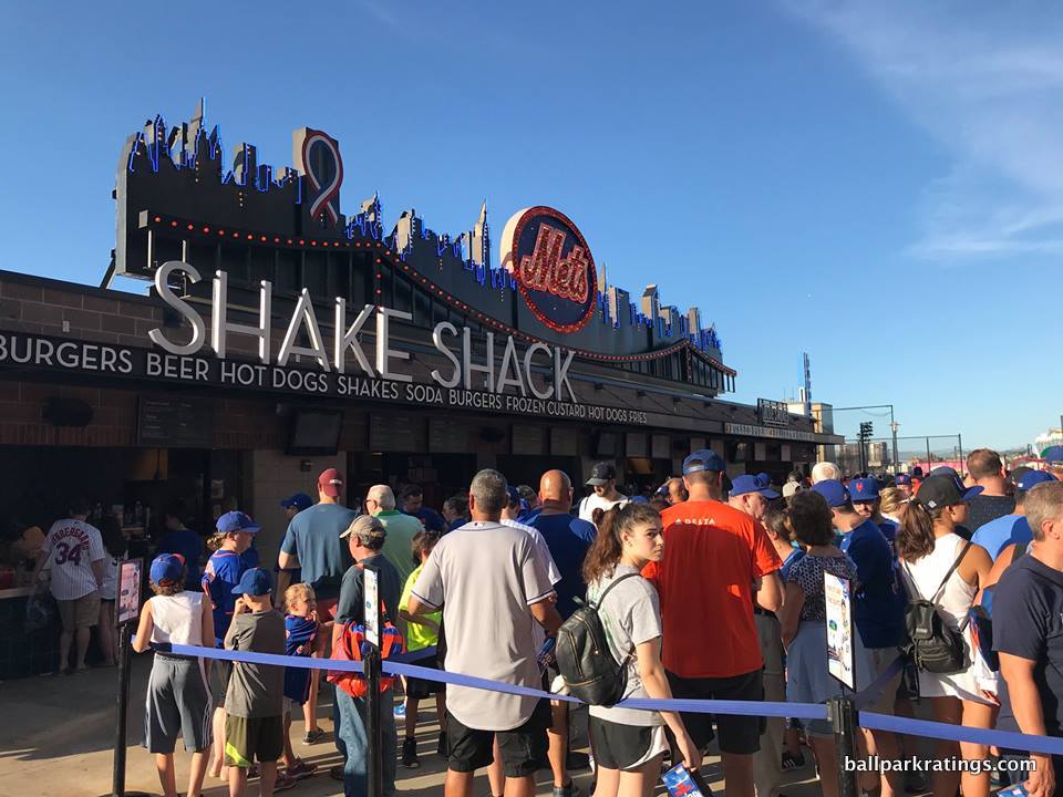
I can only think of one other open-air retro ballpark in baseball with such an enclosed outfield set-up: The Rangers’ ballpark in Arlington. While similarly contrived, those interior aesthetics are much more successful because they have a well-articulated and attractive aesthetic vision.
Where Arlington features an old-fashioned home run porch, Citi Field has the “busy” Pepsi Porch littered with ads. Where Arlington has Greene’s Hill and a brick facade, Citi Field possesses a black batters’ eye matching the aesthetic of the muffler shops outside. Where Arlington eschews more explicit gimmicks, Citi has the heavy-handed Shea Bridge just kind of thrown in the outfield scene, lacking any connection to the rest of the interior lines. Where Arlington showcases the white-steel office building as a backdrop, Citi Field has…more billboard-style ads. Are the Mets trying to emulate Times Square?
On the whole, Citi Field’s interior aesthetics are the worst of all cards: muddled, disconnected, incoherent, contrived, and gimmicky, conceding that essential contextual connection all while failing to sport any semblance of attractiveness, authenticity, or continuity. Among open-air post-1990 ballparks, it’s right there with Great American Ballpark for the worst interior aesthetics, in my opinion.
But unlike GABP in Cincinnati, Citi Field has the abysmal setting.
All of that being said, Citi Field’s “concourse aesthetics” deserve a nod because of the Jackie Robinson Rotunda. For all of my criticism of the overall concept, the inside of it is certainly beautiful. With terrazzo floors, airy archways, larger-than-life murals illustrating Robinson’s values, and other historical tributes, the inside of the rotunda is certainly Citi Field’s signature space.
____By virtue of timing and money, Citi Field barely leapfrogs a place like GABP above because it truly excels in functionality and amenities as much as any other park in Major League Baseball. Citi Field features the ubiquitous wide, open 360-degree concourses seen in most modern-day ballparks. The main concourse isn’t perfect–primarily a function of the encumbrances due to its positioning above street level–but it’s well above average. The sightlines are average, maybe a bit above average for a post-1990 park, contrary to the reaction of Mets fans in 2009.
Moving on to the amenities, Citi Field dazzles across the board.
Citi Field is perhaps best known for its outstanding variety and quality of food and beverage options, led by Danny Meyer’s Union Hospitality Group (Shake Shack!). Everything you could imagine, from special heros and dumplings to lobster and arancini, are available. All of the variety you would expect from a top-tier foodie park–BBQ, Mexican, Latin, Seafood, authentic sandwiches, Italian, Chinese, Sushi–are served here. Note: all of this fare is for sale outside of club areas, too.
Speaking of which, as expected from New York, the premium seating is nearly as over-the-top as Yankee Stadium, but with a much more fan-friendly set-up, including a “club access chart” granting club access to many more fans than usual. So many clubs. I do wish there were more social spaces open to all fans at Citi Field, but the club access chart covers a lot of folks.
The Mets have largely addressed Citi Field’s primary criticism: the lack of Mets historical references. While it’s not as strong as the display(s) at Yankee Stadium or at the parks that integrate memorabilia into the concourse system (Atlanta, Detroit), the Mets Hall of Fame and Museum is a wonderful exhibition. The obligatory caveat is there’s still not much else in the ballpark that screams “Mets baseball!” Although, the Mets have made admirable strides in correcting that in recent years. Citi Field is pretty kid-friendly, but perhaps thankfully not over the top. The center field plaza is party central for pre-game festivities.
____Anyway, Citi Field is a good ballpark, above that lower tier of post-1990 parks that are merely passable. But that is largely because of the cutting-edge amenities (which will naturally age) and decent functionality.
Redeveloping Willets Point will improve Citi Field’s score, but the pedestrian interior aesthetics are unalterable, and the patently derivative design vision never quite strikes the right tune. Even factoring in my bias against ballparks with lousy settings, Citi Field will never be one of my personal favorites.
15t) Minute Maid Park (2000), Houston Astros: 82
Consensus Ranking: Lower-Middle Tier
— Games Attended: 200+
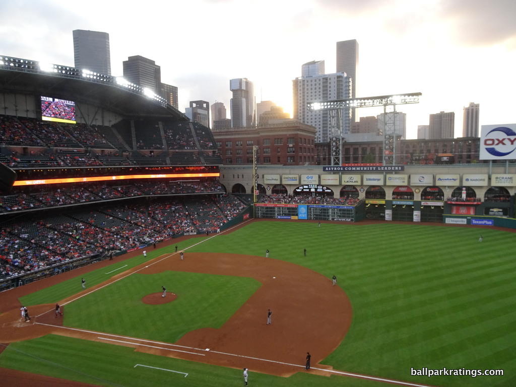
____In what used to be one of the most underrated ballparks in baseball, Minute Maid Park has fallen the farthest on my list in the last eight or so years.
This is a function of (a) the continued cluttering of the aesthetic scene above the archways, and (b) the peculiar removal of a few fan-friendly features. The latter issue was addressed this year with the addition of the fantastic Hall of Fame exhibit on the left field concourse.
I’ve traditionally felt that Minute Maid unfairly got a bad rap, because people seemed overly fixated on the park’s gimmicks, such as the train. I don’t necessarily like gimmicks or overly thematic ballparks in general, but I stress contextual appreciation of the site above all else, and MMP does it as well as any ballpark, retractable or not. Houston took one element in the downtown community, Union Station (old train station), and used it as a framework for their entire ballpark, including the roof. That’s no gimmick.
____On the outside, I love how MMP’s roof doesn’t contradict its design principles. For me, roofed ballparks in Seattle, Milwaukee, and Arizona are like state-of-the-art airplanes with brick exteriors. The clashing of retro bricks and modern roofs looks remarkably incongruent. In Houston, we have a roof that reinforces and maybe even enhances the style of the building.
It’s the only “retro” retractable-roof ballpark that successfully managed to build a “retro” roof as well, in what is constructed to resemble a giant old-fashioned train shed. MMP has one of those rare exterior designs that frankly doesn’t look that good, but it is just fantastic conceptually, so I give it a bit of a boost.
In terms of interior aesthetics, MMP used to be one of my favorites, at least when the roof is open. Subtle design cues from the general train motif are delicately interwoven throughout.
Few ballparks, retractable or not, executed a design with such depth and aesthetic vision. The park is very conceptually clever beyond the obvious. In a perfect application of context and theme to function, the sliding glass retractable roof tracks ingeniously serve as a mechanism for executing the train track aesthetic. And those gorgeous beige stone arches and the red brick Union Station tie it all together; in what is (or perhaps was) one of baseball’s most underrated interior designs.
Compared to Marlins Park and New Arlington, particularly note how the low roof tracks allow for great views throughout left field when open, in what is more of a sliding glass door than a hanger-style roof.
When sealed, it’s also about as attractive as the inside of a roofed ballpark could be, strategically maneuvering an excess of natural light through the world’s largest sliding glass door with views of the nation’s 4th largest city.
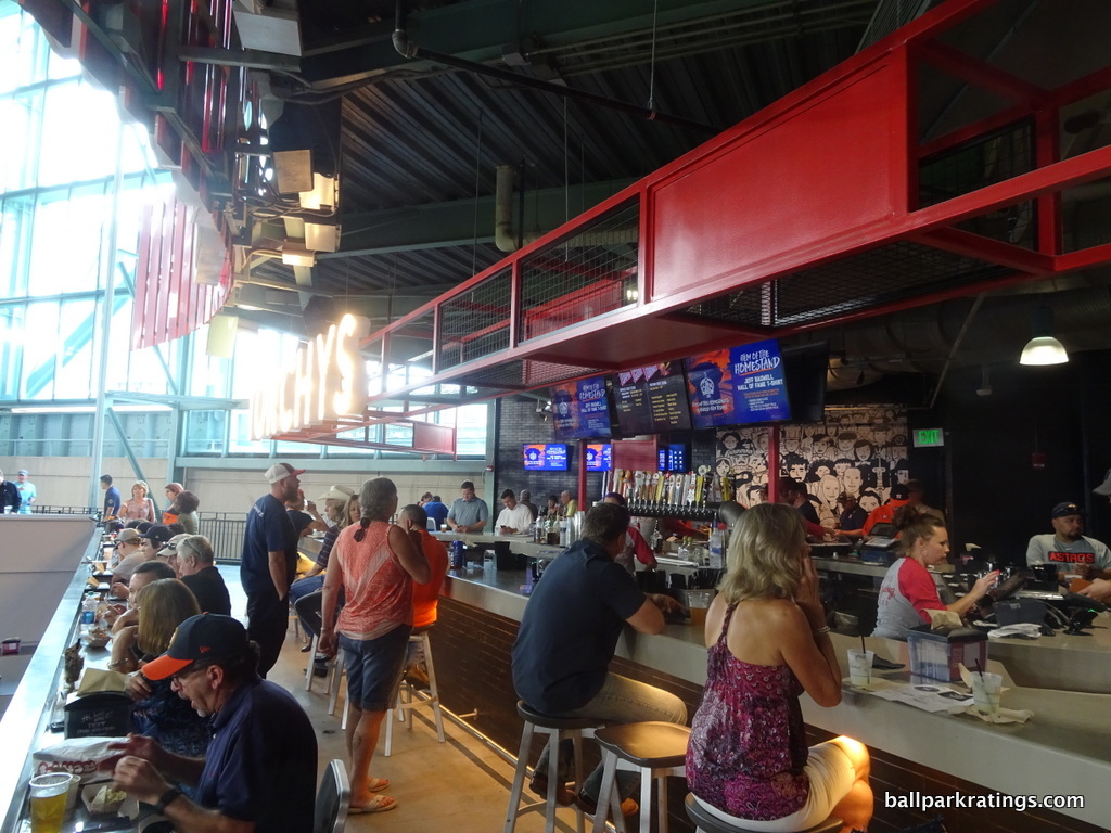
All of that has been somewhat nullified throughout the 2010s as the beige stone archways have become overcome by advertisements. It’s one thing to obscure more remote parts of the upper deck with 12 giant ads. It’s another matter to muddle your chief interior aesthetic asset with them.
In my opinion, this is akin to plastering Baltimore’s B & O Warehouse with such junk, to give you a sense of how this completely ruined the ballpark for me. Comparing the clean lines from 2000 (or even here, the pennant banners were tasteful) to now is incredible. I wrote extensively on the interior aesthetics in 2011, but much of it just no longer applies.
____For better or worse, Minute Maid Park is also rather simple compared to other “retro” parks in terms of fan-friendly features. On the plus side, the concourses are easy to navigate and welcomely open, and the park is mostly functional overall. On the other hand, the amenities are more downscaled, even after the much needed 2016-17 renovations beyond center field.
I often remark on how so many ballparks take multiple days to truly explore. Minute Maid is not one of those.
While Houston excels in high quality (Shake Shack), regional cuisine (Torchy’s Tacos and Jackson Street BBQ), the variety of the concessions isn’t great. Even with the addition of the new social spaces in center field, MMP’s array of accessible restaurants (none), bars, and social spaces isn’t as extensive as most other parks, and the lack of places to sit down on the concourses sticks out (not counting group areas). Traditional sit-down restaurants/bars behind home plate (Larry’s Big Bamboo) and in Union Station (Lefty’s BBQ) have been removed in recent years.
I don’t like that the park’s architectural highlight, the large atrium in Union Station, has now been partially converted into a team store, taking another “destination” space away. Almost gratuitously, the Astros eliminated their dynamic kids’ area as well. It is now the only post-1990 ballpark to lack such a feature. Obviously minor, but worth noting.
In addition, I was disappointed that the Astros eliminated “home-run alley,” a series of historical references throughout the left field concourse. This was rectified in 2019 with the addition of a much better team Hall of Fame exhibit in the same place. Still a far cry from the team museums in Cincinnati or Kansas City, or the monument areas in a number of other ballparks, but this is a tasteful display. Anchored by statues of Craig Biggio and Jeff Bagwell, there is a nice historical plaza outside of the park as well.
____While I have MMP as a middling ballpark today, the good news is every single one of the problems I outlined are fixable. As the downtown local scene finally continues to develop, take down the ads and make some tweaks to the amenities, and we still have a very conceptually adept structure that has always been better than people say.
15t) Marlins Park (2012), Miami Marlins: 82
Consensus Ranking: Bottom-10
— Games Attended: 13
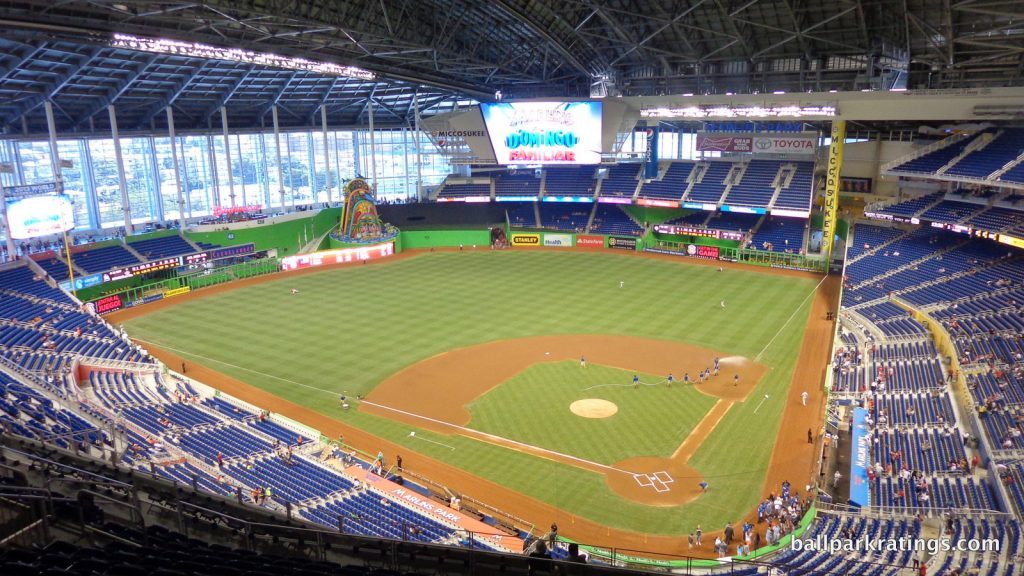
____I’ve never seen a ballpark undergo such an extreme about-face in public perception. People forget this, but Marlins Park opened to “mostly fawning architectural reviews” from the press upon opening in 2012. Today, after all of the contentious political issues, sparse crowds, two firesales, and two wildly maligned ownership groups, Marlins Park routinely places in the bottom 5-10 of MLB venues.
That doesn’t make any sense. Bitterness surrounding outside issues exacerbated an already contentious political situation over the funding of the ballpark, translating to antipathy toward the ballpark itself. That isn’t fair, as we should separate “Marlins” Park from all other controversies for the purposes of this discussion.
Ultimately, the truth about the park lies somewhere in between, as I have this ambitious structure squarely in the middle of the pack.
Marlins Park also received some nice enhancements and (for better or for worse) completely overhauled its controversial interior aesthetic vision for 2019, including removing the festive home run sculpture. You can read my complete thoughts on the 2019 enhancements here.
___Marlins Park’s setting is obviously less than ideal, but it is interesting. Situated in Little Havana, this is perhaps the only urban locale in baseball with a poor local scene. In fact, with a non-existent surrounding restaurant and bar scene, it’s probably one of baseball’s worst local scenes. Still, I prefer a park in almost any neighborhood (unless we’re talking the abject poverty surrounding Turner Field; Little Havana is more lower-middle-class) than in the abyss of suburbia. Modest but wholesome residences are sprinkled throughout the area.
Marlins Park’s primary flaw is its extremely poor structure-site relationship. The disconnect between the massive park and the intimate Little Havana neighborhood is as unfortunate as it is palpable. Marlins Park is “All about Miami” on a superficial design level, and that does deserve credit, but it has no tangible contextual connection to the area. I’ve never seen a structure so obstinately opposed to the sensibility of the surrounding area in both style and scope. Marlins Park dwarfs, then proceeds to spatially overpower, the intimate Little Havana neighborhood, in what is the most contradictory site/structure relationship you can imagine.
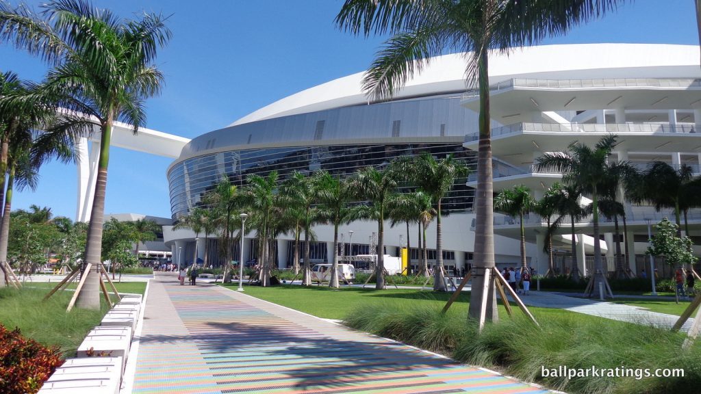
___While connection with the site is an important element of a good exterior design, Marlins Park’s greatest strength is still its contemporary architecture. In what is only a handful of ballparks in baseball that could perhaps constitute “capital-A architecture,” the structure consists of an amalgam of deep blue glass, white stucco and steel, unadulterated concrete, and sparkling silver aluminum. It does perfectly reflect the contemporary nature of a city that never really embraced nostalgia in the 21st century.
With its white stucco and graceful forms, Marlins Park conceptually captures sea merging with land, a spiritual kin to Brickell and Biscayne Bay downtown. It’s an abstract expression of Miami. Marlins Park’s lines and curves are dazzling, continually clashing then flowing in various rhythms, just like the Atlantic Ocean. Through it all, the fluidity of form is the main theme.
On the inside, Marlins Park is (or was at least) more controversial. I don’t understand why the Marlins didn’t employ Houston’s sliding glass door technique that completely opens left and center field to the sky. With poor contextual integration, it’s never going to be great, but I think whether you liked Marlins Park’s interior aesthetics was based on your 100% subjective take on the vibrant color palette and kitschy home run sculpture. As I outlined extensively in the main review, I kind of liked it!
Partially by removing the flashy sculpture for the 2019 season, the interior aesthetics have been completely refashioned. The new aesthetic vision is much more conservative, but it will surely please more people.
The white, three-tiered party deck in center field is notably subdued. Replacing the ballpark’s signature aesthetic feature, Marlins Park’s interior aesthetics now lack a dominant focal point, although I’m sure most think that is for the best given what formerly occupied the space. Red Grooms’ sculpture will be reinstalled outside for 2020.
The outfield walls have been painted blue. Facades in left-center field are decorated with greenery, as is the batters’ eye. Gone is the Miro-esque color scheme, as the main concourse aesthetics have been extensively toned down, and the tiles behind the dugout seats have even been painted blue. Signage looks state-of-the-art and varied in design, but it’s pretty unremarkable. Some of Loria’s taste in artwork throughout the main concourse appears to have been replaced as well, although some new pieces are showcased.
Overall, this is probably an aesthetic upgrade, but I liked the old look more than most.
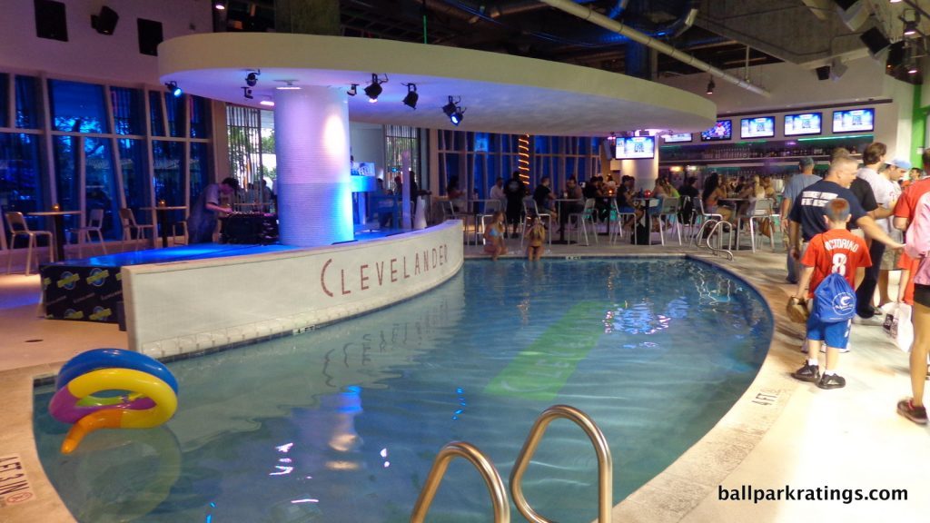
____Objectively, Marlins Park is a bit of a mixed bag. On the one hand, the park is very functional, with wonderfully wide, open concourses and some of the best sightlines for a post-1990 ballpark. No one seems to have noticed, but ballpark traditionalists should applaud the park’s superior use of cantilevers, with a mezzanine and upper deck extending far over the seating below it. There is no extra floor of suites here, either (which isn’t clear just looking at home plate). Fans are right on top of the action (comparatively speaking), and the seating geometry is excellent.
However, Marlins Park lacks some of the requisite amenities of an MLB ballpark, very odd for the second newest park in baseball. While the quality and variety of food at the concession stands is fantastic, the Marlins lack many restaurants, bars, sitting areas, and social spaces open to all fans.
If you don’t have a premium ticket, the only place to sit is at your seat, a rarity in baseball. The premium Clevelander nightclub is phenomenal, but it is supposed to require a cover charge. I love the “art in the park” at the Marlins’ home, and the Bobblehead Museum is awesome, but I would have appreciated more references to team history (two World Series victories!). Marlins Park finally added an obligatory kids’ area in recent years, but the space is so basic it’s almost purely decorative.
For 2019, Marlins Park added more spaces to “hang out.” The first tier of the new center field deck (dubbed AutoNation Alley) is accessible to all fans, while the lowest level is a group area. Called “The Social”, a large drink rail standing-room-only area has been added in right field. A similar area called Comunidad 305 has also been added in the right field corner, where fans will be encouraged to bring flags and noisemakers.
We still lack sitting areas on the concourses or accessible sit-down bars/restaurants, though! If you get a hot dog before the game, you eat it in your seat (or stand).
I should finally note that Marlins Park is a rare place that is really held back due to its lack of fan support. The truth is, minus the outliers at the top, attendance numbers and fan base quality are similar enough from city to city not to truly affect the quality of the ballpark. That is not the case here. Attendance numbers are so bad that large parts of the ballpark operation shut down.
____Overall though, Marlins Park is a fun place to see a game. While it’s not always successful, Marlins Park’s enduring legacy will be its ambitious contemporary design. As you may note, I have been here more than any other park not counting places where I have significant ties (Houston and Atlanta).
While Marlins Park never deserved the praise it received upon opening, it certainly doesn’t deserve the scorn it receives from the national media and many ballpark aficionados today.
15t) Kauffman Stadium (1973, 2009 renovation), Kansas City Royals: 82
Consensus Ranking: Top-10
— Games Attended: 5
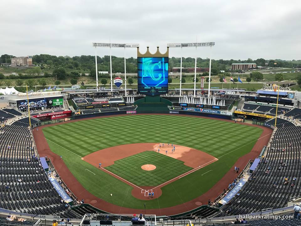
____For longtime ballpark enthusiasts and even casual baseball fans, I know this is a controversial take, as I place Kauffman Stadium a healthy deviation away from the next tier of “very good” or “great.” (and again, there’s no shame in that). My rationale is twofold: 1) I didn’t like the aesthetic changes to the outfield scene, and 2) I still can’t get past the suburban setting.
____1) Often considered a modern-classic, the truth is the K’s full-scale 2009 renovations fundamentally remade the facility into a relative of other post-1990 mall-like parks. This is contrasted with the 21st century enhancements to Wrigley, Fenway, and Dodger Stadium, all of which mostly maintained the classic vibe of those respective parks.
In my opinion, Kauffman Stadium’s interior aesthetic scene was completely altered by the 2009 renovations. While the park’s amenities were greatly improved, modern-day economics simply convoluted the timelessness of Kauffman Stadium, as the Royals failed to maintain the simple splendor that this ballpark formerly provided.
I understand the Royals were in a difficult situation. For me, the central appeal of Kauffman Stadium was not only the fountains, but the gorgeous, flowing simplicity of the grass embankments in the outfield, which allowed those signature fountains to operate effectively. Unfortunately, filling those expansive embankments with mall-like features became an economic necessity, and the K has suffered from that fact.
Yes, the same fountains are still there, but I find the outfield scene is too muddled and busy now, to the point where you notice the clutter and the ads before the fountains. Replacing Kauffman’s uncluttered greenery with ads, playgrounds, and putt-putt courses is an aesthetic travesty.
With the maintenance of those wonderful fountains and pastoral views from the upper deck, the K’s interior aesthetics are still average today, but the superb “classic K” is greatly missed, at least from an aesthetic perspective.
The exterior architecture was never notable at Kauffman Stadium, and that was almost part of the modern-classic appeal. The renovations glassed-in the home plate entry and added a set of faux-modern veneers flanking the sides. The graceful sweeping lines are still there, and the landscaping is attractive, but again, it’s a bit muddled.
____ 2) Perhaps more than anything, the K is held back because of its lifeless location and local scene in suburbia. Sure, the truly suburban locale is a product of its time, but we see my enduring persuasion against venues not integrated with a city center or neighborhood creep up again, here.
You park, you go to the game, and then you leave, with no other alternatives. Yes, I know plenty of folks love the tailgating, but that’s just no fun compared to destination ballparks in the city where you can spend an entire day, to say nothing of access issues with a ballpark in a parking lot. This blog piece from a Royals fan does a good job of illustrating why I can never fully embrace suburban baseball.
I don’t know if it is feasible, but a mixed-use development project around the park and Arrowhead Stadium, preserving the K’s pastoral views in the outfield, would at least enliven the local scene. That would certainly elevate the K 3 points or so for me, vaulting it into the next tier.
____Moving on to the objective categories, Kauffman Stadium is average in the aggregate.
Kauffman Stadium is perhaps more functional than you might think. Yes, the main concourse is pretty narrow, but the Royals utilize a dual concourse system (main concourse above the plaza level with separate enclaves below) that I find quite effective. Also, fans can now get up close to the fountains. The sightlines are mostly good here, with no separate suite levels commonly seen in newer parks. The upper deck is completely cantilevered over the mezzanine level, so you’re right on top of the action in the upper deck at the K. In addition, the curvilinear seating geometry generally works, which eschews the traditional angled seating formula. The videoboard is spectacular. While minor, the lack of cupholders in the upper deck is inexcusable for a park that underwent a $250 million-dollar renovation in 2009.
The amenities at the new K are hit-or-miss, oddly often either poor or outstanding. Kauffman Stadium’s biggest flaw in this respect is both the comparatively pedestrian food selection and the lack of specialty, regionally inspired, locally-run concession stands. Kansas City has arguably the best BBQ in the world, but the Royals opt for generically operated Aramark stands and the national chain Sweet Baby Ray’s. They need to bring back some local institutions (i.e., Gates BBQ).
The Royals took some small steps to address the (relative) paucity of food options for 2019, but it didn’t solve the primary issue of the lack of high-quality, locally-managed eateries seen at some of the great parks across baseball. On the other hand, the selection and quality of craft beer is now pretty great.
Kauffman Stadium’s recently enhanced destination social spaces—such as Craft & Draft and Rivals Bar—are fine, but they lean into the new trend of eliminating traditional sit-down dining and drinking a little too much.
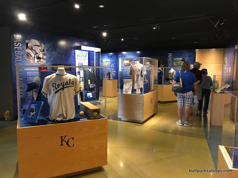
Kauffman Stadium’s best features are in the historical reference and entertainment department. The Royals Hall of Fame is fantastic, loaded with plaques, video displays, and other flavorful historical artifacts. Very well done, as I’d say this is the second-best museum in a ballpark, only behind the sprawling exhibit in Cincinnati.
Moreover, the kids’ entertainment features are marvelous. Kauffman Stadium wins best in baseball in this “competitive” category. All of the games in the “outfield experience” are appropriately out of sight for the traditionalist, but wonderfully over-the-top for those looking to find them. In addition to the standard playground and batting cages/pitching cages/base running games, we have a whiffle ball field, a carousel, and putt-putt golf! The outfield experience combines the best kid features at every park, and adds something new of its own (putt-putt).
____In sum, there’s no doubt that Kauffman Stadium is an overall better park due to the renovations, but the 2009 overhaul (a) simply took too much away from the park’s aesthetic appeal and (b) the enhancements to the amenities/functionality aren’t outstanding enough in the aggregate to compensate for that fact.
It’s also hard for a park without that vital contextual connection to an urban scene to score well in my book. In fact, there’s somewhat of a quiet consensus among Kansas City elite that the Royals will end up downtown eventually, and perhaps sooner than you think.
Despite some of my criticisms, I actually hope that’s doesn’t happen. Not only would such a move away from a beloved ballpark gain little support among Royals’ faithful, but Kauffman Stadium still has plenty to offer.
CLICK HERE FOR PART 2—–>
Like us on Facebook to get notifications about the latest articles, features, and reviews!