Best MLB Ballparks: Ranking and Rating the Major League Ballparks, Part 2
By: Cole Shoemaker
Published: August 21, 2018, updated for ballpark changes on June 12, 2019; so, if you’re reading this in 2023, some information below, including the rankings, is probably outdated. It will be updated soon.
Please read Part 1 before reading below!
The Very Good Ballparks:
While all possessing some shortcoming(s) that prevents them from entering the next tier of great, these are timeless ballpark experiences. Note the relatively significant gap in the rating between “good” in part 1 and “very good.” Quite conveniently, the ratings are dispersed in a manner natural for grouping them.
13t) Citizens Bank Park (2004), Philadelphia Phillies: 84.5
Consensus Ranking: Upper-Middle Tier
— Games Attended: 2
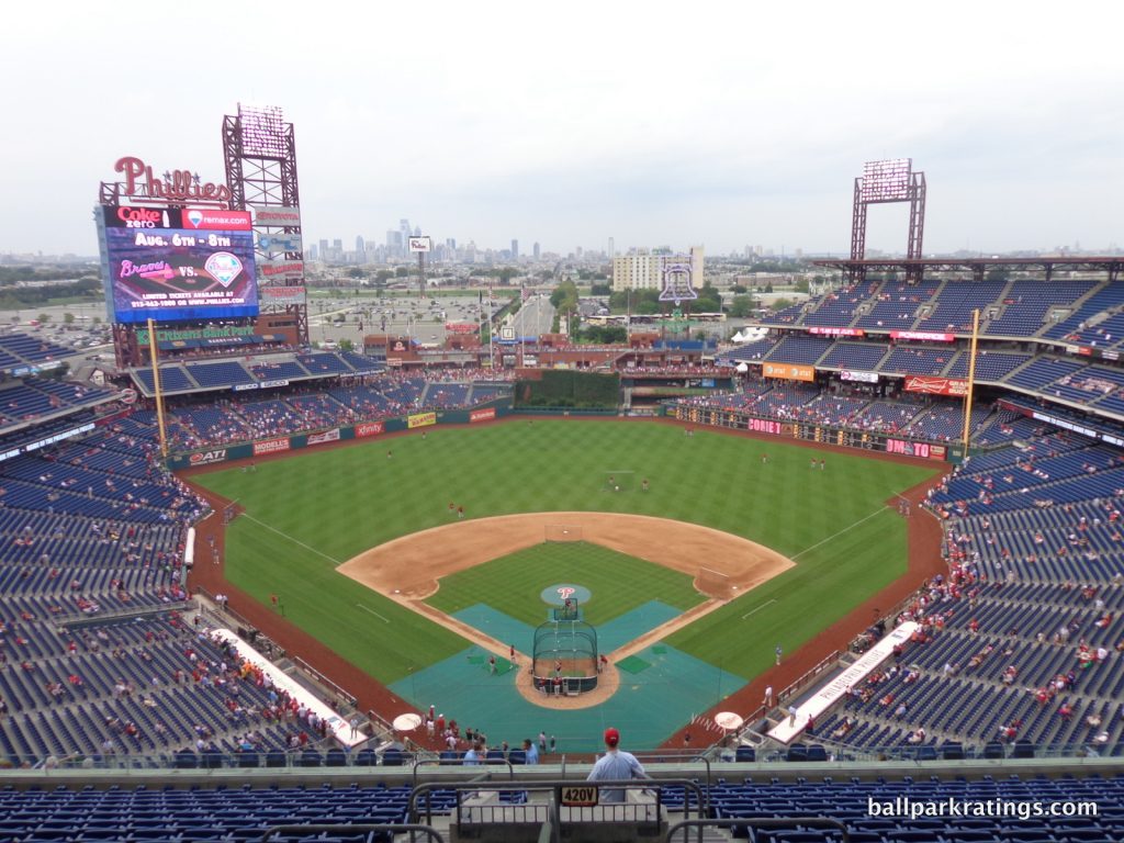
____Speaking of parks lacking any contextual connection, Citizens Bank Park illustrates that having at least a good setting is a necessary condition for building a great ballpark. Indeed, the Phillies’ home is above average to outstanding in every respect, except for its setting. For such a solid ballpark, it is almost defined by its poor setting, because it otherwise lacks any obvious flaws. Citizens Bank Park just looks like it was built to be downtown.
For something as subjective and tribal as a baseball team’s home, there’s a rare consensus in the industry here. This is the best ballpark (i.e. last one left on the list) with both a non-urban location and a subpar local scene.
____Located in the South Philadelphia Sports Complex, Citizens Bank Park’s energy dissipates into empty spaces. Despite sharp interior lines with fantastic balance and good interior design principles, there’s a certain vacuity to the whole picture, as the absence of anything beyond center field is palpable. The Xfinity Live! Complex improves the local scene, but it’s a far cry from the development required to emulate a vibrant neighborhood, in what is more akin to a series of bars in a parking lot. That electric atmosphere provided by the surroundings of a Fenway, Wrigley, Camden, etc., etc. is missing here.
I am generally not a fan of Citizens Bank Park’s exterior architecture, which is again partially a function of the park’s non-urban setting. Not only is this one of the weaker red brick facades, but the uninspired treatment has a poor sense of place. Conceptually, the layout of Citizens Bank Park is intended to look like an urban block, where the layout is constrained by city borders. That is self-evidently not the case, so the outside of The Bank has a bit of a phony, stage-set sensibility, and without the originality or raw aesthetic attractiveness to compensate (like, say, in Arlington).
The interior aesthetics are far stronger, in what could have been some of the best in baseball with an attractive backdrop. A ballpark’s interior aesthetics are largely a product of its surroundings, but they are somehow still great at Citizens Bank Park, no small feat. With clean lines, a vibrant color scheme, great structural balance, a unique angular geometric grandstand design, and one of baseball’s most attractive batters’ eyes, Citizens Bank Park succeeds solely on its own merits (the distant skyline views are not at all impressive in person), which in some ways make it more laudable.
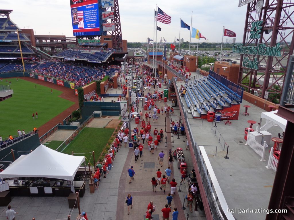
For a ballpark gazing out into miles of oblivion before reaching the cityscape, the interior aesthetics are as good as they could be, but can’t come close to matching urban parks in Pittsburgh, Baltimore, and a relatively large handful of others.
____Citizens Bank Park is impressively functional, scoring among the highest in baseball in this cumulative category.
Philadelphia’s ballpark has perhaps the best concourses in baseball from a functional standpoint. Highlighted by Ashburn Alley, Citizens Bank Park’s wide, open 360-degree concourse is filled with fan-friendly standing room areas, even behind home plate where views from the concourse are usually blocked by clubs in other parks. This was one of the first ballparks that invited fans to explore the game from different vantage points. Citizens Bank Park was also the first ballpark to have open concourses throughout the upper deck.
The park’s sightlines are great as well, with excellent seating geometry and above-average field proximity (relatively speaking).
Moving on to the amenities, Citizens Bank Park has always been good to great across the board, but it’s really benefited from recent renovations. The Phillies have done a fine job of upgrading their presentation in the late 2010s.
In the concessions department, Citizens Bank Park was one of the first MLB stadiums to ingrain high-quality, regional food options into the ballpark experience to this extent. While the variety of food and beverage options offered still isn’t outstanding, Tony Luke’s and Campo’s Steaks are traditionally the highlight.
The amenities in between the foul poles in the outfield have been significantly enhanced. Historical references and memorabilia—namely the Phillies Wall of Fame—have been wisely moved to the left field plaza entrance, giving fans a more memorable sense of arrival. Retired number monuments, championship banners, and enlarged World Series trophies are also included. Social areas and seating options have been added in the old Wall of Fame’s place in Ashburn Alley.
On the right side of the alley, Citizens Bank Park’s kids’ entertainment features have also been upgraded. “The Yard” offers a whiffle-ball field, a climbing wall, a hot dog launcher, and other fan-friendly amenities, in what is now one of the better family areas in baseball.
Finally, the Phillies significantly overhauled its presentation of social spaces and sit-down restaurants. Most notably, the rather stale McFadden’s restaurant has been replaced by a more contemporary concept featuring an open-air beer garden and fan-friendly sports bar. The Liberty Bell that was once a fixture at Veterans Stadium sits outside the new restaurant. Another space introduced the first sit-down Shake Shack restaurant (versus a standalone concession stand) in an MLB ballpark.
Citizens Bank Park has certainly earned a slight boost.
___In the “very good” category, we’re starting to get into the timeless 21st century ballparks. With its numerous fan-friendly features and thoughtful recent upgrades, Citizens Bank Park is an extremely pleasant facility. But place it in downtown Philadelphia, and witness the centralized location, vibrant local scene, and greatly enhanced interior aesthetics through gorgeous skyline views, and you would have a top-5 ballpark.
13t) Busch Stadium (2006), St. Louis Cardinals: 84.5
Consensus Ranking: Upper-Middle Tier to Middle of the Pack, High Variability
— Games Attended: 5, plus 2 tours
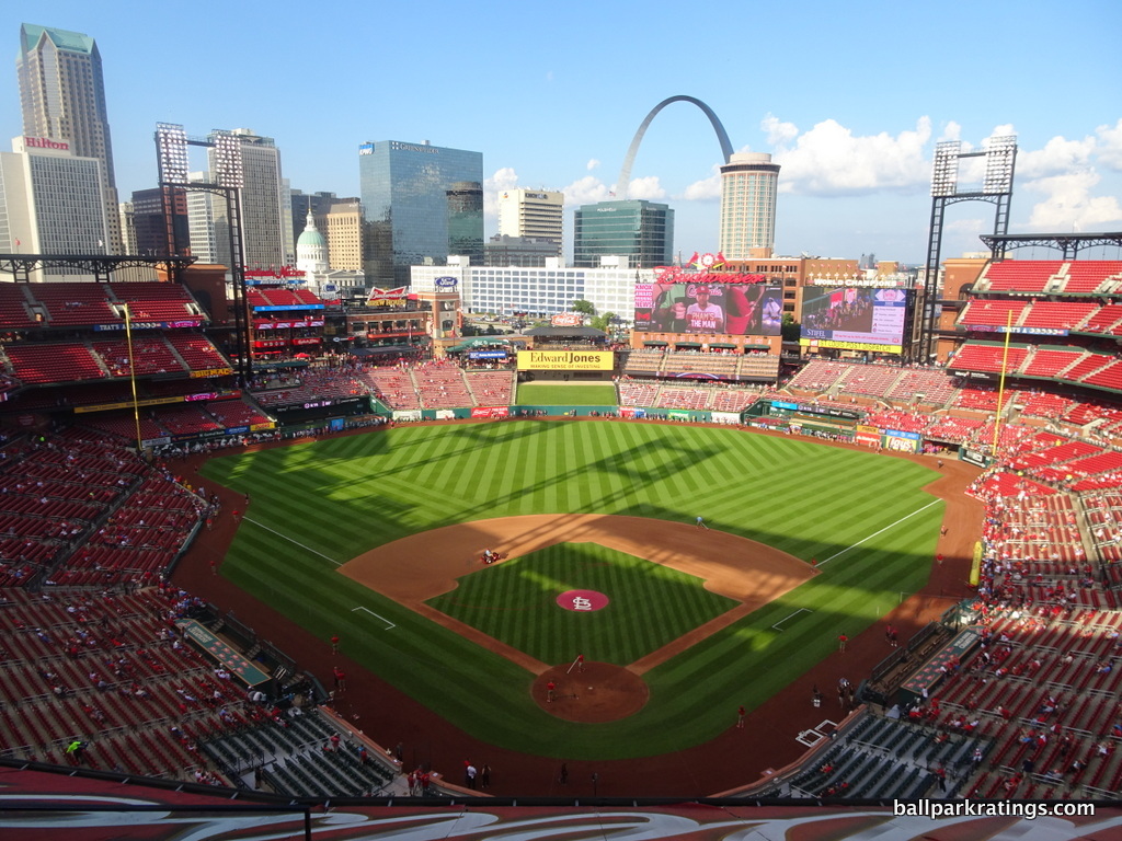
____Bolstered by a beautiful downtown locale, the emerging ballpark village, and one of baseball’s best skyline views, Busch Stadium has earned its placement in the top half of MLB venues.
However, I’ve always felt Busch Stadium was one of the safer ballparks of this generation, perhaps epitomizing the peak “retro cookie cutter,” in both formula and simple appearance. This is the other ballpark where my “gut” assessment differs somewhat from the rating, as I would instinctively rank it a little bit worse.
With drab concourses and mediocre amenities, I’ve come to see Busch Stadium as kind of the opposite of Citizens Bank Park outlined above, as Busch’s merits are almost totally derived from the beautiful views, with not much particularly great (other than the fans) within its confines.
____Busch Stadium is anchored by the new downtown Ballpark Village, filled with shops, restaurants, stores, clubs, and a new Cardinals Hall of Fame. Ballpark Village 2.0 is coming by 2020, which should place Busch near the top in ballpark local scenes.
While it has some nice features, Busch Stadium’s exterior architecture is simultaneously beautiful and uninspired, in my opinion. Yes, it possesses some tasteful Cardinals accents, and it recalls the local area through mimicry of the Eads Bridge and Cupples Warehouses, but I frankly don’t think retro was the right design choice here. The Cardinals should have gone modern, embracing the progressive image of St. Louis and the Gateway Arch. The attractive and contextually adroit exterior scores well by default, but it’s another scene that’s a bit too formulaic and derivative.
By default, the interior aesthetics are strong because of the contextual integration of Ballpark Village, downtown St. Louis, and the Gateway Arch. But beyond that, Busch doesn’t really conform to its setting or present any unique design flares in its own right. While a place like Comerica Park has dimensions conforming to surrounding streets, Busch Stadium looks like it was dropped into downtown from the sky.
Busch Stadium looks like a template that was never developed to full fruition. It looks like Populous picked Busch Stadium out of a box that said, “retro baseball stadium.” It almost looks like they tore down the outfield of Old Busch Stadium to open up the skyline, and then added some uniform single deck seating and some patio areas to increase revenue. It’s nice enough, but it’s a very lazy look. Busch Stadium is also kind of the opposite of Citizens Bank Park when talking about interior aesthetics, looking good solely because of the setting but lacking much on its own merits.
Again, Busch scores quite well in interior aesthetics, but it is not as good as it should be. Beautiful views, but a look that’s not otherwise particularly distinguished.
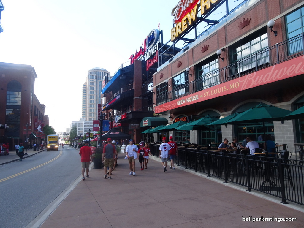
The truth is the excellent setting and good architecture/aesthetics are Busch Stadium’s strong points, but I see them more as missed opportunities. The good could have been historically great. The Cardinals fans deserved better.
____Moving on to the functionality and amenities, Busch Stadium’s presentation begins to falter by objective assessments. It lacks the thoughtful touches and fan-friendly features of other ballparks. Busch Stadium is the only MLB ballpark built in the 21st century with closed concourses throughout the lower bowl in between the foul poles. “Open concourses” sporting a field view are perhaps a tad overrated, but they are a core ingredient to the general fan-friendly nature of most modern ballparks.
Rather arcane, I can get excited about the seats themselves, however. Busch Stadium is one of only two ballparks to pad 1000s of non-premium seats throughout the lower bowl around the infield. Yes, this is a minor thing that will get overlooked, but more comfort for more fans is a plus.
Busch Stadium generally lacks the amenities of the best ballparks. While the variety of concession options is barely respectable, the biggest disappointment is the quality of the food. The Cardinals are one of the very few teams to still not import any high quality, regional cuisine into their ballpark, as almost everything is still run by a food service corporation. Even when the ballpark opened, the standard was to bring in one high-quality staple from the local community (think Primanti Bro’s in Pittsburgh), but today, the best ballparks are mostly run by regional concessionaires (think San Diego).
The Cardinals have always lacked accessible restaurants, bars, sitting areas, or social spaces in the ballpark footprint. The team began to rectify this by building a social space in the right field upper deck before the 2018 season. This is most welcome, but Busch Stadium still lags behind here.
Finally, Busch Stadium has been roundly criticized for its lack of references to the Cardinals’ illustrious history within the ballpark, those poorly proportioned statues outside the main entrance notwithstanding. The Cardinals Hall of Fame in Ballpark Village is outstanding, but it is not part of the ballpark schema. You wish for more touches that scream “Cardinals baseball!” when walking inside Busch Stadium.
____I’m (still) currently re-writing my updated Busch Stadium review, so stay tuned for that. For me, the fans and the atmosphere automatically make Busch a fantastic place to see a game, but it’s still more defined by its formulaic architecture and lack of thoughtful design flares/amenities, in what is a crowded landscape of already impressive ballparks. The Cardinals should have crafted a more original, forward-thinking design.
12) Nationals Park (2008), Washington Nationals: 85
Consensus Ranking: Middle of the Pack to Lower-Middle Tier, High Variability
— Games Attended: 1, plus 2 tours
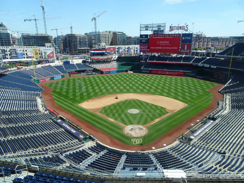
____While often noted for its lack of distinguishing features, Nationals Park is a consistently above average to great place to see a ballgame in nearly every respect. While Nationals Park is pretty well-regarded across the industry, it certainly doesn’t have a sterling reputation among everyday baseball fans and ballpark enthusiasts, as poor reviews upon opening linger to this day. I believe the park really suffered from unrealistic expectations.
Before it opened, the park seemed to have received heightened scrutiny due to a) the increased pressure to deliver a true national monument for America’s pastime in the nation’s capital b) a new generation of communicative capacity by fans and critics on the internet, and c) the height of national expectations (pre-‘08) for Major League ballparks after a line of truly outstanding ballparks.
Yes, Nationals Park obviously falls short of “national landmark” status, but with the benefit of viewing Nationals Park in the context of the 24 new or renovated ballparks from 1991-2017, it looks very solid today.
____More than anything, Nationals Park has really benefited from the continued rejuvenation of the Navy Yard in the 2010s, in what may now be the ballpark’s most appealing feature. Unthinkable a decade ago, the vibrant setting is filled with scenic bars, restaurants, residences, hotels, and other amenities. The conditions didn’t seem favorable for such a revival, but it looks as if the Nationals will boast one of baseball’s best local scenes into the 21st century.
Nationals Park’s exterior architecture has been roundly criticized, and that’s mostly fair. For a structure apparently inspired by I.M. Pei’s East Wing of the National Gallery of Art, Nationals Park’s exterior façade comes off as unapologetically mundane, with all of the pomp and grandiosity of a suburban office park. It so plainly falls short of the national monument people expected.
However, I give the exterior design a boost because it (a) thankfully departs from the retro aesthetic and (b) really fits in with the D.C. environment, which should be the goal.
Nationals Park’s interior aesthetics are both more formulaic and more attractive. Not much is notable about the inside of Nationals Park, as it looks like they copied and pasted features from around Major League Baseball and imported them into their ballpark. That being said, Nationals Park possesses a certain openness on the left side that really lets the ballpark’s surroundings (however dull) to seep into the structure, resulting in largely successful contextual integration. Yes, you can’t really see landmarks like the Washington Monument and the Capitol building from most seats, but I think it’s still an average to above-average setup.
____Nationals Park is consistently good to great in its functionality and amenities. Emulating Citizens Bank Park in Philadelphia, Nationals Park has some of baseball’s best concourses. Similar to Philly, everything is open and there are plenty of nice standing room areas. While the seating geometry is excellent, the upper deck is pushed too far back, even for a new park.
Washington’s park possesses fantastic amenities, for the most part. D.C.’s ballpark has an excellent food lineup, highlighted by notable international and seafood offerings. Danny Meyer’s Union Hospitality Group runs some of the concessions here as well, most notably Shake Shack. In addition to the impressive variety of grub, Nationals Park has brought in plenty of local eateries that highlight the D.C. area. Chiko (Korean), Tiger Fork (Hong Kong), La Casita Pupuseria (Salvadorian), DC Empanadas, and Hank’s Oyster Bar are some of the recent showstoppers, but the cuisine is varied and interesting every year. Ben’s Chili Bowl is the traditional local staple.
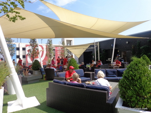
Nationals Park presents a nice array of restaurants and social spaces in the outfield. A brewhouse and the prototypical “social space” under the scoreboard are pre-game hubs for activity. The Nationals have some of baseball’s best premium seating, but without the sky-high prices or unwanted snobbery at Yankee Stadium. Be sure to experience one of these seating options if you’re in town. Tasteful references to Washington baseball history are appropriately interwoven throughout the ballpark, but they aren’t too extensive.
____In sum, Nationals Park is just a broadly pleasant place to see a game, unusual in its lack of glaring flaws. While it’s not overly memorable, there’s something to be said for well-roundedness.
11) T-Mobile Park (1999), Seattle Mariners: 85.5
Consensus Ranking: Top-10
— Games Attended: 1
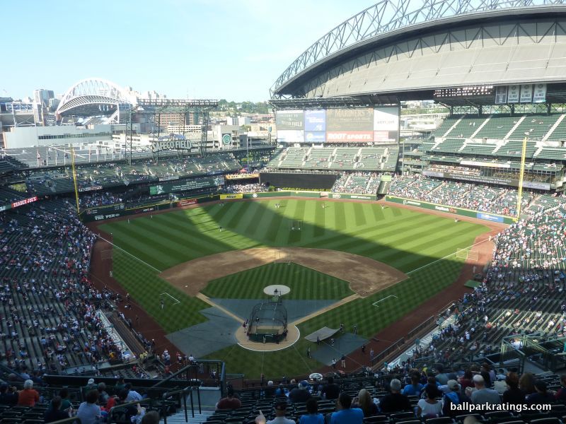
____Billed as one of baseball’s greatest success stories by saving baseball in Seattle, the park formerly known as Safeco Field routinely ranks as one of the game’s greatest cathedrals, but it’s always been a bit of a conundrum for me.
Yes, the unique retractable roof design that acts as an “umbrella” rather than enclosing the park is still unbelievably cool, but Seattle is another classic example of a local fan base’s obsession with elevating a ballpark’s reputation. Everyone ranging from Mariner announcers to old-fashioned message board flamers loved hyping Seattle’s ballpark in the 2000s.
With its stubbornly conflicting architecture and total lack of interior aesthetic vision, I still consider T-Mobile Park to be the most overrated ballpark from an aesthetic point of view. On the other hand, with over $500 million invested in this place back in the 90s, it’s only one of a couple ballparks that could be described as “ornate,” with no expense spared. Even 20 years later, it possesses dazzling amenities and excels in the essentials.
So, in a roundabout way, I’ve concluded that T-Mobile Park is a near-great ballpark. It should be noted that T-Mobile Park is due to receive a fortifying round of capital investments and enhancements in the coming years, so I anticipate that Seattle’s park will enter the next tier of great soon.
____As anyone familiar with T-Mobile’s design process knows, the park was built in the wrong place. Located on the extreme periphery south of downtown, the Mariners weren’t able to build T-Mobile Park on the site north of the Kingdome (now CenturyLink Field), which would have truly integrated the park with the city center in a manner similar to many other venues. Admittedly, it was a tight fit, but then again, so is this. There’s not much going on directly outside the park, but a long walk to the north of CenturyLink Field will reveal Pioneer Square, a destination in its own right. All things considered, the Mariners missed a huge opportunity to have a setting equal to that of Gaslamp by Petco Park in San Diego.
The exterior design is an architectural misfit, in what is perhaps the most disjointed stadium ever seen. Half the ballpark emphasizes the rationalist steelwork, while the other half is wrapped in a retro facade. You can’t do both.
If you’re going to have a modern retractable roof that dominates the stadium, why tack on retro architecture that meekly tries to fight it? And why only on one side? It all comes out as a painfully confused structure, as the steel trusses and roof are disproportionately scaled in comparison to the retro architecture.
Considering the modern nature of the jet-black retractable roof, the Mariners should have chosen to accentuate the steel trusses of the superstructure, building a decidedly modern industrial ballpark.
The interior aesthetics lack purpose, stressing functionality above all else. The ballpark’s outfield scene lacks any defining focal point, with poor attention to the urban context and with haphazardly placed outfield grandstands. Space isn’t used well in the outfield. There are large, awkward holes in the outfield seating pattern that are completely non-existent in more design-conscious ballparks.
There is simply no attention to balance or consistency here, as a disproportionate amount of time and money was spent on the retractable roof instead of beautifying the aesthetic scene. Contextually, T-Mobile Park is often known for the train tracks behind right field, but it makes no attempt to integrate the concept literally or figuratively. For having a decent location, it’s a surprisingly insular ballpark.
T-Mobile has the misfortune of having no distinguishing features on the inside other than the bulbous retractable roof hovering over the field, which wasn’t necessary in the first place.
By default, T-Mobile features nice views of the Seattle skyline on the left side, but the view is also more distant than we would want (unlike the similar setup in Houston). Extra points for the Space Needle, though.
____Looking at the functionality and amenities cumulatively, T-Mobile Park is still among the best in baseball, even conceding that it’s due for enhancements.
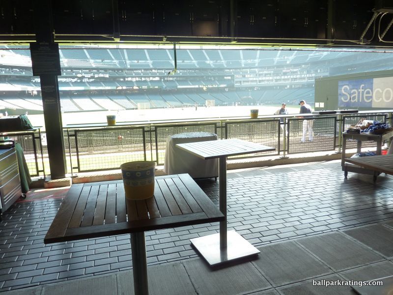
It’s a close call between Seattle and Philadelphia for best ballpark concourse functionality. Even though the main concourse is above street level, T-Mobile is superb here. T-Mobile Park is one of the few parks to possess open concourses where the game can be viewed from just about anywhere in the 360-degree system. There are so many cool standing room areas throughout the outfield spanning multiple levels. The standing space in “The Pen” overlooking the bullpens is the best in baseball.
T-Mobile Park generally features above-average sightlines for a post-1990 ballpark. Recently enhanced, the videoboard system is notable for being one of the best in the majors as well.
Looking at the park’s amenities, T-Mobile dazzles across the board for the most part.
Along with Oracle Park in San Francisco, T-Mobile Park has traditionally held the reputation of having some of the very best ballpark food. Every cuisine you could imagine is available here: ranging from fare you might not anticipate (BBQ, Mexican, Gyros), to high-quality grub expected from Seattle (Seafood, Thai, Chinese, Sushi). Ivar’s Seafood is perhaps T-Mobile Park’s signature food. Starting in 2011, the Mariners also brought in high-quality chefs to serve unique fare in “The Pen.” While no longer a fixture, Roberto Santibanez’s Torta is the best food item I’ve ever had in a ballpark to date. Seattle’s park has some of baseball’s best craft beer as well.
While enhancements will improve T-Mobile Park further in this respect, the park features a nice array of restaurants, bars, and social spaces, highlighted by the aforementioned “The Pen.” Edgar’s Cantina and the Caught Looking Lounge are also of note in this area. The right field “Hit it Here Café” is T-Mobile Park’s full-service restaurant. This could probably use a renovation. The premium spaces are tired (the club level was subpar in 2011, and still hasn’t been touched), so that will probably be addressed as well.
For a franchise with such a short history, the Mariners do a great job of honoring team history in the Baseball Museum of the Pacific Northwest/Mariners Hall of Fame off the main concourse. It is not as grand as some larger team museums in baseball, but it earns my praise, and even includes its own bar!
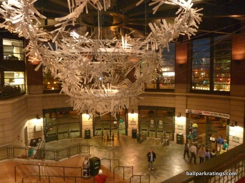
Finally, T-Mobile Park is well known for its “Art in the Park,” the most comprehensive array of baseball-related art in any MLB park. The crown jewel is the chandelier of 1,000 translucent bats in the home plate rotunda.
____Overall, T-Mobile Park is probably still a little bit overrated, but I ultimately see it as a great park that will enter my top-10 in the coming years. The fact that the park has overcome my subjective dislike for its architecture and aesthetics speaks to the overwhelmingly high quality of the ballpark experience.
The Great Ballparks:
Getting into my top 10…
10) Yankee Stadium (2009), New York Yankees: 86.5
Consensus Ranking: Upper-Middle Tier to Middle of the Pack, High Variability
— Games Attended: 5
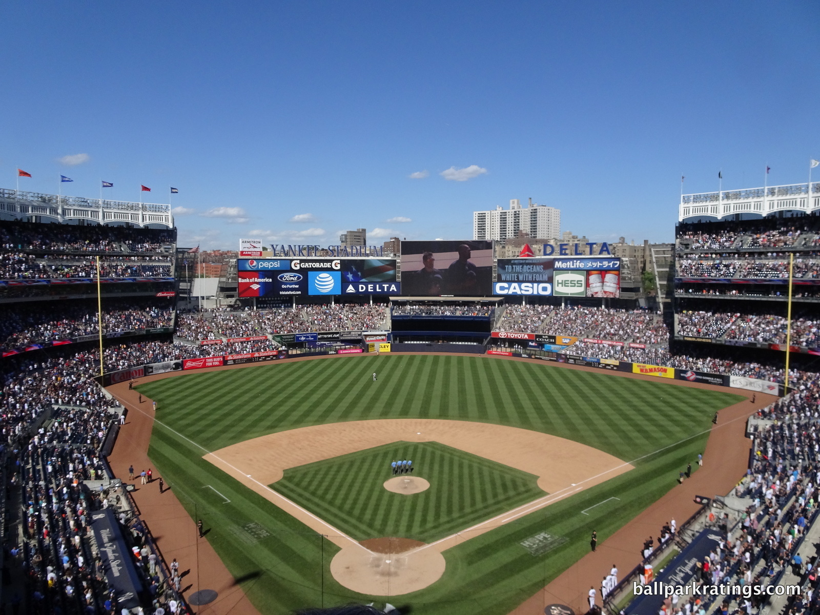
____Probably the most polarizing ballpark in America, Yankee Stadium III has elicited a wide range of reactions from fans, oddly often dependent on where you live. There’s an almost universal consensus among New Yorkers that Citi Field offers a better fan experience than Yankee Stadium. On social media, you hear some version of “I’m a Yankees fan, but Citi Field is the better ballpark” all the time. It’s a very fashionable place to bash in certain circles.
However, when you sample opinions from out-of-towners, ballpark enthusiasts, and national publications, takes on Yankee Stadium are much more balanced, recognizing its fitting grandiosity, thoughtful historical touches, and wide range of modern conveniences.
Honestly, it’s a challenging park to assess because (1) its design plays by its own set of rules. Yankee Stadium is not really intended to be visually appealing in a traditional sense (think views like in Pittsburgh, San Francisco, etc.) on the inside; it is supposed to emulate the original Yankee Stadium I. (2) It’s difficult for many to check any anti-Yankees bias at the door, especially given that the stadium just feels personally cold compared to other parks. (I do price the unfriendly ballpark policies into the rating.)
That being said, Yankee Stadium ranks quite well in my book. A lot of it has to do with the amenities (including those accessible to all fans) that just blow every other stadium out of the water. When you pour $2.3 billion into a facility, you’re going to end up with a pretty impressive product.
If fact, Yankee Stadium is the most expensive stadium in world history, and one of the most expensive structures in the world.
If I could describe Yankee Stadium in one word, it would be overwhelming. A product in and of itself that extends way beyond the game on the field and has the amenities of a medium-sized town. And a ballpark operation that is really firing on all cylinders at a logistical level. It also recieved a boost on our list due to the significant fan-friendly alterations in 2017.
____The setting around Yankee Stadium historically gets a bad rap, but it’s better than people think. It’s decidedly working class, but has a scattering of hot dog and nut stands, bars, and restaurants. Locals favor Stan’s Sports Bar and Yankees Tavern. No one would mistake the Bronx for Wrigleyville, but better this than a ballpark in a parking lot or a ballpark among scrap yards like in Queens.
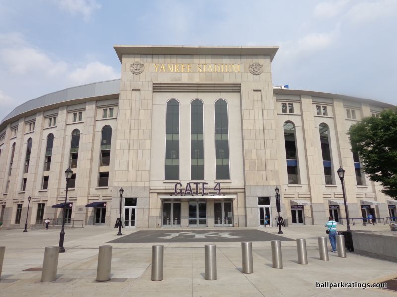
Yankee Stadium’s exterior architecture is stately and handsome, if not a bit more streamlined than Yankee Stadium I (1923). It has the air of self-importance of a new courthouse. The facade is a homage to the original, but lacks the nuance and unique accents of the original. The look is the same, but the tune is a little off, because it’s lacking the attention to detail of the classic version.
Although, I still think it’s above average for a ballpark, and the use of materials on the outside are high quality. Adorned with imposing tones of limestone, granite, and pre-cast stone, the palatial Versailles on the Harlem River is certainly fitting for the franchise.
The interior aesthetics are a whole different matter. Taken in a vacuum, this is perhaps the least aesthetically attractive interior design since the original New Comiskey Park. This would be bland and uninspiring if this was an expansion team’s stadium. Little distinguishing character, charm, or warmth, critics say.
But this is Yankee Stadium, which again kind of gets to play by its own rules. What did you expect a new Yankees’ ballpark to look like? Did you really expect the skyline panorama of a Comerica Park, the charming backdrop of a Camden Yards, the captivating water vistas of an Oracle Park, or the sweeping bridge views of a PNC Park? Of course not.
Intended to emulate the original, Yankee Stadium was always going to be an enclosed, circular bowl. It wasn’t incumbent on the Yankees to build a ballpark with the striking visuals of other post-1990 venues. You can debate whether it was successful, but the ballpark’s mission of paying homage to Yankee Stadium I was clear, and that wasn’t going to involve something creative in the grand tradition of the Empire State Building.
To be honest, I wouldn’t want new Yankee Stadium looking any other way. Does the design reflect New York City? Not really, and that’s a major strike against it. But it does certainly reflect the New York Yankees, and the baseline of any great design is reflecting the team, even if we’d greatly prefer it reflect the city/region too.
Anyway, I view Yankee Stadium’s interior aesthetics with more lenience than most critics (the Mets, on the other hand, with a building that reflects neither the team nor the city, doesn’t have the same excuse for such pedestrian interior visuals).
If you’re looking for a modicum of distinctiveness in its own right, Yankee Stadium has plenty of classic nods like the iconic frieze. The contextual integration of the subway train beyond the outfield is also neat. Visible through the slit between the batters’ eye and the scoreboard structure spanning across right-center field, the train whistling by outside of the park is salient in person. The wall is also partially cut out at the farthest end of right-center field. This gives Yankee Stadium a much-needed charming urban sensibility.
____Objectively, Yankee Stadium begins to impress when discussing functional matters. It’s the only ballpark to pad every seat in the lower bowl, even in the outfield. It wins best in baseball in seat comfort, and remember this is not counting premium seating. Open to the field on all levels, Yankee Stadium’s concourses have plenty of space, especially when you include The Great Hall. Newly added standing-room-only areas within the bleachers are welcome. Minor demerits for the unacceptably narrow main concourse in center field. I wish the upper decks were closer to the field like at the old stadium, but that’s an unfortunate aspect of every post-1990 park. Seating geometry is above average.
____Moving on to the amenities, Yankee Stadium is truly exceptional. While perhaps not possessing the quality of its neighbor in Queens, the concession variety is outstanding. Everything you could ever want—Hibachi, sushi, Italian, Mexican, subs, seafood, BBQ, etc.—is available. Moreover, the Yankees imported Lobel’s, one of the best regional staples in New York. On the flip side, Yankee Stadium does have one of baseball’s worst craft beer selections.
The Yankees compete for the best in baseball in the next three categories.
As one may expect, Yankee Stadium is by far the best in baseball with its selection and quality of premium seating, not only with their infamous “Legends Suite,” but with four other beautiful club seating areas as well. There are two more premium restaurants/bar spaces in the outfield. I’ll keep this at a minimum to preserve our sanity. But as I’ve explained, this is necessary for a viable modern-day park.
What critics don’t seem to acknowledge is the fantastic amenities accessible to all fans. This strikes me as something that readers wouldn’t care about, but the vast majority of fans (read: people) attending a game would care about.
Among the features accessible to all with a ticket: a team-branded steakhouse (NYY Steak), a martini bar, a Hard Rock Cafe, a third base lounge on the main concourse, two new social spaces replacing the poorly-oriented bleachers, two more similar spaces above the main concourse below the videoboard, and a set of new sit-down bars in the upper deck. This level of accessible restaurants and social spaces is up there with any MLB park.
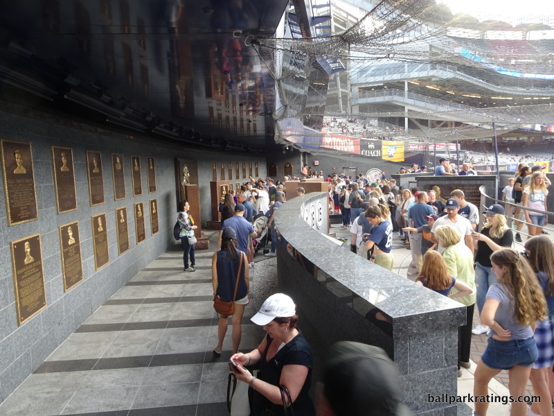
Yankee Stadium does a tremendous job of honoring team history, perhaps only behind ballparks where memorabilia is more explicitly integrated throughout the main concourse (think Atlanta, Detroit), or maybe behind parks with even more elaborate museums (think Cincinnati). Along with tasteful photographs of Yankee greats above the concessions on the main concourse, Yankee Stadium has not one but two historical destinations.
Despite earning the moniker “Monument Cave” for its drab appearance in center field, (a) Monument Park features five Yankee monuments, stone walls showcasing retired numbers, and team plaques mounted on the back wall. Anchored by statues of Don Larson throwing his famous perfect game to Yogi Berra, the (b) well-appointed Yankees Museum is a destination in its own right. Along with the obligatory memorabilia, be sure to check out that “Ball Wall” in between the statues featuring nearly 1000 balls autographed by Yankees past and present. Don’t forget about the banners in the Great Hall too.
In sum, contrary to popular belief, Yankee Stadium offers a broad range of experiences and some level of amenity for all fans balanced with frills for the high rollers.
In closing, I’ll add that I never fully understood the mourning over the loss of Yankee Stadium II in 2008. Though it occupied a nearby patch of land, it was not your grandfather’s Yankee Stadium (I). It was a renovated concrete monstrosity.
____ While new Yankee Stadium doesn’t match the aesthetic attractiveness of the best parks, it has exceptional amenities and is filled with outstanding features that emphasize fan comfort and scream Yankees baseball. I know this is not a fashionable thing to say, but Yankee Stadium is a fine venue that should evoke pride from both the organization and team fans.
9) SunTrust Park (2017), Atlanta Braves: 87
Consensus Ranking: TBD, High Variability
— Games Attended: 9, plus 1 tour
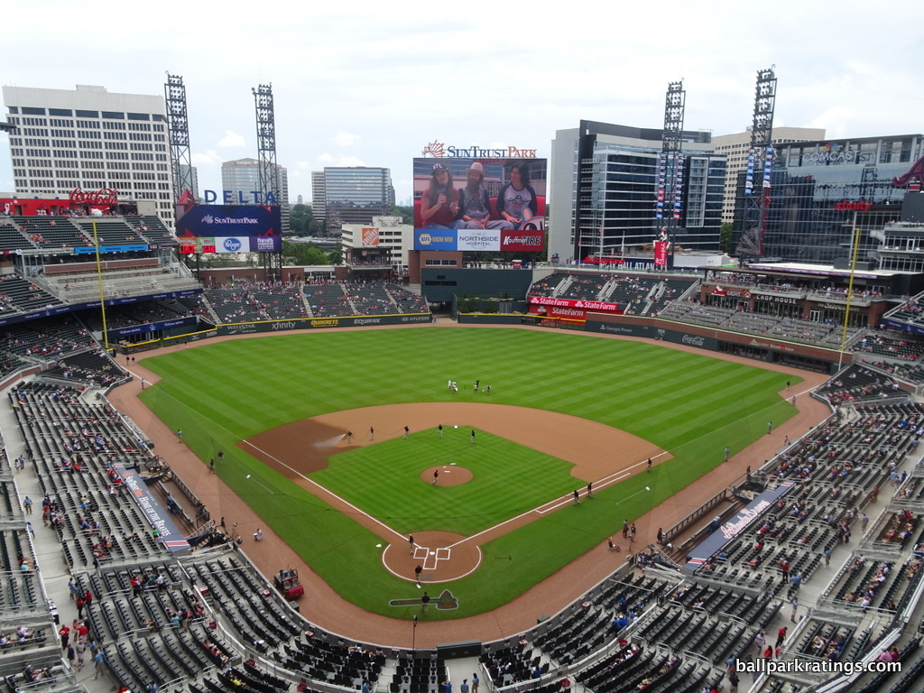
____SunTrust Park has garnered a huge diversity of opinions in its infant years. Just from ballpark websites and national publications, I’ve seen Ballpark Digest put it at #7 and five Washington Post sports writers (whose rankings almost perfectly align with the consensus) collectively put it at #24.
Some see SunTrust as the bland mallpark epitomized, while others view its mixed-use development and fan-friendly amenities as the model for future MLB ballparks. For me, it’s both.
On one hand, SunTrust possesses perhaps the most generic and derivative aesthetics and architecture in the last 20 years (which is saying a lot). The term “mallpark,” used to signify that mall-like amenities are emphasized over aesthetics, has been overused in the past. Starting in about 2008, you saw many ballparks emphasize the former at expense of the latter, but there were still some genuine architectural sensibilities lingering.
But SunTrust Park is baseball’s first true mallpark, where almost everything is all about amenities and generating revenue with little attention to original design flares and authentic aesthetics.
On the other hand, it’s hard to deny that SunTrust Park is both exceeding functional and incredibly fun. Looking at my rubric, Atlanta’s new park is perhaps the best in baseball when just looking at the “objective” categories. Indeed, SunTrust’s solid functionality, truly groundbreaking/scale-busting amenities, and innovative local scene in The Battery Atlanta make it one of baseball’s most notable parks.
But amenities age; only timeless architectural design endures. Just as Atlanta’s “old” ballpark (Turner Field) that didn’t even reach its drinking age showed us.
____SunTrust Park’s suburban setting is problematic yet awesome, and it can’t really be viewed against other ballparks separated from the city center because of The Battery Atlanta. Conceptually, the idea of this privately-controlled pseudo-city in suburbia is troubling and unmistakably superficial, a faux mimicry of the urban villages around a Wrigley or Fenway. The Battery Atlanta synthetically manufactures the sensibility that organically arises around other ballparks. It is not in the spirit of a true community ballpark. It’s a theme park.
Once you’re at the ballpark, though, that’s all academic. With a density of great bars and restaurants rivaling the best ballpark local scenes, you might start to believe the surrounding mixed-use development scene in The Battery is the new model. If you are an urban planning purist, you’ll hate that you’re loving it. Serving as the impetus behind the creation of the entire ballpark, The Battery Atlanta exceeded my high expectations, certainly in terms of its amount of popular appeal. It’s becoming a destination in its own right. The plaza outside right field serves as the epicenter of activity in The Battery. There are the well-documented parking and traffic issues, but the Braves are ironing that out.
____In terms of architecture and aesthetics, SunTrust Park might be the biggest ballpark disappointment, since, well, Turner Field.
SunTrust Park goes back to the well of retro once again, but it doesn’t really feel like a deliberate design choice; it feels like a generic starting point that wasn’t carried out to full fruition. It’s so “retro” (i.e. derivative) it’s not even consciously retro. It’s the bland professionalism that characterizes Braves baseball. This is a park that was designed in a corporate boardroom.
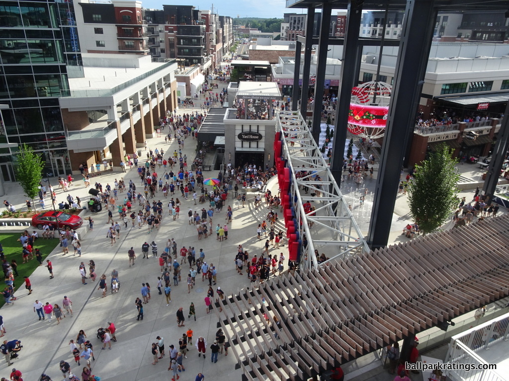
Retro is so passé, but what makes this particularly unforgivable is that unlike the other derided red brick cookie cutters, there are no distinctive design cues or regional accents. There is no larger concept here. Even for retro red brick, this is lazy and generic. It’s just red brick. No, it’s not as bad as something like the actively clashing T-Mobile Park (Seattle) or some other park that is self-evidently ugly, but I think this is completely unacceptable.
SunTrust’s interior aesthetics aren’t much better. It’s hard to know where to start without just copying my actual review. SunTrust Park looks like the Braves literally used a generic template. The rendering looks like the expansion team stadium in MVP Baseball 2005.
SunTrust Park is way too busy, suffering from a lack of continuity, balance, and order, led by a cluttered outfield scene and sprinkled with an occasional gimmick. This is all while lacking any unique aesthetic vision, of course. The Battery Atlanta lingers in the background, but it doesn’t feel contextually cultivated or integrated with the interior. With the suburban location, SunTrust’s views don’t give you any sense of place, either. This could be in Anywhere, USA. Sure, there are some interesting features that place it above baseball’s worst interior designs, but this is a disappointment. It’s obvious that team was only concerned with packing amenities into each and every space, with little interest in aesthetic principles.
____What is funny is that once we get beyond this, which is wholly subjective, SunTrust Park is one of the best ballparks in baseball.
With well above-average use of cantilevers and no separate suite levels, SunTrust Park has pretty good field proximity among post-1990 ballparks. Coupled with excellent seating geometry, the Braves have some of the best sightlines in baseball, even if the 400-level is too far pushed back because of the extreme split in the upper deck. From a functional point of view, SunTrust Park’s occasionally narrow concourse system is the only objective category that leaves something to be desired, but it’s still above average.
Moving on to the amenities, SunTrust really pushes the envelope. In terms of food, drinks, mixed-use development, social spaces, premium seating, historical references, and entertainment features, we are seeing novel concepts entering uncharted territory. There’s something for everyone at SunTrust Park in every conceivable way.
The “fan experience” at SunTrust Park, separate from any misgivings about the aesthetic design or general artificiality of the ballpark concept, may be the very best in Major League Baseball. Everything is nearly perfect.
The concessions generally have the variety and quality of the best parks in baseball, even if the selection of food options has tapered off recently. In contrast to Turner Field, the Braves import a variety of local/regional staples into the ballpark, namely Fox Bros. Bar-B-Q (the best smokehouse in the city), H&F Burger (arguably the best burger in the city), and of course, Waffle House.
SunTrust Park features full-service restaurants from The Battery Atlanta connected to the right field concourse, highlighted by the Terrapin Taproom with an onsite brewery. These are complemented by a three-level Chophouse and the Xfinity Lounge in the upper deck. We have “social spaces” galore and a “selfie spot” in every corner. The premium seating is right up there with Yankee Stadium, but without the unneeded exclusiveness, ridiculous prices, or snobbery. Whether you like it or not, this premium seating model is the future of baseball. More importantly, SunTrust Park offers fans such a fantastic variety of overall seating options.
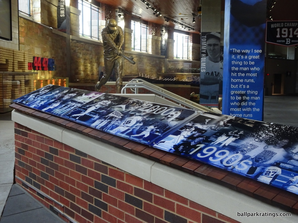
Monument Garden behind home plate does perhaps the best job of integrating team history into a Major League ballpark, bringing the past to fans on the main concourse in a beautiful exhibition as opposed to stashing monuments in a standalone museum. Anchored around a statue of Hank Aaron backed by 755 bats (in the shape of the number “755”), the garden features an interactive timeline of the franchise’s history from Boston to Milwaukee all the way to Atlanta with tons of cool memorabilia. Accentuated by gorgeous water features, it’s not only one of the best historical exhibits in an MLB park, but one of the best features in any ballpark, period.
Finally, we even have something original in the entertainment category: a zip line and rock-climbing wall! This is in addition to all of the standard kids’ games.
____In the end, we can rip SunTrust Park’s design and praise the amenities, but it’s going to be all about The Battery Atlanta, the supposed “game changer.” Just like at Turner Field, the aesthetics will never be outstanding, and the amenities will age. So, the continued development of the surrounding local scene will be vital for the success of SunTrust Park into the 21st century.
8) Progressive Field (1994), Cleveland Indians: 87.5
Consensus Ranking: Middle of the Pack
— Games Attended: 4, plus 1 tour
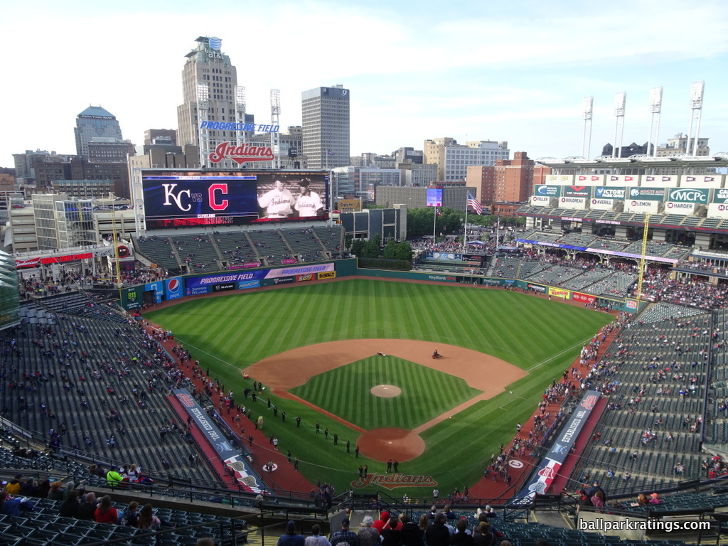
____Initially deemed a worthy successor to Camden Yards (1992), the park formerly known as Jacobs Field hasn’t gotten much love in the 21st century. While I’m partly confused by that, it is true that the ballpark was not properly maintained in the mid-late 2000s. After the 2014-2015 renovations, Progressive Field is back in full force, a prime destination for any ballpark trekker and one of the most underrated parks in baseball.
There’s a reason why baseball awarded Cleveland the 2019 All-Star Game over Baltimore, even though the latter had a longer All-Star Game drought and is generally considered to have the better ballpark. The renovations at Progressive Field have been superb, as this ballpark has risen in my rankings more than any other in baseball.
I’ve always been partial to Progressive Field because it understood what the “retro” movement was supposed to be about, not what it became after 1994. The significance of the best “retro” ballparks aren’t red bricks or silly old-fashioned gimmicks, but the connection to their cities. With Camden Yards, the fact that red brick worked perfectly in the Baltimore context was a mere coincidence. The many post-1992 ballparks that engaged in this red brick McMansion mimicry did so at their own peril. The best parks didn’t blindly imitate the red-brick aesthetic, but emulated the concept of crafting a ballpark that fits with its context.
And Cleveland really nailed that.
____Progressive Field is nestled on the edge of downtown Cleveland, in close proximity to all of the attractions. Littered with plenty of bars and restaurants, the Gateway District’s local scene is well above average.
While I think it’s attractive, Progressive Field’s exterior architecture is best understood conceptually, as the general consensus is that it doesn’t look very good. I just appreciate that Cleveland built a façade that really reflects the region.
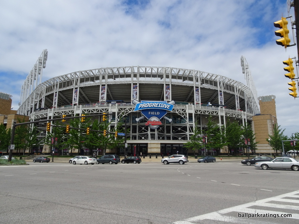
The white exposed steel look is meant to evoke Cleveland’s industrial values. With no concrete and not much of a brick “façade,” guts are exposed, revealing bones, tendons, and “reality.” The steel grinders mimic many of the local bridges, while the light towers represent the town’s smokestacks. Indiana limestone forms the base of the facade, while beige brick completes the rest of the main structure. As a concept, this is one of the best in baseball.
I’ve always loved Progressive Field’s interior aesthetics, because they eschew any semblance of gimmickry and adroitly respond to the contextual forces of the city. If you took a poll among baseball fans, Progressive Field might be derided for not having a “signature element,” which is a pretty empty critique.
Even with all of the seating engulfing the view, Progressive Field somehow feels remarkably open and responsive to the cityscape, not by default but by a conscious dexterity.
Similar to Camden Yards, no ballpark has worked as hard to capture that essential physical connection to its urban context on the inside quite like Progressive Field. I think a large part of this is due to the unusual openness in center field and the contextual integration of the arena in the left field corner. Also note how the batters’ eye is in unison with the rest of the design, not a plastic wall that sticks out like a sore thumb. The use of trees as the batters’ eye is excellent. Great use of space.
Not derived from some external kitschy treatment or an overused template, the interior is an authentic beauty. As simple as it is, the design is surprisingly original. No heavy-handed elements here; just perfect balance of the essentials with superior contextual integration. It has clean and confident architectural lines and provides a distinctive look without overloading the senses. Those new “shipping containers” are the only drawback.
____Like Camden Yards, Progressive Field has a few substantive functional issues, particularly with seating geometry. There are far too many seats down the lines that are poorly oriented. They tried to conform the stands to the surrounding streets, meaning that the seating structure itself is not angled in the right places, especially down the right field line. Many seats are pointing toward deep center field.
To add insult to injury, Progressive Field needs to replace many of its rusting seats in the upper deck, which also lack cupholders. This is strange because other early-mid 90s parks have replaced their seats. Seats aren’t a small thing obviously, so the Indians need to get with it.
Progressive Field opened with concourses closed to the field, but the 2014-2015 renovations attempted to correct this fact. While the concourses overall are greatly improved, the resulting effect isn’t too dramatic. It still feels closed, but with better field visibility through large columns. The concourse was always partially open on the first base side.
However, it should be noted that Progressive Field features baseball’s largest videoboard. While ballparks have been constantly one-upping each other throughout the 2010s in this respect, this one will probably stay the largest for the foreseeable future.
____The 2014-2015 renovations did wonders for the amenities; some of the worst in baseball are now some of the best.
While it doesn’t rival the variety seen big markets, Progressive Field now has some of the best concessions in baseball. The ballpark is quintessentially 2010s, filled with almost exclusively high-quality fare provided by local restaurants and eateries, along with a bevy of craft beer. I’m so impressed with how this trend has accelerated during this decade, and Cleveland’s food and drink renaissance is the poster child.
I counted a dozen different local restaurants from local neighborhoods serving concession fare, which is outstanding. This is one of the best ballparks in baseball for food and drinks in non-premium areas.
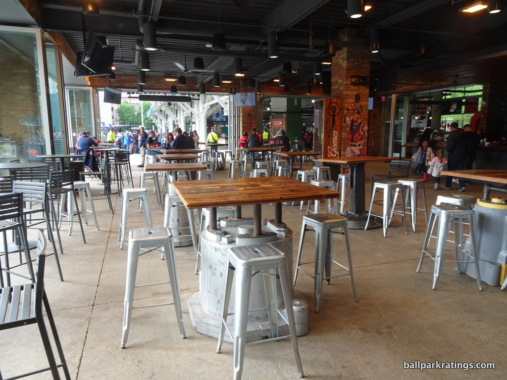
The renovations added a number of accessible bars and social spaces into the ballpark, highlighted by the bi-level Corner Bar pictured above in right field. Cleveland maintained their full-service Terrace Club restaurant (open to all) down the left field line.
In the premium seating department, Cleveland renovated its all-inclusive mezzanine club lounge in 2019. The new lounge is positively sublime, in what is one of the better mezzanine club spaces in baseball. A decidedly less upscale home plate club was also added on the main concourse in the mid-2010s, which mostly just functions as a private bar for the well-heeled fans down low.
If Progressive Field faces its downfall sooner than we anticipate, I think its basic structural design of three tiers of luxury suites will be the culprit. The park was built because of the revenue generated by these luxury suites, but that premium seating model is now flawed: no baseball market can support anywhere near this number of suites. The new model is clubs and a limited inventory of suites. The Indians have rapidly tried to repackage many of the suites as entertainment areas and clubs, but the structure can’t be changed.
Progressive Field features an excellent homage to team history in center field. The multi-tiered plaque area known as Heritage Park has an intimate setup and is easily visible to all fans, separating it from some other team museums. Anchored by a statue of Frank Robinson, the top level celebrates Indians who are inducted into Cooperstown with monuments reminiscent of those at Yankee Stadium, while the bottom level features plaques and smaller monuments of team greats. The elaborate “Kids Clubhouse” in the right field corner is also notable, in what is one of the largest children’s areas in baseball.
____Overall, Progressive Field excels in architectural and aesthetic design, but now with the requisite fan-friendly amenities of a world-class facility, resulting in a top-10 ballpark.
7) Coors Field (1995), Colorado Rockies: 88
Consensus Ranking: Top-10 to Upper-Middle Tier
— Games Attended: 5
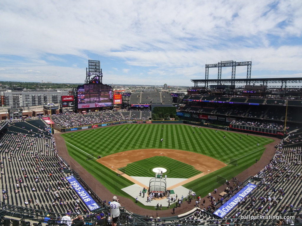
____Coors Field is one of those ballparks that everybody raves about, but you don’t really know why until you go. In my mind, it’s a park that’s swung from overrated to underrated quite rapidly, as I remember looking at the ballpark panorama as a kid and wondering what all the fuss was about.
Opening in 1995, Coors Field is now notably the oldest ballpark in the National League not named Dodger Stadium or Wrigley Field, but it’s remained a timeless jewel because of (a) its remarkable connection to its LoDo setting and (b) a series of standout renovations throughout the 2010s.
When the P.A announcer boasts that Coors Field is “baseball’s finest ballpark,” it’s a pretty big stretch, but not as big of one as you might think. The Rockies’ ballpark is pretty well-rounded, while possessing some exceptional features added during 2010s enhancements. Like Progressive Field above, we’re seeing something close to “peak Coors Field” here, as renovations throughout the decade have really cemented Coors as a great to outstanding facility.
____The highlight of the Coors Field ballpark experience is its exceptional setting in lower downtown and the surrounding local scene.
Perhaps unlike any ballpark built before, or since for that matter, the architects focused on building a structure that had a physical connection to the surrounding environment on the outside. Yes, plenty of retro ballparks do this, but Colorado does it best. Coors Field has been largely credited with revitalizing the warehouse district, highlighted by the nearby old union station. Adorned with the same red brick of the ballpark, LoDo reminds one of a quaint western downtown.
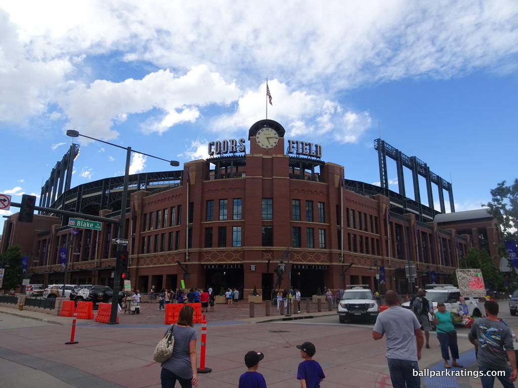
Out of all the red brick “retro” exteriors in baseball, I have Coors Field’s facade as the best, perhaps the best overall retro or not.
With many of Coors Field’s predecessors and successors, we see red brick facades whose value is simply derived from the fact that it is red brick. At Camden Yards for example, retro itself, not the individual design, is the novelty. I feel like Coors Field is one of the few retro ballparks that took the red-brick aesthetic one step further, adding regional accents and distinctive design cues from the area. In other words, it is actual architecture.
Coors Field is not another McMansion red brick ballpark, but a true architectural monument; brick, sandstone, and ornamental terra cotta columbines are added in perfect proportion, creating a design with a distinctive southwest rhythm. The darker, almost clay colored red brick works extremely well here, exuding a certain rustic neighborhood warmth that could only be associated with LoDo. Specifically, note the subtle southwest accents above and below the windows around the façade.
Considering the size of the ballpark, its recessed exterior landscaping might be its greatest asset, as the outside of Coors Field is built on an extremely intimate scale, more so than other “intimate” ballparks.
It takes a keen eye, but there is a difference between the terribly derivative and formulaic retro facades and the better ones infused with original regional sensibilities, and Coors Field is the best of the bunch.
____People rave about Coors Field’s gorgeous mountain vistas, but the park’s interior aesthetics don’t fare nearly as well outside. The entire ballpark concept was framed around the sweeping mountain views past third base. The left field upper deck is tapered off before any other ballpark in the majors, in a valiant effort to showcase perhaps the most unique view in baseball.
The problem is the mountains just aren’t notable enough to frame an entire design around, considering the ballpark’s orientation, along with the mountains’ distant scope and limited placement. Its presence just isn’t noticeable enough to most fans, and the clouds consistently compromise its visibility. If you’re sitting in the right field upper deck corner, you have one of the most aesthetically notable experiences in baseball, but only (a) in the right place (b) at the right time (c) under the exact right conditions. If you’re sitting anywhere else, including everywhere in the lower decks, Coors Field has a pretty undistinguished look.
Most of the interior simply looks functional, with interior urban integration non-existent. From more than three-quarters of the interior, the outfield structure looks like a functional stadium.

Coors Field may be an “urban utopia,” but you wouldn’t know it on the inside. LoDo’s presence isn’t at all acknowledged by the interior design. The new industrial looking apartments in left field beyond this brickwork clashes with the retro vibe as well.
I’d grade the interior aesthetics as average for a post-1990 ballpark all things considered. Spectacular from a few perches, underwhelming from most.
____Just from a functional standpoint, Coors Field sticks out from its 1990s peers. It was the first retro park to possess open concourses sporting a view of the field. It’s still plenty wide and functional today. Coors Field was also the first post-1990 ballpark to get the seating geometry right. Here, the seats are properly oriented toward the infield. This is the model copied by ballparks since. The upper deck is a little higher and pushed back from the field than we would like, but it’s nothing unusual (unfortunately). The team added a smashing new videoboard in 2018.
Moving on to the amenities, the food and drink selection is above average, even if it has lagged a bit in recent years. BBQ, Mexican, healthy fare, and an Italian market are available. Coors Field has perhaps the most unique regional staple in all of baseball. In a stroke of genius, no signature food captures the region or gives a ballpark personality quite like Coors Field’s “Rocky Mountain Oysters.”
Coors Field’s strong suit is its numerous accessible restaurants, bars, sitting areas, and social spaces within the ballpark’s confines. Again, on the forefront of ballpark trends, the Rockies added a truly exceptional “social space” in the right field upper deck called The Rooftop in 2014. Replete with cabanas, walk-up bars, drink rails, a craft burger joint (CHUBurger), happy-hour deals, and captivating mountain vistas, The Rooftop is the place to be before the game. Other ballparks have since emulated this concept.
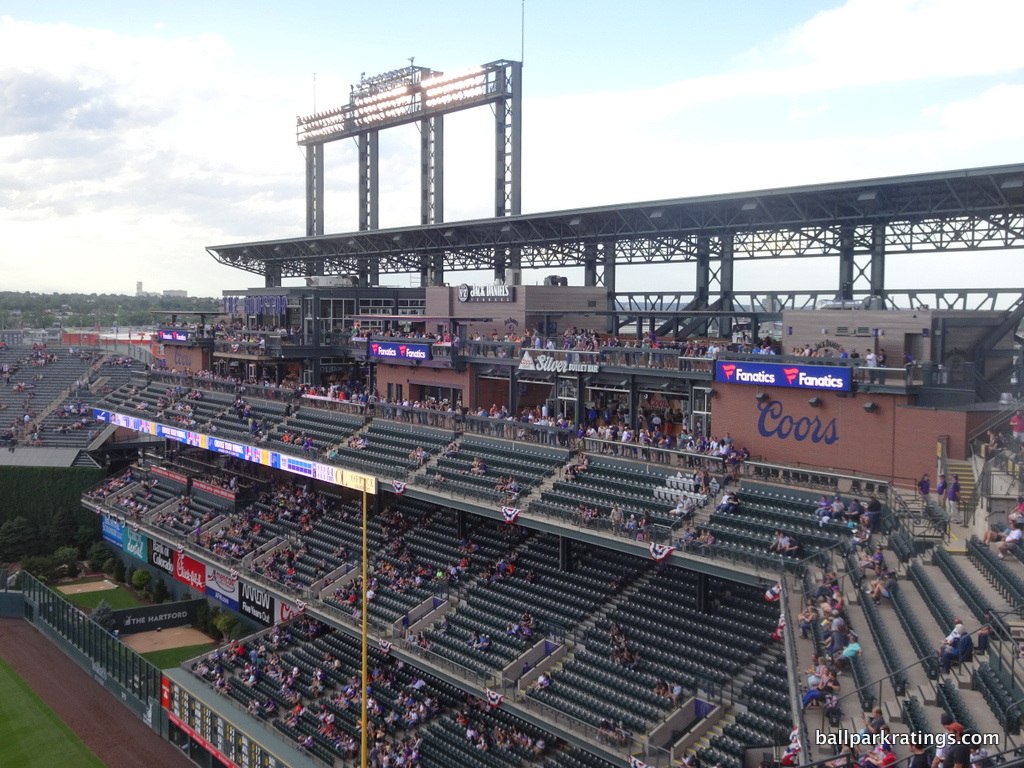
Formerly a members-only restaurant, the Rocky Mountain Ranch Bar and Grille is open to all ticket holders. You can’t talk about Coors Field without mentioning the SandLot Brewery and Smokehouse. The first brewery in a major league ballpark, the rustic taproom has a good beer selection and a fast-casual BBQ area. Add in a tasteful, climate-controlled bar in the upper deck, and Coors Field competes for best in baseball in this category.
Coors Field lacks the historical references to baseball and/or team history of most other MLB parks, but it gets somewhat of a pass because of the Rockies short franchise history. While it’s very minor, Coors also features one of the most rudimentary kids’ playground areas seen in an MLB park.
____Overall, Coors Field is well above average in most respects, from sightlines and concourses to concessions and social spaces. The Rockies’ park was ahead of its time in many respects and still compares well today. Couple that with one of baseball’s best local scenes and arguably the strongest exterior design, and you have a gem.
I think how I closed my 2011 in-depth review bears repeating: Coors Field really benefited from great timing. Derived from authenticity in 1995, it’s retro before the aesthetic became passé, free from contrivances or gimmicks. But at the same time, the Rockies fixed many of the functional flaws seen in Camden Yards and Progressive Field and established a template for the modern-day retro park.
Moreover, along with Progressive Field, the Rockies’ park has received the best enhancements throughout the 2010s.
The Outstanding Ballparks:
These ballparks will (or should) go down as some of the best of all time. What do all of these have in common? They are all centrally located in vibrant urban local scenes with beautiful views.
6) Oriole Park at Camden Yards (1992), Baltimore Orioles: 88.5
Consensus Ranking: Top-5
— Games Attended: 2
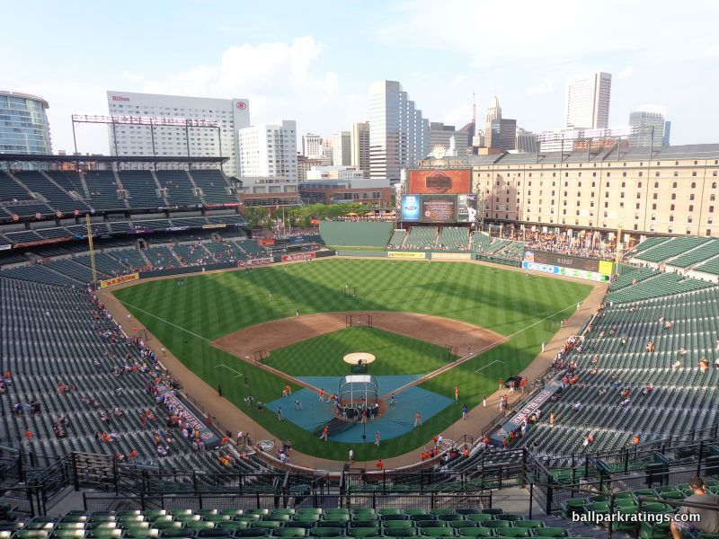
____So much has been written and spoken about Camden Yards—its narrative is as mythic as its sweep—that it’s difficult to summarize its influence without reciting clichés that have already been digested by millions of baseball fans.
Yes, the venerable sensibilities associated with a generation of “retro” parks, with their warm red brick facades, Kelly green seats, and asymmetrical dimensions, began here.
But that was never Camden Yards’ intention, which helps explain why so many of the copycats have been relative disappointments.
The significance of Camden Yards wasn’t that it was old fashioned. It’s that ballparks can be made better by abandoning templates and constructing something contextual. The first ballpark visibly integrated with an urban area in nearly seven decades, the significance of Camden Yards was its responsiveness to its surroundings.
As I’ll state one more time, the fact that red brick worked perfectly in the Baltimore context was a mere coincidence. The many post-1992 ballparks that engaged in this red brick McMansion mimicry did so at their own peril. The best parks didn’t blindly imitate the red-brick aesthetic, but emulated the concept of crafting a ballpark that fits with its context. And the other 1990s jewels (Progressive, Coors) understood that. Camden Yards was intended to start a revolution of ballparks that fit with their cities.
Beyond superficial retro treatment, the architects of Camden Yards implemented some subtle logistical innovations that have been overlooked, all of which were later imitated. Fans don’t think about these things, but they were just as influential:
- The placement of ramps on the inside of the ballpark behind the facade, allowing for unobstructed views of the exterior design. Before this, most new baseball stadiums featured ugly ramps on the outside
- The lowering of the playing field below street level allowing for easier entry
- A playing field below street level, coupled with pushing the upper deck forward, allowed for intimate exterior landscaping, thus placing the structure in scale with its surroundings
- Contextually responsive outfield dimensions along with adaptive reuse of local buildings
- Standing room only areas
- Double decked terracing of the bullpens, allowing for fan-pitcher interaction
- An attractive green ivy batters’ eye
- A classic team logo at the end of each row of the seats.
- Regional food options
- Numerous other historical or referential displays, from the Memorial Stadium foul pole in right field and retro signage on the concourses to the hall of fame plaques
It was and is a revolutionary building, it’s just that some people missed the point.
While I’m of the thought that Camden Yards is a uniquely special building for its time—the Haley’s Comet of ballparks if you will—you might note that it rates almost identically to Coors Field and Progressive Field today. That is because the latter two parks have received substantive renovations throughout the decade, while nothing meaningful has changed at Camden Yards since 2011-2012.
It’s long overdue for some much-needed enhancements, which I’ll discuss below. This is about the lowest Camden Yards will ever rate.
___Renown for ushering in a broader trend of American urbanism, the true brilliance of the Camden Yards’ concept is its location, effectively merging a highly visible and vibrant cityscape with a traditional design recalling the town’s past. The Inner Harbor scene downtown was formerly the epitome of urban blight, replete with abandoned industrial warehouses and shipyards. Decades of urban planning culminating in Camden Yards led to Baltimore being the great city it is today. While the local scene isn’t as great as the very best in baseball, there are a number of attractions in the area.
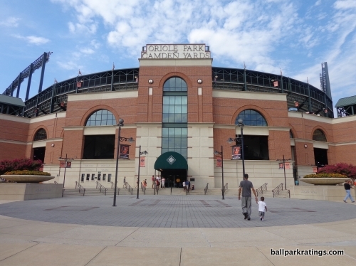
Camden Yards’ retro exterior architecture is understated but dignified. Being clairvoyantly aware of the potential for retro to become a self-conscious fake “Ye Olde” theme park in 1992 (unlike the indulgent Citi Field in 2009!), the Orioles built a remarkably intimate building in both style and substance. The façade itself is downscaled, stripped of the self-conscious pomp and frills seen in later ballparks, while still retaining elements of unique attractiveness.
Of course, inspiring this tasteful design is the classic B & O Warehouse. The eight-story, turn-of-the-century rail freight building is an essential part of the ballpark’s assemblage, acknowledging Baltimore’s bygone days as an industrial hub. Once called an ugly pile of bricks by columnists prior to construction, the warehouse now solidifies Camden Yards’ signature appeal.
____Not counting the “panoramic view” (though still good), I actually think Camden Yards has baseball’s best interior aesthetics. It’s the only one that has such a prominent “signature element” that is both authentic and attractive.
The fundamentals of Camden Yards were so seamlessly executed that we constantly overlook the giant step forward in design it represented. The fit with the city is so smooth, and the feeling is so overwhelmingly familiar, that it’s meant to look authentic, but reasonably ordinary at the same time, the striking warehouse notwithstanding.
Camden Yards was the first building in sports architecture with the central design principle of fitting with the city, or “contextual integration,” as I harp on. The superficial features or design details such as the red bricks aren’t what authentically trigger memories of the past; it’s the attempt to evoke memories by framing city views of what is classic and familiar.
Unlike some urban ballparks like Busch Stadium (or worse, the fake urban parks), Camden Yards doesn’t look like it was dropped from the sky into the area. It is effectively integrated into the setting and takes the shape of its site.
Looking down the middle of Camden Yards, we have a stunningly flawless scene in both scale and proportion. Talk about perfect balance. The scoreboard placement is simply perfect as well, allowing for the integration of the downtown setting to the left and the warehouse to the right. The right field upper deck is cut off at the perfect time to preserve just the right proportion of the red brick building.
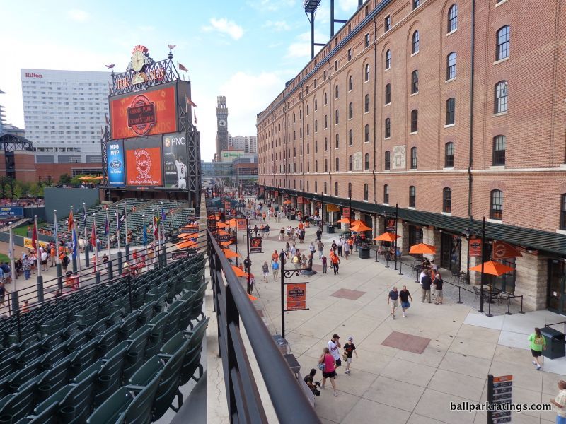
The de-facto dominant image of the ballpark, the aforementioned B & O Warehouse ties the scene all together brilliantly. The ballpark was reframed around this classic preexisting building in all ways possible. Constructed in 1899 by the Baltimore and Ohio Railroad, the 1,116-foot-long brick structure is in remarkably congruent proportions with the ballpark. It’s striking, classic, and familiar.
Through effective urban planning, the warehouse seemingly miraculously ends in the foreground right as the 250 West Pratt Street building rises in the background. The epitome of postmodern urban architecture and the tallest high-rise in Camden’s downtown view, I can’t think of a more perfect symbolic blending of historic and modern.
On the inside aesthetically, Camden Yards is the perfect ballpark. The interior design is simple and coherent, lacking the busy distractions of the newer ballparks, while also having a striking “signature feature,” lacking in the other authentic parks. No ballpark had the vision to take advantage of all the assets in its surroundings like Camden Yards.
Disregarding all the platitudes and praisings of the superficial aspects of the design, Camden Yards deserves the most credit for being the first ballpark to capture a city’s familiar spirit, which shouldn’t be mistaken for the familiar brick and steel that just happen to work in Baltimore.
____Camden Yards begins to lag a bit when looking at more objectively quantifiable elements, particularly in functional matters.
While the park in Cleveland failed to orient the seats to an adequate degree to compensate for the grandstand design, the seats at Camden Yards are not angled at all! You read that right. Thousands of seats down both the left and right field lines are pointed past the center field wall. Just awful. In my book, this should prevent Baltimore from ever taking the #1 spot. It should be noted that field proximity from the upper decks is well above average for the era, but that’s only a plus if you avoid the misfortune of sitting down the lines!
As have been much discussed, Camden Yards’ concourse systems are completely closed from the field, except above the bullpens. The flag court standing room area is nice, though. Camden Yards did replace their seats (wider than the average park) in the early 2010s, but inexplicably did not add cupholders in the upper deck. Finally, as of 2019, Camden Yards features baseball’s most outdated videoboard technology.
____Looking at Camden Yards’ amenities, they are better than the functionality, but it’s still a below-average presentation. Some nice features were added in the early 2010s, but again, the park has not been properly maintained (at least compared to contemporaries) throughout most of the decade.
The press raved about Camden Yards’ food (Boog’s BBQ and Crab Cakes, a far cry from SkyDome’s McDonalds!) when the park opened, but it’s a below-average to average smorgasbord today. It was impressive in the 90s, but the Orioles would be wise to bring in even more locally run concessionaires.
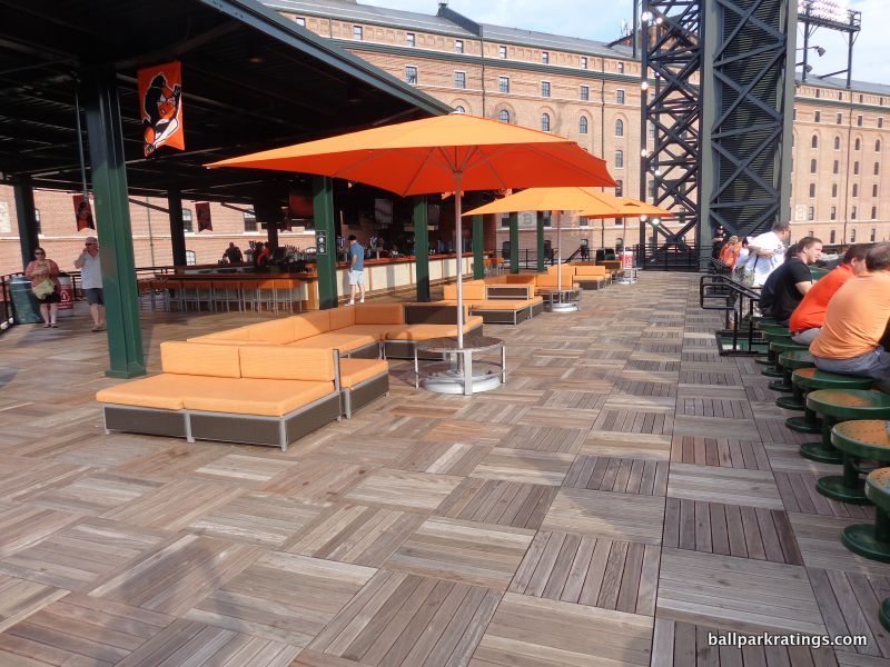
While they still have plenty of well-appointed areas, the Orioles could improve their selection of restaurants, bars, and social spaces. Right now, most notable is Dempsey’s Brewpub in the warehouse and a bar atop the batters’ eye. I appreciate the pubs on the main concourse, though. Camden Yards grades average in this category. Baltimore ranks at the very bottom in baseball in premium seating, perhaps to the delight of some readers. The outdated (albeit charming) club level is the only option, as Camden Yards is the only modern-day Major League ballpark without some sort of ultra-premium all-inclusive seating option.
While lacking the sprawling exhibits of newer ballparks, Camden Yards has done a fine job honoring Orioles history. The Orioles’ hall of fame wall, a statue garden called Legends Park, and the “Art of the Game” memorabilia area are notable. Camden Yards’ coolest historical touch? Definitely the brass baseballs designating every home run that has ever landed on Eutaw Street. See them all here. Check out Griffey’s 1993 derby home run plaque on the warehouse!
____In sum, Camden Yards’ perception as a revolutionary baseball cathedral is matched by reality, and you can’t overstate its influence and its interior aesthetic brilliance enough.
But it’s a place that could really benefit from a Progressive Field-style renovation, which brought in a dozen local eateries, added new social spaces, added new clubs, completely overhauled the concourses, and added one of baseball’s best kids’ areas, all while maintaining architectural and aesthetic integrity (for the most part). Due to excess capacity, the terrace boxes at Camden Yards could be knocked out in order to open the main concourse to the field like in Cleveland. Team officials have also discussed adding amenities like a home plate club and rooftop party decks (like in Denver), which would be wise.
While I can’t ever see it competing for the top spot due to the awful sightlines down the lines, such enhancements could catapult Camden Yards as high as #2 in baseball. This is a ballpark that could and should get much better in the next five years with meaningful renovations.
5) Target Field (2010), Minnesota Twins: 89
Consensus Ranking: Top-10
— Games Attended: 1
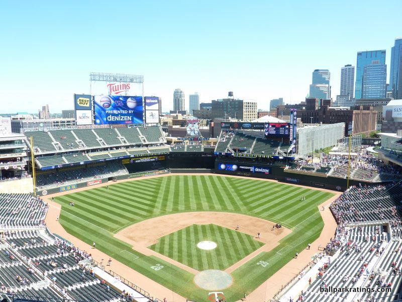
____Target Field really represents how ballparks have gone full circle since the beginning of the building boom. It represents a certain evolution in some ways, but we’re right back where we started in terms of intentions.
The central irony of Target Field is that it’s really the first park in a long time to go back to the roots of the so-called “retro” movement, i.e. building a structure in symbiosis with its environment, while being perhaps the least retro park seen in 20 years in terms of design.
Throughout the late 90s and 2000s, we saw a multitude of ballparks trying to be “retro,” though often failing due to gimmicks or a poor location. We saw multiple teams build retro cookie cutters in the middle of parking lots. We saw teams attempt to build unique and/or contextually appropriate ballparks, but come out too gimmicky, overdone, disjointed, or busy. Of course, we also saw teams build ballparks that had little independent aesthetic vision whatsoever.
With its contextual urban lines, mostly confident and free from gimmicks or distractions, Target Field directly recalls the authenticity of the best ballparks in its connection to the city. Target Field also benefits from being (a) very well rounded, as it excels in most respects while rarely being particularly outstanding, and (b) from the fact that the Twins have displayed an admirable dedication to continually upgrading the facility despite its young age.
We see something new virtually every year, including in 2019 with the beautification of the batters’ eye and the expansion of Target Plaza in right field.
____Target Field is located on the edge of downtown Minneapolis, nestled into the so-called Warehouse District. It’s within walking distance of any site of interest you could want in the city. The brilliance of the location is how they fit the park in between the interstate and downtown.
Take a look at the original land plot on Google Earth. Criticized for only being the size of Fenway Park in terms of land, they created a bridge that literally goes over I-394 to create extra space, connecting the ballpark to 6th street. Known as the Target Plaza, this standing room area in right field was actually an area improvised to connect the ballpark to the city.
____Despite its questionable architectural merits, Target Field’s limestone exterior facade certainly adds value to the derivative ballpark landscape. Originating from Minnesota, the Twins incorporated local limestone as the exterior’s primary façade, which is nicely accentuated by natural wood paneling.
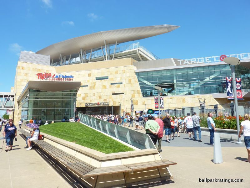
Imported from Brazil, the wood is a nice touch and definitely brings something new to the table. There’s no mistaking the natural, Minnesota forest feel, in what might be the most recognizable exterior in the majors.
However, the variance of the limestone colors is a bit too loud, in my opinion. I don’t care for how the glass and steel clashes with the limestone, either. It may be a bit too much, blatantly trying too hard to be faux regional and modern, while compromising true architectural principles.
But conceptually, it’s undoubtedly strong, successfully encapsulating a mix of cosmopolitan Minneapolis and natural Minnesota. This scores quite well considering it is a ballpark, as the standards are so low.
____Despite not equaling the best parks in terms of interior aesthetics, Target Field might be the most impressive interior design in the majors, from the contextual application of the site to the regional inspiration.
Since the 90s, except arguably PNC (Pittsburgh) and Comerica (Detroit), it’s really the first park that visibly conforms to its surroundings and makes a concentrated effort to acknowledge the city. It really is the most urban park in baseball, as everything is remarkably conformed to the area. And that deserves immense praise.
Both superficially and conceptually, Target Field directly recalls Progressive Field in its connection to the city. The open space in right field, specifically the integration of the Target Center, is a strong reference to Cleveland’s crown jewel. Both parks aren’t as “open” to their surroundings overall as parks in San Francisco, Pittsburgh, and Detroit, but they integrate their downtown setting through conscious dexterity in certain areas. Space is used very well here overall.
While it is the most brilliant urban design in a long time, I have to admit it falls short of the very best interior aesthetic scenes. While it’s a great effort, I just don’t think it comes out as pretty or as aesthetically distinctive as some of the other highly rated ballparks. My bias is against ballparks that are too heavy with seating in the outfield, and the outfield grandstands simply dominate too much of the interior on the left side. Although, I understand that’s a nod to old Metropolitan Stadium.
There are plenty of other natural regional touches that make Target Field beautiful. No other ballpark has been more successful in integrating their primary exterior motif, limestone, into the interior.
Limestone facades are present all throughout the outfield, including the Budweiser Deck and the overhang in right field. Even the backstop and the dugout, along with all of the interior grandstand facades, are designed in Minnesota’s local stone. The wood backs of many of the seats put a finishing touch on the natural theme and emphasize the ballpark’s organic color scheme.
____Given the site constraints, Target Field is much more functional than I expected. The main concourse is sufficiently wide and open, featuring great field visibility and a bevy of tasteful standing room areas. I was expecting something tight like in San Francisco, but the concourses are plenty wide.
The sightlines are squarely average, with an upper deck that is similarly pushed back to a typical post-1990 park. Although the mezzanine is admirably cantilevered over the lower bowl, and you feel right on top of the action from the left field grandstand. The seating geometry is average. There are a few more stiff necks than there should be at a newish park.
____Target Field possesses reasonably strong amenities, a few unfortunate oversights notwithstanding. Highlighted by their “state fair” concept, the concessions are very good, with variety you might not expect in Minnesota. Murray’s Steak Sandwiches are perhaps the park’s signature food item. The premium seating is well above average.
Target Field’s strong point is its delectable series of restaurants, bars, and social spaces open to all fans, something that has really been enhanced from year-to-year.
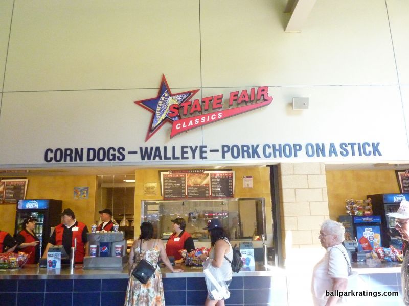
Tied with four or so other parks, this competes with the best in baseball. Included: the new and absolutely gorgeous “Bat & Barrel” (replacing the private Metropolitan Club), a Twins’ themed pub above center field, a cabana-style lounge on the main concourse below the limestone structure, two more pubs/taverns above, a restaurant/social space on the main concourse (Hrbek’s), and yet another set of climate-controlled pubs on the upper deck concourse behind home plate. Minnesota really checks all the boxes here.
With the spatial constraints, you knew the Twins were going to have to give up on something. Target Field lacks many historical references to Twins history inside the park, a far cry from the expansive monument areas and team museums seen across baseball. Instead, the Twins have a decent display outside of the park in Target Plaza, along with the obligatory statues of team legends. For what it’s worth, Target Field’s recently added kids’ playground also looks basic and temporary compared to its peers.
I’ll finally add that like any outstanding ballpark, Target Field represents its region extremely well, beyond just the aesthetics. But I feel they take it to the absolute highest level here. The “state fair” concessions and the regionally-inspired touches, along with the limestone accents integrated inside, outside, and on the concourses, really scream Minnesota. And it’s delightful.
____Despite not quite having the views of parks in Pittsburgh, San Francisco, Detroit, or even St. Louis, nor having the well-crafted interior design of parks in Baltimore or even Cleveland, the modern amenities and superior functionality that naturally come with a newer venue, along with the great location, make Target Field one of the best parks in baseball.
4) Comerica Park (2000), Detroit Tigers: 90
Consensus Ranking: Upper-Middle Tier to Middle of the Pack
— Games Attended: 6
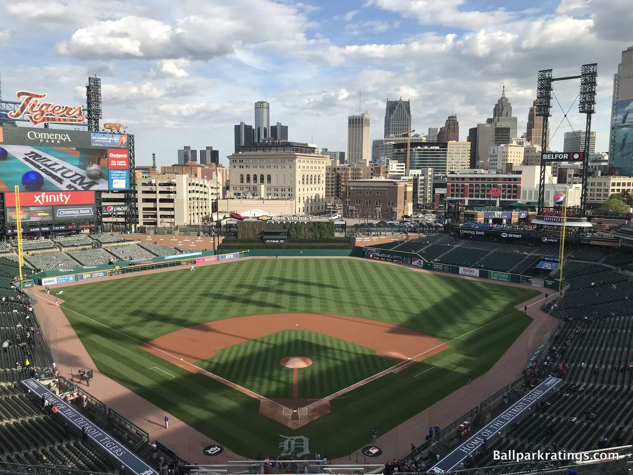
____Surely the most controversial ranking on ballparkratings.com, I’ve long considered the always well rounded to outstanding Comerica Park to be by far the most underrated park in baseball.
I cannot get my head around why others do not see what I see. Coming at Comerica from an outside perspective, this has become somewhat of a pet project for me over the years. [Aside: Although, I originally used Comerica’s skyline as the backdrop image for this site simply because it’s such a comparatively generic skyline].
Yes, in a sense this whole process is subjective because people value different things. Still, while perhaps disagreeing with the order, the majority of ballpark enthusiasts and baseball fans would agree with the placement of Pittsburgh, San Francisco, Baltimore, Colorado, San Diego, Minneapolis, etc. near the top. They are not likely to agree with Detroit. The actual ranking doesn’t matter that much because all of these parks are so close, but Comerica deserves to be in this tier. It has the core ingredients, and then some, of all of those revered cathedrals.
I wish we could move past the unfair comparisons to Tiger Stadium by the old-timers, as local fans act as if Comerica is defined by its relation to Tiger Stadium, not by how it compares to the other 29 MLB parks. Of course, Comerica Park is no Tiger Stadium, but judge the park on its own merits in the context of its post-1990 peers. I also wish we could dispense with the casual faulty assumption that the ballpark must suck because it’s in downtown Detroit by millennials.
But we haven’t come close. In fact, in a Detroit News article discussing potential enhancements to Comerica Park (like Seattle’s park, it’s at that point in its natural lifecycle, regardless of what you think of it), the author casually states that Comerica, “regularly is listed in the middle-of-the-pack among major-league ballparks,” without citing any sources.
If you have read the brief analysis for any of the parks above, the logic and reasoning behind my assessment follows naturally.
In fact, I used to have Comerica ranked even higher, but I think San Francisco and Pittsburgh have been a tad more diligent regarding enhancements so far. We’ll see what the renovations in the 2020s bring in Detroit.
In anticipated response to controversy, I’ve also included an addendum after this discussion as to why people generally overlook Comerica. I encourage you to read the addendum just as much as the analysis below.
____Like all outstanding ballparks, Comerica is effectively nestled in an urban landscape with a lively local scene of bars, restaurants, and city landmarks. Unfortunately, that urban landscape is Detroit, so from the outset, alarm bells are ringing in people’s heads.
Perhaps those people haven’t been to this area of downtown Detroit. Sure, it doesn’t compare to the very best urban locales, and yes, you do have to watch where you walk, but the immediate area is both safe and filled with attractions. Check out the Fox Theatre, the Detroit Athletic Club, and the Opera house. Most of the action is in Greektown a few blocks away. The Hockeytown Café is probably the signature eatery/bar in the area. It’s worth noting that the local scene has significantly improved since the ballpark opened.
In sum, the “but, it’s in downtown Detroit!” refrain is both overblown and ill-informed.
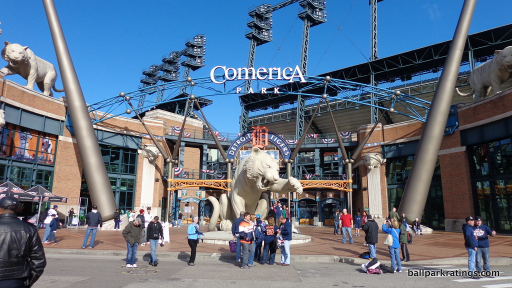
____Highlighted by numerous tiger sculptures and other artistic elements, I vacillate back-and-forth on how to assess Comerica Park’s rather controversial exterior scene, but I ultimately come out with something that is above average. On the one hand, it’s a bit much, as you could perhaps argue some true architectural merit is sacrificed.
On the other hand, there is not another ballpark in baseball where so much time, money, and effort was spent on beautifying the exterior architectural scene. Arguably over the top in its extravagance, but nicely juxtaposed with the simplicity of the interior aesthetics, Comerica Park is notable for the dozens of enlarged tiger sculptures surrounding its retro red brick.
Despite fair accusations of being too overly thematic, I don’t think it’s appropriate to call these gimmicks. Once you see the Tiger statues, you’ll realize these are real artistic sculptures. In fact, you could argue no other ballpark has more “art” on the outside than Comerica. There are many of these creatures, and they are added in perfect proportion and rhythm. If you hate corporate naming rights, just think how “Comerica” slowly but surely gets undercut: This is Tiger Stadium.
The massive bats are modeled after the bats of different Tigers legends. Other various accents help as well, such as the tiger gargoyles on the walls. Take note of the tiger claw marks running down the white columns beneath with gargoyle heads. Throughout the design, we see blue and orange pewabic tile, a material native to Michigan. We have remarkable artistic attention to detail for a ballpark.
The exterior facade itself is also remarkably intimate on the outside, sunken into the ground to the point where it looks like a regular two-story building. Comerica Park’s “outbuildings” shrink the scope of the ballpark, allowing it to fit in quite well with Detroit’s urban landscape.
____The interior aesthetics are the polar opposite of the extravagance of the outside and the pomp of the concourses: simple and understated. Confident in its simple and understated aesthetics. Free from contrivances and gimmicks. Comerica Park is retro without making a huge deal of it, complementing, not overpowering, the game on the field.
The first retro ballpark to so boldly showcase its skyline with nothing else, Comerica Park is characterized by superior contextual integration, coupled with simple interior lines. I would call it intentionally minimalist, unlike the other parks of the era.
You have to look for the little touches in what is an underrated, no-frills contextual design. You see many of these more aesthetically undistinguished ballparks add gimmicks that really clutter the look in a false attempt to supplement the design. Comerica is confident in the simple look, while parks like Citi Field self-consciously clutter their outfield design with ads and gimmicks. Comerica has a clean, uncluttered outfield design that’s especially well connected to its context.
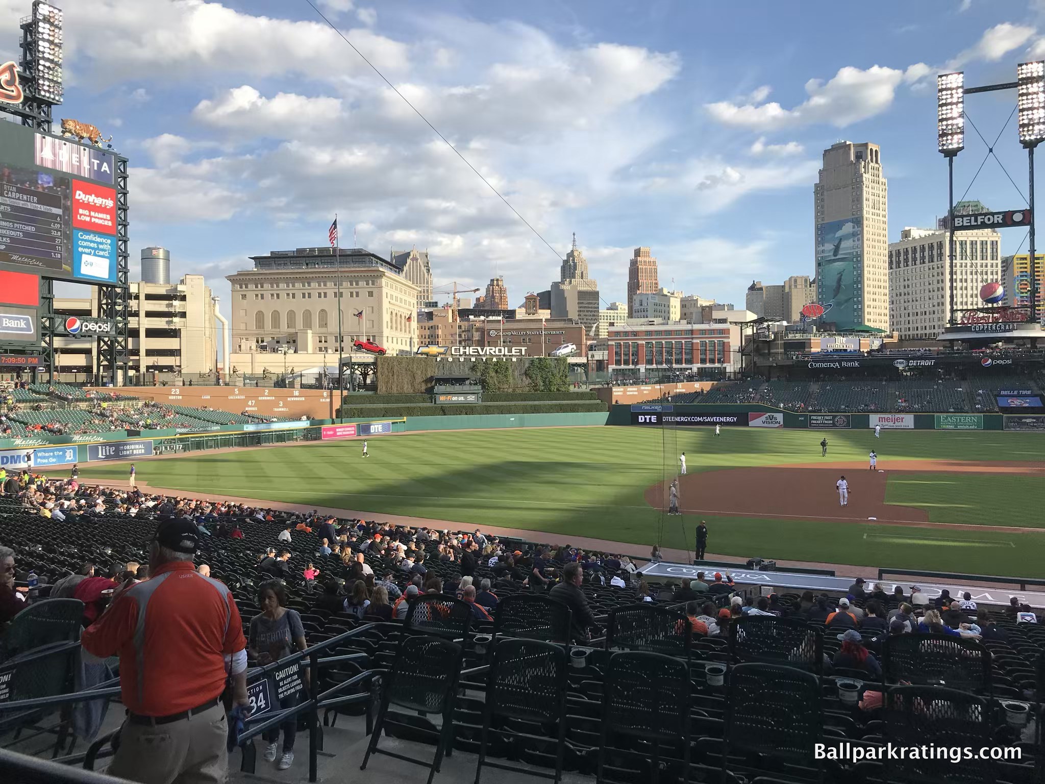
Other than PNC Park (Pittsburgh), only in Comerica can you see the skyscrapers towering over the field throughout the lower bowl because of the recessed outfield seating.
Conceptualized by the team as a ballpark in “an urban village,” this is how you invite the city environs into your ballpark. Just gorgeous.
Red brick is well integrated into the interior of the ballpark, as the “wall of fame” and the small scale of the batters’ eye carry out the “quiet retro” motif. Adorned with green ivy and a fountain at the top, Comerica Park has one of the nicer batters’ eyes in Major League Baseball, adding a small, appropriate amount of whim to a very simple structure.
I also appreciated that the Tigers integrated their historical references into the interior aesthetic schema. Located above the brick wall of fame, Comerica Park is the only ballpark where the team player statues have a prominent presence in the outfield aesthetic.
It’s not perfect, simply by the fact that the interior aesthetics aren’t as notable as Camden, Oracle (San Francisco), PNC, or even Petco (San Diego). The view itself isn’t perfect, either. While the neoclassical Detroit Athletic Club and skyline are absolutely gorgeous, we could do without the garage on the left side, even if it’s peripherally located. But that’s really nitpicking. This is obviously subjective, but it would strain credulity to call Comerica’s skyline views anything but at least above average.
Yes, the skyline isn’t as breathtaking as the one in Pittsburgh, but I think this is one of the best downtown views in baseball.
Ultimately, Comerica Park’s interior aesthetics benefit from having a simple, open, contextually-based urban design, resisting the pressure to artificially muddle its architectural lines with gimmicks just to “be different,” which may be why Comerica is just now getting the credit it deserves. Paradoxically, by not artificially “being different” with contrivances, Comerica is different from all others of its era, along with the revered PNC Park.
____ Comerica Park is a consistently functional ballpark, as team owner Mike Illich spent a lot of time and effort prioritizing the fan experience.
The 360-degree main concourse is wide and open to the field, sporting plenty of space and lots of fan-friendly standing room areas, particularly above the wall of fame. The only drawback is that the concourse is a bit too narrow behind the center field batters’ eye. Comerica Park features 1000s of more comfortable seats than your average ballpark (including non-premium seats), and the video system has been upgraded in recent years.
The greatest misconception surrounding Comerica Park deserves special attention, because it’s perhaps the most common refrain from distractors of Detroit’s “new” ballpark. Google Comerica Park, and you’ll quickly run into complaints about the park being too “spread out” with an upper deck “in another zip code.” True, in comparison to Tiger Stadium!
When comparing Comerica to its contemporaries, the sightlines are average to above average. The upper deck is similarly pushed back to other parks of the era, but with no separate mezzanine, the two-deck structure is actually lower (even if not necessarily closer) to the field than any other post-1990 ballpark except PNC Park. It baffles me how other ballpark enthusiasts haven’t pointed this out.
As I’ve stated many times, we would all like to return to the days of Tiger Stadium, but the notion that Comerica Park’s field proximity is unusually poor, or even below average for a post-1990 park, is simply a myth.
____ Comerica Park possesses some of baseball’s most fan-friendly amenities, far ahead of its time in 2000 and still comparing well today. The only slight blemish is the average to below-average food selection and quality at the concession stands (although the craft beer is solid), as the Tigers would stand to benefit from bringing in a few more local eateries. However, Comerica Park competes for the best in baseball with its wide array of restaurants, bars, and social spaces open to all fans.
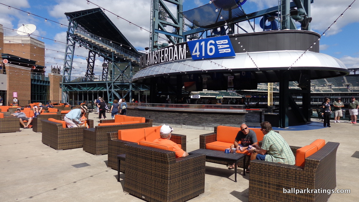
Somewhat like Target Field, there seems to be a watering hole or some sort of place to hang out at every corner of the ballpark.
On the main concourse, there is the Beer Hall, a large BBQ picnic area (Brushfire Grill), and the new Corner Taproom restaurant. On the mezzanine in the right field, Comerica Park possesses another pub restaurant, along with an expansive social space called the New Amsterdam 416 Bar (recently renamed the Coppercraft Distillery). Finally, Comerica Park has a reasonably upscale climate-controlled bar and lounge open to all fans in the upper deck, a rarity in baseball.
Heavy on old-fashioned movable box seats, Comerica Park’s lack of modern-day premium seating has been cited as a reason for renovations. From the perspective of the average fan, however, this is one of the most fan-friendly setups in baseball, an irony totally lost on the die-hard Tiger Stadium fan. It’s a very egalitarian look that doesn’t attempt to divide the ballpark along hierarchical lines. No “moats” or separate club level concourses here, as fans possessing premium seats have access to discrete spaces on and above the main concourse, and fans possessing regular seats are allowed to explore all areas of the lower bowl before the game (i.e. there is no home plate club).
Comerica Park is not only the model of how to properly honor team history inside a ballpark, but it still competes for best in baseball in this category today. Comerica Park was the first park to integrate history into the fabric of the main concourse, as most historically endowed teams just feature museums or plaque areas, which few fans would see.
In Detroit, Comerica Park itself is the museum! We see this emulated by SunTrust Park 17 years later.
Throughout the main concourse, Comerica features a prominent historical display known as the “Walk of Fame,” a decade-by-decade museum detailing Tigers history from the 1890s to the 1990s. Numerous display cases, pictures, and artifacts adorn each decade bat, in what is truly a “walking museum.” No other park integrates statues into the interior schema quite like Comerica Park, either. Walking around the main concourse, you realize that Comerica Park itself is a shrine to Tigers’ history.
From these monuments on the main concourse and statues in the outfield inside to those Tiger sculptures outside, Detroit was way ahead of its time in creating so many “Instagrammable” moments at the ballpark, something that has been all the rage in the 2010s. And they all have such a wonderful connection to the home team.
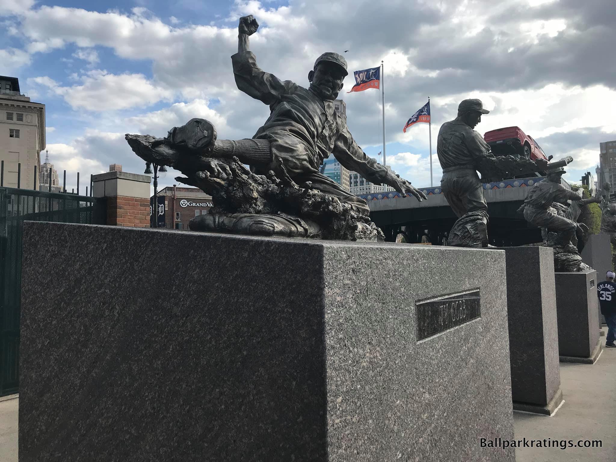
On the other hand, Comerica Park is also the model of how to integrate kids’ entertainment features into the ballpark tastefully: discretely, off the main concourse.
Famed entertainment options such as the carousel and the Ferris wheel are wonderfully delightful and over the top, but most importantly for the traditionalists, relegated to the outskirts of the ballpark. Many other parks got the historic memorabilia/kids’ entertainment placement dynamic backward.
____In the end, I often say Comerica Park excels due to sheer well-roundedness, but the park also possesses a certain tact and vision that seems to (or should) please everyone at once.
Marvelously expansive exterior monuments that create an immediate and memorable sense of arrival for the nominal fan, but tastefully understated but attractive interior aesthetics (with simple, skyline views) free from tacky gimmicks for the traditionalist watching the game.
Beautiful grounds with extravagant features off the concourse outside first base (Carousel and food court) and third base (Ferris Wheel, Brushfire Grill, Beerhall, and Tiger Den lounge) for the people, but a museum on the main concourse for the serious fan looking to revisit some Tiger history.
A swank Cigar Bar and dining club for the corporate crowd, but with a seating structure where any fan can walk up behind the dugout/home plate before the game unencumbered by dividers.
A hip social space at the Coppercraft Distillery or Miller Lite Pitchers Pub on the mezzanine for millennials perhaps not paying too much attention to the game, but free game views for the die-hard fan outside the park through the gates below.
____ Comerica Park may lack the superlatives of an Oracle Park or PNC Park, but almost no ballpark in baseball can compete with this complete package, including those two (only #1 kind of has it all). From dramatic architecture and tastefully integrated skyline views to undoubtedly solid functionality and an impressive array of amenities, Comerica is criminally underrated.
It should go down as one of the greatest ballparks of all time, right in line with Oracle, PNC, Camden, and Petco.
Here is the addendum as to why I think the underrated Comerica Park is so consistently overlooked.
3) PNC Park (2001), Pittsburgh Pirates: 90.5
Consensus Ranking: Top-2
— Games Attended: 3
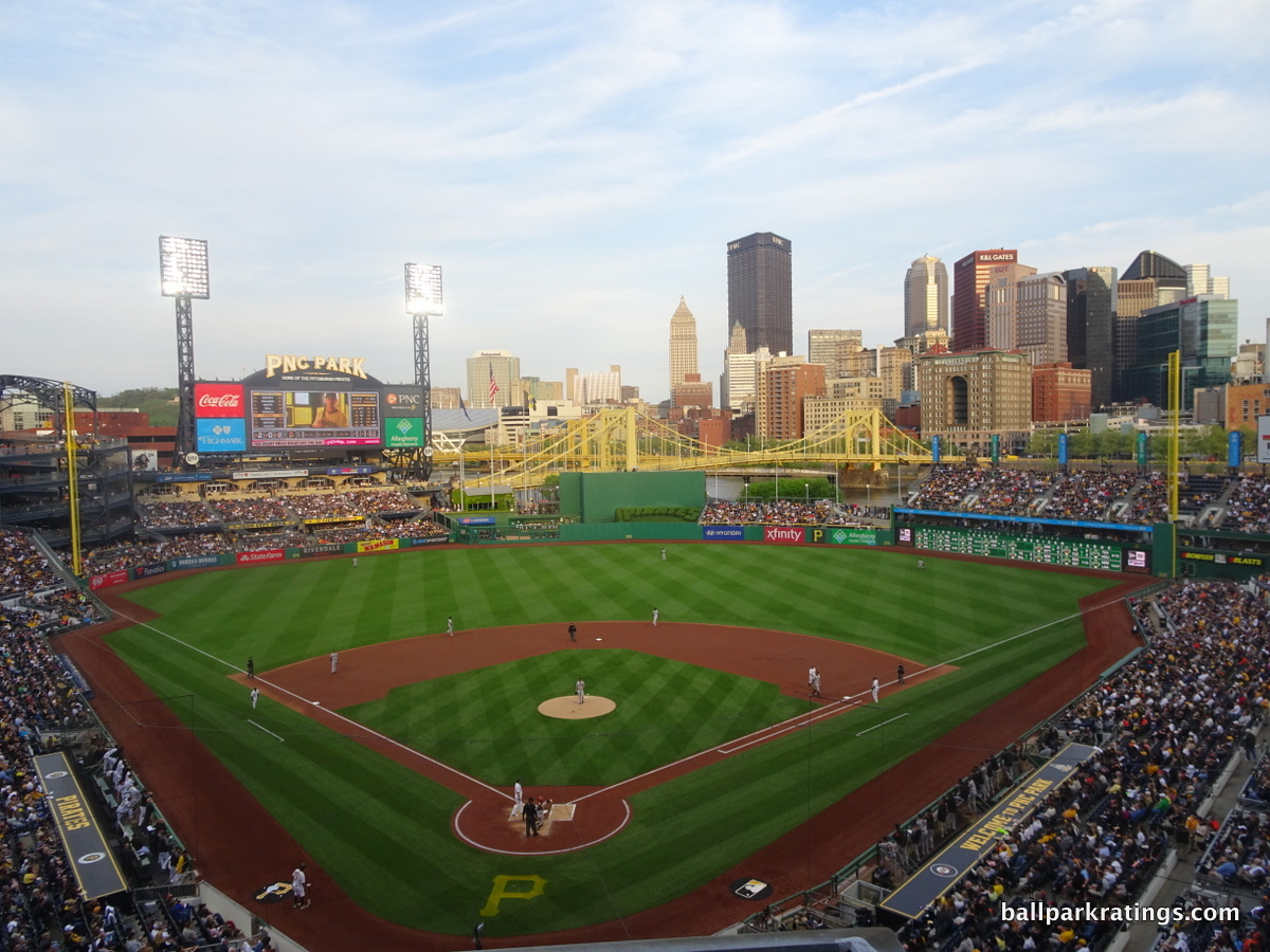
____Like Camden Yards and Oracle Park (San Francisco), it’s difficult to heap praise on something that is already so revered by ballpark enthusiasts, national writers, and baseball fans alike. Widely lauded for its views of downtown Pittsburgh and the Roberto Clemente Bridge crossing the Allegheny River, PNC Park has garnered considerable national clout in popular culture for a baseball stadium. It’s well established in the consensus top-2 along with Oracle Park.
On one level, (a) I’ve always been puzzled that PNC never receives any scrutiny whatsoever. If you literally have signs stating we are “The Best Ballpark in America,” even nitpicks (and we’ll do more than nitpick) are fair game. I’ve only seen this peculiarity pointed out one other time. If you have been to every ballpark, it’s self-evident that PNC is far from flawless.
However, (b) I’ve always considered PNC Park to be the most aesthetically attractive ballpark in baseball, and I don’t think it’s particularly close. Given the superior exterior treatment, the attractiveness of the concourses, and the fact that those gorgeous interior views can be seen from the lower bowl, I pretty clearly have it above Oracle in terms of architecture and aesthetics.
____Even saying all of that, PNC Park’s uniqueness is still not primarily about the beauty to me.
In an era where owners were demanding all the quirks and gimmicks possible to supplement their massive new ballparks, the Pirates did something different.
Somewhat quietly, around the league prior to the 2000s, sentiments echoed about how these retro parks were actually ornate projects with huge footprints, nothing like the jewel box parks. In scale, these parks had high upper decks that more resembled the cookie cutters they replaced, just with a retro façade and deceptive proportions. In actual size, these parks were not intimate and were nothing like the “classic” ballparks. Until PNC Park came along.
The Pirates decided to build a park that’s actually intimate, not just one that looks intimate through sunken exterior landscaping. From the beginning, Pirates owner Kevin McClatchy wanted an authentically low scale “35,000-to-37,000-seat park with natural grass and no roof, bells, or whistles.” Look at all of the kitschy elements incorporated into other ballparks of the era. PNC was visionary in its simplicity for the time.
Everything deviated from the retro formula: the intimate two-deck design, the limestone exterior, the lack of gimmicks, and the blue seats. Little did he know that he was building something that would stand alone in praise, in what appears to be the Wrigley Field of the 21st century.
In reality, that’s what makes PNC an all-time, historical structure in my mind.
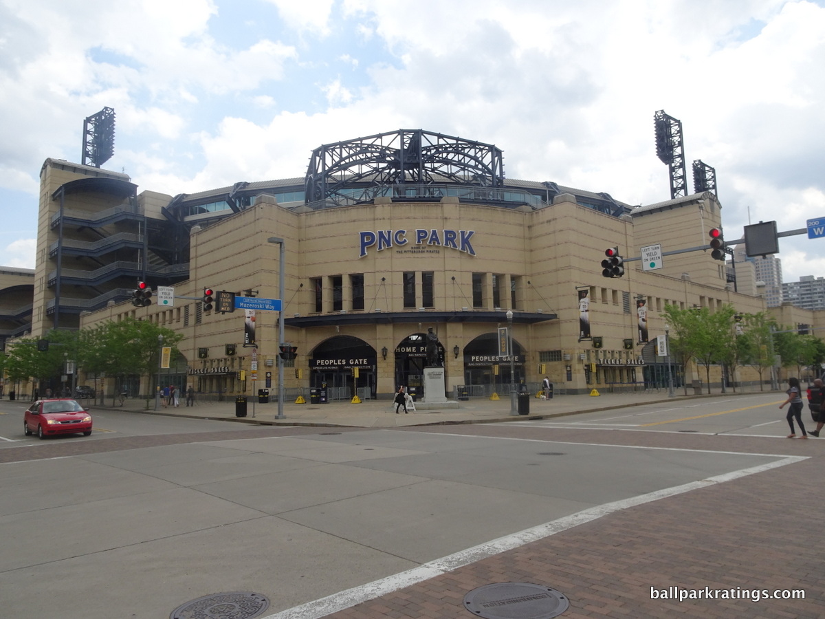
____Located in the North Shore neighborhood overlooking downtown, the architects really did a fantastic job combining the concept of downtown, the river, and the neighborhood into one. Everything that is Pittsburgh is integrated into the design. In terms of local scene, it is true that most of the activity is located across the bridge in downtown Pittsburgh, so the park is a bit removed from the best bars and restaurants of the city.
____Moving on to the exterior architecture, one of the themes you’ll begin to note is how well everything about PNC Park’s design mimics its local landscape, especially regarding the color scheme. Not only does the beige color work well with the surrounding buildings on the North Shore, but it also reflects the skyscrapers across the river. The dark blue steel trusses mimic its river environment wonderfully as well.
PNC Park uses rugged materials from the area, including Kasota stone and ochre limestone. Forbes Field inspired the park’s light towers. While the exterior mostly recalls North Shore’s 19th century buildings, there are subtle modern elements, such as the aluminum canopy by Federal Street. It’s a flavorful combination.
The small size of the exterior façade significantly contributes to the ballpark’s main theme of providing one of the most intimate experiences in baseball. While many newer ballparks strive for this look, PNC captures it best and takes the intimacy of the exterior to another level, one that even rivals Fenway. It’s up there with the best exterior designs in baseball.
____Combining “interior aesthetics” and “panoramic view,” PNC Park scores the highest in baseball.
One of the biggest challenges was finding a way to not only integrate the gorgeous view from the upper decks, but also to allow the environment to seep into the lower bowl as well. While it looks effortless, PNC Park’s greatest design coup occurs in the space between the right field porch and the left field bleachers.
Note how the minimized center field seating opens up the river views. On both sides of the batters’ eye, the stunning Roberto Clemente Bridge is seamlessly integrated into the ballpark. By limiting center field seating to less than 7 rows, the entire cityscape can be viewed from the main concourse. This was particularly important in highlighting the water. Note the complete lack of seating to the left of the batters’ eye. Pittsburgh is tops in baseball in “contextual integration”, and while it looks easy, so many others failed.
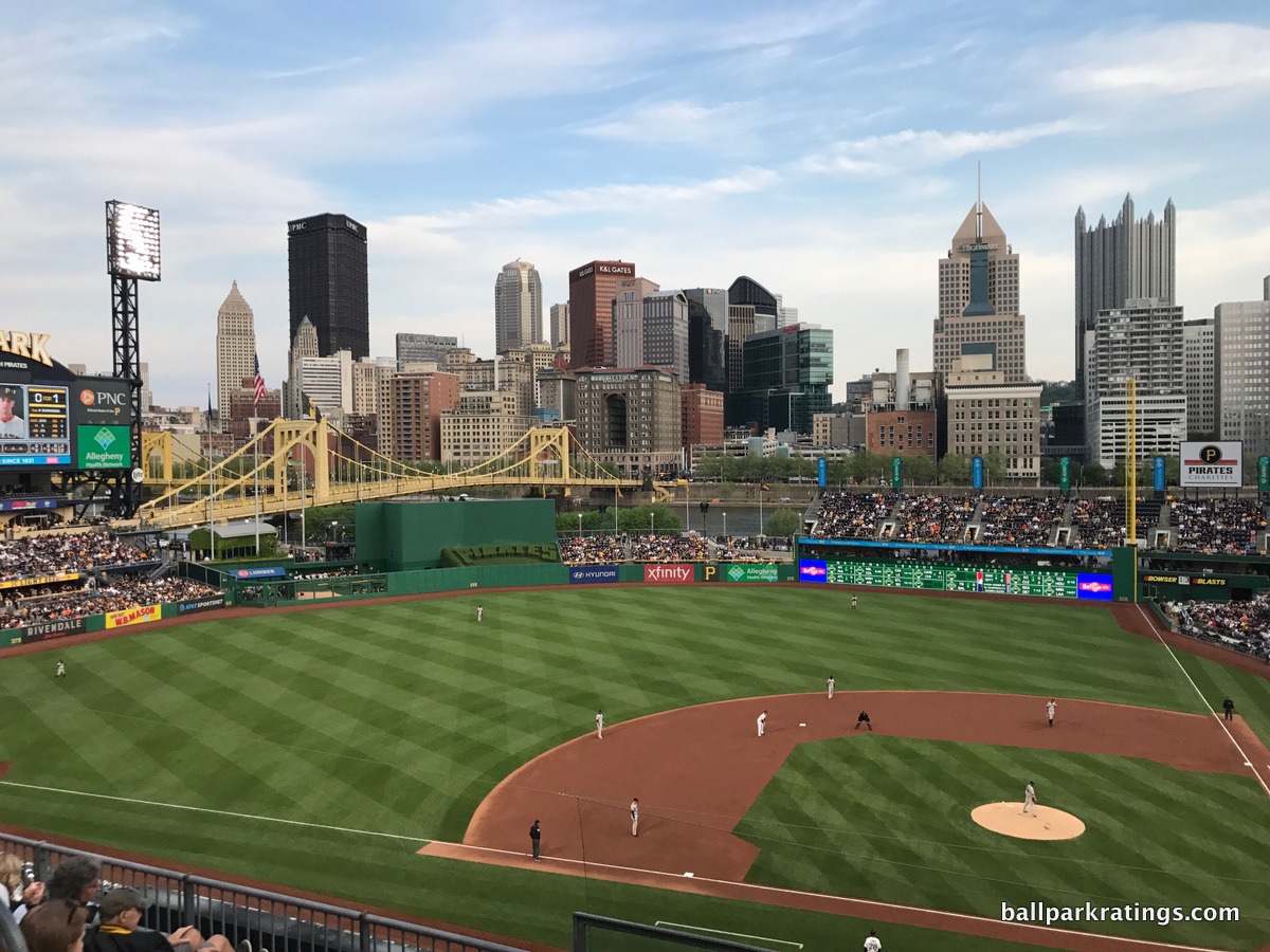
PNC is really the first ballpark to figure out that all of the outfield seating needs to be dramatically minimized. And that’s not only the key to its intimacy, but also to its trademark look. Compare the double-deck left field bleachers here to those in Cincinnati, Minnesota, or San Diego. Compare the right field porch next to the river here to Cincinnati’s same version. Regardless of the environment, it’s just a nicer, cleaner look. It all does exactly what it’s supposed to do: let the backdrop take over.
I can’t reiterate enough how PNC was one of the few parks during its era to make a concentrated effort to not muddle the design with distractions and gimmicks. Can you imagine if they had put a model Pirate ship in center field, equipped with a “home run cannon?” As ridiculous as it sounds, that was pitched, and thank god someone said no. Pretty much what Great American Ballpark is today.
The press has analyzed it like crazy, and I largely agree. The interior aesthetics are nearly perfect. Sure, PNC has the benefit of having the most beautiful backdrop, but it capitalizes on that backdrop as well as it possibly could.
____Unfortunately, it is true that PNC Park’s architecture and aesthetics carry most of its weight, as its amenities and functionality range from average to below average in the aggregate.
Everyone raves about how the “double deck” structure is great for PNC’s sightlines, but few realize the flaws in the design.
By minimizing the vertical height of the ballpark, the architects were forced to dramatically increase the horizontal footprint of the grandstand to fit 38,000 seats into the ballpark. This results in a lower bowl that is very deep with a rather gentle slope, negatively affecting sightlines. Also, the upper bowl is not cantilevered enough to compensate for the large lower bowl, meaning that some of the upper seats are pretty far back from the field for any era, despite being lower to the field.
To that point, the claim that PNC Park is a true “double deck” ballpark in the vein of the classics has always been highly misleading, because the second deck consists of the club and upper deck seats pushed together in one large grandstand. The default formula is to stack the upper deck seats on top of the club seats. By placing the club and upper deck seats in one large grandstand, fans in the actual upper deck seats are lower vertically but farther back horizontally. With the lack of pitch, you don’t feel on top of the action, like in San Diego, even though you do feel somewhat closer because you are lower.
It’s above average by default, but it could have been much better.
The main concourse is mostly open to the field, but it has some strange continuity issues, as the outfield concourse is lower than the one around the infield. This leads to many annoying changes in vertical elevation. Both the main and upper concourses are also a tad on the narrow side. Unlike other popular retro jewels, there aren’t as many standing room viewing areas in the outfield. Finally, the videoboard system is now outdated, and the seats in the upper deck lack cupholders.
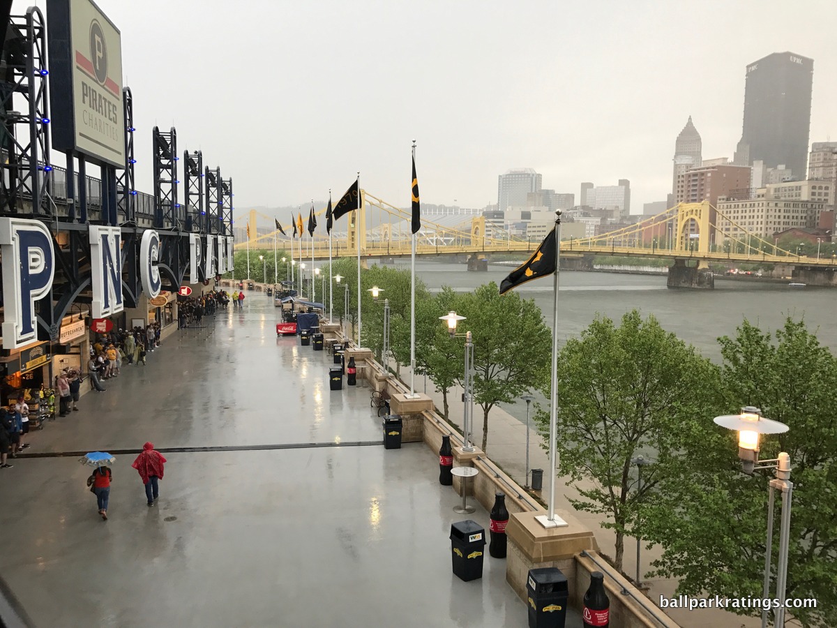
____PNC Park generally lacks the amenities of the best ballparks in baseball. While the quality of the signature food items (Primanti’s, Quaker Steak and Lube, Chickie and Pete’s, etc.) is top-notch, the variety of the food options offered is near the bottom of Major League Baseball, something that hasn’t received much attention.
PNC Park also lacks the social spaces like those pioneered by Coors Field earlier this decade, but the park admittedly exceeded my expectations in this respect. The Pirates added a number of new sit-down bars throughout the main concourse, and they have some exterior restaurants connected to the left field concourse (along with the Jim Beam Left Field lounge above). While minor, the kids’ area is comparatively rudimentary.
Most notably, the Pirates’ beautiful ballpark is missing the common references to team/baseball history within its confines, not counting the memorabilia in the premium areas. This is contrary to PNC’s reputation. In large part, PNC Park suffers here because it recently got rid of the historical showpiece in Legacy Square. It was an interactive exhibit that honored the history of the Negro Leagues and various greats from the Grays and the Crawfords. The square featured six bronze statues with interactive video systems informing fans of each player’s background and stats. There was even a movie theatre.
Disappointing to say the least. Yes, there is plenty of memorabilia on PNC Park’s wonderful club level, but most fans will not see it. Yes, the exterior statues are particularly nice here, but almost every ballpark on this list has statues. As we’ve seen throughout this essay, historical references, museums, and other such effects should be imbued in the common areas of your ballpark in some manner. It’s a connection that makes the “mallparkification” of our grand cathedrals a little more palatable, and the Pirates lack many references to team history inside the non-premium areas of the park.
____Overall, PNC Park will go down as one of the best parks of all time, but there is room for improvement. There is more to a ballpark than views. In order to be the clear best park in America, PNC needs to fix some minor functional issues and generally enhance its amenities.
However, the fact that this outstanding treasure still ranks #3 in spite of these issues is a testament to its sheer beauty.
2) Oracle Park (2000), San Francisco Giants: 91
Consensus Ranking: Top-2
— Games Attended: 3
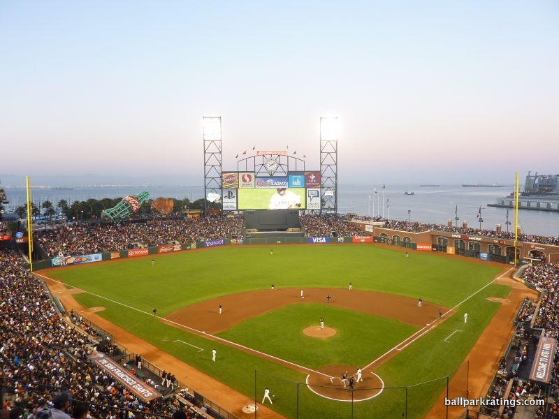
____In what many have argued represents the pinnacle of baseball’s multi-decade billion-dollar ballpark building boom, San Francisco’s scenic bayside facility has transcended that conversation in many ways. In fact, Giants’ timeless palace is just as lauded for its private financing structure and its generation of the most enduring attendance boost of any ballpark in modern history.
After scores of articles have gushed over the blending of a world-famous city known for its postcard water views with a perfect ballpark, it has cemented itself in American popular culture, similar to Wrigley and Fenway.
____After exploring the sights and sounds throughout the main concourse and in the lower bowl, you’ll be overwhelmed by the venue now known as Oracle Park, before you get to the right field arcade and are promptly reminded that the park is best known for sitting on the gorgeous San Francisco waterfront. This is intended both as a modest slight and a huge compliment.
While Oracle Park boasts the most scenic views in baseball from the upper levels, there’s little mention of the city or the water visually from the lower bowl.
Unlike at PNC Park, you don’t have a view of the scenery or the water if you’re sitting in a lower box seat. Neither does it quite capture or take advantage of all elements in the environment, such as the San Francisco skyline or the bay bridge. While the interior design is still brilliant on multiple levels, Oracle Park isn’t the absolute best in that respect. I don’t know how one could correct for this, but you would never know you’re on the water when sitting anywhere in the lower bowl (until the seagulls come after the game).
That being said, that realization demonstrates a second, arguably more important, point: this is a great ballpark even without the view.
You hear it all the time from contrarians (and Dodger fans): “well, come on, if Oracle Park didn’t have the water, it would just be another retro cookie-cutter.” Beyond the fact that Oracle Park is built the way it is because of the water, the amenities are spectacular enough here that even without the bay views, this is a stellar ballpark.
While much of the media hype surrounds McCovey Cove, the Giants’ attention to detail and thoughtfulness is unsurpassed. As I’ll get to, Oracle Park is not perfect, but the amenities are just as good as the beautiful aesthetics and the location. The Giants have also taken substantive efforts to further enhance their fan-friendly amenities in the late 2010s, enough for me to move Oracle Park to #2 in a crowded field of outstanding parks that rate almost identically anyway. The new videoboard for 2019 helped as well.
____Somewhat like Minute Maid Park and T-Mobile Park (Seattle), San Francisco’s ballpark wasn’t built near the center of downtown, but on the outskirts of the central business district. But unlike the former two, Oracle Park has been extremely successful in rejuvenating the area. When you couple the growth in the direct area with its literal location on the San Francisco Bay, along with its presence in one of the greatest cities in the world, you have one of the very best settings in baseball.
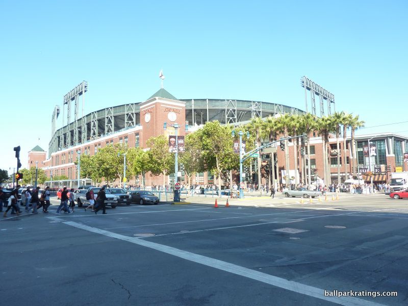
Unlike the exquisite facade in Denver, Oracle Park’s exterior architecture lacks much of the expected striking qualities. Instead of echoing the eclectic cornucopia of famous historic and modern architecture of San Francisco, the architects chose to wrap an exciting ballpark in an urbane brick cloak, lacking many of the accents seen on other brick facades across the majors.
While the setup is nice enough on the whole, it comes off as one of the safer exterior designs in baseball. Remember, I’m pretty strict with exterior architecture, so there’s no doubt it’s attractive enough. Decorated with palm trees, the Willie Mays Plaza behind home plate has become the iconic exterior image of Oracle Park.
____Oracle Park’s simple interior aesthetic treatment is based around two design principles: complete adherence to site constraints and integration of the San Francisco Bay into the ballpark. By and large, the Giants succeeded on both accounts, building a timeless structure with downscaled interior lines.
Brilliantly shoehorned in the China Basin area of San Francisco, Oracle Park’s greatest achievement is its appreciation of the site. In an era where ballparks gained their identities through synthetic quirkiness and the self-conscious whims of the PR department, Oracle Park is legitimately derived through adaptation to its environment. All of the design virtues are born of necessity.
The short porch in right field is dictated by McCovey Cove, as is the deep right center field power alley. The wall runs parallel to the water. You have to admit it is refreshing that these quirks are authentic.
Unlike almost every other retro ballpark, the outfield seating structure is rather monotonous and simple, especially the setup of bleachers in left field. Oracle Park is the only ballpark in the majors with no second deck structure in the outfield, in the interest of the bay view. Note how the gentle slope of the left field bleachers preserves the view of the palm trees.
Oracle Park is one of the few parks to integrate archways into the inside of the ballpark. The gorgeous arched promenade is a subtle reference to the nearby Memorial Stadium in Berkeley. It’s fitting that Oracle Park has brick on the inside to match the Giants’ primary color. Space is used so well, here. The layout is tight and compact, without all of the dead space seen in the worst ballparks.
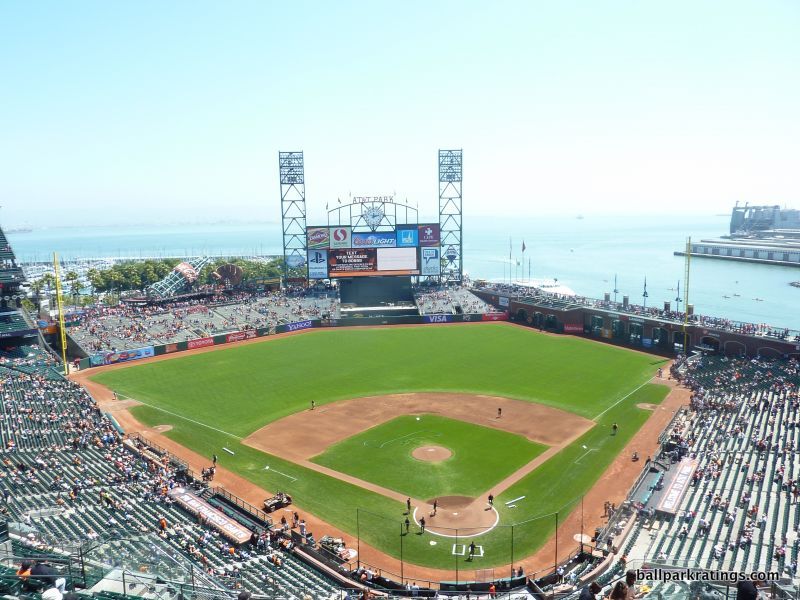
San Francisco’s method of displaying the bay views is particularly interesting, despite not being perfect. Even better views could have been possible down the left field line. If they had cut off the left field deck similar to the right field deck, we could have seen more of the Bay Bridge and the skyline. While there’s little else the architects could have done, Oracle Park doesn’t take advantage of all available landmarks, and again they aren’t viewable from the lower bowl.
Obviously though, it’s still a breathtakingly beautiful setup. When looking at the view itself, I might note that Oracle Park is more than just gorgeous sea blue water. It’s a perfect picture. On the left field side, note how the ballpark perfectly integrates the sailboats and palm trees. You have to go to the game to notice the Berkley Hills beyond the water. You couldn’t imagine a scene that better represents the bay area.
Despite my quibbles, it’s only behind PNC Park when you couple “interior aesthetics” with “panoramic view.”
____While Oracle Park features great amenities, the park is severely hampered by a couple of functional flaws, one in particular.
Perhaps unavoidable due to the site constraints, the concourses are some of the worst in Major League Baseball, even considering they are “open” to the field. 25-28 feet in width, the concourses are so narrow even short concession lines impede circulation. Visibility is poor due to the kiosks, columns, and a low ceiling.
Bottlenecks are frequent in the corners, as the main concourse gets particularly narrow in both right field and left field by the coke bottle to the point where it’s simply a passageway. Just looking at the congestion in the outfield, or even the widest points of the main concourse, we can conclude circulation isn’t properly encouraged. The upper deck concourse is narrow as well.
It’s a mystery to me why more ballpark trekkers haven’t noticed this, as somewhat like Camden Yards’ laughably poor seating geometry, it will be hard for me to ever rank Oracle Park as the #1 best in baseball because of this unalterable and enduring flaw. Space matters, and the concourses are so narrow that getting around Oracle Park is genuinely a chore. Maybe not in comparison to Candlestick Park, but certainly so compared to every other post-1990 ballpark. The lesson: there’s more to a ballpark than what you see on Instagram.
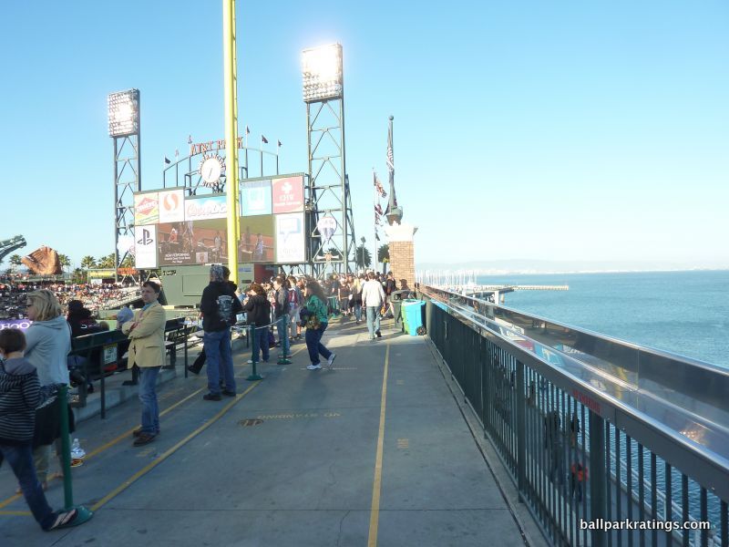
The sightlines at Oracle Park are generally more problematic than most retro parks, characterized by poor seating geometry down the left field line. In order to preserve bay and bridge views in left field, the architects were forced to squeeze a surplus of seats in foul territory (not in outfield). It’s not as bad, but similar to Progressive Field or Camden Yards, every seat in San Francisco past third base down the left field line is poorly angled in some fashion.
Due to the new videoboard arms-race in the last 10 or so years, Oracle Park’s video systems (despite being updated in 2007!) were clearly outdated in the last few years. The Giants responded by adding the third largest videoboard in baseball for the 2019 season.
____With such extreme site constraints, the fact that Oracle Park has some of the best amenities in baseball is a testament to the organization’s drive and ingenuity. They are consistently great to outstanding.
While since surpassed by Petco Park in San Diego, Oracle Park has historically held the reputation for having the best ballpark food.
The quality and selection of the concessions are so expansive they transcend the generic categories of BBQ, Asian, Mexican, Seafood, etc, and are instead subdivided into specialties characteristic of Caribbean BBQ, Irish, Italian, authentic Mexican, Thai, Chinese, etc. The Crazy Crab’z Sandwich, the Cha Cha Bowl, and the Garlic fries are traditionally said to be the staples of the ballpark. Kiosks selling clam chowder in a bread bowl scream San Francisco. As one may expect, Oracle’s sensational food is coupled with a terrific craft beer selection.
With no upper levels in the outfield and limited space on the concourses, Oracle Park doesn’t have the social spaces of most other parks, but they sure have gotten creative in recent years.
While the Giants have retained their sit-down restaurant (Public House) off the main concourse, they added a space called “the Garden” beyond center field at field level. It’s just what it sounds like, and more. Featuring two bistros, a bar, dining tables, benches, and fire pits to go with world-class healthy fare from freshly picked fruits and vegetables, it’s a prime example of how Oracle Park stands out in providing over-the-top amenities.
Historical touches are everywhere you look at Oracle Park, from the statues and “wall of fame” on the outside, to the thoughtful quotes and murals throughout the concourse. It seems as if every single available space, even throughout the ugly ramps, is appointed with a historical quote.
Most importantly, the Giants added a team museum dubbed “The Vault” in 2018. Featuring rotating exhibits of memorabilia spanning all the way back to 1883, this space alone is a prime destination for Giant fans across the country.
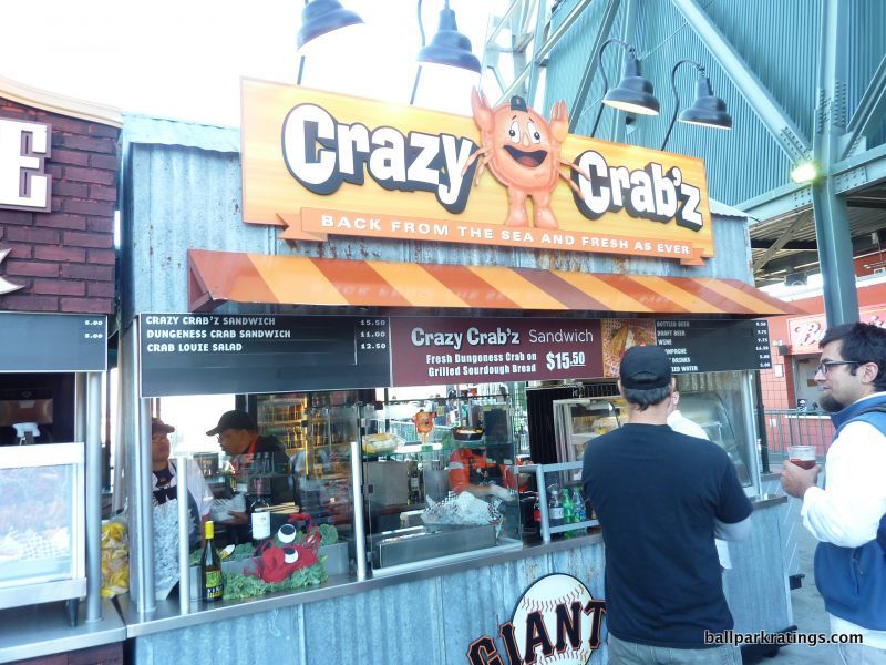
Beyond providing the cursory amenities, the premium club options are unique, one new one in particular. In 2014, the Giants added arguably the most exclusive private membership club in baseball. Cleverly dubbed the Gotham Club, members get a flurry of perks, including access to a swank bar and dining area behind the right field out-of-town scoreboard, exclusive field access, and a private game room on the suite level. Passes are not available on the secondary market.
The Giants finally added an uber-premium space at ground level in the place of a former umpire locker room for Lexus Dugout Club ticket holders. The Blue Shield Field Club which sits above this new space behind home plate has been renovated for 2019 as well.
Instead of being the usual burden to the average fan, the innovative kid-related activities are taken to a whole new level, integrated into the aesthetic appeal of the ballpark. The left field coke bottle, meant to add a small amount of whim to a monotonous array of bleachers, is both functional and attractive, containing a slide for kids leading to a mini baseball field (Fan Lot).
Generous bonus points are awarded for the transcendental qualities of this gem, as features such as the water views and the food quality burst the 5-point scale, so far above anything seen at most other ballparks. Heck, places like the centerfield garden and the Gotham Club are far above anything seen at any other park.
____In hindsight, Oracle Park is a ballpark of extremes when looking at the post-1990 facilities: the best view in baseball, some of the best aesthetics, some of the best amenities, some of the worst overall functionality, the narrowest concourse, and perhaps the most spatially constrained site. But the good is obviously far more extreme than the bad, and far more consequential.
When it’s all said and done, the historically outstanding Oracle Park meets expectations in interior aesthetics, while exceeding expectations in thoughtful design flares and amenities, despite always being limited in my book by the extremely small footprint.
The Absolute Best Ballpark in Baseball:
Something I didn’t think I would ever write a few years ago with so many wonderful facilities…
1) Petco Park (2004), San Diego Padres: 93.5
Consensus Ranking: Top-10
— Games Attended: 4, plus 1 tour
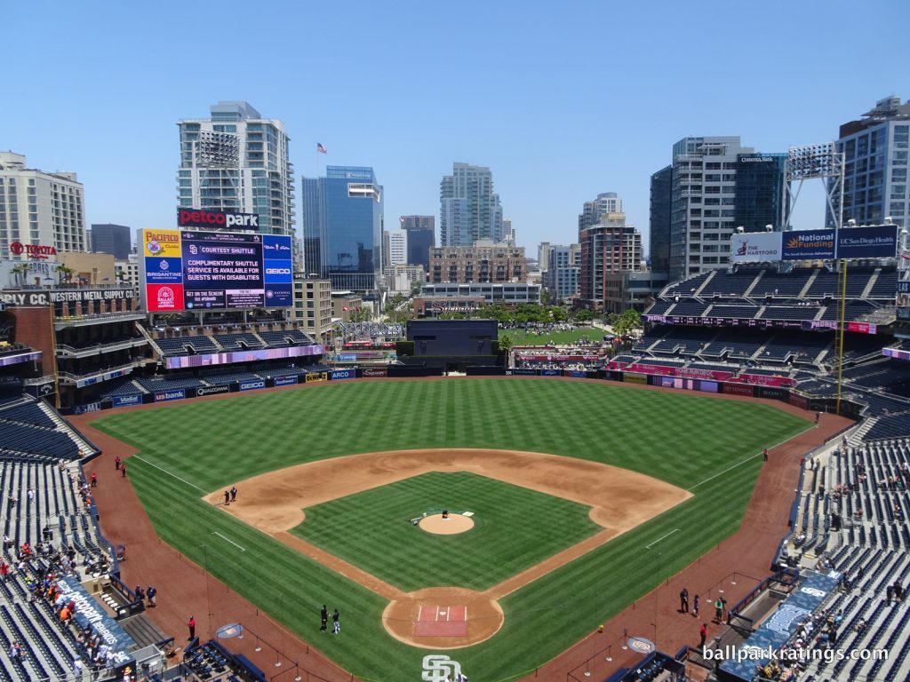
[Aside: I’m going to outline this blurb as I did in my actual review to better illustrate my thought process, as opposed to going in order by categories. Petco Park ranges from above-average to best in baseball in every category except concourse functionality.]
____Back in 2009, I wrote that Petco Park was the J.D. Drew of ballparks.
The metaphor was simple: like the player, Petco Park was great, but it had all of the tools to be the greatest in baseball and failed to put everything together. Petco Park had (and has) incredible originality, the best local scene in baseball, great amenities, great sightlines, beautiful landscaping, a great climate, an unmistakably high-quality exterior design, and a gorgeous contextually-based interior aesthetic, all centered around elevated concepts.
While he was always a good player, things never really materialized for J.D. Drew to the degree that was expected. Luckily for Petco Park, stadiums evolve and don’t have expiration dates like baseball players. J.D. Drew never became that game-defining player, but I think Petco Park has become just that.
By my careful assessment and analysis, examining every metric top to bottom, Petco Park is the best ballpark in baseball, and it isn’t particularly close.
So, how did Petco Park become the best ballpark in baseball?
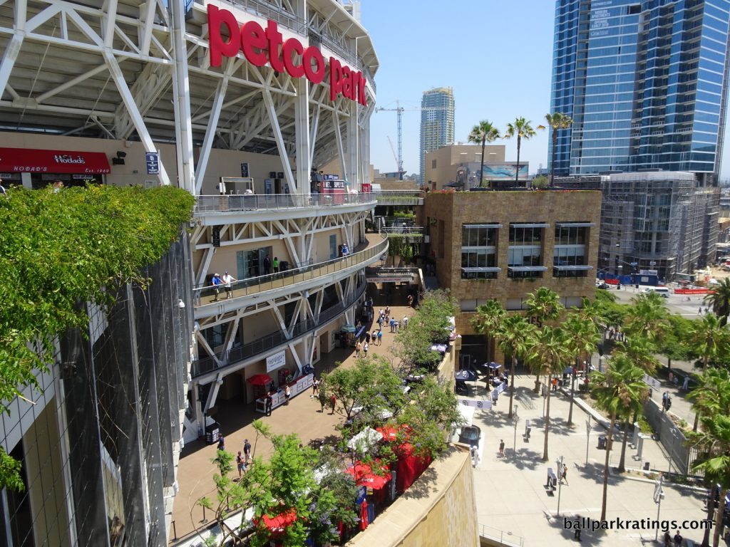
____Well, the Padres’ home was already a top-5 ballpark back in 2009, just one that was more defined by missed opportunities.
It always had one of baseball’s best local scenes (now the best) by virtue of the Gaslamp Quarter. As a design concept, it has always been the most original and ambitious ballpark of the post-1990 era. The idea of removing the restaurants and other amenities away from the seating bowl, thus carving out an open-air, canyon-like concourse, is a welcome innovation. You’re basically splitting the ballpark up into several outer structures separated from the seating bowl, with the main concourse open to the sky and bridges above connecting the upper concourses to the outer “garden buildings.” Other concepts, such as “neighborhood seating,” the suite towers, and the “Park in the Park,” are undoubtedly novel.
Through a series of tweaks and enhancements, those concepts have been refined into something unmistakably brilliant in practice. With its superior setting, Petco Park is beautiful, despite not equaling the aesthetics of PNC Park (Pittsburgh) or Oracle Park (San Francisco). Unlike those two, however, the Padres’ sparkling pad is now nearly flawless in more objective categories.
I think it’s through that equation that you get the best ballpark in baseball. Let’s look at the recent areas of improvement and some other specifics.
____One of the primary complaints about Petco Park was how the outfield concourse and the “Park in the Park” wasn’t well integrated with the rest of the interior aesthetics. By removing the silly sandbox (“the beach”) and adding a new “social space” in that area, the fan-field connection became much better. (You know, where actual fans can enjoy the game as opposed to five-year-olds playing in the sand who look like they’re about to get smacked by a home run ball.)
Perhaps most importantly, development around the park continues to accelerate, enhancing Petco Park’s setting and interior aesthetics. Compare Petco’s current appearance to the former look. Wow! I think we see the redevelopment project at full fruition today, with nearly every space occupied by a condo, hotel, or office building, except the Park in the Park. It’s a great look: an urban village with a park in the middle.
Can you think of another park where the views have improved so much?
With a lot of these ballpark categories, you get anchored into giving acclaim just based on reputation. When discussing ballpark food, for example, the reflective answer is always that San Francisco or Seattle has the best ballpark concessions. This was a bit of a sore spot for Petco Park in the early years.
During the 2010s, Petco Park made a quantum leap in this department. The Padres showcase a wide variety of BBQ, Mexican, Latin, Asian, sandwiches, and seafood, all provided by local, high-quality restaurants in the San Diego area. Both the breadth and depth are remarkable. When you couple the cuisine with San Diego’s craft beer, I think you have a system of concessions that is the best in baseball. This is perhaps the most remarkable ballpark transformation this decade in any category.
Another common criticism of Petco Park was the lack of Padres’ history integrated into the park. People always remarked that the structure was beautiful, but it didn’t look like a ballpark, and you couldn’t tell who plays here. This was rectified before the 2016 All-Star Game with a tasteful interactive Padres museum. It seems like the Padres went down the list of ballpark shortcomings and poured millions of dollars into correcting them.
____When you add these improvements to an already solid array of features, Petco Park absolutely blows everyone else out of the water in terms of amenities. The Padres’ series of restaurants and bars was always their strong point, and they continued to astonish me upon my return visit in 2017.
Just to hammer home the point, let’s provide an exhaustive list. Note that all of these areas are accessible to anyone with a ticket, and these are bona fide destinations, not one of the many delicious concession stands or walk-up bars.
On the main concourse, Petco Park has (1) an accessible outfield social space overlooking center field, (2) a full-service restaurant/bar behind home plate, (3) and an indoor wine bar behind home plate. It has a signature full-service restaurant/bar within the (4) Western Metal Supply Co warehouse. On the accessible Toyota Terrace level, the Padres have (5) an upscale full-service restaurant/bar, (6) a full-service sushi bar, (7) an informal fast-casual eatery and bar, and (8) an outdoor bar overlooking the San Diego Bay and Coronado. In the upper deck, we have yet another (9) full-service restaurant and bar, open to the sky providing great views of the ocean. The upper deck also has (10) an informal fast-casual dining area on top of the warehouse. That’s before getting to any picnic areas or any premium seating clubs.
The exceptionality of having such a wide array of restaurants and bars open to all fans cannot be emphasized enough.
The Padres’ intention of opening up most spaces to all ticketed fans is notable, in what could be construed as an “anti-Yankee Stadium,” mostly free from exclusion and division. Looking at the amenities overall, if there’s one word I’d use to describe them, it would be overwhelming.
I often remark on ballparks that take more than one day to explore, but Petco Park takes at least three days. After enjoying the exemplary regular concession stands, all 10 eateries and bars, the premium clubs, the museum, and the entertainment in the Park in the Park, I was actually exhausted by the end of the weekend. And remember, this is all inside the ballpark, not counting the best local scene in baseball in the Gaslamp Quarter outside of the gates!
Make no mistake: Petco Park is inarguably the best park in baseball for not watching the game.
____The fact that Petco Park so overwhelms a ballpark fanatic hints at the stadium’s only objective flaw: the concourse functionality. I was hoping my memories from 2009 were exaggerated, but Petco Park is very difficult to navigate. At every turn on the main concourse (especially in the corners), you’ll encounter some encumbrance. There is no ease of circulation here, as moving from the outfield to the infield even requires ramps down the right field line. The concourses are mostly closed from the field as well. Although, with sufficient space, it’s not a flaw on par with the narrow concourses at Oracle Park.
____While you could enjoy an entire weekend here without ever seeing a pitch, there’s another layer of peculiarity to that fact: while Petco Park is the best park in baseball for the non-baseball fan, it’s also the best park in baseball for watching baseball!
As has been publicized, Petco Park has some of the best seating cantilevers in baseball. The terrace level (mezzanine) extends almost 15 rows over the seating below, and the upper deck extends far over the mezzanine. While PNC Park is lower, Petco Park is actually closer to the field (horizontally) from the upper levels. With no separate suite levels, Petco Park isn’t prohibitively high either. While there have been complaints about outfield obstructions from left field, the Padres have baseball’s best sightlines judging by both field proximity and seating geometry. Seats down the lines are more aggressively angled than even at the best parks in this respect, something that I really appreciate. Petco Park has brand new videoboards too.
____So, what’s in between watching baseball and not watching baseball? Is this just a pedantic way of telling you Petco Park is the best stadium in baseball overall? Do these two facts make Petco Park literally the perfect ballpark?
No, actually. While the exterior is striking, many of my complaints about the interior aesthetics still stand.
As a general theme, Petco Park is too disjointed, built around an old brick warehouse then reframed through the prism of a sandstone nautical motif. That doesn’t make much sense conceptually.
While the Gaslamp Quarter seeps into the ballpark’s aesthetic schema, I wish we saw more elements reminiscent of the San Diego Bay. Where are the water features, the plush greenery, and the palm trees of San Diego? Yes, they are well integrated into the concourses, and you see these elements through views from the restaurants/bars, but I would have liked to have seen those features throughout the outfield.
If Petco Park looked more like this rendering, we might literally have the perfect baseball stadium.
As it stands now, the park’s interior aesthetics are good but not great, failing to reach high bars established in Baltimore, San Francisco, and Pittsburgh. But obviously, good gets the job done here, because Petco is outstanding at almost everything else.
____While the interior aesthetics don’t always add up, Petco Park was always one of the few ballparks in baseball to constitute true “capital-A architecture” on the outside. The usual standard has all the flare of a suburban office park.
At the very least, the effort is laudable. Couple that with the outstanding concept, novel use of materials, great contextual relationship, and raw aesthetic attractiveness, and Petco has one of the best exterior designs in baseball.
Designed by Antoine Predock, the ballpark’s façade evokes a jagged postmodernism rooted in the Southwest. The rough blocks of sandstone, characterized by a rich ochre earth tonality, were imported from India. Sandstone marks much of the façade, with lighter stucco filling out some of the inner areas.
Natural, contextual tones are used: the sandstone and stucco mimic the cliffs of Torrey Pines in both color and texture, while the exposed steel cultivates a nautical marine motif. The slopes and edges of the garden buildings are reminiscent of the Mayan pyramids. The white railings and steelwork recall the ships in the nearby San Diego Bay, and the subtle hues of blue represent the water. Note the plush greenery and flowers cascading down the sandstone. This competes for the best in baseball.
____The reason you don’t see Petco Park at the top of every ballpark list is because fans who make these lists on a site like Buzzfeed or Thrillist just look at pictures of the panoramic views. I think Petco has always been highly regarded, but it’s not instinctively great because so much of what you read on social media is from people ranking ballparks based on pictures. It’s photogenic, but not the most photogenic. If you take time to actually explore every ballpark in baseball, I think you’ll find the notion of Petco Park being the best ballpark quite persuasive.
You’ll note that other great/outstanding ballparks fall in the 87-90.5 range of my ratings system. Most other parks in the middle tier (#10-#18) are tightly distributed in the 80-86 range. At 93.5, Petco Park is an outlier (in an informal sense of the word), head and shoulders above all other Major League Baseball stadiums across North America.
____Despite not equaling the interior aesthetics or panoramic views of the most attractive parks, Petco Park is good enough in those respects, while being nearly objectively flawless unlike even more beautiful parks in Pittsburgh and San Francisco. And I certainly don’t want to undersell Petco Park’s raw beauty. At a basic level, it almost resembles the well-roundedness of a Target Field or Comerica Park.
However, Petco Park begins to lap the field by possessing many superlative qualities like,
- The very best local scene in baseball, even counting Wrigleyville or Yawkee Way
- Some of the best exterior architecture in baseball, in my opinion
- The most beautiful concourses in baseball
- Arguably the best sightlines among post-1990 parks, measured by both field proximity and seating geometry
- The best concessions in baseball
- Arguably the best series of accessible restaurants, bars, and social spaces within the ballpark in all of baseball, and ultimately
- Some of the best amenities overall
Not to mention some of the most unique ballpark features like the “Park in the Park.” It’s the best place to both watch a game (sightlines) and not watch a game (amenities accessible to all).
____In its best scoring categories, Petco Park is often exceptionally outstanding, all the while lacking any disqualifying or glaring flaws in even its lowest scoring categories. It’s both well-rounded and outstanding.
Petco Park has staying power as the best ballpark in Major League Baseball for years to come. It isn’t close: Petco Park is baseball’s grandest cathedral.
That’s it folks! Here are my rankings in tiers, one more time. The consensus ranking is below this.
My ranking)
1) Petco Park (San Diego): 93.5
2) Oracle Park (San Francisco): 91
3) PNC Park (Pittsburgh): 90.5
4) Comerica Park (Detroit): 90
5) Target Field (Minnesota): 89
6) Oriole Park at Camden Yards (Baltimore): 88.5
7) Coors Field (Colorado): 88
8) Progressive Field (Cleveland): 87.5
9) SunTrust Park (Atlanta): 87
10) Yankee Stadium (New York): 86.5
11) T-Mobile Park (Seattle): 85.5
12) Nationals Park (Washington D.C.): 85
13t) Busch Stadium (St. Louis): 84.5
13t) Citizens Bank Park (Philadelphia): 84.5
15t) Kauffman Stadium (Kansas City): 82
15t) Marlins Park (Miami): 82
15t) Minute Maid Park (Houston): 82
18) Citi Field (New York): 80.5
19t) Globe Life Park in Arlington (Texas): 80
19t) Great American Ballpark (Cincinnati): 80
21) Guaranteed Rate Field (Chicago): 75
22) Miller Park (Milwaukee): 74
23) Chase Field (Arizona): 72
24) Angel Stadium (Anaheim): 66
25) Rogers Centre (Toronto): 56
26) Tropicana Field (Tampa Bay): 52.5
27) Oakland Coliseum (Oakland): 40.5
The Classics:
N/A: Wrigley Field (Chicago)
N/A: Fenway Park (Boston)
N/A: Dodger Stadium (Los Angeles)
For a side-by-side comparison, here is the consensus rankings compared to my rankings. The actual consensus rankings are just a gut feel based on (a) years of Googling “ballpark rankings,” (b) talking to people who work in the industry, and (c) my own 2010 consensus ballpark rankings feature. This reflects a broad sentiment, from fellow ballpark trekkers to national sports publications.
Consensus) My ranking)
1t) 3) PNC Park: 90.5 (consensus top 2)
1t) 2) Oracle Park: 91 (consensus top 2)
3) 6) Camden Yards: 88 (consensus top 5)
4t) N/A) Wrigley Field (consensus top 5)
4t) N/A) Fenway Park (consensus top 5)
6) 1) Petco Park: 93.5 (consensus top-10)
7) N/A) Dodger Stadium (consensus top 10)
8) 5) Target Field: 89 (consensus top 10)
9) 11) T-Mobile Park: 85.5 (consensus top 10)
10) 15t) Kauffman Stadium: 82 (consensus top 10)
11) 7) Coors Field: 88 (consensus top 10 to upper-middle tier)
12) 13t) Citizens Bank Park: 84.5 (consensus upper-middle tier)
13) 13t) Busch Stadium: 84.5 (consensus upper middle tier to middle of the pack, high variability)
14) 4) Comerica Park: 90 (consensus upper middle tier to middle of the pack)
15) 10) Yankee Stadium: 86.5 (consensus upper middle tier to middle of the pack, high variability)
16) 9) SunTrust Park: 87 (consensus undetermined, high variability)
17) 8) Progressive Field: 87.5 (consensus middle of the pack)
18) 18) Citi Field: 80.5 (consensus middle of the pack to lower-middle tier, high variability)
19) 12) Nationals Park: 85 (consensus middle of the pack to lower-middle tier)
20) 15t) Minute Maid Park: 82 (consensus lower middle tier)
21) 19t) Great American Ballpark: 80 (consensus lower middle tier)
22) 22) Miller Park: 74 (consensus lower middle tier to bottom 10, high variability)
23) 24) Angel Stadium: 66 (consensus bottom 10)
24) 15t) Marlins Park: 82 (consensus bottom 10)
25) 19) Globe Life Park in Arlington: 80 (consensus bottom 10)
26) 21) Guaranteed Rate Field: 75 (consensus bottom 10)
27) 23) Chase Field: 72 (consensus bottom 5)
28) 25) Rogers Centre: 56 (consensus bottom 5)
30t) 26) Tropicana Field: 52.5 (consensus bottom 2)
30t) 27) Oakland Coliseum: 40.5 (consensus bottom 2)
Like us on Facebook to get notifications about the latest articles, features, and reviews!
[/vc_column_text][/vc_column_inner][/vc_row_inner][vc_empty_space][/vc_column][/vc_row]