

Kauffman Stadium
| Setting | 7.5/20 | 1 Thumb Down |
|---|---|---|
| Locale | 2/5 | 1 Thumb Down |
| Accessibility | 2.5/5 | 1 Thumb Down |
| Neighborhood Local Scene | 3/10 | 1 Thumb Down |
| Architecture & Aesthetics | 44/65 | Thumb Sideways |
|---|---|---|
| Exterior Design/Aesthetics | 12/20 | Thumb Sideways |
| Interior Aesthetics/Visuals | 29/40 | 1 Thumb Up |
| Concourse Aesthetics | 3/5 | Thumb Sideways |
| Functionality & Essentials | 37.5/50 | 1 Thumb Up |
|---|---|---|
| Sightlines: Field Proximity | 12/15 | Thumb Sideways |
| Sightlines: Seating Geometry | 3/5 | Thumb Sideways |
| Seat Comfort | 4.5/9 | 1 Thumb Down |
| Concourse Functionality | 12/15 | Thumb Sideways |
| Scoreboards/Tech | 6/6 | 2 Thumbs Up |
| Amenities & Features | 41.5/50 | 1 Thumb Up |
|---|---|---|
| Concessions: Food Variety | 3/5 | Thumb Sideways |
| Concessions: Food Quality | 4/5 | 1 Thumb Up |
| Concessions: Craft Beer/Other Drinks | 4.5/5 | 2 Thumbs Up |
| Social Gathering Areas/Restaurants | 7.5/10 | 1 Thumb Up |
| Premium Seating/Clubs | 7/9 | 1 Thumb Up |
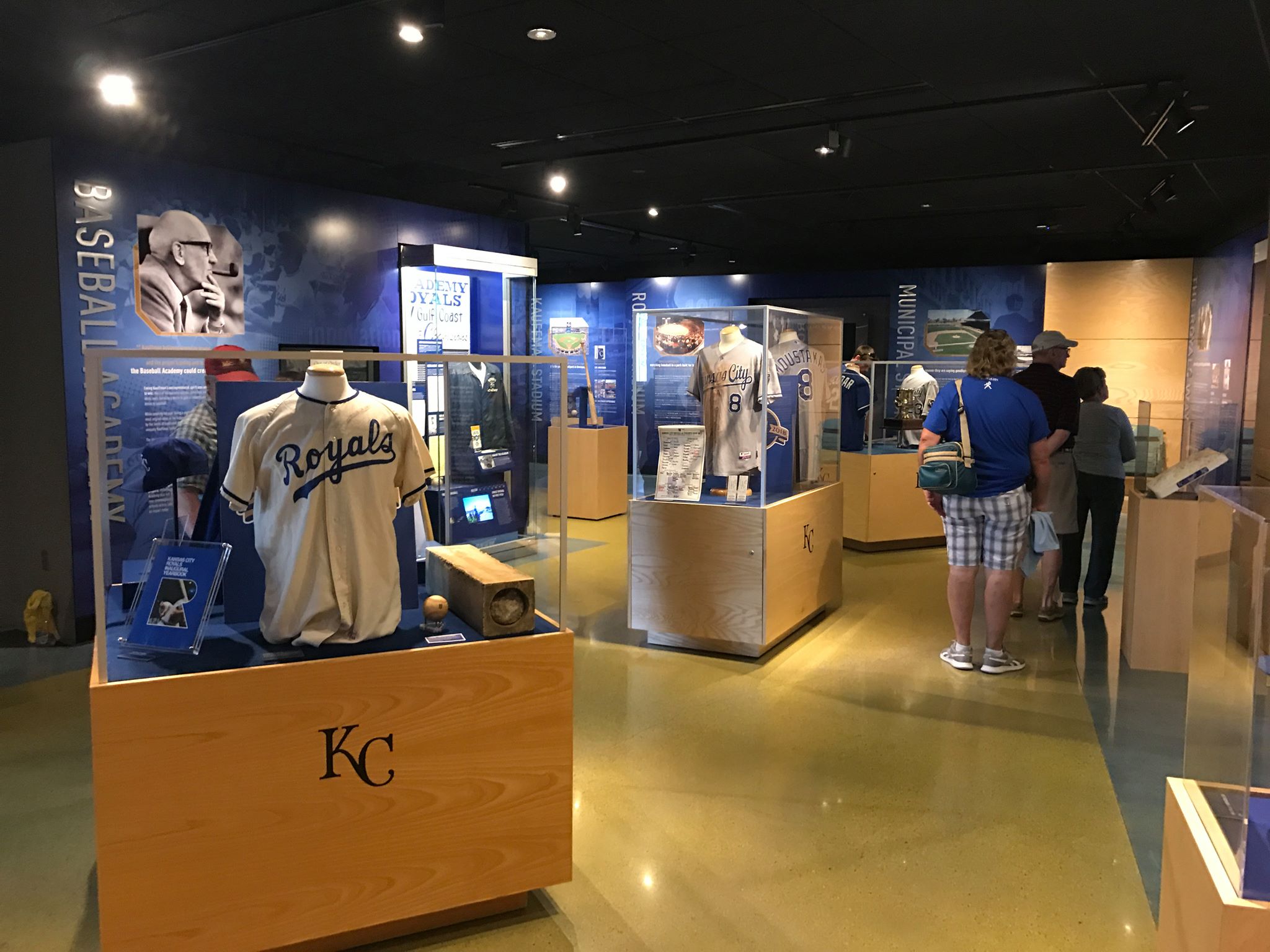
| Historical Exhibits, Memorabilia, Art, & Other Displays | 9.5/10 | 2 Thumbs Up |
| Kids Areas/Other Entertainment | 6/6 | 2 Thumbs Up Star |
| Atmosphere, Vibe, & Policies | 10.5/15 | Thumb Sideways |
|---|---|---|
| Fan Support/Attendance | 3/5 | 1 Thumb Down |
| Ballpark Traditions/Gameday Presentation | 3.5/5 | Thumb Sideways |
| Ballpark Policies/Staff | 4/5 | 1 Thumb Up |
| Adjusted Raw Score | 141/200=70.5 |
|---|---|
| Bonus | 4 |
| Curve for All 7 | 7 |
| Final Score | 81.5 |
|---|---|
| Ranking | #19/30 |
|---|---|
A Bittersweet Renovation
Renovations enhance America’s lasting “modernist” ballpark functionally, but muddle, streamline its graceful architectural lines
By: Cole Shoemaker
Written in 2009; ratings above are up to date for 2024, but this review below may be outdated and will be updated at some point; reviews and ratings are “living pages” updated yearly when necessary
Regarding the modern ballparks of the 1960s-70s, I used to claim that in the somewhat distant future, there would be three kinds of ballparks remaining.
The wide majority of the ballparks built during the turn of the century wave “1991-2015” will probably exist longer than their predecessors and are all reasonably similar in retro (mostly) style and revenue generating substance. Even those that deviate from the retro formula are built along the same mentality. Then we will have Wrigley and Fenway representing the early 1900s.
Then we have Kauffman Stadium (along with Dodger Stadium), the best from the 60s and 70s. Representing an era where utility was king, K.C. built a beautiful baseball-only stadium with “modernist” elements. Does that mean in 2040, the K will be the Wrigley/Fenway of today, at least in the sense that it epitomizes a bygone era?
It depends. First of all, they couldn’t overdo the renovations. They had to honor the simple splendor that this ballpark provided. Fenway did a masterful job in maintaining its classic feel while adding modern amenities. Wrigley Field will too. We can’t let modern day economics convolute the timelessness of the facility.
And unfortunately, the K did just that.
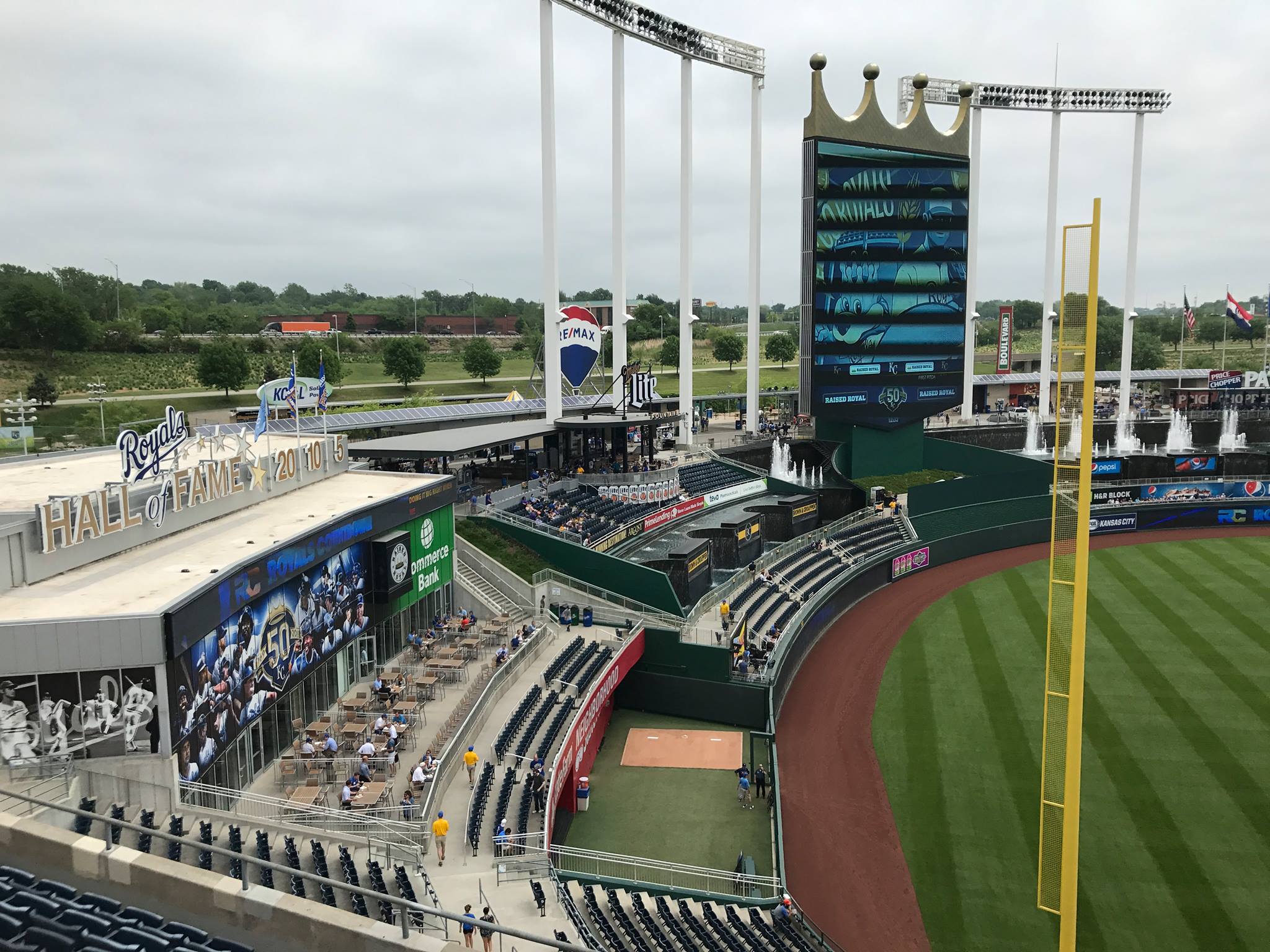
Kauffman was in a difficult situation. So much of its aesthetic appeal is based on its open sea of grass beyond the outfield. And filling those expansive embankments with mall-like features became an apparent economic necessity.
Luckily, they didn’t mess it up as bad as they could have, but there’s no doubt it’s a dumbed down facility, reduced to current “theme park” trends. The bottom line is the fountains and the pastoral appeal is no longer the primary focus.
It’s incredibly sad that the aesthetics got so watered down. We’ve essentially constructed yet another mallpark with a carnival outfield atmosphere. Replacing Kauffman’s uncluttered greenery with ads, playgrounds, and putt-putt courses is an aesthetic travesty. Its timeless identity was rooted in the simple, symmetrical outfield design.
Also, for Kauffman to be timeless, we have to understand that an urban location in a community is theoretically equal to a suburban location, taking the context of the times into account. Do most people think Kauffman’s suburban location is just as good as the possible downtown one? No. But in the future, people will come to understand the context of why the ballclub opted for a suburban location and how it typifies the era. We will see classic suburban America, and its old ballparks, as “charming”, perhaps. Charlie Finley was worried about how bad the neighborhood was around Municipal Stadium. And when the Royals came in, the management wanted fans to feel safe. Our perceptions of a rural location have only changed recently. Who knows what the future bodes?
We forget how people viewed the Jewel Box ballparks before the classic revival. For many years, the old parks were thought to be expendable and considered dumps. Fenway just couldn’t get funding for their domed stadium. We forget we are just in another phase now.
So despite the renovations, will the K be a timeless jewel, or another HOK (Populous) mallpark? Is it more representative of the retro amusement park or a modern 70’s monument?
Well, the good thing is they didn’t take away the modern look of the overall structure. While everything’s more muddied in the outfield, the curvilinear tapering of the monotonous upper deck at each end is a lasting feature. We still have that timeless symmetry, a welcome deviation from the standard.
Still, if they hadn’t touched its design, Kauffman would have easily crossed the threshold into timelessness and been hailed as the next classic ballpark. Now I’m not so sure how we will perceive it in the future.
The K went unnoticed by the public for too long, and they had no choice but to renovate it from an economic standpoint. But it takes a lot of good luck and circumstance not to be a tool of the era, just ask Wrigley and Fenway. I hope people don’t demand a replacement in 30 years if the current sensibility becomes unpopular.
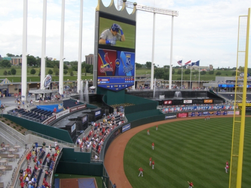
Even though there are obvious superficial differences, I see parallels to old Yankee Stadium: they renovated a classic park out of necessity, but a sterile concrete mask inevitably came with it. And once trends changed, it got replaced.
But things could certainly be worse. There’s no question Kauffman is an overall better ballpark today because of the renovations, simply because what’s lost is replaced by a surplus of amenities. Jim Caple wrote a similar review (great read), sharing many of my sentiments, but pointed out it’s a more fan friendly place.
“Even as much as I miss the old grass, I must admit, it is a pleasure to stand amid the fountains and feel the mist on your back with the game in front of you,” he said.
And he’s absolutely right. For now, at least.
Good, original architecture and aesthetics last forever, while amenities inevitably evolve by the decade. Aesthetically, the K just loses too much of its timeless appeal.
Setting
Location/Access:
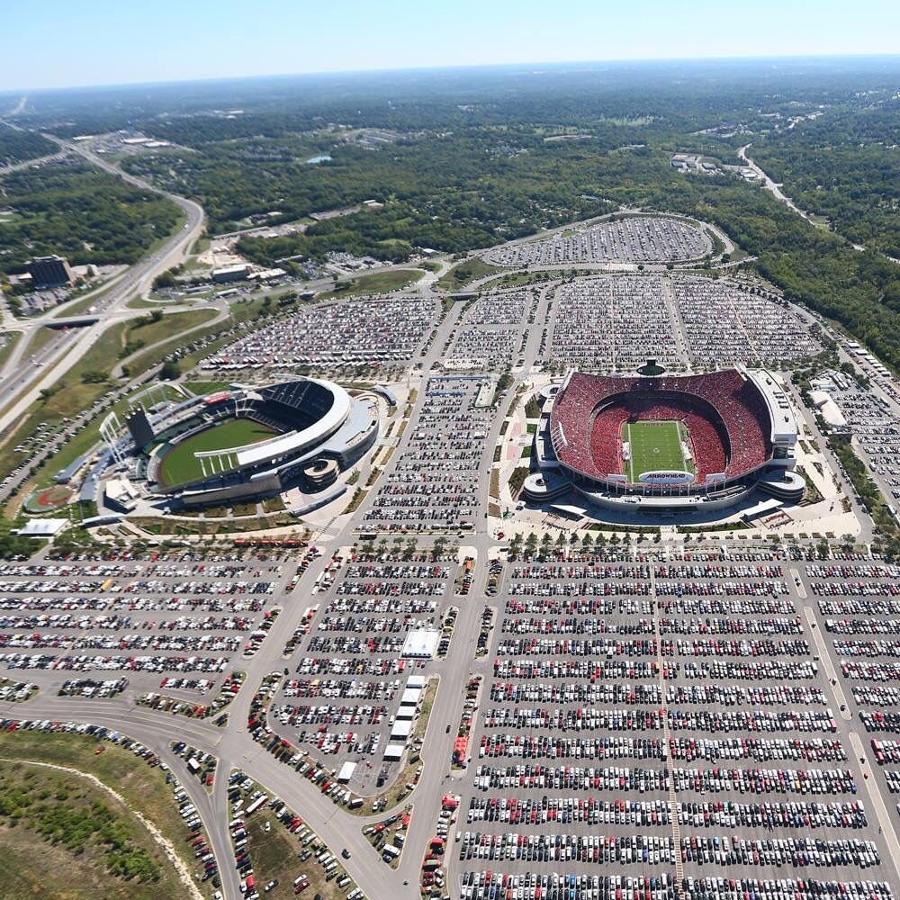
With our current standard of examining locations, Kauffman Stadium isn’t going to be elite. But for a suburban location, the Royals do it as well as possible. In comparison to Rangers Ballpark, for example, everything is easily accessible and straightforward. Go on I-70 east and you can’t miss it.
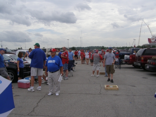
They don’t hide the fact that they’re a modern suburban ballpark; they’re proud of it. You see Rangers Ballpark and Citizens Bank Park try to contrive the downtown urban feel, and it doesn’t always work. This feels like a true, suburban park.
Score: 2.5/5
Local Scene:
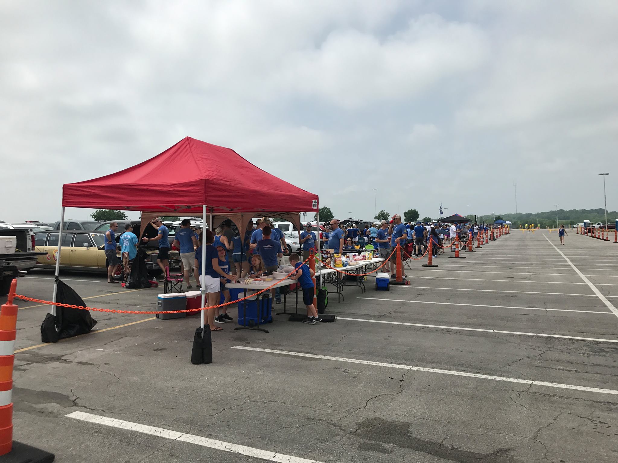
There’s a Denny’s down the highway! But seriously, it’s pretty bleak, more insular than any other ballpark in the majors. At least the tailgating scene gets pretty hot during sellouts.
Score: 2.5/5
Total: 5/10
Architecture & Aesthetics
Exterior Design:
Before the renovations, Kauffman Stadium was so beautiful because it was built on an intimate scale. It was a stadium where baseball was the focal point, and the architectural merits were subtle. It had an exterior characterized by heavy structural concrete elements, which was perfectly juxtaposed with the light, airy nature of the fountain on the inside. There wasn’t much of a façade.
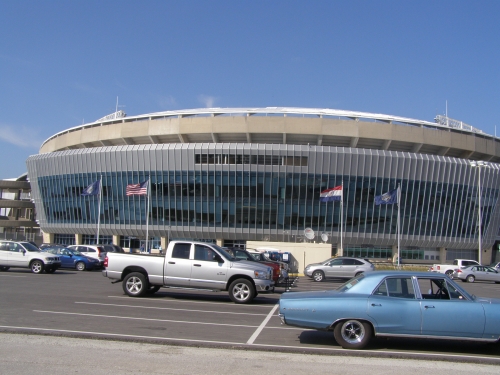
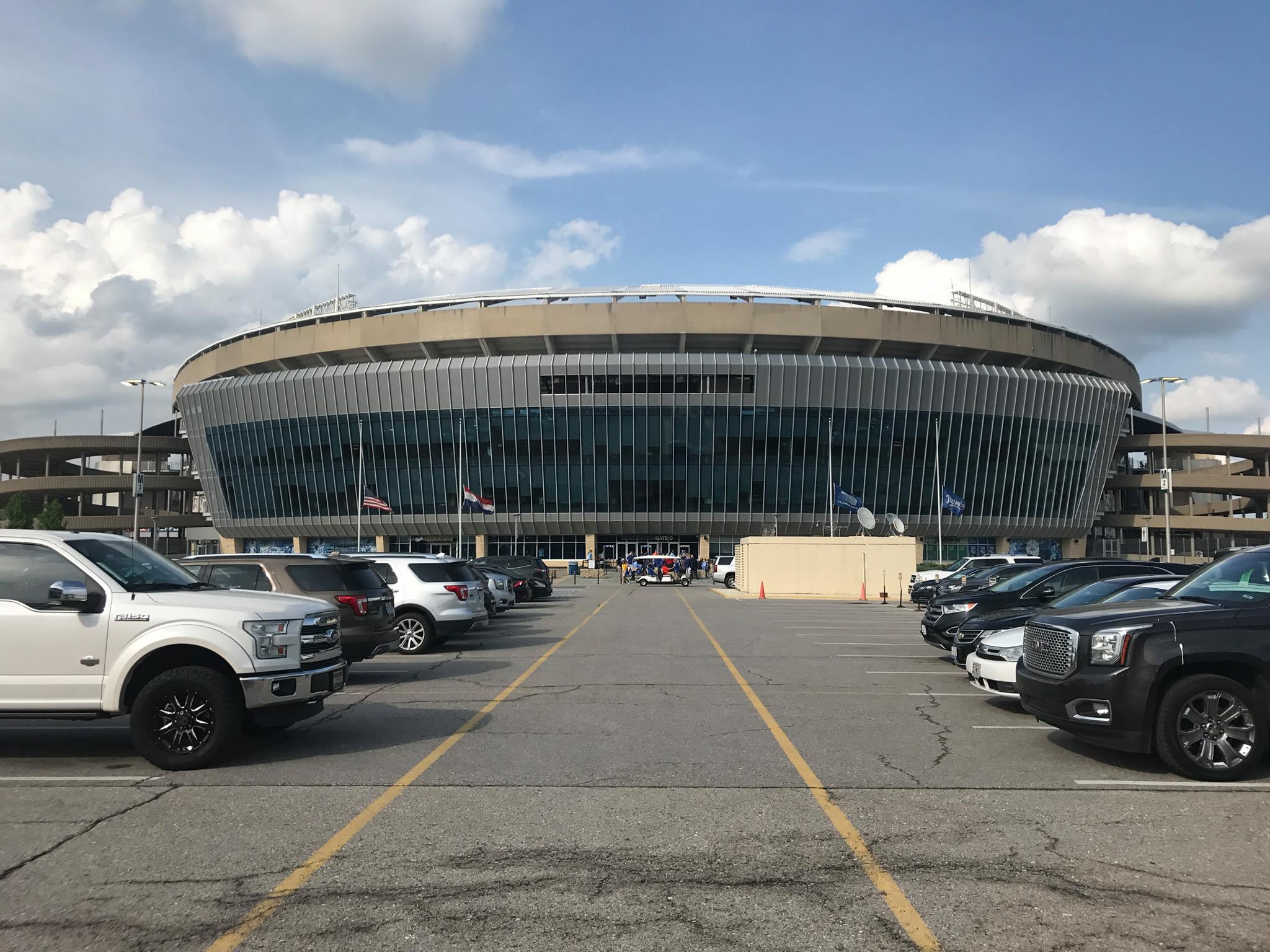
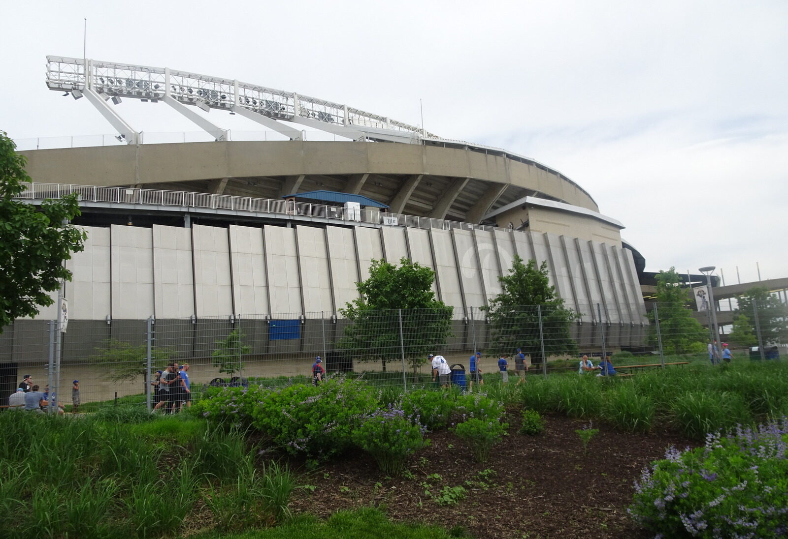
Unfortunately, new glass veneers now overpower much of the former simplicity, deemed unattractive by today’s standards. The “Royals” metal facades on the sides of the exterior don’t do much, and the glassed in façade behind home plate is unremarkable.
In my opinion, if you are going to muddle the exterior architecture, you might as well go all out. They tried to maintain the modernist design, but right now it looks like they put one foot in and one foot out. It’s just not productive.
While it certainly has questionable, overly themed, architectural merits, the Royals could have spent more money and done something like Angel Stadium. They had wide-open space and could have done something amazing, like some sort of grand “crown entrance”. It would have lost all architectural timelessness, but gotten better reviews today.
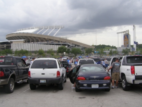
As it is, the ballpark at least maintains its sleek, cerebral architectural lines. It’s clear the Royals weren’t trying to create a Disneyfied appeal: they publicly embraced the ballpark’s modern, futuristic image. Another important note: look how much exterior is uninvitingly fenced off, failing to create that necessary sense of arrival.
Score: 6/10
Interior Aesthetics:
I lamented the loss of the simple splendor that formerly characterized Kauffman in the opening, but the interior design is still quite good by default. We still have the razor sharp architectural lines. It’s just ruined in comparison to what it once was, but comparing the interior aesthetics to some of the similarly muddled retro parks, it stands up well.
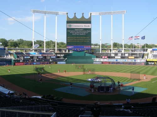
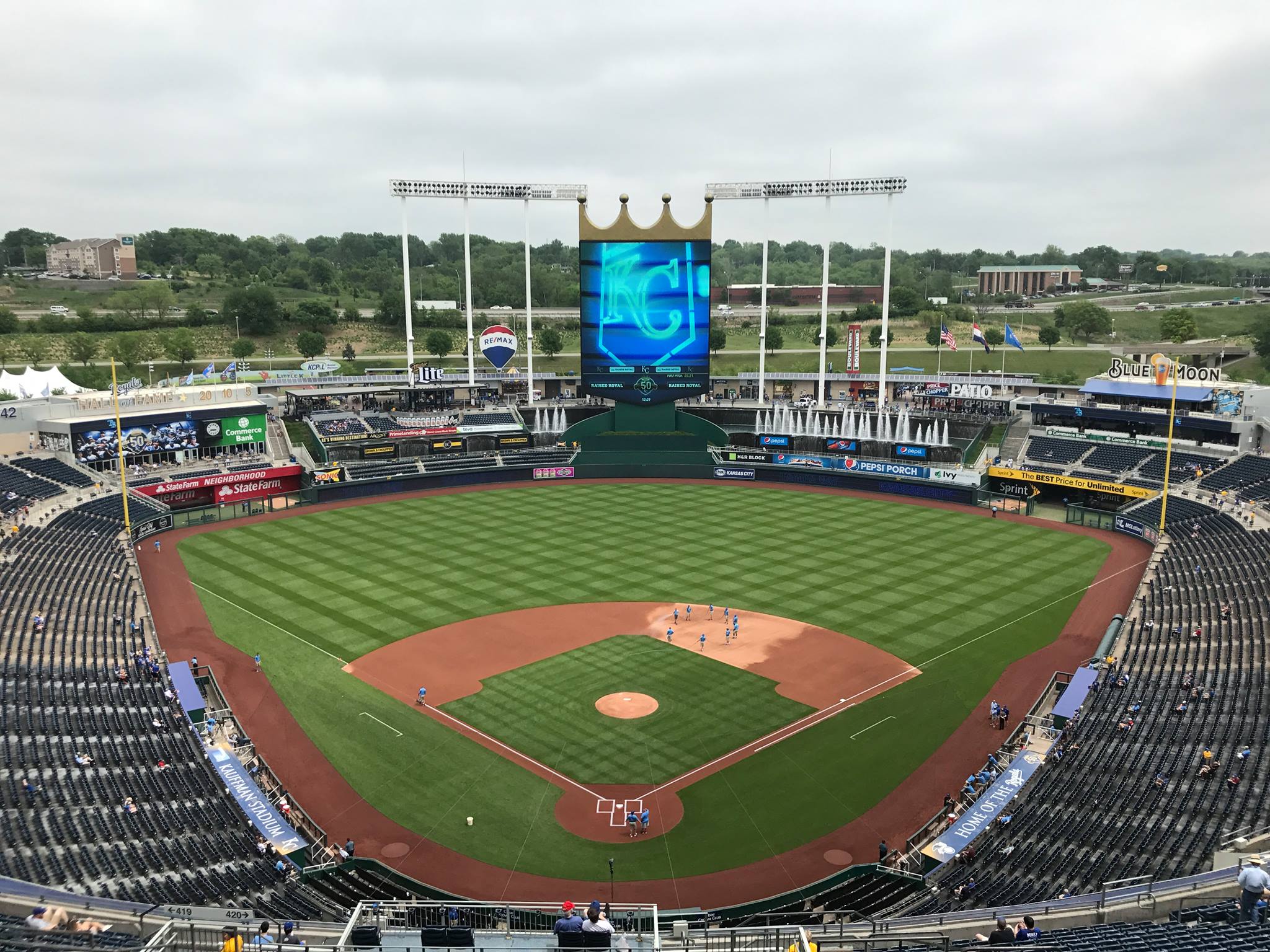
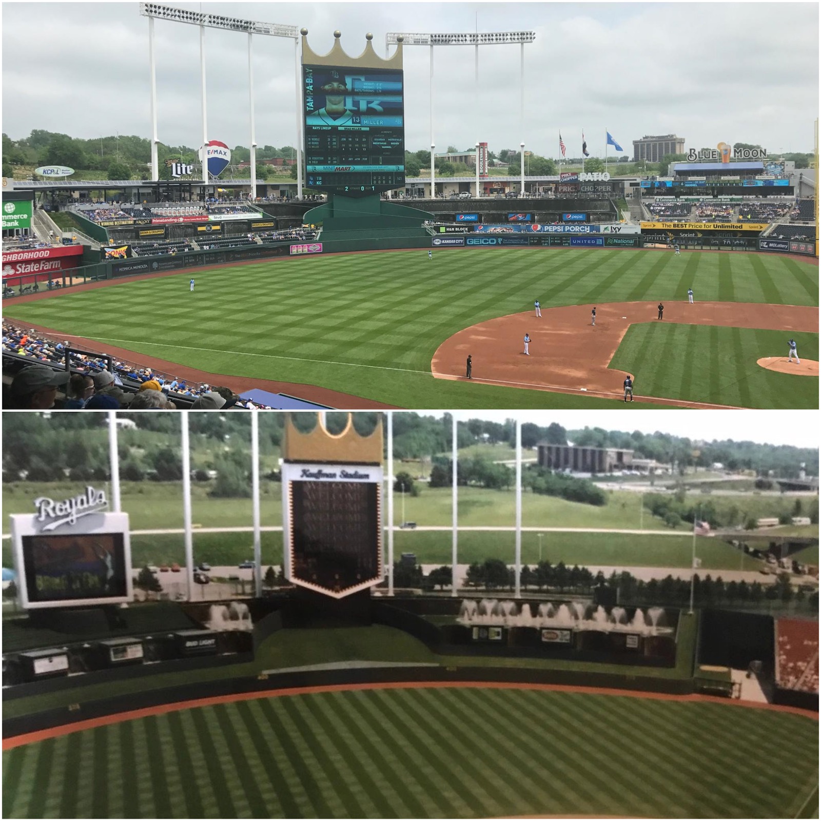
Despite the congestion, everything comes together all right, in my opinion. First of all, the giant video board, crown vision, oddly makes the park feel extremely small and intimate due to an illusionary perception: because it is so large, everything around it, including the seating and the field, feels very small. This causes the park to be one of the most intimate I have experienced.
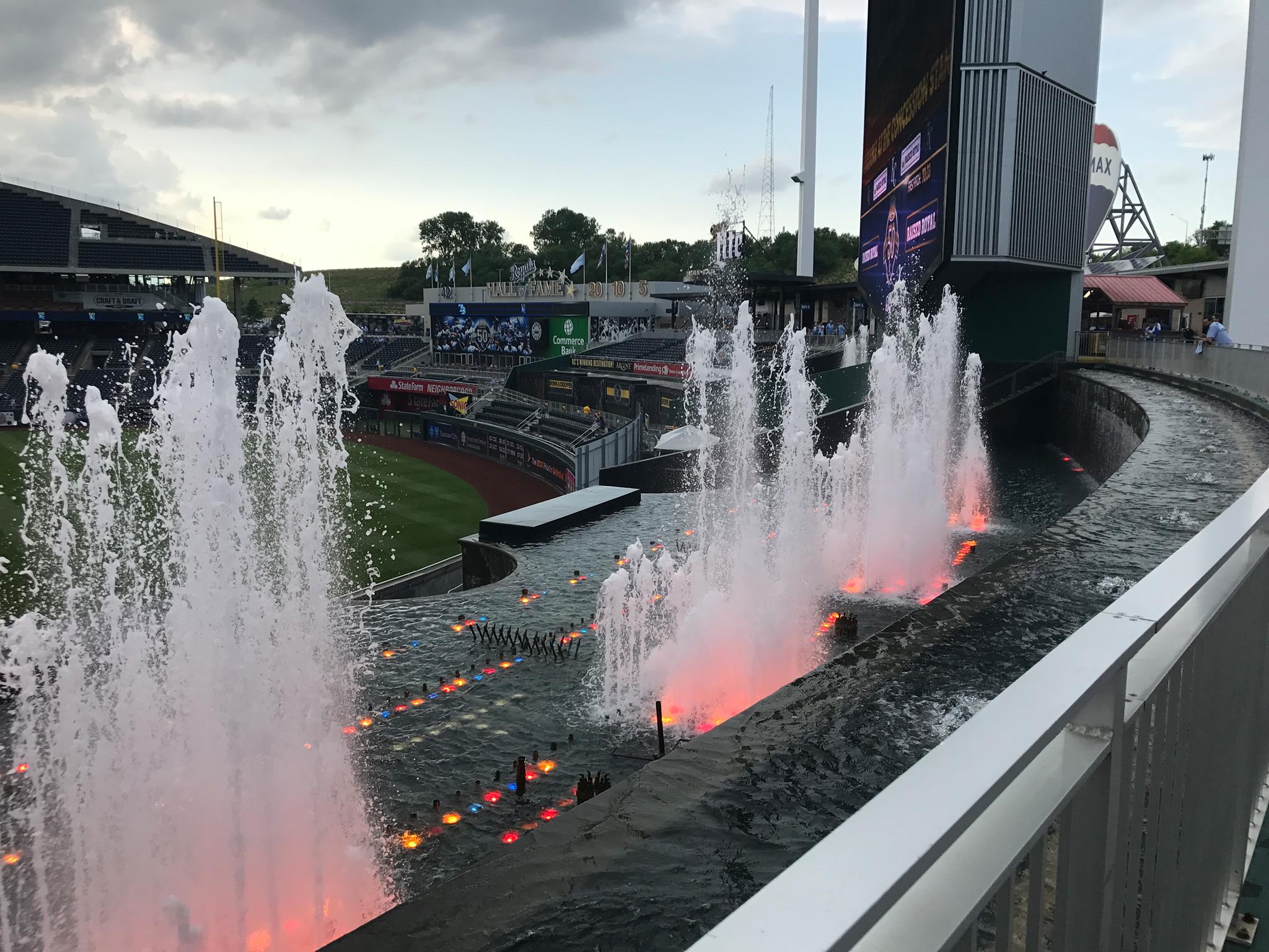
The Fountain Bar, Royals Hall of Fame, Pepsi Porch, LCD screens, Rivals Sports Bar, and the Party Deck all supplement the ballpark well, despite overshadowing the fountains. The blue of the Pepsi ad does a good job in perceptually highlighting the concept of the water.
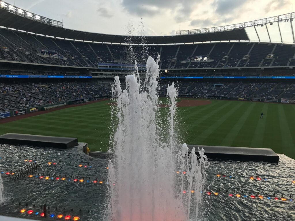
It all does look too busy, however. Kauffman Stadium’s pastoral appeal and airy fountains are completely overshadowed, rendering it no different than any other muddled retro ballpark. No longer do the majestic fountains explode like they used do, nor do we have those beautiful grass embankments.
But it still has its “modernist” architectural lines.
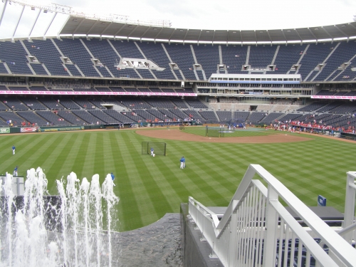
When you look past the convolution, the true architecture flows together brilliantly. We still have a heavy structural look that is nicely juxtaposed by light, whimsical waterfalls. The tapering of the upper deck at both ends, which is both functionally and aesthetically sound, perfectly reflects the flowing waterfalls.
The symmetry of the upper deck and the structure as a whole is pleasing. Despite the new loud features, the ballpark maintains that certain classy simplicity in its curvilinear contours. The towering lights in the outfield tie it all together. The new glitzy outfield concourse muddles all of this, but it still works reasonably well, despite not being as good as before.
I think the slightly artificial and busy look could have been mitigated if they had kept some greenery in the outfield. Note how the original renderings had glass embankments in the center field. That would have looked better.
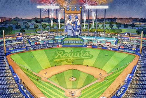
You see acknowledgement of the bland outfield scene when the Royals added some greenery to the batters eye in 2011. It looks like an afterthought and reveals a lack of confidence in design. They should have found a way to maintain some sort of grass in the outfield.
They didn’t remove any of the fountains with the renovation, contrary to the perception, though they do feel more convoluted. I would have created more fountains on the left side where the fountains seats are too create more symmetry. This might have served as an effective remedy.
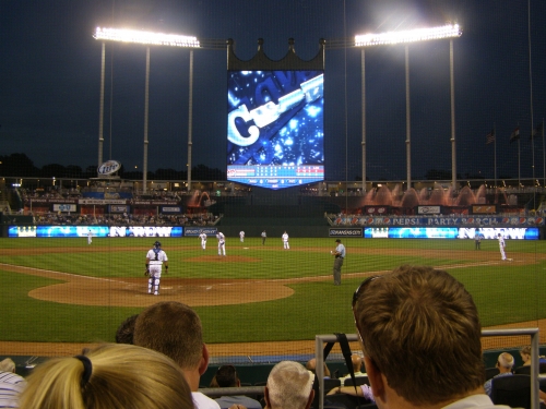
By default, Kauffman Stadium is still well connected to its pastoral setting, simply because there is only one deck in the outfield. The interior still does a good job of showcasing its grasslands beyond the outfield. But there’s no doubt its more corporate and amenity filled in its bottom line. For now, the renovations remain controversial among purists from an aesthetic perspective.
It’s hard to grade and there isn’t much to say now. But in my opinion, the original would have been awarded a rare 14-15.
Score: 10.5/15
Panoramic View/Backdrop:
All things considered, the view is unique and fantastic. From the upper decks, how many parks around the nation have a view like Kauffman does?
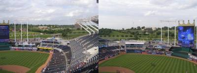
Enough with the skyscrapers, for once let’s recognize the greenery beyond the outfield and the “rural realism” that Kauffman showcases. Yeah, in reality it’s a freeway and as suburban as it gets, but it looks pastoral. There’s really nothing like it in the majors.
It gives the park a true rural feel, which is something that no other park does. The ones that aren’t downtown and in the suburbs try to hide it, but again, the K is the only one to go in a different direction. Ironically, if Kauffman had been oriented in the other direction, they would have had an even better view of greenery.
Score: 4/5
Concourses:
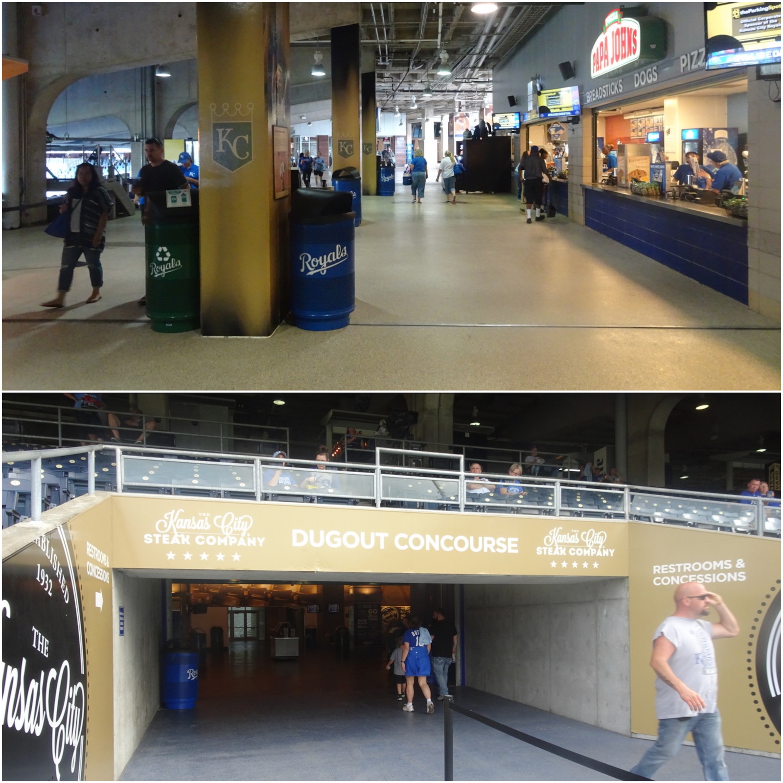
The aesthetic appeal of the concourse grounds weren’t really enhanced with the renovations. The concourse is certainly on the bland side, designed completely in concrete. There were reasonable efforts to spruce up the signage and technology, but the concourse still lacks the attractiveness expected of a major league facility.
Score: 2/3
Total: 22.5/33
Functionality & Essentials
Sightlines:
Some say the K accomplished a perfect balance in sightline and cross section design, in many respects.
First of all, the upper levels are cantilevered effectively over the lower stands. In fact, the upper deck is completely over the mezzanine, leading to one of the closest upper decks in the majors. With no suite level, the upper deck is lower than most as well. Unlike its brother, Angels Stadium, overhang issues are kept to a minimum. So the fundamentals are perfectly executed.
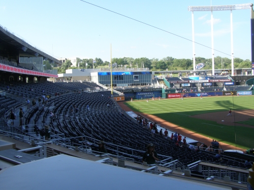
That being said, even though I had heard people rave about the perfect sightlines, I was skeptical.
At first glance, it appears that many of the seats down the line are pointing toward center field due to the curvilinear grandstand design, like many venues from the 60s and 70s. But apparently they employed a design where the lower deck first curves around home plate and then curves at a larger radius down the line.
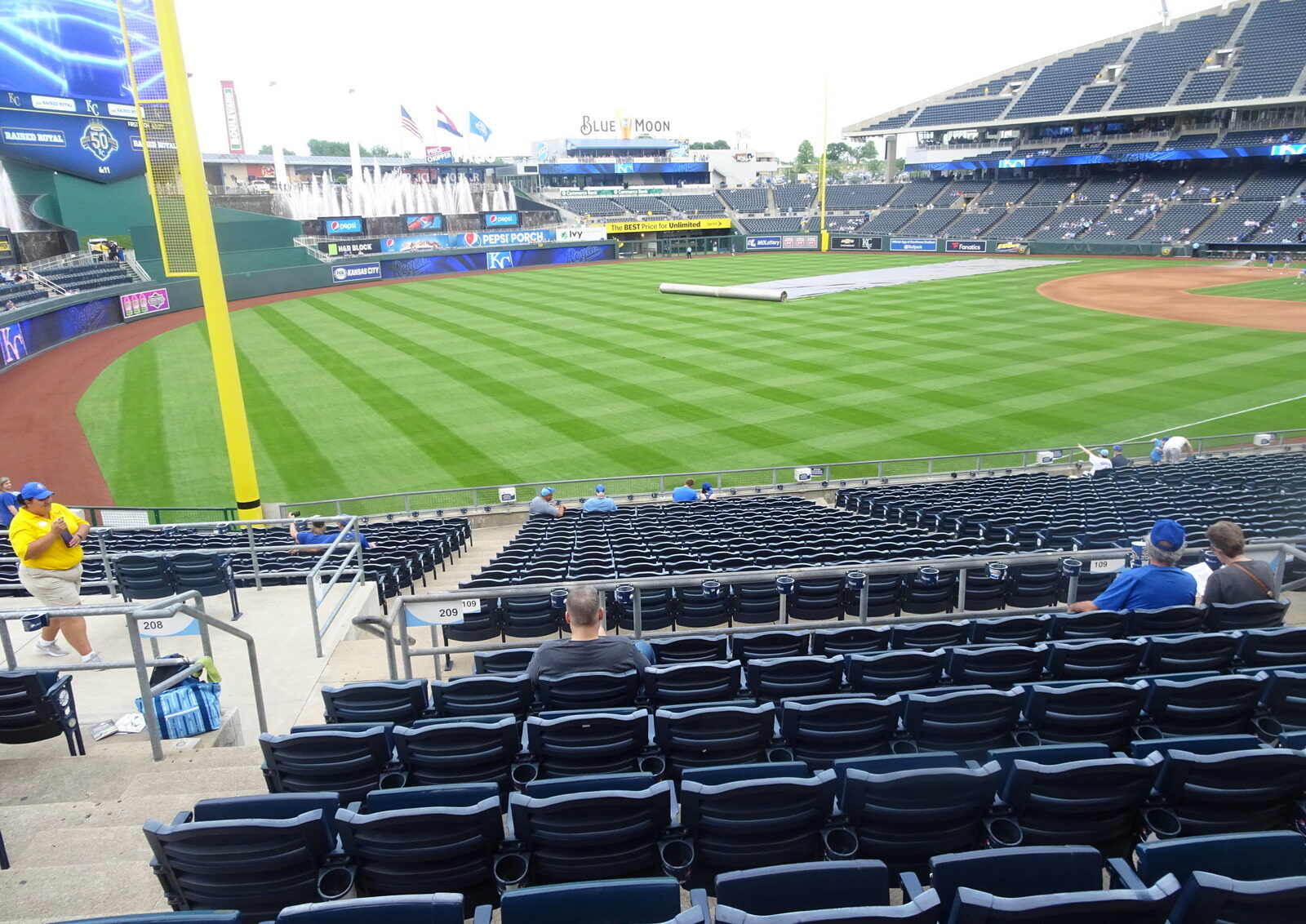
This guarantees that after the curve down the lines, the seats farthest down the line will point toward home plate, and basically all seats where you would normally have to turn your head point in the general vicinity of the in field. This is a good alternative to angling the seats or sharply angling the grandstand.
Am I buying it? I tested it out, and more or less. But it seems that this would lead to good sightlines throughout the lower level but not particularly great sightlines anywhere besides the obvious. It’s more efficient and certainly keeps stiff necks to a minimum. I love the curvilinear appearance of these grandstands, but completely reorienting the seats is optimal. So I like it aesthetically, but angled seating is generally preferred by most.
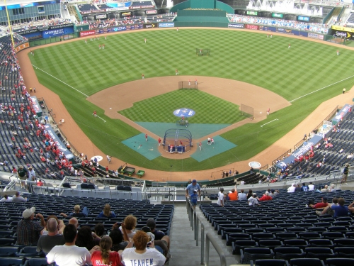
This approach gets the job done, and I’m evolving to view this more favorably. This is similar to the curvilinear grandstand down the first base line at Great American Ballpark and Minute Maid Park.
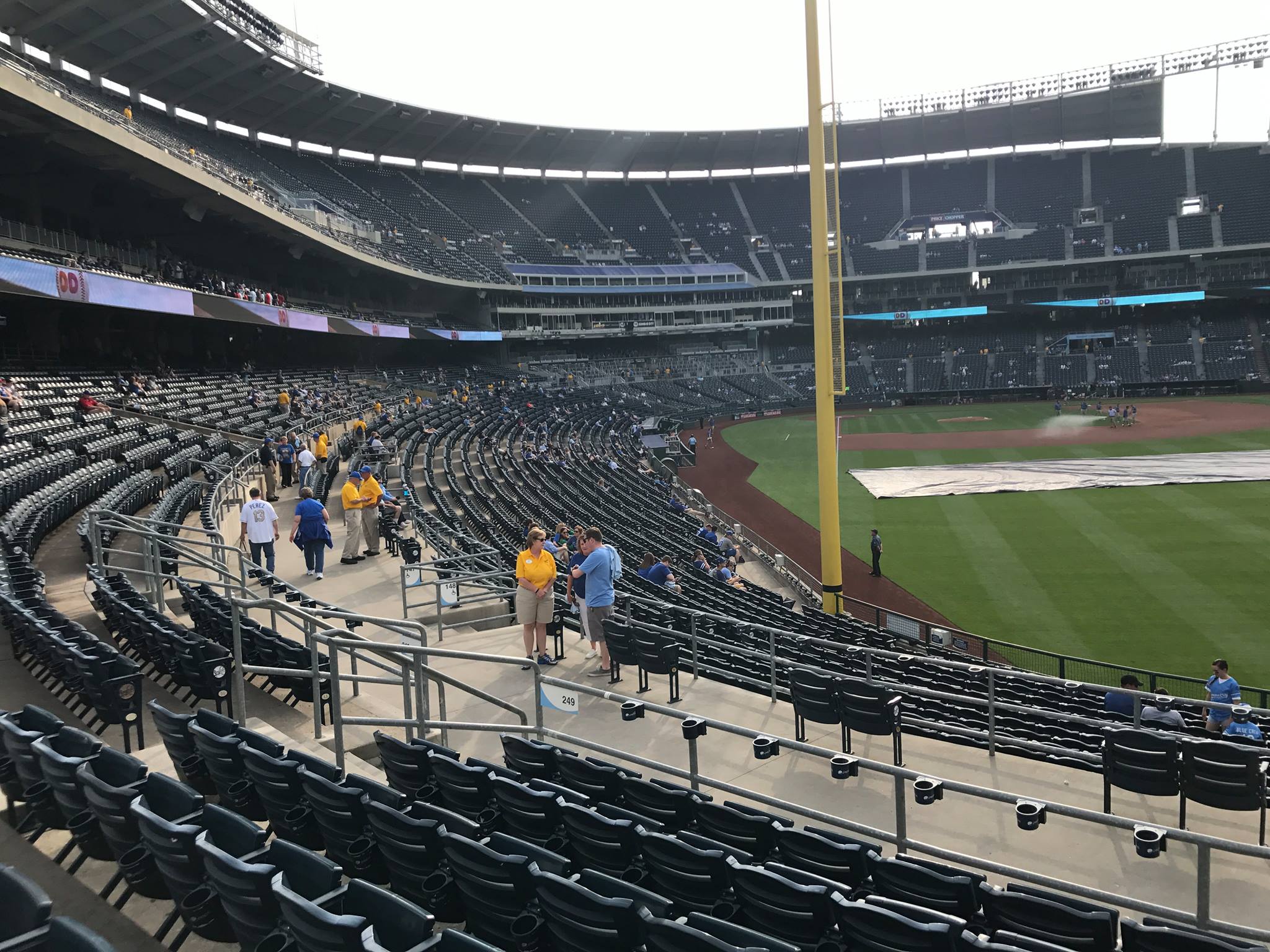
Nonetheless, there are certainly some overt miscues: the seats furthest down the line in the upper deck definitely don’t point toward the infield, and there are seats in the outfield where a portion of the field is blocked by the fountains. The fountain seats are especially flawed, as half of left field is blocked, but I guess that’s obvious. But again, the sightlines are definite plus.
Score: 8.5/10
Seat Comfort:
On my visit, an alarming amount of seats at Kauffman Stadium were dirty. Both nights they had peanut shells and stains on them, even in the Diamond Club. There were no ushers with towels to clean them. Sure, it is somewhat understandable if there are dirty seats in the upper deck where no one sits, but the seats in prime locations were not clean.
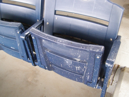
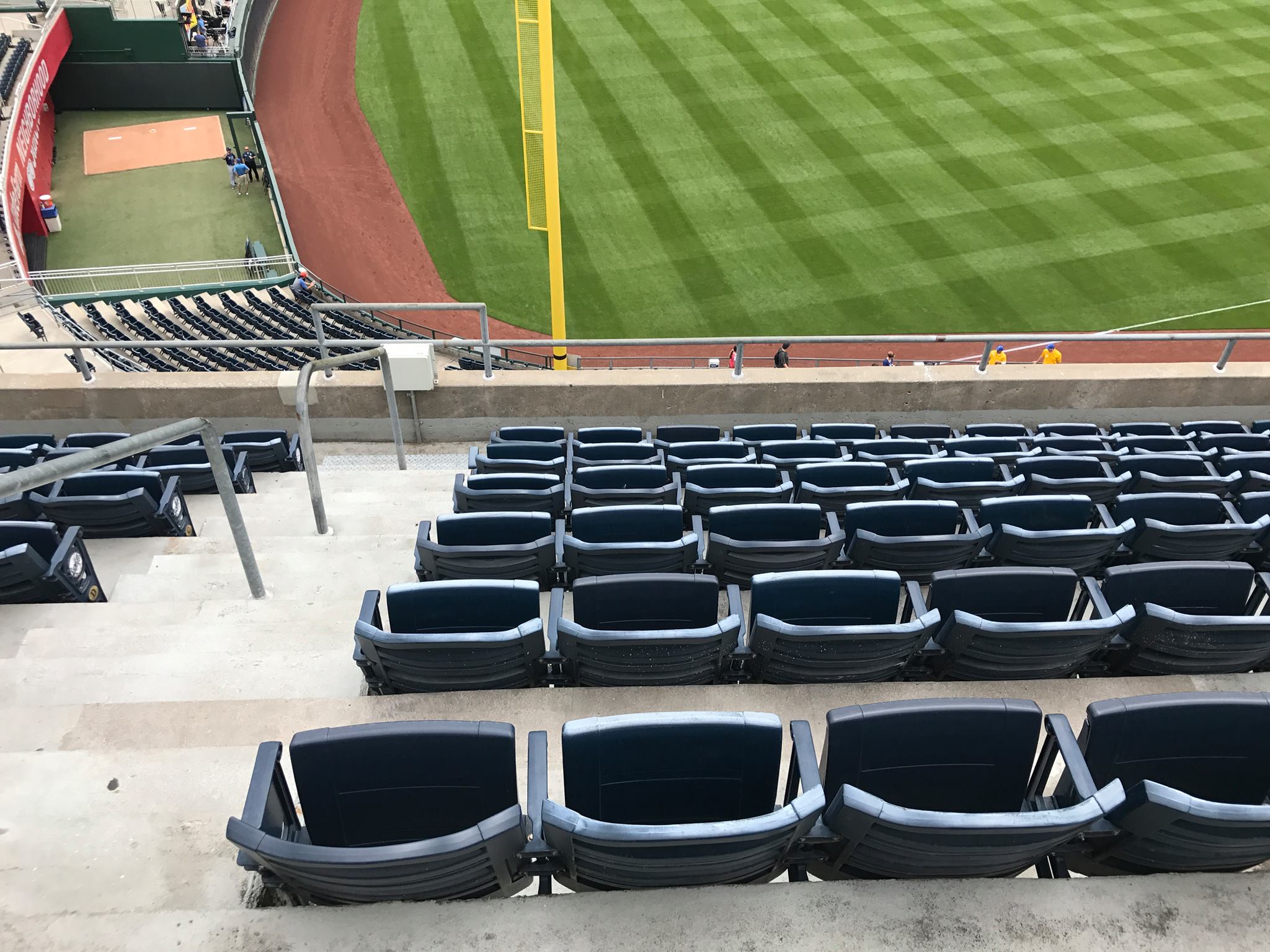
I also found it odd that the $9-$18 upper deck seats and $25 ‘outfield boxes’ lack cup holders, but somehow the $7 Dri Duck fountain seats do have them. First of all, why would they not install cup holders for all seats when the entire place has been renovated? And why didn’t they install cup holders on the new seats just added? This couldn’t look lazier.
Also, the seats just looked too old for a $250 million dollar renovation. They installed new blue ones in 1999, and they’re starting to decay in the upper deck. What’s more odd is that they decided to install what appeared to be the same exact 1999 seats in the new outfield sections. Like leftovers from last decade!
Score: 3/5
Concourses:
Despite being built nearly 40 years ago, Kauffman Stadium has some superiority from a functional point of view, greatly enhanced by the renovations.
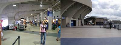
The renovations greatly expanded the concourses throughout the main level and the upper deck. Average width went from 24 ft to 37 ft, which is below the minimum standard of 40 ft for ballparks. Where they are a tad short on width, they make up for in efficiency.
I think Kauffman Stadium accomplishes a perfect and unique balance in concourse design from a functional point of view: while the main concourse is above the seating bowl, there is also a small non-premium enclave (but not a separate concourse) that serves concessions below the bowl, accessible from the middle walkway. This gives the fan sitting in the lower box seats a separate area, eliminating crowding, while avoiding a dual concourse system at the same time, thus maintaining the flow and interconnectivity of the main concourse above.
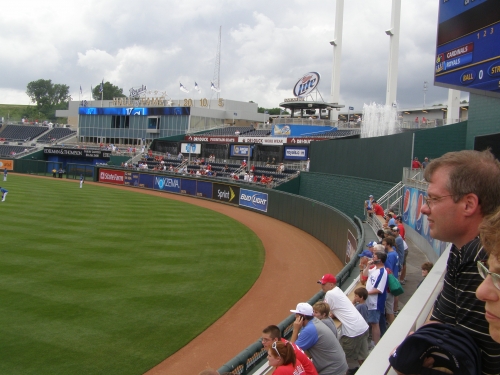
The main concourse is open to the field throughout the ballpark. Although I would have liked for them open the concourses on the upper deck from a functional standpoint, maintaining the large upper deck is a welcome departure from the current choppy upper decks. The “portals” they created was a perfect choice.
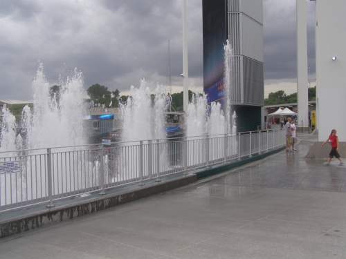
Kauffman is now a 360-degree experience that provides some of the best outfield standing room areas in baseball. After 35 years of seeing the fountains, the fan can now get up close and personal while taking in baseball at the same time. The Pepsi Porch boasts the most exciting standing room in baseball, placing the fans right up against the fence 7 feet from the ground.
Score: 5.5/7
Scoreboard System:
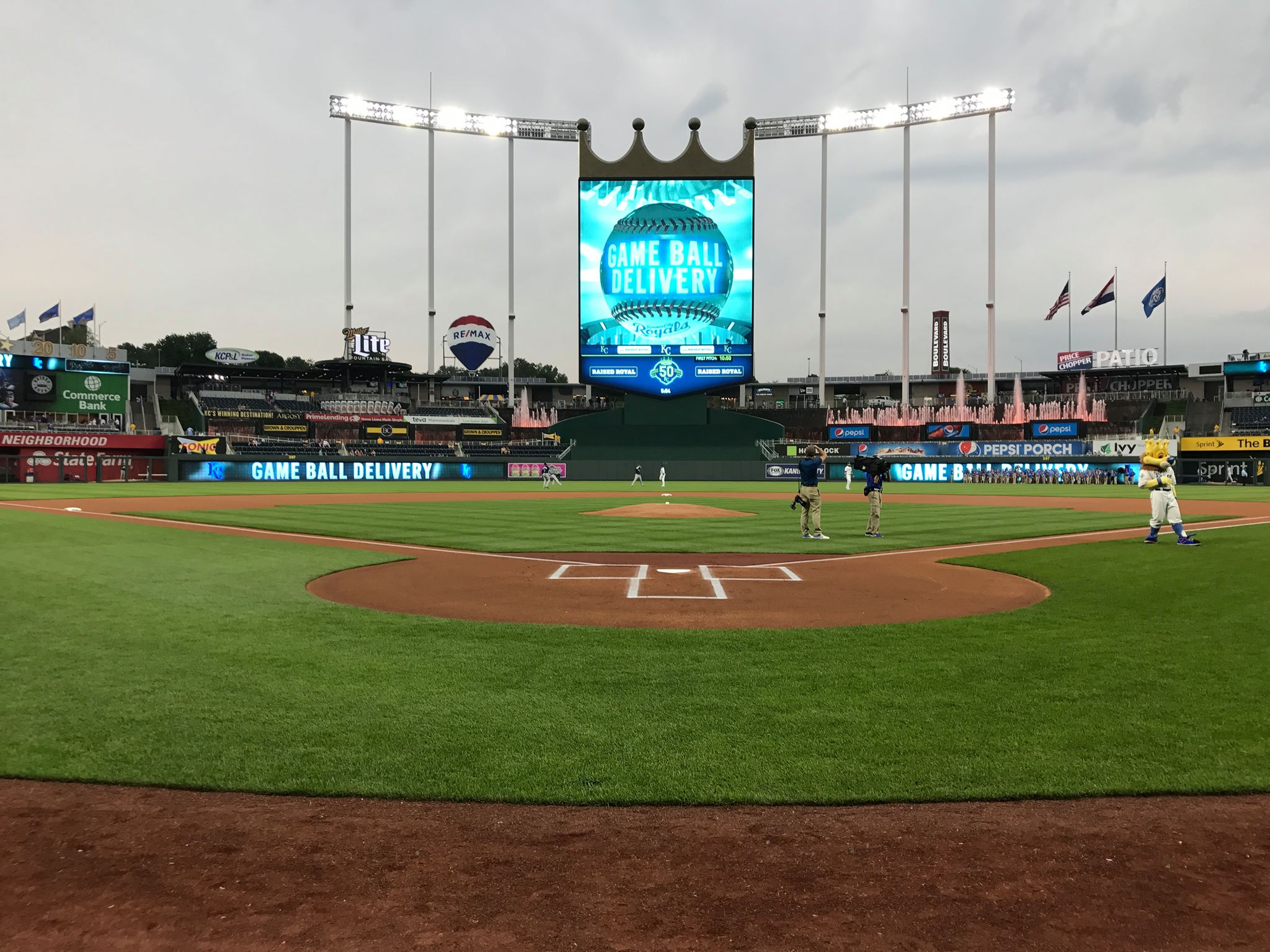
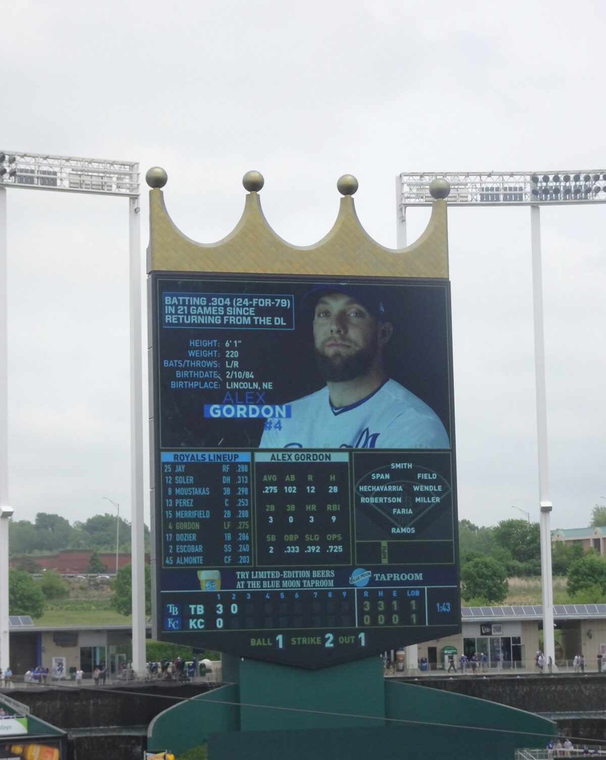
Not only is “crown vision” the largest HD video board in baseball, but its just as informative and aesthetically pleasing.
Not only do you get a large photo of the batter, but also get all of his detailed stats, the batting team’s entire line-up, the defensive alignment of players on the field, who they’ll be sending up in the next inning, the speed of the pitch, etc, etc.
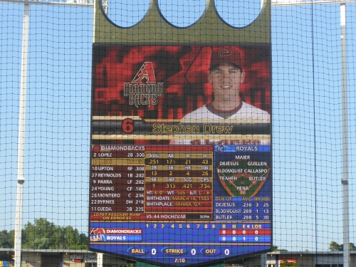
There are also video boards on the outfield wall, which serve as an out of town scoreboard. The video strips are a nice supplement. Sometimes, all of these video boards show the same display, which is really cool.
To top if off, Crown Vision has a sparkling gold crown on the top, and it is free from those annoying cluttered ads. It’s more than the technology; the whole setup really adds to the experience.
Score: 3/3
Total: 20/25
Amenities & Features
Quality and Selection of Concessions:
While Kauffman has a limited selection of food, the renovations have brought in a new batch of fresh local cuisine.
They mostly focus on a wide variety of BBQ, which is Kansas City’s specialty. This list is particularly extensive, as I show below. The best bet is ribs or the turkey leg.
The local Kansas City establishment Jose Peppers provides the Mexican food at Kauffman Stadium, which is surprisingly yummy and authentic. Along with the regulars like beef tacos, burritos, nachos, you can get chips, salsa, and queso as well. I’ve never seen a ballpark serve chips and queso in the general areas, even in Tex-Mex country like Houston or Chicago (yes, White Sox).
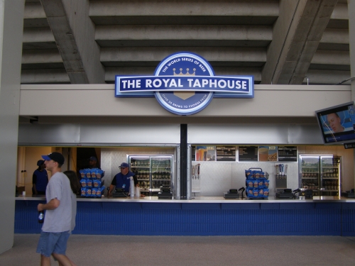
Some unique offering in the past included subs, fish n’ chips, KC rib eye, and various vegetarian items. The mini doughnuts are a winner. Look for the new Sheridan’s Frozen Custard, especially the royal turtle sundaes. A new Fry Works stand has some unique offerings, such as specialty house made chips and sweet Asian spring rolls.
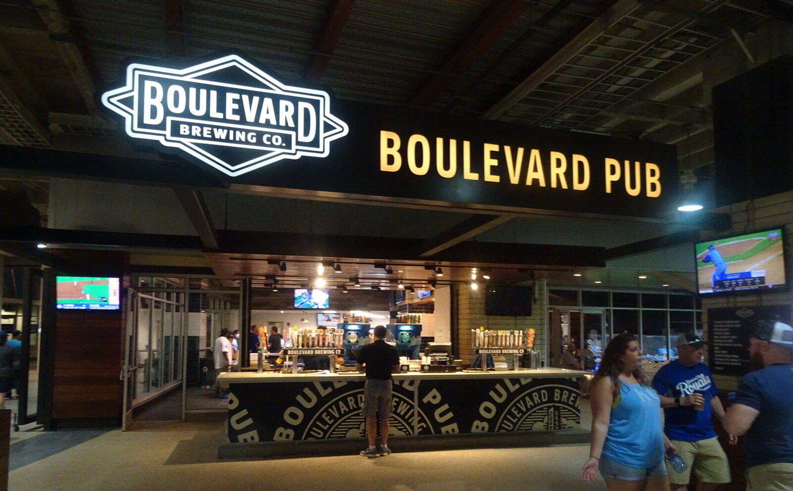
Most notably, the selection of beer is quite impressive. First of all, the “Royal Taphouse” has a unique selection that includes Samuel Adams, Amstel, Red Stripe, Pilsner Urquell, Perone, and more. Not to mention, the Boulevard Pale Ale is some of the best local brew around.
Score: 3.5/5
Regional/Signature Concession(s):
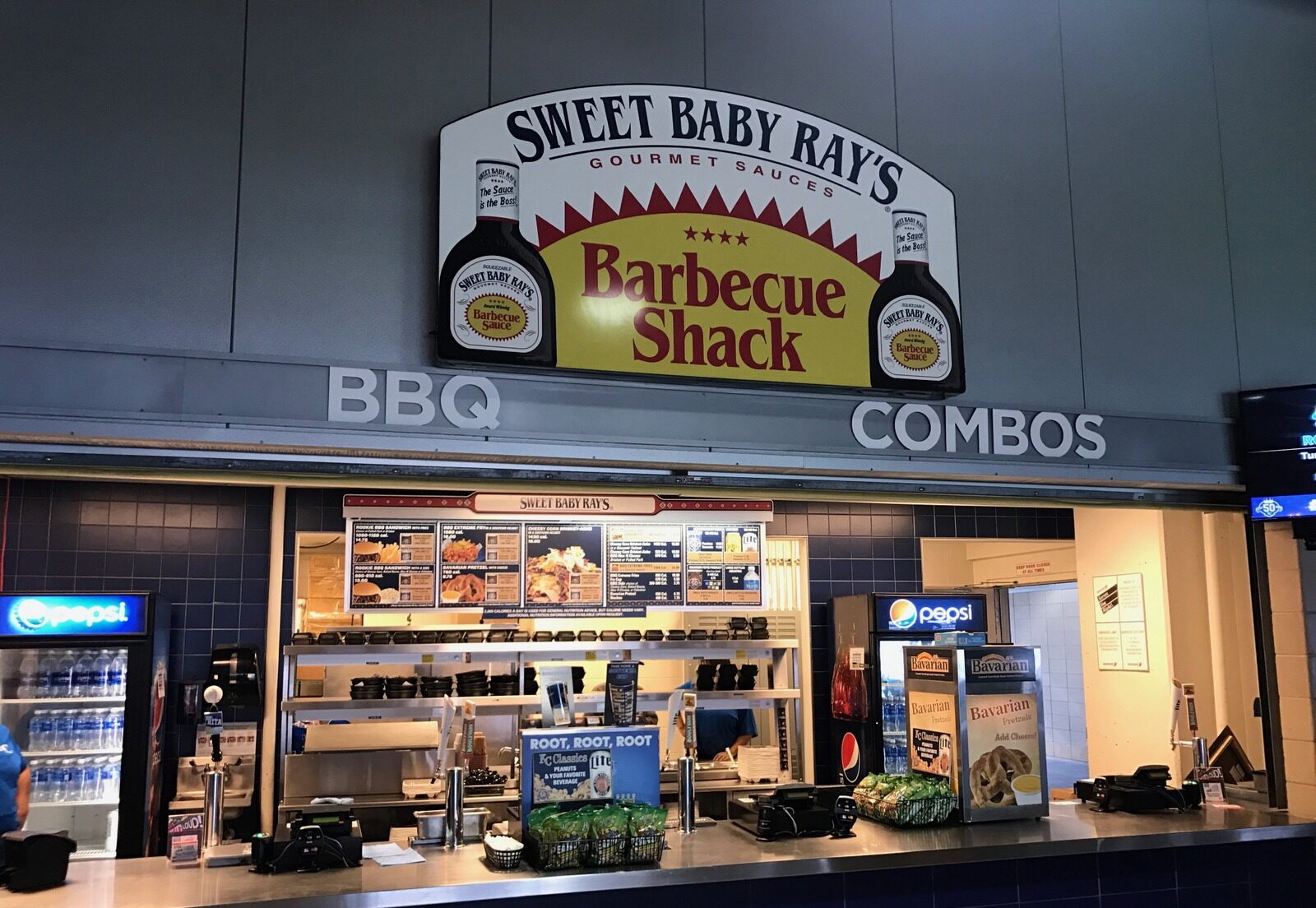
Kauffman Stadium serves up that famous KC BBQ, but it’s the wide selection that’s most impressive. Even though Gates BBQ got replaced, the new Kansas City style BBQ serves ribs, turkey legs, burnt ribs, hickory ham, blackened catfish, smoked turkey, roast pork, pot roast, coleslaw, baked beans, and even baked potatoes a la Minute Maid Park in Houston. Honestly, it took guts to replace Gates BBQ with generic Aramark BBQ, but word on the street is that the switch was for the best.
Most importantly, while not having a standout item, the Royals do a good job of providing local eateries. Scimeca’s Sausages is a Kansas City institution, serving up Sheboygan, Polish, Italian, and Bratwurst. Jose Peppers is good quality. But the true signature local restaurant is Stroud’s famous fried chicken. Take note Atlanta!
Score: .5/2
Public Restaurants/Bars/Sitting Areas:
The public sit down restaurants are executed to perfection here: one upscale and one informal. Kauffman Stadium is one of the few to have two restaurants with a field view.
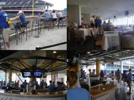
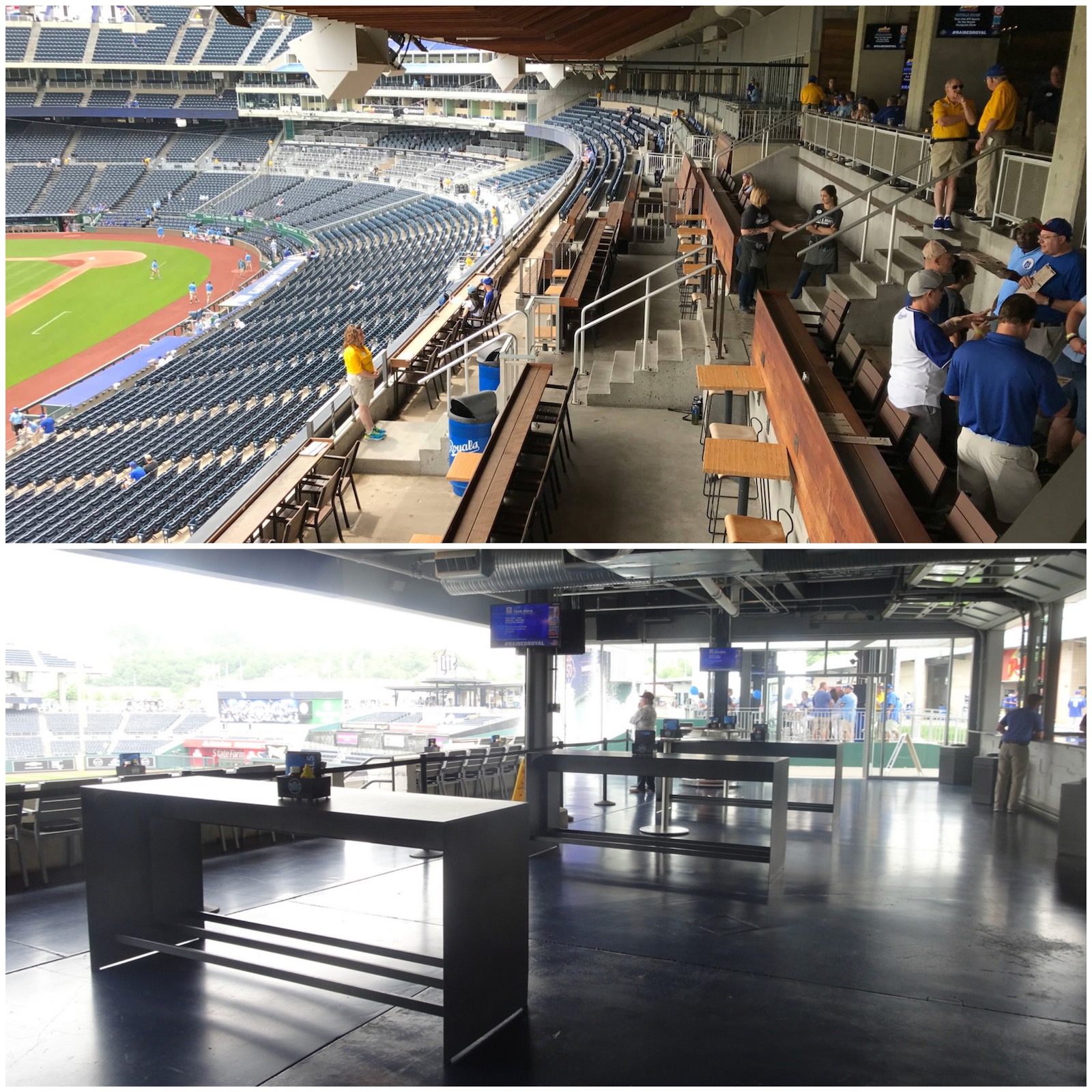
Formerly a white tablecloth dining experience, The Stadium Club has been rebranded into the .390 Bar and Grill. Glassed in on the mezzanine down the left field line, the restaurant is a tribute to George Brett’s best season. The Rivals Sports Bar in right field beyond the outfield is Kauffman Stadium’s informal option. Be sure to also check out the Fountain Bar in the outfield, which is a perhaps the coolest concept of them all. Seating pictured is first come first serve.
Score: 4/5
Premium Seating/Clubs:
The premium services may not be as loud as other recent ballparks, but the K gives the fat cat a certain degree of innovation not seen anywhere else in the league.
There are two premium-seating options on the first level: one is the ultra exclusive Crown Club, decked out in a lavish crème décor. At $240 a seat, these are still available for single game or season ticket purchase in the lagging economy, but rarely enter the secondary market at a much lower price due to a lack of supply. So there is a certain degree of exclusivity.
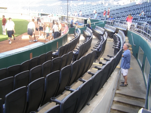
The Diamond Club is another more informal premium area located directly behind the Crown club. The Diamond Club offers some of the best views from the patio of any premium space in existence. Note the enlarged baseball cards on the ceiling. This new club level provides a tasteful design without being too stuffy.
Behind the padded regular club seats, the Royals offer “Diamond Club Boxes,” a more private, padded deck-style seating with a drink rail. This is one of the more innovative concepts introduced to the modern ballpark and distantly resemble the NBA’s “loge boxes.”
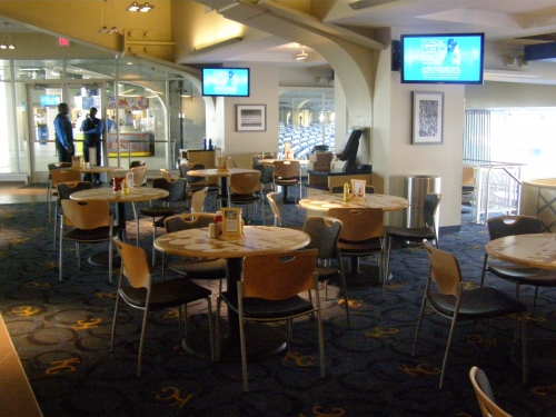
Considering it was a “club level” before the renovations, the loge level is a quasi-exclusive area with tiled flooring and suites, despite not being climate enclosed. The Royals wanted quality over quantity, so the suites are limited 35, but bring a higher amount of luxury to the table.
The Royals offer the most unique suite option in baseball: the dugout suite. Not only are you right on the field, in the same position as the player in a literal dugout, but this premium seating concept is an especially good use of space, as it doesn’t interfere with the average fan or push the stands farther into the stratosphere. Hall of Fame suites in the outfield by the museum offer an uncommon experience as well.
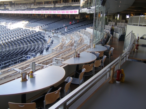
Another unique premium seating option is the “signature club boxes”, which more or less combine a club level atmosphere with suite amenities. Guests get access to suite style seating and all-inclusive buffets with a large club lounge. While limited in quantity, the Royals give quite a specialized selection to feed the corporate appetite.
The best thing about all these amenities is that they are presented in a very understated manner. None of the premium options dominate the structure. The Royals really do it well, despite the comparitive lack of luxury and the lack of a true mezzanine club level.
Score: 4/5
General or Artistic References to Baseball or Team History/Museums:
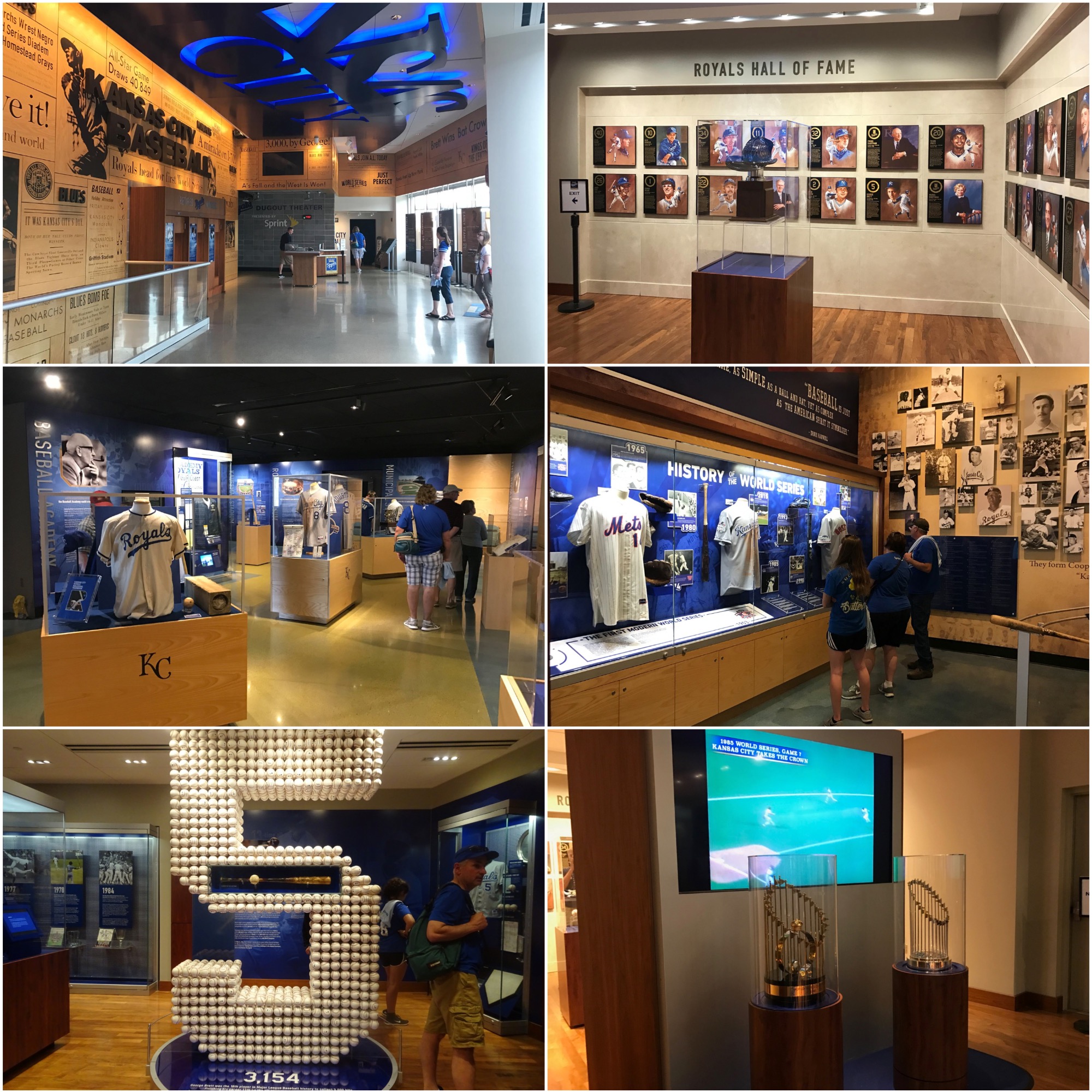
The Royals Hall of Fame is the most extensive and technologically advanced team Hall of Fame in the country, according to many. Unfortunately, I went in June 2009 before it opened.
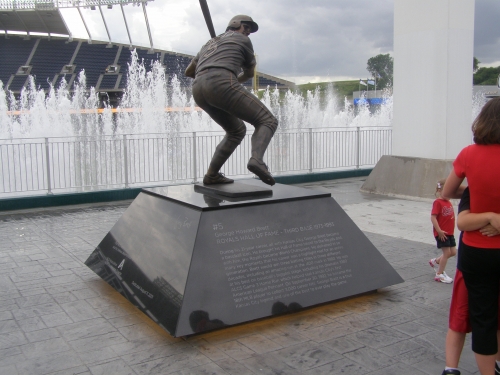
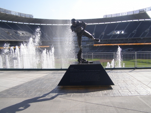
I still would have liked to see some sort of mural or timeline on the concourse acknowledging the history. On the outfield concourse behind the fountains, the Royals showcase three statues: George Brett, Dick Howser, and Frank White. There’s not enough history shown throughout the ballpark, but the Hall of Fame is so far ahead of everyone else, I’ll give a 5.
Score: 5/5
Entertainment/Kids Activities/Other Amenities:
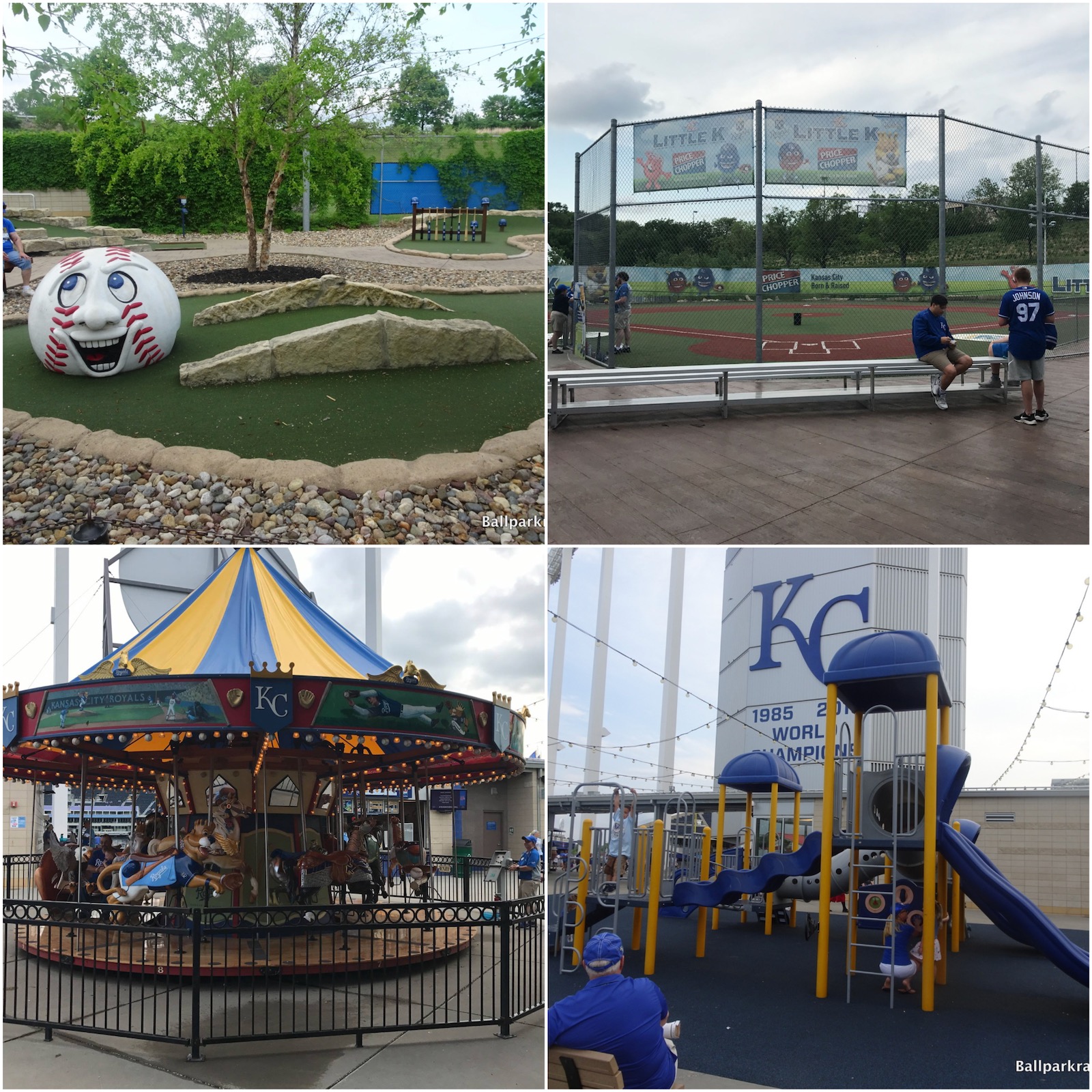
The sheer abundance of entertainment features on Kauffman Stadium’s outfield concourse is way over the top, beyond anything we’ve ever seen before.
Behind the outfield concourse, as part of “the outfield experience,” there is an area devoted to kids that features all the activities you could ever imagine. Little K diamond: a mini field for the kids to play ball? Check. Giant playground? Check. Video game arcade? Check. Batting cages, speed pitch, base running, and all the typical stuff? Check.
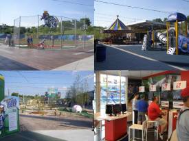
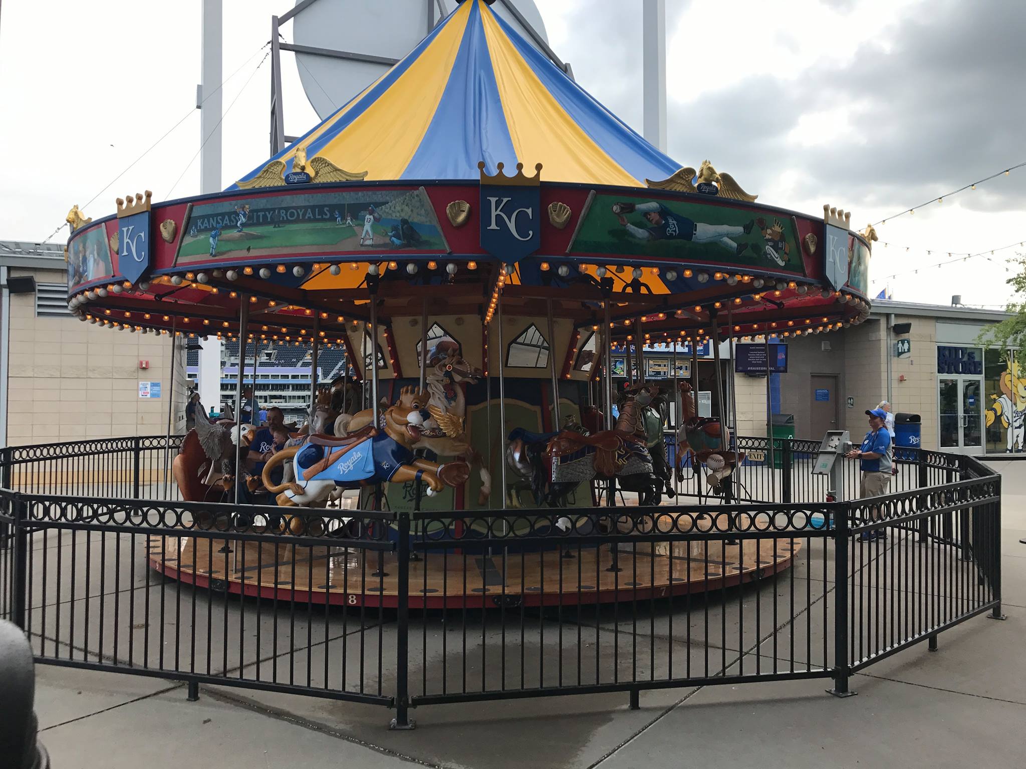
In addition to that, the K is the second MLB ballpark to sport a merry-go-round carousel. However, the most unique part of the experience is the mini golf course, done in a baseball theme.
This effort won’t ever be topped, possibly to a fault. Most importantly, all of this won’t interfere with the baseball game, but it can add to the experience if you wish.
Score: 3/3
Total: 20/25
Atmosphere, Vibe, & Policies
Atmosphere/Fan Support:
Based on the two games I attended, the fan atmospheres were very different: one was an ordinary game, while the other was against the Cardinals, which is the most attended annual series at Kauffman Stadium. The former is the norm.
The atmosphere at the K is the most minor league I have experienced, even with the renovations. In the ninth inning during a blow out game, it was so quiet that four rowdy guys took over the entire lower bowl with their chants and got the fans into the game.
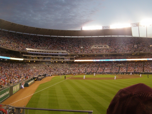
What’s sad is that attendance actually went down a year after the renovations in 2010, compared to before the renovations. With an exciting young team, attendance should go back up in the new decade.
Score: 3.5/5
Ballpark Policies/Customer Service:
The ushers at the new K may be a tad stricter than before the renovations, but that still doesn’t mean they’re not some of the best in baseball. The customer service as a whole was completely without problems. It was also fairly easy to upgrade to better seats at the end of the game. I recently read a poll on Joe Mock’s ballpark website which said they are the best in the American league, with St. Louis being the best in the National League.
Score: 2/2
Bonus:
For standing out from its peers and being a baseball-only facility in an era where every sporting edifice served multiple purposes, but wasn’t ideal for any particular sport. And now, it is still one of the best +3
For having the best interactive kids activities in baseball +2
For sticking to its modern image and being unique despite the wave of retro and quasi retro ballparks being built and renovated over the past 20 years +1
For the most aesthetically pleasing ballpark feature in the majors, the fountains +1
For not only having the biggest video board in baseball, but for having the coolest, most creative, and most attractive scoreboard system +1
For the Royals Hall of Fame +1
Score: 9
Total: 15
Conclusion
FINAL SCORE: 81.5
RANKING: #19/30
Summary
TL;DR? Here’s the long-form piece in a nutshell:
Praised as a 20th century classic for its clean, modernist lines and outfield fountains, my take on Kauffman Stadium is one of the site’s more controversial ones, as longtime ballpark enthusiasts generally place The K in the top 10.
My rationale is twofold: 1) I didn’t like the aesthetic changes made to the outfield scene during the sweeping 2008-08 renovations, and 2) I still can’t get past the suburban setting.
1) The central appeal of old Kauffman was not only the fountains, but the gorgeous, flowing simplicity of the grass embankments in the outfield. It’s an aesthetic travesty that modern-day economics forced the Royals to convolute the timeless uncluttered greenery with seating, ads, playgrounds, and putt-putt courses, because the greenery allowed the fountains to stand out. I find the outfield appearance too muddled and busy now.
2) Kauffman Stadium is the ultimate suburban “parking lot ballpark,” with one of the lowest walkability scores in baseball. My enduring persuasion is against venues not integrated with the city center or a neighborhood. America’s venerated ballparks resonated with fans because they were part of a community, and suburban baseball can never replicate that appeal.
Kauffman has a few other flaws—the lack of a locally-operated BBQ joint in the stadium representing America’s BBQ capital is confounding, for example—but there’s still plenty to like here.
The fountains are still there. The interior lines are still sharp. The sightlines are good. The videoboard topped with a crown is iconic. And other than the food, a big caveat, the amenities are spectacular: Kauffman has (a) some of baseball’s best craft beer, (b) wonderful social spaces like Craft & Draft and Rivals Bar, (c) the Royals Hall of Fame, and (d) the Outfield Experience offering baseball’s #1 family-friendly kids’ areas.
But the superb “classic K” is greatly missed. Wrigley, Fenway, and Dodger managed to incorporate 21st century amenities without taking away so much aesthetic appeal.
Defining Features
Fountains
Biggest Hit
Fountains
Biggest Miss
Suburban Location
Other Hits
Videoboard Topped With a Crown
Influenced by Googie Style, The K’s Seating Bowl is Truly Sculptural in Design
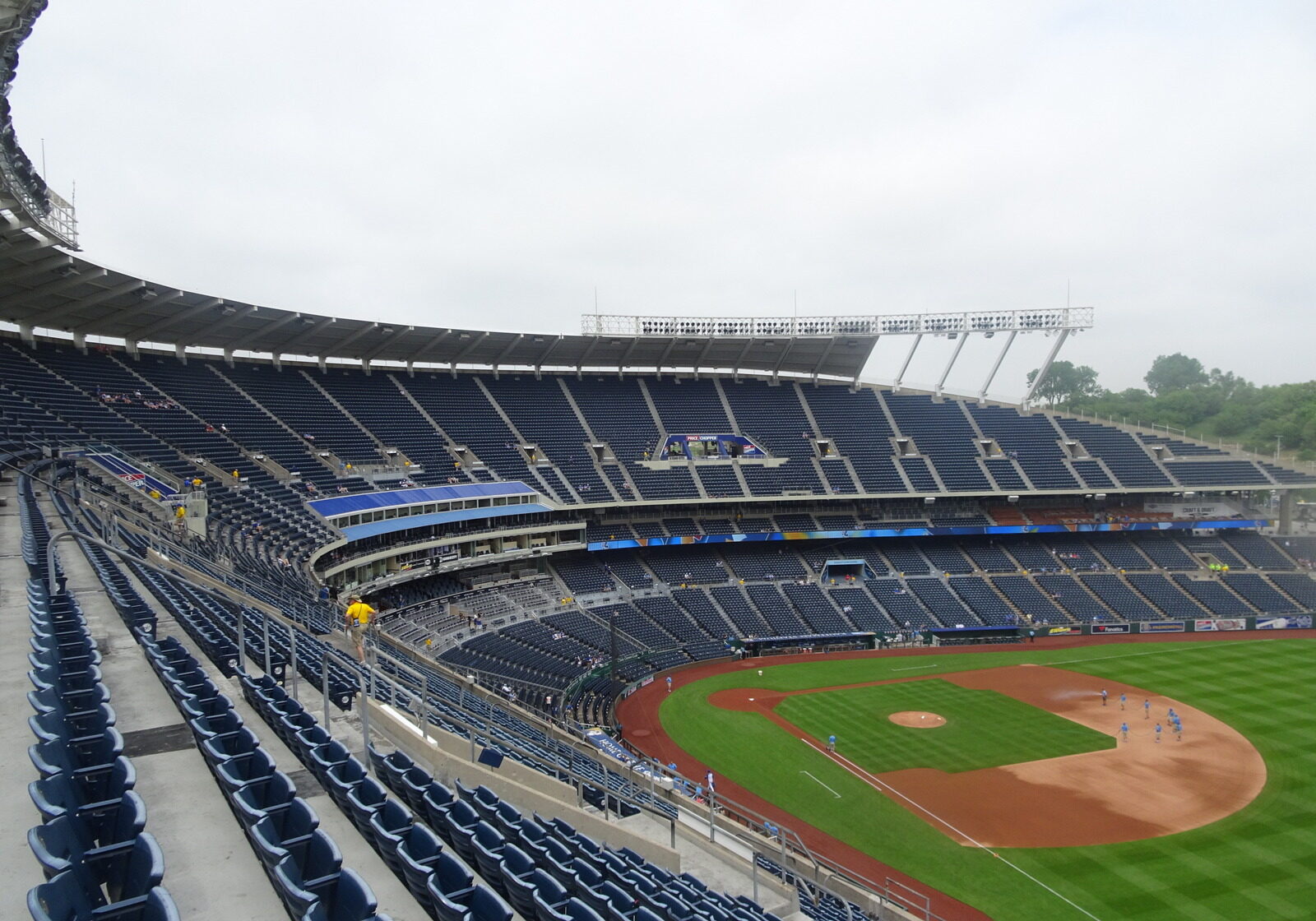
"Pastoral" Views From the Upper Deck

Smart Lower Concourse System
Upper Deck Comparatively Close to the Field
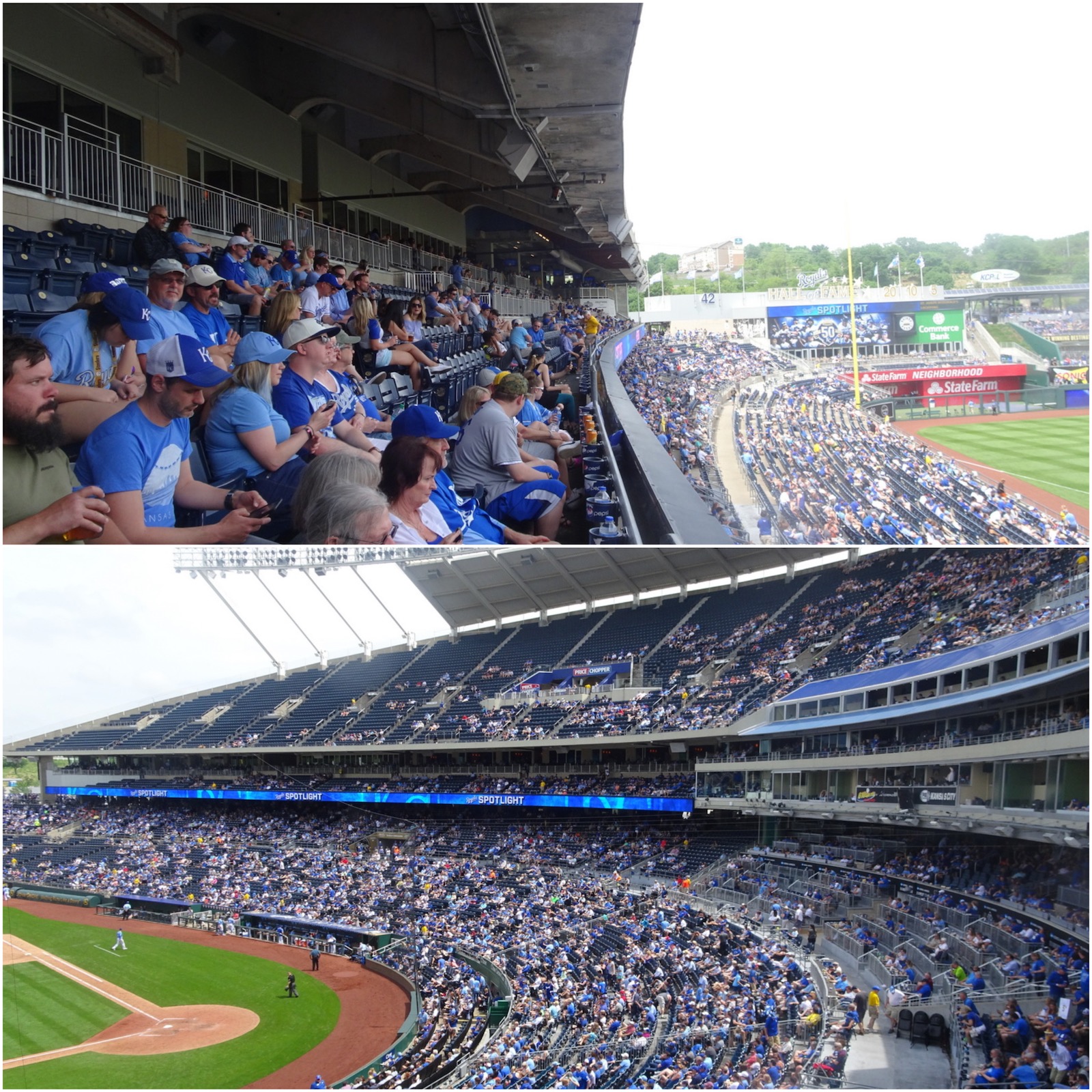
Royals Hall of Fame
MLB's #1 Ballpark for Kid and Family Fun
Craft & Draft and Rivals Bar Are Solid Social Spaces
Top-10 Craft Beer Ballpark
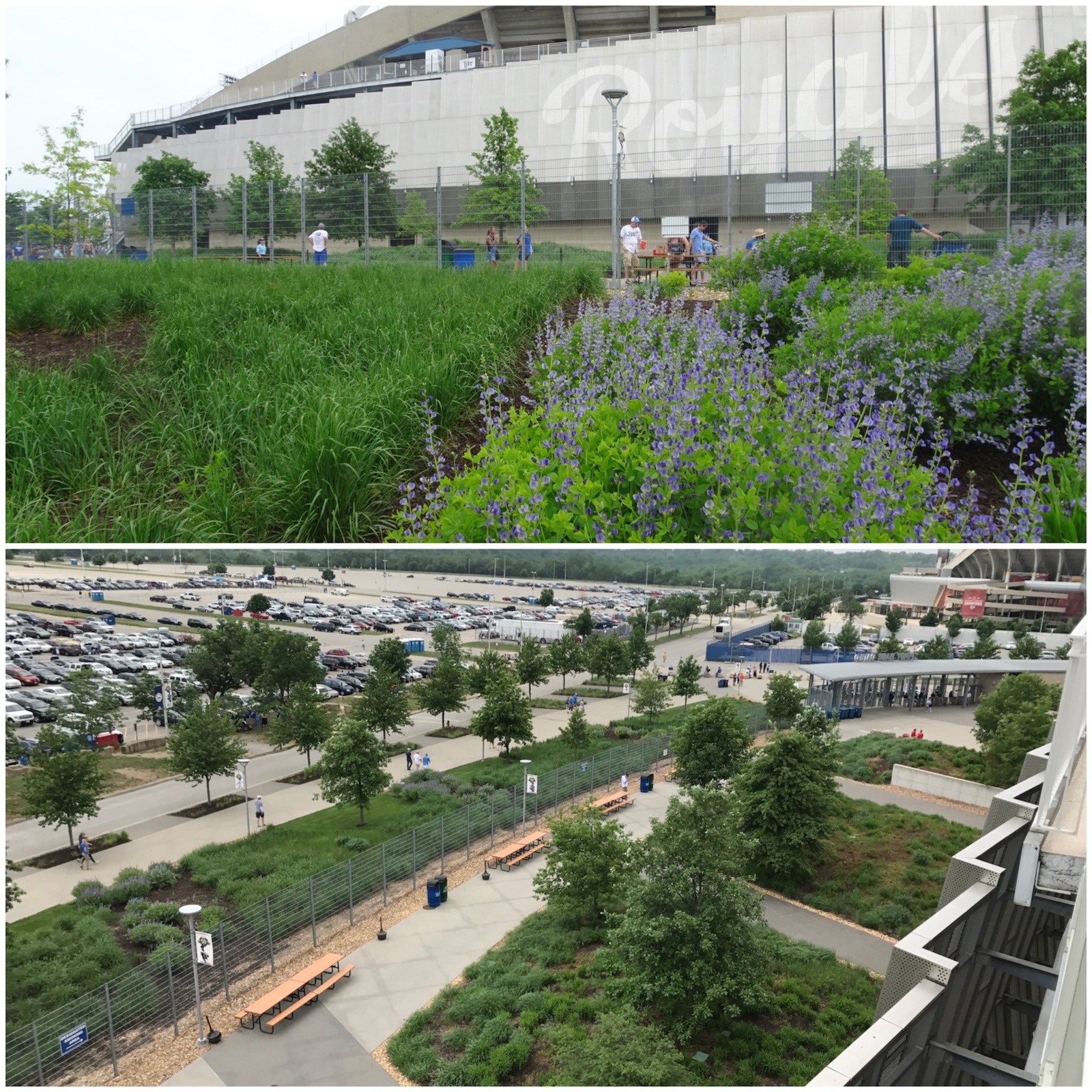
Lush Landscaping Outside and Throughout the Outer Concourse
Outfield Statues
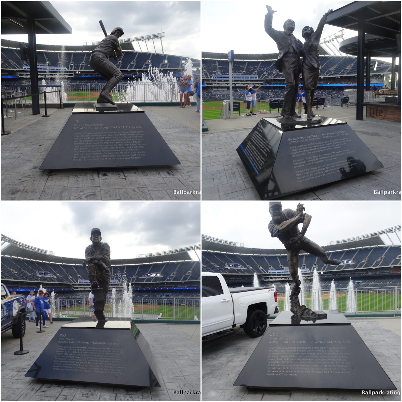
Almost every MLB ballpark has statues of team legends, but they’re often outside, essentially a decorative artistic flourish to the exterior design. Like those in Detroit, I love that Kauffman’s statues are inside the stadium, part of the in-park fan experience.
Tailgating
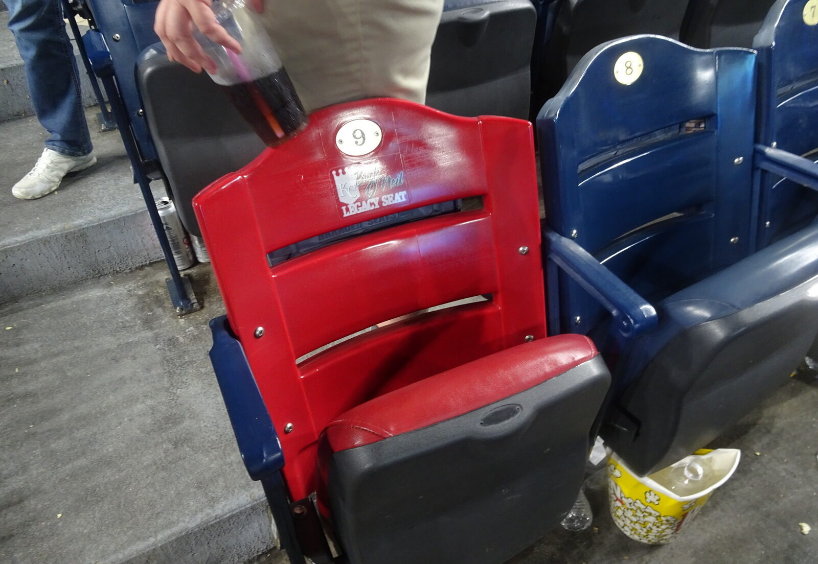
Buck O'Neil Legacy Seat Program
Other Misses
Formerly Timeless Interior Aesthetics Are Now Too Cluttered
Exterior's Graceful, Sweeping Lines Are Now Muddled By Faux-Modern Veneers
While Curvilinear Seating Design Doesn't Make it Awful, the Seating Geometry is Still Subpar
Poor to Pedestrian Food Selection and Quality
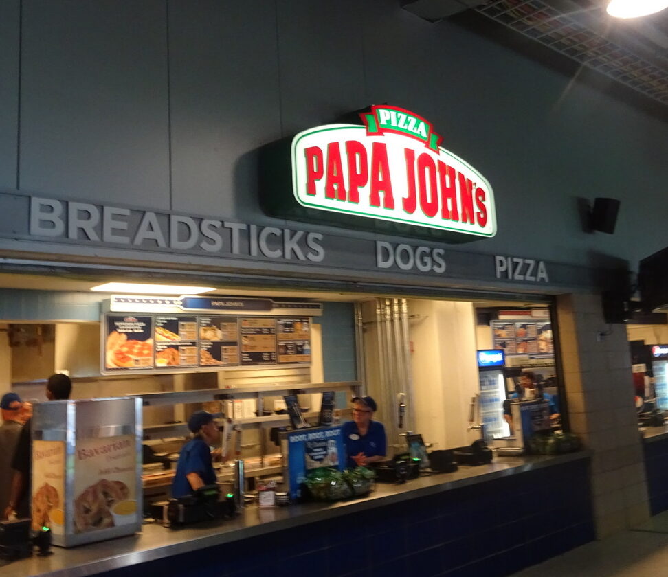
Lack of a High-Quality, Local BBQ Joint at Kansas City's Baseball Stadium is Absolutely Unacceptable
Upper Deck Seats Lack Cupholders
Best of
Best Neighborhood Restaurant/Bar: None
Just how quintessentially suburban is Kauffman Stadium? Denny’s across the interstate is your best bet. Denny’s! Stick with the tailgating.
Best Seats: Crown Club
Favorite Seats: Diamond Club
Best In-Park Pregame Spot: “Outfield Experience"
I’m not going to pick any one spot to hang out, but cite the entirety of the so-called “outfield experience” added in 2009. Check out all of the attractions — The Royals Hall of Fame, games for adults and kids, bi-level bar and restaurant, statues, etc. — throughout the outfield concourse.