loanDepot park
| Setting | 8/20 | 1 Thumb Down |
|---|---|---|
| Locale | 2.5/5 | 1 Thumb Down |
| Accessibility | 2/5 | 1 Thumb Down |
| Neighborhood Local Scene | 3.5/10 | 1 Thumb Down |
| Architecture & Aesthetics | 47/65 | 1 Thumb Up |
|---|---|---|
| Exterior Design/Aesthetics | 16/20 | 2 Thumbs Up |
| Interior Aesthetics/Visuals | 27/40 | Thumb Sideways |
| Concourse Aesthetics | 4/5 | 1 Thumb Up |
| Functionality & Essentials | 40.5/50 | 1 Thumb Up |
|---|---|---|
| Sightlines: Field Proximity | 12/15 | Thumb Sideways |
| Sightlines: Seating Geometry | 4.5/5 | 1 Thumb Up |
| Seat Comfort | 7/9 | Thumb Sideways |
| Concourse Functionality | 14/15 | 1 Thumb Up |
| Scoreboards/Tech | 3/6 | Thumb Sideways |
| Amenities & Features | 36/50 | Thumb Sideways |
|---|---|---|
| Concessions: Food Variety | 4.5/5 | 1 Thumb Up |
| Concessions: Food Quality | 4.5/5 | 1 Thumb Up |
| Concessions: Craft Beer/Other Drinks | 2.5/5 | 1 Thumb Down |
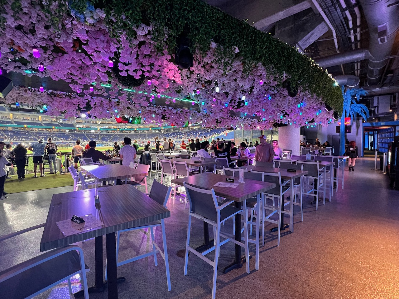
| Social Gathering Areas/Restaurants | 7.5/10 | Thumb Sideways |
| Premium Seating/Clubs | 6.5/9 | Thumb Sideways |
| Historical Exhibits, Memorabilia, Art, & Other Displays | 8/10 | 1 Thumb Up |
| Kids Areas/Other Entertainment | 2.5/6 | 1 Thumb Down |
| Atmosphere, Vibe, & Policies | 7/15 | 1 Thumb Down |
|---|---|---|
| Fan Support/Attendance | 1/5 | 2 Thumbs Down |
| Ballpark Traditions/Gameday Presentation | 2.5/5 | Thumb Sideways |
| Ballpark Policies/Staff | 3.5/5 | Thumb Sideways |
| Adjusted Raw Score | 138.5/200=69.25=69.5 |
|---|---|
| Bonus | 3 |
| Curve for All 7 | 7 |
| Final Score | 79.5 |
|---|---|
| Ranking | #22/30 |
|---|---|
Fish Out of Water
Marlins Park’s gleaming architectural design doesn’t fit with the Little Havana environment, but brings something new to an array of derivative major league ballparks; isolated deficits in amenities and poor fan support also limit an otherwise inviting ballpark
By: Cole Shoemaker
Part of introduction written in 2012; everything else written in 2017; ratings above are up to date for 2024, but this review below is outdated given recent changes (check out updated blog review) and will be updated at some point; reviews and ratings are “living pages” updated yearly when necessary
While I’ve grown to love it as a building, the media’s initial reaction to Marlins Park represented how much our standards for ballpark architecture have declined in response to the latter retro years. In light of the Loria fire sale and the stadium-funding furor (the political side of this is well documented, so I won’t discuss it here; I briefly touch upon what it should mean in the conclusion), it’s easy to forget the ballpark itself opened to universally fawning press reviews in 2012.
Yes, I think that it’s fantastic that we finally demonstrably deviated from the red brick retro years, even evolving past the self-proclaimed “organic” faux-regional stone ballparks like Petco Park (San Diego) and Target Field (Minnesota). I get it more than anyone, because I’ve been preaching this for years. The Marlins want their park to be seen as a 21st century modern piece of art, and trying something new is what we need.
For a website that claims it doesn’t do “original research,” Wikipedia sure has had fun labeling Marlins Park the world’s first “contemporary ballpark,” in what is one of the wiki’s largest ballpark pages, sighted with scores of articles handing out high acclaim in terms of vague modernity. However, building the first “contemporary modern” ballpark in baseball history doesn’t necessarily equate to building a great ”contemporary modern” ballpark. And constructing a captivating edifice doesn’t equate to constructing a great ballpark.
Don’t get me wrong. Marlins Park is a breath of fresh air almost by default, and I love the exterior design even on its own merits. The architecture is clearly the park’s strongpoint in comparison to the inside. I appreciate that they showed a modern ballpark could reflect its city without resorting to bricks and steel. But Marlins Park is simply not the paradigm-breaking ballpark everyone seems to be portraying it as.
By labeling Marlins Park a visionary modern contemporary ballpark, and it is indeed a radical departure from 20 straight retro or quasi-retro parks, the media seems to be implying that this structure reclassifies the nature of the major league ballpark, akin to what Camden Yards in Baltimore did.
On multiple levels, that just seems ridiculous to me.
First of all, Marlins Park is going to benefit from a great coincidence of timing, as it opened at the very end of the ballpark building boom. Critics seem to be inevitably associating Marlins Park with some sort of revolution in ballpark aesthetics, which is totally unfalsifiable because we aren’t going to see another ballpark for a long time (2017 check: the claim that Marlins Park was going to start a contemporary ballpark craze or remake the 21st century ballpark looks ridiculous).
While the retro movement was somewhat inevitable due to the coming ballpark building boom and the flow of the country, I would also argue that this movement in ballpark architecture was so pervasive because Camden Yards was so transcendental.
Camden Yards wasn’t just the first retro park. In many ways, according to my analysis and others, Camden Yards was, and still is, one of the best retro parks in terms of interior design. We have taken much of what that ballpark did for granted, as it is no hyperbole to say it’s the most influential sporting facility in modern time. The attention to detail, the aesthetic balance, the downtown location, and the contextual integration of the warehouse is still unmatched.
My point is Camden Yards is certainly one of the greatest retro ballparks of all time. I don’t think Marlins Park would be one of the greatest contemporary ballparks ever, especially on the inside. Camden Yards was a once in a lifetime occurrence. What it did for a generation of retro parks, Marlins Park isn’t going to do for a generation of “contemporary parks,” or whatever fancy classification you want to give it.
Getting that out of the way, Marlins Park looks pretty good today, falling squarely in the middle of the pack in a crowded landscape of solid ballparks.
While there’s a ceiling on how high ballparks with retractable roofs can score here, its architecture and aesthetics at least have a distinct and coherent vision. The new SunTrust Park, on the other hand, has none, in a signal that we may have reached the point where ballpark architecture no longer matters. Amenities are the primary focal point of the design. In other words, team financial officials in boardrooms dictate all aspects of the interior and exterior design, with no regard for regional appeal and little original input from fresh architects.
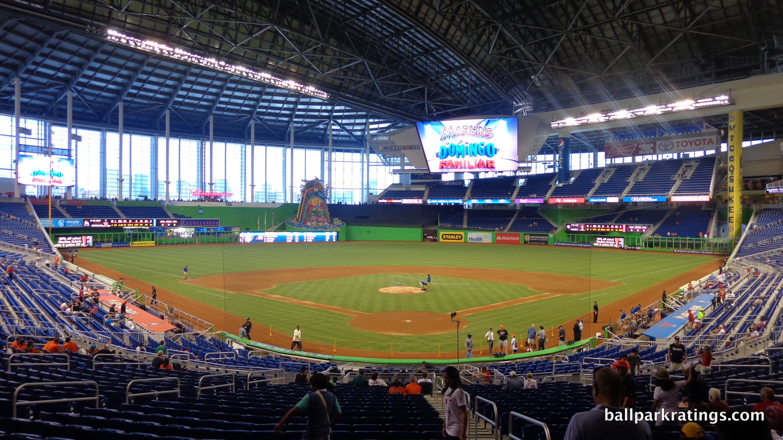
Marlins Park is not one of those. And honestly, we have Jeffrey Loria to thank for that. With the new Rangers ballpark trending in that direction as well, Marlins Park may be the last ballpark built before the “mallpark” (a word I’ve been reluctant to use for a variety of reasons) totally took over baseball’s cathedrals.
Marlins Park’s primary flaw is its extremely poor structure-site relationship.
First of all, I don’t understand why they went for an enclosed retractable roof design, instead of the sliding glass door model like at Minute Maid Park (Houston). While an enclosed environment leads to a poor sense of place, Marlins Park isn’t in symbiosis with it’s setting to start with. The disconnect between the massive park and the intimate Little Havana neighborhood is as unfortunate as it is palpable. Marlins Park is “All about Miami” on a superficial design level, and that does deserve credit, but it has no tangible contextual connection to the area.
Great ballparks represent their cities, and Marlins Park does that to a degree, but definitely not to one that the ambitious architects would like. The best ballparks represent their cities through integrated contextual aesthetics. I get more into this later.
Overall though, the architecture and aesthetics are fairly strong for a retractable roof ballpark.
What is perhaps more interesting are the surprisingly mediocre amenities. With the opening of SunTrust Park, there’s this meme going around that new parks will continue to accelerate because there is an arms race in amenities, with every single new ballpark having better concessions, bars, restaurants, clubs, and entertainment options than the previous one. Marlins Park shows this is not necessarily the case.
I’ll be the first to admit the cumulative metrics of “amenities,” “functionality,” etc. can be nebulous and perhaps incompletely defined for these purposes. When aggregating many factors you’re naturally going to want to group them, however imperfectly. I note this specifically with Marlins Park because there are multiple elements that don’t fit neatly into one category.
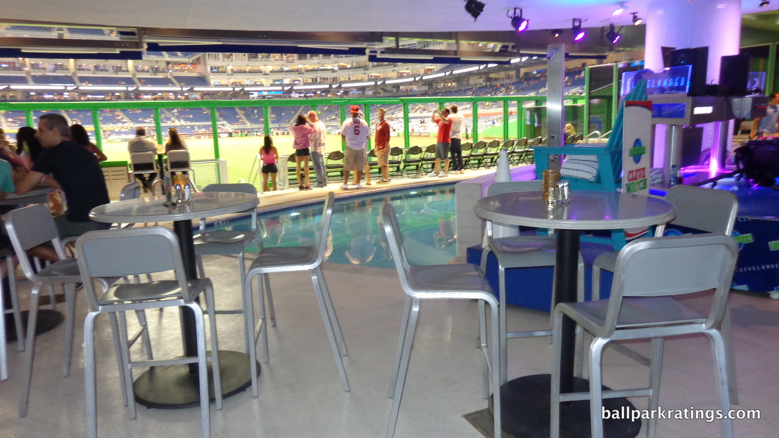
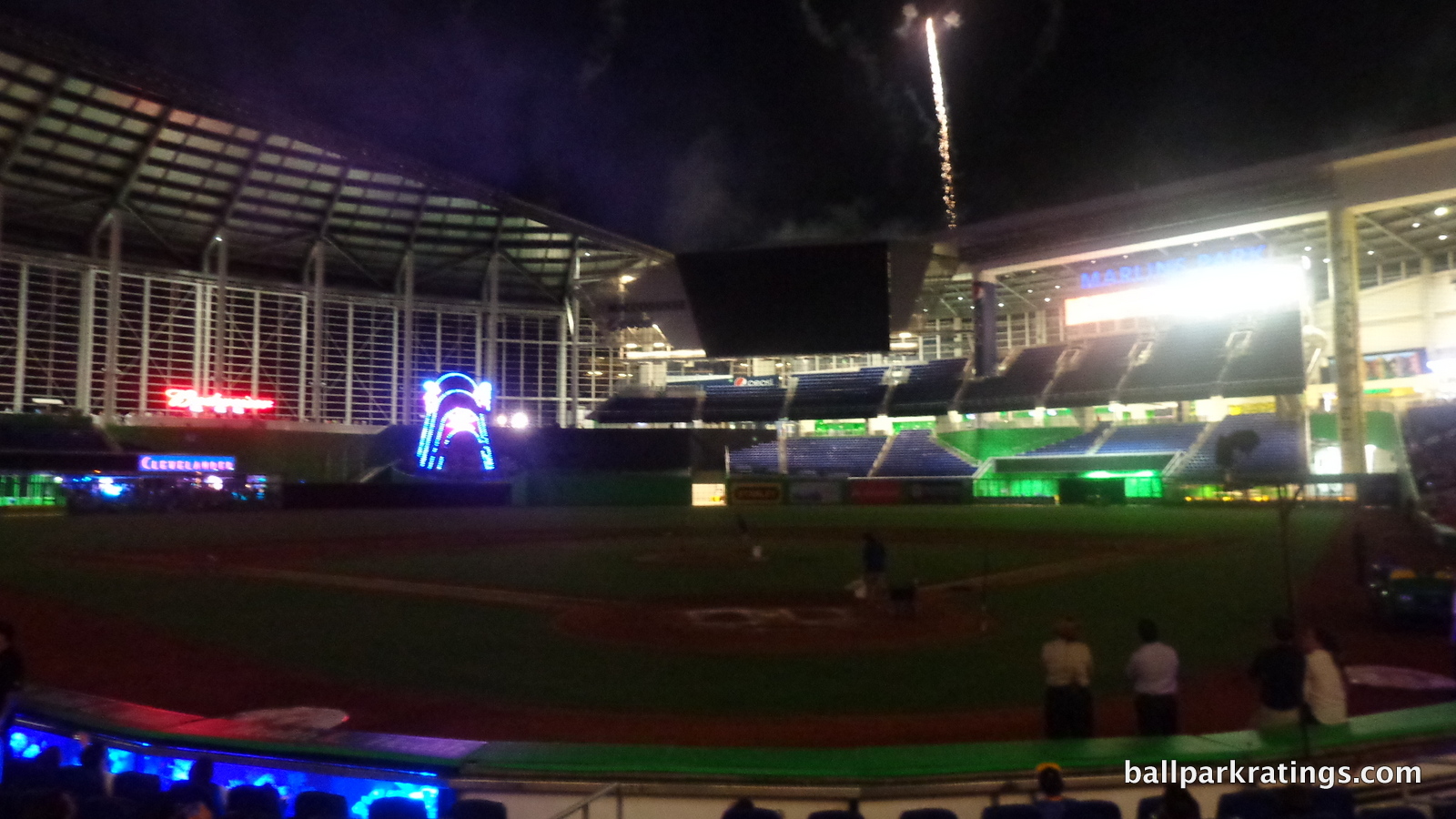
The Clevelander is, shall we say, unusual. It’s technically premium seating/clubs, but I could see it going in accessible restaurants/bars/etc. because it eventually opens to all fans, or even entertainment because of the pool and music element. While “historical references” is explicitly defined to include artistic references, Marlins Park’s fantastic art isn’t properly recognized in that section. You need to separate the lack of Marlins history from the art and features such as the bobblehead museum. So, the cumulative amenities score may not capture everything, and that’s why we have a higher bonus score.
Regardless, Marlins Park still has a number of odd oversights in its amenities compared to other post-1991 ballparks. Perhaps the most peculiar of which is the complete lack of restaurants, social spaces, and sit-down areas on the ballpark’s accessible levels.
Sit-down social spaces have become increasingly popular and expansive across the country’s ballparks, with many older parks adding them. These usually feature numerous lounge areas anchored by a large bar. Marlins Park lacks this. The outfield Budweiser Bar functions more as a large alcoholic concession stand, so that doesn’t really qualify.
Miami’s ballpark is the only modern day stadium I can remember without any sort of sit-down areas throughout the concourses. All parks have something somewhere– maybe a set of picnic tables, a sit down bar, or some sort of watering hole. Not here. If you’re not in a club seating area and you buy food, the only place to eat is at your seat. Weird. While critics don’t notice this, it is something quite consequential, even for the hardcore fan who usually disdains more elaborate amenities.
To hammer the main point home, Marlins Park is only the second ballpark (Busch Stadium, although definitions can be fuzzy here) built since 1991 to lack an accessible sit down restaurant, full-service or otherwise, although I do understand the trend is to move away from these. Marlins Park is also only the second ballpark (Target Field) built since 1991 to lack a kids’ entertainment area. These obviously aren’t the most consequential things, but they do matter, which I’ll get to in those respective sections. The cumulative effect of all of this is damning.
It also has to be noted that the poor crowd sizes are having a larger impact on Marlins Park than anywhere else. It’s not only about the empty seats. It’s about how the ballpark operations respond to the empty seats. Marlins Park completely shuts down at an unprecedented level.
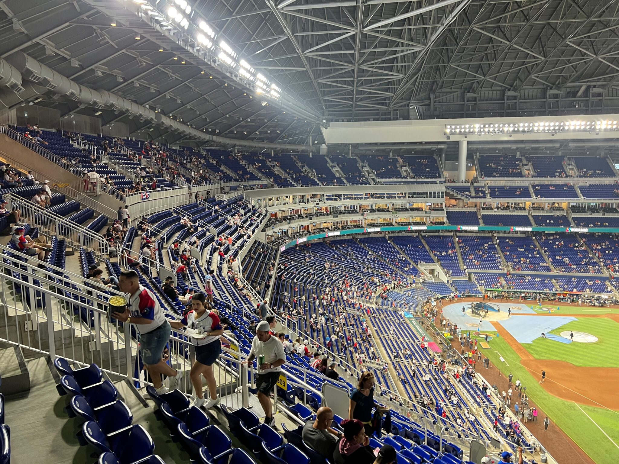
The upper deck closes entirely, certain food items are phased out, concessions are shut down in the corners of the legends club level, and so on. Other parks don’t do this to the same degree when faced with attendance issues. It’s hard for Marlins Park to fulfill its potential when it’s literally operating at half capacity.
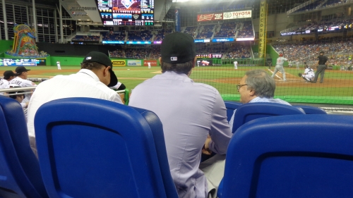
While these deficits don’t define the ballpark, they do enough cumulatively to prevent Marlins Park from reaching the next tier of near great ballparks. As you’ll see in the architecture and aesthetics section, I’m quite charitable regarding common subjects of ridicule, like the color scheme or the home run sculpture. While more minor, it’s harder to be charitable about these aspects.
Marlins Park does plenty right. I probably bash it too much here, which is more my response to its total immunity from any criticism whatsoever just because it’s “not retro” and “modern.” Much of this introduction was crafted in response to initial 2012 positive reviews without any criticism. Despite a poor contextual design, Miami’s park is admirably “All about Miami”, from the contemporary exterior aesthetic and the bold color palette, to the art in the park and the local concessions.
Finally, I should probably disclose that I’ve been to this park more times than any other park besides Turner Field (Atlanta) during the 2010s. It’s a place I’ve grown to call my second ballpark home (or maybe third or fourth, given my various ties).
While I like it architecturally, Marlins Park falls short by failing some of the central tenets of ballpark interior design and integrated urban aesthetics, while also lacking some of the amenities of other new parks. Marlins Park’s designation as a “contemporary ballpark” that is indisputably “modern” doesn’t necessarily translate to an all-around great ballpark experience. At the same time, we desperately needed something new to a formulaic ballpark scene, and Marlins Park certainly brought that originality.
Setting
Location/Access:
According to conventional wisdom, Marlins Park’s location isn’t its strong suit, to say the least. While it’s not ideal, it’s certainly unique among modern day ballparks, all of which are located downtown or in suburbia.
Located 2 miles west of downtown Miami in Little Havana, Marlins Park sits on the former site of the Orange Bowl. The team insisted on a downtown location, but the city informed them that Little Havana was the only viable option. The Marlins weren’t happy, but they took what they could get.
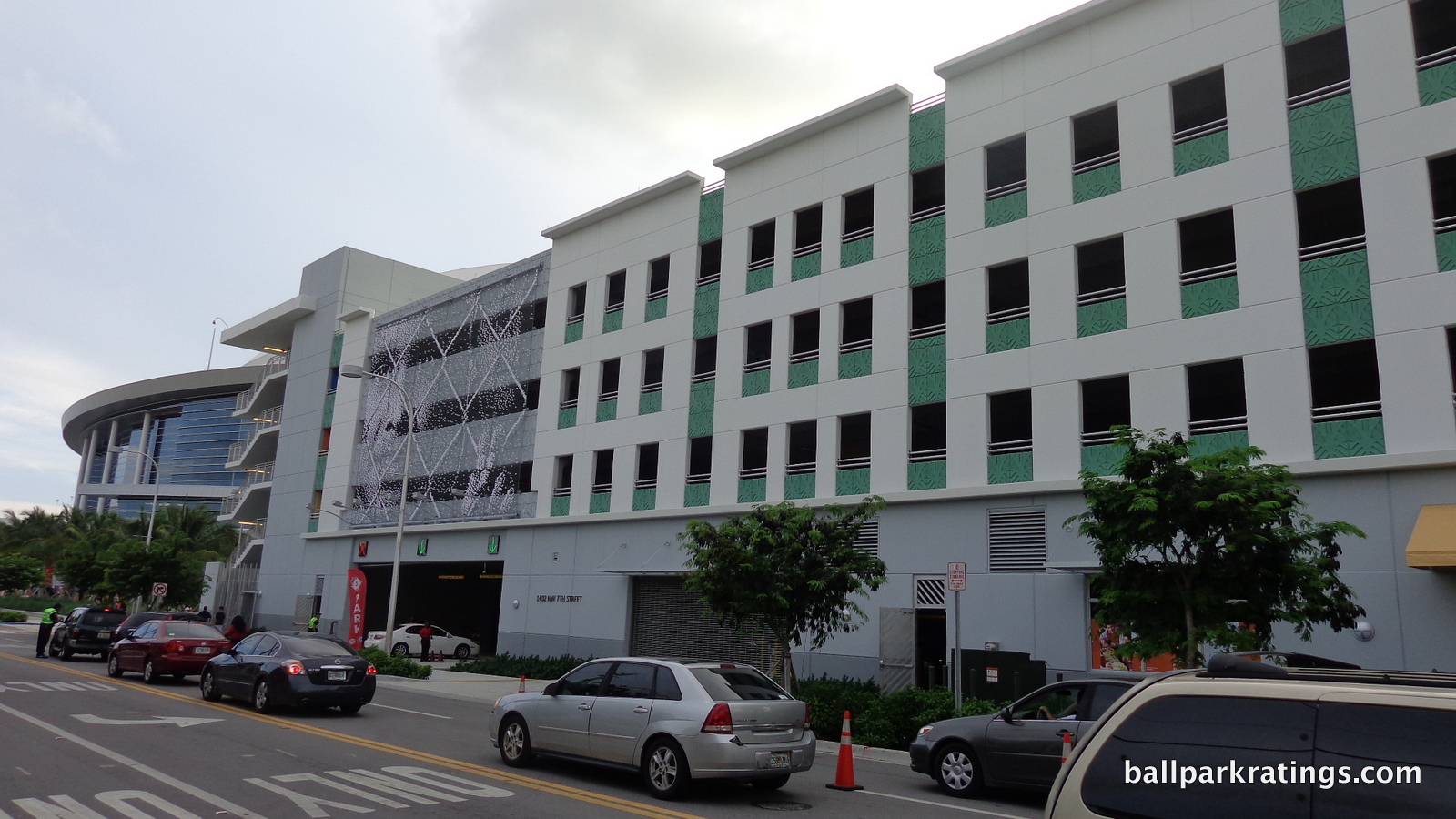
Perhaps the most apt comparison for the setting is that of Turner Field, also located on the periphery of downtown in an actual neighborhood. With Turner Field now closed, Marlins Park is the only post-1991 ballpark that could be construed as a “neighborhood ballpark.” Like that of Turner Field, the area is advertised as being impoverished. While the former was truly populated by an underclass and characterized by crime, Little Havana comes off as a charming cultural cocoon of the city’s Cuban-American population.
So I don’t think it’s entirely fair or accurate to say Marlins Park’s location is made up of boarded, graffiti-scattered buildings.
Although not directly reached by public transit, access is pretty seamless. There have been some complaints about parking. It is true that if the event is at full capacity (not common, obviously), you might have to park in a residential lot. I don’t like to go off of anecdotes, but we’ve had to do this for a couple of highly anticipated WBC games, and it went swimmingly. This isn’t like Turner Field where someone will say, “pay me $20 and I’ll watch your car.” In my experience, residential parking is safe and the locals are welcoming.
Score: 3/5
Local Scene:
Today, I don’t think you can really dispute that Marlins Park has a subpar local scene, defined by the density of bars, restaurants, and hotels in the direct vicinity. It’s similar to what you might find in a suburban park.
The primary bar in the vicinity is the Batting Cage Sports Bar & Lounge. There’s also a Wendy’s and a Subway in the area, but that’s basically it, in what is only a slight step above a place like Miller Park (Milwaukee) or Kauffman Stadium (Kansas City), but without the tailgating.
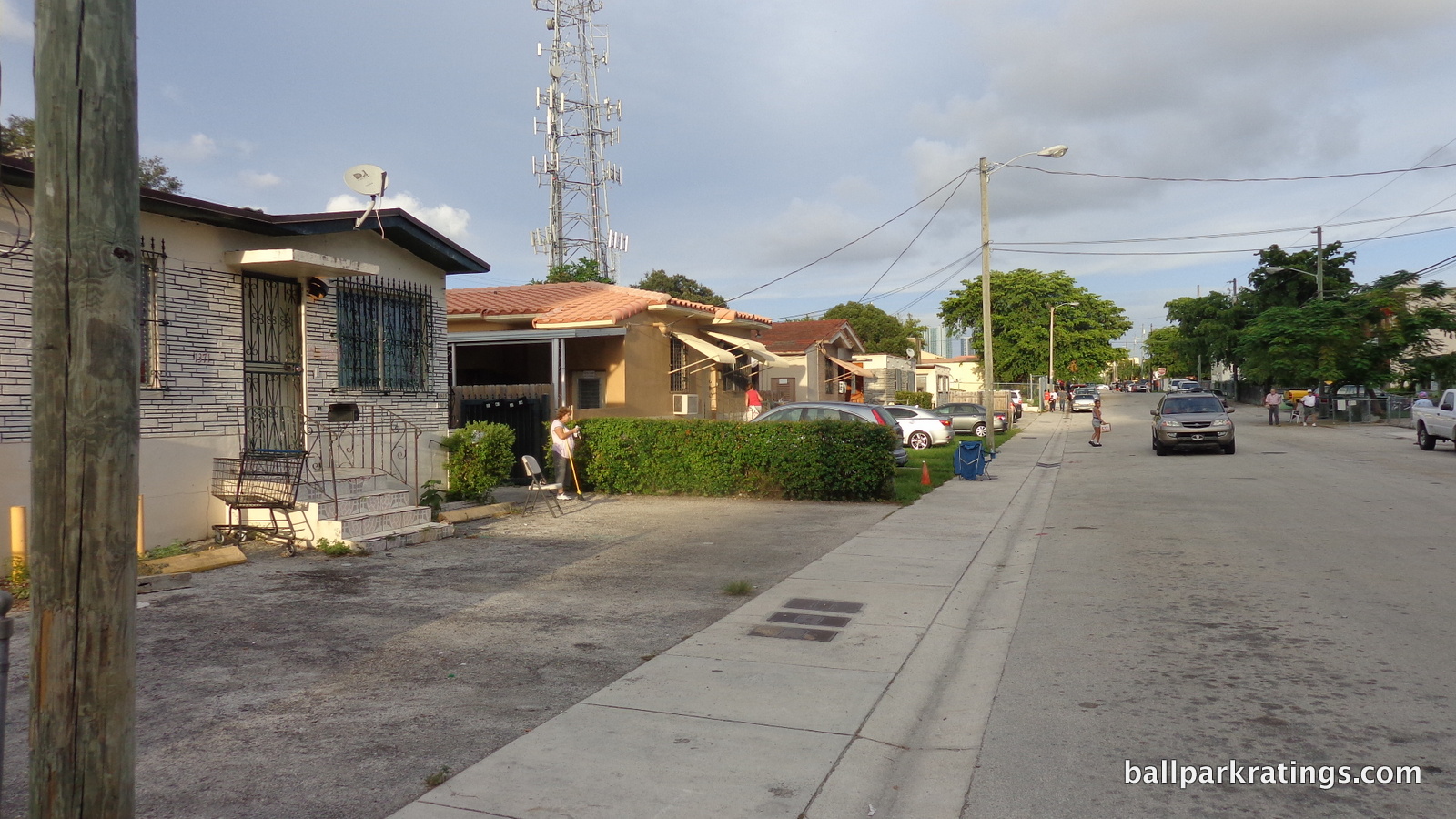
When the Marlins were constructing the surrounding garages, space on the ground floor was designated for local eateries and stores to move in. There hasn’t been much activity, but I noticed there’s now a family owned cigar shop in one of the spaces!
As the ballpark ages, I hope the Marlins try to cultivate this neighborhood vibe instead of building a mixed-use development complex, as I see potential here in the very long term. How do you think the neighborhood around Wrigley Field or Fenway Park looked 100 years ago? Neighborhoods evolve organically around ballparks as time passes. That’s what makes the fact that Marlins Park is so structurally opposed to the surrounding sensibilities such a shame.
It appears apartments are now being constructed. You could see this development beyond left field during 2016-2017.
Score: 2.5/5
Total: 5.5/10
Architecture & Aesthetics
Exterior Design:
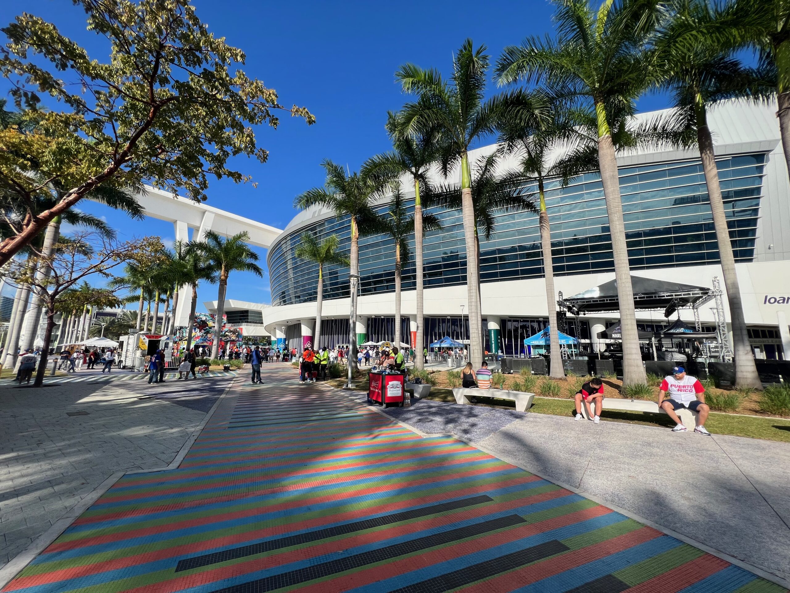
Marlins Park’s exemplary exterior architecture is characterized by a cacophony of contradictions, stridently in opposition to the neighboring sensibilities to a jarring degree, but visually stunning and remarkably innovative when looked at alone.
When I assess ballpark exterior designs, I consider (1) pure aesthetic attractiveness; (2) structural innovation and novelty, specifically if the treatment was unique for its time, or if it was merely a formulaic rip-off; (3) the conceptual intentions on their own, as there are a few ballparks that are conceptually clever, but may not look that great; and (4) how well the architectural materials and overall treatment fit in with the surroundings.
Most parks are a least somewhat of a mixed bag, like maybe a double, single, strikeout, and a home run. Here, we’re looking at three grand slam home runs and a strikeout looking.
We’ll start with the negative first, because Marlins Park is more characterized by its grand slams.
Marlins Park’s abysmal relationship with its site is so confounding it’s almost offensive. This building would be absolutely smashing if located in the city center, perfect in style with the gleaming glass skyscrapers of downtown and Brickell, and perfect in scope with the 21st century “Manhattanization” of the area.
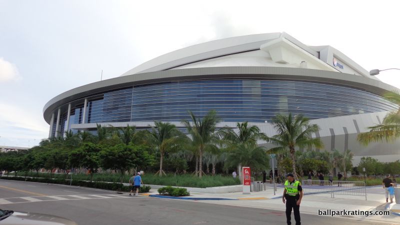
Located in sleepy Little Havana, I’ve never seen a structure so obstinately opposed to the sensibility of the surrounding area in both style and scope. Marlins Park dwarfs, then proceeds to spatially overpower, the intimate Little Havana neighborhood, in what is the most contradictory site/structure relationship you can imagine.
Coors Field’s red brick exterior fits with that of LoDo in Denver. Progressive Field’s industrial white steel is meant to recall that of nearby bridges in Cleveland. PNC Park’s ochre Kasota limestone matches that of the North Shore context in Pittsburgh. Not only does nothing about Marlins Park say Little Havana, the two are opposed in a starkly direct manner.
What’s more, it’s so noticeable that the Marlins took steps to reduce this perceptible contrast. They show awareness of this contradictory dynamic by meekly designing the parking garages with palm tree pastel tiles in order to connect the massive facility to its small-scale Little Havana environment. It’s intended to reduce the visual scale more gradually, serving as a bridge between the two. This is actually a thoughtful gesture, but it doesn’t solve the problem.
Anyway, this is something I really frown upon, but the structure’s merits are even more impressive than this shortcoming. There’s a lot to unpack here.
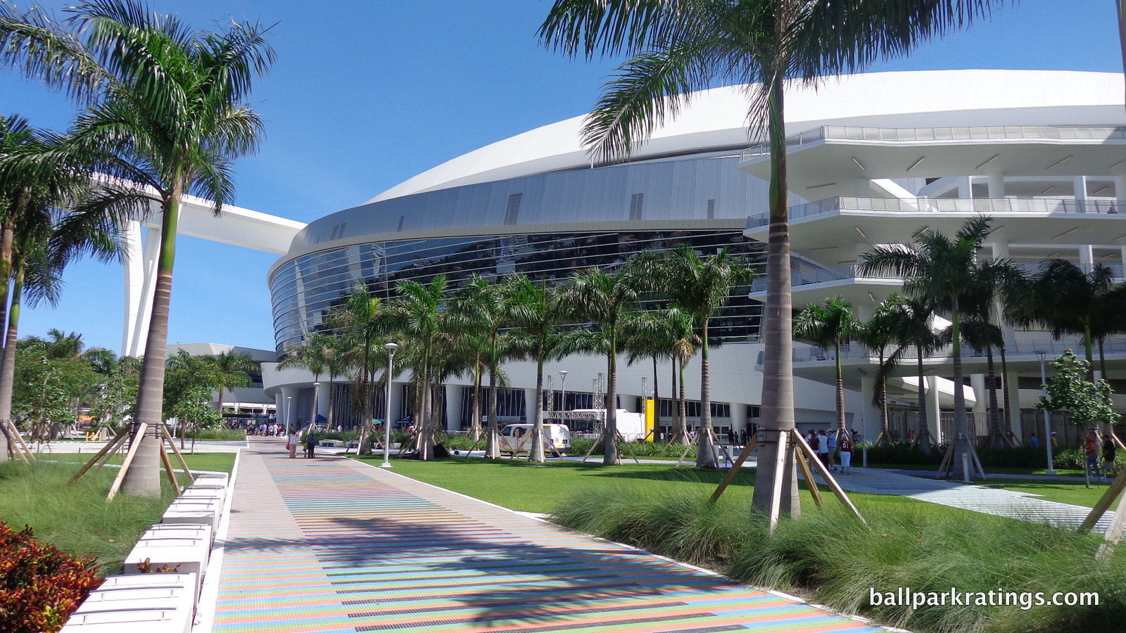
In case you haven’t noticed, Marlins Park isn’t retro. Not one brick. Not one stone. No exposed steel painted green. No Ebbets Field rotunda. This is indeed the starkest stylistic departure since Camden Yards, as 24 other ballparks since 1991 (including three renovated ones) feature at least one of these elements. Retro was so popular you even get hints of it at Tropicana Field. While I know I’m contradicting myself slightly, Marlins Park’s originality as “not retro” does give it an initial leg up.
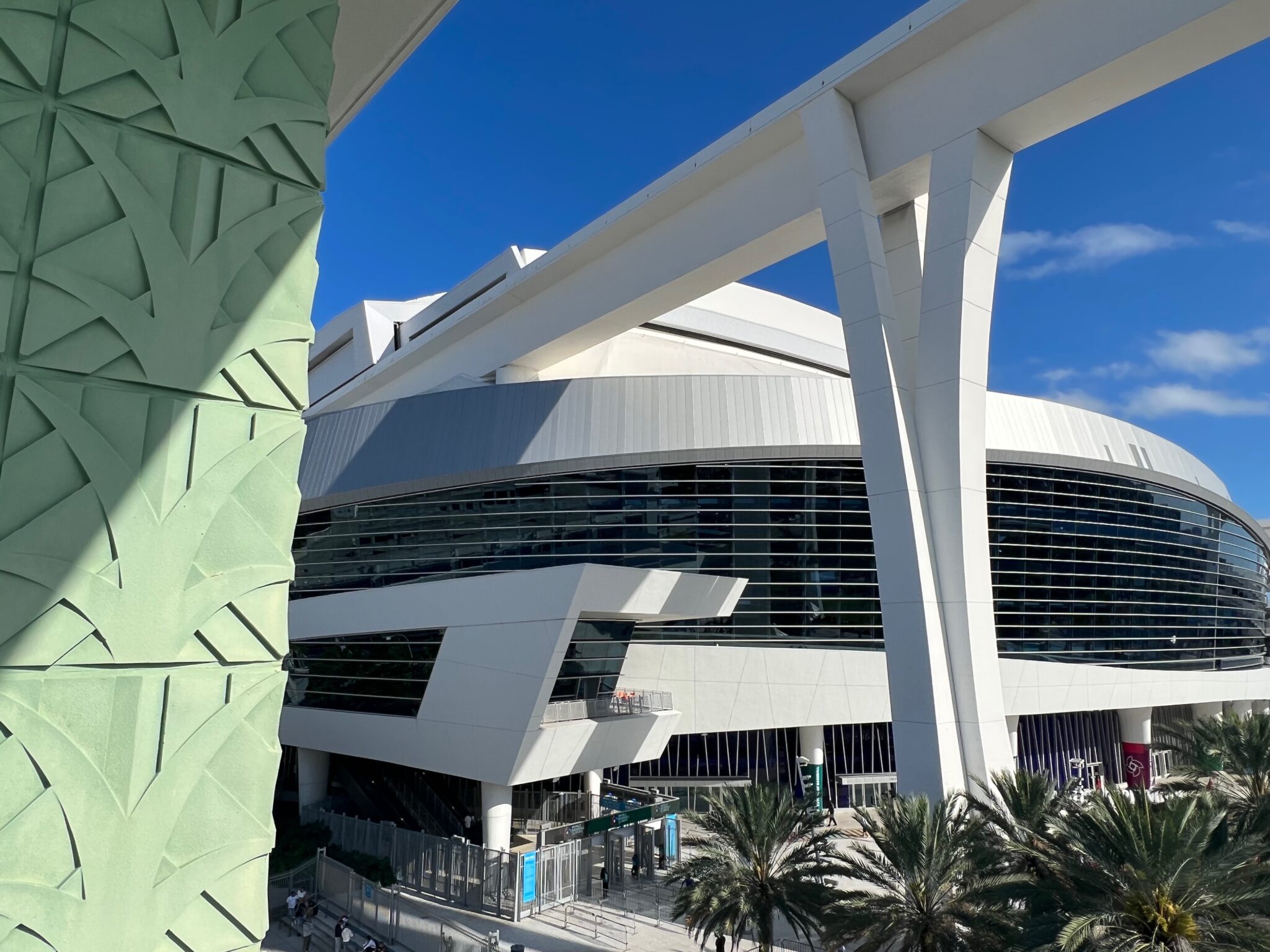
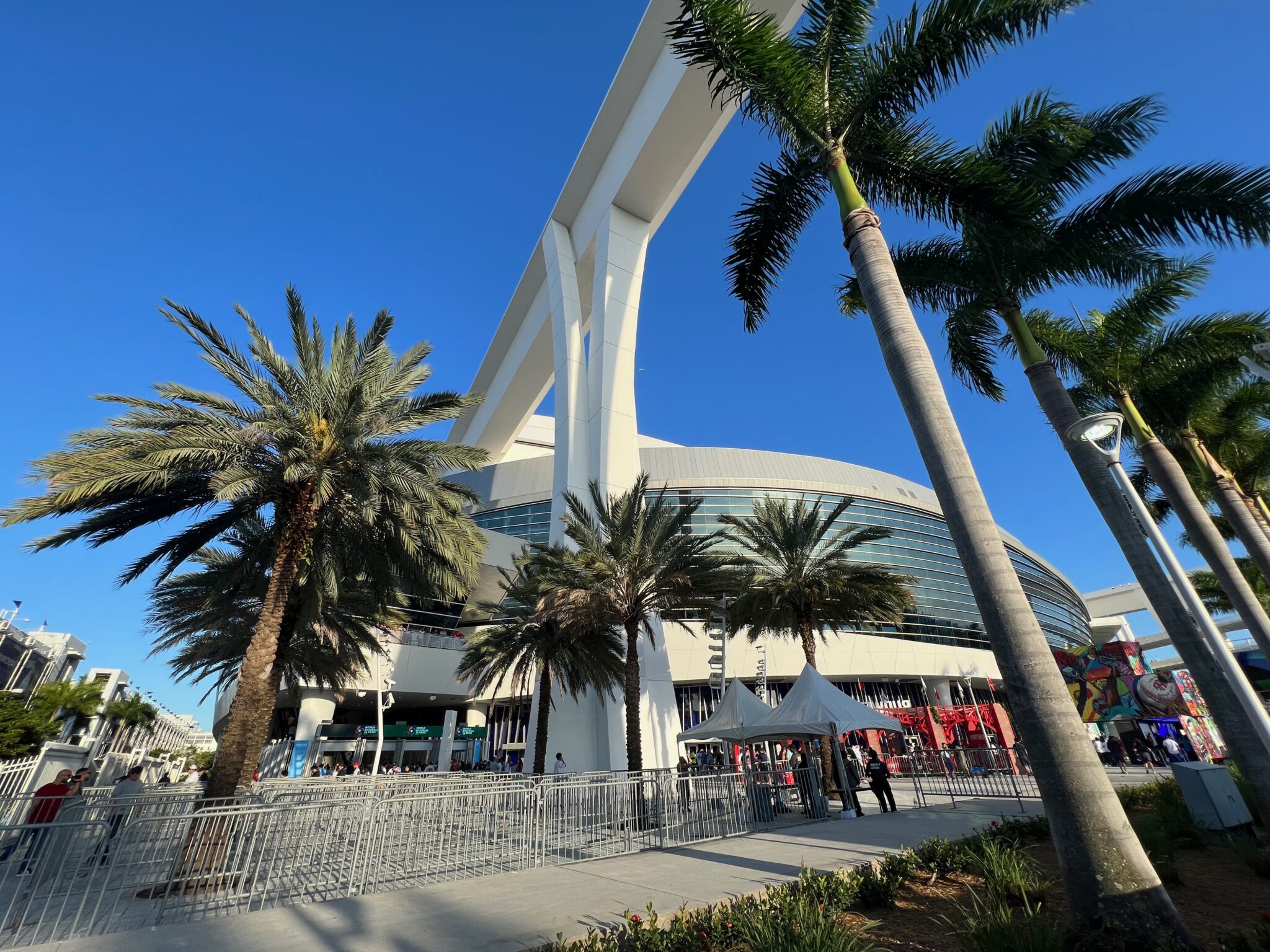
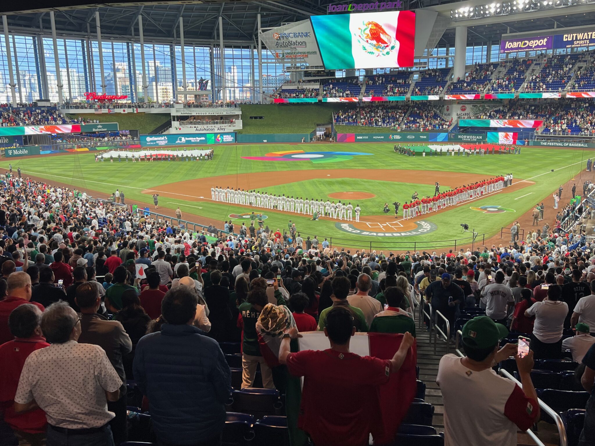
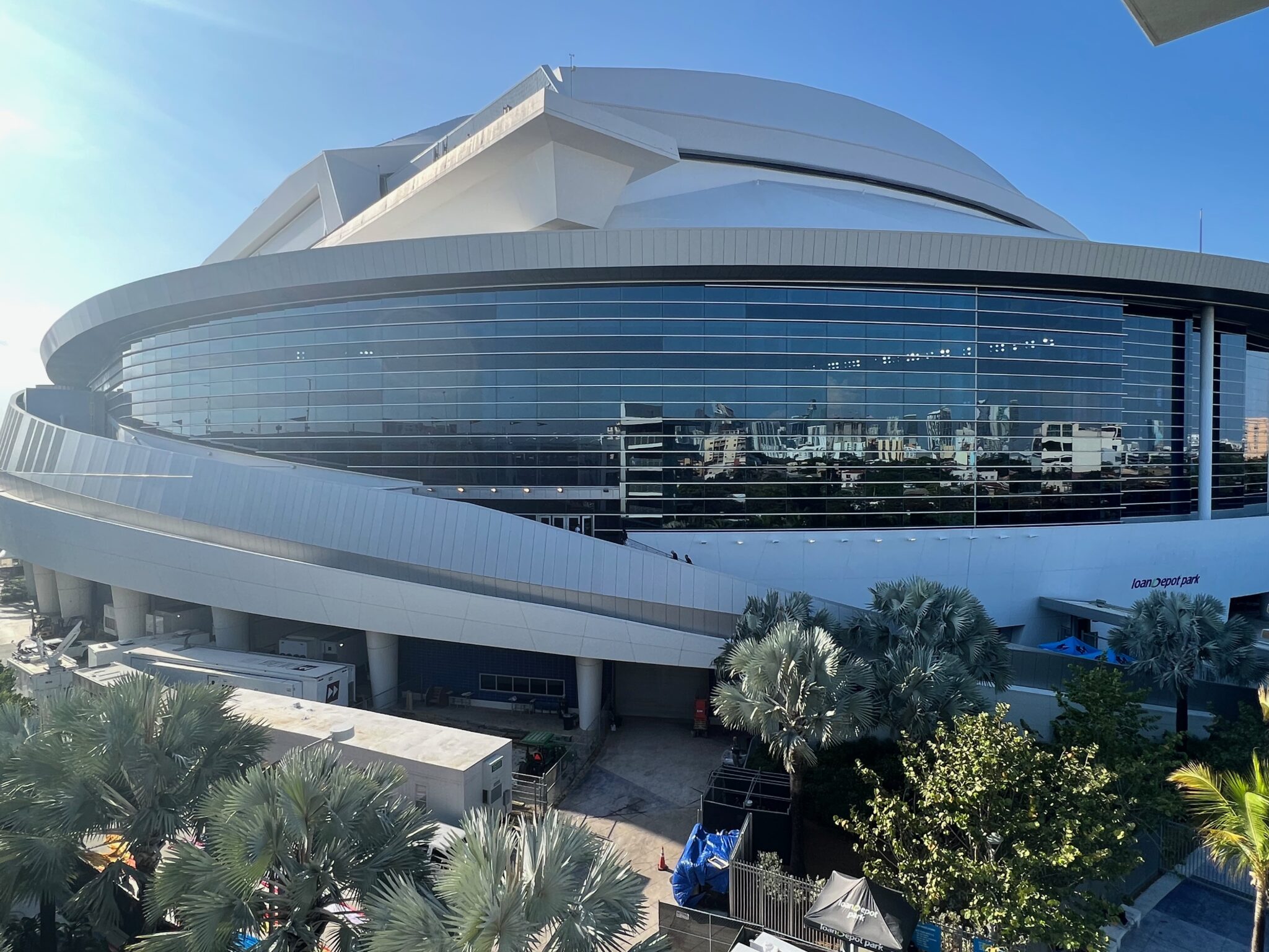
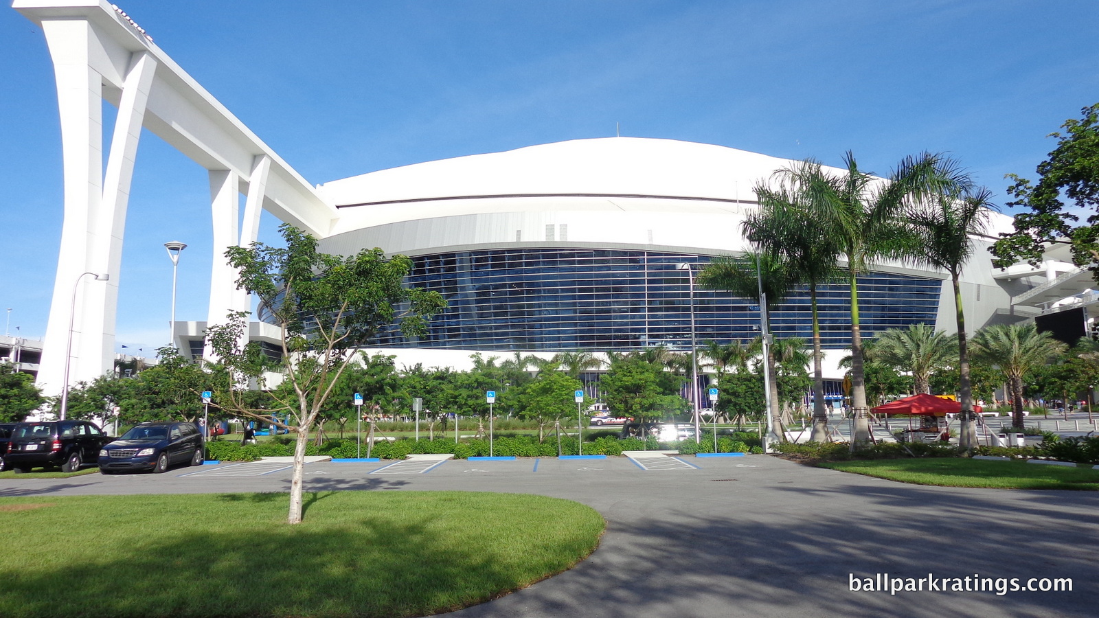
Marlins Park has been called a “neomodern” form of ballpark architecture, and I think that’s a good categorization. The building consists of an amalgam of deep blue glass, white stucco and steel, unadulterated concrete, and sparkling silver aluminum. It does perfectly reflect the contemporary nature of a city that never really embraced nostalgia in the 21st century.
First of all, this is one of only a handful of ballparks in baseball that can constitute “capital A architecture,” aspiring for something more resounding than the look of a suburban office park. Owner and art collector Jeffrey Loria was intimately involved in making Marlins Park. You do have to start with the building’s architectural intentions, which are already an accomplishment when you look at our derivative ballpark scene.
With its white stucco and graceful forms, Marlins Park conceptually captures sea merging with land, a spiritual kin to Brickell and Biscayne Bay downtown. It’s an abstract expression of Miami. Marlins Park’s lines and curves are dazzling, continually clashing then flowing in various rhythms, just like the Atlantic Ocean. Through it all, the fluidity of form is the main theme.
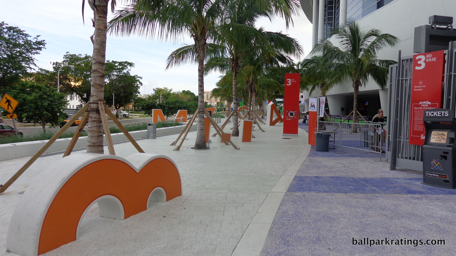
Near the east end of the park in the left field corner, we have the flowing simplicity of blue glass hugged by a draping aluminum veneer.
Note how the aluminum veneer gradually points downward, meeting with the palm tree lined plaza littered with letters spelling out “Miami Orange Bowl” (note: any artistic references like this including the tiles detailed below will be further explored during the “historical references/art” section later).
While it seems most fans enter in the left field corner, the west plaza is Marlins Park’s signature entry point, envisioned as a space for people to congregate before the game. As fans encounter this plaza, they meet the most explicit metaphors for Miami’s topography.
Note how the colored tiles alternate from green to blue below you, meant to represent grass and water. At eye level, the bottom cobalt sea blue glass represents the ocean. Above, the more orderly white stucco represents the land. The clashing aluminum lines going up and down (forming sharp “M”s and “W”s) the cobalt blue at eye level represent the waves of the “ocean” crashing against the “land” above. Finally, the vast horizontally flowing deep blue glass above it all represents the sky.
I particularly love the look of the north end (left side) of the west plaza, where the constant horizontal curving fluidity gets interrupted by a sharp, linear form protruding out of the main structure (this is actually behind home plate, but you can’t tell), emphasizing the unpredictability of the natural scene of land and water. The elliptical form generally eschews rigid angles, but this is an exception.
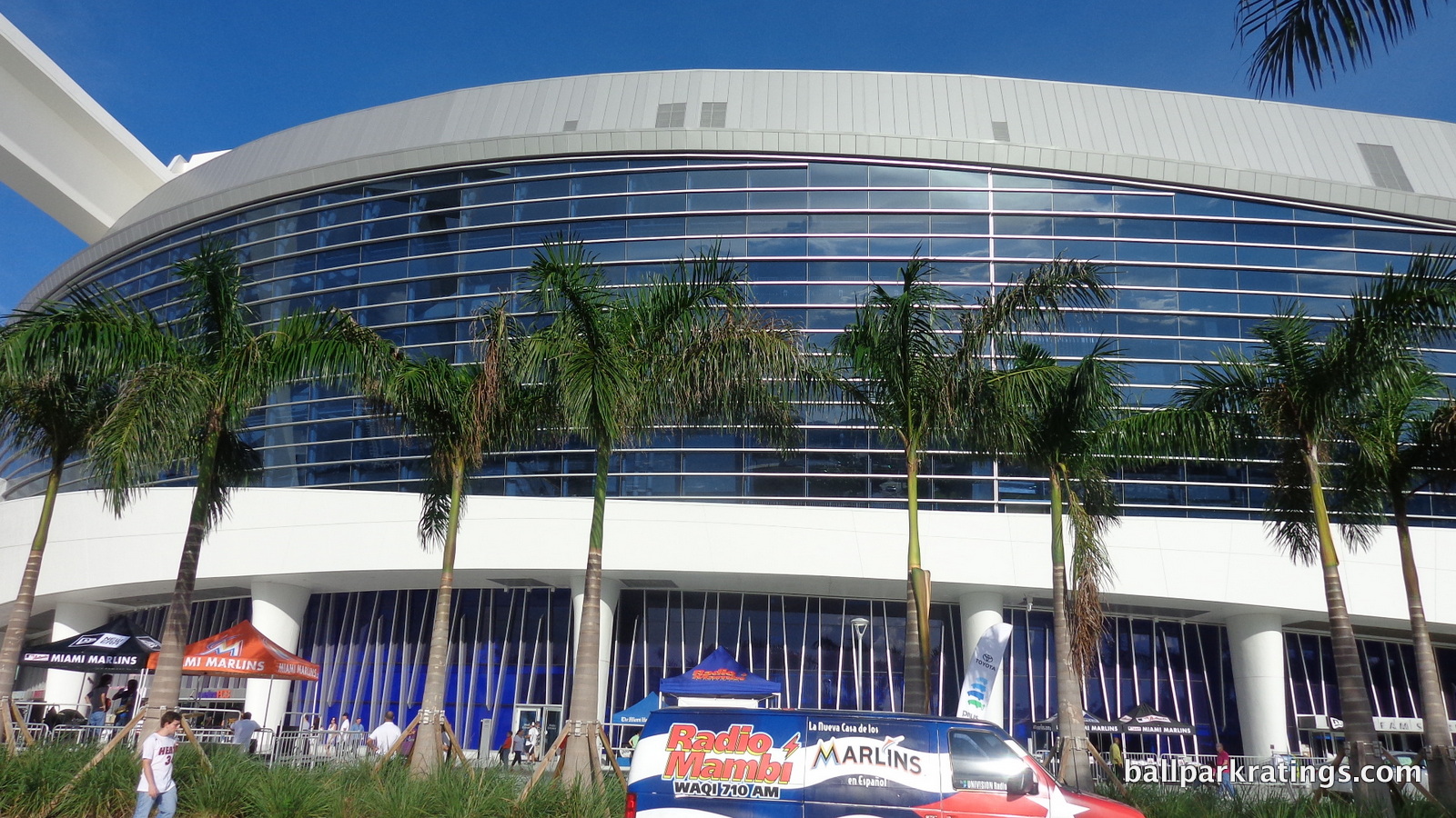
This is conceptually outstanding and visually breathtaking for any structure, much less a ballpark. It’s just such a delightful meeting of the most elemental natural forms, free from more elaborate gimmicks. The abstraction isn’t complicated.
Marlins Park is also free from more explicit gimmicks. You’ll note other ballparks have what I call “regional accents” in order to distinguish their tired red brick facades. In Philadelphia, we have “PHILADELPHIA” spelled out in bricks (seriously); Arlington features local imagery with historical Texas bas-reliefs; Detroit is punctuated by Michigan blue and orange pewabic tile. While I certainly don’t think this is bad by definition, you’ll note Marlins Park needs none of that. Marlins Park is pure architecture, and more conceptual than any ballpark ever built. At the same time, the concept is accessible.
While most retro parks want you to think they’re intimate, Marlins Park boldly makes no such illusions, as the towering structure is anchored by soaring columns holding up the retractable roof. Daunting in proportion, these towering concrete columns are awesome. No post-1991 ballpark, with the *possible* exception of PNC Park, is intimate, so not only do I love Marlins Park’s appearance, but I love that it isn’t deceptive about any ostensible intimacy.
One of the most innovative exterior design elements is the ramp on the south end (right side) of the west plaza. It’s subtle, but these are unlike any other ramps in major league baseball. Instead of being circular or hidden behind the façade like most ballparks, these visible ramps are angled and cantilevered, forming a triangle, with the appearance of floating in mid-air. This has the same effect of the protruding structure on the left side of the west plaza discussed above.
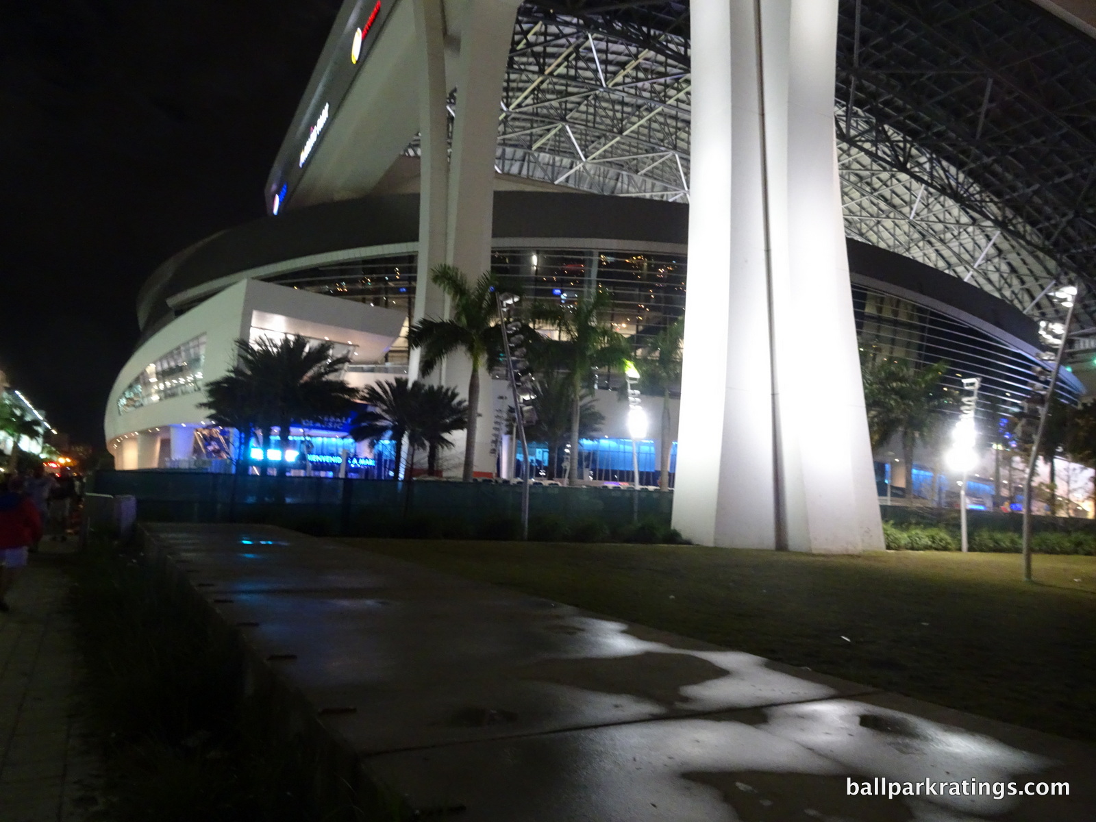
Finally, you may note everything we have discussed takes place in the east end of the ballpark behind left field (where the Orange Bowl letters are) or in the west end (main west plaza area which takes the lion’s share of the attention) ranging from home plate to first base. What about the north and south sides?
These areas are bordered by parking garages, again helping give the towering structure a more intimate sense of place. The space between the structure and the garages are designed as walkways intended to funnel fans to either the east or the west side.
I won’t drone on anymore, but this is one of baseball’s best exterior designs. For new readers, no one gets higher than an 8.5. Only parks with lovably intimate structure-setting connections top it. Fleshing all of this out in detail leads one to totally forget Marlins Park’s principal flaw in exterior design, similar to when you are there in person. The conceptual cleverness and execution of Miami’s natural forms, the structural novelty and original use of materials, and the raw aesthetic attractiveness is all overwhelming.
Score: 8/10
Interior Aesthetics:
When you get to Marlins Park’s interior aesthetics, you reach the point where you stop evaluating Miami’s swank home as a structure and start assessing it as a ballpark. And that’s where, by definition, it gets more problematic.
Because no other retractable roof ballpark has anywhere near as nice exterior architecture as Marlins Park, it does a particularly good job of illustrating how ballpark interiors can’t be analyzed in the same fashion as the outside. For the most part, ballpark exteriors can be looked at like any other architectural monument. Interior aesthetics, on the other hand, operate under an entirely different set of rules, where things like openness to the sky, a natural grass playing surface, panoramic views, and a general spirit of contextual integration are almost requisites.
You can get the most highly acclaimed architect in the world to design the inside of a ballpark, and it’s no guarantee of anything.
Retractable roof ballparks in the style of Marlins Park, where the outline of all sides are enclosed (i.e. not like the sliding doors that open on one side of the park like Safeco Field and Minute Maid Park), run into some of these problems by definition. And no matter how you design a retractable roof park, you’re pretty much guaranteeing you won’t be near the top in interior aesthetics.
For what it is, Marlins Park actually excels to a higher degree than expected, above the more unimaginative Miller Park (Milwaukee) and Chase Field (Arizona) or even the completely visionless Safeco Field (Seattle).
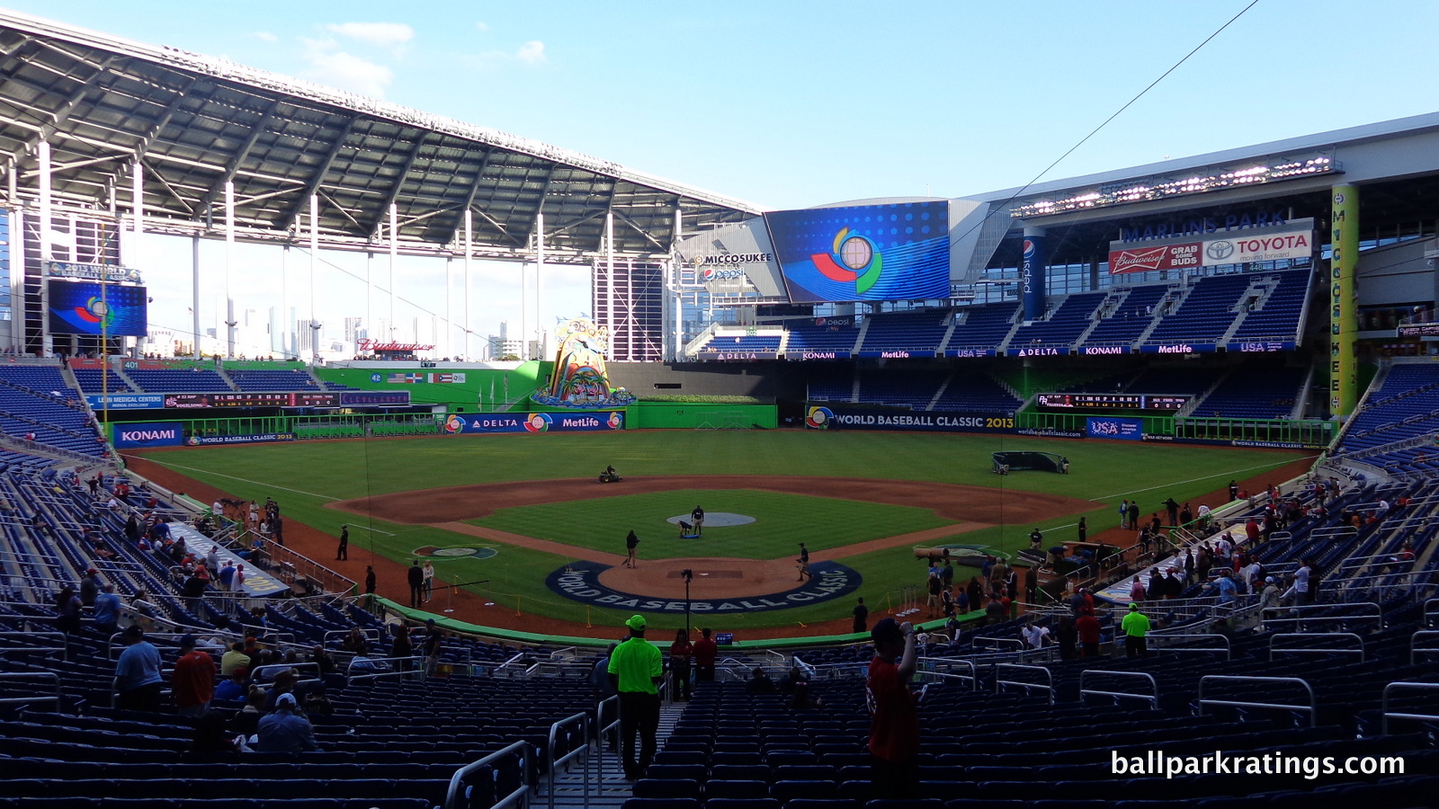
So while Marlins Park does continue the distinct and well-executed aesthetic vision from the outside on the inside, let’s first address this primary issue of Marlins Park’s relationship with its site. The poor contextual connection is just more salient on the inside.
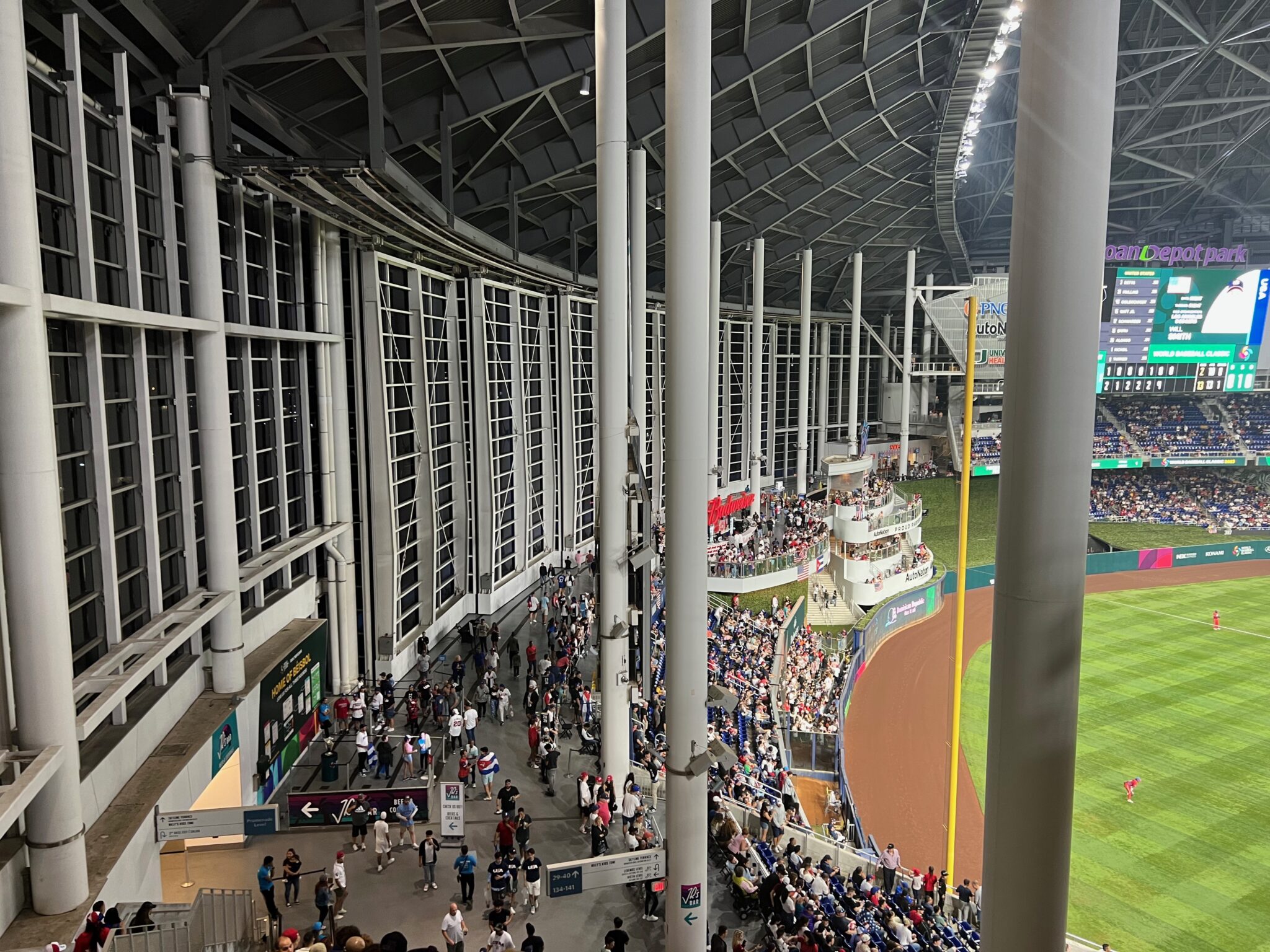
On the inside, all great ballparks serve as amphitheatres that connect the fans to the community. Marlins Park dwarfs the community and separates it from the fans. While many have recognized the distant skyline view through the retractable left field panels, the interior doesn’t recall the true nature of the area, and this distant skyline view actually mischaracterizes the site.
As ballpark guru Janet Marie Smith once said, “It’s not the steel trusses and brick arches that I think of as being the formula for success. It’s rather the relationship to the city.” Marlins Park is “All about Miami” on a superficial design level, but it’s a neighborhood park in Little Havana, whether the Marlins like it or not. It’s not in downtown Miami.
In addition, the extent to which Marlins Park succeeds in being “All about Miami” in terms of interior aesthetics is limited by the enclosed environment and poor sense of place anyway. It’s like if PNC Park was built with Kasota ochre limestone and blue steel trusses but had little visible mention of the similar North Shore context, the concept of the blue river, or the Pittsburgh skyline in the direct vicinity to match it. This may seem a bit unfair for a retractable roof ballpark, but this is the standard by which we judge all ballparks.
Houston’s Minute Maid Park is the model for success here, with a sliding glass door technique that completely opens left and center field to the sky when retracted and takes in a surplus of natural light when closed. Admittedly, I’m not sure that would have made this situation any better in Little Havana, as Marlins Park is so contrasted with the area in the first place. In Houston, you already had a ballpark in perfect symbiosis with its surroundings. We just have to take Marlins Park for what it is: a totally insular and self-contained structure more in the vein of a facility than a ballpark.
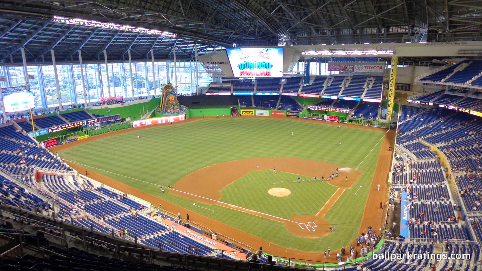
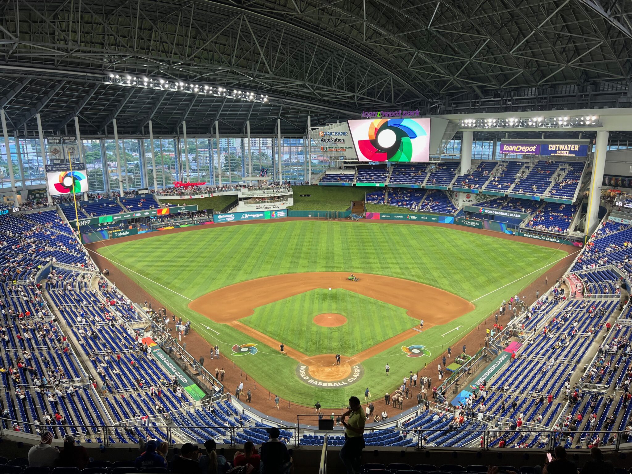
Once you get past this, I think Marlins Park is pretty engaging, but you can’t escape the sensation that you’re watching baseball in a retractable arena instead of a retractable ballpark.
After addressing Marlins Park’s insularity, I think its aesthetics are some of the most polarizing and subjective in the majors. You either appreciate Marlins Park’s neo-modern design, or you don’t. You either like its bold color scheme and general panache, or you don’t.
While I’ll inevitably get to these points, I’ll start with a less subjective position: in contrast to most other retractable roof parks and a relatively large handful of open-air parks, Marlins Park has plenty of aesthetic vision.
What I mean by “aesthetic vision” is that the overarching design and elements of that design are sculpted for the primary purpose of being aesthetically attractive. Miller Park and Chase Field are obvious, but is there anything in the seating bowl of the beloved Safeco Field that has such aesthetic intentions either? To me, this is always a nice quasi-objective starting point, like contextual integration.
Of course, you can say, “so what, I think it looks uglier anyway,” but this usually counts for something. With curving fluid forms and vibrant color, Marlins Park incorporates both the neo-modern design and the Miamian motifs from the outside on the inside.
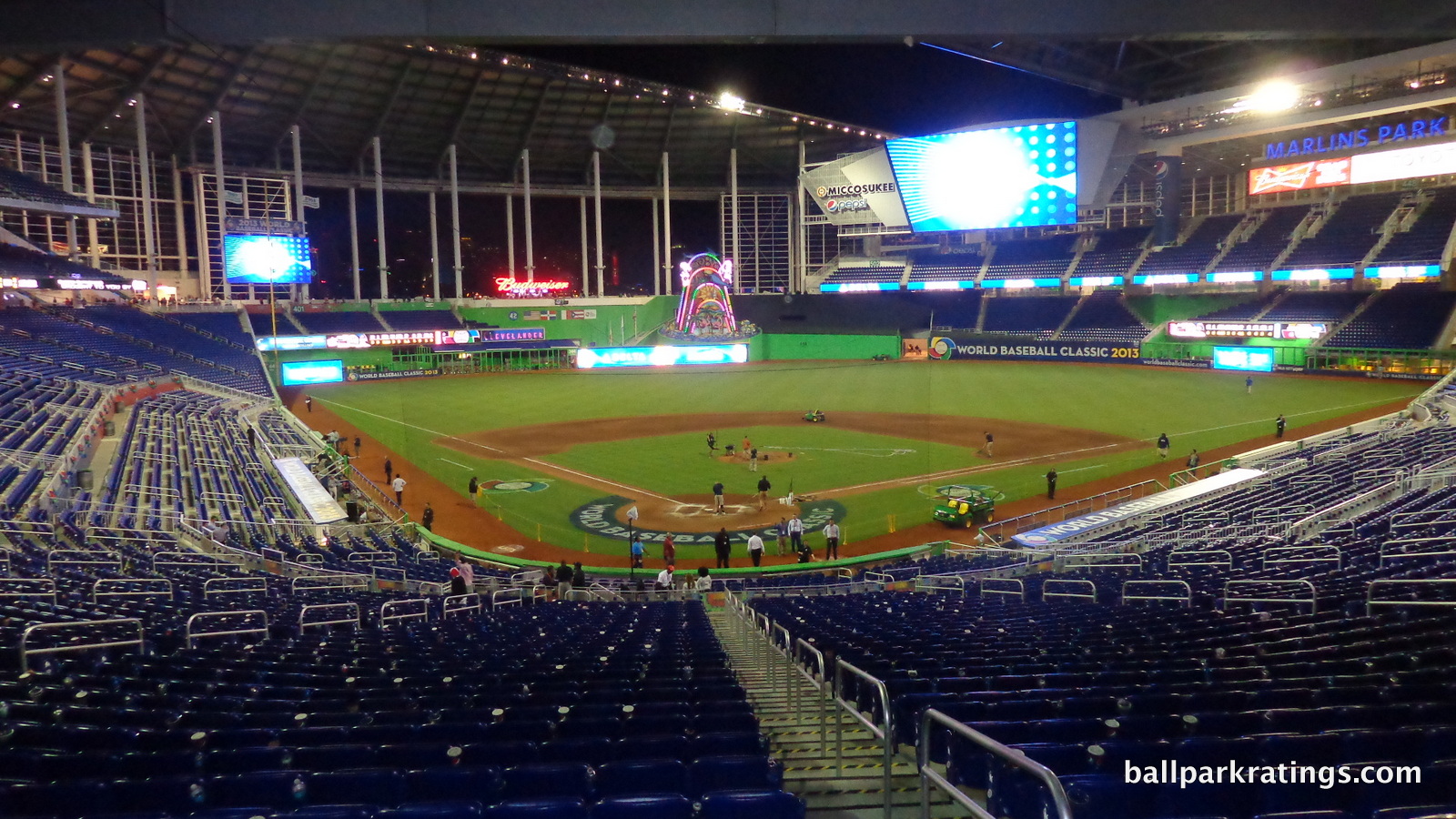
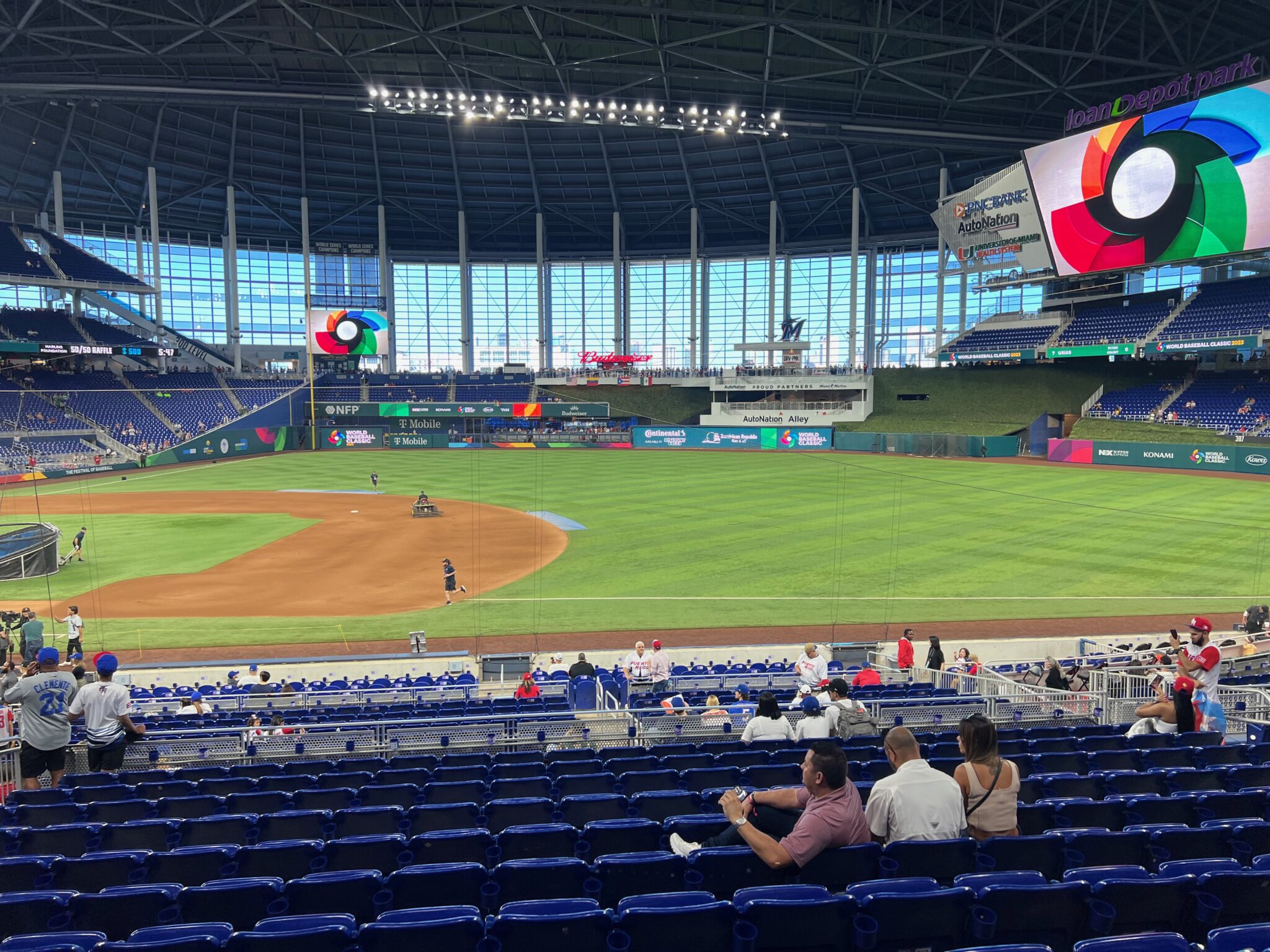
Almost all of Marlins Park’s interior aesthetic vision is articulated by its controversial color palette. The seats, endowed with a cobalt-blue shade not seen in other parks, are supposed to continue the concept of water meeting with land, which is represented by the green of the field and the walls.
Inspired by Spanish artist Joan Miro, Marlins Park is visually divided into four quadrants, monochromatically marked with bright shades of yellow, red, blue, and green. This is mostly manifested on the concourses, but you can see it on the facades beyond the left field seating and behind each section of dugout seating.
More controversial is the glaring lime green flavor of the outfield walls and the outfield facades. Resembling that of a Rainforest Café, it generally hasn’t been well received. I can’t quite put my finger on it, but I’ve always liked this color. It just fits. What I don’t like is that they changed the lime color of the façade beyond left-center field to bright red to accommodate a “State Farm” ad (in 2016, I think). Now that definitely does not fit, considerably complicating an already controversial color scheme.
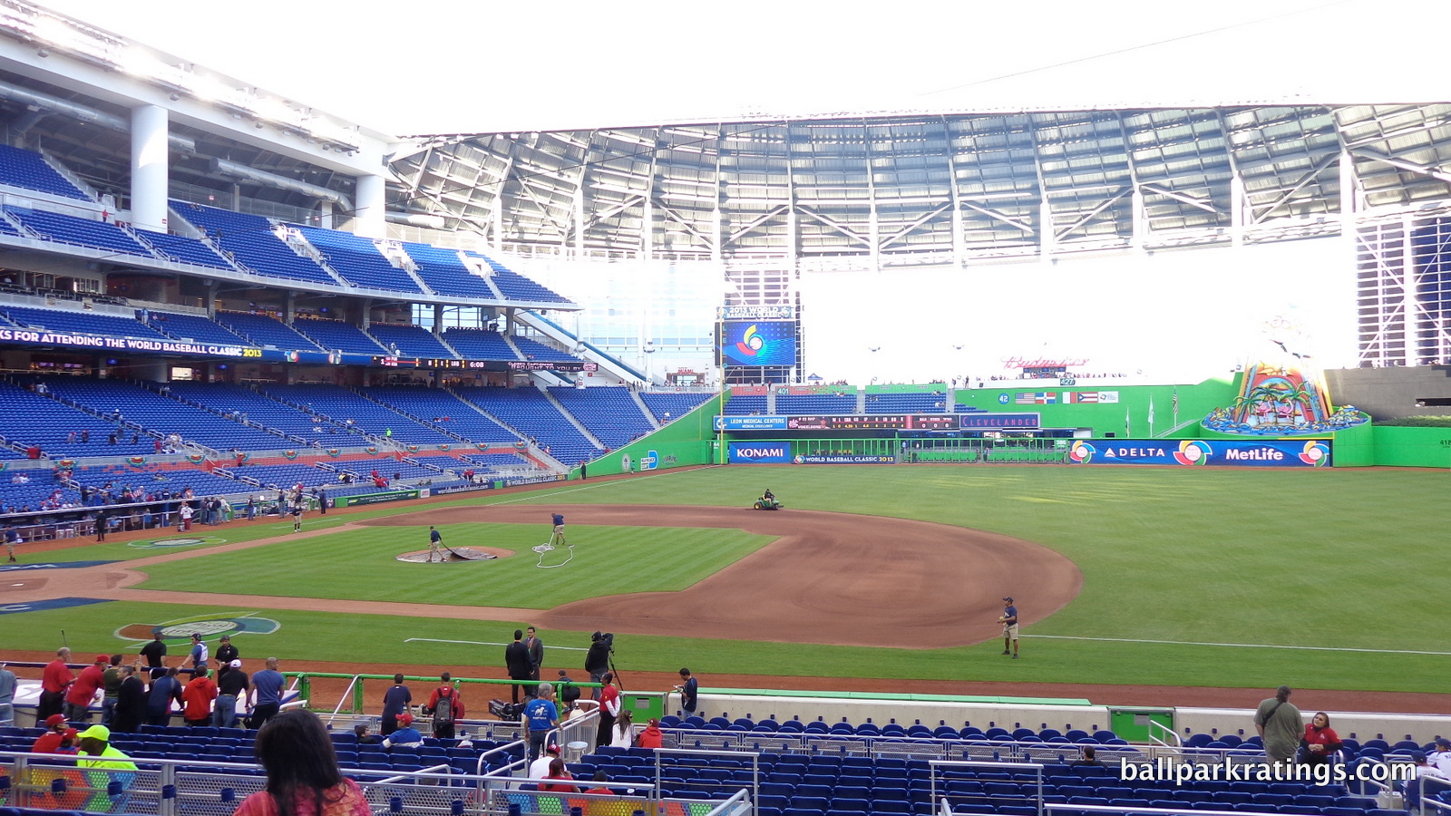
For what it’s worth, I just love the simple fact that Marlins Park is defined by its splashes of color. I always discuss ballpark color schemes here, but usually as an afterthought, because they’re more muted and less definitive in retro parks.
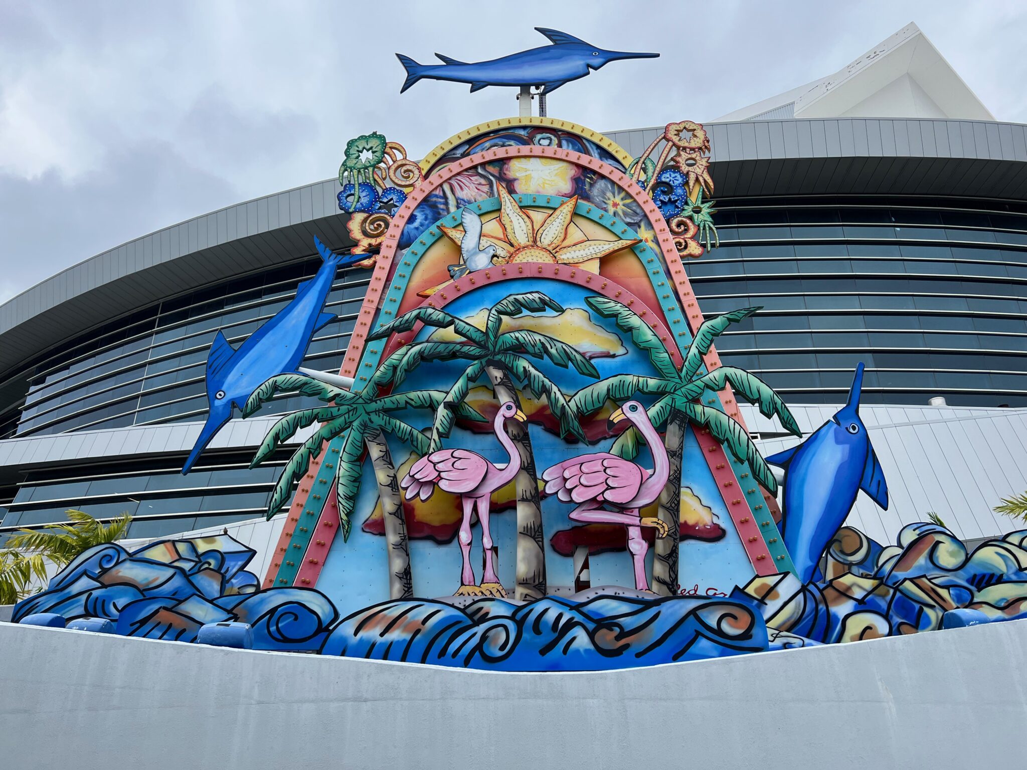
Next, we should probably address the elephant in the room at Marlins Park, meant to tie the aesthetic scene all together: the home run sculpture. Peppered with flamingos, seagulls, clouds, and palm trees, marlins jump out of the water and lights shine when activated. It has become extremely fashionable to mock this feature, especially when its $2.5 million price tag was revealed after the 2012 fire sale (it cost more than the vast majority of the players on the team earned in 2013). People say “of course” and “it goes without saying” the piece is “obscene,” “hideous,” “gross,” “tacky,” “a monstrosity,” etc. I feel like saying anything in its defense runs the risk of being tarred and feathered.
Critiques of this kind are far too easy and far too uncharitable.
First of all, this absolutely cannot be judged in the context of other ballpark “gimmicks”. It’s often compared to features like Great American Ballpark’s fake Lego smoke stacks, or most often, Angel Stadium’s fake rocks. This is an anti-analogy. The sculpture is designed by well-known pop-art multimedia artist Red Grooms, while other ballpark gimmicks are designed by team officials who realized their park was boring and wanted to distract you from that fact.
The sculpture transcends the status of other ballpark gimmicks because it must be looked at within the context of Red Grooms’ art. It’s so artistically kitschy, it manages to transcend the usual thematic gimmicky kitschiness seen in some retro ballparks. Miami’s ballpark deserves credit for having art throughout its aesthetic schema. Marlins Park was originally going to have a simple animatronic marlin in the outfield. Now that’s a gimmick.
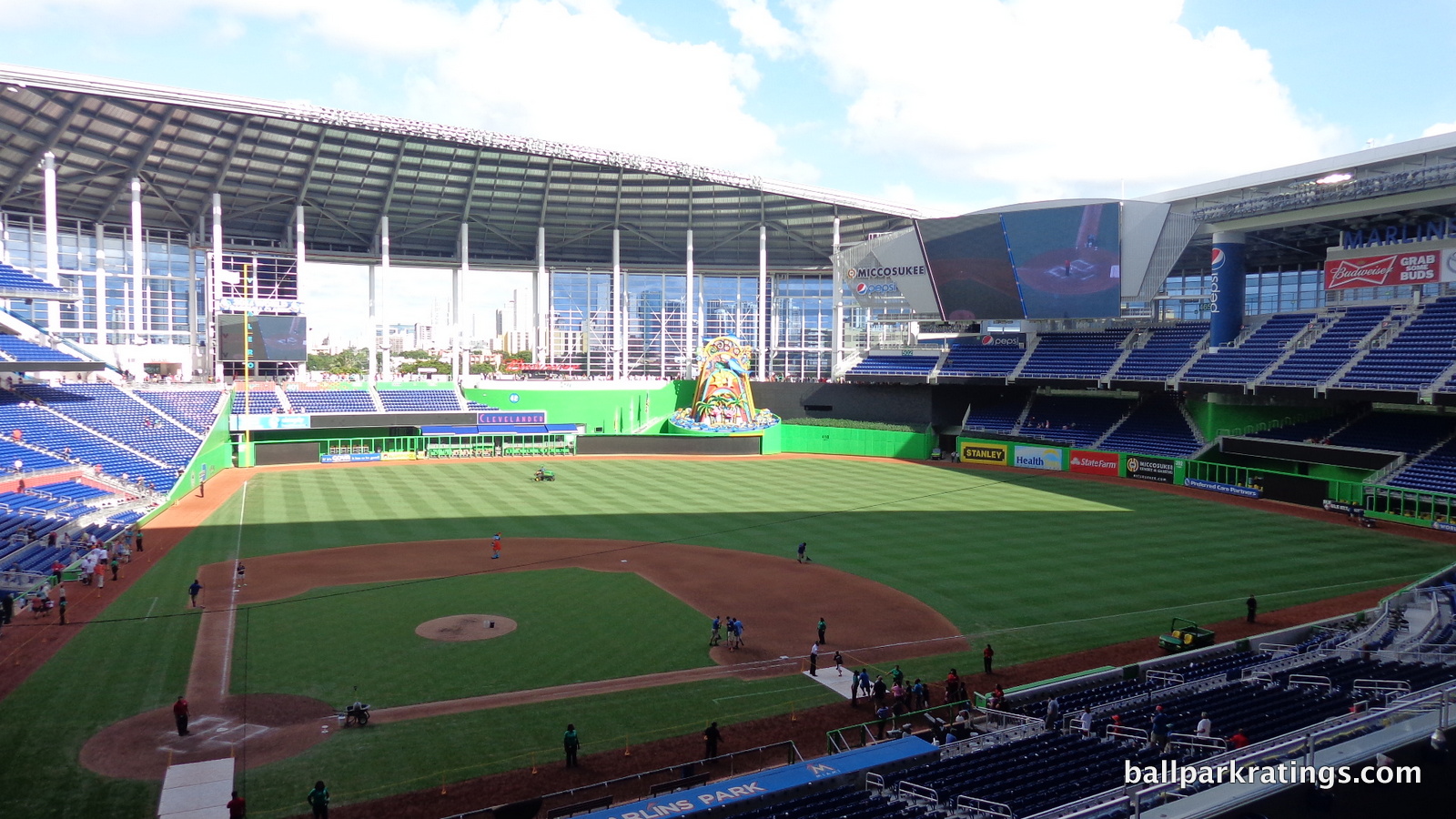
Perhaps more understandably, a ballpark gimmick like the Angels’ rock pile is far more conceptually isolated, meant to create a ballpark aesthetic alone. While a feature like that tries to create the aesthetic, the Marlins Park home run sculpture supplements an already well-defined and well-executed vision of “All about Miami.” Again, in my opinion, it fits with the rest of the design literally and conceptually.
Despite its self-contained nature, Marlins Park does a number of more concrete things better than other retractable roof ballparks. In Seattle, Milwaukee, and Arizona, you’ll note lots of gaps beyond the outfield and “empty space” throughout the aesthetic design. Marlins Park features a great use of space. The layout is just more tight and compact, without the vast corners and awkward spaces seen in those parks.
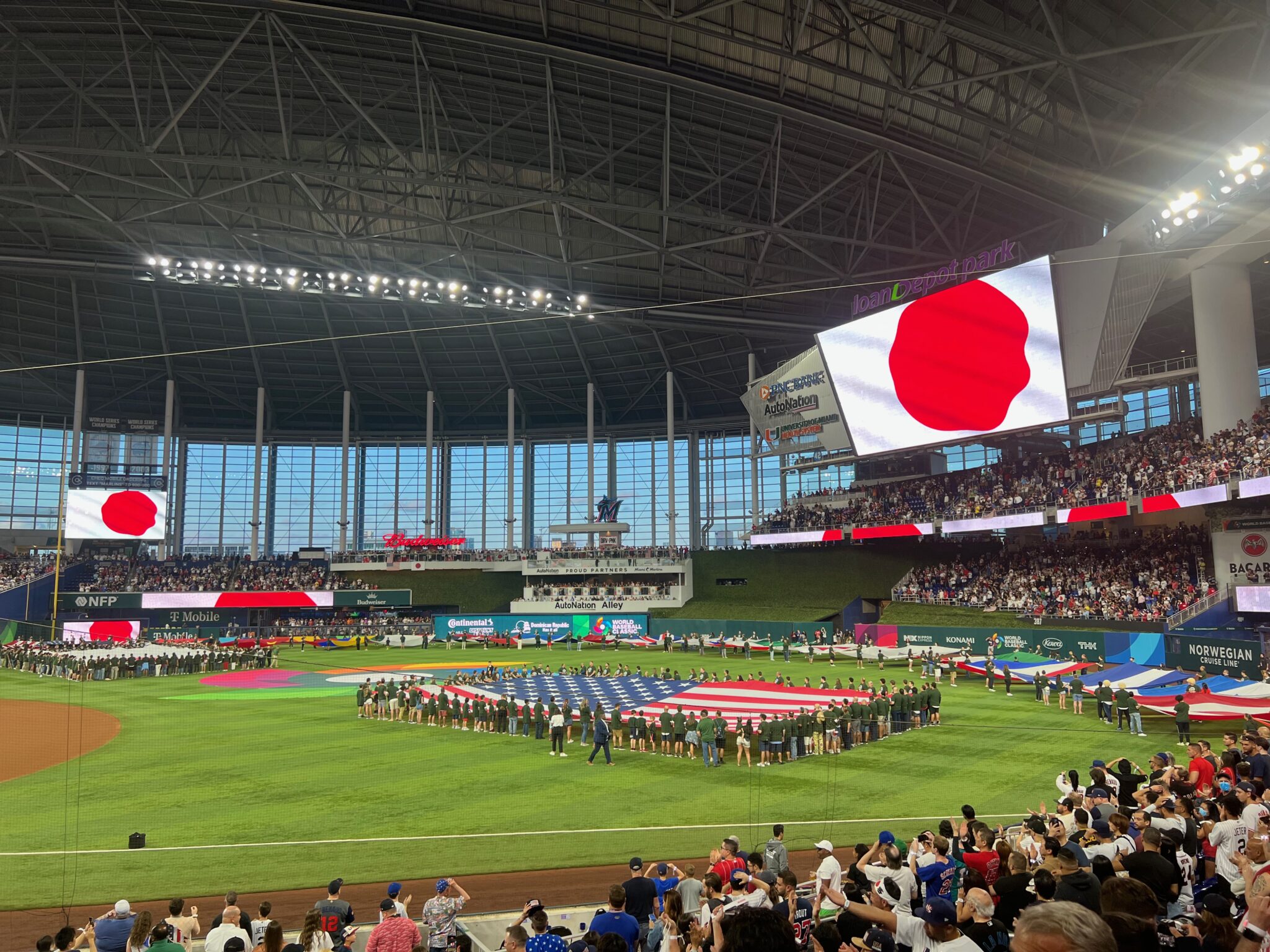
Also, Marlins Park is not as dominated by ads as most other parks. Note the look in right field, where we have a simple double deck design with only a couple of ads. Compare that look to Minute Maid Park, Miller Park, or a number of open-air parks. Note the videoboard, which is much more aesthetically streamlined than others. Looking across the outfield also highlights Marlins Park’s great balance and clean lines, with perfect placement of the videoboard and outfield seating.
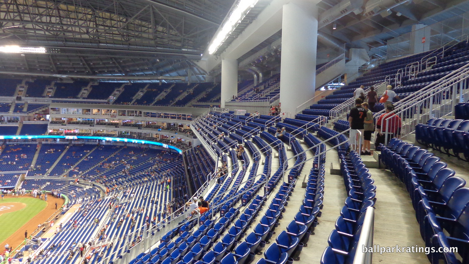
Finally, you might note the retractable roof is remarkably inconspicuous when open, not hovering above the outfield like at said similar parks. I should note that in this section, I like to analyze a park at its best, so most of this is looking at Marlins Park with the roof open. It obviously loses some of the appeal when closed, particularly because natural light isn’t as effectively funneled through the panels.
Other than the lack of connection and acknowledge of its environment (the most important fact), most of this has been positive, but the appearance does succumb to a few deficiencies. When the roof is open, the panels don’t completely retract out of sight down the left field line and in the center field area, which looks quite awkward. There is also some empty space in the right field corner. While not compromised from a functional point of view, the disconnected and constantly segmented upper deck doesn’t look very good, and contradicts the fluidity of the primary aesthetic. If I had to pick my most pressing secondary complaint, it would probably be that new “State Farm” ad and how it alters the color scheme.
After failing in basic contextual design, neglecting to appropriately integrate its setting, Marlins Park is swimming upstream. But with a coherent aesthetic vision, good use of space, and generally clean lines, Marlins Park scores above most other retractable roof parks and a handful of open-air ones.
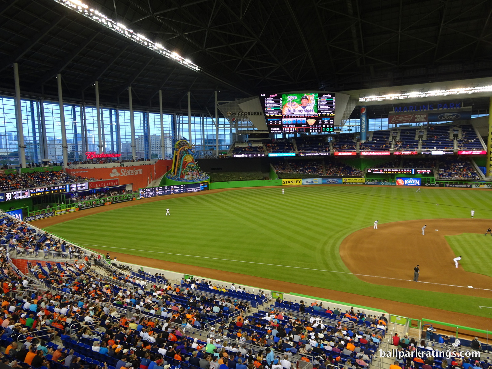
Score: 10/15
Panoramic View/Backdrop:
On a good day, Marlins Park’s gleaming skyline view is probably better than what many pictures indicate, in what is something between the view from suburbia at Citizens Bank Park (Philadelphia) and a view at a true downtown ballpark. It could have been much better if the Marlins had used a design where the entire left side of the park opens like in Houston or Seattle.
Mostly though, it just makes you yearn to be there.
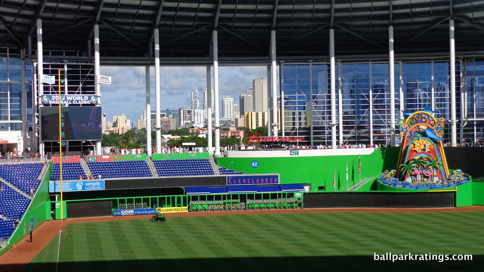
Miami is one of the most prominent examples of “Manhattanization”which is used to describe a boom in high-rise buildings throughout a city. Both the new skyscrapers related to two real estate booms and the large financial district make Miami a “southern Manhattan.”
Miami apparently now has the country’s third-tallest skyline, behind only Chicago and New York. With those cities not getting parks near downtown in the foreseeable future, Marlins Park perhaps missed a bigger opportunity than many people realize. While I don’t lead with it, Marlins Park is similar to the Phillies’ home in that a downtown setting would have placed it in the highest echelon in baseball.
During 2016-2017, it should be noted that the construction in the foreground obscures some of the view, but new development in Little Havana should be welcome.
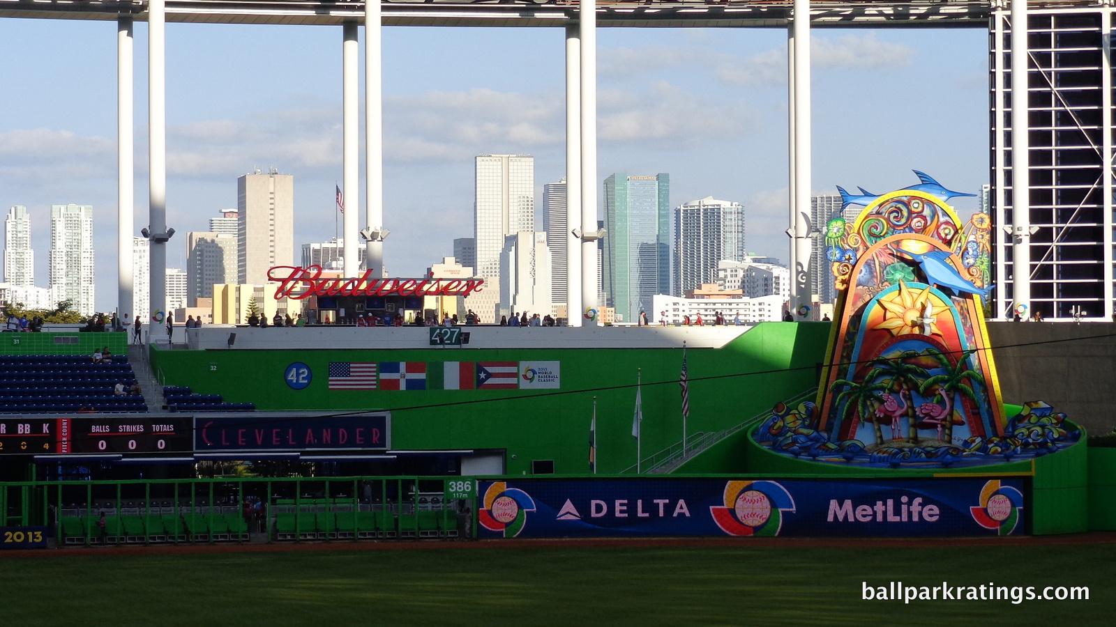
Score: 3/5
Concourses:
While there’s a certain level of standardization across ballparks, Marlins Park’s concourses are a different animal. They integrated much of their flavorful interior aesthetics into the concourses.
Miro’s strong colors mentioned above are primarily evident here. The four quadrants of the ballpark are color-coded into red, blue, green, and yellow. It does aesthetically enhance an aspect of ballparks that need more aesthetic attention. For me, it provides a sense of place and an awareness of where you are when walking around the concourses. When colors meet, walls feature a sprinkling of both shades.
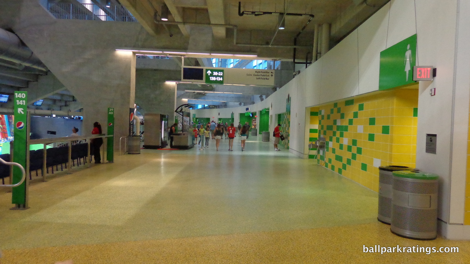
All of that being said, I don’t think it works as well as the Marlins would like. The concept is strong, as always, but in practice it’s too bland, resembling monochromatic bathroom tiles. This is subjective, but it’s hard to see this look aging well.
Marlins Park also draws strength from the fact that strolling the concourses can seem like walking in an art gallery. Again, I’ll describe the specific pieces of art later.
In my book, the fact that such attention is given to the concourse aesthetics merits praise alone. But while the intention is well taken, I don’t think it looks quite as strong as we would want.
Score: 2.5/3
Total: 23.5/33
Functionality & Essentials
Sightlines:
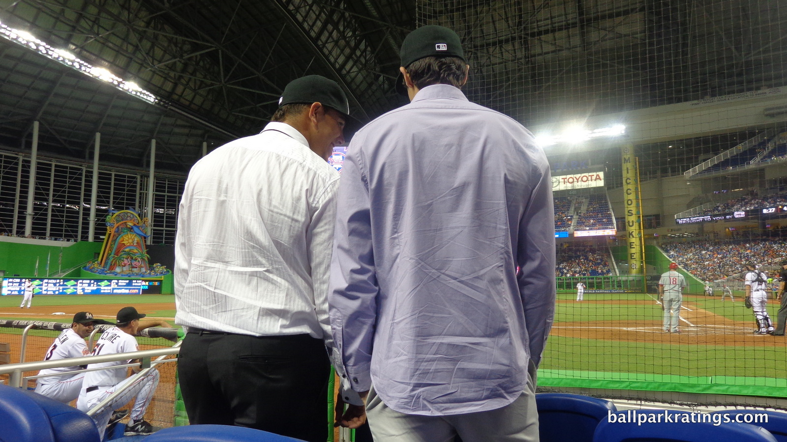
The ballpark’s most overlooked asset is its fantastic sightlines, relatively superior compared to most other post-1991 ballparks in the two most important components: seating geometry and field proximity.
While most parks use angled seating, Marlins Park eschews this approach in favor of a curvilinear grandstand design reminiscent of Kauffman Stadium. The seating bowl gradually curves outward until the seats farthest down the lines are oriented directly toward the infield.
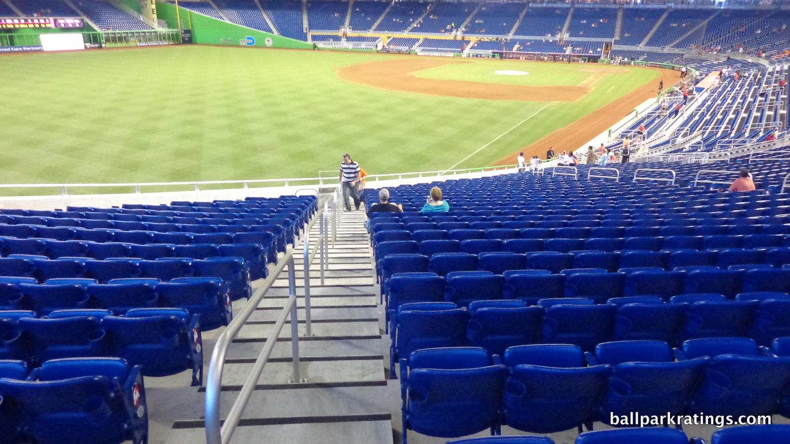
I’ve found this approach generally ensures good but not great sightlines, where you’ll never have to turn your head, but also don’t have optimally angled seats in some places, like the midpoint between home plate and the foul pole. However, every seat is well oriented at Marlins Park. It might not have the extreme angled seating of Petco Park or Chase Field, but Marlins Park is just as good.
Miami’s ballpark also features some of the best field proximity from the upper levels of any post-1991 stadium. This is of course relative, comparing poorly to the old parks like Wrigley and Fenway.
When your eye hits the cross section behind home plate, you might pause, but this is a deceptive place to start. The press box on the third tier occupies the lower part of the upper deck (seen to the left and right), where in most parks you’d have the spatial equivalent of three tiers below the entirety of the top deck.
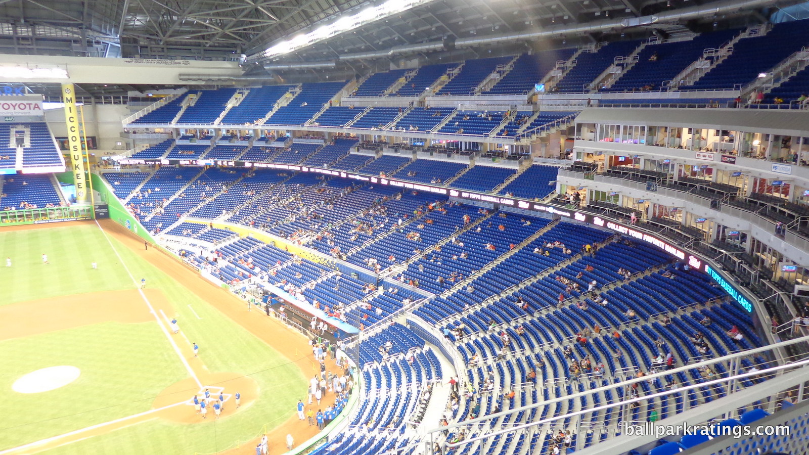
At Marlins Park, two tiers of luxury suites also take the space that would otherwise be occupied by the mezzanine (Legends Level). So in reality, the park lacks the extra floor of luxury suites spanning the seating bowl above or below the mezzanine, just like at earlier retro parks in Baltimore, Atlanta, and Arizona.
Unlike those, however, Marlins Park features a better use of cantilevers. Both the mezzanine and the upper deck extend far over the seating below it, putting fans right on top of the action. Fool around on Andrew Clem’s website to see just how much better this is compared to most parks, especially the newest ones. For those wondering, the columns in the upper deck on the third base side don’t cause any obstructions.
Marlins Park is right up there with the best sightlines in baseball, something that probably doesn’t get enough attention.
Score: 9/10
Seat Comfort:
For whatever reason, Marlins Park appears to have slightly wider seats than other post-1991 ballparks. Most stadium seats in this era are relatively indistinguishable, designed by the same manufacturer, and technically below historical standards with a minimum of 18-19 inches of width.
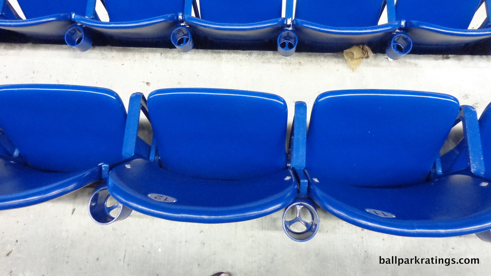
Marlins Park is very similar, but I and others have gotten the sense that there’s a little bit more width here (on average) than usual. Also, every seat on the Legends Level is fully padded. This is unlike most other large ballpark club levels that might feature thinly padded bottoms.
The most unusual aspect is the presence of netted pouches in the non-premium home plate box behind home plate, meant for a bag or a purse. This is the first time I’ve seen that at a ballpark!
Score: 4/5
Concourses:
We’ve discussed the aesthetics, but Marlins Park’s concourses are also state-of-the-art from a functional point of view, right in line with other late 2000s ballparks.
Upon entering the park, you’ll note the main concourse is not at street level, meaning you’ll have to climb a story. While parks like Safeco Field showed this doesn’t necessarily have to be a flaw, it is here. In left field, you enter a dark space, then ride up to a burst of activity, much like a mall. The main home plate entrance isn’t as dreary, but reaching the main concourse is a trip up stairs/escalators on the outside reminiscent of older parks.
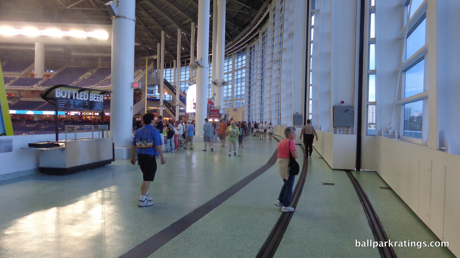
The best concourse systems provide more seamless entry at street level. I assume the Marlins encountered problems with the lower water table in Miami. This prevents it from scoring even higher.
The main concourse is wide and open, with decent visibility of the field. The retractable left field panels operate on mechanisms taking up a large chunk of the left field concourse, so when the roof is closed (almost all the time), the concourse can be a bit constrained in that area. Generally speaking though, the concourse width is fine. We have a fairly standard system here, without the annoying vertical or horizontal, maze-like discontinuities seen in the worst offenders. Everything is straightforward.
Marlins Park has a number of nice standing room only areas, as the game can be viewed from all around the concourse, even behind home plate. If I had to nitpick, the enclosed Founders Suite level above the concourse behind home plate can impact visibility. The best standing room only areas are located in left field by the bar. Emulating Citizens Bank Park, we have drink rails behind the seating all around the concourse.
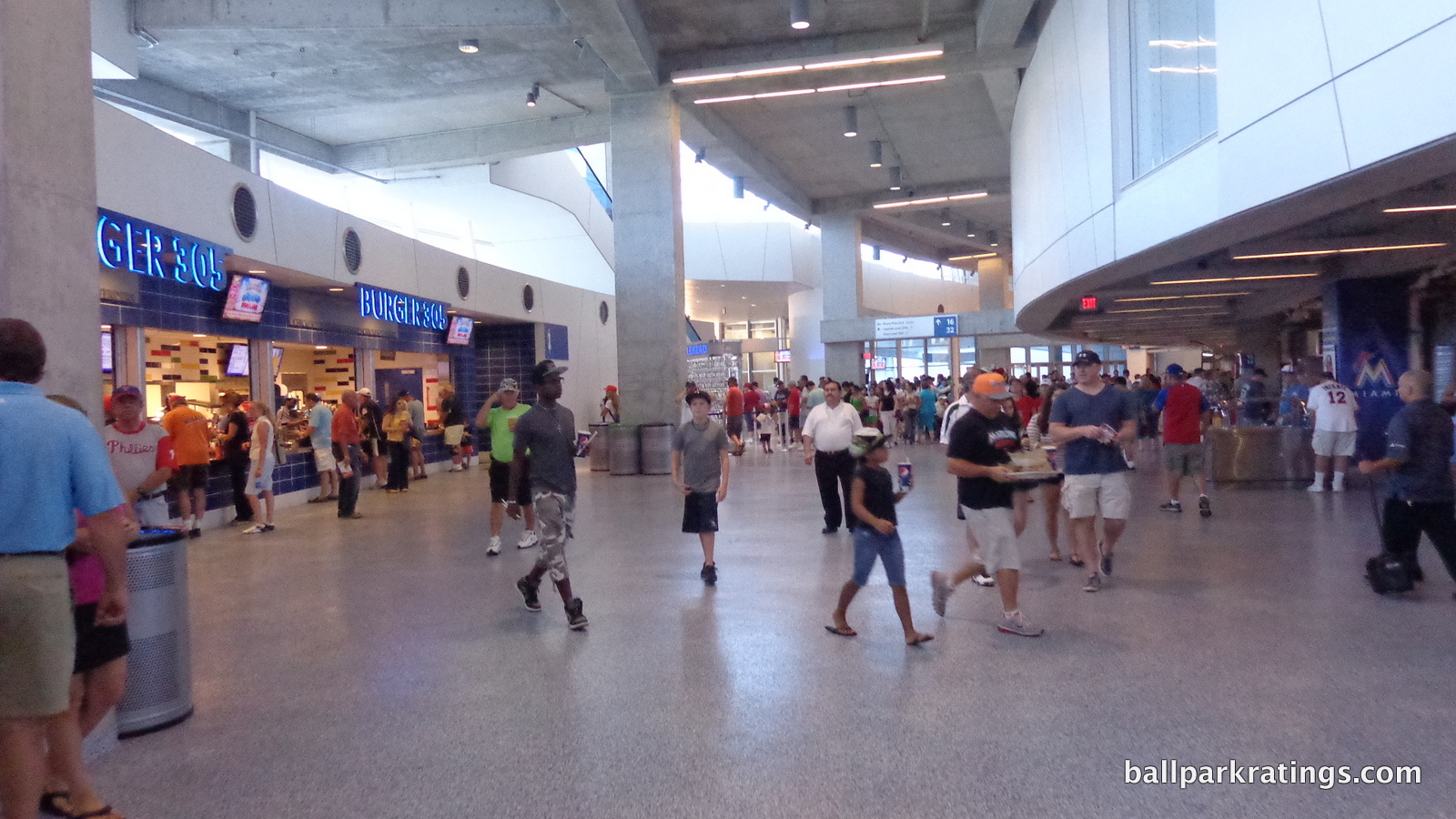
Finally, the width of the rarely seen upper deck concourse is similar to other parks of the era. What’s really interesting is that there is a partial view on the field side from the concourse on the first and third base sides, reminiscent of the open upper deck concourses at many newer parks. But here, you can’t see anything, as fencing obscures it, and it’s only a few feet high. What would be the purpose of this? They should either open up the concourse or close it and put a concession there.
Overall though, Marlins Park meets the modern day standard.
Score: 6/7
Scoreboard System:
While I doubt anyone will notice, Marlins Park is in the bottom half in terms of videoboard size, now 17th in the majors. That’s incredible. Ten new ones have been installed across the majors since 2012!
We’re getting to a point of diminishing marginal returns in this category, as the technology and size are more than adequate. It still looks state-of-the-art in every respect. There’s also a secondary board in left field. I’m not going to give every park a perfect score, but the curve can’t be too steep.
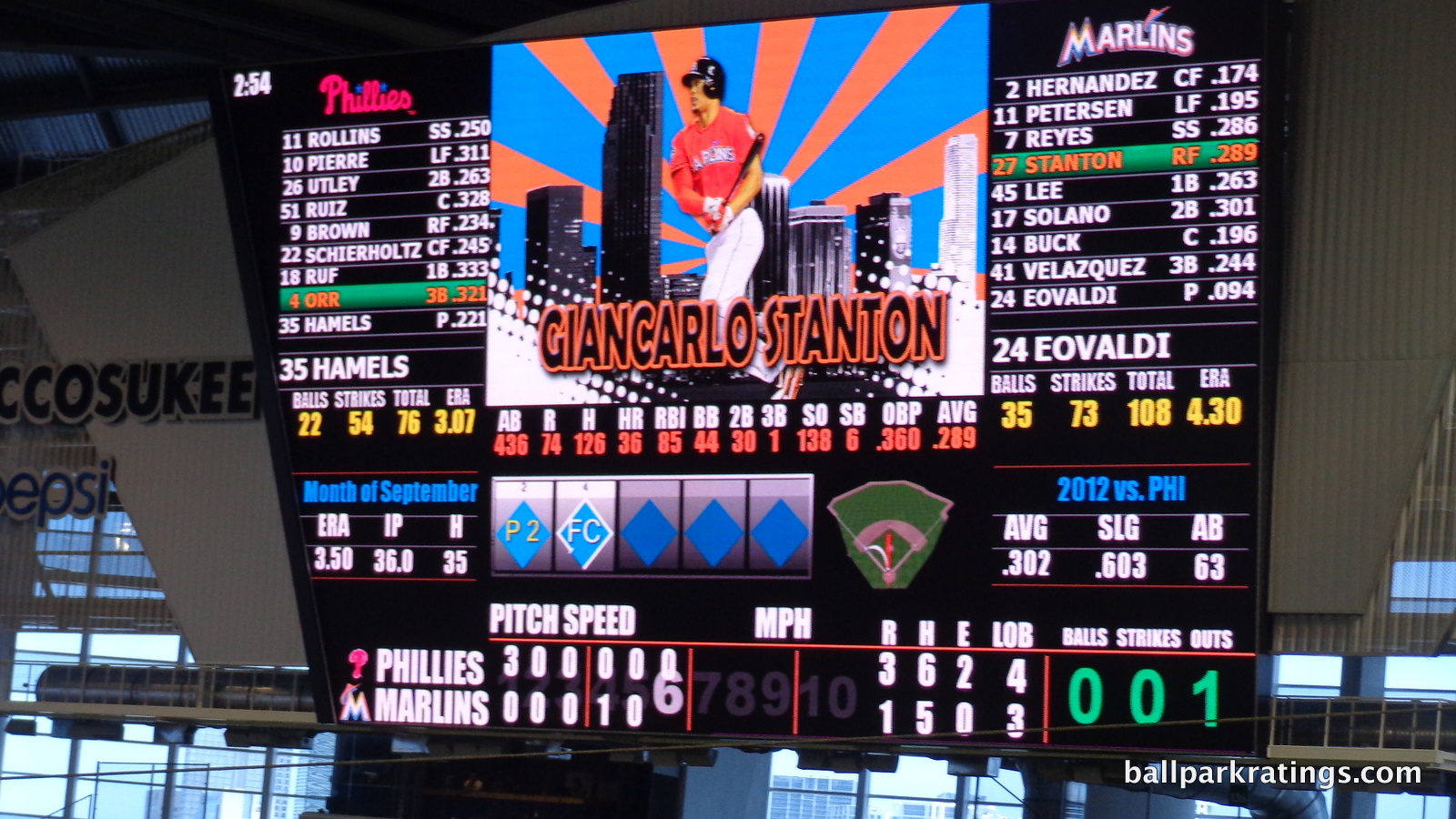
Score: 2/3
Total: 21/25
Amenities & Features
Quality and Selection of Concessions:
Marlins Park presents a dazzling array of concessions, mostly focusing on local cuisine. They have the good variety and great quality to compete with the best parks in baseball in this respect, only hindered by closures due to sparse crowds.
Being in Miami, Marlins Park offers some truly unique regional cuisine, transcending the usual generic categories south of the border.
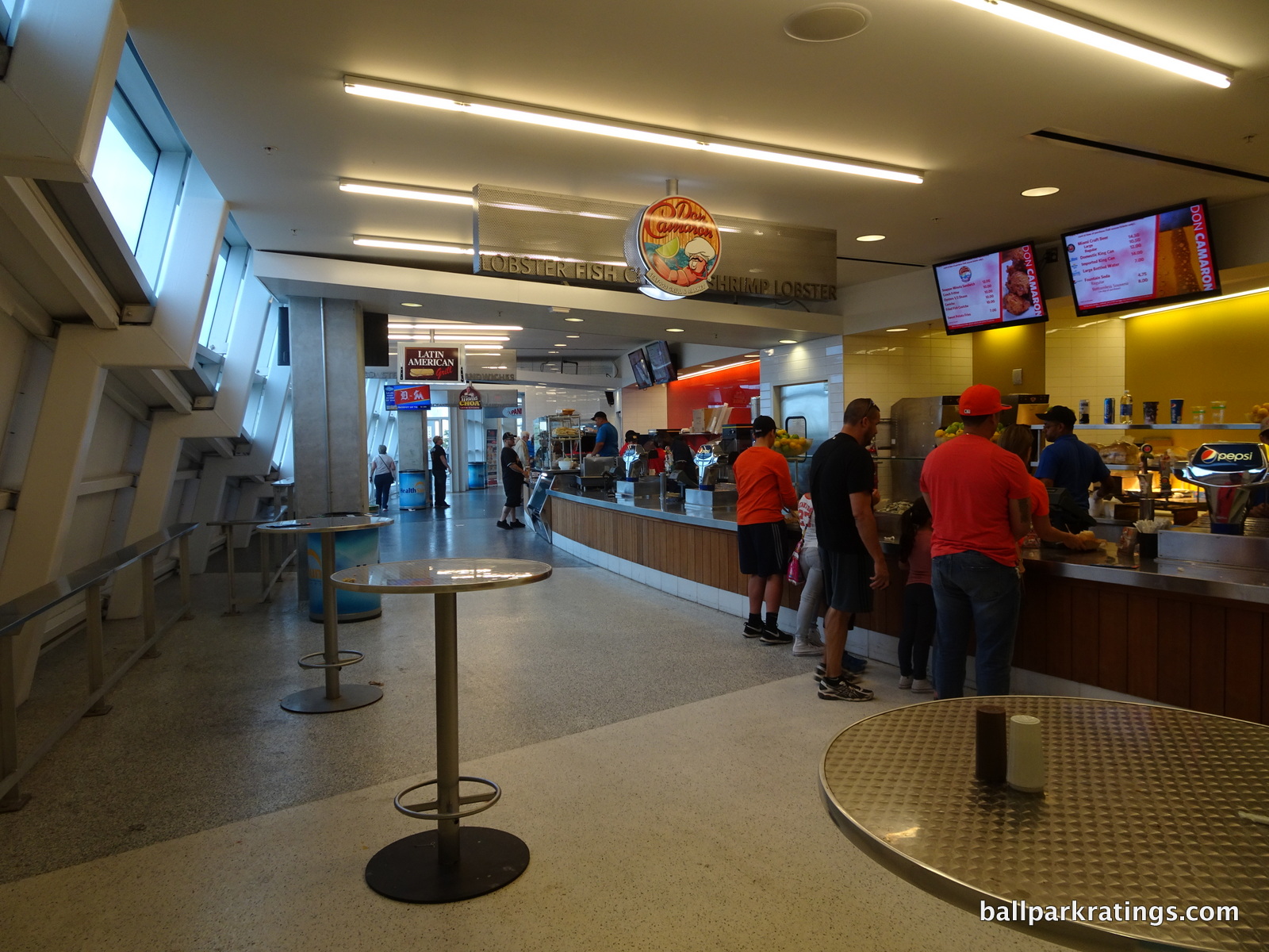
All of the highlights are in the “Taste of Miami” food court in the left field corner. The Latin American Grill serves many unique sandwiches, highlighted by the obligatory Cuban sandwich. Some of their ballpark favorites include the “media noche” (midnight sandwich), “macita de cerdo” (pork), and “mariquitas con mojito” (plantains). They also serve Cuban coffee.
Mama Choa cooks roast pork sandwiches, pork nachos, tamales, chicharrones, and the Cuban frita burger. The fare at Panna Café Express is quite unique. Mini tequenos, empanadas, and Columbian empanadas are on the menu. Most notable are the assorted arepas and Colombian cheese bread. Columbian coffee is available.
Marlins Park also has seafood with a Latin flavor. Don Camaron is probably the favored restaurant concessionaire in the ballpark, so I’ll save that for below. On the main concourse, the Goya Latin Café serves more standard Latin food, including rice and bean bowls, mojo pork sandwiches, more Cuban sandwiches, and Goya chicken nachos.
Desiring more standard fare with a flair? Head to Miami Mex, offering braised chicken tacos, fish tacos, nachos, and bowls. Most fans in North America just seem to categorize all such food as “Mexican” or “Latin,” but in Miami you have to parse it all out.
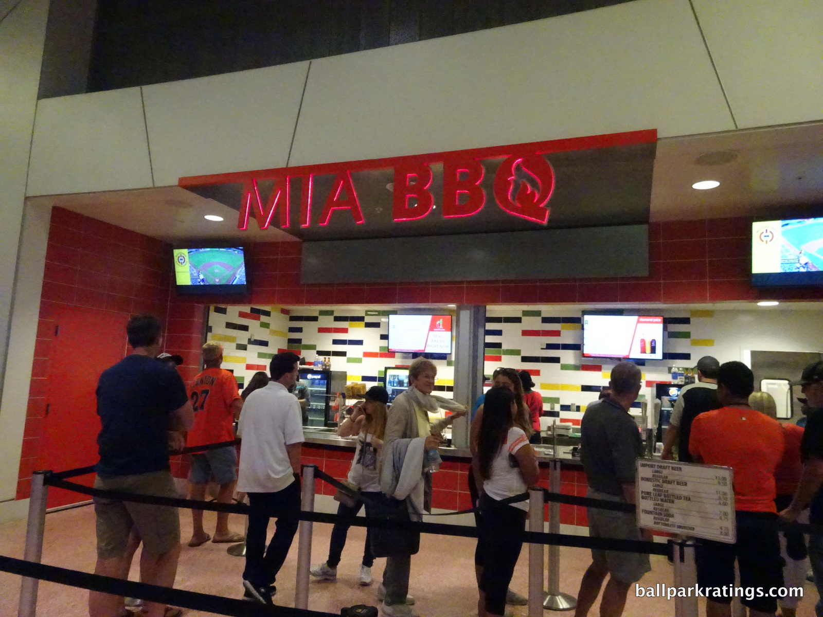
Marlins Park does a decent job in catering to fans with other tastes as well. MIA BBQ cooks up smoked sandwiches, BBQ nachos, BBQ mac & cheese, bourbon baked beans, corn bread, and peach cobbler. A new concession stand serves a number of trendy grilled cheese specialties, including the brioche triple, the pot roast mac & cheese grilled cheese (you read that right), and the fried chicken pimento grilled cheese. The Marlins are one of the only parks I’ve seen with a dedicated kosher stand, serving pastrami, chicken, and burgers. Of course, there are gluten free stands as well.
The best items not from the Taste of Miami food court come from Suviche behind home plate. The local eatery is a sushi-Peruvian fusion concept. Their shrimp ceviche of the day, spicy tuna roll, Miami roll, Suviche poll, Marlins roll, and “Japo taco” are served.
Finally, Marlins Park excels in desserts and non-alcoholic drinks as well. Miami’s most popular ice cream shop, Azucar, opened only its second location in Marlins Park. Velvet Crème Doughnuts are also located throughout the stadium.
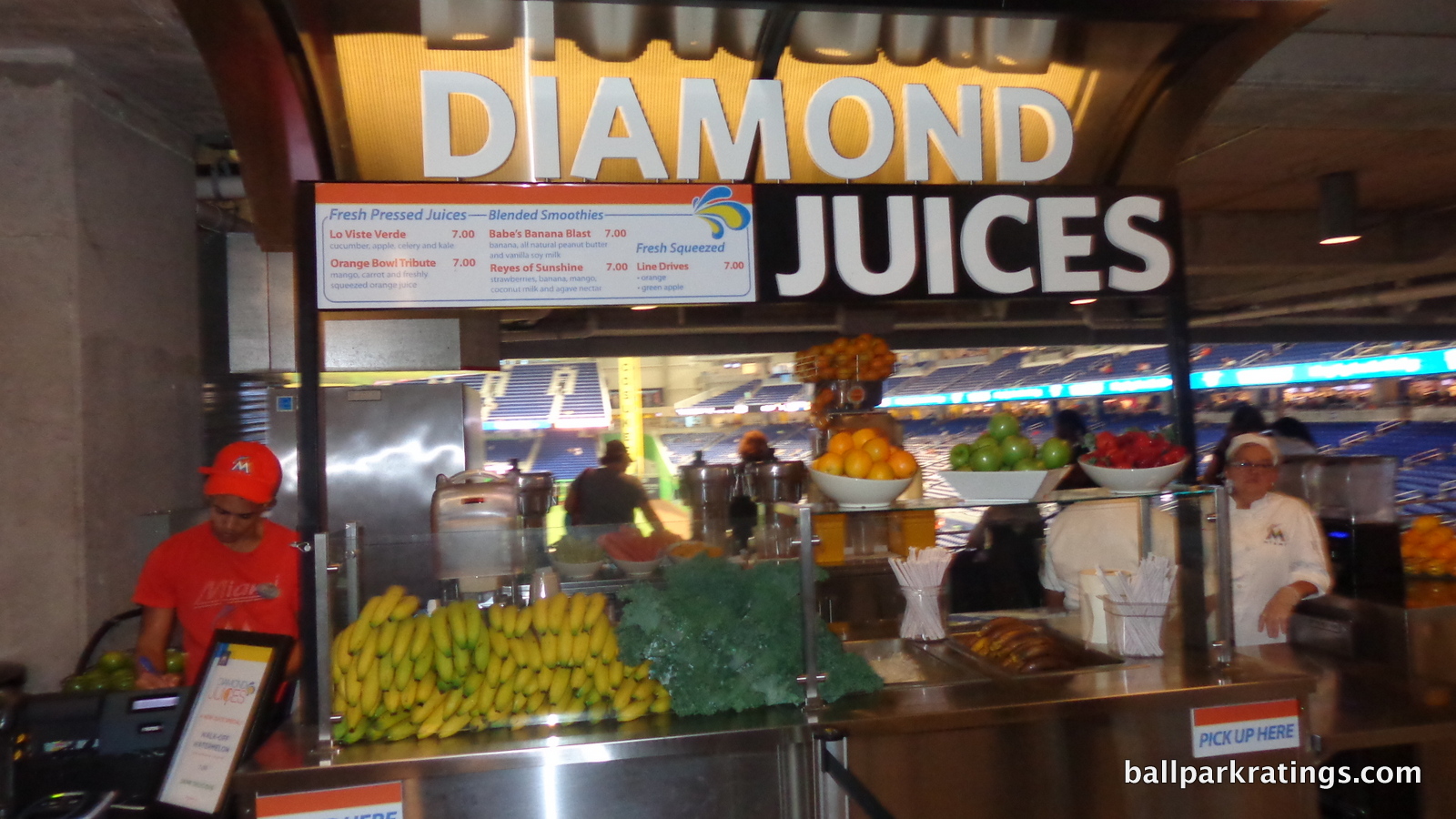
My favorite concession of all might be Diamond Juice, a concept spearheaded by Julia Loria, the wife of the Marlins owner. Serving limited smoothies and juices at ballparks is nothing new, but this really is the first true juice bar in major league baseball. All unique juices and smoothies are made on the premises. Two thumbs up for this!
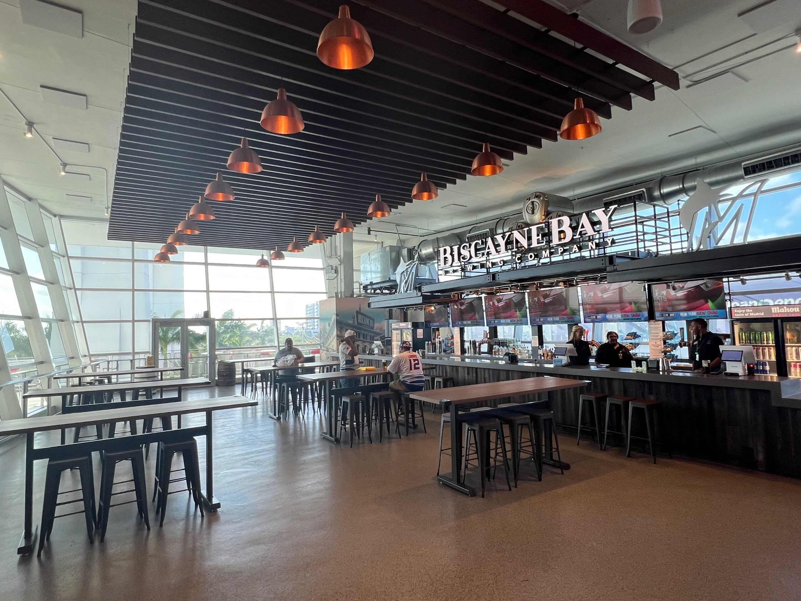
While there have always been plenty of concession bars, the Marlins finally got on the craft beer train in 2017. Overall, Marlins Park represents its region through its cuisine as well as any park I’ve seen, while also having a respectable variety to cater to all fans.
Score: 4.5/5
Regional/Signature Concession(s):
So out of all this local food, what is most notable? The favorite at Marlins Park is probably Don Camaron, a Latin American seafood restaurant in Little Havana.
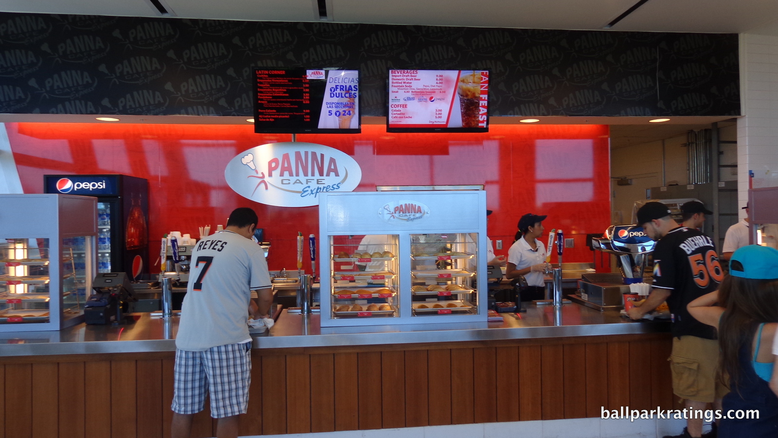
The experience of eating ceviche out of a Styrofoam cup at a ballpark is very Miami! The stand also serves snapper sandwiches, conch fritters, and fried shrimp with malanga chips.
In terms of other individual items, I’ll name a few you should try. The Cuban sandwich is a must eat item if you’re visiting. The lechon pork nachos at Mama Choa combine the two things you have to have at a Miami baseball game: Cuban food and nachos. The Japo-Taco at the sushi stand is one of the most unique foods I’ve ever seen. Finally, go to Diamond Juice and get the “Bases Loaded” smoothie! Or you can just have some kale juice.
Score: 2/2
Accessible Restaurants/Bars/Sitting Areas/Social Spaces:
As discussed at length in my introduction, Marlins Park lacks any of this. I continue to be completely confounded by this fact, in what is Marlins Park’s second biggest flaw overall. The low score is warranted, and while it shouldn’t ruin the entire ballpark experience, it’s more than a minor scar.
How did this happen? My guess is the Marlins correctly thought that the trend was moving away from static spaces more toward informal bars where large groups of millennials can hang out. You see this in the outfield Budweiser Bowtie Bar. But that doesn’t mean you should have no sit-down bars, no restaurants, and no places to sit anywhere! (Again, this category encompasses non-premium seating. For those screaming at their screens, The Clevelander doesn’t count.)
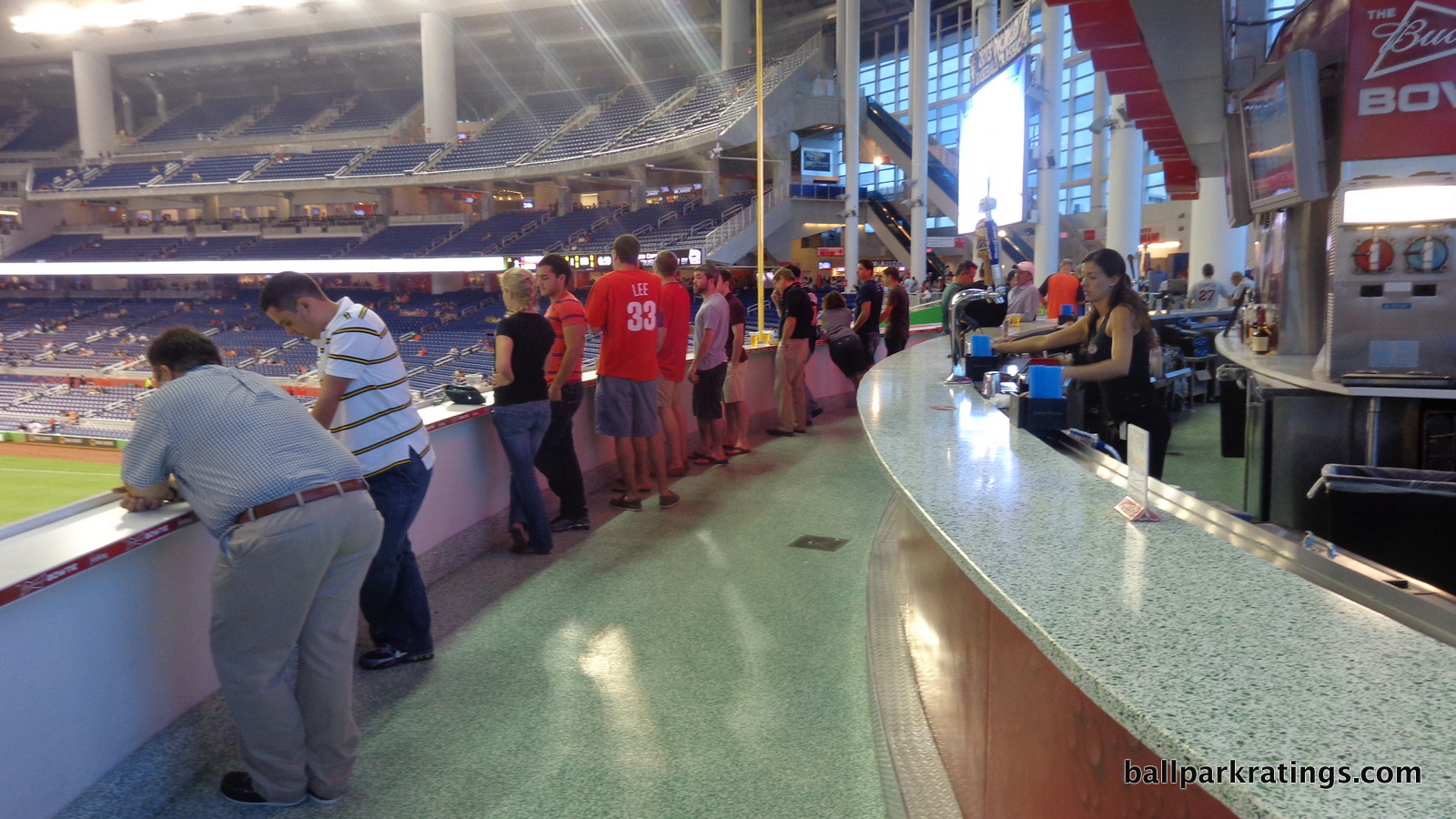
The Marlins also misinterpreted what these modern day social spaces were supposed to be. While you want a large walk-up bar, true ballpark social spaces are much more expansive, featuring picnic tables and lounge areas with a center bar. You have to have some area to sit down! Look at those added during this decade in Cleveland, Denver, Seattle, Houston, or Detroit. The Marlins need to add something like this.
Not having a true “social space” for regular people to hang out obviously isn’t debilitating for most fans, but not having any places to sit down other than your seat affects everyone. The cumulative effect is striking, as most parks have a couple of full service/fast casual restaurants, tables and chairs somewhere on the concourse, and a fun sit-down/social bar.
What I’m addressing isn’t arcane to an average person at a baseball game. If you’re not into batting practice and you’ve already seen the art, what is the point in coming early? If you and your family get to a game early and want to eat together, there’s nothing you can do. You can’t even buy a cheap concession and sit across from each other.
This category strikes me as one where someone inclined to view this website wouldn’t care, but the vast majority of people in the ballpark would.
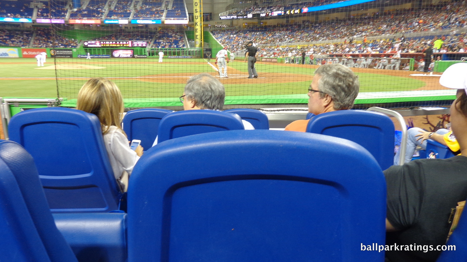
So what can the Marlins do? The enclave behind home plate (the one that protrudes from the façade on the outside) could fit more than half a dozen tables with chairs. You could also do something more elaborate with it. The “UHealth Physical Therapy” center, offering “free health information and screenings to Marlins fans,” is ridiculous. They could put a trendy craft beer pub in here. Although they already added craft beer to an existing walk-up bar behind section 38 (with new art!), that is not in the vein of what we’re talking about. Finally, considering the attendance issues, they could add a new restaurant and bar in the seating bowl like at Coors Field, but that would probably be an aesthetic downgrade.
Marlins Park is by far the worst of the post-1991 parks in this category. The fact that the Clevelander (discussed below) opens to all fans late in the game warrants leniency.
For 2019, Marlins Park added more spaces to “hang out.” The first tier of the new center field deck (dubbed AutoNation Alley) is accessible to all fans, while the lowest level is a group area. Called The Social, a large drink rail standing-room only area has been added in right field. A similar area called Comunidad 305 has also been added in right field, where fans will be encouraged to bring flags and noisemakers.
We still lack sitting areas on the concourses or accessible sit-down bars/restaurants, though! If you get a hot dog before the game, you eat it in your seat (or stand). But minor boost in score warranted.
Score: 3/5
Premium Seating/Clubs:
Built in a large market with a “small market team”, Marlins Park doesn’t feature the premium seating of teams in New York or even Washington D.C, focusing on a limited number of high quality spaces and a more informal mezzanine club level. The score is bolstered by the Clevelander, one of the coolest spaces in all of baseball.
Consisting of just 380 or so seats behind home plate, the Marlins’ Ricoh Diamond Club is absolutely exquisite and one of my personal favorite places in all of baseball. I’ve written extensively on ballpark home plate clubs in various reviews, and this is one of the top 5-7 (they’re all great, obviously).
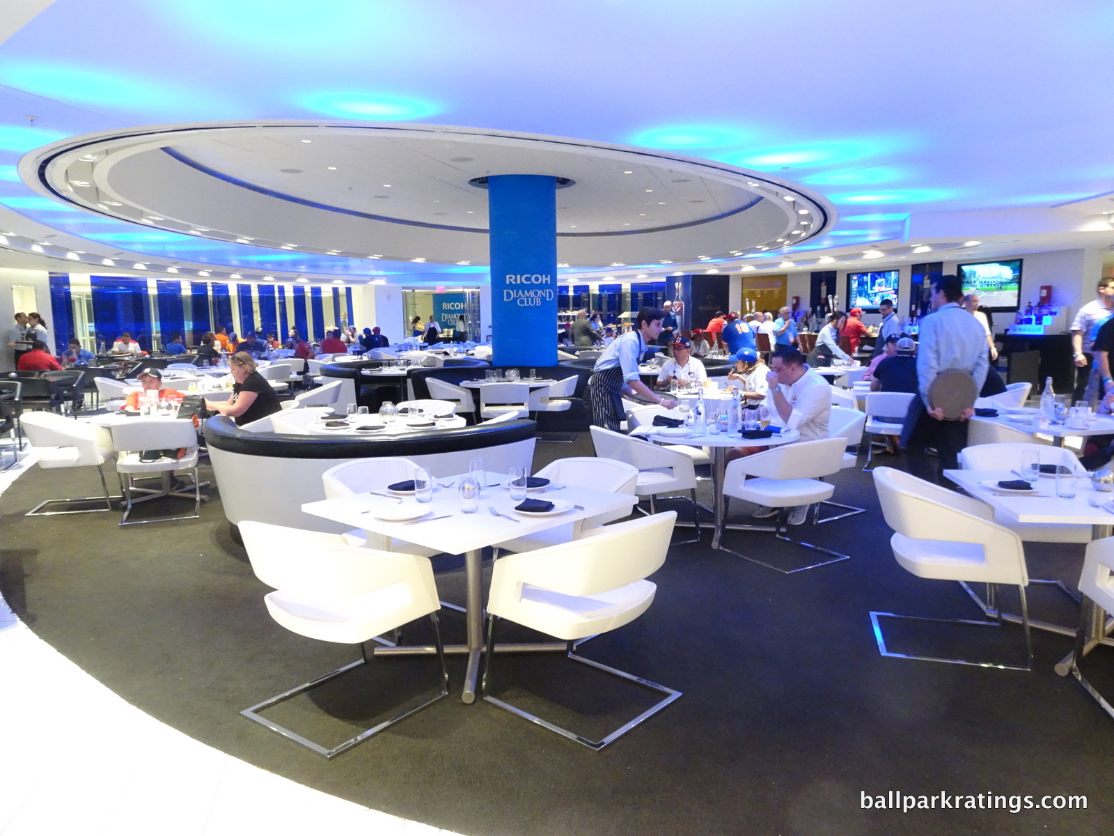
The Marlins’ most high-end offering features all-inclusive food, beer, and wine and a private entrance. It has similar ultra comfortable high back theatre-style seating seen in other parks’ clubs, and in-seat service is available until the 7th inning. While not reaching the level of clubs in New York (few do), the food is great. In the past, they’ve had items such as charcuterie, salads, pasta, shrimp, chicken, pork, fish, prime rib, sliders, melts, egg rolls, plantains, and perhaps most notably, high-end Latin American dishes. My recent WBC brunch included donuts, pancakes, a smoked salmon bar, glazed bacon, pan seared mahi mahi, delicious pork tostones, and some excellently rare prime rib. The club is open up to an hour after the final out and said alcohol continues to be gratis.
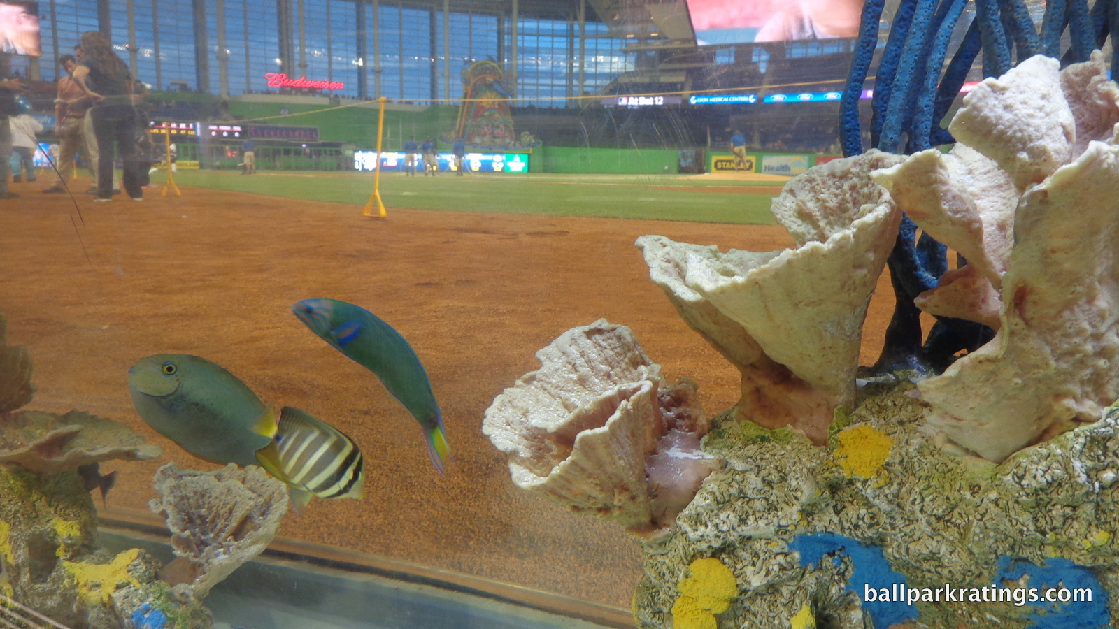
The Diamond Club distinguishes itself with its stunning contemporary design. Surrounded by blue glass and aqua mood lighting, the circular restaurant has plush white and black chairs and tables. The dramatic curtained reception area never gets old. In addition to the fish tanks, Marlins Park’s view of team batting cages is unique. Other clubs feature overhead views or views through windows of batting cages, but at Marlins Park you can walk right up to it! During the WBC, it was blacked out, and I couldn’t get an answer if this was permanent (feel free to let me know). Also be sure to note the wine cellar in the restaurant and the old photos in the right side tunnel when you walk to your seats. A great ballpark experience!
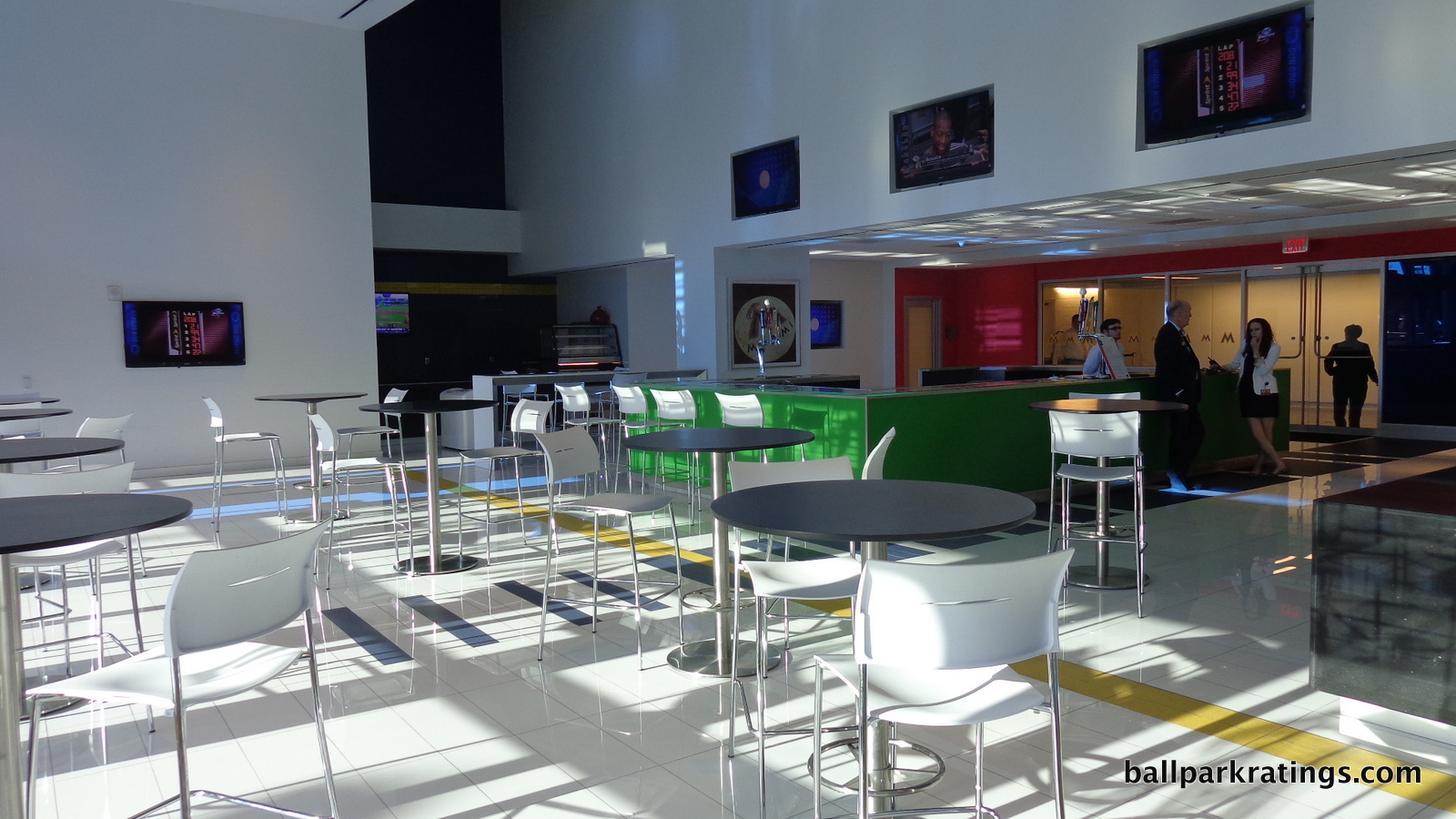
On the other hand, the two Marlins Park dugout clubs have been a flop. Featuring a similar all-inclusive model to the Diamond Club, these two clubs are located down the lines adjacent to both team dugouts. Just like at Yankee Stadium, club seating on the field down the lines didn’t work. The Marlins scrapped the all-inclusive model, and now give all lower level seats “below the moat” access to the dugout clubs, which is very much welcomed. Located on the service level, the dugout clubs themselves have relatively nice bars and serve regular ballpark fare a-la-carte.
The Lexus Legends Level is one of the weakest ballpark club levels in the majors, but it doesn’t really aspire to be much in the first place, notably avoiding the “club level” label. While it’s still exclusive to ticket holders on this level, it is similar to the Excelsior Level at Citi Field in New York. Most significantly, both lack the standard climate-controlled concourse or lounge space. The Legends Level features floors resembling black terrazzo and four (in theory) sparkling colorful circular bars. There are also chairs and tables overlooking the field in the right and left field corners.
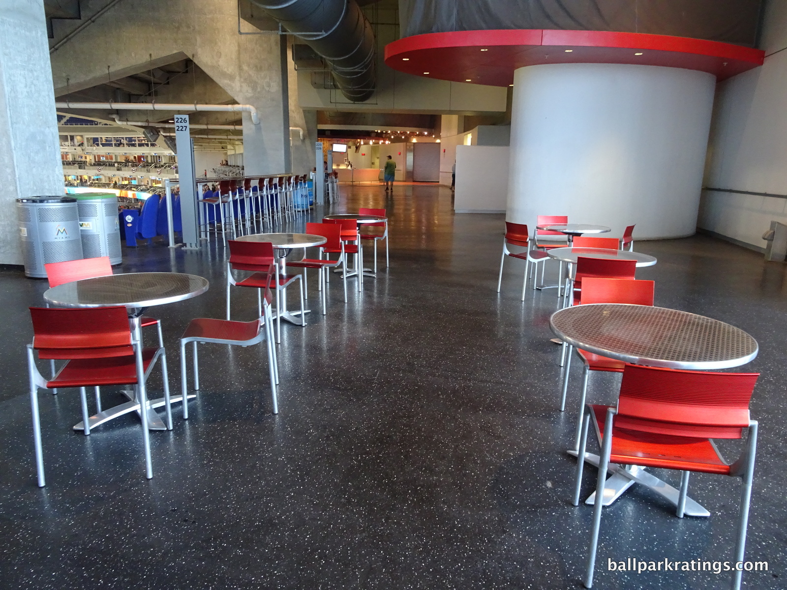
It’s actually quite attractive, but it isn’t supposed to compare to others around baseball. Also, many of these bars and concessions are not open for the vast majority of games. The Legends Level is not in high demand, to say the least. The perks of buying tickets here are the lack of lines and accessible alcohol past the 7th inning, as this is a premium space with its own liquor license. The all-inclusive Hall of Fame Club located among the luxury suites rounds out the traditional premium clubs.
Marlins Park’s luxury suites are appropriate in both quantity and quality. With only 42, Miami is following the trend of fewer luxury suites with higher luxury suite quality. These are some of the most attractive and well located in baseball. Most are located on the Legends Level, with the other 14 Founders suites having their own private concourse below. All luxury suite patrons get to use the Diamond Club entrance.
Finally, we get to the Clevelander, a club Marlins fans can see everyday in the outfield. Unlike anything else in baseball, the Clevelander might be the coolest amenity in any ballpark, and that’s saying a lot. The fusion between club entertainment and baseball has arrived, as fans get access to high quality food, a bar, tabled seating, live music, body painted dancers, bullpen views, a locker room, and of course a pool!
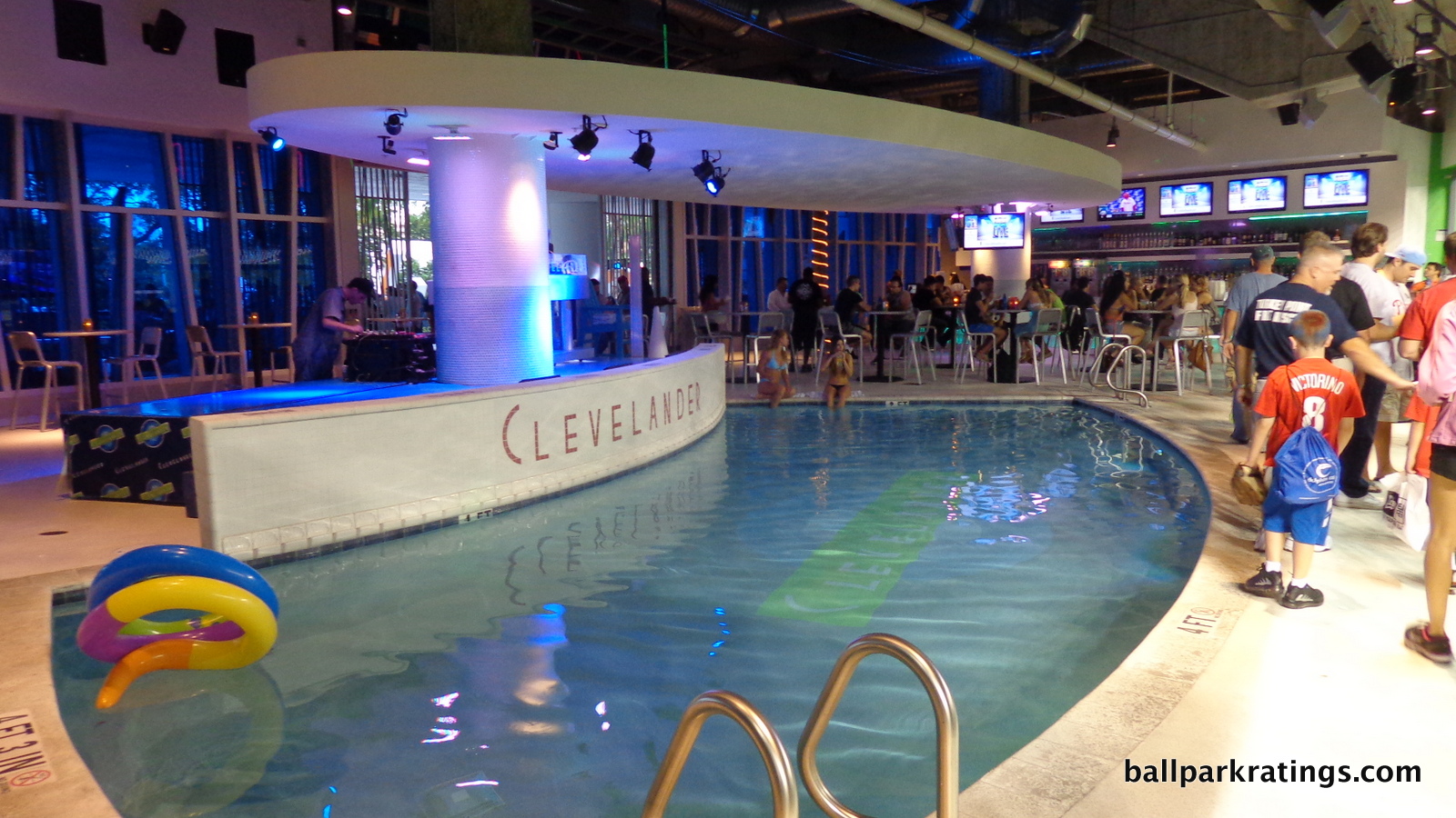
There is also an outdoor patio on the far side, which features a separate makeshift bar and lounge seating. As an aside, this has to be the only place in baseball where you can smoke and get a slight glimpse of the game. It’s certainly a provocative exhibition for a ballpark, but one that also offers ground level views, with three rows of fully padded seats against the left field fence with in-seat service. The Clevelander is open after the game to all fans, and gets quite crowded because it’s one of the few post-game bars in the area. During the game, fans not sitting in the section can pay a cover charge to get in.
Over the years, there have been some interesting changes. I remember bringing my swimsuit to the second game ever played here, and no one swam or wanted to swim. Everyone thought it would be too awkward. As the Clevelander became available to more fans and transformed from what I envisioned as a “pool club” into a “night club,” the pool element has been deemphasized. Now, they rope off the pool, but signs still indicate swimming is allowed.
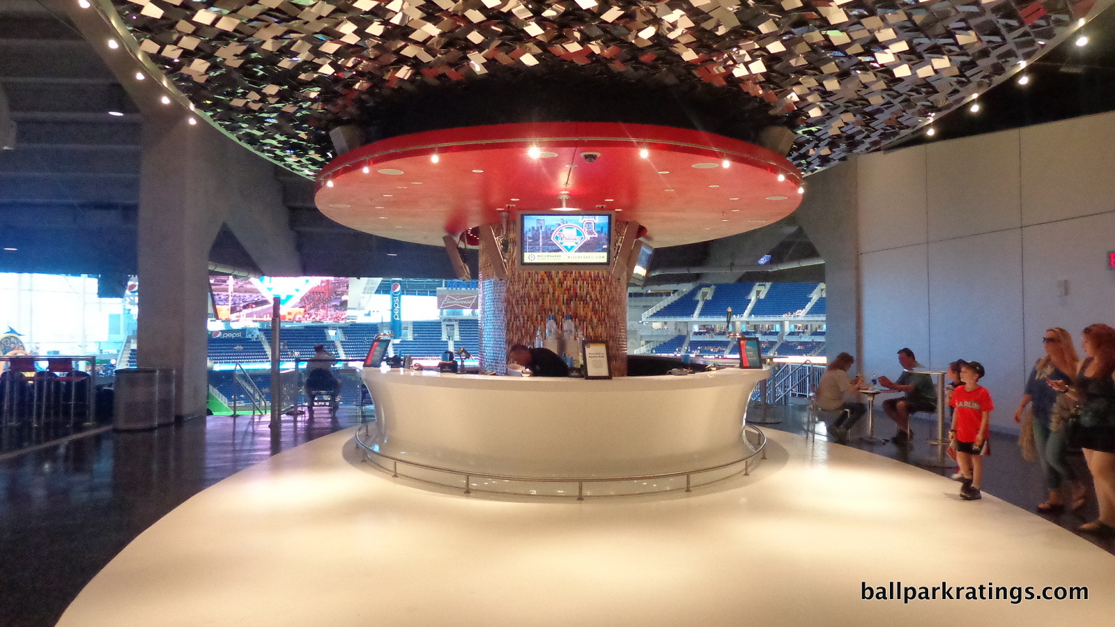
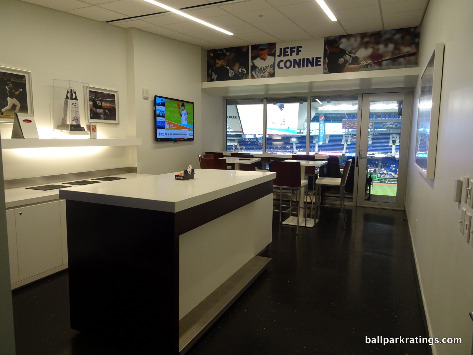
Score: 4.5/5
General or Artistic References to Baseball or Team History/Museums:
While limited by its lack of historical references, Marlins Park is most notable for its numerous contemporary artist replicas. Like Safeco Field, the Marlins love to talk about their “Art in the Park.” It’s much more apparent here than in Seattle though.
Let’s start with the Marlins’ history. The luxury suites honor historically great players. Two larger ones are named after the Marlins’ World Series championship years. The left field entrance has posters honoring Marlins greats. On the main concourse past third base, there is a tribute to the Orange Bowl. There will also be a Jose Fernandez statue at some point in the future.
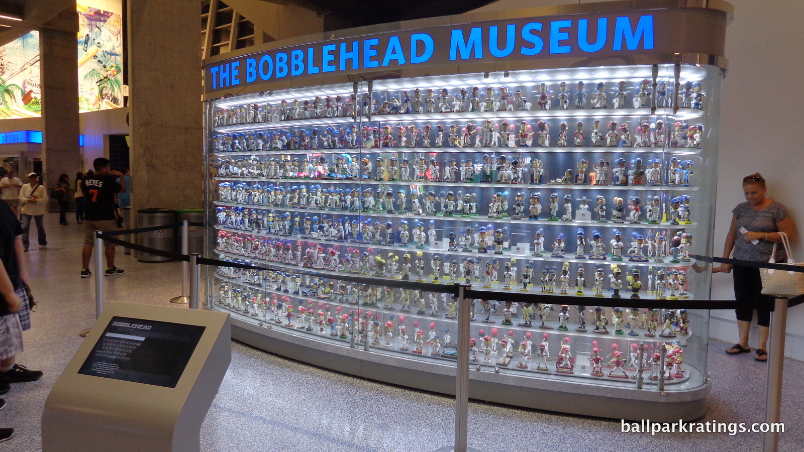
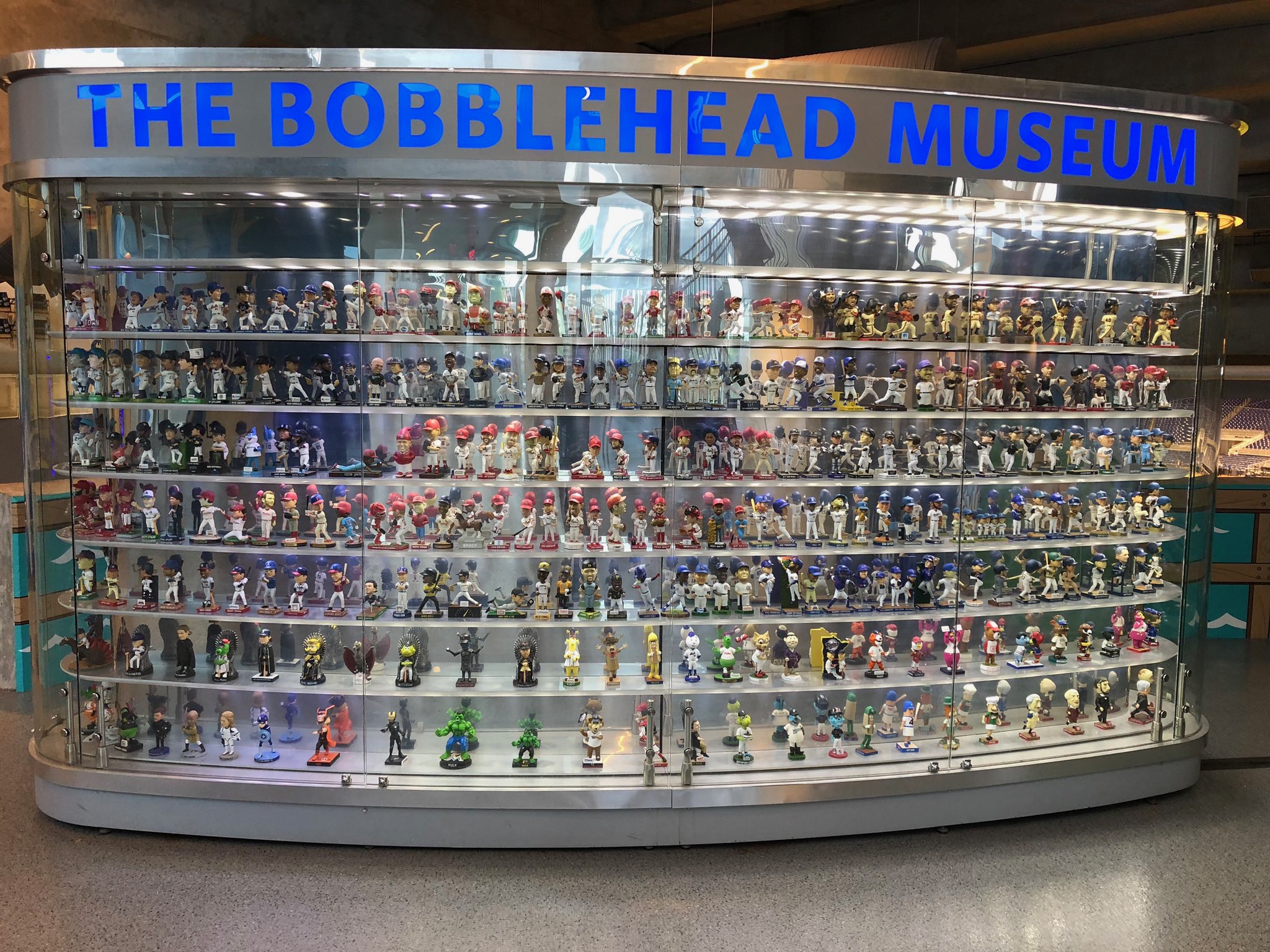
The Bobblehead Museum is the highlight of the presentation. The glassed-in, 360-degree display case features 609 bobbleheads that have a vibrating mechanism so that the heads are always in motion.
The pieces of art throughout Marlins Park are more plentiful. The home run sculpture has been discussed, but that fits squarely in this category too. Behind home plate on the Founders suite level façade sits a reproduction of a painted ceramic by Joan Miro, who was the inspiration for the colorful four quadrants. Replicas of two baseball-oriented pieces called “Baseball” and “The Pitcher” sit on the outer corridor of the Legends Level behind home plate. A reprint of Roy Lichtenstein’s the “Baseball Manager” is the coolest of the bunch.
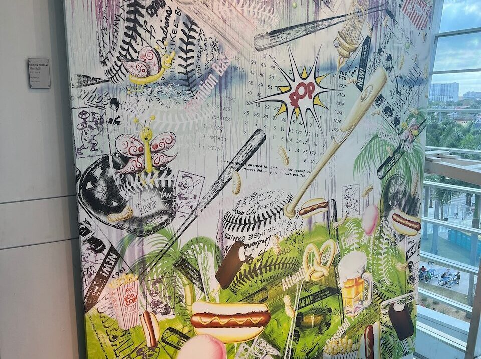
Kenny Scharf’s “Playball” appears to be the largest (and most obnoxious) piece of the art, spanning across multiple floors. Sitting in the right field corner is Dominic Pangborn’s “Baseball in Motion,” which I always seem to miss up close, but it can be seen in the outfield.
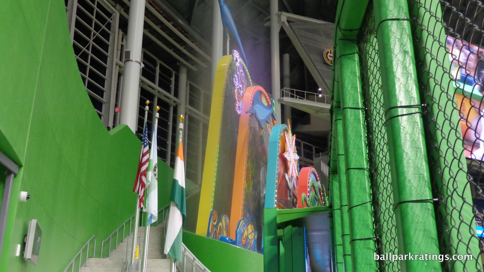
Marlins Park also has some art on the outside. In honor of the Orange Bowl, an artist rearranged those original concrete letters in the east plaza. The west plaza entrance’s tiles are designed by Carlos Cruz-Diez, and apparently form a rhythmic pattern, in addition to their conceptual representation in relation to the ballpark.
Bonus points for both the Bobblehead Museum and the art, which aren’t quite represented by the grading here.
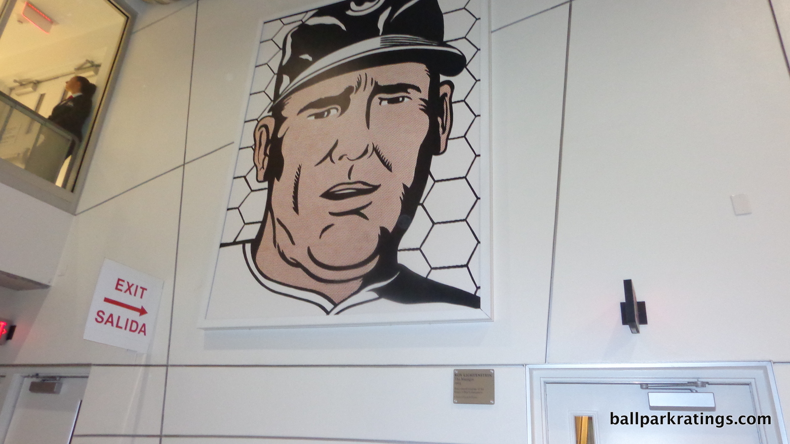
Score: 4/5
Entertainment/Kids Activities/Other Amenities:
Though far more inconspicuous and less consequential, the second peculiar absence at Marlins Park is the lack of kids’ entertainment areas. All other post-1991 ballparks, except Target Field, have some sort of dedicated playground, mini baseball diamond, or even more elaborate feature.
Why does Marlins Park lack one? I’m not sure. I know at Target Field with the urban constraints they literally ran out of room, wisely preferring to add more important amenities like extra destination bars instead of kids’ entertainment. With Marlins Park, my guess is the upper management culture led by Jeffrey Loria wasn’t interested in such a feature.
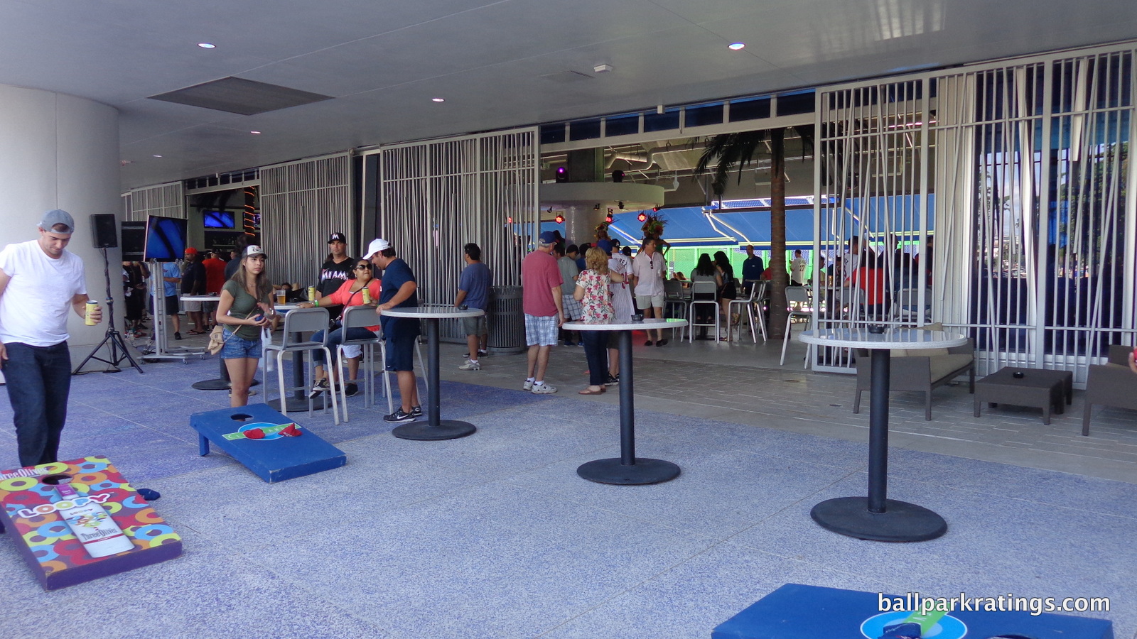
Say what you will about Loria, but he was very involved in the design of this place, having much more influence than your average owner over ballpark specifics. Loria loves baseball and art, and Marlins Park was to be about baseball and art. A tacky kids’ area would detract from this.
The conventional wisdom is that these are essential in attracting young families to the ballpark. Even the Yankees gave in and added a kids’ area for 2017.
In the past, Marlins Park did feature an isolated video game station in center field.
Score: 1/3
Total: 19/25
Atmosphere, Vibe, & Policies
Atmosphere/Fan Support:
Issues with the attendance at Marlins Park are well documented, so I won’t get into that too extensively. We haven’t had much of a chance to truly assess fan support in Miami because the team has never been good for more than a couple of years. The mediocre attendance at the beginning of 2012, with a new ballpark and a well thought of team, was most revealing. Part of why the Marlins sold off all of their assets after the 2012 season was that team officials never thought they would draw so low.
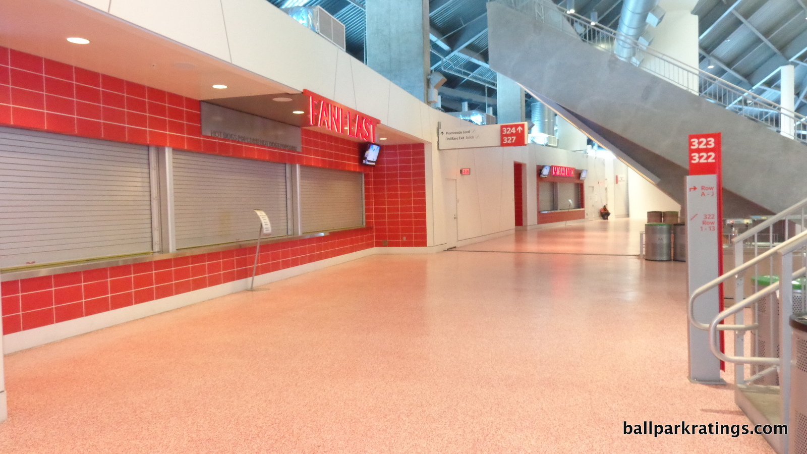
Score: 2/5
Ballpark Policies/Customer Service:
Everything is fine. This category has become binary, with most teams getting a 2/2, while teams like the Giants, Yankees, and White Sox that don’t allow all ticketed fans around the dugout hours before the game get lower. Ushers allow fans to get autographs in the Clubhouse Box area before the game. I guess the one negative is fans can’t get autographs down the lines because of the dugout clubs.
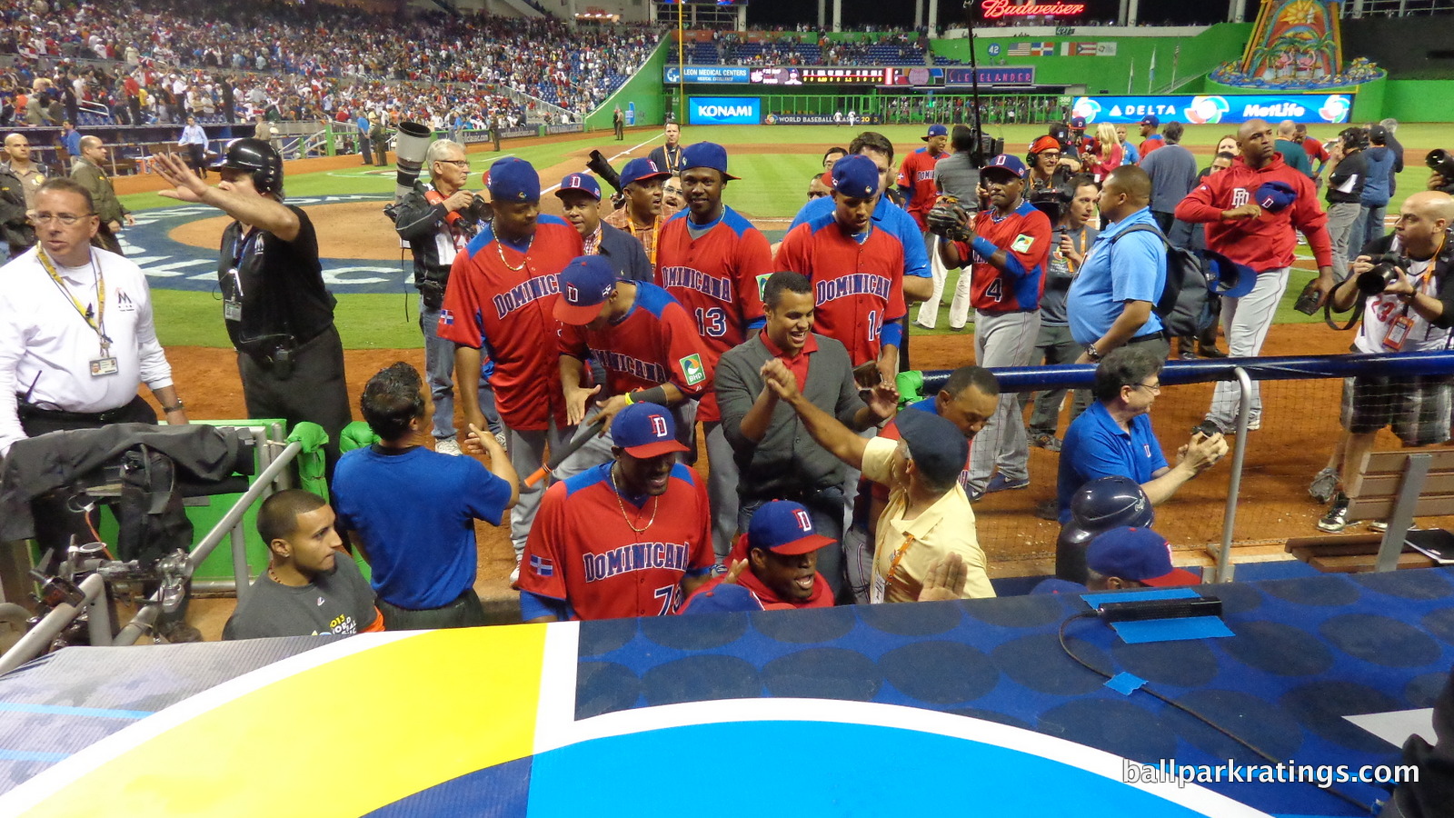
As I discussed in the introduction, the main consequence of the poor attendance is that much of the ballpark shuts down. That’s actually more on the team management than the fans, as even Tropicana Field (Tampa Bay) doesn’t close their entire upper deck.
It is always interesting to see the staff try to accommodate a capacity crowd once a year, then close down half the park for the rest of the year. They must hire a special group for these rare occasions.
Signage is articulated in both English and Spanish.
Score: 2/2
Bonus:
For being the first “neo-modern” ballpark in baseball. Marlins Park is an ambitious ballpark, bucking the retro trend and conceptualized with a bold aesthetic vision. +2
For being “All about Miami,” from the exterior design and the color-coding of the concourses to the local food and art; and don’t forget the fish tank behind home plate! +2
For the Clevelander, one of the best amenities in all of sports +2
For the Art in the Park +1
For the Bobblehead Museum +1
For the Taste of Miami food court and the great local concessions +1
Score: 9
Total: 13
Conclusion
More than five years have elapsed since the Marlins first called this place home. While I critiqued the initial fawning reviews by most of the news media in the introduction, fans and “ballpark aficionados” weren’t nearly as positive in the first place. Today, the media focuses on the political issues surrounding Marlins Park, the poor team that plays in it, and the sparse crowds. Marlins Park has suffered quite a turnaround in treatment from the media, but people who paid attention were always suspicious of Jeffrey Loria and critical of the entire situation.
Marlins Park shouldn’t suffer because of any of that.
In late 2012, bitterness toward an underachieving team and a controversial owner exacerbated an already contentious political situation over the funding of the ballpark, translating to antipathy toward the ballpark itself. That isn’t fair, as we should separate “Marlins” Park from its funding controversy and what happened in late 2012, at least for the purposes of this discussion.
For all the good and bad across the board, and there’s a lot of it (10,000 words worth), Marlins Park should be most known for its ambition.
We now live in a baseball era where not one word is uttered in the national press about a new ballpark’s architecture and aesthetics. While it will score better overall, SunTrust Park (Atlanta) looks like accountants designed it. It achieved its intended purpose of not offending anyone, so much so that people didn’t mention anything positive or negative about the architecture.
Say what you will, but Marlins Park took more chances than any ballpark in recent memory and obviously cares about art, architecture, and aesthetics. No, it’s not the visionary structure the media initially portrayed it as, but the pendulum has swung too far in the other direction. Miami’s ballpark falls in the middle of the pack in our ratings, but it’s an effort and a concept that should be remembered. This is the kind of experimentation we need.
FINAL SCORE: 79.5
RANKING: #22/30
Summary
TL;DR? Here’s the long-form piece in a nutshell:
Despite receiving positive reviews upon opening, Marlins Park is generally considered a bottom 5-10 ballpark for issues that have little to do with the actual ballpark.
Bitterness surrounding unrelated issues—like the stadium’s dodgy financing scheme and the Marlins organization’s ineptness—translated to antipathy toward the ballpark itself. They conflate the Marlins franchise with Marlins Park. That makes no sense.
However, I’ve downgraded Marlins Park’s rating as of late for two reasons.
1) Attendance issues are sufficiently dire to affect the essentials of the ballpark experience, with the stadium operations routinely at 1/3rd capacity. Think a closed upper deck, closed concession stands in prime areas, and dormant signature spaces.
2) The Jeter-era no-fun alterations took a flawed “addition by subtraction” approach, removing amenities like the Clevelander pool nightclub and the cool fish tanks behind home plate, but without adding anything of interest in their place! Sure, there’s now a new lounge in the spot formerly occupied by the pool, and it’s admittedly pretty nice, but nearly all ballparks have trendy lounges. So what? And the home run sculpture now sits outside. Marlins Park can’t really afford to be boring given the product on the field.
Replacing the home run sculpture with a generic party deck, the pool nightclub with an overpriced lounge, and the fish tank with ads represents the new homogeneity of ballparks to a tee.
Regardless, I still think the building itself is architecturally underrated, even if it doesn’t fit in the Little Havana neighborhood. Design-wise, Marlins Park stands alone in baseball history as the only contemporary MLB ballpark in the 21st century sense of the word.
On the outside, Marlins Park conceptually captures sea merging with land, with an amalgam of deep blue glass, white stucco and steel, unadulterated concrete, and sparkling silver aluminum. With graceful fluidity in form, it’s an abstract expression of Miami.
The refreshed interior feels modern yet subdued, highlighted by the sleek white facade and attractive greenery. The retractable left field panels reveal surprisingly beautiful views of Brickell/Downtown Miami. I also adore the contemporary baseball-related artwork sprinkled throughout the concourses.
Marlins Park is particularly functional, with a wide, open main concourse without interruptions in field visibility and excellent sightlines for a post-1990 ballpark. The park’s amenities aren’t as fan-friendly as they should be—sparse crowds are partly to blame—but scrumptious Latin food options, a new beer hall, the Bobblehead Museum, and one of baseball’s best home plate clubs (relatively affordable on Stubhub!) are highlights.
In sum, Marlins Park is a bottom-10 ballpark experience, mostly because a ballpark this empty just isn’t a fun one. Attendance this poor has operational effects beyond a listless atmosphere. But Marlins Park’s dazzling contemporary architecture and aesthetics make it worth a visit.