Hammond Stadium
| Setting | 8/10 | 1 Thumb Up | Location/Access | 8/10 | 1 Thumb Up |
|---|
| Architecture & Aesthetics | 22.5/28 | 1 Thumb Up |
|---|---|---|
| Exterior Design/Aesthetics | 8.5/10 | 2 Thumbs Up |
| Interior Aesthetics/Visuals | 12/15 | 1 Thumb Up |
| Concourse Aesthetics | 2/3 | Thumb Sideways |
| Functionality & Essentials | 19.5/25 | 1 Thumb Up |
|---|---|---|
| Sightlines | 8/10 | 1 Thumb Up |
| Seat Comfort | 3.5/5 | Thumb Sideways |
| Concourse Functionality | 5/7 | 1 Thumb Up |
| Scoreboards/Tech | 3/3 | 1 Thumb Up |
| Amenities & Features | 16/20 | 1 Thumb Up |
|---|---|---|
| Concessions | 8.5/10 | 1 Thumb Up |
| Premium/Group Seating | 3/4 | 1 Thumb Up |
| Social Spaces | 3.5/4 | 1 Thumb Up |
| Kids Areas | 1/2 | Thumb Sideways |
| Atmosphere, Vibe, & Policies | 15.5/17 | 1 Thumb Up |
|---|---|---|
| Ballpark Personality | 8.5/10 | 1 Thumb Up |
| Fan Support | 5/5 | 1 Thumb Up |
| Ballpark Policies/Staff | 2/2 | 1 Thumb Up |
| Bonus | 8 |
|---|---|
| Final Score | 89.5 |
|---|---|
| Ranking | FL: #6(t)/14; Overall: #10(t)/24* |
|---|---|
New Vision Behind the Veil
Hammond Stadium’s captivating exterior design is finally matched on the inside, as renovations enhance ballpark’s aesthetic appeal, amenities, despite being a bit too derivative of other Grapefruit League ballpark renovations; ballpark is also very well-rounded without any major flaws
Note: I usually don’t write “long-form” reviews of the spring training parks, but I got a little carried away with this one back in 2015. Below is a lengthy review of Hammond Stadium.
By Cole Shoemaker
Despite being the first* true “super spring training complex,” meaning it was the first spring training ballpark to be a destination in its own right for fans, and an elaborately extensive training system for players, the dichotomic Hammond Stadium was always perceived as somewhat of a disappointment as a structure.
For most of history, baseball fans went south simply to get an early peek at their favorite team, because spring training baseball was closer to the sport as it was originally conceived: smaller parks, cheaper ticket prices, and a significantly more intimate fan-player relationship.
And Hammond Stadium was arguably the first step away from that, as spring training baseball became more of a mini-major league experience, which wasn’t necessarily a bad thing.
This complex was the prime example of the kind of state-of-the-art facilities that communities would offer big league clubs to entice them to relocate. Instead of having to train in a separate area from your ballpark, the Lee County Sports Complex consisted of a system of baseball diamonds reminiscent of a “sophisticated major-league camp.” The site included ten indoor batting cages, 53 pitching rubbers, a bullpen that could accommodate ten relievers, a minor league clubhouse, and a major league clubhouse larger than that of the Metrodome! There was even a players’ lounge and a sauna.
Twins marketing director Laurel Prieb asserted it would be “a jewel.” According to the Star Tribute in “A Bit of Baseball Heaven,” the consensus was “that the Twins’ facility and the Mets’ 3-year-old complex in Port St. Lucie are the Grapefruit League’s best.”
“I’ve seen them all in Florida, and Boardwalk and Baseball might be more grandiose, but this is more functional,” said Prieb. “It’s the best in baseball.”
And it was. It was a game changer. You can draw a direct line originating here (1991) to Space Coast Stadium (1994), to Steinbrenner Field (1996), to Roger Dean Stadium (1998), to Surprise Stadium (2003), to Camelback Ranch (2009), all the way to Salt River Fields at Talking Stick (2011), in terms of increases in aesthetic value, fan amenities, and player development resources.
But this vision of a “super spring training complex,” a far cry from the intimate Tinker Field where they trained for 54 years, isn’t what made Hammond Stadium a disappointment.
What made Hammond Stadium such a disappointment was that its grandiose Churchhill Downs-style exterior design had such a bland interior design, and dramatically so by comparison. The initial shock and awe faded quickly when one entered the gates. The Twins managed to execute such an attractive façade, one rarely seen anywhere in all of baseball at the time, that it made the pedestrian interior design just that much more palpable. You can imagine how ecstatic fans much have felt upon approach, only to be completely underwhelmed by the visuals on the inside.
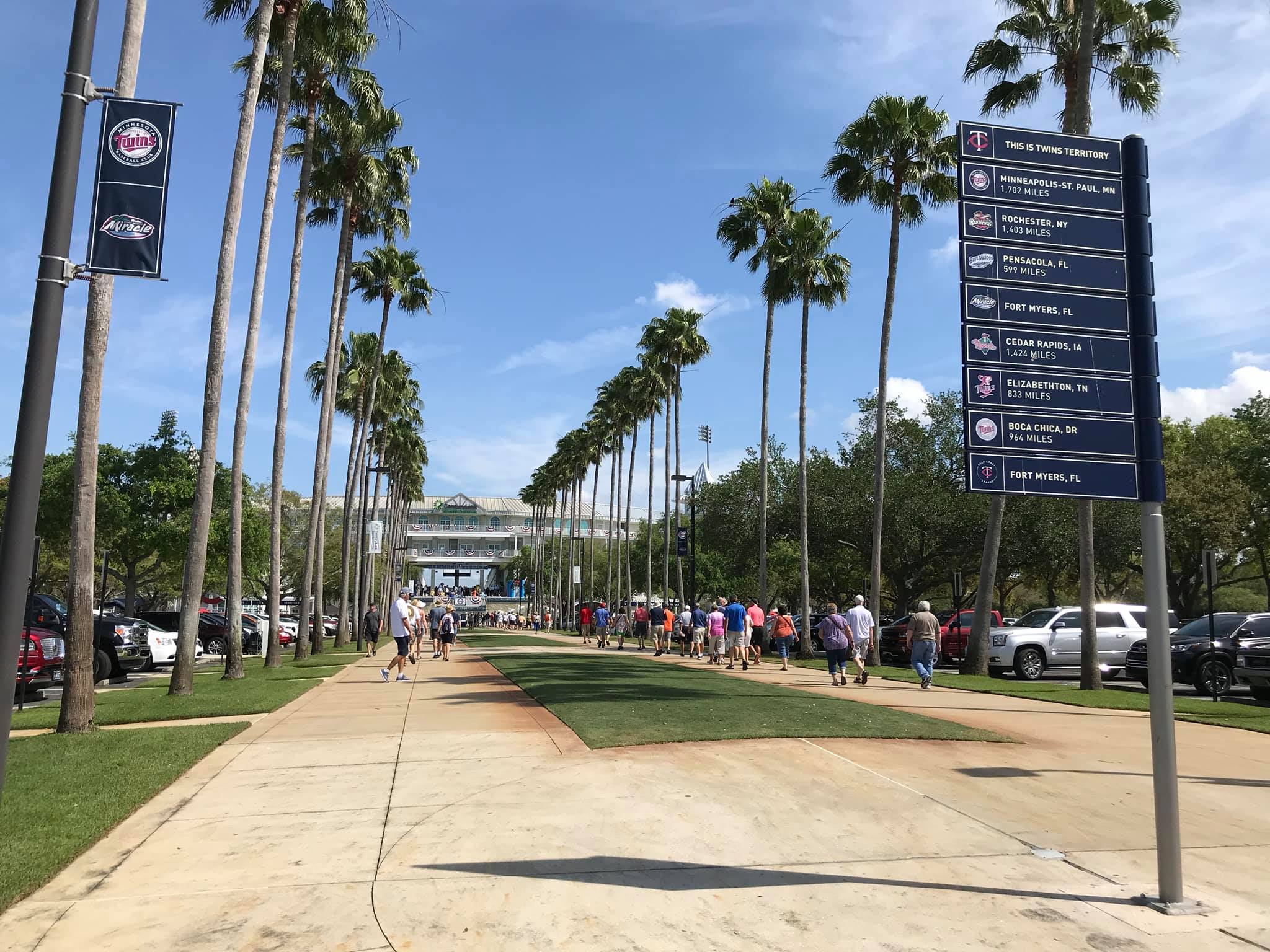
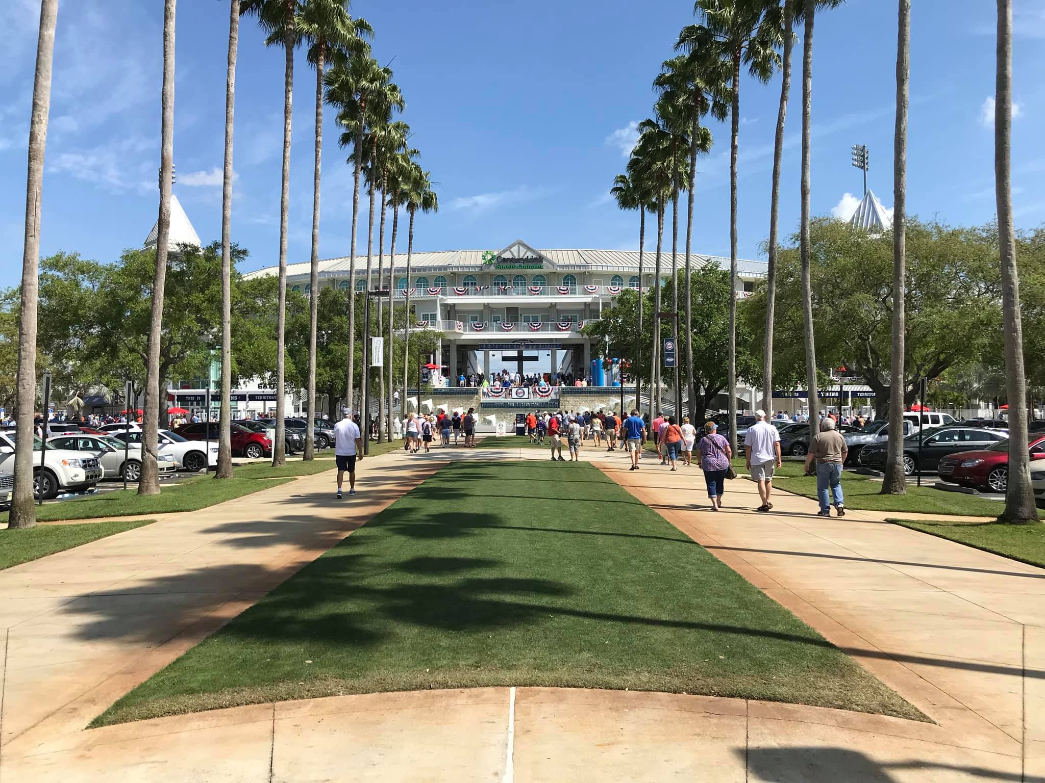
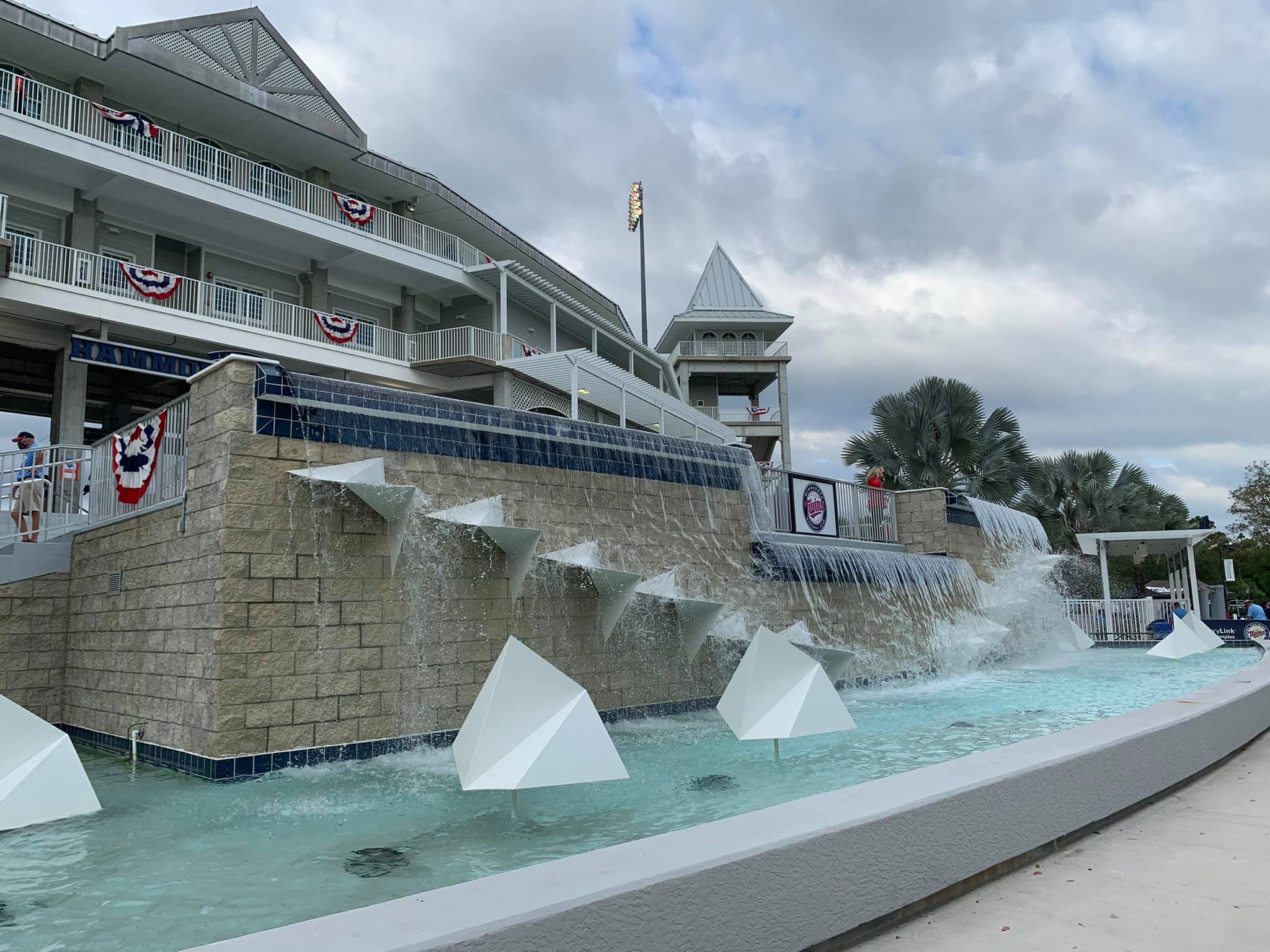
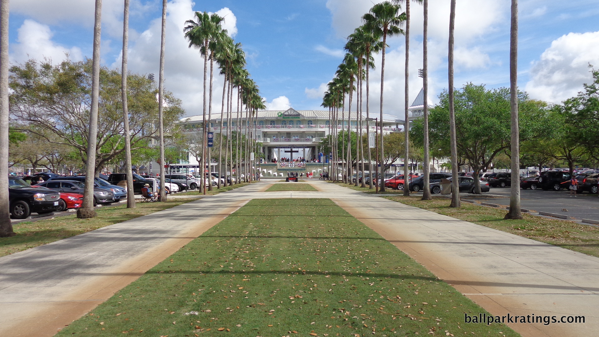
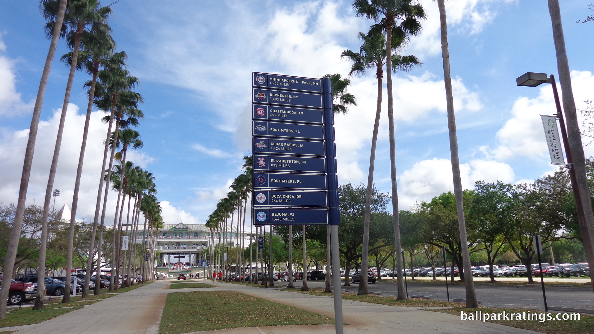
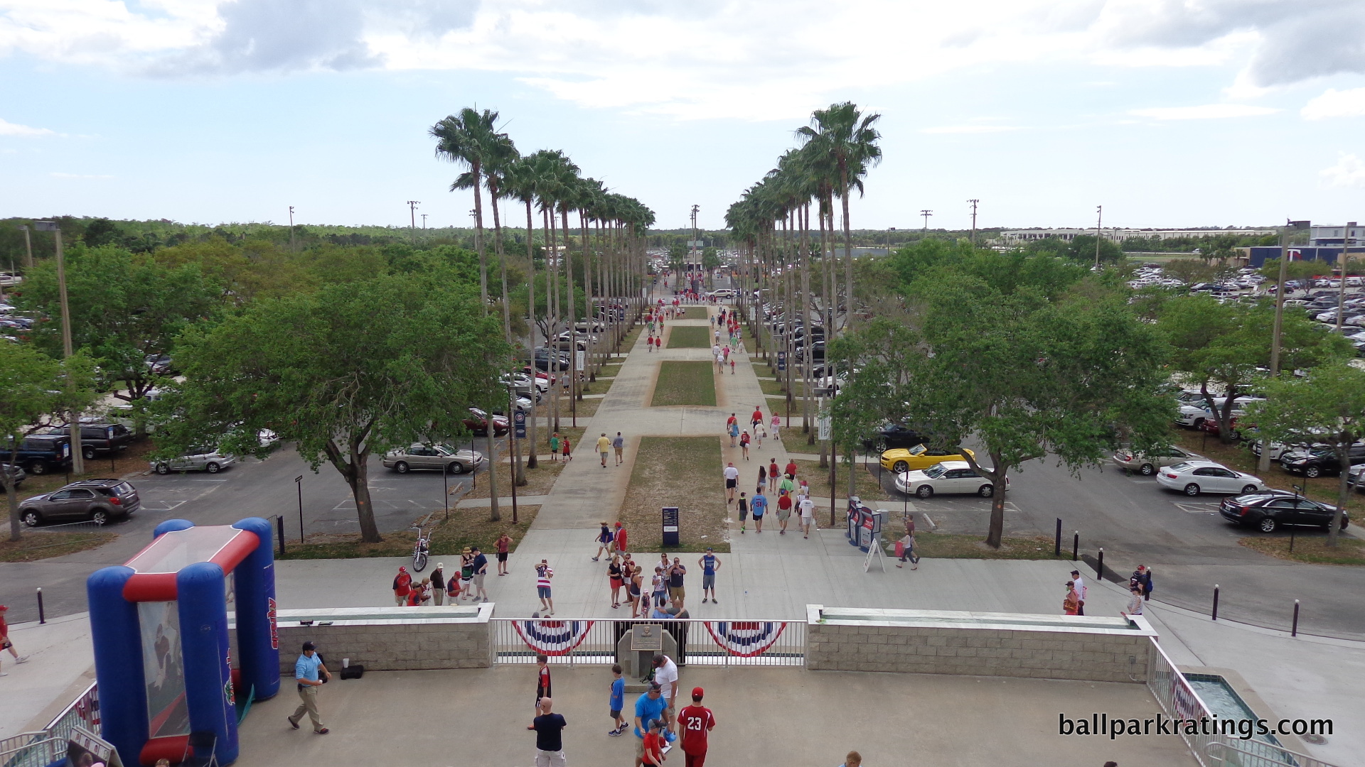
An overhanging roof and windows, railings, lattice, and a spire atop the main ramp gave the park what folks called at the time a nostalgic “old Floridian style.” Team officials called it “something like a combination of Fenway Park and Churchhill Downs,” complete with a steeple and a fountain. The stroll toward that façade further accentuated that impression, as fans approach the ballpark via a magnificent palm tree lined path. The initial plans even called for a series of three reflecting pools in-between the palm trees, but this was cut due to costs, and replaced with manicured grass.
“This is exactly what we wanted,” said Bill Hammond, the county official who supervised the project. “What we dreamed of and planned for was an old-style facility with a certain style and grace that would still be highly functional and have all of the modern conveniences.” This was meant to be a truly visionary concept for spring training baseball.
In truth, that aesthetic vision was always more of a façade, literally and figuratively, than a reality for fans. The interior design was remarkably constrained in comparison, heavy on concrete and aluminum bleachers. While the interior vacuity was persistently notable due to the contrast with the exterior, it became downright self-evident when compared to the more attractive interior designs of later spring training parks.
Opening in 1993, City of Palms Park next door integrated those aforementioned royal palms inside the ballpark. Space Coast Stadium had a scoreboard that celebrated home runs by launching a blinking baseball satellite and fumes of smoke. Steinbrenner Field had those identifiable Yankee windscreens. The Ballpark at Disney (or whatever) had a gorgeous stucco second deck façade adorned with a matrix of dark blue and green tiles, along with trellised silver roofing. Roger Dean Stadium had an identifying and attractive set of beige clubhouses as a backdrop.
By the end of the 1990s, Hammond Stadium’s iconic exterior was just a veneer for a sterile ballpark.
Luckily, the latest round of extensive renovations added some magnetism behind the mask. While the beautification of the outfield scene isn’t quite at the level of Ed Smith Stadium or some others, the ballpark’s new “grand entrance” gives Hammond Stadium that “vision” it had for years on the outside, but desperately needed on the inside.
I love when the concept between “exterior,” “concourse,” and “interior” is blurred, and that is exactly what this element does, giving the entire park room to see and breathe.
The Twins technically call this creation the “grand vomitory,” (lets use the term “grand entrance”) which enhances what I call the “compress and release” concept. Like with everything, a mix is necessary in design: the main concourse is closed below the second deck, with an open terrace level at the top of the second deck. When you exit the main concourse through this grand portal, you get that tremendous explosion into the stands for a dramatic entrance, which appropriately overwhelms the senses, while you can still walk around on the terrace level concourse and see the game. The Orioles do something similar, but the Twins do this as well as anyone. I’ll elaborate later.
The rest of the renovations are top quality, despite being a bit too unimaginative. We have an outfield boardwalk concourse similar to McKetchnie Field and Charlotte Sports Park. There is the second open terrace concourse, like at Ed Smith Stadium. Everything else is pretty much what you would expect: expanded 360 degree concourses, lots of trendy drink rail seating, new seats, new concessions, two new bars, brand new suites, new party decks, etc. It’s all pretty formulaic, but well done. I should also note the state-of-the-art player development academy is pretty groundbreaking, although these reviews are solely focused on the fan experience.
My only quibble, which is fairly significant given the complete sense of absence, is with their decision not to substantially improve their scoreboard system. No videoboard! Little information is displayed about the game situation. You’d think after $48.5 million, they could improve this. *Edit: A state-of-the-art HD videoboard was added in 2017.*
Overall, this was a great renovation, even if many of the features are very derivative of other Grapefruit League ballparks. At the end of the day, Hammond Stadium had staying power because of its initial bold vision statement and attractive exterior design. Now 25 years later, to the tune of nearly $50 million, the Twins finally integrated some of that vision on the inside, resulting in a top tier Grapefruit League park.
*For the purposes of this discussion, I’m excluding the tragically ill-fated Homestead Stadium. While Hammond Stadium broke ground a number of months earlier, so it was still the “first” in my opinion, Homestead Stadium opened in 1991 (although with no tenants), and was rebuilt after Hurricane Andrew using the same design as before. You can put everything written here on steroids for Homestead Stadium. It was way ahead of its time, both inside and out. It was finally matched in 1998 by Roger Dean Stadium, yet Homestead Stadium never hosted a team. Please read the story if you haven’t here and here.*
Setting
Access/Location/Local Scene:
For its relative geographical isolation on the southwest coast of Florida in Fort Myers, Hammond Stadium has a pretty respectable location.
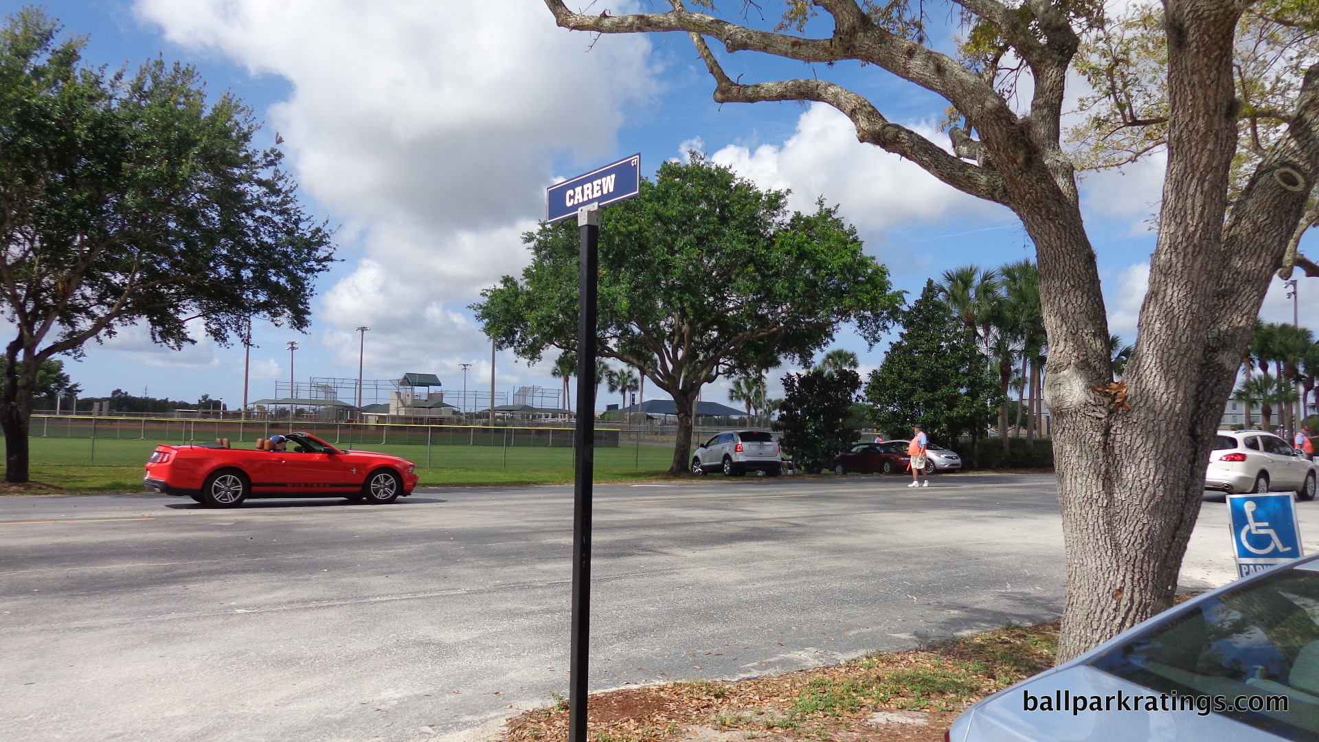
CenturyLink Sports Complex can be accessed via the Six Mile Cypress Parkway, just 2 and ½ miles from I-75. The complex itself is 80 acres, as Hammond Stadium is just one of five full sized baseball diamonds in the area. According to their website, the complex also includes four softball fields, two soccer fields, and an eight-acre lake for fishing.
Due to size and efficiency, parking is quite convenient outside the stadium. Parking is segmented into fields by lanes named after Twins greats.
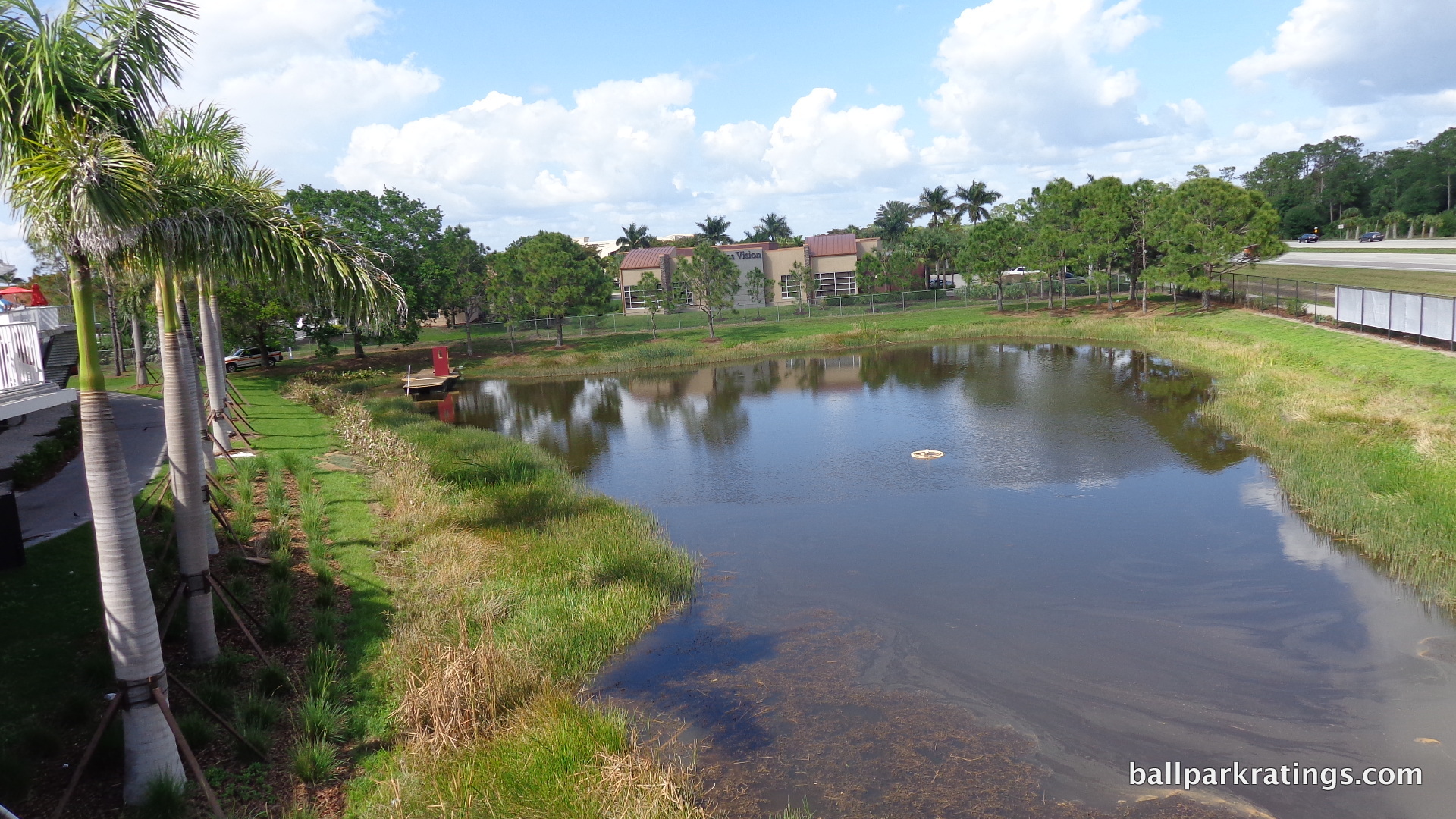
While not a neighborhood park, the direct local scene, along with the larger surrounding area, is pretty good. Within a mile, you’ll find chains ranging from Jersey Mike’s Subs to Subway. The development of this area of Fort Myers in general is relatively upscale. You’ll find shopping centers and office buildings in the vicinity.
For scenic waterfront tourism, Fort Myers Beach and Sanibel Island are both within 15 miles. Sanibel Island is the best known of the areas, to the point where nearby JetBlue Park took design cues from the island in the form of seashells. Hammond Stadium chose not to make any overt references to the area in its design.
Score: 8/10
Architecture & Aesthetics
Exterior Design:
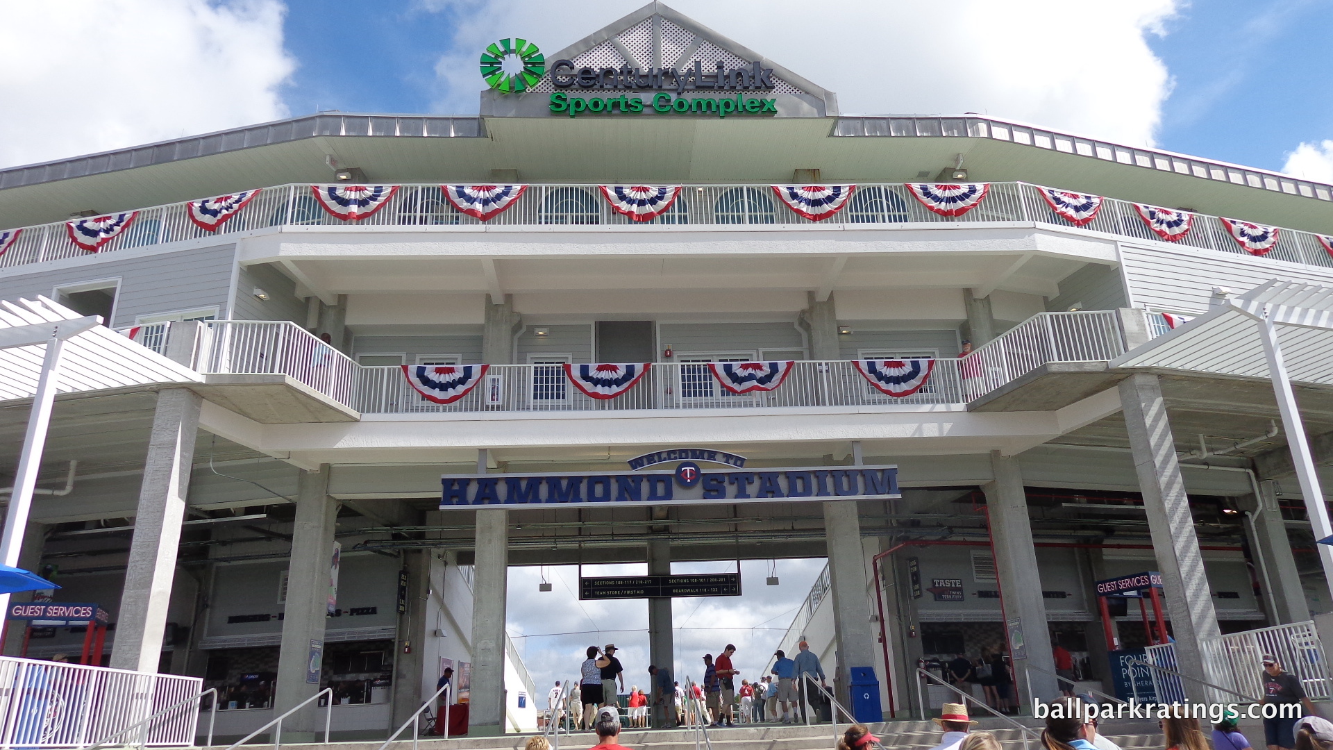
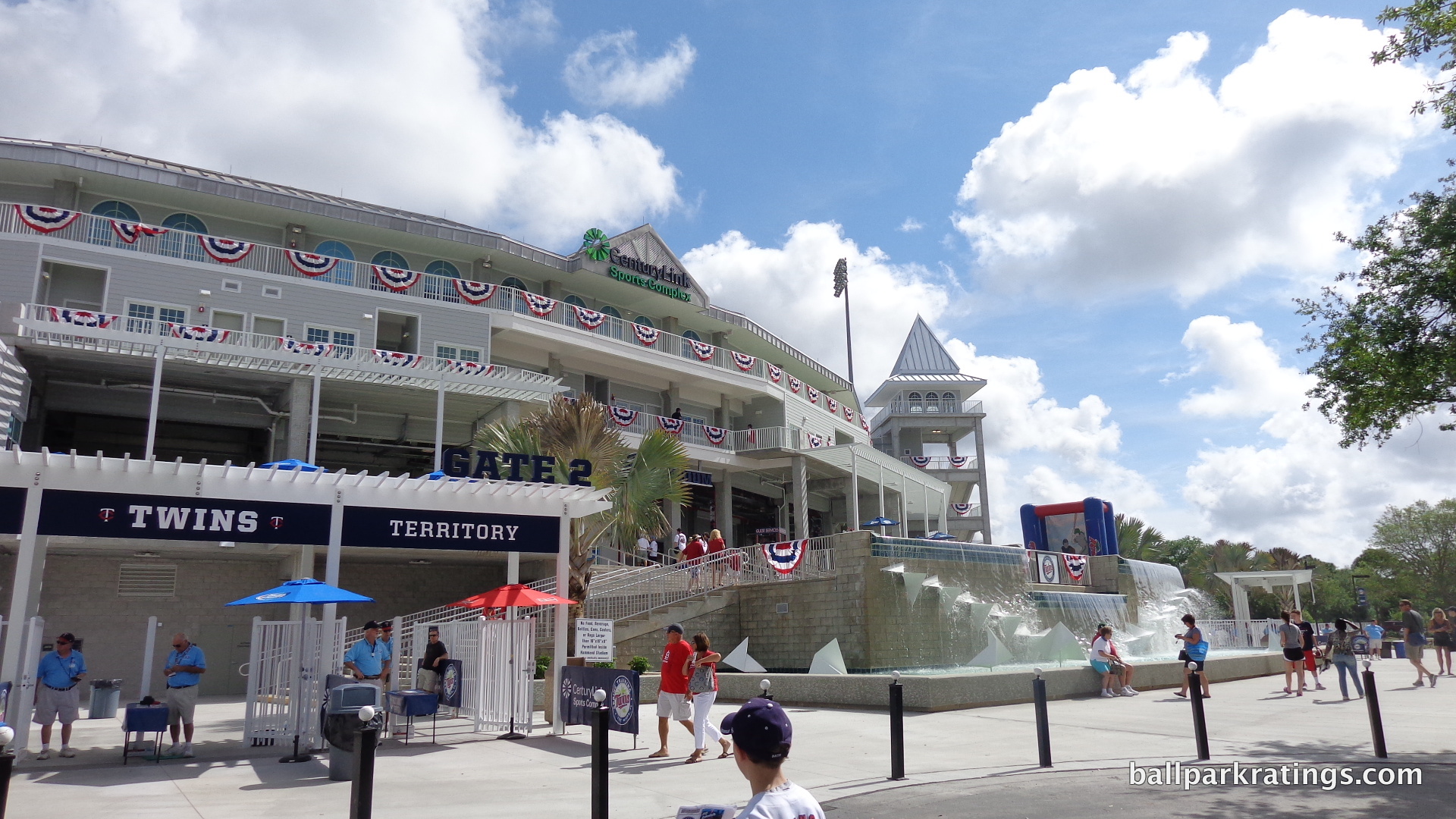
While it doesn’t blow you away in today’s context of ballparks with ochre sandstone imported from India, the renovations mostly maintained the exterior’s novel grandeur. The improved functionality compromised some of the outside appeal by muddling the façade and eliminating the archways above the main concourse, but it’s still a distinctive look and one of baseball’s more memorable entrances. Some other aesthetic additions during the renovations aid the design as well.
I think it’s pretty important to understand how novel this was when it opened. Not only for spring training, but for all of baseball. Was there anything that looked like this? I don’t think so. While Coca-Cola Field often gets the credit for being Camden Yards’ minor league predecessor in 1988, I can’t find any ballpark at the time remotely resembling the Hammond Stadium concept of classic and distinctive exterior architecture. Only after 1991 would this become commonplace across the country. It appears Hammond Stadium’s significance has been overlooked in ballpark history.
While ballparks across the country were characterized by almost extreme banality on the outside at the time, this was particularly true of baseball’s spring training parks. Both the Grapefruit and Cactus League was littered with two-story concrete iceboxes, sometimes featuring the team’s insignia if they were lucky. It’s almost laughable today. Forget the now ubiquitous “Spanish Mission/Mediterranean” designs seen throughout the Grapefruit League.
Compared to Compadre Stadium ($1.6 million in 1986), Charlotte County Stadium ($5 million in 1987), Plant City Stadium ($5.7 million in 1988), and Ed Smith Stadium ($8.5 million in 1989), this project (at $14 million) was the a giant leap forward for exterior design in spring training baseball and baseball as a whole.
It was a concept. Churchhill Downs meets Fenway Park meets Old Florida. New ballparks weren’t concepts. It was attractive, characterized by white lattice windows with green awnings and archways below spire topped roofing. The almost disarming pomp was accentuated by a fountain and palm tree landscape. New ballparks weren’t attractive. People really hadn’t seen anything like it from a ballpark, much less a spring training ballpark. It’s the one spring training stadium where you can find plenty of other people talking about the outside, so I won’t expound too much here.
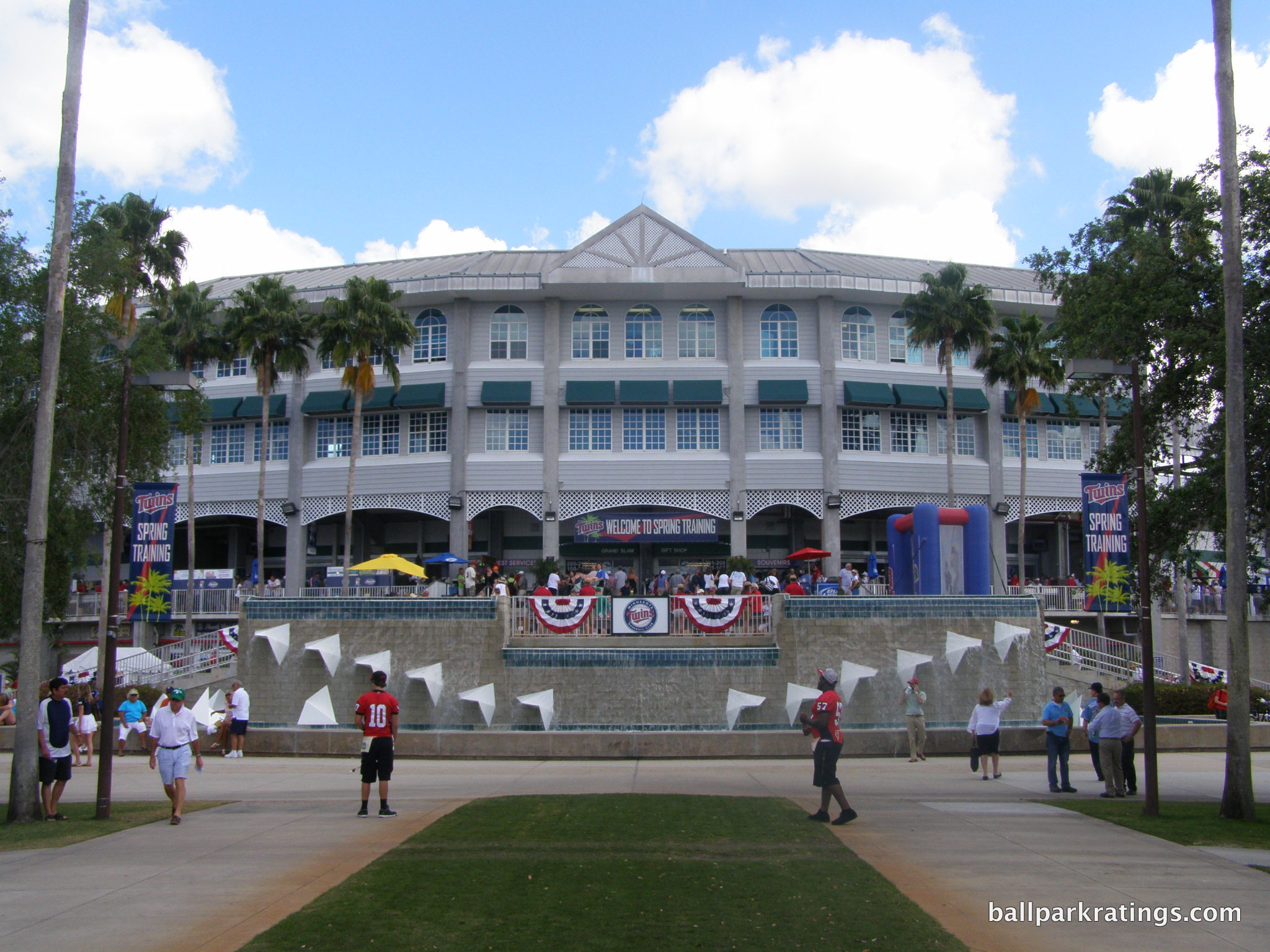
I’ll talk a bit more about how the renovation affected the original design. The aesthetic appeal is slightly neutralized by the new upper walkways in front of the façade, resulting in a more cluttered look. These suite and press level walkways partially obstruct the attractive windows, resulting in these less aesthetically endowed railings disturbing the order of the façade. The expansion of the main concourse below also took out the lower archways. On paper, it’s a messier look.
I’m not a fan of the pennant banners, either, which just further complicate the scene. They replaced the pretty green window awnings, which seemed to be a fairly important part of the conceptual aesthetic. At least the palm tree lined path leading to the ballpark, as if it were some grand estate, remains mostly unchanged. There is also an addition of a gift shop on the left side of the façade.
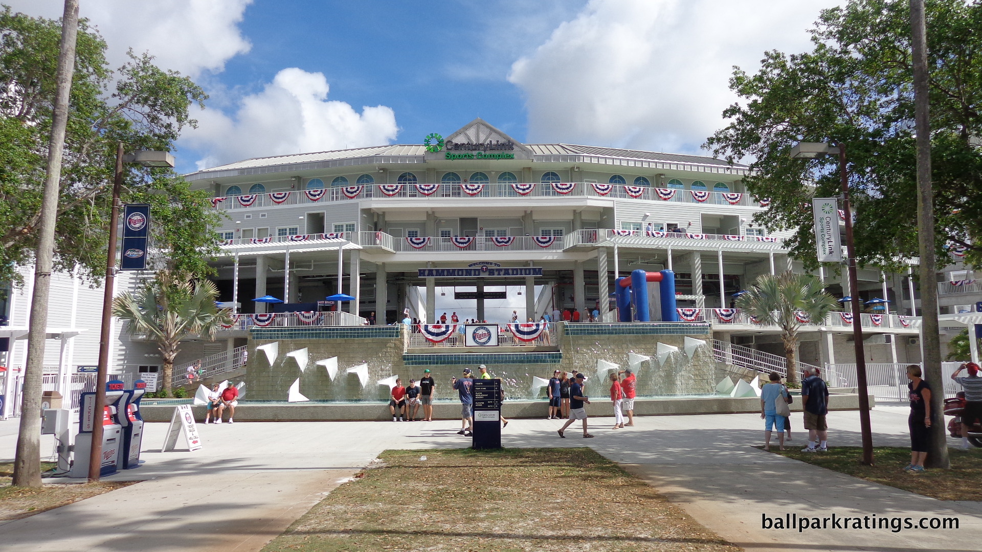
Overall, the renovations altered the exterior design more than you realize, just by looking at the before and after photos. There are some substantial differences from the original concept, and the raw appearance is different too.
But you don’t really get the sense that the aesthetic appeal has been changed when you’re there. The overall aesthetic impression isn’t diminished, perhaps because of the increased sense of openness provided by the grand entryway and the improved landscaping on the sides of the exterior. Symmetry is also enforced with the addition of three more spire topped “witch-hat towers,” two more on the right side and one more on the left. Or perhaps it’s just a function of everything being newer. It does feel bluntly “more modern” somehow. Either way, I don’t think it’s as effectively streamlined or stately, but it all comes together to form a similar impact.
Score: 8.5/10
Interior Aesthetics:
Perhaps it’s not a coincidence that Hammond Stadium was the dawn of a series of exponentially more attractive spring training ballparks. One of the chief criticisms of this project was that it was so striking on the outside, while so lacking anything imaginative on the inside.
The purpose of the exterior was to give the fans an immediate and memorable sense of arrival, but with fans spending minutes on the outside and hours on the inside, fans were distinctly underwhelmed. Like with some other parks, it felt that far more time was spent designing the outside than the inside. Perhaps this pressured architectural firms (like Populous) to spend more time beautifying the interior aesthetic scene.
With the Hammond Stadium renovations, addressing the interior vacuity was the primary objective. With enhancements becoming so formulaic around the league (outfield “boardwalk,” second level concourse, new bars, party decks, drink rail seating, etc.), this park risks being forgettable. Hammond Stadium needed to capitalize on its existing distinctive features.
With that obviously being the memorable exterior design, the architects did exactly what they should have done: find a way to bring the exterior into the interior! Blur the lines between exterior, concourse, and interior.
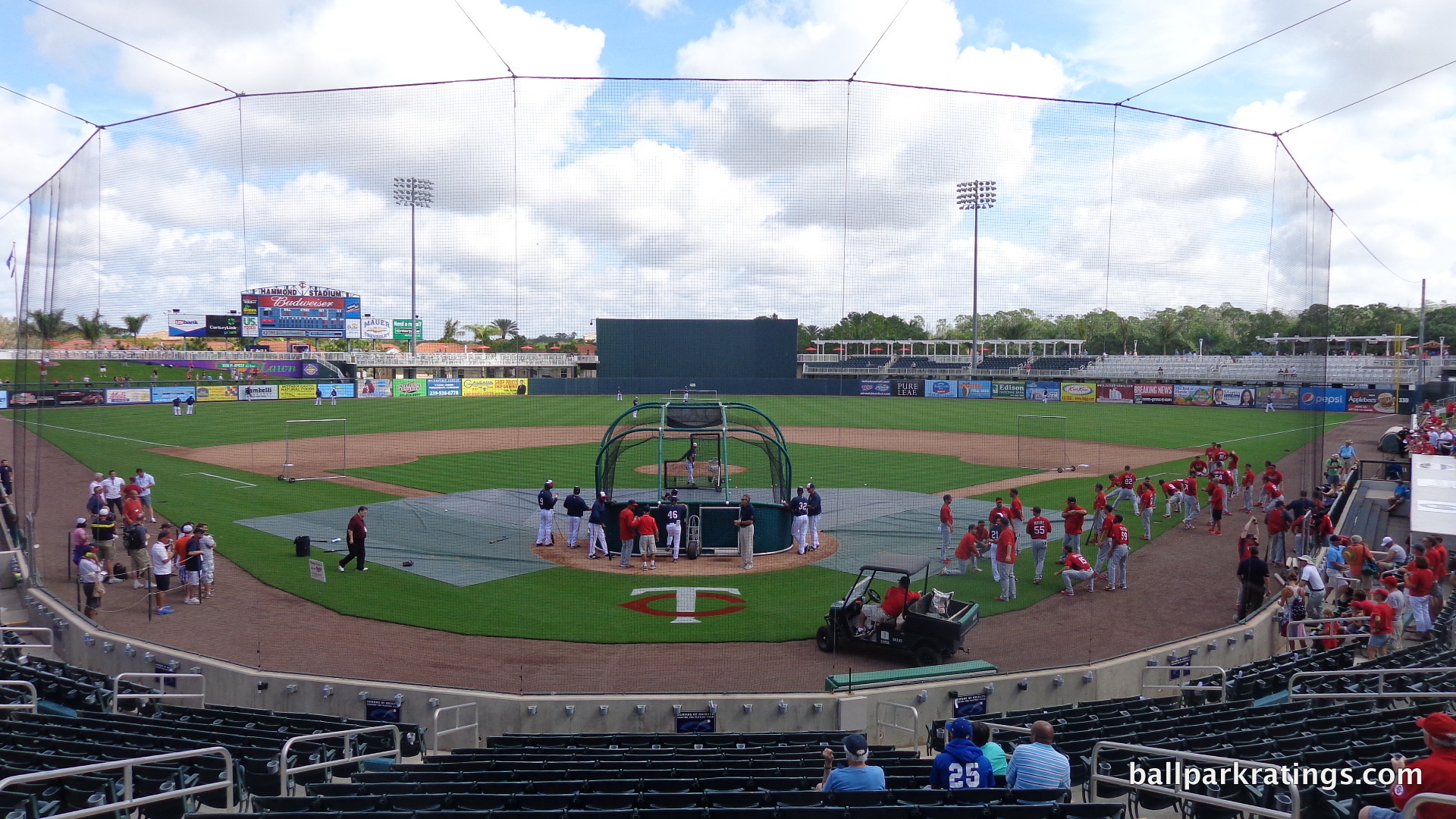
We’ve seen this concept in renovated Ed Smith Stadium and Goodyear Ballpark, but the Twins do it best. They call it the “grand vomitory.” The word derives from the Latin word meaning, “to spew forth,” as in a crowd spewing forth. The effort required removing a large swath of prime seating right behind home plate, resulting in a massive gap that immediately connects the fan entering the ballpark to the inside.
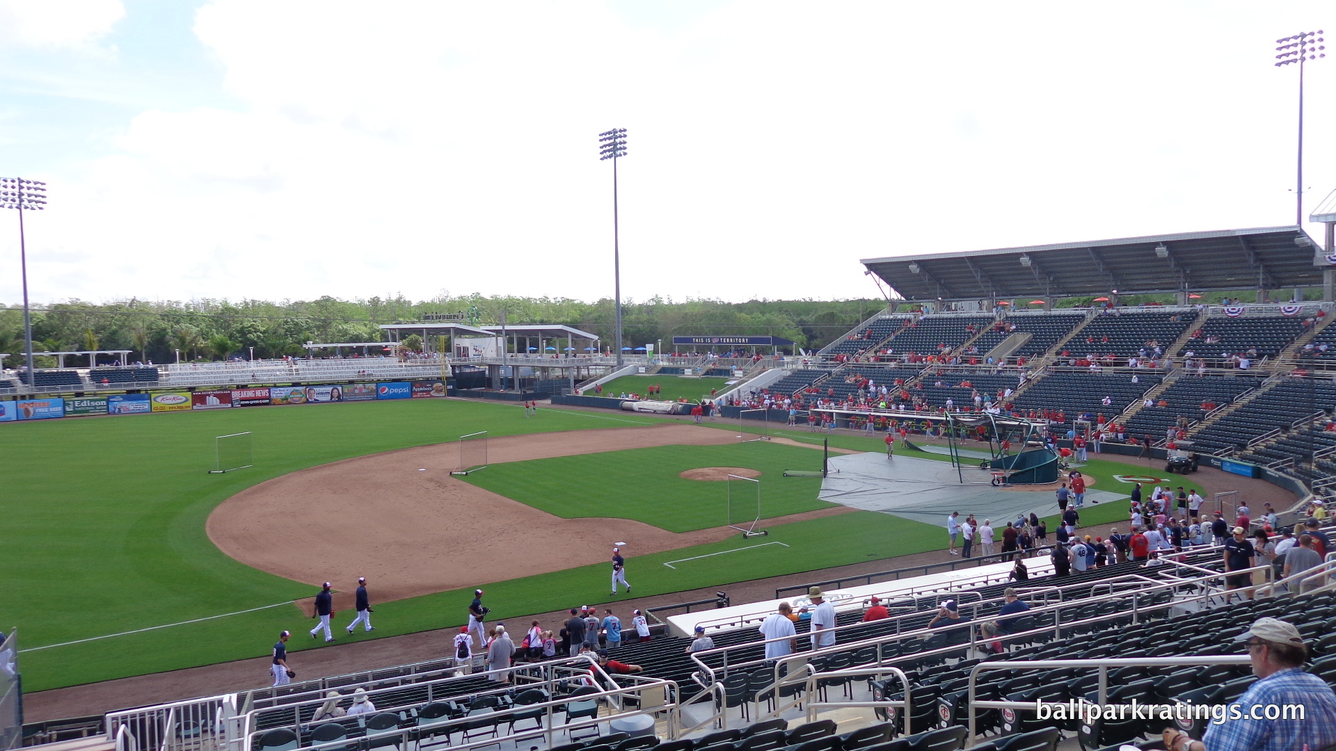
A grand entrance works so well at Hammond Stadium because of the line of palm trees guiding fans right to it in the first place. As fans walk toward the ballpark, their sense of arrival becomes more and more pronounced and distinctive, resulting in an impression of complete immersion by the time fans are above the fountain. It’s also a gateway that allows that positive impression of the exterior design to remain once you’re in the seating bowl. That previous sense of being underwhelmed once inside is diminished, as all fans in the ballpark feel a connection to the exterior design.
So before even touching anything else, this 60-foot gap enhances the interior design.
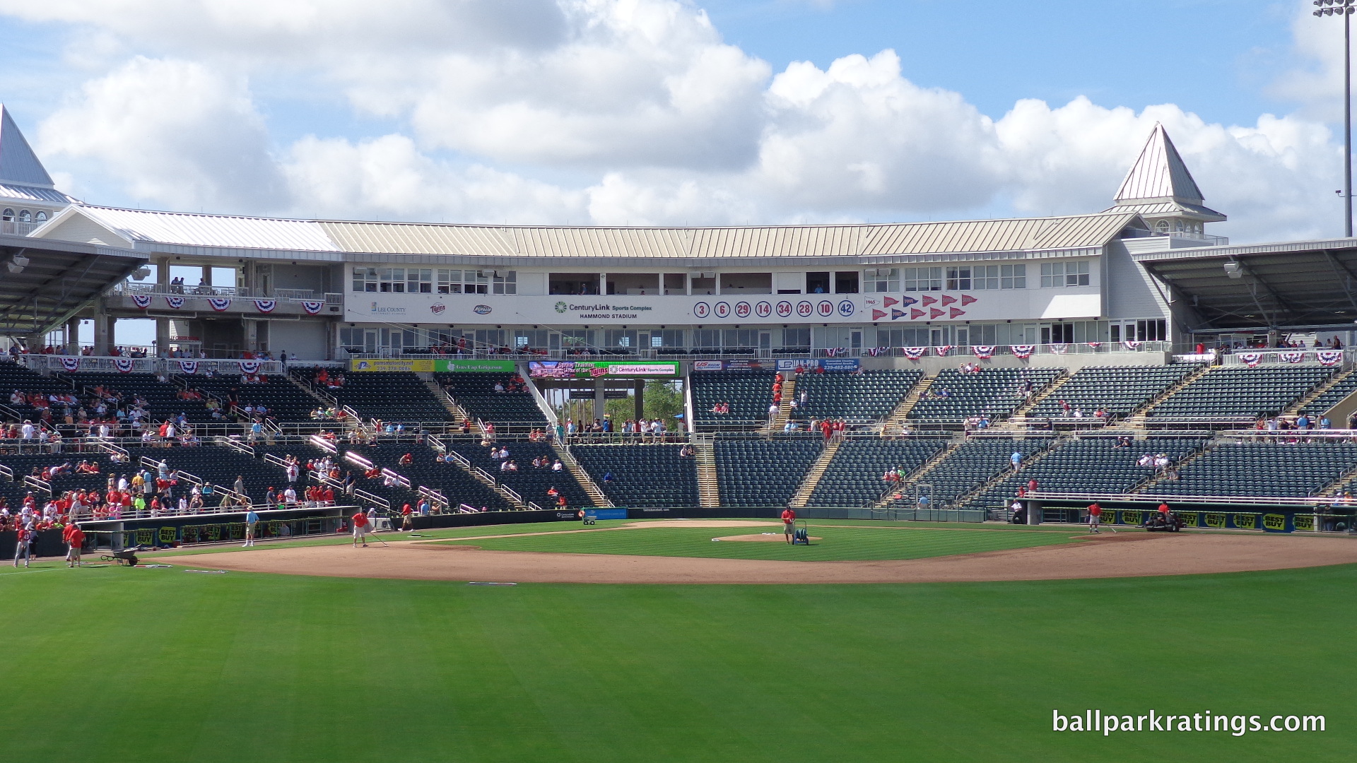
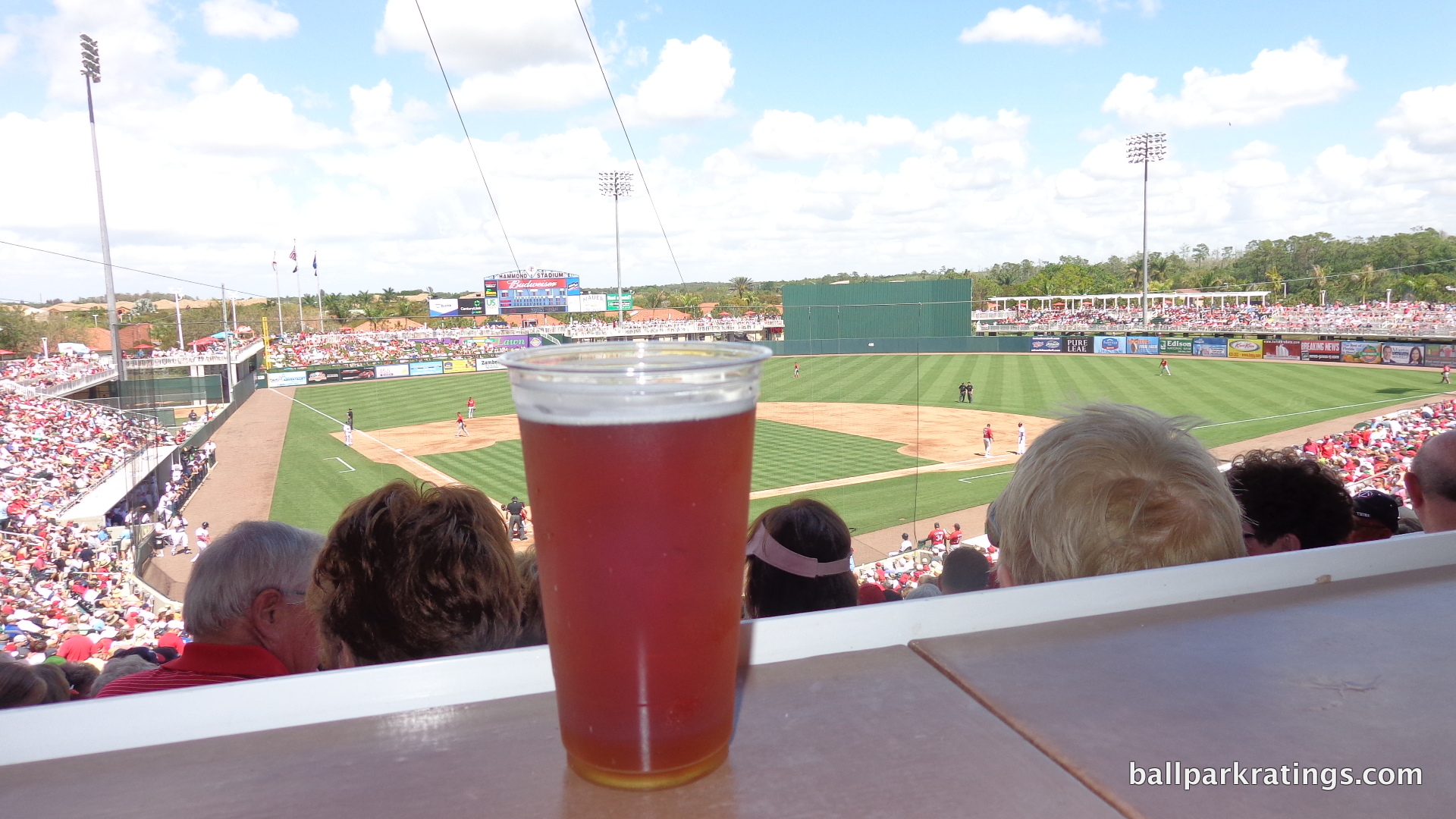
The other changes are subtler, but add up in the aggregate. First of all, the simple presence of an outfield concourse beautifies the scene. The white railing of the outfield boardwalk matches the aesthetic ethos on the outside. The railed awning in right-center field has the same effect. The batters’ eye is slightly darker and less austere. The overall backdrop in right field isn’t spectacular, but it meshes with the seating quite well.
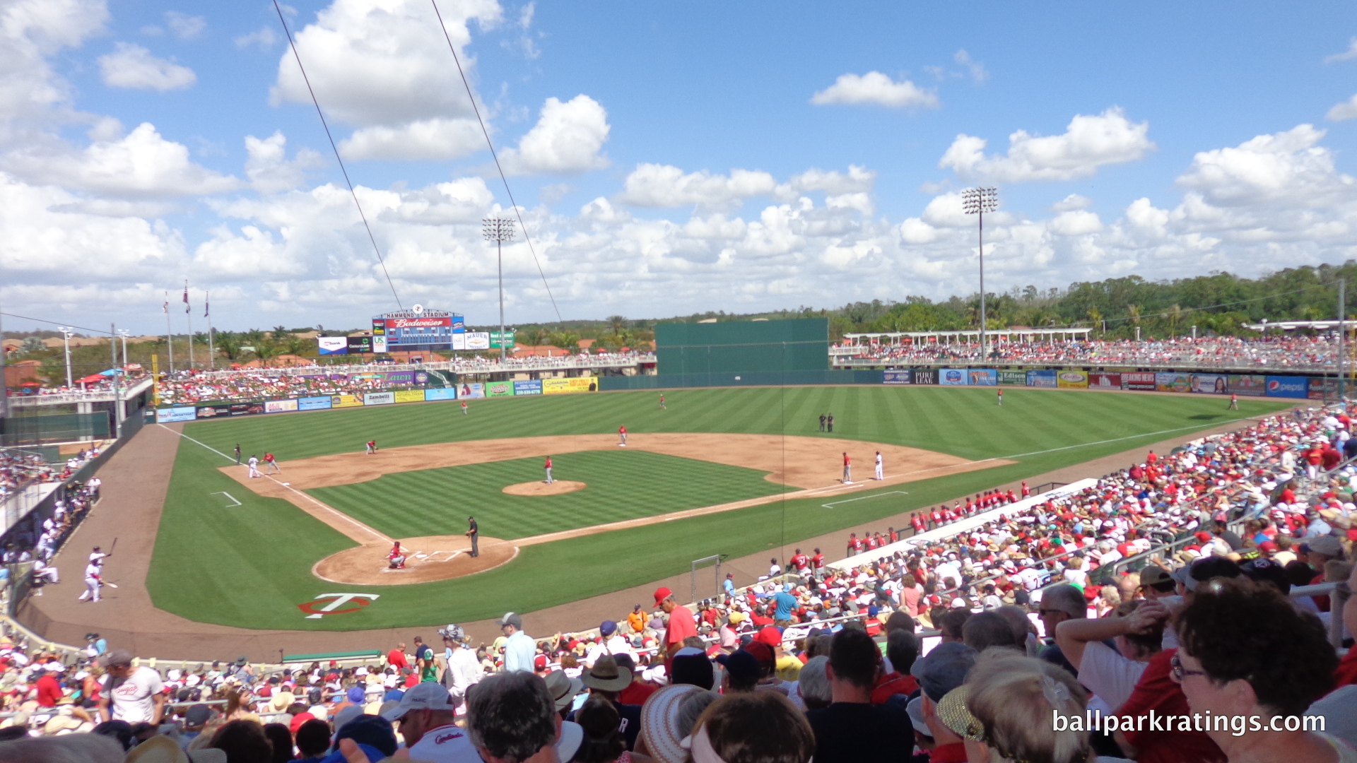
The orange tiled roofs so ubiquitous in Fort Myers nicely integrate some color into the ballpark. It’s always good to have some integration of local buildings into the park. Looking across the outfield scene left to right, the aesthetic is a bit uneven, but a major improvement nonetheless.
The changes to the previously unembellished façade behind home plate mostly consist of adding Twins retired numbers and pennants. If there’s anything that prevents Hammond Stadium from being one of the top interior designs, it’s this rather unremarkable structure, not to say its appearance hasn’t been enhanced. But the roof covering the 1st and 3rd base stands also appears to be unchanged.
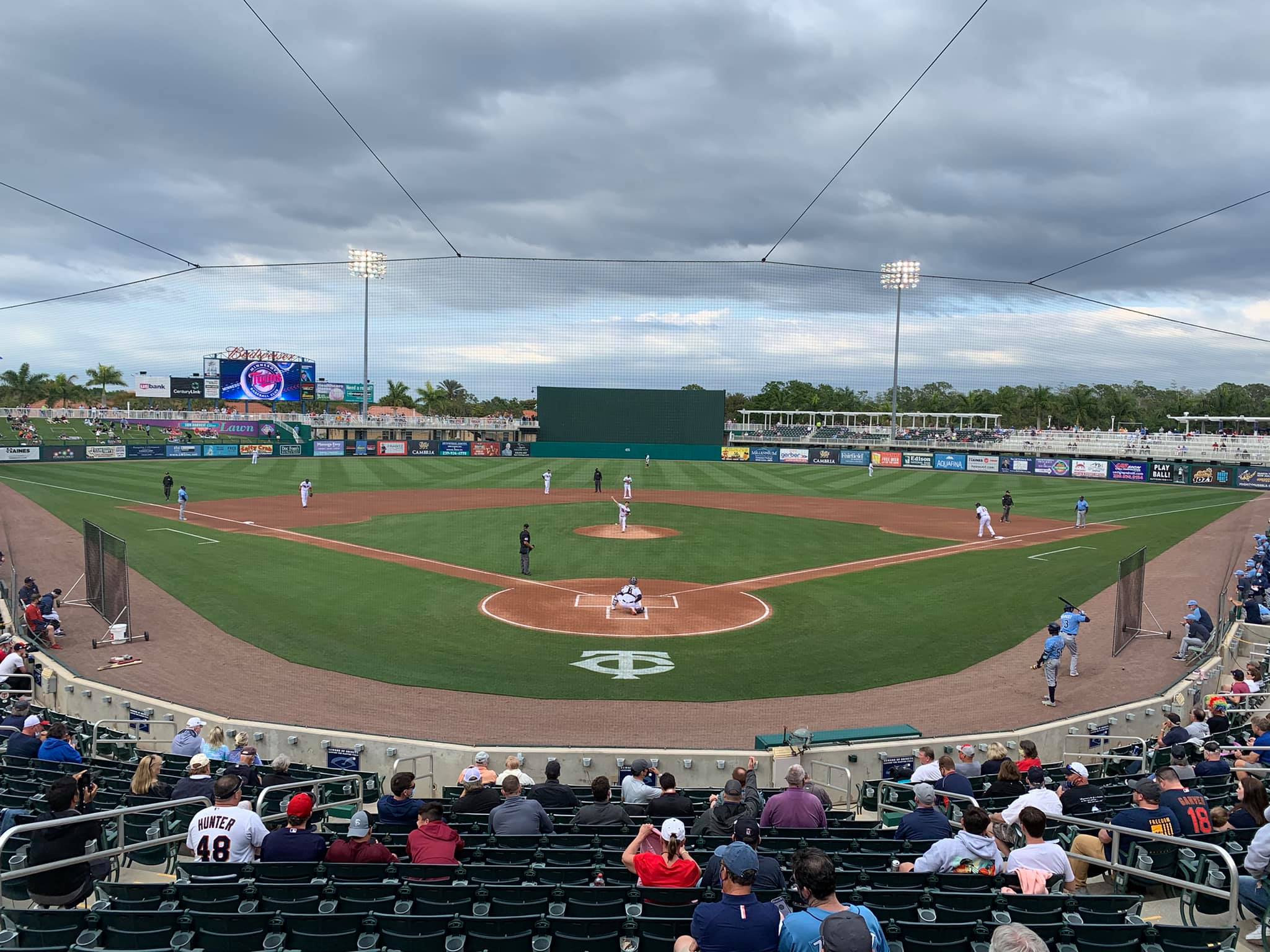
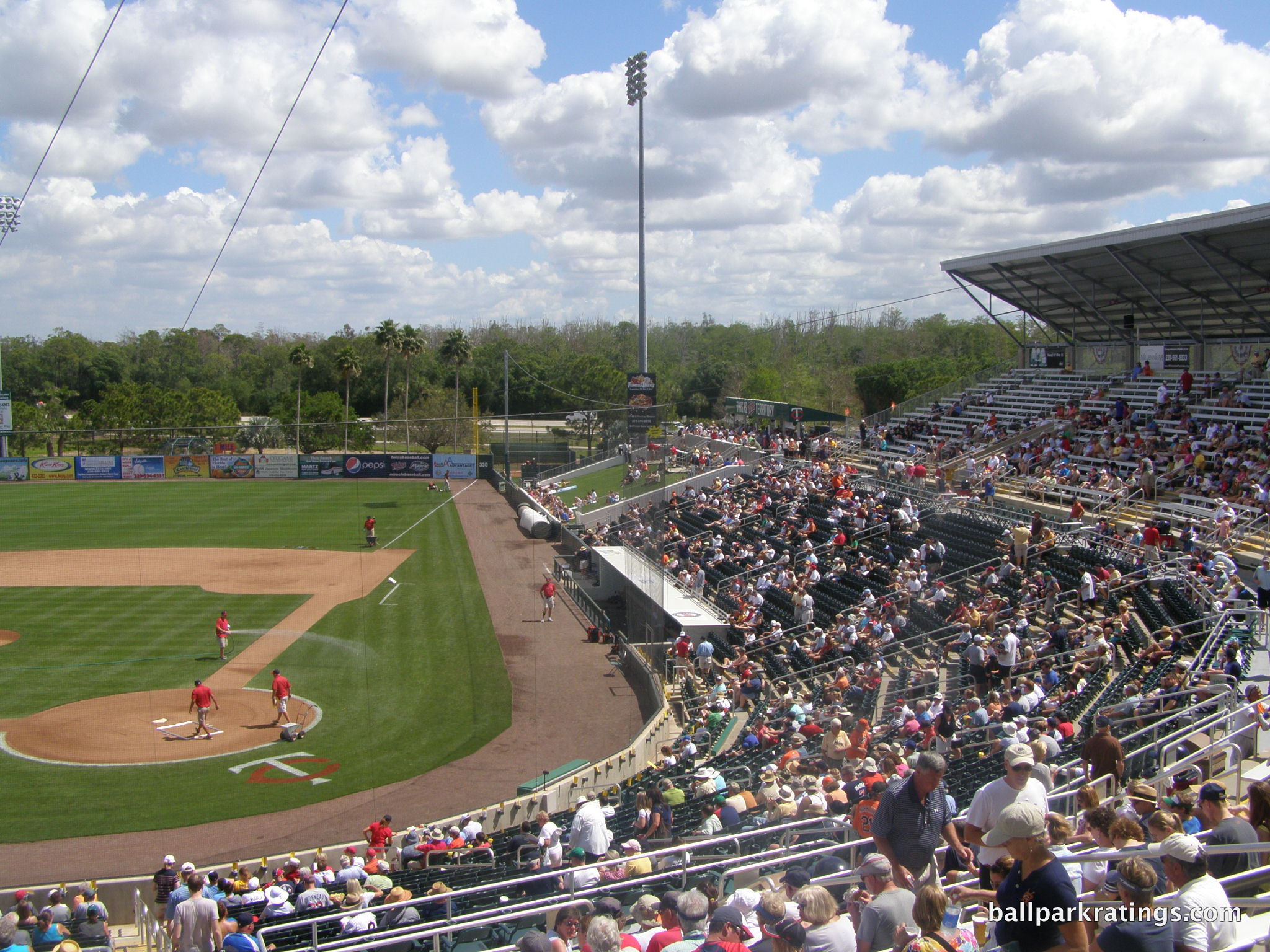
Similar to Tradition Field and others of the era, intimacy isn’t Hammond Stadium’s strong suit, as the grade of the seating bowl makes the park feel bigger than parks in more recent eras.
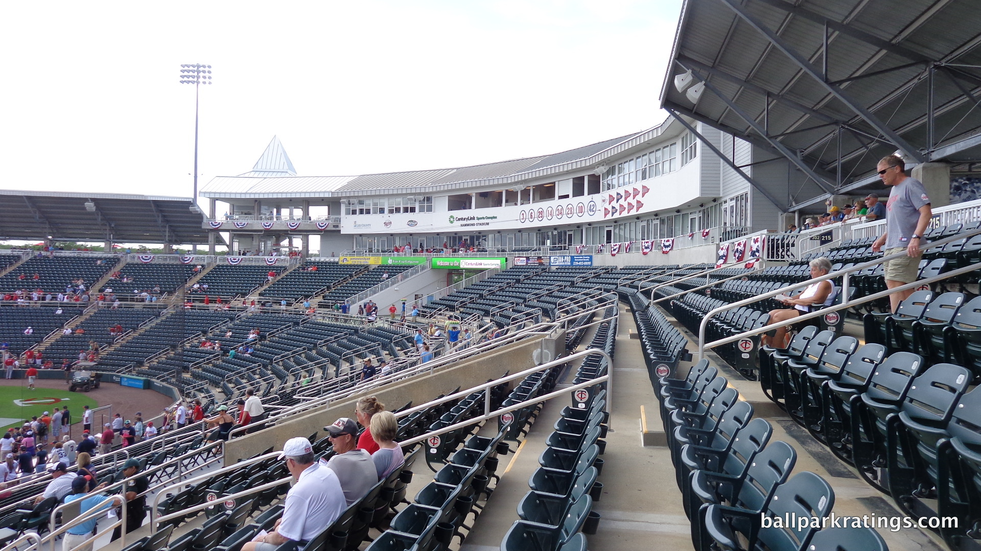
Also, for all the symmetry added by the grand entrance and the three new “witch hat towers”, I don’t like the asymmetry behind home plate on the right side created by the 3rd floor terrace seating and the 4th floor skybox. Note how the metal roofing on right side (1st base side) is clearly newer and shiner than the old one covering the rest of the interior façade. Once you notice this, it’s quite awkward.
When you take all the changes in totality, Hammond Stadium’s interior design has significantly improved.
Score: 12/15
Concourses (aesthetics):
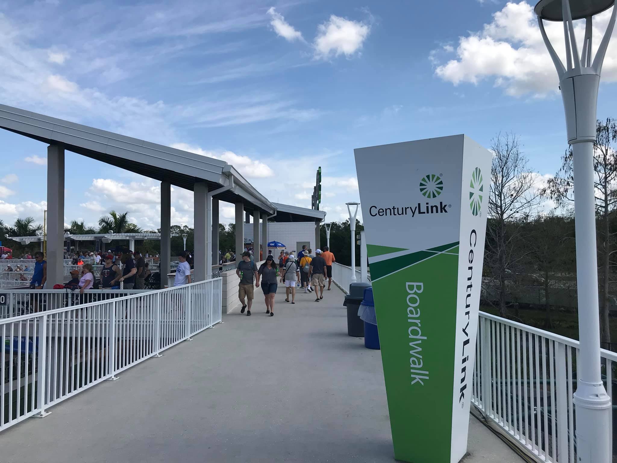
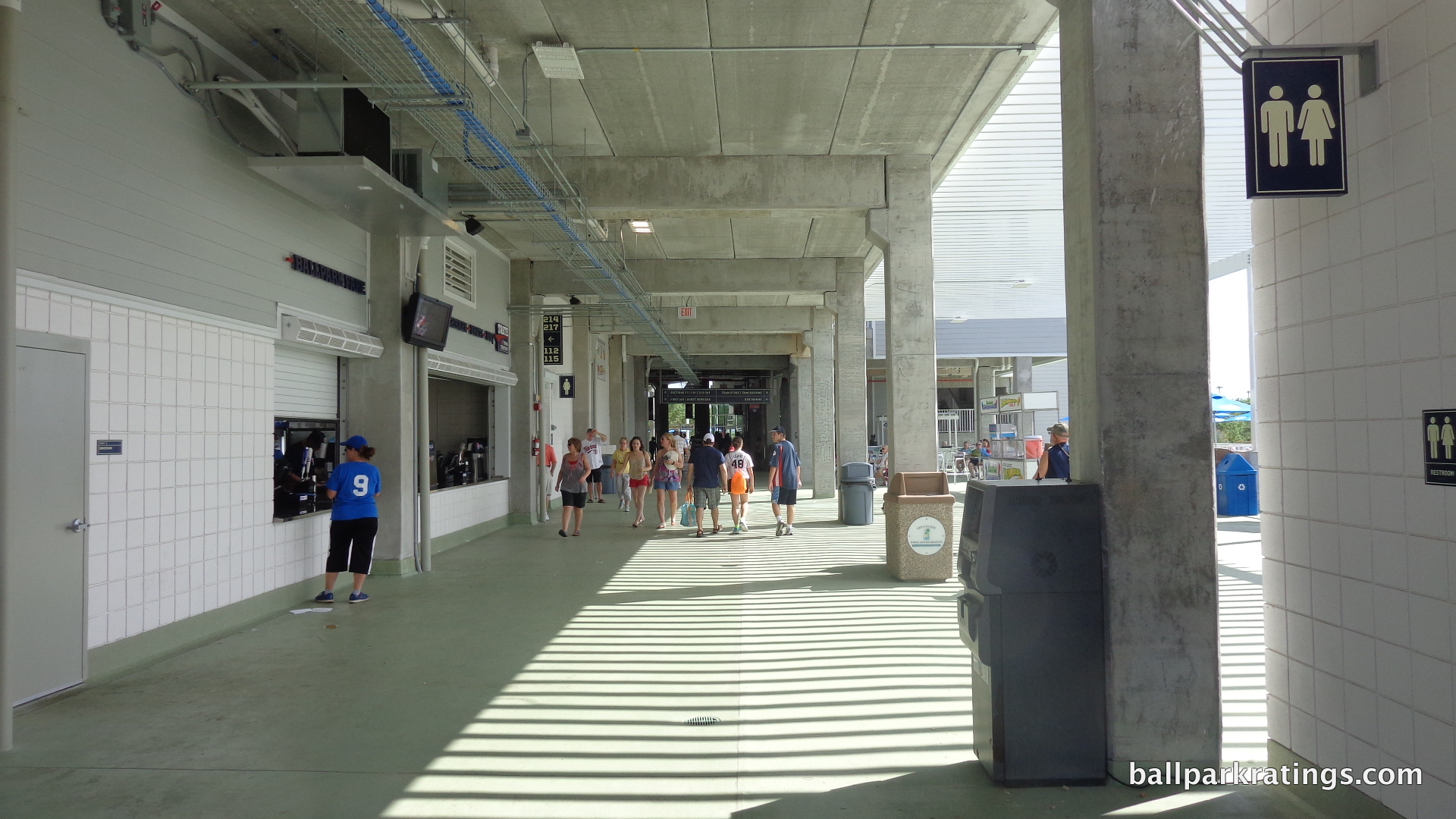
While the main concourse feels nicer due to its remarkable increase in size, it’s still not especially attractive. It’s simply functional, with white tiles and exposed concrete. The concession stands have a similar motif as the renovated exterior. The grand entrance and outfield boardwalk allow the concourse system to feel much more open and airy. Note the lake when walking by the boardwalk in right field.
Score: 2/3
Total: 22.5/28
Functionality & Essentials
Sightlines:
There obviously isn’t much differentiation in the quality of the sightlines at a small ballpark, and that’s especially true in spring training. It’s become a hallmark for spring training fans year in and year out to rave about the intimacy of their team’s ballpark.
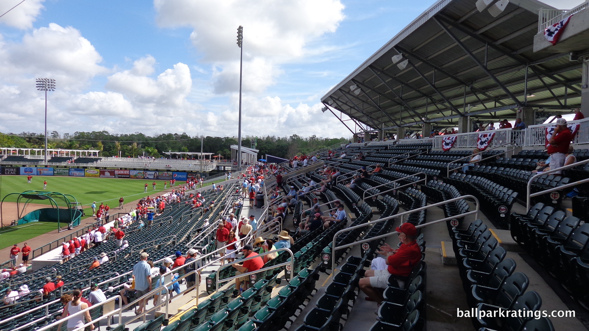
While it’s slightly better than Tradition Field (even though Tradition Field is smaller), this axiom isn’t as true as it could be for Hammond Stadium, in what is mostly a function of the era. The grade of the grandstand is rather steep here, to the point where sitting in the last row of the 200-level is analogous to sitting in the front row of the second deck of a major league facility. If you travel around Florida for spring training, it’s a pretty noticeable difference. Just try sitting a few rows behind the dugout here and compare it to Lakeland (an old facility) or Clearwater (a new one).
In my opinion, you simply don’t feel as close to the action as you should. There isn’t as much intimacy. I suppose the intention of this design choice (popular in the late 80s to early 90s) is to assure a taller individual sitting in front of you won’t block your view. The foul territory here is probably more expansive than the average new ballpark. Two rows of dugout box seats were added behind home plate before 2007.
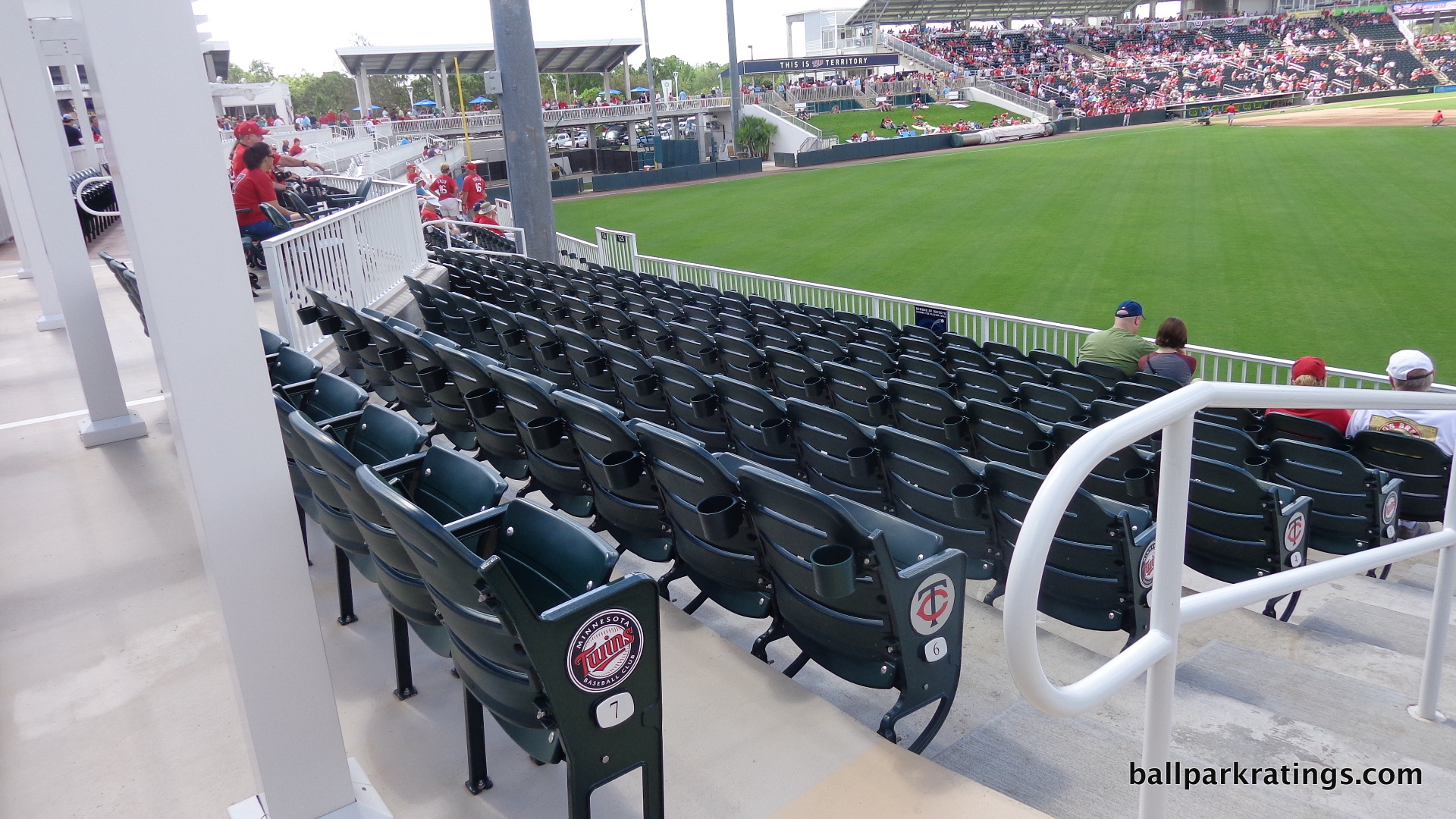
All seats of the fold-down variety are located around the infield, so Hammond Stadium doesn’t have any major issues with seating geometry. I have noticed that fans in the aisle will almost certainly block the first row of the 200-level seats. I guess 1991 is long ago enough where that common design flaw wasn’t addressed yet.
Fun factoid: Hammond Stadium has the most physical (i.e. not berm) outfield seats in spring training, and is the only ballpark with sections of standard fold-down seats in the outfield.
Score: 8/10
Seat Comfort:
Prior to the renovations, seating was an issue at Hammond Stadium, and that’s never a good sign.
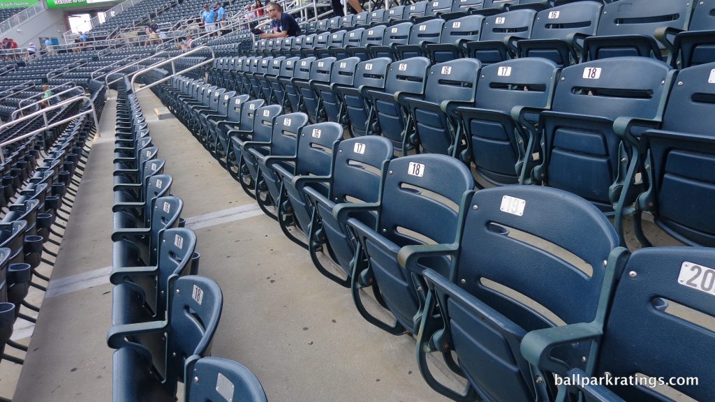
All 200-level sections at Hammond Stadium consisted of aluminum bleacher seats, more than any other park in the Grapefruit League for a long time. During the 2014-2015 renovations, new seats with cupholders were installed in this area. Sometime in the mid 2000s, the Twins replaced their light green 100-level seats with similar dark green seats equipped with cupholders. So the 100-level seats are older than the 200-level seats, for what it’s worth. The dugout box seats are identical to other 100-level seats. Foot room and width of all seating is average.
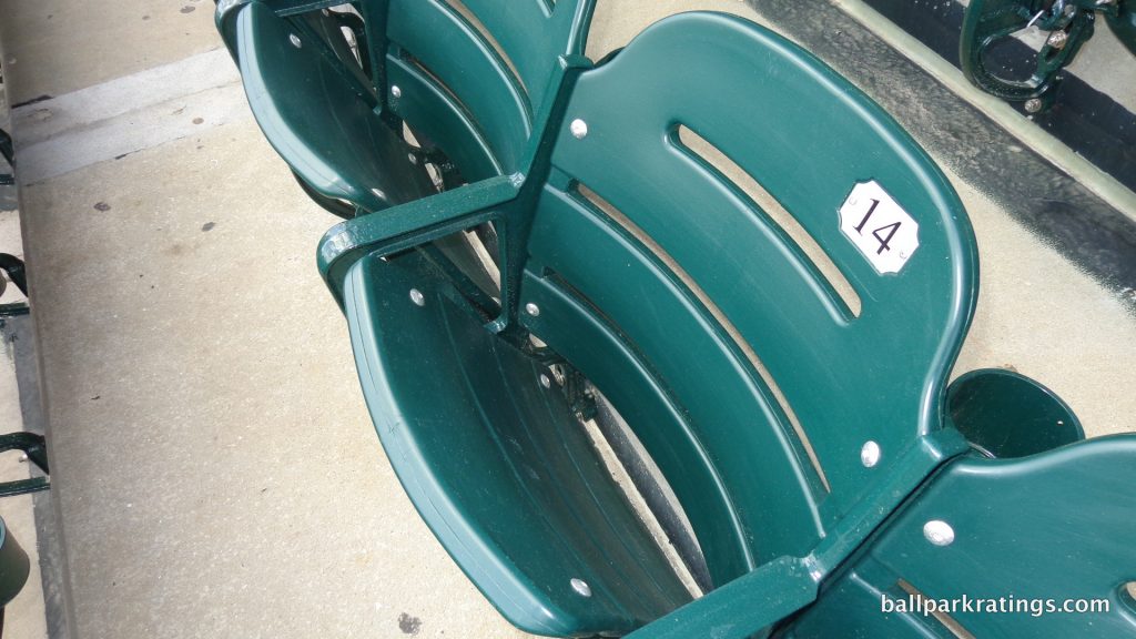
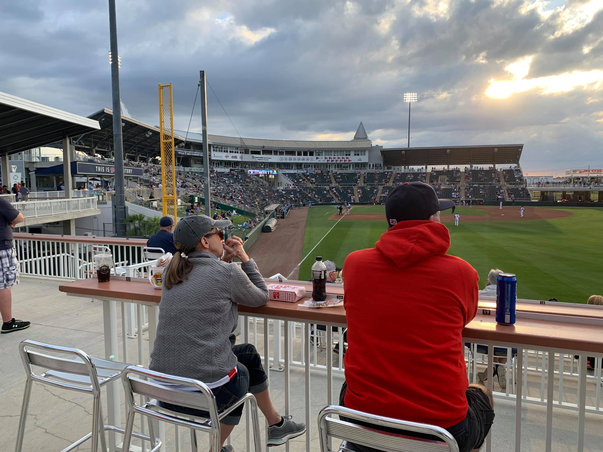
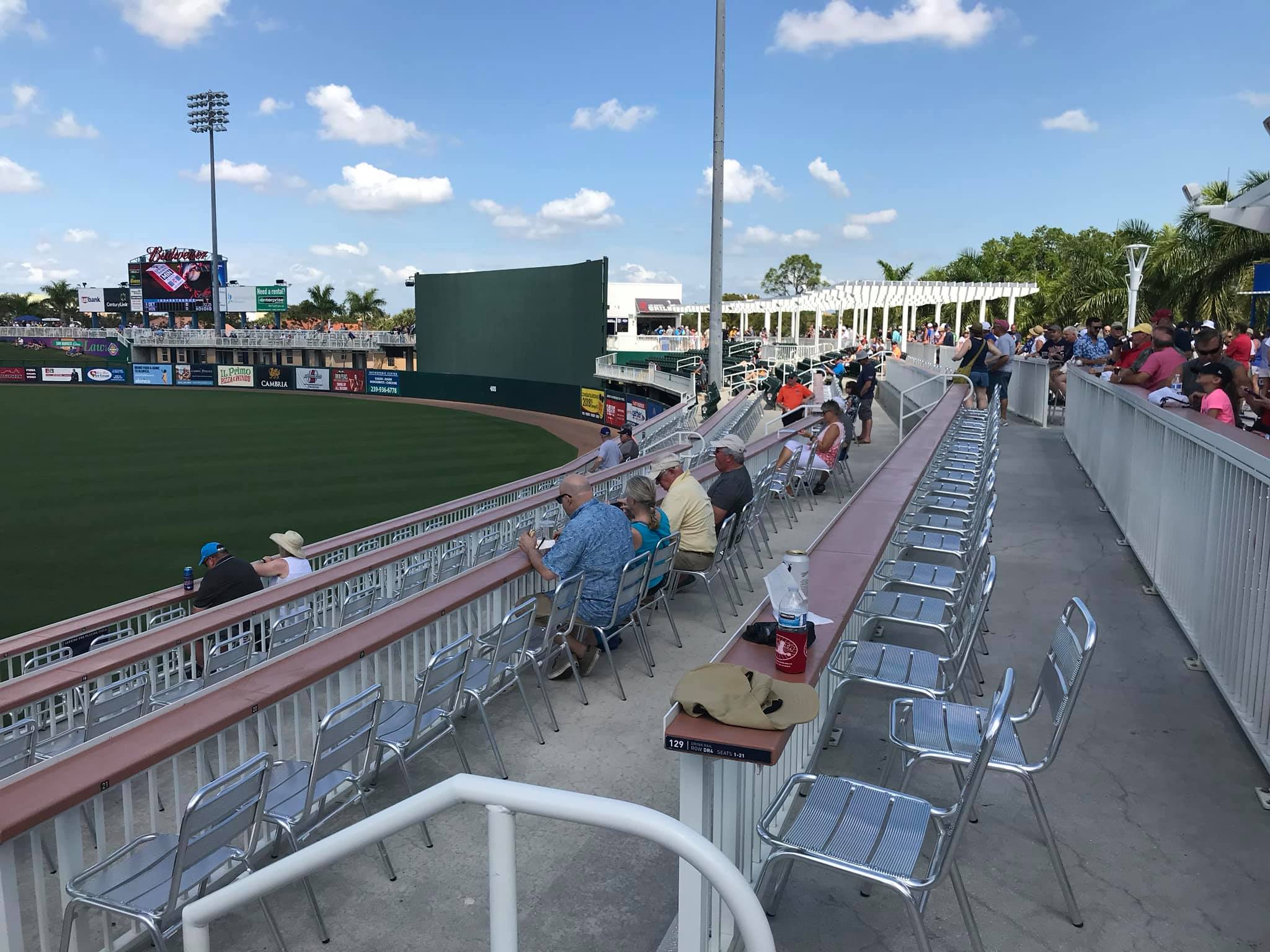
Hammond Stadium now has more drink rail seats than any ballpark in recent memory. Wooden drink rail seats are featured in the first/third base terrace, skydeck, above the right field bullpen and berm, above the left field bullpen and berm, and throughout the outfield.
I’m not sure where to include this, but the Twins berm down the right field line features one of the most conspicuous foul ball warning signs I have ever seen. The embankment is indeed directly in line drive territory, and, if you think about it, you are in a more defenseless position sitting back on that lawn.
Score: 3.5/5
Concourses:
With its new grand entrance and substantially expanded main concourse, I think Hammond Stadium increased its concourse score as much as any ballpark could. Prior to the renovations, the park was one of the most spatially constrained ballparks in spring training (perhaps only behind Tradition Field and Tempe Diablo Stadium).
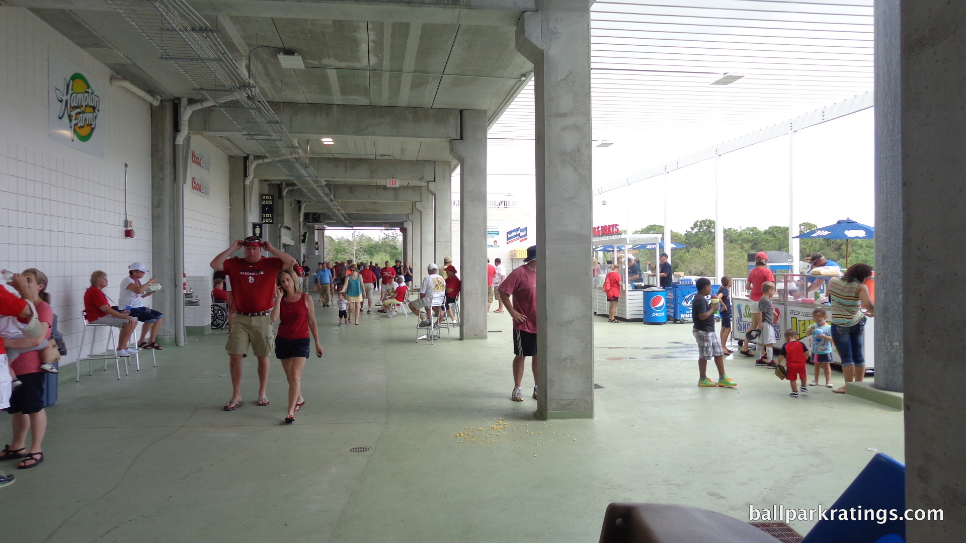
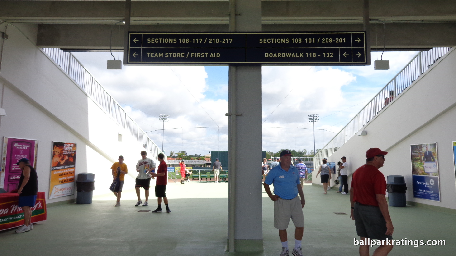
I wasn’t sure a significant expansion was feasible, because the main concourse is above street level. Fans enter the ballpark by walking up a story of stairs on either side of the fountain. Not only was the congested concourse enlarged, it is now one of the largest in spring training. The main concourse around the infield was widened from 17-21 feet to 45-68 feet.
For whatever reason, they didn’t expand the concourse down the right field line. The main concourse ends around the infield, so fans desiring to reach the new outfield “boardwalk” from the 1st base end of the main concourse must turn left and use the extension of the middle aisle. This may not seem like a big deal, but it doesn’t naturally encourage flow from this end of the main concourse to the outfield boardwalk (which the Twins want, because the money is where the bars are). Unwelcome horizontal discontinuities aside, Twins fans now have plenty of space.
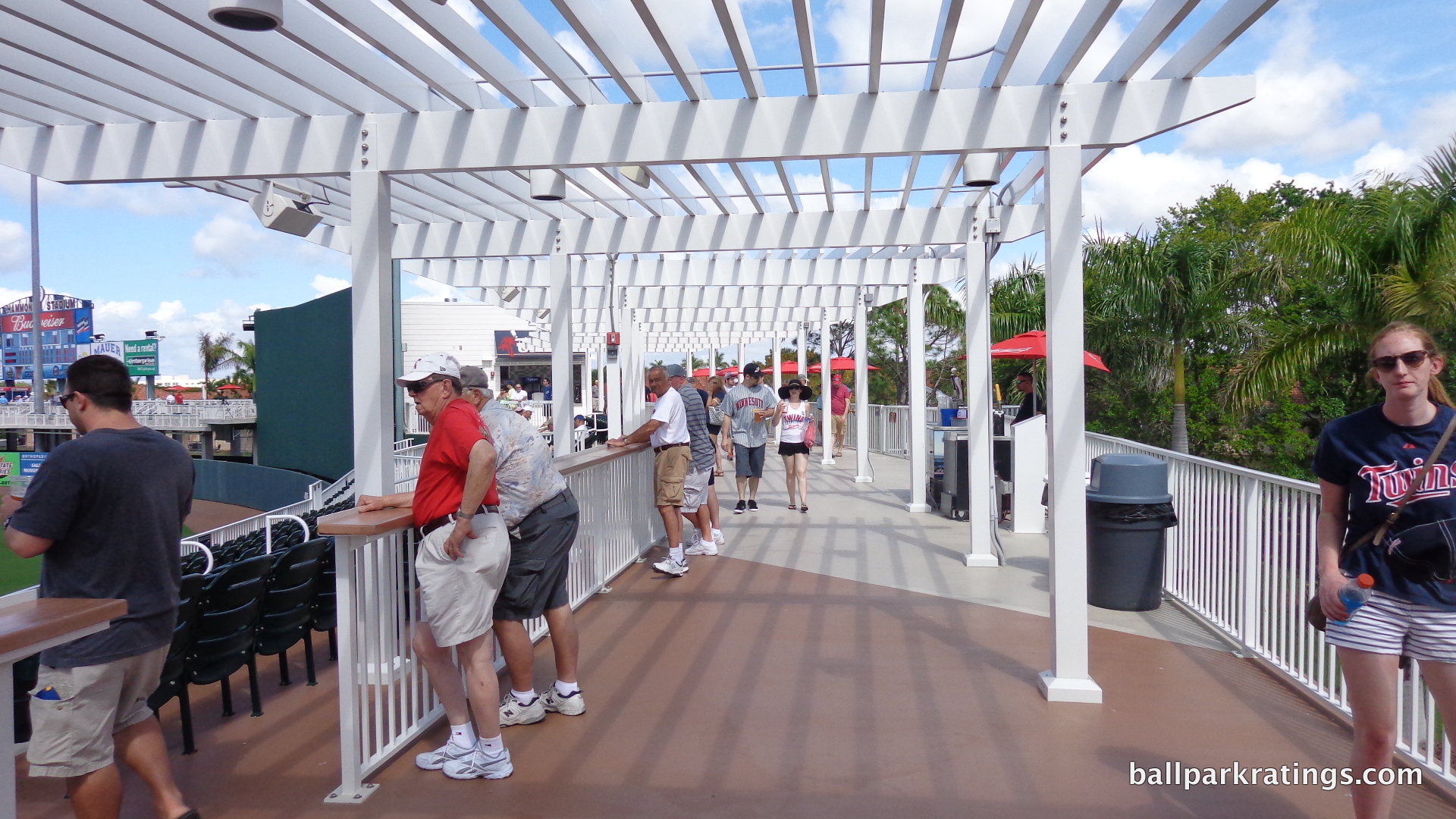
Of course, the new outfield boardwalk is an encouraging addition. But the boardwalk’s function as a concourse isn’t particularly notable; this concept has been done before. I don’t know if this should be construed as a disparagement, as it is perfectly functional, just derivative. But is that necessarily a bad thing? Outfield concourses are derivative. I guess it just doesn’t seem like a distinct concept like the “boardwalk” in Bradenton or Port St. Charlotte. The space does get narrow at times, perhaps because the Twins prioritized adding so much outfield seating, but it’s not a huge issue.
Like the Orioles in Sarasota, the Twins added a second concourse above the 200 seating. It is open to the playing field, but provides drink rail seating in the front. While not as nice, or large, it appears, as the one at Ed Smith Stadium, the 3rd and 1st base terraces are mini destinations in their own right. There are tables and a small bar area open to all fans. It’s a nice place to eat before the game. In 2016, the Twins expanded the 3rd base terrace down the left field line, which also functions as shade for those by the left field bar below.
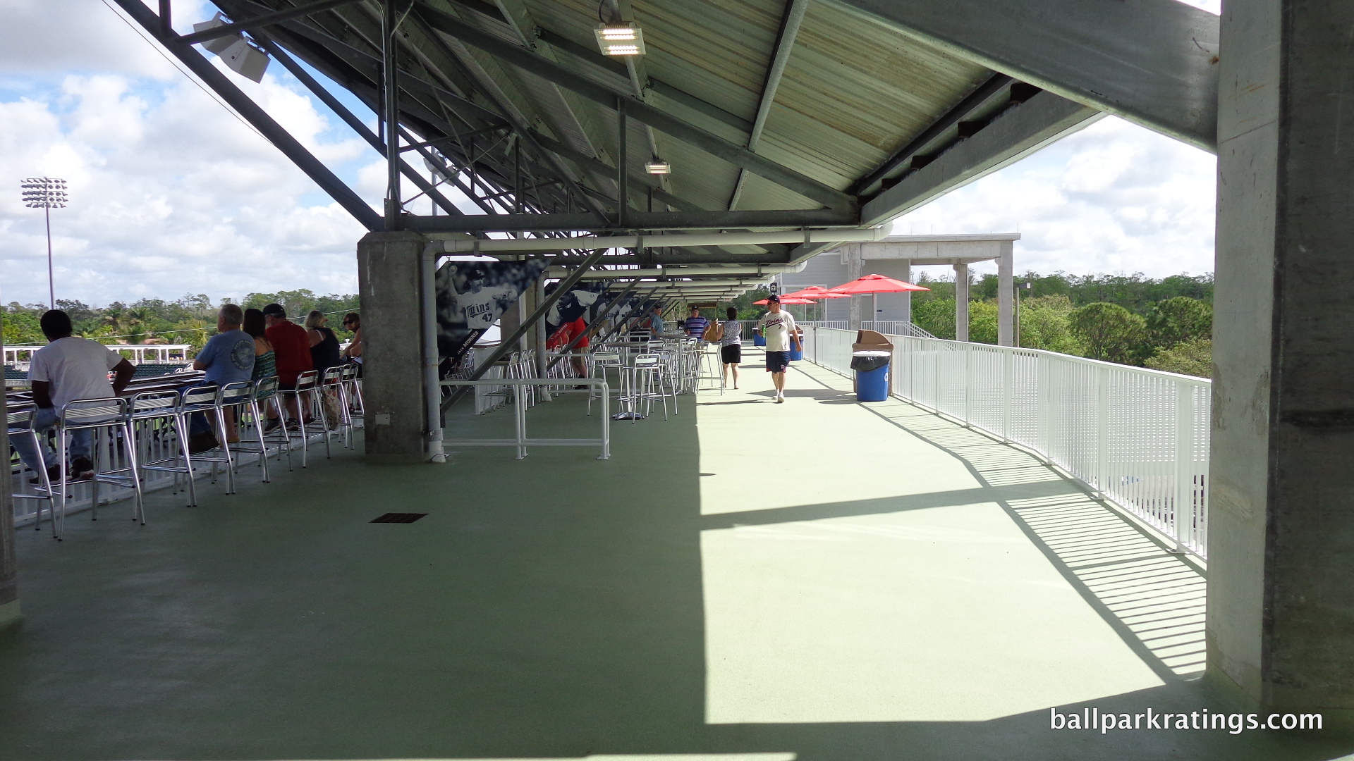
While Hammond Stadium doesn’t sport an “open” main concourse, the grand entrance bestows this sensation when circling around home plate. The park feels much more unencumbered inside and out.
Score: 5/7
Scoreboard System:
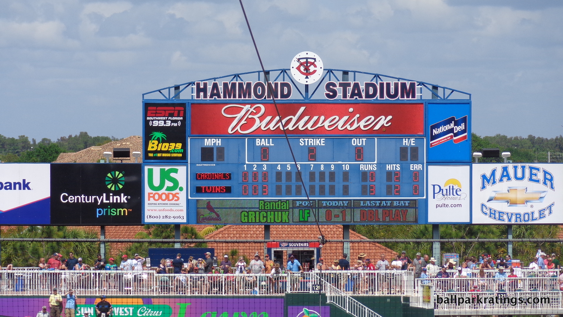
What’s the deal with some of these ballparks not significantly upgrading their scoreboard systems after multimillion-dollar renovations? Hammond Stadium inexplicably lacks a videoboard, just like McKechnie Field and Charlotte Sports Park. McKechnie Field I kind of get, with its Florida’s Fenway vibe.
The Twins park at least features a LCD board with the players’ name and stats for the day. For fans in the outfield, there is a colored line score board above the grand entrance. Hammond Stadium also has a speed pitch meter.
*Edit: A state-of-the-art HD videoboard was added in 2017.
Score: 3/3
Total: 19.5/25
Amenities & Features
Concessions:
Sometimes with new and renovated ballparks, we tend to get the “halo effect,” where because X looks like it’s upgraded, we assume Y must be upgraded as well. While the selection and quality of the food and beverages is sufficient enough, I’m don’t see any improvement with the renovations, other than the attractive new branding. The ballpark continues to be a good destination for alcoholic drinks, but I was a little disappointed.
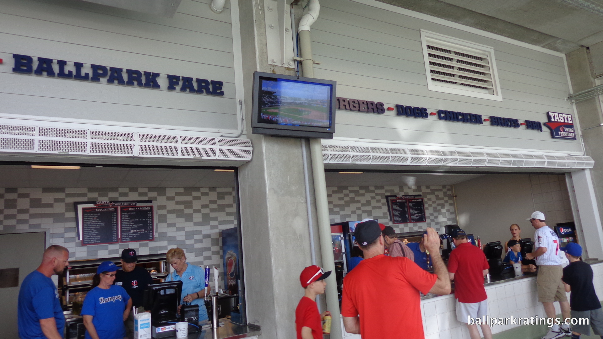
The new “Taste of Twins Territory” and “Lee Country Grill” look nice, but there isn’t much served that is out of the ordinary. They have fish and chips; along with some of the specialty items served at those other kiosks.
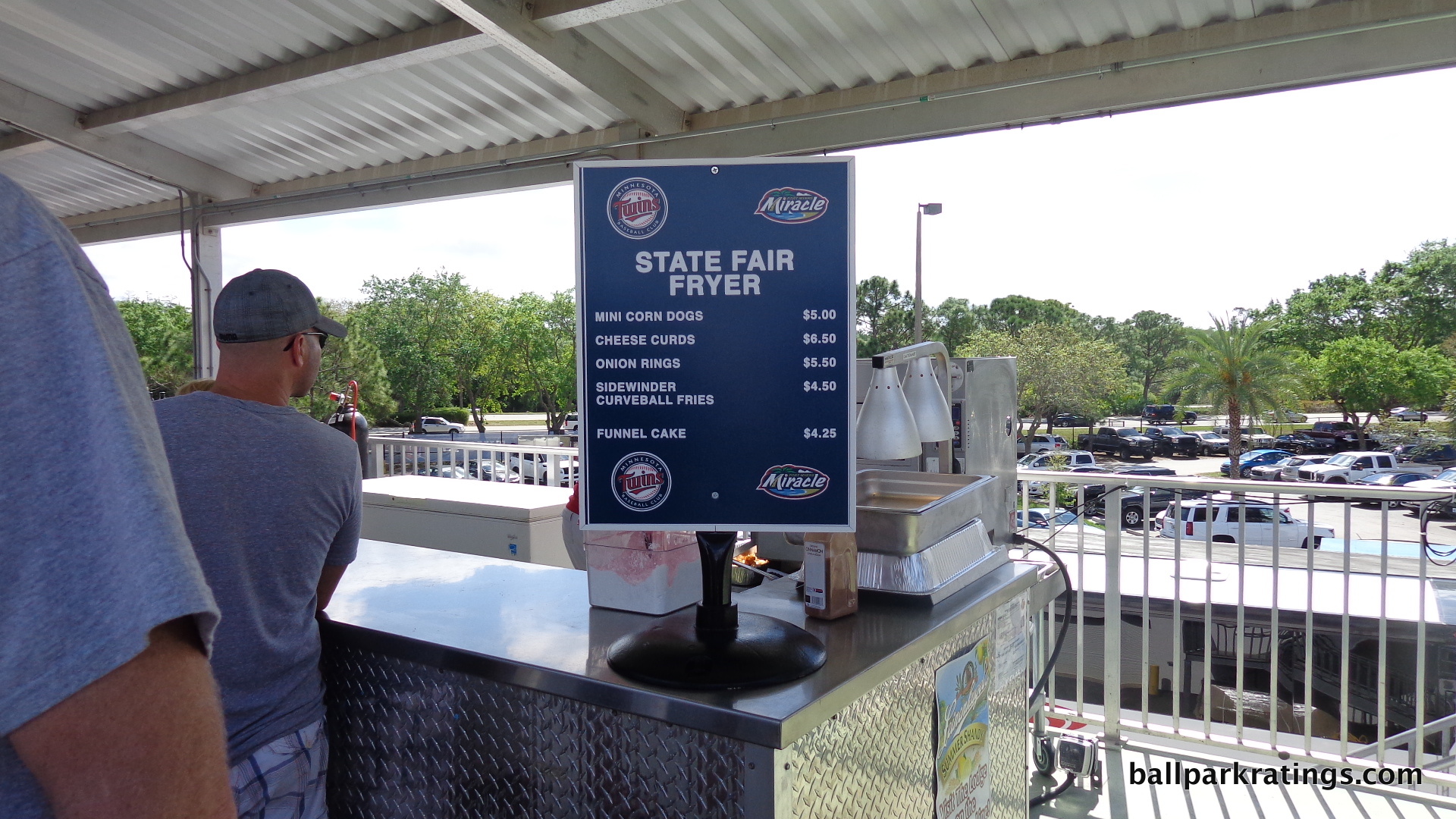
These specialty foods include those available at the “State Fair Fryer,” serving mini corn dogs, cheese curds, onion rings, and curveball fries. Hammond Stadium also features separate Philly Cheese Steaks stations. Like Target Field, Hammond Stadium has a mini donut stand.
Grilled hot dogs and brats are located in the back of the main concourse and on the terrace level. There are also burger grills in the outfield.
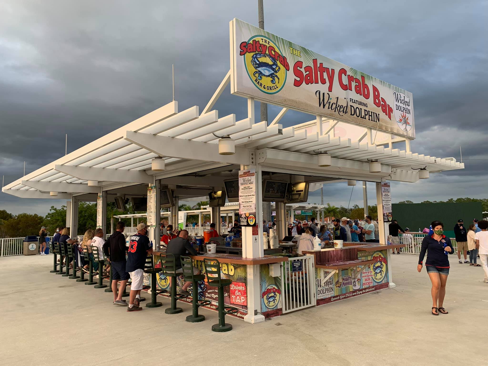
The Twins’ feature two full service bars detailed below, and one down the right field line that operates more as a concession stand (with similar options). The beer selection, especially on draft, isn’t nearly as extensive as before the renovations. Margaritas, liquor, and wine are also served, but there are no specialty cocktails like the “tiki bars” in Bradenton, Port St. Charlotte, or Clearwater. The highlight is the “beer shake.”
Looking back, there is even less here than I thought. Perhaps I missed something.
*Edit: The selection of food seems to vary year-to-year here more than other places, and I always seem to go in off years. In the past, specialty items have included shrimp boil, duck deli sandwiches, local BBQ, and Mexican food. Increased score warranted.
Score: 8.5/10
Premium Seats/Party Decks:
From the new suites to the bevy of drink rail seating, Hammond Stadium provides fans with a number of individual and group seating options.
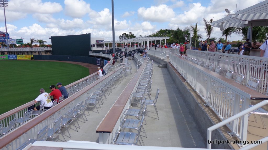
Even though they aren’t “premium seats” per se, my impulse is always to include drink rail seating in this discussion, perhaps because they often sell at a premium and a similar concept will go for $90+ per game at Steinbrenner Field in 2017. This seating option does provide the added amenities of shade and a place to put your food. At Hammond Stadium, they are everywhere: behind the bullpens, behind the lawn, in the outfield, and on the terrace level. The clear goal here is to link the alcohol at the bars to the seating. The ballpark also features semi-circular tables beyond left-center field.
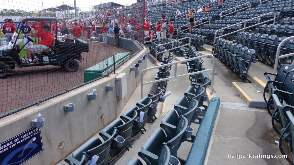
The first two rows of seats in between the dugout are sold as “dugout box” seats. Unlike most other teams that designate a higher price point for the first few rows behind home plate, these seats come with legitimate premium amenities, specifically VIP parking, in-seat service and exclusive game notes.
The luxury suites at Hammond Stadium have been completely rebuilt on the third floor, in stark contrast to the old dark rooms on the 4th floor without outdoor seating prior to the renovation. There are six of them. Each suite is named after a Twins legend and features photography of the corresponding player. The Twins suite honors Harmon Killebrew, while the Lee County suite features Kirby Puckett. The four other suites (Oliva, Carew, Hrbek, and Blyleven) are available for rental by fans. The suites have theatre style padded bottom seats.
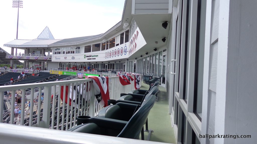
The Twins premium group area is the Skydeck, located to the right of the press box on the 4th floor. The space provides an interesting vantage point, about as high up as you’ll get in spring training. It has similar tables and drink rail seating featured throughout the ballpark, with a buffet. A permanent, full bar was added to the space in 2016.
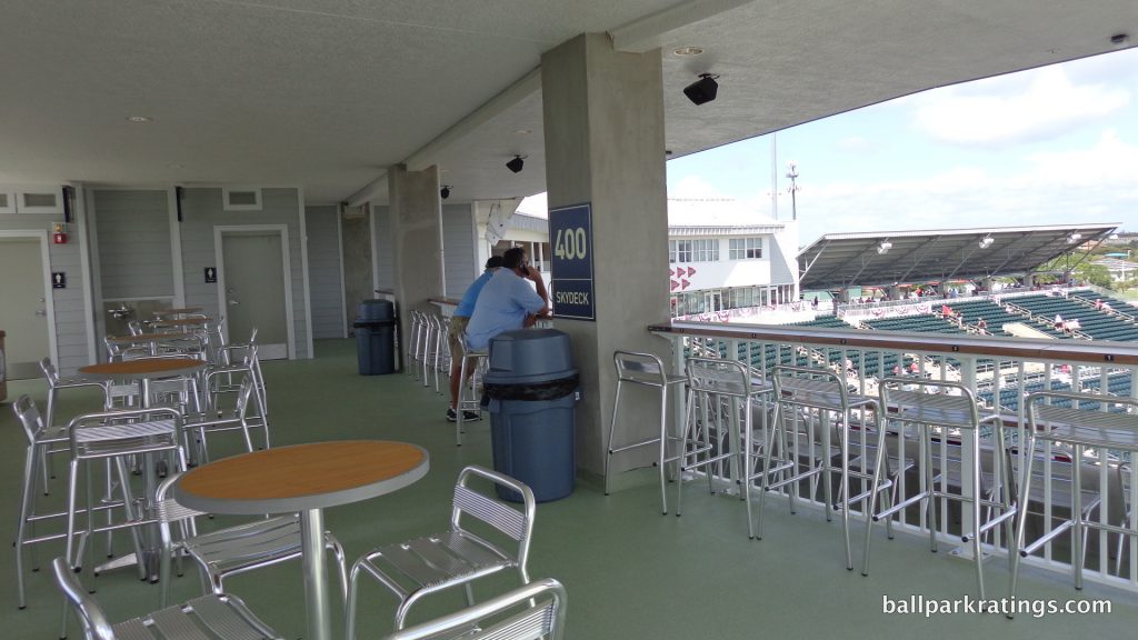
Score: 3/4
Restaurants/Bars/Sitting Areas/Social Spaces:
“Destination” bars, “selfie spots,” restaurants, and sitting areas are vital to ballparks in the 2010s, and Hammond Stadium mostly gets it. The sit down bars aren’t at the same level as others, but there are plenty of other sitting areas.
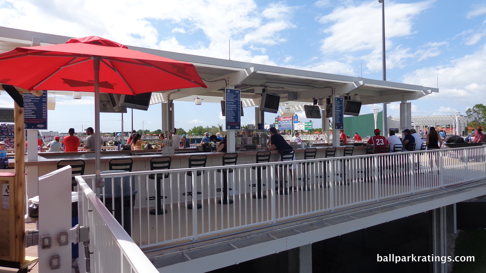
The Twins’ two full service bars are located beyond right field on the outfield boardwalk and down the left field line behind the bullpen, respectively. Not only is the alcohol selection not as extensive, but the bars are not as attractive, and not as well branded. Other ballparks really seem to embrace the tiki bar motif or extensively embellish these areas, but here they are rather bland. The expansion of the terrace level in 2016, done in order to provide shade to the left field bar, perhaps coincided with an enhancement below.
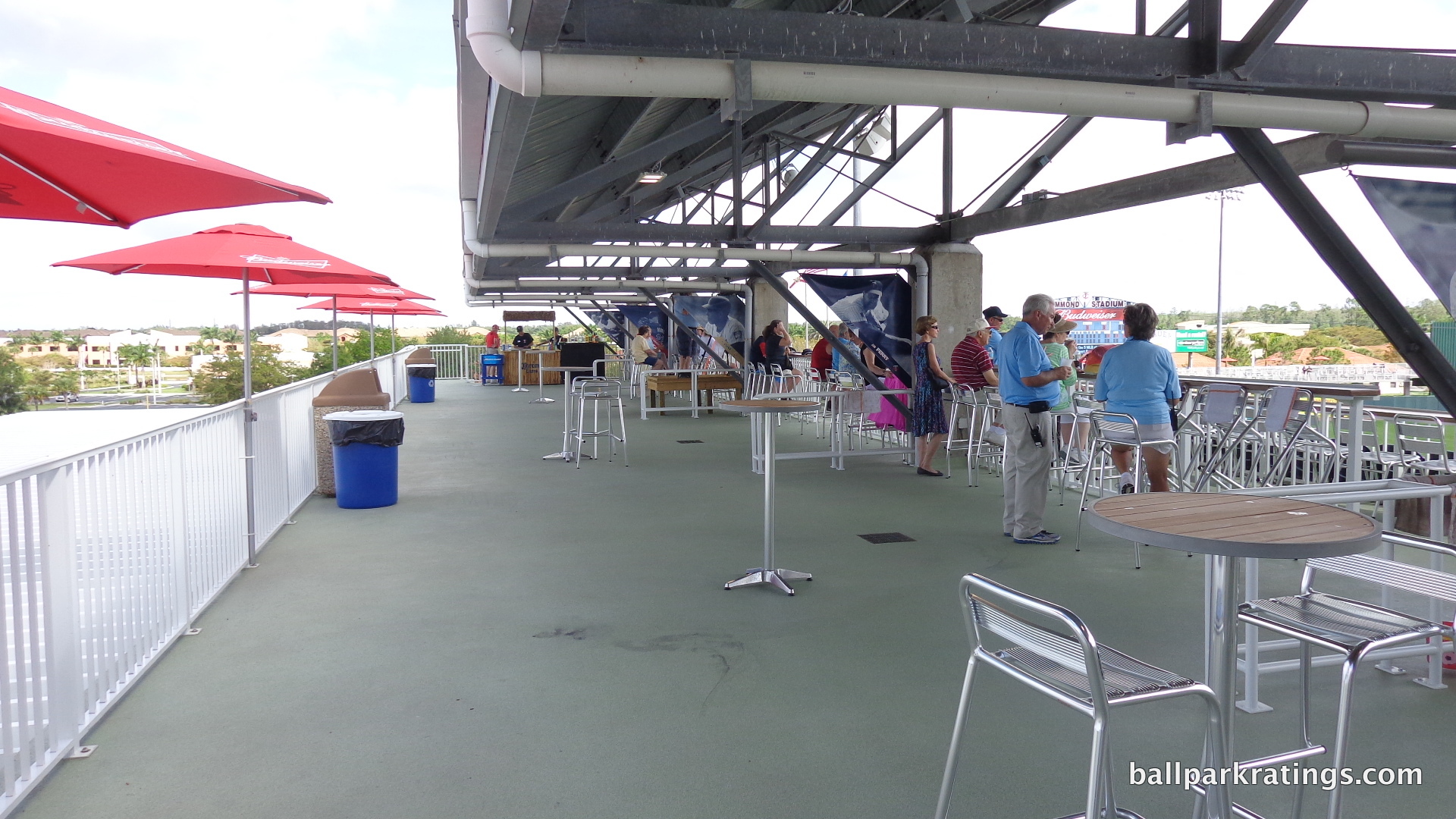
While there aren’t any couches or granite counter tops like in Sarasota, the terrace level is a comfortable area. But it functions more as a second concourse than a space to hang out. Unlike up the road, the aforementioned drink rails are reserved for ticket holders, so you can’t sit there.
The main concourse features plenty of room to sit down while finishing off those cheese curds. Tables and chairs are littered throughout the main concourse, and there is a dedicated sitting area in the right field corner that overlooks the lake.
Like the concourses overall, the Twins took from Ed Smith Stadium (intimate second-level area) and Charlotte Sports Park/McKetchnie Field (outfield bars and sitting areas).
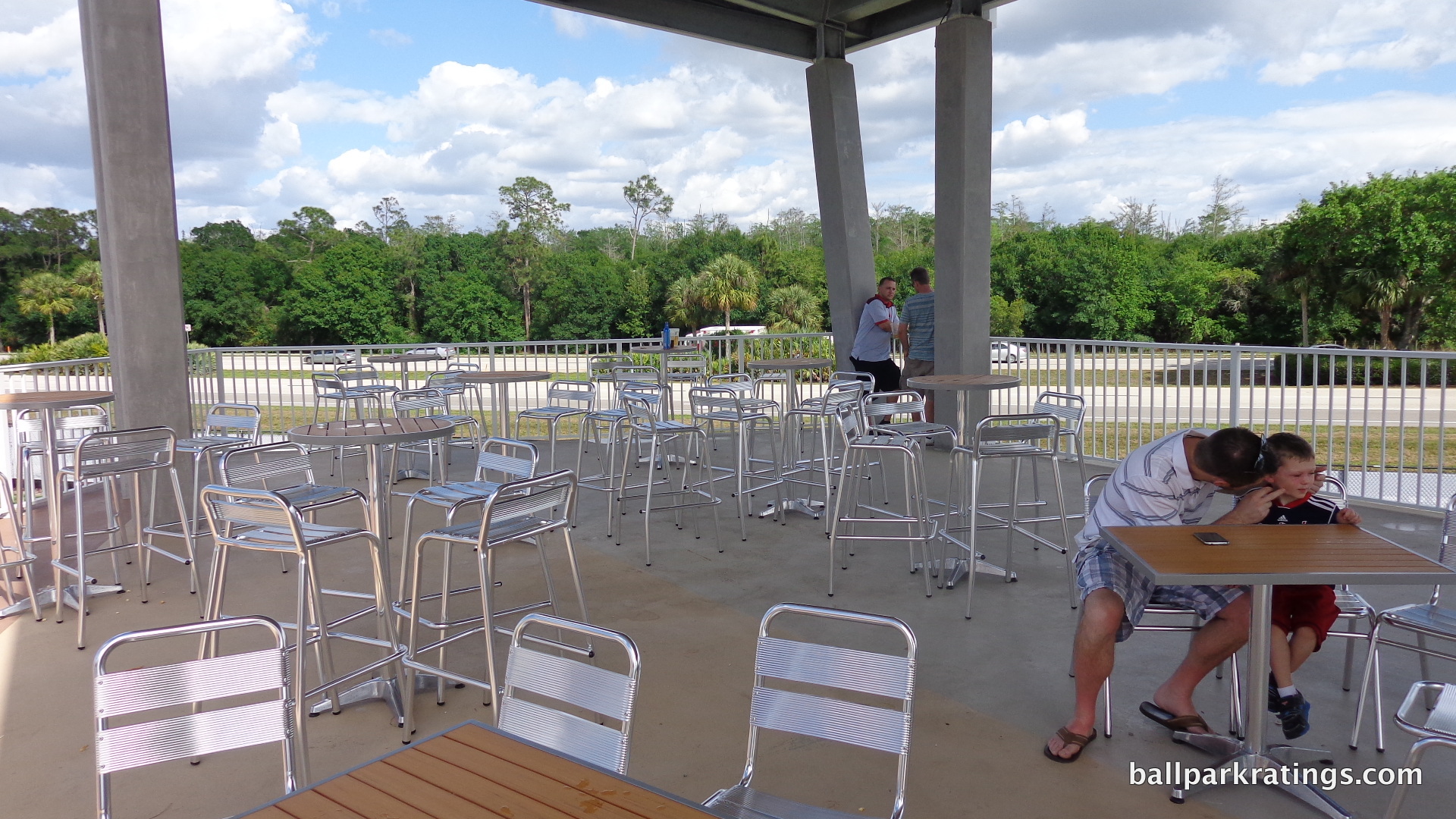
Score: 3.5/4
Entertainment/Miscellaneous amenities:
The Twins chose not to incorporate anything too expansive (or perhaps they didn’t have the space), like the playground in Port St. Charlotte, and that’s perfectly fine. At the base of the main entrance, there is a speed pitch machine. This falls short of a couple parks in Florida and some in Arizona, but this is the extent to which most teams go in spring training for entertainment.
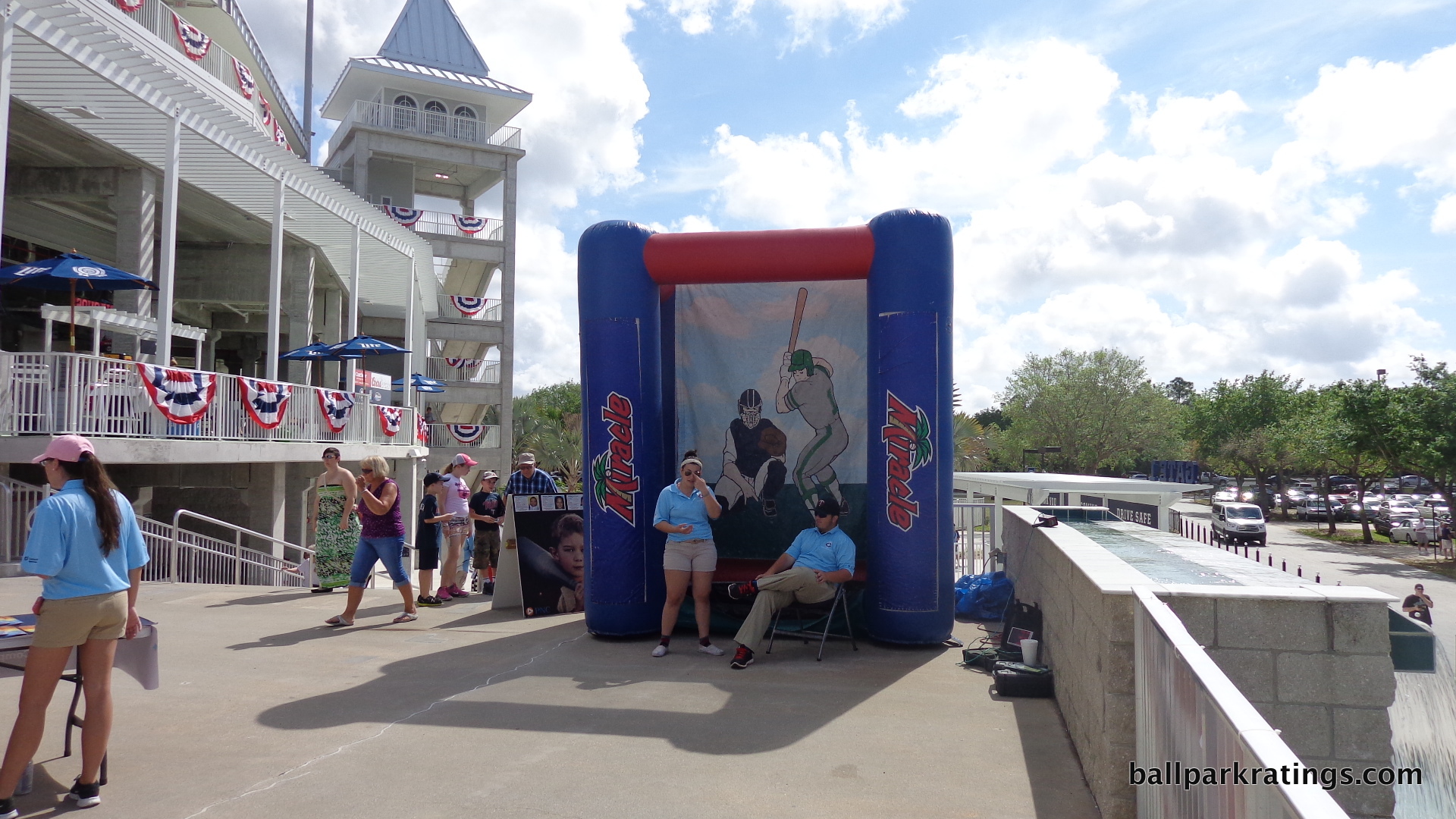
Score: 1/2
Total: 15/20
Atmosphere, Vibe, & Policies
Ballpark Personality:
While Hammond Stadium’s distinctiveness primarily comes from the fans in this case, there are a number of unique design touches and Twins references that make this ballpark stand out.
The park’s most identifiable feature will always be its majestic entrance. With manicured palm trees and the famous fountain, Hammond Stadium will be one of the more memorable ballparks along your Grapefruit League voyage, regardless of the inside.
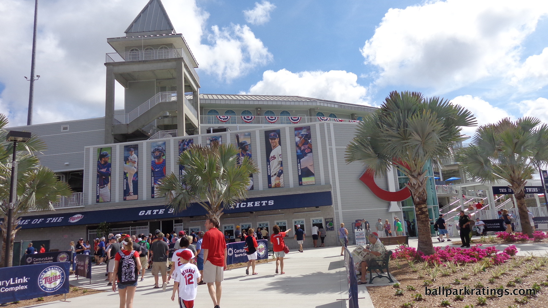
While not as prominent as I would want, there are a substantial number of references to the Twins throughout the ballpark. The façade below the press box behind home plate features team retired numbers and championship pennants. Streets entering the complex are named after club greats. Banners of current Twins players cover the exterior façade on the left and right sides. There are also banners throughout the main concourse.
The “Taste of Twins Territory” concessions don’t provide anything too unique, but the “Street Fair Fryer” down the right field lines serves mini corn dogs and cheese curds, which are popular in Minnesota.
Score: 8.5/10
Fan Support/Attendance:
Throughout the new millennium, Twins fans have been among the most loyal snowbirds in baseball, and perhaps the most impressive. In recent years, their attendance is usually just below the Yankees, Red Sox, and Phillies, near the Tigers and Braves depending on team quality. In fact, going back to 1996, only the Yankees match them in terms of consistency, with the Phillies varying and the Red Sox not being as consistent before jetBlue Park. The Twins might be alone when looking at inelasticity to team quality, a few outliers notwithstanding (like their dramatic, one time, 1997 drop off without Kirby Puckett).
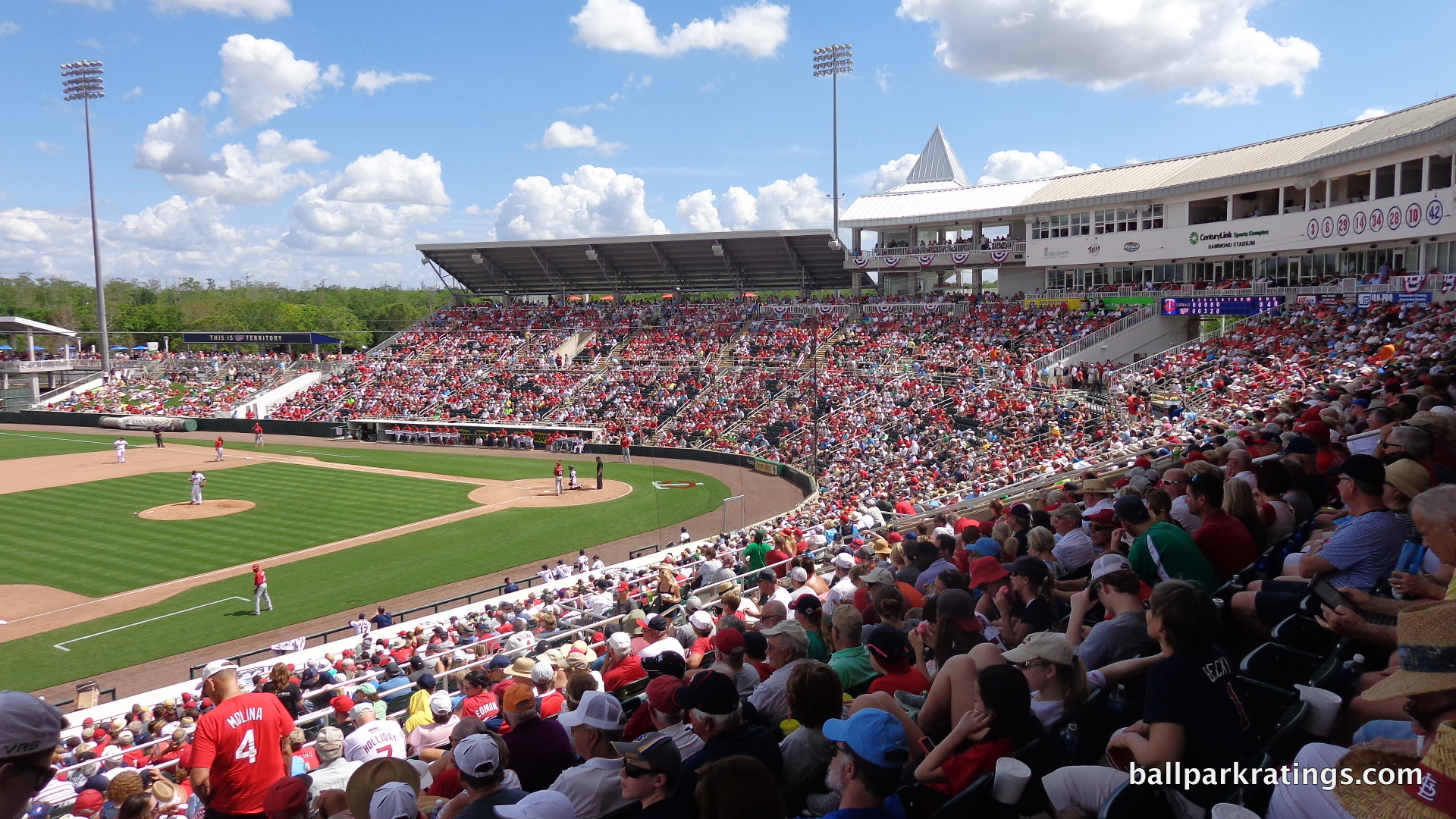
I’m not entirely sure why this is, compared to other, small to medium market teams in the north. Some similar markets have never reached the Twins attendance levels regardless of team quality, despite trying out multiple spring training locations in some cases. Is the location in Fort Myers that big of a draw? Did Twins fans fall in love with the strong sense of place associated with Hammond Stadium? Was there a significant desire to see their Twins play outdoors in contrast to the Metrodome (pre-’10)? Or is the contrast that stark compared to the snowy winters in Minnesota?
Perhaps the Twins fan base is just that good. We couldn’t get a good read on the Twins’ fans loyalty because their team played in the Metrodome long past its prime, but the Twins have some of the best fans in baseball.
Score: 5/5
Ballpark Policies/Fan Friendliness:
Prior to 2015, Hammond Stadium opened an incredible 3 hours before the first pitch, allowing fans to see both teams take their entire batting practice. While they rolled that back to the standard 2 hours, the park is still a pretty fan friendly place.
Ushers aren’t overbearing, and Hammond Stadium is very “walkable,” as it should be. In terms of food and beverages, only bottled water is allowed inside, which isn’t too unusual.
Unfortunately, autographs seem to be harder to come by than at the average spring training park.
Score: 2/2
Total: 15.5/17
Conclusion
Bonus:
For building an ambitious park in 1991, the first spring training super stadium +3
For a successful renovation, in 2014-2015 +1
For the Churchhill Downs exterior with fountain +1
For the new boardwalk +1
For a surplus of seating options, including the skydeck, terraces, and many drink rail seats +1
For multiple bars and being one of the best ballparks for drinks +1
Score: 8
All of this parsing over the renovations aside, I think Hammond Stadium will always play a special role in the long linage of spring training ballparks.
During the late 60s to early 80s, spring training baseball had a ballpark drought, with only two stadiums opening during that time period. The old parks were seen as sufficient. As the concept of sophisticated training expanded, there was a massive ballpark building wave in the mid-late 80s, starting with Osceola County Stadium (1984), in many ways the first modern spring training “complex” as we know it today. Ballparks in Chandler (86’), Port Charlotte (88’), Baseball City (88’), Plant City (88’), Port St. Lucie (88’) and Sarasota (89’) soon followed.
While the concept of spring training being a “complex” was also expanded here more than ever before, Hammond Stadium (91’) was the first where some attention was paid to the ballpark’s aesthetic attractiveness, or at least aesthetic whim, and the overall fan experience. With the exception of HohoKam Park (97’), all spring training ballparks have featured some varying degree of aesthetic vision since then, while those that opened prior lacked any at all.
Prior to this place, no team talked about their spring training complex using terms like “style” and “grace.” Whether it was through design motifs, identifying aesthetic anchors, or gimmicks, teams after 1991 have framed their park in those terms.