Target Field
| Setting | 18.5/20 | 1 Thumb Up |
|---|---|---|
| Locale | 4.5/5 | 1 Thumb Up |
| Accessibility | 5/5 | 2 Thumbs Up |
| Neighborhood Local Scene | 9/10 | 1 Thumb Up |
| Architecture & Aesthetics | 52/65 | 1 Thumb Up |
|---|---|---|
| Exterior Design/Aesthetics | 15/20 | 1 Thumb Up |
| Interior Aesthetics/Visuals | 33/40 | 1 Thumb Up |
| Concourse Aesthetics | 4/5 | 1 Thumb Up |
| Functionality & Essentials | 40.5/50 | 1 Thumb Up |
|---|---|---|
| Sightlines: Field Proximity | 10.5/15 | Thumb Sideways |
| Sightlines: Seating Geometry | 4/5 | 1 Thumb Up |
| Seat Comfort | 6.5/9 | Thumb Sideways |
| Concourse Functionality | 13.5/15 | 1 Thumb Up |
| Scoreboards/Tech | 6/6 | 2 Thumbs Up |
| Amenities & Features | 40.5/50 | 1 Thumb Up |
|---|---|---|
| Concessions: Food Variety | 4.5/5 | 1 Thumb Up |
| Concessions: Food Quality | 4.5/5 | 1 Thumb Up |
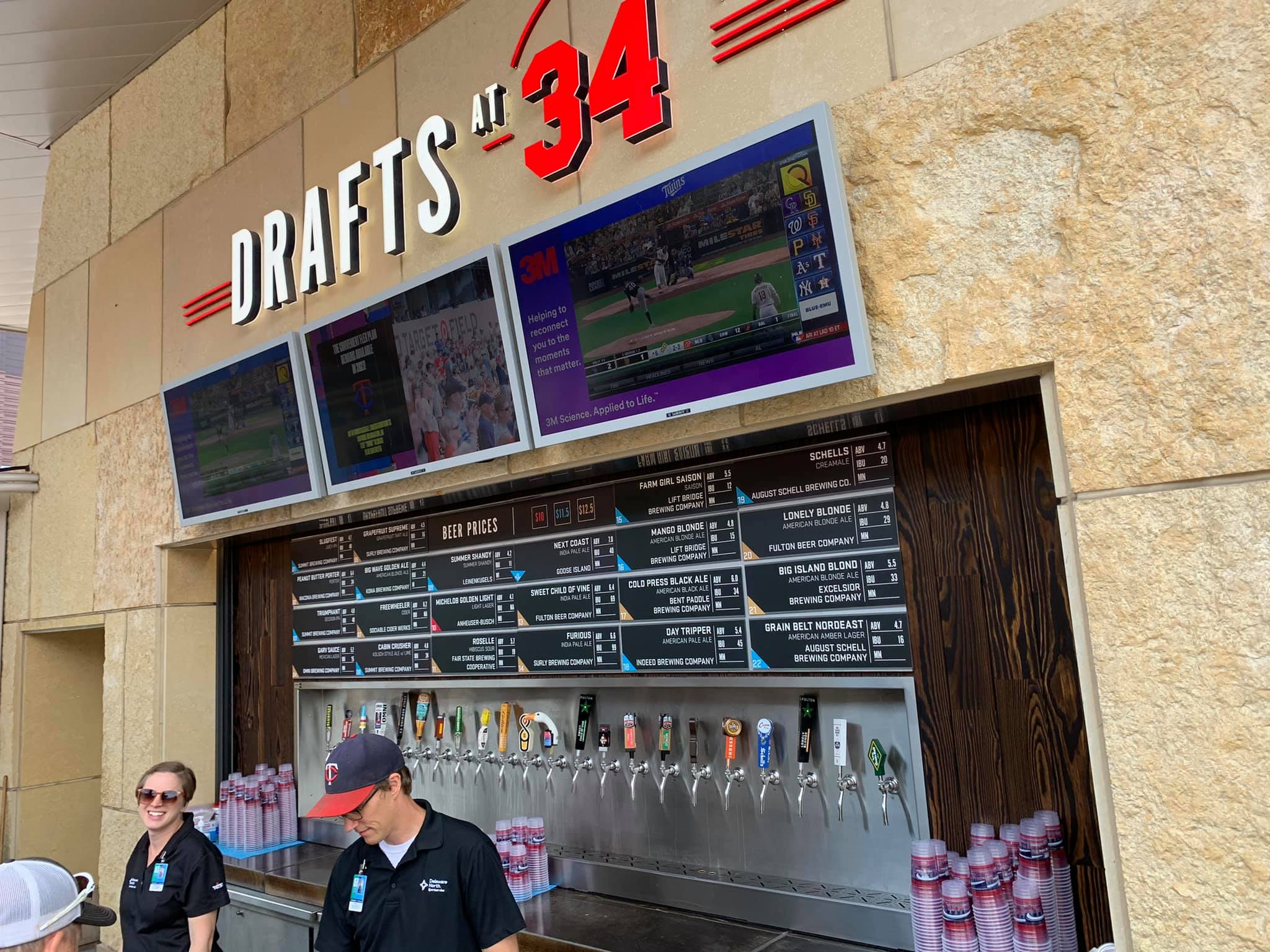
| Concessions: Craft Beer/Other Drinks | 4.5/5 | 1 Thumb Up |
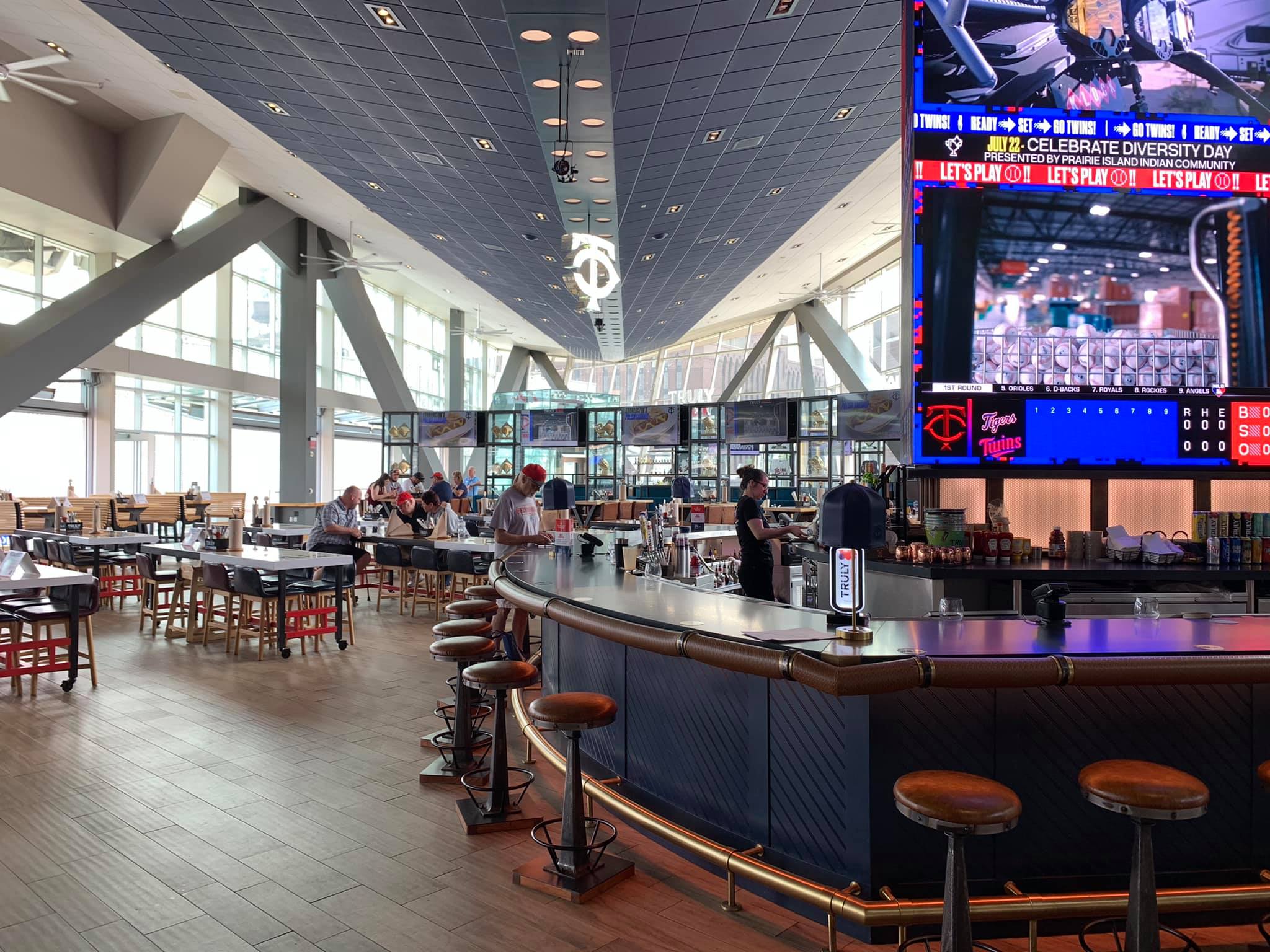
| Social Gathering Areas/Restaurants | 10/10 | 2 Thumbs Up Star |
| Premium Seating/Clubs | 7.5/9 | 1 Thumb Up |
| Historical Exhibits, Memorabilia, Art, & Other Displays | 6.5/10 | 1 Thumb Down |
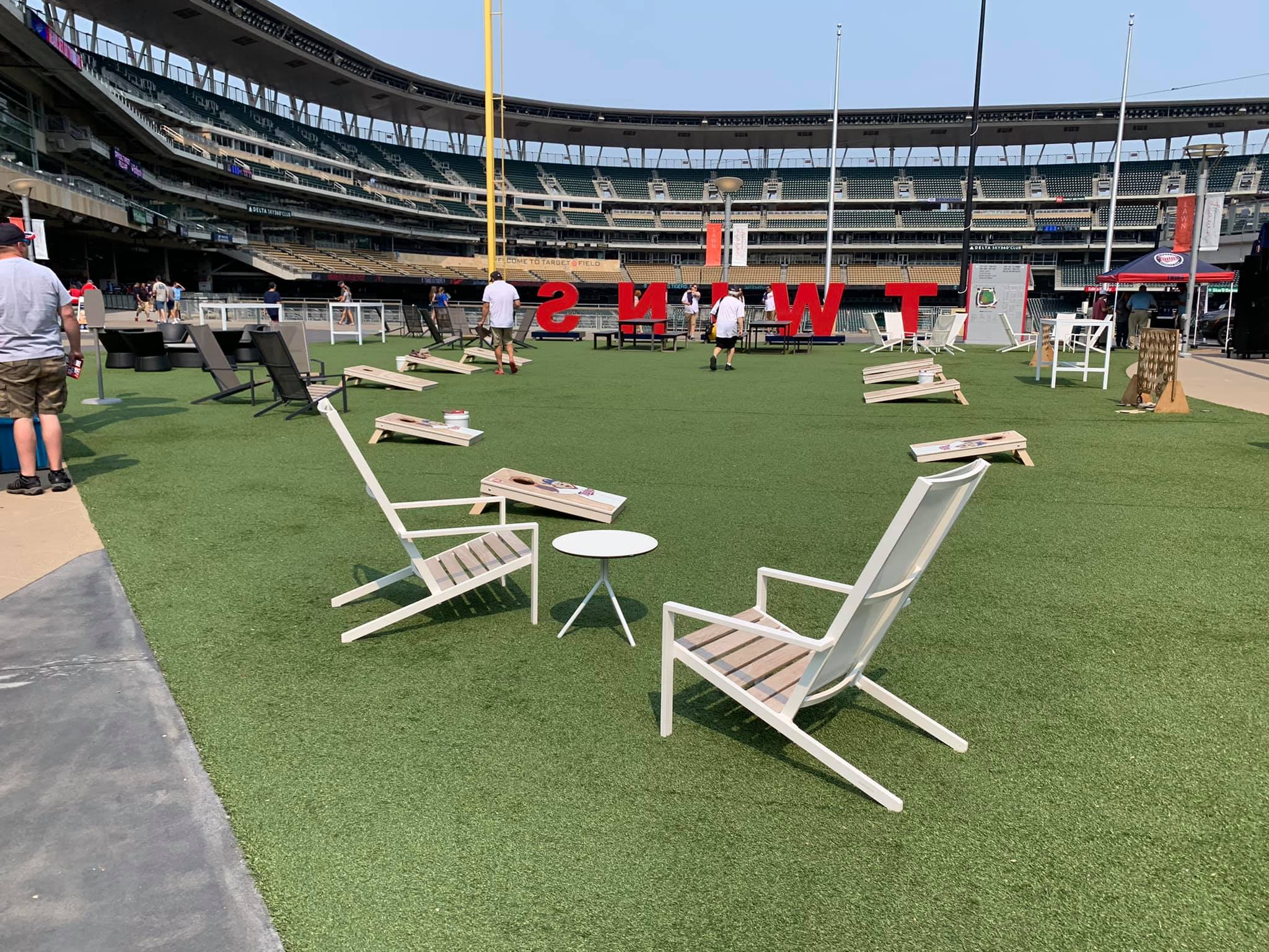
| Kids Areas/Other Entertainment | 3/6 | Thumb Sideways |
| Atmosphere, Vibe, & Policies | 10.5/15 | Thumb Sideways |
|---|---|---|
| Fan Support/Attendance | 3.5/5 | Thumb Sideways |
| Ballpark Traditions/Gameday Presentation | 3.5/5 | Thumb Sideways |
| Ballpark Policies/Staff | 3.5/5 | Thumb Sideways |
| Adjusted Raw Score | 162/200=81 |
|---|---|
| Bonus | 3 |
| Curve for All 7 | 7 |
| Final Score | 91 |
|---|---|
| Ranking | #4/30 |
|---|---|
The Twins’ “Modern” Digs Goes Back to the Roots of “Retro”
Despite not quite eclipsing other jewels, Target Field is the most authentic urban park built in more than a decade
By Cole Shoemaker
Written in 2011; ratings above are up to date for 2024, but this review below may be outdated and will be updated at some point; reviews and ratings are “living pages” updated yearly when necessary
Target Field really represents how ballparks have gone full circle since the beginning of the building boom. It represents a certain evolution in some ways, but we’re right back where we started in terms of intentions. I know I’ve said this time and time again, but when Camden Yards built a red brick park, they weren’t trying to start a retro revolution. They were starting a revolution of building ballparks that applied to their cities. Cleveland and Denver got it.
The central irony of Target Field is that it’s really the first park in a long time to go back to the roots of the retro movement, a la Jacobs Field and Camden Yards, while being perhaps the least “retro” park seen in 20 years in terms of design.
Throughout the late 90s and 2000s, we saw a multitude of ballparks trying to be retro, though often failing due to gimmicks or a poor location, not acknowledging that contextual integration is the central tenet of a well designed “retro” ballpark.
We saw multiple teams build retro cookie cutters in the middle of parking lots (The Ballpark in Arlington, Citizens Bank Park, Citi Field). We saw teams attempt to build unique and/or contextually appropriate ballparks, but come out too gimmicky, overdone, disjointed, or busy (Minute Maid Park, Petco Park, Great American Ballpark). Of course, we also saw teams build ballparks that had little independent aesthetic vision whatsoever (Turner Field, Busch Stadium, Nationals Park). As a side note, Turner Field fits all three categories. (Sorry Braves fans I couldn’t help it).
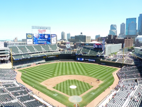
With its contextual urban lines, mostly confident and free from gimmicks or distractions, Target Field directly recalls Jacobs Field in its connection to the city. The open space in right field, specifically the integration of the Target Center, is a strong reference to Cleveland’s crown jewel.
Since the early 90s, except arguably PNC and Comerica, it’s really the first park that visibly conforms to its surroundings and makes a concentrated effort to acknowledge the city. It really is the most urban park in baseball, as everything is remarkably conformed to the area. And that deserves immense praise.
This is as naturally constrained an urban structure that you’ll see in baseball. We have freeways and trains nearby, with warehouses stacked to the left. In fact, you have sections of the ballpark literally situated into and over the urban context. Note the slanted right field grandstand conformed to the parking garage or how the Target Plaza is literally built over the I-394 freeway. You can debate how it looks, but there’s no doubt it’s pretty cool.
While it is the most brilliant urban design in a long time, I have to admit it falls a bit short in comparison in providing an aesthetically pleasing experience on the inside. While it’s a great effort, I just don’t think it comes out as pretty or as aesthetically distinctive as some of the other highly rated ballparks.
While the structure itself is consistently connected to the city, the interior sometimes fails to acknowledge it, instead opting for a towering monolith of seating with unnecessarily invasive video ribbon boards. But it’s no doubt the best step in the right direction.
Like every great ballpark, Target represents its region extremely well. But I feel they take it to the highest level here. The “state fair” concessions and the historical touches, along with the limestone accents integrated inside, outside, and on the concourses, really screams Minnesota.
But I wouldn’t go so far as to say it’s a top three ballpark, like everyone seems to be claiming. It’s a gorgeous new ballpark, but not quite an aesthetic monument that eclipses some of the others. When the renderings came out, reviews were reasonably tepid, so we forget how low our standards have become after the uninspired parks of the decade came out.
Despite not quite having the views of PNC, Comerica, or AT&T, nor having the well-crafted interior design of Jacobs or Camden, the modern amenities and superior functionality that naturally come with a new venue, along with the great location, make Target one of the best, despite lacking a bit due to the small footprint.
Setting
Location/Access:
What’s most ironic about Target Field’s location is that it was the least ideal urban choice, with more scenic settings on the Mississippi River or in downtown St. Paul preferred. I guess that goes to show it’s not the place itself, but what you make of it.
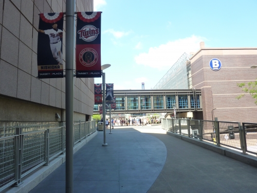
Built in a nondescript parking lot, Target Field is located on the edge of downtown Minneapolis, nestled into the so-called Warehouse District. It’s within walking distance of any site of interest you could want in the city. The brilliance of the location is how they fit the park in between the interstate and downtown. Take a look at the original land plot on Google Earth. Criticized for only being the size of Fenway Park in terms of land, they created a bridge that literally goes over I-394 to create extra space, connecting the ballpark to 6th street. Known as the Target Plaza, this standing room area in right field was actually an area improvised to connect the ballpark to the city.
To give you an idea, the right field wall is basically the extent of Target Field’s actual footprint. I’ll elaborate more later on how the interior design is entirely a product of its location.
To top it all off, access to Target Field is spectacular, perhaps the best in the majors. Along with the conveniently located parking decks, the ballpark is directly adjacent to multiple existing metro and commuter transit networks. Much like some new basketball arenas, a light rail system is next to the ballpark. Since renamed Target Field station, fans using Gate Six are steps away from a train ride. Multiple rail lines are being planned for future use, making Target Field the gold standard in ballpark accessibility.
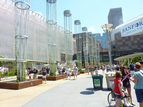
Score: 5/5
Local Scene:
Despite being located on the outside perimeter of downtown, Target Field has a surprising amount of development within walking distance for a new ballpark.
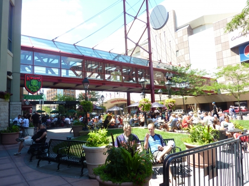
Of course, the downtown side by the preexisting Target Center is bustling, with plenty of bars, restaurants, and hotels. While not at the level of some of the more notable local scenes, walk down 6th street and you’ll get all the activity you could ever need. First Avenue is only two blocks away. Kieran’s Irish Pub is probably the most notable establishment by the ballpark. The warehouse district activity has materialized quicker than I expected. Consisting of old warehouse buildings, the area appears to be developing. Already, you’re seeing plenty of renovated lofts.
Score: 4.5/5
Total: 9.5/10
Architecture & Aesthetics
Exterior Design:
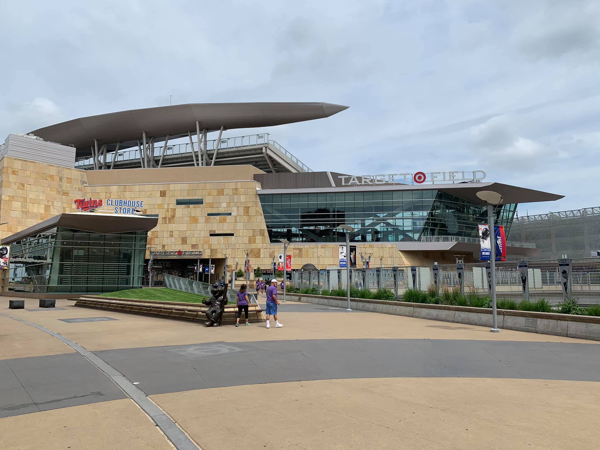
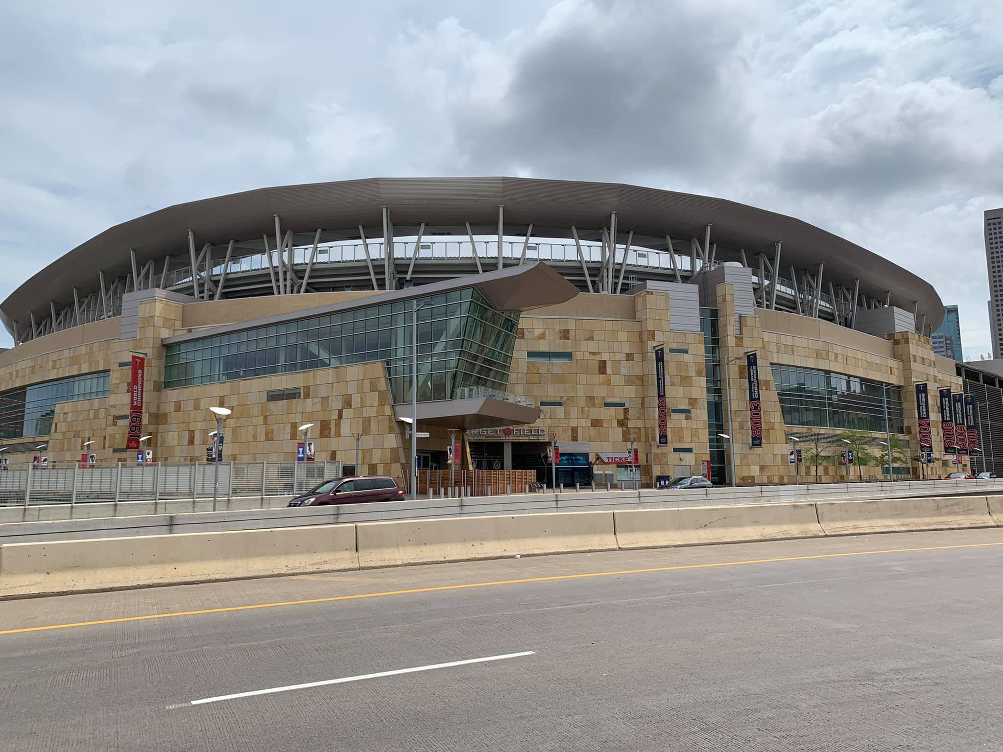
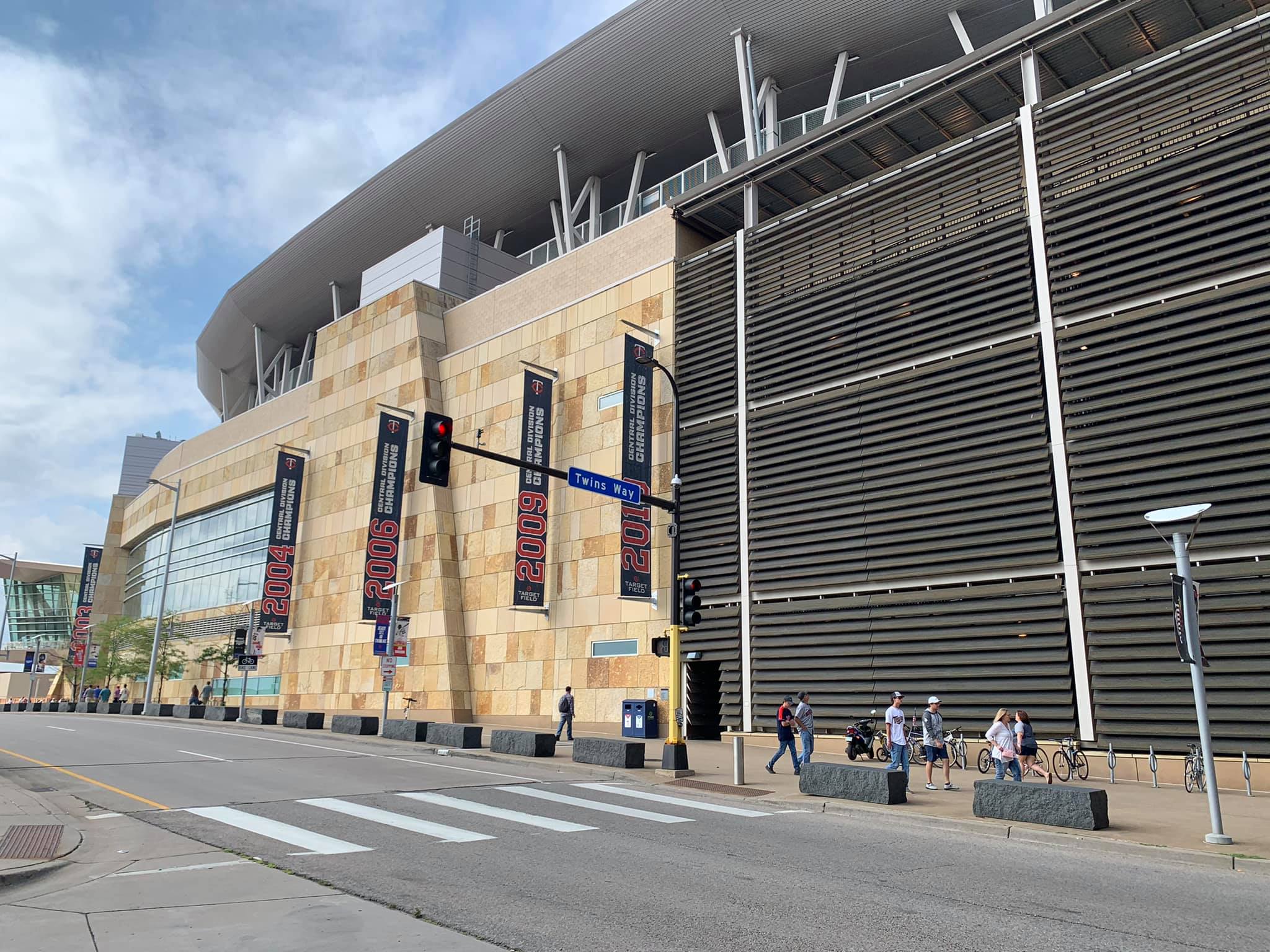
Despite its questionable architectural merits, Target Field’s limestone exterior facade certainly adds value to the derivative ballpark landscape.
Originating from Minnesota, the Twins incorporated local limestone as the exterior’s primary façade, which is nicely accentuated by natural wood paneling. Apparently imported from Brazil, the wood is a nice touch and definitely brings something new to the table. The exterior looks good in my opinion, but the variance of the limestone colors is a too bit loud. But there’s no mistaking the natural, Minnesota forest feel, in what might be the most recognizable exterior in the majors. So I appreciate its novelty.
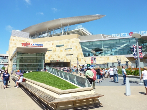
I’m not a big fan of the glass and steel structures jutting out from the limestone. The overuse of glass is a distinctively modern touch, but I don’t care for how it clashes with the limestone. It goes well with the attractive curves of the sculpted canopy roof, but the tangential lines of the glass structures don’t look very good extending out from the limestone.
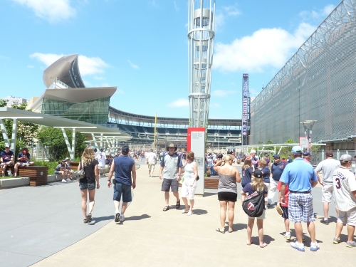
Much of the landscaping around Target plaza, including the artwork, flowers, and historical monuments, is simply fantastic. Pay special attention to the artistic wind veil on the parking garage. You can tell the Twins devoted a disproportionate amount of time giving the fan a gorgeous immediate sense of arrival upon entering the plaza.
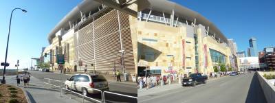
Overall, it may be a bit too much, blatantly trying too hard to be faux regional and modern, while compromising true architectural principles. They just use the “local” materials to get environmental design awards, such as the LEED silver rating. At worst, it could be considered an awkward deconstructivist version of postmodernism.
But conceptually, it looks all right, successfully encapsulating a mix of cosmopolitan Minneapolis and natural Minnesota. This certainly will score high considering it is a ballpark. They tried something much more audacious here so I’m not critical at all, and many of the little touches are excellent.
Score: 7.5/10
Interior Aesthetics:
Despite not equaling the best parks in terms of interior aesthetics, Target Field might be the most impressive interior design in the majors, from the contextual application of the site to the regional inspiration. When you look closely at the blueprints, you really begin to appreciate how hard this was. I’ll later go on to expound on why Target’s interior falls just a bit short in my opinion, but there’s no overlooking that this is probably Populous’s (HOK) greatest effort, considering what they were given.
I think looking at some of the initial design principles will give us an interesting framework in assessing what the architects created here. The two most important principles were executing an “Outside-In” and “Inside-Out” design. As we have already covered, it relies of the contextual acknowledgement of the city and vice-versa. The ballpark responds to the forces of the city, while the ballpark is nestled into the confines with great dexterity.
Rail lines and I-394 are cutting below and around the ballpark; parking garages and warehouses are literally on the cusp of the outfield, forcing any hypothetical outfield seating up, instead of out. It’s amazing that the actual planned landscape of the park was about eight acres, the minimum requite for a minor league park. Through creative planning, they expanded the actual footprint of the fan experience to about 12 acres.
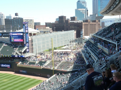
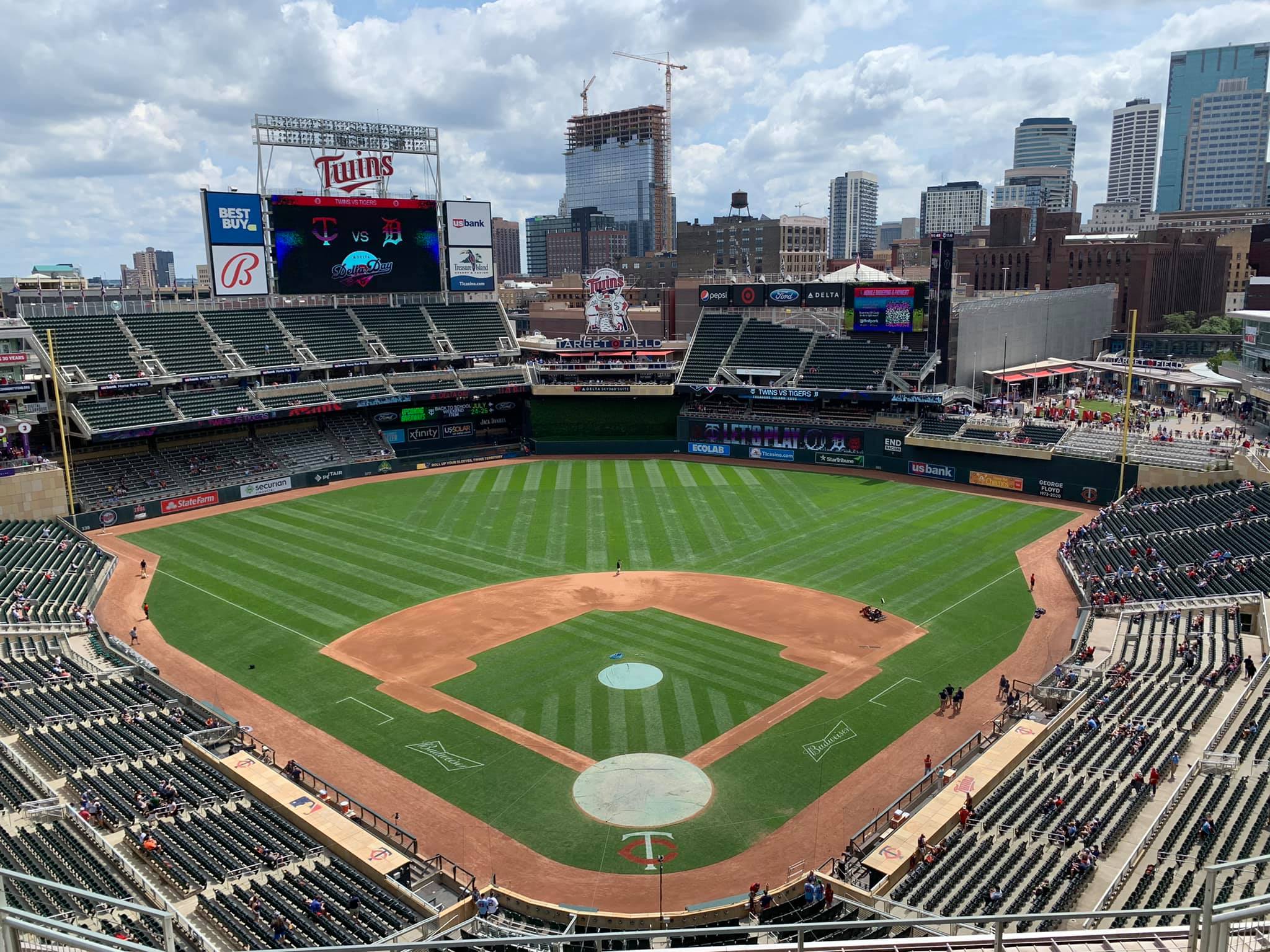
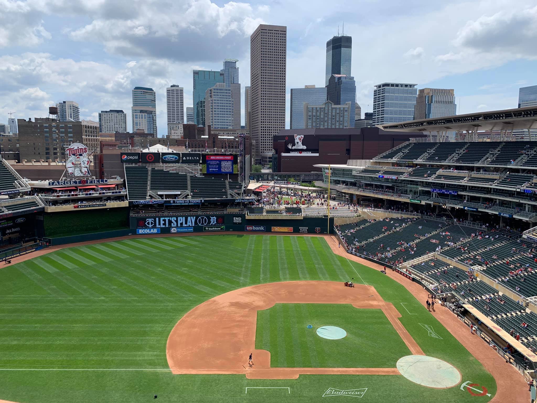
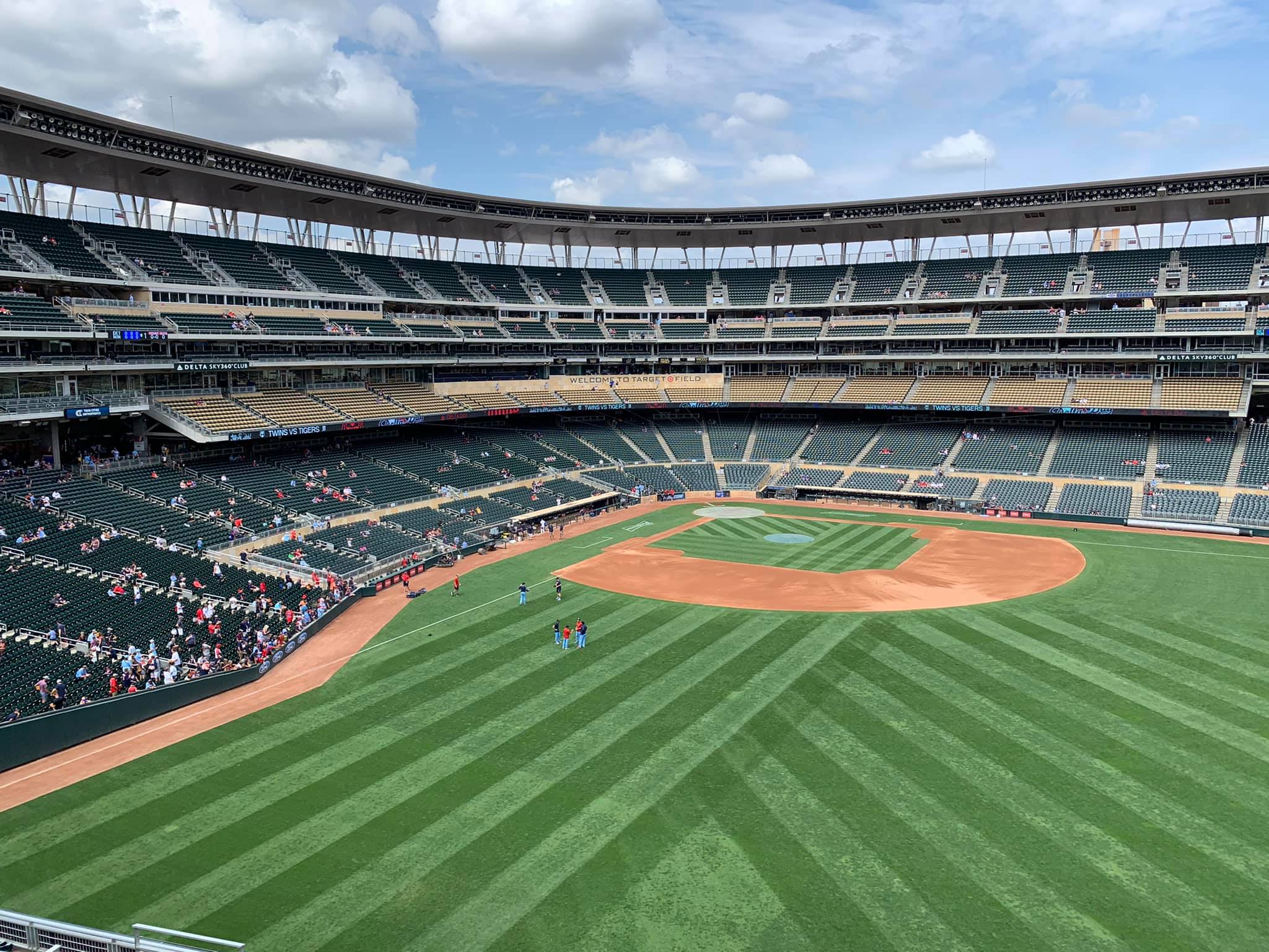
The Target Plaza in right field is perhaps the best example of this. As previously touched upon, it serves as a link between the ballpark and the city over the freeway. It looks absolutely fantastic as well, putting the urban surroundings literally in the ballpark. The wide-open space is brilliantly juxtaposed with the rest of the enclosed interior.
Note the downward slant of the trapezoidal right field grandstand, derived from the constraints of the parking garages, which visually culminates in the Target Plaza to the right. It effectively emphasizes the view and accentuates its presence, almost pointing downward toward it. The quirky trapezoid grandstand complements the overall theme of the exterior façade. The right side of the outfield interior is an artistic masterpiece executed to perfection. A ballpark should serve as an amphitheatre that connects the fan to the city, and Target Plaza literally does that.
Unfortunately, the rest of the interior design isn’t as great, but many of its problems were unavoidable. Just because the seating structure is contextually based doesn’t mean that the seating structure does a good job of allowing that context to enter the ballpark. The former is most important, but you have to do both.
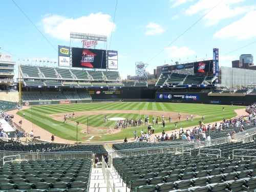
The outfield grandstands simply dominate too much of the interior. It’s nicely balanced with the open right field porch, but I guess there’s a point where too much seating becomes the visual focal point to a fault. Most urban parks have more open viewing spaces. Note how tall and vertical the outfield structure is. Towering walls and seating structures engulf the ballpark due to the land constraints. Note how no seats until left field are lower than 20 feet from the field. Perhaps no other ballpark has its outfield seating so disconnected to the field of play.
The architects didn’t have the benefit of employing a sprawling design that lets the surrounding area seep into most of the ballpark, like say Comerica. They were forced to maneuver too many seats into the outfield to get capacity to a reasonable level, resulting in an enclosed feel.
Cozy and intimate? Perhaps. Well connected to its surroundings on the inside? Not really, as seating shuts out the warehouse distinct and much of the urban area. I think it looks functional and nothing more. I understand the left field grandstand is a nod to Metropolitan Stadium, but it doesn’t do much for the interior aesthetics.
Why did they build a cliché warehouse building if they were already short on space? Instead of building that unnecessary Budweiser deck in left field, they could have wrapped the upper deck a bit further down the line, allowing them to greatly minimize the imposing outfield grandstand and integrate the Warehouse District in some fashion. Or better yet, integrate the warehouse buildings themselves in lieu of the Budweiser deck or integrate the two right field parking garages in some creative way.
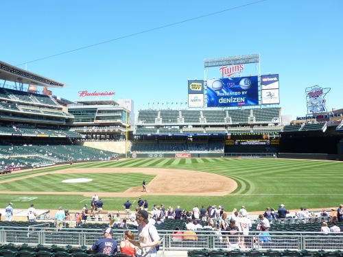
I just thought I’d through that out there, but understand that the red brick architecture of the warehouse district clashes with the modern limestone motif of Target Field. It probably wouldn’t work too well, resulting in another Petco Park look with conflicting elements. But the fact is, integrating your surroundings into the ballpark should be the chief goal of the architect, and they didn’t completely succeed here.
But I’m extremely lenient. Considering that much of the urban area in left field clashes with limestone architecture, along with the obvious site constraints and seating capacity issues, I can’t be too critical of the outfield structure. Overall, it’s a cool contextual design, but not necessarily one that’s aesthetically pleasing throughout most of the outfield. Considering this, Target Field probably does need a little more flash and “whim”, and I never say that. The fact that this is necessary is a sign that you’re not quite at the level of a Camden Yards or PNC Park. But as touched upon previously, the coherent interior lines are welcomed.
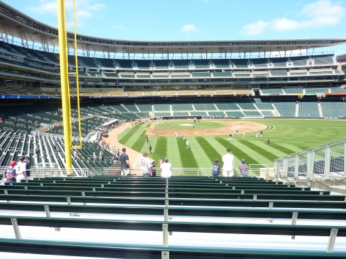
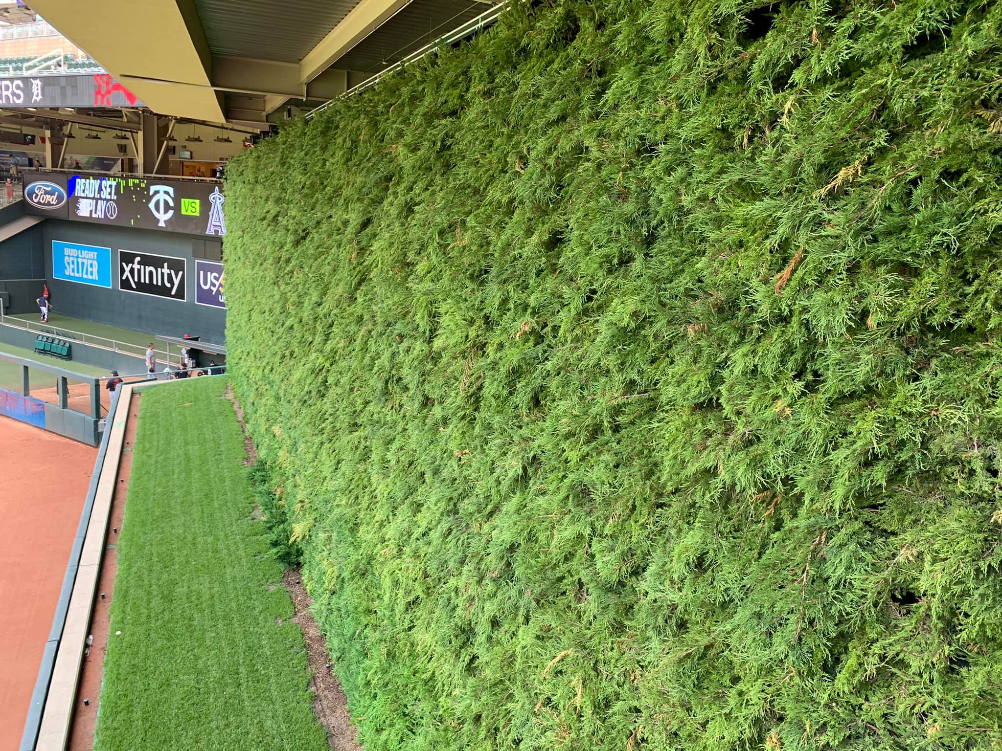
The removal of the spruce trees in front of the center field batter’s eye took away some of the ballpark’s aesthetic appeal. Formerly representing the “nature” and “regional inspiration” principle, the current bland green batter’s eye emphasizes the functional feel of most of the outfield structure.
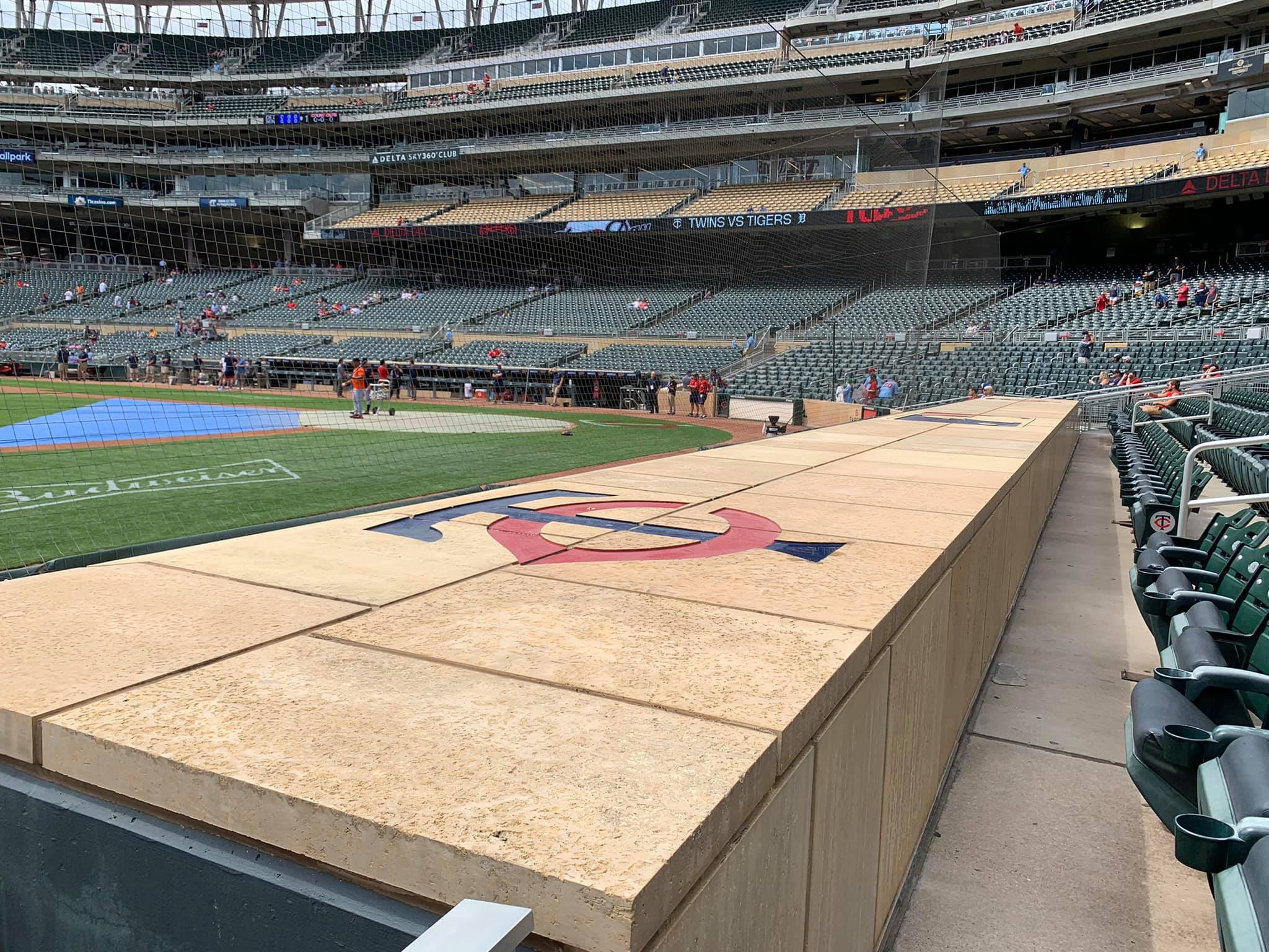
On the positive, there are plenty of other natural regional touches that make Target Field beautiful. No other ballpark has been more successful in integrating their primary exterior motif, limestone, into the interior. This alone enhances Target’s aesthetic value greatly. Limestone facades are present all throughout the outfield, including the Budweiser Deck and the overhang in right field. Even the backstop and the dugout, along with all of the interior grandstand facades, are designed in Minnesota’s local stone. The wood backs of many of the seats put a finishing touch on the natural theme and emphasize the ballpark’s nice color scheme.
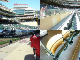
Unfortunately, the copious outfield grandstand space is particularly conducive to plenty of ribbon boards and video technology. I’m the last person to complain about video boards in a ballpark, but Target Field’s set up is just too busy. Along with the giant ribbon boards throughout the outfield, we have two video boards and three other pointless screens, including an ugly video tower at the end of the right field grandstand. Modern technology enhances the ballpark, but I like it in one place. To have seven, count them, seven, different video boards scattered throughout the outfield naturally begins to compromise the aesthetics. It especially clashes with the clean limestone look of the inside.
Quibbles aside, Target Field certainly has a nice balance unlike some of the more convoluted structures in the majors, with the focal point on the Target Plaza and the right field skyline. But the seating structure is just a bit too heavy (and also a tiny bit busy) to be as good as the best in baseball. Then again, being 7th out of the 24 on interior aesthetics isn’t bad!
Score: 12/15
Panoramic View/Backdrop:
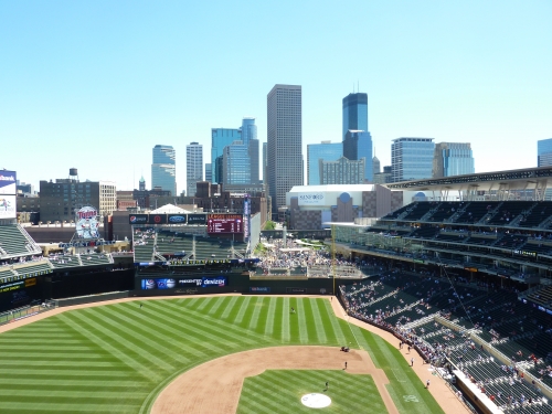
Like so many new ballparks, Target Field has fantastic views, but only in certain spots. The urban integration of the Minneapolis skyline and the Target Center is pretty much unparalleled in my opinion.
If you look closely, you’ll note that the plaza aligns perfectly with many of the urban skyscrapers, particularly the Wells Fargo Center, which appears to be the tallest in the area. The problem is, if you’re sitting on the first base side of the ballpark, you’re staring at a vast array of seats.
Score: 4/5
Concourses:
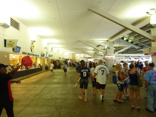
People have raved about the aesthetic design of the main concourse. Adorned with a cream colored decor to match the limestone, Target Field is really the first park to attempt to make the concourse look more “polished”, if you will. Gone are the industrial pipes and high neglected ceilings, as you’ll note the low cream-colored ceiling is more like the inside of an interior hallway.
I’ll be honest: I’m not a big fan of this. I think it looks much too sterile and fails to evoke the ballpark feel we’ve come to expect. It also doesn’t have that massive, cave like feel which usually leads to better field visibility due to the low ceiling. But there’s no doubt it’s designed to look nicer. Note how the kiosks are designed in faux limestone to mimic the architecture. The modern minimalist signage is well done too.
Score: 2.5/3
Total: 26/33
Functionality & Essentials
Sightlines:
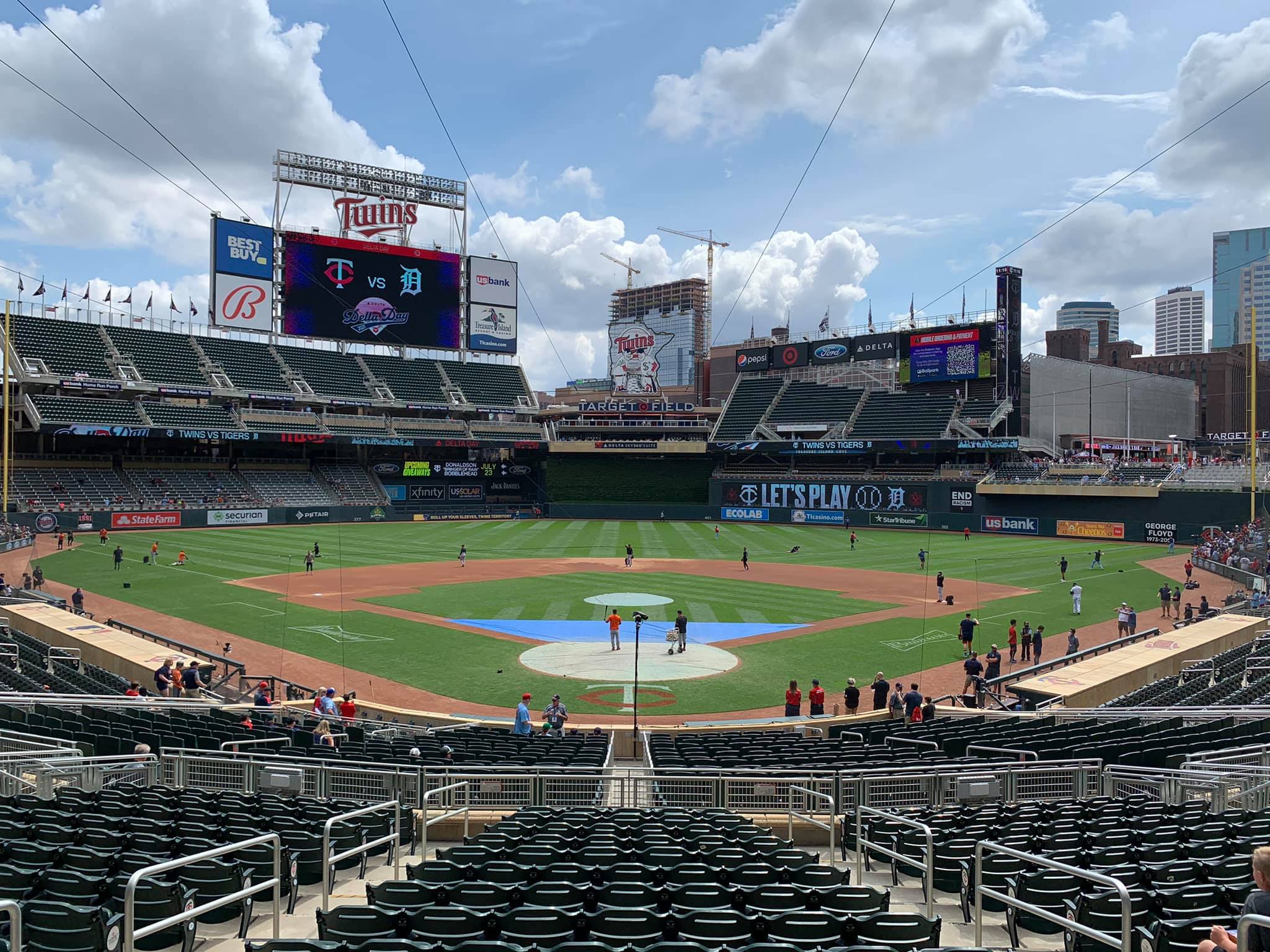
Target Field employs the angled seating technique down the lines that is common with most modern ballparks. The seating geometry is adequate enough, where sightlines are consistently above average with few strained necks. I don’t understand why they didn’t angle the seats farther down the lines at a more aggressive angle, where all the seats down the lines are actually pointing toward the infield. Like most retro parks, it’s becoming a tired line.
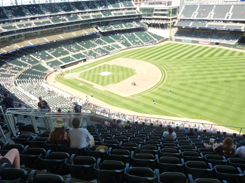
Petco Park, Citizen Bank Park, and Chase are the only ones that truly do this aggressively from my experience, so Target is in line with most of the other retro parks. I haven’t been to Nationals Park, Citi Field, Yankee Stadium, or Great American Ballpark. In Minnesota, there are some seats far down the right field line, particularly in the upper deck, which sport terrible sightlines.
The cantilevers of the upper deck aren’t extended over the club level as much as other ballparks, but the deck height is pretty similar to most ballparks that employ this seating arrangement. On the other hand, the Legends Club seats seem to be extended outward to an impressive degree, compensating for the lack in overhang in the upper deck, but only for premium paying fans. With no mezzanine, there’s a total waste of space on the first base side grandstand, but it does make for good main concourse visibility.
Like so many new ballparks, the upper deck isn’t as close to the field as it should be. However, much of the outfield seating is right on top of the action, especially the cantilevered grandstand. While this will inevitably lead to some minor obstructions of the outfield, it’s worth it to be closer to the field.
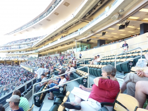
Score: 8/10
Seat Comfort:
Like so many modern ballparks that try to squeeze 40,000 plus into a small footprint, much of Target Field’s seats are simply too tight compared to historical standards. While 18-inch seats fill the left field grandstand, the Twins claim the rest are 19 inches in width, but some are smaller than that. Those left field grandstand seats are smaller than the ones in the same location at the Metrodome. Luckily, a substantial percentage of seats are padded, including the Dugout Box seats. Of course, every non-bleacher seat in the ballpark has cup holders.
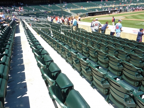
Score: 3.5/5
Concourses:
Despite the small land parcel, Target Field lives up to the high standards set by many new ballparks last decade. You can really tell they put a lot of attention into making it look clean as well.
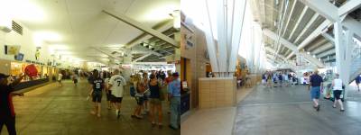
Before entering Target, I had the preconceived impression that the concourse was going to be small due to the land constraints. Not so fast! The open 360-degree system is amply wide, easily meeting modern expectations, unlike the other urban gems in San Francisco and Pittsburgh. Unfortunately, it gets ridiculously tight in the outfield, to the point where there’s often a constant bottleneck. It’s not a huge deal, but certainly a problem for those trying to encircle the park. It gets a little too tight in the upper deck as well.
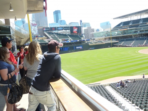
It appears that the Twins managed to exceed the already high standard for standing room only areas and field visibility from the concourse. Like most of the recent parks, the concourses are open to the field of play throughout every grandstand. But few parks in baseball offer so many cool standing room only areas than Target, along with Safeco Field and Citizens Bank Park. Unique perches include the Target Plaza, multiple floors of the Budweiser Deck, and bullpen views in left field. You can even see the view from behind center field over the batter’s eye, a rarity in baseball.
Score: 6/7
Scoreboard System:
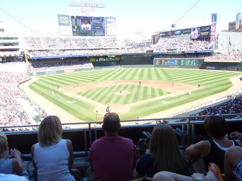
Despite looking a bit busy, the Twins scoreboard system is inevitably outstanding from a functional standpoint. The main video board is the 6th largest in baseball, and is supplemented by another large video screen in right field. It’s only one of three in the sport to be a true 1080-i video screen as well. Only in Minute Maid Park and here, can essentially all fans see a video board.
I do think they could have been more informative with the space they had. For example, the video board only shows part of the fielding team’s lineup. I don’t like that the information is spread across different scoreboards, instead of one intuitive location. But because of its size and quality, and its six other supplementary video systems, Target Field has one of the best in baseball.
Score: 2.5/3
Total: 20/25
Amenities & Features
Quality and Selection of Concessions:
The Twins provide a wide array of high quality regional concession choices. Coupled with an excellent variety, Target Field features one of the best culinary experiences in the majors. Few teams combine good local fare with a nice international selection.
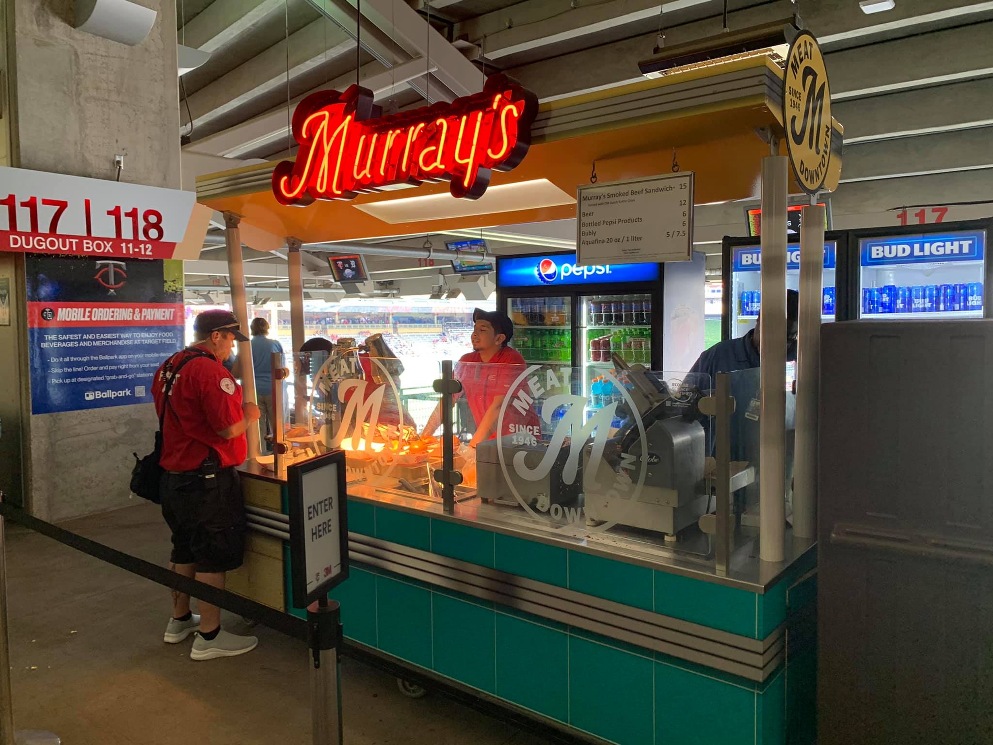
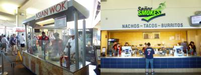
Various BBQ options are available in multiple locations around the ballpark, including beef sandwiches, turkey legs, ribs, and BBQ Pulled Pork. In Minnesota? Senor Smokes serves surprisingly authentic Tex-Mex (if that makes any sense) options, including tacos, burritos, pico de gallo, salsa, and guacamole. In Minnesota? Even some eclectic stir-fry options are available at Asian Wok, with fortune cookies included.
A host of subs and specialty sandwich options are served at Target Field. Covering various tastes, turkey wraps, Murray’s Steak sandwiches, Tony O’s Cuban Sandwiches, Italian Meatball, Calzones, and Tortas are available throughout the ballpark.
The Twins also feature a surprisingly good selection of coffee, baked goods, and healthy items. Plenty of cool fruit platters are available at the Farmers Market. Smoothies and Salads are offered as well. Even Mini Donuts are served.
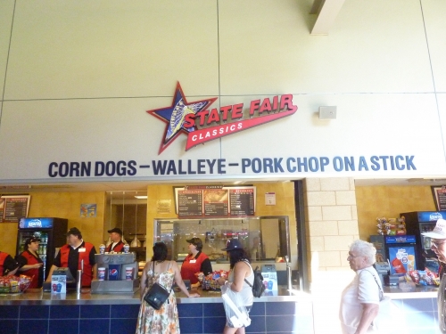
Target Field really succeeds in providing a wide variety of concessions options with a local flare. Presented as the “State Fair Classics,” Walleye’s (fish), Pork Chops, Kabobs, Corn, and the new “MinneApple Pie” will delight all taste buds. Other specialty items including Chili, Wild Rice Soups, Cheese Curds, and Kramarczuk’s Sausages will surely raise some eyebrows if you are unfamiliar with the area.
Score: 4.5/5
Regional/Signature Concession(s):
Like the new trend requires, the Twins brought a fair number of famous outside establishments into their new park.
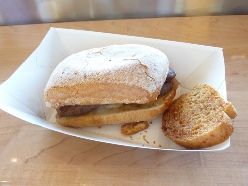
In addition to Krazmarcuk’s Sausages and Vincent Burger, Murray’s Steak Sandwiches are probably Target Field’s most notable regional item. Served on a delicious buttery ciabatta roll from Franklin Street Bakery, the tender steak is cooked well done, but still quite delicious with melted cheese. Included with garlic toast, I thought it was much too salty, but a tasty item nonetheless.
The State Fare Classics serve multiple items that seem to have a direct connection to the area. The most notable is the Walleye on a Stick. A reference to the lakes, it is nice the Twins found a way to incorporate some seafood specialties into the ballpark.
Score: 2/2
Public Restaurants/Bars/Sitting Areas:
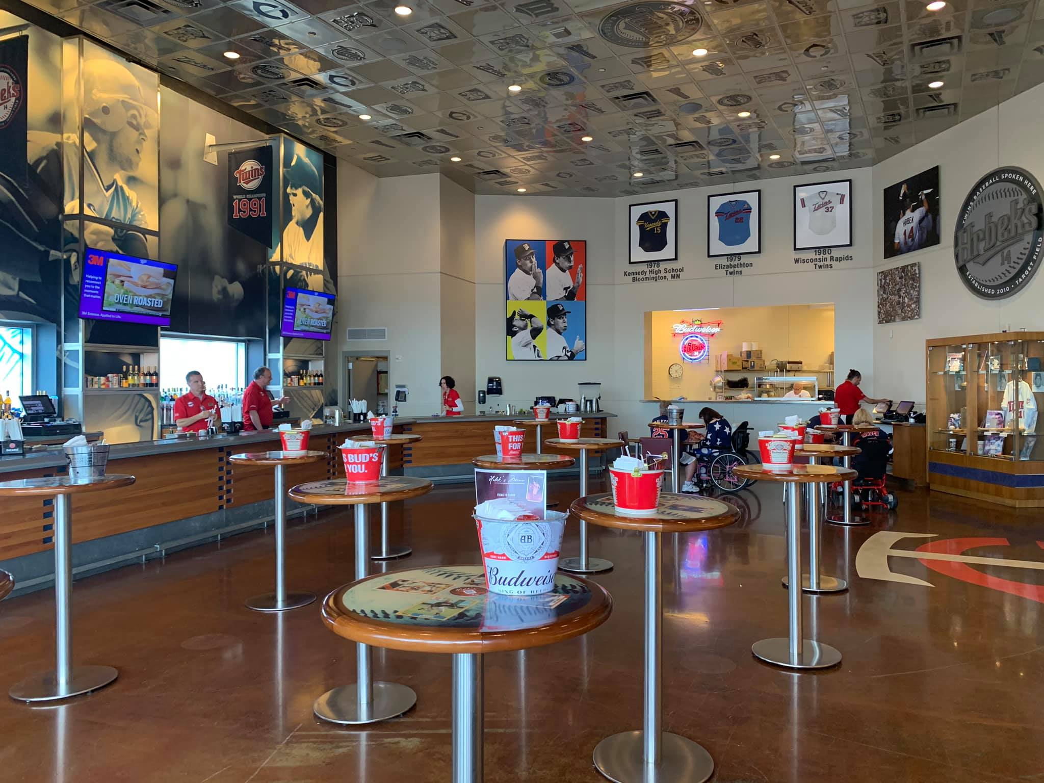
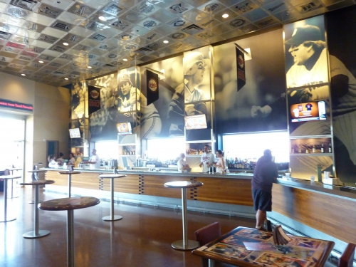
Exceeding expectations, the Twins managed to provide a number of sit down restaurants and heated lounge areas to satisfy fan comfort. Hrbek’s is an informal eatery and bar with indoor and wood accented outdoor seating. Serving pub fare, Hrbek’s features a number of references to its namesake.
The Town Ball Tavern is a larger full service restaurant celebrating amateur Minnesota baseball with hardwood flooring, located in left field by the third floor of the Budweiser Deck. I actually missed this one, so it’s a bit hard to find from the main concourse. Multiple “Twins Pub’s” on the upper deck concourse provide fans with shelter from the elements.
Score: 5/5
Premium Seating/Clubs:
As a new park should, Target Field delivers in offering a wide array of high quality premium options. But unlike Nationals Park, Citi Field, and Yankee Stadium, the Twins do a good job of not being too invasive as well.
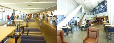
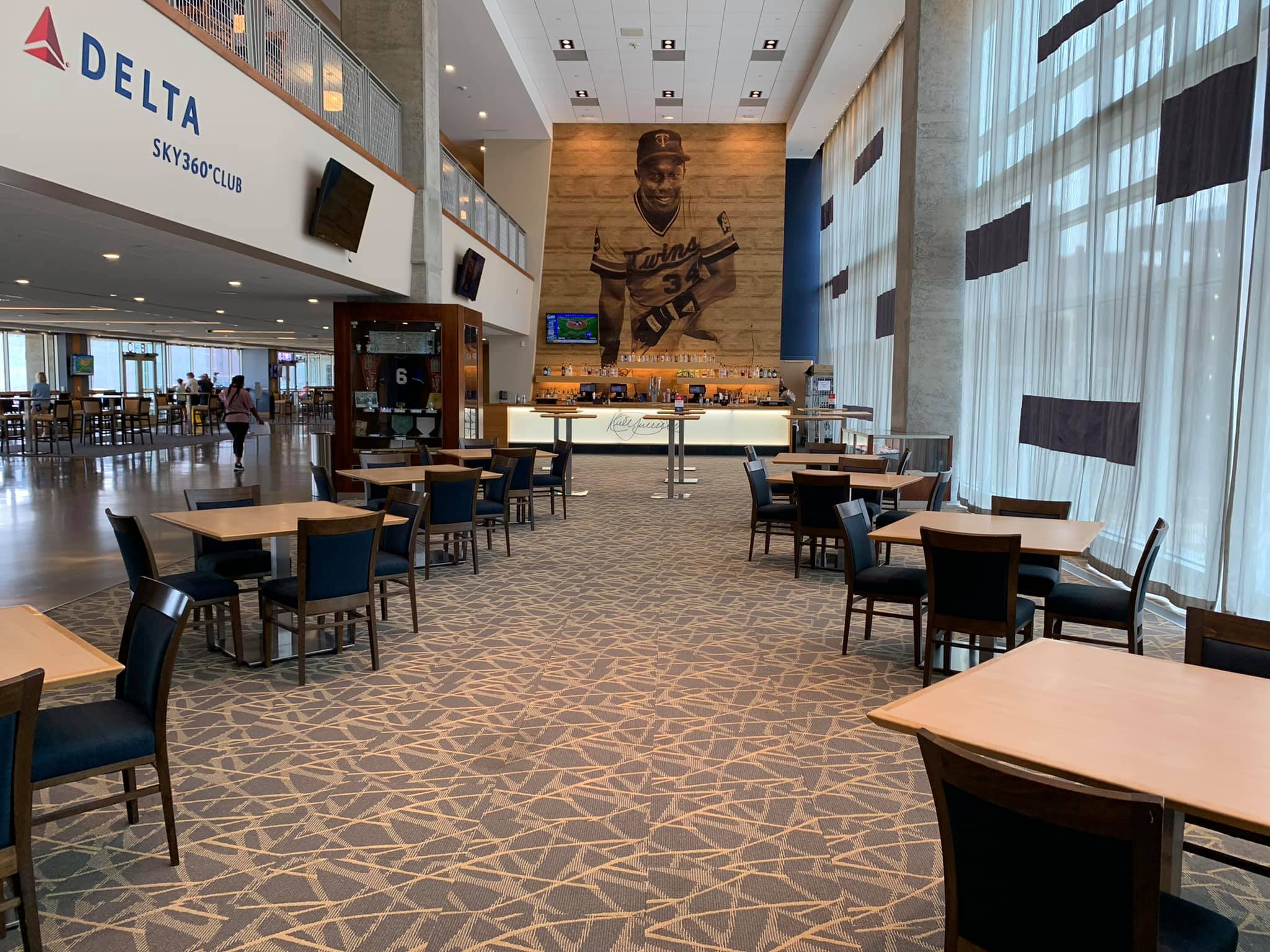
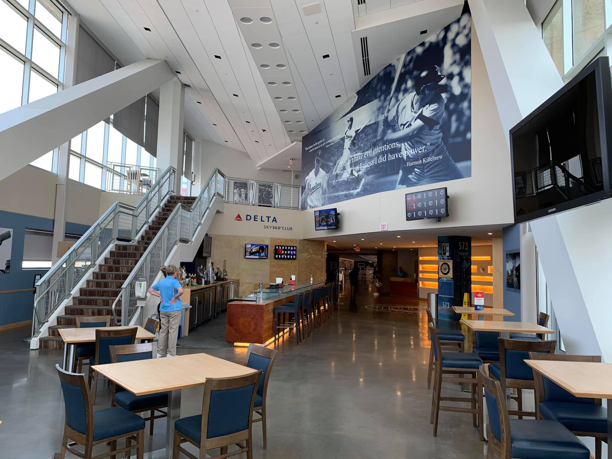
Target Field uses the same premium seating formula as most of the older retro ballparks, but separates itself with tremendous quality. Along with Nationals Park, the Twins probably feature the nicest mezzanine club level in the majors, known as the Legends Club. This premium space is more exclusive in capacity than most club levels, but features wider concourses and more lounge areas than ever seen before. Decked out in a cream colored décor with blue accents, the club features three separate lounge areas in addition to a luxurious concourse with tables and upscale concessions. The spaciousness of the concourse and the number of places to sit and watch the game is indeed impressive.
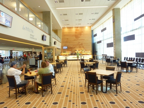
The attention to history of Twins players throughout the club level is executed to perfection. Be sure to check out the Rod Carew and Kirby Puckett Lounge. Both feature a host of player memorabilia and a gorgeous wood mural by the respective bars. Designed in a limestone motif, the 573 bar honors Harmon Killebrew.
The Champions Club is Target Field’s lavish super premium option behind home plate. Accentuated by the same stonework seen throughout the ballpark, the club features the Twins’ championship trophies. Another thoughtful space that reduces crowding on the main concourse is the first and third base lounge. While not a premium area, this gives dugout box ticket holders access to restrooms and concessions.
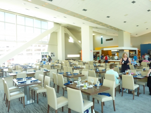
Departing from the usual stuffy atmosphere seen in stadium club restaurants, the Metropolitan Club is a fantastic option available to all season ticket holders. In fact, you can’t even buy passes for one game off the Internet. Light and open, the club is designed in a modern aesthetic, seen from the 1960’s style “Mad Men” lettering and the multi colored walls. The restaurant is luxurious but relatively simple and minimalist, avoiding the usual white tablecloth experience. The white cream color and rich wood are quite pleasing to the eye. Sporting a gorgeous view of the skyline and also outside patio seating, its one of the top club restaurants in the majors.
Score: 4/5
General or Artistic References to Baseball or Team History/Museums:
Because of the constraints in space, the Twins don’t really have too many historical touches on the inside, but do a good job of compensating by packing tons of cool references on the outside by the plaza, including a marble tradition wall, which allows the fans to create their own personal ballpark legacy.
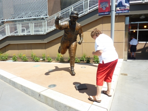
After being immediately greeted by a timeline of Minnesota ballparks, you’ll see a Twins “wall of fame,” nicely accentuated by local flowers. Statues in the area include Kirby Puckett, Harmon Killebrew, Rod Carew, Calvin Griffith, and the Pohlads. All of the gate numbers are numbered after Twins greats. Also note the giant bronze glove by Gate 34, honoring every Gold Glove winner in Minnesota history.
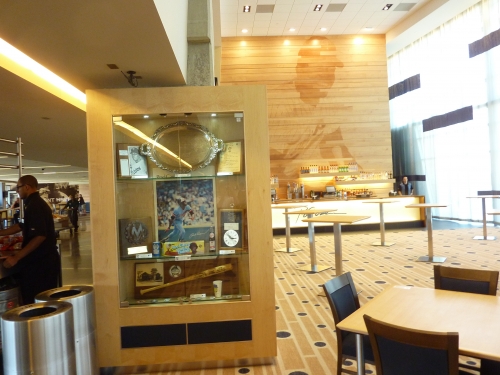
On the main concourse, the Twins have very little to salute the players of the past, but no team did more on the outside. Despite no hall of fame or museums, the Twins do a fantastic job in integrating historical information into their premium areas and restaurants. No club level in baseball, except maybe in Pittsburgh, has more history and memorabilia than the Legends Club. Check out the mezzanine concourse before the Metropolitan Club, featuring a history of Target Field itself and a visual tour of every ballpark in the majors. History is seamlessly incorporated into all of the restaurants. The first and third base lounges honor third sackers and first basemen from Twins history.
Score: 3.5/5
Entertainment/Kids Activities/Other Amenities:
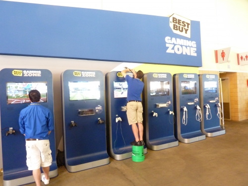
Target Field’s one flaw, while obviously not fatal, is the complete lack of entertainment options and kid related activities.
It’s obvious with the land restraints that they weren’t going to have some requite amenity. I’d rather a couple restaurants than a playground. But by my account, it’s the only ballpark built in more than 20 years to lack any significant activities for the kids, other than new Yankee Stadium. No playgrounds. No speed pitch. No batting cages. And while most of us don’t care, it’s hard to overlook that when judging amenities.
Score: 1/3
Total: 20/25
Atmosphere, Vibe, & Policies
Atmosphere/Fan Support:
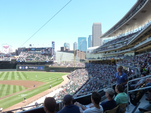
Other than San Francisco and Philly, no fans pack their ballpark quite like the Twins. As of now, Target Field inevitably has one of the most vibrant parks in the nation. After years of having a noisy reputation in the Metrodome, they get to back it up attendance wise in a nice ballpark.
There’s also a definite local feel to the people as well, perhaps due to the high number of season ticket holders. It’s a community ballpark, and everyone seems to know each other. And while we still have the luster of a new ballpark, it’s an easy 5.
Score: 3.5/5
Ballpark Policies/Customer Service:
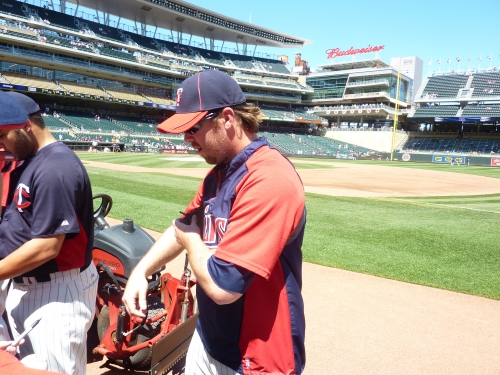
For a new ballpark, Target Field has surprisingly nice and non-invasive ushers, to the point where it positively affects the ballpark experience. Without hesitation, I was allowed to spend time in the season ticket only Metropolitan Club to take pictures. All fans are allowed behind the dugout before the game into the dugout boxes. Heck, Target Field is so fan friendly, I wondered down to the dugout to take some pictures and a player was waiting there to sign an autograph. No Joke.
Score: 2/2
Bonus:
For building the most gorgeous, contextually based urban ballpark that fits with its city in over a decade +2
For shoehorning such a great ballpark into such a small space through effective engineering and innovative thinking +2
For the fantastic cream-colored décor extended throughout the concourses and the Legends Club (specifically) that matches the limestone design and wood seats. Target Field is littered with finished soffits and touches, unlike others across the majors’ +1
For having fantastic high quality local cuisine with a surprisingly adequate international selection +1
For the beautiful Target Plaza, literally bridging the city to the ballpark with a brilliant design +1
For sticking to baseball principles by building an outdoor facility, while still keeping fans warm +1
Score: 8
Total: 15
Conclusion
Coming soon.
FINAL SCORE: 91
RANKING: #4/30
Summary
TL;DR? Here’s the long-form piece in a nutshell:
While a handful of downtown ballparks may have more captivating views, Target Field has the most creative and impressive urban design in ballpark history, with plazas, concourses, and outfield seating bowls constructed above roads to expand the footprint.
Given its responsiveness to its urban surroundings, Target Field represents a return to the best “retro” ballpark principle of adhering to contextual design, while ironically being one of the least retro parks. With a clean outfield aesthetic free from gimmicks and an abundance limestone inside and out, Target Field screams authentic Minnesota baseball.
Target Field also benefits (1) from being extremely well rounded, as it excels in almost all respects, and (2) from the fact that the Twins have displayed an admirable dedication to continually upgrading the facility despite its young age. As of 2022, it still looks brand new.
While a few other ballparks may be more outstanding in some respects, Target Field does it all: (a) downtown locale with vibrant local scene, (b) regionally-inspired architecture, (c) contextually-based interior design, (d) adroitly-integrated downtown views, (e) wide, open concourses, (f) choice local food and craft beer options, (g) a fabulous array of climate-controlled spaces and bars, and (h) generally phenomenal amenities. This was the single most difficult park to choose a “biggest dislike.”
At the end of the day, the Twins pad both checks all of the boxes and brings an unmistakable sense of place via notable aesthetic flourishes and locally-inspired amenities.