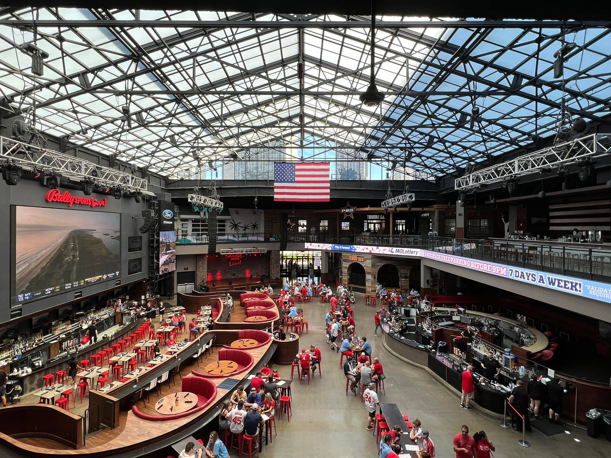
Busch Stadium
| Setting | 17/20 | 1 Thumb Up |
|---|---|---|
| Locale | 4.5/5 | 1 Thumb Up |
| Accessibility | 4/5 | 1 Thumb Up |
| Neighborhood Local Scene | 8.5/10 | 1 Thumb Up |
| Architecture & Aesthetics | 51/65 | 1 Thumb Up |
|---|---|---|
| Exterior Design/Aesthetics | 14/20 | 1 Thumb Up |
| Interior Aesthetics/Visuals | 34/40 | 1 Thumb Up |
| Concourse Aesthetics | 3/5 | Thumb Sideways |
| Functionality & Essentials | 35.5/50 | Thumb Sideways |
|---|---|---|
| Sightlines: Field Proximity | 11.5/15 | Thumb Sideways |
| Sightlines: Seating Geometry | 4/5 | 1 Thumb Up |
| Seat Comfort | 8/9 | 2 Thumbs Up |
| Concourse Functionality | 8.5/15 | 1 Thumb Down |
| Scoreboards/Tech | 3.5/6 | 1 Thumb Up |
| Amenities & Features | 36/50 | Thumb Sideways |
|---|---|---|
| Concessions: Food Variety | 3.5/5 | Thumb Sideways |
| Concessions: Food Quality | 2.5/5 | 1 Thumb Down |
| Concessions: Craft Beer/Other Drinks | 3.5/5 | Thumb Sideways |
| Social Gathering Areas/Restaurants | 7.5/10 | Thumb Sideways |
| Premium Seating/Clubs | 7/9 | 1 Thumb Up |
| Historical Exhibits, Memorabilia, Art, & Other Displays | 8*/10 | Thumb Sideways |
| Kids Areas/Other Entertainment | 4/6 | 1 Thumb Up |
| Atmosphere, Vibe, & Policies | 14.5/15 | 2 Thumbs Up |
|---|---|---|
| Fan Support/Attendance | 5/5 | 2 Thumbs Up Star |
| Ballpark Traditions/Gameday Presentation | 5/5 | 2 Thumbs Up |
| Ballpark Policies/Staff | 4.5/5 | 1 Thumb Up |
| Adjusted Raw Score | 154/200=77 |
|---|---|
| Bonus | 3 |
| Curve for All 7 | 7 |
| Final Score | 87 |
|---|---|
| Ranking | #11/30 |
|---|---|
Safe Effort in St. Louis
Despite being the ultimate uninspired retro cookie cutter, the fans and the setting make Busch a good enough ballpark
By: Cole Shoemaker
Written in 2010 and 2012; ratings above are up to date for 2024, but this review below is outdated and will be updated at some point; reviews and ratings are “living pages” updated yearly when necessary
Camden Yards ignited a movement in ballpark architecture that would captivate the sport like never before, perhaps even reigniting the basis of the sport. While fundamentally different in appeal, the retro trend is no different than the previous two building booms: tastes and/or economics will inevitably change.
While not indistinguishable like the real “cookie-cutters”, there’s still a relatively constant retro aesthetic of red brick facades and exposed steel. Some structures of this period will certainly last, but others are simply too derivative. So the question begs to be asked: why wouldn’t the Cardinals ask for a new ballpark in 30 years? What makes New Busch stick out from the crowd?
There is no way you could argue they set out to build a visually innovative or inspiring structure. The Cardinals weren’t trying to build the best park in baseball; they built yet another retro assembly line venue. They built a serviceable structure that, while pleasing enough, took no chances architecturally. And they know it too.
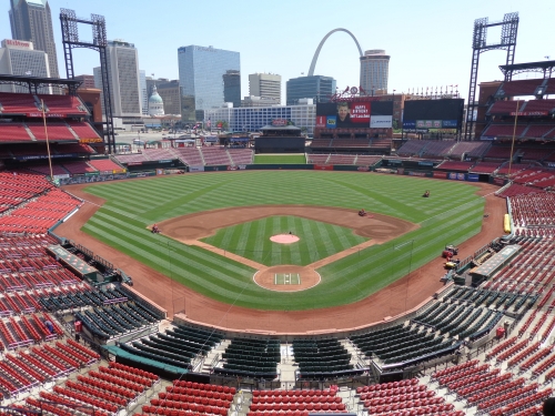
All things considered, Busch Stadium might be the HOK’s (Populous) safest effort ever. Even safer than Citi Field or Nationals Park. Not only that, but it’s lacking that certain attention to detail and quality in terms of amenities and historical touches of better parks. But, you know what, maybe that’s the point.
They don’t need expansive monuments of civic pride to please the fans. St. Louis doesn’t need features like open concourses: Cardinal fans don’t want a mallpark where fans are encouraged to get out of their seats and explore the park. They don’t need fancy food courts, restaurants, flashy scoreboards, or team museums. We’re here to stay in our seat and watch the game!
Why does St. Louis need artificial gimmicks to distinguish itself? We are the Cardinals! We don’t need fake rocks, fountains, hills, or any other bells and whistles.
But still. They could have done significantly better design wise. I feel like they tore down the outfield of Old Busch Stadium to open up the skyline, and then added some uniform single deck seating and some patio areas to increase revenue. It’s nice enough, but it’s a very lazy look.
Note Comerica Park, which I see as the standard-bearer of how ballparks without distinguishing features and gimmicks can be great ballparks. Perhaps they were going for that look, but Busch comes out more uninspired and standardized in its bottom line. The outfield design and the large seating structure isn’t as well connected to its setting, either. Plus, Comerica Park has the amenities.
The complete lack of fan friendly amenities and thoughtful touches is salient in comparison to other ballparks. No artistic design flares. Few interior historical touches. Closed concourses. Mediocre concessions. No restaurants!?
Remember, Busch Stadium is also the cheapest ballpark built from 2004-2008 by a significant margin. Or maybe its just by 2006, the retro look was getting old. Whatever it is, Busch Stadium will never be up there with the elite, but it gets the job done. The distinct skyline saves it from being too aesthetically streamlined as well. I returned in 2012 to give it another evaluation, and it’s not a bad ballpark by any stretch of the imagination. But in a crowded new ballpark landscape, not much about the structure or the amenities make this one stand out, as the awesome fans serve as the ballpark’s main asset.
Setting
Location/Access:
While the park is located downtown, its location isn’t particularly prime, especially considering 1/4th of the exterior is against the highway. That being said, it’s still nestled downtown rather nicely, despite not equaling the perfect location of some of the earlier retro ballparks. Access from the area is very convenient, facilitated by I-70.
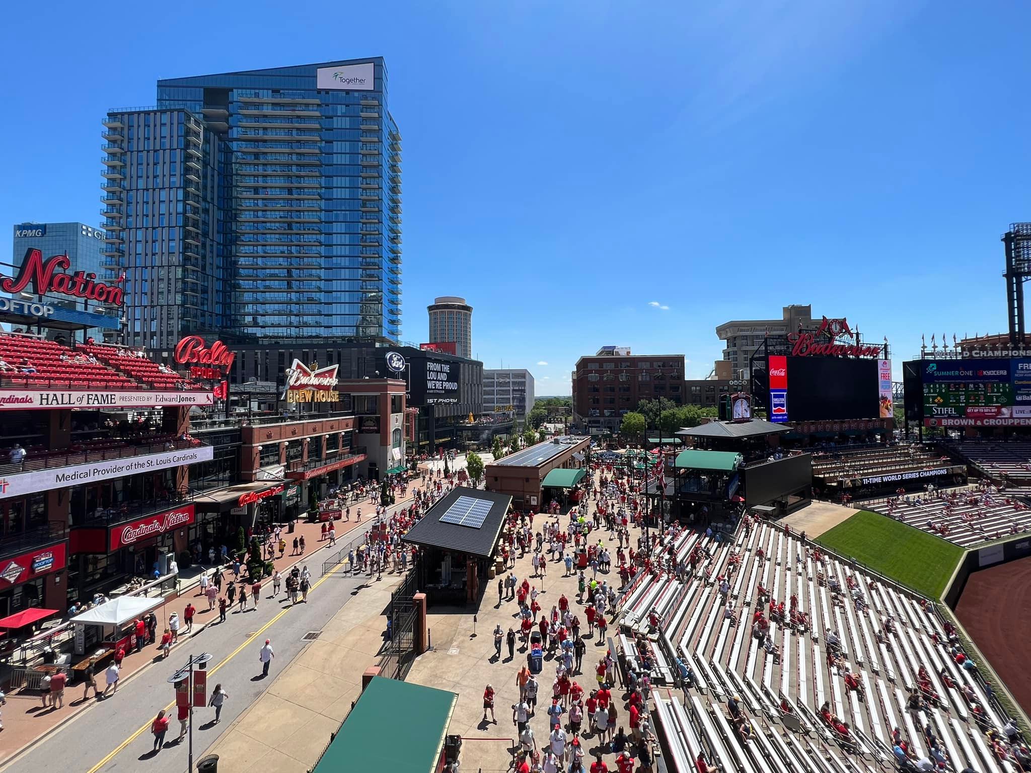
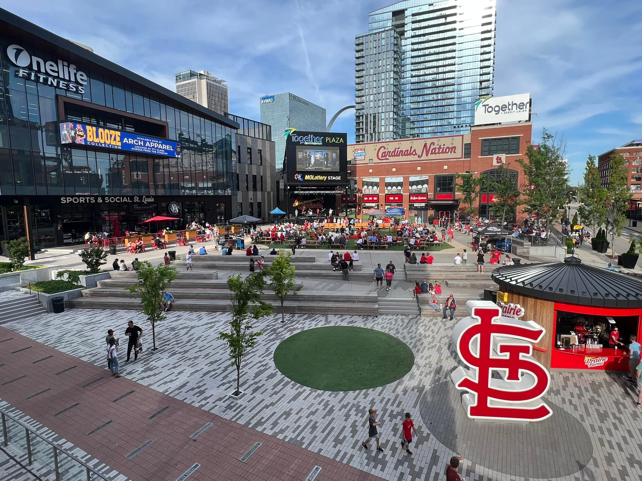
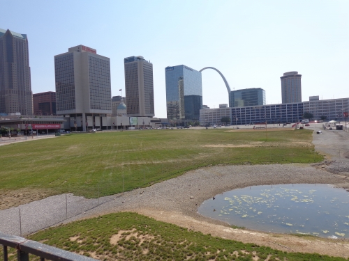
Right now, it’s not the centerpiece of downtown it was intended to be, but everything will get much better with the development of the Ballpark Village, which is finally moving forward.
Score: 4.5/5
Local Scene:
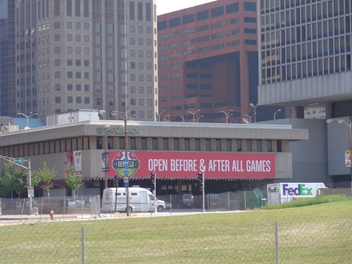
Again, the local scene is not too lively in the direct vicinity, but it will only continue to get better whenever the Ballpark Village is built. There is a Westin hotel across from the Musial Bridge. A few blocks down towards the city center past the grass ballpark village lot yields much more activity.
Considering Busch is against I-70 in one direction, and against parking lots and empty construction sites for the Ballpark Village in the other direction, you really have to walk a while to get to the major attractions. Mike Shannon’s and Flannery’s are among the many well known local options to hit up after the game.
Score: 4.5/5
Total: 9/10
Architecture & Aesthetics
Exterior Design:
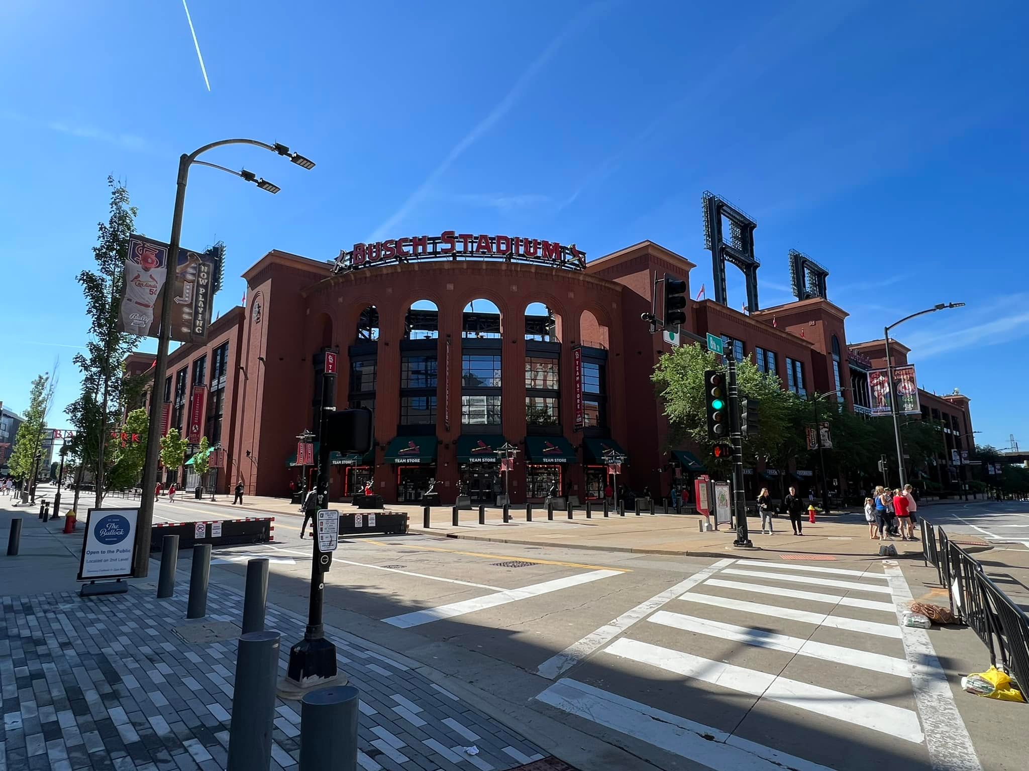
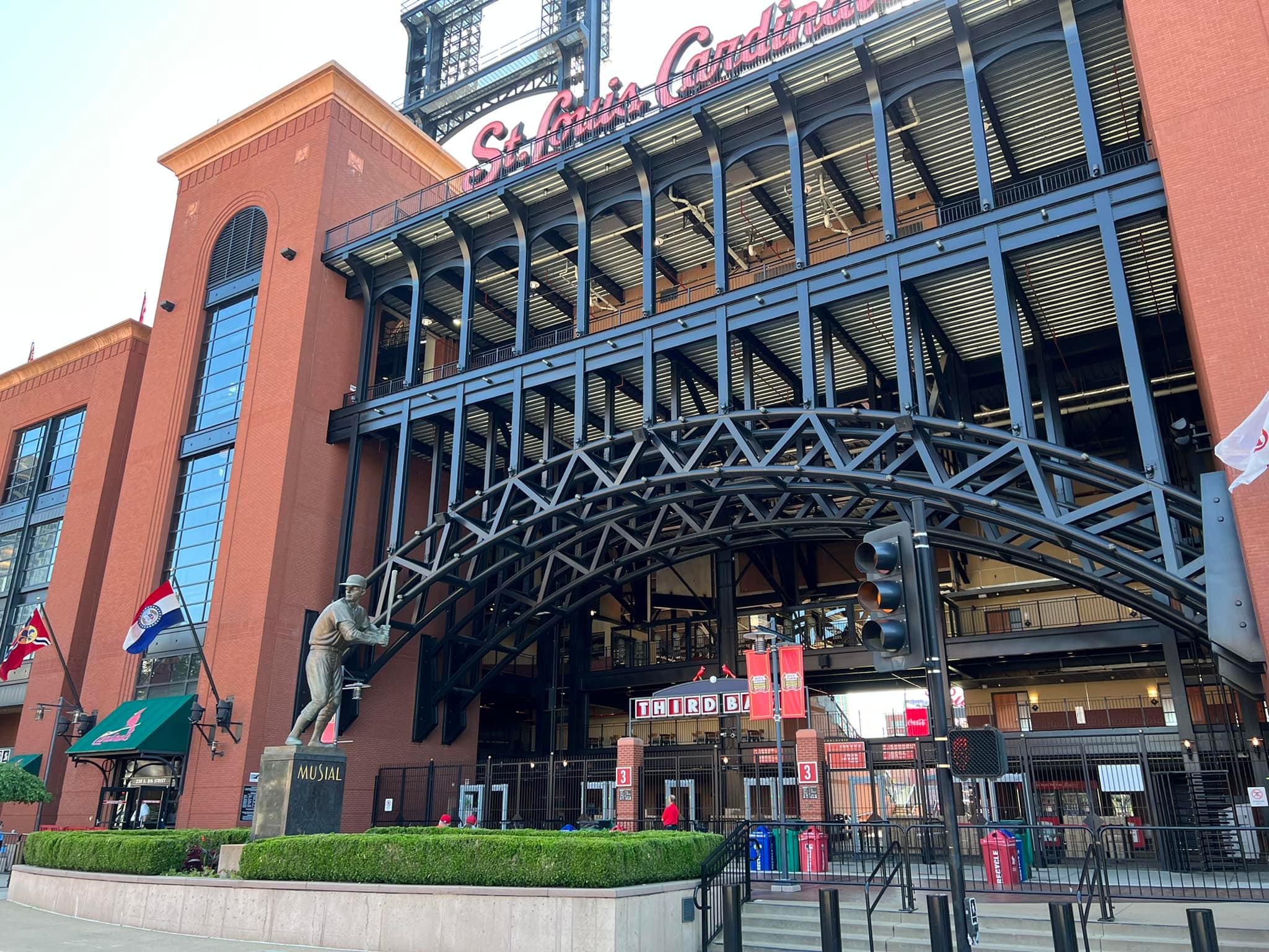
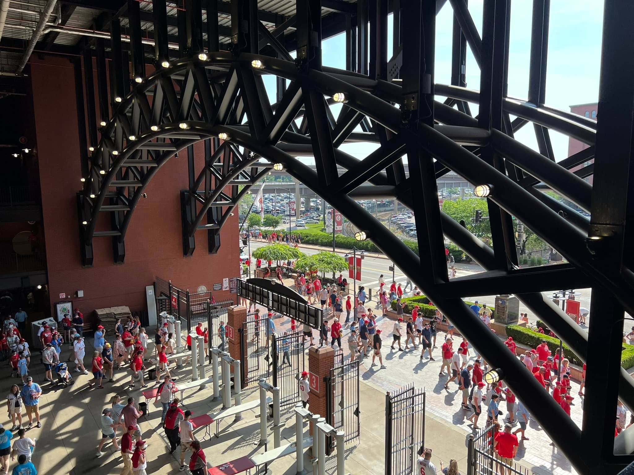
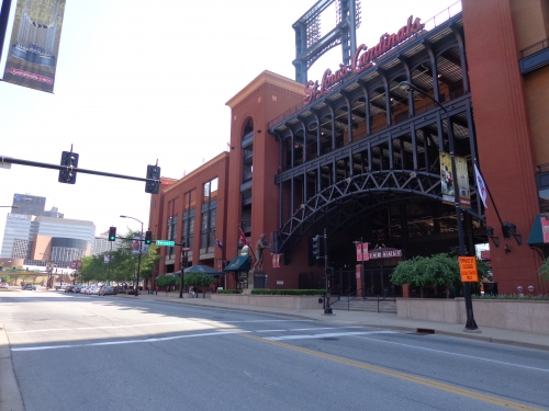
Just by judging the pictures, I did not have a good first impression of Busch Stadium’s tired formula of red brick and wrought iron. The design is rather standardized, as there are three similar circular rotunda entrances.
As outlined in the St. Louis Post Dispatch upon opening, the Cardinals definitely should have gone modern, embracing the progressive image of the Gateway Arch. But after being there in person, I have grudgingly concluded that Busch was done rather tastefully in St. Louis on the outside.
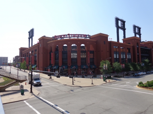
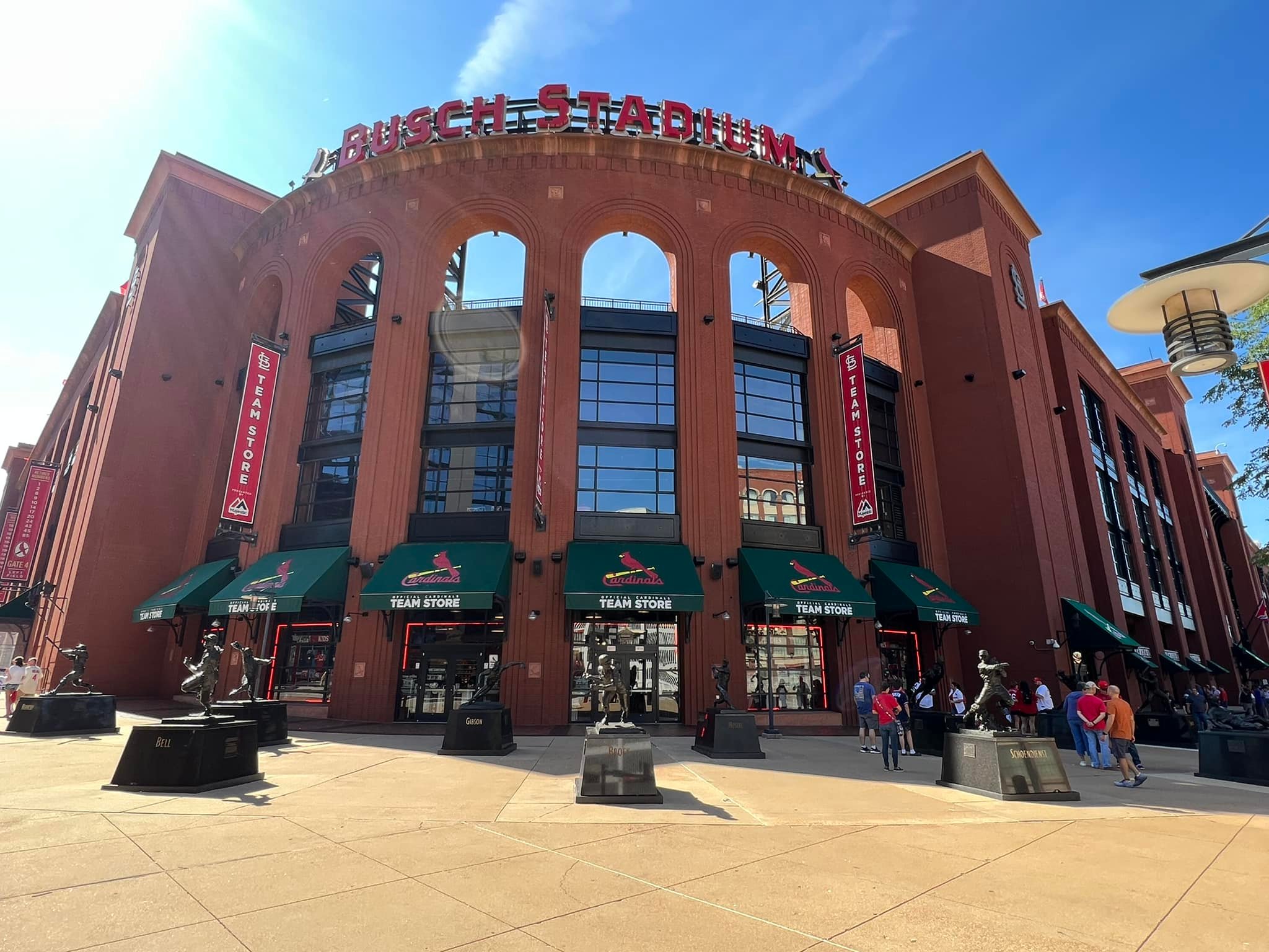
It’s one of the better red brick designs in baseball, while still not eclipsing the more nuanced façades in Denver or Arlington. The brick consists of darker hues, distinguishing the exterior from its peers and fitting the Cardinal red color scheme. Exposed steel is black as well, not green. The entire exterior façade mimics the local landscape quite well, especially the nearby Cupples Warehouses. There are plenty of Cardinal touches adorning the exterior, including small birds, statues, and personalized bricks.
Most importantly, there are architectural embellishments that reflect St. Louis. The Stan Musial Bridge is Busch Stadium’s highlight, echoing giant arches of the famous Eads Bridge. The ornamental terracotta panels on the main façade recall the famous Merchants Building, considered the Wall Street of the Midwest in the city’s heyday.
Still, it’s problematic that all they did was look to the past.
Score: 7/10
Interior Aesthetics:
Busch is really a simple, no frills retro park that doesn’t break new ground in terms of architecture and design. While that doesn’t prevent it from having crisp, clean architectural lines, it certainly lacks the innovation of a Citizens Bank Park or the contextual connection of a Jacobs Field or Comerica Park.
Rarely am I at a loss for words when writing a review, but I had to think about this derivative structure. It’s inevitably going to score high because it does a decent job of capturing downtown by default, but the outfield structure doesn’t have that vital symbiosis to the surrounding area like Camden, PNC, Comerica, or Jacobs.
In other words, it just looks like an opened up stadium that just happens to be downtown.
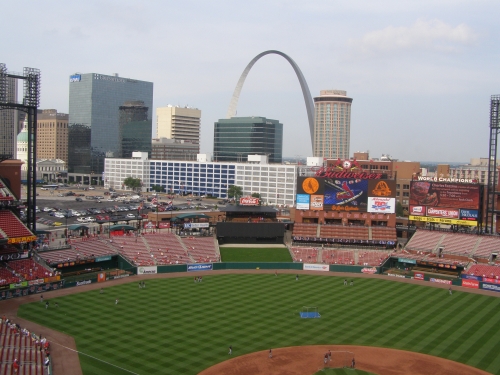
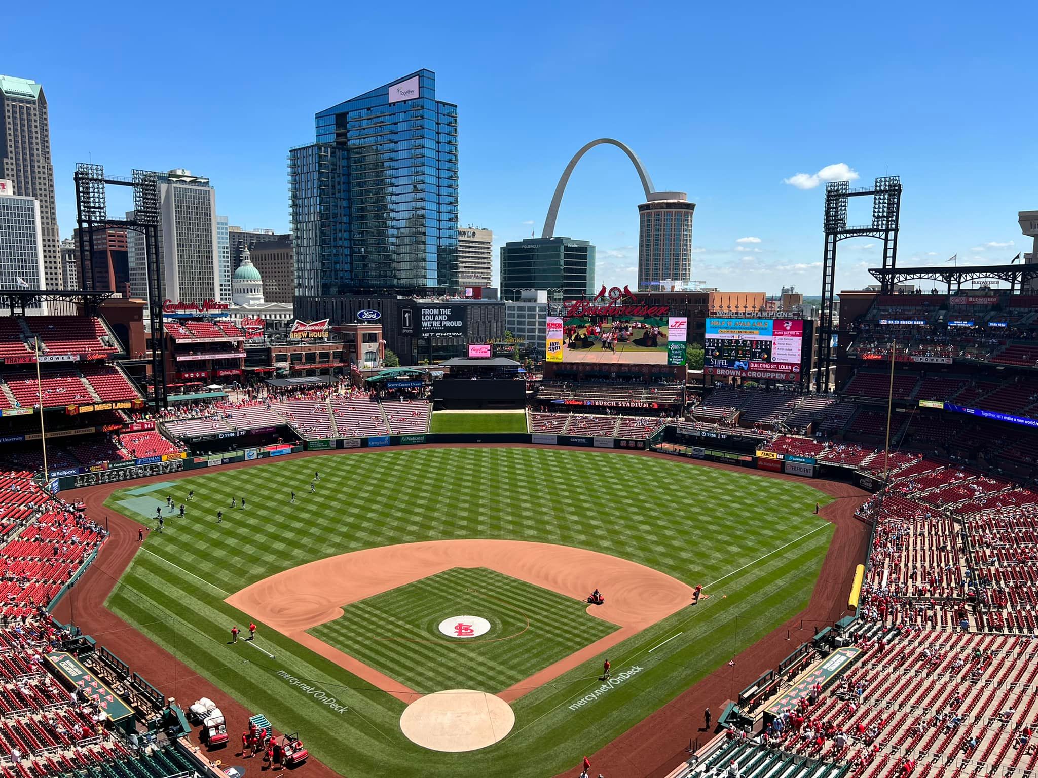
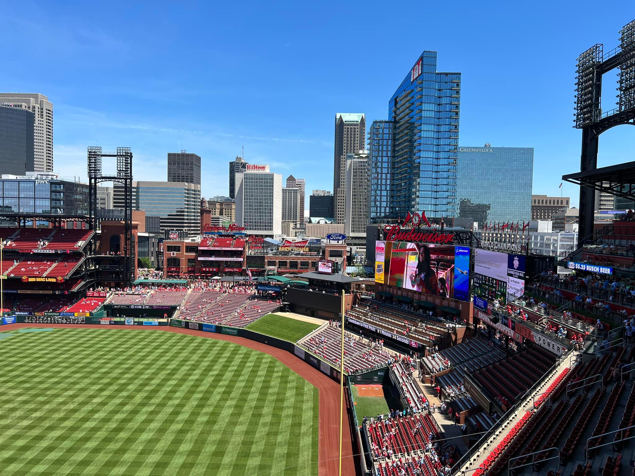
The central flaw in Busch Stadium’s interior design is that it was based on contextually integrating the hypothetical ballpark village in left field, which was never built. As a result, the foreground in left field is filled with awkward empty space in front of the skyscrapers, while the duel scoreboards block the views of some contextually attractive buildings in right field. Most of the problems I will mention in the outfield scene derive from this systematic flaw.
In terms of contextual integration and background scene, the absence of the ballpark village is palpable.
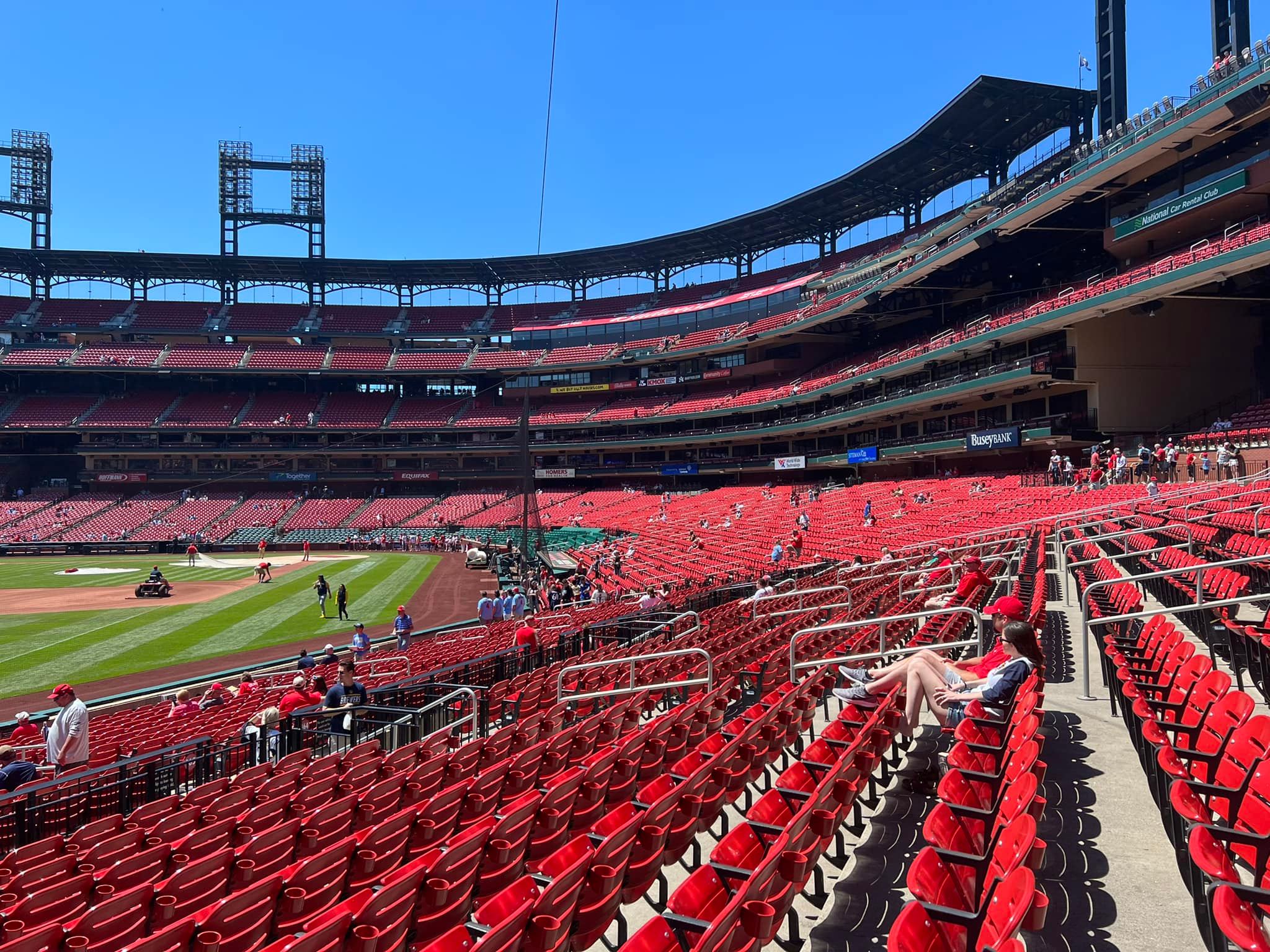
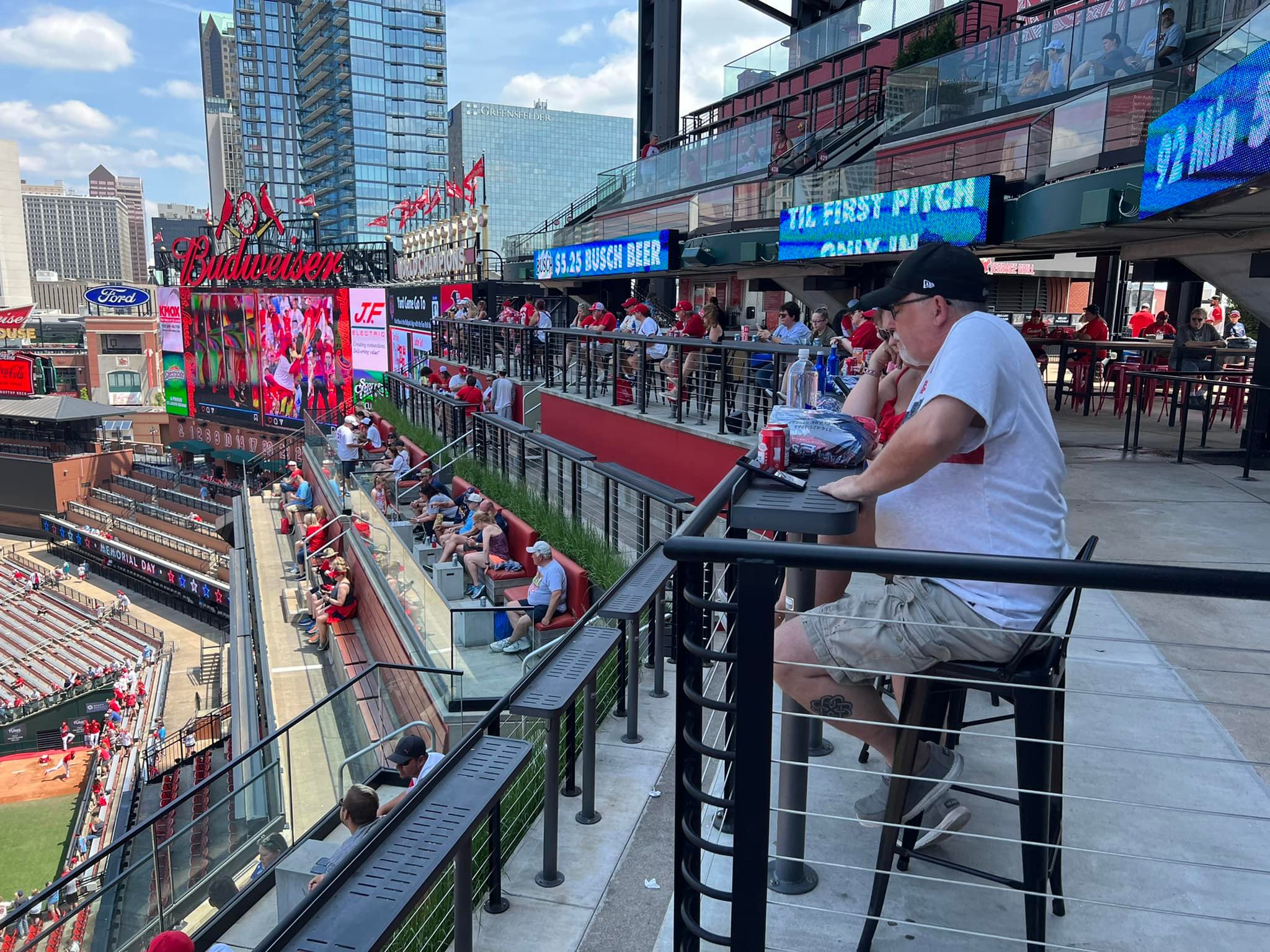
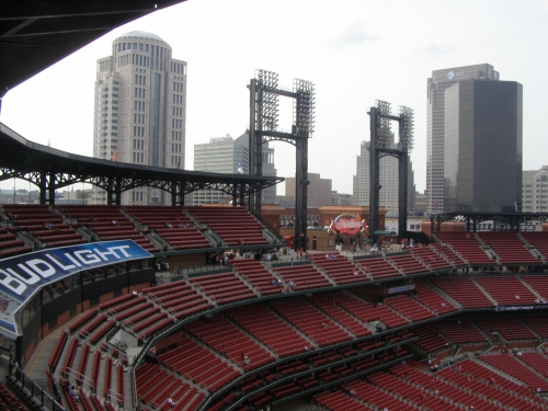
I don’t particularly like the seating arrangement, where the two levels of suites block the view from the main concourse, even though it is a good use of space. The upper part of the split upper deck discontinues on the third base side, creating a nice standing room area and some interesting asymmetry to the structure. I have no problem as it serves a functional purpose.
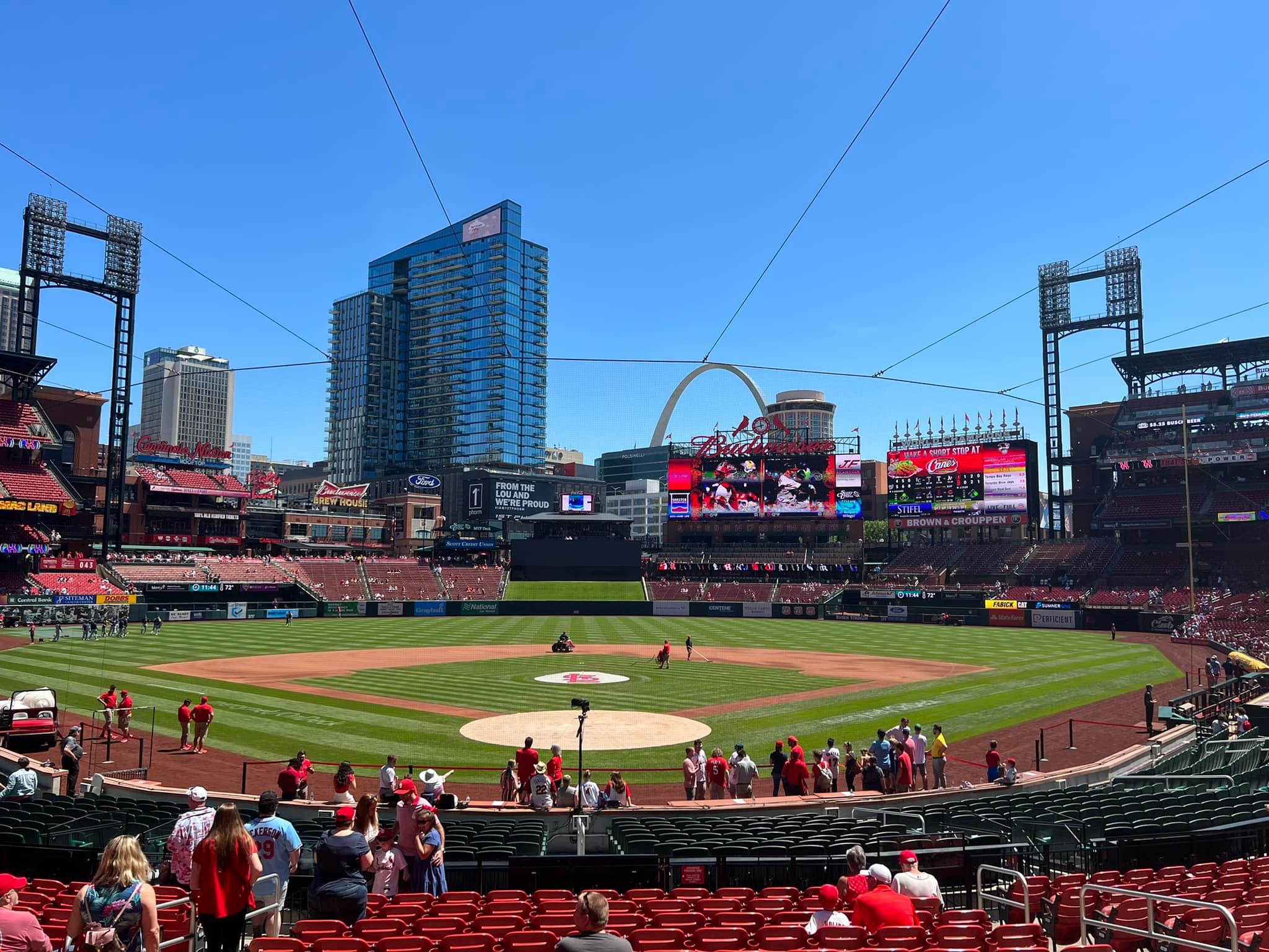
The scoreboard system is a bit visually cluttered here: the two scoreboards side by side create a busy look on the right field side of the outfield. There are also too many corporate ads in the ballpark, the most egregious being the giant Bud Lite ad in the upper deck behind home plate.
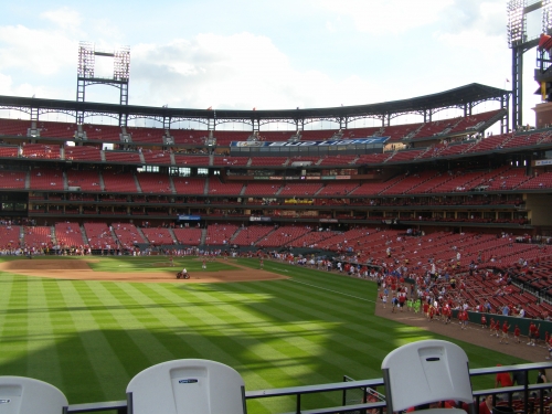
The location of the ad is for the benefit of tourists looking down from the Gateway Arch. While having an ad integrated into the seating structure itself is a faux pas in my opinion, its use makes sense here, and I can at least appreciate its novelty.
Save the downtown location, the outfield design is somewhat evocative of Turner Field, highlighted by the scoreboard patio in right-center field. Note how the black batter’s eye, scoreboard system, and patio seating engulfs much of the view from the lower bowl. Busch Stadium isn’t gimmicky, but it’s a bit more cluttered than it should be. It’s not very confident in its architectural lines.
It tells me HOK (Populous) not only ran out of bold ideas, but it also didn’t have the confidence to integrate the setting more into the structure. And every good interior design has either one or the other. This doesn’t feel like an urban park nestled into its surroundings, like you would think based on the location, but rather a generic stadium. Again, we might have had an entirely different sensibility if the ballpark village had been built.
With an upper deck in both left and right field, you could believe that Busch Stadium is a renovated 70s cookie cutter on the inside. So I guess it’s a cookie cutter in two senses of the word. Ask yourself: couldn’t they have achieved the same look basic look by opening up Old Busch?
We have a uniform single deck that spans the outfield in between the upper decks in the corners. Once you add the formulaic placement of some patio seating and a grassy knoll for the batter’s eye, we have one of the most uninspired interior designs in baseball! It looks like it was constructed using a mass produced formula.
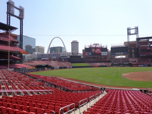
Many may point to the similarity between Busch, and another understated downtown park, Comerica in Detroit. Both have contextually based urban designs without distinguishing features or gimmicks, so many might be curious as to why I greatly favor Comerica. But as I have outlined, Busch has too much outfield seating amongst other uninspired elements. It seems to come off more formulaic than Comerica, and it doesn’t utilize its setting quite as well.
As much as I’ve bashed it, there’s absolutely nothing ugly about new Busch. While the outfield design is rather bland, it somewhat allows the distant backdrop to take over, despite not being in direct connection with it. It won’t score too low because it still honors that central tenet of a good interior design by maintaining a somewhat open feel.
Its architectural lines are clean, without with any diversions, distractions, or gimmicks, despite being a bit cluttered. The dimensions are pretty standard as well: no contrivances here.
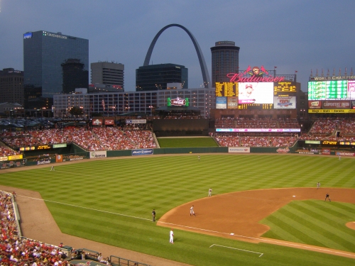
I will mention that the general color scheme of the ballpark is excellent. They pull off the red seats quite well by using a darker tone with black armrests. Note that all of the exposed concrete on the grandstand in the upper decks is painted dark green. That is fantastic attention to detail. For all of the use of red in the ballpark, there is a nice use of rich dark greens that complements the look well. The designers also integrated the red brick from the outside quite extensively on the inside, as seen by the portals and the patio. The black canopy above the upper deck is particularly attractive, effectively evoking the St. Louis Arch.
But in large part, Busch incorporates all the elements that embody the retro movement without adding any unique nuances of its own. It’s a nice enough interior design, but one that is so standardized it’s hard to describe. Especially considering the spectacular setting, it’s one of the safer designs in the majors. It ends up scoring decently by default.
Score: 11.5/15
Panoramic View/Backdrop:
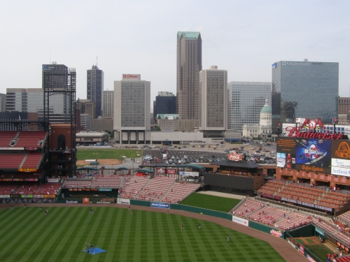
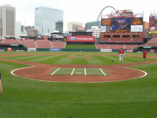
The ballpark is positioned downtown and provides sweeping views of the skyscrapers beyond the outfield. The view of the old courthouse and the Gateway Arch is particularly invigorating. The set-up probably isn’t as good as it could have been, but Busch Stadium still sports one of the most aesthetically pleasing backdrops in baseball.
Score: 5/5
Concourses:
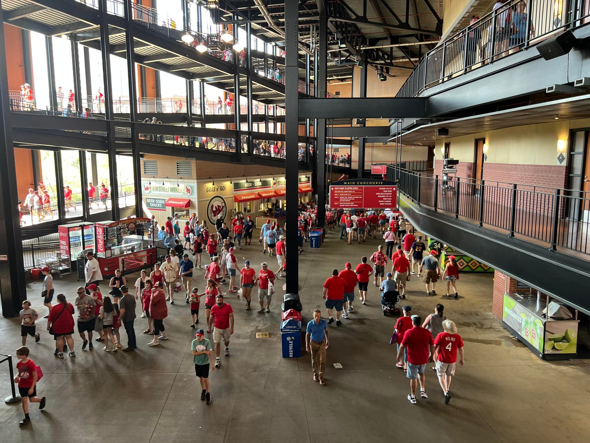
The aesthetic design of the concourses is not noteworthy. Muted beige and red brick adorn the area, which isn’t particularly engaging. The lack of Cardinal character throughout the concourses is a problem. The Old Busch Stadium manual scoreboard on the main concourse is oddly placed, but a nice touch nonetheless.
It’s also one of the darkest you’ll see in baseball, as it’s not open to the surrounding streets either, except in certain spots by the entrances. A bland concourse can really kill the atmosphere. While some argue that open concourses are somewhat overrated as a concept, I can’t stress enough how much simply having an “open feel” adds to the experience.
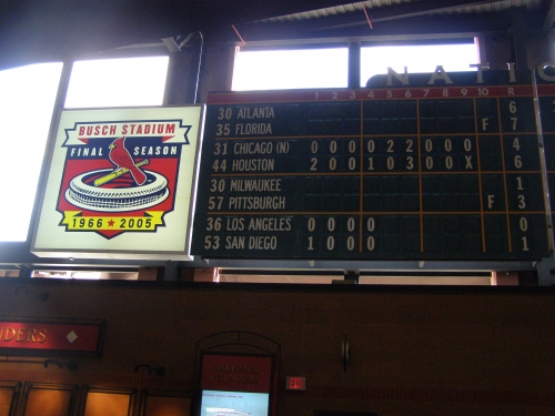
Score: 1.5/3
Total: 25/33
Functionality & Essentials
Sightlines:
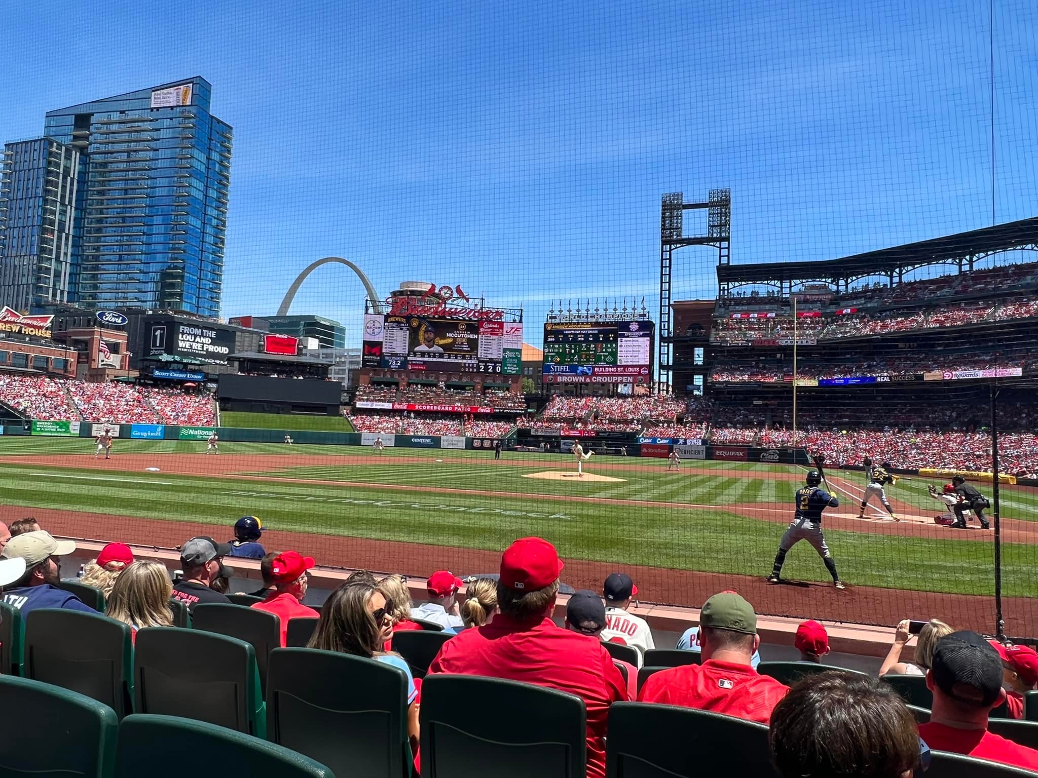
Overall, the sightlines are acceptable, but Busch Stadium stands out among modern ballparks because HOK (Populous) chose not to have each individual seat oriented toward home plate. Some earlier parks tried to angle the seats to a certain indiscriminate angle, which doesn’t always work (the Jake), but Busch didn’t even try.
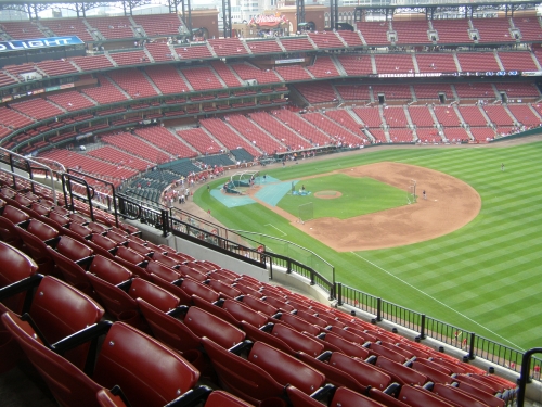
Instead, general seating areas are pointed toward home plate, but there are some examples where seats in certain areas are oriented more toward the outfield behind second base. Before the grandstand reorients itself as a whole (i.e. past the bases and before the foul pole), you’ll have some mediocre views with slight neck cramps. I want to reiterate there are no bad seats because of this seating geometry (unlike the Jake), but I don’t think this is a sound approach.
I assume they did this because pointing individual seats toward the infield can create awkward foot room in certain situations (stressing seat comfort). So the sightlines are generally average or good, but not great, from a viewing angle perspective.
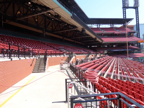
On the other hand, the stands are admirably cantilevered over the field, more so than all the modern ballparks except Petco Park. Note the upper deck in left field, where the stands are literally on top of the party porch. While that’s about the most extreme cantilever you’ll see in baseball, the upper deck as a whole is pretty close to the action. The upper levels are very high though, limiting the appeal.
Busch’s sightlines are good, but with seating right on top of the action, it could have been elite with better seating angles.
Score: 8/10
Seat Comfort:
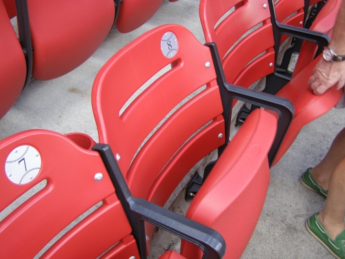
In a random and unusual gesture, Busch Stadium appears to have stressed seat comfort more than any other retro ballpark.
The seat comfort at Busch is among the best in baseball: the seats are ample in size, and there are more padded seats than every park in the majors, save Yankee Stadium. Every diamond, dugout, and field box seat has theatre style padded seats, along with all of the premium areas. Every seat, not including the bleachers, has a cup holder. Unlike New Yankee Stadium, the bleachers have backs. There are a lot of bleacher seats here (that’s not uncommon, but this park has slightly more), but I’m assuming they may have done that because local fans like them, not as a cost cutting measure, because they took time to pad so many seats. If it was a cost cutting measure, it wouldn’t be surprising though.
Score: 5/5
Concourses:
Unlike almost all ballparks that have opened after 1995, the main concourse on the lower level is completely closed from the field, except for a small area in left center. Throughout most of the main concourse, there is a lack of standing room only areas for fans to watch the game, in contrast to others of the era. These issues place a lower than necessary ceiling on the ballpark’s functional value for the fan.
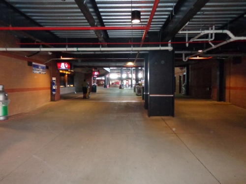
Suites block the view from the main concourse, which speaks volumes to where the Cardinals’ priorities lie. They did provide very larger portals, but the concourse system is automatically sub-par because of this fact. Again, perhaps management thought this wouldn’t be a high priority for the knowledgeable fans in St. Louis, who are more unlikely to get out of their seat and explore the ballpark.
Despite this modern requisite for a good ballpark ignored, the concourses throughout the ballpark are adequate in size, though I may have overrated the concourse width a little bit in 2009. The oversized press box blocks some of the club level concourse, though parts of it are open. The concourse is open throughout the upper deck, employing the controversial split upper deck design.
Again, it’s also one of the darkest you’ll see in baseball, as it’s not open to the surrounding streets either, except in certain spots by the entrances. A bland concourse can really kill the atmosphere. While some argue that open concourses are somewhat overrated as a concept, I can’t stress enough how much simply having an “open feel” adds to the experience.
As a side note, I do love the standing room area by the Hardee’s in the upper deck on the third base side. A full, open standing room area unimpeded by grandstands in the upper deck provides a unique vantage point, and it is a nice touch more teams should copy (this is only matched by Turner Field, but it is a good thing this time). I just wish they had done that more on the main concourse.
Score: 3.5/7
Scoreboard System:
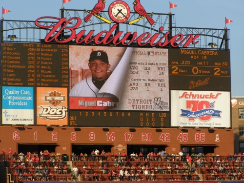
The scoreboards at Busch Stadium do not use the very best technology available in 2006. The Cardinals seem to be lacking in some fashion everywhere you look. There are two: one medium sized colored board used for out of town scores and one small sized video board, supplemented with three small matrix boards.
They show both team batting orders and only some information about the batter. I don’t really understand the function of the board in right field, used solely for out of town scores and ads. Once you take that away, this is actually a system that’s just as rudimentary as some of the 90s parks. This is symbolic of the laziness of this facility overall.
Score: 2/3
Total: 18.5/25
Amenities & Features
Quality and Selection of Concessions:
The quality and selection of the food at Busch is marginal at best.
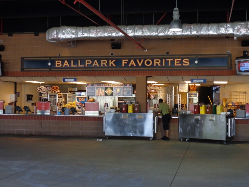
There is an average selection of BBQ, highlighted by turkey legs, brisket, and pulled pork. Busch Stadium has a nice selection of Mexican food, led by quesadillas, burritos, and soft tacos. The famous toasted ravioli/fried cannelloni specialty is thrown in to add some variety, but that’s about it.
They recently added a farmer’s market and an Asian stir fry stand, the latter of which seems to come and go throughout the ballpark’s tenure. The Ben and Jerry’s stand is a wonderful touch, though.
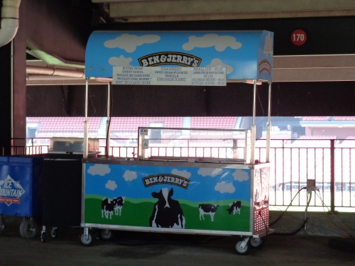
There is a mini Hardee’s concession stand set up in the upper deck. The specialty fry stand is cool, but there’s very little to set the food apart here. Other than ravioli/cannelloni, you can find almost everything else in most other ballparks. There’s nothing of great quality, either. There is a complete lack of regional, high quality names in the ballpark, coupled with a lack of mall-like variety. You need one or the other.
While the variety of food is not that bad, just subpar in comparison to its competitors, the beer selection is flat out bad. Only Bud and Busch throughout most of the park. Other than the Backstop Bar behind home plate, there are few kiosks serving more select options.
Score: 3.5/5
Regional/Signature Concession(s):
St. Louis’s own toasted ravioli/toasted cannelloni is clearly considered their signature food item. While it is distinctive, the consensus is that it’s pretty mediocre: I’ve never seen it make the lists of best signature ballpark foods and the New York Times said it was the worst food in Busch Stadium. The Cardinals need some locally run food stands.
But this is all opinion and a matter of taste; many in St. Louis obviously love it. While not run by an authentic local eatery, you can’t find it anywhere else! I wish I had tried it when I was at Busch in 2009 (I tried it at their spring training venue, Roger Dean Stadium, at it was pretty good).
Score: .5/2
Public Restaurants/Bars/Sitting Areas:
One important caveat is the complete lack of restaurants in the ballpark. This is the only ballpark built since who knows when, my guess would be the Metrodome, to sport no restaurants whatsoever. Just think about that. It’s pretty laughable when you look at the ridiculously expansive options offered around the league. They don’t even have a premium club restaurant, which wouldn’t even be counted here. Busch is way behind in amenities.
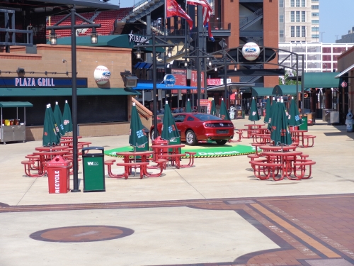
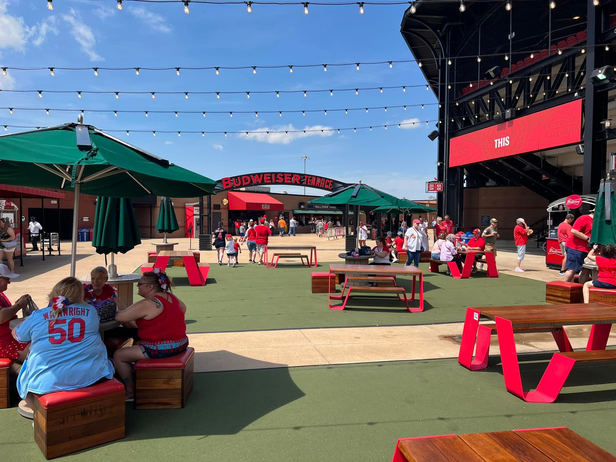
Perhaps since there were so many patio club options, they deemed it unnecessary, but I think the average fan would beg to differ. I think they’d be best served making the scoreboard patio into a restaurant area, whether is requires a separate ticket or not.
There is the backstop bar behind home plate, along with some picnic tables in the upper deck. There are also some picnic tables in center field at the Ford Plaza. So at least it’s a step ahead here of the oddly lacking New Marlins Park.
Score: 4/5
Premium Seating/Clubs:
Other than the usual home plate club and mezzanine club, Busch Stadium uses a fascinating different premium seating model focused on numerous auxiliary all inclusive areas.
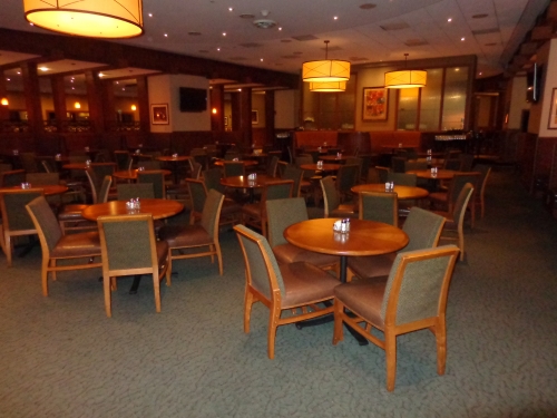
The upscale Cardinal Club behind home plate provides as exclusive of an experience as any ballpark in the majors, while equally others in luxury. In terms of ultra-premium home plate clubs, this is one of the largest areas in the majors. Lucky fans will walk down a marble staircase to be greeted by a grand piano and an expansive dining room decorated in wood. There is also a press room adjacent to the buffet area.
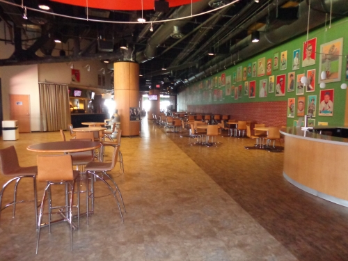
The mezzanine club level, known as the Redbird Club, is especially well done as well. With its polished colored floors, Cardinals carpet, and old enlarged baseball cards on the wall, it doesn’t have the feel of an upscale country club like other club levels in the majors. While it’s not as luxurious as some, it screams baseball. Take special note of the enlarged baseball cards throughout the club. You know you’re at a ballpark when you’re in the Redbird Club. The Cardinals further enhanced this area with upgraded lounge chairs and tables in 2012.
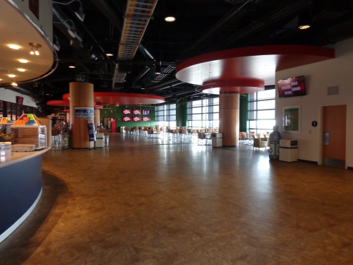
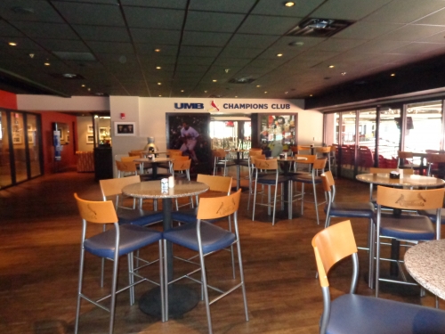
Busch Stadium sticks out in its impressive array of random all-inclusive areas. The Champions Club, which houses the 2006 and 2011 World Series trophies and other Cardinals memorabilia, the Bank of America Club, and the Legends Club are among many options that cater to the all inclusive market. Other unique options of that nature include the Commissioner’s Box next to the dugout, which includes many interesting perks, and the Coca-Cola Scoreboard Patio in the outfield, which includes tables and countertops. There are a number of other minor ones too. This premium-seating model of random luxury clubs in non-premium areas is a remnant of the mid 2000s.
The suite levels at Busch, which are all in between the bases under the club level, are among the closest to the field. No premium membership restaurants are available.
Score: 4/5
General or Artistic References to Baseball or Team History/Museums:
When the ballpark opened, it was roundly criticized for not having enough allusions to the long and illustrious history of the Cardinals on the inside.
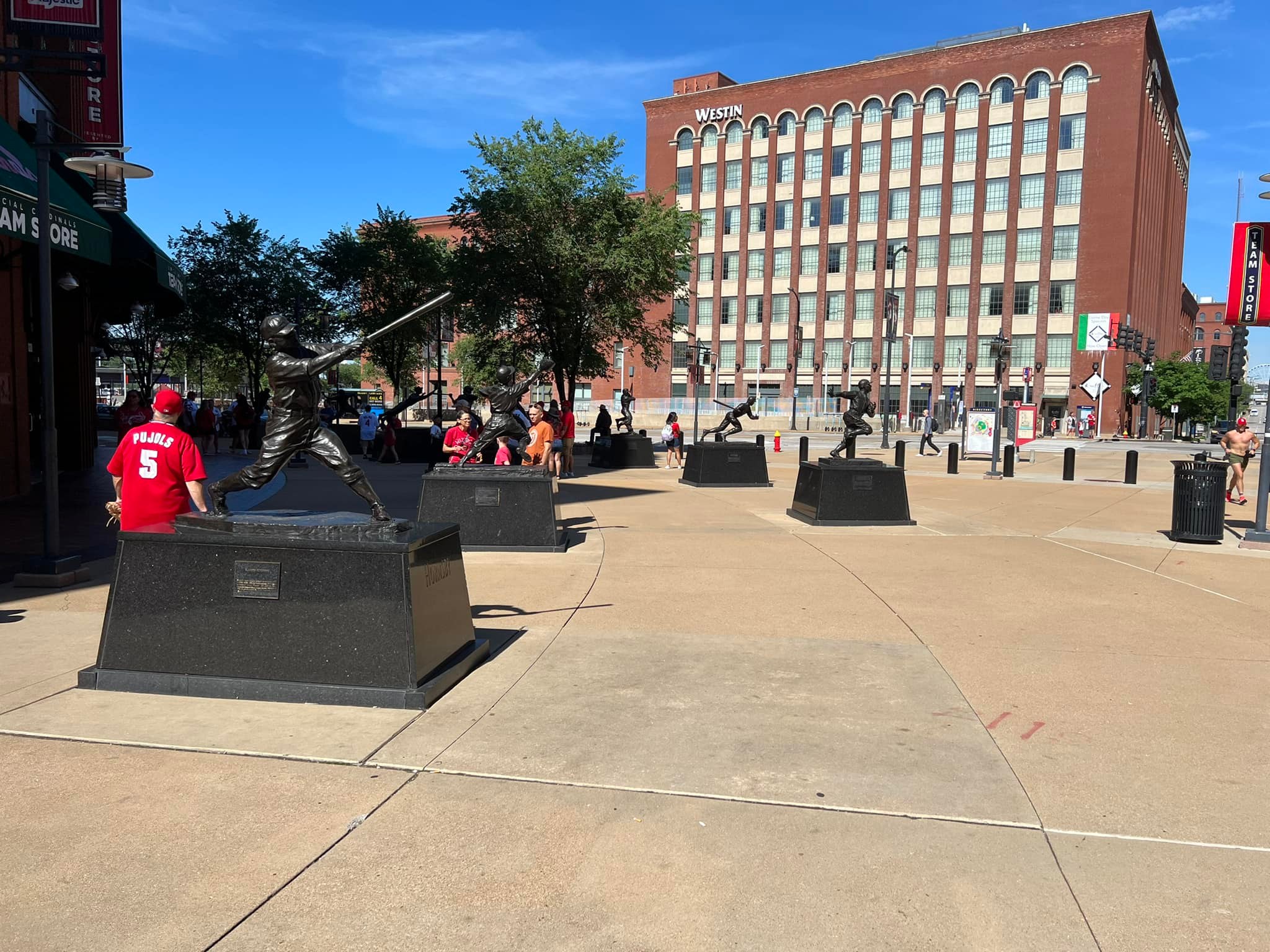
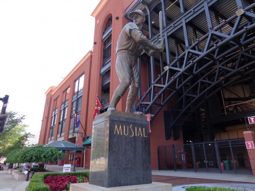
Let’s start with the positives: the exterior of the ballpark at least makes an effort. Perhaps the best feature on the exterior is the giant statue of Stan Musial by the Musial Bridge. There is a tasteful display of Jack Buck on the side of the ballpark by the outfield. In general, the Cardinals do a great job in alluding to history on the outside, at least in terms of quantity.
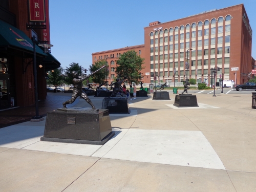
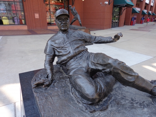
The numerous statues on the exterior by the front entrance are cheap and poorly designed, sculpted in an odd, smaller scale, lacking the distinctive expressions that would characterize the players. There seem to be too many statues in one place. While there are a few great ones, the disastrously lifeless and generic facial expression on Enos Slaughter generally characterizes the bunch.
But at least there’s something on the outside. There are no references to the team history on the main concourse, other than the Old Busch Stadium scoreboard, which is oddly placed. No museum or plaque area honoring the history. That’s pretty egregious. St. Louis needs to take a page from Atlanta, Cincinnati, Detroit, and Philly. Or even Pittsburgh and Cleveland for that matter. Even San Francisco, with its complete lack of space, managed to seamlessly integrate historical touches into all corners (literally) of the ballpark. St. Louis is pretty alone here, in terms of classic cities honoring team history with their retro ballparks.
They do a better job of presenting history in the premium areas. There is a separate Champions Club dedicated to team history. The classic baseball cards in Redbird Club are a nice touch. On the playing field, the championship flags are played on top on the scoreboard and the retired numbers are on the left field wall. There are also some championship logos on the Cards dugout. But none of this really compares to the center field set up in Old Busch Stadium.
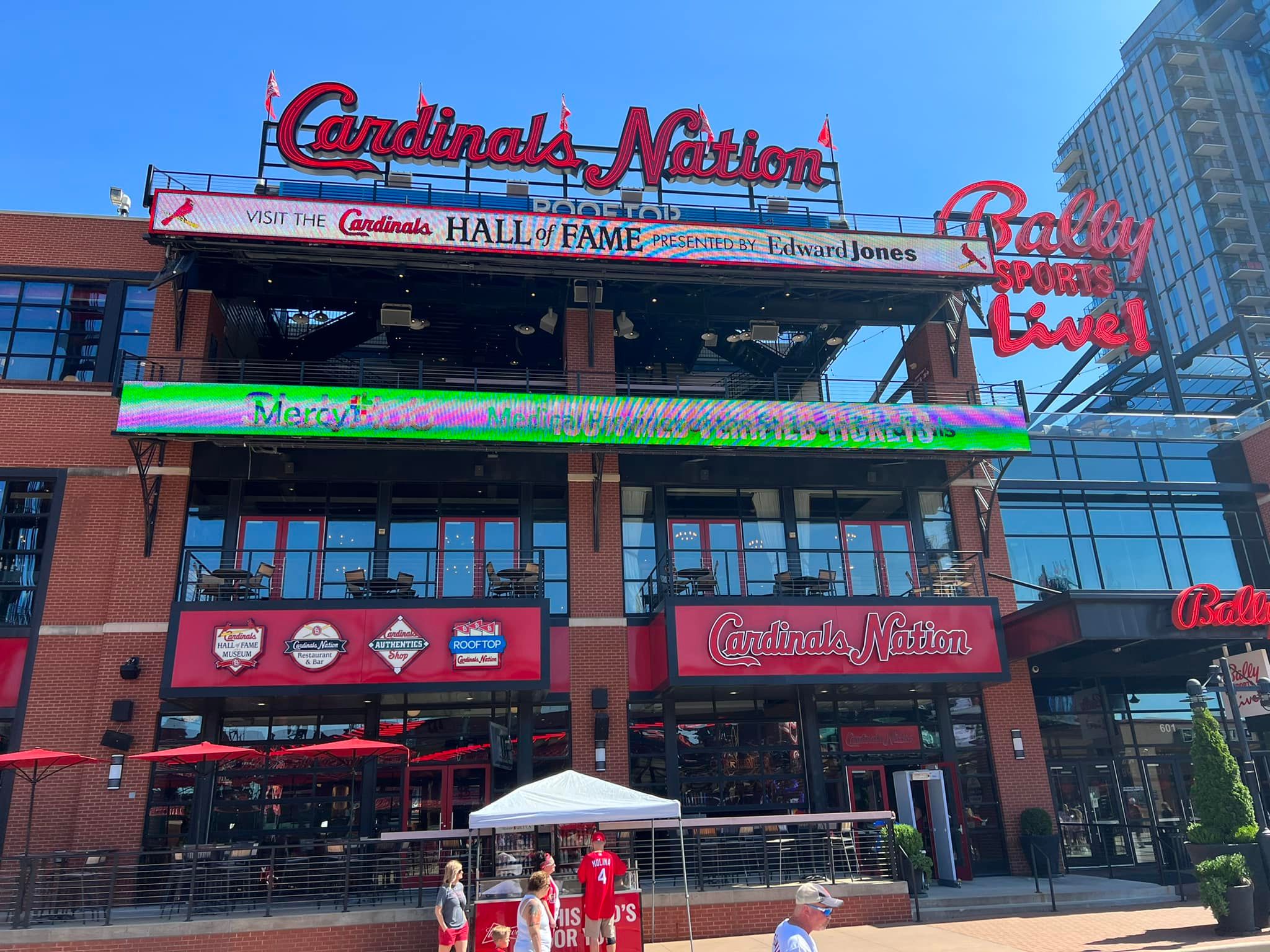
While the opening of the Hall of Fame museum will help (though it is not even in the ballpark), the team did a sub-par job in acknowledging Cardinal history, especially considering its depth. Just putting a bunch of random statues by the front entrance doesn’t cut it for me, as Busch Stadium is under par in yet another category.
Score: 4/5
Entertainment/Kids Activities/Other Amenities:
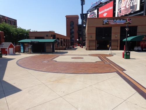
Busch Stadium has plenty of fun stuff to entertain the fans, but it’s not too overbearing. The Ford Plaza behind center field is a large area designated for pre-game entertainment, including a concert stage at the back. Most notably, the U.S. Cellular Family Pavilion houses batting cages, speed pitch, and various other features offered for children of all ages. Note the popular Make–a-Fredbird shop, modeled after Build-a-Bear!
Score: 2/3
Total: 18/25
Atmosphere, Vibe, & Policies
Atmosphere/Fan Support:
Without a doubt, the St. Louis faithful are Busch Stadium’s biggest asset.
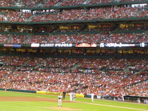
While the fans are not as boisterous as some, they are in my opinion, the most knowledgeable in baseball. In no other ballpark, do you see more fans scoring the game on scorecards. No other fans sport their team’s jersey quite like the Cardinals fans. They’re among the friendliest fans in baseball as well.
While people often cite New York, Chicago, or Boston as the greatest baseball towns, St. Louis probably gets the nod, considering it’s the only city where baseball is undoubtedly the most important sport in the area. It’s the only one that’s a clear baseball-oriented town, with the Rams and Blues taking a backseat. And a ballpark filled to capacity is always a great ballpark, as they say.
Score: 5/5
Ballpark Policies/Customer Service:
Like most of the new ballparks, Busch allows fans to explore non-premium areas before the ballgame. The ushers are very highly regarded at Busch Stadium. As I walked around the ballpark, they were all friendly and accommodating. When I went into an all-inclusive restricted area behind the batter’s eye, instead of kicking me out, an usher offered to take my picture. While ushers are usually good in major league ballparks, the concessionaires were unusually good spirited. The beer men walking down the aisles were especially funny. Good staff all around.
Score: 2/2
Bonus:
For Ballpark Village +2
For having some of the best and most loyal fans in baseball +2
For stressing seat comfort and having more padded seats than any other park in baseball, other than Yankee Stadium +1
For the Musial Bridge +1
For being the only ballpark to significantly integrate a national landmark into the ballpark schema. The arch will always be looming over New Busch, instantly making it a national icon of St. Louis baseball +1
Score: 7
Total: 14
Conclusion
Busch Stadium seems to be one of the few ballparks where there is a consensus verdict from the ballpark community: it’s the ultimate lazy retro cookie cutter. I went out of my way to return in 2012 when I was driving through the area to verify that I gave it a fair shake the first time (and to update my pictures). It’s nice enough; it has a good setting, but it is just so extremely derivative. If you think about it, they made a ballpark with a great skyline view of the St. Louis Arch about as banal as possible. It’s telling that it’s even hard to find bonus points.
I’ve come to the realization that the Cardinals didn’t solely fail (in comparison to other ballparks) because of the ballpark’s architectural design, which is “safe,” but not bad. Note that the interior design scores above average by default because of the great location and views. Plenty of ballparks are derivative, so that’s not the main reason for the low score.
Busch Stadium gets a particularly low score overall because it is lagging in almost all other objective categories (except for the unusually comfortable seats). The bottom line is Busch Stadium not only fails to break any new ground architecturally, but also fails in meeting high standards in other aspects, such as the concessions, restaurants, concourses, scoreboards, historical/artistic touches, and other amenities.
But the location and the fans save it from being one of the consensus worst retro parks. Some have made the argument that the fans and the team are all that ultimately matter, making Busch Stadium’s objective flaws not that important, as it is still a great experience at the ballpark. Yes, I get that, but we are grading ballparks here, and the fan atmosphere doesn’t carry enough to compensate for Busch’s flaws.
In the future, this is a ballpark that could get much better though, as the score could jump 3-5 points with the opening of ballpark village and by fixing some of the objective flaws.
FINAL SCORE: 87
RANKING: #11/30
Summary
TL;DR? Here’s the long-form piece in a nutshell:
Busch Stadium is one of the more difficult ballparks to assess, because nearly all of its assets are derived from factors independent of the actual building that was heavily value engineered.
While baseball’s 2nd best skyline views, a now-completed Ballpark Village, and the Cardinals fanbase bolster the overall Busch Stadium experience, there aren’t many frills to elevate a merely passable structure.
1) Independent of the postcard views, Busch Stadium is one of the most generic parks of its era, perhaps epitomizing the peak “retro cookie cutter.” While other parks with skyline views seem more organically interwoven with their urban context, Busch Stadium feels kind of dropped from the sky into Downtown St. Louis, with a boring outfield seating design that could be mistaken for a renovated multipurpose facility. The interior feels like a template, a generic starting point without any distinction in its own right.
Recalling the local area, the exterior facade is admittedly beautiful, but it comes across as a bit too formulaic and derivative for 2006, and I don’t think retro red brick was the right design choice for the city. Yes, it’s gorgeous, but architecturally, a very safe and unoriginal design.
2) Independent of Ballpark Village outside of the park, the amenities inside of the park are completely unimpressive, with a main concourse closed to the field, poor to pedestrian food and craft beer quality, and a notable lack of destination social spaces within the footprint. The Cardinals Hall of Fame in Ballpark Village is outstanding, but there’s aren’t many historical tributes that scream Cardinals baseball within Busch’s confines.
Busch Stadium is all about the view, the fans, and the features outside in Ballpark Village, without much creative thinking applied to the structure itself and to the neglect of adding fan-friendly amenities inside the park.
Those assets alone are outstanding enough to get Busch Stadium in my half top, but it should have been better.