
Oriole Park at Camden Yards
| Setting | 18/20 | 1 Thumb Up |
|---|---|---|
| Locale | 5/5 | 1 Thumb Up |
| Accessibility | 4.5/5 | 1 Thumb Up |
| Neighborhood Local Scene | 8.5/10 | 1 Thumb Up |
| Architecture & Aesthetics | 57/65 | 2 Thumbs Up |
|---|---|---|
| Exterior Design/Aesthetics | 15/20 | 1 Thumb Up |
| Interior Aesthetics/Visuals | 38/40 | 2 Thumbs Up |
| Concourse Aesthetics | 4/5 | 1 Thumb Up |
| Functionality & Essentials | 30/50 | 1 Thumb Down |
|---|---|---|
| Sightlines: Field Proximity | 11/15 | Thumb Sideways |
| Sightlines: Seating Geometry | 1.5/5 | 1 Thumb Down |
| Seat Comfort | 6.5/9 | Thumb Sideways |
| Concourse Functionality | 9.5/15 | 1 Thumb Down |
| Scoreboards/Tech | 1.5/6 | 1 Thumb Down |
| Amenities & Features | 34/50 | Thumb Sideways |
|---|---|---|
| Concessions: Food Variety | 3.5/5 | Thumb Sideways |
| Concessions: Food Quality | 4/5 | 1 Thumb Up |
| Concessions: Craft Beer/Other Drinks | 3.5/5 | Thumb Sideways |
| Social Gathering Areas/Restaurants | 7/10 | Thumb Sideways |
| Premium Seating/Clubs | 4/9 | 1 Thumb Down |
| Historical Exhibits, Memorabilia, Art, & Other Displays | 8/10 | 1 Thumb Up |
| Kids Areas/Other Entertainment | 4/6 | 1 Thumb Up |
| Atmosphere, Vibe, & Policies | 13.5/15 | 1 Thumb Up |
|---|---|---|
| Fan Support/Attendance | 4/5 | 1 Thumb Up |
| Ballpark Traditions/Gameday Presentation | 4.5/5 | 1 Thumb Up |
| Ballpark Policies/Staff | 5/5 | 1 Thumb Up |
| Adjusted Raw Score | 152.5/200=76.25=76.5 |
|---|---|
| Bonus | 5 |
| Curve for All 7 | 7 |
| Final Score | 88.5 |
|---|---|
| Ranking | #8/30 |
|---|---|
The House that Baltimore Built
The Orioles’ field of dreams wasn’t just the first “retro” park: Camden was a game changer for contextual architectural design, ballpark amenities, and entire city, continues to be in the top echelon of ballparks
By: Cole Shoemaker
Written in 2013, ratings above are up to date for 2024, but this review below may be outdated and will be updated at some point; reviews and ratings are “living pages” updated yearly when necessary
So much has been written and spoken about Camden Yards—its narrative is as mythic as its sweep—that it’s difficult to summarize its influence without reciting clichés that have already been digested by millions of baseball fans.
It’s ironic that this is one of my last reviews, because a lot of what I’ve already written stems from the fundamentals of this ballpark. I know some may think praising Camden Yards borders on cliché now, but reviewing Camden at this point in my ballpark cycle gives me a deeper appreciation for just how incandescently brilliant this place was when it opened, and still is.
Ushering in a new era of old fashioned retro-styled ballparks, Camden Yards has received unqualified praise throughout the past 20 years from the baseball community for its contextual architectural design and new amenities, including a ridiculous amount of hype upon opening. And yes, we all know Camden Yards deserves credit for inspiring this new trend in aesthetics. Indeed, it is actually impossible to overstate this ballpark’s influence. George Will once called it one of the three most important developments of post-WWII baseball, along with the breaking of the color barrier and the development of free agency.
While still widely praised by critics and fans, I get the sense that some “ballpark aficionados” now praise it somewhat backhandedly.

Believe it or not, it’s a common line that there wasn’t anything particularly extraordinary or unusually unique about Camden Yards in comparison to other new retro ballparks. They say Baltimore just got there first, and any other brick and steel park could have spawned this new generation of stadiums. Some contrarians even had the gall to ask, “Why is everybody making a big deal of Camden Yards?”, claiming its “just another ballpark” and the copycats will be no better or worse. Many later in the decade agreed.
I take the contrary position and believe that Oriole Park is a uniquely special and revolutionary building, one that not only ushered in a generation of innovative features, both big and small, but one that also stands alone as the gold standard of all-time great ballparks.
Sure the retro movement was inevitable because the architectural ethos of America was swiftly changing, as you do see a clear evolution to some extent (see Dunn Tire Park in Buffalo, the later renderings with the warehouse but with symmetrical dimensions, the vague arched facade of New Comiskey Park). But if Camden Yards hadn’t been so perfectly executed in 1992, I don’t know if this style of ballpark would have gained as much traction. Can you imagine if Turner Field was the first retro park?
Camden Yards is the Halley’s Comet of ballparks. It’s a once in a generation structure. Just because it was the first isn’t the most relevant point. The creation of Camden Yards is like if the first person in the history of basketball to dunk was Michael Jordan.
Aesthetically speaking, you can make a strong argument it is still the best. In the same place where President Abraham Lincoln rode through on a train in 1861 and 1865, the interior design element of the warehouse is still unmatched. None of the subsequent ballparks were able to flawlessly incorporate such a prominent but authentic signature feature; especially one that so brilliantly ties the roots of the city and the country via Eutaw Street to the America’s pastime.
Similarly to how I think we underestimate how bad New Comiskey originally was (its much better now, obviously), I think we also underestimate what a giant leap forward Camden Yards was for the ballpark experience. To go from this to this in a matter of 12 months is extraordinary. The exact contrary sentiment is the more popularly held view among ballpark aficionados.
The implications of this building stretch far deeper than superficial aesthetic treatment, not only spawning a generation of retro clones, but also revolutionizing the idea of contextual integration, downtown views, urban settings, local food options, along with numerous other little amenities and design flares. It not only revitalized an area once characterized as the epitome of urban blight, but also changed the urban fabric of cities across America and revived the identity of Orioles baseball (although admittedly, that revitalization model was rarely worth it in terms of cost-benefit analysis, which again indicates why this situation was so special).
Perhaps most overlooked, it also got something right that almost all subsequent retro ballparks didn’t: building an authentically intimate structure with a low upper deck and great field proximity.
Also think about some of the more subtle innovative details the designers/architects implemented in Camden Yards that don’t often come to mind, all of which were later imitated:
- The placement of ramps on the inside of the ballpark behind the facade, allowing for unobstructed views of the exterior design. Before this, most new baseball stadiums featured ugly ramps on the outside
- The lowering of the playing field below street level allowing for easier entry
- A playing field below street level, coupled with pushing the upper deck forward, allowed for intimate exterior landscaping, thus placing the structure in scale with its surroundings
- Contextually responsive outfield dimensions along with adaptive reuse of local buildings
- Standing room only areas
- Double decked terracing of the bullpens, allowing for fan-pitcher interaction
- An attractive green ivy batters’ eye
- A classic team logo at the end of each row of the seats.
- Numerous other historical or referential displays, from the Memorial Stadium foul pole in right field and retro signage on the concourses to the hall of fame plaques
I won’t go too much into it in the introduction, but there’s painstaking attention to detail everywhere you look, from 1890s detailing on the top of the scoreboard to the old fashioned ads. There are numerous other fun features added since the ballpark’s opening as well, such as the home run plaques on Eutaw Street.
So no Camden Yards is not “just another retro ballpark” that “was lucky to be the first”. Looking at the park that opened one year before, many of the innovations weren’t inevitable. And 20 years later, the novelty hasn’t worn off.
At no fault of their own, not all of the effects of Camden Yards turned out to be positive, as many teams completely missed the point. First of all, they missed the point that these parks would be successful if they were authentically intimate with great upper deck field proximity, differing from deceptive intimacy clashing with three tiers of luxury suites.
But most importantly, Camden Yards was never meant to start a retro revolution of red brick ballparks; it was meant to start a revolution of ballparks representing their cities.
The significance isn’t that it’s old fashion; it’s that ballparks can be made better by abandoning templates and constructing something contextual. I don’t need to harp on the faux retro contrived quirks seen in subsequent retro ballparks, which I’ve chastised in numerous articles. But like many of the great first generation 1990s ballparks, we see none of that fake retro nonsense here. Just authenticity.
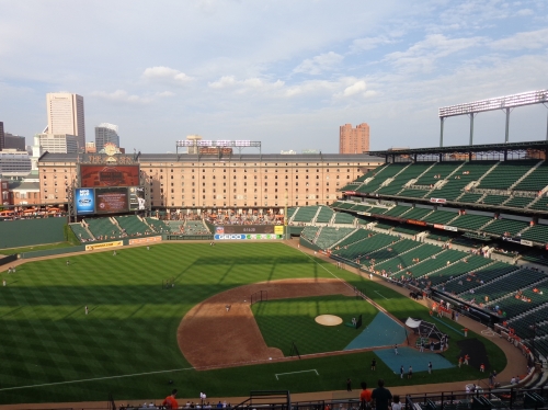
“We never felt that Camden was a retro ballpark”, Janet Marie Smith said, the revolutionary architect who spearheaded the so-called retro concept. “We were trying to design a ballpark that was responsive to the surroundings. We wanted the building to be contextual.”
Camden’s subjective ballpark innovations not listed above, like the green seats, steel trusses, and red brick, fit Baltimore perfectly. And the teams who copied these “retro” aspects without any appreciation for their civic/regional context did so at their own peril. Building an intimate structure that fits with the city in scale and substance is the framework for every great ballpark today.
The final point is that Camden Yards fundamentally changed the perception of Baltimore, and I’m not talking about the way it and other parks like Progressive, Coors, and AT&T changed the urban landscape of their respective cities. No, it changed Baltimore in a more transcendental sense; the way Wrigley Field is associated with Chicago and Fenway Park is associated with Boston, Camden Yards is and forever will be intrinsically tied to Baltimore throughout the 21st century. 20 years later, Oriole Park has become a tourist destination, in a way newer, superior parks like PNC, AT&T, and Comerica never will be.
As I just implied and many often point out, Camden Yards is by no means perfect due to a couple of functional design quirks. Although surprisingly wide, Camden features concourses closed from the playing field, contrary to the now ubiquitous open 360-degree experience.
While mitigated by superior field proximity, the sightlines are terrible in the aggregate: the seating geometry down the lines is an absolute disaster, as they made no attempt to angle the seats toward the infield. While minor, Camden Yards also features the weakest selection of premium seating in baseball, lacking any sort of premium home plate club, club restaurant (the Camden Club in the warehouse is now a private rental area), or upscale all-inclusive experience. The 1990s waiting room décor of the club level, while admirably charming and well-appointed, is all Camden Yards has in upscale options other than the usual suites on the aforementioned level.
While it still has some severe functional flaws, Camden Yards is still one of the best ballparks in baseball due to improving amenities, when coupled with timeless aesthetics and location. Camden Yards is still a top ballpark due to perennial enhancements, supplementing its revolutionary design and cementing it as America’s most timeless ballpark.
Setting
Location/Access:
The true brilliance of the Camden Yards concept is its location, effectively merging a highly visible and vibrant cityscape with a traditional design recalling the town’s past.
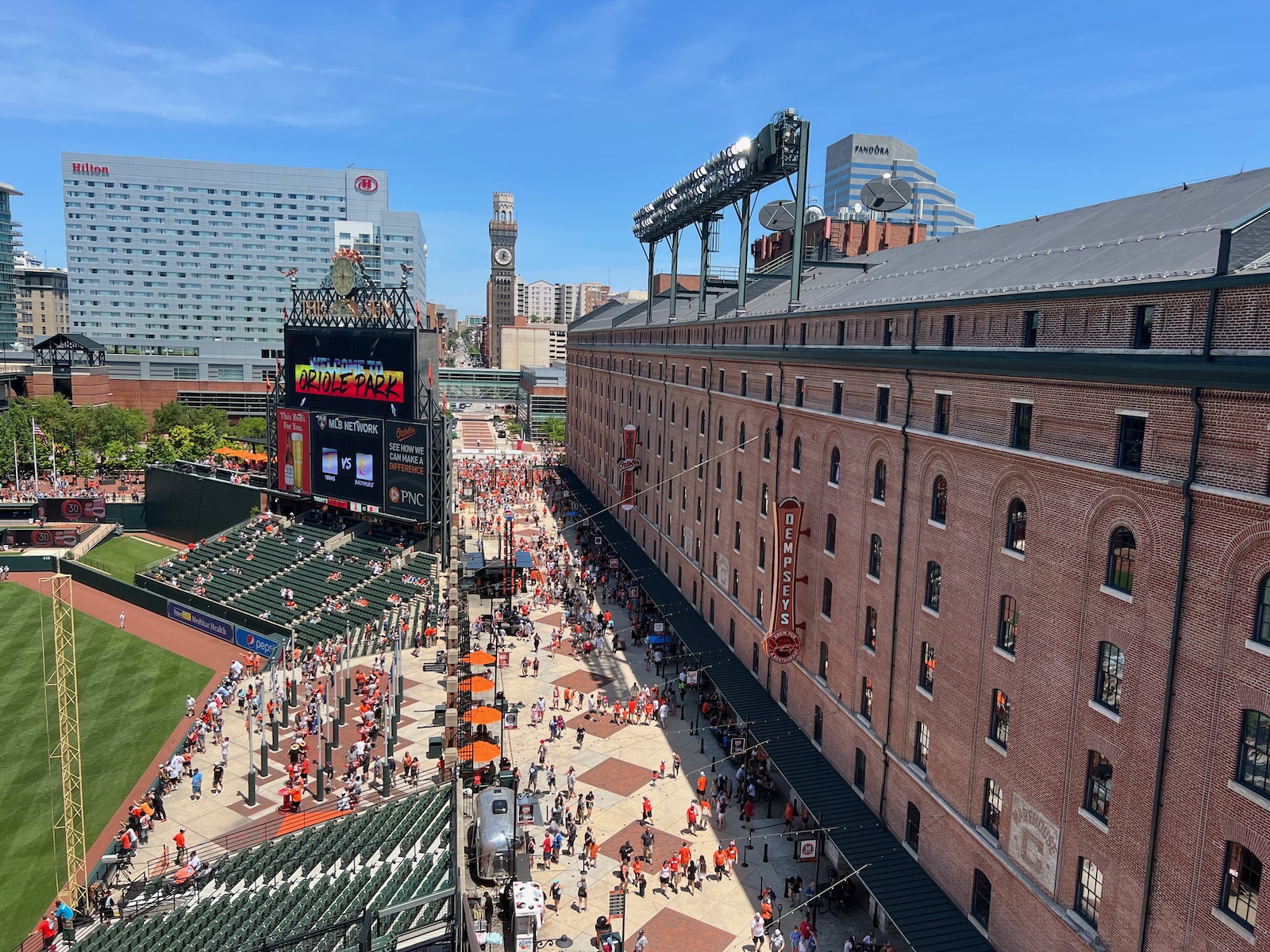
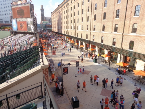
The ballpark is located on the southwest edge of downtown Baltimore, within a short walking distance of all the city’s attractions, including a 10-minute walk from the famed Inner Harbor. M&T Bank Stadium is located in the vicinity. The Orioles managed to literally integrate a street into the ballpark’s footprint, which serves as the right field concourse. Located in front of the B & O Warehouse and behind the standing room flag court, Eutaw Street is open to the public on non-game days and includes shops and restaurants. More on the warehouse later.
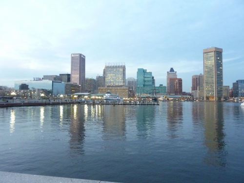
Parking around the ballpark is relatively plentiful, but many fans opt to park on the other side of the harbor for a scenic walk. In addition to multiple highways that converge on the city, Camden Yards is right next to I-395 on the home plate side, so access is fairly easy. There are also many garages around, which tend to be more expensive.
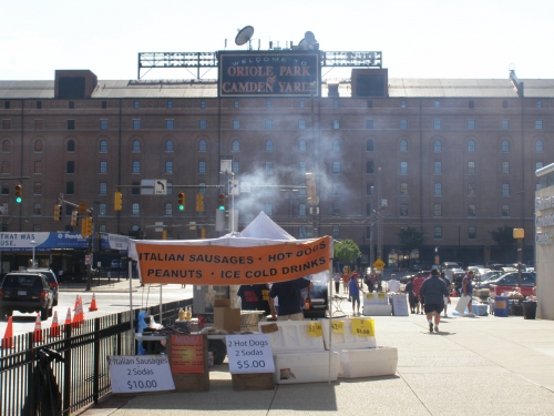
Parking north of the ballpark behind the warehouse enhances the game day experience, as independent street vendors selling hotdogs, peanuts, and Orioles merchandise will greet you. It’s a great environment. Another advantage of going to a ballgame in Baltimore is the mass transit. The light rail and MARC train are commonly used options.
Score: 5/5
Local Scene:
As mentioned above, Camden Yards most universal contribution to the ballpark scene wasn’t architecture or amenities, but the notion that a stadium could revitalize an urban area. As it turned out, Baltimore’s formula was perfect for success: close to mass transit, popular downtown restaurants, and old tourist attractions in the Inner Harbor area.
Many cities overlooked these unusually favorable circumstances in what turned out to be relative failures (other than Denver and San Diego, and perhaps Cleveland), leading to a national excess of unfruitful “stadium socialism.” The ballpark can’t be the sole catalyst. Touting the economic benefits and community value to cities, the Orioles new park became the prototype. Even though Camden Yards propagated this urban redevelopment myth across the nation, because the economic benefits usually don’t justify the immense cost, that doesn’t take away what this ballpark did for Baltimore.
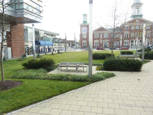
The Inner Harbor scene downtown was the epitome of urban blight, replete with abandoned industrial warehouses and shipyards. Decades of urban planning culminating in Camden Yards led to Baltimore being the great city it is today. The harbor features the National Aquarium, Maryland Science Center, and the Maritime Museum, along with numerous restaurants and shops. A hopping area for people in their 20s, Federal Hill has an excellent bar scene south of the Harbor.
Nearer to Camden Yards, there are a number of sports related attractions, in addition to a solid pre-and post-game restaurant and bar scene. The most salient cluster of establishments features the popular Pickles Pub and Sliders Bar & Grille. Be sure to check out the childhood home of Babe Ruth as well.
It doesn’t reach the level of newer ballpark local scenes because there isn’t as much in the direct vicinity (along with the fact that there are some impoverished areas nearby), but there’s plenty worth checking out.
Score: 4.5/5
Total: 9.5/10
Architecture & Aesthetics
Exterior Design:
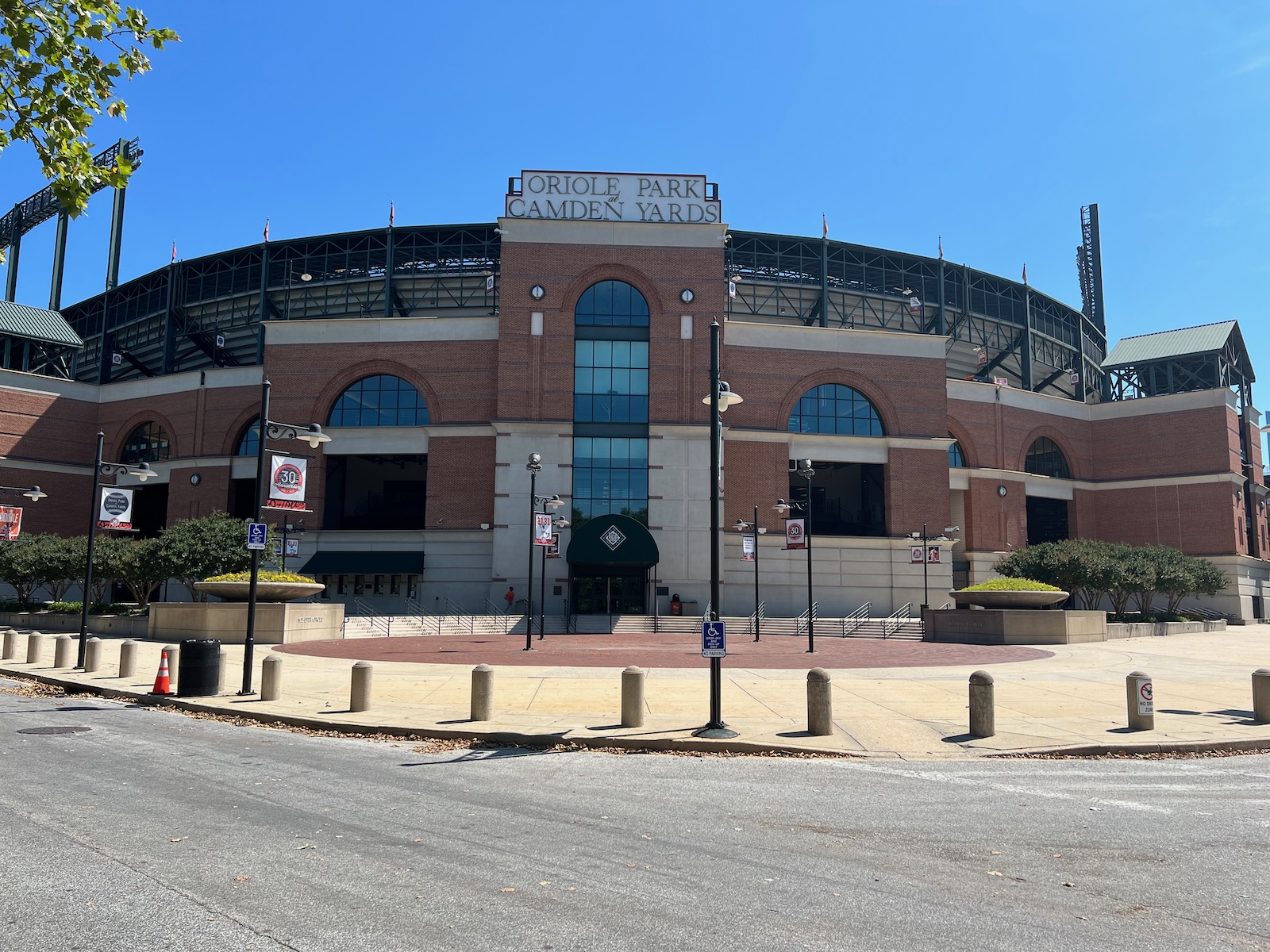
Despite being eclipsed in nuance and style points, the warm simplicity of an exterior design featuring red bricks and arched windows reached its crescendo of praise with Camden Yards. Being clairvoyantly aware of the potential for retro to become a self-conscious fake “Ye Olde” theme park in 1992 (unlike the indulgent Citi Field in 2009!), the Orioles built a remarkably intimate building in both style and substance.
Camden Yards mimics the spirit of Baltimore via the B & O Warehouse and the Inner Harbor, while bringing a number of lasting exterior innovations to the table. Groundbreaking by definition, the attractive exterior façade is supplemented by wonderful landscaping as well.
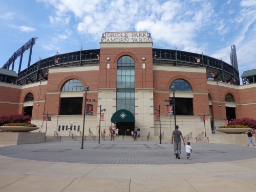
With the advent of the multi-tiered stadiums featuring luxury boxes and an upper deck, ramps and elevators became a functional necessity. Naturally, the easiest way to construct these ramps was to place them on the outside of the stadium, as the idea of integrating the ramps into the ballpark seemed pointless or was cost prohibitive. Engineers, not architects, did this work; so little character was added on the outside. The new idea, of course, would be to have an attractive visible façade on the outside, unobstructed by the ugly concrete of cookie cutter stadiums resembling nuclear power stations.
And then behold, Camden Yards: the first modern ballpark with an attractive façade, effectively tucking those pesky ramps behind the façade into the stadium’s interior (although it’s worth pointing out the Orioles’ Memorial Stadium partially did this). Work usually left to engineers, like elevators towers and exit ramps, were done by architects. This seems like no big deal today, as this has seamlessly been accomplished by every ballpark since.
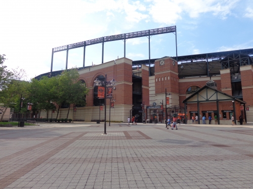
The exterior was also novel and attractive, characterized by brick masonry, exposed green steel, and an intimate scale. Camden Yards was also the first modern ballpark to be built below street level, allowing the ballpark profile to stay in scale with its surroundings. The upper deck is also pushed forward (back looking from the façade), further reinforcing an intimate feel. While the steel trusses still bulge up and out more than we would wish, this allows the ballpark to resemble a two-story structure, a look we are very familiar with today in baseball.
The façade itself is downscaled, stripped of the self-conscious pomp and frills seen in later ballparks, while still retaining elements of unique attractiveness. Walking around, you’ll note the façade is very horizontally segmented, especially around home plate, which further reduces the scale of the large ballpark. It’s meant to appear like it’s broken up into smaller structures. This effectively reduces the perceptual scale of the ballpark, in order to mimic the community surroundings including the warehouse. Perhaps this isn’t a coincidence, as the similar Minute Maid Park is more dramatically broken up to have the same effect and match Union Station (a warehouse beyond left field). Note how triangular roofing tops the stairwells on the sides. Well done. The bricks themselves are characterized by a consistent stream of horizontality as well, periodically interrupted by a vertical array of bricks topped with lighting resembling a baseball.
Of course, inspiring this gorgeous design is the classic B & O Warehouse. The eight-story, turn-of-the-century rail freight building is an essential part of the ballpark’s assemblage, acknowledging Baltimore’s bygone days as an industrial hub. Once called an ugly pile of bricks by columnists prior to construction, the warehouse now solidifies Camden Yards’ signature appeal.
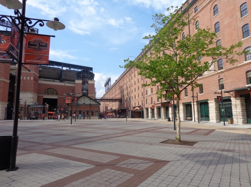
Finally, the landscaping around the ballpark effectively supplements the wonderful old-fashioned design. Purple spruce trees and orange flowers sprinkle the foreground of the footprint while flowers of the same colors lie at the base of the façade. The area in right field by the warehouse is attractively landscaped, highlighted by the ground bricks and “Time will not dim the glory of their deeds” monument from Memorial Stadium.
Once you add these venerable retro qualities to timelessly attractive design principles, and acknowledge the building’s innovations, you have one of the highest scoring exterior designs in the majors.
Score: 7.5/10
Interior Aesthetics:
In retrospect, it all looks so familiar. The contextual integration of an urban setting. The warehouse. The asymmetrical dimensions authentically derived from the site’s footprint. And that’s the point.
The fundamentals of Camden Yards were so seamlessly executed that we constantly overlook the giant step forward in design it represented. The fit with the city is so smooth, and the feeling is so overwhelmingly familiar, that it’s meant to look authentic, but reasonably ordinary at the same time, the striking warehouse notwithstanding.
Like Progressive Field in Cleveland, Camden Yards does benefit from being an earlier retro park, based on a simple contextually based design, but that’s the fault of the successors, not the luck of being early to the party. The copycats who used Oriole Park as a template felt they had to be more gimmicky and contrived in order to stand out, ultimately coming out less authentic and more muddled at their own peril. Many of the copycats also mistook Camden for being about red bricks instead of being about the symbiosis with the city.
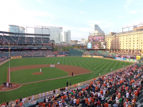
But they didn’t have to. PNC Park and Comerica Park (remember, we’re talking interior design) understood Camden Yards was so successful because it exemplified that essential architectural balance and visual harmony with its city, minus the gimmicks, contrivances, or distractions. The interior of Comerica Park was originally described as “boring” and “the least interesting of the new parks,” but as I reclaimed it, people understood an effective urban design is what makes a good interior design.
In retrospect, Camden Yards is brilliant in its simplicity, while also being fortunate enough to possess the most identifying, but most importantly authentic, signature feature in baseball.
Camden Yards was the first building in sports architecture with the central design principle of fitting with the city, or “contextual integration”, as I harp on. The superficial features or design details such as the red bricks aren’t what authentically trigger memories of the past; it’s the attempt to evoke memories by framing city views of what is classic and familiar.
“The last thing we wanted to do was create something Walt Disney would have done,” HOK architect Joe Spear said, in an article celebrating Camden Yards’ 20th anniversary. “It has to be real. That’s why we all loved the warehouse, because it was genuine and it was familiar.”
Unlike some urban ballparks like Busch Stadium (or worse, the fake urban parks), Camden Yards doesn’t look like it was dropped from the sky into the area, but effectively integrated into the setting.
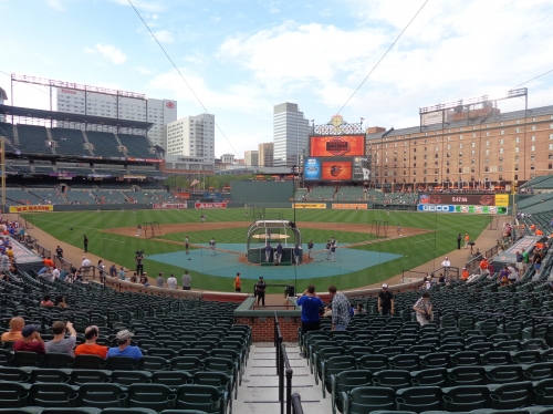
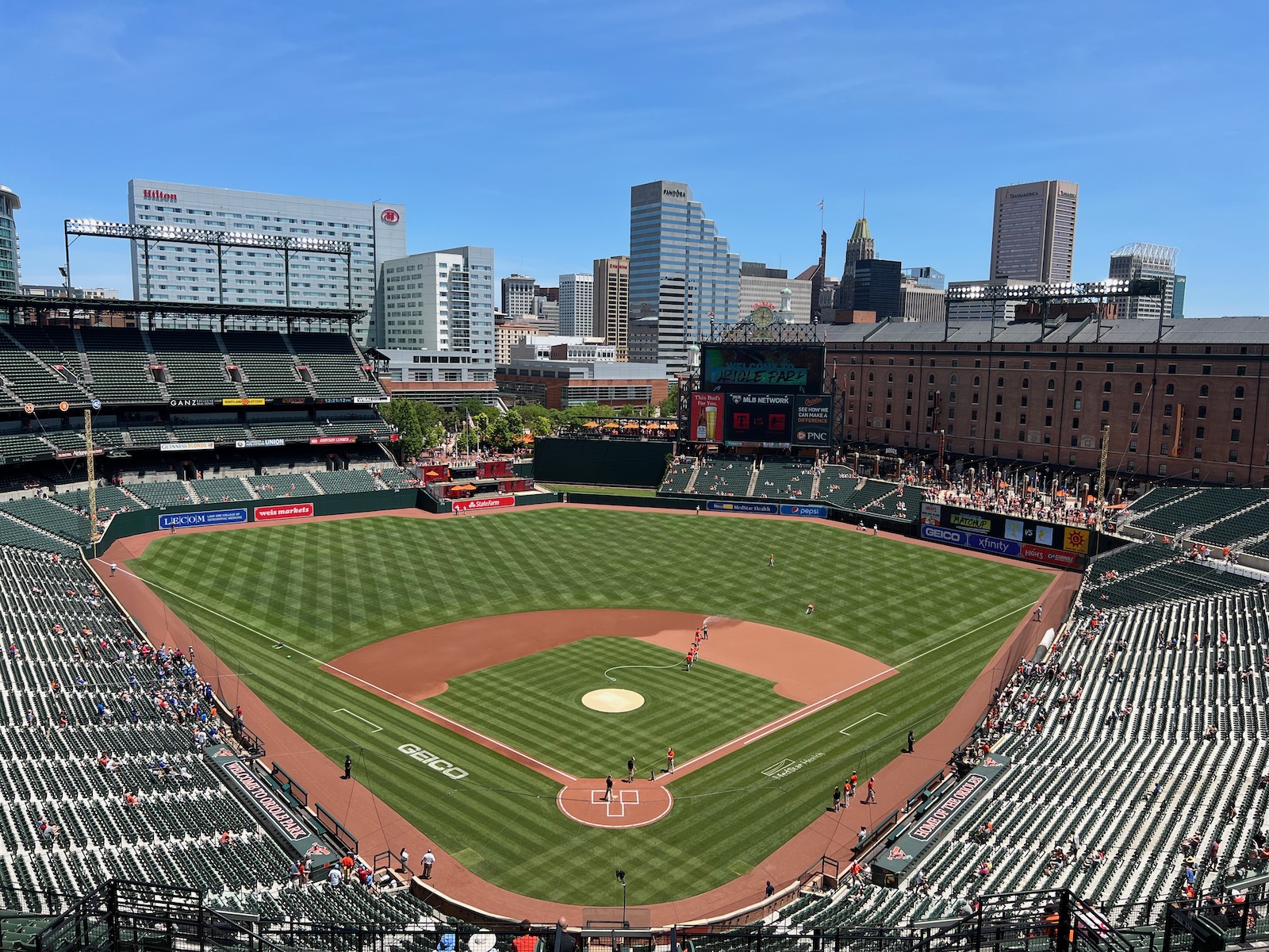
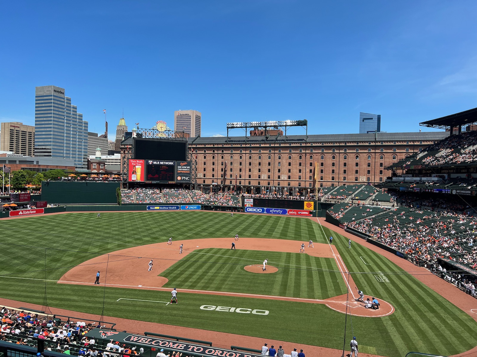
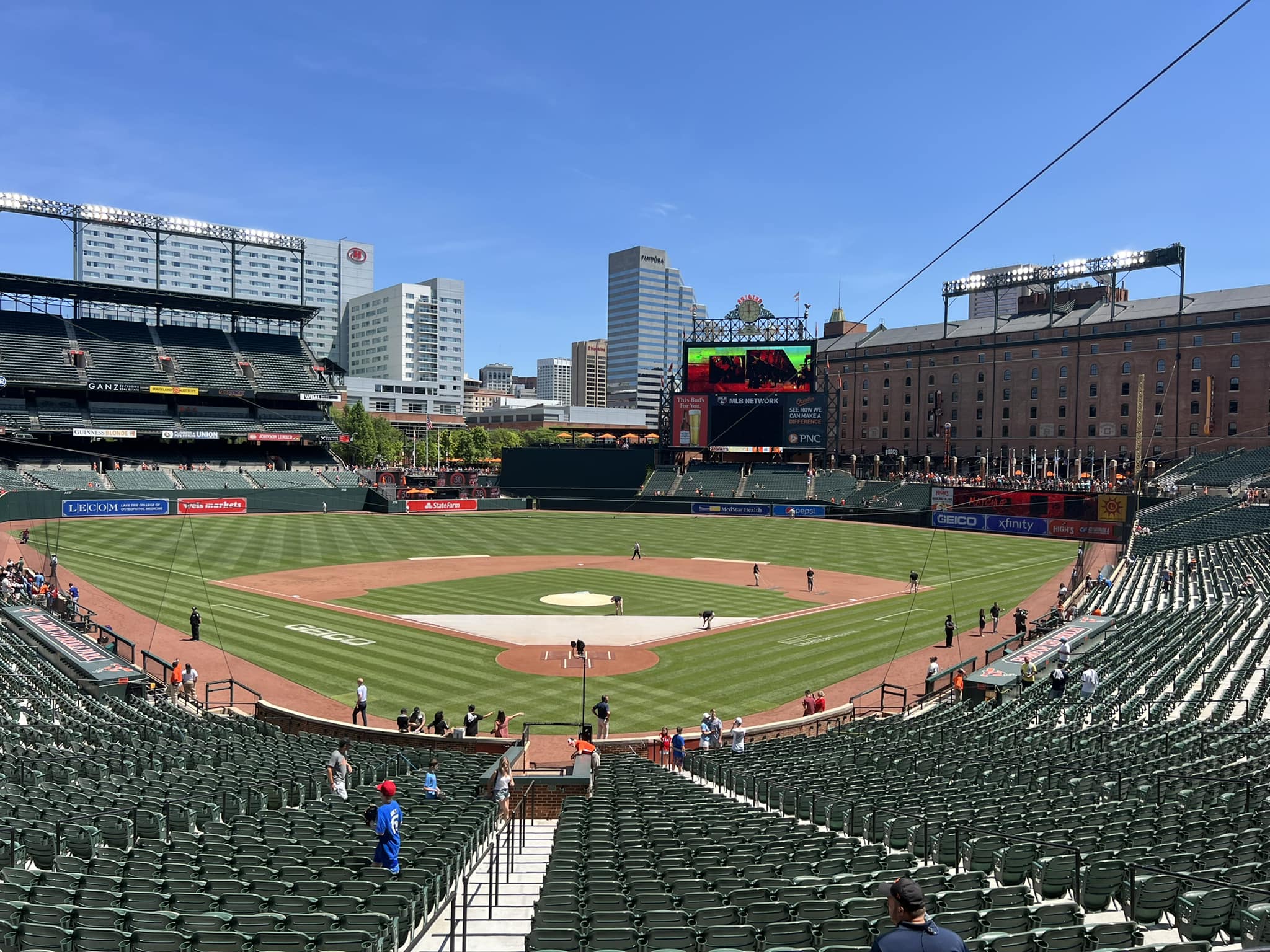
Looking down the middle of Camden Yards, we have a stunningly flawless scene in both scale and proportion. Talk about perfect balance. The left field upper deck is cut off at the most ideal time to preserve a picture perfect view of the Bromo-Seltzer Tower (now blocked by the ugly Hilton, at no fault of Camden Yards, more on that later), a building dating back 1911. The scoreboard placement is simply perfect as well, allowing for the integration of the downtown setting to the left and the warehouse to the right. The right field upper deck is cut off at the perfect time to preserve just the right proportion of the red brick building.
The de-facto dominant image of the ballpark, the aforementioned B & O Warehouse ties the scene all together brilliantly. The ballpark was reframed around this classic preexisting building in all ways possible. Constructed in 1899 by the Baltimore and Ohio Railroad, the eight-story, 1,116-foot long brick structure is in remarkably congruent proportions with the ballpark. It’s striking, classic, and familiar.
Through effective urban planning, the warehouse seemingly miraculously ends in the foreground right as the 250 West Pratt Street building rises in the background. The epitome of postmodern urban architecture and the tallest high-rise in Camden’s downtown view, I can’t think of a more perfect symbolic blending of historic and modern.
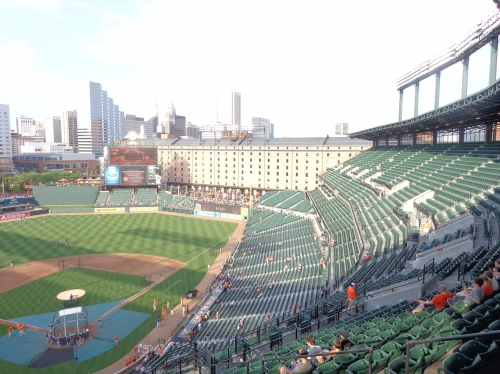
The warehouse was originally going to be demolished, but Eric Moss’s plan to integrate the warehouse into the ballpark was eventually adopted by the team. Most significantly, the imposing presence of the warehouse causes the ballpark to feel extremely small and intimate, similar to Minute Maid Park. Many often think Camden’s contemporary Progressive Field is larger, but Cleveland’s park actually has a much smaller capacity. Other than being an aesthetic marvel, the warehouse serves many functional purposes as well, which we shall get to later.
Eutaw Street, which separates the warehouse and the ballparks gates, is a great planning principle, which allowed the community to connect with the ballpark. By constructing a superstructure that approaches the warehouse but doesn’t touch it, the two giant buildings reinforce each other as equals. Since there is no literal physical connection between the structures (other than the bridge on the club level), the warehouse serves as an urban building that symbolically connects the ballpark to the community. There is nothing left to be desired here.
The entire set-up looks so easy right? Well, as seamless as it appears, judging by all the subsequent ballparks that got it wrong, I wouldn’t be so sure.
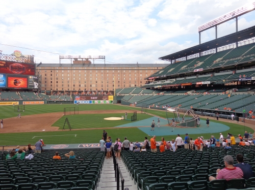
In layman’s terms, when you look at the seating and features, the great thing about Camden Yards is they know when more of something is needed and when more of something is not necessary. While it seems obvious today, they knew to make the area in front of the warehouse in right field, called “the flag court,” a standing room area, instead of adding more seats. Unlike structures like Great American Ballpark in Cincinnati, they didn’t muddle the design with too many outfield seats that rob the ballpark of any aesthetic value. Yet they still added enough outfield seats in left field. Just perfect balance.
A number of supplementary features and a painstaking attention to detail further pad onto Camden Yards’ lead as the best interior design in baseball.
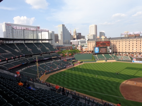
As previously touched upon, the contextual integration in center field is gorgeous, but a few other details make it perfect. While not as nice as the tree setup in Cleveland, Camden Yards’ batters’ eye is attractive and well integrated into the overall design schema. Near the site where Babe Ruth’s father once owned a pub, the green structure is often covered in Boston ivy and is in perfect proportion with the ballpark. Note the matching trees to the left of the batters’ eye above the bullpens
Through later enhancements, red brick is appropriately integrated into the interior design, accentuating the presence of the warehouse. The backstop behind home plate and the façade behind the home plate box seats, both of which were added later, are done in a similar style. The towers in the right field flag court are also brick. While not as extensive as Minute Maid Park, the relative omnipresence of brick is nice.
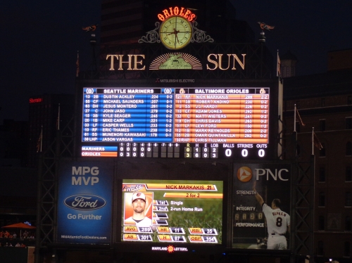
The signage on the top of the scoreboard got a lot of attention in the park’s early years for its artistic merits. The old-fashion clock with Roman Numerals, emphasized by the styling of The Sun advertisement, is the icing on the cake. Note the ornithologically correct birds flaking the top of each side of the scoreboard as well.
We have a very consistent and flavorful color scheme of orange and green throughout the ballpark, ranging from the outfield walls to the detailing on the scoreboard. Like Coors Field in Denver, Camden Yards has clean interior lines free from distractions. While we know this sacred ballpark didn’t dare add any gimmicks or contrivances, also note the relative lack of ads on the outfield wall, leaving this consistent color scheme to adorn the entire design.
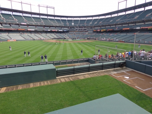
On the inside, Camden Yards is the perfect ballpark. The interior design is simple and coherent, lacking the busy distractions of the newer ballparks, while also having a striking “signature feature,” lacking in the other authentic parks. No ballpark had the vision to take advantage of all the assets in its surroundings like Camden Yards.
Because of its inevitable success, the architects were hyper-aware of the risk of retro becoming a theme park “Ye Olde” contrived experience, and it shows. Camden is a rare retro park to be the jack-of-all-trades, like Wrigley and Fenway: authentic, yet unmistakably distinctive and original.
As illustrated by PNC Park, Camden Yards isn’t just great because it was the first. It was the fault of subsequent clone parks to falsely distinguish themselves with gimmicks, instead of distinguishing themselves by their cities. While Camden Yards was used as a template for many retro misadventures, it shouldn’t be blamed for it.
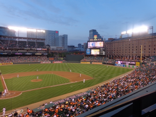
Do I have to post Janet Marie Smith’s quote again? Camden Yards was supposed to start a revolution of ballparks fitting in with their cities, which it did to some extent (especially at first with the brilliant Progressive Field). The old-fashioned approach worked for Baltimore, due to the city’s tradition and historical buildings. They were explicit that this template is not appropriate for every city. The lesson here wasn’t the retro cookie cutter.
Disregarding all the platitudes and praisings of the superficial aspects of the design, Camden Yards deserves the most credit for being the first ballpark to capture a city’s familiar spirit, which shouldn’t be mistaken for the familiar brick and steel that just happen to work in Baltimore.
Score: 15/15
Panoramic View/Backdrop:
In recent years, the once famed panoramic view of the Baltimore skyline has been a point of contention. When the ballpark opened, it featured not only a view of downtown skyscrapers in centerfield, but also a glimpse of the Bromo Seltzer Tower, arguably Baltimore’s most famous landmark.
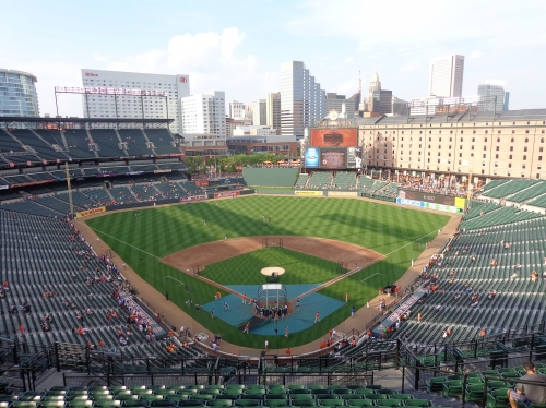
In 2009, the aforementioned large Hilton Hotel was constructed (here is the more popular view prior to that) in the foreground, effectively co-opting the left side of the skyline and wiping out the view of the Bromo Seltzer Tower. People were outraged. A Washington Post columnist allegedly called it a “cruel cubist joke on a previously perfect ballpark.” In principle, I should agree. The Hilton is the antithesis of everything Camden represents in architecture: a giant slab of white antiseptic concrete, visibly clashing with the brick warehouse on the other side.
On paper, it effectively neutralizes everything Camden Yards stands for. Although, once I went in person, I didn’t think it was that bad. Ok, well sure, looking at the before and after pictures, it is pretty bad. But once you are at the game, you still notice all of that ballpark’s aesthetic assets before you notice that ugly white monstrosity looming in left-center field.
Also, we have to acknowledge this represents another step toward revitalizing the area. So the view isn’t as good as it was before obviously, but worse things have happened to ballparks. You have to especially consider this isn’t the ballpark’s fault. It’s a .5 to 1 deduction at most.
Score: 4.5/5
Concourses:
Enhanced by renovations in recent years, Camden Yards has reasonably attractive concourses, especially for an early park. We have the familiar décor of green, orange, and white seen in the interior. Along the main concourse, we have the now familiar high ceilings with exposed green steel columns. From the Oriole historical tributes to the concession stands, the signage has been greatly improved. There are now painted murals of historical teams logos. Note the new polished white floors and stucco walls.
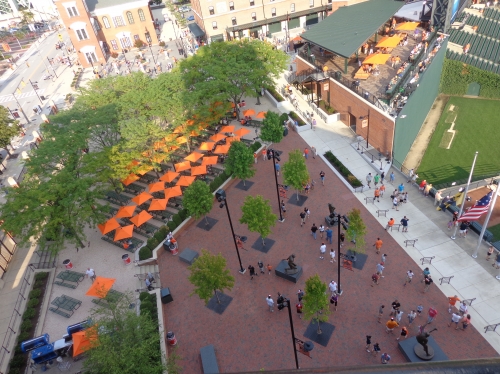
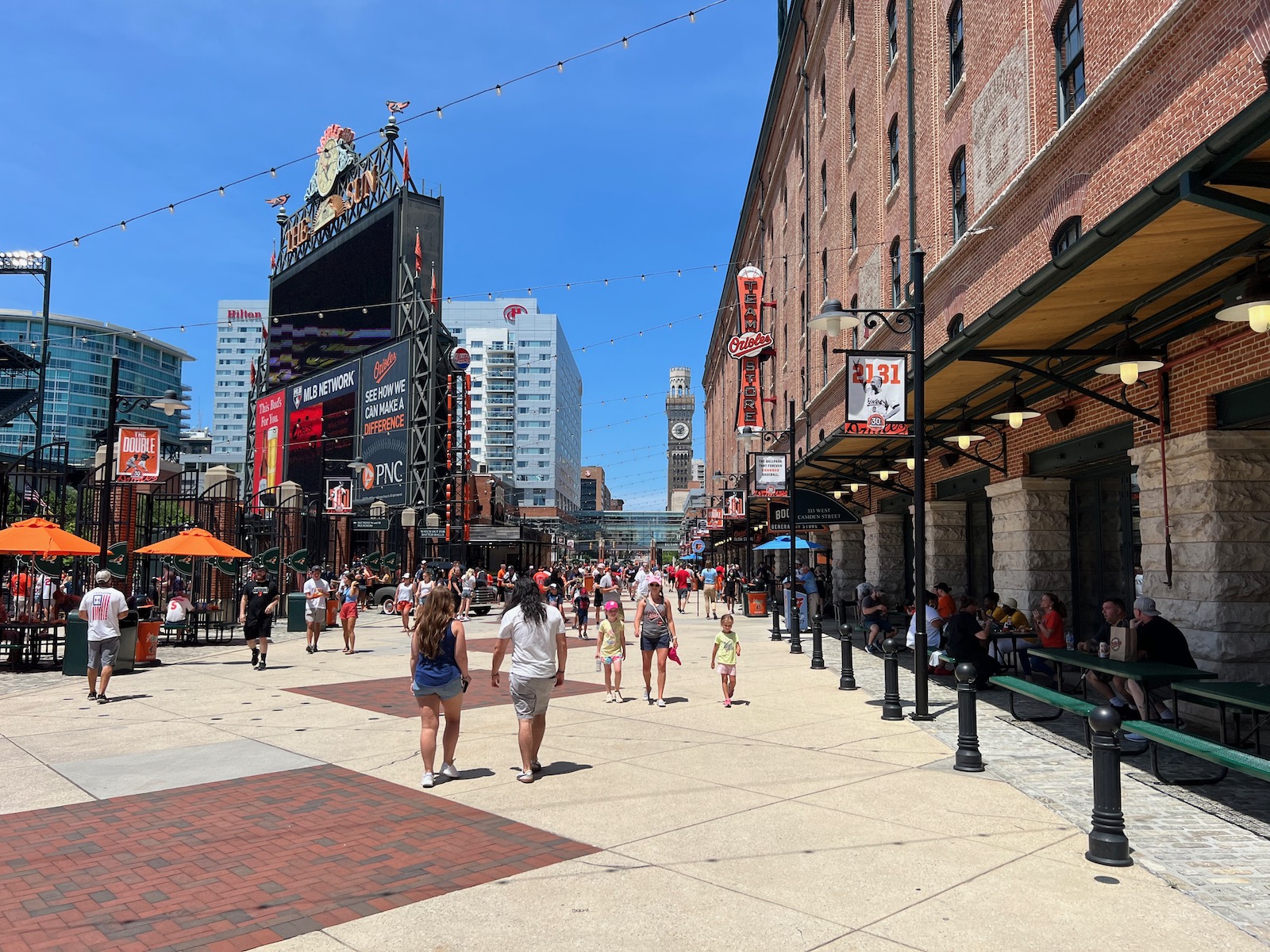
As expected, Eutaw Street is an aesthetic delight: bricks on the right side, bricks on the left side. Be sure to check out the old fashion Coca-Cola sign on the back of the scoreboard.
In the upper deck, Camden Yards provides nice views of the local area. On the oppose side of the concessions, we have views of Ridgely’s Delight, Mount Clare, and University Center.
Score: 2.5/3
Total: 29.5/33
Functionality & Essentials
Sightlines:
While not an unmitigated disaster due to the excellent field proximity of the upper decks, the sightlines at Camden Yards are extremely poor due the failure to angle the seats down the lines.
As it turns out, the first two retro parks, Camden Yards and Progressive Field, have the worst sightlines of the baseball-only ballparks. Both of these parks adhered to the design principle of contextual design, meaning that the grandstands conform to the surrounding streets. This is fine, but the seats need to be sharply angled to compensate for this.
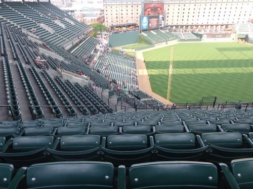
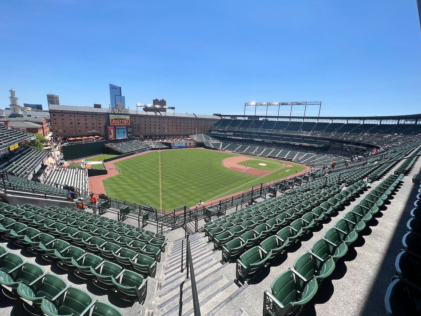
At most parks with bad sightlines like Progressive Field, the seats are angled at the same uniform degree past a certain point, which means that a number of them aren’t angled aggressively enough. But at Camden Yards, the seats down the lines in the infield are barely angled and the seats in the upper deck aren’t angled at all!
Let me repeat: Camden Yards upper deck seats are not oriented toward home plate. So essentially, when you look at the seating map, the direction of the grandstand determines your viewing angle. This means that the seats in the left field sections 360-372 and right field sections 310-306 are pointed towards center field.
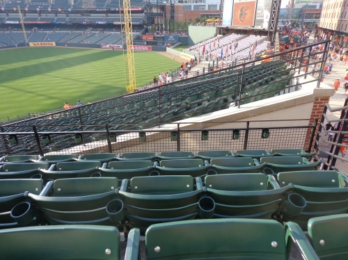
This is Metrodome stuff here, where fans would rather sit in the outfield than down the lines, and undoubtedly Camden Yards’ biggest flaw. It’s probably not as widely publicized as it should be, but people who have explored the ballpark or sat down the lines are well aware of it. I would like to ask engineers why it wasn’t feasible to angle the new seats installed in 2011.
The seats down the left field line in the infield 66-70 aren’t much better. Due to the grandstand design, the infield seats down the right field line are fine, but at the expense of some above. In a hilarious example of quirkiness, club section 204 is literally the absolute worse section in all of baseball, pointed beyond center field, clashing with terrace boxes 1-5.
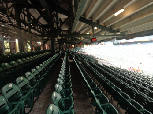
To add insult to injury, there are a number seats at the back of the terrace level on the infield grandstand that suffer from obstructions above. This was widely publicized when the ballpark opened, and the Orioles ended up selling these back rows of the terrace seats as “lower reserve” at a lower price. For me, this isn’t a huge deal and can actually be a plus for most others in the ballpark: the seats above are closer and lower to the field.
So the saving grace and mitigating factor of Camden Yards’ sightline situation is the excellent field proximity from the club level and upper deck. This is unlike the high and sprawling designs of The Ballpark in Arlington and Progressive Field (both of which opened in 1994), which had the appearance of intimacy, but were actually just as high and large as their predecessors.
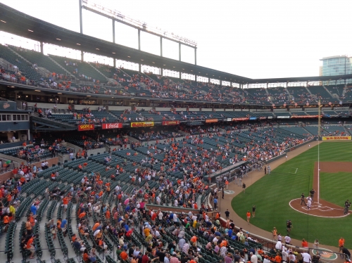
Camden Yards is authentically intimate, featuring an upper deck lower and closer to the field than any ballpark other than Comerica Park and PNC Park. Also note how it’s much less steep than contemporaries, a fact that is often mentioned. The lack of an open concourse and lack of a separate suite level helps significantly. Fans in the area who are more used to Citizens Bank Park (Philly), Yankee Stadium, or Citi Field (New York) will be shocked at how close the upper decks are here.
While they claimed they fixed some minor issues during the 2012 enhancements, the sightlines are Camden Yards’ primary downside.
Score: 6.5/10
Seat Comfort:
In 2011, I was very excited to read that Camden Yards was replacing all of it’s seats (except the padded infield seats, which were added in 2004), all of which would be 21 inches, some of the widest in baseball. They would be so wide it would reduce the capacity from 48,876 to 45,971. Originally, some seats were only 18 inches and only the ones in the infield and club had cup holders, so this was a significant upgrade.
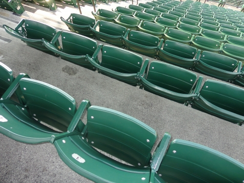
Unfortunately, this didn’t lead to the improvement I expected.
For some reason, the new seats in the upper deck and outfield right center seats still lack cup holders. Almost all ballparks include a cup holder at every seat. If they were going to install new seats, why wouldn’t they include cup holders? Cup holders are the primary differentiator in this category, and Camden Yards still fails.
Ironically, the padded field box seats from 54-20 are the most problematic, as they significantly lack foot room. It’s still a marginal improvement overall, because the new seats are as wide as advertised.
Oddly enough, this is a ballpark that pads all of their infield box seats (which don’t include any club access), while leaving the seats on the club level unpadded. Unheard of. Hedging the appeal of each section I suppose.
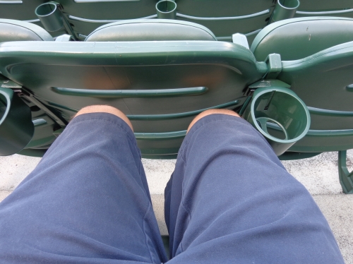
Score: 3.5/5
Concourses:
Widely publicized as the ballpark’s main flaw in comparison to other new parks, Camden Yards’ main concourse is closed from the playing field, in contrast to the now ubiquitous open experience. As I’ve often written, I greatly enjoy this feature as many fans do, but it’s probably a little bit overrated here.
What’s not widely publicized is that the main concourse has a canyon-wide sprawling design, exceeding the 40-feet standard in the infield areas (allegedly 52 feet wide according to the opening day program) and reaching 60 feet of width in the famed Eutaw Street. The upper deck concourse, also closed from the field, is average. This contrasts with the usually more constrained urban parks in Cleveland, Pittsburgh, and San Francisco. In addition, there are many open spots in the outfield. Despite the closed system around the grandstand, all of this is very impressive for an older retro park.
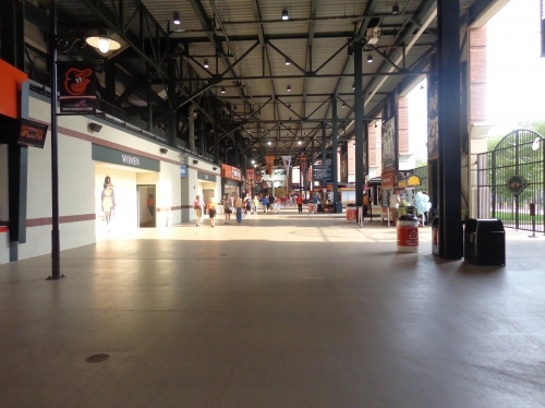
In addition, egress is seamless because the concourse is at street level. However, Eutaw Street (serving as the right field concourse) is often separated from the rest of the park, creating some maze-like horizontal discontinuities in that area of the ballpark. It isn’t as navigable as it could be, especially in center field where the concourse becomes a narrow walkway due to the picnic area.
Really, the main concourse under the grandstand and the outfield sections are two distinct areas, although it’s a true 360-degree system. Occupied by a hall of fame statue court (called Orioles Legends Park) and the picnic area, the left-center field concourse beyond the two bullpens is attractive, but a bit burdensome in walking space. This eventually leads to the outfield concourse in center and right field, which is Eutaw Street. Occupied by a kid’s area, the concourse in right field that leads to Eutaw Street on the other side can get a bit narrow.
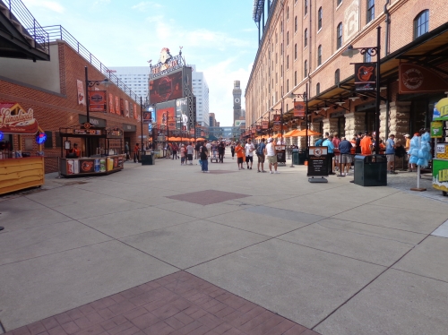
Separated by gates in right and center field, Eutaw Street is the de-facto hub for Camden Yards’ activity. Numerous historical references, plaques, an art museum, the warehouse, concession stands, and restaurants occupy this “street.” We’ll expound on each of these features in the amenities section.
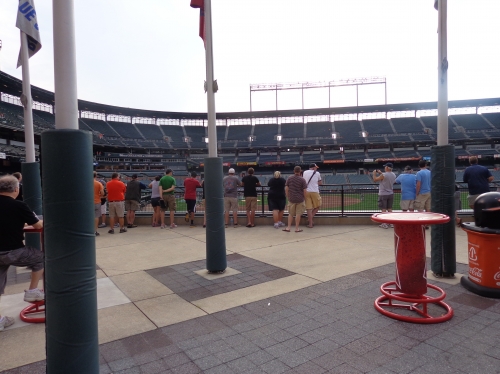
Camden Yards was a pioneer in ballgame viewing standing room areas, and still has some of the best in any ballpark today. On the field side of Eutaw Street in right field, the flag court area allows fans to walk right up to the 25-foot high scoreboard. In left-center field, Camden Yards also initiated the trend of open bullpen viewing areas. The double deck bullpens allow the players to view the game and the fans to see relievers warming up.
Sure it would be nice if we had a view of the field from the main concourse, but “open concourses,” shouldn’t be the only litmus test for a high score here. An open system was considered early on, but they wanted terrace boxes at the back of the seating bowl for a higher capacity.
Camden does okay, scoring better than other closed concourse systems. I do hope the Orioles someday consider a Progressive Field-style renovation, where the terrace boxes are eliminated and the main concourse is opened.
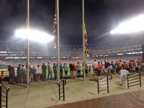
Score: 4/7
Scoreboard System:
Similar to AT&T Park and Coors Field, the Orioles replaced their dilapidated matrix board with a video board system when the technology hadn’t yet hit its peak (in the mid 2000s), translating in a comparatively average display even at the time. Today, it is near the bottom in terms of video systems in baseball.
Score: 1.5/3
Total: 15.5/25
Amenities & Features
Quality and Selection of Concessions:
Perhaps the most unheralded part of Camden Yards’ legacy is the culinary revolution it initiated at our nation’s ballparks.
Only three years prior, Skydome was praised for the novelty of serving McDonald’s throughout the stadium. The Orioles did a complete 180 here, opting for regional food options, altering the course of cuisine served at ballparks for generations. Now concessions would be part of the equation that gives a ballpark a local identity.
However, after being cited as having the best ballpark food of the 90s, there was a significant decline in quality during the next decade. Recently, the Orioles have taken steps to regain their title as serving some of the best ballpark food in America.
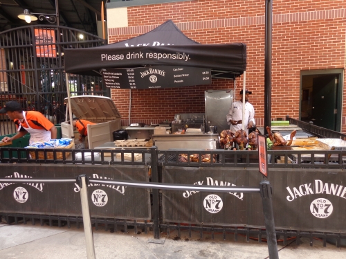
The most famed items at Camden Yards consist of BBQ, particularly the variety served by Boog’s. Beef, pork, and turkey BBQ sandwiches are on the menu, complemented by coleslaw and beans. The Jack Daniel’s stand provides ribs, pulled pork sandwiches, bacon on a stick, turkey legs, BBQ nachos, and corn on the cob.
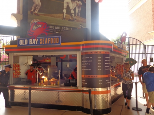
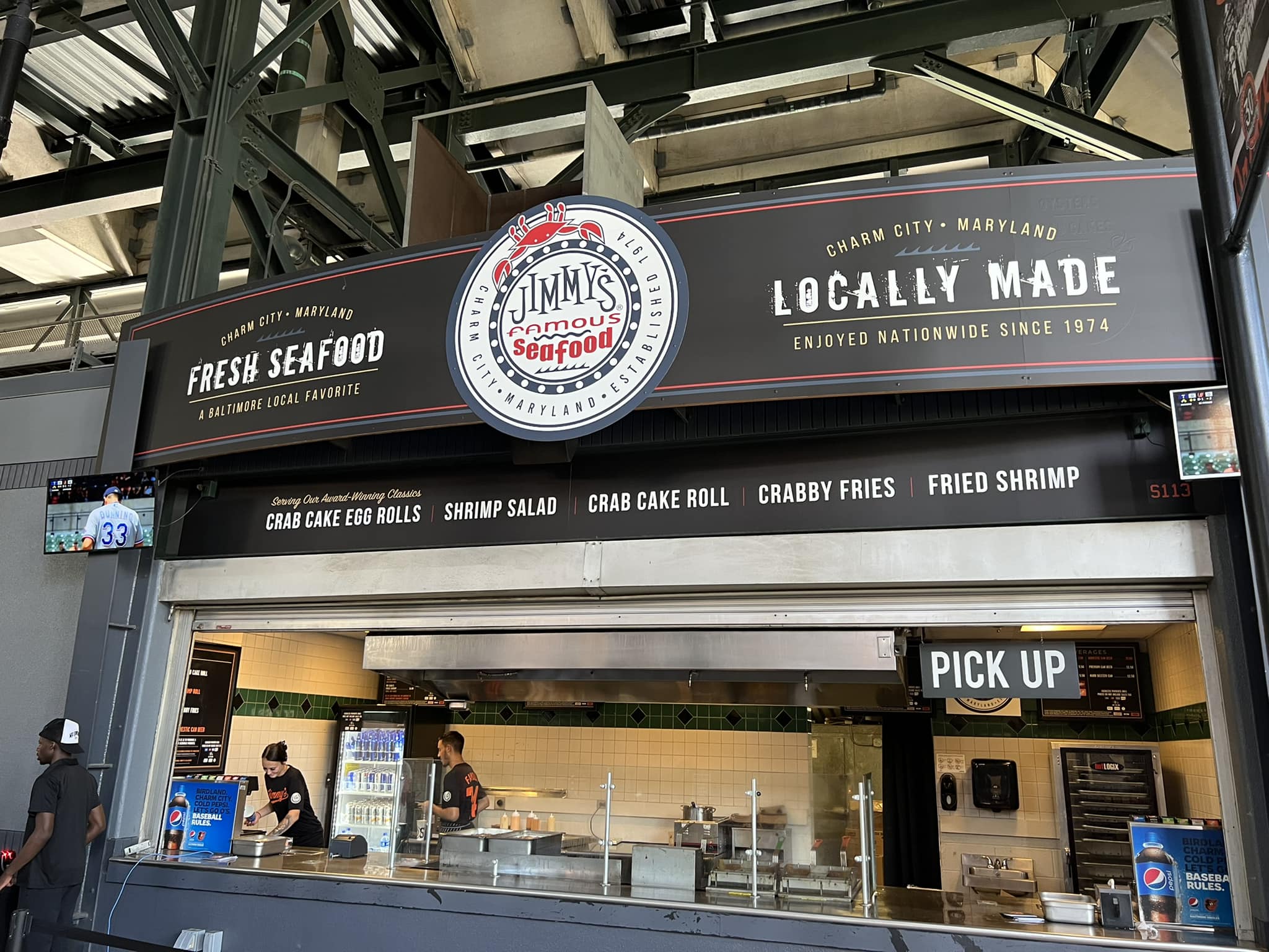
Naturally, Baltimore’s field of dreams provides a great selection of seafood, highlighted by the famous Camden Yards Crab Cakes. At Old Bay Seafood, Soft shell crab sandwiches, Maryland crab soup, crab salads, crab waffle fries, and a “rolling crab” are available. On an unrelated note, deli Sandwiches are also served in some fashion on the main concourse.
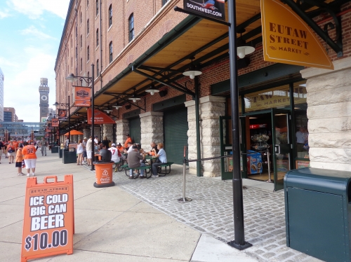
The Baltimore Chop House serves some eccentric food, such as steak and eggs and cheese steak sandwiches. A famed establishment in the northeast and a presence at New York baseball games, Carvel provides the Ice Cream. While there aren’t as many healthy options available as in the new ballparks, the Eutaw Market and Flying Fruit Fantasy serves snacks and smoothies. Tippy Martinez used to have a concept in the 90s, but Mexican options are now non-existent.
Finally, in 2013, the Orioles added an Asian food stand for perhaps the first time in their history. TAKO Korean BBQ serves beef steak Tako, chicken Tako, Edamame Bao, BBQ pork Bao, and Pad Thai Noodle Salads. Some of these options are vegetarian or gluten free, intended to cater to a more contemporary crowd.
While the quality or selection isn’t better than some of the newer parks in San Francisco, Seattle, of New York, Camden Yards have improved immensely in recent years in this category.
Score: 4/5
Regional/Signature Concession(s):
Through perennial enhancements, Camden Yards has cemented its status providing some of the top local food in baseball.
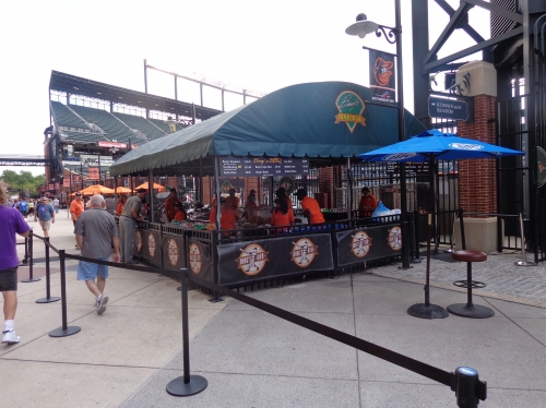
Boog’s BBQ Pit Beef Sandwich. The O’s hand made soft pretzels. The famous Camden Yards crab cakes. The list goes on and on. The latter probably best represents the region, and is probably one of the most underrated regional food concepts in any ballpark.
In recent years, the Orioles have taken it up a notch even further, following the trend of bringing in local establishments into the park to serve food. Gino’s Hamburgers, a famous fast-food restaurant chain in Baltimore, now provides burgers and chicken. Stuggy’s is now in the ballpark as well, serving a variety of hot dogs, including a crab Mac n cheese dog. Polock Johnny’s dogs and sausages have been a mainstay.
Score: 1.5/2
Public Restaurants/Bars/Sitting Areas:
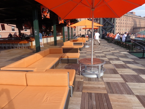
From full service restaurants to informal sitting areas, Camden Yards does a fantastic job in providing the average fan a place to sit down and relax. Improvements to areas on the concourse have greatly aided the Orioles in this category.
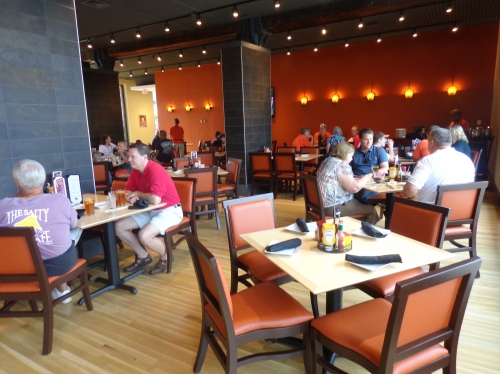
Open on non-game days on Eutaw Street in the B & O Warehouse, Dempsey’s Brew Pub is a new full service restaurant in an area formerly occupied by Attman’s Deli (prior to that Pasttimes Cafe) in a rather bland space. Completely renovated and expansive in space, the eatery honors the longtime Orioles catcher and features plenty of memorabilia.
The refined yet chic décor features polished light wood floors, orange leather chairs, and a view of brewery equipment by the brick wall on the bar side. The first floor restaurant features outdoor seating on Eutaw Street, but does not feature field views.
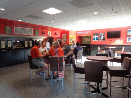
Camden Yards excels in providing fans many nice areas to sit down. Similar to their spring training facility in Sarasota, the Bullpen Picnic Area in left-center field forms a lovely alcove adorned with green trees, bushes, and pebbles. There are similar green picnic benches located throughout the ballpark, even in the upper deck.
Added during the concourse renovations, there are now two pub bars with tables and chairs. On the first base side, we have the Natty-Boh Bar, while the third base side features the Free State Pub. The upper deck even has an area of refuge called the Grandstand Lounge. The small enclave is characterized by signage honoring the history of Budweiser.
Score: 4/5
Premium Seating/Clubs:
In retrospect, Camden Yards often receives considerable praise for having a modicum of restraint regarding their presentation of private clubs and luxury suites.
Other parks of the early-mid 90s, such as New Comiskey Park, Jacobs Field, and the Ballpark in Arlington, featured three tiers of luxury suites/club levels, dominating the seating structure. In contrast, Camden Yards only has one modest tier of club seating backed by suites.
While they deserve credit for not overdoing what would now be an unmarketable inventory of suites like the above ballparks, Camden Yards’ premium services don’t translate well today, because it doesn’t really have anything in terms of selection. I know people don’t want to hear it, but a good mix of club seating is important for any viable 21st century ballpark. As I’ve harped on before, these parks were built because of the revenue generated from luxury suites, club seating, and any other exclusive innovation in between. Aesthetics were an afterthought. I’m just being practical; this category is here for a reason.
I know many of you think Camden’s shortcoming here is a good thing, and I’ll give bonus points later for Camden being the most egalitarian ballpark in baseball, but it scores terribly. As indicated in the restaurants section, there just aren’t any super premium/exclusive spaces in Baltimore’s park.
No ultra-exclusive home plate club. No VIP lounges. No all-inclusive club spaces. None of those afterthought hybrid club/suite spaces like nearly every other older retro park. Not even a white tablecloth stadium club restaurant anymore, as the Camden Club is now used for private non-game day functions.
It’s literally just the mezzanine club level, and nothing else, other than some new deck seating and bistro tables on this club level.
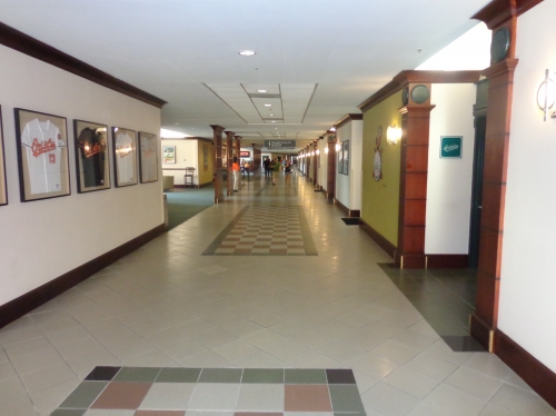
So this simple, non-exclusive club level better be good, right? Well surprisingly, the answer is mostly a resounding yes. While still adorned in old tile floors with a 90s waiting room décor (which is actually sort of charming), the space is extremely expansive, filled with more than dozen lounges and bars.
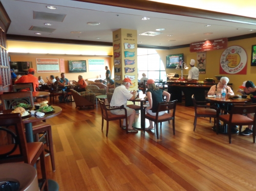
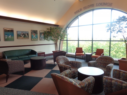
More so than newer retro parks, the Orioles focused on making the club level extremely nice and loaded with sit down spaces. This isn’t just some jazzed up concourse. I counted 8 lounges (all with a baseball-related moniker, such as the Cy Young Lounge, Gold Glove Lounge, 2131 Lounge, etc.) and 5-6 bars (including O’Says Pub). Unlike some other club levels in baseball, the bars are legitimate sit down bars, not just an informal walk-up space. Heck, not only can you go bar hopping inside Camden Yards, you can go bar hopping inside the Camden Yards’ club level!
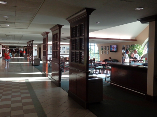
If they ever renovate these areas, I hope they don’t change these cool intimate sit-down bars in the club, which contribute to a broken up, neighborhood-like feel. The trend is to move away from the traditional sit-down bar towards trendy walk-up bars when renovating these club areas, for reasons I can’t quite understand. The explicit goal is to create “destination bars” and “social spaces,” and intimate sit-down bars (seen in the photo below) give these spaces a more tangible sense of place. You want to create spaces where your friend can call you and say “meet me at x bar in y area,” and these current spaces are more well-defined, unlike the new bars at Marlins Park for example. Ok, quite the digression.
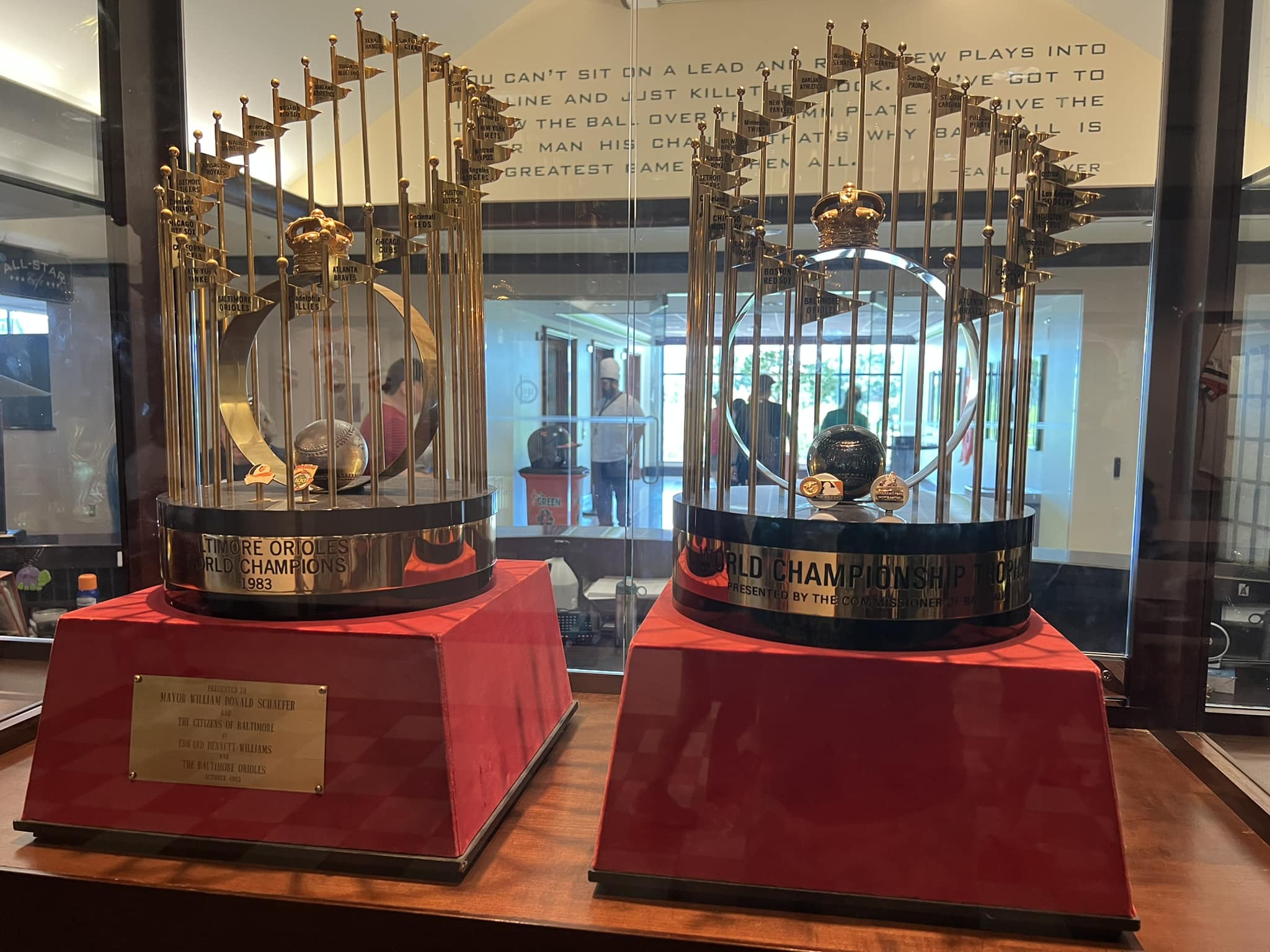
Behind home plate, the newer All-Star Café is the eatery of note in the club, serving crab cakes and Boog’s BBQ. Compared to the rest of the ballpark, the food isn’t much of an upgrade. Be sure to note the championship memorabilia in the entry atrium as well. Dwarfing all other mezzanine club levels in terms of bar and lounge space, even the newer ones, the Orioles deserve profuse credit. Despite being dated in décor, and lacking a field view as the concourse is blocked by suites, this was one of my favorite club spaces in baseball.
But the Orioles should add some new premium clubs at Camden Yards. An underground home plate club (often called “diamond clubs”) is structurally feasible, and has been added after the fact at Coors Field and Turner Field. Every ballpark that opened in the new millennium has one except Comerica and Miller. This has been a huge cash cow for every team that’s tried it, even those in smaller corporate markets from Kansas City to San Diego. (well…)
In any case, fans love options, and every other older retro park has enhanced their premium seating mix, but not Camden Yards. But since it has renovated everything else, perhaps the lack of any new club spaces is intentional. They want to keep it classic and simple. Traditionalists who just want to watch the game should give them a standing ovation.
Score: 2.5/5
General or Artistic References to Baseball or Team History/Museums:
While lacking the museums and explicitly large references to team history seen in newer ballparks, Camden Yards has done a fine job honoring Oriole history, supplemented by other referential displays.
First of all, I appreciate that the Orioles chose to integrate references to team history throughout the general areas. We see plenty of championship banners and retired numbers throughout the concourses, ranging from orange player pennants and painted Oriole logos on the concourse behind home plate to the banners on Eutaw Street. The club level also has numerous references to Oriole history, ranging from the aforementioned lounges to the championship trophy banners. Dempsey’s Brew Pub also has plenty of memorabilia honoring baseball and the restaurant’s namesake.
Sure Progressive Field added Heritage Park, but we don’t see historic references throughout the concourses, clubs, or restaurants. There’s more benefit to spreading the history around.
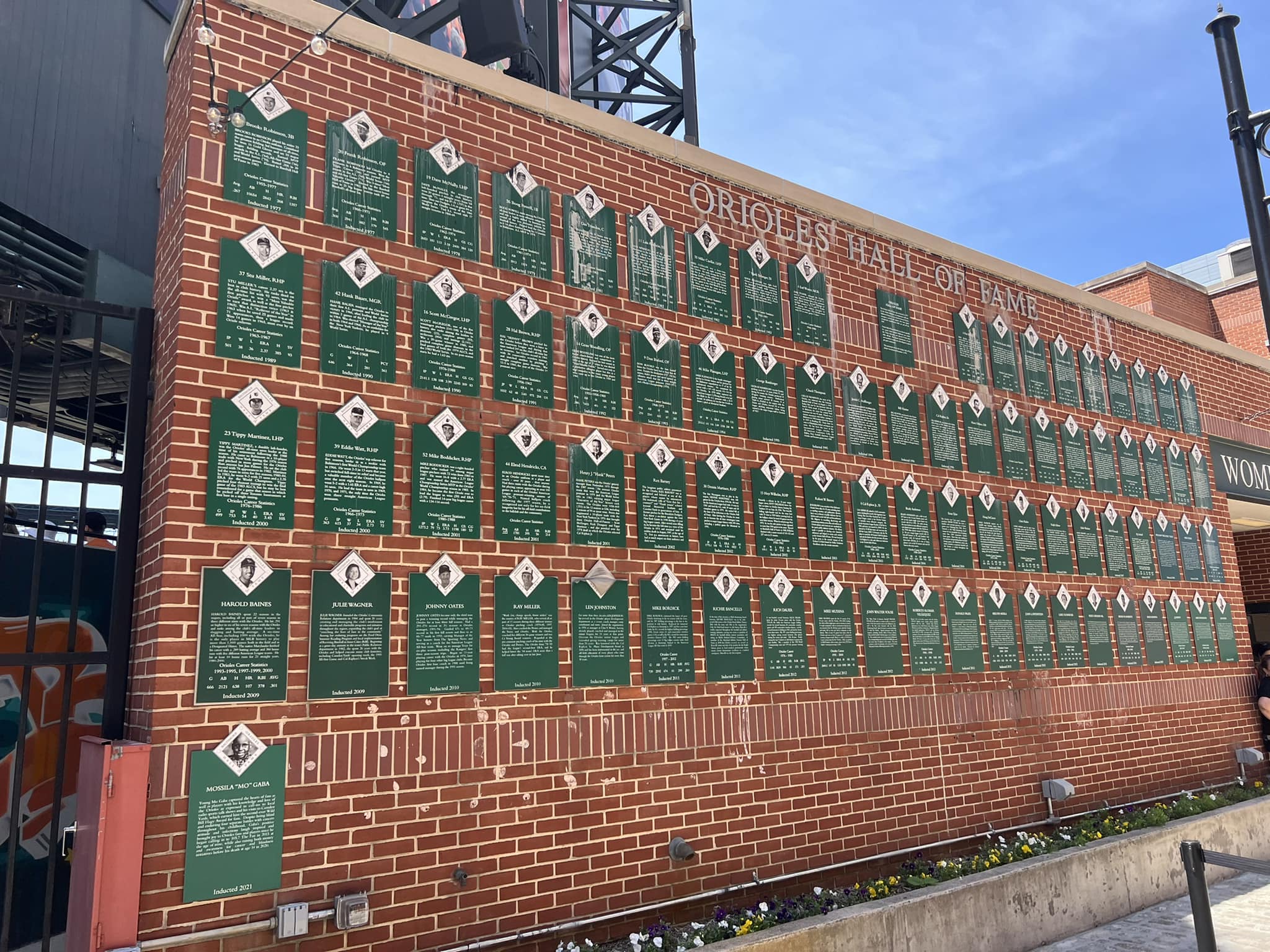
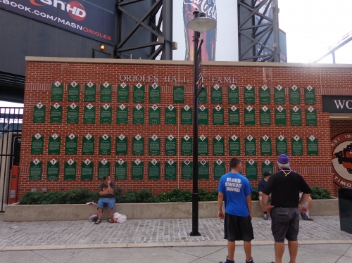
This isn’t to say Camden Yards doesn’t have any similar displays. Most notably, the Orioles Hall of Fame Wall is located on the opposite side of the warehouse on Eutaw Street. The green plaques on the red brick wall honor every Oriole inducted into the team’s hall of fame.
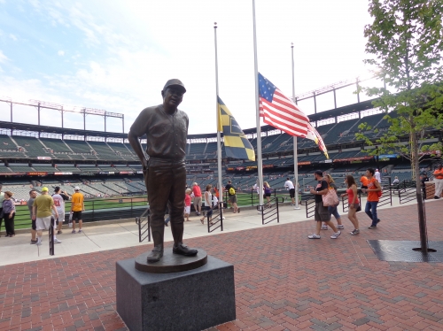
Take note of the ground plaques throughout Eutaw Street as well, marking the spot of each home run that landed past the flag court onto the street. Look for the Ken Griffey Jr. home run on the warehouse!
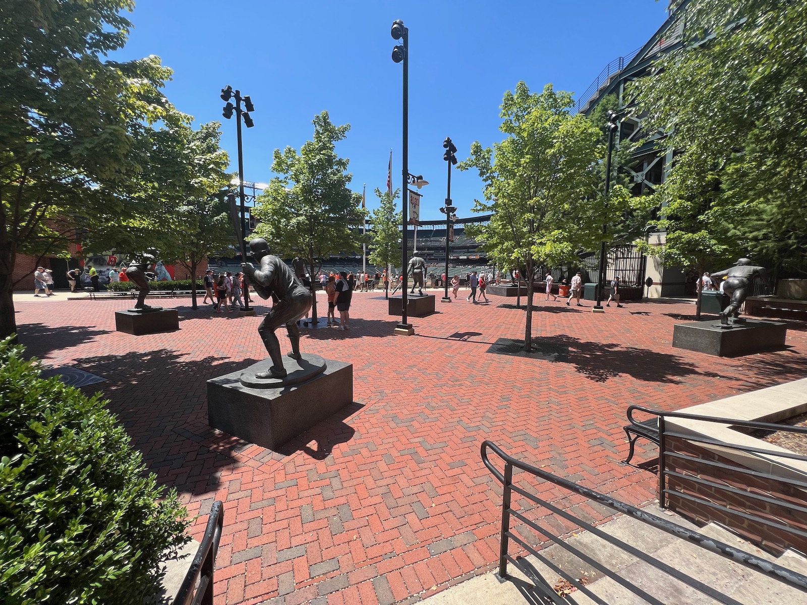
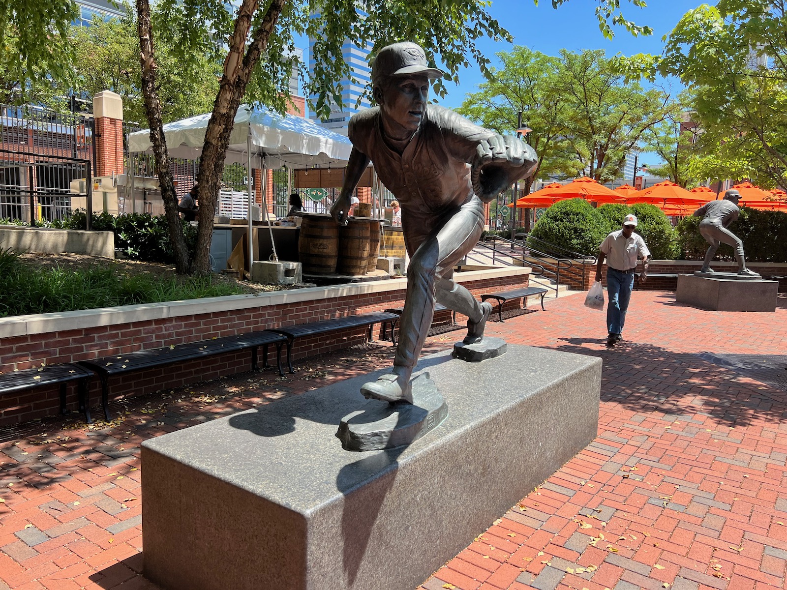
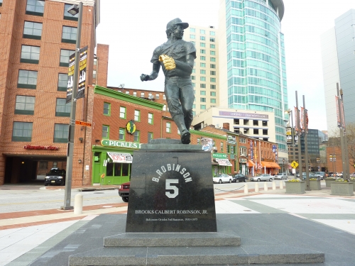
Added throughout the 2012 season, the new sculpture garden called Legends Park features some of the best player sculptures in baseball. The plaza houses six bronze works of Oriole Hall of Famers: Frank Robinson, Cal Ripken, Earl Weaver, Eddie Murray, Brooks Robinson, and Jim Palmer. In quantity, placement, and quality, this is one of the most impressive displays in the majors. Most of all, it’s fantastic that the sculptures are inside the ballpark, unlike most other ballparks and the terrible setup at Busch Stadium. Don’t forget about the original Babe Ruth statue either, honoring the location he frequented as a kid.
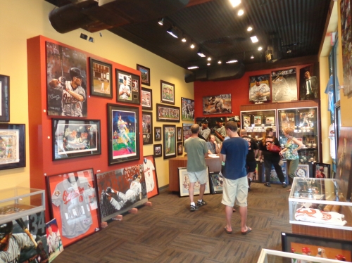
Finally, Camden Yards recently added a sports art and memorabilia museum called Art of the Game in the warehouse. This area features historically significant bats, balls, bases, and jerseys, along with paintings and pictures of all things baseball.
Score: 4.5/5
Entertainment/Kids Activities/Other Amenities:
While they don’t overdo it, Camden Yards holds it’s own in terms of kid related games and entertainment in 2013.
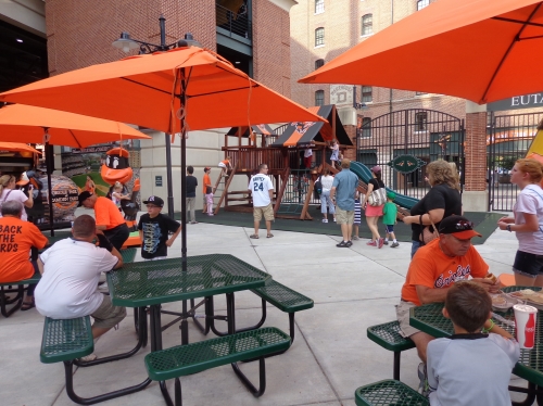
Located in between Gate A and Gate C in right field adjacent to Eutaw Street, Kids’ Corner includes plenty of fun activities. This area is mostly oriented for younger fans, featuring air tee ball, speed pitch, and a batting cage. The main attractions are the slide and play area, along with the moon bounce. Note the giant Oriole piggy as well.
While none of this rivals the entertainment in the newer parks or the kid’s area just added to Progressive Field, it’s certainly sufficient.
Score: 2/3
Total: 18.5/25
Atmosphere, Vibe, & Policies
Atmosphere/Fan Support:
Throughout the 90s, Oriole fans were among the most renowned in baseball for their passion and support. But after 15 years with the team in the cellar, the fans began to stay home, culminating in an average of 21,395. When I went in 2008, there were only about 15,000.
But now that the team is in contention, they are beginning to come back. They are nearly at 30,000 in 2013. With a string of successful years under their belt, hopefully Baltimore will regain its former image and shred itself of the title “Fenway/Yankee south.” This better is than Cleveland, which was just able to touch 26,000 the year after being one game away from the World Series in 2008. Despite being in a similar position to the Orioles this year, they are only at 19,721.
Score: 3.5/5
Ballpark Policies/Customer Service:
The usher staff at Camden Yards is fantastic, with plenty of retires and colorful employees. Our usher even performed magic tricks in between inning at the bottom of the aisle. All of the ballpark policies are fan friendly, as upgrading your seat is fairly easy.
Score: 2/2
Bonus:
For being the ballpark that changed baseball forever; the first contextually based, retro park in baseball and spawning a generation of warm, fan friendly facilities, duh! +3
For being the first ballpark to appreciate the virtues of a ballpark’s location and integrating the surroundings into the park, leading to the best and most coherent interior design in baseball when coupled with the warehouse and admirable lack of gimmicks +2
For Eutaw Street and the B&O Warehouse, the most transcendental features in concourse and interior design respectively +2
For starting a culinary revolution of regional food options at ballparks +1
For being the most egalitarian and structurally intimate ballpark in baseball, with a low upper deck and without the moats, clubs, or exclusive seating areas seen today +1
For the amazing Legends Park statue area and great appreciation of history throughout the ballpark +1
Score: 10
Total: 15.5
Conclusion
During Camden Yards’ tenure in the last decade, it always struck me as kind of funny how the ballpark ended up eclipsing the team in attention and praise. Few teams have ever been so synonymous with their ballpark. I always loved the end of the Baltimore Orioles’ Wikipedia introduction page, which boldly stated, “in recent years, the Orioles have become most well-known for their successful stadium, the trend-setting Oriole Park at Camden Yards…”
In 2012, that got altered to “also well-known” with the “in recent years” eliminated in the light of recent success, which is more a credit to farm system development and the team changing culture provided by Buck Showalter than anything else.
In truth, this is a ballpark that should arguably transcend any team.
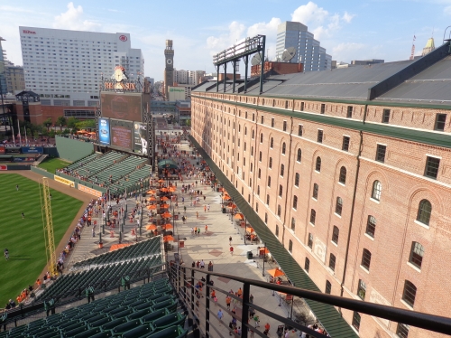
As I’m writing this, I mentioned to a girl I was with that I was finishing up my Camden Yards review. She recalled, “Isn’t that the ballpark that has green everywhere.” I didn’t know what she meant. She said, “you know, everything is green; the walls are green.” I guessed she meant Fenway Park, and she said “Oh, yeah, I get that one confused with Camden Yards.” I kid you not.
She represented an average familiarity with baseball among American sports fans, and in the last 20 years, Camden Yards has indeed become as apparent in our cultural psyche as Fenway Park or Wrigley Field.
Beyond just starting a revolution in contextual design aesthetics, amenities, or downtown locations, it is still considered one of the best, by most critics. But today, you often hear, Camden Yards is still one of the best ballparks in baseball, but…but it has been surpassed by many parks since…but PNC Park and AT&T Park are better…but Coors Field has open concourses…but newer ballparks have expansive food courts and kids play areas…and other less complementary comments about how Camden Yards wasn’t that special, but just lucky to be the first.
No, no buts about it. Unless you’re the President or Gordon Gekko, or someone sitting down the lines (a serious issue), it’s still a near flawless ballpark.
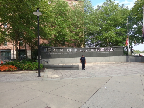
As I’m editing this in 2017, I think Camden Yards would benefit from a Progressive Field-style renovation. Due to excess capacity, the terrace boxes could be knocked out in order to open the main concourse to the field like in Cleveland. Team officials have also discussed adding amenities like a home plate club and rooftop party decks (like at Coors Field), which would be wise. While it won’t quite compete for the top spot right now, such enhancements could put it in the same conversation as parks like AT&T Park, PNC Park, Comerica Park, and Petco Park. I hope to hear something after the 2017 season.
Camden Yards is transcendentally brilliant in aesthetics, which is obviously the most important factor, while the 2011 enhancements in amenities are significant enough for it to remain a great ballpark. It doesn’t hurt that the fans are coming back too.
The Orioles’ field of dreams is not only the most significant ballpark of all-time, but will remain one of the best ballparks in baseball for the foreseeable future.
FINAL SCORE: 88.5
RANKING: #8/30
Summary
TL;DR? Here’s the long-form piece in a nutshell:
Camden Yards, aptly said to be of equal significance in baseball history to the breaking of the color barrier and the development of free agency, inspired decades of “old-fashioned ballparks with modern amenities.” The venerable sensibilities associated with generations of “retro” ballparks—the asymmetrical dimensions, warm brick facades with exposed steel, green seats, and various historical nods—were born here.
However, the importance of Oriole Park transcends conversations about its superficial stylistic treatment. Not only did it pioneer many subtle design elements that are commonplace today, but it ushered in a broader trend of American urban rival, reinvigorating the country’s downtown cores.
Camden Yards’ brilliance lies not with its old-fashioned design, but with its philosophy that ballparks can be made better by abandoning templates and constructing something contextual. Camden’s retro architectural treatment was authentically inspired by its urban surroundings, not conceived of in a vacuum like some of its retro cookie cutter successors, and therein lies its ingenuity. The building is in perfect harmony with Baltimore.
Successor ballparks that “got it” by crafting something contextual, red brick or not, have been most well-received. Others that oh-so-ironically used Camden as a template without urban contextual appreciation have not.
Despite receiving few significant enhancements in its 30-year history, Camden Yards still holds up well today inside and out. Surrounding views may happen to be better at parks in Pittsburgh and San Francisco, but one could argue Camden’s interior aesthetics have never been eclipsed.
With the B&O Warehouse serving as a landmark on par with Wrigley’s ivy or Boston’s Green Monster, Camden’s interior design is simple, coherent, authentic, and attractive, lacking the busy distractions of the newer ballparks, while also having that organic, uncontrived “signature feature.” The authenticity of the warehouse remains unmatched.
A charmingly simple red brick façade, skyline views, local grub, Legends Park statues, Eutaw Street, and brass baseball designating every home run to land on Eutaw Street also define the park.
Significance doesn’t equal perfection, and Camden falls short of the newer parks in a number of respects, hence its placement at #8. Just in terms of essentials, the main concourse is dark and almost entirely closed from the field, the seating geometry down the lines can be terrible, upper deck seats lack cupholders, and the videoboard is the smallest and among the most outdated in MLB. Camden’s food and beverage department is okay, but it’s also generally lacking the amenities of newer parks or renovated contemporaries.
Be on the lookout for Camden Yards to receive renovations similar to other 1990s ballparks in Cleveland and Colorado, perhaps opening up the concourses, adding more social spaces, upgrading the tech, etc. Just make some tweaks, and there’s no reason Camden couldn’t catapult to the top again, because the underlying aesthetic is timeless.
Defining Features
B&O Warehouse and Eutaw Street

Biggest Hit
B&O Warehouse and Eutaw Street
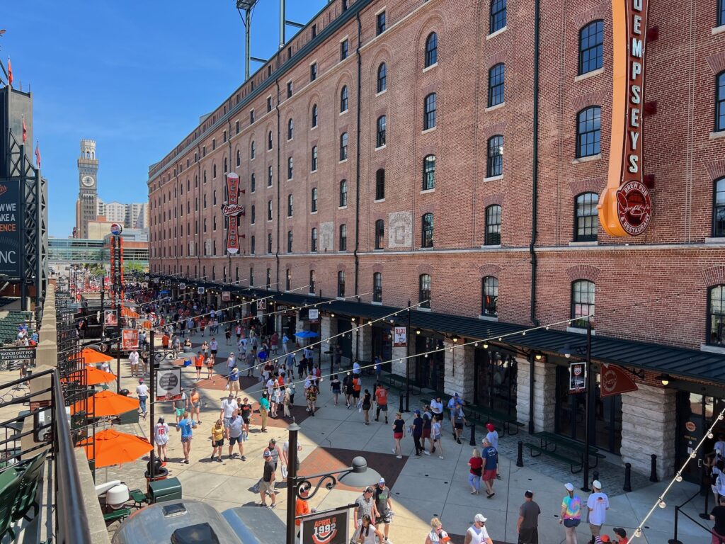
Camden Yards’ adaptive reuse of the B&O Warehouse (c. 1899) set the standard for ballpark urban integration. The iconic 1,116-foot-long red brick building inspired Camden’s entire design, as both its style and proportions are remarkably congruent with the superstructure. Eutaw Street, which separates the Warehouse and the ballpark’s gates, serves as a concourse during games and effectively integrates the city grid into the ballpark. It features many attractions, most notably Boog’s BBQ and plaques marking home run balls that landed on the street. Ultimately, Camden’s B&O Warehouse is the only modern-day ballpark landmark on par with Wrigley’s Ivy or Fenway’s Green Monster. Today, it houses Orioles’ executive offices, a restaurant, team stores, and banquet facilities.
Biggest Miss
Worst Seating Geometry of Any Modern-Day MLB Ballpark
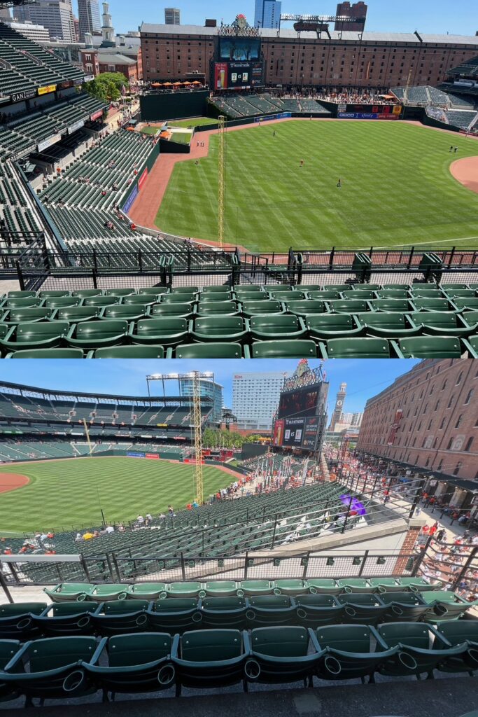
As MLB’s first neoclassical ballpark, one that spurred a generation of sporting facilities with “old-fashioned architecture and modern amenities,” Camden Yards will go down in history one of America’s most important buildings. But first movers often make mistakes corrected by successors, and one of Camden’s mistakes is really egregious. The seating geometry down the lines is abysmal. All down-the-line seats in the upper deck and club level (sections 360-372, 256-270; 310-306, 214-204) are not angled toward the infield, with many oriented toward center field. Lower level seats down the left field line (sections 60-70) are barely angled toward the infield. That’s 8,000 seats or so you couldn’t pay me to sit in. It’s among the biggest ballpark flaws in MLB. Beauty and influence don’t equal perfection.
Other Hits
Gorgeous Interior Aesthetics That Authentically Conform to the Site, Free From Gimmicks or Contrivances

On the inside aesthetically, Camden Yards has the fundamentals of a perfect ballpark. The interior design is simple, coherent, authentic, and attractive, lacking the busy distractions of the newer ballparks, while also having an organic “signature feature,” lacking in the other authentic parks.
Skyline Views

Independent of the Warehouse, the views of Downtown Baltimore are gorgeous. Note how the Warehouse ends in the foreground right as the 250 West Pratt Street building rises in the background. The epitome of postmodern urban architecture and the tallest high-rise in Camden’s downtown panorama, I can’t think of a more perfect symbolic blending of historic and modern.
Understated Yet Dignified Exterior Architecture

The first retro-classic exterior design in baseball has aged wonderfully well. Intimate in scale and free from over-stylized accents, the warm simplicity of Camden’s exterior facade fits with the Warehouse, the surrounding urban area, and the spirit of Baltimore.
Ushered in a Broader Trend of American Urban Revival
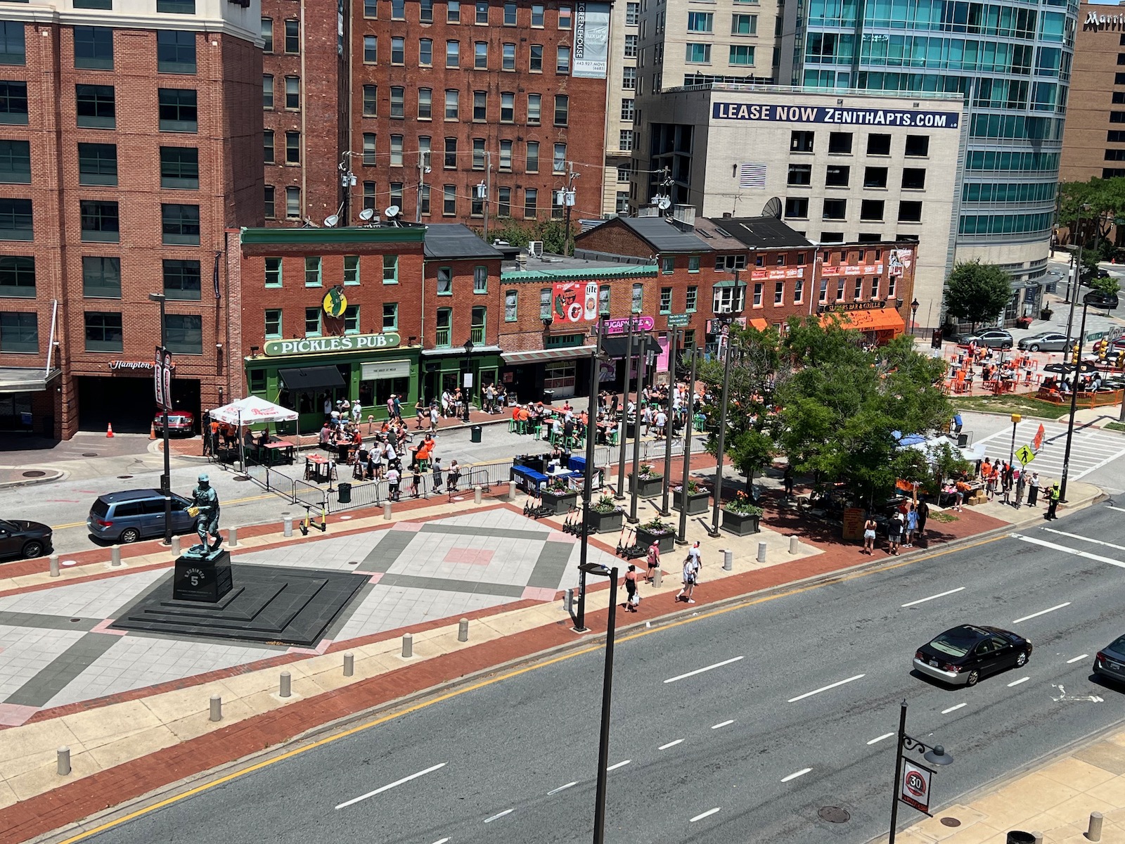
Camden Yards’ most universal contribution to America’s stadium scene wasn’t architecture or amenities, but the notion that a stadium could revitalize an urban area. Baltimore’s formula was perfect for success: close to mass transit, popular downtown restaurants, and old tourist attractions in the Inner Harbor area. Results have been mixed nation wide, but just bringing sports back to the city has been a revelation.
Location Near Baltimore's Inner Harbor
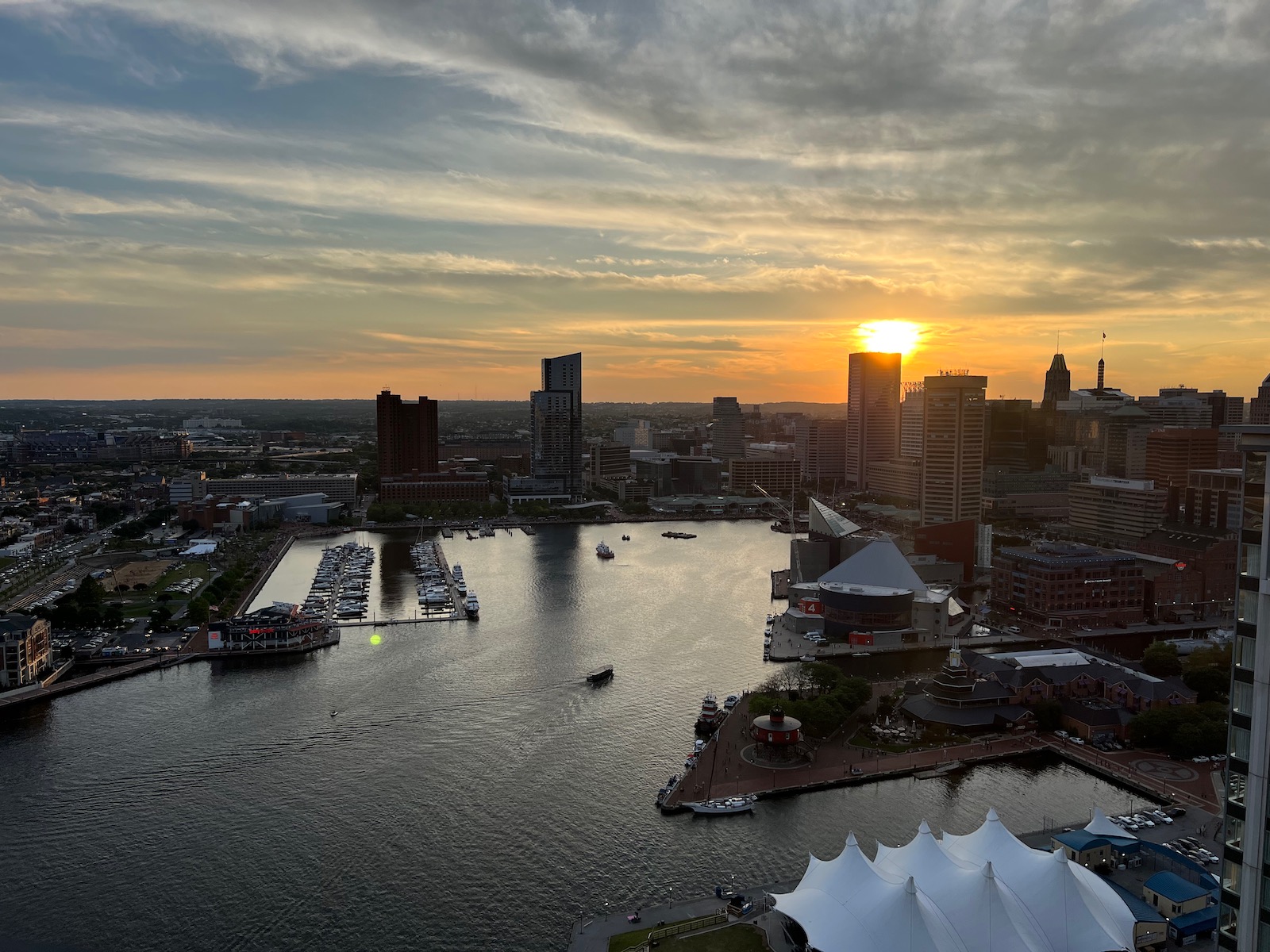
Today, Camden Yards’ local scene is good but not great — don’t walk too far into downtown or into certain pockets to the south — but the iconic Inner Harbor is a 10-15 minute walk away.
Iconic Clock and Artistry Atop the Scoreboard
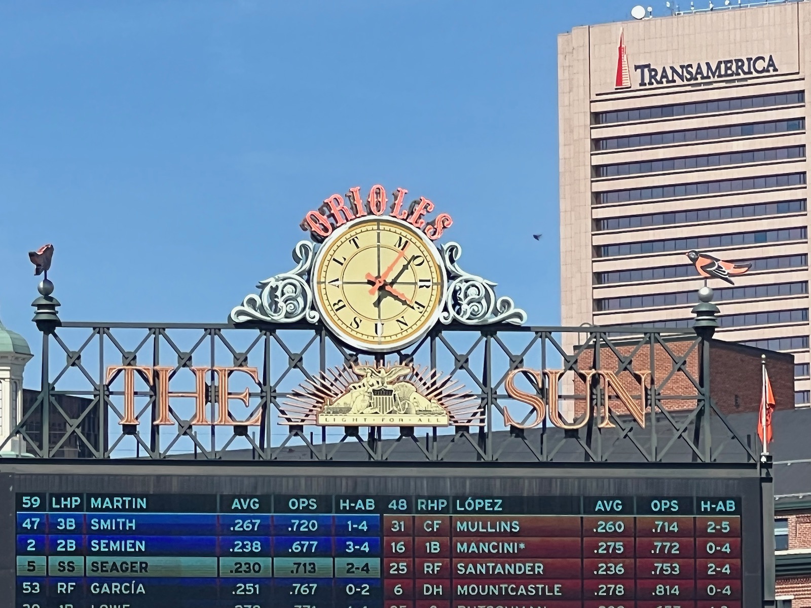
Tons of neat artistic flourishes and decorative elements adorn Camden Yards inside and out. Perhaps the most salient is the styling of “The Sun” advertisement and the 19th century-style clock. Note the ornithologically correct birds flanking the top as well. For 2023, “The Sun” ad was removed, but the clock and Orioles are still there.
Upper Deck is Comparatively Lower to the Field
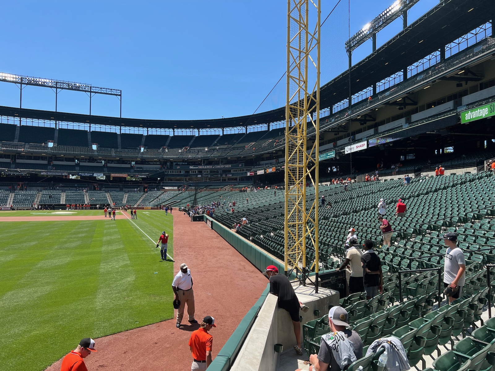
Virtually every post-1990 MLB ballpark utilizes some variation of the lower-club-suite-upper level seating deck formula. At Camden, the club and suite levels are combined into one and the lower concourse is closed, allowing the upper deck to sit lower to the field.
Sparked Culinary Revolution at MLB Ballparks
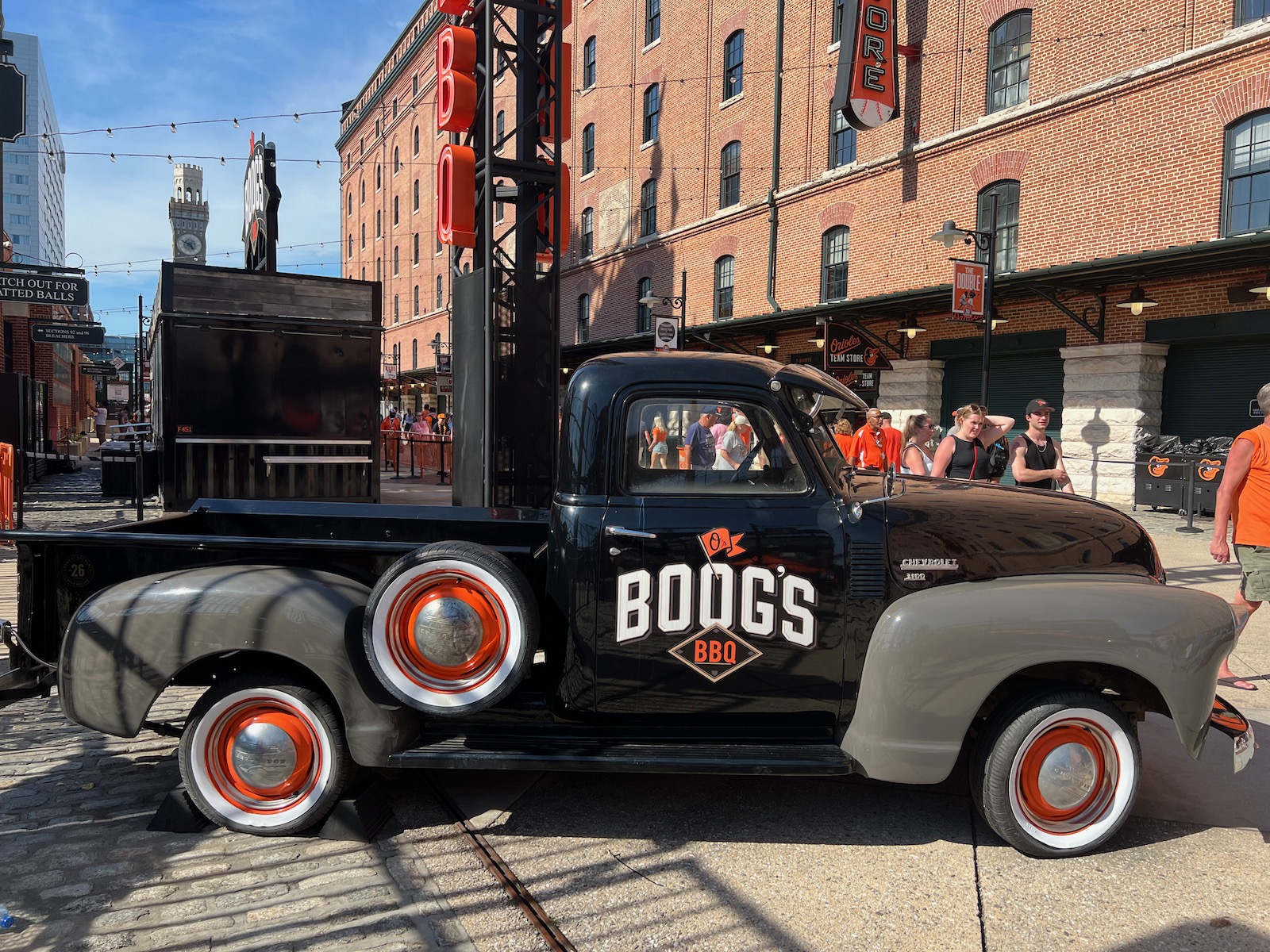
Camden Yards was a pioneer in offering higher-quality, regional cuisine at sporting facilities. Out was McDonald’s at SkyDome (1989), seen as revolutionary at the time, in was Boog’s BBQ, crab cakes, and pretzels shaped like “Os,” only three years later (1992). The grub holds up well today.
Flag Court
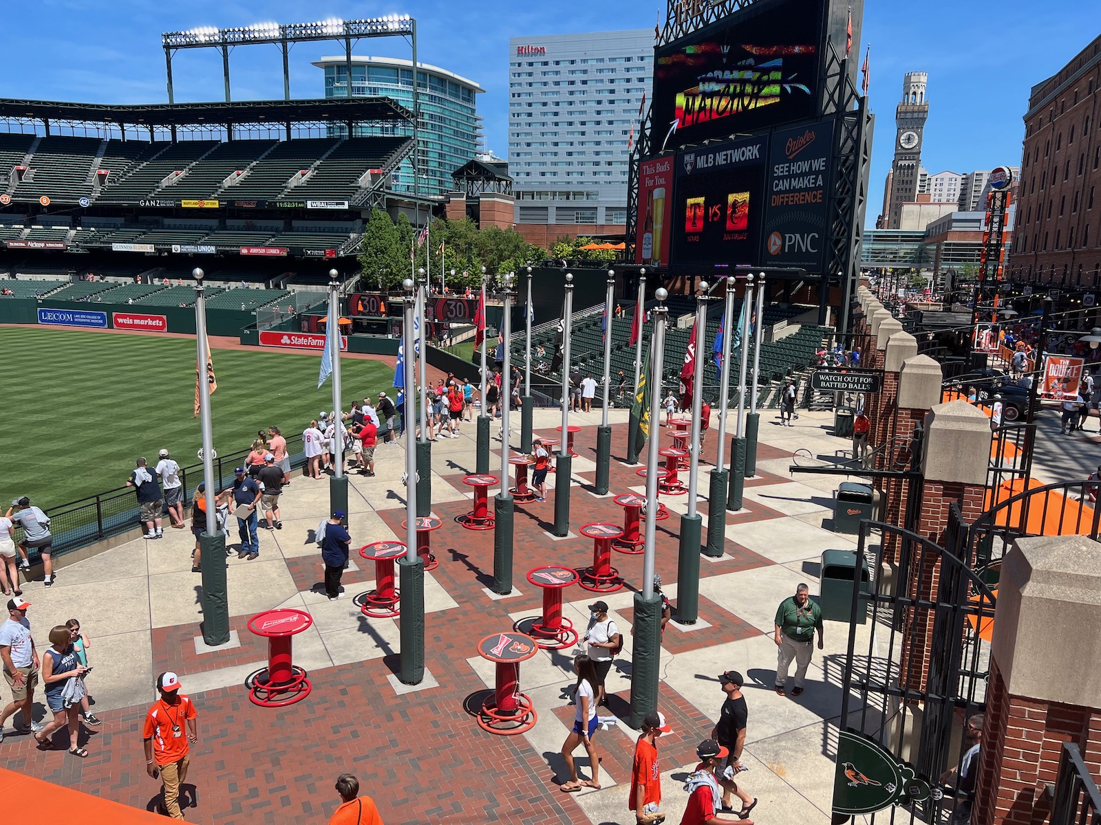
Camden Yards pioneered well-located Standing-Room Only (SRO) areas accessible to any fan with a ticket. Positioned atop the right field scoreboard adjacent to Eutaw Street, this is one of MLB’s best affordable perches, and it’s a prime spot to catch home run balls.
Statues in Legends Park
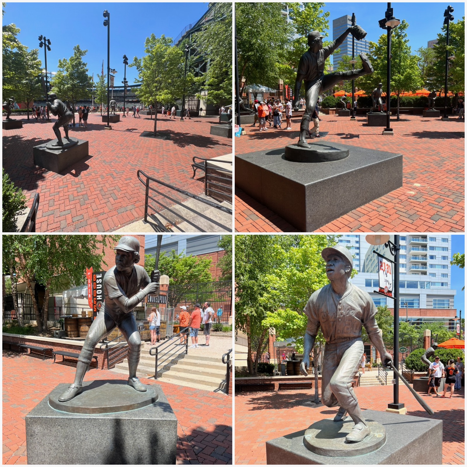
Most clubs feature statues of team greats somewhere, often dispersed outside of the venue, but the Orioles showcase their bronze big guns in a sculpture park above the left-center bullpens. Six Oriole legends are in action here: Cal Ripken Jr., Jim Palmer, Eddie Murray, Earl Weaver, Brooks Robinson, and Frank Robinson.
Babe's Dream
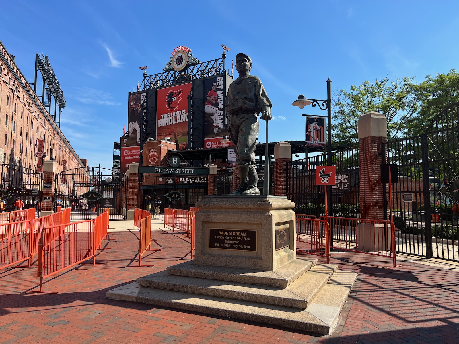
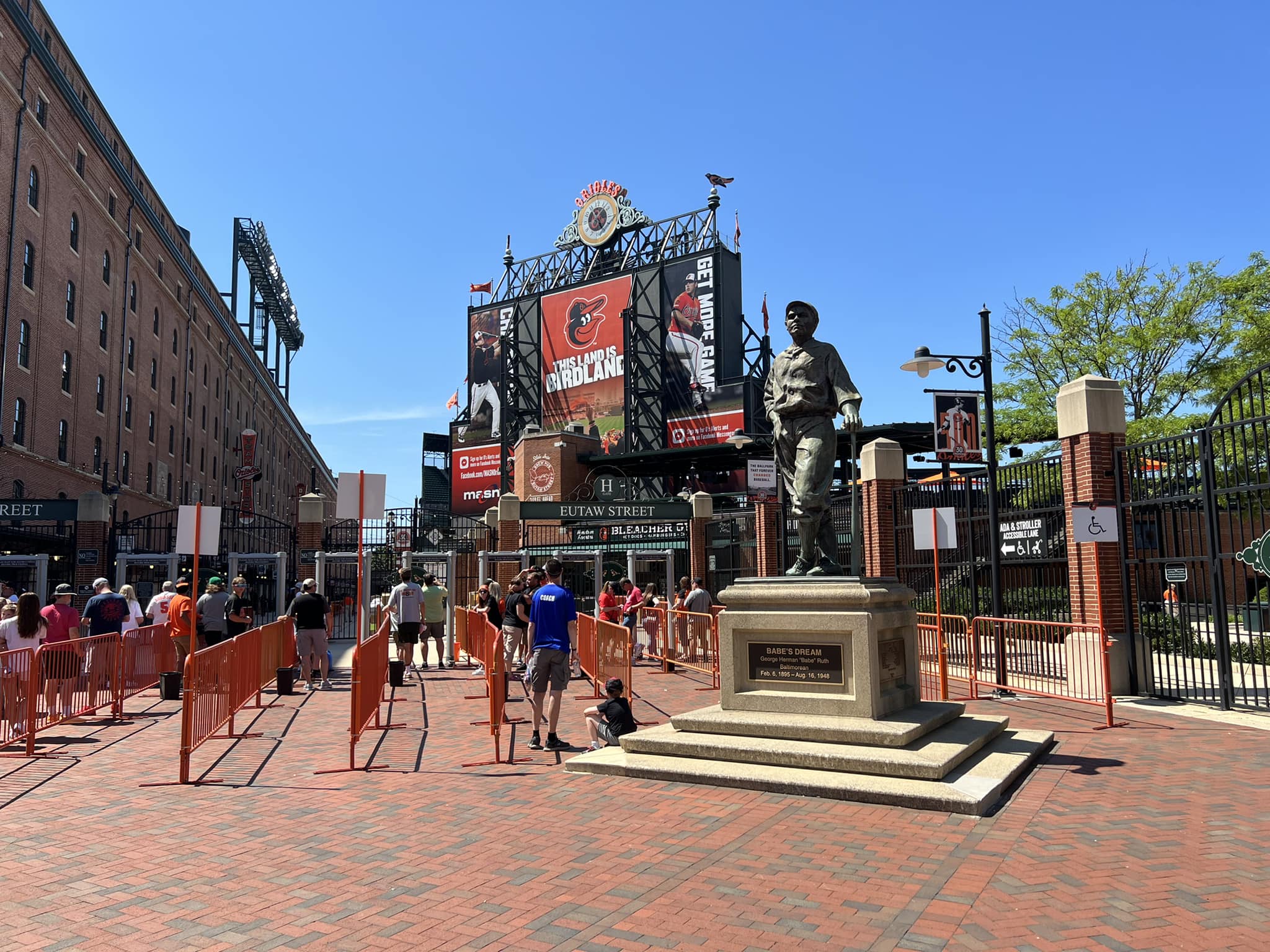
Located outside of the centerfield entrance by Eutaw Street, I debated whether or not to include this Ruth statue (these hits and misses are not exhaustive). On one hand, there’s the unforgivable error of depicting Ruth with a right-handed glove. On the other hand, (a) it’s so contextually appropriate because not only was The Babe was a Baltimorean, his father owned a saloon near what is now Camden Yards, and (b) some ballpark needs a statue of baseball’s most famous ballplayer (there inexplicably isn’t one at Yankee Stadium). Plus, Babe’s Dream is pretty famous.
Brass Baseballs Marking Home Runs That Landed on Eutaw Street
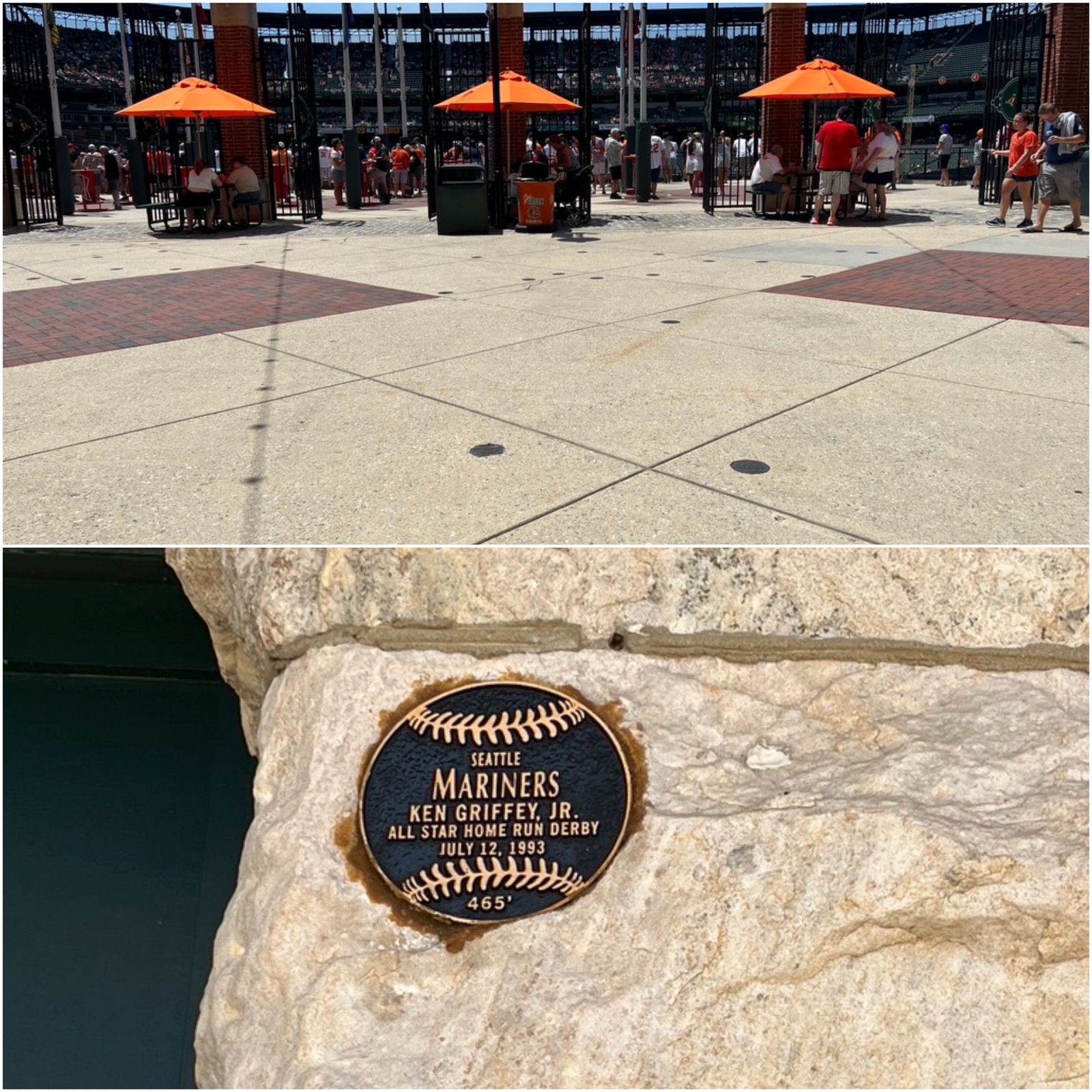
Now here’s Camden Yards’ most ingenious “little touch.” Also don’t miss the plaque marking the spot where Ken Griffey Jr. hit the Warehouse during the 1993 Home Run Derby.
Other Subtle Historical References and Vintage Artistic Flourishes
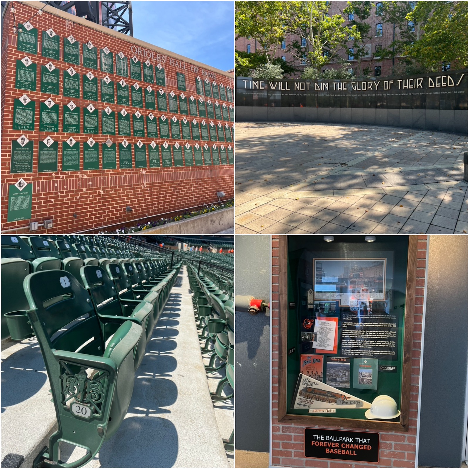
Camden Yards was the first ballpark with bespoke logos on each aisle seat. Here, it’s the insignia of the original Baltimore Baseball Club Emblem. Foul poles were imported from old Memorial Stadium, a concept again copied by other teams after leaving their respective old parks. Concourse signage feels classic. The Orioles Hall of Fame wall is worth a peak on Eutaw Street. That all just scratches the surface.
Art in the Park
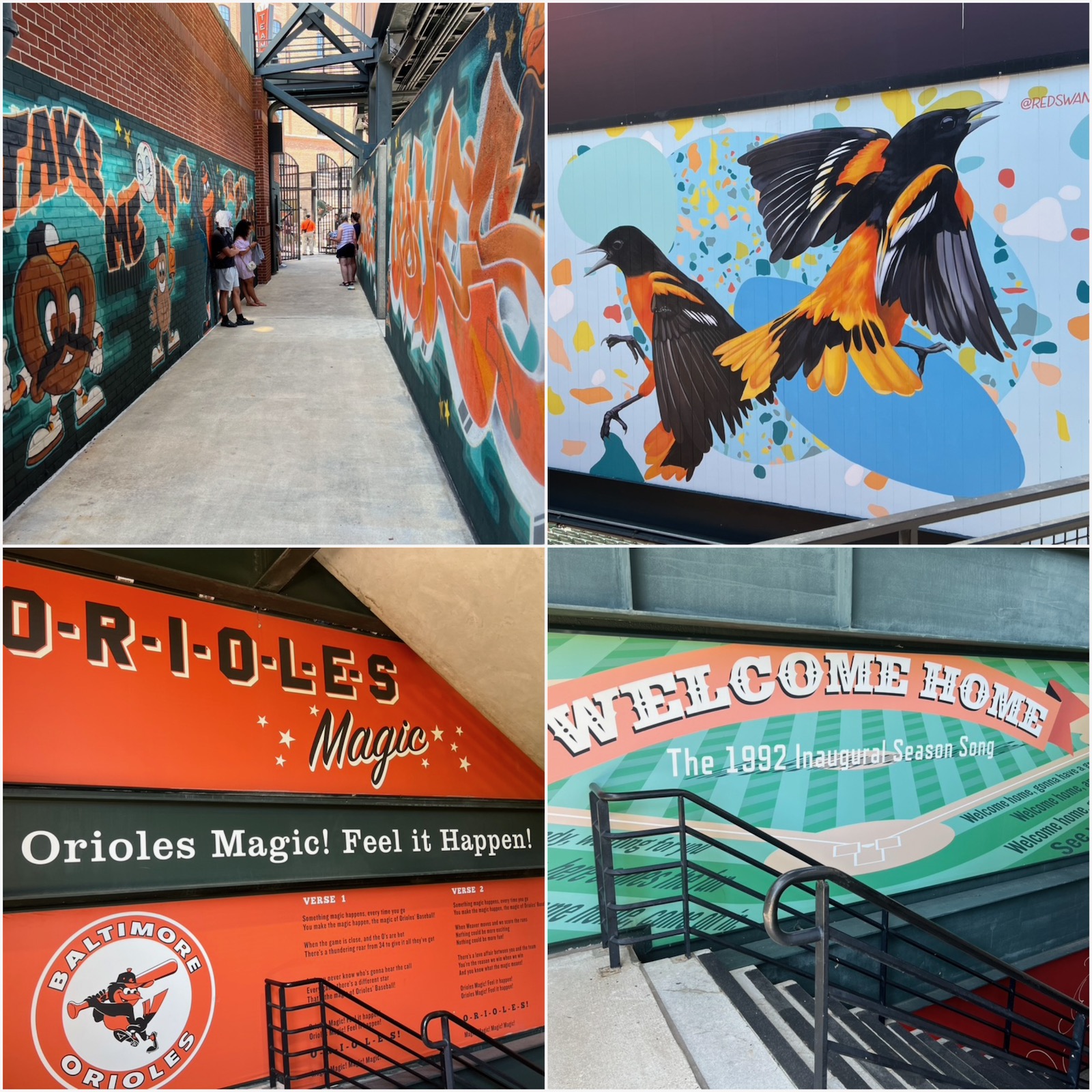
In recent years, Camden Yards has commissioned local artists to curate murals around the concourses. There are also murals in the stairwells that date back to earlier years.
Bullpen Picnic Area
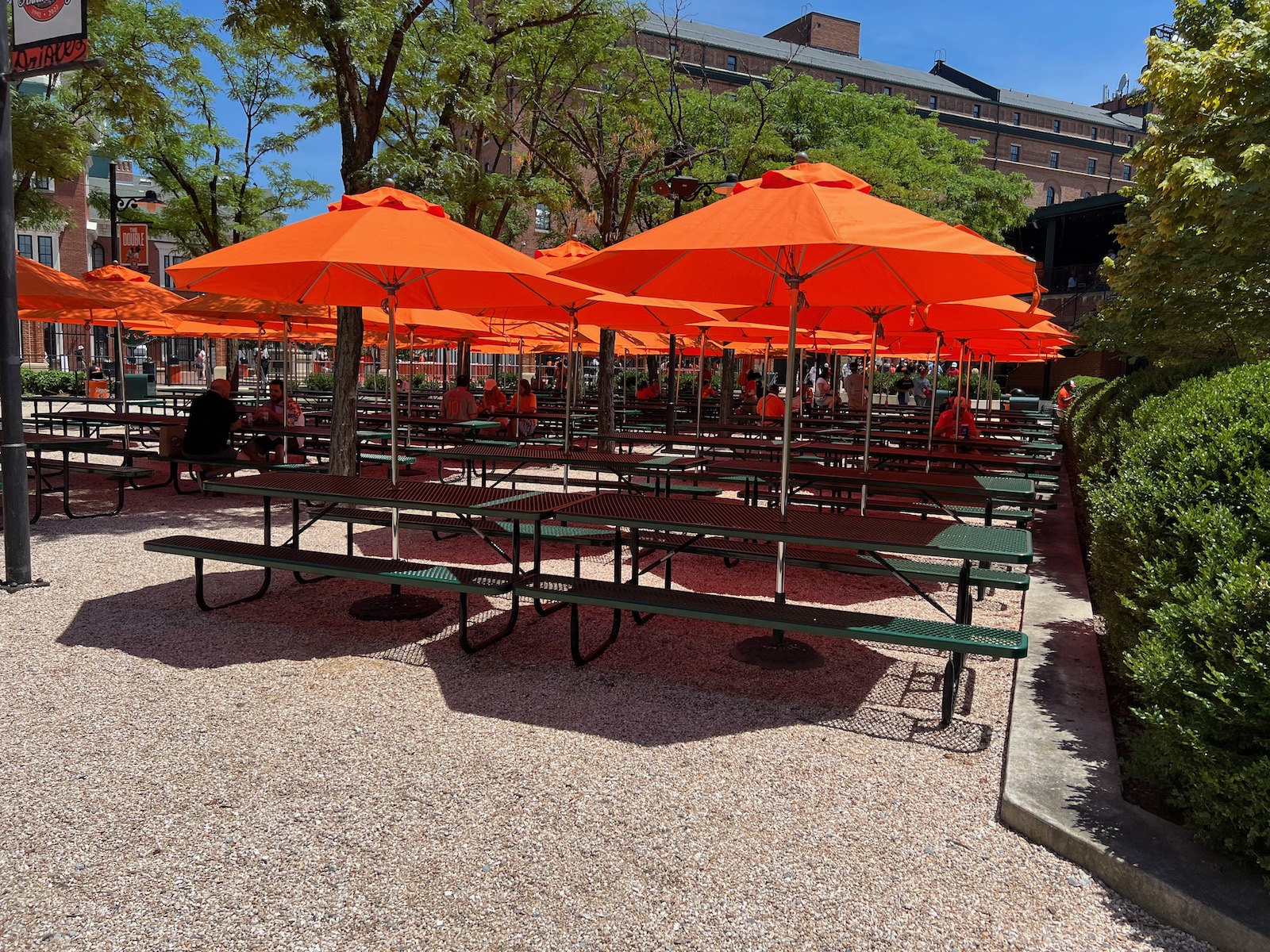
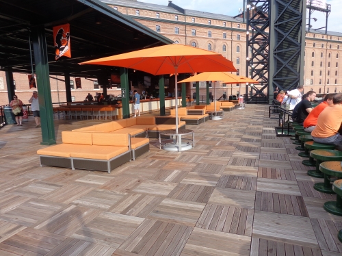
My ballpark pet peeve is the lack of places to sit down and eat/drink on the non-premium concourses. Who wants to eat these messy meals on their lap in a cramped fold-down seat? Camden’s beautiful picnic area means you won’t have that problem in Baltimore.
Batter's Eye Bar
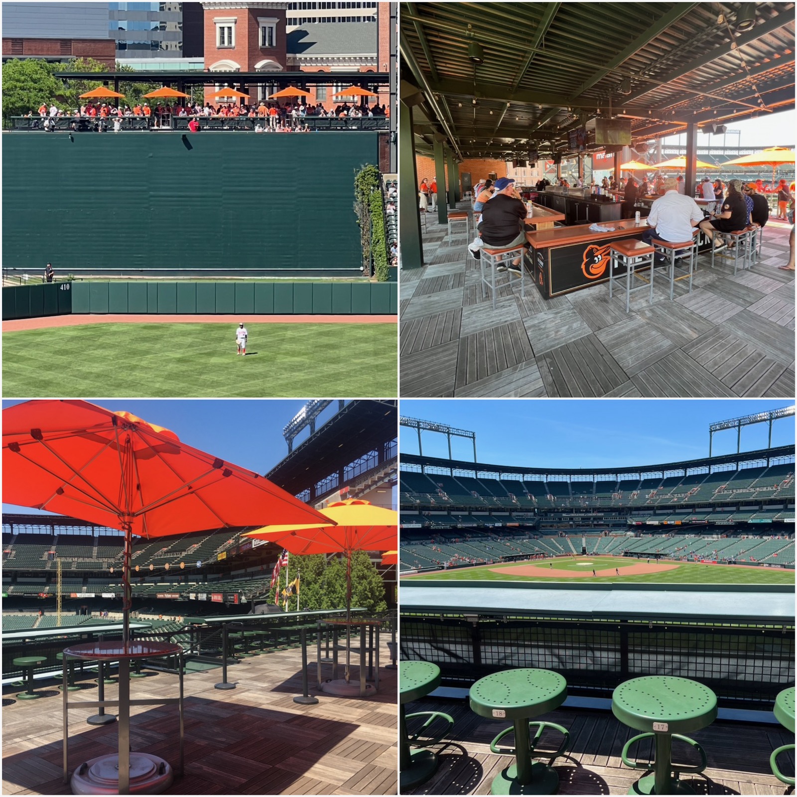
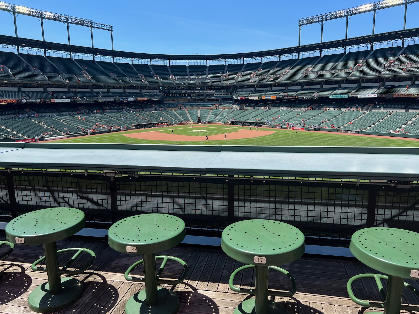
Camden Yards naturally doesn’t have the social spaces of newer parks, but its well-appointed bar atop the batter’s eye is a star, and it’s almost always accessible to anyone with a ticket. Prime field views and lots of seating (including proper bar seating) make this one of the best social gathering areas in baseball.
Two-Tiered Bullpen Design
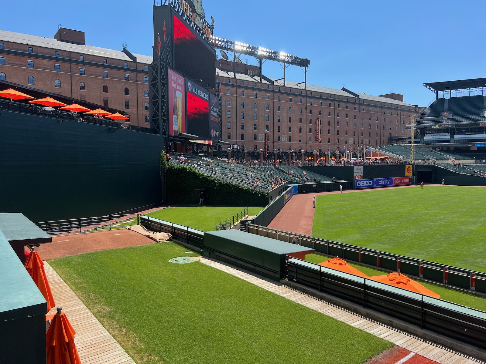
Yet another first for Camden Yards, something of course copied by subsequent ballparks. Fans can stand, hang out, and look into bullpens on the left-center field walkway.
Only MLB park without ANY Club Seats, Clubs, or Suites in the Lower Bowl
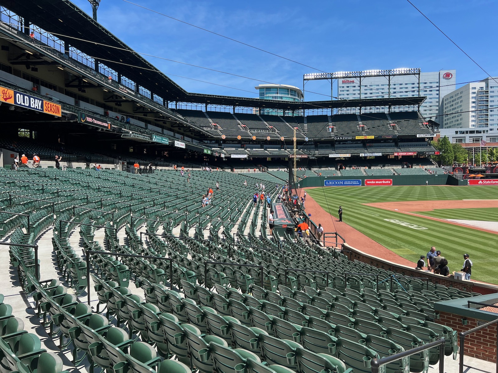
Camden Yards opened before the premium seating bonanza hit sporting venues. We only have a mezzanine club level backed by suites here. Whereas almost every ballpark has super premium all-inclusive “home plate clubs” and “moats” in the lower bowl, while the few others that don’t have luxury suites or some sort of other premium concept somewhere in the lower bowl, the ENTIRETY of the lower bowl at Camden Yards was built for the “baseball-watching fan,” not the corporate crowd. Many 1990s parks and even Wrigley and Fenway added such clubs/club seats recently, but Camden has stayed strong. Note this means ushers will let you down to the first rows behind home plate before the game for a picture, even if you don’t have tickets down there. I wouldn’t expect this to last, however, as the Orioles are leaving 8 figures per year on the table (hence, see the misses).
Other Misses
Ugly Hilton Hotel Looming Over Left-Center Field Blocks Skyline Views, Notably of the Iconic Bromo-Seltzer Tower
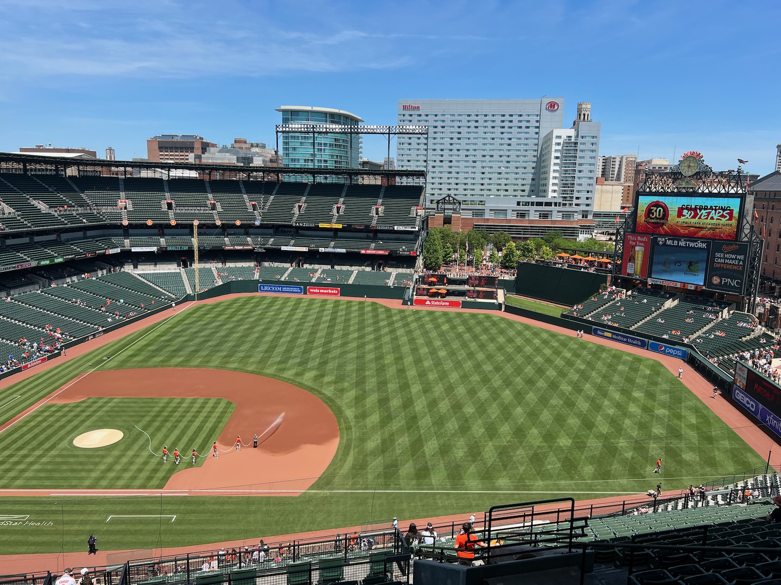
Opening in the late 2000s, this convention hotel doesn’t just block skyline views of iconic Baltimore buildings. It fights Camden Yards’ core aesthetic. Overscaled, antiseptic, and um, WHITE, you couldn’t imagine a building that clashes more with The Ballpark That Forever Changed Baseball. Moreover, the Hilton has been a financial disaster. Knock this monstrosity down, and you’d be looking at an “interior aesthetics” score on par with parks in Pittsburgh and San Francisco. All that being said, I don’t think it “ruins” the park. See the before and after.
Smallest Video Board in MLB and Arguably MLB's Most Outdated Tech
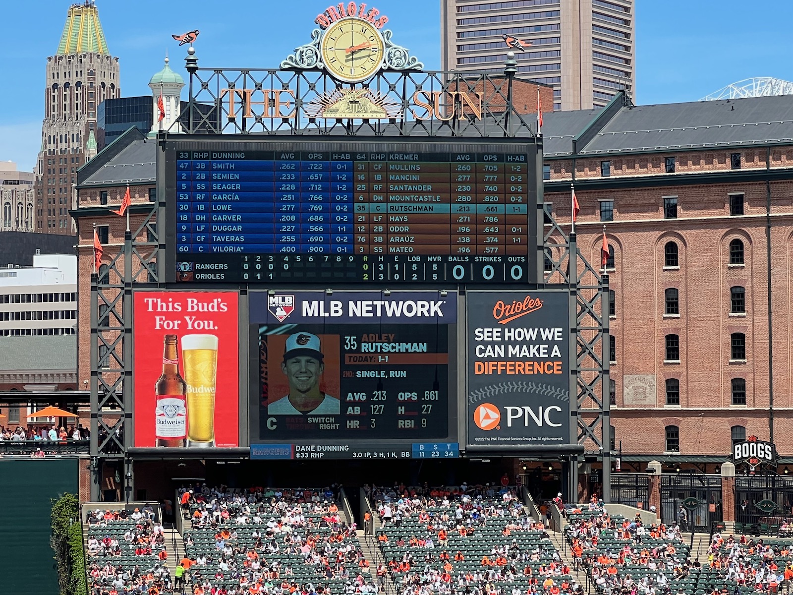
The Angelos family has failed to sufficiently enhance Camden in a handful of respects, but the lack of tech upgrades is most notable. Camden’s main videoboard is the smallest in MLB; its total video space is only ahead of Tropicana Field; and it’s top-3 in most outdated. Moreover, the sound system is just awful, something I don’t usually note. In a prime club level seat adjacent to the press box, everything sounds muted.
Main Concourse Closed From the Field
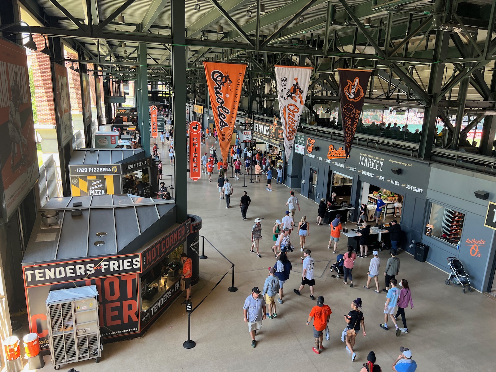
This is another area where Camden Yards doesn’t functionally compare to newer parks. Except for in left-center field, you can’t see the field when walking the 360-degree concourse. Now, this is a personal preference — some ballpark aficionados prefer closed concourses; I love concourses open to the field — but without wading into that debate in this space, almost every single state-of-the-art ballpark that has opened in the past 25-ish years has open concourses.
New Left Field Dimensions Butcher Formerly Clean Outfield Aesthetics
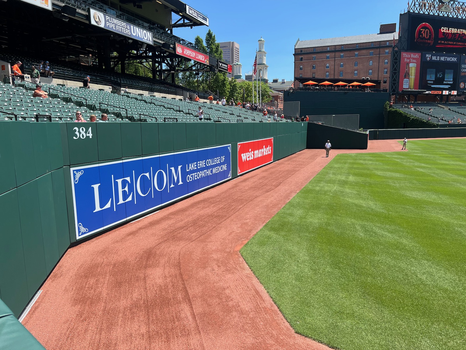
I’m not going to opine much on the baseball aspect of this — it’s an overcorrection at best but probably just plain shortsighted — but it looks terrible aesthetically. Camden Yards was the first MLB park to have an outfield wall made up entirely of straight wall segments since Ebbets Field, but in contrast to successors, they didn’t overdue it.
The dimensions were disciplined and authentically related to the site. Now left field just looks cartoonish.
Terrace Level Overhang Obstructions
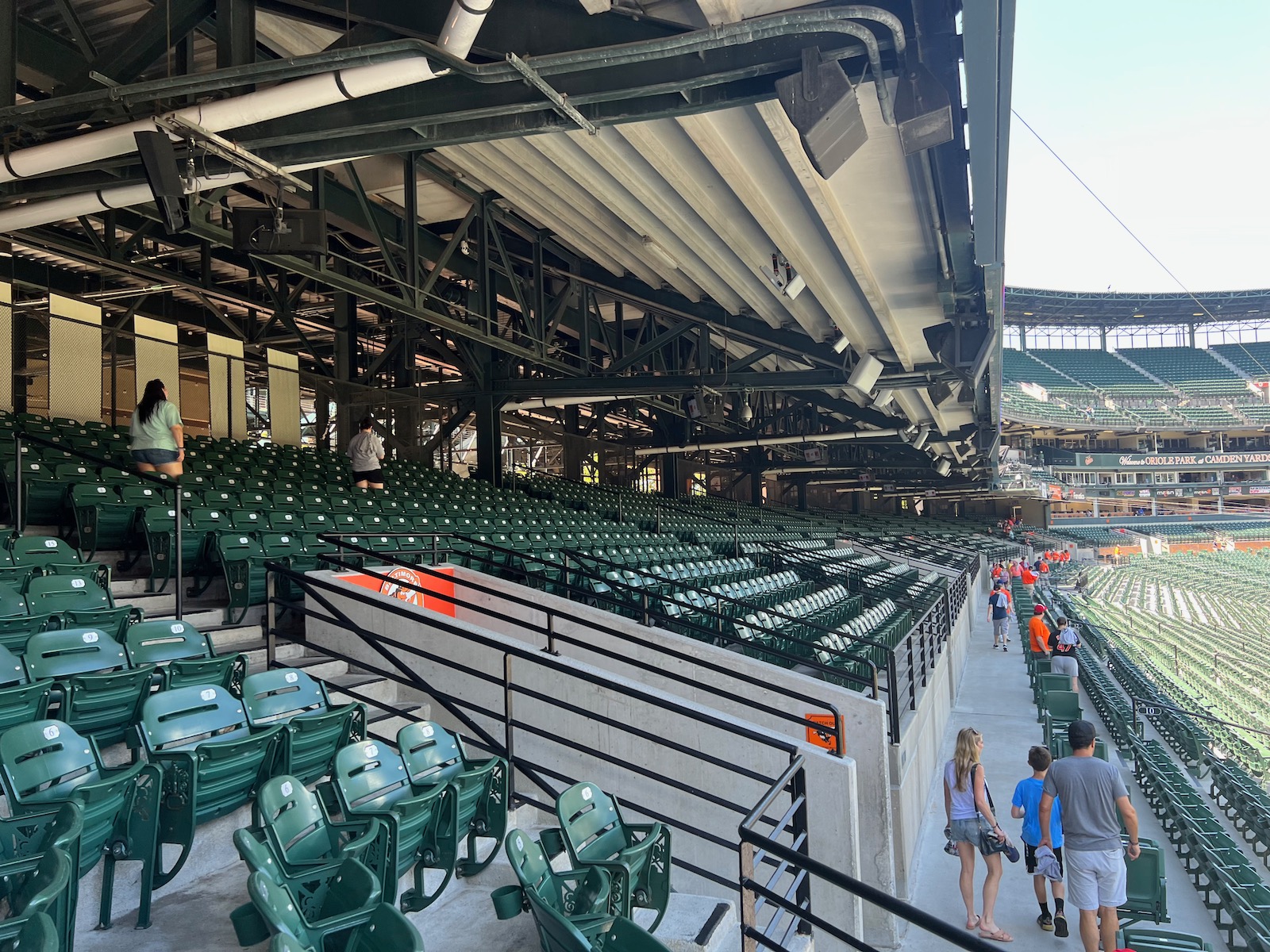
Camden Yards features a large lower bowl: ~30 rows of Field Boxes backed by a cross aisle and ~13 rows of Terrace Boxes. The overhang of the Club Level above creates very poor visibility from the back of the Terrace Boxes. This was a big complaint in Camden’s infant years, and these seats go unoccupied these days save Opening Day.
Upper Deck Seats Lack Cupholders
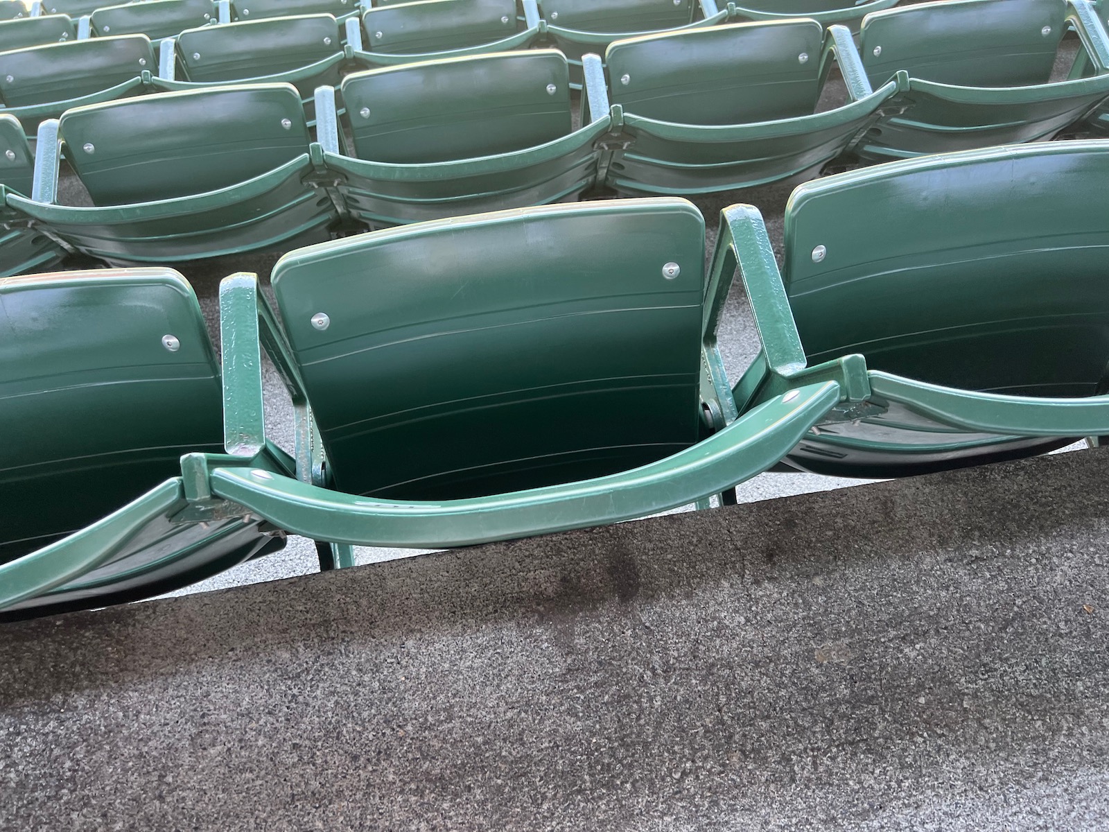
In 2011, the Orioles replaced all of its upper deck seats, but they inexplicably didn’t add cupholders. A very small thing, yes, but only two 21st century MLB parks lack cupholders in the upper deck, so this is not standard. Moreover, the padded Field Box seats added in 2004 lack adequate leg room. Even for me – I’m 5’8. Lots of issues — big and small — with the seats and seating angles at Camden, and that’s pretty essential!
Unusual Lack of Premium Seating Puts Team at a Financial Disadvantage
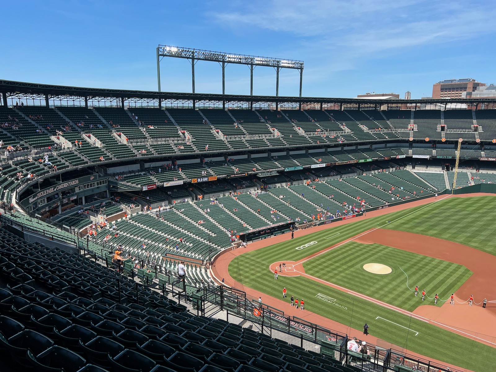
Hey, premium seating counts on my scorecard for a reason: the Orioles are simply leaving too much money on the table by not having sufficient club seating. No all-inclusive clubs whatsoever. No VIP lounges. No premium restaurants. No unique premium loge-style seating. Just the outdated mezzanine club level and tired luxury suites. If you look at other markets, you know what I’m talking about. It doesn’t have to be the gross excess of a Yankee Stadium, but there has to be something. The Angelos family has kicked the can down the road on this many times, but I think we’ll see something in the 2020s. Plus, let’s be honest: all-inclusive club seats are fun as hell if you can get them. And great deals can often be had on Stubhub. Just look at Nationals Park.
While Charming, Mezzanine Club Level is Woefully Outdated
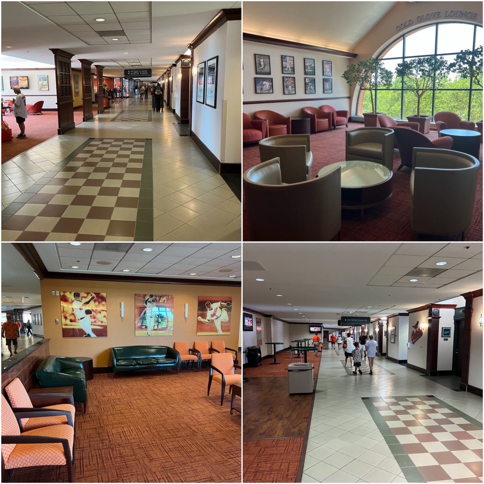
I like Camden Yards’ club level, but the design and decor harkens back to another era. The off-concourse lounge areas were apparently enhanced in the early 2000s, but have the furnishing of a 1990s waiting room. The actual tiled club level concourse appears to date back to 1992.
No More Dempsey's Brew Pub
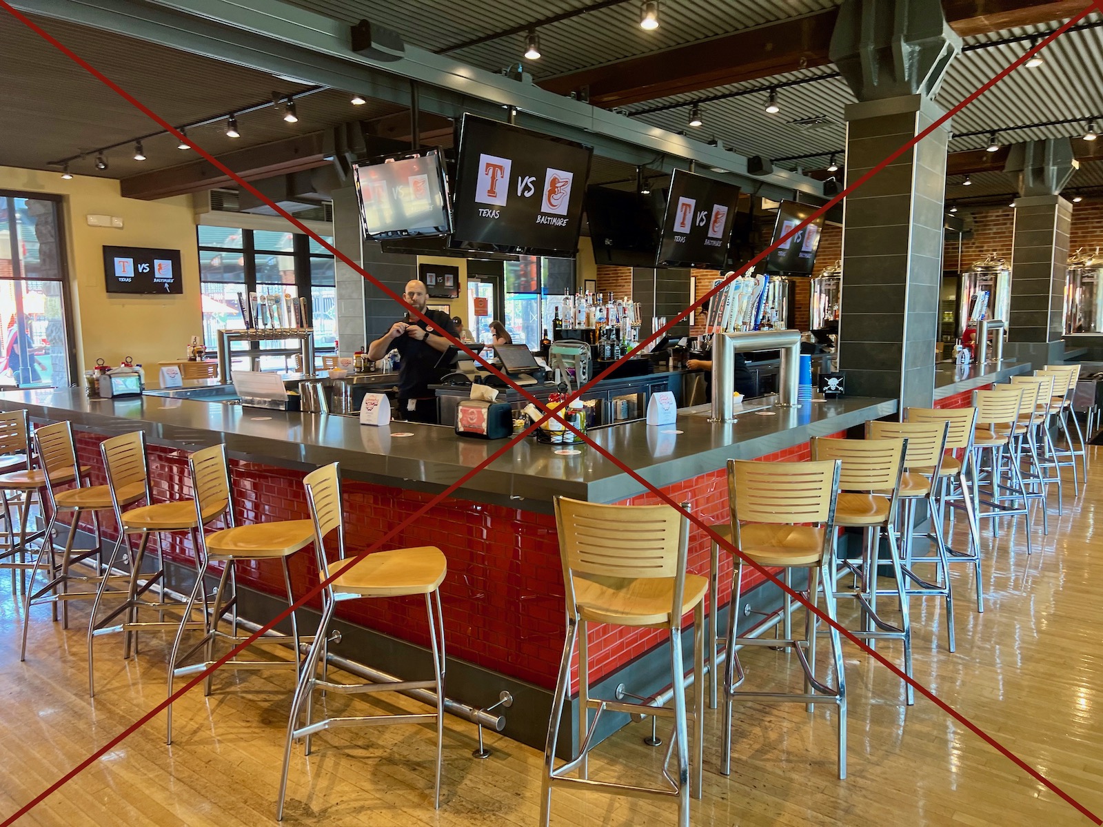
Dempsey’s Brew Pub has closed for the 2023 season. It will lie dormant while the Orioles say they decide what to do with it, but it will probably hold the new SportsBook. This is a negative for me, mostly because these trendy SportsBooks attached to MLB parks aren’t accessible for fans inside the park! So, that’s a definite downgrade.
Best of
Best Neighborhood Restaurant/Bar: Pickles Pub
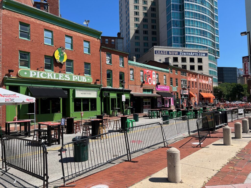
Located adjacent to the park on Washington Blvd beyond the left field corner, this is probably Camden Yards’ most famous pre and post-game option. It’s a classic sports bar and has become a local institution for pub classics. Sliders nearby gets an honorable mention.
Best Seats: Field Boxes, Sections 28-46, Behind Home Plate
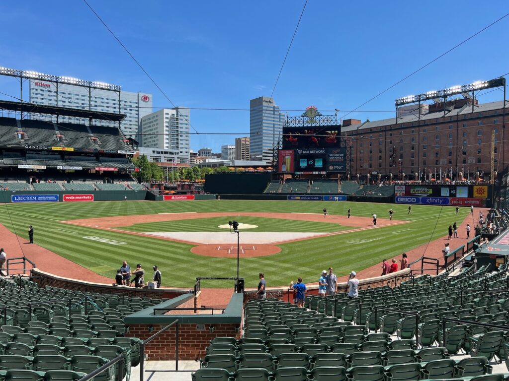
Located behind home plate in the lower part of the lower bowl, these are often considered Camden Yards’ best seats. They are also padded. Moreover, because Camden has no lower-level “home plate club” seating attached to extra amenities, these are probably MLB’s most affordable “best seats.” One big issue, though: these padded seats added in 2004 inexplicably lack adequate leg room. Even for me – I’m 5’8.
Favorite Seats: Club Level, Sections 242-246, Behind Home Plate to Third Base Side
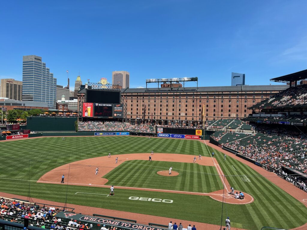
This was a tough call. I like to be elevated, so Camden’s Upper Box (lower part of the upper deck) behind home plate was tempting given it’s the tremendous value. But I’m picking the mezzanine club level on the slight third base side: (a) low enough for terrific views of the action but meets my preference for elevation, (b) perfect views of the Warehouse and the best part of the skyline, (c) access to club level amenities, including much-needed climate-controlled lounge space on a hot day, (d) shade, and (e) quick stairwell access for anything you the main concourse.
Signature Food: Boog’s BBQ Pit Beef Sandwich or Crab Cake Roll
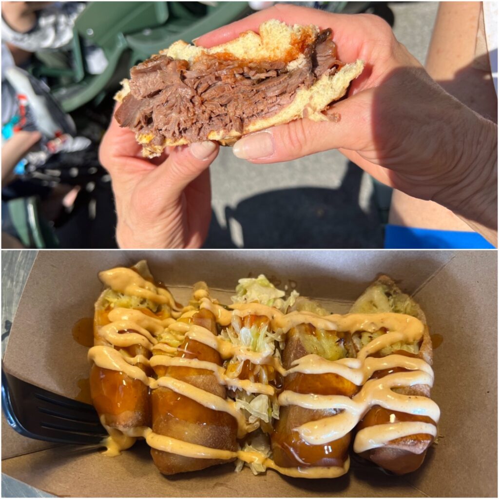
Fenway Park has the Fenway Frank. Dodger Stadium has the Dodger Dog. But Boog’s BBQ at Camden Yards is the OG ballpark “signature food” beyond a hot dog. Go with the always delicious Pit Beef Sandwich at the Eutaw Street location. Camden Yards is also known for its crab cake-related dishes. My favorite grub in the park are the Crab Cake Egg Rolls from Jimmy’s Seafood — they’re crab cakes in egg roll form with a cream cheese blend, mango ponzu, and spicy mayo. Yum!
Best In-Park Pregame Spot: Batter's Eye Bar
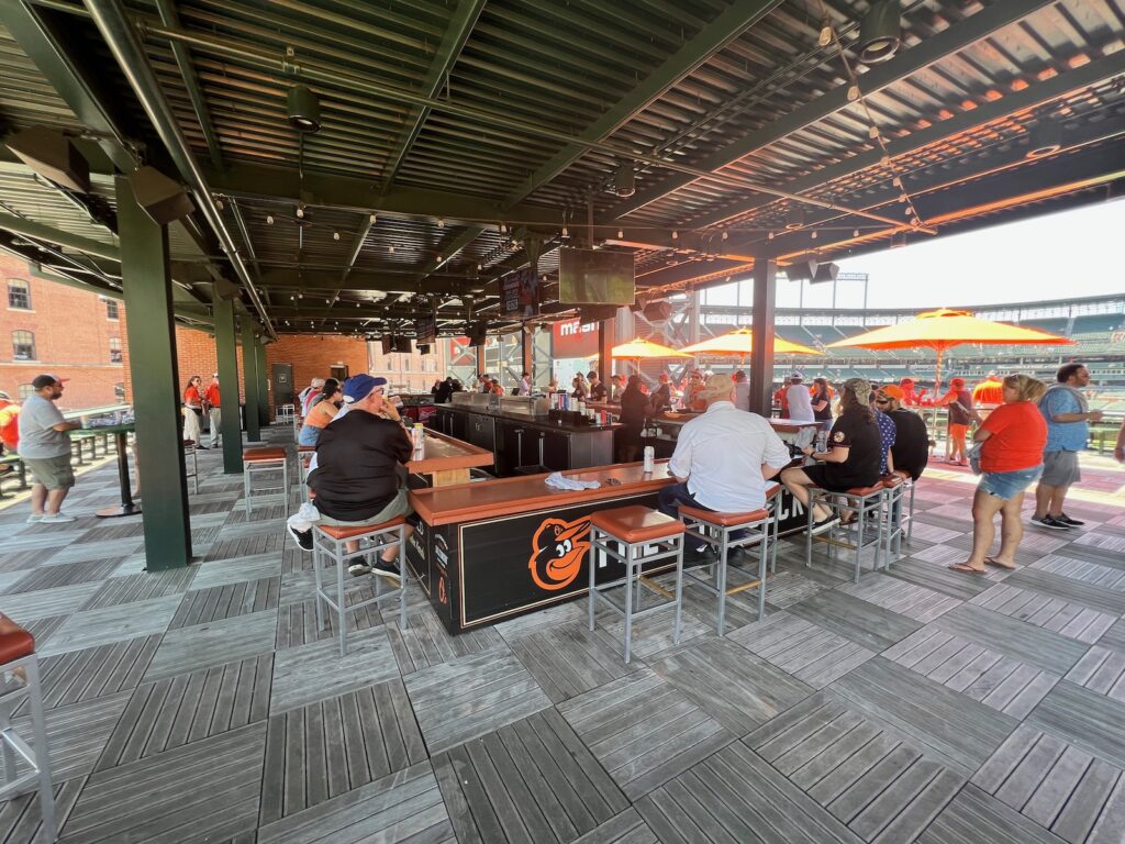
After you check out Eutaw Street, this aforementioned gem should be your next stop for great views of both downtown Baltimore and the field.