Great American Ball Park
| Setting | 17/20 | 1 Thumb Up |
|---|---|---|
| Locale | 4.5/5 | 1 Thumb Up |
| Accessibility | 3.5/5 | Thumb Sideways |
| Neighborhood Local Scene | 9/10 | 1 Thumb Up |
| Architecture & Aesthetics | 36/65 | 1 Thumb Down |
|---|---|---|
| Exterior Design/Aesthetics | 12.5/20 | Thumb Sideways |
| Interior Aesthetics/Visuals | 20/40 | 1 Thumb Down |
| Concourse Aesthetics | 3.5/5 | Thumb Sideways |
| Functionality & Essentials | 39.5/50 | 1 Thumb Up |
|---|---|---|
| Sightlines: Field Proximity | 10.5/15 | Thumb Sideways |
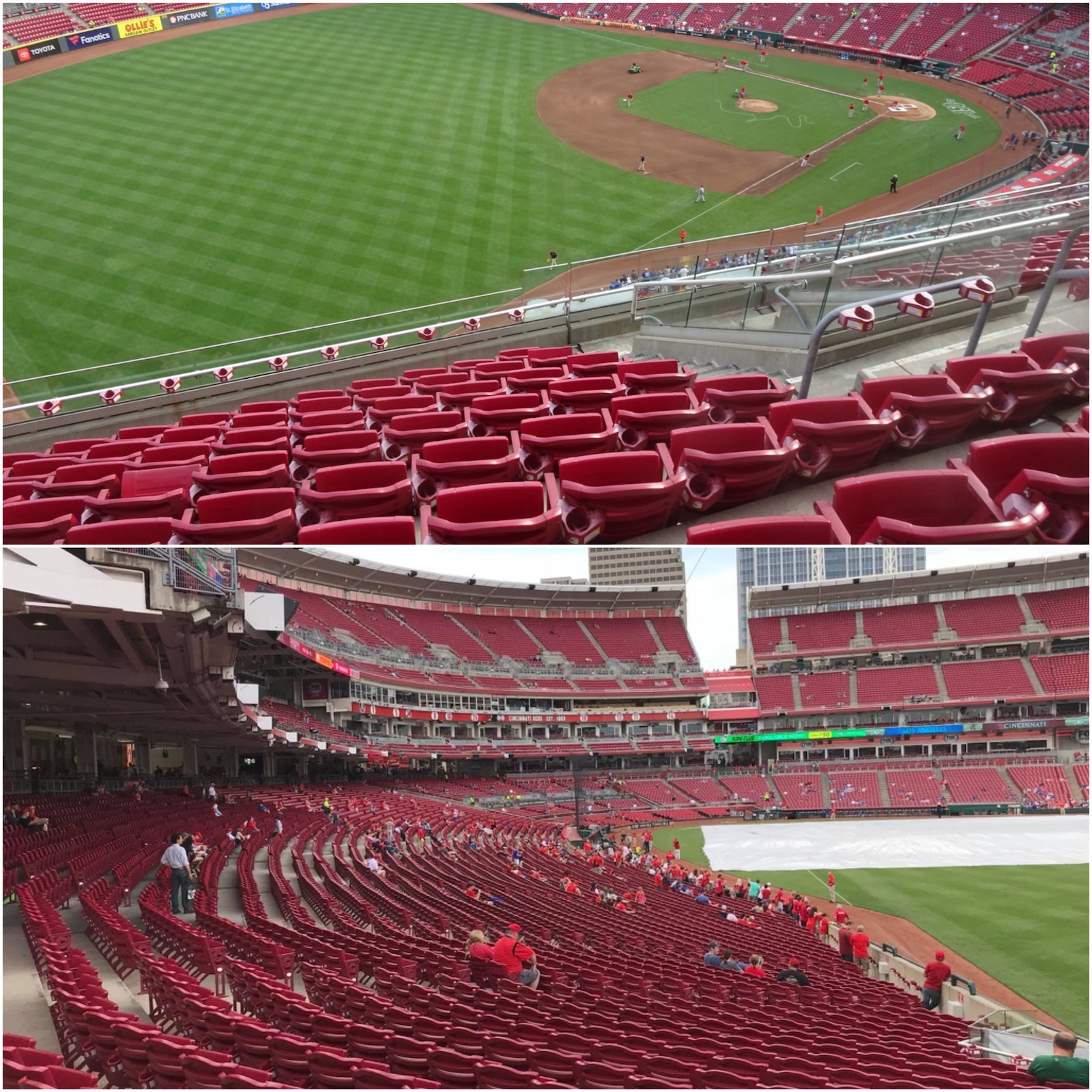
| Sightlines: Seating Geometry | 5/5 | 2 Thumbs Up |
| Seat Comfort | 6.5/9 | Thumb Sideways |
| Concourse Functionality | 11.5/15 | Thumb Sideways |
| Scoreboards/Tech | 6/6 | 1 Thumb Up |
| Amenities & Features | 40/50 | 1 Thumb Up |
|---|---|---|
| Concessions: Food Variety | 2.5/5 | 1 Thumb Down |
| Concessions: Food Quality | 3.5/5 | Thumb Sideways |
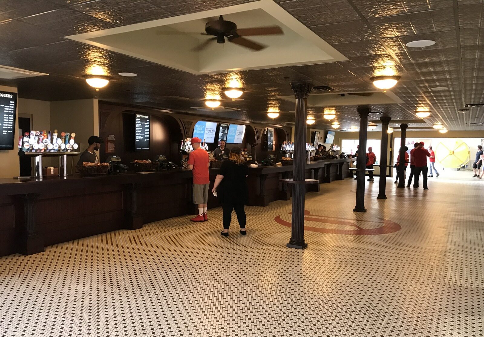
| Concessions: Craft Beer/Other Drinks | 4.5/5 | 1 Thumb Up |
| Social Gathering Areas/Restaurants | 7/10 | Thumb Sideways |
| Premium Seating/Clubs | 7.5/9 | 1 Thumb Up |
| Historical Exhibits, Memorabilia, Art, & Other Displays | 9.5/10 | 2 Thumbs Up |
| Kids Areas/Other Entertainment | 5.5/6 | 1 Thumb Up |
| Atmosphere, Vibe, & Policies | 10.5/10 | Thumb Sideways |
|---|---|---|
| Fan Support/Attendance | 3/5 | 1 Thumb Down |
| Ballpark Traditions/Gameday Presentation | 3.5/5 | Thumb Sideways |
| Ballpark Policies/Staff | 4/5 | 1 Thumb Up |
| Adjusted Raw Score | 143/2=71.5 |
|---|---|
| Bonus | 2 |
| Curve for All 7 | 7 |
| Final Score | 80.5 |
|---|---|
| Ranking | #21/30 |
|---|---|
The full in-depth review of Great American Ball Park is coming soon. In the mean time, below is an excerpt from our long-form ballpark rankings piece:

Speaking of post-1990 parks that tried too hard, we have Great American Ballpark, which represents the single biggest ballpark missed opportunity of our generation.
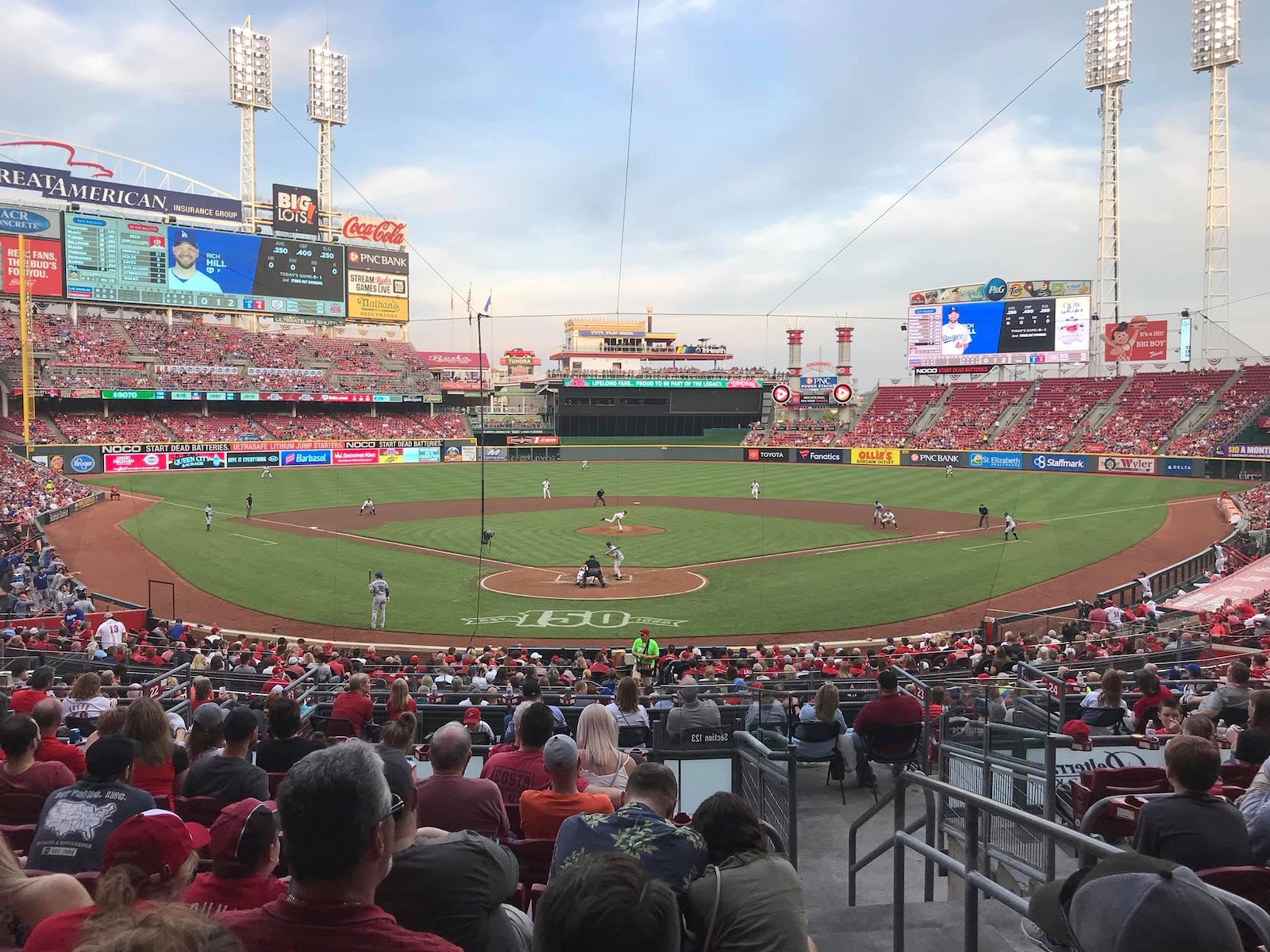
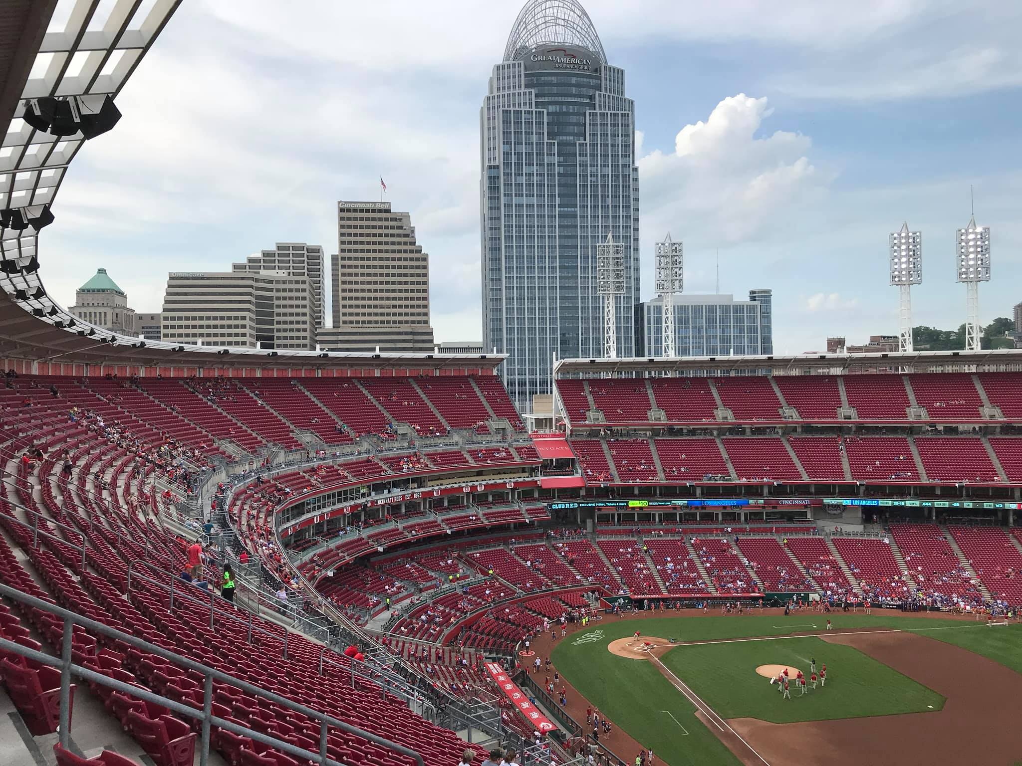
Great American Ballpark has a vibrant local scene, potential for downtown skyline views, the Cincinnati riverfront, a blueprint filled with fan-friendly amenities, and generally sound functionality. And the Reds managed to screw it all up, largely because of the park’s truly abysmal interior aesthetics. Purely subjective, but I’m hardly alone.
There’s a perception that GABP was built on the cheap, but that really wasn’t the issue. For downtown, riverfront ballparks, everything PNC Park in Pittsburgh ($215 million) did right, Great American Ballpark ($290 million) did wrong.
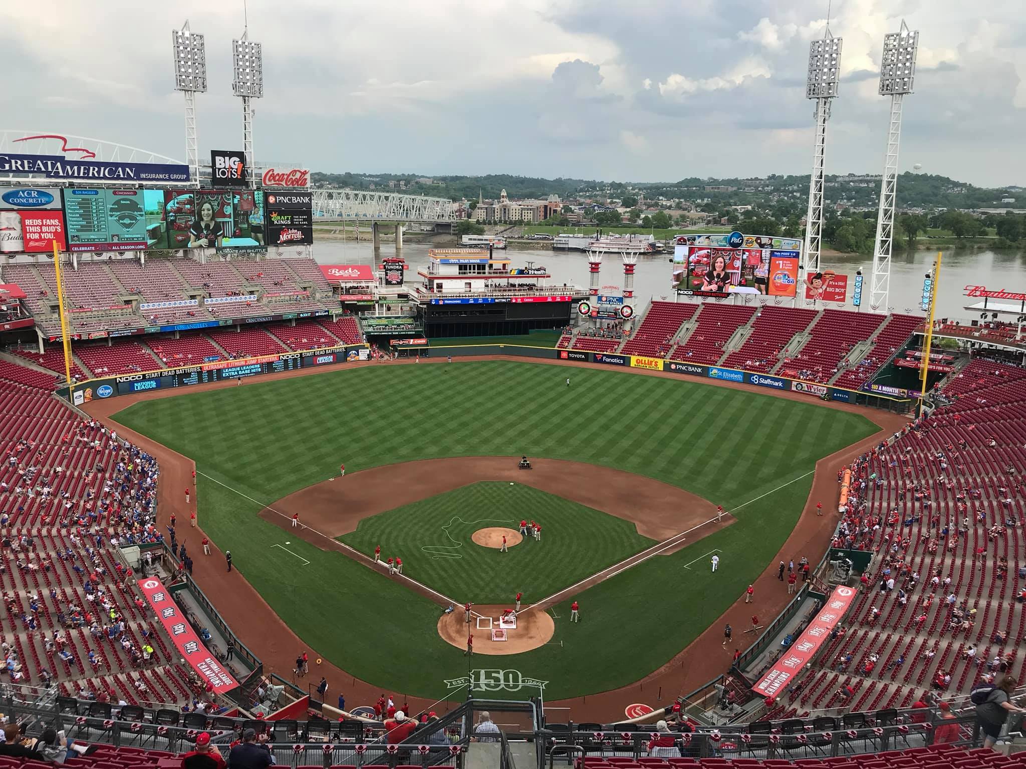
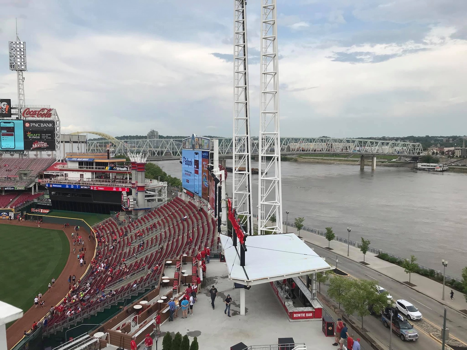
Where PNC Park integrates its setting into the lower bowl, GABP’s riverfront views are blocked by oversized seating and clumsy signage. Where PNC succeeds in the most complicated aspects of urban design, you don’t get any sense of place at GABP. Where PNC has clean interior lines, GABP has the ugliest gimmicks in baseball. This is related to the lack of sense of place at GABP, because it’s those very gimmicks that block out views of the riverfront.
Where PNC cultivates contextual space, GABP clutters neutral space with distractions and diversions. Where PNC is authentic, GABP feels contrived. The angles in Pittsburgh relate to the riverside, but the ethos in Cincinnati is totally separated from its context. Where Pittsburgh is confident in its simplicity, Cincinnati is busy. Where PNC has consistency, GABP is disjointed and fragmented, attempting to add too many elements. “The Gap” is well-intentioned, but silly. Where PNC has a nautical and pastoral color scheme, GABP has magenta.
For such a wonderful setting, this is a ballpark with no continuity or order whatsoever, lacking a consistent design vision where the design vision should be obvious: integrate the riverfront scene and/or the urban context into the ballpark. They failed on both accounts.
There is so much junk here without any attention to that. The kitschy stuff distracts from the original concept.
Can you imagine a fake riverboat or gimmicky smokestacks in Pittsburgh and San Francisco? Can you imagine those parks installing an extra videoboard blocking the water views in right field?
It’s all just awful, in what is perhaps the worst interior aesthetic design for a post-1990 non-retractable roof park in baseball. Even some of the uglier parks are at least simple. It doesn’t just compare poorly to the nation’s best waterfront parks (i.e. Pittsburgh/San Francisco). It compares poorly overall.
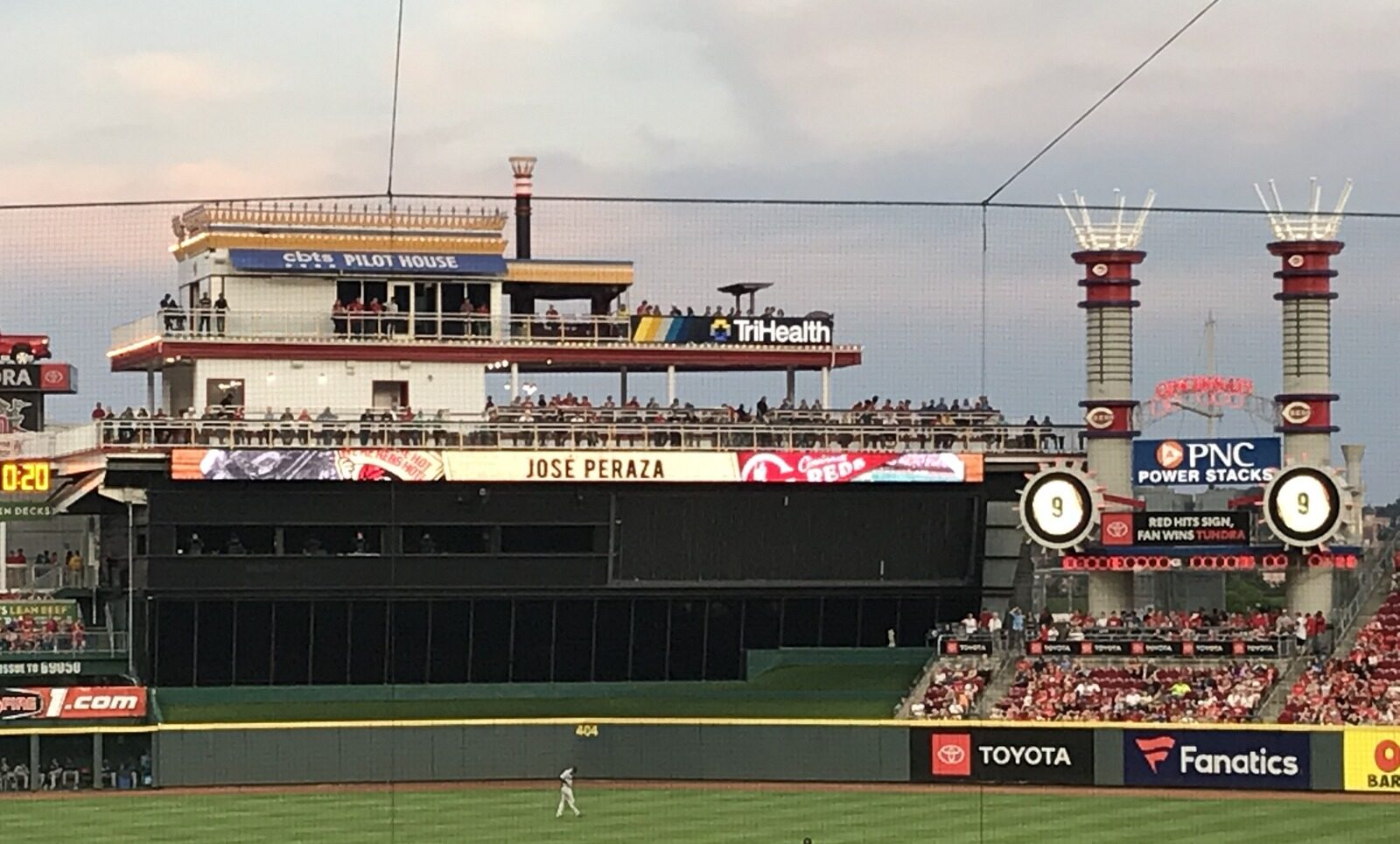
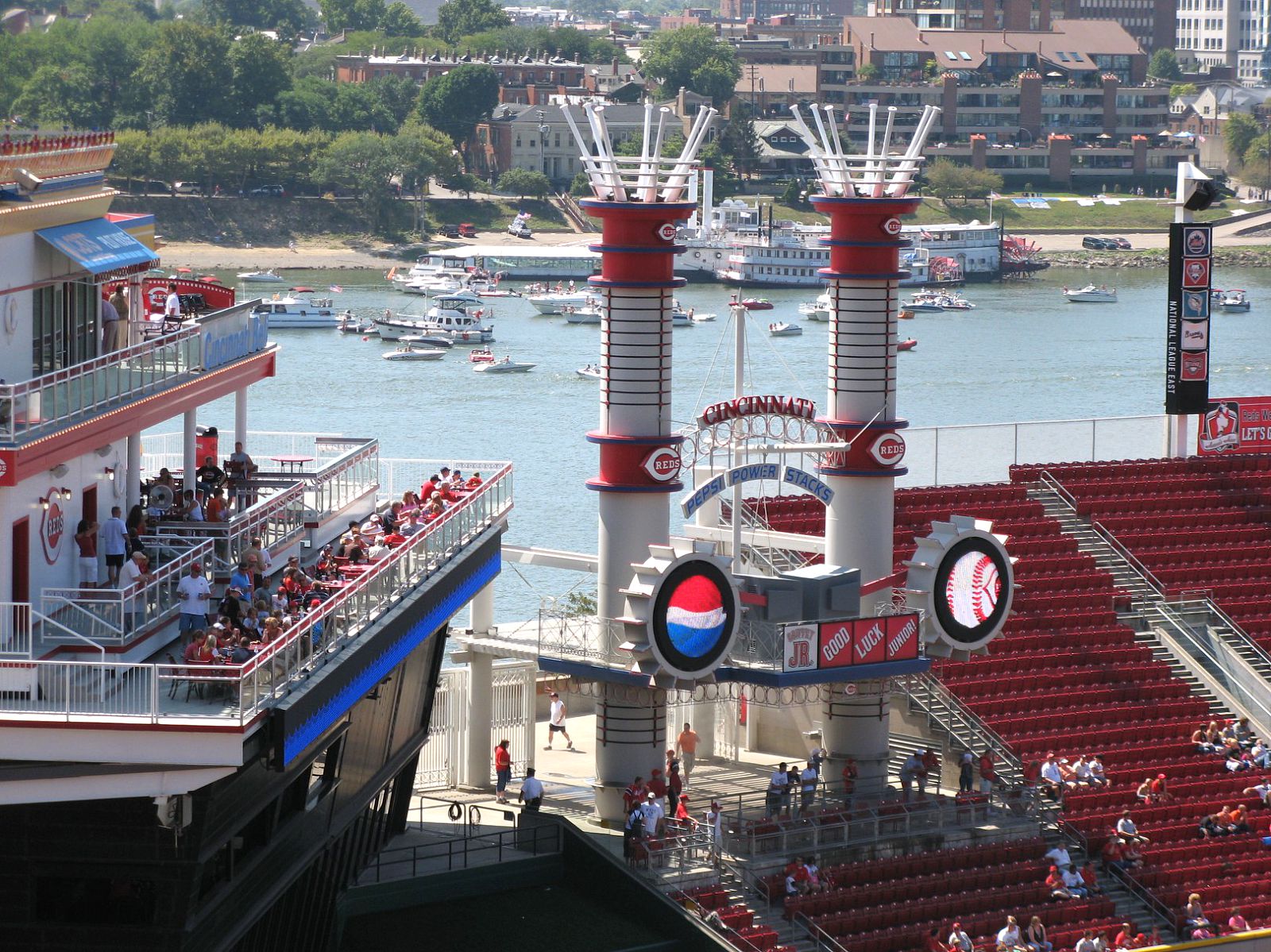
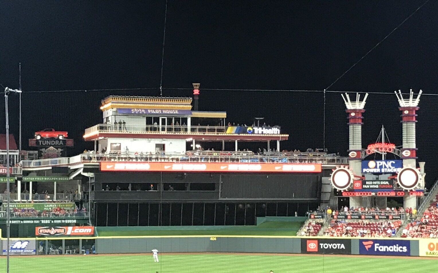
Take out all of the visual garbage, namely the charred black batters’ eye box, the set of Lego smoke stacks, the fake, plastic riverboat, and the extra videoboard above the right field seating, in order to simply let the setting take over, and we’d be in business. GABP is never going to have the captivating views of the best parks, but it could be much better.
What is sad, where Great American Ballpark tried to improve, it only compounded the park’s aesthetic chaos: the fake riverboat and the extra videoboard were added after the ballpark opened.
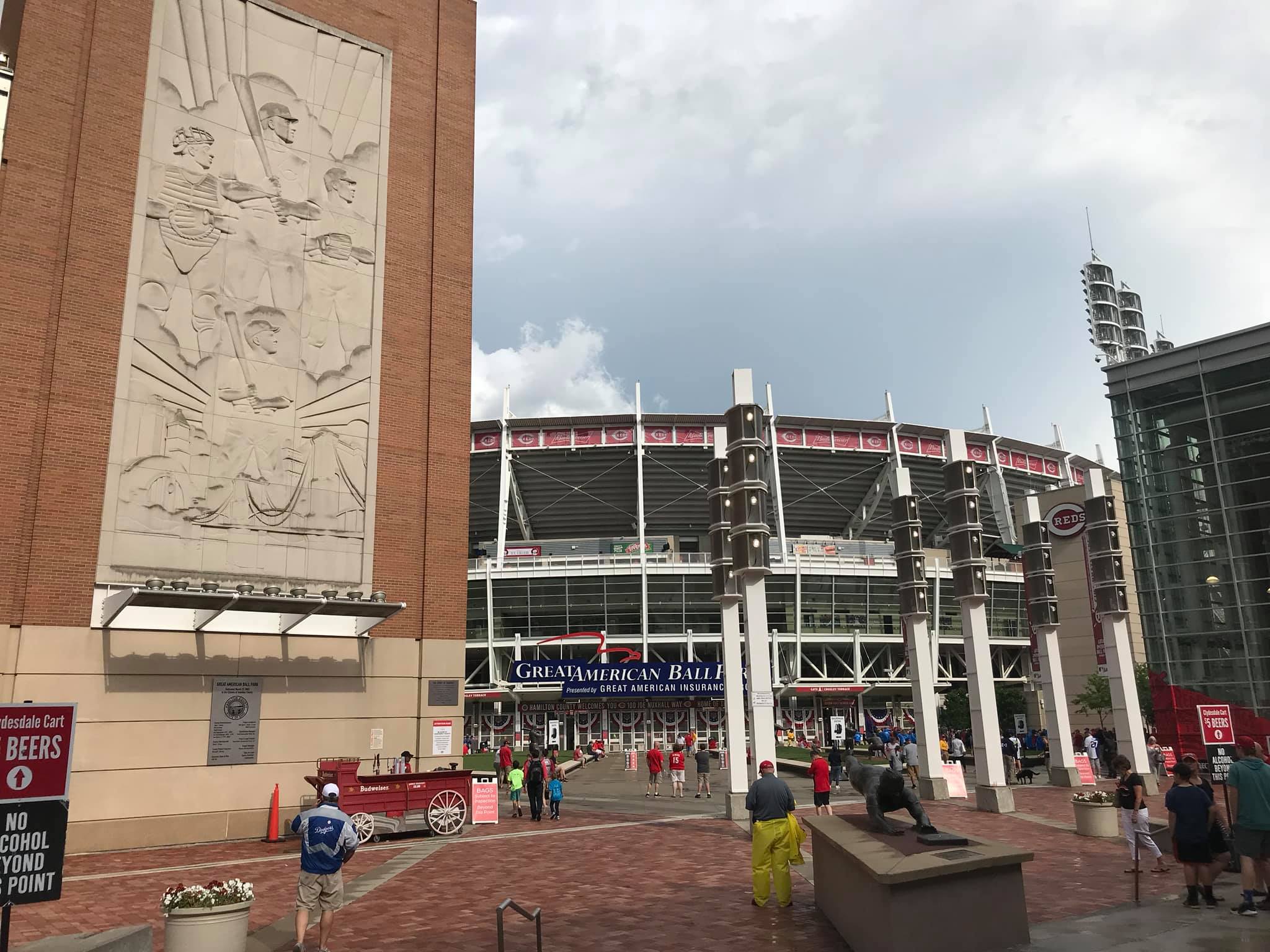
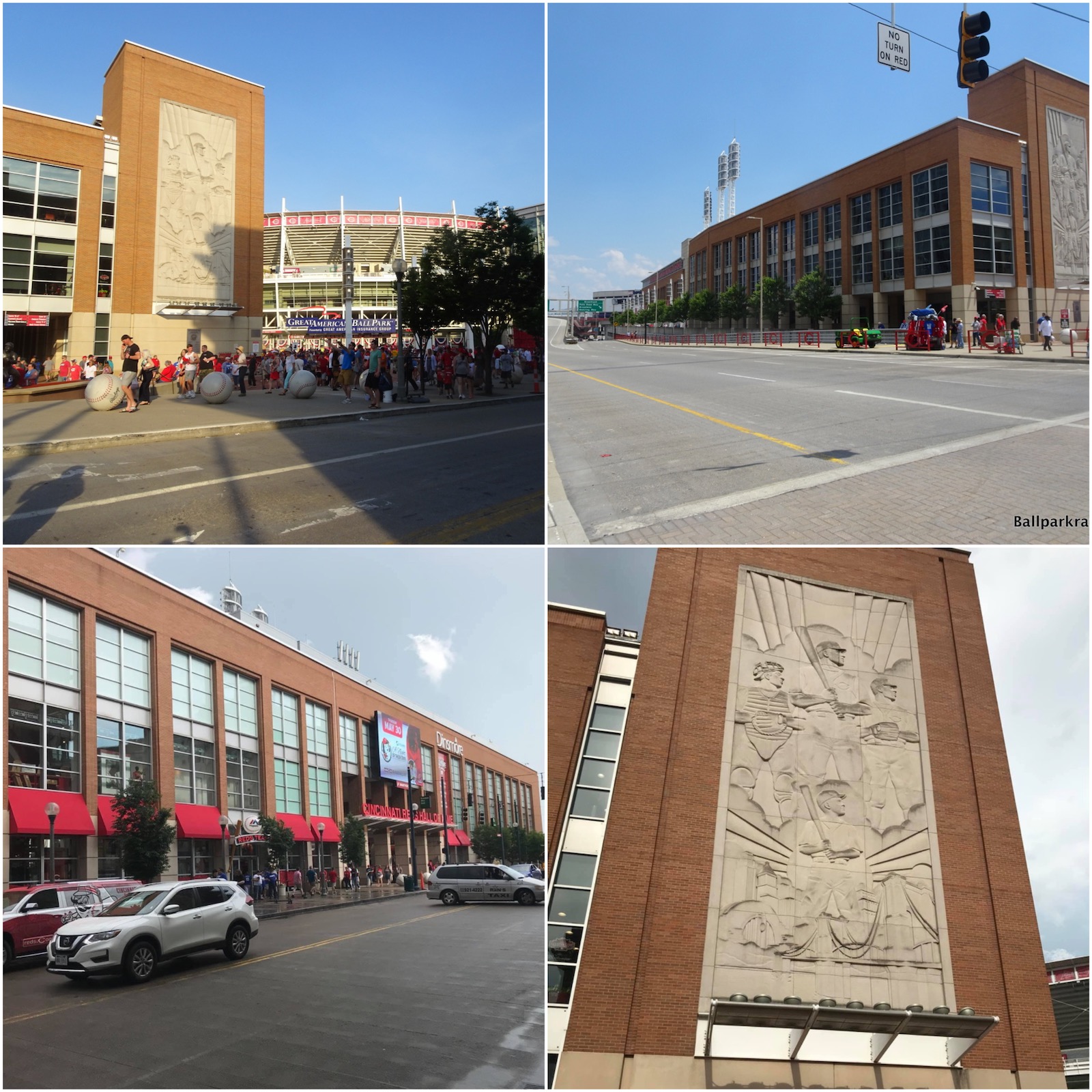
The exterior architecture is rather haphazard yet aggressive, lacking consistency in proportion and use of materials. Like with the inside, the architects tried to please too many people at once. The inner facade embraces an industrial theme with exposed glass and white steel echoing Ohio, while the “outbuildings” utilize an interesting mix of Midwestern Art Deco and International Style. There are some nice features, but it simply doesn’t form a cohesive picture.
Luckily, architecture and aesthetics aren’t everything! And totally subjective!
Many of my aesthetic criticisms have been echoed by others, but that shouldn’t constitute the totality of the analysis, in my opinion. Independent of that, Great American Ballpark is actually quite underrated. If I made a ranking of parks only based on “fan experience,” separate from the aesthetics of the structure, Cincinnati’s park generally gets high marks.
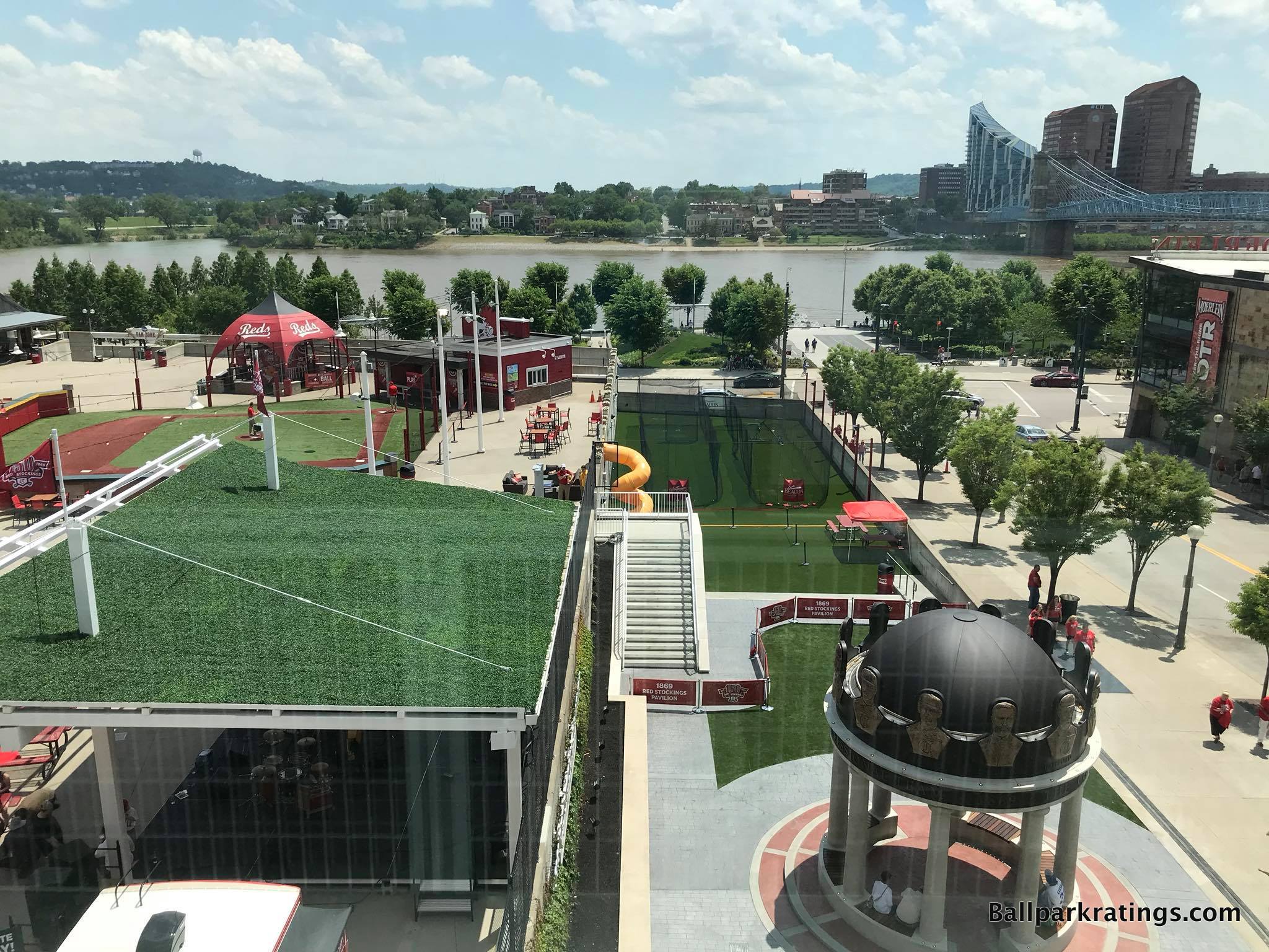
For one, Great American Ballpark’s downtown setting and local scene get better and better every year. Plenty of vibrant bars and restaurants right next door, and this increasingly excellent local scene is key to GABP’s appeal given some of the aesthetic problems within its confines.
Beyond the architecture/aesthetics and features outside of its confines, Great American Ballpark is pretty solid across the board, including an outstanding feature or two.
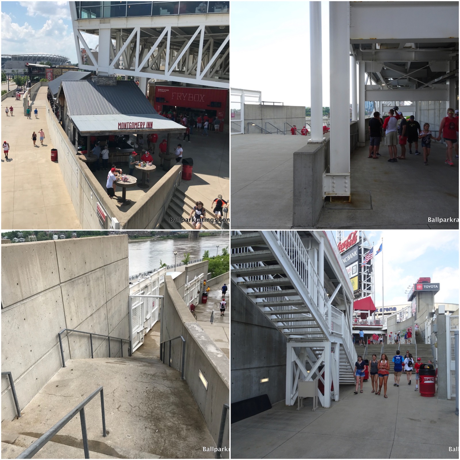
Although, if I had to pinpoint the other overarching flaw, independent of our misgivings regarding the aesthetics, it’s that Great American Ballpark is such a complicated structure from a functional point of view. Exploring the concourses here is like walking the Mall of America, with a twist and turn at every corner. So many horizontal and vertical discontinuities. Levels within levels, on every level!
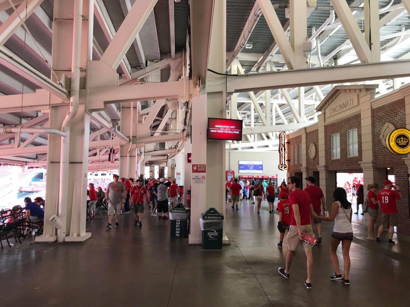
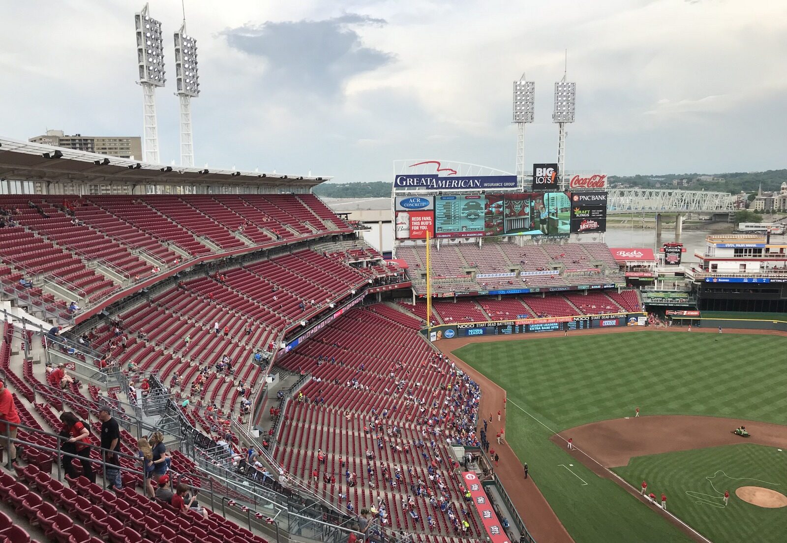
Regardless of its confusion, the main concourse in Cincinnati is mostly wide and open to the field. The upper deck is a bit higher than usual (but that’s par for the course at our post-1990 ballparks, even if it’s a bit worse here), but the seating geometry is superb.
Natural given its “split personality,” Great American Ballpark utilizes a curvilinear grandstand design down the right field line, and a more traditional one down the left field line. Down the left field line, all seats are aggressively oriented toward the action, something that earlier ballparks (see Cleveland and Baltimore) somehow didn’t get right. Regardless of the fading color, the seats at Great American Ballpark are fine from a functional point of view. The video systems are also solid.
Other than the poor food selection, the ballpark’s amenities range from above average to outstanding.
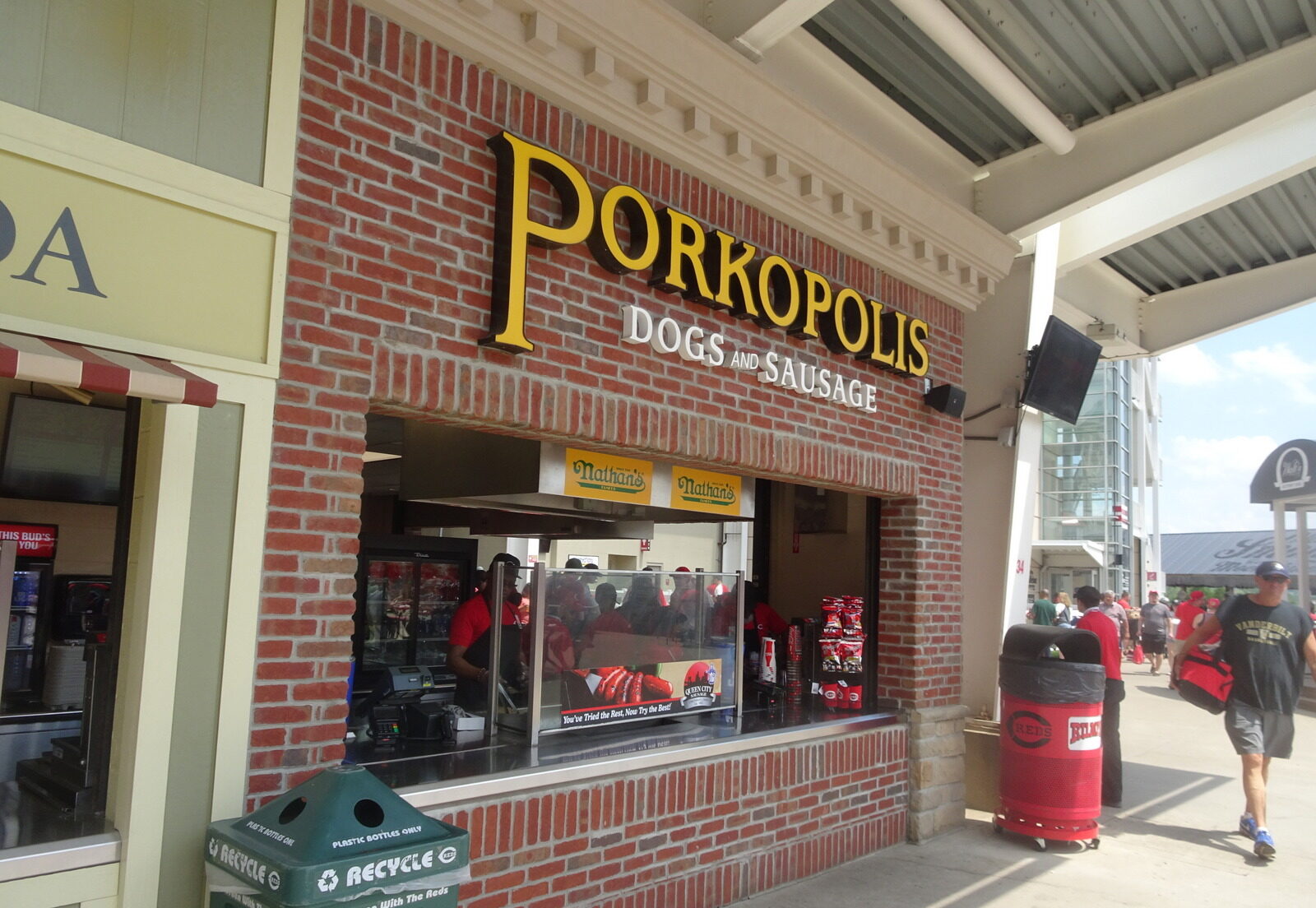
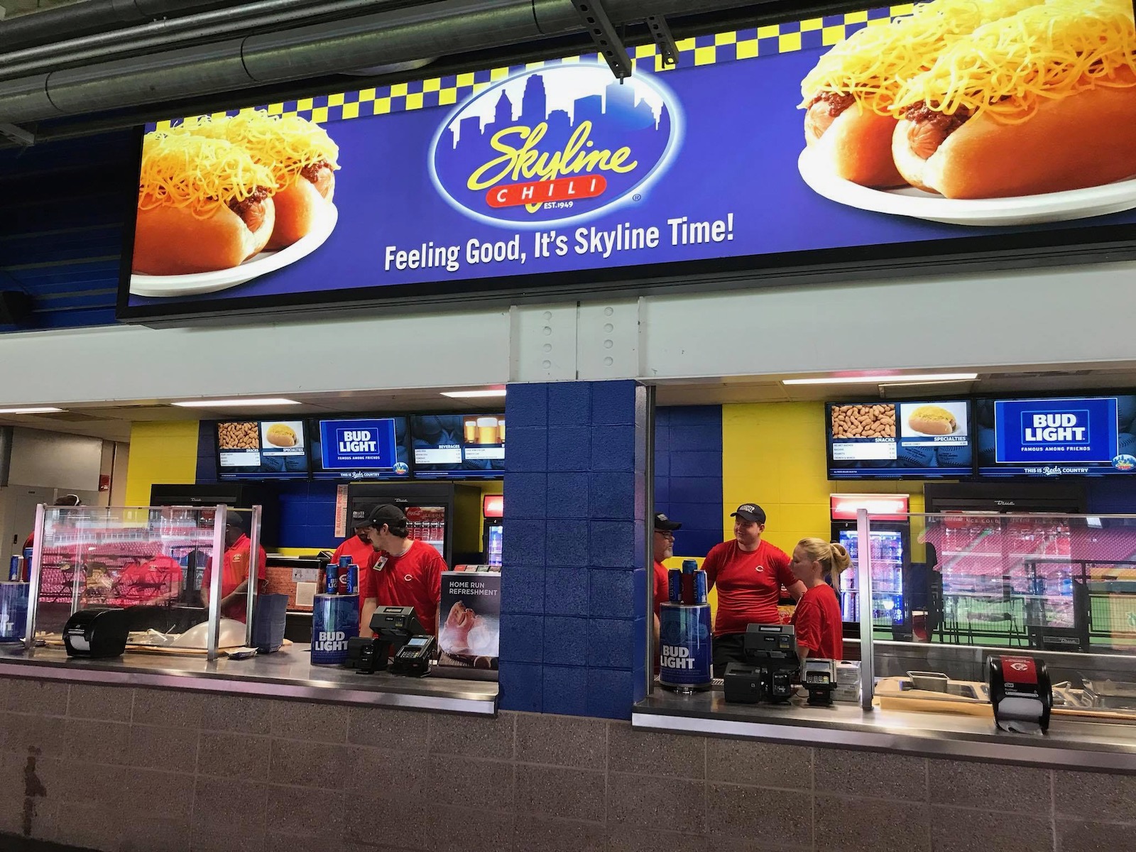
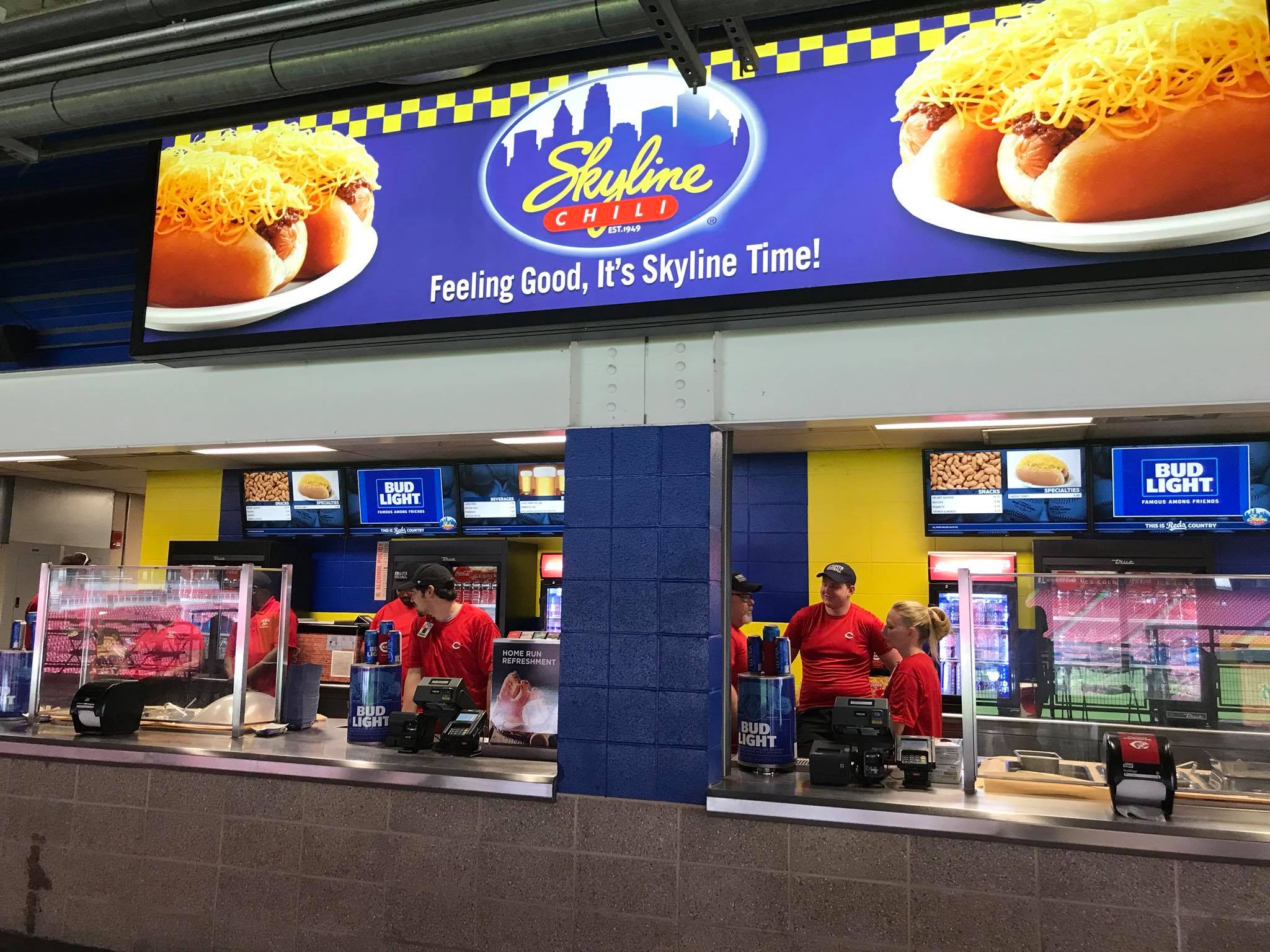
Throughout the 2010s, ballpark food has undergone a quantum leap in improvement, but I am consistently disappointed in the quality and variety of the regular concessions at Great American Ballpark. Mostly just the standard stuff at the accessible stands. However, Great American Ballpark does do a fantastic job in bringing a taste of Cincinnati to the ballpark, highlighted by the Skyline Chili, a quintessential ballpark “signature food” item. The craft beer selection is also terrific.
Other than the pedestrian concession stand food, everything is solid across the board. Great American Ballpark doesn’t reach the level of a Comerica Park (Detroit) or Coors Field (Denver) in accessible restaurants, bars, social spaces, and sitting areas, but it excels to a respectable degree in this category.
Located in the left-field corner on the mezzanine, the Machine Room Grille is perhaps Great American Ballpark’s signature restaurant and bar. Dedicated to the Big Red Machine of the 1970s, the space has a blue-collar feel, much like the Reds team of the era. Brick and steel finishes, with an exposed ceiling, set the tone.
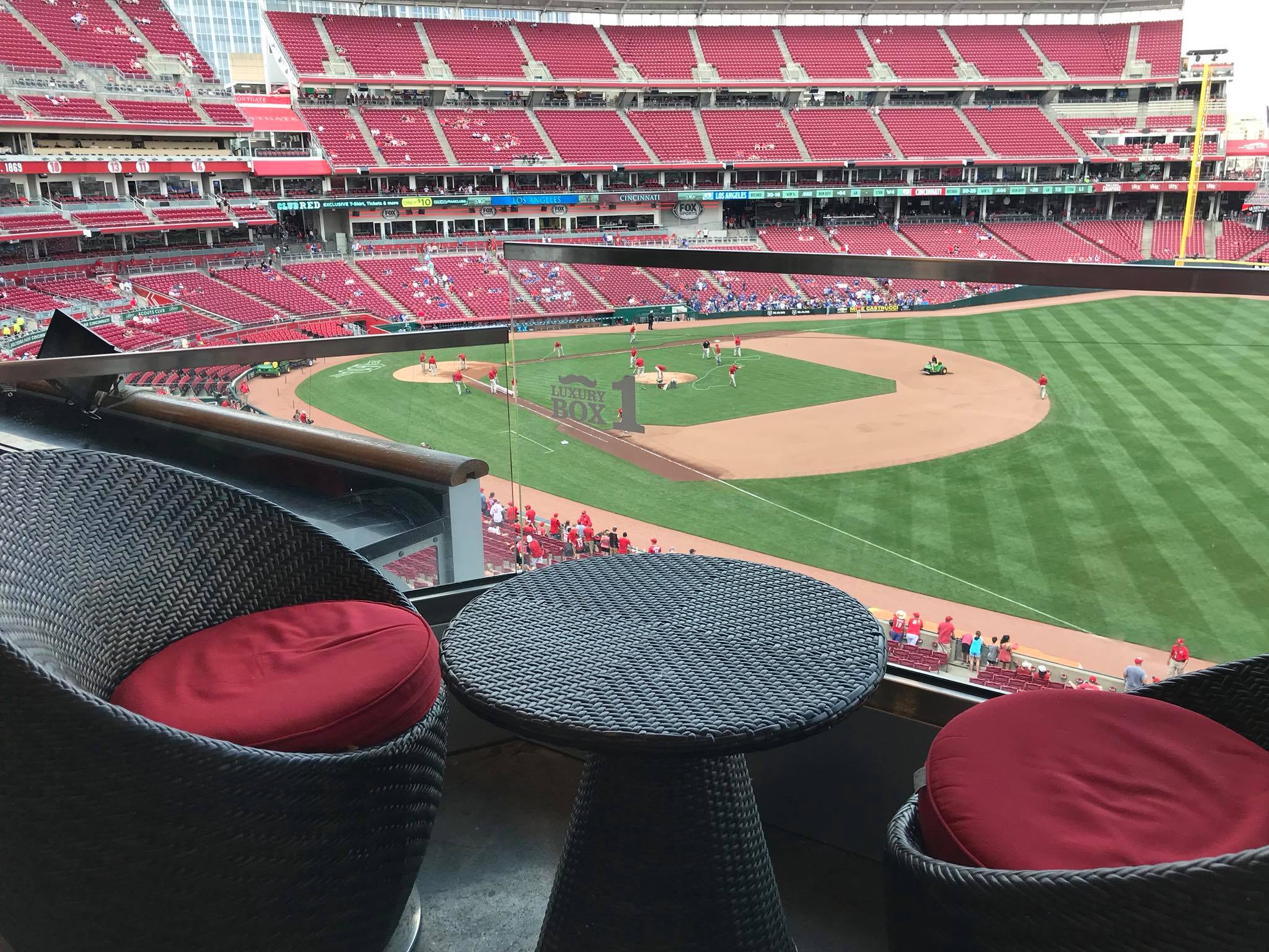
Plenty of sitting areas and destination bars are littered throughout the main concourse, most notably in the Kroger Fan Zone. A new bar was added in the upper deck left field corner in the late 2010s. Especially impressive for such a small market, Great American Ballpark has plenty of decent (or unique) premium seating options as well.

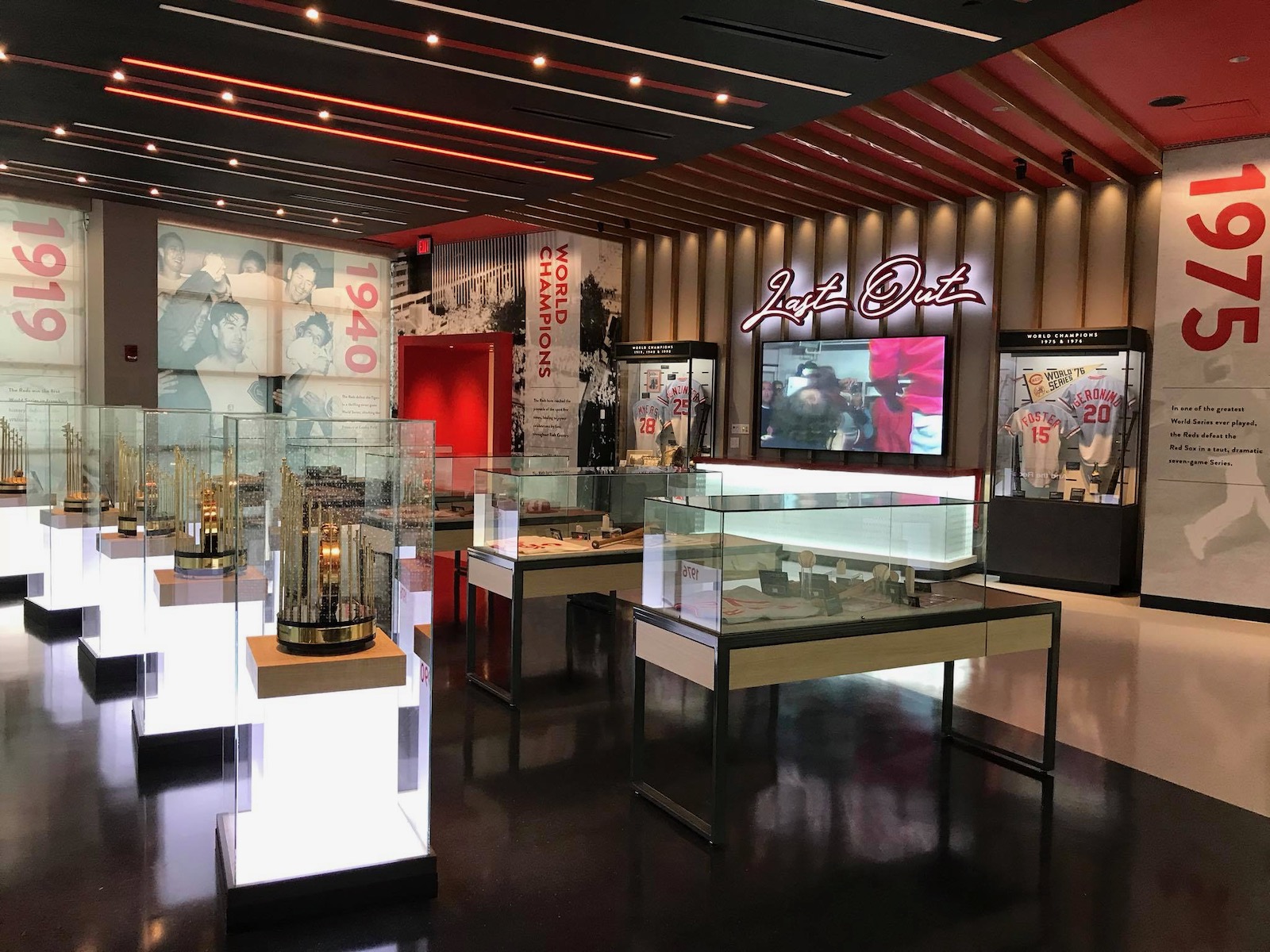
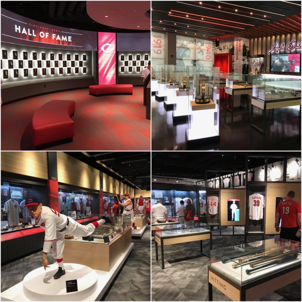
Great American Ballpark’s strongest suit is its kids’ entertainment features and historical references. The latter of which is most notably displayed in the newly renovated Reds Museum and Hall of Fame.
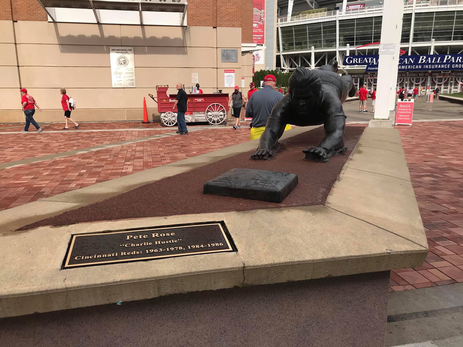
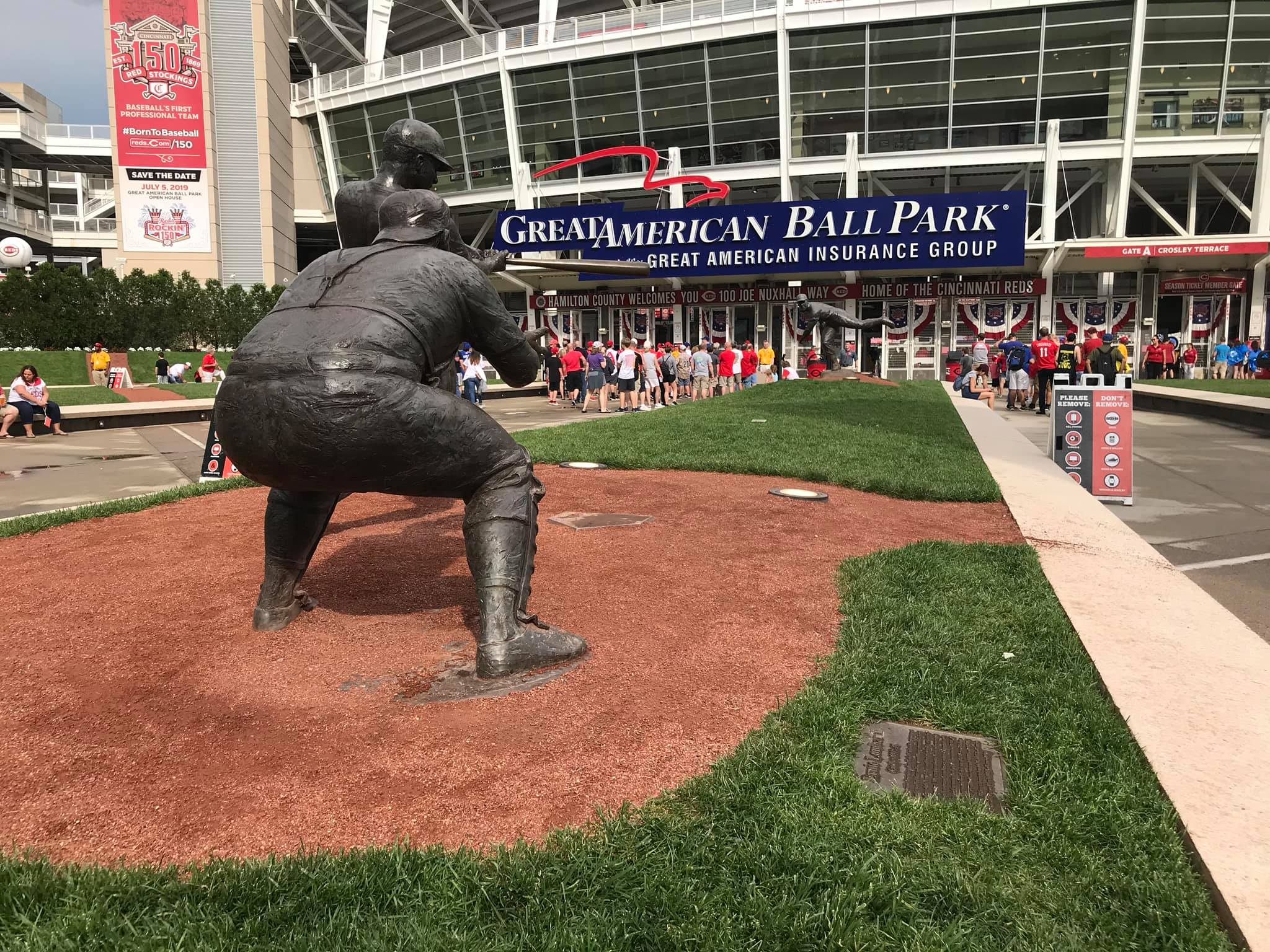
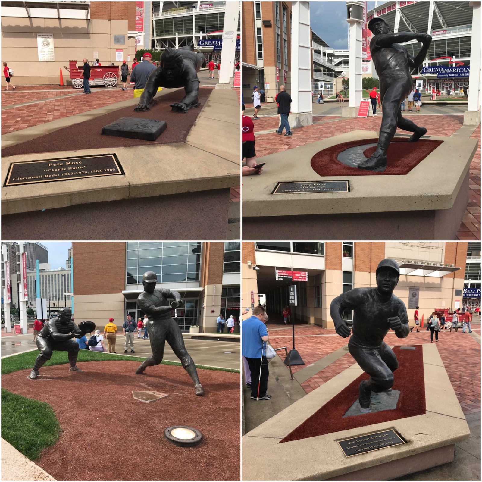
Celebrating inspiring and compelling characters, amazing athletic achievements, pennant wins, and world championships, this Hall of Fame is the best of its kind at an MLB ballpark. While I prefer team history more explicitly integrated into the ballpark footprint, the multi-level complex connected to the home plate facade is the best museum at a major league ballpark. The statues outside the ballpark’s main entrance are great as well.
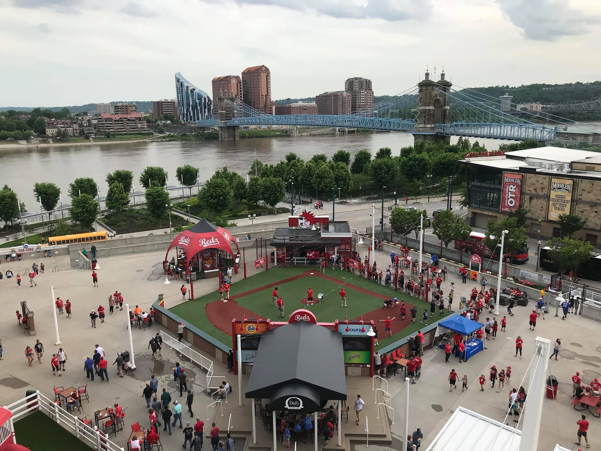
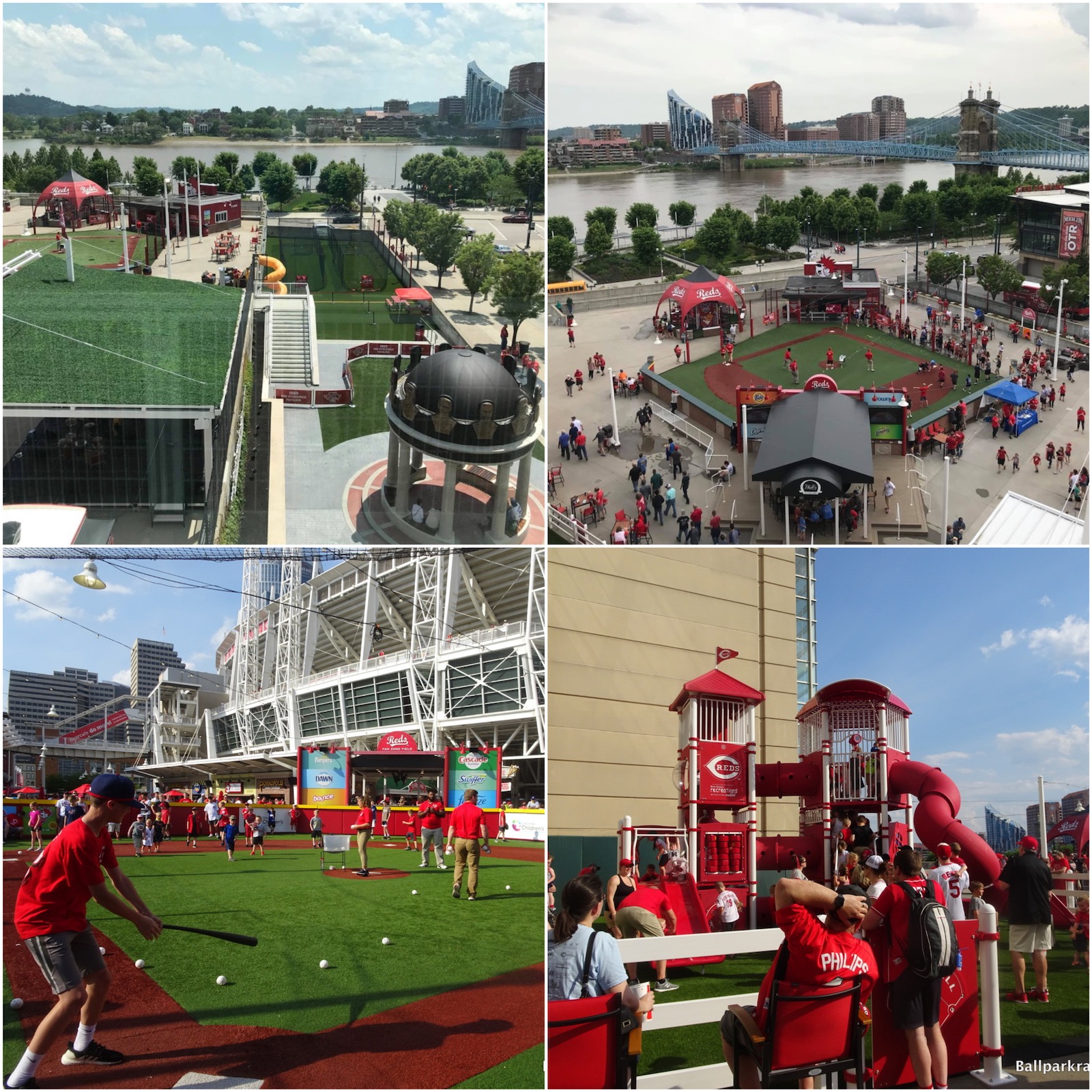
Located off the main concourse behind first base, the Kroger Fan Zone is one of the best entertainment areas in baseball. Featuring a festive pre-game atmosphere with plenty of elaborate but tasteful kids’ activities, this is a great place to hang out for regular folks and younger fans alike. Numerous sitting areas, a destination bar, a whiffle ball field, a playground, a multi-level slide, carnival games, and a concert stage highlight the Fan Zone.
Anyway, I thought I owed it to readers to be more exhaustive than usual (at least for a ballpark this early on the list) about the good parts of GABP, because my aesthetic criticisms are especially stinging, and it cannot be reiterated enough that there’s more good than bad here all things considered.
In the end though, my misgivings about the interior aesthetics are strong enough to put Great American Ballpark decidedly in the bottom half of our ballpark rankings. Given how solid the amenities are, Great American Ballpark is a huge disappointment in my book. The fix isn’t easy, but it’s doable: completely overhaul the busy, inconsistent, disorienting interior aesthetic scene, particularly in the outfield.
Table of Contents
Summary
TL;DR? Here’s the long-form piece in a nutshell:
While Great American Ball Park has plenty to offer, it has received mixed reviews for a 21st century ballpark, generally landing in the lower-mid tier to bottom 10 of most ballpark rankings.
Equipped with a downtown riverfront setting, GABP represents the single biggest ballpark missed opportunity of our generation, because the architects totally botched the execution.
GABP has my least favorite interior aesthetics for a ballpark without a roof. How do you have the riverfront and the skyline, yet have good views of neither?
The underlying design is disjointed and fragmented. In the outfield, riverfront views are blocked by oversized seating, clumsy signage, a new superfluous videoboard, the tackiest gimmicks in baseball, and an ugly black batter’s eye, leaving the park with little sense of place. In the infield, “The Gap” behind home plate is well-intentioned but silly, giving GABP a real “split personality.” It’s all just awful, with so much junk and kitschy stuff thrown in that distracts from the original concept of integrating the riverfront scenery/urban context.
The interior design and visuals are obviously going to comprise the bulk of any analysis, but if you’re willing to look past that, GABP has a lot of things going for it.
The surrounding downtown local scene of bars and restaurants has greatly improved. Crosley Terrace with statues of Reds legends in action behind home plate is awesome. The seating geometry is excellent. While not perfect, some of the amenities are superb: (a) local food, (b) top-10 ballpark for craft beer, (c) the Kroger Fan Zone is one of the best ballpark hangout spots for fans of all ages, and most importantly, (d) the Reds Museum and Hall of Fame connected to the park is the very best of its kind.
But purely design-wise, GABP is probably Populous’s biggest miss.
Defining Features
Smokestack and Riverboat Deck
The Gap

Biggest Hit
Reds Museum and Hall of Fame
Biggest Miss
Busy, Disjointed, Gimmicky Interior Aesthetics Poorly Integrated With Both The Downtown or Riverfront Fabric
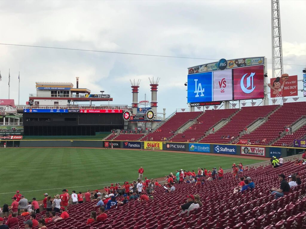
This is the mother of all “Biggest Dislikes” on the site, one that alone relegates GaBP to the periphery of the bottom 10. Around the infield, “The Gap” attempting to integrate skyline views is poorly executed. In the outfield, riverfront views are blocked by oversized seating, clumsy signage, a new superfluous videoboard, the tackiest gimmicks in baseball, and an ugly black batter’s eye, leaving the park with little sense of place. It’s all just awful, with so much junk and kitschy stuff thrown in that distracts from the original concept of integrating the riverfront scenery/urban context. It’s fragmented; none of it flows; none of it makes sense. Bottom Line: GaBP is surrounded by both the riverfront and the skyline, and not only somehow has poor views of both, but tacks on a bunch of gimmicks that further subtract from any visual appeal. GaBP is the anti-PNC Park.
Other Hits
Crosley Terrace (with statues in action)
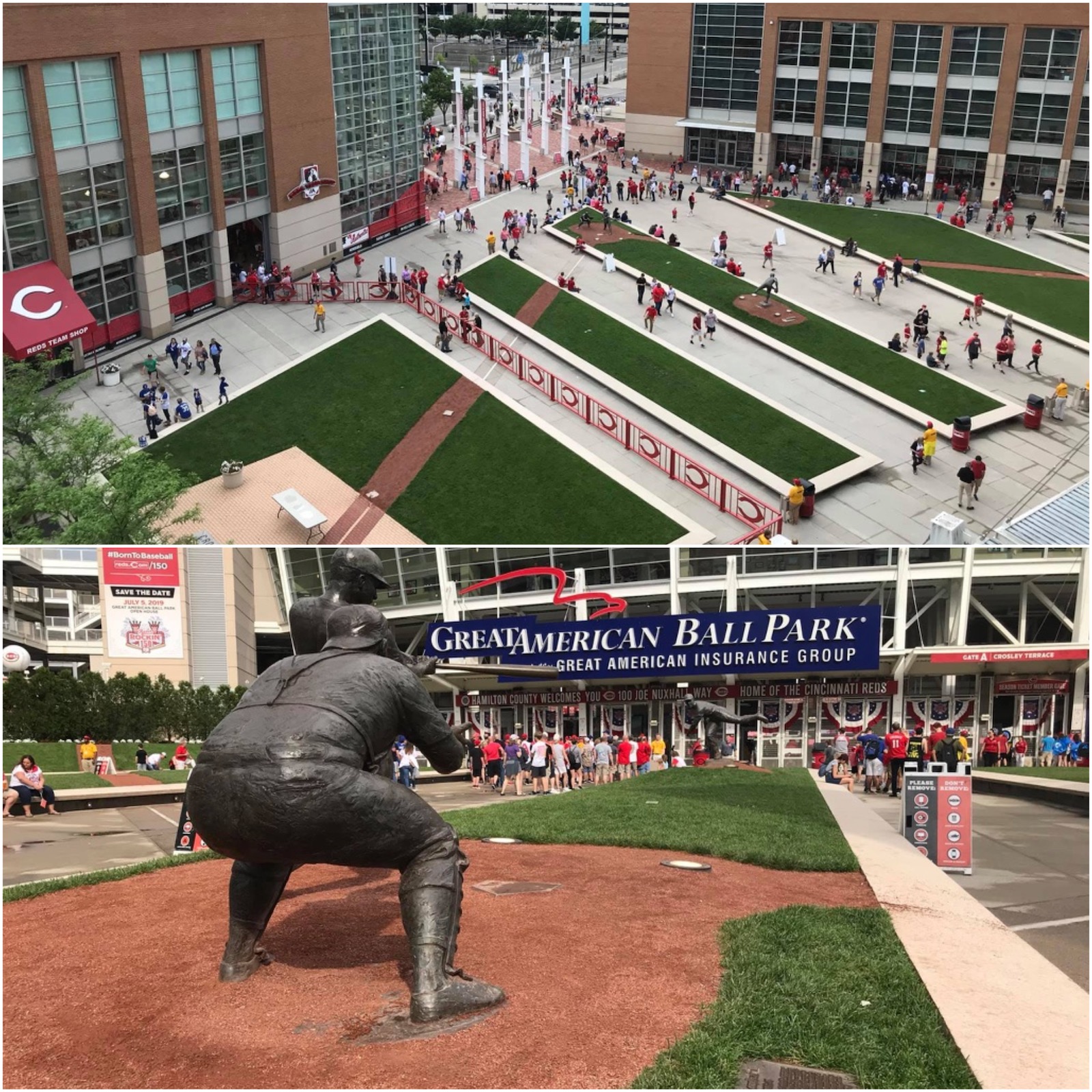
Statues
Outbuilding Facades Utilize an Interesting Mix of Midwestern Art Deco and International Style
Fan Zone
Superb Seating Geometry
Skyline Chili
Top-10 Craft Beer Ballpark
The Handlebar and Surrounding Seating
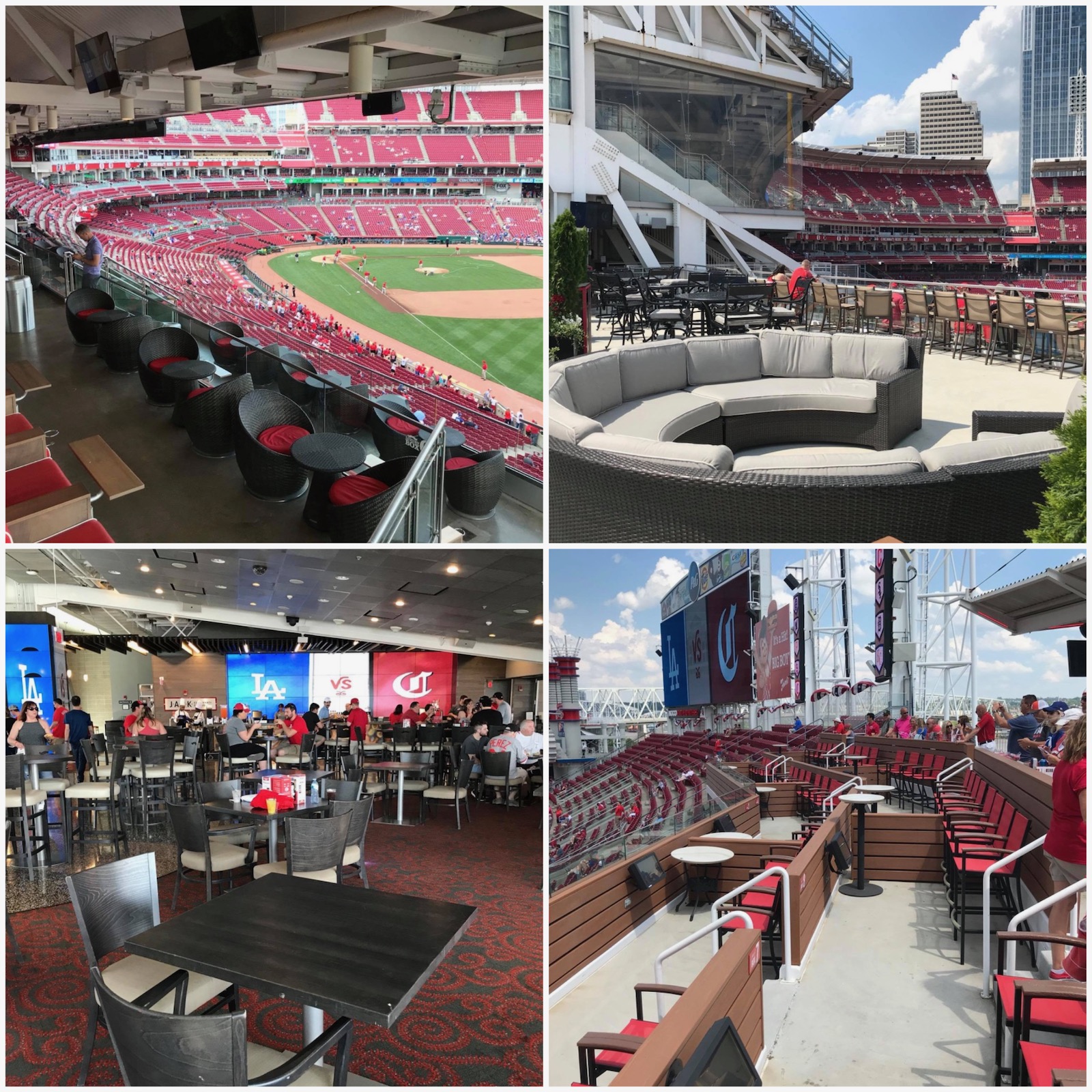
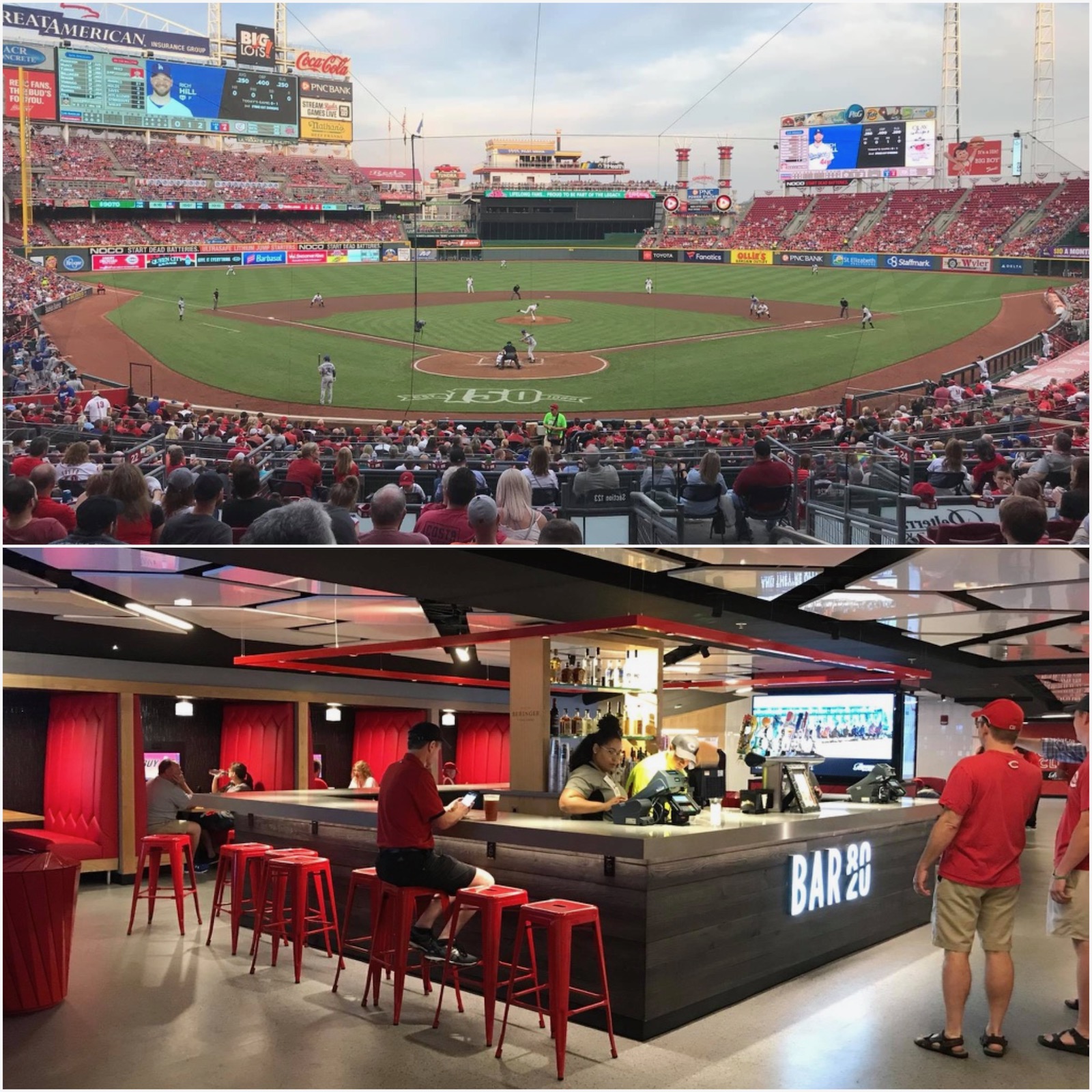
Scouts Club - Rare Club Seats Behind Home Plate That are Relatively Affordable
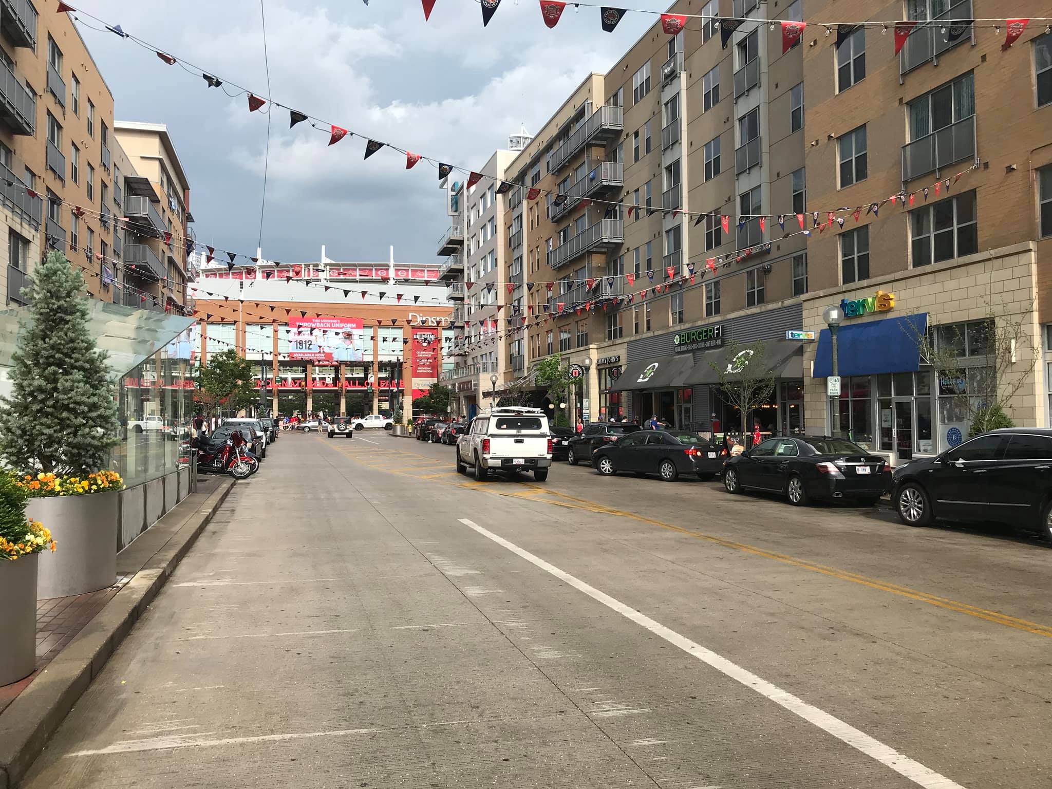
Surrounding Mixed-Use Development
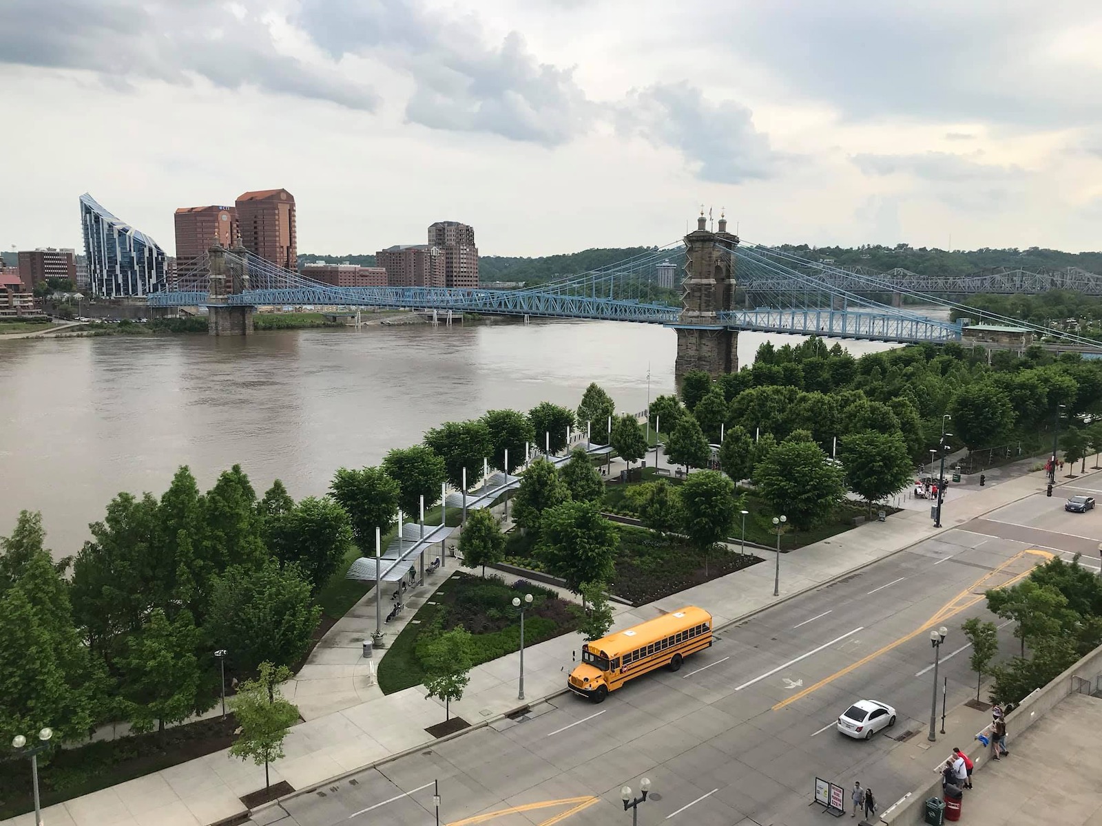
Smale Riverfront Park
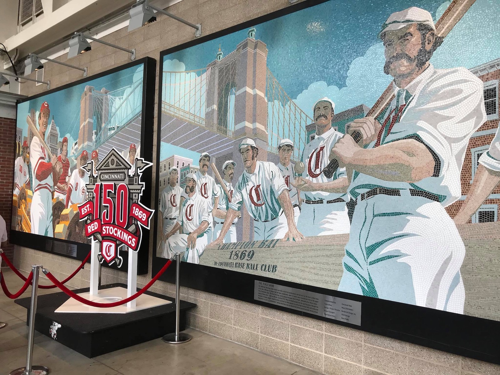
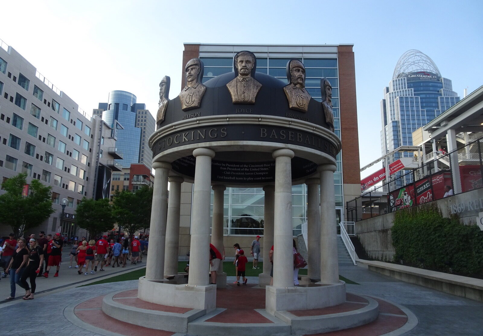
1869 Red Stockings Pavilion
Other Misses
Smokestacks
Batter's Eye and Riverboat Deck
Exterior Architecture Lacks Cohesiveness
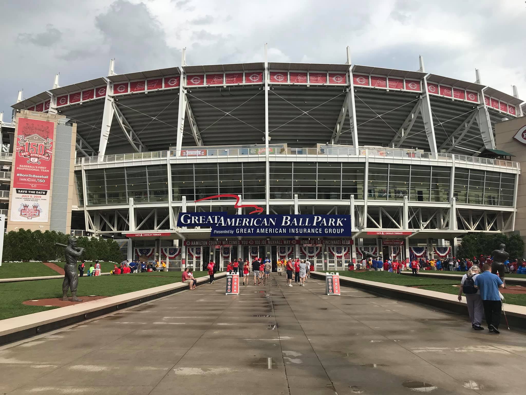
I harped on the interior aesthetic failings enough in the “biggest dislike,” but the exterior architecture also fails to form a coherent picture. The inner façade embracing an industrial theme echoing Ohio doesn’t mesh well with the much better outbuilding facades mentioned in the “hits.” Overall, this is a design that tried to please too many people all at once.
Complicated Concourse Flow With Many Horizontal and Vertical Discontinuities
Concourse Connectivity To The Field
Upper Deck On The Third Base Side
Selection of Grub Is Sorely Lacking
