Daikin Park
| Setting | 15/20 | 1 Thumb Up |
|---|---|---|
| Locale | 4/5 | 1 Thumb Up |
| Accessibility | 3.5/5 | Thumb Sideways |
| Neighborhood Local Scene | 7.5/10 | Thumb Sideways |
| Architecture & Aesthetics | 42.5/65 | Thumb Sideways |
|---|---|---|
| Exterior Design/Aesthetics | 13/20 | 1 Thumb Up |
| Interior Aesthetics/Visuals | 26.5/40 | Thumb Sideways |
| Concourse Aesthetics | 3/5 | Thumb Sideways |
| Functionality & Essentials | 37/50 | 1 Thumb Up |
|---|---|---|
| Sightlines: Field Proximity | 11.5/15 | Thumb Sideways |
| Sightlines: Seating Geometry | 4/5 | 1 Thumb Up |
| Seat Comfort | 6.5/9 | Thumb Sideways |
| Concourse Functionality | 11/15 | Thumb Sideways |
| Scoreboards/Tech | 4/6 | 1 Thumb Up |
| Amenities & Features | 34/50 | Thumb Sideways |
|---|---|---|
| Concessions: Food Variety | 3/5 | Thumb Sideways |
| Concessions: Food Quality | 4.5/5 | 1 Thumb Up |
| Concessions: Craft Beer/Other Drinks | 4/5 | 1 Thumb Up |
| Social Gathering Areas/Restaurants | 6/10 | 1 Thumb Down |
| Premium Seating/Clubs | 7.5/9 | 1 Thumb Up |
| Historical Exhibits, Memorabilia, Art, & Other Displays | 8/10 | 1 Thumb Up |
| Kids Areas/Other Entertainment | 1/6 | 2 Thumbs Down |
| Atmosphere, Vibe, & Policies | 13.5/15 | 1 Thumb Up |
|---|---|---|
| Fan Support/Attendance | 4.5/5 | 1 Thumb Up |
| Ballpark Traditions/Gameday Presentation | 4.5/5 | 1 Thumb Up |
| Ballpark Policies/Staff | 4.5/5 | 1 Thumb Up |
| Adjusted Raw Score | 142/200=71 |
|---|---|
| Bonus | 3 |
| Curve for All 7 | 7 |
| Final Score | 81 |
|---|---|
| Ranking | 20/30 |
|---|---|
Reclaiming Minute Maid
Despite being maligned for contrived quirks, Houston’s pad benefits from creative architectural design, as the Juice Box remains the most all-around underrated, misunderstood ballpark in the majors
By: Cole Shoemaker
Important Note: This review was written in 2011 and is now particularly outdated as to my current view of this park. Long overdue re-write coming during 2024 season. Ratings above are up to date.
“What is your least favorite new ballpark in the majors?”
“Probably Minute Maid Park.”
“Why?”
“Because it has a damn hill in center field!”
Maybe it’s just me, but that’s about as far as the discussion of Minute Maid Park ever gets on ballpark websites or between fans.
No ballpark has ever puzzled me as much as this one. As much as I, like many ballpark aficionados, despise what Minute Maid Park represents with its over-the-top hokey features, I have come to appreciate the structure itself, in what is my most complex review to date.
I’d say my ratings mostly reinforce the general consensus on a ballpark. But I think everyone sorely miscalculated here, mostly because the ballpark had so much going against it in terms of public perception. Roof. Heat. Hitters Park. Gimmicks. Houston. Roger Clemens. The Bushes. Enron. Crappy new name. We live in a society of guilt by association. It doesn’t exactly have the best brand. People always fixate on the superficial aspects of the park, and I did at first as well. But no ballpark quite surprised me like this one, so I think we need to reexamine some of the underlying assumptions for which Minute Maid is ridiculed.
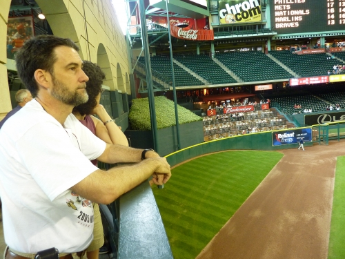
Oh, those gimmicky, forced quirks. Specifically the hill, the in-play flagpole, and the train.
“Minute Maid’s purposely created eccentricities represent everything wrong with the new retro ballparks. Designers think they can add cute features just for the sake of being cute. What happened to contextual design? That’s what Camden was originally about; this is faux character. And how about the cheapening of the game itself? It doesn’t get more phony and contrived than Minute Maid Park!,” critics and traditionalist would say.
So recently, architectural critics and ballpark aficionados put their foot down. “Nostalgia just for the sake of cuteness without context is artificial. These faux retro parks are an abomination.” It eventually became fashionable to bash this park if you were a critic or simply an opposing fan. Minute Maid really suffered the brunt of the backlash against the excess of the retro movement, somewhat unfairly in my opinion.
And yeah, they are mostly right, but when you look past the fact that the design is muddled with quirks, ads, and distractions, the architectural vision of the ballpark is brilliant. I’m actually not a fan of the quirks, but how does that ruin an entire ballpark?
I often stress contextual appreciation of the site above all else, and Houston does it as well as any ballpark, retractable or not. Minute Maid Park took one element in the local community, Union Station (old train station), and used it as a framework for the entire ballpark, including the roof. The process of incorporating an old building into the design is certainly the most explicit manner to integrate the area’s context into the ballpark, but it has to be well done, unlike Petco Park. Unlike the former, Houston’s version is consistent and universal.
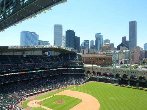
The adaptive reuse of Union Station is contextually integrated with all aspects of the park. Subtle design cues from the general train motif are delicately interwoven into the interior design. In a perfect application of context and theme to function, the sliding glass retractable roof tracks ingeniously serve as a mechanism for executing the train track aesthetic. And those gorgeous beige stone arches tie it all together; in what is one of baseball’s most underrated interior elements.
Few ballparks, retractable of not, executed a design which such depth and aesthetic vision. It may be a bit gimmicky, but there’s nothing as bold or genius in the majors. It’s also about as attractive as the inside of a roofed ballpark could be, strategically maneuvering an excess of natural light through the worlds largest sliding glass door.
Perhaps what’s most remarkable about the aesthetic design of Minute Maid is how its roof doesn’t contradict its design principles. For me, Safeco, Miller, and Chase are like state of the art airplanes with brick exteriors. The clashing of retro bricks and modern roofs looks remarkably incongruent. In Houston, we have a roof that reinforces and maybe even enhances the style of the building. And no one bothers to see that because it contradicts the ever-sacred outdoor baseball mantra.
You can argue whether it looks good or not, but it all goes back to having continuity between elements and simply having a contextual aesthetic vision. You can argue Safeco is the best retractable roof park overall, but Minute Maid has the best architectural design. You heard it here first.
Now you can criticize Minute Maid on its small footprint and relatively mediocre amenities. It’s got to be first ballpark to come in under budget, so it’s lacking some of the thoughtful artistic design flares of others. They did go cheap here. Just think, Safeco cost over twice as much.
But they still manage to excel in enough objective measures to be a great park. No one seems to realize it, but it actually provides more open air space in the outfield than Safeco. When you look closely, the upper decks are the most cantilevered of 90s/early 00s ballparks. The downtown location is getting better, despite not equaling others. They pack tons of local touches into the park, including high quality local cuisine. It’s extremely intimate and fan friendly too, to the point where those walking outside can peek through the arches across the concourses and see the field.
Just to be clear, I have always chastised forced and contrived features. There will be plenty of criticism (that simply echoes the loud and incessant consensus) later. And you can always argue that the climate-controlled experience can never feel like true baseball. But the bottom line is people grossly underestimated Houston’s park: contrivances clouded the ballpark community’s thinking and many people refused to look past them. In other words, even once you get past the fixation of “this is gimmicky as hell,” it’s a hell of a ballpark.
While its extreme features don’t add to the appeal, its underlying merits speak for themselves. Just looking at the Astrodome, Houston isn’t afraid to build a visionary, innovative structure, and while Minute Maid Park couldn’t be more different, it’s no exception.
Setting
Location/Access:
Situated on the far eastern end of downtown, Minute Maid Park is one of those ballparks intended to rejuvenate a neglected area formerly important to the city. While it hasn’t been as successful as some, it’s located near enough to the main city center to be considered good.
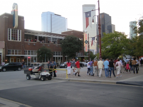
However, just being in downtown Houston isn’t really that great compared to other cities, as it’s one of those places that’s more active during the day due to business activity, not so much at night. The direct area has some residential buildings, but it mostly consists of recently constructed hotels, restaurants, and bars. But again, if you walk a few blocks to the central business district expecting to see LoDo in Denver before the game, you’re mostly going to see people coming home from work.
Access to Minute Maid Park is generally good, as the freeway and road system has become very efficient in recent years, something out of towners who visited in the past may not be aware of. For those working downtown, the light rail is a frequently used option. However, Houston is one of those cities where public transportation is not a viable option, as most people drive.
Score: 4/5
Local Scene:
Today, Minute Maid Park offers a host of pre and post game options in the immediate vicinity. The B.U.S. and the Home Plate Bar and Grill are generally considered their two most notable options. Vic and Anthony’s steakhouse is the area’s upscale restaurant of note. Be sure to check out The Inn at the Ballpark by Union Station, which probably has the highest quality bar area if you are looking for a more formal and less social atmosphere than the B.U.S. While the local scene has improved, it’s never going to be at the level of others without some “ballpark village”-like development, which would hypothetically fit in perfectly. Main Street is only a five-minute walk away though.
Like I said before, downtown Houston in general doesn’t have the greatest local scene. So even if Minute Maid were in the middle of the city, it wouldn’t be one of the best.
New development during the mid-late 2010s has slightly increased MMP’s score here.
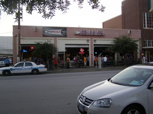
Score: 4/5
Total: 8/10
Architecture & Aesthetics
Exterior Design:
Like the ballpark’s aesthetics in general, Minute Maid Park’s exterior design is somewhat of a paradox, as there is plenty to criticize and praise at the same time. It is widely successful in theory as a concept, but in practice, the common take is the exterior doesn’t look very good.
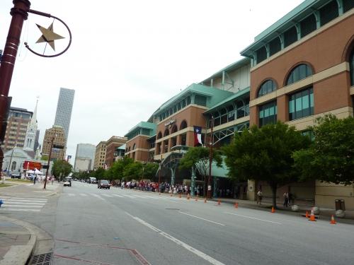
In terms of appearance and pure architectural merits, the outside is probably one of the worst in the majors, with overtly themey designs and an ugly “bath tub” like look. But at the same time, unlike retractable roof ballparks in Seattle and Arizona, Minute Maid Park’s exterior design is very well articulated in its architecture, without the conflicting modern ethos we see in those two ballparks. It’s the only “retro” retractable roof ballpark that successfully managed to build a “retro” roof as well, in what looks remarkably coherent and well thought out. So in other words, no one would ever say it’s one of the more attractive exteriors in the majors, but as a concept, it’s absolutely brilliant.
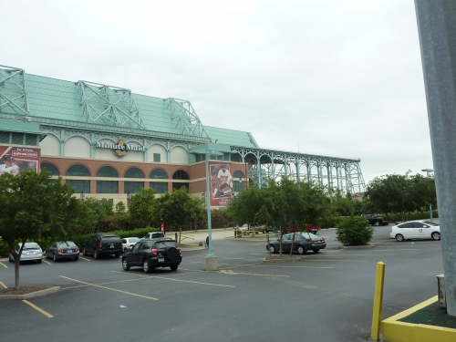
The park’s architectural design is reframed around the Houston’s classic Union Station, built in a Victorian neighborhood in 1911. Minute Maid Park takes that contextual element’s authentic architecture and applies it to the ballpark. The warm red brick is typical, but it’s nicely accentuated by granite, limestone, and other masonry prevalent in the area. The round arches relate not only to Union Station but also to the nearby historic church.
Specifically note how the exterior façade is broken up into small, disconnected structures to better match the scale of intimate Union Station. Well done.
But what is clearly the most audacious exhibition is the style of the retractable roof on top of the retro-classic building. If you take a look at my Safeco Field review, you’ll know my disdain for ballpark architecture that doesn’t know what it wants to be. At Safeco, half of the ballpark is rapped in a meekly articulated red brick façade, while the other half of the ballpark emphasizes a rationalist steelwork, which matches the imposing modern jet-black retractable roof. In Houston, Minute Maid Park is successful in avoiding that clashing sensibility between 21st century technology and 20th century retro architecture.
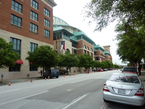
Architects examined classic train sheds for inspiration, using elegant lacy ironwork. The coherent Minute Maid Park has a turquoise beamed retractable roof, evoking the faded lacy ironwork of 19th century train sheds, in direct connection to Union Station. The turquoise color is meant to represent the faded copper of train tracks. Because the roof’s superstructure received this contextually based treatment, Minute Maid Park looks like a giant retractable train station, in what is one of the most conceptually successful retro ballparks in the majors. Like Marlins Park is an unmistakable contemporary ballpark, Minute Maid Park is unmistakably retro, unlike the more confused Miller Park, Chase Field, and Safeco Field.
Of course, while Minute Maid Park carried out its design goals to perfection, in what is “all about trains and baseball,” the general consensus is it doesn’t look that good from the outside. As I’ll cover more in the interior aesthetics section, there is a growing backlash against overly thematic ballparks like Minute Maid, but I think it gets some immunity because it is so consistently well done. Like with most retractable roof ballparks, it suffers from a number of awkward areas for the roof mechanisms.
Some of the supplementary elements reinforce the 19th century train motif as well. The turquoise retractable roof supports are arched, mimicking the brick arched façade below. The arched turquoise home plate/left field entrances are vaguely reminiscent of European facilities, but are meant to represent a classic train station waiting area. The home plate clock tower is very attractive as well.
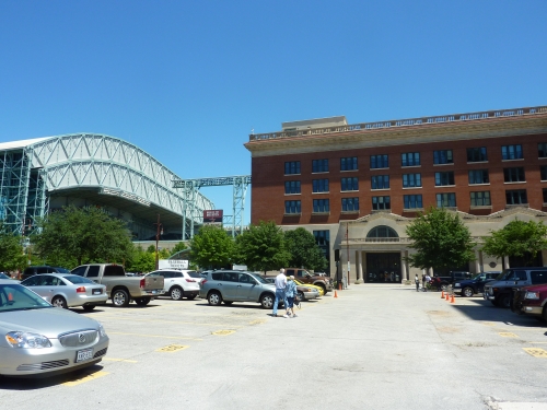
But as a piece of architecture, when you turn your ballpark into a theme park with no revolutionary new ideas, there is a low ceiling on its merits, in what is a too heavy-handed attempt to evoke the past. But that’s something that all retro parks suffer from.
So I guess the central point is it doesn’t look that good from the outside, and that’s all it takes to get a lower than expected score despite the praise. Not counting Marlins Park yet, it’s the best of the retractable roof exterior designs, but it’s a close race of mediocrity, especially with Minute Maid Park because there is so much to consider. As a concept, Minute Maid Park is admirably ambitious on the outside, despite its aesthetic merits, and we see those ambitions taken to another level on the inside.
Score: 6.5/10
Interior Aesthetics:
See introduction. Minute Maid Park recently added a disastrously ugly array of ads. Former rating was 12. Positive tone of article unchanged.
The central irony of Minute Maid Park, especially when you now consider what the park is known for, was the team’s obsession with building a ballpark that would “stand out” and be “different.”
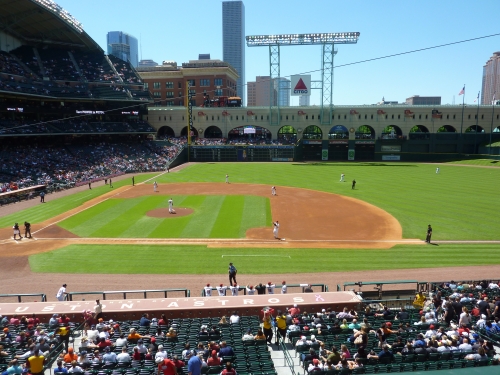
The novelty of just being “retro” wasn’t enough. They knew that all new ballparks were being built in the same fashion. They felt they had to push the envelope. We need a short porch in left field, quirky dimensions, an 1860s choo-choo train that runs during home runs, a dirt lining in between the mound and home plate (later taken out, but you can see it in the renderings), a flag pole in play, and yes, a hill in center field!
But the second wave of retro ballparks were paradoxically cookie cutters because they all represented the same synthetically quirky retro philosophy. So really Minute Maid Park was just amplifying the same retro quirks and designs to absurd proportions, taking the aesthetic to its extreme logical conclusion. And it’s now considered the poster child of this “faux-retro” sensibility.
And that’s basically been echoed, albeit less eloquently, by many critics, and I agree on a superficial level.
But architectural critics and ballpark aficionados are missing an even deeper irony here: Minute Maid Park’s interior aesthetics are unique and attractive enough without the synthetic quirkiness or attention grabbing gimmicks, especially for a retractable roof ballpark.
Many of the heavy-handed phony elements were due to Astros management. When you just look at what the architects did, Minute Maid Park is a very well designed building on the inside, with a surplus of high quality materials and consistent retro-classic treatment not seen in similar ballparks.
Much of what I described in my opening paragraph are hallmarks of the “second wave of retro ballparks” built from 1997-2004. But Minute Maid Park also succeeds in the central hallmark of the first wave of retro parks (and many second wave parks get this right, to be fair), building a ballpark that tangibly connects to its downtown context. Perhaps this is even more palpably impressive considering all other retractable roof ballparks failed miserably here, especially the insular Safeco Field, which didn’t really have an excuse.
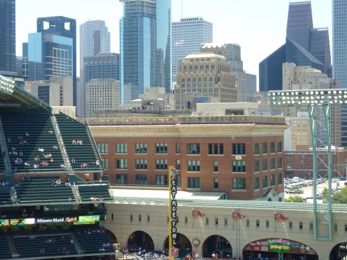
In other words, this is the only retractable roof ballpark that is in scale with the local area, part of the urban fabric of the city.
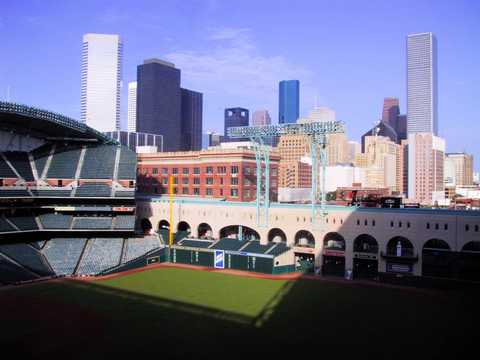
While I wish it could have been more prominent on the inside, Minute Maid Park’s consistent application of Union Station (a historic Houston building) to the interior design is better than Petco Park’s warehouse and conceptually equal to Camden Yards’ same version. The proverbial “train station” of the ballpark, a reference to this brick building is seen all throughout the interior aesthetics. The upper deck in left field is horizontally truncated in order to facilitate views of Union Station and downtown Houston.
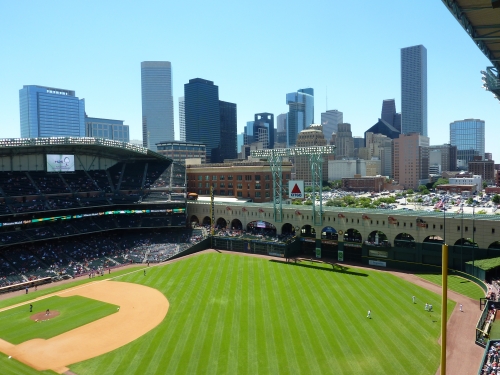
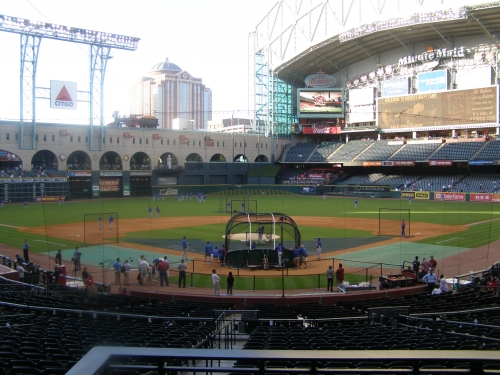
Similar to AT&T Park in San Francisco, Minute Maid Park is one of the few to bring a retro mainstay, the classic archways, to the inside of the ballpark. Attractive cream-colored stone arches span a quarter of the ballpark’s perimeter in left and center field, in what is both functional and attractive. Especially in comparison to Safeco Field, this is a fantastic use of space, effectively tightening the layout of the ballpark, serving as a platform for the retractable roof mechanisms, and providing a retro-classic sensibility, all in one. They remind me of the classic Roman aqueducts.
The interplay between the red brick Union Station in the background and the archways in the foreground, serving as a platform for the train tracks, is quite clever. In what is a perfect application of context and theme to function, the sliding glass retractable roof tracks ingeniously serve as a mechanism for executing the train track aesthetic, as the model 1860s train can move up right in front of Union Station. Yeah, it’s a bit cheesy, but it’s very well executed.
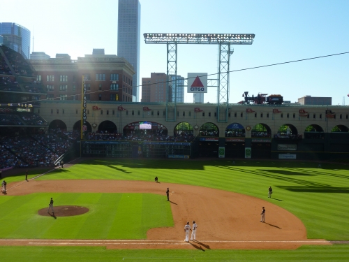
The vertical height of the arches is deceptively low, so when the roof is open, you’re not just in the one of the most attractive retractable roof ballparks, but one of the most attractive ballparks in all of baseball. You are in a true open air ballpark, with a view of Houston’s courthouse and downtown. Contrary to popular belief, Minute Maid Park, not Safeco Field, has the most open air space when the roof is fully retracted, as all of center field is open too.
The arches and lack of seating in left-center field are attractively juxtaposed with the simple double deck grandstand spanning right field. The geometry of the infield grandstand design is especially unique as well. The curvilinear grandstand design down the first base line and the curvature of roof is beautifully contrasted with the rigidity of the third base grandstand. Also note the curvature of the canopy matching the retractable roof design on the third base side. This is another park that has particularly good balance, despite all of the convulsion and contrivance within.
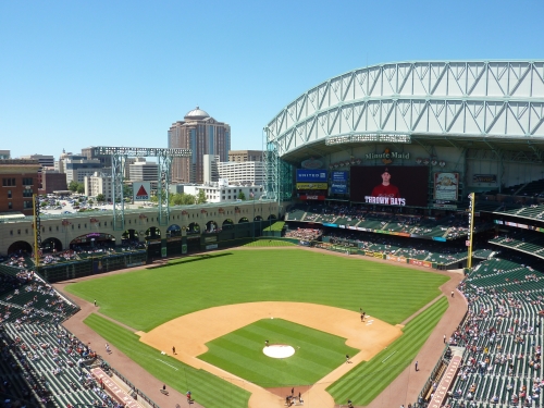
The right side of Minute Maid Park’s outfield set-up is much more simple, but still uses space efficiently. When open, take careful note of the turquoise lacy ironwork on the roof’s white façade above right field, which matches the general motif of the ballpark and the cream stone arches. Again, you may not find this attractive, but for a retractable roofed ballpark, Minute Maid Park is very aesthetically coherent in its bottom line. At least it fosters some much needed unity in the disjointed retro retractable roof ballpark landscape, meaning it has aesthetic vision and consistency.
One thing that surprised me was how intimate the structure is; especially in comparison to other more highly acclaimed ballparks. Logically, this makes sense, as Minute Maid Park has a particularly small footprint, as the left field archways are essentially the limit of the physical plant. In contrast to sprawling ballparks like Miller Park, Chase Field, and Safeco Field, Houston’s home is quite spatially compact, without the “dead” space commonly seen in other retractable roof ballparks. Also, they made a concentrated effort to limit outfield seating. With the roof open and minimal seats in the outfield, I would venture to say only PNC Park, AT&T Park, and perhaps Target Field would compete with this intimate scale, as you can hit a home run out of this park and watch the street lights change off of Prairie and Crawford from the upper deck. Yet it still somehow has a roof. Quite impressive.
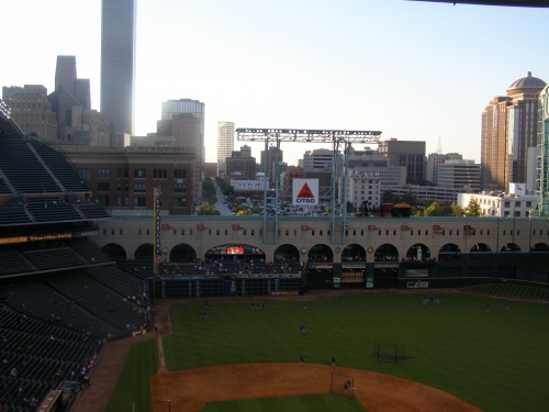
Some of the subtle aspects aid Minute Maid Park’s appeal as well. Continuing the theme of aesthetic consistency, Minute Maid Park’s cross section design reinforces the retro nature of the looming Union Station and the cream colored arches. If there was ever a ballpark to have red brick in the infield grandstand, this is it, something that Camden Yards chose not to do quite at the same level. The upper deck portals are all adorned with red brick, something seen nowhere else in baseball. The press box, Inspirity Club, and the backstop are finished in red brick as well.
Because of the Tal’s Hill in center field, Minute Maid Park’s batter’s eye is particularly effective and unobtrusive. Because the incline of the hill partially serves as the batter’s eye, only a small compact box of plush greenery is needed. As implied, the ballpark’s interior color scheme is excellent, as the dark green in the seating bowl nicely matches the light beige archways and red brick throughout the interior.
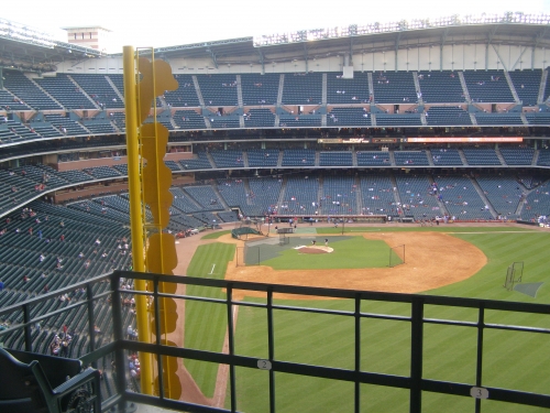
This is all a far cry from the conflicting Safeco, where the stark black modern interior fights the retro sensibility on the outside; it is a building primarily dedicated to functionality.
The only reason Safeco Field is generally considered better design wise (it is better in terms of amenities) is because it lacks the highly criticized kitschy gimmicks of Minute Maid Park, and it has a unique umbrella-styled retractable roof that doesn’t enclose the park. Both are legitimate criticisms, as Minute Maid Park is closed for roughly 65-70 out of 81 games on average.
It is true that Minute Maid Park loses much of its aesthetic appeal with the roof closed, but not to the extent that others lose it. Out of all the retractable roof ballparks, Houston lets in the most natural light while closed, as it uses a transparent sliding glass door. Safeco Field, while closed much less often, has a dark dungeon like vibe when closed. Minute Maid Park also has open viewing areas through the archways below the roof, showcasing a profusion of trees.
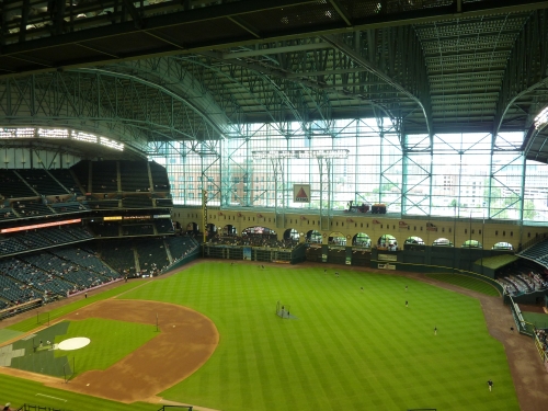
But as I touched upon in the beginning, it is highly problematic that Minute Maid Park went too far over the top with some of its “retro” features. But for me, the park’s primary flaw isn’t necessarily the gimmicks, but just how muddled with general distractions and ads the ballpark has become throughout its tenure.
If you compare the left side of the ballpark in 2000 when it opened to how it is now, you’ll see what I mean. On the arches, you now see numerous pennants, ads, and other pointless sponsorships. This is applied to most of the ballpark as well, as there are simply way too many ads, and I have a high tolerance for ads in major league ballparks. The most egregious, and possibly the worst feature in all of baseball, is the Chick-Fil-A “Eat Mor Fowl” poles. Ads on the foul poles, really? The ads were taken to the extreme in 2012.
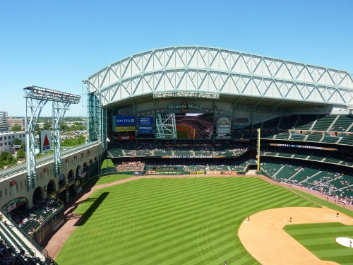
It’s a shame, because all of these distractions show a lack of confidence in its architectural lines. And unlike Turner Field or Citi Field, which are also horrendously muddled, Minute Maid had every right to be confident in its lines. If they had left this fairly simple structure alone and let the interior architecture shine, perhaps it would have been perceived differently. Right now, many critics see Minute Maid Park as a tacky ballpark, over indulgent in it’s faux retro features. People find the planned quirkiness off-putting.
While you often here the buzzwords “gimmicky” and “contrived” thrown out regarding Minute Maid Park, I would argue it’s more gimmicky than contrived. The dimensions and even the Crawford Boxes (short porch) in left field are derived from the confines of Crawford Street and the surrounding downtown area.
So as for those gimmicky features that everyone loves to criticize? As I said in the beginning, I wouldn’t have included them in the design, but I don’t see how they take away from the appeal of the entire ballpark. As a principle, I agree with much of what is said, it’s totally phony.
But how would removing Tal’s Hill in center field after the fact improve the ballpark? Yes, it shows a lack of confidence in the overarching design, but my general rule is that unless a feature is aesthetically unattractive, meaning it doesn’t add any aesthetic value to the ballpark, then you should leave well enough alone. Tal’s Hill is contrived, but it’s attractive enough. People need to chill, and maybe someday Tal’s Hill will be seen as a parody of itself. Also the train is fairly innocuous in scope, and again I love the concept.
I would contrast this with a couple of other features around the majors: Petco Park’s pointless notch in right field and Great American Ballpark’s model riverboat/model smoke stacks. Not borne from necessity, the right field notch (“home run porch”) is the single most contrived element in baseball. At least you can understand why they’d think to put a hill in Houston, because of the deep center field. But there’s zero reason or rationale for Petco’s porch on any possible level, as it doesn’t add anything to the ballpark. Great American Ballpark’s tacky river-themed features (black box boat and Lego smoke stacks) ruin the entire ballpark by obstructing the river views and blocking out the context. And they are generally considered ugly.
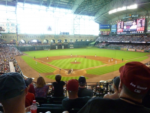
These are examples of when removing a gimmick or contrivance would actually make the ballpark better.
Few ballparks attempted to execute a design project with such aesthetic depth and vision like the Astros. I’m generally critical of ballparks that are overly thematic, like Great American Ballpark, but Minute Maid Park is so well executed you have to give partial immunity, as the theme derives from contextual authenticity.
Overall, Minute Maid Park is really more than the sum of its parts, because the parts people tend to fixate on aren’t really indicative of the quality of the design. Across the retro ballpark landscape, gimmicks and contrivances were added because retro ballparks were starting to all look the same. They needed to be distinguished. Minute Maid Park needed these gimmicks and distractions less than anyone else! It’s distinct without them.
Hokey gimmicks and contrivances aren’t what Minute Maid Park is solely about, contrary to popular belief. When Tal Smith said, “Ballpark’s should be known for something. I’d rather be known for a hill than a swimming pool,” he was underselling his ballpark. Minute Maid Park should have been known for being the only retractable roof ballpark to respond to the contextual forces of the city. It should have been known for its superior use of space and intimate scale. It should have been known for Union Station, the attractive cream archways, the Houston skyline, and the 19th century lacy train shed ironwork. While it gets points off for not being confident in it’s architecture by adding kitschy features and muddling the structure, no one can take that away from the Astros or the astute observer.
Score: 12/15
Score: 10/15
Panoramic View/Backdrop:
Minute Maid Park has a very similar set up to Safeco Field in terms of picturesque views, as both provide sweeping downtown views past left field. While Safeco Field provides more spectacular views, Minute Maid Park is closer to downtown. Note how the upper deck in left field is expanded upward in sections 405-407 and cut off horizontally, preserving views of Union Station and downtown Houston, somewhat like Camden Yards. It’s too bad the ballpark couldn’t be located 400 feet to the left, and the skyline would have spanned the outfield. Now it’s basically in the far left corner, only visible in the upper deck down the first base line. But the view of Union Station is still nice.

Score: 3.5/5
Concourses:
Minute Maid Park was conceptualized around Union Station and the concourse aesthetics are no exception. The Astros continue their train motif throughout the concourses, with arched windows and railroad themed concession stands seen throughout the building.
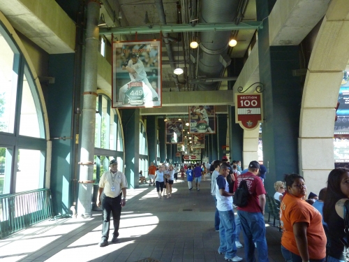
While perhaps a tad “mall-like,” though I would disagree, Minute Maid Park’s concourses are adorned in dark red, sandy beige, and light green, similar to the color scheme of the interior design. Note the brickwork on some of the walls, which is very pleasing to the eye. The railroad theme is extended specifically to the concession stands, some of which are modeled after cabooses. Examples include “All Aboard,” the “Dining Car Grill,” the “Whistle Stop Libations,” and the “Union Station Express.” Yeah, it’s a bit overdone, but it’s very executed and most importantly consistent. Note the arched windows as well, especially the attractive brick arches on the upper deck concourse.
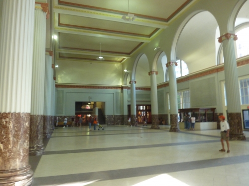
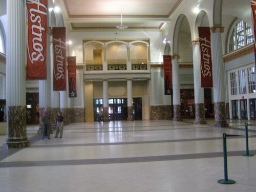
But the highlight of the “concourse aesthetics” is the Union Station lobby itself, which is part of the ballpark. The 30-foot high Union Station has massive stone arches, marble, and limestone floors. The lobby architecture is reminiscent of the late 19th century Victorian revival featuring Romanesque elements, specifically columns in Ionic order with a Corinthian capital. An old-fashioned ticket booth lies on the west side (front side) of the lobby. There is also a team store to the right. Union Station includes team offices and a party deck on top, used when the roof is open.
After fans walk past the former train station onto the main concourse, they encounter those cream-colored arches that extend from left field onto the concourse, meant to evoke a rail bridge. It’s all a very tasteful set-up, in what is one of the best “signature entrances” in baseball. Of course, the entire concourse system is climate controlled and enclosed, so there is a ceiling on how high it can score aesthetically.
Score: 2/3
Total: 22/33
Functionality & Essentials
Sightlines:
To the naked eye, Minute Maid Park’s sightlines look like they use the same conventional decking formula and seating geometry as others during the era. While that would be good enough, there are some subtle nuances that make Minute Maid Park’s sightlines superior. Characterized by relatively excellent cantilevering and very good seating geometry, it has some of the best sightlines in baseball.
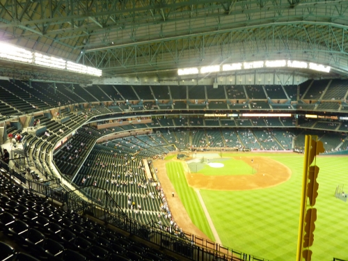
First of all, you might note that the first base side uses a curvilinear grandstand design, similar to the modern Kauffman Stadium and New Marlins Park. For sightlines, this works better in some places than others, but it is at least guaranteed to provide decent sightlines. In Houston, it generally works very well.
They employed a design where the lower deck first curves around home plate and then curves at a larger radius down the line. This guarantees that after the curve down the lines, the seats farthest down the line will point toward home plate, and basically all seats where you would normally have to turn your head point in the general vicinity of the infield.
At the same time, the seats down the third base line use the traditional retro angled seating formula. As there is so little space because of the 315-foot short porch, there isn’t much of an issue, as most seats are effectively angled toward the infield. While it’s probably not done as well as Petco Park or Chase Field, the seating geometry is generally excellent at Minute Maid Park.
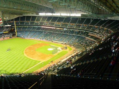
Other than Petco Park, Minute Maid Park might employ the best cantilevers in baseball, as the upper decks have excellent overhang above the lower levels. You are closer to the game here, despite being higher. This may be surprising to some, but check out Andrew Clem’s stadium profiles. One of these is not like the other.
Like many parks of the era, you’ll note it uses the conventional lower/club/suite/upper deck formula. But unlike parks like Coors Field, Target Field, or AT&T Park, where the upper deck might be slightly overhung above the club level, the upper deck here extends all the way to row two of the club level. The club level is also extended 12 rows above the lower deck, which is fairly conventional.
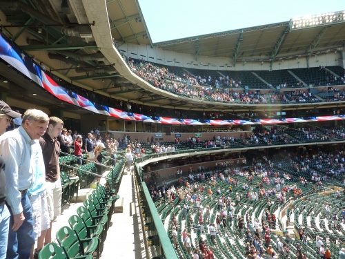
However, there is a trade-off to this approach, as Minute Maid Park had to raise the upper deck higher than usual to avoid overhang issues. This results in it being one of the highest upper decks in baseball. Because they have a separate suite level, unlike Petco Park, who also uses aggressive cantilevering, the top of Houston’s upper deck is probably too high. But I think it’s worth it to be closer to the field and slightly higher, rather than slightly lower and farther from the field.
The first row in the upper deck at Minute Maid is 30 rows from the field, while at a park like Rangers Ballpark you are 45+ rows away. It’s not as good as Petco Park and of course it doesn’t compare well to the classics like Wrigley Field and Tiger Stadium, but Minute Maid Park excels here in comparison to its peers. Again, this is all very subtle, but the effect is cumulative.
Score: 9/10
Seat Comfort:
The width of the seats at Minute Maid Park tend to vary greatly based on location. But as a general theme, they are too tight compared to historical standards, like most retro parks. Here, they especially had to cram a number of seats in a small footprint.
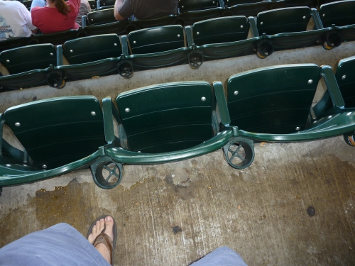
Unlike many ballparks, the seat width is ample in size around home plate and the dugout, ranging from 20-21 inches. This is the only park I’ve seen with 20+ inch seats consistently in a non-premium area. But at the same time, many seats down the lines, in the Crawford boxes, in the mezzanine, or in the upper deck are extremely small. Listed at 19 inches, many are actually around 18 inches.
For some reason, I’ve heard cup holders used to be an on-going project here, as they used to lack them in the mezzanine and the upper deck. But as of 2011, they have installed cup holders in all seats. Note that Minute Maid Park has no bleachers. Club seats are thinly padded.
Score: 3.5/5
Concourses:
Due to the small footprint, Minute Maid Park’s concourse system is quite simple, but varies greatly in width from area to area. In general, the concourses are above average.
The main concourse is very navigable, lacking the confusing changes in vertical elevation like PNC Park or Petco Park, or the maze-like horizontal discontinuities seen in Miller Park. Like logistically successful concourse systems at Comerica Park or Coors Field, the entrance to the main concourse is at street level and there are no interruptions in continuity.
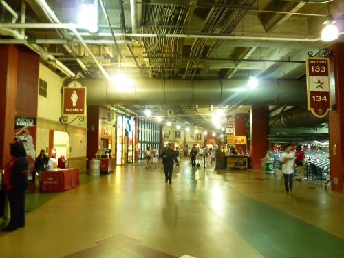
Unfortunately, due to the logistic constraints of the site, the width of the concourse seems to vary greatly in different areas on the main level. The concourse is slightly under average in width down most of the third base line, culminating in a very narrow concourse behind the archways in left field, which is known as “home run alley.” The space around the home plate on the first base side is mostly occupied by a food court, meaning that crowding is very common in this area. On the other hand, the concourse width past first base is ample in size, in excess of 40 feet. Also, the park has unusually large concourses throughout the upper deck. Usually, there is some consistency in width, but not in Minute Maid Park.
On the plus side, Minute Maid Park benefits from excellent field visibility from its concourse system, which is open throughout the main concourse except behind home plate where the Inspirity Club is located. Because the club level is slightly higher than usual, cantilevered over the lower bowl, you can actually see the action on the field from the kiosks. It has open concourses where you can actually see much of the field.
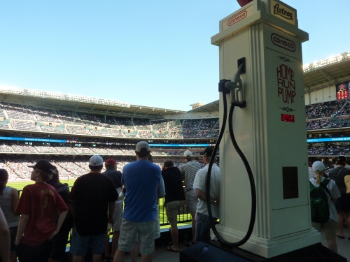
Finally, Minute Maid Park benefits from fantastic outfield standing room areas, some of which are up there with the best in baseball. In left field, there is a number of fun viewing areas through the archways, right above the yellow line. The standing room porch featuring the Conoco Home Run Pump is actually hovered over left-center field, in what might be the coolest standing room area in baseball.
Score: 5/7
Scoreboard System:
Despite your subjective opinions on Houston’s heavy-handed home, there isn’t any disputing that Minute Maid Park has one of the best video board/scoreboard in the majors, significantly enhanced by the new system installed in 2011.
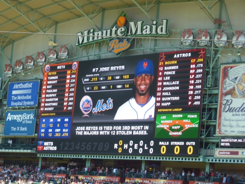
During the offseason, the Astros became the latest franchise to install a new mega video board, but they went really over-the-top. Measuring 6,696 square feet, it is the 3rd largest videoboard in baseball as of this review, behind Citizens Bank Park and Kauffman Stadium. It is as informative as any, showing both lineups and pitching info in crystal clear quality. It is one of the few to be 1080i as well.
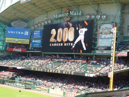
But that wasn’t enough for the Astros. Because the videoboard is in right field, not visible for fans in the outfield seats or the mezzanine, they also added another video board in the left field upper deck area, about the same size as the original 2000 video board. This is probably the only ballpark where all fans can get informed, regardless of your seat.
To top it all off, Minute Maid Park has the best out of town scoreboard in the majors, which is no small feat. First of all, it is one of the few parks to still use a single use manual out of town scoreboard that isn’t also used for rotating ads in between innings. Most importantly, it is the only ballpark other than Wrigley Field to show the line score for each inning in addition to the overall score.
All of this really matters for the average fan, as it is quite a thoughtful addition by the Astros.
Score: 3/3
Total: 20.5/25
Amenities & Features
Quality and Selection of Concessions:
While having a below average selection of food with varying quality, Houston generally compensates by excelling in a few regional categories. It’s one of the tougher categories to grade because Houston doesn’t really demand “gourmet cuisine,” like in Denver, Seattle, or San Francisco, nor does it have a good selection like others. While it’s not one of the best concession providers, it really excels in the categories it wants too. It doesn’t have breadth, but it has depth.
While the regular fare comes off as a bit uninspired and limited, especially the Papa John’s pizza, Houston has an excellent selection and quality of authentic Latin/Tex-Mex cuisine. Along with a nice selection of fresh Latin fruits, the Goya Latin Café serves a variety of tacos, burritos, and nachos, with your choice of spicy beef picadillo, chipotle chicken, and tomatillo pork. What’s nice is that they actually use real ingredients, and yes, real cheese.
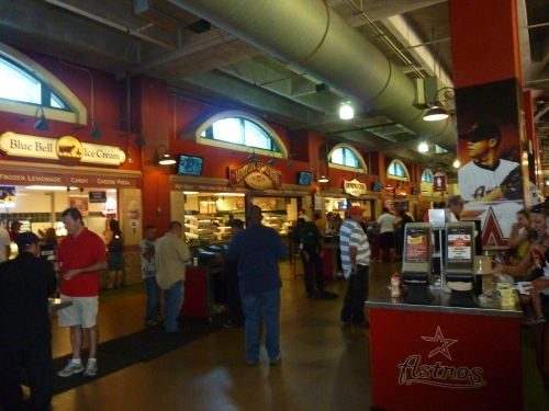
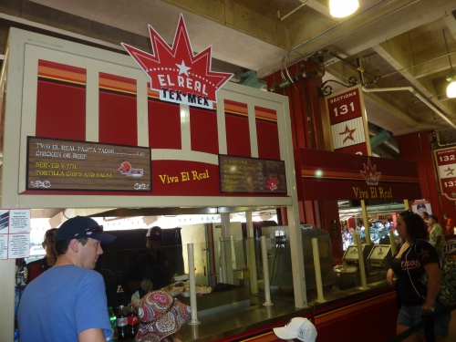
Speaking of nachos, they have five varieties throughout the ballpark. In addition to the ones served at the Goya stand, the Astros serve beef fajita nachos, monster chicken nachos, buffalo chicken nachos, and BBQ Pork nachos. But the highlight of the Mexican selection is actually the El Real Fajita stand down the right field line. A Houston establishment run by chef Bryan Caswell, the tortillas are made from scratch with the tenderest chicken or beef you’ll ever taste in a ballpark. Topped with lime, tomatoes, and onions, it’s a true treat, and about the highest quality item you can get in any ballpark. For 2012, they added a new Mexican stand serving Tamales.
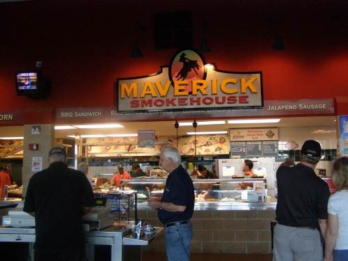
Other than the outstanding Mexican selection, I was a bit disappointed by the rest of the food, especially the BBQ. Texas is BBQ country, but you wouldn’t know it in Minute Maid Park. The Maverick Smokehouse only serves the common BBQ Brisket and turkey Sandwich. But to be fair, its selling point is the famous loaded BBQ Baked Potato, which we’ll get to later. Other deli, seafood, international, or unique cuisine is non-existent.
Larry Big Bamboo is marketed as their tropical joint, serving garlic fries, Caribbean jerk/tangy wings, and fish tacos. Perhaps the Astros could integrate some seafood specialties in here. The Burgers are of note, led by Little Biggs sliders and Prince’s Hamburgers, a local chain. Another award winning restaurant run by Bryan Caswell, Little Bigs serves good portions with caramelized onions.
Other than smoothies, Minute Maid Park was known for it’s distinct lack of healthy or gluten free options in the ballpark. In 2012, Astros management addressed that by adding the largest salad stand in the majors, known as Green Fork, offering three varieties of lettuce and over 20 different toppings. Texas Cobb and Shanghai salads are especially of note.
The alcohol selection never really comes to my attention, but due to quirky Texas liquor laws, this is the only ballpark you’ll see without hard alcohol on the main levels. Coupled with a limited beer selection, that’s pretty outrageous. This is a rarity in major league baseball, and enough to deduct half a point.
While not having a wide variety, Houston certainly succeeds in providing some quality concessions. But some of its shortcomings seem to endure a bit more when comparing to other parks.
Score: 3.5/5
Regional/Signature Concession(s):
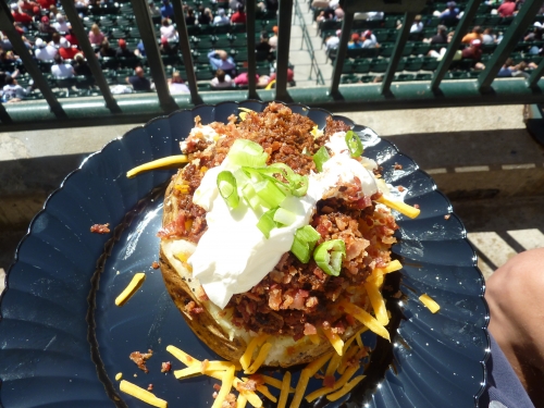
The one area where Minute Maid Park has actually gotten a lot of positive press is in the signature food category. While I think it’s probably a little bit overrated, the Texas Stuffed BBQ Baked Potato has long been sited as one of the best signature foods in the majors.
Frequently topping the lists of best ballpark foods, the baked potato is loaded with Texas-style beef brisket, cheese, barbeque sauce, onions, sour cream, jalapeño peppers, and sometimes bacon. This is definitely one of the best snacks you can get in baseball, but in terms of quality, Minute Maid Park has a much better item.
Again, the beef fajitas at Bryan Caswell’s El Real Tex Mex, which is a highly acclaimed restaurant in Houston, serves up some of the tenderest meat you can get in any ballpark. Little Bigs sliders are also good.
Score: 2/2
Public Restaurants/Bars/Sitting Areas:
Due to the removal of Tal’s Hill, Minute Maid Park’s center field renovations have gotten a lot of national attention. The additions did add some vibrancy to a formerly barren bar scene within the park. In addition to new concessions and group areas, we have three new bonafide destination bars, in what is overall a legitimate social space like The Rooftop at Coors Field.
So why the mediocre score? The Astros literally have nothing else. Other teams have at least some additional restaurants, bars, or sitting areas on the main concourse or the upper deck. Coors Field, for example, has a full-service restaurant with a field view, an informal restaurant, a brewery, and an upper deck lounge to go along with it’s new Rooftop. The Astros center field renovation is adding to nothing.
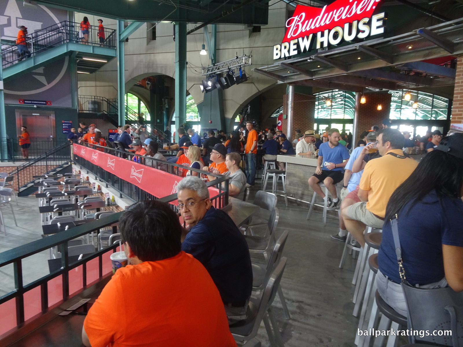
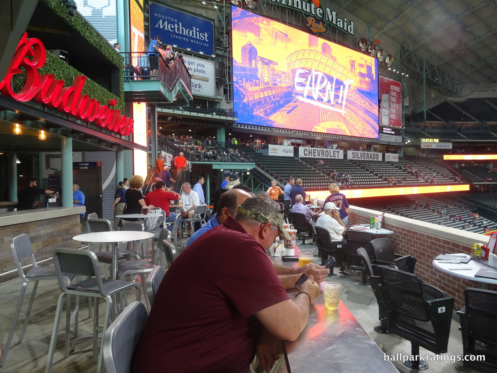
While I wish there were more sitting areas instead of group spaces, the Astros center field renovation is very impressive. While the prime area known as the Budweiser Patio is for group tickets only, there is a sit-down bar with a field view behind the patio off the main concourse. Despite only featuring beer and wine, the Budweiser Brew House is a great place to hang out and have a drink. It’s not a full-service area, but tabled seating for the food is located in the vicinity.
Above, we have a similar set up, but the Patio area tickets can be bought by individual fans. The Torchy’s Bar (full bar) behind the patio features an elevated view of the playing field. We also have tables for the Torchy’s Tacos concession stand.
Situated directly above the batters’ eye in centerfield, the Budweiser Batters’ Eye Bar is probably my favorite area. While 20 season ticket holders have domain over the area closest to the wall, the area behind it features a standing room area with tables and a full bar. If you get to the game early enough, go here to avoid lines and enjoy the best view.
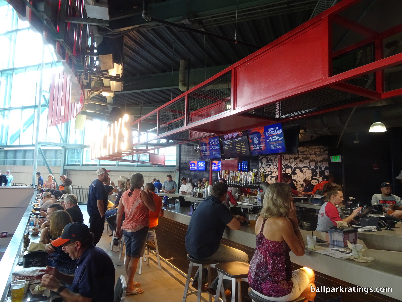
The Astros used to have three full-service restaurants or casual sit down areas on the main concourse. The rather poorly received FiveSeven Grille was Houston’s signature restaurant, in what was a tribute to Craig Biggio and Jeff Bagwell. This has been replaced by the FiveSeven market. The Astros used to have a place called Lefty’s BBQ in Union Station, but that area now appears to be dormant. Larry’s Big Bamboo, a causal sit down area with tropical fare and a beach decor, was replaced by an expanded team store.
All of this is actually understandable, as the trend is to move away from the tired sit-down spaces toward new vibrant social spaces and bars. But some other area of refuge is necessary. I would also like to see the Astros add some area on the upper deck, as it’s especially lifeless. There is a small enclave of tabled seating in the left field upper deck concourse.
Score: 3.5/5
Premium Seating/Clubs:
Considering Houston has the 2nd most fortune 500 companies in America (behind New York City), Minute Maid Park makes a special effort to cater to premium corporate patrons, stressing high quality. In fact, the Astros have renovated all of their existing spaces to state-of-the-art standards in the last 5 years, so I’ll also note old designs compared to new ones.
However, considering the market, the consensus in the industry is that Houston was perhaps the only ballpark to air on the conservative side in premium seating during the dot com boom, as they built a small diamond club and a modest number of suites. This is especially surprising considering the meteoric growth of the energy sector in Houston before 2002. Get this: Minute Maid Park is the only ballpark built prior to 2001 (other than Rangers Ballpark, which needs to) that hasn’t had to reduce their inventory of luxury suites. In the current economic climate, their modest approach makes them look very wise, as demand is still met. They even chose to add a third premium seating area for 2011, despite the awful team.
Houston does a great job in this department, as it was one of the first ballparks to stress various club seating over luxury suites and archaic Stadium Club restaurants.
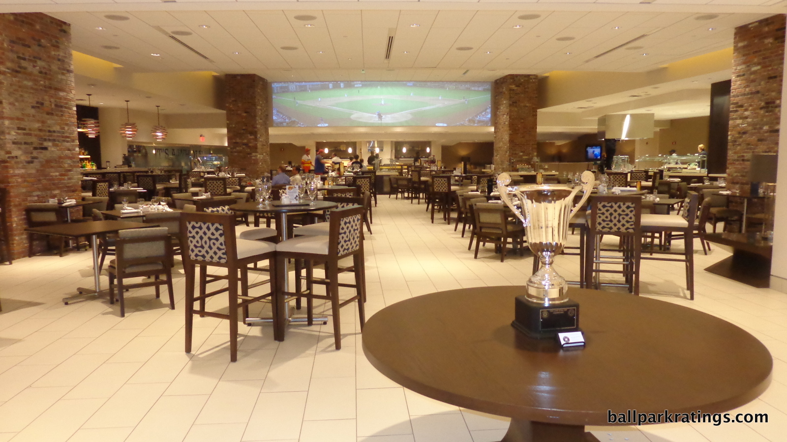
Along with Safeco Field a year earlier, Minute Maid Park was a pioneer in the Diamond Club concept. While originally not as luxurious as those that opened after 2000, Houston’s premium home plate club has long been one of the most exclusive and hardest to obtain seats in baseball. Due to excess demand, seats were nearly impossible to get in early years, with a waiting list in the 100s for season tickets. Also, former president Bush had season tickets here, so outside entry on the secondary market was somewhat restricted. Even today, the seats are sold only on a season ticket basis and don’t enter the secondary market in the same quantities as other parks.
The old décor was very casual, with an abundance of wood paneling, banquette seating, brown leather booths, and dark red table cloths. However, the space was distinctively dark and cramped, in what was probably the worst quality Diamond Club in the majors. The only loss was the dramatic marble rotunda entrance, with a beautiful sky scene mural on the ceiling, meant to offset the cramped setting.
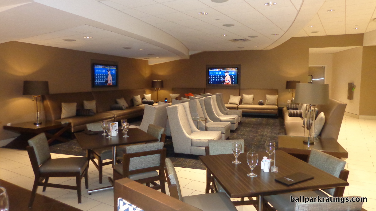
Anyway, the new renovated Diamond Club is everything the old one wasn’t: spacious, light, and airy. The high ceilings are a welcome departure from the formerly limited space. It also solved a classic problem with these bunker clubs: the lack of a field view. With the addition of the Inspirity Club at the top of the main concourse, detailed below, the Astros saw higher demand for that space than the old Diamond Club, with the chief reason being the lack of a prime field view in the Diamond Club. The Astros solution was to project a new video display feature on the upper wall that gives fans the feeling of standing behind home plate and watching the game. The image is 30 feet wide and 6 feet tall.
The club itself is about as spacious as you will see for a bunker space like this. There was also a complete overhaul in the food, with open view cooking stations replacing stale buffet lines. Note the wine display along the wall. The new fixtures and furniture are attractive, but still relatively casual. The Astros should integrate some more historical references into the club. I’ll also note that alcohol is not included in the ticket price similar to Los Angeles or New York, in what what is a departure from the norm for the ultra premium all-inclusive clubs. I’m told this is because of liquor laws. Overall, it’s still one of the top club spaces in major league baseball.
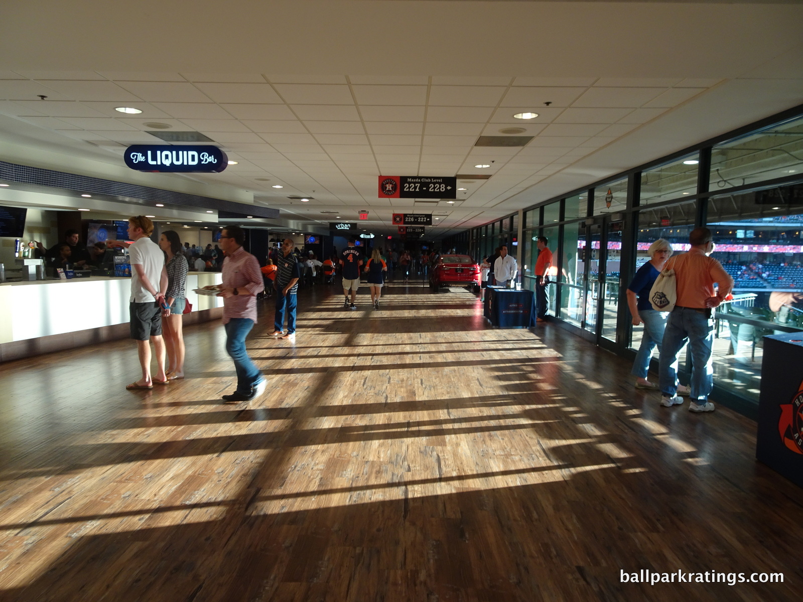
Even before the 2015 remodel, Minute Maid Park had one of the highest quality mezzanine club levels in the majors. Except for maybe PNC Park’s club level, it was the nicest in the majors for parks that opened before 2008. The club concourse was ample in size, decorated in black carpet with red accents. Some of the lounge concessions stands were adorned with quality wood paneling, while the regular club concessions were even done in a faux-marble paneling. It was an unusually nice setting for a mezzanine club level.
Now known as the Honda Club Level (changed from Mazda after 2016), the new space is probably an upgrade, but I actually liked the old design better. Check out the photo gallery and you be the judge. The old space was carpeted and more traditional, characterized by a series of lounge areas. The Svedka Lounge was the highlight, featuring cherry red leather dining booths and chairs. The new space is definitely sleeker and more modern, with hardwood floors replacing carpet and open view cooking stations replacing lounges. Two new additions probably make the remodeled version better if you’re being objective. By knocking out a useless ticket sales office, the third base side of the club level has been greatly expanded. It features another open view cooking station. Second, a 360-degree indoor/outdoor bar with a field view was added down the 3rd base line.
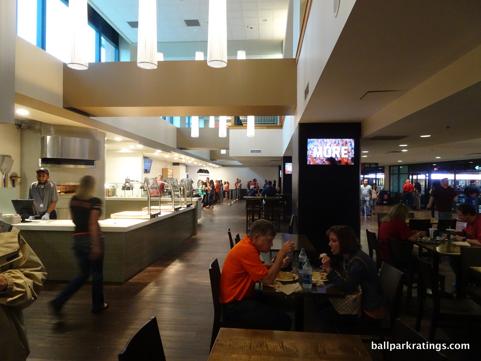
The main thing I don’t like is the elimination of true sit-down bars. Now, most of the bars are just concession stands. This is in line with the new idea of creating trendy walk-up bars, for reasons I can’t quite understand. The explicit goal is to create “destination bars” and “social spaces,” and intimate sit-down bars give these spaces a more tangible sense of place. You want to create spaces where your friend can call you and say “meet me at x bar in y area,” and these old spaces were more well-defined. Overall though, Minute Maid Park this is one of the nicest mezzanine club levels.
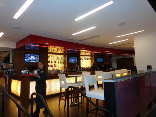
Somewhat like U.S. Cellular Field, the Astros added a third premium area in the former press box. Located behind home plate at the back of the seating bowl, the three row Insperity Club is a true premium space unlike other awkwardly located ancillary hybrid club-suite experience throughout the majors. Many of those spaces are added in places where teams couldn’t sell existing suites. The new Insperity Club features red theatre style seats with tables, a premium buffet, a top-shelf bar, and a small white-hued lounge area. Like the Diamond Club, alcoholic is not included.
For 2017, the Astros added the Lexus Field Club against the fence beyond centerfield. This is a bit of a misnomer, as it’s actually just a group area available for rent on a game to game basis. I don’t put much stock in group areas. Anyway, Minute Maid Park doesn’t meet the high standard set by newer parks in New York, Washington D.C., and Atlanta, but the quality is as good as anywhere.
Score: 4.5/5
General or Artistic References to Baseball or Team History/Museums:
For some reason, the Astros eliminated “home run alley” in 2017, resulting in little to no historical references inside Minute Maid Park.
The long fan arcade had a series of murals hanging from the ceiling in order of Astros career home run leaders. Those featured included Jeff Bagwell, Craig Biggio, Lance Berkman, Jimmy Wynn, and Glenn Davis. The area also had two extensive displays on the wall dedicated Biggio and Bagwell. Both featured memorabilia alluding to Craig Biggio’s 3000 hits and Jeff Bagwell’s 449 Home Runs, respectively.
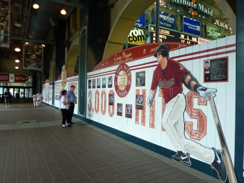
The flaw in the display is there was no reference to Astros pitching, which was dominant during the Astrodome years. We see no reference to Mike Scott, Don Wilson, or Nolan Ryan, which is a testament to baseball’s obsession with hitting during the 2000s. There are some additional memorabilia items in Union Station.
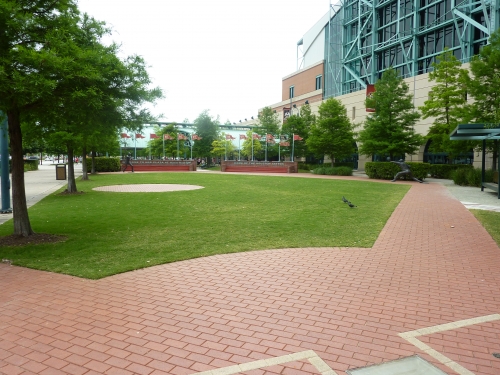
Minute Maid Park has a tasteful historical display on the outside, similar to Great American Ballpark’s historical baseball diamond. Beyond left field outside, the Astros built a mini-ball field featuring Astros historical plaques, division winning pennants, and a statue of Biggio throwing to Bagwell from second to first base. I must say, building a statue of Biggio and Bagwell when the ballpark opened was quite a presumptuous move, as both were just entering their 30s. Bagwell was going to be a free agent in 2001! It was a testament to the mutual loyalty and expectations between these two legends and the franchise.
What is nice about this set-up is that the diamond was designed so a statue of a pitcher and catcher can be added later. It’s fun to speculate on any future Hall of Fame-level pitchers and catchers playing for the Astros. As good as the team is as of 2017, I can’t say I see any prime candidates. Looking to the past, Roy Oswalt probably isn’t statue material. They would have done Nolan Ryan ages ago if he was a candidate. Justin Verlander? He would have to pitch at Randy Johnson-like levels into his late 30s and early 40s, which is extremely unlikely. Dallas Keuchel looks to be fading. Lance McCullers Jr. doesn’t have the stamina. And franchise defining catchers are hard to come by these days.
Anyway, cool concept! Let’s hope the Astros don’t ruin it, as there’s some rumor of a new kids’ area in this space (see below).
In 2019, the Astros added a new Hall of Fame exhibit on said left field concourse. Still a far cry from the team museums in Cincinnati or Kansas City, or the monument areas in a few other ballparks, but this is a great display that warrants a re-boost in score
Score: 4/5
Entertainment/Kids Activities/Other Amenities:
While it has since been surpassed by more ridiculous excess (see Kauffman Stadium), the Astros opened the largest kids area in all of baseball in mid-2000. Today, it is still one of the better kids’ areas in baseball, and gets extra credit for being tucked out of sight in the right field corner, unlike Miller Park.
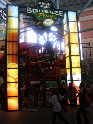
Minute Maid Park’s Squeeze Play features one of the largest playground areas in the majors, along with speed pitch, a virtual hitting game, a virtual pitching game, a water hitting game (“Splatting Cage”), and a base running game, where kids can race against a mechanical ballplayer (“Running Man”). The playground is a replica of Minute Maid Park and even has a train full of oranges. Also note the new umpire’s box and the area where sculpted hands portray different pitching grips. Quite impressive, even if you hate this kind of stuff. You can only enter this area if you have kids.
Also, I love that the Astros actually came up with a creative name for their area. Squeeze Play is a colorful reference to the ballpark’s name and a welcome deviation from the ubiquitous “Kids Land.”
2018 edit: Squeeze Play has been replaced by a team store! Notice a trend here?
I was told there will be a large kids area somewhere in the ballpark by 2019 or 2020, but for now, Houston gets a demerit for this. Minute Maid Park is only one of three parks in all of baseball without an extensive kids’ play area, some sort of playground, or some sort of large kid-related feature, the others being Marlins Park and Target Field.
So as you can see, this is hardly a predictor of ballpark quality. But these features are essential to attracting families with children to the ballpark.
And if they just expand the left field concourse into the historical baseball diamond plaza to create a new kids’ area (as rumored), that just removes the one Astros-related historical touch to Minute Maid while putting a kids’ area in a more visible location (which is not ideal). Squeeze Play was located off the concourse out of sight for most fans, a huge plus.
Anyway, I hope the Astros find a creative way to address this situation.
Score: 1/3
Total: 18.5/25
Atmosphere, Vibe, & Policies
Atmosphere/Fan Support:
Attendance numbers throughout the latter part of the 2000s indicate that Astros fans are a particularly loyal bunch, relatively inelastic to the decrease in team quality like Seattle. In other words, it took a long time for Houston to realize that the Astros were bad, as the residual effect of the Biggio/Bagwell era lasted until 2010. Even in their 2011 106-loss season, they drew similarly to good teams in Cincinnati, Arizona, and Chicago (A.L.).
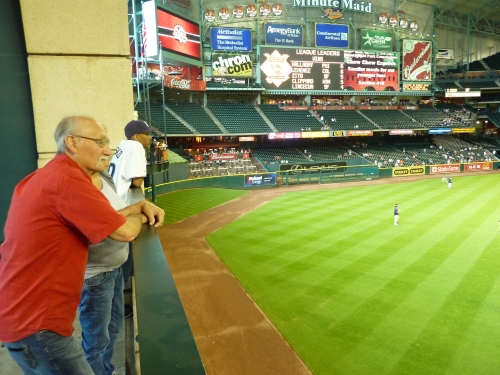
From 2007-2010, the Astros attendance trended downward from 37,289, but ended at a respectable at 28,784 during that date range, despite not fielding a competitive team during that four year time period. During their historically bad year in 2011, the team remained 15th-17th in the MLB for most of the year, before bottoming out in September. Like I always say, people generally underestimate the residual impact of past success on current attendance, but that is especially evident in Houston.
During the dreadful 2011 season, one factor that helped the Astros was a solid season ticket base. Over 10 teams bottomed out in the 13,000-17,000 range in the April-May months a couple times, including Atlanta, while Houston never drew under 20,000 (until getting 19,000 in September). They benefited from a very high attendance floor due season tickets, though they also have a low ceiling.
Unfortunately, all of that will be erased in the next 5 years as the attendance will continue to trend downward, as the aftereffects of the 106-loss season will be felt during the rebuilding process. But Houston had a good run in terms of fan support, with an especially boisterous atmosphere with the roof closed during better times earlier in the 2000s. Here is another 3.5 that’s more inevitably a result of poor team quality, as attendance will always reflect that.
2018 alert: the fans are back!
Score: 4/5
Ballpark Policies/Customer Service:
In my experience, the Astros customer service staff has been excellent. With the attendance issues, the ability to upgrade to a better seat really varies, as some ushers are more lenient than others, but all do their job very well. But most importantly, Houston recently lifted their awful policy of restricting outside food and drinks from the ballpark. Before 2012, it was the only ballpark in the majors that wouldn’t even let you bring a bottle of water in the ballpark. Now their policies are more fan friendly.
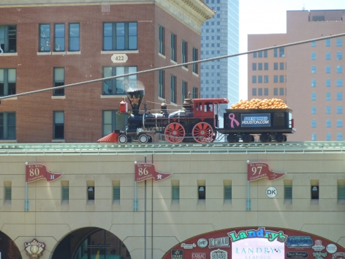
Also: remember how the Astros don’t have a bar on the main concourse? Well, they compensated with a very great deal. For only $5, you can get a “club level pass,” which gets you access to the series of liquor bars and lounges. But it’s unadvertised and you can only get it once you are already in the ballpark. Hypothetically, you could buy a $5 upper deck seat and a $5 club pass, and watch the game from an empty seat in the club level, which is easy to do. This is a wonderfully fan-friendly initiative; I haven’t heard of any other ballpark doing this, as it instantly gives fans a $60 value. This was done in the early 2010s, and the Astros have since added liquor on the main concourse.
Oh, and even cooler, any Honda key gets you complementary access to the Honda Club Level.
Score: 2/2
Bonus:
For building the most attractive retractable roof ballpark and the only one that has a connection to its urban context, in a structure that blends seamlessly with the neighborhood, city, and the region literally and conceptually. As a design concept, it’s an admirably ambitious building, in contrast to the boring “third-era retro parks” from 2006-2009 +2
For the architecturally gorgeous Union Station and its influence on the ballpark, recognizing the city’s railroad heritage +1
For the efficient and cost-effective retractable roof, which is the largest sliding glass door in the world and emits a surplus of natural light into the ballpark. No matter what, like Miami and Arizona, Houston had to have a climate-controlled environment, but they maintained an open feel much better than those two +1
For having one of the best P.A. Announcers in all of baseball, Bob Ford, who ESPN deemed the “voice of god.” This is only the second time I have given a P.A system or announcer distinction (Renel Brooks-Moon in San Francisco was the other), as he has an A-list Hollywood movie commercial voice +1
For one of the best traditions in baseball and the second best 7th inning stretch in baseball after Wrigley, where fans sing and clap to “Deep in the Heart of Texas” +1
For the new center field renovations, which add one of the premier social spaces in baseball in their totality +1
Score: 7
Total: 13
Conclusion
Important Note: This review was written in 2011. In 2012, the Astros added a series of ads beyond the outfield, eventually moving them on the outfield facade above the archways. In what was really the final straw, the Astros have muddled Minute Maid Park’s interior aesthetics with ads to an extreme degree over the years. Other than the scores, most of the review is unchanged in response to these ads and the removal of Tal’s Hill. A few sections in the amenities category were updated for 2017-19. Ratings and ranking are updated.
Former rating was 87. Positive tone of article unchanged.
If you actually took time to read this entire review, especially the interior design section, you’ll never see a better case made for Minute Maid Park. I felt this is the first time in a ballpark review that I was going against an overwhelming consensus. Critics see Minute Maid Park as a subpar place to see a game compared to other new ballparks. I’ve been here a few times, and I’ve always loved the place in pretty much all criteria. But if you’ve read any other ballpark blogs or websites from people who consider themselves ballpark aficionados, you can instantly see what I mean. Some ballpark snobs really hate this place. And in some ways, I get it, but in most ways, I don’t.
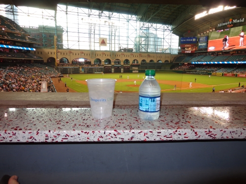
I get that Minute Maid Park generally represents the pitfalls of the retro movement in it’s over the top gimmicks and contrivances. It’s indulgent in its overtly quirky features to the point where it takes every basic design cue from the retro ballpark movement and amplifies them to absurd proportions. (By the way, the irony is most regular fans who attend these games actually love features like Tal’s Hill.)
But that isn’t really what Houston’s ballpark is about, and I’ve never really understood how those things ruin the entire park. Its extreme features don’t add to its appeal or its viability as a good ballpark in the future, but the underlying merits speak for themselves.
In how many ballparks can you sit in the upper deck and watch the streetlights change downtown? How many ballparks are so well connected to the city that home runs are capable of flying out onto the street? Especially when compared to other retractable roof ballparks, Minute Maid blows everyone else out of the water, with consistent architectural intentions and consistent application of the site, articulated by excellent use of space, intimate scale, attractive cream archways, Union Station, and the gorgeous skyline of the 4th largest city in America.
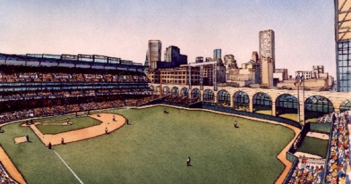
Of course, there’s no doubt that having an enclosed retractable roof design inevitably hinders the aesthetic merits of the ballpark. But the bottom line is Minute Maid Park excels in both subjective and objective categories. It’s located downtown, the sightlines are great, the concourses are open and airy, the new videoboard is top notch, the local food is high quality, and most of all, the local flare provided by the fans makes it a regionally memorable place for a ball game, as fans clap and sing to “Deep in the Heart of Texas.”
The chief architect of this project, Earl Santee (who was also in charge of Marlins Park, showing great versatility), did a fantastic job here, even though as I’ve said many times team officials have much more say in the “big picture” design of the ballpark. Even without the quirks, Houston’s park is one of the more memorable places to see a game. You heard it here first: Minute Maid Park is the most underrated ballpark in baseball.