By: Cole Shoemaker
April 1, 2021
Many have lamented the demise of everyday social interactions during Covid—the handshakes, the hugs, the impromptu chats with neighbors—but I mostly just miss the crowds.
Particularly when cheering at a live event, that celebratory collective effervescence brings us all together. As the pandemic endlessly wound on in 2020, those communal public experiences seemed like a thing of the past.
Now that we’re nearing the light at the end of the tunnel, I know I’m not the only one excited to experience live baseball once again. I personally sensed an extra spark in the small crowds at spring training last weekend, with fans cheering a little louder for meaningless victories.
There’s a robust community of traveling baseball fans and ballpark enthusiasts, but my website has been described as ultra-niche. Exhaustive long-form stadium reviews go through everything from seating proximity and arcane architectural analysis to concessions and every amenity one could imagine. It’s an encyclopedic volume of opinions on significant ballparks, something that’s not necessarily accessible in an era where information is digested in your hand.
In fact, I ranked, rated, and reviewed all MLB ballparks in a lengthy and detailed piece a couple of years ago, but I’m often asked to just summarize my favorite and least favorite part of each ballpark.
I thought now would be the perfect time to do so! With all 30 teams allowing in fans for Opening Day and throughout the 2021 season (with one caveat: Toronto will open at their spring training site in Dunedin, FL), I look forward to revisiting MLB ballparks this summer when interest is at an all-time high!
The criteria by which I rate ballparks is briefly outlined in the linked piece above, but I’ll just say I try to be as comprehensive as possible in evaluating all aspects of the experience.
From 1) Setting (location/access, local scene) and 2) Architecture and Aesthetics (exterior, interior visuals, concourse aesthetics) to 3) Functionality (sightlines, seat comfort, concourse functionality, scoreboards) and 4) Amenities (food and beverage, restaurants, bars, social spaces, seating options, historical references, miscellaneous entertainment), I look at the totality of what the ballpark has to offer, proportioned appropriately of course. One thing I don’t consider: price. Why should a stadium receive demerits because fans are willing to pay more?
All of this being said, I think there is one element that encompasses almost all of these categories.
If I could distill the answer to “what makes a ballpark great?” to one aspect, it is that a great ballpark represents its team, city, and/or region. All ballparks should pass the, “Where Am I?” test. From downtown views and local grub to team historical references and other regionally-inspired amenities, that sense of place is the overarching key.
Even with rigor, there’s subjectivity involved. Fans value different things. You may not care that a ballpark serves high-quality local food or has the best historical exhibit in baseball. That’s all cool.
I’ll use a loose definition of “feature”: it can be one single defining attribute or some category of features. “Other strengths” and “Other weaknesses” will also be listed to give context as to how I view the park overall, but I’ll try not to be exhaustive. If I fail to note some aspect, it’s probably average. I’ll go in order from last to first of how I “rate” then “rank” the ballparks, with the exception of the classics. Note you can click on each ballpark link to read each full review. In terms of Covid-19, I’m writing with the assumption that things will go back to normal eventually, so good grub and suds will be mentioned frequently.
Without further ado, here is my favorite and least favorite aspect of every Major League Baseball stadium.
The Classics, in a League of Their Own
I’m not going to overkill with “tiers” in this piece, but I prefer not to compare the three classic parks like the other 27. There is no way to objectively measure the unparalleled sense of history and authenticity of these grand cathedrals. I think you can have a conversation about Wrigley Field and Fenway Park (and Dodger Stadium, for these purposes, even though that’s more debatable), and then you can have a conversation about the other 27 ballparks.
Rating a park that opened in 1912 or 1914 based on 21st century standards doesn’t really tell us anything about the quality of the ballpark. They must be looked at solely in their historical context. You wouldn’t go on Yelp and opine that the Roman Colosseum is “a rundown, shoddily maintained ruin” with no redeeming value and proceed to compare it to the Sydney Opera House!
WRIGLEY FIELD (1914), CHICAGO CUBS: N/A
Consensus Ranking: Top 5
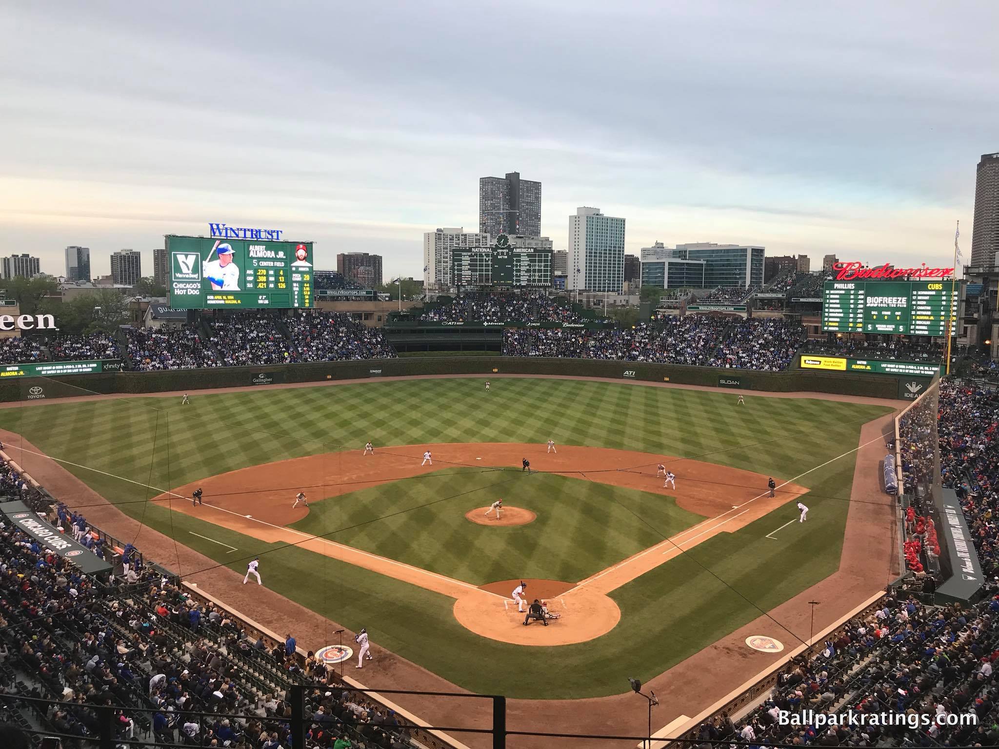
-Best Feature: Ivy-Covered Outfield Walls
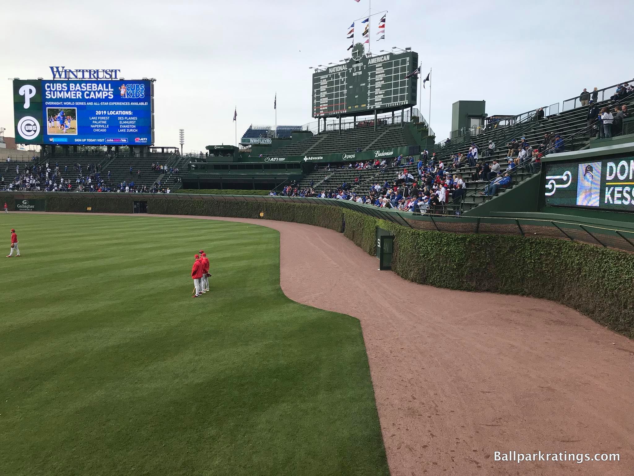
Compared to more expansive and grandiose “jewel box parks” like Shibe Park, Comiskey Park, and Forbes Field, the iconic venue now known as The Friendly Confines wasn’t particularly notable in its early years.
Decades of alterations, changing cultural tastes, and Wrigley’s evolving symbiosis with its surrounding neighborhood made it the historic monument we love today, something we should keep in mind when assessing the wave of post-1990 parks.
Wrigley’s lore arguably began with its extensive 1930s “beautification project,” in which Boston Ivy mixed with Japanese bittersweet vines was planted on the outfield walls. To distinguish the Cubs from their South Side competitors, someone came up with a novel idea: let’s make our park itself a visually appealing destination!
Marketed as “a park not a stadium,” and “an oasis for the family, a respite from the hubbub of urban life” with “sunshine-recreation-happy hours,” “Beautiful Wrigley Field” was born.
In today’s era where well-positioned skyline panoramas and captivating water views define highly-acclaimed ballparks, it now seems rather obvious, but Wrigley Field was the first ballpark with aesthetic attractiveness on the inside.
Sure, beauty is in the eye of the beholder. But show the layperson with no knowledge of baseball history or nostalgic bias a picture of the inside of Wrigley compared to the inside of a Tiger Stadium, for example, and what do you think most would say?
Wrigley Field is beautiful in its own right, not just beloved for history, and that’s partially due to the iconic ivy-covered walls. The ivy reminds fans of the timeless, pastoral beauty of the game and remains one of MLB’s greatest landmarks.
—-Other strengths: 1) Wrigleyville neighborhood, 2) Wrigley rooftops, 3) Art Deco-style main entry marquee, 4) Exterior terracotta finishes and ornamental fencing structures added by the renovations, 5) Exterior statues, 6) Classic hand-operated scoreboard, 7) Superior upper deck puts fans close to the action while mostly avoiding overhang issues below unlike other classic jewel-box parks, 8) Good seating geometry, 9) Various traditions: (a) Take Me Out to the Ball Game, (b) W flag, (c) organ music, 10) Excellent fan support, 11) Late 2010s renovations were mostly successful: (a) renovated concourses with attractive signage, (b) well-appointed clubs, (c) gorgeous social spaces including Gallagher Way, (d) new historical plaques, etc.
-Worst Feature: Oversized Videoboards and Expanded Bleachers Block Out Some of Wrigleyville
A common refrain in the past was that even with all of the beauty and history, Wrigley Field was “a dump.” But the $575 million multi-year renovation project (2015-19) added top-of-the-line amenities on par with the aesthetics and history.
Just objectively speaking, this isn’t a dump anymore, for the most part.
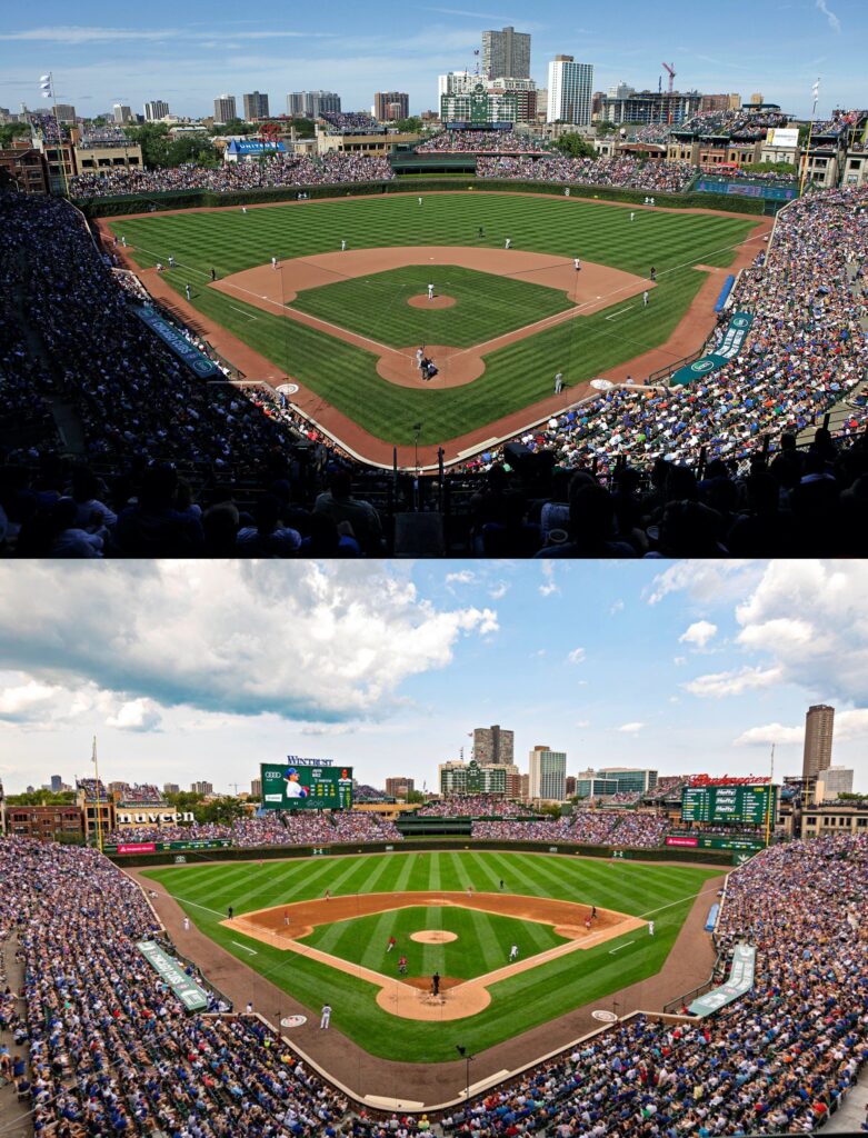
However, the renovations weren’t all peaches and cream. Before the enhancements, I would have cited Wrigley’s integrated community aesthetics as its best feature, with downscaled lines allowing for views of the local neighborhood.
Wrigley Field’s new videoboards have changed its complexion considerably, nullifying some of that charming contextual connection. The facades of the neighborhood buildings predate Wrigley, but they were essential in defining the ballpark’s character. The upward expansion of the bleachers had a similar effect, with extra rows blocking some views of Waveland and Sheffield.
It’s not like all of the rooftops are blocked out, and I understand the necessity of videoboards, but the resulting look isn’t nearly as nice from the inside of Wrigley.
—-Other weaknesses: 1) I’m not one to think gentrification is always a dirty word, but some parts of Wrigleyville are a little too clubby and exclusive compared to even 5 years ago, 2) No 360-degree concourse: bleachers are separated from the main concourse, 3) No escalators to get to the upper deck, 4) Support columns may obstruct views, 5) Awkward catwalk required to navigate upper deck concourse behind home plate due to new Catalina Club, 6) Food and craft beer quality has gotten better, but the selection is still comparatively lacking
FENWAY PARK (1912), BOSTON RED SOX: N/A
Consensus Ranking: Top 5
-Best Feature: Green Monster
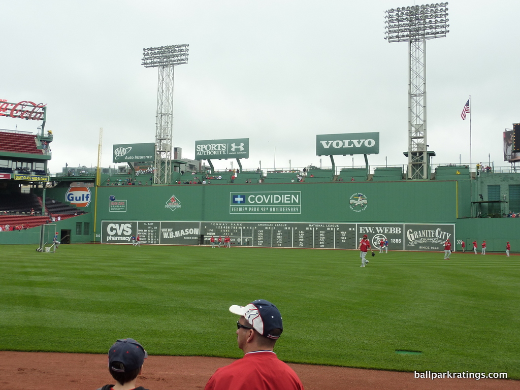
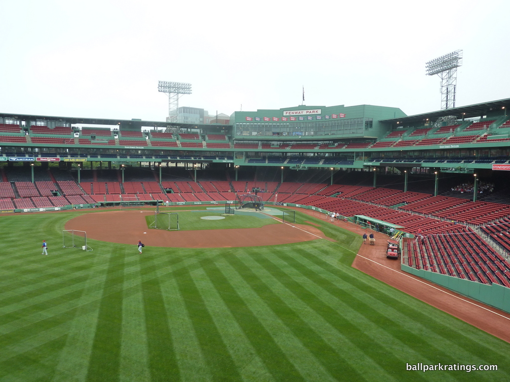
As one of the most well-known sporting venues in the world and an icon of America’s national pastime, Fenway Park is one of the most written about buildings of the 20th century. So naturally, there’s so many quirks and features to choose from here, but let’s not overthink this one. It’s the Green Monster!
The Wall dates back to 1912, but the Green Monster actually has quite a storied history. Until 1933, “The Wall” was fronted by a sloped terrace known as Duffy’s Cliff designed to handle overflow crowds, a common feature of the era. Its original function was to conceal the field from outside viewers and prevent cheap home runs.
Unlike modern ballparks with varying wall heights contrived for novelty, Fenway’s wall was born of necessity.
The Monster we know today was painted green in 1947, and remained mostly unchanged until 1999 when ads reappeared. 2002 renovations added the widely popular “Monster Seats” on top of the wall.
What I love most is how well the Green Monster has aged, as I would argue the renovations even enhanced its appeal compared to the more spartan 1947-1999 look.
The new venerable shade of swamp-like green evokes a certain timelessness of classic baseball. Attractive and distinctive, this shade of green looks faded, suggesting it’s been worn in like a comfortable old shoe. Simply inimitable.
—-Other strengths: 1) Fenway-Kenmore neighborhood, 2) Jersey Street (aka Yawkey Way), 3) Inimitable red brick façade that looks like it hasn’t been touched since the years of the Model T, 4) Exterior statues, 5) Refurbished wooden seats, 6) Various other interior quirks: (a) The Triangle, (b) The Lone Red Seat, (c) Pesky’s Pole, 7) Classic ticket booths filled with memorabilia, 8) Sweet Caroline tradition, 9) Excellent fan support, 10) 2000s renovations were in keeping with the park’s classic image: two upper level clubs, suites, patio seating, Green Monster seating, and even the kids’ area somehow look like they belong
-Worst Feature: Various Sightline Issues
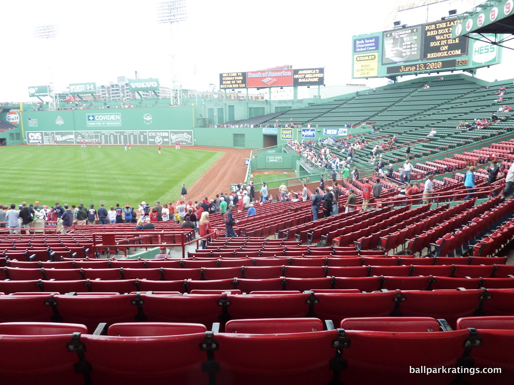
The Fenway Park vs. Wrigley Field debate is a fun one—I probably lean more toward Wrigley, although I’m not firmly on one side, and it’s a totally subjective exercise—but I think Wrigley is certainly a better place to actually watch the game.
Not only are Fenway’s seats and aisles tighter, but the bowl is rife with poorly angled seats, overhang obstructions, and other sightline (ahem) quirks.
You’re more likely to be behind a pole at Fenway. You’re more likely to have your view obstructed by the overhang due to the deeper lower bowl. Your views aren’t properly oriented toward home plate from outfield sections 37-39. But most of all, the seating geometry down the right field line is horrific, with 1000s of seats oriented past center field. Fans have to contort their neck a healthy 90 degrees to see the action, with the added insult of blinding sun in their face.
Yes, the seats around the infield are some of baseball’s closest, and yes, some quirks are what make Fenway Fenway, but these are serious deficiencies beyond just tourists wining about bathroom lines.
—-Other weaknesses: 1) Forget “360-degree concourses”: serpentine concourse walkways are so difficult to navigate you’ll have trouble making it 100 feet, 2) Concourses are among the most constrained in baseball, 3) Narrowest seats in baseball, 4) Narrowest seating aisles in baseball, 5) Craft beer selection and quality needs improvement, 6) Red Sox Hall of Fame plaques can only be seen by premium ticket holders and those on ballpark tours
DODGER STADIUM (1962), LOS ANGELES DODGERS: N/A
Consensus Ranking: Top 10
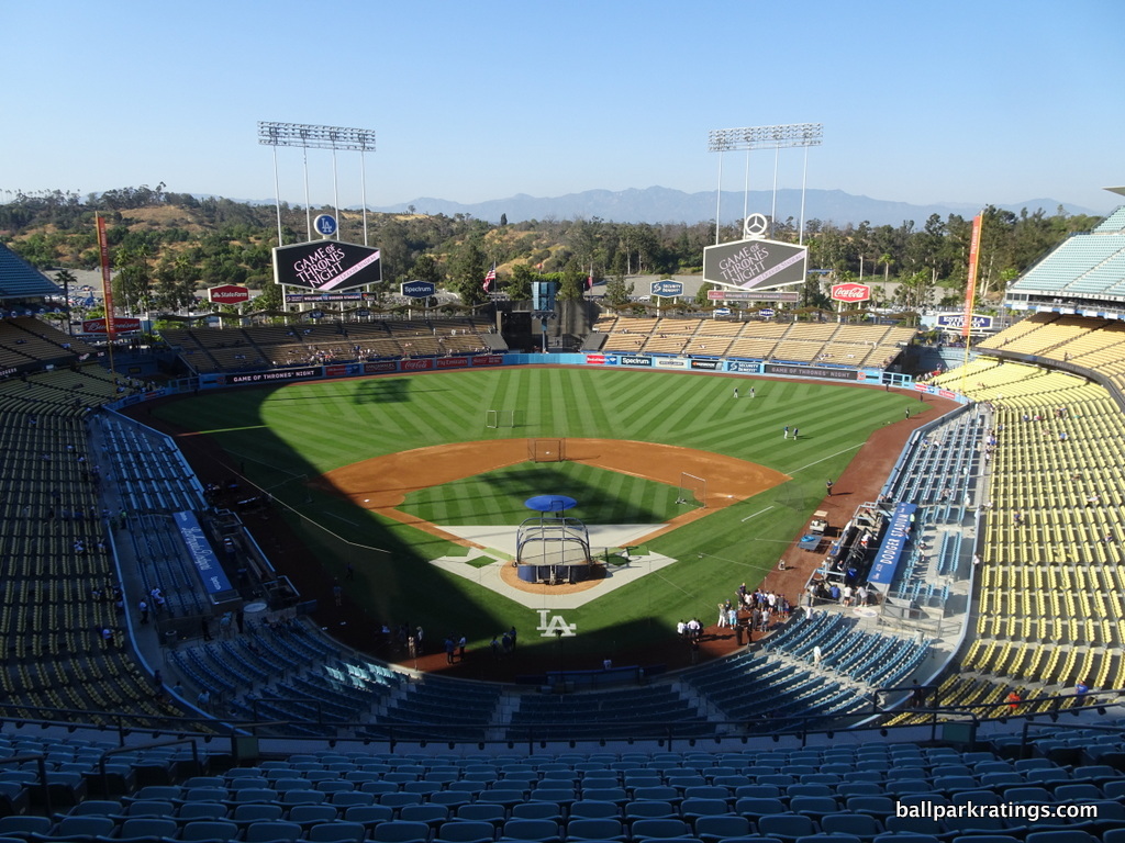
-Best Feature: Gorgeous Interior Aesthetics With Flavorful Seating Color Scheme
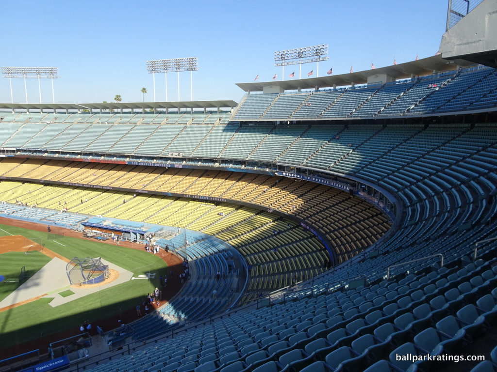
Dodger Stadium is a tricky ballpark to categorize, as it’s only slightly more inappropriate to compare it to any post-1990 ballpark (new or renovated) than it is to compare it to Wrigley Field or Fenway Park.
However, judging by the park’s aesthetics and its place in American baseball history, Dodger Stadium stands alone as the Wrigley/Fenway of the 1960s mid-century modern style, as parks like Kauffman Stadium and Angel Stadium have been complicated by renovations that compromised aesthetic integrity for amenities and kitsch.
In the retro era where most new ballparks copied Camden Yards’ green seats, Dodger Stadium’s restored pastel color scheme reflecting the natural landscape stands out.
Conceptualized by Walter O’Malley, the Top Deck is light blue reminiscent of the ocean and skies surrounding Los Angeles, the Reserve Level is a sea foam green representing the foliage around Dodger Stadium, the Loge Level emulates the light orange hue of Santa Monica’s sandy beaches, and the Field Level’s yellow shade screams sunny Southern California.
Couple that with the natural earth tonality beyond the outfield, and you have beauty that rivals the best of the jewel box parks (Wrigley) and the best of the “new” ones (PNC in Pittsburgh/Oracle in SF.).
—-Other strengths: 1) Mid-Century Modern exterior architecture, 2) Stunning exterior landscaping, 3) Underrated views of San Gabriel Mountains that rival any view in baseball, 4) Excellent sightlines, 5) Open main and loge concourses, unusual for the era, 6) Accessible suite level allows all fans to explore historical memorabilia, 7) 2020 renovations in the outfield (which fans have yet to see) are supposed to put Dodger Stadium’s functionality and amenities on par with the best: (a) improved navigability of concourses and ingress/egress from outfield to other areas, (b) new Centerfield Plaza includes upgraded food offerings, numerous social spaces, open-air bars, and beer gardens, (c) Two climate-controlled, destination sports bars looking into bullpens, (d) “Legends of Dodger Baseball” plaques, (e) Sandy Koufax statue and relocated Jackie Robinson statue, (f) new kids’ area, etc.
-Worst Feature: Abysmal Accessibility with Crippling Traffic
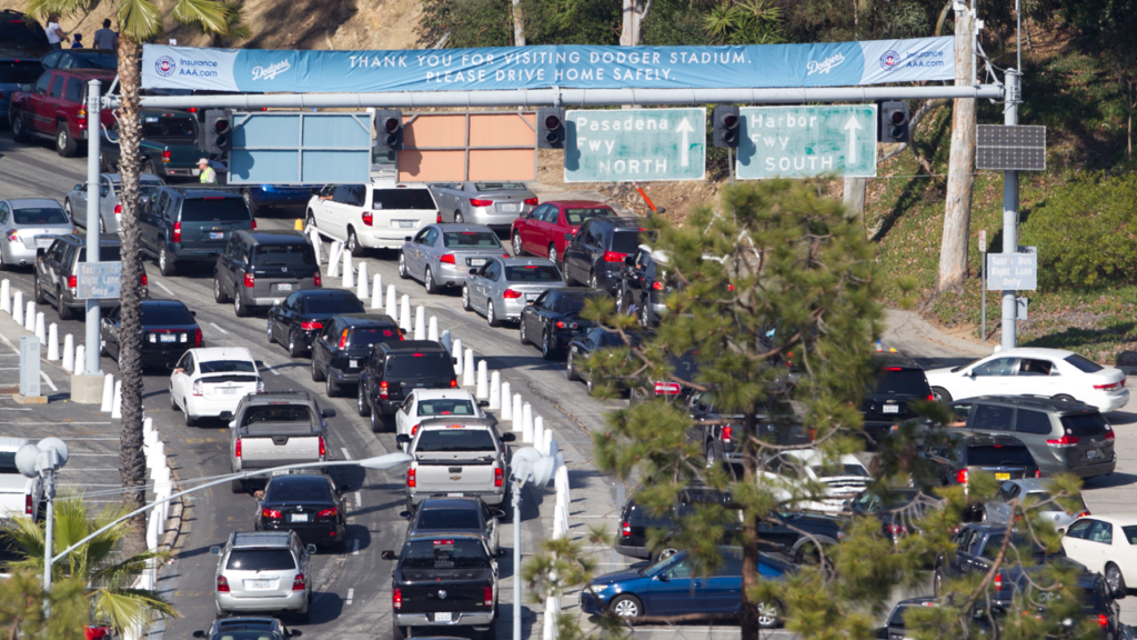
It’s hard to overstate Dodger Stadium’s parking and traffic issues. With its puzzling system of ingress/egress and constantly congested surrounding roads, getting to and leaving Dodger Stadium is such a hassle that it serves as a deterrent from even coming here in the first place. I wouldn’t say that about any other MLB stadium drawback, so perhaps this is the worst feature of any park!
You’ll commonly hear stories about being a couple of miles from the stadium an hour before game time and getting there in the 3rd inning. Ask ballpark aficionados who have been here 2 times or 20 times and compared it to the other 29 MLB stadiums and they’ll all have a similar story: Dodger Stadium’s accessibility is worse beyond compare.
This is obviously exacerbated by Dodger Stadium’s lack of “walkability.” Separated from the city center with no bars, restaurants, or shops in the vicinity, all fans arrive by vehicle.
—-Other weaknesses: 1) Ugly black batter’s eye is only aesthetic blight on the beautiful interior, 2) Largest seating capacity in baseball doesn’t exactly make for intimate vibe, 3) Understandably narrow concourses given the era. [Renovations are supposed to remedy some other drawbacks I’d list, so I’ll hold off on naming any more weaknesses that existed pre-2020.]
Now onto the 27 that are ranked and rated with best and worst feature! In the longer piece, I did divide these by tiers, because there’s a wide chasm between, say, #25 and #24. So, note the rating.
27) RingCentral Coliseum (1966; 1995-96 RENOVATION), OAKLAND ATHLETICS: 40.5/100
Consensus Ranking: Bottom-2
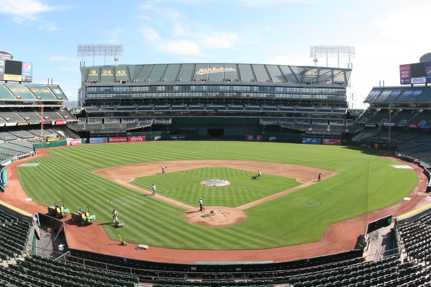
-Best Feature: Food Trucks in Championship Plaza

I used to say that the multipurpose Oakland Coliseum veers into my dreaded “I’d rather not come back here” territory, with its only redeeming qualities being: (a) people play baseball here, and (b) it is an open-air stadium with natural grass. By virtue of the latter, it’s not as ugly as the dome in Tampa, but that’s about it.
After the Athletics made some minor tweaks to the gameday experience in 2018-19 with the Raiders leaving again, that assessment is a tad unfair.
Oakland Coliseum’s nightmarish industrial local scene and comparative lack of frills are two of its (many) problems, but the Athletics took a small step in remedying both of those issues by adding food trucks in Championship Plaza.
The formerly barren plaza is overflowing with imaginative concepts, ranging from burgers, BBQ, and Mexican to Japanese, Mediterranean, and even Nepalese. They rotate—so it really depends on what game you attend—but it’s a fantastic concept.
The food trucks will not be present at the beginning of the 2021 season, but the Athletics anticipate that they will return when Covid subsides. Again, I’m operating under the assumption that ballpark operations will get back to normal eventually in this piece, so Oakland’s food trucks definitely get the nod.
—-Other strengths: 1) “The Treehouse” social space, 2) Craft beer game is respectable, 3) When they show up, A’s fans are a lively bunch, 4) 2019 enhancements added new premium loge boxes and a kids’ area. Yeah, I’m reaching. Hey, at least baseball is played here!
-Worst Feature: Mount Davis
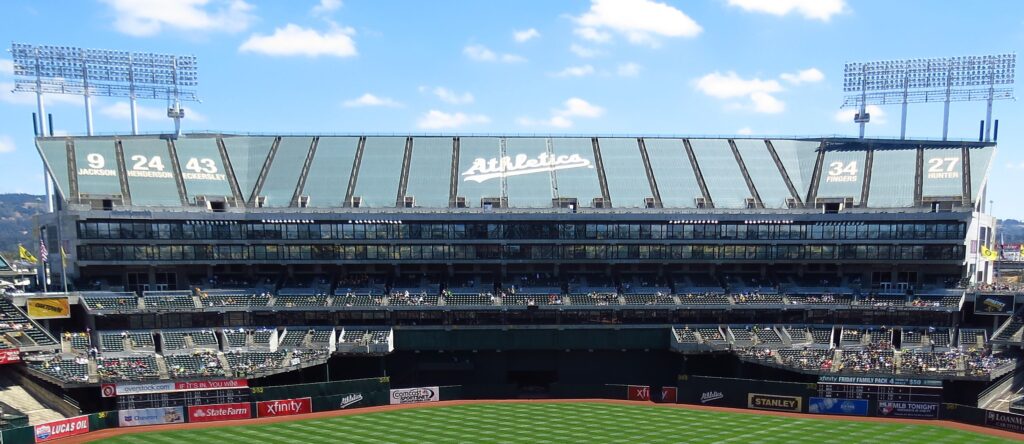
Oakland Coliseum’s infamous sewage problems are the low-hanging garbage, but since we’re talking aspects that impact the fan experience on a consistent basis, I’ll go with the other obvious choice: Mount Davis.
As you can read below, there’s plenty to choose from, but the Coliseum’s negative perception started with the construction of 20,000 seats on the third level in the outfield. Built to the tune of $220 million with the intent of luring the Raiders back to Oakland in 1995, the gargantuan monstrosity known as Mount Davis was roundly criticized for obstructing views of the Oakland Hills and destroying the park’s intimacy.
Oakland ended up with a mediocre football stadium and MLB’s worst stadium, and the Raiders left yet again after 2019. Worst $220 million ever spent!
—-Other weaknesses: 1) Dilapidated industrial location is one of baseball’s worst, 2) Brutalist exterior architecture makes for a charmless concrete monstrosity that rivals Tropicana Field for baseball’s worst, 3) Largest foul territory in baseball puts seats far away from the action, 4) Narrow, dark concourses, 5) Tight, aging seats with many lacking cupholders, 6) Inconveniently located videoboards for baseball, 7) Mediocre food quality and selection other than outside food trucks, 8) Despite 2018-19 enhancements, not very many bars and social spaces, 9) Outdated to nonexistent premium seating, 10) Few historical references to storied Athletics franchise, a far cry from the museums and concourse memorabilia at other parks, 11) Poor attendance numbers
26) TROPICANA FIELD (1990; 1998 RENOVATION), TAMPA BAY RAYS: 52.5
Consensus Ranking: Bottom-2
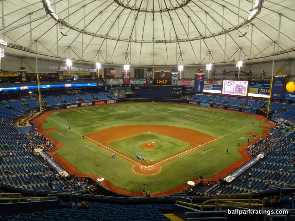
-Best Feature: Ted Williams Museum and Hitters Hall of Fame
If you don’t consider the unsightly visuals or lackluster fan atmosphere, Tropicana Field’s gameday experience is actually decent. Sure, it doesn’t have the amenities of the best ballparks, but they are competitive. Moreover, the Rays organization has generally been diligent in upgrading the creature comforts from year to year.
Early on, you should know that I love ballparks with museums and historical memorabilia. Baseball is an inherently historical game and such references make the “mallparkification” of so many ballparks just a little bit more palatable. In terms of those “extra amenities,” what better way to cultivate a unique ballpark atmosphere than by celebrating baseball history?
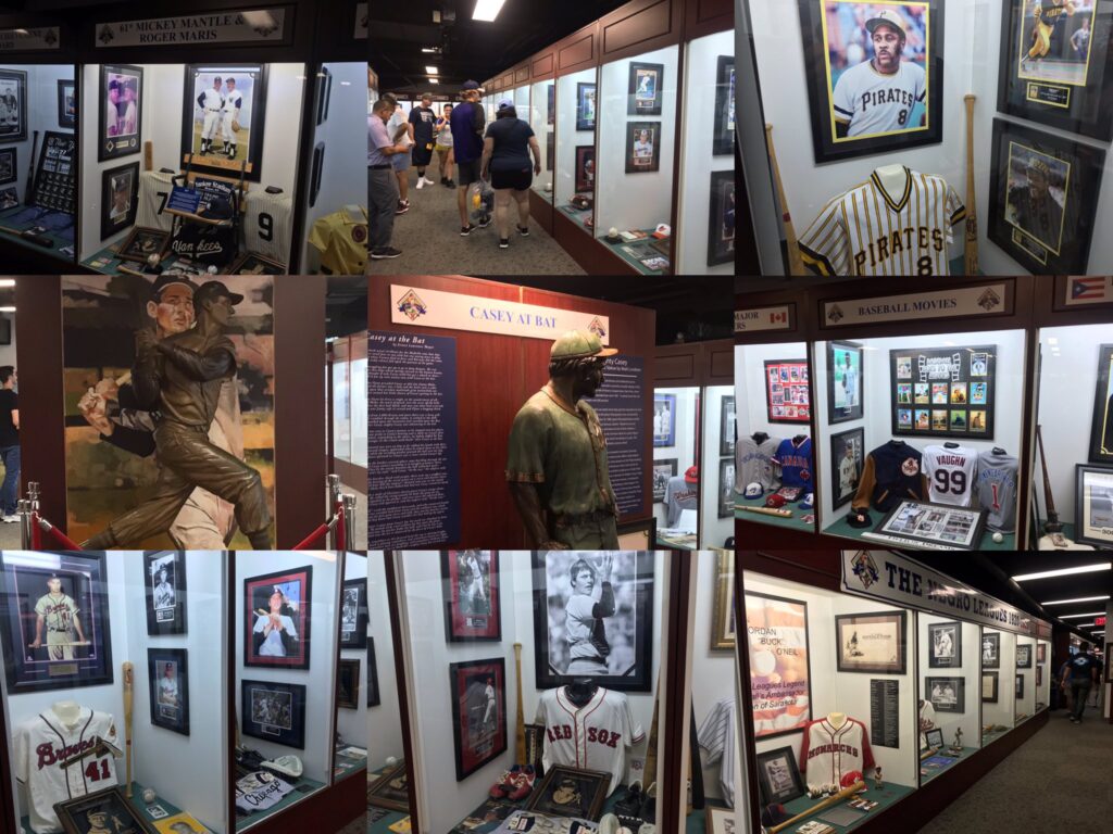
It may not directly relate to Tampa Bay Rays history, but the Ted Williams Museum and Hitters Hall of Fame is one of the best.
The museum houses memorabilia from Ted Williams’ careers with the Boston Red Sox and with the United States Marine Corps. It also has monuments to the members of the “Hitters Hall of Fame” with memorabilia and a movie theatre. Four statues appear throughout the museum, including one of Wade Boggs, one of Casey at the Bat, and two of Ted Williams (one fishing and one playing baseball).
Even before Covid, the museum was downsizing with the expectation that Tropicana Field will close in 5-7 years, so see it while you can!
—-Other strengths: 1) Ceramic mosaic tile adorned with Floridan fishes creates memorable entrance, 2) Centerfield Rotunda, 3) Respectable food selection and quality, 4) Top-10 craft beer scene, 5) Excellent array of bars and social spaces: (a) Budweiser Porch in center field, (b) full-service Outfielder Bar and Grill, (c) family-friendly Ballpark & Rec, 6) Rays Touch Tank, 7) Friendliest gameday staff I have experienced
-Worst Feature: Baseball’s Only Stationary Dome Creates Drab Interior and Exterior Aesthetics
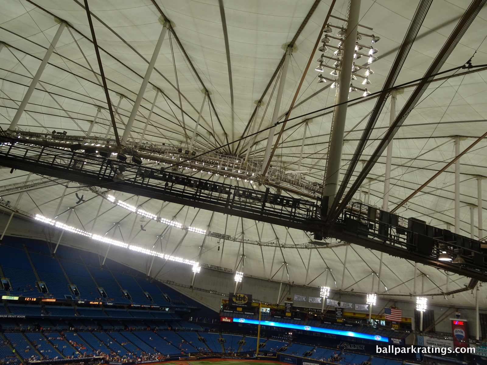
This one’s pretty self-explanatory. Inside, you’re in an enclosed, dreary, windowless dome with catwalks above and artificial turf below. Visually, you’d have no idea where you are, which is a real bummer on a pleasant sunny day in Florida.
Outside, the exterior doesn’t even have the brutalist architectural principles of an Oakland Coliseum, in what could only be called utilitarian. The dreary, off-white façade looks like a Walmart distribution warehouse.
Tropicana Field isn’t the worst MLB ballpark, but sorry Rays fans, it is the ugliest!
—-Other weaknesses: 1) Out-of-the-way location for Tampa residents, 2) Immediate local scene is weak, even if it gets better a couple of miles away, 3) Plastic-looking exterior façade, 4) Catwalks, 5) Artificial turf, 6) Upper deck seats no longer sold makes ballpark feel even more empty and takes away affordable tickets, 7) Outdated videoboard, 8) Many seats lack cupholders, even some in the lower bowl down the lines and in the outfield, 9) Seats at the back of the lower bowl suffer from overhang obstructions above, 10) Woeful attendance numbers create depressing atmosphere
25) ROGERS CENTRE (1989), TORONTO BLUE JAYS: 56
Consensus Ranking: Bottom-5
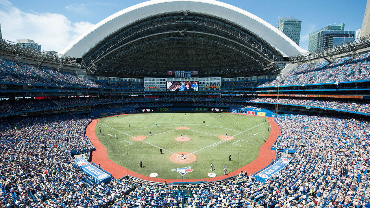
-Best Feature: Hotel in Center Field
When Rogers Centre (née SkyDome) opened in 1989, it was a modern marvel. A retractable dome that works! McDonald’s in a stadium! A Hard Rock Café! Fancy restaurants with field views! A hotel in center field! The world’s largest video screen! A record number of luxury suites! Millions of dollars of art!
After Camden Yards ignited a movement toward baseball-only “retro” ballparks in 1992, the multipurpose Rogers Centre became widely regarded as “just another stadium” at an alarmingly hasty pace.
All of those features have either aged poorly or now lie dormant, or they have been better executed elsewhere. Rogers Centre’s hotel is the exception.
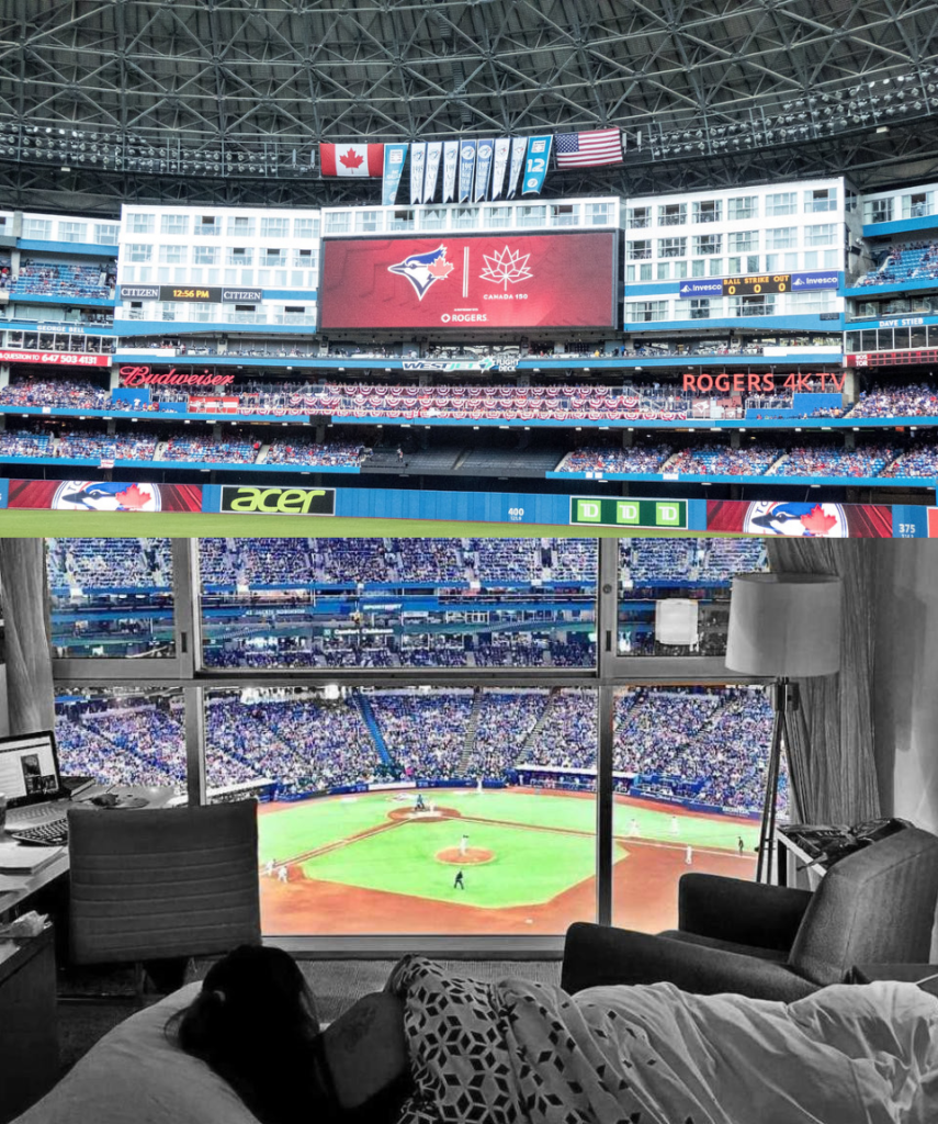
While other parks may have hotels in the area where you can see the game, Rogers Centre’s 348-room hotel is the only one inside of the park, with 70 rooms directly overlooking the field. Rooms with a view are a good deal too. Averaging $500 USD a night, that’s way cheaper than renting a stadium luxury suite, and you get to bring your own beer and sleep there!
Sure, some say Rogers Centre’s hotel is a bit overhyped—the Marriott property itself is unremarkable and without baseball references—but it’s still the only hotel within a stadium in the world. Watching a Jays game from a room is surely on stadium enthusiasts’ bucket list.
—-Other strengths: 1) Centralized location near downtown in one of the world’s greatest cities, 2) Massive gargoyle sculptures protruding out from the exterior façade are cool, 3) Main concourse open to the field, not an established feature in 1989, 4) Glimpse of the CN Tower when the roof is open, 5) Regardless of what you think of Rogers Centre as a ballpark, it’s still a globally recognized icon of Toronto’s skyline
-Worst Feature: Worst Food and Beer Quality and Selection in Major League Baseball
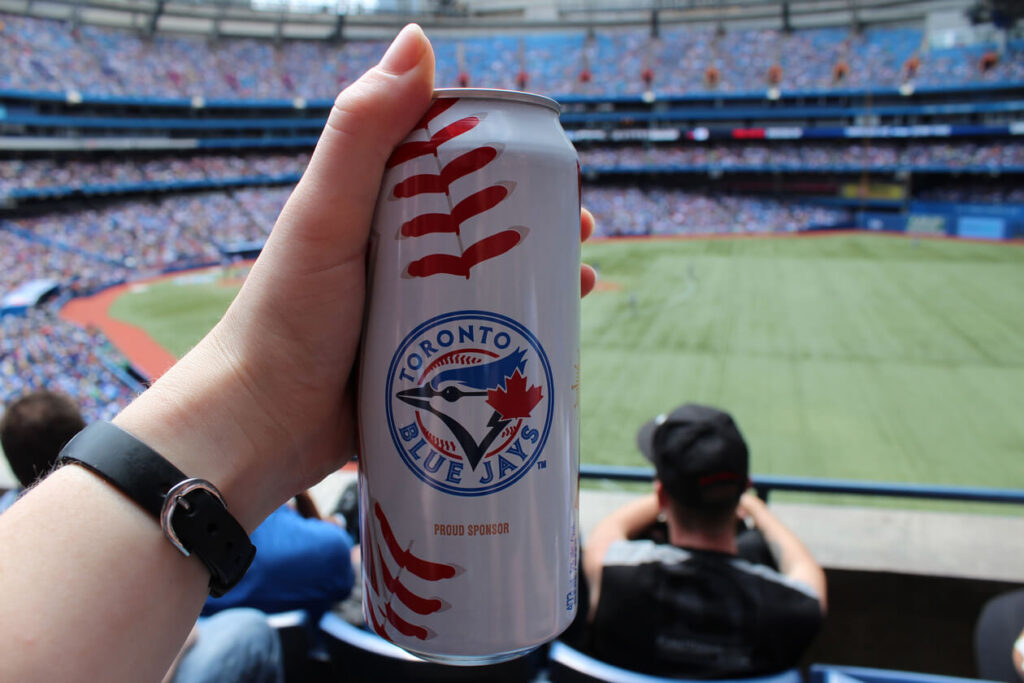
While I don’t think it’s quite fair to compare Toronto’s signature venue to the two consensus “bad” ballparks in Oakland and Tampa, many would cite Rogers Centre’s drab interior visuals, charmless exterior concrete, multipurpose functionality, or various logistical deficiencies as reasons for poor reviews.
That’s all true, but I want to explore something different in this space.
With millions of dollars invested in improving the fan experience at the laggards above, something that hasn’t happened to the same extent here, one could make the argument that Rogers Centre’s fan amenities are the very worst in baseball.
That’s most apparent looking at Rogers Centre’s food and beverage department.
Now understand, stadium grub improved dramatically in general throughout the 2010s. No venue serves only stale hot dogs and cracker jacks anymore—indeed, Muddy York Market still has some decent cuisine and the Montreal-style smoked meat sandwich is a must—but Rogers Centre lacks the varied, high-quality local fare seen throughout Major League Baseball.
I have the grub dead last a hair, but I’m sure Jays fans will say you can find some good items, because you can at every park. But Rogers Centre’s craft beer game is even worse, far below any other MLB park. Following national trends, suds from local breweries have exploded across baseball, but that’s almost totally lacking at Rogers Centre. It’s a shame because Toronto has a strong craft beer scene.
—-Other weaknesses: 1) Bleak, grey concrete exterior architecture, 2) Dark, hermetic interior aesthetics compared to modern retractable roof ballparks, 3) Artificial turf, 4) Anti-septic, mall-like concourses, 5) Multipurpose functionality with poor sightlines for baseball, 6) With two separate suite levels and a separate mezzanine, the upper deck is perhaps the farthest from the action in baseball; it’s certainly the steepest, to the point that rails are required in each row, 7) Very narrow seats with most lacking cupholders, 8) No escalators or stairs to get to the upper deck, 9) Few modern destination bars and social spaces on the concourses, 10) Outdated premium seating model with a glut of unsold luxury suites, 11) Almost no historical memorabilia referencing baseball or the Toronto Blue Jays, behind even Oakland in this category, 12) Kids’ area is fairly weak for an MLB ballpark
24) ANGEL STADIUM OF ANAHEIM (1966; 1980 and 1998 RENOVATIONS), LOS ANGELES ANGELS: 66
Consensus Ranking: Bottom-10
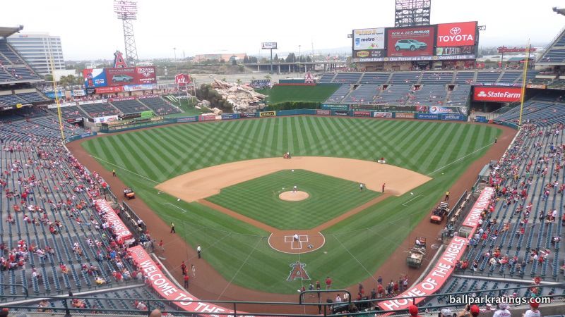
-Best Feature: Represents Financial Prudence
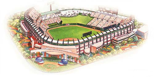
Ok, so this seems like a cheap backhanded insult, but I found Angel Stadium to be the most difficult ballpark to pick a significant “best feature” worth discussing.
What’s the first thing you think of when you think of Angel Stadium? The grand entrance flanked by those goofy oversized hats and bats? The contrived rock pile geyser that, quite understandably, screams “Mickey Mouse”? The iconic Big A, which would be the best feature if it was not sitting far away in the parking lot? The Rally Monkey? Beach balls?
At the same time, there’s nothing truly inadequate about the place like with the three outdated stadiums outlined above. It’s below average in just about every facet, and the cumulative effect of that leads to a wholly unmemorable experience, but you’ll have a pleasant enough time.
No, Angel Stadium mostly stands out for being one of the few relics of the mid-20th century to be renovated rather than replaced during the post-1990 ballpark-building boom. With 22 new MLB ballparks opening from 1991 to 2012, two of which have already been replaced (!), the city of Anaheim saved hundreds of millions of dollars renovating Angel Stadium for only $118 million.
So, the Angels don’t play in the flashiest of facilities, and I don’t think it even compared well in the late 90s upon reopening, but taxpayers can be thankful for the cost savings at a time when local governments across the country were getting boondoggled.
—-Other strengths: 1) New videoboards are massive and informative, 2) Courtyard plazas flanking the 100-level concourse are spacious and attractive, 3) With the club level and suite level combined, the upper deck is comparatively close to the action, 4) Proximity to Disneyland is surely a plus for the kids, 5) Say what you will about Angels fans, but Anaheim’s attendance numbers have historically been outstanding and perhaps the most inelastic to team quality other than the Yankees
-Worst Feature: Total Lack of “Wow Factor” On Any Level
On the flipside, it’s genuinely hard to find one singular “worst feature” that’s significant enough to discuss, either!
Again, nothing is inadequate, but almost everything is below average. This mostly stems from the fact that the 1997-98 renovations which “Disneyfied” the ballpark didn’t go far enough. The ballpark’s functionality is still littered with underlying design flaws as well, with many remnants of the old 1980s football version apparent inside and out.
Moreover, in now rather stark contrast to other 1990s ballparks, Angel Stadium hasn’t been as properly maintained and enhanced since 1998, translating to poor amenities by today’s standards.
We’ve been spoiled in the last 25 years by gorgeous ballparks with exteriors of ochre sandstone imported from India, interiors with water views, and concourses with top-shelf local restaurants, brewpubs, cigar bars, premium lounges, museums, and even nightclubs, all of which overshadow the fact that Angel Stadium is a perfectly adequate place to see a ballgame.
It just doesn’t compare well to any of the post-1990 ballparks.
—-Other weaknesses: 1) Suburban locale surrounded by parking lots is not ideal, as this is a classic “in and out” stadium, 2) Grand entrance is more of a concrete paint job plastered with gimmicks when you take a close look, 3) Rock pile geyser is too cheesy for my taste, 4) Sightlines have plenty of awkward viewing angles and overhang obstructions, 5) Main concourse is closed to the field, while the open terrace concourse is too narrow, 6) Concourse signage has a very 90s mall-like vibe, 7) Middling food and beer quality and selection, 8) Clubs, restaurants, and social spaces are dated, 9) Weakest “club level” in baseball, 10) Few Angels historical references other than a meek display on the 100-level behind home plate
23) CHASE FIELD (1998), ARIZONA DIAMONDBACKS: 72
Consensus Ranking: Bottom-5
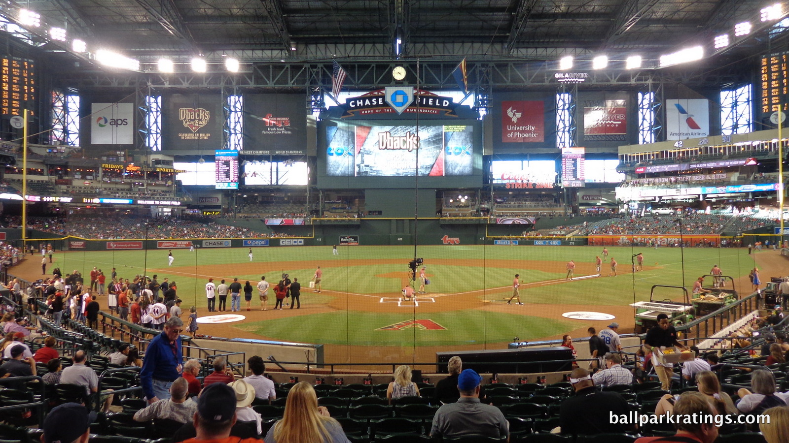
-Best Feature: Aggressively Angled Seats
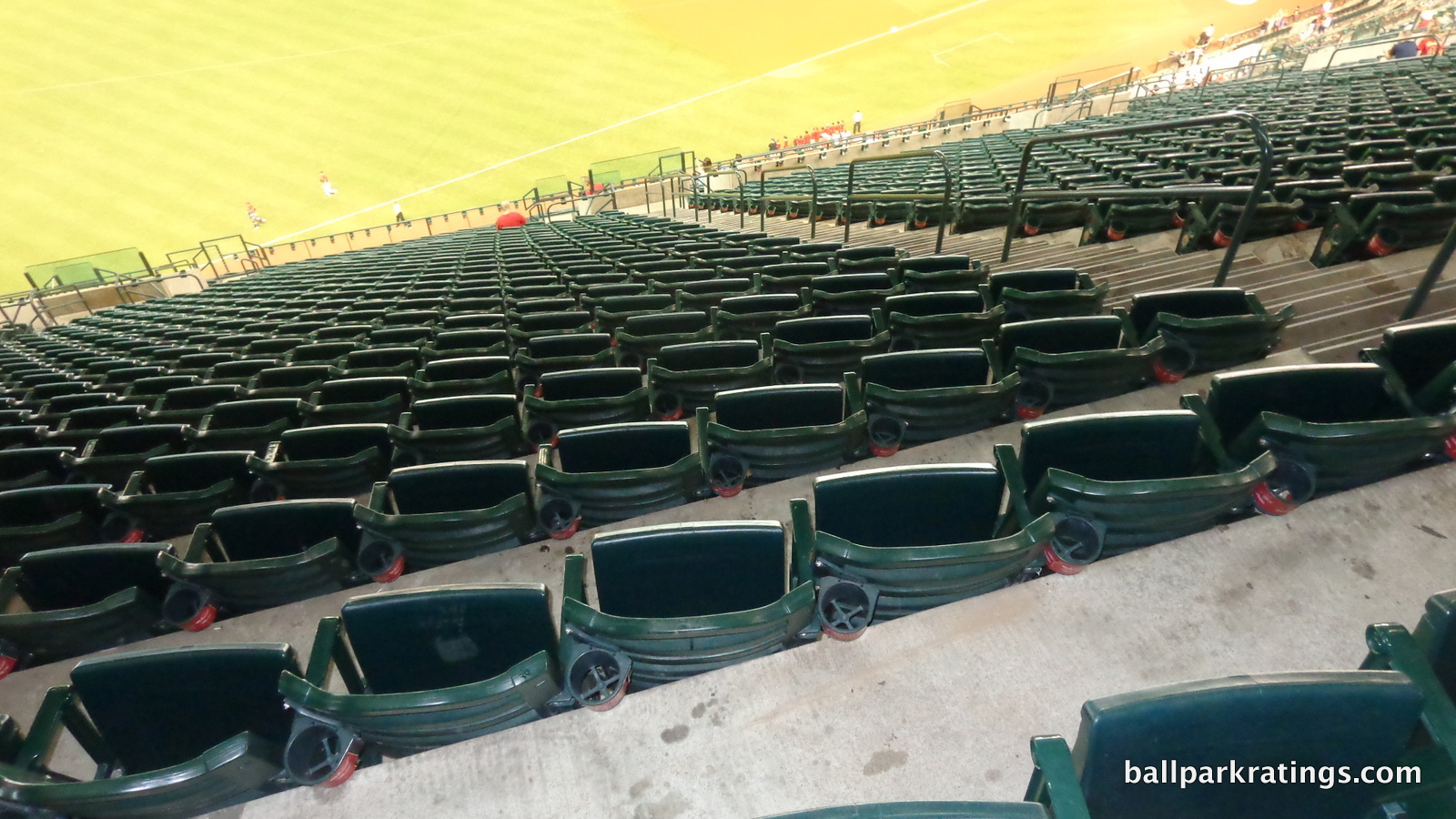
Chase Field’s pool would have been an obvious choice—it’s a neat feature even if I wish it was better integrated with the overall design—but I’m picking something more technical.
Historically, ballparks may have oriented its grandstands down the line toward the diamond, but ballparks didn’t properly orient each seat toward the infield until the mid-1990s. The seminal neo-classical park, Camden Yards (1992), has notoriously bad seating geometry. Stiff necks galore. Since roughly 1995, ballparks orient the seats toward the infield to some degree.
But at Chase Field, every single seat, even those at the ends of the dugout, is aggressively oriented toward the infield. Whether you’re sitting just past third base or way down the line, you’re perfectly positioned toward the action.
Why doesn’t every ballpark have angled seating this extreme? Well, a few others in fact do, but leg space can get awkward (aside: this is also the only MLB ballpark designed by independent firm Ellerbe Becket, not Populous or HKS, so that’s a factor). Still, it’s a noteworthy plus in my opinion. Especially in today’s era, 90% of the “action” is between the pitcher and the batter.
—-Other strengths: 1) Pool, 2) At least the outfield panels fold open unlike in New Arlington, 3) Beautiful rotunda with murals depicting Arizona’s most historic landmarks, 4) Main concourse open to the field, 5) Combined club and suite level places upper deck relatively close to the action, 6) Solid videoboard, 7) Overall, it’s a very functional venue for actually watching baseball
-Worst Feature: Feels Like Watching Baseball In A Giant Gym
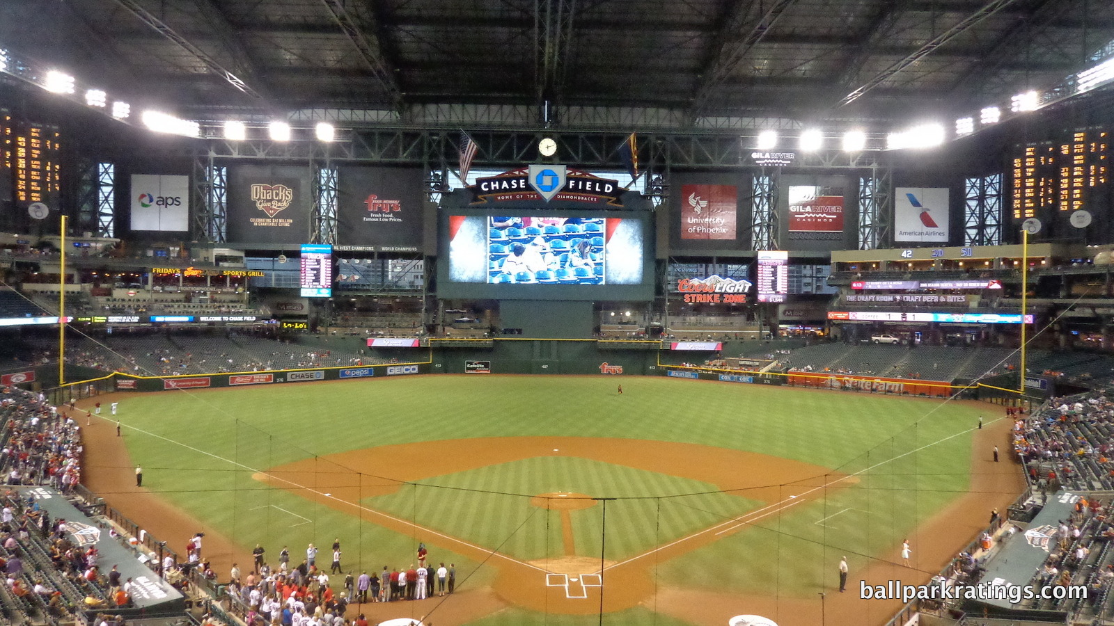
As the first baseball-only stadium with a retractable roof, Chase Field is all about pumping in air conditioning and making baseball work in the desert. Form follows function at the Diamondbacks’ home. It is probably the least aesthetically attractive ballpark of the post-1990 building boom.
Shaped like a big box or an airplane hangar, that’s particularly apparent inside. I prefer retractable roof designs where the roof retracts from a low position exposing large parts of the outfield to the elements (see Houston and Seattle), not designs where the roof simply opens at the top (here and others).
Even when the roof is open, Chase Field feels enclosed. When the roof is closed, almost no natural light is emitted into the building.
—-Other weaknesses: 1) Clashing exterior architecture, typifying an era where inevitably modern retractable roof parks also tried to be “retro”: yellow sandstone reflecting Arizona, red brick with green steel recalling the classic parks, and pragmatically sharp glass all add up to a jumbled look, 2) Mall-like concourses, 3) Massive upper deck, 4) More foul territory than usual, 5) Pedestrian food and beverage quality, 6) Poor craft beer, 7) Aging restaurants and premium spaces
22) American Family Field (2001), MILWAUKEE BREWERS: 74
Consensus Ranking: Lower-Middle Tier to Bottom-10, High Variability
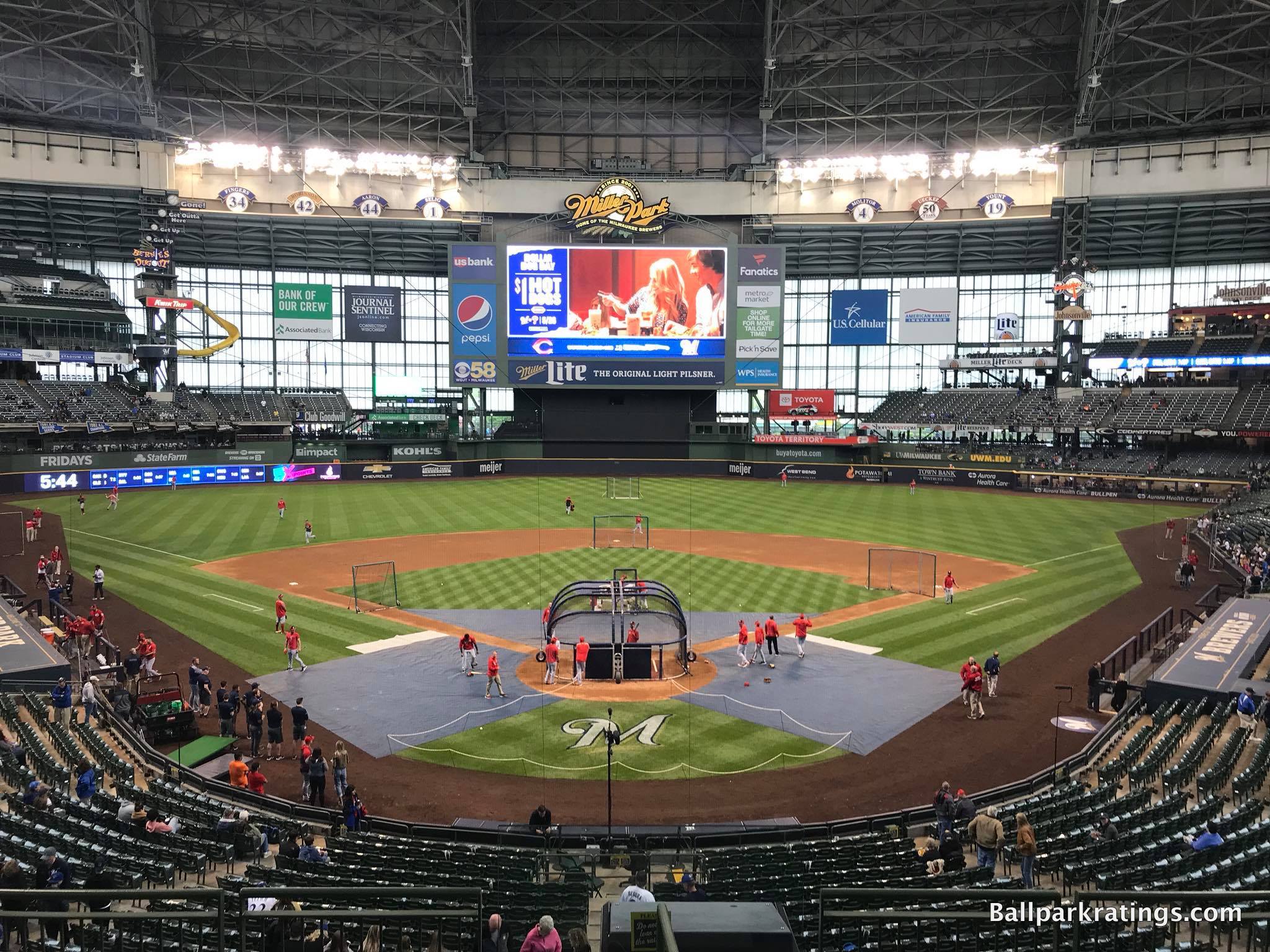
-Best Feature: Distinctive Milwaukee Vibe
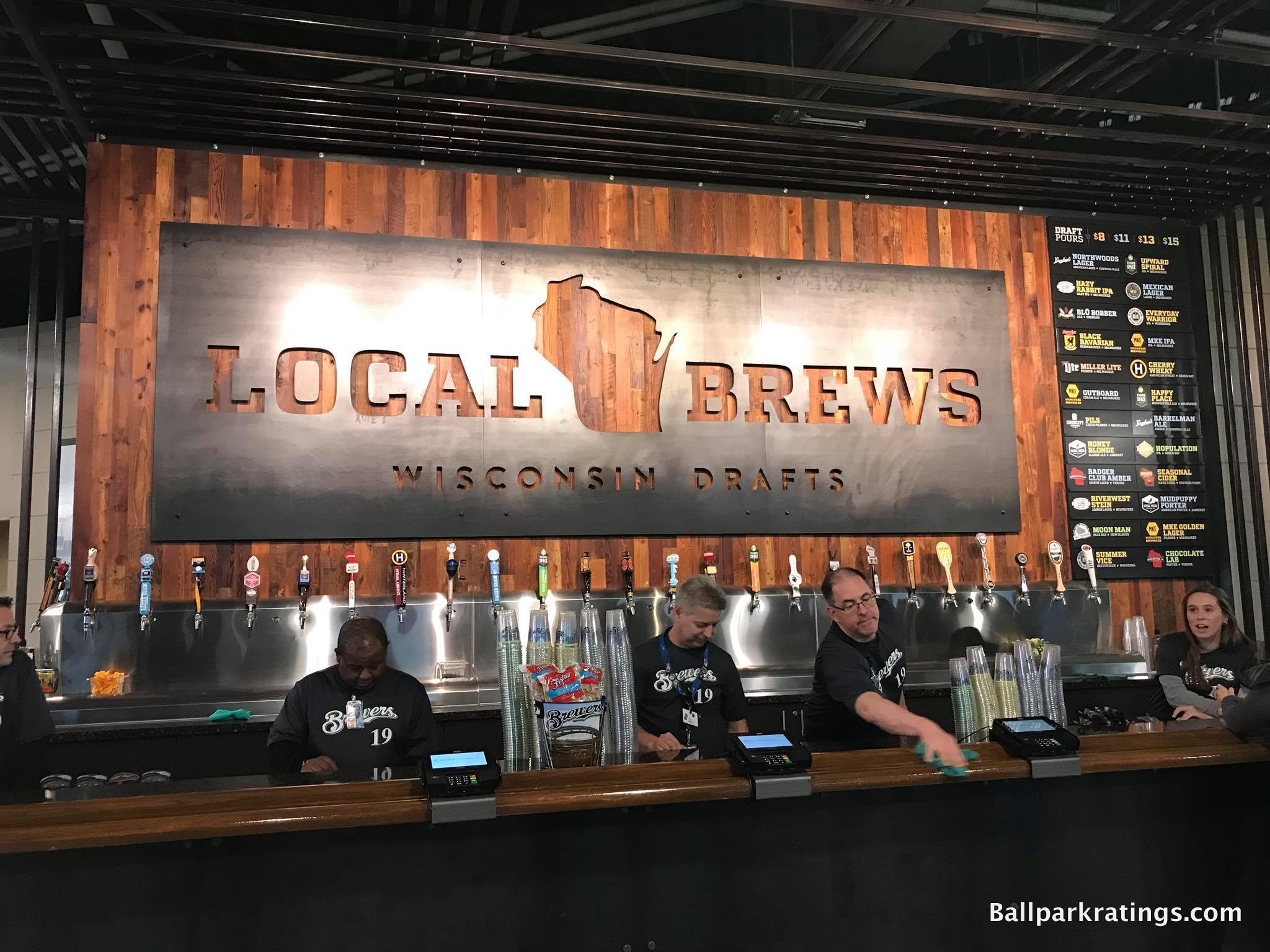
The interior visuals don’t let you know where you are, and the architectural materials don’t reflect the city, but the venue formerly known as Miller Park has always possessed that indelible Milwaukee sensibility.
This makes sense because Milwaukee itself is quite a distinctive midwestern city, heavily influenced by its German heritage and renowned for its unique brewing culture.
Miller Park is the only MLB ballpark where brats outsell hot dogs. It’s the only MLB ballpark where you could argue a non-urban location is desirable due to the tailgating tradition. The food is locally inspired, with quirky items like Wisconsin Cheese Fry on the menu. The beer is increasingly regional, with exceptional Milwaukee breweries on tap. Numerous ballpark traditions, notably the Famous Racing Sausages and the Beer Barrel Polka, are one of a kind. The friendly gameday staff makes Miller Park feel like a “Mom and Pop” run ballpark too.
And then there’s the passionate fans. Despite playing in MLB’s smallest market and never winning a World Series, the Brewers’ attendance numbers are consistently strong.
I may not be a fan of Miller Park as a structure, but its various features and traditions (though not its architecture) reflect Milwaukee, and passing the “Where Am I?” test is a crucial part of creating a good ballpark. Miller Park passes spectacularly.
—-Other strengths: 1) Best tailgating scene in baseball, 2) Architecturally novel structure, 3) Recently redesigned concourses, 4) Massive footprint means little crowding, 5) Great local food options, 6) Some of baseball’s best draft beer selections (recently improved) 7) Unique Bob Uecker statue at the top of the upper deck (!) 8) Old-school outfield “Stadium Club” is one of the last of its kind in MLB yet doesn’t feel that dated, 9) Robust fan support, 10) Extensive kids’ activities
-Worst Feature: Upper Deck Pushed Back Too Far From Field
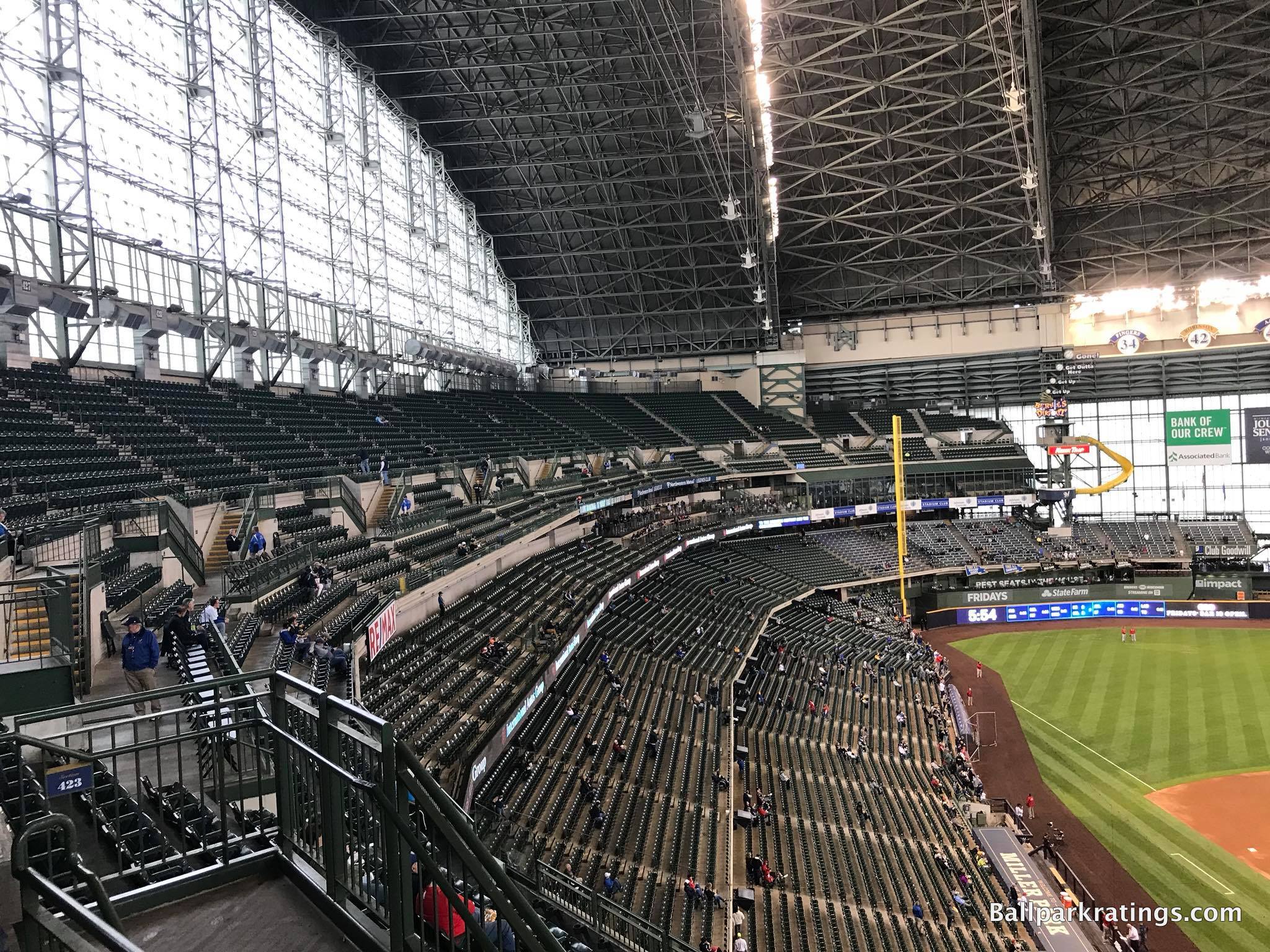
While my assessment of Miller Park isn’t likely to cause controversy among those who have actually been to all 30 stadiums, this might be the most controversial placement on my entire list from the viewpoint of a ballpark’s home fans. If you took a poll, Miller Park has among the highest satisfaction rate among local fans, right up there with universally acclaimed parks in Baltimore, San Francisco, and Pittsburgh.
Unfortunately, we’re comparing ballparks, and I just don’t see how Miller Park compares well.
I don’t like the pedestrian interior visuals even when the roof is open. I don’t like the red brick exterior architecture and massive profile that screams “small town trying to be prime time,” out of place for the non-urban setting, city, and roof technology. I don’t like roof itself, which resembles a space vulva. But the seating bowl deserves particular attention.
Poor field proximity from the upper decks is the biggest flaw of the “new” post-1990 ballparks. As has been discussed over and over again, the average fan is pushed farther away compared to the classic parks.
All post-1990 MLB venues are not ideal in this respect, but some are better than others. After the closing of the Rangers Ballpark in Arlington, Miller Park is the worst offender.
With four decks and little overhang, Miller Park opts for a “stepped effect,” pushing fans in the upper deck far from the action. Between the field, loge, and club level, the first row of the upper deck is horizontally 45-48 rows back from the field. In my in-depth review, I get into the weeds of how poorly this compares, but suffice it to say it’s not good.
Thinking the aesthetics are ugly is subjective, but being so far removed from the game in the affordable seats (even compared to contemporaries with seats also too far away!) is a serious objective drawback.
—-Other weaknesses: 1) Despite the vibrant tailgating scene, I still prefer an urban ballpark around attractions, 2) Interior doesn’t show off views even when the roof is open, 3) Outfield panels aren’t totally transparent when the roof is closed, unlike better contemporaries, 4) “Retro” red brick exterior doesn’t fit in the “Cream City,” much less in a parking lot or with roof technology, 5) Seating geometry is off in the right field upper deck, 6) Main concourse is difficult to navigate with many confusing diversions and horizontal discontinuities, 7) Dead, narrow space on the center field concourse is unacceptable, 8) No cupholders in the upper deck is unusual for a park of this era, 9) “Bernie’s Dugout” pales in comparison to him sliding into the beer mug at County Stadium, 10) I’m not a staunch traditionalist who objects to kids’ playgrounds in MLB parks, but why did the Brewers put the kids’ areas in the most conspicuous places possible while relegating the historical memorabilia to obscure corners of the ballpark? Better venues take the opposite approach.
21) GUARANTEED RATE FIELD (1991), CHICAGO WHITE SOX: 75
Consensus Ranking: Bottom-10
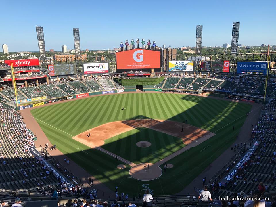
-Best Feature: Craft Kave
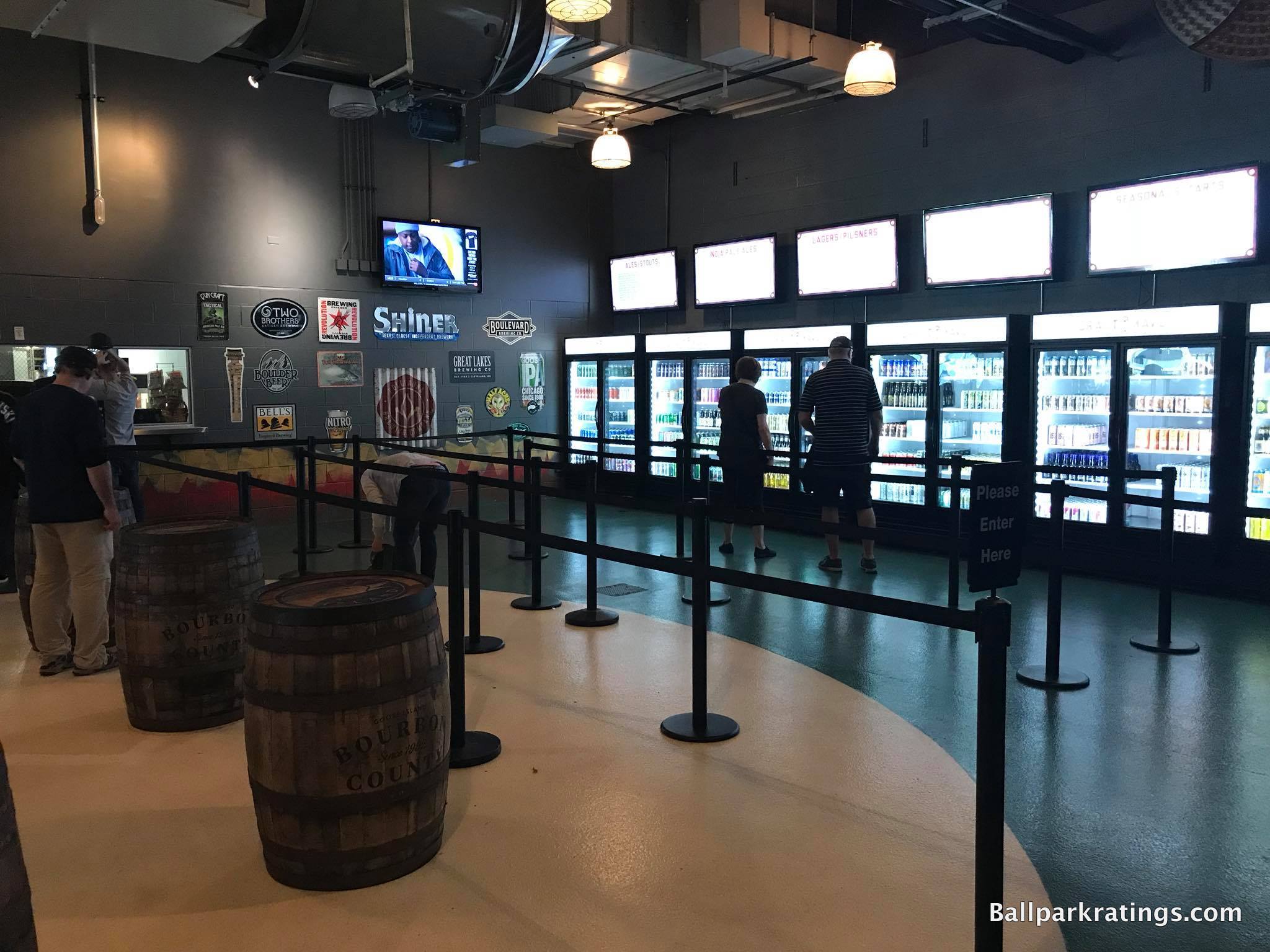
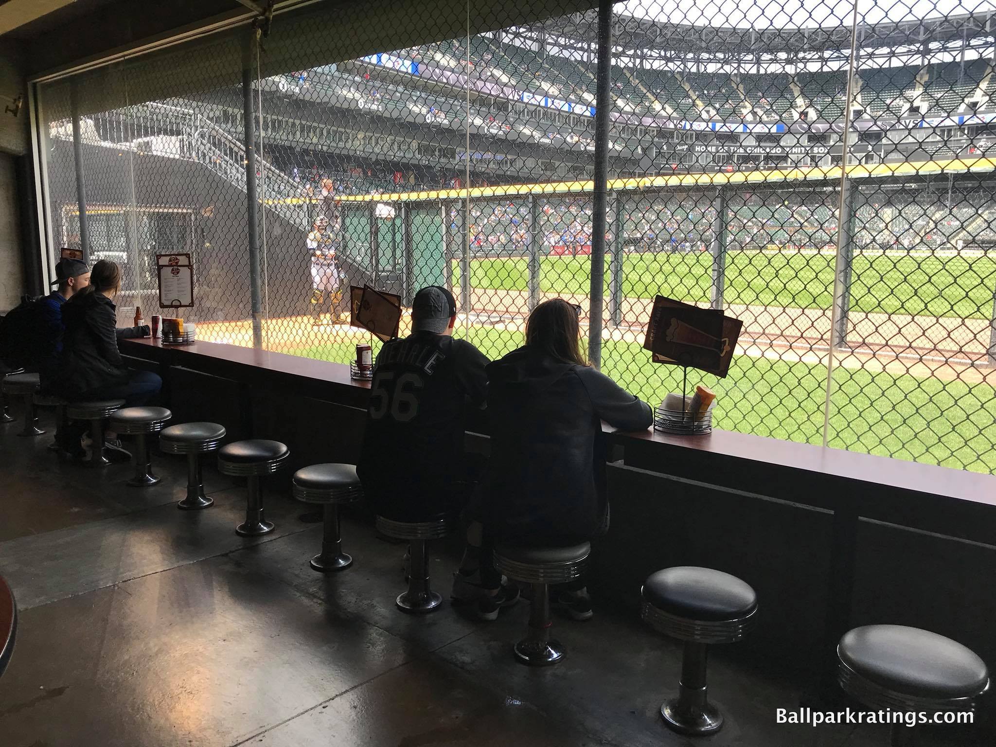
Panned as a boring, antiseptic toilet bowl upon opening, people love to rip on the White Sox park (1991), which just barely missed the retro-classic trend ushered in by Camden Yards (1992). In fact, when you look at assessments by national baseball writers and ordinary fans, you find Guaranteed Rate Field near the very bottom.
With so many respectable places to see a game, I have it in the bottom-10. But as any ballpark enthusiast will tell you, Chicago’s South Side ballpark has gotten so much better after over 20 years of periodic renovations, and I think it’s still a tad underrated.
Located at ground level in right field, the Craft Kave is certainly Guaranteed Rate Field’s highlight. As of 2019, it possessed the largest beer variety of any MLB ballpark.
Even if you’re not an enthusiastic beer aficionado (I’m not particularly), the Kave is a wonderful space to hang out. Offering a full-service menu and seats looking right into the visitor’s bullpen, this is the place to be before the game. Ticketed tabled seating is also available outside.
—-Other strengths: 1) Interior simplicity: generations of subsequent “retro” ballparks with contrived quirks tried too hard, so there’s something pleasing about the park’s symmetry, 2) Color scheme enhanced by the renovations is surprisingly flavorful, 3) Attractive batter’s eye, 4) First modern baseball-only park with main concourse open to the field, 5) Famous “Exploding Scoreboard” is not only iconic but now bolstered by premier videoboard technology as well, 6) Good food quality, 7) Considering the Craft Kave and other concessions, top-5 ballpark craft beer quality and selection, 8) Outfield statues, 9) Many restaurants, lounges, bars, and social spaces throughout the ballpark’s footprint, 10) The White Sox have the rare “Kids Zone” that actually focuses on baseball activities!
-Worst Feature: Ramps Galore Make Exploring the Ballpark A Hassle
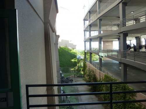
Despite renovations that dramatically improved the fan experience, there are plenty of structural issues that can’t be fixed.
With no stairs, few escalators, and elevators reserved for people with disabilities/VIPs, cumbersome ramps are often necessary for vertical circulation. Moreover, the main concourse is above street level, so ramps are required for entry into the ballpark as well unless you have Scouts Seats at field level.
For a ballpark enthusiast like myself who loves to constantly move between seating levels and explore different areas upon each revisit, this really sticks in my craw. Ramps take forever to navigate.
The Craft Kave’s location best illustrates this headache. Guaranteed Rate Field’s best feature down low in the right field corner is only accessible by ramps, so if you’re sitting in any of the upper levels, you’re in for a good 10-minute hustle back and forth. For me, the White Sox park congers up memories of running up and down ramps!
Sporting venues that opened a mere year after GRF greatly improved accessibility.
[Significant aside: Officially, upper deck ticket holders are restricted to that level, meaning they can’t explore other areas of the ballpark. This is the single most fan-unfriendly policy in Major League Baseball. However, that rule was not enforced throughout the 2019 season, so I’m giving the Sox a pass for now.]
—-Other weaknesses: 1) Location surrounded by parking lots gives Guaranteed Rate a “suburban” feel, 2) Neighborhood isn’t the absolute worst, but this is not a vibrant local scene, 3) Exterior and interior architecture has little pretense of being aesthetically attractive, 4) Not much about the place says “Chicago,” 5) Steep upper deck far removed from the action with poor use of cantilevers, even if it’s not quite as bad as initially received and renovations lopped off the highest seats, 6) Outfield statues. Yes, this is both a plus and a minus. 9 statues are overkill, and the artistic execution is hit or miss. And the choices don’t even make sense. How do you exclude Luke Appling, Eddie Collins, and Shoeless Joe but have a space for all of these middling modern players? 7) Outdated premium areas, 8) Poor attendance numbers compared to other cities’ second teams
20) Globe Life Field (2020), Texas Rangers: TBD
Consensus Ranking: TBD
Note: Based on an extensive tour of the site and attendance at two 2020 NLCS games, I reviewed Globe Life Field last year. This ranking is secure at #20 (it will rate somewhere in the 76-79 range), but I’m holding off on assigning a formal “rating” until after Covid.
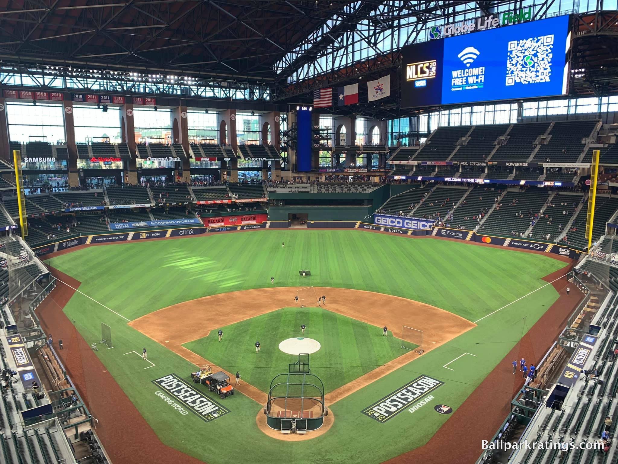
-Best Feature: Rangers Branding
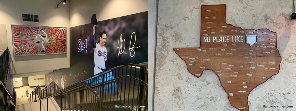
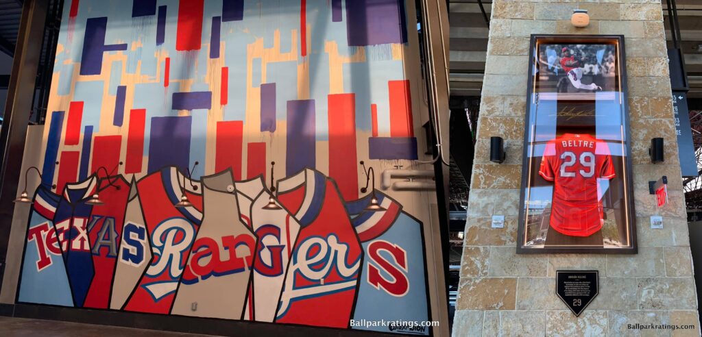
Dampened by the Covid pandemic, ballpark aficionados and Rangers fans alike probably didn’t get a look at Globe Life Field in its opening year. While my review is peppered with caveats about the inability to glean the full “ballpark experience” for obvious reasons, I am sorely disappointed in the structure. That has nothing to do with Covid.
While more comfortable and wholly functional, Globe Life Field embodies a stadium-building philosophy that has abandoned even the slightest pretense of crafting distinctive visuals or original architectural concepts, representing the culmination of the assembly-line “mallpark.” Moreover, its crowd-pleasing amenities aren’t extensive enough for the average fan to offset the underwhelming aesthetics.
But Globe Life Field does some things right. Despite my complaints about the lack of an extensive team museum or historical destination, Globe Life Field has a much stronger Texas Rangers flare than I expected.
“Shadow Boxes” in left field, player murals throughout the main concourse, various pieces of memorabilia, numerous artistic displays, the open PA booth on the main concourse for Chuck Morgan, and the obligatory statues on the outside at least make an effort to pass the “Where Am I?” test, something you wouldn’t know based on architecture and interior aesthetics that lack a sense of place.
There’s some piece of Rangers branding at every corner. Even with Globe Life Field’s pedestrian design and multi-purpose, event-focused philosophy, you do know what baseball team plays here when walking around.
—-Other strengths: 1) Texas Live!, 2) Archways above the skybridge on the upper concourse are gorgeous, 3) Even if it’s only above average for a post-1990 ballpark, the field proximity from the upper levels is dramatically better than that of the former ballpark, 4) Wide, open, navigable concourses on both the “main” (second) and upper level with great field visibility, 5) First baseball-only park with a 360-degree concourse on the upper level, 6) Widest seats (20 inches in non-premium areas) in Major League Baseball, 7) Cutting-edge tech and video systems one would expect from a new venue, 8) So many first-come tables and chairs on the concourses are much appreciated; it’s a simple thing some other parks lack, 9) For better or for worse (I’ll be charitable), the entire ballpark feels upscale. Main concourse areas might have passed for a premium concourse 20 years ago. Premium clubs and suites feel more like a space at the Ritz Carlton than a 1990s waiting room, with an unmatched fit and finish for a ballpark.
-Worst Feature: Lower Bowl Exclusivity is Beyond the Pale
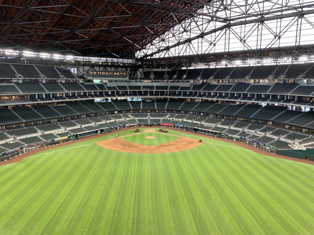
As perhaps the biggest letdown since Chicago’s New Comiskey Park, there’s a lot I’ve picked apart at Globe Life Field. Most of what I’ve written is subjective and debatable, but I predict almost all Rangers fans will dislike the unfriendly seating bowl layout.
Structurally, Globe Life Field is the most fan-unfriendly ballpark in baseball for getting close to players and exploring different areas unless you have enhanced access.
At Globe Life Field, fans enter the concourse above the second level bowl at street level due to the topography, which is labeled the “main concourse,” and the entire first level below that is construed as premium (club access on exclusive lower concourse) or semi-premium (general access to exclusive lower concourse).
Translation: fans cannot access the entirety of the lower bowl concourse in between the foul poles without an appropriate ticket!
Basically, this makes all of the lower level, both above and below the cross-aisle, an exclusive space. The “club level” is essentially the lower bowl. With every other ballpark, at least some parts of the lower bowl in between the foul poles are accessible, allowing fans to get a closer glimpse of players before the game. Not here.
Pre-game autographs or selfies with players before the game for those in the nosebleeds at Globe Life Field? Forget about it. Instead, those paying a pretty penny to sit in the lower bowl get exclusive access to “The District” concourse, which would ordinarily be the main concourse.
Many new stadiums have garnered reputations of having sharp class distinctions in seating, but Arlington reaches new heights in “ballpark gentrification.”
—-Other weaknesses: 1) Texas Live! is enjoyable but unmistakably artificial; A privately-controlled faux-city in suburbia can never replicate the organic urban sensibility around a Wrigley or a Fenway, 2) First new MLB venue in recent history whose predecessor is almost universally considered more aesthetically attractive, 3) Widely panned exterior isn’t as overtly ugly as social media would have you think, but this is still exceptionally uninspired architecture that could be in “Anywhere, USA,” 4) Due to the high positioning of the roof tracks, the interior visuals still feel enclosed even when the roof is open. Compare. 5) Unlike interiors in Arizona and Milwaukee that are also somewhat derided, the outfield panels below the roof line do not even fold open or retract, even when the roof is open. This design would be generic and unacceptable for 2000 much more for 2020. 6) We obviously can’t gage the quality, but looking at the planned menu pre-Covid, the food and beverage options are unremarkable, 7) Comparative lack of restaurants, bars, and social spaces accessible to all fans within the ballpark. Some rocking chairs outside of a sky porch aren’t going to cut it. You will heavily rely on Texas Life! outside of the park for those extra amenities, 8) No elaborate historical destination or ballpark museum, something the Rangers’ former park had in its early days, 9) Pre-Covid, GLF was planning to open without a kids’ area, and it still does not have one. Only a few other parks totally lack this feature.
19) GREAT AMERICAN BALLPARK (2003), CINCINNATI REDS: 80
Consensus Ranking: Lower-Middle Tier
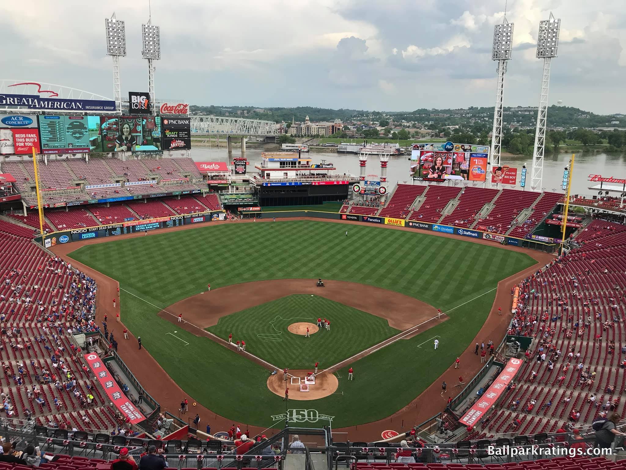
-Best Feature: Reds Museum and Hall of Fame
I’ve ripped various aspects of Great American Ballpark’s design, but the overall fan experience separate from the structure’s aesthetics generally gets high marks.
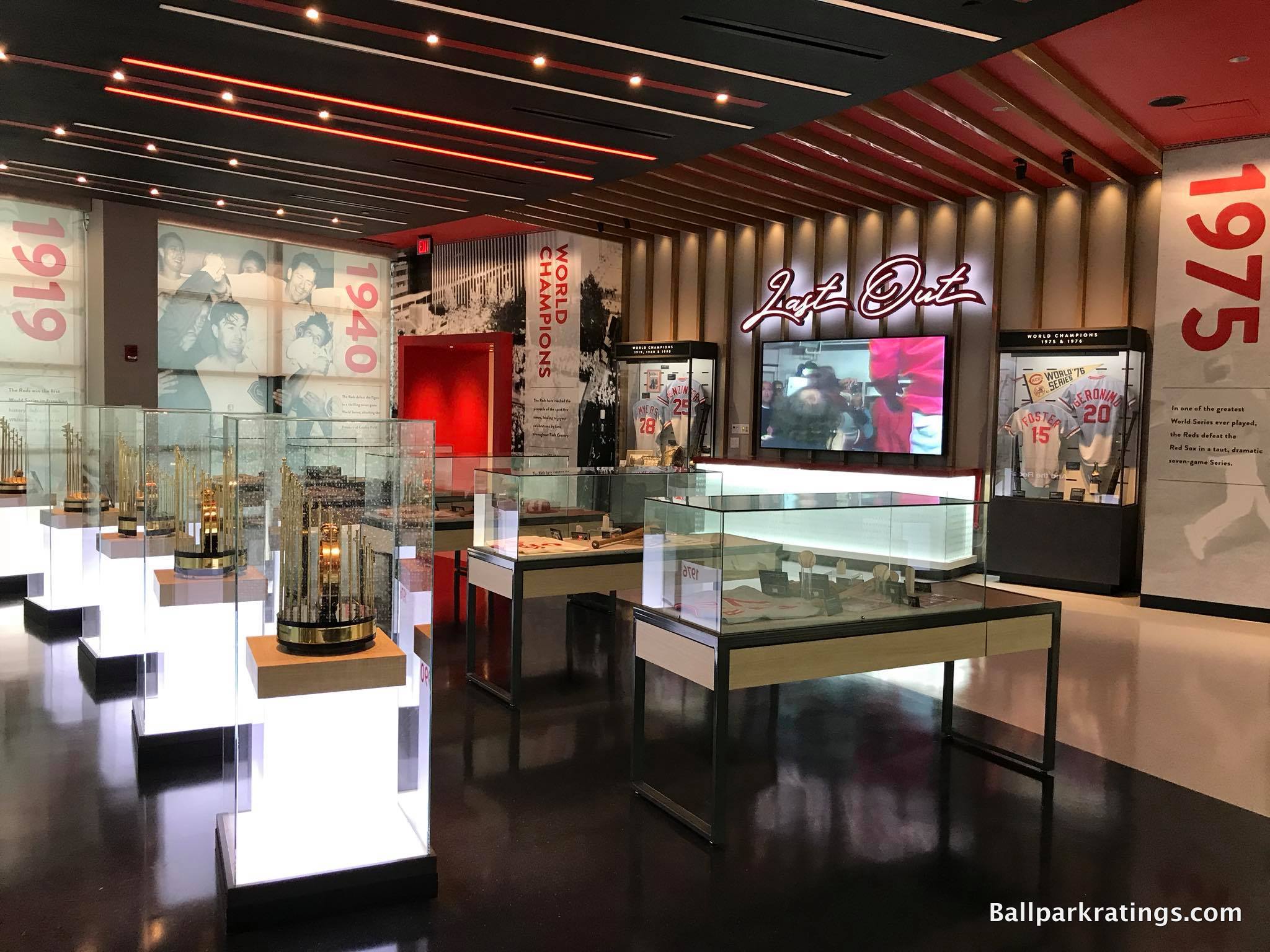
While the Cardinals Hall of Fame and Museum in Ballpark Village might give it a run for its money, I think Great American Ballpark’s version is the single best baseball team museum in North America.
Celebrating compelling characters, amazing athletic achievements, pennant wins, and World Championships, the Reds Museum and Hall of Fame is a destination in its own right. While I prefer team history more explicitly integrated into the ballpark footprint, the multi-level complex is connected to the façade behind home plate.
Highlights include (a) statues of the Big Red Machine celebrating a World Series victory, (b) a decade-by-decade exploration of Reds’ history with more statues, (c) historical artifacts and bas reliefs honoring the 1869 Red Stockings, (d) displays devoted to the evolution of Reds’ uniforms, (e) displays of awards won by Reds, (f) a massive baseball card collection, (g) the Reds’ Hall of Fame gallery, (h) the Reds’ championship gallery with World Series trophies, and best of all, (i) an exhibit commemorating past Reds’ ballparks with models.
The Reds Museum and Hall of Fame was renovated before the 2019 season, so it’s absolutely worth your time even if you’ve seen it before. It may even be the best baseball museum of any kind outside of Cooperstown.
—-Other strengths: 1) Downtown setting and surrounding local scene of restaurants and bars continue to improve, 2) Crosley Terrace with statues in action behind home plate is brilliant, 3) Outbuilding facades utilize an interesting mix of Midwestern Art Deco and International Style, 4) Reds installed MLB’s first HDR videoboard before the 2020 season, 5) Excellent seating geometry, 6) The polarizing Skyline Cheese Coney dog is the quintessential ballpark “signature food” item providing a sense of place, 7) Top-10 ballpark for craft beer, 8) Plenty of social spaces throughout the concourses, 9) Machine Room Grille is really neat, 10) Interesting selection of premium ticketed options, 11) Kroger Fan Zone is one of the best kids’ areas in baseball
-Worst Feature: Busy, Disjointed, Gimmicky Interior Aesthetics
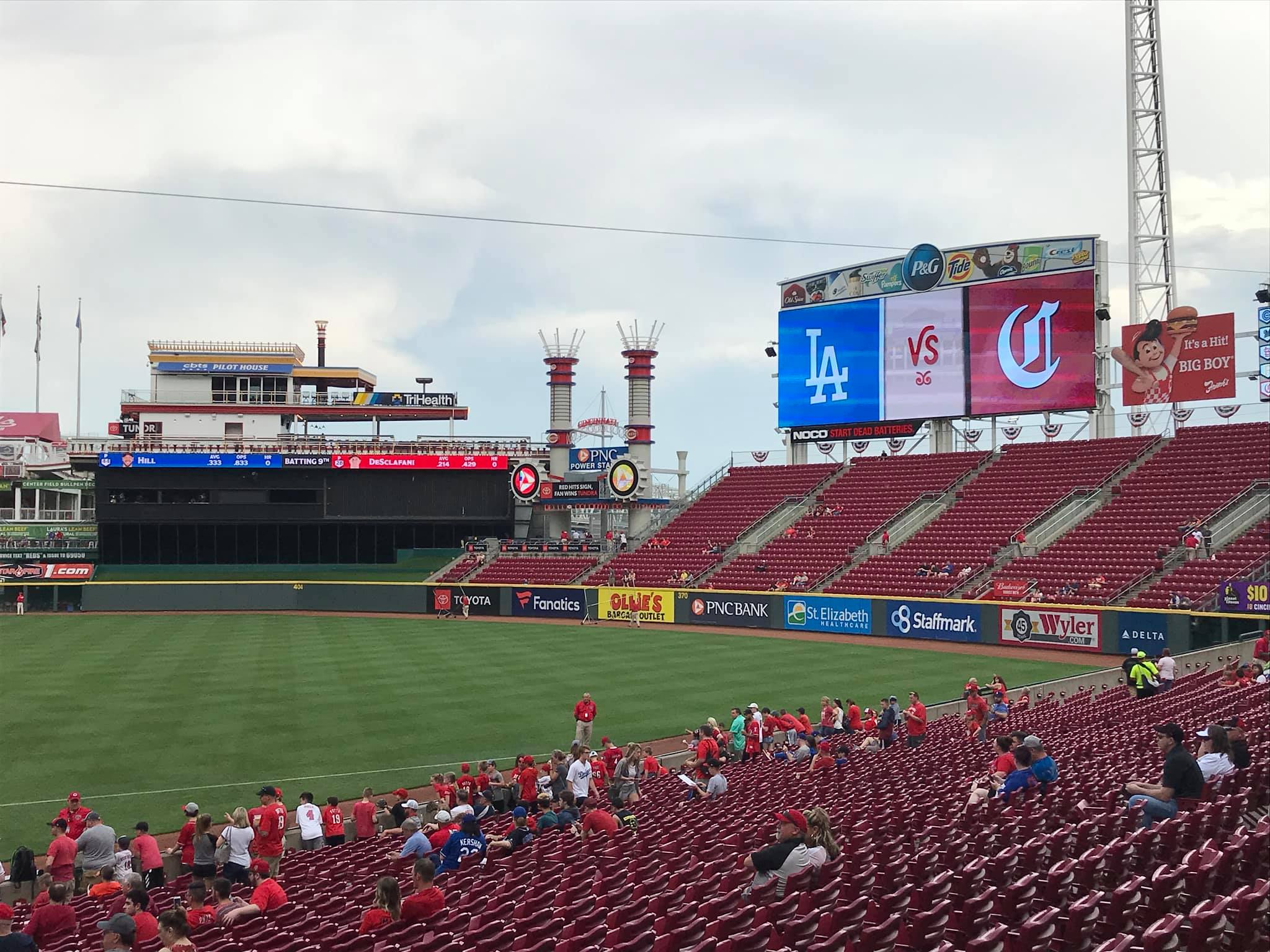
Given all of those pluses, Great American Ballpark represents the single biggest ballpark missed opportunity of our generation, all because of its abysmal interior visuals. Purely subjective, but I’m hardly alone.
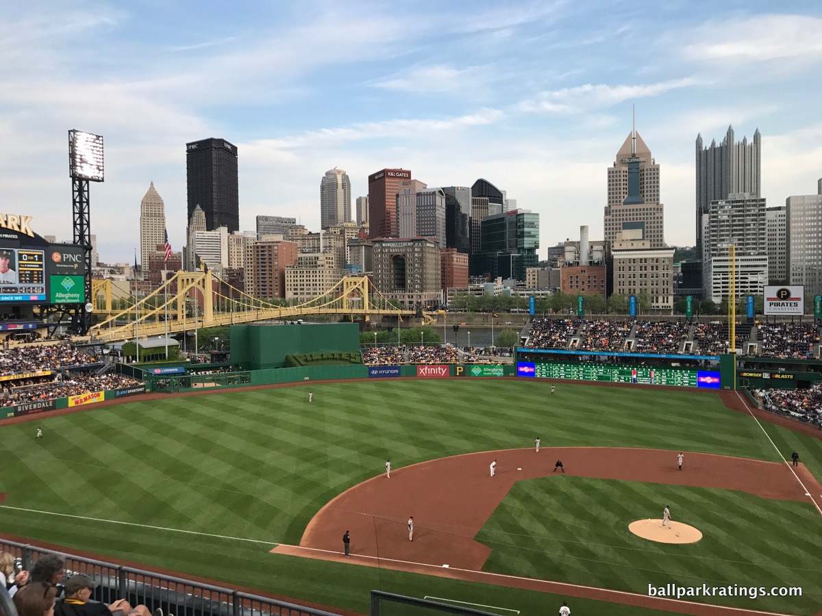
There’s a perception that GABP was built on the cheap, but that really wasn’t the issue. For downtown, riverfront ballparks, everything PNC Park in Pittsburgh ($215 million) did right, Great American Ballpark ($290 million) did wrong.
Where PNC Park integrates its setting into the lower bowl, GABP’s riverfront views are blocked by oversized seating and clumsy signage. Where PNC has clean interior lines, GABP has the ugliest gimmicks in baseball. Where PNC cultivates contextual space, GABP clutters neutral space with distractions and diversions. Where PNC is authentic, GABP feels contrived. The angles in Pittsburgh relate to the riverside, but the ethos in Cincinnati is totally separated from its context.
Where Pittsburgh is confident in its simplicity, Cincinnati is busy. Where Pittsburgh has consistency, Cincinnati is disjointed and fragmented, attempting to add too many elements. “The Gap” is well-intentioned, but silly. Where PNC has a nautical and pastoral color scheme, GABP has magenta.
For a relatively captivating setting, this is a ballpark with no continuity or order whatsoever, lacking a consistent design vision where the design vision should be obvious: integrate the riverfront scene and/or the urban context into the ballpark. They failed on both accounts.
There is so much junk here without any attention to that. The kitschy stuff distracts from the original concept.
Can you imagine a fake riverboat or gimmicky smokestacks in Pittsburgh and San Francisco? Can you imagine those parks installing an extra videoboard blocking the water views in right field?
And GABP doesn’t just compare poorly to the nation’s best waterfront parks (Pittsburgh/San Francisco). It compares poorly overall.
Take out all of the visual garbage, namely the charred black batter’s eye box, the set of Lego smoke stacks, the fake, plastic riverboat, and the extra videoboard above the right field seating, in order to simply let the setting take over, and we’d be in business. GABP is never going to have the breathtaking views of the best parks, but it could be much better.
Truthfully, there aren’t many other significant weaknesses here, so GABP’s poor interior aesthetics are its fatal flaw. If you like the design and disagree with my totally subjective analysis, there’s not much else to complain about.
—-Other weaknesses: 1) Exterior architecture also fails to form a cohesive picture: the inner façade embracing an industrial theme echoing Ohio doesn’t mesh well with the much better outbuilding facades mentioned above. Overall, this is a design that tried to please too many people all at once. 2) Complicated concourse flow with many horizontal and vertical discontinuities, 3) Even for a post-1990 park, the upper deck on the third base side is too pushed back, 4) Food quality can be good, but the selection of grub is sorely lacking
18) CITI FIELD (2009), NEW YORK METS: 80.5
Consensus Ranking: Middle of the Pack to Lower-Middle Tier, High Variability
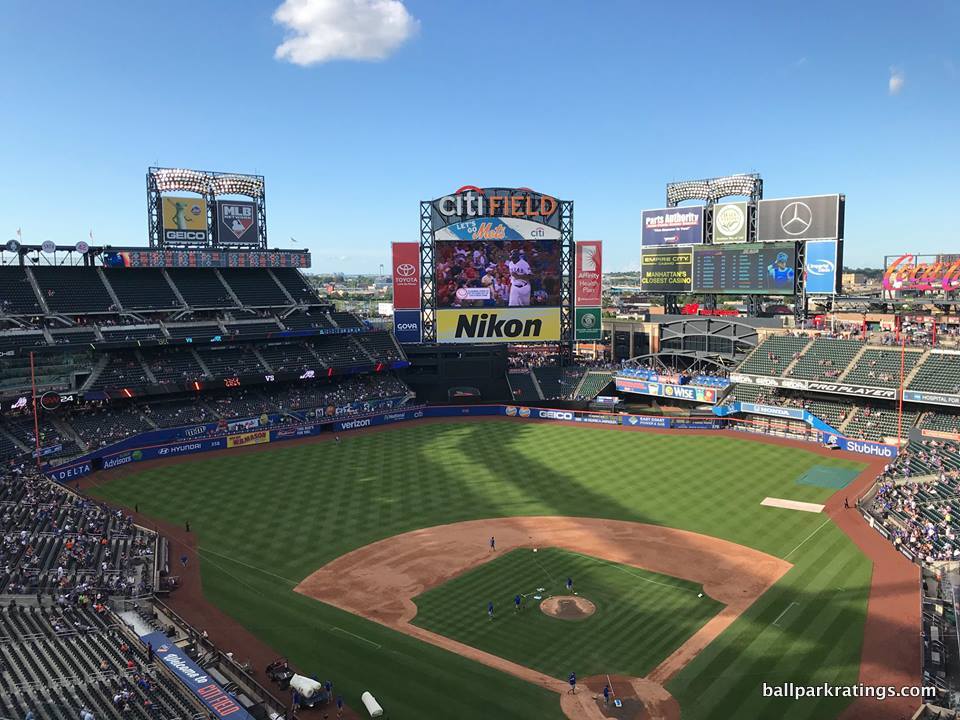
-Best Feature: Food
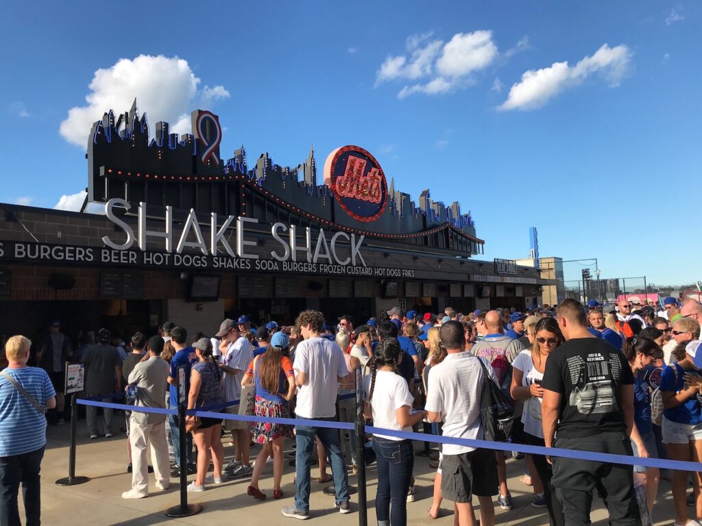
While venues in Seattle and San Francisco brought ballpark food into the 21st century with unprecedented varieties of cuisine, Citi Field is generally reputed as setting an entire new standard in 2009.
Defined by its Taste of the City food court and World’s Fare Market, Citi Field’s grub is not only phenomenally varied but also consistently delicious.
Local eateries offer everything you could imagine, from special heros and dumplings to lobster and arancini. All of the variety you would expect from a top-tier foodie park––BBQ, Mexican, Latin, Seafood, authentic sandwiches, Italian, Chinese, Sushi––are on the menu. Mama’s of Corona is the highlight.
Danny Meyer’s tremendous Union Square Hospitality Group runs the stands in center field not curated by more authentically local restaurants, most notably Shake Shack. Check out my ballpark food piece for a full analysis of Citi Field’s grub. It’s one of four parks in the conversation for best ballpark food.
—-Other strengths: 1) Despite my esoteric quibbles, the Ebbets Field-inspired exterior design is aesthetically pleasing, 2) Jackie Robinson Rotunda is perhaps baseball’s most rousing entryway, 3) I’m not a huge fan of the Home Run Apple or the Shea Bridge, but it gives the interior visuals some much needed sense of place, 4) Open concourses on all three levels, 5) Over-the-top premium seating with numerous high-end clubs, but with a fan-friendly “access chart” that gives many more folks access to these spaces than you’d expect, 6) Mets Hall of Fame and Museum, 7) Plaza in center field is party central for pre-game festivities for fans of all ages, 8) Mr. Met
-Worst Feature: Located in Baseball’s Worst “Neighborhood”
Somewhat like the park of their crosstown rival, Citi Field is quite polarizing among ballpark trekkers. Most everyone agrees that Citi Field is a major upgrade over Shea Stadium, but many view it as heavy-handed mimicry of an authentically classic park that has no relation to the team, while a few others see Citi as the model “retro” ballpark.
While Citi Field is a fan-friendly place replete with modern amenities, put me in the camp that tends to view the Mets’ park more negatively.
The contrived “faux-retro in a parking lot aesthetic” rarely works in the first place. Why build a faux-urban ballpark longing for an urban setting? But it was especially conditioned not to work here, given the redundancy of the design (one that had already been emulated by a dozen clubs) and the lack of connection to the team.
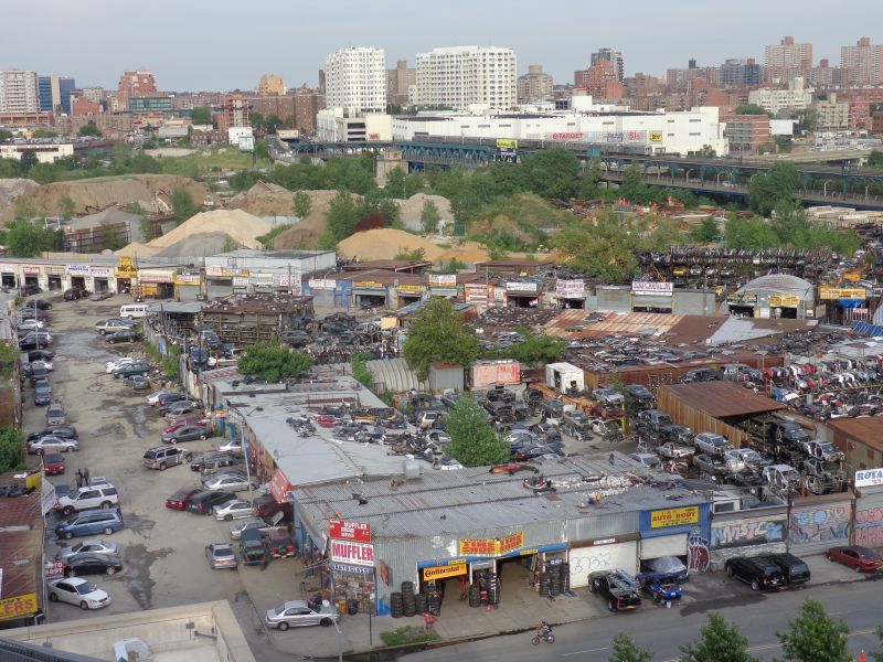
That’s all debatable, though. What’s not debatable is that Citi Field’s self-contained location surrounded by junk yards in an industrial wasteland is even worse than that of your run-of-the-mill suburban retro cookie-cutter.
After over a decade of exploring every corner inside and out of every Major League Baseball stadium, I think the scene immediately around Citi Field in Willets Point is the very worst.
There’s a lot of valid complaints about ballparks gentrifying surrounding neighborhoods (see Navy Yard debate in D.C.). But these ugly auto repair shops, scrap yards, and waste processing plants don’t even constitute a neighborhood. Described as “post-apocalyptic” in appearance and the most surreal place in NYC, Willets Point has no sidewalks, no sewers, and only 10 legal residents (although, many blocks have been demolished in recent years, so a few plots nearest to the stadium look more barren today than post-apocalyptic).
Ebbets Field was in part so charming because it was shoehorned into a venerable neighborhood, not dropped from the sky in an area so positively dystopian it inspired the “Valley of Ashes” in The Great Gatsby!
—-Other weaknesses: 1) Despite its beauty, the Ebbets Field-inspired façade feels out of place for the time (2009, this had been copied enough), setting (parking lot/industrial wasteland), team, and forward-looking architectural spirit of New York City, 2) I understand the Mets were going for that cozy, enclosed vibe, but the outfield aesthetics feel hermetic, muddled, contrived, busy, and ultimately not particularly attractive. 3) No views mean no visual sense of place in one of the world’s greatest cities, 4) Too many ads in the outfield, 5) Quirky sightlines aplenty, although I think that problem has been a tad exaggerated, 6) Unless you have club access, few sit down areas or social spaces on the concourses, 7) The team has been mostly successful in adding Mets’ historical references after Citi Field opened, but where are the statues? (One of Seaver will be added soon).
15T) MINUTE MAID PARK (2000), HOUSTON ASTROS: 82
Consensus Ranking: Lower-Middle Tier
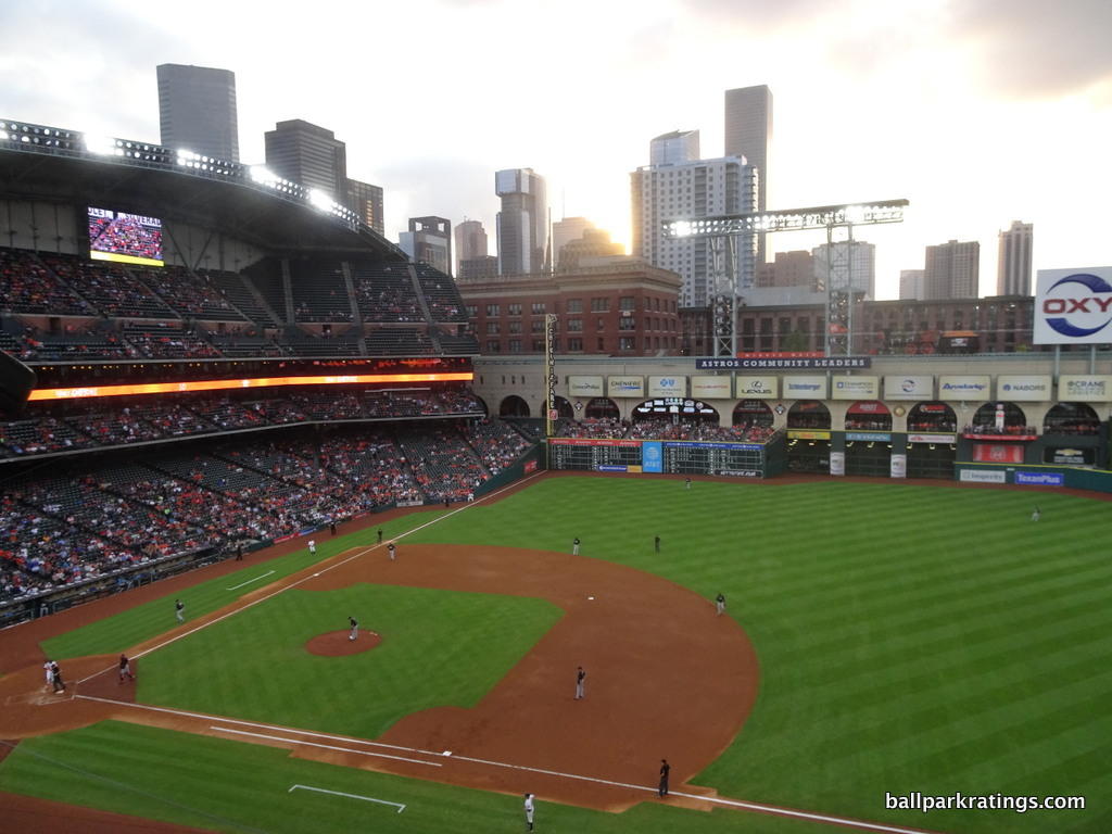
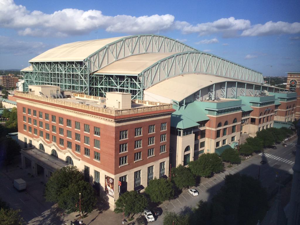
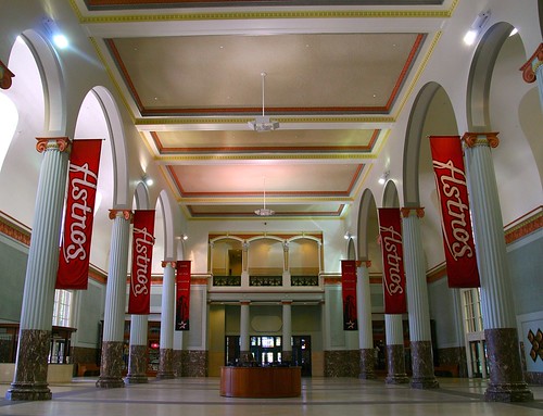
-Best Feature: Architecture Inspired By Union Station
Minute Maid Park has traditionally gotten a bad rap for its numerous gimmicks. The train. The home run pump. The cheap home runs. Tal’s Hill and the flagpole in play (now gone). “This is a theme park, not a baseball park,” critics would say. Minute Maid Park has also traditionally been negatively associated with things outside of its control. Enron. Roger Clemens. And now, cheating with trash cans!
In its over 20 years of existence, Minute Maid Park hasn’t exactly accrued positive brand equity!
Even with the new serious deficiencies I discuss below, I think Minute Maid Park is underrated. As you’ll see discussed as we go into the best ballparks, I stress contextual appreciation of the site above all else, and MMP does that as well as any ballpark, retractable or not.
Houston took a signature building in the downtown community, Union Station (old train station circa 1911), and used it as the inspiration for the entire ballpark. That’s no gimmick.
Unlike jumbled exteriors with retractable roofs in Seattle, Milwaukee, and Arizona that look like state-of-the-art airplanes topping brick exteriors, MMP’s exterior architecture resembles a giant old fashioned with lacy ironwork inspired by Union Station. Brilliant concept.
Inside, subtle design cues from the general train motif are delicately interwoven throughout. In a perfect application of context and theme to function, the sliding glass retractable roof tracks ingeniously serve as a mechanism for executing the train track aesthetic. And those gorgeous beige stone arches and the red brick of Union Station tie it all together.
While I loathe how the Astros have turned part of it into a team store, the inside of Union Station is stunning as well. Decked out with massive stone arches, marble, and limestone floors, the lobby is reminiscent of late 19th century Victorian revival architecture. Check out the old-fashioned ticket booth, too.
—-Other strengths: 1) Downtown local scene continues to develop, 2) Coherent exterior architecture, 3) While Seattle’s park gets more attention because the roof is open more often, MMP’s retractable roof design actually reveals more open-air space when the roof is retracted, 4) When the roof is open, MMP showcases the skyline of America’s 4th largest city, 5) When the roof is closed, plenty of natural light seeps through the world’s largest sliding glass door, unlike in Milwaukee and Arizona, 6) Due to the low roof tracks, the park feels intimate for a roofed facility, 7) One of baseball’s last large hand-operated scoreboards under the Crawford Boxes, 8) Main concourse open to the field, with phenomenal SRO areas underneath the left field archways, 9) Center field social spaces replacing Tal’s Hill, including three full-service bars, are pretty good, 10) Excellent regional cuisine (Torchy’s Tacos and Jackson Street BBQ), along with Shake Shack, 11) Tasteful Astros Hall of Fame exhibit on left field concourse
-Worst Feature: Outfield Scenery Littered With Ads
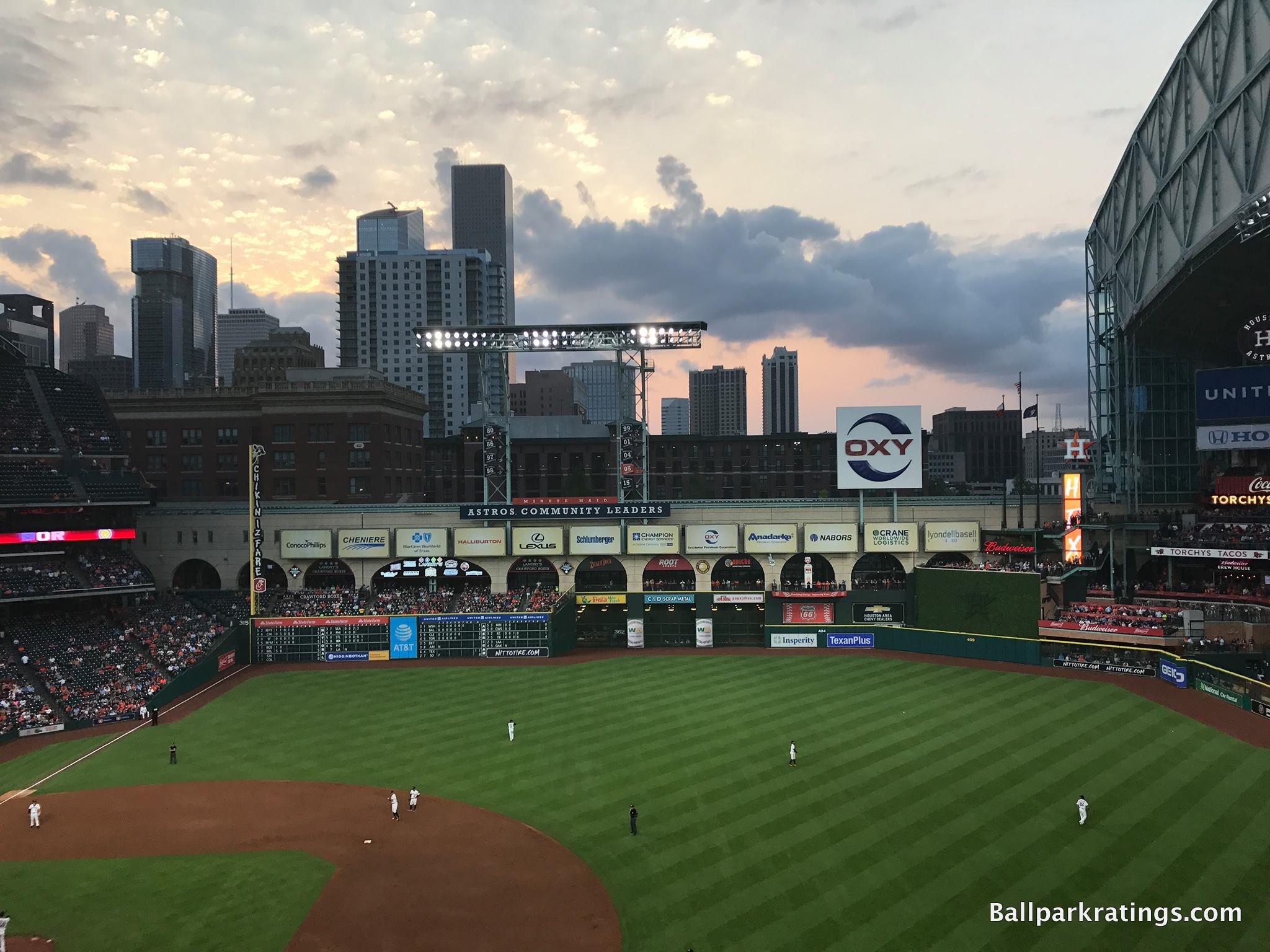
As someone who frequently discusses the business of ballparks, I understand the necessity of advertisements. Of course. I get it. Everyone gets it. When I critique MMP’s evolving appearance, I get a lot of sneers and eyerolls from Astros fans. “All ballparks have ads throughout the outfield!”
Yes, but not like this. Not to this extent. And most importantly, not to the point where the ads muddle the ballpark’s signature features.
As the elegant beige stone archways have been overcome by massive billboards of corporate logos, much of the positive content I wrote about Houston’s pad has been nullified. It’s one thing to obscure more remote parts of the upper deck with 12 giant ads. Or even the outfield walls, which is perfectly acceptable. It’s another matter to mask your chief interior aesthetic asset with them.
In my opinion, this is akin to plastering Baltimore’s B & O Warehouse with such junk, to give you a sense of how this completely ruined the ballpark for me. Comparing the clean lines from 2000 (or even here, the pennant banners were tasteful) to now is incredible.
That’s not all. Tal’s Hill was obviously controversial, but at least it had a clean, simple appearance. The new center field amenities are fan-friendly, but that scene is totally cluttered as well. To add insult to injury, the Astros removed the team “H” logo from the center field tower for 2021. Unbelievable.
All baseball clubs, many of which are in smaller, struggling markets, are hunting for more revenue streams. Only the Houston Astros seem intent on making their ballpark uglier in the process.
—-Other weaknesses: 1) Houston’s oppressive heat means the roof is closed roughly 80% of the time, so many don’t know how beautiful this place can be inside, 2) The food offered can be delish, but variety of grub is lacking compared to peers, 3) Comparative lack of places to sit down on the concourses or around the bars drives me nuts; you’ll be eating your hot dog at your seat or standing, 4) Team store overkill! This seems like an odd thing to note, but team stores have (a) taken over Union Station, (b) displaced a wonderful sit-down bar on the main concourse behind home plate, and (c) displaced the kids’ area, 5) So, no dedicated kids’ area. Minor but very rare for a modern venue. 6) For all of its the superficial bells and whistles, MMP is a deceptively simple place: no on-site restaurants, museums, or unusually elaborate amenities here
15T) MARLINS PARK (2012), MIAMI MARLINS: 82
Consensus Ranking: Bottom-10
Note: Just before opening day 2021, Marlins Park was renamed “loanDepot park.” It will go by Marlins Park in this space.
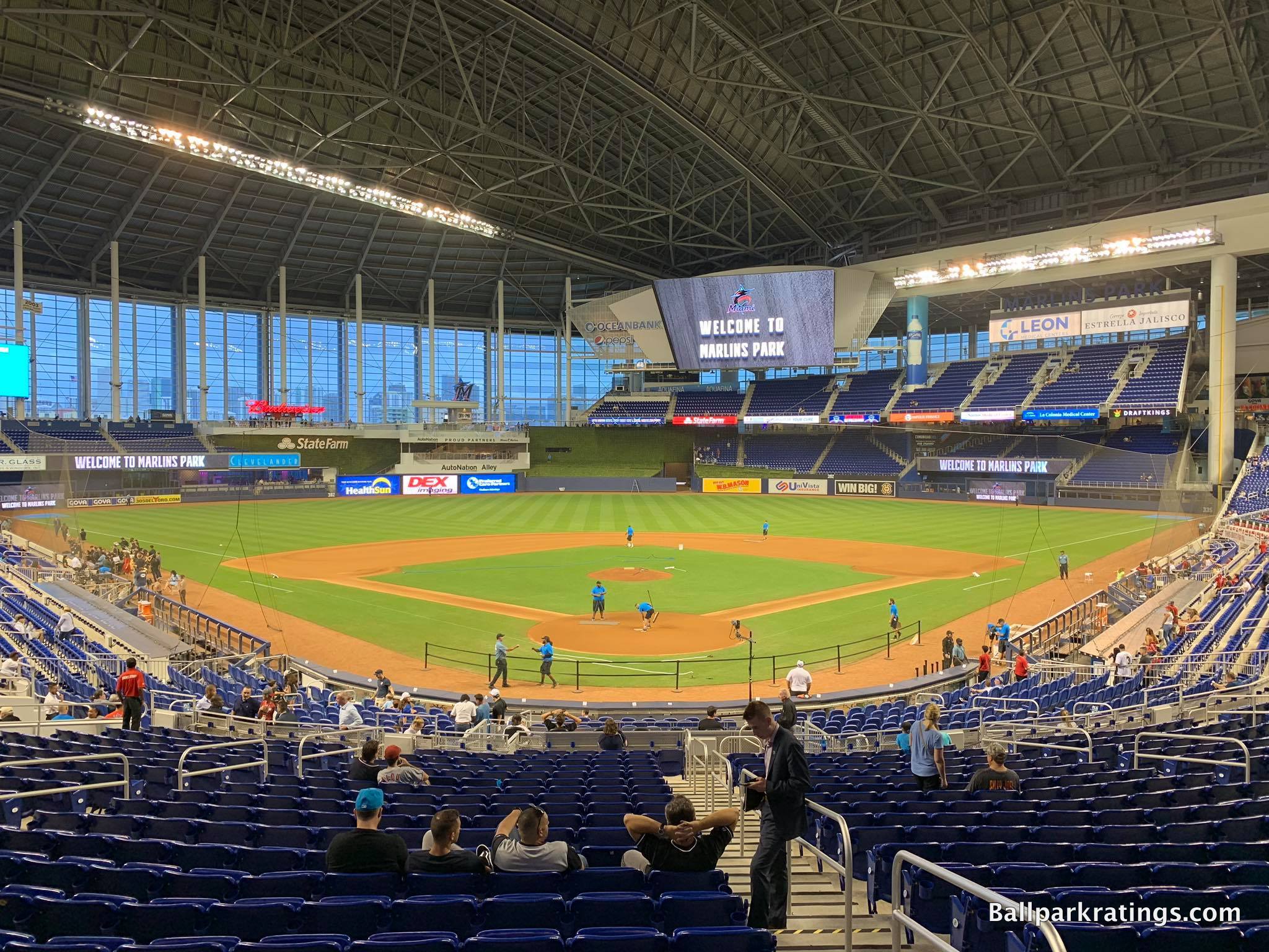
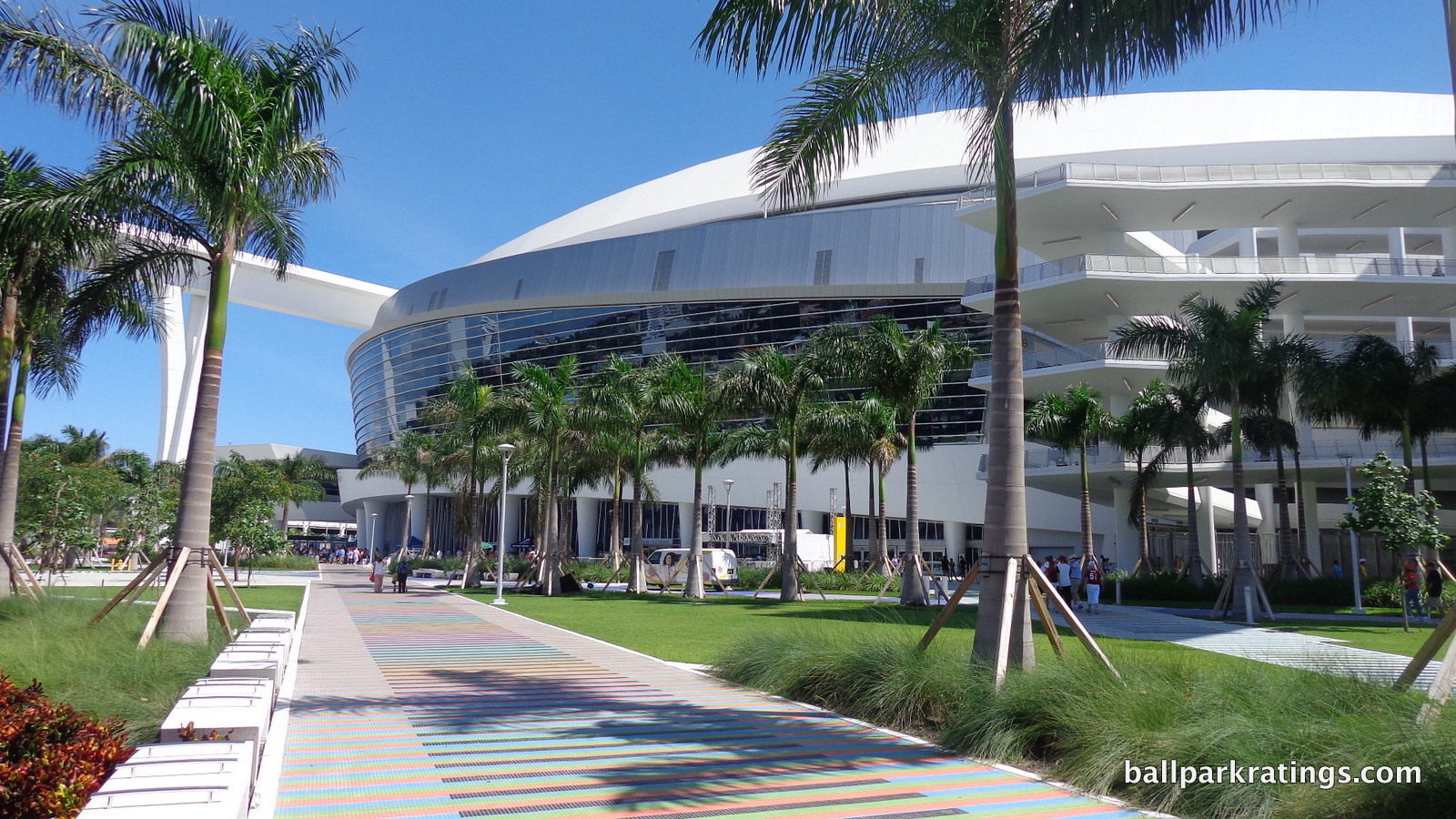
-Best Feature: Contemporary Architecture
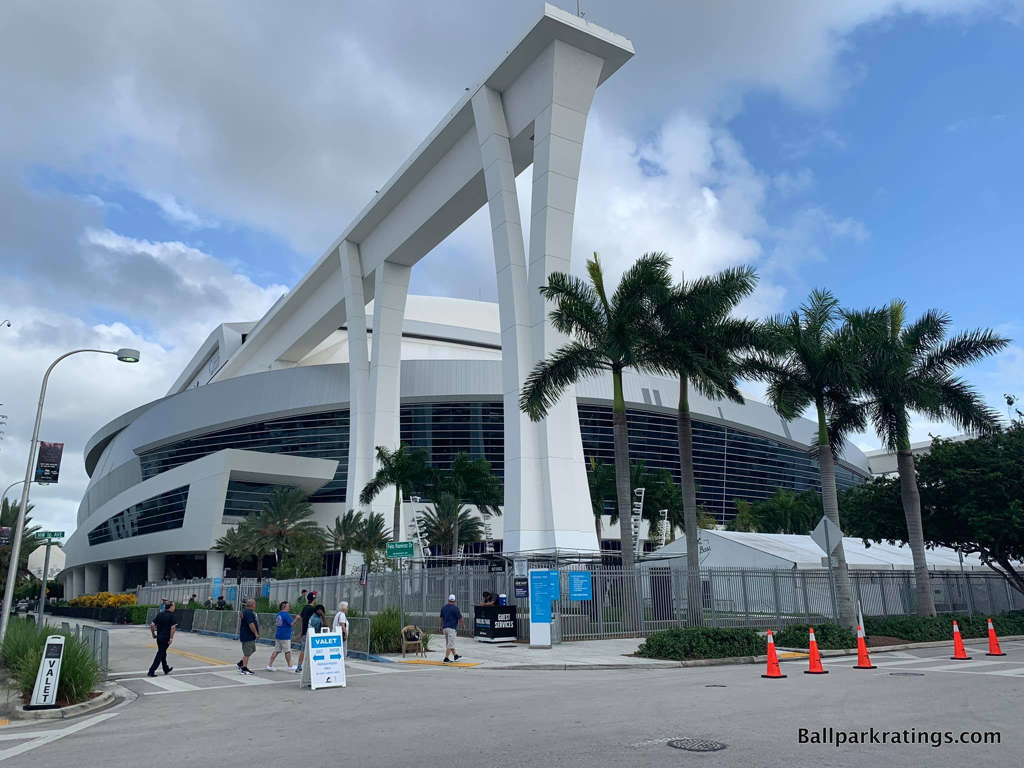
Today’s media environment produces such short memories, because fans tend to forget Marlins Park opened to “mostly fawning architectural reviews” from the press upon opening in 2012. I remember thinking the praise seemed a bit excessive at the time, as you can see by the tone of my in-depth review.
By the mid 2010s, the pendulum swung too far in the other direction. After all of the contentious political issues revealing dodgy financing schemes, the sparse crowds, the two firesales, and the two wildly maligned ownership groups, Marlins Park is often mocked and routinely places in the bottom 5-10 of MLB venues.
The truth lies somewhere in the middle, as bitterness surrounding outside issues translated to antipathy toward the ballpark itself. That doesn’t make any sense.
Regardless, Marlins Park’s long-term legacy may be its abstract contemporary architecture. We have the jewel-box classics (Wrigley and Fenway), mid-century modern (Dodger), modernist (Kauffman), brutalist (Oakland), utilitarian (Tropicana), retro-classic (too many to name), retro-modern (too many to name), and a few others I’ll just call “confused.”
But Marlins Park may stand alone in baseball history as the only contemporary MLB ballpark in the 21st century sense of the word.
The structure consists of an amalgam of deep blue glass, white stucco and steel, unadulterated concrete, and sparkling silver aluminum. With its graceful forms, Marlins Park conceptually captures sea merging with land, spiritually akin to Brickell and Biscayne Bay downtown. It’s an abstract expression of Miami.
Marlins Park’s lines and curves are dazzling, continually clashing then flowing in various rhythms, just like the Atlantic Ocean. Through it all, the fluidity of form is the main theme. It does perfectly reflect the contemporary nature of a city that never really embraced nostalgia in the 21st century.
It’s all absolutely gorgeous, in what is “all about art, architecture, and Miami.” Marlins Park’s emphasis on visual aesthetics instead of money-grabbing “experiences” with afterthought architecture is so refreshing in the age of the mallpark.
As detailed in the “other weaknesses” below, it’s too bad that the Jeter-era ownership group is intent on challenging Marlins Park’s original organizing philosophy. But it can’t change the exterior architecture.
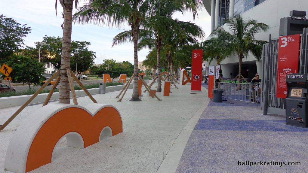
—-Other strengths: 1) I had mixed feelings about the removal of the kitschy home run sculpture, but the refreshed and subdued interior aesthetics are classy, 2) Retracting left field panels showcase surprisingly nice (though distant) views of Downtown Miami and Brickell, 3) Contemporary baseball-related artwork spread around the concourses, 4) Wonderfully wide main concourse open to the field, 5) Comparatively superior use of cantilevers place upper decks closer to the action than most post-1990 ballparks, 6) Excellent seating geometry, 7) Fantastic quality and variety of local Latin food options, 8) Remodeled home plate club is first class. Most ballparks have these super-duper VIP clubs, but “The Club: DEX Imaging” is notable as one of baseball’s newest and very best, 9) Bobblehead Museum, 10) Orange Bowl tributes outside (orange letters pictured above) and on the concourse down the 3rd base line
-Worst Feature: Lack of Fan Support
Ballpark enthusiasts love to compare baseball fanbases. It’s only natural given that history has shown us that robust fan support can single handedly make a ballpark legendary through an accumulation of lore. To a certain extent, ballparks are only a product of the folks in the seats.
But contrary to popular belief, there’s little practical difference in fan noise at various capacities from one city to the next, with a few exceptions at the top (i.e., New York, Boston, etc.). For our purposes, fan base quality is similar enough from city to city to not drastically alter the ballpark operations. Sure, there are differences, and that’s reflected in the score, but never enough to be a “best” or “worst” feature.
Miami is an exception. A ballpark this empty isn’t a fun one.
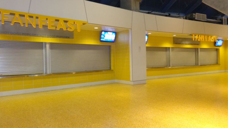
Attendance numbers are so bad that Marlins Park is basically operating at 1/3rd capacity even on a Saturday night in June. The upper deck is closed throughout the season except on opening days. Concession stands are routinely closed down, even on the Legends Level! Various signature spaces now lie dormant. Billy the Marlin constantly falls asleep (I kid, I kid).
It’s a crying shame nobody comes here, because Marlins Park is an underrated structure. Try coming here for the World Baseball Classic (now slated to return in 2023) when the Dominicans play, and you’ll experience an atmosphere on par with a World Series game.
—-Other weaknesses: 1) Almost non-existent surrounding restaurant and bar scene in Little Havana, 2) Contemporary architecture fits with the city, but not the intimate Little Havana neighborhood, 3) Miami’s legendary heat and humidity means the roof is closed nearly 90% of the time, 4) Paltry craft beer selection, but it should get better with the addition of a new brewhouse behind home plate in 2021, 5) Even after the Jeter-era enhancements, not many good social spaces, 6) Marlins Park is the single worst offender in lacking communal chairs, tables, and benches to sit down on the main concourse. Such a critical oversight, yet the fix is so simple. 7) Eliminating the Clevelander nightclub with a pool that no one ever used was inevitable, but it was one of baseball’s coolest features; ditto for eliminating the live fish tanks, which were a total gimmick but incredibly neat when you saw them up close. 1992-2012 was all about installing quirky “signature features” in ballparks, but the period since has reestablished the homogeneity of ballparks. I think that’s unfortunate, and you see it so much at Marlins Park in alterations made after it opened in 2012. Gaudy home run sculptures, fish tanks, and (ultimately) swimming pools don’t make money. 8) The Marlins are obviously a young franchise, but with two World Series victories, I’d prefer more team historical references, 9) New kids’ area in center field is so basic it looks merely decorative
15T) KAUFFMAN STADIUM (1973, 2009 RENOVATION), KANSAS CITY ROYALS: 82
Consensus Ranking: Top-10
-Best Feature: Fountains
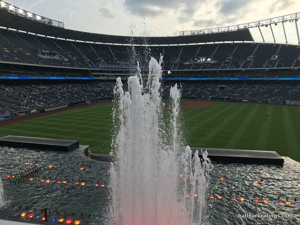
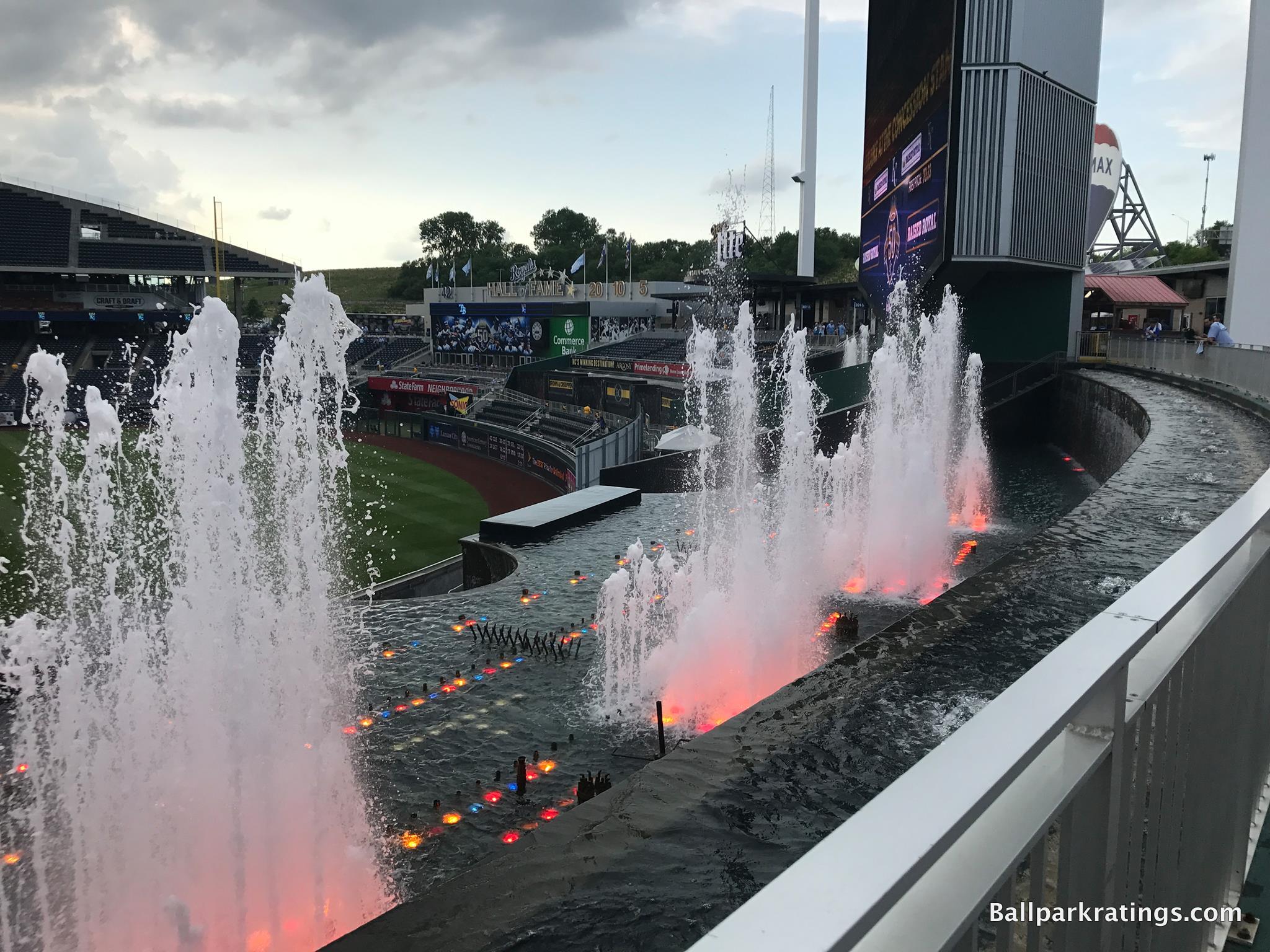
Failing to maintain the simple splendor that Kauffman Stadium formerly provided, I didn’t like how the 2009 renovations filled the expansive outfield embankments with mall-like amenities. Convoluting the timeless uncluttered greenery with ads, playgrounds, and putt-putt courses was an aesthetic travesty, because that flowing simplicity allowed the fountains to stand out. They’re now muddled by all of this clutter.
But these renovations did come with a massive upside, other than simply adding all of these flashy amenities.
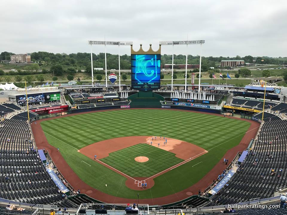
Via the new “Outfield Experience,” fans can now get up close and personal to Kauffman Stadium’s famous fountains, one of baseball’s greatest icons.
Featuring numerous water jets and many cascades and waterfalls, the 322-foot-wide extravaganza is largest privately funded fountain in the world. Officially known as the “Water Spectacular,” the waterfalls operate continuously, but the fountains lit up by different colors erupt in between innings, after games, and after home runs.
Appropriate for the “City of Fountains,” the Water Spectacular has been expanded and tinkered with over the years, but it actually dates back to the ballpark’s opening in 1973. It’s one of baseball’s seminal “signature features,” along with Wrigley’s ivy and Boston’s Green Monster.
—-Other strengths: 1) Outside of Milwaukee, K.C. may have baseball’s best tailgating scene, 2) Influenced by Googie style, The K’s seating bowl is truly sculptural in design, 3) The panoramic views beyond the outfield feel genuinely pastoral, even though it’s suburbia by I-70, 4) Main concourse above the plaza level is open to the field, while 100-level ticket holders have access to enclaves below to reduce crowding, 5) Combined mezzanine/suite level and comparatively fantastic use of cantilevers place upper deck closer to the action than others, 6) Videoboard topped with crown is informative and attractive, a true piece of architecture itself, 7) Top-10 craft beer quality and selection, 8) Craft & Draft and Rivals Bar offer fans a place to hang out, 9) The Royals Hall of Fame is the best of its kind inside an the actual ballpark, 10) The K is MLB’s #1 ballpark for kids in my opinion, with attractions ranging from standard playgrounds, batting cages, and base running games to wiffle ball fields, carousels, and putt-putt golf
-Worst Feature: Suburban Location
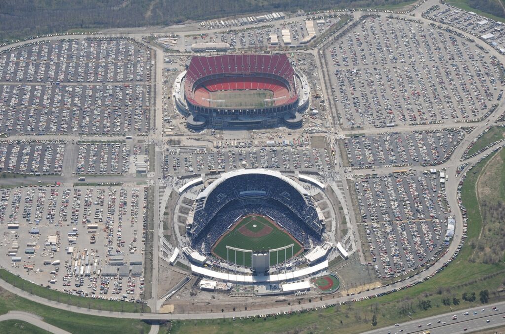
For longtime ballpark aficionados and even casual baseball fans, I’m aware that placing Kauffman Stadium in the middle of the pack is controversial. While that’s partially because I didn’t like those aesthetic changes to the outfield scene, I still can’t get past the suburban locale lacking a vibrant local scene.
Sure, Kauffman’s suburban setting is a product of its time, but we see my enduring persuasion against venues not integrated with a city center or a neighborhood creep up again, here. America’s venerated ballparks resonated with fans because they were part of a community, and ballparks in a parking lot can never replicate that appeal.
You park your car, you go to the game, and then you leave, with no other alternatives. No surrounding bars, shops, restaurants, hotels, etc. Yes, I know plenty of folks love the tailgating, but that’s not as fun compared to destination ballparks in the city where you can spend an entire day, to say nothing of access issues with a ballpark in a parking lot.
This blog piece from a Royals fan does a good job of illustrating why I can never fully embrace suburban baseball.
—-Other weaknesses: 1) The exterior’s graceful, sweeping lines have been a bit muddled by the new faux-modern veneers, 2) No cupholders in the upper deck, inexcusable for a park that underwent $250 million dollars’ worth of enhancements in 2009, 3) Poor to pedestrian food selection and quality, 4) In an era of ballparks with grub sourced from local eateries, Aramark serving generic BBQ in the BBQ capital of America is baffling. Bring back Gates! 5) And as mentioned, fountain scenery is now muddled with ads, seating decks, and glitzy features.
13T) CITIZENS BANK PARK (2004), PHILADELPHIA PHILLIES: 84.5
Consensus Ranking: Upper-Middle Tier
-Best Feature: Ashburn Alley
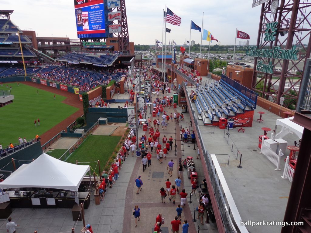
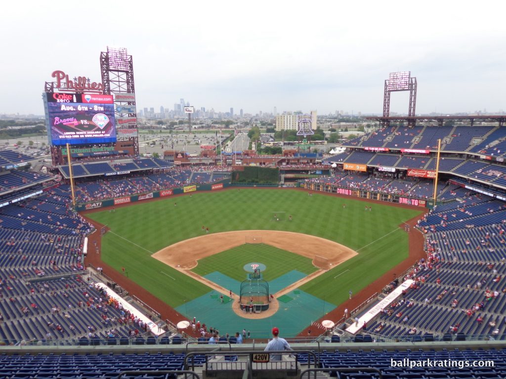
With its open concourses on all three levels, local food options, numerous social spaces, and other fan-friendly amenities, Citizens Bank Park (2004) is generally reputed for taking ballpark “fan experiences” to the next level.
I often think of CBP as Camden Yards 2.0, but just from a functional point of view. Many of the crowd-pleasing features and effective design cues you see here have been copied in subsequent ballparks at the end of the building boom.
Citizens Bank Park’s center field concourse, dubbed Ashburn Alley, is a pioneering feature in ballpark design. For traditionalists who scoff at fans who buy tickets and just like to “hang out” on the concourses, you can blame Citizens Bank Park for popularizing that trend.
Featuring multiple tiers of standing-room only areas, prime bullpen views, drink rails, and many entertaining diversions, Ashburn Alley was arguably Major League Baseball’s first “social space,” even if it was originally envisioned as just an exciting outfield concourse. Social spaces are now tremendously popular across baseball. Widely emulated in other parks since, the Phillies open the “outfield experience” hours before the other gates.
Architects realized that baseball’s leisurely pace with delays and in-between inning breaks required other creature comforts to pacify younger fans looking for instant gratification. This seems obvious today, but most average folks don’t want to sit in their seat for 9 innings!
The days of ballparks filled with only die-hards are long gone. Families with young children, individuals on group outings, employees with corporate-owned seats, common folks dragged to the game by their partners, or just people who got free tickets comprise a large proportion of those in attendance, all of whom are not likely to have their eyes glued to the action much of the time.
Today, Ashburn Alley suffers from some crowding issues because the concept turned out to be way more popular than even the Phillies expected (so the team has made some appropriate tweaks, to their credit), but it remains CBP’s prime destination.
—-Other strengths: 1) Fantastic interior aesthetics with clean lines, an engaging color scheme, and great structural balance, 2) Unique angular geometric grandstand design, 3) One of baseball’s most beautiful batter’s eyes, 4) Wide, open, easily navigable concourses on all three levels, 5) First park to put drink rails at the top of the seating bowl so you can stand and watch the game from the open concourse, 6) Excellent seating geometry, 7) Local food options headlined by Tony Luke’s and Campo’s Steaks, 8) Newly redesigned historical exhibit in left field, 9) New open-air beer garden and sports bar, 10) New kids’ area (The Yard) with a wiffle ball field and a climbing wall is top notch, 11) Philly Phanatic, 12) Passionate Phillies fans are certainly colorful, 13) Liberty Bell adds some much need visual sense of place for a ballpark in a parking lot
-Worst Feature: Location in South Philadelphia Sports Complex
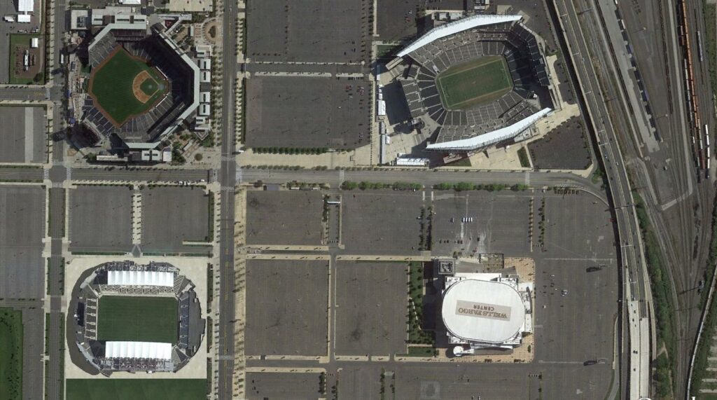
For something as subjective and tribal as a baseball team’s home, there’s a rare consensus in the industry here. Consistently fantastic park; poor setting.
In fact, Citizens Bank Park is almost defined by its location, because it otherwise lacks any serious flaws. This is my highest scoring ballpark with both a subpar location and a lifeless local scene.
Located in the South Philadelphia Sports Complex, Citizens Bank Park’s energy dissipates into empty spaces. Despite sharp interior lines with fantastic balance and good interior design principles, there’s a certain vacuity to the whole picture, as the absence of anything beyond center field is palpable. With the city’s core visible 4 miles north, you just want to drag the park by the light poles and place it downtown.
There’s something magical about a city’s awakening before and after a game at Wrigley Field or Coors Field. When exiting after a big win, the collective effervescence hits the cityscape, spilling into streets, bars, and restaurants, as the exuberance of the crowd meets the exuberance of the city in a collective rejoicing of victory. Think cars honking and locals wailing in excitement. A city’s familiar spirit of unity is never more on display.
Call it a missed opportunity.
Yes, the Xfinity Live! Complex improves the vibe a bit, but that’s a far cry from the development required to emulate a vibrant neighborhood, in what is more akin to a series of bars in a parking lot. That electric atmosphere provided by the surroundings of a Fenway, Wrigley, Camden, etc., etc. is missing here.
—-Other weaknesses: 1) Out of all of the red brick exteriors, CBP’s facade is one of my least favorites. The fact that the architects felt the need to spell out “PHILADELPIA” in darker bricks because the design is so generic says a lot, 2) Distant view of downtown is underwhelming in person, 3) Premium clubs now look a little outdated, 4) Because this is a place defined by fan-friendly amenities (which naturally age) and not timeless views (which don’t), CBP began to lack that “Wow Factor” by the late 2010s.
13T) BUSCH STADIUM (2006), ST. LOUIS CARDINALS: 84.5
Consensus Ranking: Upper-Middle Tier to Middle of the Pack, High Variability
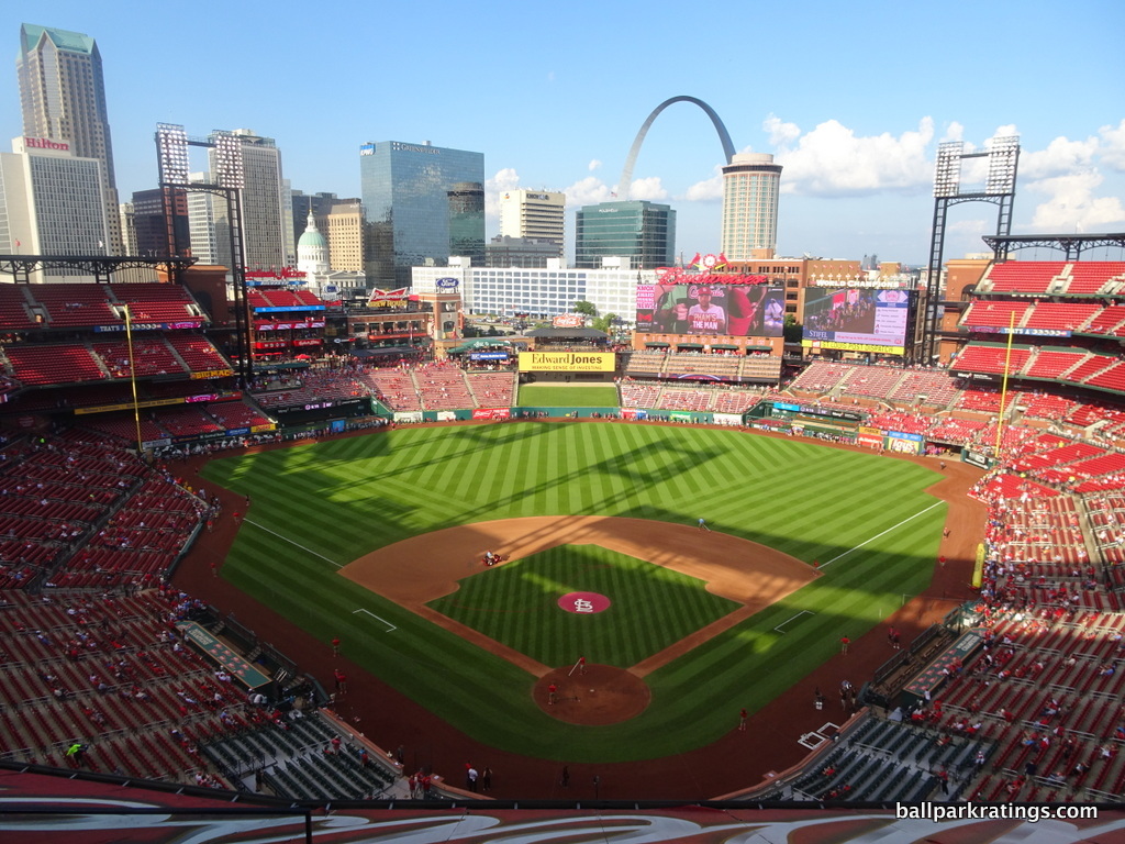
-Best Feature: Views of Downtown St. Louis and the Gateway Arch
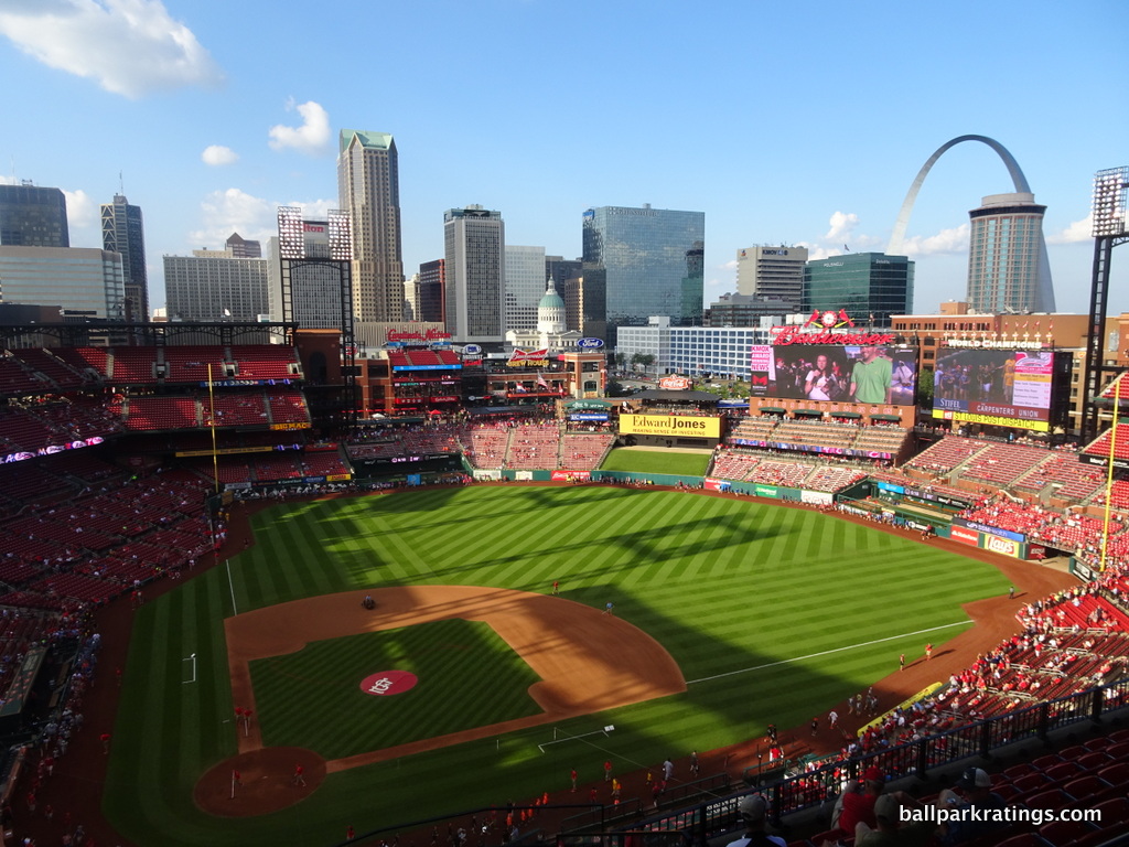
Heavily value engineered, Busch Stadium is one of the more generic retro-classic ballparks, and there aren’t many frills to elevate the merely passable structure. But there’s no debating the quality of the breathtaking panoramic views.
Behind only PNC Park in Pittsburgh, perhaps baseball’s best park, and Comerica Park in Detroit, perhaps baseball’s most underrated park, Busch Stadium showcases the most captivating skyline.
Ranging from left to center field, Busch Stadium has postcard views of downtown St. Louis and the city’s classic Old Courthouse. Best of all, with the Gateway Arch looming over center field, Busch is the only ballpark to integrate a national landmark into the interior schema to this extent. Visually, the sense of place is nearly unrivaled.
One future consideration: How do the new high-rise apartments, which absolutely tower over the surrounding structures, affect the look? I’ll be curious to hear what Cardinals fans think.
—-Other strengths: 1) Ballpark Village, 2) The exterior design is derivative and runs counter to the progressive architectural image of St. Louis, but it’s undoubtably attractive and recalls the local area through mimicry of the Eads Bridge and Cupples Warehouses. Hard mixed feeling on this one, but I’ll be charitable, 3) Only one of two parks to pad thousands of non-premium seats in the lower bowl, 4) Cardinals Hall of Fame and Museum, but it’s in Ballpark Village, 5) New Budweiser Terrace social space in the right field upper deck is welcome, 6) Massive Stan Musial statue isn’t the best sculpturally, but it’s a memorable exterior element, 7) This has become an eyeroll-inducing cliché, but Cardinals fans are the best in baseball
-Worst Feature: Subpar Amenities Across the Board
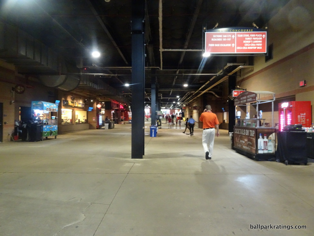
Bolstered by a beautiful downtown locale, the emerging ballpark village, and one of baseball’s best skyline views, Busch Stadium has earned its placement in the top half of MLB venues.
However, I’ve always felt Busch Stadium was one of the safer ballparks of this generation, perhaps epitomizing the peak “retro cookie cutter” in both formula and simple appearance. Independent of the views, it looks like Populous picked this place out of a box that said “baseball stadium.”
With drab concourses and mediocre amenities, I’ve come to see Busch Stadium as kind of the opposite of Citizens Bank Park outlined above, as Busch’s merits are almost totally derived from the beautiful views, with not much particularly great within its confines.
I could pick one single “worst feature,” but the effect is cumulative so this is the one time I’ll just point readers to the list of weaknesses.
The lesson: aesthetics grab your attention on Instagram, but there’s more to a park than views.
—-Weaknesses: 1) Only MLB park built in the 21st century with dark concourses closed to the field throughout the lower bowl. That trend is perhaps a tad overrated, but it’s a core ingredient to the fan-friendly nature of most modern ballparks, 2) Food variety and quality rivals Toronto for baseball’s worst; While other ballparks present grub run by local eateries, Busch Stadium is still mostly operated by Delaware North, 3) Craft beer game has greatly improved, but it’s still comparatively poor, 4) Relative lack of bars and social spaces on the concourses, 5) No sit down restaurants accessible to all fans on the concourses, 6) With the Cardinals’ history displayed in Ballpark Village, there’s not much about Busch Stadium that screams “Cardinals baseball!” when exploring the footprint, 7) Generally not a fan of the poorly proportioned exterior statues, which are too clustered together to have an iconic impact and can be terrible in quality, 8) Kids’ area is beginning to feel small and dated, 9) In general, Busch Stadium lacks the thoughtful artistic design flares of its peers.
12) NATIONALS PARK (2008), WASHINGTON NATIONALS: 85
Consensus Ranking: Middle of the Pack to Lower-Middle Tier, High Variability
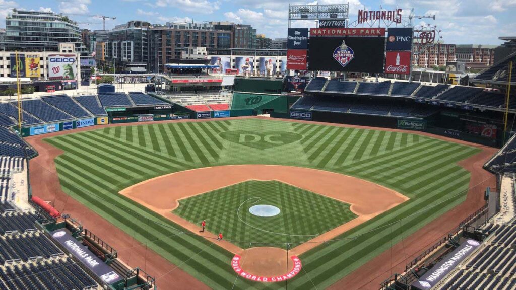
-Best Feature: Navy Yard setting
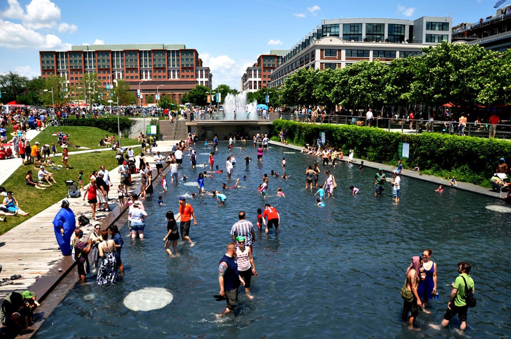
Often noted for its lack of distinguishing features, Nationals Park doesn’t have a sterling reputation among everyday baseball fans and ballpark enthusiasts, as poor reviews upon opening linger to this day.
People expected a true national monument for America’s pastime in the nation’s capital after a line of outstanding ballparks in San Francisco, Pittsburgh, San Diego, etc., so Washington’s park was a disappointment. I believe it suffered from unrealistic expectations.
After looking at Nationals Park in the context of all new parks from 1991-2017, it obviously falls short of “national landmark” status, but its compares well in every respect. Kind of like Angel Stadium is uniformly below average, Nationals Park is uniformly above average, good across the board but not outstanding at anything.
The one aspect that is outstanding is Nationals Park’s location in the rejuvenated Navy Yard.
Unthinkable a decade ago, the Navy Yard has been transformed into a riverfront showpiece. If you take a 20-minute walk around the area, you’ll count nearly 20 restaurants and bars. Walking along the Riverwalk, you’ll note the river itself looks pristine too, a prediction that would have gotten you laughed out of the conversation 10 years ago.
Most notable is The Yards a block to the east, consisting of a family park, reflecting pools, modern sculptures, and restaurants. Hotels and apartment complexes have sprung up all over the area, most notably beyond the outfield. Fans can watch the game from the Top of the Yard Rooftop Bar at the new hotel beyond center field.
Nationals Park has reshaped the Navy Yard into a glittering hangout, confounding the expectations of even the most caustic cynic.
—-Other strengths: 1) The bland exterior architecture has been roundly criticized, but it really fits in with the D.C. context, which is the goal, 2) Views of The Capitol are hard to come by with the new development, but views of the new development are surprisingly nice, 3) Views of the Washington Monument are strategically integrated between the left field grandstand and the parking garages, 4) Excellent seating geometry, 5) Following Philadelphia’s footsteps, we have wide, open, easily navigable concourses on both the lower and upper level, 6) Extremely underrated quality and variety of food, which I actually have as the 5th best in baseball, 7) Ben’s Chili Bowl is a quintessential ballpark “signature food” stand, 8) Respectable series of restaurants, bars, and social spaces, including the Red Porch and the Scoreboard Walk (pre-sponsor names), 9) Appropriately subtle nods to Washington Senators history, which shouldn’t be too extensive because that history does not belong to the Nationals. The park walks that fine line well. 10) Premium seating selection is extensive with lavish quality, but without the sky-high prices or unwanted snobbery at Yankee Stadium, 11) The Presidents Race is the only Sausage Race imitation that actually works
-Worst Feature: Lack of Any Defining Characteristic
So, Nationals Park is well-rounded. It excels functionally with wide concourses and plenty of good seats. It’s equipped with plenty of fan-friendly frills, namely delicious food options. Its architecture is a mixed bag, but the design reflects Washington. It even possesses a few of charming Nationals/D.C. traditions.
But a ballpark is more than the sum of its parts.
What’s the first thing you think of when you think of Nationals Park? That’s tough. The red seats in center field? The distant view of D.C. landmarks, which are increasingly obstructed by development? The three statues of Washington baseball greats that no one will ever see because they’ve been moved to the sparsely used home plate entrance? The left field cherry blossoms planted as an afterthought that only bloom for a week in early April?
I’d respond that ballparks don’t necessarily need some synthetically quirky gimmick or kitschy contrivance to make it stand out, but this is still an issue.
I stand by my ranking and assessment of Nationals Park, but its lack of some sort of distinctive charm limits its “repeat value” when I’m revisiting MLB venues.
—-Other weaknesses: 1) It may fit D.C.’s grey and neutral order, but the park’s aforementioned façade still comes off as unapologetically mundane, with all of the pomp and grandiosity of a suburban office park, 2) Garages covered with ads looming over left field aren’t exactly inspiring, 3) Even for a post-1990 park, the upper levels are too far pushed back with very poor use of cantilevers; the mezzanine barely hangs over the 100-level, for example, 4) Centerfield Plaza entrance can get congested
11) T-MOBILE PARK (1999), SEATTLE MARINERS: 85.5
Consensus Ranking: Top-10
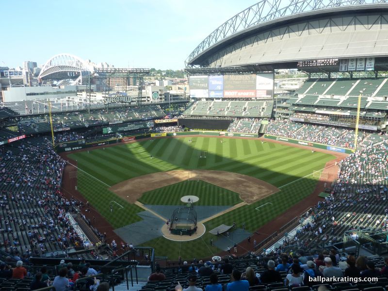
-Best Feature: The Pen
Billed as one of baseball’s greatest success stories by saving baseball in Seattle, the park formerly known as Safeco Field routinely ranks as one of the game’s greatest cathedrals.
I have my issues with some aspects of the stadium’s design, but there’s no denying the fan-friendliness of the Mariners home, which was way ahead of its time in many respects.
With over $500 million invested in this place in the late 1990s, it’s only one of a few ballparks that could properly be described as “ornate,” with no expense spared. Even over 20 years later, the amenities positively overwhelm.
The umbrella-style roof is an obvious contender, but “The Pen” remodeled in 2011 is the showstopper.
While many parks have crowd-pleasing setups allowing views into bullpens, The Pen allows fans to watch pitchers warm up at ground level mere feet away unobstructed by significant barriers. I’ll never forget talking with a Yankees fan who was absolutely floored by the intimate layout compared to his home ballpark.
T-Mobile Park is a top-tier food venue overall, but I’d argue The Pen is the single best standalone location for food within an MLB ballpark as well.
Local eateries in The Pen have varied widely since the concept debuted—in the past, the Mariners have mingled Mexican tortas stands and Parisian crepe kiosks, offered lobster rolls and local BBQ—but the restaurant-caliber quality has consistently been the very best of the best. This is the home of Seattle’s infamous chapulines (toasted grasshoppers).
The Pen also features bars, cocktail seating, and a fireside lounge. It’s absolutely the first place to check out when visiting T-Mobile Park.
—-Other strengths: 1) Retractable roof design acts as an “umbrella” rather than sealing the park; you’re protected from the rain, but exposed to the climate, 2) There’s little visual sense of place from the lower bowl, but the upper deck in right field offers views the Seattle skyline. Other perches further up reveal glimpses of the Space Needle and Puget Sound, 3) Open main concourse offers great visibility of the field, 4) Numerous SRO areas throughout the outfield spanning multiple levels, 5) Upper deck concourse offers magnificent water views on the far side, 6) One of baseball’s largest videoboards, 7) Places #3 in our ballpark food rankings, 8) Arguably the very best ballpark for craft beer, close with Petco in San Diego, 9) Mariners Hall of Fame and Museum is impressive for a franchise with such a short and relatively unmemorable history, 10) Various pieces of “Art in the Park,” the crown jewel being the chandelier of 1,000 translucent bats suspended over the home plate rotunda, 11) Ken Griffey Jr. statue is nice, but the sculpture of announcer Dave Niehaus sitting at his booth with notes is one of the most detailed statues I’ve ever seen.
-Worst Feature: Incoherent Exterior Architecture
Despite its various fan-friendly features, T-Mobile Park has always been something of a conundrum for me. I love the gameday experience and the numerous frills, but I dislike the actual structure.
With its stubbornly conflicting architecture and total lack of interior aesthetic vision, I’ve always considered T-Mobile to be the most overrated ballpark from an aesthetic point of view. With all of the time, money, and effort spent on the $70 million roof, T-Mobile’s interior visuals lack a defining focal point, with poor attention to the urban context and haphazardly placed outfield grandstands. The park is not as beautiful as Mariners fans would have you think, especially from the lower bowl.
I think that’s a less controversial sentiment when looking at the outside, as most architecturally-inclined baseball fans agree that the exterior design is a total mess.
In what is perhaps the most disjointed stadium in North America, half of the ballpark emphasizes the rationalist steelwork, while the other half is wrapped in a retro facade. You can’t do both.
If you’re going to have a modern retractable roof that dominates the stadium, why tack on retro architecture that meekly tries to fight it? And why only on one side!? It all comes out as a painfully confused structure, as the steel trusses and roof are disproportionately scaled in comparison to the retro architecture.
Considering the modern nature of the retractable roof, the Mariners should have chosen to accentuate the steel trusses of the super structure, building a decidedly modern industrial ballpark. But “retro” was king in 1999, and the Mariners tried to have their cake and eat it too.
—-Other weaknesses: 1) Located on the extreme periphery south of downtown, the Mariners should have built their home north integrated with Pioneer Square. But that was admittedly a tight fit. 2) Interior lacks aesthetic vision or defining element other than the bulbous roof, 3) Little visual sense of place from the lower bowl, 4) Planned renovations will surely correct this, but the Hit it Here Café, club level, and other premium spaces feel worn and tired
10) YANKEE STADIUM (2009), NEW YORK YANKEES: 86.5
Consensus Ranking: Upper-Middle Tier to Middle of the Pack, High Variability
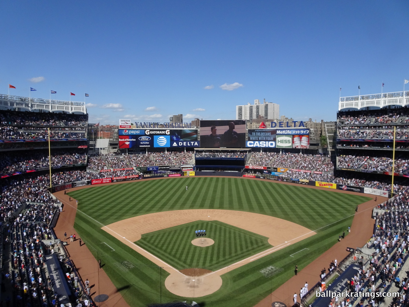
-Best Feature: Celebration of Yankees History
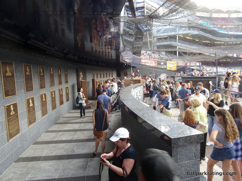
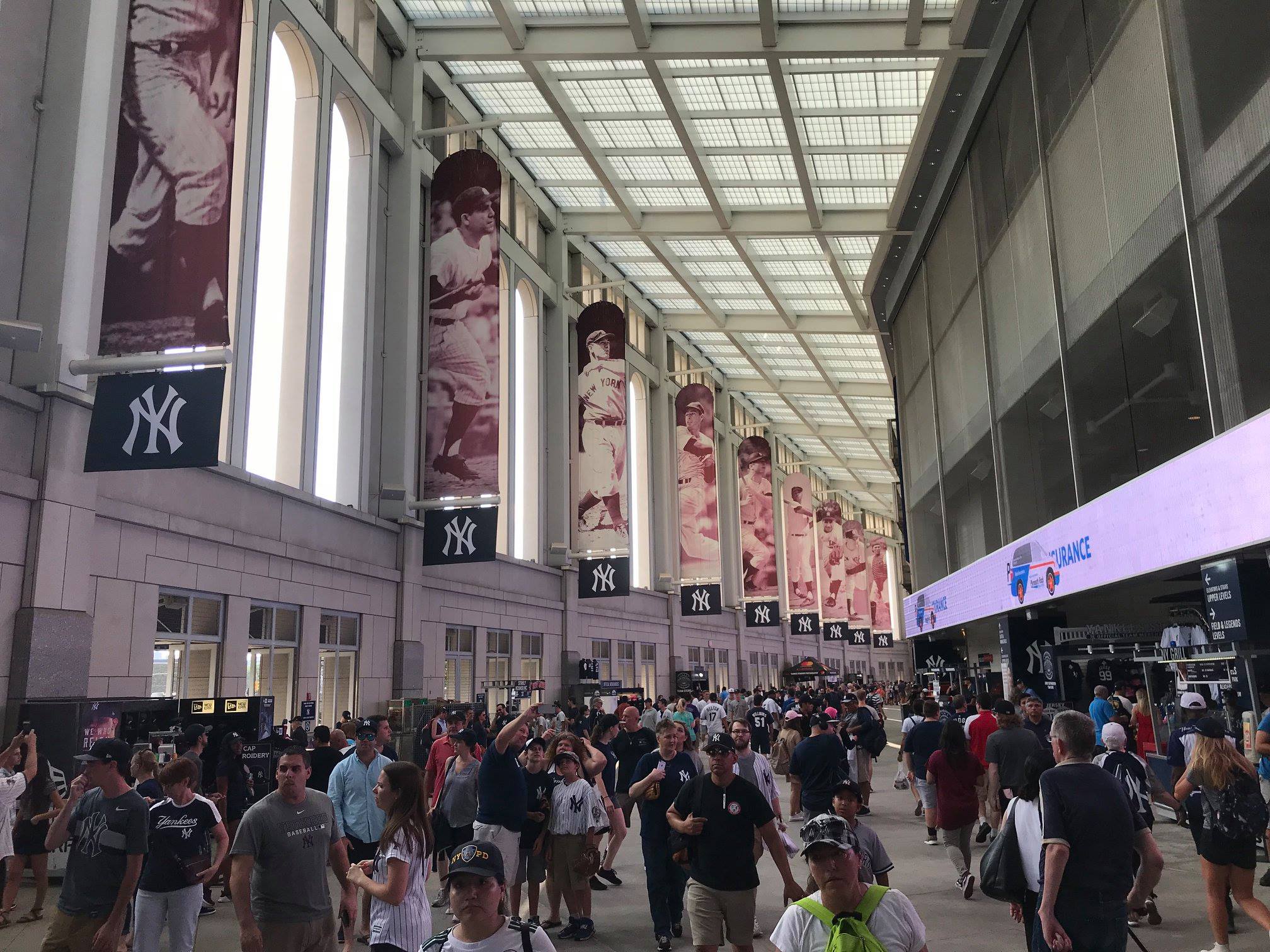
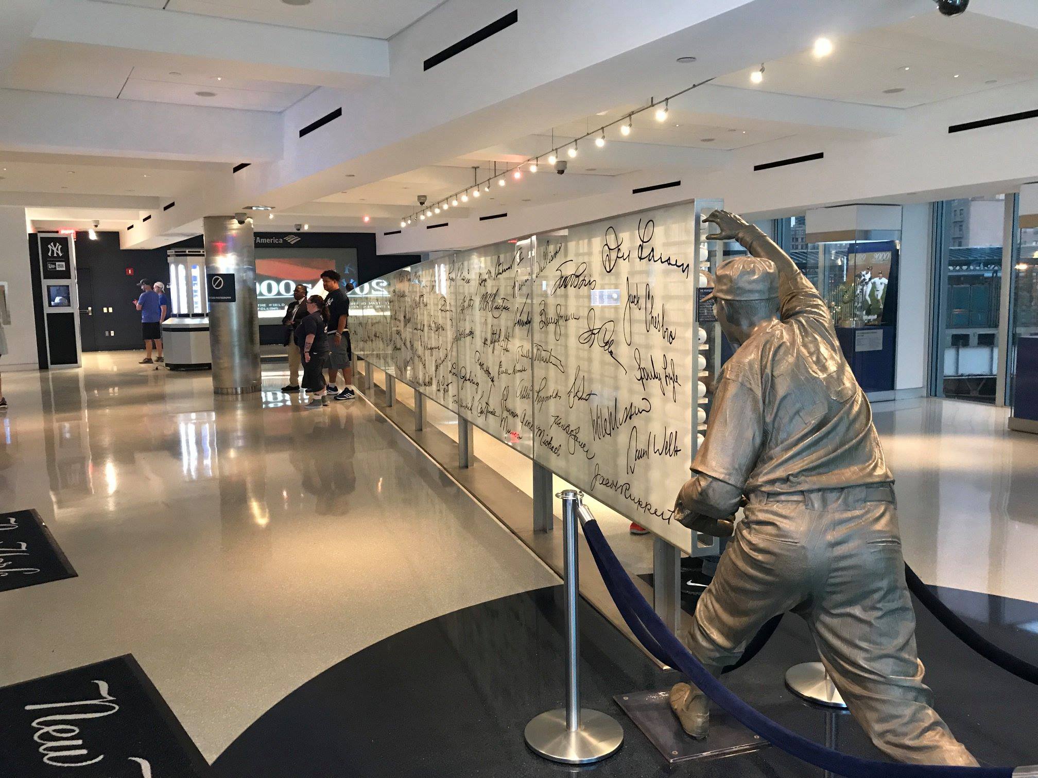
Probably the most polarizing ballpark in America, Yankee Stadium III has elicited a wide range of reactions from fans, oddly often dependent on where you live. There’s an almost universal consensus among New Yorkers that Citi Field offers a better fan experience than Yankee Stadium. On social media, you hear some version of “I’m a Yankees fan, but Citi Field is the better ballpark” all the time. It’s a very fashionable place to bash in certain circles.
However, when you sample opinions from out-of-towners, ballpark enthusiasts, and national publications, takes on Yankee Stadium are much more balanced, recognizing its fitting grandiosity, thoughtful historical touches, and wide range of modern conveniences.
Maybe the out-of-towners like me are more drawn to this place as an awe-inspiring baseball destination where each game seems like a big event, while it doesn’t have the same “repeat value” for locals given some of the fan-unfriendly policies.
Regardless, I’ve always had a contrarian impulse to defend Yankee Stadium against detractors. Hating the Yankees and their stately stadium is the hip thing to do, but as the most expensive ballpark in baseball history, it’s firing on all cylinders on a functional level and has the amenities of a medium-sized town. Fan-friendly alterations in 2017 also helped. Have some pride in your ballpark, Yankees fans!
But no matter your persuasion, you can’t deny that Yankee Stadium is all about Yankees baseball and Yankees history, and reflecting the team is a baseline for any great ballpark design.
Called “Part Stadium, Part Museum” by multiple publications upon opening, Yankee Stadium has not one but three historical destinations.
Despite earning the moniker “Monument Cave” for its drab appearance in center field, (a) Monument Park features five Yankee monuments, stone walls showcasing retired numbers, and team plaques mounted on the back wall. Anchored by statues of Don Larson throwing his famous perfect game to Yogi Berra, the (b) well-appointed Yankees Museum is a destination in its own right. Along with the obligatory memorabilia, be sure to check out that “Ball Wall” in between the statues featuring nearly 1000 balls autographed by Yankees’ past and present. Finally, (c) the banners in The Great Hall are positively monumental.
Be sure to check out the tasteful photographs of Yankees greats above the concessions on the main concourse. It’s all simply wonderful, if you can get over your bias against the organization.
—-Other strengths: 1) With New York undergoing so much gentrification in the 21st century, I kind of like how the South Bronx scene around Yankee Stadium has been somewhat immune to that (Stan’s Sports Bar and Yankees Tavern), 2) Exterior façade lacks the nuance of the original (pre-1973), but the imposing tones of limestone and granite certainly fit the importance of the franchise, 3) Iconic white frieze, 4) Subway trains whistling by visible through a slit in right-center field give the park a much-needed charming urban sensibility, 5) Only MLB ballpark to pad every seat in the lower bowl, even in the outfield, 6) Main, terrace, and upper concourses are all open to the field, 7) When you include The Great Hall, the concourses have plenty of space, 8) Food variety is outstanding, 9) Lobel’s steak sandwich is one of baseball’s best “signature foods,” 10) If you can afford it, the premium clubs are utterly sybaritic, 11) Plenty of amenities accessible to all fans with a ticket: (a) NYY Steak, (b) Hard Rock Café, (c) a martini bar, (d) third base lounge on the main concourse, (e) two new social spaces replacing the poorly oriented bleachers, (f) two more new sit down bars in the upper deck, 12) Passionate Yankees fans and ballpark traditions like the Bleacher Creature Roll Call and playing New York, New York after the game
-Worst Feature: Unfriendly Ballpark Policies
Admittedly, the Yankees have taken small steps to counter the perception that their stadium is a cold, corporate, ultra-sanitized place to see baseball (Hey, look! We added a kids’ zone!). But it still has a vastly more ridged environment than the other 29 ballparks.
As I mentioned, I don’t consider price in judging the quality of the ballpark, but it’s impossible not to measure it indirectly at Yankee Stadium. Because of exorbitant costs, the team is unbelievably strict about checking tickets, to the point where you have to negotiate to get a picture in the lower bowl.
And that’s just the regular lower bowl. Forget about the Legends Suite club, the ring of ultra-premium club seats closest to the infield. Unauthorized entry into the Legends Suite is more difficult than unauthorized entry into the United States Capitol Building.
I actually had a Legends Suite ticket a few years ago. At least once, I try to get the priciest seats at an MLB ballpark, because having access to the best premium club will usually grant you access to all similar spaces, and I want to explore every nook and cranny of a ballpark for the website. Not here. Even if you have access to a club with a seat worth a bazillion dollars, the staff will act aghast that you would dare try to take a picture of a club for seats worth $90 dollars. That should give you a sense of how the staff operates.
I finally got to see every nook and cranny of Yankee Stadium, but it took me six trips. During my first trip to new Yankee Stadium in 2012, someone even threatened to throw me out for trying to take a picture of a space where I wasn’t authorized. I’ll never forget it.
So, Yankee Stadium has earned it’s #10 ranking in the face of pretty significant misgivings!
Interestingly, the individual staff members top to bottom are very well trained, but they’re stiff and rehearsed like a hotel staff. Strike up a conversation with an usher, and you might think he or she was marginally schooled in the art of hospitality like a bellhop at the Ritz Carlton. Suffice it to say, unlike any other ballpark.
—-Other weaknesses: 1) Yankee Stadium may reflect the Yankees, but it doesn’t reflect New York. I give it somewhat of a pass because you knew Yankee Stadium was always going to be an enclosed, circular bowl emulating the original, and that wasn’t going to feature a skyline panorama like a PNC Park, but not reflecting the city is still a major strike against it. 2) Unacceptably narrow concourse in center field behind the bleachers, 3) Upper deck too far pushed back even for a post-1990 park, 4) Dreadful craft beer selection, only behind that of Toronto’s barren scene
9) Truist Park (2017), ATLANTA BRAVES: 87
Consensus Ranking: Middle of the Park, High Variability
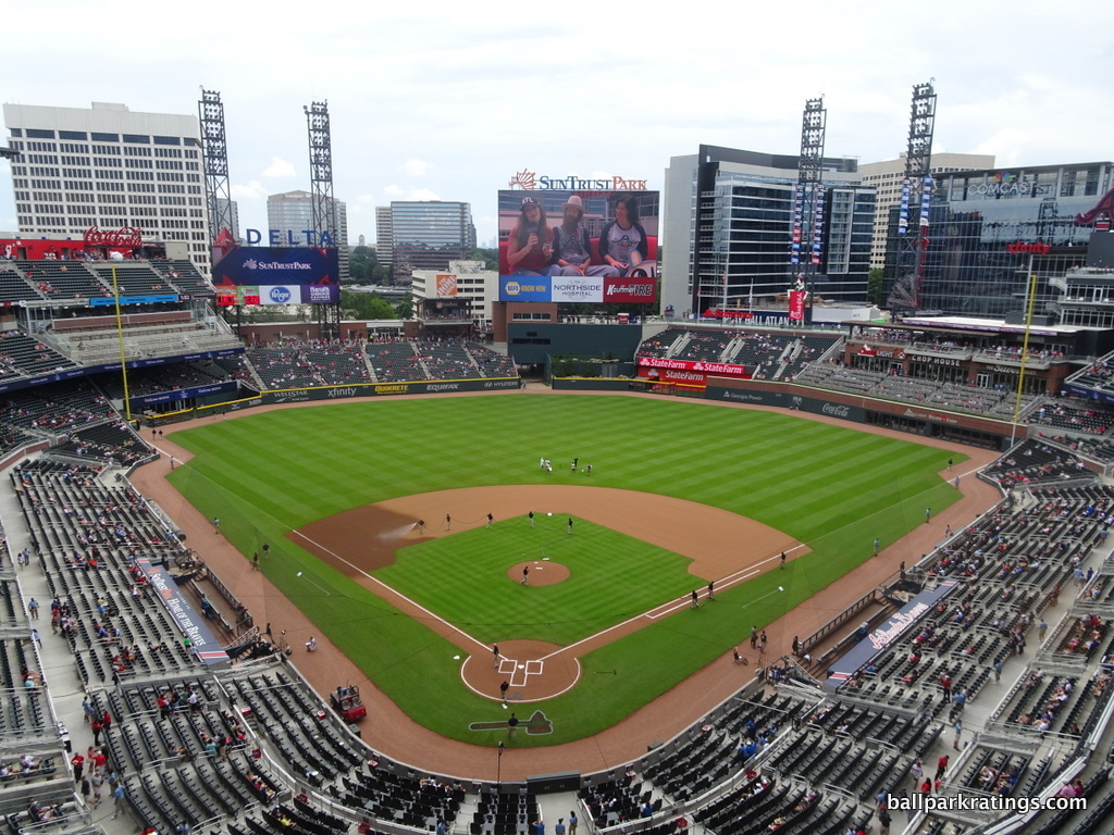
-Best Feature: Monument Garden
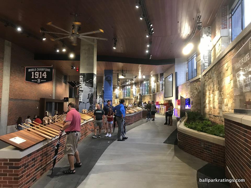
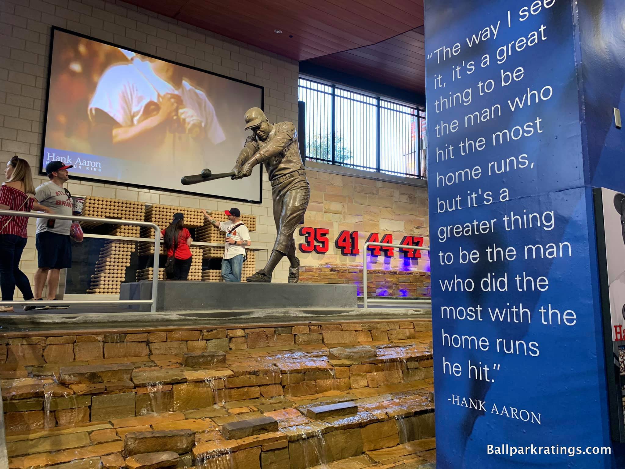
Truist Park garnered a huge diversity of opinions in its infant years. Just from ballpark websites and national publications, I’ve seen Ballpark Digest put it at #7 and five Washington Post sports writers (whose rankings almost perfectly align with the consensus) collectively put it at #24.
Some see Truist as the bland mallpark epitomized, while others view its mixed-use development and fan-friendly amenities as the model for future MLB ballparks. For me, it’s both.
Naturally, we’ll focus on the latter first. The “fan experience” at Truist Park, separate from any misgivings about the aesthetic design or general artificiality of the ballpark concept, may be the very best in Major League Baseball. In terms of food, drinks, mixed-use development, social spaces, premium seating, historical references, and entertainment features, we are seeing novel concepts entering uncharted territory. There’s something for everyone at Truist Park in every conceivable way.
Located on the main concourse behind home plate, Monument Garden is undoubtably Truist Park’s standout feature. I’ve lavished praise on various historical exhibitions in this piece, but the Braves’ version is the very best.
Standalone ballpark museums are great, but how many fans will go out of their way to see them? In Atlanta, the “museum” is weaved into the fabric of the ballpark onto the concourse itself!
Anchored around a statue of Hank Aaron backed by 755 bats (in the shape of the number “755”), the garden features an interactive timeline of the franchise’s history from Boston to Milwaukee to Atlanta with tons of cool memorabilia. The exhibition combines all kinds of artifacts in perfect rhythm and proportion, from photos and videos to bats, gloves, and baseballs.
Accentuated by gorgeous water features, it’s not only the best historical exhibit in an MLB park, but one of the best features in any ballpark, period.
—-Other strengths: 1) The Battery Atlanta, the mixed-use development model surrounding Truist filled with shops, bars, and restaurants rivaling baseball’s best local scenes, 2) Large canopy over the upper deck is functional and visually pleasing, 3) Above-average use of cantilevers with no separate suite levels place the 300-level close to the action, but that’s a bit nullified for folks in the 400-level given the extreme split in the upper deck, 4) Concourses mostly open to the field on all three levels, 5) High-quality local food options, namely Fox Bros. Bar-B-Q and H&F Burger, 6) Terrapin Taproom with a brewery onsite, 7) Plenty of other bars and social spaces accessible to all fans, namely the three-level Chophouse and the Xfinity Lounge in the upper deck, 8) Premium seating quality up there with Yankee Stadium, but without the unnecessary exclusiveness, ridiculous prices, or snobbery, 9) Original kids’ entertainment options, including a zipline and a rock climbing wall
-Worst Feature: Generic Mallpark Architecture Inside and Out
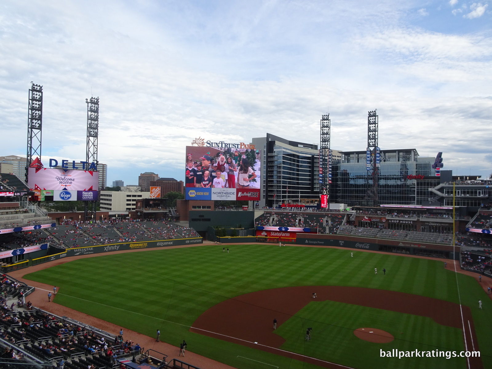
If you’re a casual fan, you’ll have tons of fun at Truist Park. If you’re a serious fan, it’s a pretty good place to actually watch the game. But the structure itself is the most formulaic and derivative in all of baseball (which is saying a lot).
The term “mallpark,” used to signify that mall-like amenities are emphasized over aesthetics and the game on the field, has been overused in the past. Starting in about 2008, you saw many ballparks emphasize the former at expense of the latter, but there were still some genuine architectural sensibilities lingering.
But SunTrust Park is baseball’s first true mallpark, where almost everything is all about creating “experiences” and generating revenue with little attention to original design flares and authentic aesthetics.
Looking at the outside, Truist Park’s red brick architecture doesn’t even feel like a deliberate design choice; it feels like a generic starting point that wasn’t carried out to full fruition. Unlike the other derided red brick cookie cutters, there are no distinctive design cues or regional accents. There is no larger concept here. Even for retro red brick, this is lazy and generic. It’s just red brick! It’s the bland professionalism that characterizes Braves baseball. This is a park that was designed in a corporate boardroom.
Truist Park’s interior aesthetics aren’t much better. It looks like the Braves literally used a generic template, something out of the expansion team stadium in MVP Baseball 2005. The interior visuals are way too busy, suffering from a lack of continuity, balance, and order, led by a cluttered outfield scene and sprinkled with an occasional gimmick. The Battery Atlanta lingers in the background, but it doesn’t feel contextually cultivated or integrated with the interior.
With the suburban location, Truist Park’s views don’t give you any sense of place, either. This could be in Anywhere, USA. It’s obvious that team was only concerned with packing amenities into each and every space, with little interest in aesthetic principles.
Unlike the new Globe Life Field in Arlington, the fan-friendly features here are so elaborate that they offset the almost offensively pedestrian structure, so Truist fares well overall in our book. It’s also not like Truist Park is ugly or anything, as this design is decidedly non-polarizing to the layperson. But from my perspective, that’s exactly the problem.
Timeless designs endure, while amenities in ballparks with boring, tame McMansion architecture age. So, it will be interesting to see how the Braves’ new home does in the long run.
—-Other weaknesses: 1) The Battery Atlanta, a strength and a weakness. This privately-controlled pseudo-city in suburbia synthetically manufactures the organic sensibility around a Wrigley or a Fenway. It’s faux mimicry of an urban neighborhood. 2) Traffic and parking headaches; Truist Park is a pain to get to if you’re not in Atlanta’s northern suburbs, 3) Concourses can get surprisingly narrow in some areas
8) PROGRESSIVE FIELD (1994), CLEVELAND INDIANS: 87.5
Consensus Ranking: Middle of the Pack
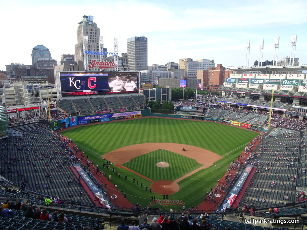
-Best Feature: Local Food
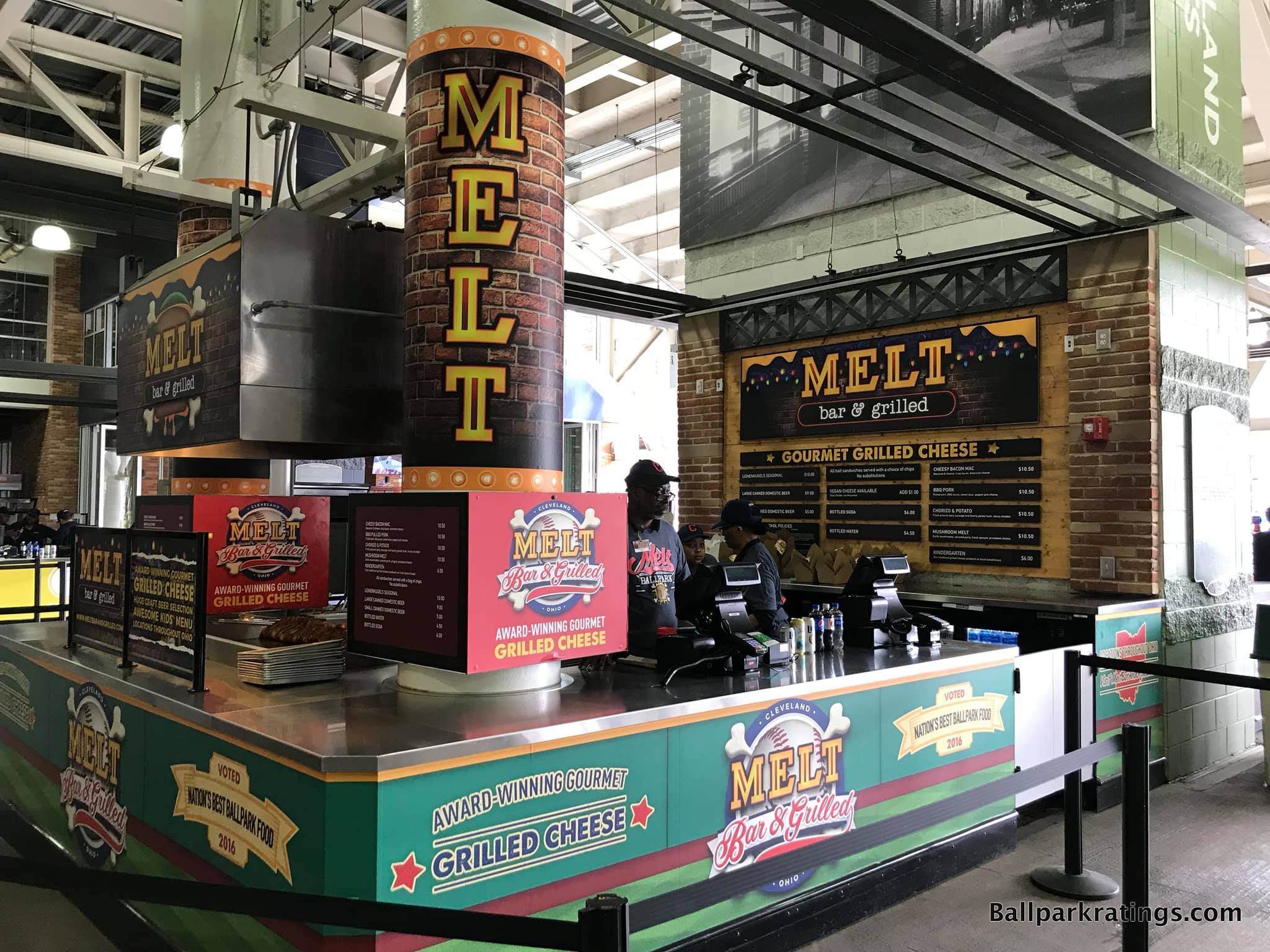
Initially deemed a worthy successor to Camden Yards (1992), the park formerly known as Jacobs Field hasn’t gotten much love in the 21st century. It is true that the ballpark was not properly maintained in the mid-late 2000s. After the 2014-15 renovations, Progressive Field is back in full force, a prime destination for any ballpark trekker and one of the most underrated parks in baseball.
It’s one reason why baseball awarded Cleveland the 2019 All-Star Game over Baltimore, even though the latter had a longer All-Star Game drought and is generally considered to have the better ballpark. The renovations at Progressive Field have been superb, as this ballpark has risen in my rankings more than any other in baseball.
Renovations improved just about everything, but the enhancements are most apparent in the food and beverage department.
Formerly characterized by Subway and value-oriented options, Progressive Field is now quintessentially 2010s, filled almost exclusively with first-rate fare from local eateries. I counted over a dozen different Cleveland restaurants within the Indians’ home highlighting the city’s foodie scene. Absolutely outstanding.
Five specialty sandwich shops, three local Mexican eateries, a couple of burger joints, and an Italian pasta stand are most notable. According to the Indians, most will be back for 2021 even after Covid.
Parks in New York, San Francisco, San Diego, and Seattle may have more exotic varieties of cuisine, but the quality of the grub in Cleveland is near the top.
—-Other strengths: 1) Gateway District local scene in Downtown Cleveland is above average, 2) Conceptually brilliant exterior architecture reflects Cleveland’s industrial values, with steel grinders mimicking local bridges and light towers referencing smokestacks, 3) Authentic interior aesthetics that eschew any semblance of gimmickry and adroitly respond to the contextual forces of the city, 4) Use of trees as the batter’s eye is a great use of space, unlike some plastic-looking walls at other ballparks that stick out like a sore thumb, 5) Renovations divided the main concourse into different “districts,” conceptually separating the park into “neighborhoods” emulating the city, 6) Expanded Centerfield Plaza with statues gives fans an immediate sense of arrival, 7) Progressive Field has the largest videoboard in baseball, 8) Top-10 craft beer selection and quality, 9) Numerous accessible bars and social spaces, the best of which is the bi-level Corner Bar, 10) Full-service Terrace Club restaurant accessible to all fans is one of the last of its kind in MLB, given the trend toward more flexible spaces; be sure to check out the Bob Feller exhibit here, 11) Renovated all-inclusive mezzanine club lounge is sublime, 12) Heritage Park in center field is a solid historical tribute to Cleveland’s past greats, 13) The elaborate “Kids Clubhouse” is one of the largest children’s areas in baseball
-Worst Feature: Three Tiers of Luxury Suites
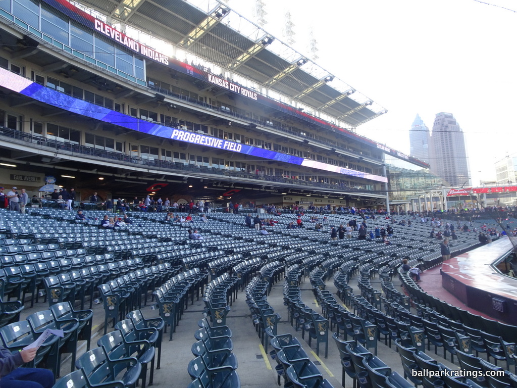
While parks like Yankee Stadium have garnered reputations to having sharp class distinctions in seating, Progressive Field has the most hierarchically divided appearance in baseball with its towers of suites. Even more importantly, this premium seating model with hundreds of individual luxury suites is no longer viable.
If Progressive Field faces its downfall sooner than we anticipate, I think this basic structural design will be one of the culprits. The park was built because of the revenue generated by these luxury suites, but no baseball market can sell anywhere near this number of suites.
The new model is to have more club seats and a limited inventory of individual suites. The Indians have rapidly tried to repackage many of these suites as entertainment areas and clubs, but the structure can’t be changed.
Progressive Field’s three tiers of suites also have implications for its various seating issues, pushing the upper deck higher than necessary.
—-Other weaknesses: 1) As thorough and thoughtful as the renovations were, they added these hideous white boxy structures resembling shipping containers in the right field upper deck, 2) While many of the worst seats down the right field line were eliminated, Progressive Field’s seating geometry down the lines is still subpar, 3) The renovations oddly did not replace the old seats with new ones. All other early-mid 1990s ballparks have replaced their old seats, and many of Progressive Field’s old seats are rusting and breaking. Big flaw. 4) Upper deck seats also lack cupholders, 5) We can debate the cause, but Cleveland’s attendance numbers have been near the bottom for more than a decade despite a competitive club
7) COORS FIELD (1995), COLORADO ROCKIES: 88
Consensus Ranking: Top-10 to Upper-Middle Tier
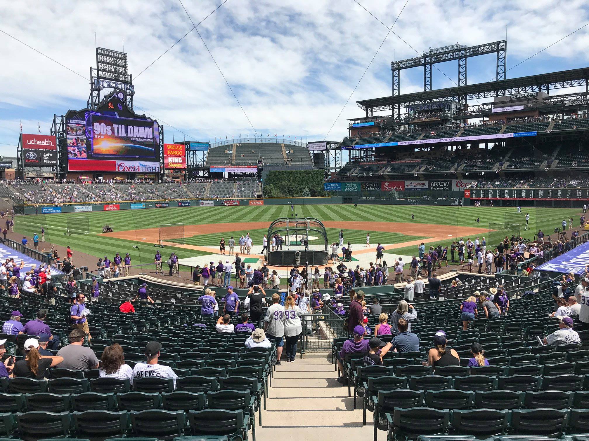
-Best Feature: Intimate Exterior Design That Fits Perfectly in LoDo
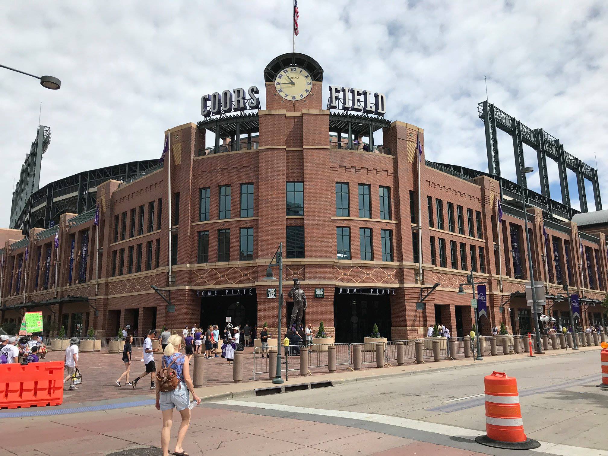
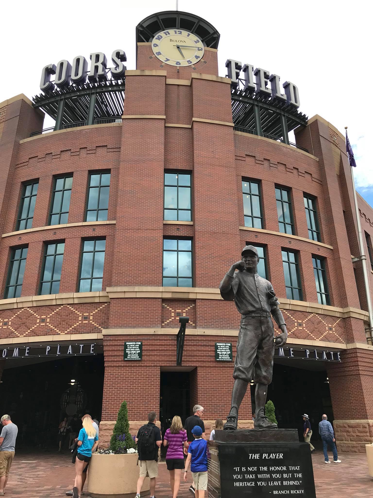
Coors Field is one of those ballparks that everybody raves about, but you don’t really know why until you go.
When the P.A announcer boasts that Coors Field is “baseball’s finest ballpark,” it’s a pretty big stretch, but not as big of one as you might think. The Rockies’ ballpark is pretty well-rounded and was on the forefront of a number of ballpark trends, while possessing an exceptional feature or two added during the 2010s enhancements.
But Coors Field’s greatest asset will always be its timeless exterior architecture in perfect symbiosis with Denver’s Lower Downtown.
With many of Coors Field’s predecessors and successors, we see red brick facades whose value is simply derived from the fact that it is red brick. At Camden Yards for example, retro itself, not the individual design, is the novelty. I feel like Coors Field is one of the few retro ballparks that took the red brick aesthetic one step further, adding regional accents and distinctive design cues from the area. In other words, it is actual architecture.
Coors Field is not another McMansion red brick ballpark, but a true architectural monument; brick, sandstone, and ornamental terra cotta columbines are added in perfect proportion, creating a design with a distinctive southwest rhythm. The darker, almost clay colored red brick works extremely well here, exuding a certain rustic neighborhood warmth that could only be associated with LoDo. Specifically, note the subtle masonry below the rectangular windows is designed in a “diaper pattern,” which refers to the beige diamonds along the façade in a diagonal shape.
Perhaps unlike any ballpark built before, or since for that matter, the architects focused on building a structure that had a physical connection to the surrounding environment on the outside. Yes, plenty of retro ballparks do this, but Colorado does it best. Like when you walk up to Wrigley and Fenway, Coors looks like it’s been there for 100 years, because the architecture so strongly matches that of the surrounding old warehouse buildings. For a relatively large interior, Coors Field is scaled so intimately on the outside.
Coors Field ultimately earns the #1 spot in our analysis of MLB exterior architecture due to the use of higher quality materials, unique southwestern accents, plenty of regional touches, superior scaling through intimate exterior landscaping, excellent sense of place, and masterful integration with the neighborhood. Check out my ballpark architecture piece for a full analysis of Coors Field’s exterior.
—-Other strengths: 1) LoDo itself is still one of baseball’s very best ballpark neighborhoods; from breweries and full-service restaurants to clubs and rooftops, there’s a scene for everyone. Most notable: The National Ballpark Museum is right next door! 2) Given all of the discussion about the outside, Coors Field’s clocktower behind home plate also deserves a nod, 3) Mountain views discussed below can be beautiful given the right conditions, 4) The geysers surrounded by shrubbery in center field liven up the interior aesthetics, 5) Wide, open main concourse with good field visibility, 6) Massive new videoboard shaped like a mountain, 7) First modern-day MLB park to get the seating geometry mostly right, 8) The Rocky Mountain Oysters are awful but always amusing to sample anyway. When in Rome. 9) Replete with cabanas, walk-up bars, drink rails, signature eateries, and captivating mountain views, “The Rooftop” in right field is truly exceptional, 10) Sandlot Brewery and Smokehouse, the first brewery in an MLB ballpark and the birthplace of Blue Moon (No joke!), 11) Overall, Coors has a tremendous series of full-service restaurants, bars, and social spaces accessible to all fans, 12) Purple seats in the upper deck, marking exactly one mile above sea level, 13) Rockies attendance numbers are consistently great despite the middling team.
-Worst Feature: Underwhelming Interior Visuals
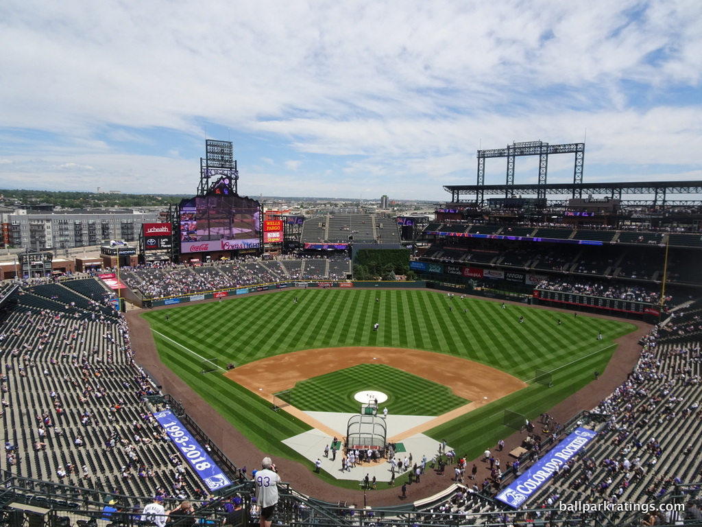
Considering Coors Field’s many strengths, it’s ironic how often fans rave about its spectacular mountain vistas, given that the views are rarely spectacular and not visible from most seats.
The entire ballpark concept was framed around these sweeping mountain views past third base. Deliberately turning its back on Downtown Denver, Coors Field’s left field upper deck is tapered off before any other ballpark in the majors, in a valiant effort to showcase perhaps baseball’s most unique views in theory.
The problem is the mountains just aren’t notable enough to frame an entire design around, considering the ballpark’s orientation, along with the mountains’ distant scope and limited placement. Its presence just isn’t noticeable enough to most fans, and the clouds consistently compromise its visibility.
If you’re sitting in the right field upper deck corner, you have one of the most aesthetically notable experiences in baseball, but only (a) in the right place (b) at the right time (c) under the exact right conditions. The mountain views are incredible when things go exactly right, and I personally had that experience at a game here in 2018, but that’s a narrow set of parameters!
If you’re sitting anywhere else, including everywhere in the lower bowl, Coors Field has a pretty undistinguished look. Most of the interior simply looks functional, with interior urban integration non-existent. From more than three-quarters of the interior, the outfield structure looks like a practical stadium.
Coors Field may be an “urban utopia,” but you wouldn’t know it on the inside. LoDo’s presence isn’t at all acknowledged by the interior design. The new industrial-looking apartments in left field beyond this brickwork clashes with the retro vibe as well.
The interior aesthetics are spectacular from a few perches, but underwhelming from most.
—-Other weaknesses: 1) Coors Field lacks the historical references to baseball and/or team history of most other MLB parks, but it obviously gets somewhat of a pass because of the Rockies short franchise history. 2) One of the most rudimentary kid playgrounds in an MLB park. But Coors Field is impressive in its lack of any other major or minor flaws.
6) ORIOLE PARK AT CAMDEN YARDS (1992), BALTIMORE ORIOLES: 88.5
Consensus Ranking: Top-5
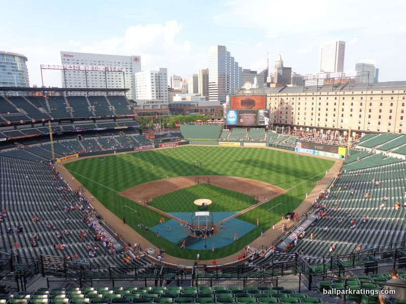
-Best Feature: B&O Warehouse and Eutaw Street
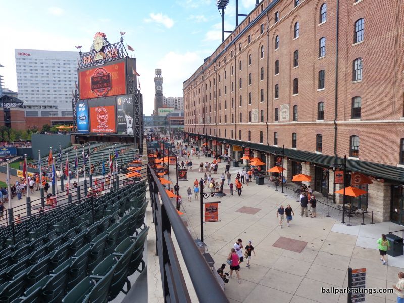
So much has been written and spoken about Camden Yards—its narrative is as mythic as its sweep—that it’s difficult to summarize its influence without reciting clichés that have already been digested by millions of baseball fans.
Yes, the venerable sensibilities associated with a generation of “retro” parks, with their warm red brick facades, dark green seats, and asymmetrical dimensions, began here.
But that was never Camden Yards’ intention, which helps explain why so many of the imitators have been relative disappointments.
The significance of Camden Yards wasn’t that it was old fashioned. It’s that ballparks can be made better by abandoning templates and constructing something contextual. The first ballpark visibly integrated with an urban area in nearly seven decades, the significance of Camden Yards was its authentic responsiveness to its surroundings.
That’s best illustrated by Baltimore’s B&O Warehouse, a ballpark landmark now on par with Wrigley’s ivy or Boston’s Green Monster.
Serving as the inspiration for the entire design, the eight-story, turn-of-the-century rail freight building is an essential part of the ballpark’s assemblage, acknowledging Baltimore’s bygone days as an industrial hub. Once called an ugly pile of bricks by columnists prior to construction, the warehouse now solidifies Camden Yards’ signature appeal. The ballpark was reframed around this classic preexisting building in all ways possible.
The de-facto dominant image of the ballpark, the B&O Warehouse ties the scene all together brilliantly. The 1,116-foot-long brick structure is in remarkably congruent proportions with the ballpark. It’s striking, classic, and familiar.
Through effective urban planning, the warehouse seemingly miraculously ends in the foreground right as the 250 West Pratt Street building rises in the background. The epitome of postmodern urban architecture and the tallest high-rise in Camden’s downtown view, I can’t think of a more perfect symbolic blending of historic and modern.
Eutaw Street, which separates the warehouse and the ballpark’s gates, is a phenomenal urban planning tool that allows the community to connect with the ballpark. By constructing a superstructure that approaches the warehouse but doesn’t touch it, the two giant buildings reinforce each other as equals. Since there is no literal physical connection between the structures (other than the bridge on the club level), the warehouse serves as an urban building that symbolically connects the ballpark to the community.
On the inside aesthetically, Camden Yards is the perfect ballpark. The interior design is simple, coherent, authentic, and attractive, lacking the busy distractions of the newer ballparks, while also having an organic “signature feature,” lacking in the other authentic parks.
Sure, surrounding views happen to be better at ballparks in Pittsburgh and San Francisco, but I don’t think the Camden’s interior design itself has ever been eclipsed.
—-Other strengths: 1) Camden Yards ushered in a broader trend of American urbanism, 2) The immediate surrounding area has gotten some bad press lately, but the revitalized Inner Harbor is still a prime attraction, 3) Understated yet dignified exterior architecture, stripped of the self-conscious pomp and frills seen in later ballparks, 4) Outfield dimensions authentically conform to the site, without arbitrary quirkiness, 5) Combined club and suite level and closed lower concourse place upper levels very close to the field for a post-1990 park, 6) Some new seats installed in 2011 are wider than usual, 7) I think the food and beverage selection and quality is average today, but Camden Yards was a pioneer in bringing higher-quality fare to the ballpark, 8) The Rooftop Bar atop the batter’s eye is an exciting space, 9) Legends Park statue garden in left-center field has some of baseball’s best statues, 10) Brass baseballs designating every home run that has ever landed on Eutaw Street is Camden’s coolest artistic touch, 11) As you can read in the actual review, Camden Yards implemented many subtle logistical innovations that have been emulated by subsequent parks
-Worst Feature: Worst Seating Geometry of Any Modern Ballpark
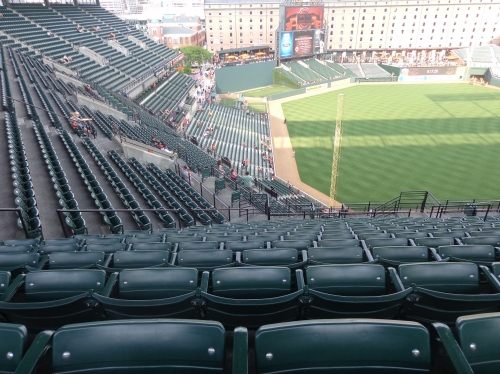
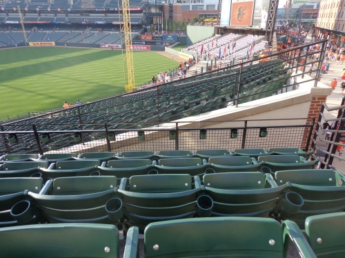
Many of the best retro-classic ballparks strongly adhere to the principle of contextual design, meaning the grandstands conform to the surrounding streets like the jewel-box parks. That’s pretty cool, but the seats down the lines need to be sharply angled toward the diamond to compensate for this.
Some ballparks don’t angle the seats quite aggressively enough to compensate. It’s annoying, but not intolerable. But Camden Yards barely orients the infield seats down the lines, and it doesn’t orient the upper deck seats down the lines toward the action at all!
So essentially, when you look at the seating chart, the direction of the grandstand determines your viewing angle. This means that the seats in the left field sections 360-372 and right field sections 310-306 are pointed toward center field. In fact, thousands of seats down both the left and right field lines are oriented past the center field wall.
This is Metrodome stuff here, where fans would rather sit in the outfield than down the lines in the upper deck. It’s undoubtedly Camden Yards’ biggest flaw, and it’s a doozy.
Camden Yards got almost everything right aesthetically, but beauty and influence don’t equal perfection across the board. Most of its successors are more functional.
—-Other weaknesses: 1) As has been widely discussed, Camden Yards’ concourses are completely closed from the field, unlike the vast majority of parks that followed, 2) Seats at back of the terrace level in the infield grandstand suffer from obstructions above, 3) As of 2021, Camden Yards has baseball’s smallest videoboard and most outdated technology overall, 4) Upper deck seats added 2011 inexplicably don’t have cupholders, 5) Perhaps to the delight of traditionalists, Camden Yards is the only modern-day MLB park without some sort of ultra-premium all-inclusive seating option. Camden’s at the bottom of premium seating, which puts the team at a financial disadvantage, 6) Club level is charming but woefully outdated, 7) Overall, Camden Yards could benefit from a Progressive Field-style renovation that would remedy many of these issues
5) TARGET FIELD (2010), MINNESOTA TWINS: 89
Consensus Ranking: Top-10
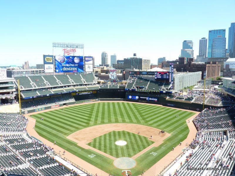
-Best Feature: Ballpark Screams “Minnesota” Inside and Out
After a handful of near-misses in the mid-to-late 2000s, Target Field went back to the roots of the so-called “retro” movement by building a structure in symbiosis with its environment, despite being one of the least retro designs we’ve seen in 20 years.
With its contextual urban lines, mostly confident and free from gimmicks or distractions, Target Field directly recalls the authenticity of the best ballparks in its connection to the region. Target Field also benefits (a) from being very well rounded, as it excels in almost all respects while rarely being particularly outstanding, and (b) from the fact that the Twins have displayed an admirable dedication to continually upgrading the facility despite its young age.
Not one particular feature sticks out in my opinion, but the through line is everything ranging from the design to the fan-friendly amenities reflects Minnesota.
Decked out with limestone derived from Kasota quarries and natural wood paneling imported from Brazil, the exterior façade encapsulates a flavorful mix of cosmopolitan Minneapolis and natural Minnesota.
Inside, limestone facades are present all throughout the outfield, including the Budweiser Deck and the overhang in right field. Even the backstop and the dugout, along with all of the interior grandstand facades, are finished with Minnesota’s local stone. The wood backs of many of the seats put a finishing touch on the natural theme and emphasize the ballpark’s organic color scheme. The new natural “living” batter’s eye further accentuates this sensibility.
Target Field represents the region beyond just the obvious aesthetic flares. Concourses are decked out in beige hugs matching the interior and exterior. The “state fair” concessions serve local classics like Wild Rice Soup, cheese curds, Wally on a stick, pork chops, and sweet corn. Designed by a local artist, the Minnie and Paul logo in center field depicting players shaking hands across the Mississippi River represents the Twin Cities coming together. A Prince song plays after the 7th inning stretch.
The Twins’ home certainly passes that essential “Where Am I?” test possessing a strong sense of place, despite not having either the visuals or the superlatives of the 4 parks below.
—-Other strengths: 1) Target Field has the smallest square footage in baseball (yes, smaller than Fenway), so the architects had to get creative. The architects created a bridge that literally goes over I-394 to create extra space, connecting the ballpark to 6th street. Part of that space is Target Plaza in right field, which was later integrated into the ballpark footprint. Amazing. 2) Located on the edge of downtown Minneapolis, Target Field is within walking distance of plenty of attractions, 3) Given all of the obstacles the Twins were forced to work around, this feels like the most urban park in baseball, 4) Interior design in right field is perfectly aligned to showcase beautiful views of Minneapolis skyline, 5) Given the site constraints, the main concourse is surprisingly wide, 6) Concourses are open to the field on all three levels, 7) Fan-friendly outfield SRO areas, 8) Food is varied and tasty, not just local, 9) Top-10 craft beer scene, 10) Target Field has some of the best accessible restaurants, bars, and social spaces in baseball: (a) brand new Bat & Barrel replacing a private club, (b) a Twins’ themed pub above center field, (c) a cabana-style lounge on the main concourse in left field, (d) the Townball Tavern a level above in left field, (e) Hrbek’s on the main concourse, and (f) a set of climate controlled pubs in the upper deck, 11) Club level is one of baseball’s best, highlighted by the dazzling wood murals of Puckett and Carew
-Worst Feature: Lack of Twins’ Historical References on the Main Concourse
With diligent yearly enhancements and almost no flaws in the first place, Target Field was the single hardest ballpark to find a noteworthy “worst feature.” So, bear with me on this one.
Yes, Target Field features respectable historic displays outside Target Plaza, along with the obligatory statues of Twins legends. There’s also a Gold Glove statue honoring Twins who won the award. Gates are named after former team greats. The flagpole is from the Twins’ initial Minnesota home, Metropolitan Stadium. Restaurants do a good job of referencing team history. The home plate Champions Club and the club level are filled with memorabilia and other nods.
But in stark contrast to other MLB parks of this caliber, I don’t see anything on the main concourse referencing Twins’ history. Nor is there a dedicated team museum or even a plaque area inside.
With the spatial constraints, you knew the Twins were going to have to give up on something, and it looks like that something was an expansive monument area or a team museum commonly seen inside other parks across baseball.
—-Other weaknesses: 1) I understand that the massive left field grandstand is a nod to Metropolitan Stadium, but it simply dominates too much of the interior. My bias is against heavy outfield seating and for maximum openness. Perhaps excess outfield seating expanding upward was necessary due to the tiny footprint, 2) Recently added kids’ playground looks basic and temporary compared to other ballparks
4) COMERICA PARK (2000), DETROIT TIGERS: 90
Consensus Ranking: Upper-Middle Tier to Middle of the Pack
-Best Feature: Tigers Galore, Along With Numerous Detroit Tigers Historical References
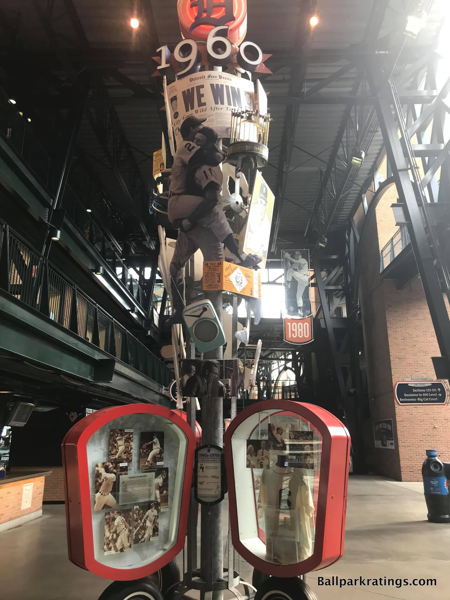
Surely the most controversial ranking on ballparkratings.com, I’ve long considered the always well rounded to outstanding Comerica Park to be by far the most underrated park in baseball. Coming at Detroit’s park from an outside perspective, elevating Comerica’s reputation has become somewhat of a pet project for me over the years.
Part of the problem is that we still can’t move past the unfair comparisons to Tiger Stadium by the old-timers, as local fans act as if Comerica is defined by its relation to Tiger Stadium, not by how it compares to the other 29 MLB parks. Of course, Comerica Park is no Tiger Stadium, but judge the park on its own merits in the context of its post-1990 peers.
In that context, Comerica comes close to having it all. From dramatic architecture and tastefully integrated skyline views to undoubtedly solid functionality and an impressive array of amenities, Comerica is right there with parks in Pittsburgh, San Francisco, and San Diego for baseball’s best.
Surely Comerica’s best aspect is just how elaborately it embodies its tenant.
No team has ever integrated its culture and name into a ballpark as extensively as the Tigers have. Starting on the outside, Comerica Park is notable for the dozens of enlarged tiger sculptures surrounding its retro red brick. I sometimes find it a bit over the top, but no other ballpark spent so much time, money, and effort beautifying the exterior architectural scene. Added in perfect rhythm and proportion, these are real artistic sculptures too, not something out of Disney’s Animal Kingdom.
Other various accents help as well, such as the tiger gargoyles heads on the walls, tiger claw marks running down the white columns, and blue and orange pewabic tile native to Michigan. We have remarkable artistic attention to detail for a ballpark.
On the inside, Comerica Park is the model of how to properly honor team history. While most historically endowed teams just feature museums or plaque areas, Comerica was the first park to integrate history into the fabric of the main concourse. Emulated by Atlanta’s park 17 years later, Comerica Park itself is the museum!
Throughout the main concourse, Comerica features a prominent historical display known as the “Walk of Fame,” a decade-by-decade museum detailing Tigers history from the 1890s to the 1990s. Numerous display cases, pictures, and artifacts adorn each decade bat, in what is truly a “walking museum.”
I love ballpark statues, and I also happen to think Comerica Park has the very best in terms of setup and artistic quality. Unlike others ballpark statues that you may see for five minutes on the outside, sculptures of Tiger greats are integrated into the outfield aesthetic above the brick wall of fame. While you can get a closer look on the concourse, they seem omnipresent from the seating bowl.
From the towers of memorabilia on the main concourse and statues in the outfield inside to those Tiger sculptures outside, Detroit was way ahead of its time in creating so many “Instagrammable” moments at the ballpark, something that has been all the rage in the 2010s. And they all have such a wonderful connection to the home team.
—-Other strengths: 1) “Downtown Detroit” sets off alarm bells in people’s heads, but the area surrounding Comerica has plenty of eateries/bars and historic attractions, 2) I vacillate back and forth on the true architectural quality of Comerica’s exterior—I generally don’t favor overly thematic designs—but it’s a significant plus all things considered, 3) Comerica features baseball’s best skyline views outside of Pittsburgh, 4) View of the historic neoclassical Detroit Athletic Club is timeless, 5) Covered in shrubbery and topped with a fountain, Comerica has one of baseball’s most beautiful batter’s eyes, 6) Concourses are aesthetically gorgeous in many spots; check out the topiaries around the Brushfire Grill, 7) Main concourse is easily navigable, wide, and open to the field, 8) Excellent SRO areas in the outfield, 9) 1000s of more comfortable padded seats (including some non-premium) than almost any other park; old-fashioned, moveable Tiger Den chairs are the most comfortable seats in all of baseball, 10) With no mezzanine “club level,” the upper deck is lower to the field than any other post-1990 park outside of Pittsburgh, 11) Local craft beer quality is top-shelf, 12) Like Target Field, we have a wide variety of restaurants, bars, and social spaces open to all fans: (a) Beer Hall, (b) Brushfire Grill, and (c) Corner Taproom all on the main concourse; (d) Coppercraft Distillery and (e) Miller Lite Pitcher’s Pub in the outfield; and (f) Climate-controlled upper deck lounge, a rarity in baseball, 13) Although it requires a premium ticket, the last MLB cigar bar is here, 14) With no home plate clubs, club levels, or “moats,” Comerica Park has a very egalitarian seating structure, 15) Carousel and Ferris Wheel for the kids
-Worst Feature: Gentle Incline Of the Lower Bowl
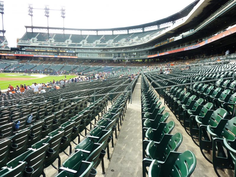
Comerica Park suffers from loads of misconceptions and mischaracterizations, something that’s immediately apparent if you’ve taken the time to compare it to the 29 other MLB parks.
Fans complain about Comerica Park’s “spread out” design with an upper deck “in another zip code,” but that’s just factually wrong. True, in comparison to Tiger Stadium; not true in comparison to any place today. Comerica’s upper deck is similarly too pushed back like other modern-day parks, but it’s actually lower to the field. It’s better than contemporaries, not worse.
Traditionalists cite the Carousel and the Ferris Wheel as “a step too far” and an example of how not to introduce family-friendly features in MLB parks. In fact, the exact opposite is true. Unlike the playgrounds dividing the concourses at numerous other stadiums, Comerica’s glitzy attractions are discretely relegated to the outskirts of the ballpark, so as not to interfere with traditionalists’ enjoyment of Tigers baseball. You don’t encounter them unless you want to.
Others say, “Okay, the amenities may be wonderful, but I just want to watch the game.” With a comparatively low upper deck, good seating geometry, and plenty of good seats in the lower part of the lower bowl, nothing is stopping you. Comerica is a fine place to watch baseball.
Laypeople lament the stadium’s location, but the “it’s in downtown Detroit!” refrain is both overblown and ill-informed.
There’s one criticism that has a kernel of truth. The massive lower bowl, which puts the 100-level and Tiger Den seats (de facto club seats) in one large grandstand, has a gentle slope. This was designed as such to eschew a separate mezzanine club level that would have pushed the upper deck higher, so it was a tradeoff.
This is a bit of a stretch for “worst feature,” because all post-1990 parks have this problem, but it’s a tad worse at Comerica Park. The gentle incline means you are more likely to be blocked by a tall person sitting in front of you. The higher 100-level seats below the Tiger Den are not ideal.
But sorry Tigers fans, it’s no fatal flaw, and it’s not that much worse than lower bowls at other ballparks.
Take it from someone who grew up in Houston and lives in Atlanta: Comerica Park is awesome. If it replaced the Metrodome and not Tiger Stadium, a top-5 ranking would not be controversial.
—-Other weaknesses: 1) The only other common quibble with some validity is that sun exposure can be brutal during day games in the summer, because Comerica faces south in order to integrate the skyline views, 2) Main concourse gets too narrow in center field, 3) Food quality could use some improvement; I’d like to see more local eateries on site, 4) Premium seating model is outdated and club spaces are worn, a commonly-cited reason by the organization for renovations.
3) PNC Park (2001), PITTSBURGH PIRATES: 90.5
Consensus Ranking: Top-2
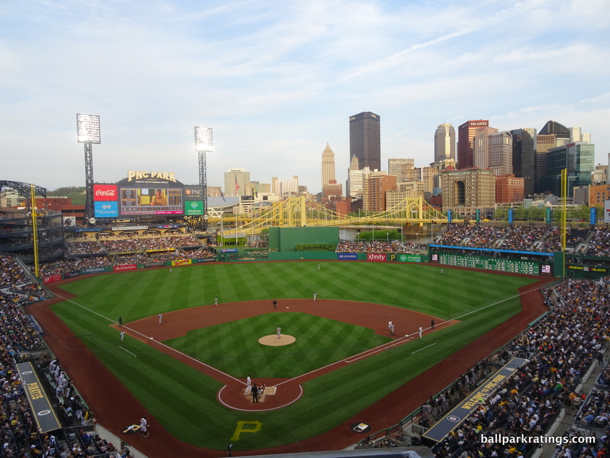
-Best Feature: Views of Downtown Pittsburgh and Clemente Bridge crossing the Allegheny River
Like Camden Yards and Oracle Park (San Francisco), it’s difficult to heap praise on something that is already so revered by ballpark enthusiasts, national writers, and baseball fans alike. Garnering considerable national clout in popular culture for a baseball stadium like Wrigley or Fenway, PNC Park is quickly becoming a baseball icon.
I don’t think it’s the “perfect ballpark” that deserves to be totally immune from critique, as has seemingly been the case, but it’s certainly baseball’s most beautiful ballpark.
Given the superior exterior treatment, the attractiveness of the concourses, and the fact that those famed interior views can be seen from the lower bowl (unlike in San Francisco), I don’t think it’s particularly close. This place is so beautiful you’d be content sitting in stands without baseball.
One of the biggest challenges was finding a way to not only integrate the gorgeous view from the upper decks, but also to allow the environment to seep into the lower bowl as well. While it looks effortless, PNC Park’s greatest design coup occurs in the space between the right field porch and the left field bleachers.
Note how the minimized center field seating opens up the river views. On both sides of the batter’s eye, the stunning Roberto Clemente Bridge is seamlessly integrated into the ballpark. By limiting center field seating to less than 7 rows, the entire cityscape can be viewed from the main concourse. This was particularly important in highlighting the water. Pittsburgh is tops in baseball in “contextual integration,” and while it looks easy, so many others failed.
PNC was really the first ballpark to figure out that all of the outfield seating needs to be dramatically minimized. And that’s not only the key to its intimacy, but also to its trademark look. Compare the double-deck left field bleachers here to those in Cincinnati, Minnesota, or San Diego. Regardless of the environment, it’s just a nicer, cleaner look. It all does exactly what it’s supposed to do: let the backdrop take over.
The press has fawned over it, and I largely agree. PNC Park has the benefit of having the most beautiful backdrop, but it capitalizes on that backdrop as well as it possibly could.
—-Other strengths: 1) The walk from Downtown Pittsburgh over the Clemente Bridge (closed to traffic on gamedays) to the ballpark is always memorable, 2) Limestone façade emulating the local landscape is both captivating and intimate, 3) “Double deck” design makes for baseball’s most intimate aesthetics, 4) Most everything deviated from the tired “retro” formula: (a) two grandstands instead of three, (b) limestone not red brick, (c) blue seats not green seats, and (d) lack of gimmicks and contrivances, 5) Fabulous views from the right field riverfront concourse, 6) Main concourse mostly open to field, 7) Left field rotunda can make for an interesting SRO perch, 8) High-quality signature food at Primanti Bros, 9) The Pirates added some sit-down bars off the main concourse, 10) PBC mezzanine club level is one of the best of its kind, featuring three lounges with extraordinary memorabilia, 11) Exterior statues are some of baseball’s best
-Worst Feature: Small and Outdated Scoreboard
While PNC Park isn’t perfect, it’s also true that the place is free from any glaring flaws.
It’s not perfect because it possesses quite a few little things that either could have been done better or don’t quite measure up. The cumulative effect puts it just a notch below parks in San Francisco and San Diego, in my opinion.
One of those little things is the small scoreboard. Installed in 2007, the videoboard is now the 2nd oldest in baseball and one of the smallest. It’s also not particularly informative, and it’s beginning to show its age in terms of graphics.
Hey, if you literally have signs stating we are “The Best Ballpark in America,” even nitpicks are fair game! I shall do so below. I’ve only seen this peculiarity pointed out one other time.
—-Other weaknesses: 1) Setting that makes for beautiful views removes the ballpark from Pittsburgh’s downtown core of bars and restaurants. It’s only a short walk to downtown, but I’d like to see more development in the North Shore neighborhood around the ballpark, 2) Calling PNC Park a true “double deck” ballpark has always been highly misleading, because the second deck consists of the club and upper deck seats pushed together in one large grandstand. This pushes the actual upper deck seats pretty far away horizontally. 3) Outfield concourse is lower than the main concourse around the infield, leading to annoying vertical discontinuities, 4) Upper deck seats lack cupholders, 5) Food quality is generally excellent, but the variety of grub is lacking, 6) With the removal of the historical Negro League showpiece in Legacy Square, I wish PNC Park had more historical references on the main concourse, 7) Kids’ area is comparatively rudimentary
2) ORACLE PARK (2000), SAN FRANCISCO GIANTS: 91
Consensus Ranking: Top-2
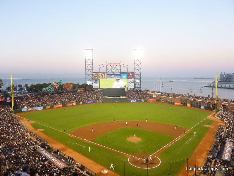
-Best Feature: McCovey Cove and Views of The San Francisco Bay
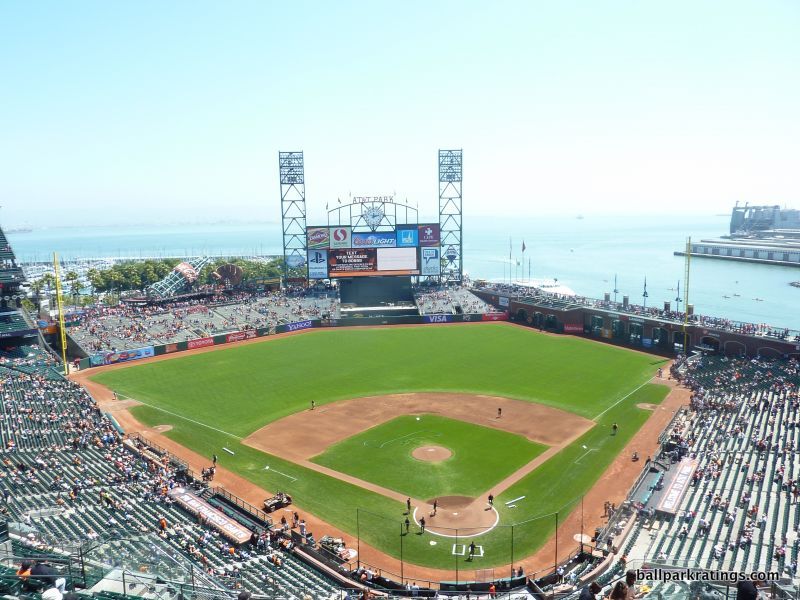
In what many have argued represents the pinnacle of baseball’s multi-decade billion-dollar ballpark building boom, San Francisco’s scenic bayside facility has transcended that conversation in many ways. In fact, Giants’ timeless palace is just as lauded for its private financing structure and its generation of the most enduring attendance boost of any ballpark in modern history.
After scores of articles have gushed over the blending of a world-famous city known for its postcard water views with a perfect ballpark, it has cemented itself in American popular culture, similar to Wrigley and Fenway.
While it’s “More Than a Ballpark by the Bay” with amenities on par with the aesthetics, unlike PNC where its beauty does supply most of its appeal, McCovey Cove will always be Oracle Park’s signature feature.
Oracle Park’s simple interior aesthetic treatment is based around two design principles: complete adherence to site constraints and integration of the San Francisco Bay into the ballpark. By and large, the Giants succeeded on both accounts, building a timeless structure with downscaled interior lines.
Brilliantly shoehorned in the China Basin area of San Francisco, Oracle Park’s greatest achievement is its appreciation of the site. In an era where ballparks gained their identities through synthetic quirkiness and the self-conscious whims of the PR department, Oracle Park is legitimately derived through adaptation to its environment. All of the design virtues are born of necessity.
The short porch in right field is dictated by McCovey Cove, as is the deep right center field power alley. The wall runs parallel to the water. You have to admit it is refreshing that these quirks are authentic.
Unlike almost every other retro ballpark, the outfield seating structure is rather monotonous and simple, especially the setup of bleachers in left field. Oracle Park is the only ballpark in the majors with no second deck structure in the outfield, in the interest of the bay view. Note how the gentle slope of the left field bleachers preserves the view of the palm trees.
When looking at the view itself, I might note that Oracle Park is more than just gorgeous sea blue water. It’s a perfect picture. On the left field side, note how the ballpark perfectly integrates the sailboats and palm trees. You have to go to the game to notice the Berkeley Hills beyond the water.
You couldn’t imagine a scene that better represents the bay area.
—-Other strengths: 1) Constructed on the outskirts of downtown in what was formerly an industrial pit, Oracle Park has been very successful in rejuvenating the area, 2) Willie Mays Plaza behind home plate creates an iconic exterior image, 3) Gorgeous arched promenade in right field is a subtle reference to nearby Memorial Stadium in Berkeley, 4) Giant glove in left field adds some charm to an otherwise appropriately simple outfield design, 5) New videoboard added in 2019 is baseball’s 3rd largest, 6) Places #2 in our ballpark food rankings. San Francisco brought ballpark food to an entirely new level upon opening. The grub is still outstandingly varied and delicious. 7) Top-5 ballpark craft beer quality and selection, 8) While the constrained footprint doesn’t allow for that many social spaces, “The Garden” in center field is one of a kind, 9) Historical touches are everywhere you look, from the murals throughout the concourses to thoughtful quotes even in the ugly ramps! 10) “The Vault” team museum added in 2018, 11) Exterior statues, with the Seal balancing a ball on its nose the most unique, 12) Excellent premium seating, and the Gotham Club is the most exclusive membership club in baseball, 13) Kid-related activities are integrated into the aesthetic appeal of the ballpark, with a slide placed in the left field coke bottle winding down to a wiffle ball field, 14) Giants attendance has been consistently strong
-Worst Feature: Narrow Concourses
When comparing the best ballparks in baseball, Oracle Park doesn’t have a slew of minor things that need improvement like PNC, but it possesses one substantial flaw that will always keep it out of the #1 spot in my book.
Perhaps unavoidable due to the site constraints, the concourses are some of the worst in Major League Baseball, even considering they are “open” to the field. Merely 25-28 feet in width, the concourses are so narrow even short concession lines impede circulation. Visibility of the field from the concourses is poor due to the kiosks, columns, and a low ceiling as well.
Bottlenecks are frequent in the corners, as the main concourse gets particularly narrow in both right field and left field by the coke bottle to the point where it’s simply a passageway. Just looking at the congestion in the outfield, or even the widest points of the main concourse, we can conclude circulation isn’t properly encouraged. The upper deck concourse is narrow as well.
It’s a mystery to me why more ballpark trekkers haven’t noticed this. Space matters, and the concourses are so narrow that getting around Oracle Park is genuinely a chore. That’s a big problem.
—-Other weaknesses: 1) Oracle Park boasts some of the most scenic views in baseball from the upper levels, but there’s little mention of the city or the water visually from the lower bowl. Unlike at PNC Park, you don’t have a view of the scenery or the water if you’re sitting in a lower box seat. 2) Poor seating geometry down the left field line. In order to preserve bay and bridge views in left field, the architects were forced to squeeze a surplus of seats in foul territory (not in outfield). Seats down the line are oriented toward center field, and seats in the left field corner are pointed behind home plate.
1) PETCO PARK (2004), SAN DIEGO PADRES: 93.5
Consensus Ranking: Top-10
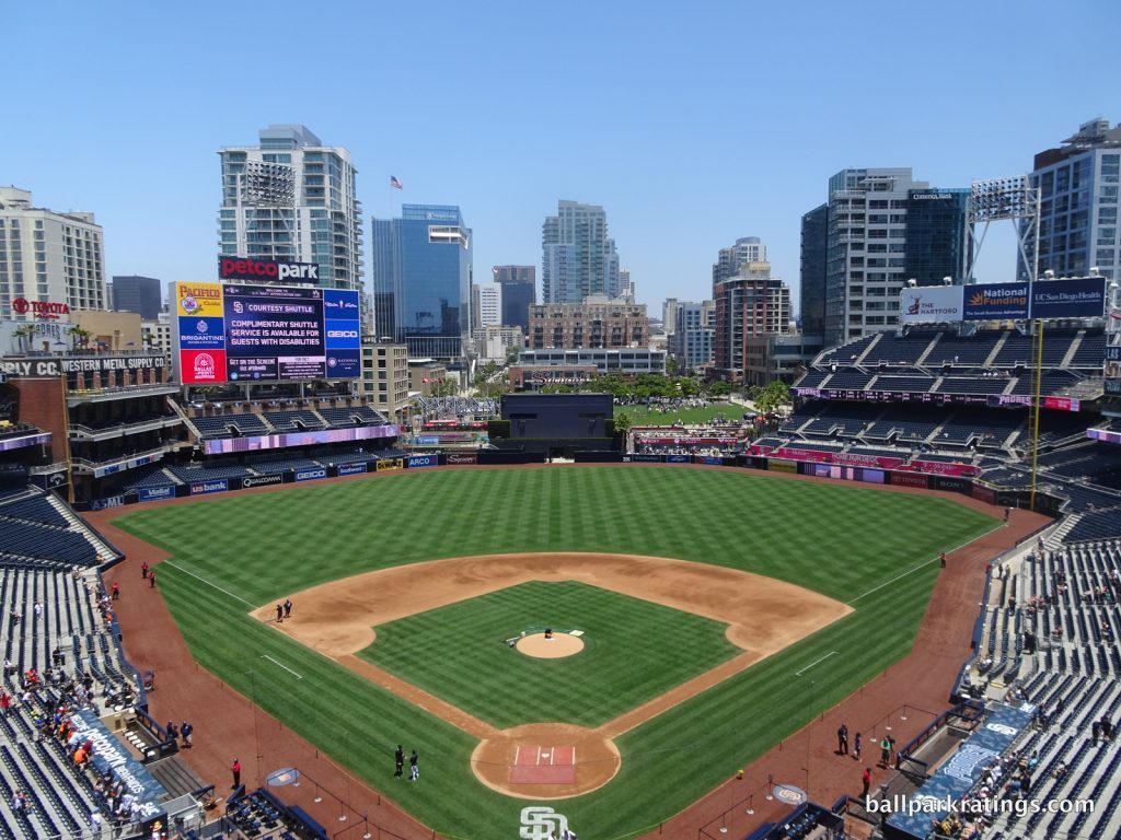
-Best Feature: Park in the Park
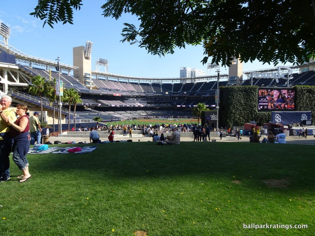
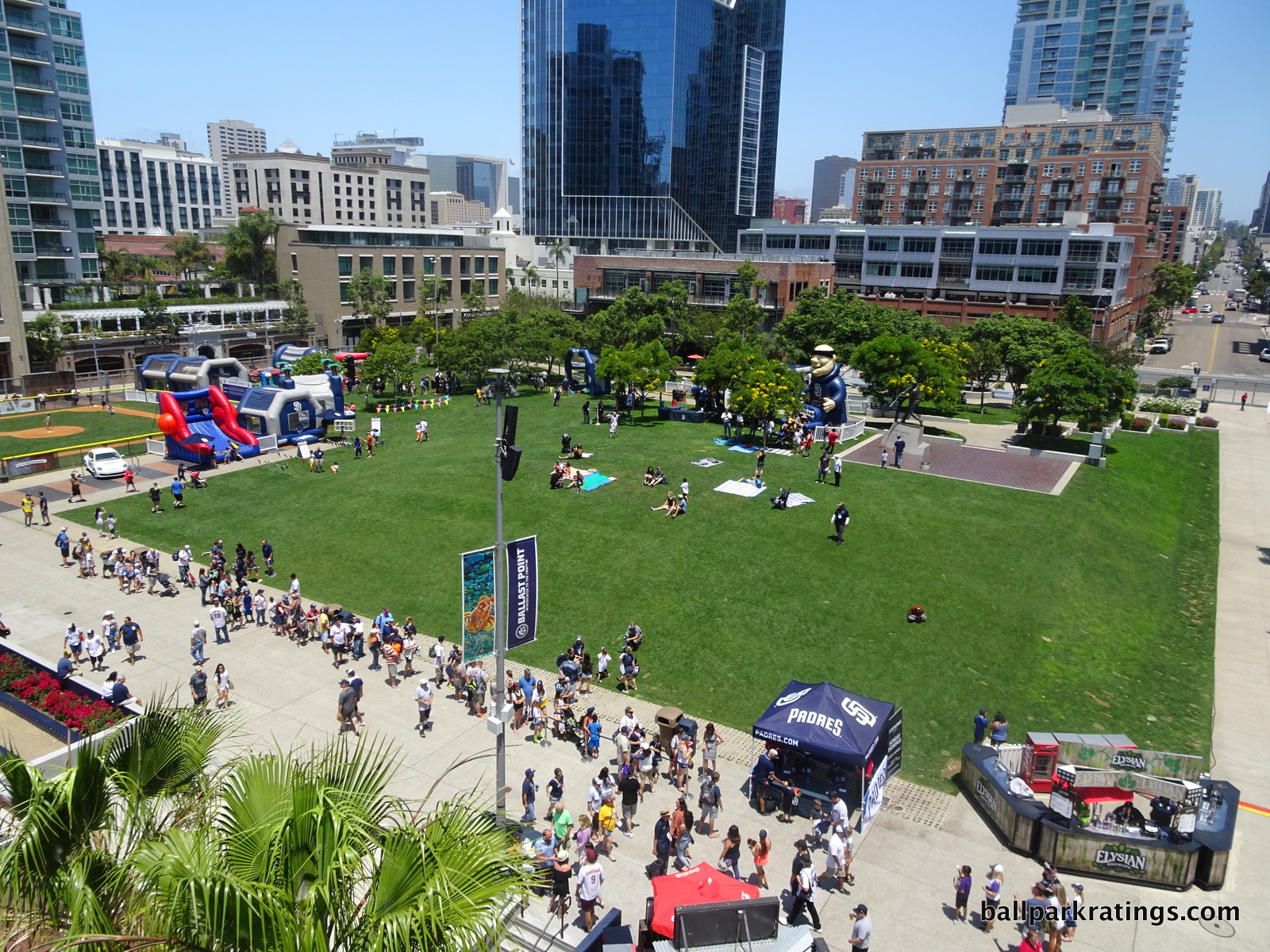
Petco Park opened to moderately favorable reviews in 2004, but it took more than a decade of tweaks and enhancements for the park to reach its full potential. Like a top prospect, it had all of the raw tools, but some of the concepts took a while to materialize.
By the mid-2010s, 1) the Gaslamp Quarter had really blossomed; 2) the panoramic views had undergone the biggest improvement (check out the original look) of any ballpark in memory; 3) the Padres made wise alterations to the outfield scene; 4) the food and beverage game underwent a quantum leap from middling to best in baseball; and 5) a tasteful interactive Padres museum and new videoboard were added.
Couple those improvements with already existing “capital-A architecture,” beautiful concourses, some of baseball’s best sightlines, and some of baseball’s best amenities, and you have my pick of Major League Baseball’s best ballpark.
Overall, it doesn’t quite have the aesthetics of PNC and Oracle, but it’s now almost objectively flawless across the board unlike those two venues. I think it’s through that equation that you get the best ballpark in baseball.
Petco Park is filled with superlatives as you can see below, so it’s hard to pick one best feature. But since it’s always been such a conceptually innovative place, I’ll go with Petco’s best concept of all: The Park in the Park.
Envisioned as a green space in an urban village, the Park in the Park is not some cleverly branded piece of grass, but rather an actual park where one can relax, play catch, or take a walk. When differentiating a park from a stadium, going to a baseball game should be like going to a neighborhood park, and Petco Park tangibly applies that concept.
Take time to walk around the Park in the Park and appreciate its enormity compared to other such spaces in Major League Baseball. The hill in the middle of the park is positioned for watching the game, but much more space on the other side of the hill has kids’ activities, a Tony Gwynn statue, and other frills. You keep going and going thinking this can’t be part of the ballpark’s physical plant, but it is.
Visually, the Park in the Park now looks spectacular. Condos, hotels, and office buildings occupy nearly every space beyond the outfield, except The Park. That serves to highlight its presence. The concept is flawless: an urban village with both a ballpark and a literal park in the middle.
—-Other strengths: 1) The Gaslamp Quarter is baseball’s best neighborhood for a variety of reasons, but all you have to know is it’s perhaps the only ballpark local scene that’s a true tourist destination in its own right even for a non-baseball fan visiting San Diego, 2) Petco’s façade of sandstone and stucco evoking Torrey Pines and steelwork recalling the ships in San Diego Bay is my 2nd favorite exterior in baseball, 3) Other truly innovative concepts: (a) neighborhood seating, (b) vertical suite towers, (c) open-air canyon-like concourses separating the seating bowl from the outer “garden buildings.” 4) Adorned with hanging ivy above and cascading Bougainville and jasmine plants, Petco Park’s concourses are by far the most beautiful in baseball, 5) Adaptive reuse of the Western Medal Supply Co. warehouse in left field, 6) Petco Park’s aggressive use of cantilevers, combined mezzanine/suite level, and superb seating geometry make for baseball’s best sightlines, 7) Massive videoboard(s), 8) Places #1 in our ballpark food rankings, 9) Arguably the very best ballpark for craft beer, close with T-Mobile in Seattle, 10) Single best series of accessible restaurants, bars, and social spaces in Major League Baseball, with a whopping 10 “destinations” on three levels (I won’t list them all this time!), 11) This is partially because the Padres open most spaces to all ticketed fans, even on the mezzanine. The anti-Yankee Stadium. 12) Padres Museum and Hall of Fame, 13) Nods to ballplayers in the military make sense given San Diego’s naval connections, 14) Wiffle ball field for the kids in The Park in the Park, 15) Overall, Petco Park is exceedingly functional (best place to watch the game) and loaded with fan-friendly amenities (best place to not watch the game).
-Worst Feature: Navigating the Concourse is Confusing
I’m always hoping my memories are exaggerated each time I return to Petco Park, but exploring the concourses is genuinely cumbersome.
State-of-the-art main concourses go all the way around the field on one level, without horizontal encumbrances or vertical changes in elevation. They are open to the playing field at every point, so you never lose sight of the game. They also feature seamless entry at street level. Think Citizens Bank Park in Philadelphia. It has a simple, wide, and open system that is easy to navigate.
Forget all of that at Petco Park. Along the main concourse, especially when you transition from the infield to the outfield, there are so many vertical changes in elevation and horizontal maze-like discontinuities you will literally get lost. It doesn’t even really qualify as a 360-degree system. There is no ease of circulation here, as moving from the outfield to the infield even requires ramps down the right field line. At every turn, you’ll encounter some encumbrance.
Petco Park may have some of baseball’s best amenities, but some may not have the patience to find them.
I’m sure Padres fans get used to it (they have noted they confusion), as it’s certainly not a flaw on par with the narrow concourses at Oracle Park. But Petco’s confusing flow may befuddle out-of-towners.
—-Other weaknesses: 1) This is more of an abstract misgiving, but many of my initial critiques of the interior aesthetics still stand. Petco Park is too disjointed, built around an old brick warehouse then reframed through the prism of a sandstone nautical motif. It still looks good, but that doesn’t make much sense conceptually. 2) Many parts of the main concourse are closed from the field, 3) Some views of the outfield are obstructed by the warehouse in a few sections in the left field upper deck, but it’s an overstated problem.
Like us on Facebook to get notifications about the latest articles, features, and reviews!
