A Monument to Atlanta
With the most uninspired retro cookie cutter architecture, complete lack of character, Turner Field has few redeeming qualities, emphasizes mediocre theme park-like entertainment amenities over aesthetics
Number of games seen: 25+
First game: August 21, 2009
Most recent game: October 2. 2017 (Final game ever)
PHOTO GALLERY at bottom of page
By: Cole Shoemaker
Written 2012
Every great ballpark finds some way to represent its region or city. Whether it is through highlighting the surroundings, using contextual building materials, or serving regional food options, pretty much every ballpark gives a somewhat local vibe.
Turner Field’s extraordinarily banal red brick exterior façade has all the qualities of a generic expansion city trying to look retro. Its interior aesthetics are thoughtless and solely functional, lacking any distinctive design cues or acknowledgements to the environment, yet somehow also superficially muddled with annoying gimmicks. It has a striking lack of regional flare seen in almost all other retro ballparks. Along with its bland atmosphere and transplanted fan base, Turner Field pretty much represents Atlanta perfectly.
// <![CDATA[ (adsbygoogle = window.adsbygoogle || []).push({}); // ]]>
And I’m really sorry, but I mean that in the worst possible way.
Like I always say, whether you’re a baseball fan or not, the American ballpark merits study because it often seems to represent its city better than anything else. It’s relatively more immune to the recent “stripmallization” of America. But Turner Field is the exception. As bland as Atlanta may be, Turner Field is the party I’m trying to blame here, just to be clear. It doesn’t even try, even if you grant its qualities are derived from the fact that it’s in Atlanta. Go to every other ballpark and compare the unique cultural vibe to that of Turner’s generic feel and you’ll see what I mean.
Despite having absolutely nothing distinguishing or contextual, its interior lines are clean and simple, free from contrivances. The problem is Turner Field crosses the line into bland and uninspired, not at all authentic or minimalist. What we see on the inside of Turner Field is only functional, along the lines of a retractable roof park like Miller or Chase. With a boring array of single deck outfield seating, it makes no attempt to provide views of its surroundings or even be aesthetically pleasing.
Perhaps the central irony of Turner Field is its wonderfully eccentric and creative namesake. No distinguishing architectural embellishments or design quirks exist here, in what is really more of a testament to the organization and the city.
What bugs me most is that Turner Field really isn’t confident in its simple, contrivance-free look. I can live with, but perhaps not love, a simple no frills baseball only park, even if it is bland and enclosed. Instead, it greatly muddles a very honest structure with tons of gimmicks and distractions. Note the difference between contrivances (artificially quirky dimensions) and gimmicks.
What we have here is a boring stadium superficially accentuated with Chick-fil-A cows, coke bottles, and other flashy ornaments. We have a formulaic retro structure with no aesthetic vision, in the middle of a parking lot that tries to compensate with busy, distracting features. It’s really the worst of both worlds: bland and gimmicky.
Objectively, it has very little going for it as well. The location is awful, the food actually appears to be the worst in the majors in terms of selection and quality (club level food is premium services; although the main concessions improved in 2013), and the fan atmosphere is generally considered to be poor. But I’ll even be generous and give a point for the Tomahawk Chop.
I probably bash it too much in this intro, as there are plenty of nice features I’ll point out. The ballpark was built on a huge footprint, integrating a museum, a giant playground, a fan plaza, multiple restaurants, and numerous other amenities into the superstructure. For better or for worse, it is the ultimate baseball theme park, just one that now seems to be aging fast (amenities age, timeless architecture doesn’t). It was also the first to incorporate an open-air eatery in the outfield. They attempted to create a neighborhood within the ballpark to compensate for the terrible location, and largely succeeded, at least at the time.
The references to team history are perhaps Turner Field’s strong point. From Monument Grove and the museum, to pretty much every area on the concourses, there’s a nod to Braves history. That deserves huge praise, as history mitigates the bland atmosphere. It’s almost like they knew there was no way to give the ballpark any type of distinct regional feel because of the area, so they compensated with tons of team history.
But all post-1991 ballparks are good ballparks, and I think its clear that Turner Field offers the least to the retro ballpark landscape. Just looking at the inside, you can tell it emphasizes an overabundance of amenities above aesthetics and contextual integration. But it fails too much architecturally for you to notice some of these nice, albeit generic, fan features. You’ll note it’s probably the least mentioned new park on the Internet as well, so that should tell you something. Honestly, it’s a pretty soulless venue, overtly transparent in what it actually is as a structure: a generic yet distracted renovated Olympic stadium.
Location/Access:
I always love to examine how the media and team officials presented a ballpark when it opened. Since location is the hallmark of all fantastic retro parks, the team always seems to claim “our new ballpark is going to rejuvenate the area!,” whether it actually has the potential to or not. And for the few ballparks built in the middle of nowhere, the team pretty much sweeps the poor location under the rug.
Well, Turner Field is unique in the fact that team officials were pretty forthright about the surrounding area being terrible (I bought the 1997 opening day program on eBay). In fact, they actually used it as a rationale to claim everything inside the ballpark is the best. I love that idea, too bad no one is going to notice because the bland interior architecture dominates the venue’s vibe. I will give plenty of credit for some of the amenities later. But the location is still very poor.
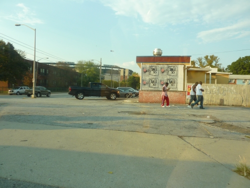
Turner Field kisses the highway in an impoverished neighborhood on the extreme periphery of downtown Atlanta. You here in the media that Turner Field is “downtown,” but that’s very misleading. Being in the middle of nowhere is one thing, but being in a raunchy area with no attractions is another. Take a seven block hike south or west, and you’re in for a nice adventure. Other than that, Turner Field is surrounded by nondescript parking lots.
To add insult to injury, the ballpark isn’t as accessible as it could be. Not only do you have to navigate through some ambiguous areas after you exit the highway, but Atlanta’s public transportation system, MARTA, doesn’t directly access the ballpark.
Score: 2/5
Local Scene:
Using the term “local scene” when talking about Turner is a total joke. Out of all the so-called “suburban ballparks”, which is a way to say they are not truly downtown, Turner Field deserves special attention. It’s suburban in the sense that there isn’t much going on around the ballpark, but it’s certainly in a distinct area. Again, to the south of Turner Field is a terrible neighborhood, characterized by poor housing, boarded up buildings, and liquor stores. Not only is Turner Field a ballpark without a community, it’s in the ghetto.
Score: 2/5
Total: 4/10
Exterior Design:
With the primary entry point in the center field plaza, Turner Field defies all efforts to get a signature shot of the exterior façade, and for good reason. Make no mistake: it’s a nice enough looking structure, but easily the most generic of all the red brick ballparks. How fitting that Atlanta’s retro exterior design is lacking any notable accents separating it from the typical ye olde ballpark.
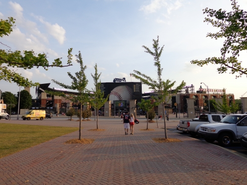
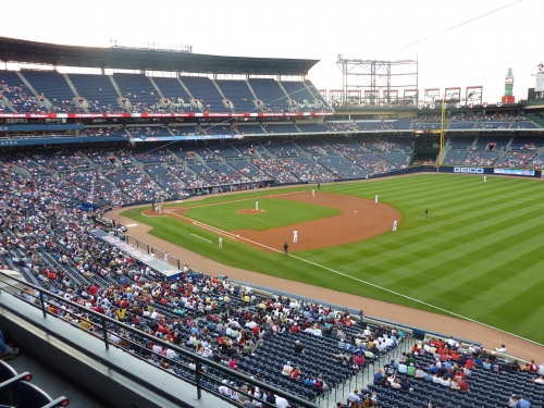
If you make the effort to walk around, you’ll note the areas around home plate are pretty much uninhabited. You’ll also notice Turner Field’s upper deck grandstand overwhelms the structure underneath, eliminating any potential sense of intimacy seen in a ballpark like Coors Field. Atlanta doesn’t seem to have the effective sunken exterior landscaping of others.
As for the façade itself, there’s not much to say. Along with an overabundance of glass in the middle of the archways, Turner Field consists only of the homogeneous red bricks seen in a 1990s suburban Mcmansion, with the occasional use of concrete. Turner Field stands apart as having the worst exterior design of all non-retractable retro ballparks. Don’t believe me? Take a close look at every other apparently “generic” red brick baseball stadium built in the last two decades, and you’ll see some kind of distinctive architectural design flare (except maybe Camden Yards, which gets a free pass because it’s the first and has some interesting qualities).
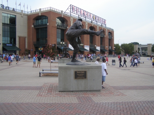
I’ll later give a bonus point for Monument Grove, a thoughtful and fairly unique area for fans to congregate before entering the gates in center field. But overall, Turner is a dud architecturally.
Score: 5/10
Interior Aesthetics:
When first looking at the interior aesthetics, you have to acknowledge that this was originally an Olympic stadium. Considering what they were given, the architects primarily valued packing numerous amenities into the outfield, overlooking any consideration for aesthetic appeal. If you look at nearly every retro ballpark, you’ll note the outfield is either designed with a “view” in mind or at least constructed with some kind of visual harmony. But not Turner Field, which comes off as a painfully confused and fragmented structure.
Other than the retractable roof ballparks in Phoenix and Milwaukee, Turner Field is the least “aesthetically conscientious” ballpark in the majors, stressing form and function above all else. Unfortunately, the Braves later compound this problem by overloading the outfield with unnecessary gimmicks.
Lets look at some of the positives first. Being an Olympic stadium in the middle of nowhere, I love that the Braves chose to keep the dimensions pretty symmetrical. In an era where exciting yet contrived dimensions were in vogue, the Braves abstained unlike anyone else. What’s funny, is when people take a step back from what’s in vogue, they’ll realize that this simple symmetrical look is actually pretty attractive.
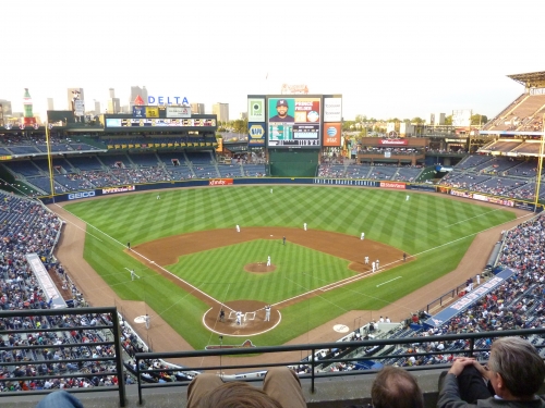
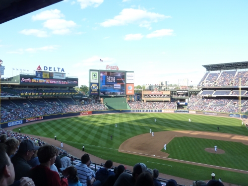
I like the elegant curvature of the outfield dimensions, a welcome departure from the nooks and crannies of the others. It’s different in that way, and has the potential to have a very stately look. I like how the curvature of the “Delta deck” (755 Club) in left field mimics the dimensions. The dimensions actually mimic the construction site to a tee if you look at the blueprints. Perhaps that was Janet Marie Smith’s influence (She is the Camden Yards architect who spearheaded the so-called retro concept. She also worked on Turner Field). It lacks those annoying kitschy references to the past. I guess I like the color scheme as well, especially the blue seats. The particularly large canopy is interesting. Unfortunately, that’s about where the positives end, as you realize the contrivance free dimensions are more derived from thoughtlessness than authenticity.
Ultimately, Turner Field fails almost all interior design principles, because any regard for aesthetics were an afterthought. No aesthetic purpose. No connection to its context. No harmony or unification between elements. It’s not even confident in its simple architectural lines in the end.
Not having any “forced quirkiness” in terms of the dimensions is just about Turner Field’s only asset. When I often use the vague phrase “aesthetic vision” you should now know what I mean. When looking at the outfield design, we really have multiple elements that not only fail to add visual appeal, but seem out of place as well.
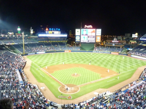
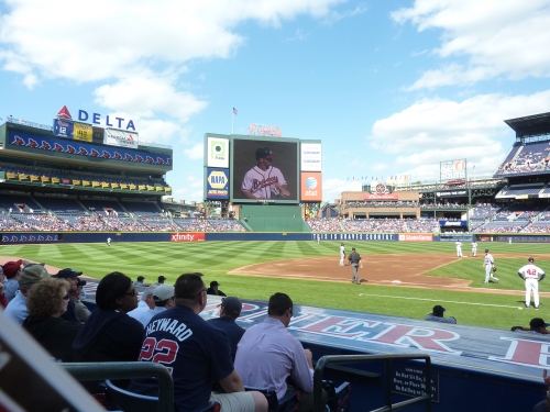
The corporate “Delta deck” in left field dominates the interior, while obliterating any connection to the city. The Braves could have incorporated the Atlanta skyline into the ballpark, but chose to build a club restaurant instead. The giant video board is nice, but it looks awkward and out of place in center field. And then why not add a random brick restaurant beyond right-center field to look “retro”? Even the batter’s eye is ugly.
This is the backdrop for a monotonous array of functional stands, which just screams renovated stadium. But it doesn’t stop there.
As you may have deduced, the substantial flaw here is the total lack of a signature aesthetic dominating the interior design. You don’t really need some kind of artificial distinguishing element if the ballpark is open and acknowledges its environment through effective urban planning. But for a completely enclosed ballpark, it risks coming off as a functional cookie cutter stadium.
Because they knew the ballpark would be perceived as a bit uninspired and boring, the Braves compensated by falsely accentuating the outfield with a number of gimmicky features and ads, which ultimately comes out as a busy disaster.
Space isn’t used too well here, and it seems like Turner Field makes an extra effort to close the gaps and “liven up” the ballpark. Instead of enhancing the contextual space, they artificially created a neutral space and filled it with diversions and gimmicks. Turner Field is an example as to why it’s hard to build a great ballpark so out of touch with its environment, but they especially failed here. It ultimately comes off more distracted than boring. And I didn’t think that was possible. The irony is that ballpark visionary Janet Marie Smith was involved in this project. What happened?
The “skyfield” murals are certainly a nice feature, but end up cluttering the structure too much. They effectively truncated the upper deck down the left field line to add this feature, but it looks awkward. The illuminated coke bottle and the giant Chick-fil-A cow only further complicate the ballpark, serving as the de facto “signature feature”, signaling that Atlanta is a city only known for its consumerism. The “Gas South” fireworks station is particularly annoying as well. It seems Turner Field has more annoying bells and whistles and random fireworks than any other ballpark in the majors, in an attempt to compensate for the boring design and to distract the fan.
When looking at Turner Field, you’ll find that your eye wonders, almost like a bad high school newspaper without a dominant image. Not only is it way too cluttered, but also there’s absolutely no continuity between elements. It ultimately results in a structure lacking any order whatsoever, lacking any attention to form, rhythm, or proportion. The continuity of the pleasing curvilinear dimensions is strongly contradicted by the fragmented features beyond the outfield.
Perhaps the outfield wouldn’t look so overloaded if they had chosen not to make the ballpark so cavernous. Why not put the 755 club (Delta deck) along the infield stands and open up the structure? You can disagree with what I’m writing, but there’s no doubting Turner Field feels way to big, with a capacity of about 50,000. Another legitimate criticism is the complete lack of lighting in the outfield. Night games are bleaker here than anywhere else. With all the distractions they have out there, no lights? Amazing.
While there are times I look at the unique curvature of the outfield design and appreciate that Atlanta tried to build a ballpark with elegant symmetrical interior lines, the finished product comes out more streamlined and confused. Out of the open-air parks, it’s similar to the inside as Citi Field, which is both 100% derivative and hopelessly muddled to the point where it has no redeeming qualities (but at least Turner doesn’t have those contrived dimensions). Of course, Great American Ballpark is an entirely different monster, which I can’t wait to pick apart in an interior architecture review, but at least it did try to be original, despite failing completely in execution.
But as a general theme, Turner Field is the worst of all cards. Boring, uninspired, and visually unappealing, while also being gimmicky and overloading the senses. I know its subjective, but Turner Field has little confidence in its architectural lines, despite having perhaps the most basic and undistinguished interior architecture. With so much junk thrown into a very utilitarian looking structure, Turner Field seems very noncommittal and without any coherent logic in its aesthetic appeal. It doesn’t look like it started with any idea or vision either, and needless to say, it doesn’t make any honest attempt to capture the city.
Perhaps what’s most amazing is the spectacular ballparks Turner Field followed. In the “golden era” of retro ballpark architecture, Camden Yards, Progressive Field, and even Rangers Ballpark features some of the most distinct and well-executed interior aesthetic visions we’ve seen. Turner Field upped the ante for entertainment features and amenities, but the structure itself is a failure. Good amenities circa 1997 aren’t that snazzy now. Good design still endures.
Score: 7.5/15
Panoramic View/Backdrop:
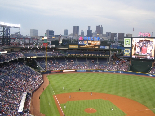
Like so many in recent memory, Turner Field has some nice views from certain areas. While being far removed from downtown Atlanta, the ballpark could hypothetically feature some decent views. But of course, the 755 Club almost completely obstructs the view. Fans in the upper deck can see downtown Atlanta, but its not nearly as expansive as you would expect. Above the Braves Chophouse in right center field, the landscape is sprinkled with nondescript residential areas. But again, we see no attempt at neighborhood integration.
Make no mistake: the architects intended for the fans to be contained inside the ballpark. Of course, they didn’t execute it well from an aesthetic point of view, unlike in Rangers Ballpark, as Turner just seems noncommittal.
Score: 3.5/5
Concourses:
The décor of the concourses is a bit 1990s blandish, highlighted by red, white, and blue bathroom tiles. And from an aesthetic point of view, “Tooner Field” is the tackiest thing I’ve ever seen, so I’m glad it got replaced with a new sponsor in 2012. Overall, the color scheme and signage is mediocre.
Score: 1/3
Total: 17/33
Sightlines:
Despite originally being configured for the Olympics, the sightlines are generally what you would expect for a baseball only park.
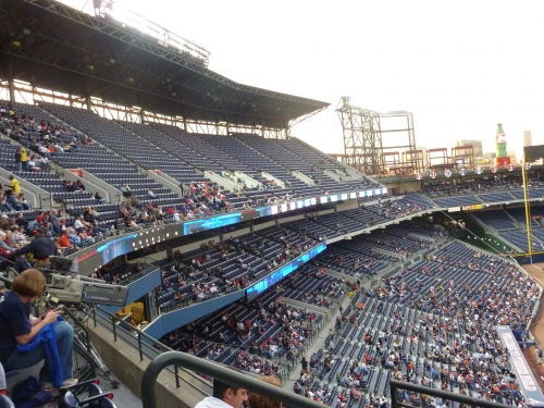
Turner Field’s field proximity benefits from having no separate suite level, but the large lower deck deceptively pushes the upper decks back more than you might think. Comprised of both field box and terrace box seats, Atlanta has the largest lower deck in baseball. As a result, the mezzanine club level feels like the farthest from the field in the majors. Just looking at pictures, the decks in general look close to the action, but they are deceptively far back. On the other hand, the upper deck is appropriately cantilevered over the club level and particularly low to the ground. Overall, Turner Field is probably still above average in terms of field proximity, despite appearing much better.
Like many parks in the 90s, Turner Field suffers from some mediocre seating geometry. Like Progressive Field, they indiscriminately angle the seats down the line at the same degree, meaning that many seats are pointed toward center field. Luckily for Atlanta, they’re able to reorient sections at an appropriate degree due to the open site, avoiding many of the problems in Cleveland. I don’t mean to imply Turner has seating geometry on par with Progressive Field, but some of the individual seats themselves could have been angled at a much more aggressive degree.
Score: 8/10
Seat Comfort:
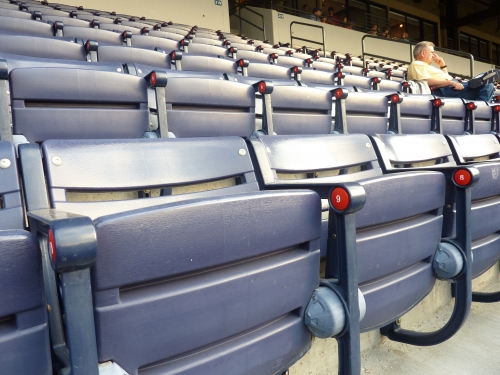
If you’re a ballpark trekker like me, one of the first things you’ll notice about Turner Field is the seats. All ballpark seats are usually indistinguishable from city to city, because most parks are designed by HOK (Populous), but you can tell a different manufacturer designed Turner Field’s seats. Designed in dark navy blue with red emblems, the color scheme is a welcome departure from the Kelly green we see everywhere else.
The seats themselves are of typical width. But upper deck seats lack cup holders and club seats are not padded, both of which (but mainly the former) are unacceptable, and put the score below the average of 3.5.
Score: 3/5
Concourses:
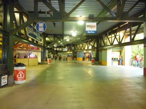
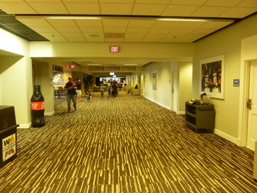
Built on the footprint used for the Olympics, Turner Field might be the only ballpark where it’s guaranteed not to get crowded. Despite its drab appearance, the Braves utilize a duel concourse technique on the lower level, which is quite successful in controlling traffic.
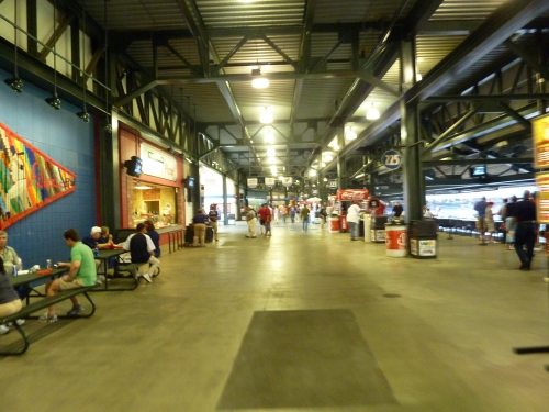
Instead of the typical three, Turner Field has four distinct concourses throughout the ballpark. Despite being closed from the action, the main concourse completely encircles the field. It’s directly connected to the fan plaza, facilitating effective egress. Another open concourse is located on top of the terrace level, providing good visibility of the field. Both concourses are ample in size and never crowded, especially since so much fan activity takes place in center field.
Unfortunately, the Braves lack any cool standing room areas in the outfield. However, one section of note is the Coca-Cola Sky Field in the upper deck. Multiple standing room areas provide majestic views of the field and the Atlanta skyline. Integrating this into the upper deck was a fantastic idea, at least from a functional point of view.
Score: 5/7
Scoreboard System:
The Braves made headlines in 2005 by being the first team in baseball to install a high definition video board, the world’s largest at the time. With rapidly changing technology, it’s average today. Unfortunately, the Braves also don’t use it as well as they should. Why is there only one lineup shown at a time? They place an emphasis on the visuals over the information, showing only a giant picture of the batter, along with a few stats, and the batting team’s lineup. It may look good, but its one of the weaker video boards in terms of being informative.
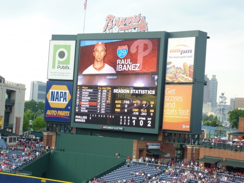
Score: 2/3
Total: 18/25
Quality and Selection of Concessions:
As of 2012, Turner Field presents an astounding lack of variety in its food selection (not counting the club level, that’s premium services) that recalls the pre-retro era. Ultimately, the Braves offer mall-like quality without the wall-like variety. In 2013, the Braves took my council and made a couple of upgrades, particularly in the “signature food” category below.
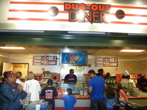
What’s a shame is that when Turner Field opened in 1997, you could tell they really tried. Taste of the Border provided fajita wraps and a multitude of Mexican options. A Deli featured turkey, ham, and Italian subs. They had a true taste of the majors’ stand, which featured cuisine tied to each visiting team. They even had a “Peaches N Cream” stand, which offered Georgia oriented desert fare. It’s a shame the Atlanta demographic didn’t bite.
15 years later, the meek “Smokehouse BBQ” is the only remnant of the Braves’ once fine food selection. And even that is of lower quality than usual ballpark BBQ in my opinion. No Mexican fare. No deli sandwiches. No international foods. There is nothing at all distinguishing it from a cheap Georgia state fair. Even the “taste of the majors” stand has been reduced to regular items, characterized by the “Texas BBQ Nachos,” “Summer Dog,” “Grant Park Cheeseburger,” or “Signature Po’Boy Sandwich”. They don’t even give the illusion of trying.
Top Dog Express serves a variety of regional hot hogs, while not at all uncommon for a major league park. If you’re looking for a guarantee, there is a Chick-fil-A in the ballpark serving its usual fare. There are a couple of Philly cheese steak carts around the park, but other than that, it really is the bare minimum of what you would expect. Club level patrons enjoy a huge increase in variety and quality of food, so it might be worth the upgrade. They have pretty much everything (sushi, Mexican, Italian, ext), but that isn’t weighted much here.
Score: 3/5
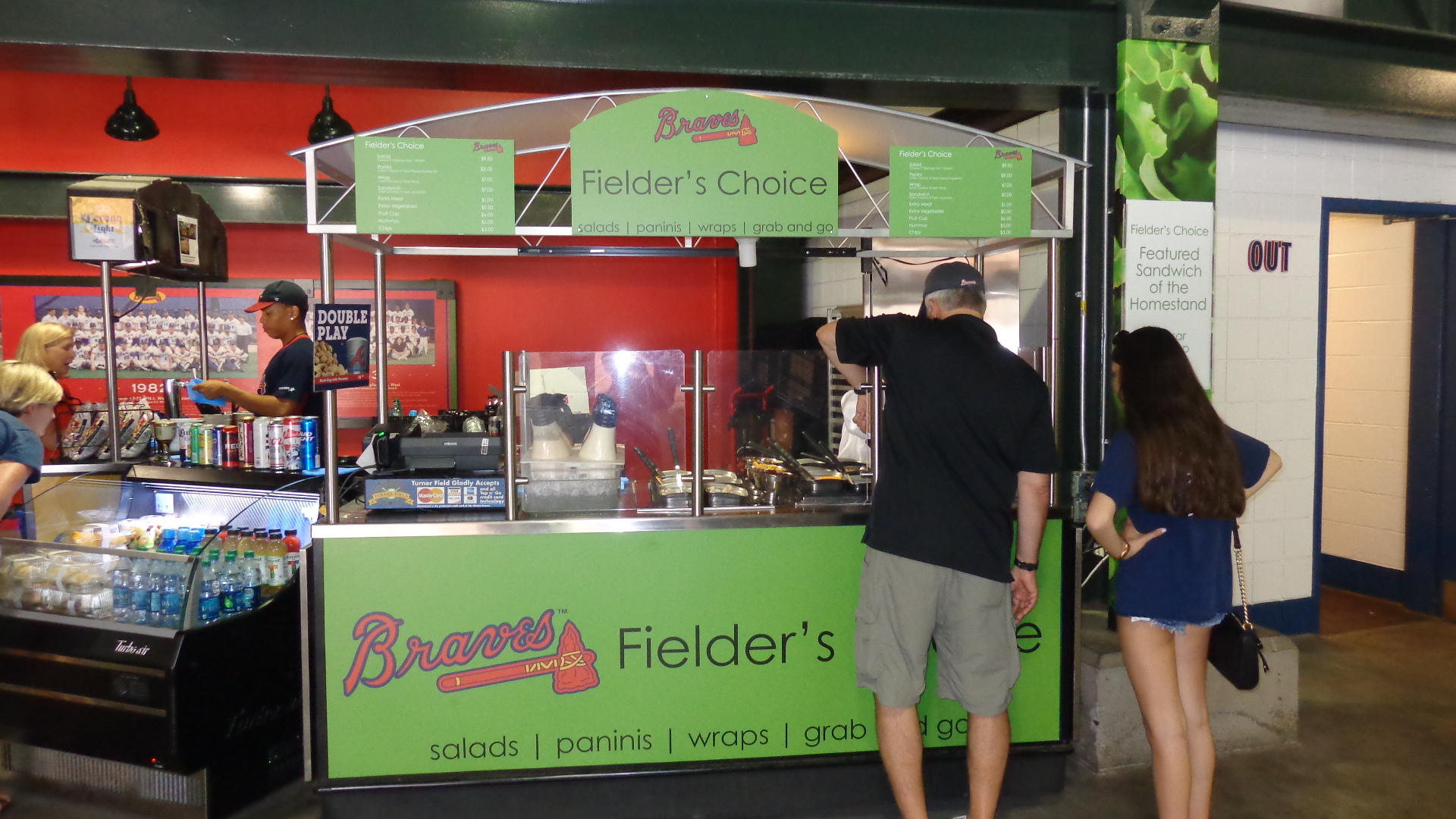
Regional/Signature Concession(s):
For the middle part of Turner Field’s history, the ballpark lacked any significant signature items. In the 90s, they did present some nice regional items. But what happened to the Bison burger? What happened to Peach N’ Cream? There was little on the menu in Atlanta that distinguishes it from any other ballpark. San Diego has fish tacos, Colorado has Rocky Mountain Oysters, and Baltimore has crab cakes. What does Atlanta have? Then again, it’s Atlanta, can you blame the Braves that much?
Well, yes. They bill the “Georgia Dog” as their specialty item, but it really has to be more than a hotdog. I guess the shrimp po’ boy is a nice enough gesture, but Turner Field severely lacks a true signature or regional item. All the Braves need to do is bring in some specialty concessionaires from the local area. Think Primanti Bro’s Sandwiches in Pittsburgh or Skyline Chili in Cincinnati. It’s a little bit tougher here, but it would do wonders for the ballpark’s personality and reputation, because they really dropped the ball here.
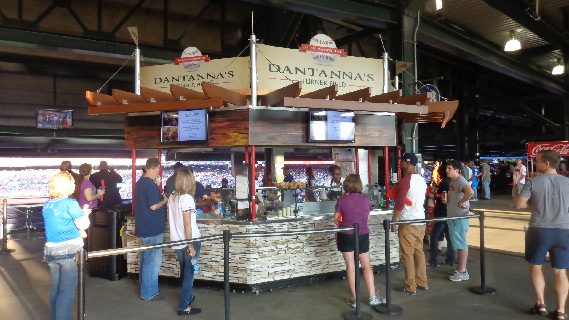
Luckily, the ballpark did just that in 2013 on multiple accounts. On the terrace level at 216, the team brought in Dantanna’s, a longtime mainstay in the Atlanta area. The restaurant’s concession stand will sell crab cake sandwiches and sesame steak skewers (soy, garlic and honey marinated beef) with ginger-soy aioli at their grill cart.
More significantly, H & F Burger has three concession stands located throughout the ballpark. Holeman & Finch Public House and it’s hometown chef are frequently mentioned as providing one of the top burgers in the nation. Way beyond what I expected, given my that I previously implied the city has mundane culinary tastes.
How about something a little more Southern? Originating from Georgia, the Braves recently opened up a Waffle House! Serving a variety of waffles and a couple other southern breakfast items, this is a significant step forward in bringing a regional feel to Turner Field.
Score: 2/2
Accessible Restaurants/Bars/Sitting Areas/Social Spaces:
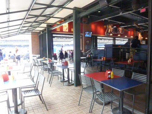
The Braves Chop House was one of the first accessible (non-club) restaurants in the majors to afford a complete view of the field from beyond the fences. The multi-level casual dining experience has a full-service restaurant and a decked out bar, with multiple picnic tables on the second level as well. The Top of the Chop is a new public patio area located outside the club level above the existing restaurant. Unfortunately, the park lacks the multiple bars and social spaces of many newer parks.
Score: 3/5
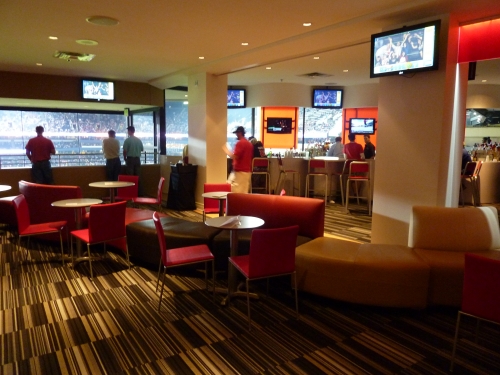
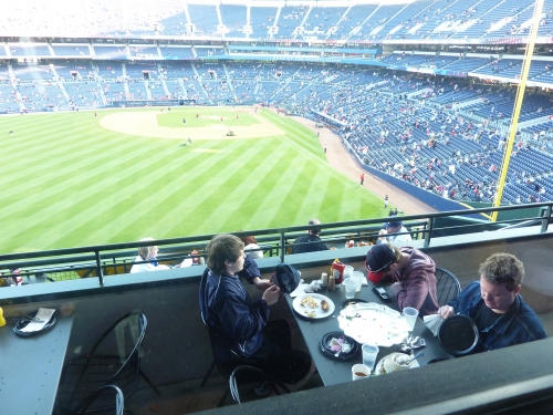
Premium Seating/Clubs:
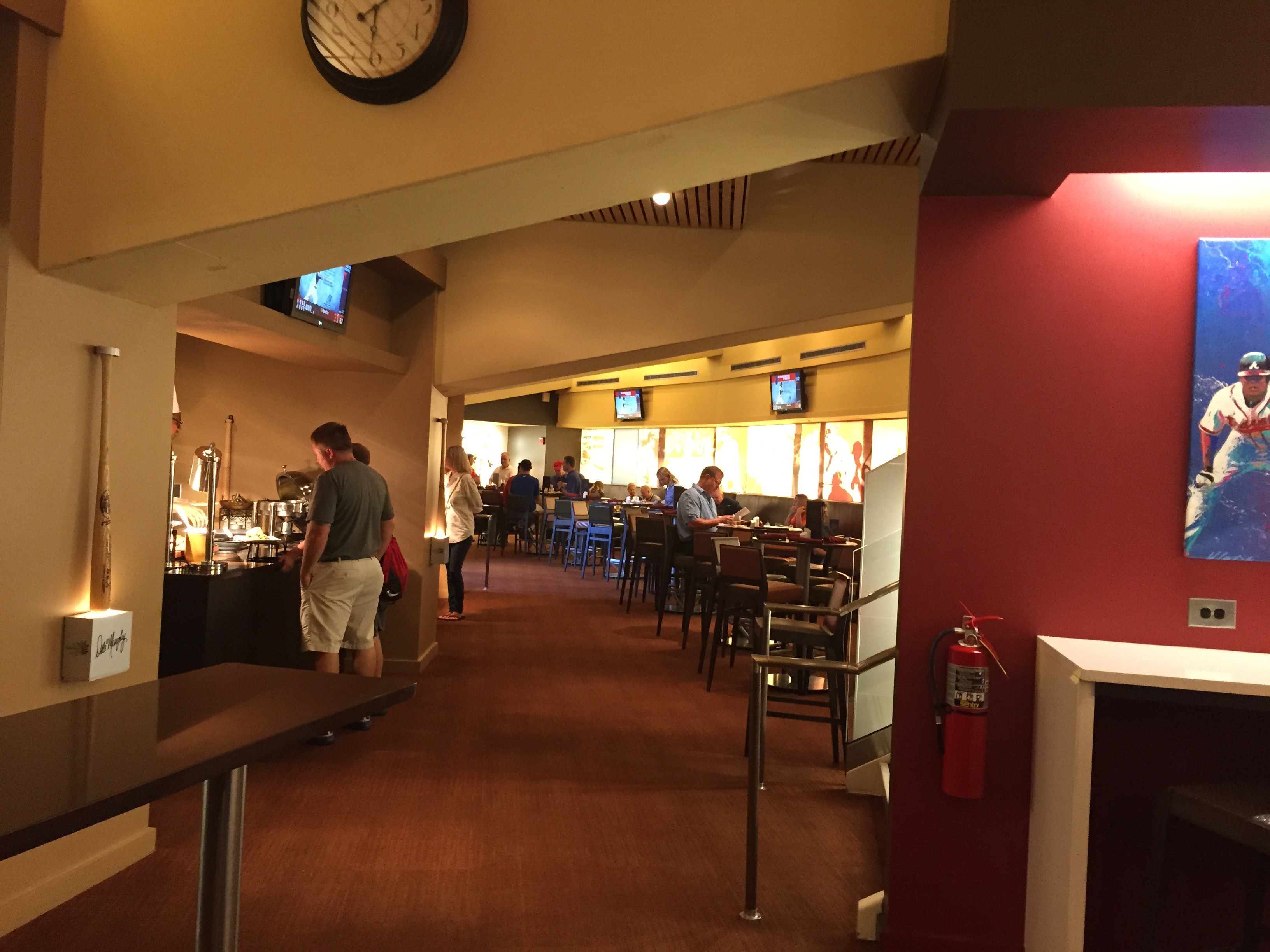
Turner Field places an emphasis on amenities above all else, and premium seating is no exception. Constant renovations in the last 15 years have maintained Atlanta’s position as a generally decent place for premium seating.
The area formerly known as the Golden Moon Casino Level (now without a sponsor) is a fairly nice club space that has been enhanced over the years, while still not eclipsing anything built since 2004. The club features a minimalist stone colored décor, with plenty of whites, blacks, and grays. It may come off as a bit drab, but I think it looks nice. One unique tidbit: the suites look like they require an entry card like a room at a hotel. Despite being closed from the concourse and lacking in seat service, the club level is probably worth it for the substantial upgrade in food selection. In stark contrast to the rest of the ballpark, it includes Mexican, Italian, pasta, crepes, and even sushi. From the decade walls to the concession stands, Braves history is well integrated into the club space as expected.
Only 43 feet from home plate, the closest of all ballparks, the super premium SunTrust Club may very well be the best seats in all of baseball. Arguably the most luxurious in baseball, the club features an overabundance of wood, marble, and leather. The atmosphere, service, and food are all unparalleled in baseball, but with the intimacy lacking in a place like the Legends Suite at Yankee Stadium. With built-in TV monitors and only 150 seats, The SunTrust Club is the most exclusive space in baseball. Unlike anything else in sports, it’s like an exclusive clique, as ticket holders must promise not to sell the seats on the secondary market, even though I’ve seen that violated on Stubhub. When I finally got tickets in 2015 (off Stubhub), I noticed they made all fans sign-in when entering the club, as if to hold the season ticket holders accountable for others in possession of their tickets.
The 755 Club restaurant has long been a symbol of Turner Field’s classy high-end vibe. Renovated in 2009 (which added the Delta 360 Lounge), the members only club features a much welcome chic feel, abstaining from the usual stuffy country club atmosphere. Adorned with rich reds in a modern décor, the 755 Club now gives off more of a vibrant club and bar feel, not so much an upscale restaurant (though they do have an a-la-carte menu). With fantastic open-air patio seating and numerous references to The Hammer, the 755 Club rivals any in baseball.
Following the common trend, the Braves recently opened two hybrid suite/club experiences in areas formerly occupied by suites on the club level. Georgia’s Own Credit Union Club and the Superior Plumbing Club have 152 premium seats adjacent to each side of the press box. The club seats consist of chairs around semicircular tables with flat screen TVs.
Score: 4/5
General or Artistic References to Baseball or Team History/Museums:
Despite criticism in most areas, the Braves deserve unqualified credit for their superior attention to team history. Most teams succeed to some degree here, providing maybe a museum, a team plaque area, or multiple allusions on the concourse, but Turner Field succeeds across the board. They really integrated history into all areas of the ballpark.
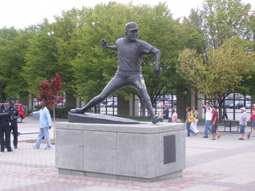
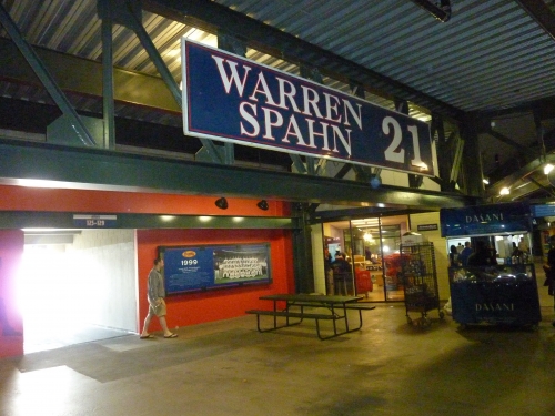
Almost all new ballparks feature statues of team greats, but Turner Field turned its entry plaza into a gorgeous exhibit of historical monuments. You see teams randomly put statues throughout the exterior of their ballpark, but Turner Field made it the focal point. Monument Grove depicts four Braves players, all executed to perfection. In terms of quality, perhaps only Detroit and maybe Pittsburgh can compete with these works of art. Warren Spahn’s high leg kick is perfectly captured, as is Hank Aaron’s 715th home run. Excellent attention to detail with facial expression. Ty Cobb sliding into home plate is also decently done. My favorite is the statue of Phil Niekro, just because of how well you can see the knuckle ball motion.
In Monument Grove, you’ll definitely note the mural emphatically reminding you that the Braves are “the longest continuously operating franchise in major league baseball”. This is only the beginning, as you’ll note pretty much anything that is painted along the concourses will have some reference to team history. Of course, we have Hank Aaron’s home run ball in center field. On the terrace level concourse, note the retired numbers and references to stadium history. On the field level concourse by the portals, there are pictures and display areas of past Braves teams. There seems to be something everywhere you look.
Every corner of the club level is packed with some sort of historical reference. The walls in the premium concourse serve as a timeline for Braves history, and particularly great teams and players are highlighted. Note the numerous historical photographs, quotes on the wall, and allusions to Boston Braves history by the concession stands.
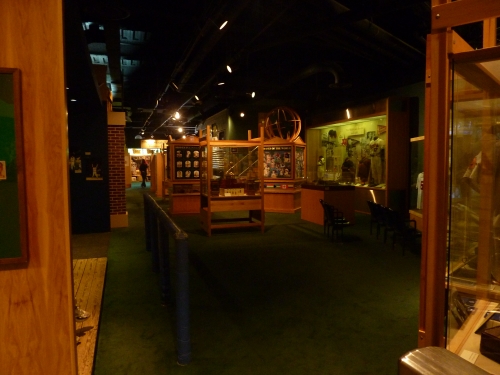
While Turner Field is a literal historic museum for Braves baseball, don’t think that management wasn’t going to include an actual museum as well! While not eclipsing the newer ones in Kansas City or Cincinnati, the Braves Museum and Hall of Fame is still very impressive, housing more than 600 Braves’ artifacts from eras in Boston, Milwaukee, and Atlanta. The Atlanta exhibit is a must see and includes the 1995 World Series trophy. Other exhibits include the 20 members of the Braves Hall of Fame, a leader board, Braves in Cooperstown, and information on the Olympics.
Score: 5/5
Entertainment/Kids Activities/Other Amenities:
When it opened, Turner Field bragged that they had more extra amenities and entertainment options than ever seen before.
I have a high tolerance for kid related activities, if they are done tastefully. If you look at ballparks in Kansas City, Detroit, and Houston, you’ll note that they definitely go all out with playgrounds, carousels, little league fields, putt-putt golf courses (no joke), etc, but they are kept out of site from most fans, or they are aesthetically attractive and part of the building. No matter how ridiculous a feature is, it should be rewarded for its novelty as long as it doesn’t interfere with the architecture of the building or the baseball immersion experience.
But Turner field’s outfield arcade is, for the most part, absolutely disgusting. Most fans enter through the attractive center field plaza (Monument Grove), only to be greeted by Cartoon Network and Johnny Bravo. It doesn’t get tackier than having to look at “Tooner Field” every time you enter the ballpark.
Anyway, the Braves do go all out with entertainment. Scout’s Alley on the outfield concourse is the park’s interactive baseball area, featuring three different simulated pitching games, batting cages, and speed pitch.
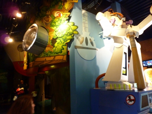
The aforementioned Tooner Field, added in 2005, might be the most expansive kid friendly area in the majors. Inside Tooner Field, the Sandlot features two painted baseball fields with cartoon characters. There is also a stage where kids can display their karaoke skills, equipped with a camera, speakers, and video screen. The large playground area is quite elaborate as well, highlighted by a small room filled with neon lights and video screens.
The Coca-Cola Sky Field might be Turner Field’s most tasteful kid friendly amenity, where kids are invited to run the bases on a small grass field. There is even a mini-dugout. The Braves do get extra points for their musical stage in center field, where there are often pre-game concerts.
Turner Field gets the obligatory high score, but subjective deductions for creating the ultimate baseball theme park.
Score: 3/3
Total: 20/25
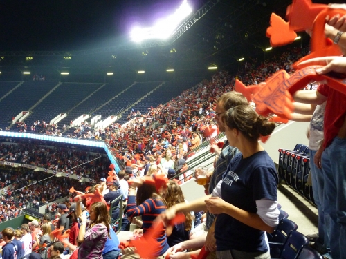
Atmosphere/Fan Support:
Atlanta has long been maligned as one of the worst baseball towns in America. Critics quickly point to relatively low attendance numbers and a failure to sell out playoff games. Is it deserved? Not entirely.
More than any other Southern city, Atlanta is often on the mind of those in the East Coast media, because so much of the population is transplanted from there. But compared to say, San Diego, Houston, Phoenix, Seattle, etc, is it that much worse? Probably not. But it’s not good.
How does a perennial top 5 franchise like this have a floor of 14,000 in April, while 100-loss Houston doesn’t go below 20,000? That’s not season ticket loyalty.
For all the years of winning, the atmosphere and attendance is mediocre at best. The fan base certainly lacks character, consisting of your typical polo shirt wearing Yuppie. You’d think because the Atlanta Braves represent the entire South, fans would be driving from all over to see them. But consistently averaging 29,000-32,000 throughout all the winning years is inexcusable, traffic problems and Atlanta’s sprawl notwithstanding.
Score: 3.5/5
Ballpark Policies/Customer Service:
Perhaps I am biased because I have attended multiple Braves games, but I have had some bad experiences with some of the Braves staff. Note that I will not take off any points for this, as it could just be because I’ve been here so many times.
Like most new ballparks, the Braves let you into the lower bowl before game time to get autographs. However, they do seem to be a bit strict in checking tickets in odd places. It’s even difficult to upgrade in the upper deck, as they even diligently check tickets to make sure general admission fans aren’t going to the seats behind home plate in the upper deck.
There also seems to be some disconnect between staff on certain policy issues, such as whether you can leave and re-enter the game. I get different information on this each time, as they are totally arbitrary on this policy. Once, I was allowed to leave and re-enter under certain conditions, as the lady actually said, “be back in 15 minutes.” As if that’s enforceable. They are also uninformed and inconsistent regarding the post game status of the Chop House. Much of the staff seems uninformed and sometimes argumentative. I was once even challenged as to why I was getting a fork at a concession stand without buying anything, even though I purchased an item at another stand. This isn’t to say I haven’t seen many nice Braves ushers.
Score: 2/2
Bonus:
For being the first ballpark to integrate such a vast array of entertainment features and amenities into the structure, compensating for the poor location; the musical stage and occasional pre game concerts are my favorite: +2
For having the most wide-ranging references to team history of any ballpark, including the team museum: +2
For having so many kid-related activities +1
For being the first ballpark to deviate from the retro formula of quirky dimensions and green seats. The blue seats with red accents look fantastic here +1
For Monument Grove, a nice meeting area before the game: +1
For the Tomahawk Chop: most people don’t realize it was actually “Prime Time” Neon Deion Sanders’ idea while playing for the Braves. It really is a fun tradition. +1
Most of all, for successfully building a venue that effectively accommodated both the Olympics and baseball. +1
Score: 9
Total: 14.5
Turner Field is mostly a testament to the “mallpark” commodification side of the retro ballpark era. Less focus on true architecture, aesthetically pleasing elements, and regional character, and more focus on making the ballpark a revenue generating entertainment experience. They hooked the nostalgic fan under the guise of retro, but Turner Field is more about large food courts, restaurants, fan plazas, musical entertainment, historic museums, and numerous interactive kids areas.
What’s hilarious is that I don’t necessarily have anything against that. Because I try to objectively quantify all positive qualities of the ballpark, I reward the flashy entertainment. I personally know many fans, not even including the stone cold traditionalists, who despise the fact that Turner Field is foremost an entertainment venue. Just imagine if I didn’t reward or even criticized the Braves for their effort. Turner Field wouldn’t just be one of the worst retro parks; it would be the worst park in the history of civilization!
Yes, the Braves succeeded in making Turner Field a true event, rather than a ballgame. But the point is, even if I reward that, Turner still scores remarkably low. After the poor aesthetics, dismal location, lack of character, and a bad food variety (even with the improvements in 2013), it’s an uphill battle. So much of an uphill battle, that Turner Field appears to be one of the worst retro parks using my semi-objective grading criteria. Perhaps most importantly, the amenities simply don’t look as good today as they did in 1997.
What can the Braves do? I gave tons of bonus points because it is a fun place to be and doesn’t deserve a score on par with the Metrodome. Keep touting that Turner Field is a literal shrine for Braves history and the entertainment capital of baseball, because that’s all the ballpark has going for it. What’s unfortunate is that amenities aren’t timeless, unlike great aesthetics. In terms of entertainment, they can and have been easily outdone, which is why in the aggregate, it scores the worst of the post-1991 ballparks.