
Angel Stadium of Anaheim
| Setting | 10/20 | 1 Thumb Down |
|---|---|---|
| Locale | 3/5 | 1 Thumb Down |
| Accessibility | 2.5/5 | 1 Thumb Down |
| Neighborhood Local Scene | 4.5/10 | 1 Thumb Down |
| Architecture & Aesthetics | 35.5/65 | 1 Thumb Down |
|---|---|---|
| Exterior Design/Aesthetics | 9/20 | 1 Thumb Down |
| Interior Aesthetics/Visuals | 24.5/40 | Thumb Sideways |
| Concourse Aesthetics | 2/5 | 1 Thumb Down |
| Functionality & Essentials | 35/50 | Thumb Sideways |
|---|---|---|
| Sightlines: Field Proximity | 12/15 | Thumb Sideways |
| Sightlines: Seating Geometry | 2/5 | 1 Thumb Down |
| Seat Comfort | 6.5/9 | Thumb Sideways |
| Concourse Functionality | 8.5/15 | 1 Thumb Down |
| Scoreboards/Tech | 6/6 | 2 Thumbs Up Star |
| Amenities & Features | 29.5/50 | 1 Thumb Down |
|---|---|---|
| Concessions: Food Variety | 4/5 | 1 Thumb Up |
| Concessions: Food Quality | 2.5/5 | 1 Thumb Down |
| Concessions: Craft Beer/Other Drinks | 3.5/5 | Thumb Sideways |
| Social Gathering Areas/Restaurants | 5.5/10 | 1 Thumb Down |
| Premium Seating/Clubs | 5/9 | 1 Thumb Down |
| Historical Exhibits, Memorabilia, Art, & Other Displays | 7.5/10 | Thumb Sideways |
| Kids Areas/Other Entertainment | 1.5/6 | 1 Thumb Down |
| Atmosphere, Vibe, & Policies | 12/15 | 1 Thumb Up |
|---|---|---|
| Fan Support/Attendance | 5/5 | 2 Thumbs Up |
| Ballpark Traditions/Gameday Presentation | 3/5 | Thumb Sideways |
| Ballpark Policies/Staff | 4/5 | 1 Thumb Up |
| Adjusted Raw Score | 121.5/200=61 |
|---|---|
| Bonus | 0 |
| Curve for All 7 | 7 |
| Final Score | 68 |
|---|---|
| Ranking | #28/30 |
|---|---|
A (Big) A for Effort
While 1998 renovations didn’t put Angel Stadium on par with even the weakest retro ballparks looking at all aggregate metrics, ballpark is still a perfectly acceptable place to see a game
By: Cole Shoemaker
Written in 2017; ratings above are up to date for 2024, but this review below may be outdated and will be updated at some point; reviews and ratings are “living pages” updated yearly when necessary
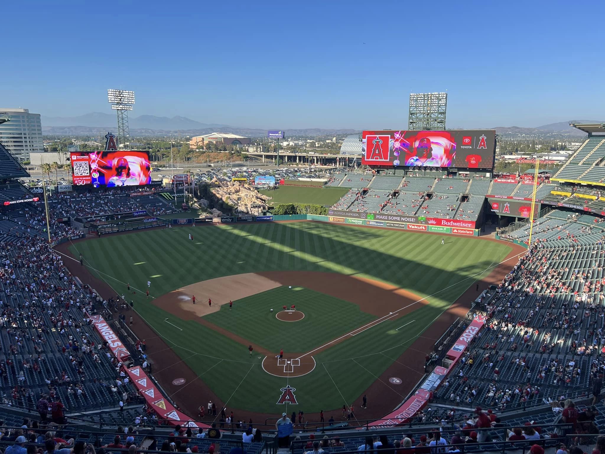
While I have often lamented the declining standards of ballpark architecture for baseball’s newer parks, Angel Stadium actually illustrates how high the bar is for ballparks overall, at least in a relative sense.
Opening in 1966 as a facility primarily built for baseball (it was designed to secondarily host football), the original “Anaheim Stadium” was a rarity for its time. Often characterized by “The Big A” and sea of cars beyond the outfield, I can’t speak much to this original version, but the three-deck grandstand design was ahead of its time. In 1980, Anaheim Stadium was expanded to better accommodate football, losing much of its original appeal. At the dawn of the Disney era, team officials decided to renovate instead of building a new park, so Angel Stadium 3.0 was born in 1998.
To me, two things have become clear about Angel Stadium:
- (a) While initially hailed as a success, the full-scale 1997-1998 renovations, which “Disneyfied” the ballpark through an attention-grabbing water feature (the geyser rock pile) and a striking grand entrance, didn’t go far enough. Yes, the renovation was fantastic comparing the before and after shots, but you see too much of the old football design. And other than one gimmick, the interior design lacked focus and a unifying aesthetic. The ballpark’s functionality was still littered with underlying design flaws as well.
- (b) In now rather stark contrast to other 1990s ballparks, Angel Stadium hasn’t been as properly maintained and enhanced, translating to poor amenities by today’s standards. Tens of millions of dollars have been spent beautifying the concourses and adding new bars, restaurants, and social spaces to 90s parks like Guaranteed Rate Field (Chicago), Camden Yards (Baltimore), Progressive Field (Cleveland), Globe Life Park (Texas), Coors Field (Colorado), and Safeco Field (Seattle). We see very little of that at Angel Stadium.
So really, parts of the ballpark look like they’re from the 1960s-1980s, while other parts are from 1998, which isn’t a good look. Even Chase Field (Arizona), which I’ve criticized for not undergoing proper enhancements, has renovated its concourse appearance and some of its premium spaces. While the Angels claim they’ve spent millions since 2003, it’s mostly in operations and repairs, other than the left field scoreboard, the new greenery in the outfield, and some minor touches.
These two facts not only lead to Angel Stadium comparing unfavorably to the best ballparks of today, but being far below the “worst” post-1991 ballparks like Guaranteed Rate Field, Chase Field, and Miller Park (Brewers). It’s the only park built or renovated after 1991 (which should always be used as the natural cutoff) that I’d label substandard.
While I’ll circle back to my initial premise of what that says about the other 23 parks that meet the standard, and how Angel Stadium provides perspective to how much ballparks have improved in the last 30 years, lets take a closer look at claims (a) and (b) above.
(a) Was Angel Stadium a top-10 ballpark when the extensively renovated version opened in 1998? Probably, as only six stadiums that are now construed as modern-day ballparks preceded it, and we were only nine years removed from Skydome (an unabashed multi-purpose stadium) being considered state-of-the-art. Did it actually compare well to these six modern-day ballparks that preceded it? No way.
Upon reopening, the architects and team officials admitted the ballpark was something of a pastiche, infused with just a touch of original Californian whim: take the terraced bullpens from Camden Yards, the dugout suites from Progressive Field, the outfield kids area from Turner Field, the open left field concourse from Coors Field (I don’t know why this was notable), and add the outfield geysers with the rock pile, and you get Angel Stadium.
Not only does this fail to cobble together any sort of unifying design vision, but there are too many remnants of the old 1980s football version inside and out. While these other new parks got tasteful retro treatment, Angel Stadium got paint on concrete. The exterior design is still flanked by exposed ramps, while the grand entrance is more of a touched up version of the old facade than a new one. Looking at the before and after photos of the outside, you realize it’s just a very well done paint job, with the addition of those goofy oversized hats and bats. You can argue it looks nice, if you’re being charitable, but it’s not on the same level as the new parks.
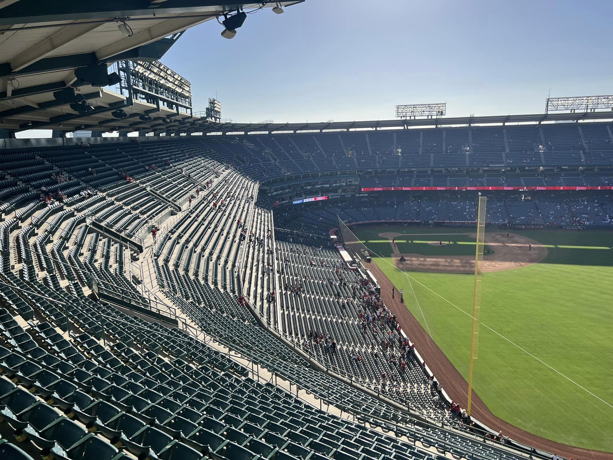
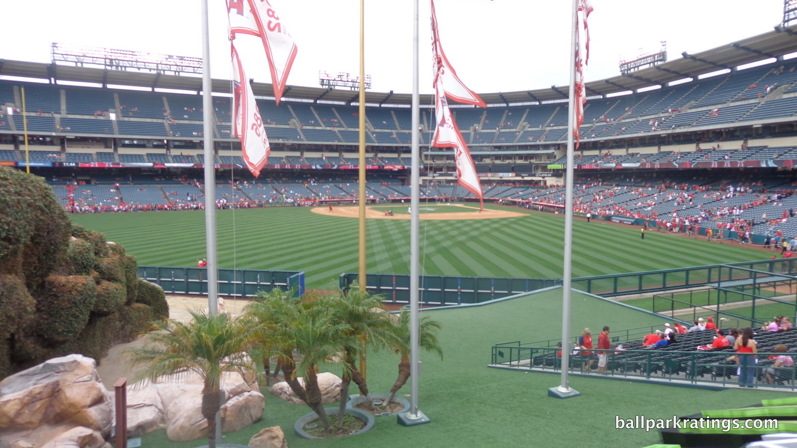
Throughout the outfield interior, you can still see the shell of the multi-purpose grandstand. The decks were completely leveled in left field, while the mezzanine was kept in center and right, with a new scoreboard on top. Click here, here, and here to see how much of the physical plant they retained. The Angels should have leveled the football stands in right field. While actually above a few ballparks that are more muddled, contrived, or just completely devoid of any aesthetic appeal in terms of interior design, the interior aesthetics are characterized by tired, disconnected outfield stands with a poorly integrated rock pile geyser (however you may think it looks). The Angels were correct in keeping the original 1960s baseball-only grandstand behind home plate, but perhaps they should have completely started over in the outfield in order to craft a truly original design, unencumbered by preexisting functionality.
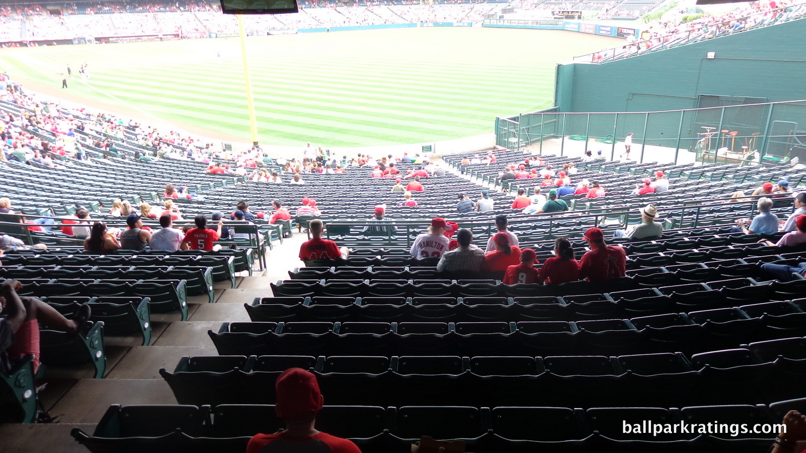
Much of that preexisting functionality is not up to snuff with the post-1991 ballparks. While Angel Stadium’s four (instead of the usual three) distinct concourses reduce crowding, they are very narrow, especially in the upper deck. The rows and seats are noticeably closer together than usual, and the aisles and cross aisles between decking structures (i.e. aisle between 100 and 200 levels, 400 and 500 levels) are far too constrained. Sightlines have overhang obstruction issues and problems with the seating geometry. While the terrace concourse is open to the field, the concourses lack dedicated standing room areas seen in most retro parks.
The most prominent original deficit to Angel Stadium 3.0 has been the total lack of team or baseball history incorporated into the ballpark. While some expansion teams get a bit of a pass here, a hallmark of the new retro ballparks is the incorporation of a team’s storied history into the ballpark, whether it is through statues, banners, plaques, monuments, or museums. While we’ve seen touches added here and there since 1998, Angel Stadium is a very ahistorical building with little sense of who plays here. It’s at or below the level of expansion team ballparks like Coors Field (Rockies) and Chase Field (Diamondbacks).
(b) Second is the claim that Angel Stadium hasn’t received the upgrades of the other 1990s ballparks, which is pretty undeniable, looking at the new money poured into contemporaries versus Angel Stadium. Sure, there have been minor enhancements over the years, but it doesn’t compare to the substantive capital investments taken at other parks. I’ve already mentioned this in passing, but I want to emphasize amidst all this criticism, the outfield beautification of the drab plastic areas to the left and the right of the rock pile was laudable and much needed. But overall, not much else has changed about the ballpark since 1998 that affects the fan experience.
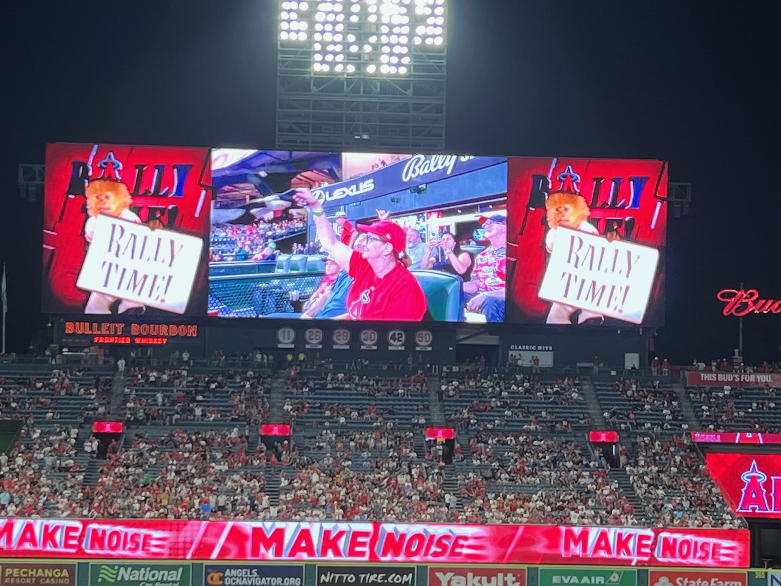
If you’re looking over Angel Stadium’s appearance quickly and superficially, the videoboard might be the canary in the coalmine. Not only were bigger and better videoboards installed across the majors in the mid to late 2000s, but there’s been a massive arms-race in the 2010s. Added in 2004, Angel Stadium has the oldest videoboard in baseball, including classic parks like Wrigley Field and dilapidated multi-purpose stadiums like Oakland Coliseum.
It’s not very consequential, but it’s a good indicator that Angel Stadium isn’t being properly maintained. 2018 UPDATE: They finally installed a modern video system.
With tiled floors and mall-like signage, Angel Stadium’s concourses were pretty outdated from the outset, and haven’t been properly enhanced. Ballpark concourses are usually renovated every 7 to 15 years depending on initial appearance, and Angel Stadium’s were always substandard.
Concessions also evoke a more mall-like vibe, instead of the now common cultivation of local food across the nation’s ballparks. While Angel Stadium pioneered the Diamond Club concept (although not an ultra premium bunker club like successors), the premium seating options are behind other ballparks in baseball. Consisting of two unadorned bars with metal seating and a meekly tiled open-air concourse, the Angels’ park possesses the worst club level in baseball. It’s one of the few parts of the park I’d call flat out unacceptable, not just substandard.
Perhaps most noticeably, Angel Stadium lacks the expansive bars, restaurants, social spaces, and simple places to hang out seen in other parks across the majors. Comparatively, this is a pretty large deficit. The Angels one restaurant, the “Saint Archer Brewing Co.” (formerly known as the Knothole Club) is a traditional dining experience.
In many respects, Tropicana Field (Tampa Bay) has better amenities, which isn’t very controversial if you’ve been there, but helps illustrate the perspective from which Angel Stadium should be viewed.
That’s not to say Angel Stadium isn’t far superior to Tropicana Field overall, which leads me back to my initial premise: Angel Stadium is still a serviceable ballpark, and is particularly illustrative in providing perspective for the 23 superior parks (or 24 if you include Turner Field) and the 3 truly inadequate stadiums.
The 23 other post-1991 new or renovated ballparks in use, ranging in scores from the mid 70s to the low 90s, have more in common with each other than they have in common with Angel Stadium. New parks have the ability to start from scratch and craft their own design vision. While some obviously have more flaws than others, all of these parks are good parks, so fans of the lower rated parks shouldn’t be insulted.
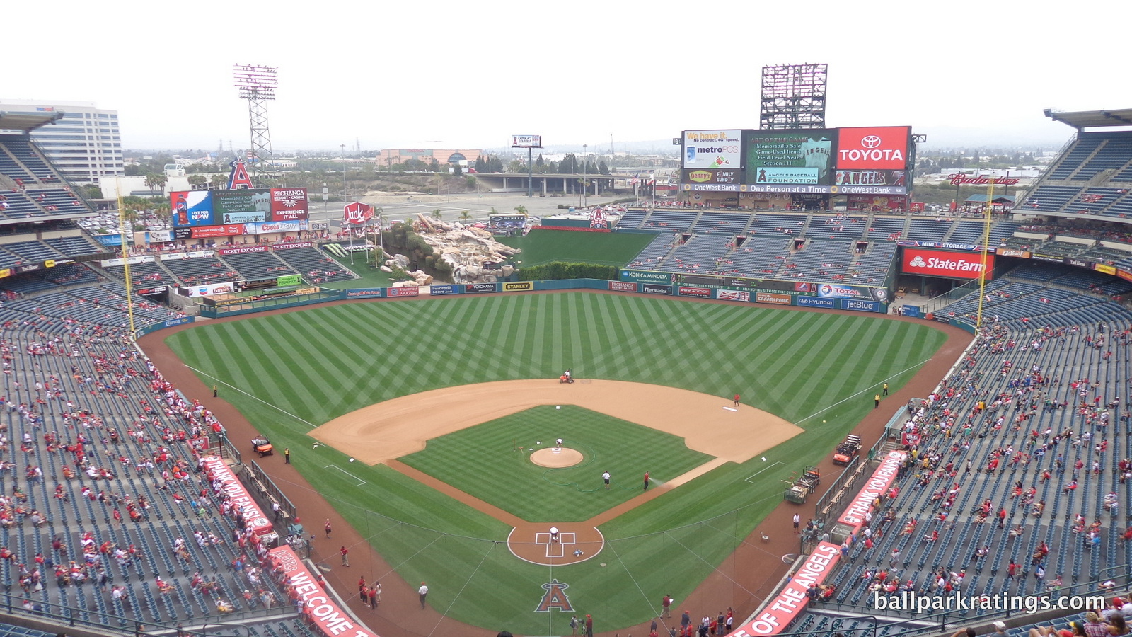
At the same time, Angel Stadium is far superior to the Oakland Coliseum, Tropicana Field, or Rogers Centre (Toronto). 30 years ago, the park would primarily be compared to these stadiums. This puts Angel Stadium squarely in the “take it or leave it” category, where I’m on the fence about its future existence and certainly wouldn’t cheer if it got replaced. It gets its very own “tier” in rankings, below the good and the great, above the inadequate.
We’ve been spoiled in the last 25 years by gorgeous ballparks with exteriors of ochre sandstone imported from India, interiors with water views, and concourses with top-shelf local restaurants, cigar bars, premium lounges, museums, and even nightclubs, all of which overshadow the fact that Angel Stadium is a perfectly acceptable place to see a ballgame. And I don’t touch upon the fact that renovating the park rather than building a new one saves the taxpayers’ money.
But the bottom line is (a) the 1998 renovations didn’t go far enough in the first place and (b) the ballpark hasn’t undergone necessary yearly enhancements since that time to ensure requisite quality. Angel Stadium is subpar across the board, from setting and architecture/aesthetics to functionality and amenities. Let’s hope the Angels take note.
Setting
Location/Access:
A great location is a necessary condition for building a great ballpark, as the quality of the location is often highly correlated with other factors like the quality of the interior design. This is because integrated contextual aesthetics are often central to a great interior (and sometimes exterior) design. Citizens Bank Park in Philadelphia (at 83.5), which makes up ground in amenities and functionality, is probably the best a park can get with a poor location, but it’s outside the top 10.
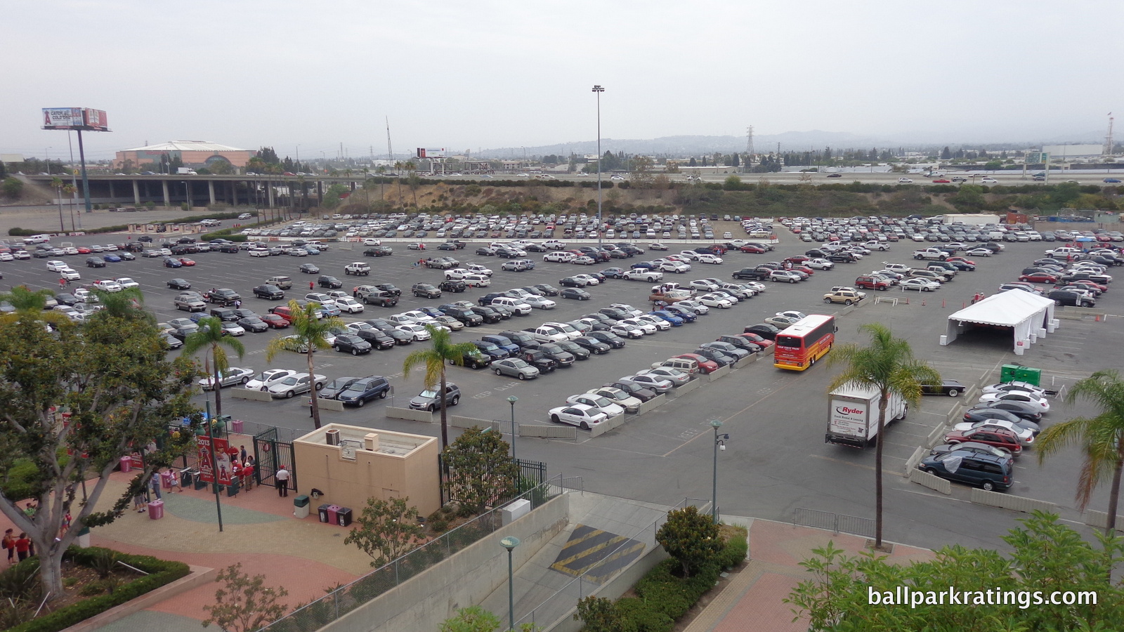
Conversely, a poor location can knock a ballpark down an entire tier. It’s worth pointing out that Angel Stadium might not be Angel Stadium if not for the location. If originally located in a city center, ballpark architects might have completely altered their approach to the renovated interior design, instead taking views and existing local structures into account. Instead, the park is truly a suburban park southeast of downtown Anaheim, surrounded by freeways and parking lots, like Miller Park (Milwaukee) or Kauffman Stadium (Kansas City). To be fair, Orange County is kind of an inherently suburban place.
Unlike Miller and Kauffman, traffic is expectedly a nightmare around Angel Stadium (although nothing compared to Dodger Stadium). If you aren’t near the stadium, it’s quite a trek to get here factoring in traffic. Perhaps that’s why the Dodgers-Angels matchup is called the “Freeway Series,” because fans of the visiting team will spend more time on the freeway than at the game.
While the traffic is bad, that isn’t to say the parking and access are bad, with relatively efficient parking and close proximity to four freeways (5, 57, 55, 22). But perhaps the parking situation just looks so favorable by comparison to Chavez Ravine.
Score: 2/5
Local Scene:
Located on a plot of ex-farmland, Angel Stadium was placed southeast of downtown Anaheim, near Disneyland and Chapman University in the city of Orange. You could favorably factor in Angel Stadium’s proximity to a major world tourist attraction, but it isn’t proximate enough to make a difference.
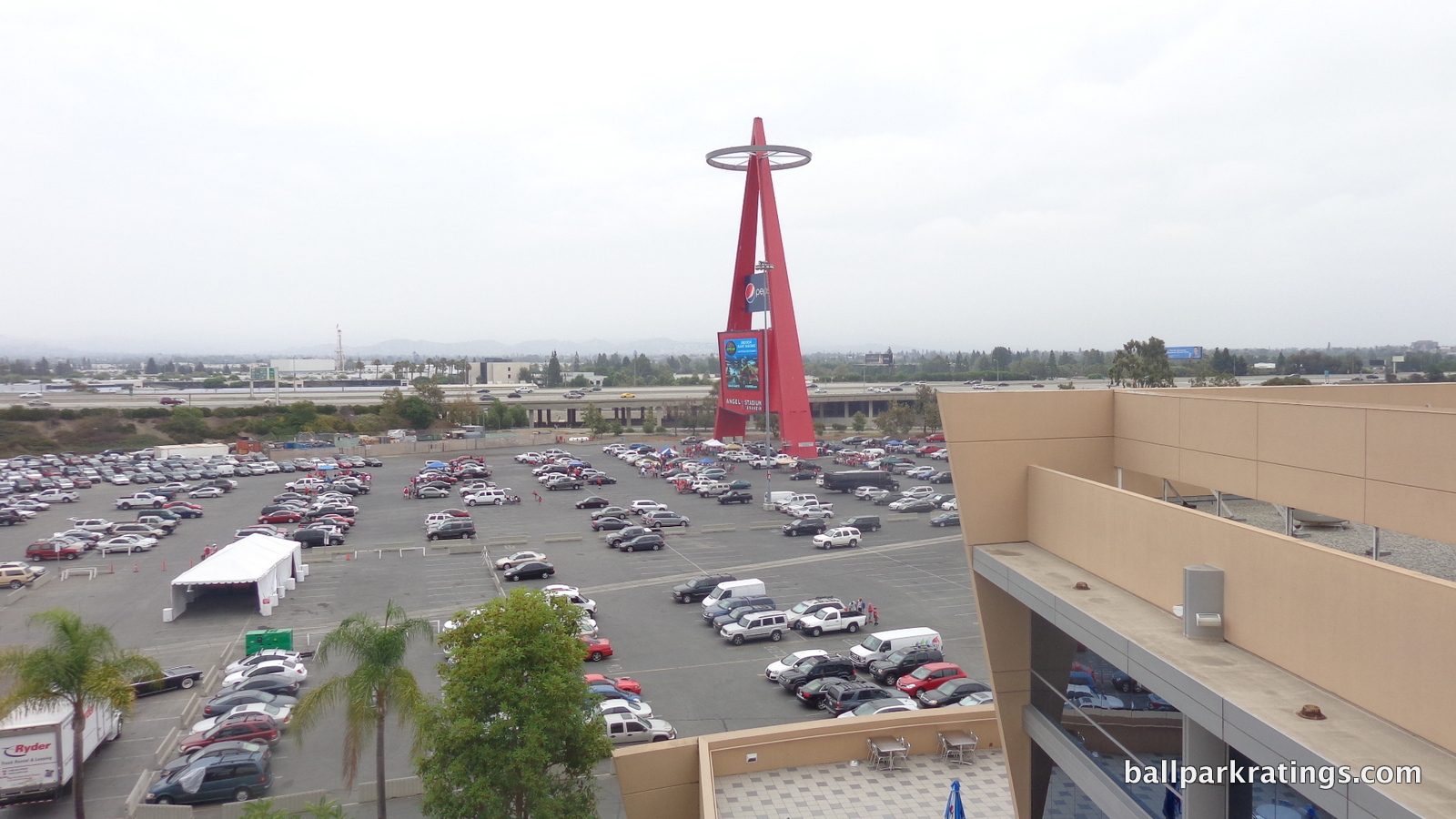
An entertainment complex known as “Sportstown” was originally planned as the nexus between the Angel Stadium-Honda Center experience, but failed to materialize. Tinsletown, a quintessentially 90s Hollywood-themed restaurant, was formerly nearby, but the larger sports entertainment concept had difficulty attracting tenants.
There are actually some chain restaurants located within walking distance on E Katella Ave., elevating the local scene above other suburban parks, but it’s a pretty dull scene. Tailgating is technically allowed at Angel Stadium, but it’s not nearly as prevalent as in a place like Milwaukee or even Kansas City (likely because of the prohibition of alcohol).
The Angels have expressed interest in building a SunTrust Park-like mixed use development community in the area, so we’ll see where that goes.
Score: 3/5
Total: 5/10
Architecture & Aesthetics
Exterior Design:
At times, Angel Stadium is conceptually adept and visually engaging, but always with little to no true architectural merit. This is despite ostensibly having an eclectic group of architects, including the famed Robert A.M. Stern.
Even a spiritless exterior design like Turner Field can claim to be more than a concrete paint job plastered with gimmicks.
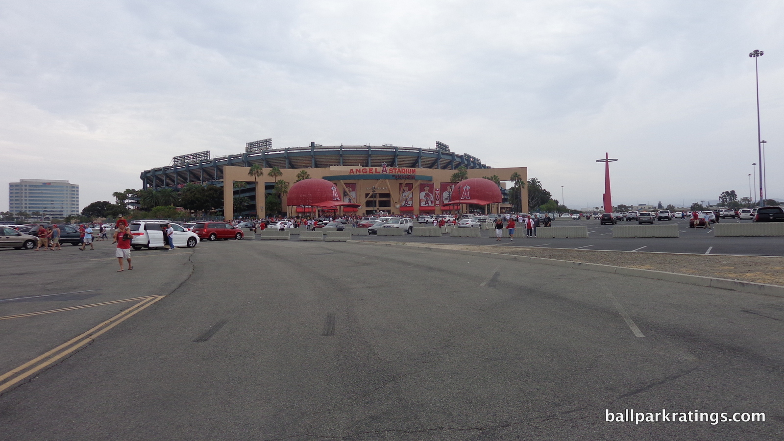
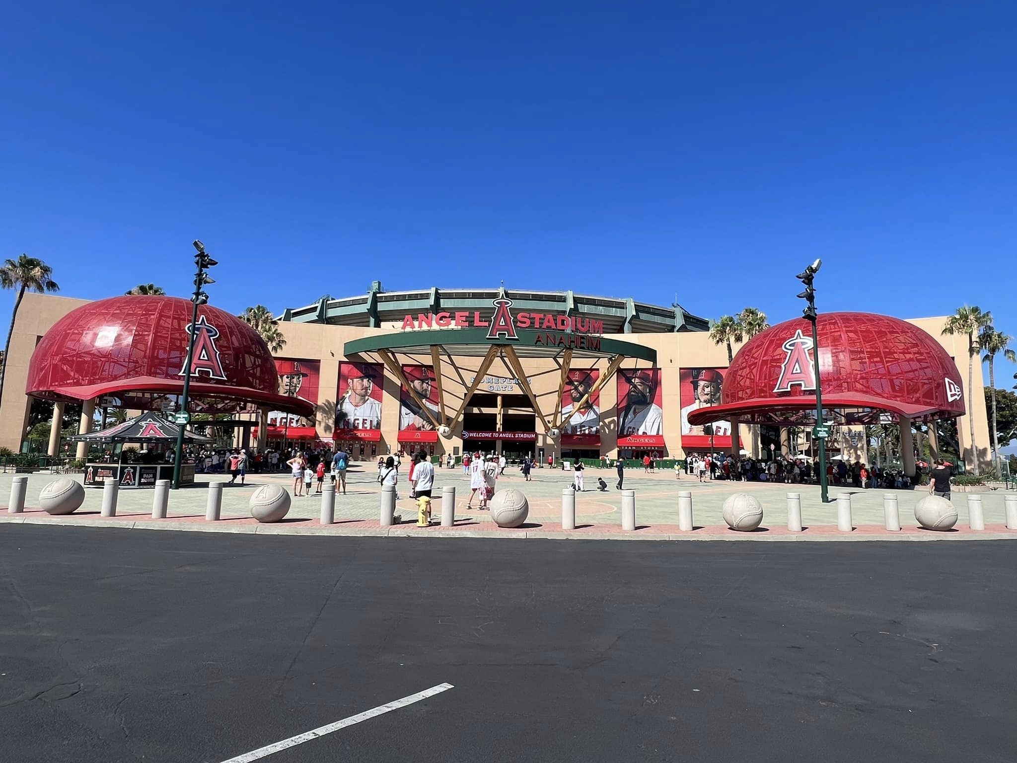
The Angels insisted on calling this a “new park” when it reopened in 1998, but that’s never really been plausible, as the exterior and interior lines are still highly recognizable. This is especially true of the outside, where utilitarian exposed ramps were given a coat of heavy green paint, new plazas were decorated with palm trees, and a gimmicky grand entry was added behind home plate. It’s architecturally hollow, and transparently so, but bluntly attractive.
I can’t speak to the extent to which the grand entry façade used the bones of the original white civic-looking structure, but it certainly looks that way. While it’s often referred to as stucco, the fact that it’s actually light beige (or copper dust, as the architects would say) painted over concrete might partly confirm this. Regardless, any charm it possesses is neutralized by this aesthetic banality and architectural emptiness. Rather than the brick, stone, steel, or glass seen in even the worst retro parks, we have paint on concrete camouflaged by frivolity.
For what it’s worth, most of that frivolity (all at the grand entrance behind home plate) accomplishes the goal of making Angel Stadium an inviting and playful ballpark, which was the stated purpose. More kids see this ballpark in person than others, and they will like it. Fans are greeted with an immediate and memorable sense of arrival.
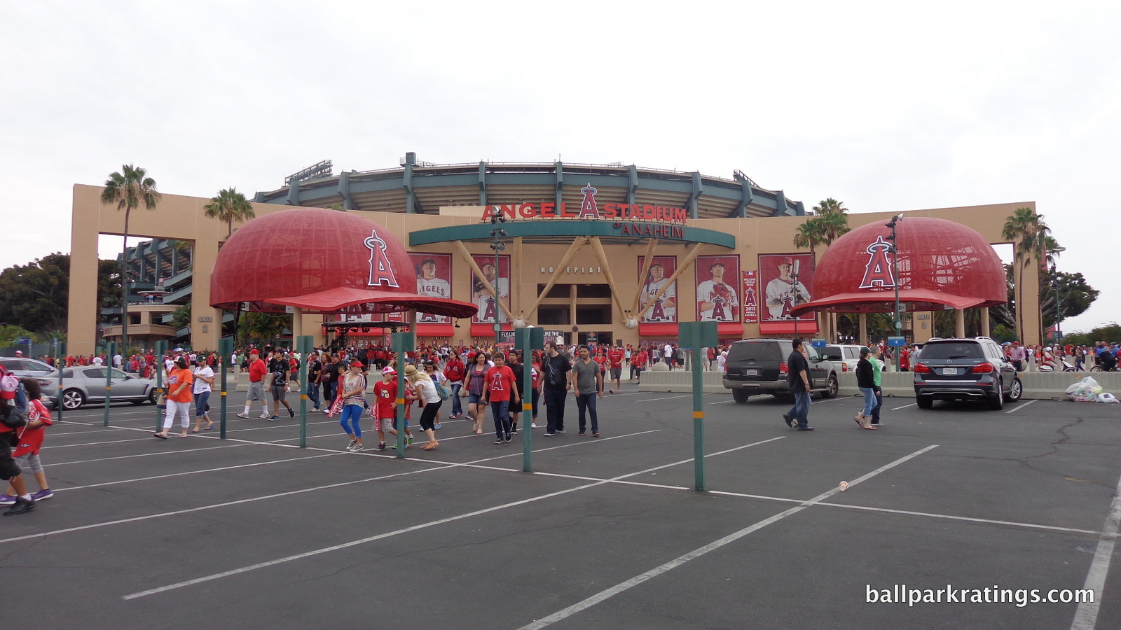
Inside and out, the “The Big A,” particularly the crowning circularity of the halo, was always Anaheim Stadium’s strongpoint. We see this theme of circularity emphasized with the new grand entry. Flanked by two oversized Angels’ caps, the home plate façade curves outward toward the fans, subtly enhancing the already ingratiating sensibility of the design. The brick plaza in between mimics the infield. Propped up by baseball bats, the ring holding up the signage resembles a semi halo.
There’s only one exterior design similar to this in its team-oriented gimmicks, and it might be instructive to contrast Angel Stadium to this much more successful one. Comerica Park (Detroit) features a similar set of baseball bats around its grand entrance, but they are specially crafted to resemble the bats of Tiger legends, while the Angel Stadium bats look like they came out of a Louisville Slugger’s factory. Where Comerica Park has artistically sculpted Tigers added in near perfect rhythm and proportion, Angel Stadium has two brute team hats. And with Comerica Park, all of this is backed by tasteful design cues with some architectural merit.
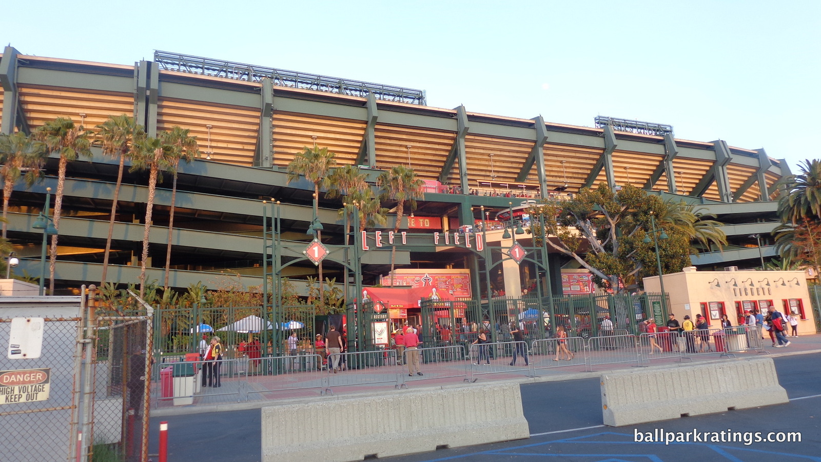
When the banality is not camouflaged by this frivolity (everywhere except around home plate) at Angel Stadium, it’s rather revealing. While they don’t jut out as much as those at Guaranteed Rate Field, we still have the exposed ramps of the original design. Even more transparently, the corners of the ballpark have the same utilitarian design of the original, again just covered with a coat of paint. You don’t have to look too closely to see the old stadium. The palm tree plazas help the situation, but this appearance would be unacceptable for other parks.
Overall, this criticism should be taken lightly, as this comes with the territory of renovating an older ballpark rather than constructing a new one. Just don’t compare it to the latter.
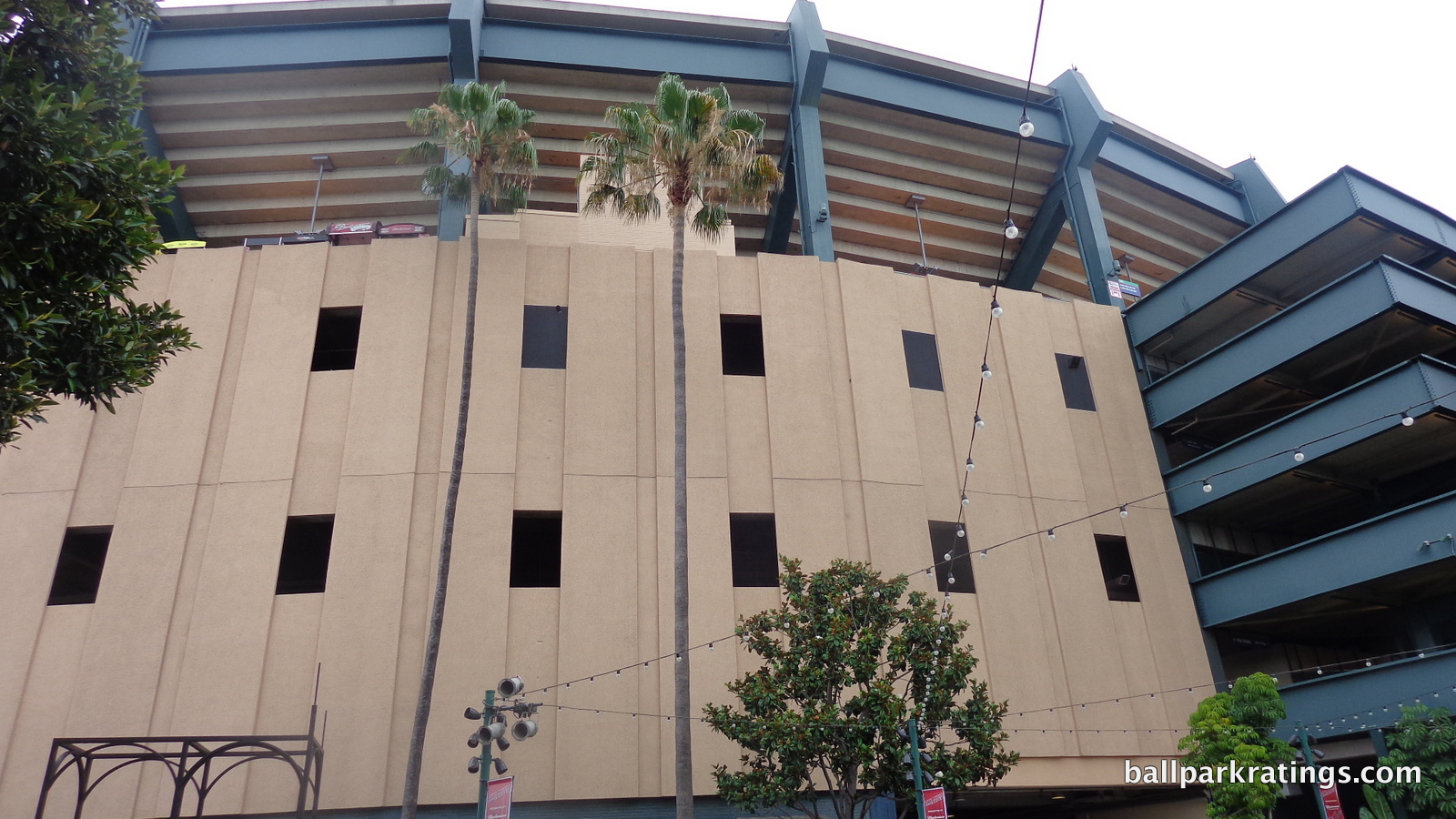
Score: 4.5/10
Interior Aesthetics:
The general consensus from ballpark nerds and longtime Angel fans alike is that Angel Stadium should have incorporated the “Big A” back into the interior design in a Kauffman Stadium-style renovation, restoring the 1960s’ “modernist” aesthetic vision. I generally agree with that sentiment. Instead, like some other retro ballparks, the 1998 Angel Stadium renovation is a testament to its time: heavy on loud gimmicks and overly themed designs, attempting to mask an interior design the lacks much true aesthetic merit.
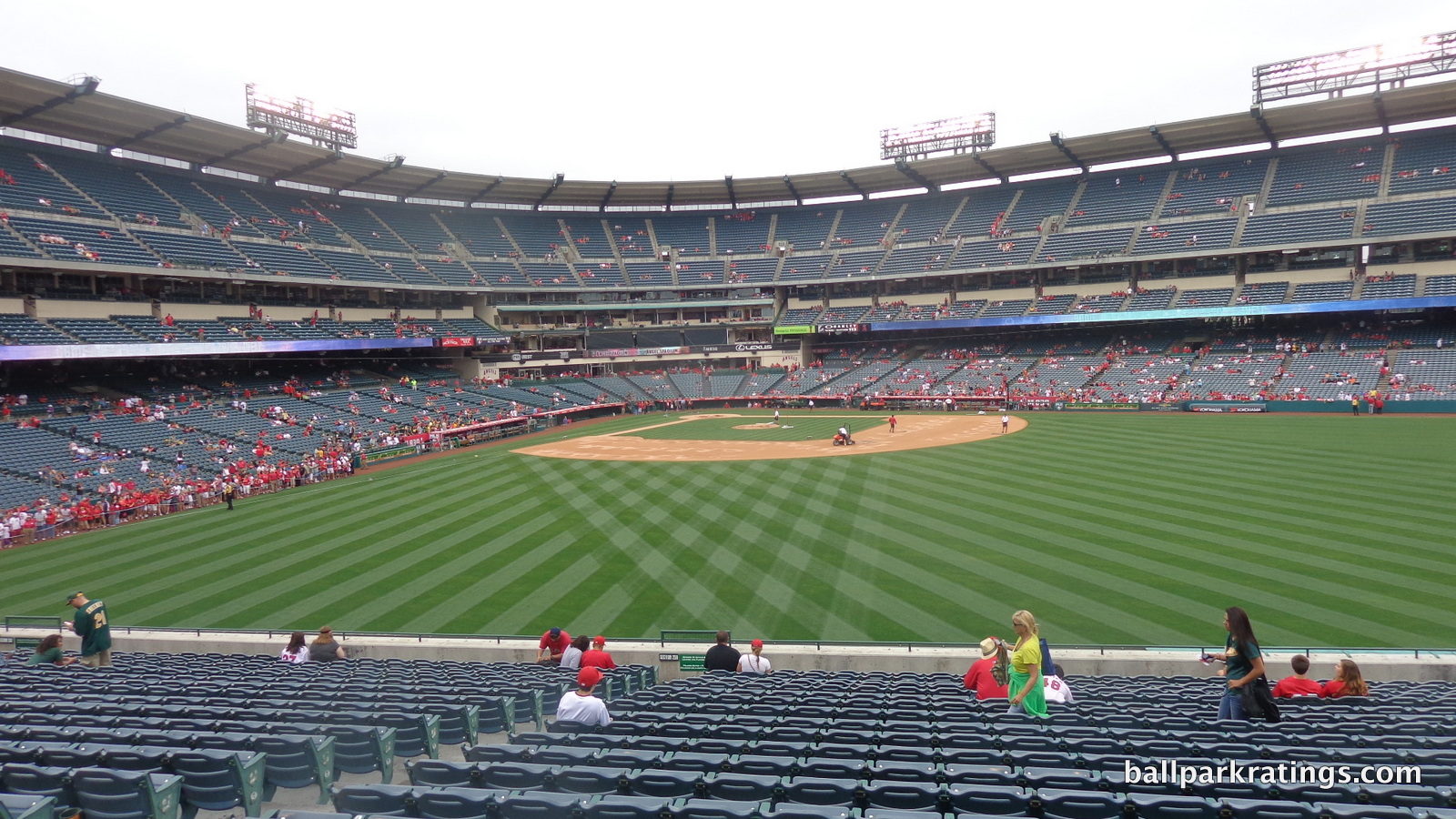
To its detriment, Angel Stadium also failed to completely start anew in the outfield, as the shell from the multi-purpose stadium design can be seen spanning the right side of the park.
It all adds up to a rather haphazardly put together appearance with little aesthetic vision, a lot of dead space, and no continuity between elements. Only the maintenance of a simple, open design and the new attractive treatment of the batters’ eye prevent it from being among the worst interior designs of the new or renovated post-1991 ballparks.
Let’s first look at why the Angels decided to renovate rather than construct a new ballpark. Even before accounting for costs, the initial intention was to build a new ballpark, and then the Angels noticed something crucial. When stripped of the outfield stands, the original main grandstand (1966) was nearly identical to the highly successful Camden Yards (1992) and other three-deck 1990s parks that were in the works.
The architects realized they could make a copy of Camden Yards just by renovating if they wanted to, with a large lower deck with terrace boxes above, a mezzanine club level backed by luxury suites, and an upper deck. Not only that, but they could improve upon it, with four distinct concourses instead of three, an open terrace concourse, and a home plate club. So from a functional standpoint, it wasn’t like renovating the Metrodome; it did have a skeleton that could incorporate modern amenities. While parks today would use a design more resembling SunTrust Park or Yankee Stadium, the main grandstand is fine, as the problems are almost entirely in the outfield.
We should first note that any park with a suburban location lacking views has a difficult time here, as you either have to (a) punt on authenticity and build a self-contained structure like Globe Life Park in Arlington, and gamble that the aesthetics will compensate for the contrivance, or more commonly, (b) build a ballpark open to its suburban surroundings and hope the interior lines operate effectively in view of the vacant surroundings.
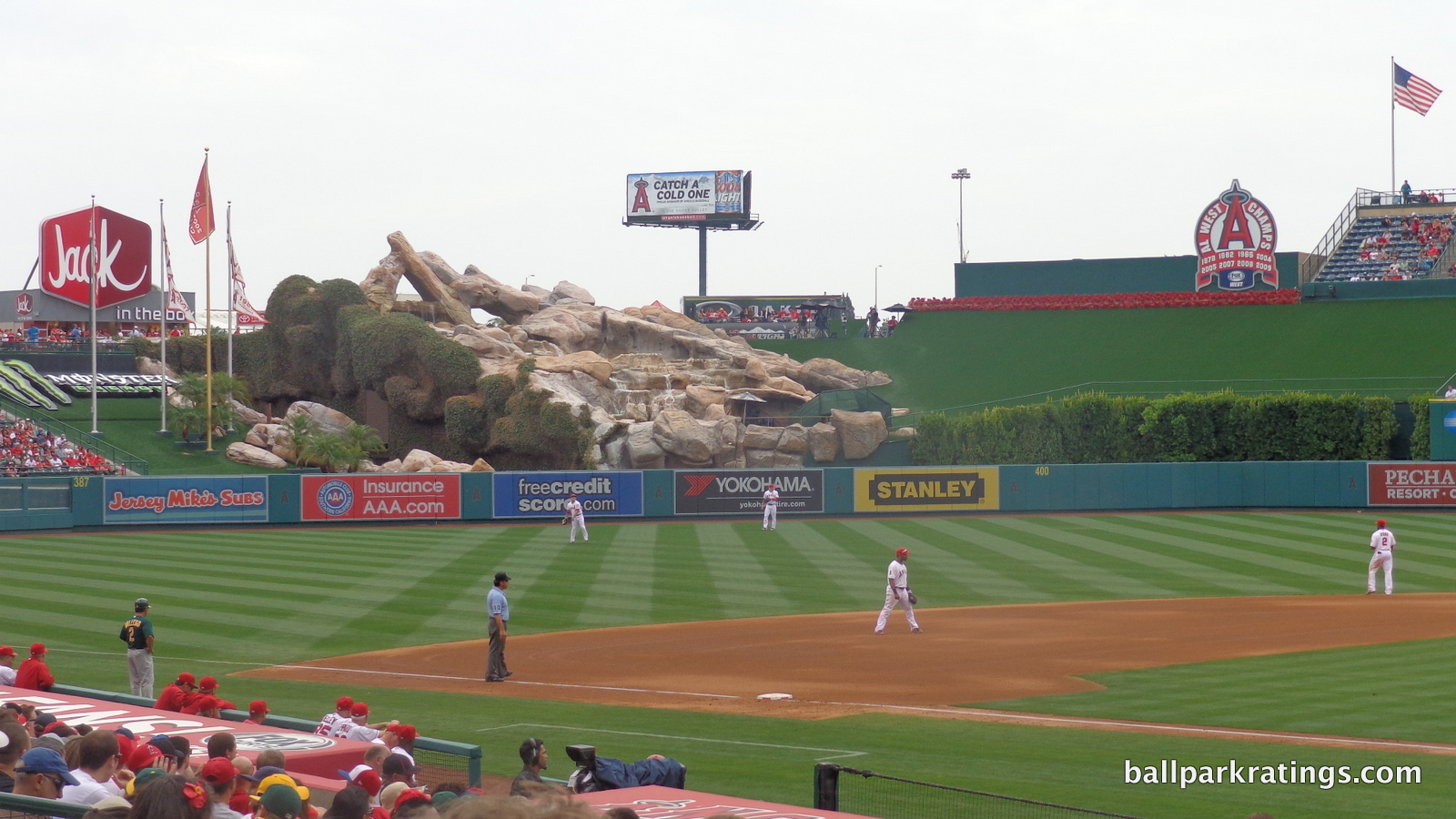
If you don’t take the former tact, the best you can get is something like Citizens Bank Park. And Angel Stadium isn’t Citizens Bank Park, lacking confidence in its architectural lines and having little to no cohesive outfield design.
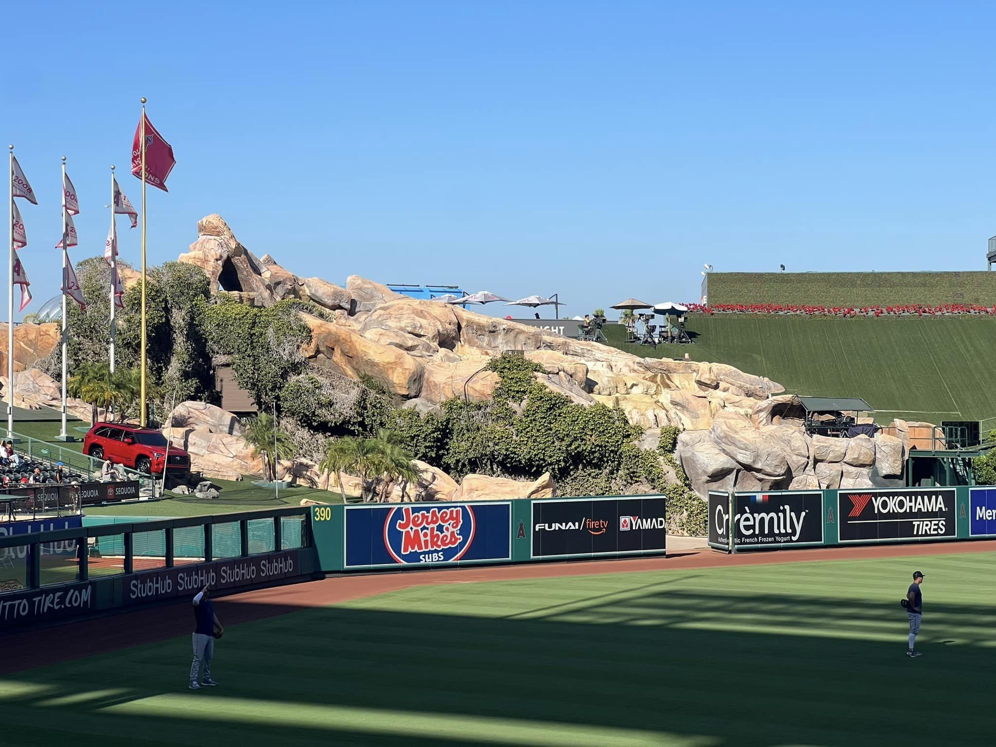
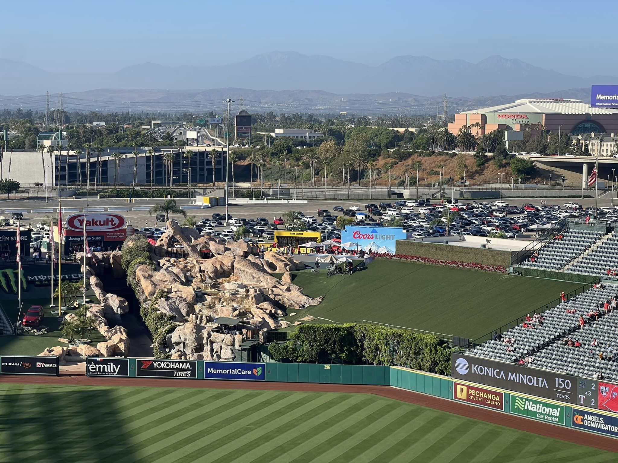
In what can only be described as the elephant in the room, the much derided outfield rock pile geyser exemplifies the entirety of the outfield design, and not in the way you might think.
Alternatively known as the “Outfield Extravaganza” and “California Spectacular,” the infamous geyser (referred to as “geyser” or “rock pile” going forward) might be the most mocked 100 x 100 in baseball, at least among ballpark aficionados. If you hit a pithy description ranging from “mildly contrived” to “L.A. shitty,” you’d be in the ballpark.
Well, it’s obviously a gimmick, one that was self-consciously added to give some flavor to a monotonous array of stands. By 1998, many ballparks included features to superficially distinguish their design due to underlying structural similarity, basically tipping their hand that their design wasn’t original. For example, you might respond to a snarky critic by saying, “how would removing the fake plastic rocks make Angel Stadium better?,” but the fact that the ballpark needed it in the first place shows a lack of confidence in its architectural lines. It’s a vivid example of how the ballpark wants to distract you from the fact it’s in a sea of 15,000 parking spaces and has nothing else.
While all of this is telling, the primary interest is whether an interior design feature looks good and how it relates with the rest of the ballpark. On the former point, while I can’t imagine liking the geyser, I understand why the Angels included it. I don’t think it’s self evidently ugly (certainly not anymore, after the greenery was added), and even great ballparks sometimes need to add some whim.
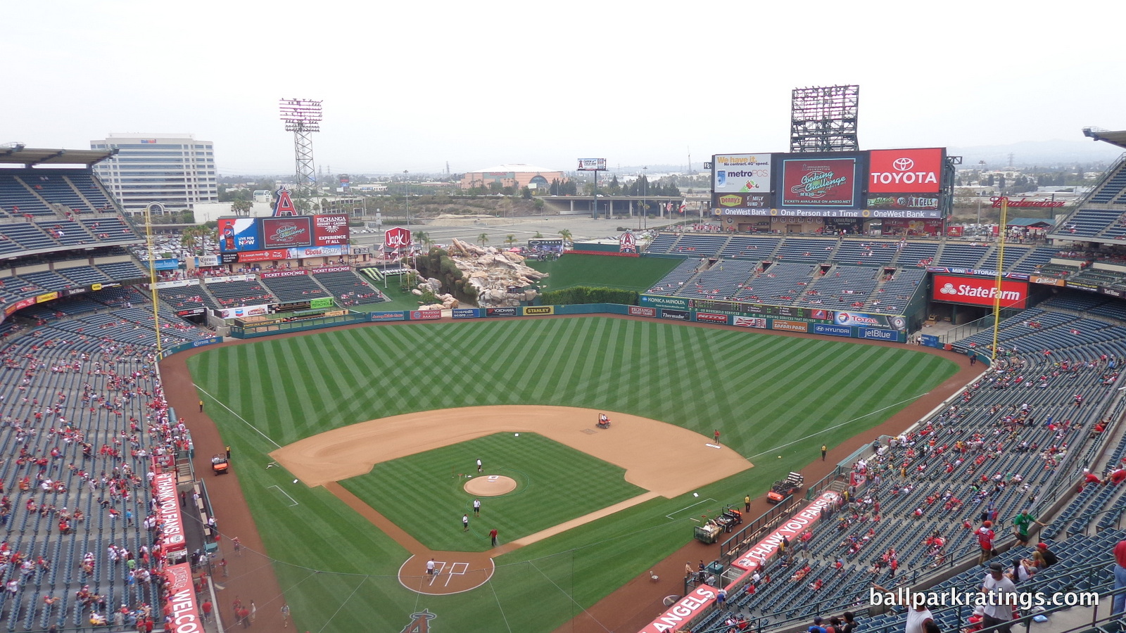
The central problem, which includes the fact that an external gimmick can’t anchor an entire aesthetic, is that the geyser isn’t effectively integrated into the rest of the interior design and doesn’t fit with the surrounding environment.
I understand it’s meant to bring a splash of the California coastline into Angel Stadium, but the rock pile looks out of place in a suburban environment. More saliently, it looks completely isolated in center field. It’s not part of a larger aesthetic vision, and if the rock pile was meant to alone anchor a larger design vision, that’s way too weak. If the entire aesthetic is “California coastline,” you can’t have the only reference be an isolated gimmick, however prominent.
Gimmicks can only work if they are part of an existing larger aesthetic vision. Say what you will about the train at Minute Maid Park, but that’s part of an existing grand aesthetic vision of bringing the train station into the ballpark, evidenced by the lacy ironwork, the cream stone archways, and the actual Union Station visible beyond left field. The train supplemented that sensibility. Angel Stadium’s rock pile acts alone.
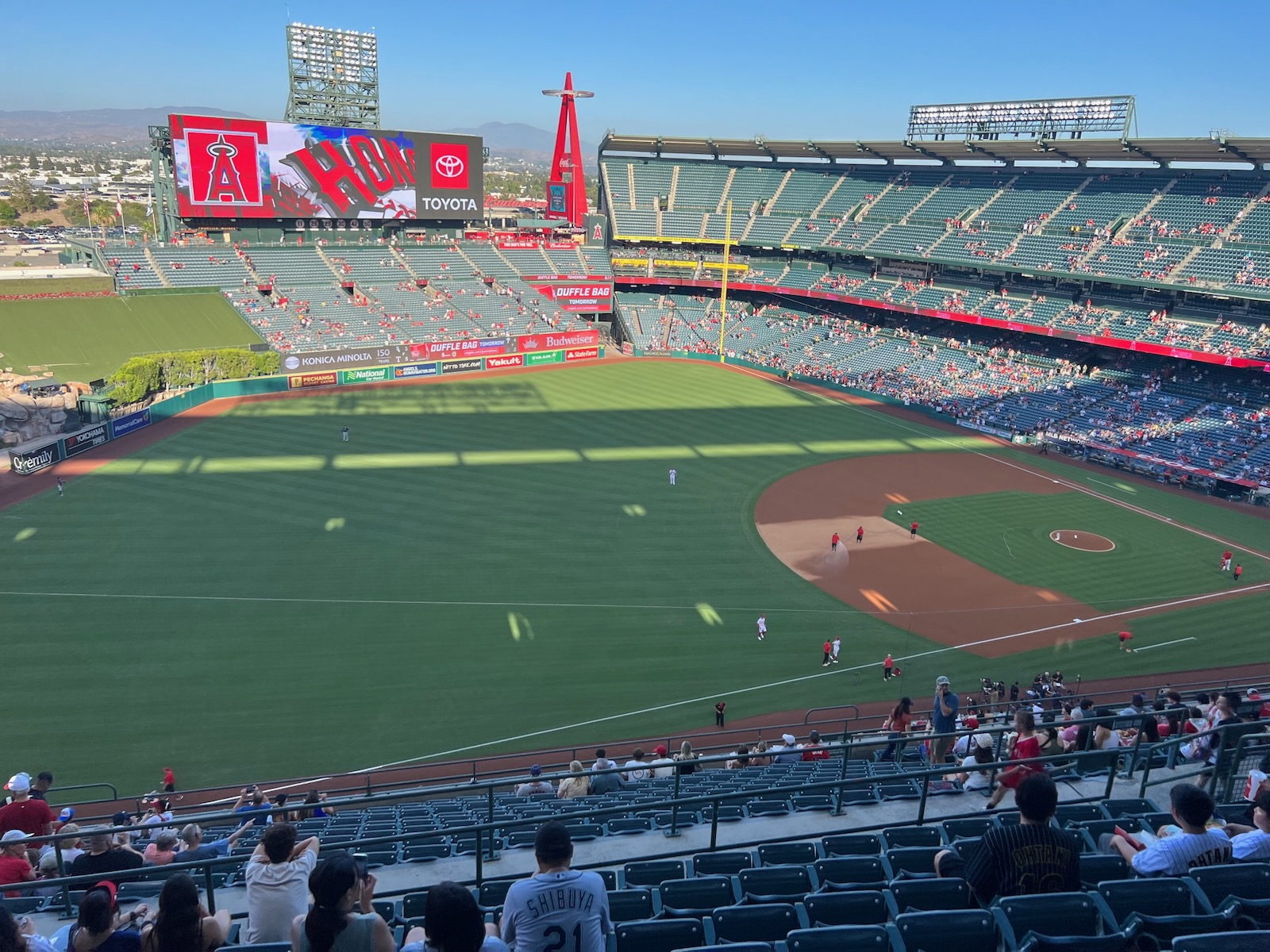
This is a problem with the outfield scene in general, as elements fail to visually connect with each other or combine to represent anything in particular. The outfield scene as a whole doesn’t connect with the main grandstand either, as they were built during different eras.
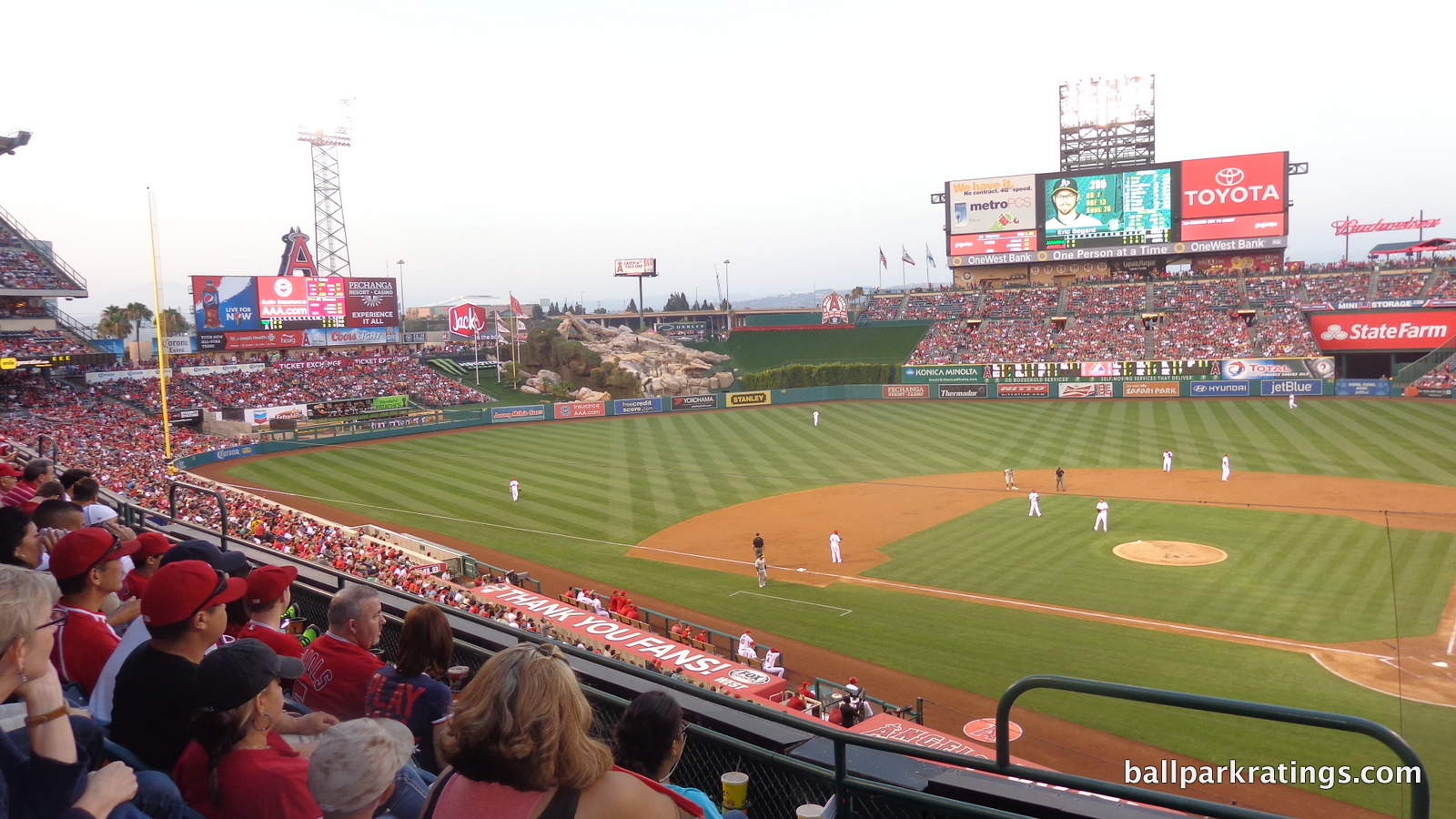
In right field, the Angels tried to keep the old football seats and build a larger wall in front of them in order to have quirky retro height dimensions, and it looks terrible. The right field scene doesn’t look like it connects with the rest of the ballpark because it was never intended to in the first place. Just judging by raw appearance, fans can tell the right field structure was built at a different time for a different purpose than the main grandstand farther to the right. All of the empty space between these structures is palpable. The batters’ eye is also an extension of the football stands.
With terraced bullpens, the left field stands are better, but they still don’t effectively connect with the main grandstand. They look like they might be from the old football stadium too. The curves of the main grandstand don’t match the lines of the left field seating far removed from the field. The empty space between this seating and the rock pile sticks out. It all looks very much like what it is: a renovation of a stadium used for football.
In the aggregate, the outfield scene has absolutely no sense of continuity, and thus can’t claim to have any balance, order, or good proportion between elements. Different parts of the interior aesthetic scene were built during three different eras.
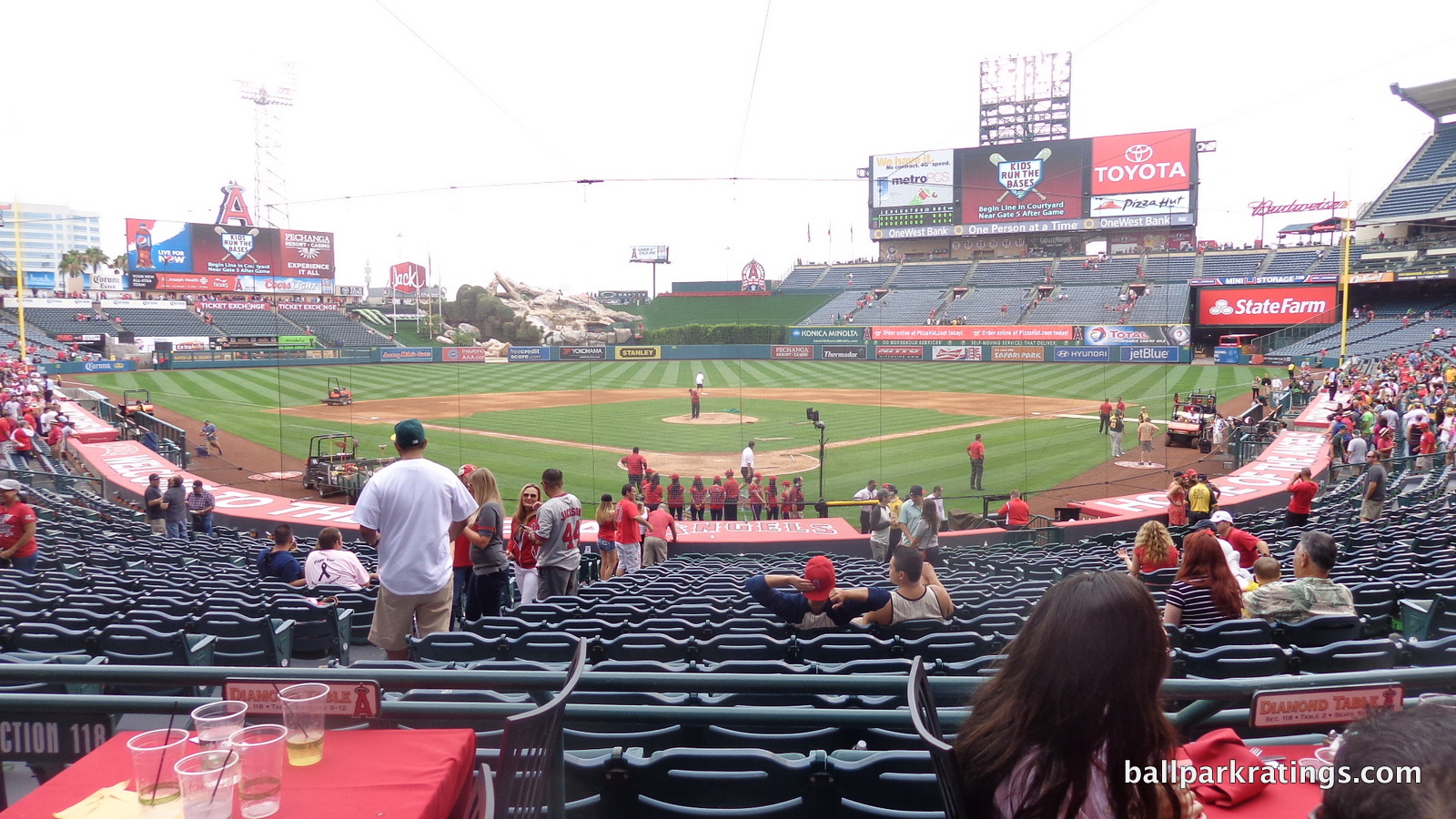
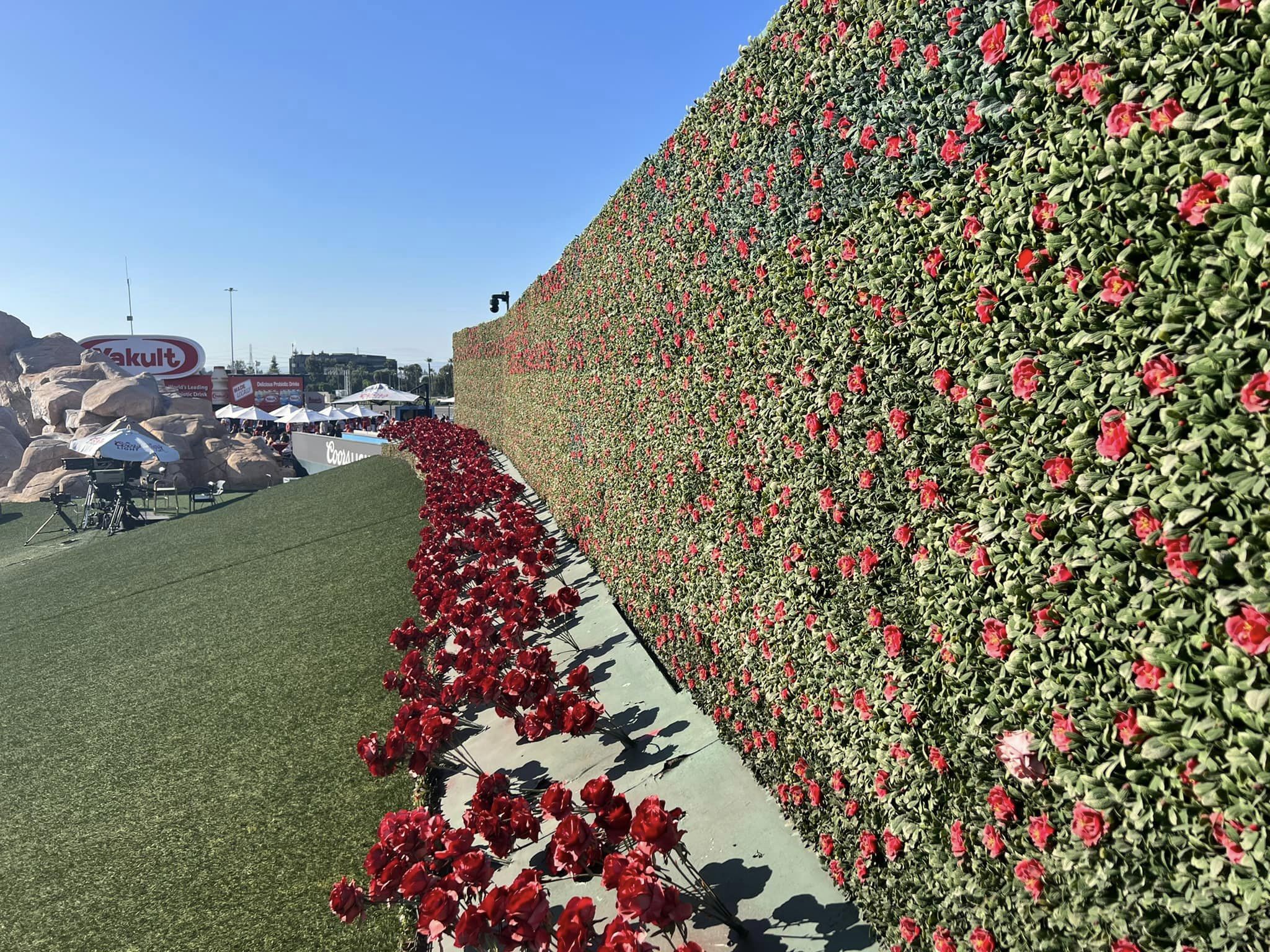
What prevents Angel Stadium from ranking at the bottom of ballpark interior aesthetics? Well, all of the spatial and continuity issues discussed were much more apparent before the Angels wisely enhanced the appearance of the batters’ eye and rock pile. Uncovered by greenery, the plastic batters’ eye to the right and the exposed surface to the left stuck out like a sore thumb.
Not only was this visually uninspired, but it revealed two crucially unappealing facts about the ballpark: (a) it was even more obvious that the batters’ eye and the rock pile were an extension of the original football stands and (b) the said “Outfield Extravaganza” was even more evidently a “rock pile,” as it just appeared to be rocks on old football bleachers and plastic.
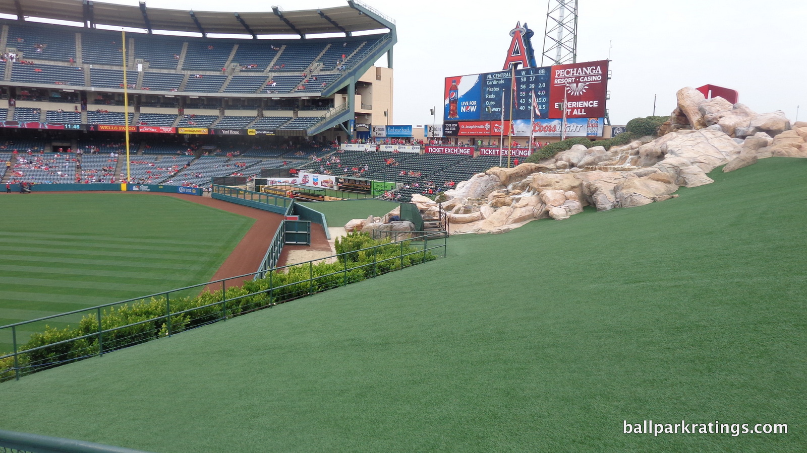
If not for the new profusion of greenery seen throughout the photos in this review, all of my concerns above would be amplified. So needless to say, the aesthetics have been greatly beautified by smoothing out the edges of the center field scene.
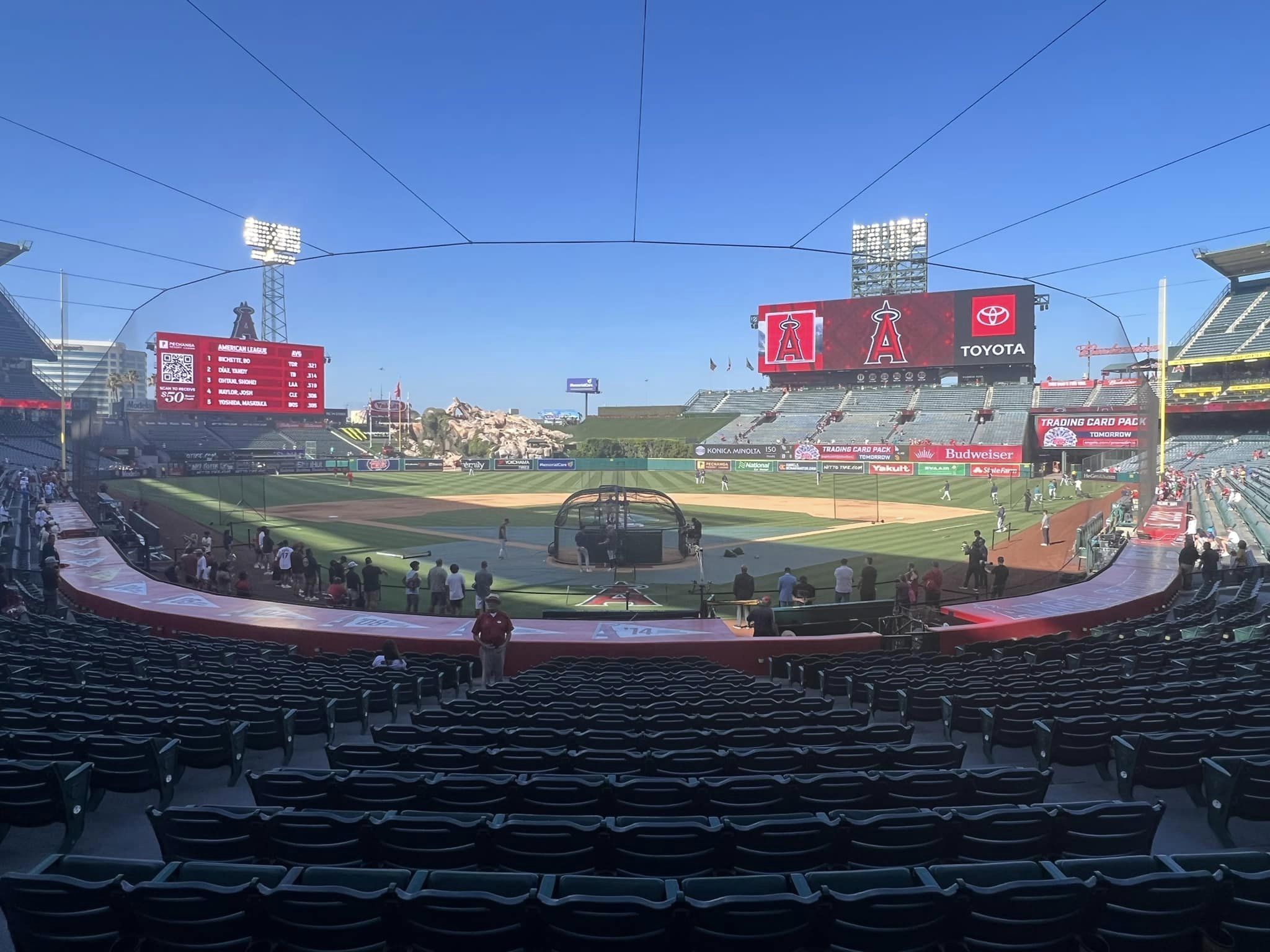
While this isn’t saying much, Angel Stadium benefits from an open, single deck design. I’d rather be looking at a generic suburban landscape than 5 levels of outfield seating. Between the right field scoreboard and the grandstand, the “Big A” is effectively integrated into the visual scene for fans sitting in left field.
Angel Stadium also has a better view of the San Gabriel Mountains than people give it credit for. In practice, it’s a similar view to that of Coors Field (perhaps even better; this certainly gives more sympathy to the rock pile), which gets much more press despite being underwhelming on most days.
Finally, I appreciate that Angel Stadium didn’t fall into the trap of compounding its aesthetic flaws by adding even more gimmicks after the fact, as other uninspired parks like Turner Field and Great American Ballpark did, believe it or not.
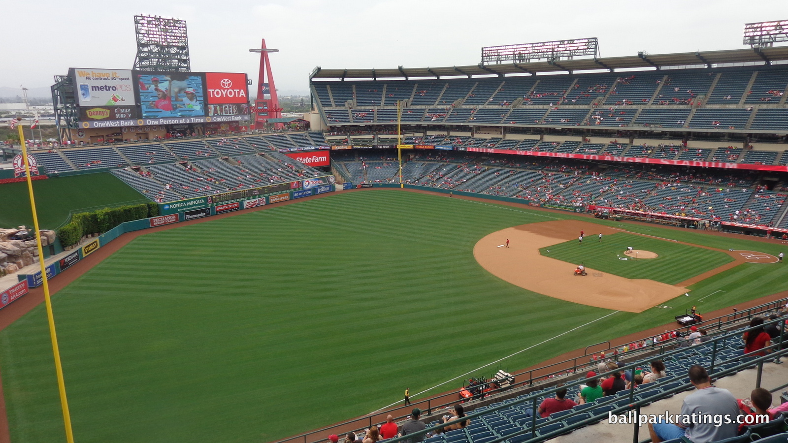
But overall, the renovation needed to include a completely rebuilt outfield. While the interior aesthetics are characterized by a weak aesthetic vision, almost entirely articulated by the gimmicky rock pile, they can’t even get off the ground due to constant disconnection.
I don’t know how the Angels will proceed with their extensive renovations in the next 10 years (or maybe not so extensive, as it could be only until 2029), but they’d be wise to restore some of the curvilinear, flowing simplicity seen in the original 1966 design.
The current design is too reminiscent of the peak frivolity during the retro excess. And the retro parks that succeeded with gimmicks succeeded because these gimmicks were supplementary (think giant glove at AT&T Park) to the design, while gimmicks at Angel Stadium (rock pile) define the design, lacking any architectural continuity or aesthetic beauty to anchor them.
Score: 8.5/15
Panoramic View/Backdrop:
Okay, so not much (read: not anything) about ballparks surprise me these days, as this has been my obsession going back to childhood. In my Coors Field review in 2011, I mentioned how the views of the San Gabriel Mountains at Angel Stadium are in practice similar to the mountain views at Coors. I did this to demonstrate a conceptual shortcoming at Coors (integrating them was central to the interior design, and they are too underwhelming to base an entire design around) and to emphasize that the mountain views at Angel Stadium were underrated.
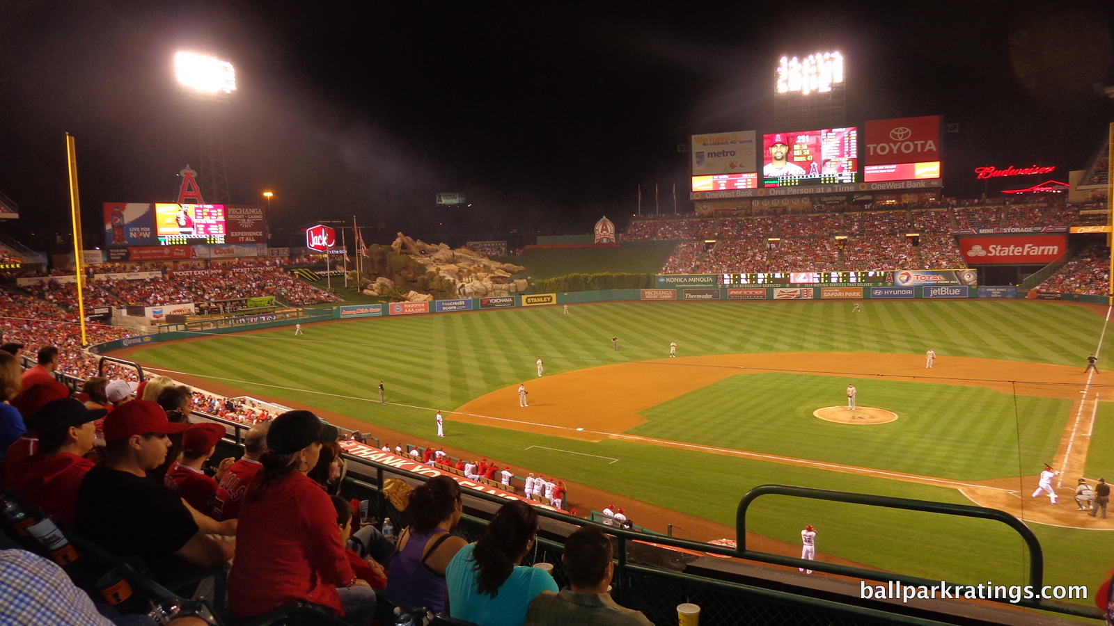
When I went to Angel Stadium in 2013, clouds closed the door on my opportunity to see the mountain views in person, and I left with my existing (already positive) impression mostly intact until today.
Well, at least judging by the photos on a good day, these views are positively stunning, and clearly equal to or exceeding those at Coors on a good day (not considering the sunset). With all the focus on ballpark views, these have to be the most overlooked. I was not aware Angel Stadium had such gorgeous views. It’s nice to learn something new!
Score: 3.5/5
Concourses:
As I touched upon in the introduction, Angel Stadium’s concourse aesthetics don’t compare well to the new parks.
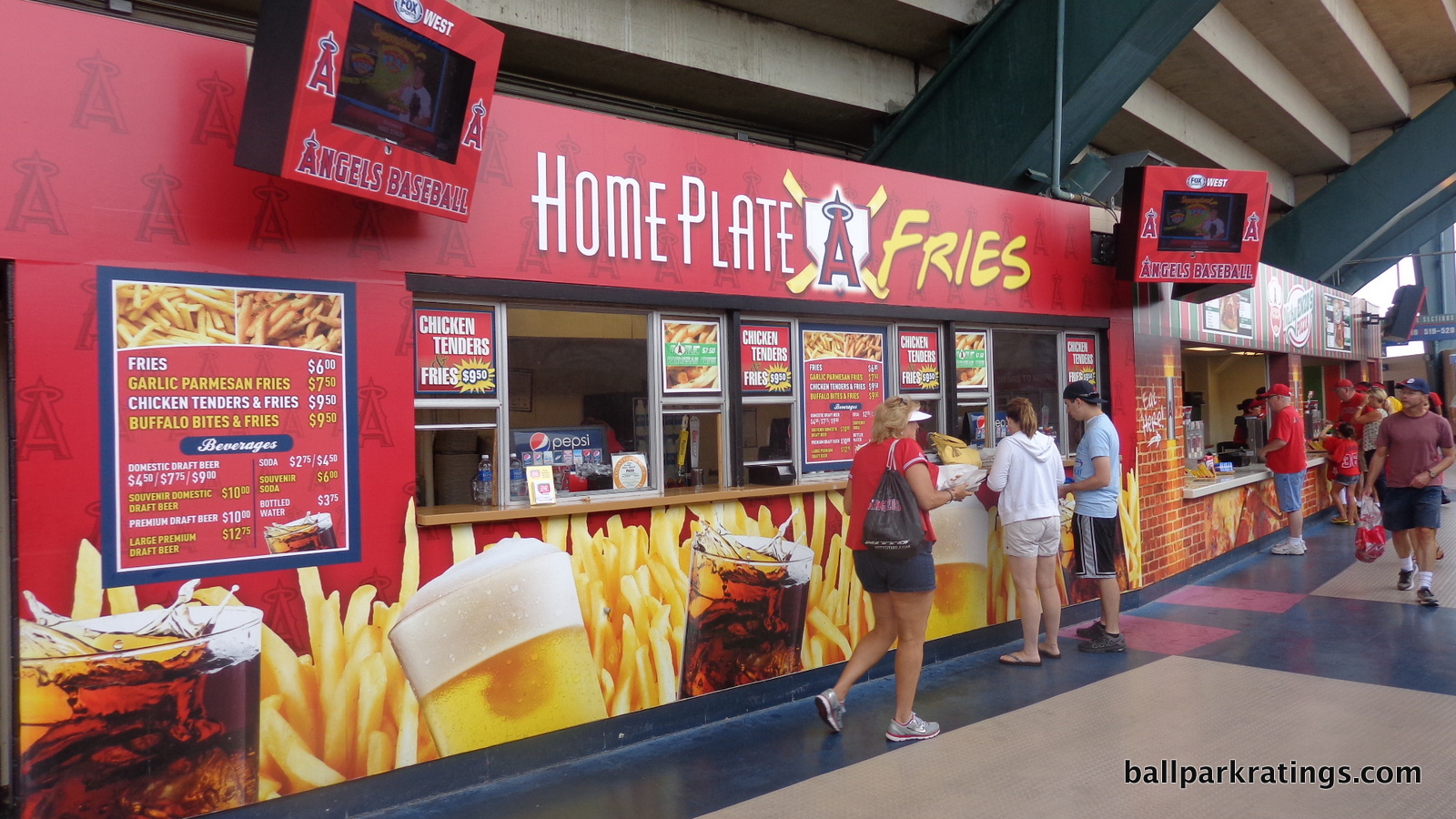
While I think the term “mall-park” is overused, Angel Stadium’s concourses can literally resemble a mall, complete with tile flooring, goofy pictures of generic food, and Panda Express (the latter is gone as of 2017).
Looking for a previously unmentioned strong point? Check out the palm tree filled courtyard plazas, which I’ll detail more in the functionality and amenities section.
Score: 1/3
Total: 17.5/33
Functionality & Essentials
Sightlines:
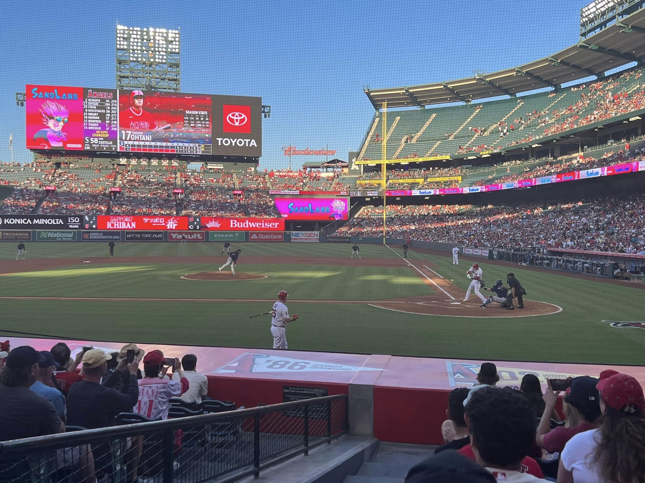
Despite well above average field proximity compared to contemporaries, Angel Stadium doesn’t have the effective seating geometry of other curvilinear grandstand designs like the classic Kauffman Stadium or the new Marlins Park.
While angling seats down the lines is a relatively new phenomenon, a few classic modern parks were able to provide good seating geometry down the lines. Kauffman Stadium, for example, employed a similar design to this where the lower deck first curves around home plate then curves at a larger radius down the line.
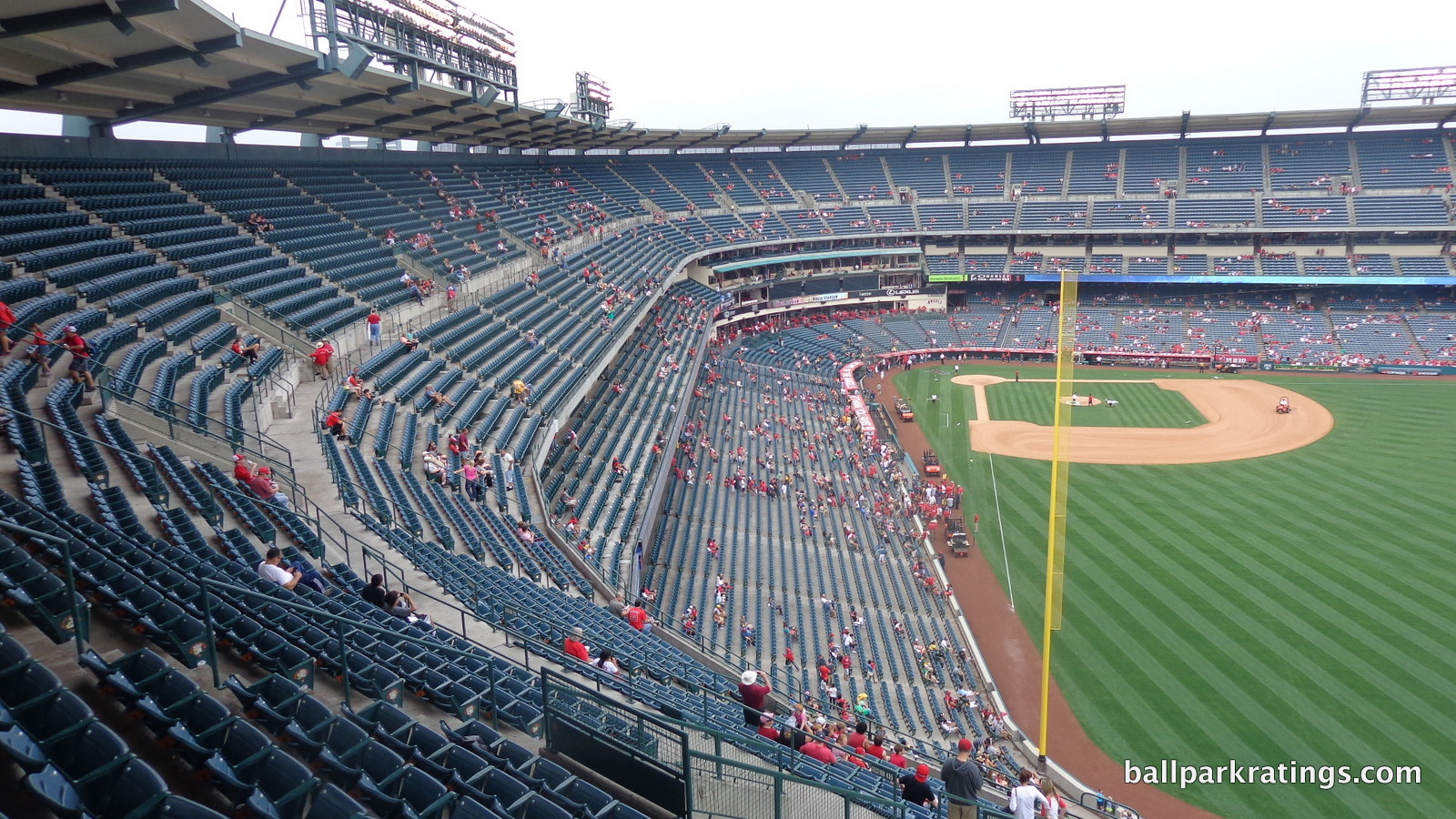
This guarantees that after the curve down the lines, the seats farthest down the line will point toward home plate, and basically all seats where you would normally have to turn your head point in the general vicinity of the infield.
At Angel Stadium, this doesn’t work as well, because while we have a similar curvilinear design, the seats down the lines don’t curve outward at a large radius. Why? Well, this wasn’t exactly a baseball-only facility at first. Unlike Kauffman Stadium, Angel Stadium was built to secondarily accommodate football, in between a true baseball-only facility and a multi-purpose facility. It was kind of like the opposite of Dolphin Stadium: often mistakenly referred to as a multi-purpose stadium or a football-only stadium, it was a football stadium that was designed to also accommodate baseball. So the not baseball-only original Anaheim Stadium wasn’t optimal for baseball in this respect.
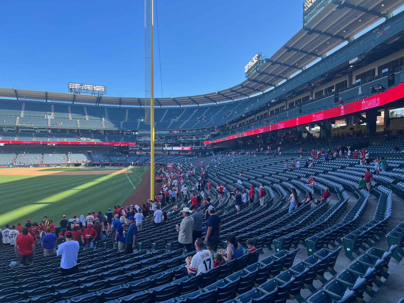
The 1998 renovations couldn’t rectify this initial structural design flaw. Thousands of seats down the right and left field lines aren’t oriented toward the infield. While not as bad as those at Camden Yards, this is less than optimal.
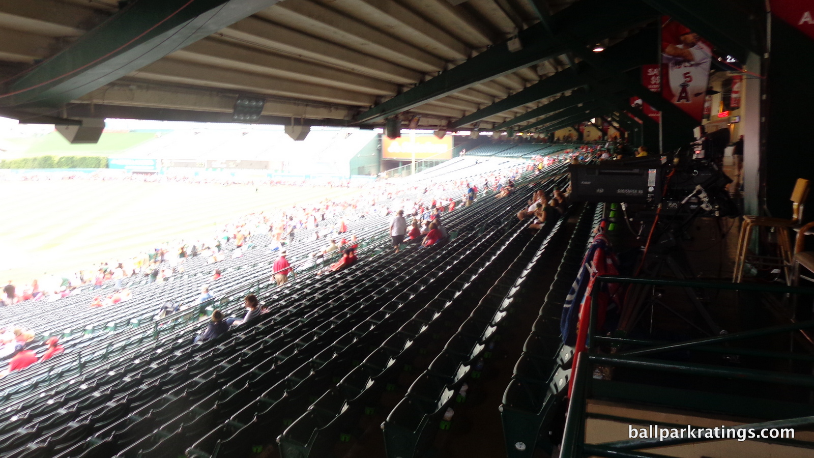
Like Camden Yards, Angel Stadium is one of the few new or renovated post-1991 ballparks to have serious overhang obstruction issues at the back of the lower bowl. The club level is too low, resulting in most of the sky being obstructed from the terrace seats below. This is another area where Kauffman Stadium subsequently got it right.
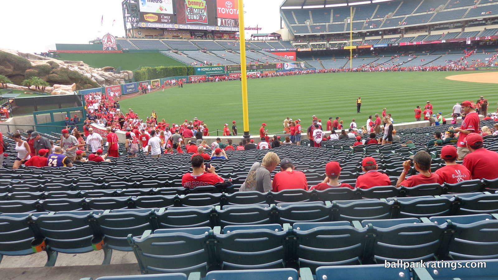
Especially discernable in comparison to some of the new retro parks, Angel Stadium benefits from upper decks with great field proximity. With this low, cantilevered club level and no separate suite level, the upper deck is close to the action. The upper deck itself isn’t quite as cantilevered over this mezzanine as Kauffman Stadium, but it’s well above average. You’ll also notice that the upper deck is considerably steeper than newer parks, which is a good thing in this case.
In sum, Angel Stadium has some of most subpar sightlines of the post-1991 ballparks due to remnants of the original design, just edging out Camden Yards and Progressive Field.
Score: 7/10
Seat Comfort:
The seats at Angel Stadium are right in line with other retro parks, good enough in comparison to its peers, but below historical standards.
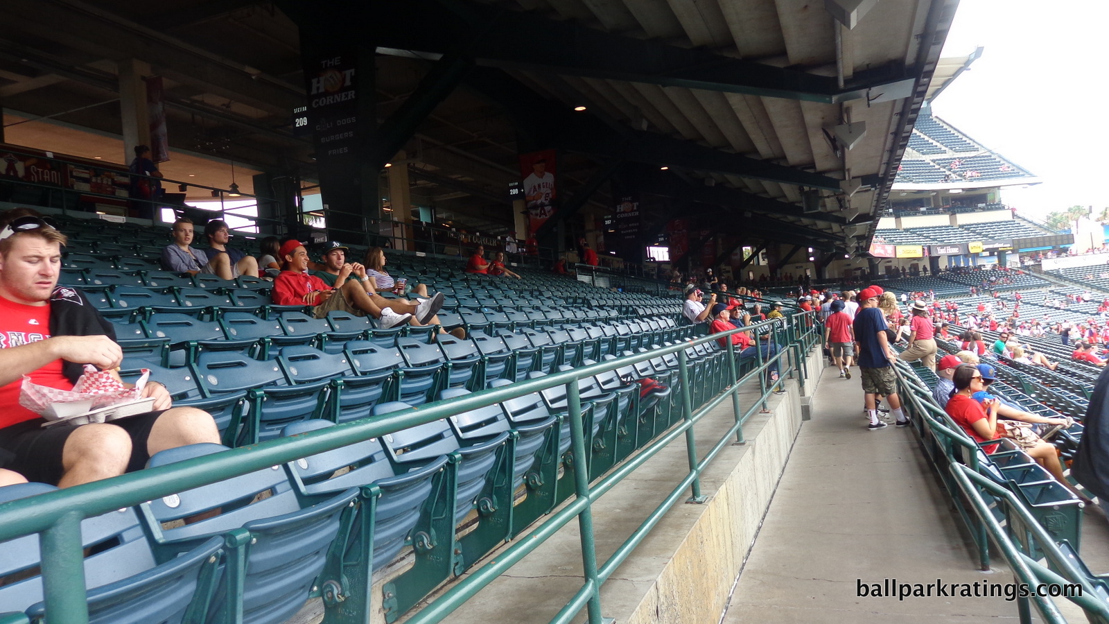
They are roughly 18-19 inches throughout non-premium areas, and all possess cup holders. For what it’s worth, the left field seats look a little different from the rest of the standard 1990s HOK (Populous) seats. All club level and Diamond Club seats have thin padding typical of the era.
As the ballpark approaches the 20-year mark, we’ll see new seats installed, but that probably won’t increase the width unless the Angels want to cut capacity.
Score: 3.5/5
Concourses:
The concourse functionality at Angel Stadium is difficult to assess, because we see both some of the best and worst aspects of ballpark design here. Not one but two distinct concourses reduce crowding for the main seating bowl, but with continuity issues; some of the narrowest concourses in baseball in most areas, but with spacious courtyards on the field level concourse; open to the field on the terrace level (above the lower bowl), but closed on most levels, all lacking the dedicated standing room-only areas seen throughout baseball.
In the aggregate however, there’s clearly more bad than good, I’m sorry to say.
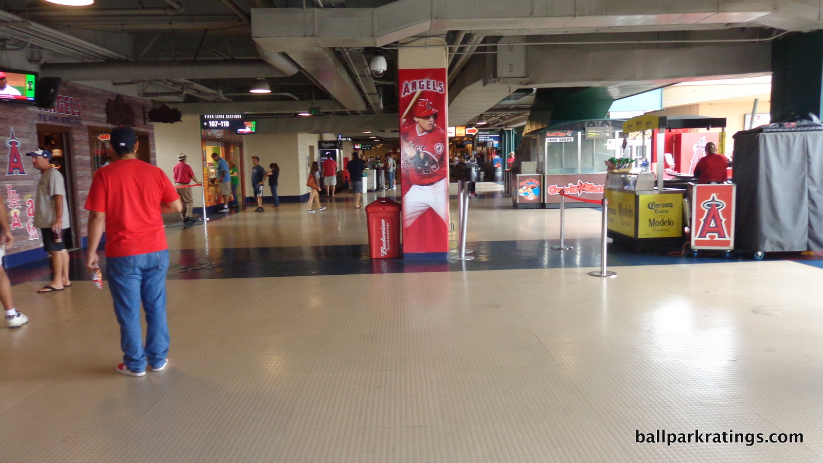
I should start by indicating it’s unclear which is the main concourse in the lower bowl, as the open terrace level concourse encircles the field, but is laughably narrow in many areas, while the closed but spatially superior field level concourse is only around the infield, and may be the one that is less used. It was clearer at Turner Field (Atlanta), the only other ballpark to employ this design.
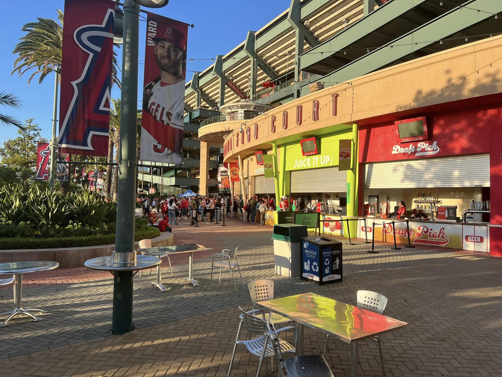
Located at street level, the field level concourse is sufficient in space, meeting the standard of other retro ballparks at the time. It’s the best the Angels have to offer. The issue is the best concourse ends in the corners, and I don’t think as many fans use it as was perhaps intended. Already sufficient in space, massive courtyards flank the field level concourse on the first and third base side. Filled with food courts, statues, picnic areas, palm trees, and a music garden, these airy and scenic spaces are great places to gather before a game. They are meant to evoke a kind of streetscape seen in more urban retro parks.
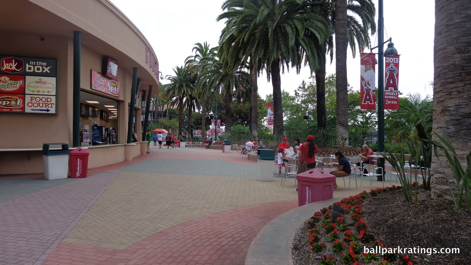
In what I think must be construed as the main concourse, the terrace level concourse encircling the field at the top of the lower bowl is much too narrow in most areas. While it wasn’t logistically feasible, an area of spatial recourse like the courtyard plazas below would have been more appropriate here, as this area gets highly congested. This is apparent down the left field line, but concern peaks in right field, where the concourse is heavily complicated by the kids’ area. While open to the field, visibility is especially poor, as the club level is again very low to the ground.
No matter which concourse fans use, I don’t want to minimize the fact that Angel Stadium does have plenty of space in its totality, just that fans encircling the field will be constantly constrained.
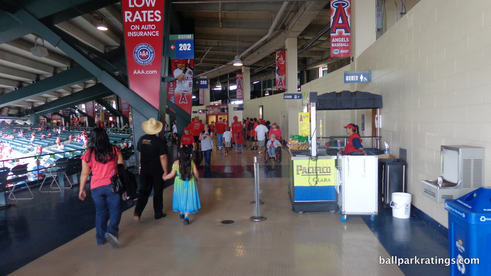
Angel Stadium begins to really show its age in the upper deck concourse, which might be the narrowest in baseball. In fact, when met with escalators, it’s really just a hallway. Movement between levels is a real inconvenience as well, as fans have to walk up and down ramps, my ballpark pet peeve.
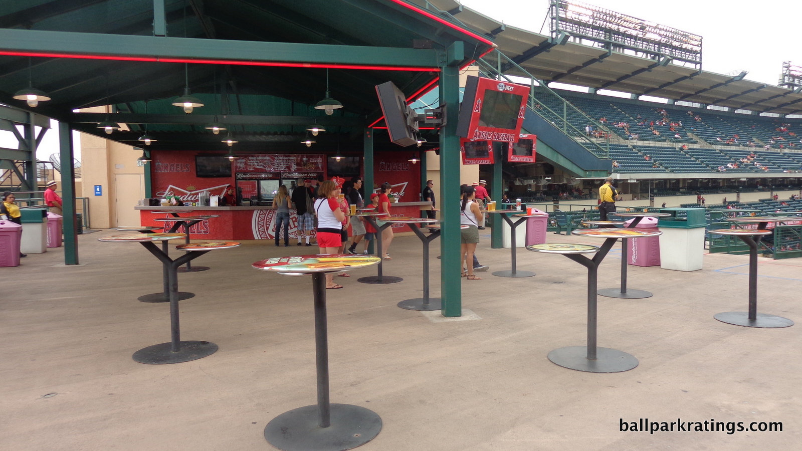
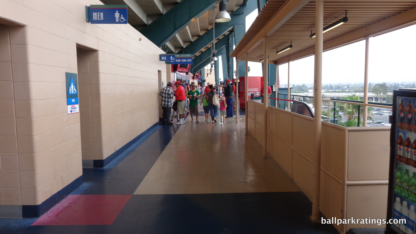
Finally, the Angels’ ballpark lacks the fun standing room areas and non-designated places to watch the game we’ve come to expect. The terrace level is too narrow throughout, as it’s even difficult to stand in a place like the open left field concourse. The Budweiser Patio above sections 241-243 is probably the closest thing to a standing room area.
Overall, Angel Stadium’s classification as a renovated facility is apparent throughout in this category.
Score: 3.5/7
Scoreboard System:
In what I used as a good indicator of ballpark upkeep in the introduction, however inconsequential, the Angel Stadium videoboard is behind all others in major league baseball.
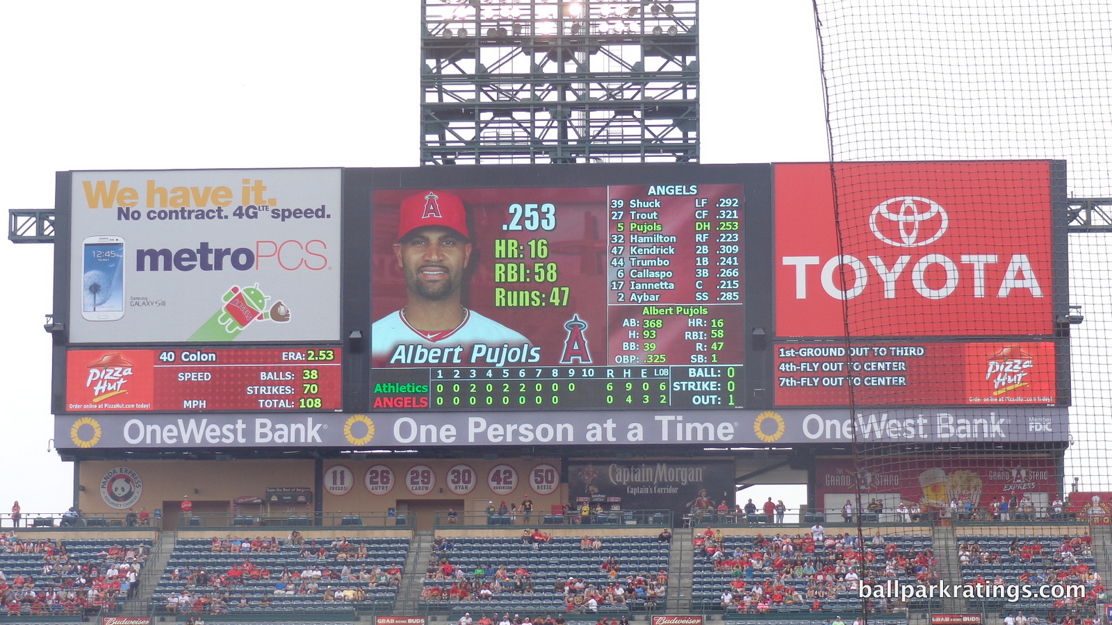
Added in 2004 and coming in at less than 1/4th of the size of the largest one, Angel Stadium’s videoboard is the oldest in baseball, including all of the classic and multipurpose parks. The Angels also added the second scoreboard in left field in 2004.
If the Angels are serious about maintaining their facility, we should see a new one in the coming years.
2018 Update: The Angels have finally installed a modern videoboard system.
Score: 3/3
Total: 17/25
Amenities & Features
Concessions:
Somewhat like Chase Field (Arizona), Angel Stadium has traditionally gone in the category of ballparks that have above average variety, but often with mall-like quality. Local food at baseball stadiums has really soared this decade above anything I’d expected in 2009, so Angel Stadium has improved, but still has catching up to do.
As of 2017, the Angels have gotten with the program, replacing chain restaurants like Carl’s Jr., Ruby’s Diner, Panda Express, and Jack in the Box. Legends Hospitality now presents a rather ambitious lineup. While sometimes falling flat, these changes are most welcome.
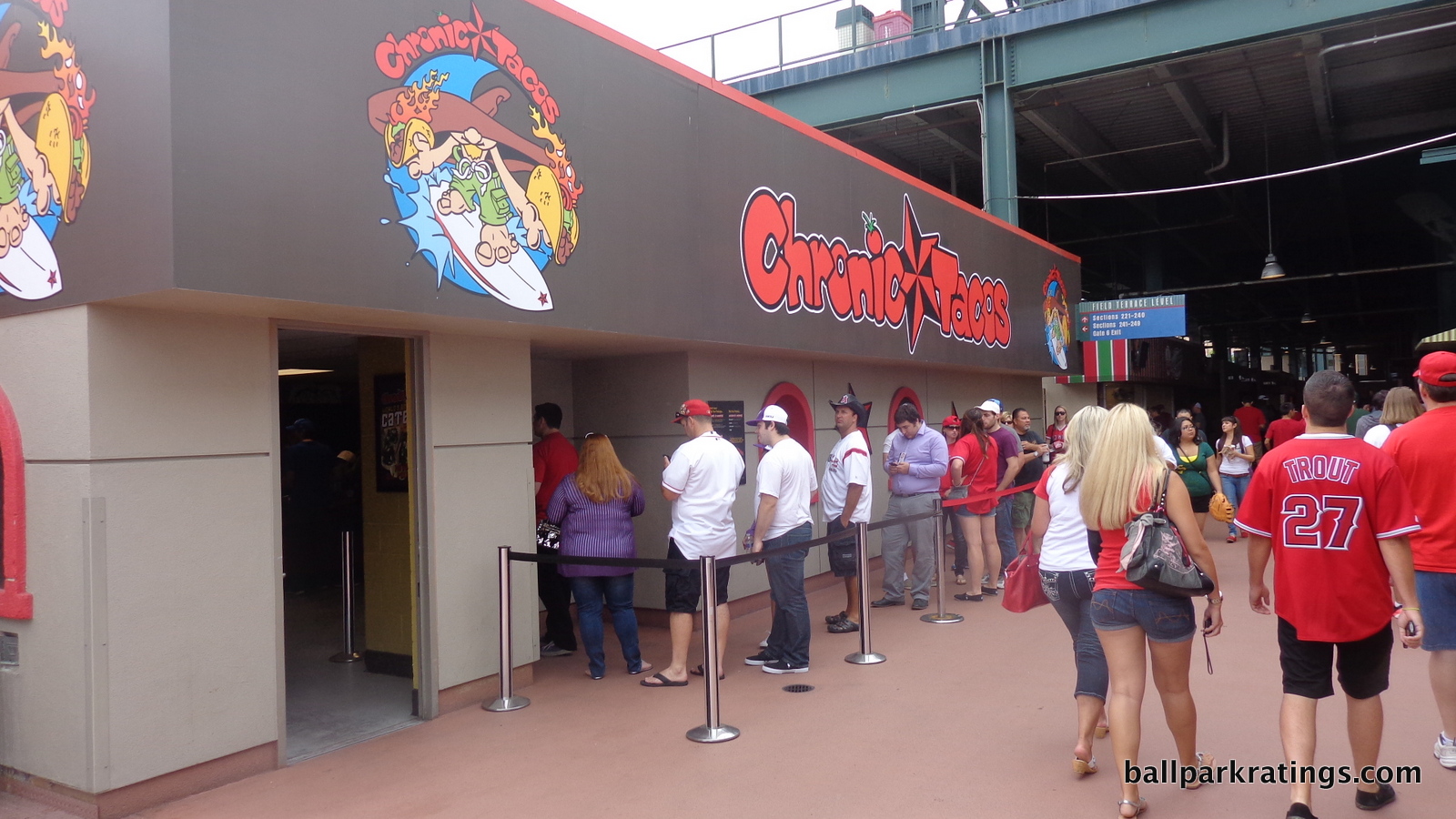
Mexican fare is strong at Angel Stadium. Featuring the longest lines at the ballpark, Chronic Tacos are the closest thing to local food. The California fast casual chain serves chicken or steak tacos, burritos, bowls, and nachos. Muscle Market Grill and Frescas also have tacos, burritos, wraps, and bowls.
Smoke Ring BBQ provides a rather timid quality and selection of BBQ to the ballpark, serving ribs and brisket sandwiches. Sub chain Jersey Mike’s Subs covers the classic sandwiches category, offering the famous Philly cheesesteak, turkey, and the super sub. Located in the field level food courts in the courtyards, Melissa’s Harvest has the healthy fare covered. Metro Los Angeles eatery Oggi’s Pizza is also at Angel Stadium, certainly a step above the Papa John’s seen in the worst cases around baseball.
In addition to the right field restaurant, Ballast Point brewing company handles most of the local craft beer at the ballpark, also serving wings and garlic fries.
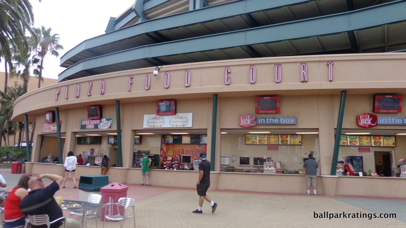
A handful of rather ambitious and/or trendy concepts stand out. As the name would imply, the Change-Up Kitchen claims to offer new menus for each homestand, and food has ranged from lobster rolls and crab cakes to falafel wraps and chicken shawarmas. Oke Poke is trying to capitalize on the trend of poke across America, and will be rather difficult to pull off at a ballpark, even more so than sushi 20 years ago. La Rotisserie is apparently going to serve slow roast chickens in the area formerly occupied by the Oakley store. Of course, we have a grilled cheese stand and a mac and cheese stand.
I always say the ballpark has an uncanny ability to quickly capture changes in America’s tastes, and it’s fun to see that with the addition of items like local craft beer, poke, and mac and cheese.
We’ll see how this ages in the coming years, as reputation has a strong sway in this category.
Score: 3.5/5
Regional/Signature Concession(s):
While an improvement above the 0 or .5 it would have scored with that mall-like selection, Angel Stadium still has work to do.
While not necessarily a problem, Legends Hospitality provides most of the notable offerings.
Most importantly, while there are some good local chains, the park needs to build up some goodwill here. Sometimes ballparks offer a gimmicky new local food item every year, then replace it and start over again. That often seems to be the case at a park like Globe Life in Arlington, for example. Let’s see if some of these items become a staple of the ballpark like the Rocky Mountain Oysters at Coors Field (Colorado) or Tony Luke’s cheesesteaks at Citizens Bank Park (Philadelphia).
The poke has a chance to do that, and it is obviously very unique and local. It represents the region well, so let’s see if it stays.
Score: 1/2
Accessible Restaurants/Bars/Sitting Areas/Social Areas:
Angel Stadium lacks the bars and social spaces of most other parks in baseball, which is a function of the lack of significant capital investments undertaken at this ballpark.
Ranging from nice enhancements to revolutionary ballpark game changers, almost every 1990s and 2000s ballpark has added some large bar space to hang out and watch the game. To illustrate this point, I’ll provide an exhaustive list of ballparks that opened from 1992-2000 and the feature they added in chronological order:
- The rooftop bar at Camden Yards
- The Corner Bar at Progressive Field
- The Rooftop at Coors Field
- The Pen and Edgar’s Cantina at Safeco Field
- The new centerfield social spaces at Minute Maid Park
- The 416 New Amsterdam Bar at Comerica Park
- The Garden at AT&T Park.
We see nothing like this at Angel Stadium. The closest you get is the Budweiser Patio in the right field corner, which is just a beer concession stand with standing room.
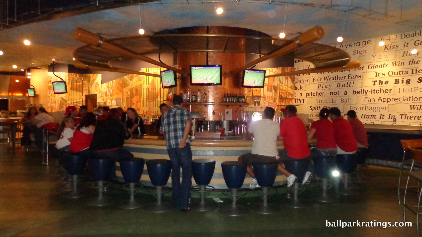
The Angels do have a relatively nice sit-down restaurant on the club level in the right field corner, which opens to all fans after the first pitch. Formerly known as the Knothole Club, the “Saint Archer Brewing Co.” is open to the field and features an outdoor patio. The gastropub-style eatery features an eclectic menu, including carne asada nachos, short rib poutine, and a watermelon salad topped with a crispy pork belly. It’s gotten good reviews. Quite irritatingly, the outdoor dining patio is now a ticketed group space called the Wings and Arrow deck.
Going back to its early days, the Angels used to feature a “Stadium Club” restaurant behind home plate on the club level (known as the “Home Plate Club” after 1998), but that’s been used as a rental space for the last 8 years or so.
The Coors Light Centerfield Bar is an enclosed space in centerfield with seats and tables, but is oddly not a full-service bar. On the concourses, there are picnic tables beyond the rock pile and in the courtyard plazas. The upper deck lacks any areas to sit down, although what they did with the indoor space formerly serving Panda Express (which was just a concession stand) is unclear.
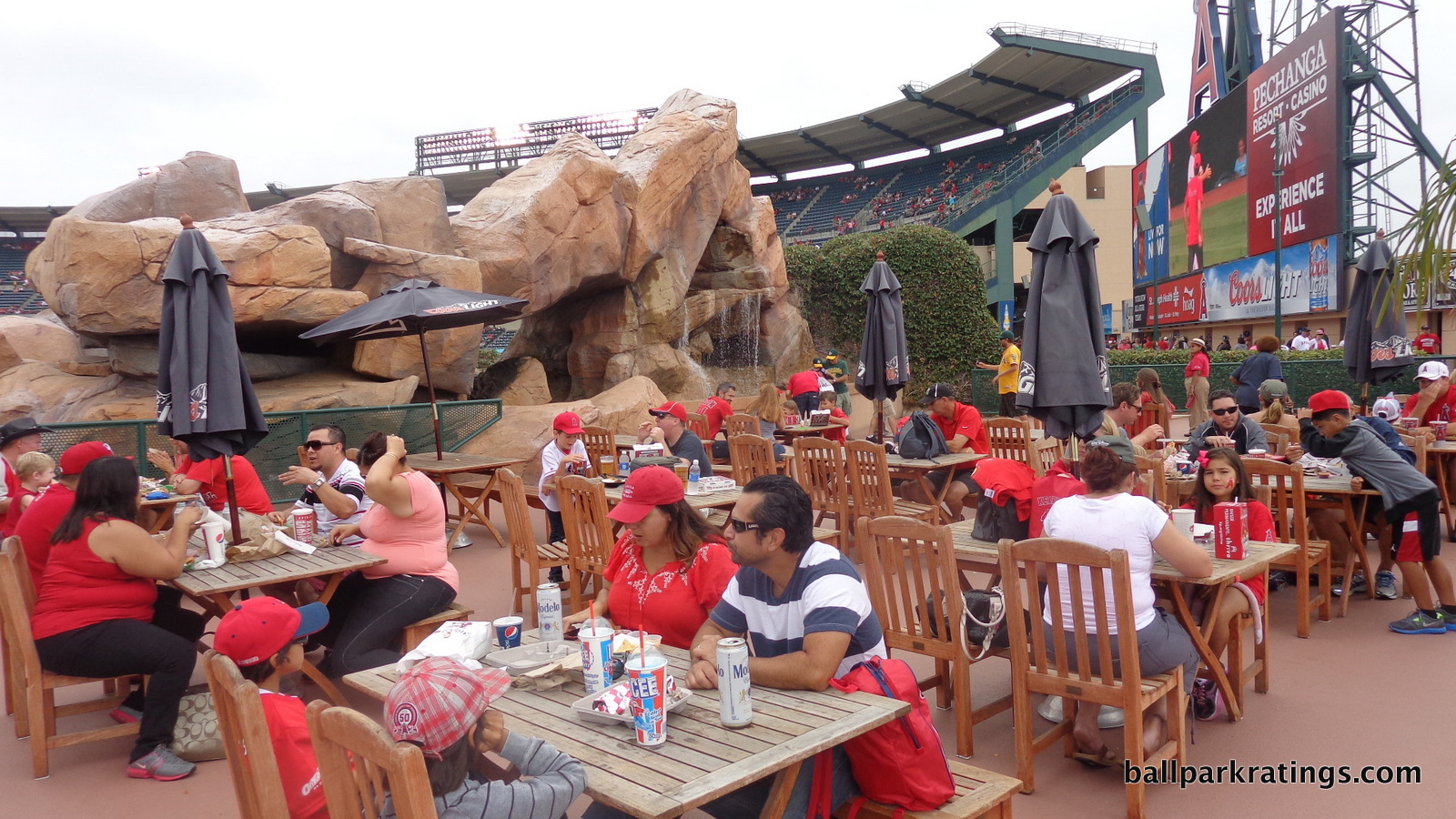
Score: 3/5
Premium Seating/Clubs:
Highlighted by the woefully inadequate club level and lack of options, Angel Stadium’s premium seating doesn’t compare well today, but represented a step forward at the time.
While you see some of it in Angel Stadium, in the 1990s, teams were building an exorbitant number of suites in unnecessary spaces. Teams like the Indians and Rangers opened with over 100 of them, while the industry standard was to build at least 70. This was at first a huge cash cow, but by the early 2000s, the majority of these were unmarketable. Today, SunTrust Park (Atlanta), which has approximately 32 luxury suites, is an industry leader. The emphasis is now on plentiful club seating options and a small number of very high quality and well-located luxury suites.
During this luxury suite craze, most of the best seats in the ballpark were not premium seats. Premium seating was a caricature of what you might think the well-to-do fan might want: mostly luxury suites, exclusive and divisive, and removed from the action. No one thought that premium paying fans might not want luxury suites or mezzanine club levels, and might prefer to sit close to the action, like, say behind home plate!
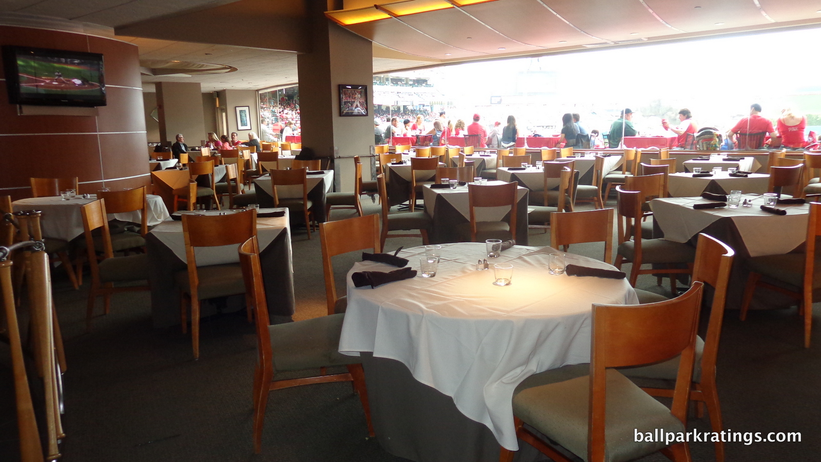
While we see this amplified to absurd proportions in a park like Yankee Stadium, the best seats are now premium seats, and the first sign of this sea change started at Angel Stadium. In 1998, the Angels opened a private club on the main concourse behind home plate known as the Diamond Club. The restaurant was accessible to fans in the Diamond Club seats behind home plate, and regular fans could not enter the club or the seating area. While other teams refined the concept by building even more exclusive clubs below the seating and offering such seats as part of an all-inclusive package with extra perks like valet parking, food, and alcohol included, the idea started here. These are now ubiquitous across the majors, with five other teams even copying the “Diamond Club” name.
The only remnants of the suite-heavy era are the dugout suites behind home plate in front of the Diamond Club seats. Located too far below the playing surface to afford views justifying the cost, the Angels might be wise to retrofit these dugout suites into another ultra-inclusive club with better views, like the Dodgers did (see before and after). For what it’s worth, these dugout suites pioneered the idea of batting cage views within a club or suite area.
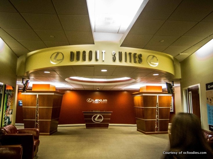
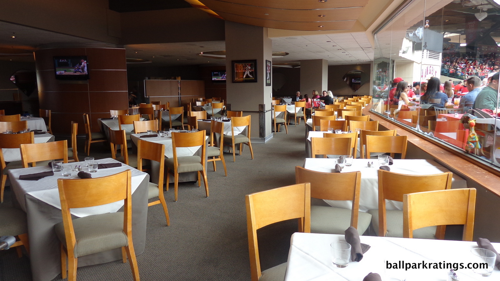
Anyway, the Lexus Diamond Club underwent an enhancement in 2014, but it’s mostly the same as it was in 1998. The padded seats come with in-seat service and access to the restaurant, where fans can pay $49 for the premium buffet or chomp on the bar bites menu. The buffet is similar to those in ultra exclusive clubs across the majors, featuring canapés, charcuterie, salads, rolls, pasta, shrimp, short rib, pork, and prime rib. The size of the outdoor dining patio is particularly large and unique. This Diamond Club is more of a white tablecloth dining room restaurant than the others as well. Suite holders also get access to the Diamond Club.
On the other end of the spectrum, Angel Stadium’s club level was a step back compared to the other ones at Camden (1992) and Coors (1995), and is easily the worst club level in baseball today.
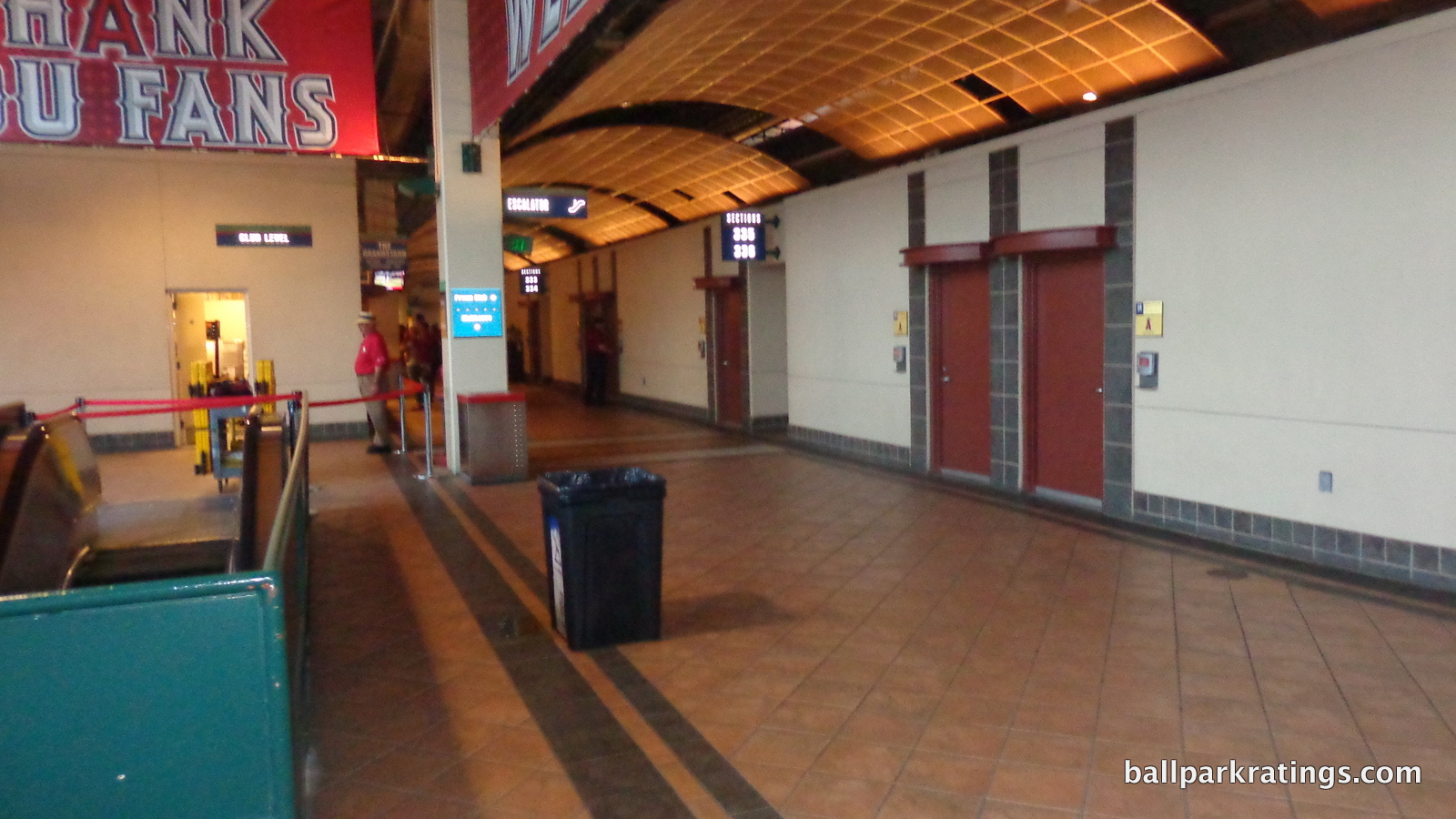
Featuring tiled floors, just slightly nicer than those a level below, with flashy concession stand signage, the club level is just an open-air hallway. A curved transparent overhang obscures the exposed piping above. The bright spot is supposed to be the circular bars extending out from the concourse on the first and third base sides. In reality, these bars look similar to the circular food courts in the plaza below, featuring identical metal chairs and tables. There is also no upgrade in food.
Overall, this looks like a common suite level hallway, one in which fans would rarely venture out into the concourse. This is unacceptable for accommodating expansive club seating. It’s very similar to Kauffman Stadium’s loge level, which isn’t even marketed as club seating.
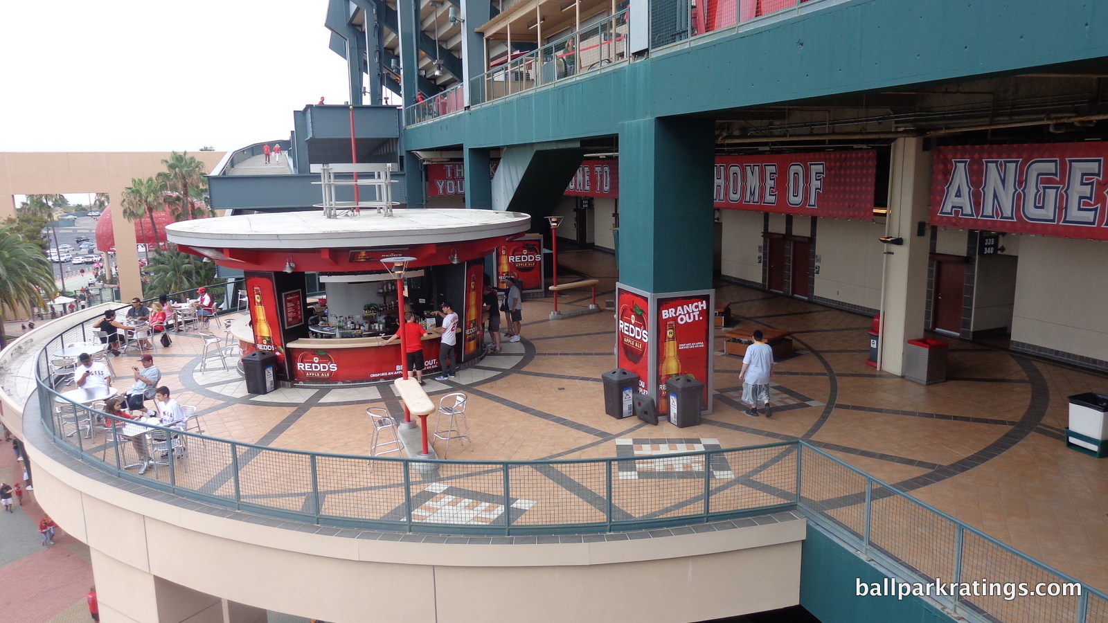
In 2014, the Angels added an all-inclusive club space one floor above the Diamond Club in an area formerly reserved for the press. Featuring only 83 swivel chair seats, these Ketal One Club ticket holders have access to a premium buffet in an industrial chic space. Unlike some other clubs added after the fact in areas formerly occupied by poorly located suites, the Ketal One Club has fantastic views in prime territory. As an interesting side note, I haven’t seen these seats enter the secondary market, making them one of the more difficult seats to get in baseball.
In order to improve in this category, the Angels should build an ultra exclusive bunker club in front of the Diamond Club in place of the dugout suites, which would put the premium options somewhat near those at Kauffman Stadium (4/5). I don’t know how they could really improve the “club level,” so perhaps they should take the latter ballpark’s advice and not market it as a club level with prices to match.
Score: 3/5
General or Artistic References to Baseball or Team History/Museums:
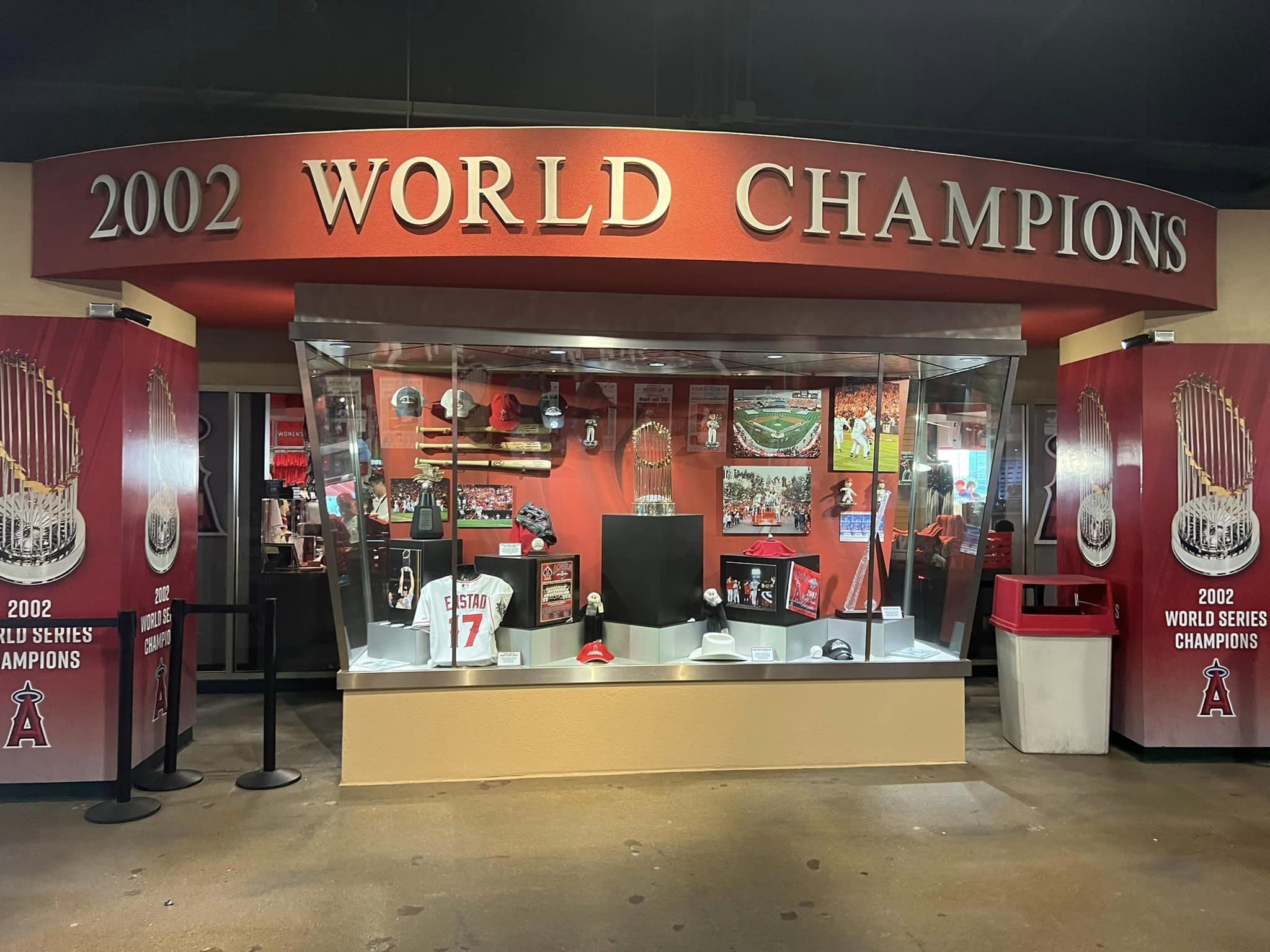
What happened here? While Angel Stadium was susceptible to some of the worst retro impulses, it apparently wasn’t receptive to the retro obsession of making the ballpark a historical building, filled with museums and references to team history. While some additions have been made over the years, Angel Stadium lacks any major references to team history.
Most teams have something ranging from a large museum to a dedicated plaque area. Angel Stadium has a meekly presented series of historical references added after the fact reminiscent of expansion ballparks like Coors Field or Chase Field. That’s unacceptable for a team with the longevity of the Angels.
Behind home plate, Angels hall of famers are painted on the wall. Nearby, the 2002 World Series trophy is on display with a mural featuring the best moments. There is also a mural of team postseason memories. In 2013, the Angels Authentics store presented some history.
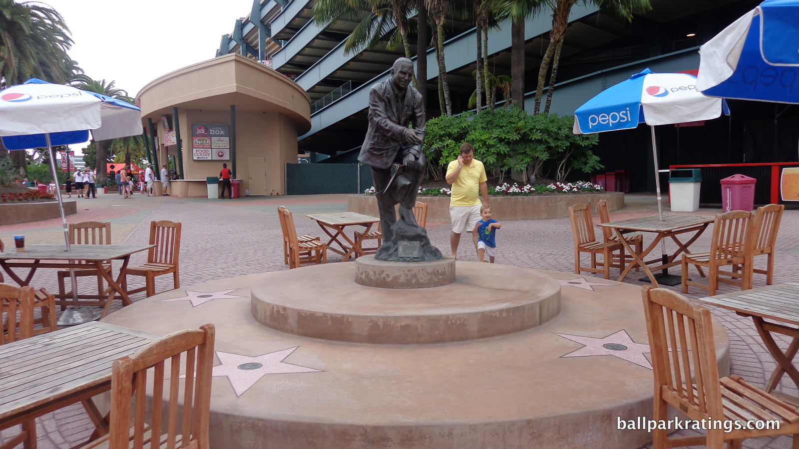
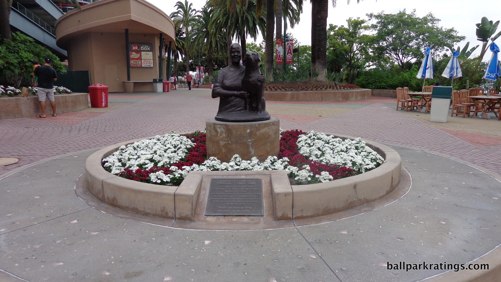
Angel Stadium does feature some nice statues in the courtyard plazas. On one side, we have a statue of former owner Gene Autry, surrounded by Hollywood stars. On the other side among a bed of flowers, we have a statue of Rod Carew’s daughter, who died of leukemia.
Score: 2.5/5
Entertainment/Kids Activities/Other Amenities:
Angel Stadium’s outfield entertainment was intended to emulate the outfield games and attractions at Turner Field (Atlanta), which opened one year before Angel Stadium 3.0. While it didn’t even reach that level at the time, the kids’ games aren’t elaborate compared to other parks today.
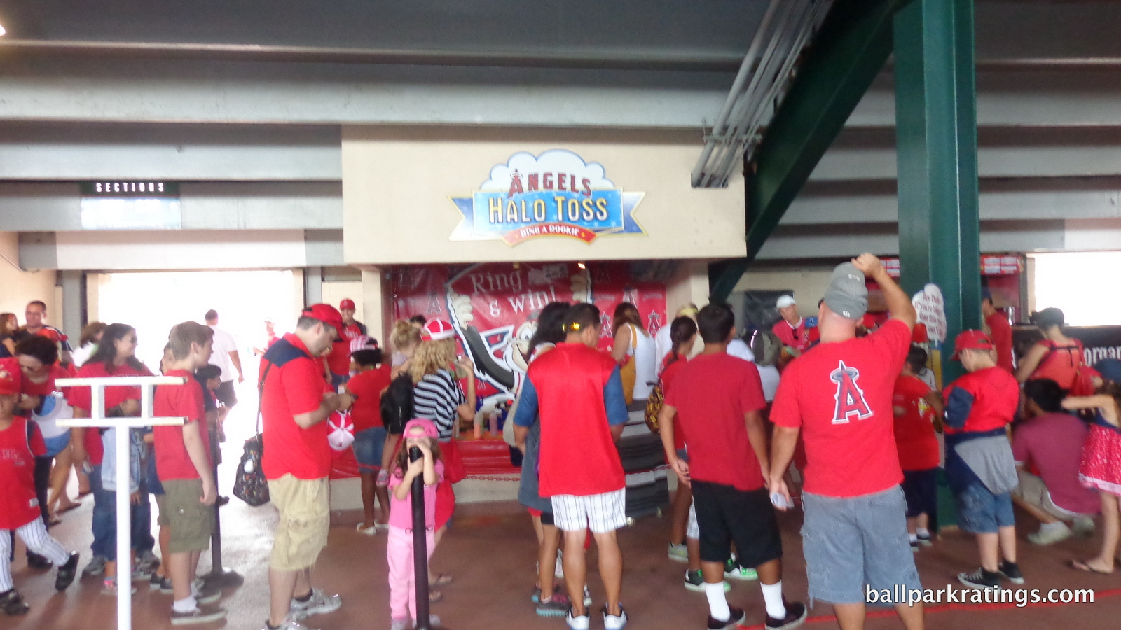
Activities include speed pitch, an art station, video games, a prize wheel, halo toss, and a tattoo station. There aren’t the large playgrounds or mini baseball diamonds seen in other parks.
Located down the third base line past the courtyard plaza by gate 1, the music garden is a unique space that warrants a bonus point. Pre-game music is presumably performed here.
Score: 1.5/3
Total: 14.5/25
Atmosphere, Vibe, & Policies
Atmosphere/Fan Support:
The Angels, and Los Angeles at large, don’t get enough credit for their excellent attendance numbers. Going back to 2003, Anaheim arguably has the strongest attendance in all of baseball, and the most inelastic to team quality.
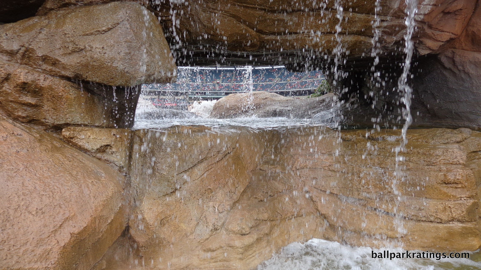
Yes, it’s a laid back crowd, with more beach balls than you’ll ever want to see. But boy do the fans come. They haven’t dipped below 37,000 per game since 2002, as fans trust the Angels team office to routinely field a competitive team. Disneyland helps, too. While the Cardinals and Giants come close, only the Yankees can say that. And those teams have been more consistently competitive.
Score: 5/5
Ballpark Policies/Customer Service:
This category might as well be binary, with most teams getting a 2/2, while teams like the Giants, Yankees, and White Sox that don’t allow all ticketed fans around the dugout hours before the game get lower. Angel Stadium passes.
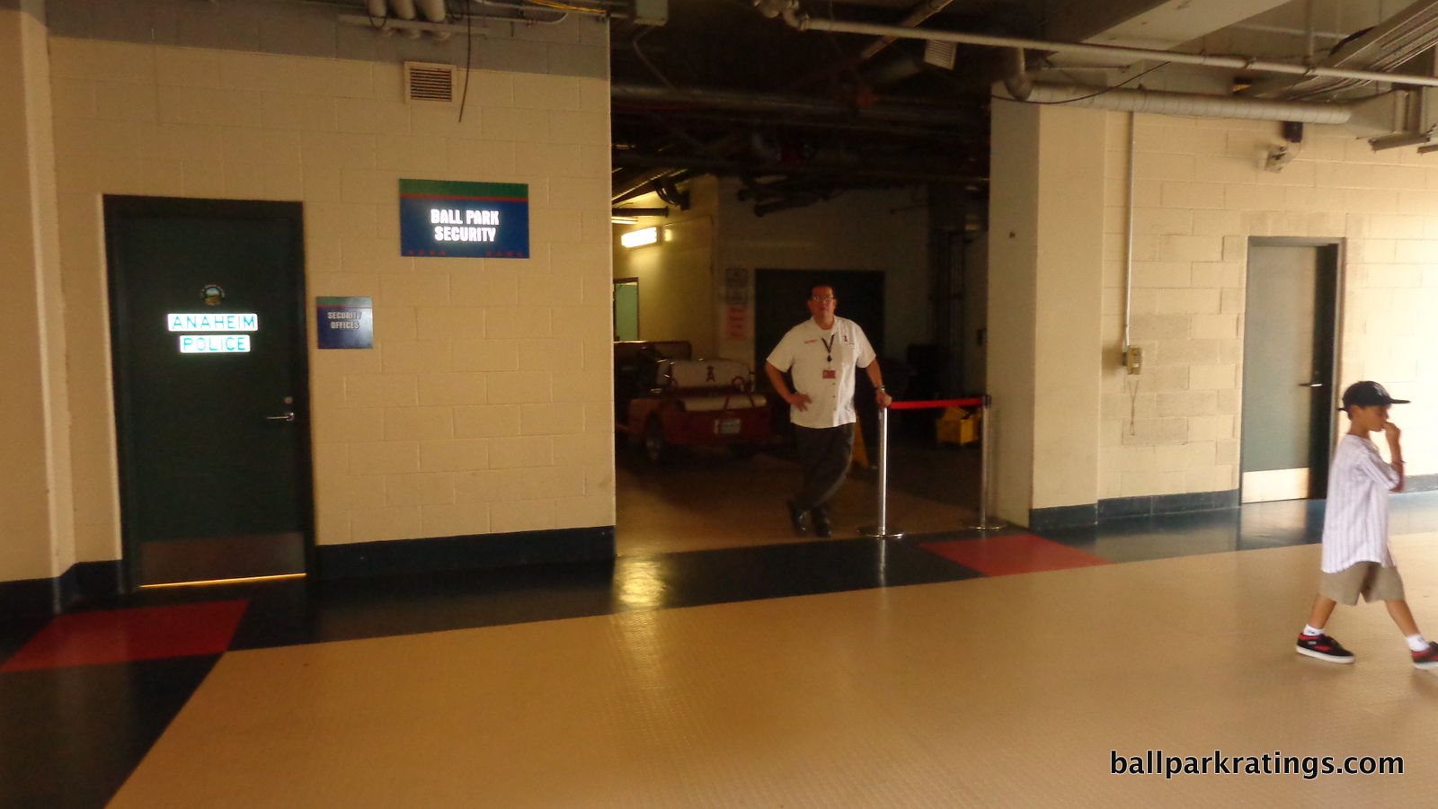
So I may use this space to tell a funny anecdote regarding the ballpark experience. My second game at Angel Stadium was only the second time in my life I got hassled and/or reprimanded for taking pictures.
In highlighting Angel Stadium’s fun in your face renovated stadium motif, I took a picture of where the field level concourse is cut off by the former football bleachers. It wasn’t a photo I gave much thought to, as I snap left and right. Immediately, the security guard seen in the picture asked what I was doing, who I was (literally, “who are you”), demanded that I *show* him my website on my phone, and that I not take any more pictures in the vicinity. Weird!
To be fair, it is true that most ballparks don’t feature such prominent “ballpark security” areas in public spaces, so I don’t know how others would react. Anyway, it’s all in levity.
Score: 2/2
Bonus:
For the fact that the Angels renovated their ballpark instead of building a retro cookie cutter +2
For the signature entrance +1
For the courtyard plazas +1
For the music garden +1
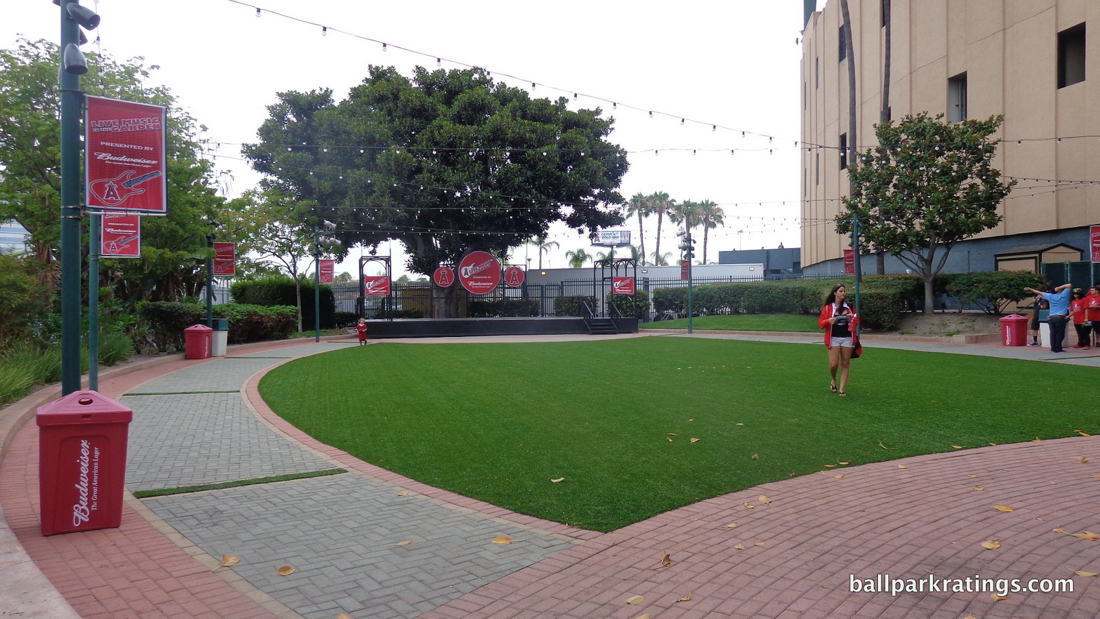
Score: 5
Total: 12
Conclusion
There’s more to unpack here than I would have ever anticipated, in what is one of my longest reviews to date. This isn’t too surprising, as my reviews have gotten longer and more detailed over time. I wouldn’t have expected this from Angel Stadium, although I would have said that with more certainty for a park like, say, Nationals Park.
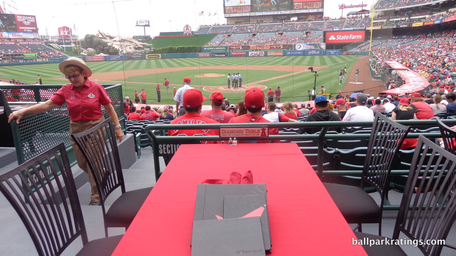
Angel Stadium is a broadly attractive place to see a game, but it may not have enough obvious assets to add anything to the nation’s ballpark scene. Off the top of my head, the grand entrance is inviting, despite architectural merits; I like the Diamond Club; the courtyard plazas are great; and…the music garden is unique?
That’s not enough, to the point where many people may not miss Angel Stadium if it got replaced. As outlined at the end of the introduction, I don’t hate it, but Angel Stadium scores below average in every single category except fan support, from setting and aesthetics to sightlines and concourses. The second round of major renovations should completely start over if they want the stadium to compete with even the worst post-1991 ballparks.
FINAL SCORE: 68
RANKING: #28/30
Summary
TL;DR? Here’s the long-form piece in a nutshell:
After being enclosed to accommodate football and converted into a multiuse facility the early 1980s, Angel Stadium was the only multipurpose MLB stadium to be renovated instead of replaced during the post-1990 ballpark-building boom.
However, 1) those 1997-98 renovations that transformed Angel Stadium back to baseball-only status didn’t go far enough, with remnants of the stadium’s multipurpose existence still apparent inside and out, and 2) Angel Stadium hasn’t been properly maintained in the 20+ years since those renovations.
Angel Stadium is a quintessential suburban parking lot stadium, and that’s always cause for demerits. Outside, while new parks of the era got tasteful retro treatment, Angel Stadium got paint on concrete. The new grand entrance is more of a touched-up version of the old façade plastered with gimmicks. Inside, you can still see the shell of the multipurpose grandstand, characterized by tired, disconnected outfield stands with a poorly integrated faux rock geyser.
Aesthetically, it ranges from generic to tacky. That’s a pretty unfortunate duality.
Objectively, Angel Stadium falls short across the board compared to the post-1990 parks. The sightlines have plenty of awkward viewing angles and overhang obstructions. The concourses are generally too narrow, among other issues. The seats are quite worn. From the food and drinks to the social spaces and clubs, the amenities are poor across the board. Even compared to a Tropicana Field, Angel Stadium doesn’t have any extra frills.
It all adds up to a wholly unmemorable stadium experience that’s below average in almost every facet, even if there’s nothing startlingly inadequate like at the parks in Oakland, Tampa, and Toronto.
A dramatic mixed-use development plan has been proposed for the site, and Angel Stadium will either be renovated (again) or replaced in the not-so-distant future.