Great American Ball Park
Cincinnati Reds
Major League
TL;DR? Here’s the long-form piece in a nutshell:
While Great American Ball Park has plenty to offer, it has received mixed reviews for a 21st century ballpark, generally landing in the lower-mid tier to bottom 10 of most ballpark rankings.
Equipped with a downtown riverfront setting, GABP represents the single biggest ballpark missed opportunity of our generation, because the architects totally botched the execution.
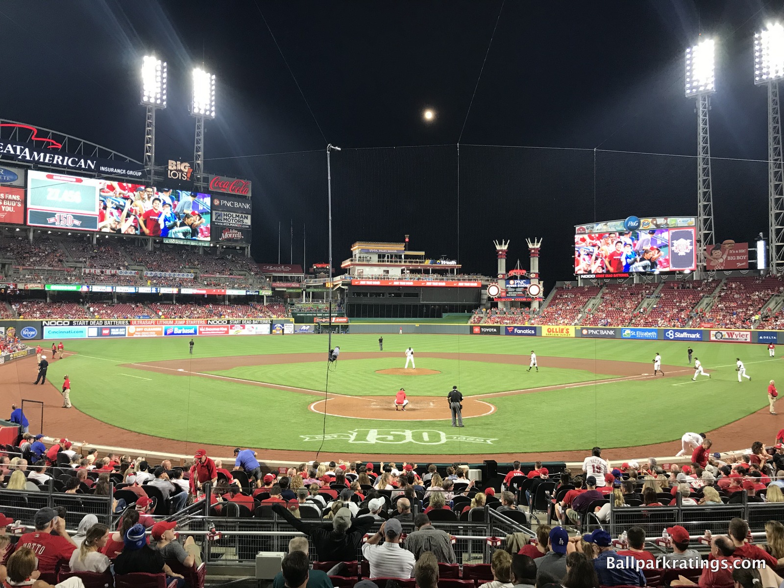
GABP has my least favorite interior aesthetics for a ballpark without a roof. How do you have the riverfront and the skyline, yet have good views of neither?
The underlying design is disjointed and fragmented. In the outfield, riverfront views are blocked by oversized seating, clumsy signage, a new superfluous videoboard, the tackiest gimmicks in baseball, and an ugly black batter’s eye, leaving the park with little sense of place. In the infield, “The Gap” behind home plate is well-intentioned but silly, giving GABP a real “split personality.” It’s all just awful, with so much junk and kitschy stuff thrown in that distracts from the original concept of integrating the riverfront scenery/urban context.
The interior design and visuals are obviously going to comprise the bulk of any analysis, but if you’re willing to look past that, GABP has a lot of things going for it.
The surrounding downtown local scene of bars and restaurants has greatly improved. Crosley Terrace with statues of Reds legends in action behind home plate is awesome. The seating geometry is excellent. While not perfect, some of the amenities are superb: (a) local food, (b) top-10 ballpark for craft beer, (c) the Kroger Fan Zone is one of the best ballpark hangout spots for fans of all ages, and most importantly, (d) the Reds Museum and Hall of Fame connected to the park is the very best of its kind.
But purely design-wise, GABP is probably Populous’s biggest miss.
