Progressive Field
| Setting | 18/20 | 1 Thumb Up |
|---|---|---|
| Locale | 4.5/5 | 1 Thumb Up |
| Accessibility | 4.5/5 | 1 Thumb Up |
| Neighborhood Local Scene | 9/10 | 1 Thumb Up |
| Architecture & Aesthetics | 51.5/65 | 1 Thumb Up |
|---|---|---|
| Exterior Design/Aesthetics | 14/20 | 1 Thumb Up |
| Interior Aesthetics/Visuals | 34/40 | 1 Thumb Up |
| Concourse Aesthetics | 3.5/5 | Thumb Sideways |
| Functionality & Essentials | 32/50 | 1 Thumb Down |
|---|---|---|
| Sightlines: Field Proximity | 10/15 | Thumb Sideways |
| Sightlines: Seating Geometry | 2/5 | 1 Thumb Down |
| Seat Comfort | 4/9 | 1 Thumb Down |
| Concourse Functionality | 10/15 | Thumb Sideways |
| Scoreboards/Tech | 6/6 | 2 Thumbs Up Star |
| Amenities & Features | 43/50 | 2 Thumbs Up |
|---|---|---|
| Concessions: Food Variety | 4/5 | 1 Thumb Up |
| Concessions: Food Quality | 5/5 | 2 Thumbs Up |
| Concessions: Craft Beer/Other Drinks | 4.5/5 | 2 Thumbs Up |
| Social Gathering Areas/Restaurants | 9/10 | 1 Thumb Up |
| Premium Seating/Clubs | 6/9 | Thumb Sideways |
| Historical Exhibits, Memorabilia, Art, & Other Displays | 8.5/10 | 1 Thumb Up |
| Kids Areas/Other Entertainment | 6/6 | 2 Thumbs Up |
| Atmosphere, Vibe, & Policies | 10/15 | Thumb Sideways |
|---|---|---|
| Fan Support/Attendance | 2/5 | 1 Thumb Down |
| Ballpark Traditions/Gameday Presentation | 3.5/5 | Thumb Sideways |
| Ballpark Policies/Staff | 4.5/5 | 1 Thumb Up |
| Adjusted Raw Score | 154.5/2= 77.25=77.5 |
|---|---|
| Bonus | 1 |
| Curve for All 7 | 7 |
| Final Score | 85.5 |
|---|---|
| Ranking | #14/30 |
|---|---|
Progressive Field Defies post-Camden Faux Retro Movement
Despite many functional flaws, Cleveland’s ballpark exudes a certain sense of authenticity and realism not seen in other, sometimes contrived retro parks; amenities have been sufficiently upgraded in the 2010s
By: Cole Shoemaker
Written in 2011 and updated in 2017; ratings above are up to date for 2024, but this review below may be outdated and will be updated at some point; reviews and ratings are “living pages” updated yearly when necessary
What is a “retro ballpark”?
Well according to conventional wisdom, it’s an intimate red brick edifice, one that has taken on cookie cutter status throughout the new millennium. But according to the architects who designed Camden Yards in Baltimore, retro is nothing of the sort. My absolute favorite tidbit of the neoclassical ballpark renaissance is how the one that started it all blatantly rejected the term.
“We never felt that Camden was a retro ballpark”, Janet Marie Smith said, the revolutionary architect who spearheaded the so-called retro concept. “We were trying to design a ballpark that was responsive to the surroundings. We wanted the building to be contextual.”
And all of the Camden Yards architects pretty much echoed that sentiment, understanding the danger of the red brick aesthetic becoming a Disneyland-type experience, if you research the news archives. And yet 15 years later, we saw retro cookie cutters popping up all over the place.
Well, they got it right with Progressive Field, a staple of everything that neoclassical ballpark architecture was intended to be.
In 1994, those who recognized its symbolic representation of Cleveland, and its well-executed contextual design, deemed it a worthy successor to Camden Yards. But as the red brick retro movement gained traction into the new millennium, people realized that many of the superficial elements of Progressive Field were in direct opposition to the template of the time. Some dubbed it “overrated,” and as of now, the consensus view is in flux.
Despite a renewed sense to move away from the red brick, wrought iron formula, the wild success of Baltimore’s park has had an undeniable effect on most new parks to this day. For Cleveland to oppose that aesthetic directly after Camden opened took true vision, a vision rooted in authenticity.
But it’s not just about the opposition to a blind red brick façade. Throughout the past two decades, excessively cozy dimensions, short porches, numerous nooks and crannies, along with your occasional gimmick, made for heavy-handed attempts to recall the ballparks of yesteryear. Want an overhang in left field? Why not? How about a hill in center field? Sure.
I think Cleveland got what the “retro movement” was supposed to be, not what it became.
The significance of the best “retro” ballparks aren’t red bricks or silly old-fashioned gimmicks, but the connection to their cities. With Camden Yards, the fact that red brick worked perfectly in the Baltimore context was a mere coincidence. The many post-1992 ballparks that engaged in this red brick McMansion mimicry did so at their own peril. The best parks didn’t blindly imitate the red brick aesthetic, but emulated the concept of crafting a ballpark that fits with its context.
This especially comes to light when you compare Progressive to the other ballpark that opened in 1994, Globe Life Park in Arlington, which really suffers from that stage-set sensibility. Building a good ballpark should be about constructing a building that conforms to its own context, and you really see that inside and out Progressive Field. It’s as urban as a park you’ll ever see. Great ballparks authentically represent their cities, and the Indians’ park is pure Cleveland.
I think you see elements of Camden in every single park built from 1994-2010. You see little of it in Cleveland. Sure it’s going to have some superficial connections to Camden Yards, but it’s one of the few neoclassical parks that marches to its own drummer, if you really scrutinize all elements of the design.
In 2010, I truly went into Progressive Field with no preconceived notions. And while I was deeply impressed with its aesthetic design, I noted the many functional flaws.
The sightlines were a mess down the lines, the food options were about as limited as it got for a post-1991 ballpark, and the concourses were closed and on the small side. With an overabundance of suites, their premium-seating model was flawed as well.
While some issues are unfixable, Cleveland rectified many of the functional flaws and paltry amenities upon my return in 2017. Most notable are the additions of the Corner Bar, the Heritage Plaza, the Home Plate Club, and a bevy of local concessions. Progressive Field also emulated the dual concourse technique of the first base side on the third base side, marginally improving the overall concourse functionality.
The only blemish on an otherwise fine renovation project is the widely maligned white facades in the right field upper deck. Resembling shipping containers, not only do they subtract from the interior aesthetics, but they are dormant and non-functional throughout most of the year. On the plus side, this endeavor removed thousands of the worst seats in baseball, many of which were oriented past center field (sections 525-520). 426-420 still remain, unfortunately.
But overall, we have substantial improvements in nearly every objective category: concessions, local food, restaurants/bars/social areas, premium seating, kids’ entertainment, and concourse functionality. Progressive Field continues to do a very good job of honoring team history as well. The only subtraction was with the already fantastic interior aesthetics, and they need to replace/restore some of the seats. Progressive Field’s extensive renovations came after similar projects at the other early to mid 1990s parks like Camden Yards (Baltimore) and Globe Life Park in Arlington, but they are the best and most comprehensive of the bunch.
There’s a reason why baseball awarded Cleveland the 2019 All-Star Game over Baltimore, even though the latter had a longer All-Star Game drought and is generally considered to have the better ballpark.
From where I stand, Progressive Field is absolutely a worthy successor to Camden Yards as one of the gold standards of 1990s ballpark architecture, meaning it’s one of the more underrated ballparks of all time. If you took a poll in 2017, I don’t think Progressive Field would fare too well, as people say it lacks any sort of distinguishing or recognizable elements.
But that’s exactly the point: it doesn’t need to. Ballparks don’t need cheesy gimmicks; they need to visually represent their cities. The backdrop of the Cleveland skyline or Quicken Loans Arena are the distinguishing elements, much better and more authentic than the gimmicks seen in other parks from 1997-2004 (think pools, faux rocks, fake smokestacks, giant coke bottles, trains, etc.) Too many other parks try too hard. I flesh out more specifics in the architecture and aesthetics section.
Right now, Camden, PNC Park (Pittsburgh), and AT&T Park (San Francisco) are widely considered the best ballparks in the majors, with parks in San Diego, Minneapolis, Detroit, Philadelphia, and a few others often in the discussion (don’t forget, I don’t compare Wrigley or Fenway to the “new” parks). I believe Progressive Field will ultimately be one of the best ballparks in history as well, if circumstance bodes well of course. From an architectural design standpoint, in terms of originality, distinctiveness, authenticity, and overall aesthetics, Progressive Field should join the elites on the timeless scale.
If Progressive Field faces its downfall sooner than we anticipate, I think its basic structural design, explicitly intended to only accommodate luxury suites, will be the culprit. The park was built because of the revenue generated by these luxury suites, but that premium seating model is now flawed: no baseball market can support anywhere near this number of suites. The Indians have rapidly tried to repackage many of the suites as entertainment areas and clubs, but the structure can’t be changed. If anything, much of the renovation project itself proves stadiums with tiers of luxury boxes are difficult to retrofit for normal fans (unlike say with Yankee Stadium, where if they ever want to make their club seating regular seating, it isn’t structurally unfeasible at all).
But as of 2019, the bottom line is Progressive Field still excels in architectural and aesthetic design, but now with the requisite fan-friendly amenities of a world class facility, resulting in a top-10 ballpark.
Setting
Location/Access:
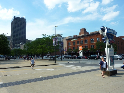
Cleveland does an excellent job in providing a surplus of parking options within walking distance of the complex. I was again impressed with the entire scene upon my revisit in 2017.
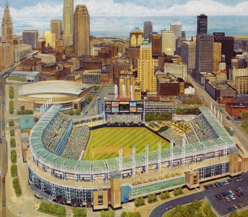
As for the ballpark itself, Progressive Field is nestled on the edge of downtown Cleveland, in close proximity to all of the attractions. The location is strikingly similar to that of Camden Yards, with the view and most of the activity to the north and a highway to the south. The good hotels are a bit of a walk toward the lake, but the pre and post game energy is fantastic. Like Camden, the park formerly known as Jacobs Field bodes an urban neighborhood atmosphere, while also being right by the highway that filters into downtown Cleveland. So it’s really the best of both worlds.
Score: 5/5
Local Scene:
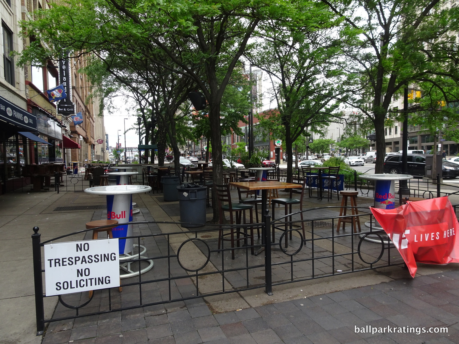
You’ll have to walk a bit north, but the bar scene around Progressive Field is rocking. The atmosphere around the ballpark, especially beyond the outfield area, is well above average. The Gateway District is certainly experiencing an economic downturn because of the loss of LeBron……….an economic resurgence with the return of LeBron……(an economic downturn again due to the loss of LeBron?), in what is one of the premier sports restaurant and bar scenes in America. But seriously, I was very impressed upon my return. I think the downtown Cleveland local scene rivals any in baseball, much closer to something like Coors Field (Denver) than Minute Maid Park (Houston), and that’s a huge compliment!
Score: 4.5/5
Total: 9.5/10
Architecture & Aesthetics
Exterior Design:
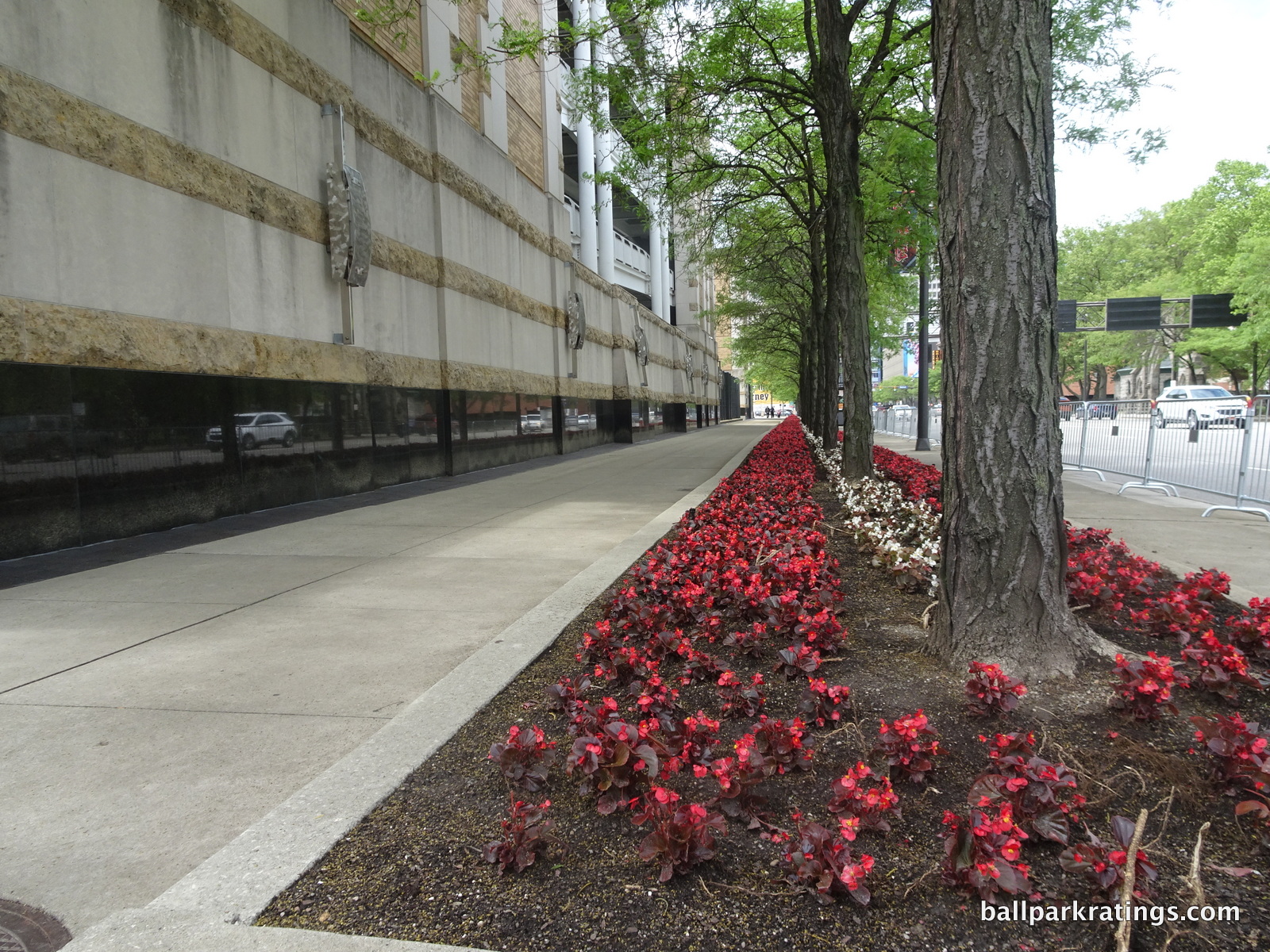
Thank you Progressive Field for designing a façade that fits your city.
At some point in time, retro stopped being an innovation and became a lazy starting point for any club looking to construct a ballpark. And an unfortunate number of clubs failed to consider that classic ballpark facades resonated because they fit in within the community. Throughout the 1990s and 2000s, many of these “attractions” were just thrown into the middle of nowhere. It represented a time where retro became a novelty rather than something authentic. Retro parks essentially became theme parks.
Progressive Field, my friends, is not one of those.
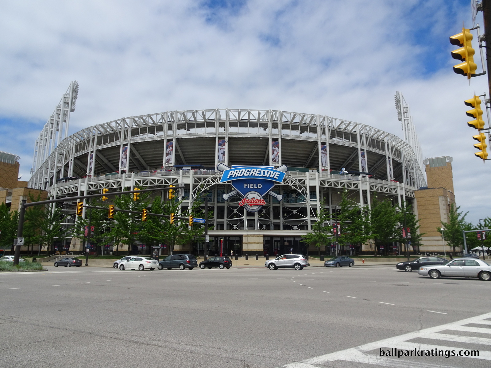
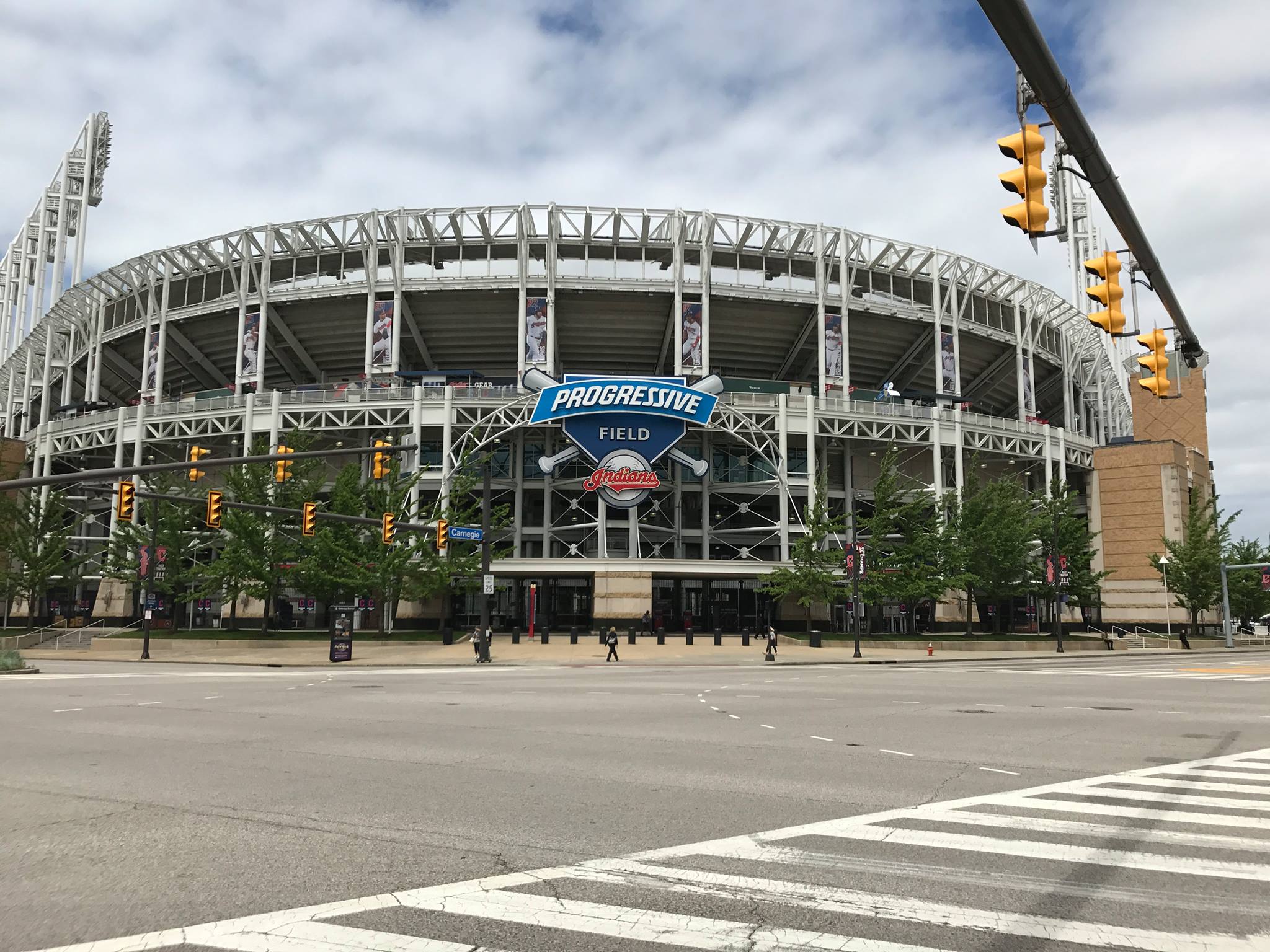
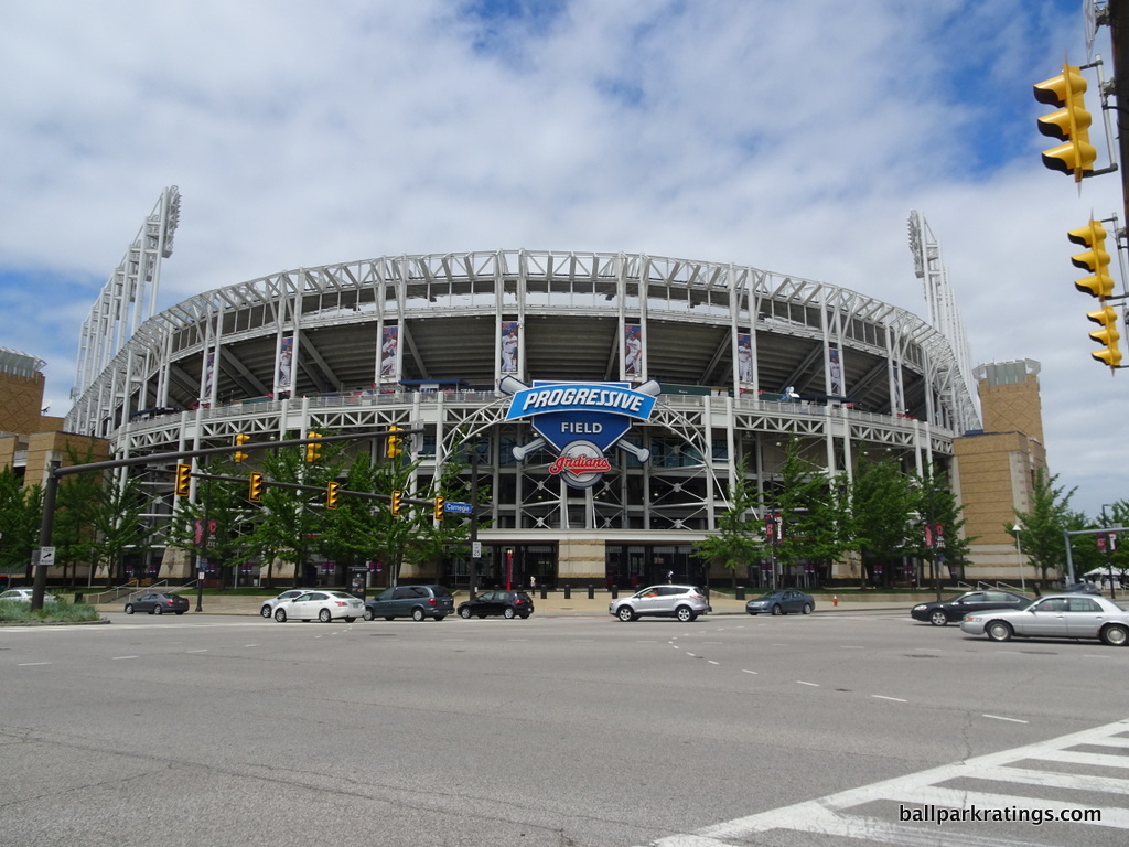
You may have heard that the white exposed steel look is meant to evoke Cleveland’s industrial values. But Progressive Field is not really a façade in any sense of the word. It’s a transparent statement of Cleveland. With no concrete and not much of a brick “façade”, guts are exposed, revealing bones, tendons, and “reality”. The steel grinders mimic many of the local bridges, while the light towers represent the town’s smokestacks.
The complementary elements work great here as well. Indiana limestone forms the base of the facade, while Pennsylvania brick completes the rest of the main structure. The faded yellow brick and limestone are a nice change of pace and unique among ballparks. The local limestone is especially impressive for it’s time. The silver light fixtures are worth noting as well.
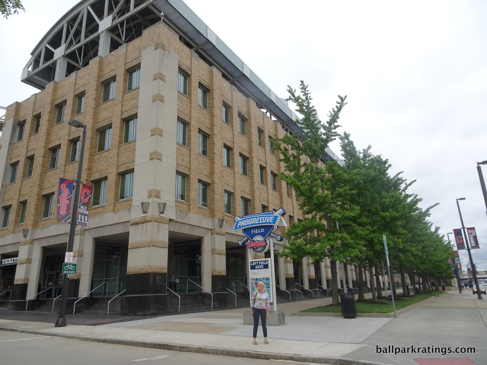
While many of the recent ballparks, such as Target Field (Minnesota), try to use “local” and “natural” elements to gain LEED “green” certification, Progressive Field was a pioneer here, way ahead of its time. We don’t see another park use similar materials for another 7-10 years.
Despite the consensus that the exterior is not particularly good looking (not necessarily my opinion, I’ll take this over a generic retro clone), all the elements work well together and contribute to the authentic feel of the ballpark. And the “guts” look contributes to the openness.
As a concept, it’s one of the best in baseball.
Score: 7.5/10
Interior Aesthetics:
On the surface, it’s difficult to grasp the originality of the interior design. If you took a poll among baseball fans, Progressive Field might be derived for not having a “signature element,” which is a pretty empty critique (hint: great ballparks which have attractive contextual connections don’t need external kitschy “signature elements”).
But from the sharp interior lines and subtle unique structural elements, to the perfect balance of the outfield design and differentiated seating structure, Progressive Field may have the best, and least derivative, interior design in the majors. I feel like it’s the only one that didn’t use Camden as a template.
First off, I think both Camden Yards and Progressive Field benefit from being simple contextually based urban ballparks because they were the first, and the copycats had to be more gimmicky in order to stand out, while being less authentic and more muddled.
In my opinion, no ballpark, except maybe Camden Yards, exemplifies that essential balance and visual harmony quite like Cleveland. Subjective, I know. But I’ll try to outline what I see here. What’s most remarkable is that unlike Camden, PNC, or AT&T, the Indians’ park doesn’t have that one, identifying standout feature. It’s one of the few in baseball not to have that loud, obligatory distinctive element. Progressive Field was the first that proved to me you don’t need that forced signature feature to be a great park.
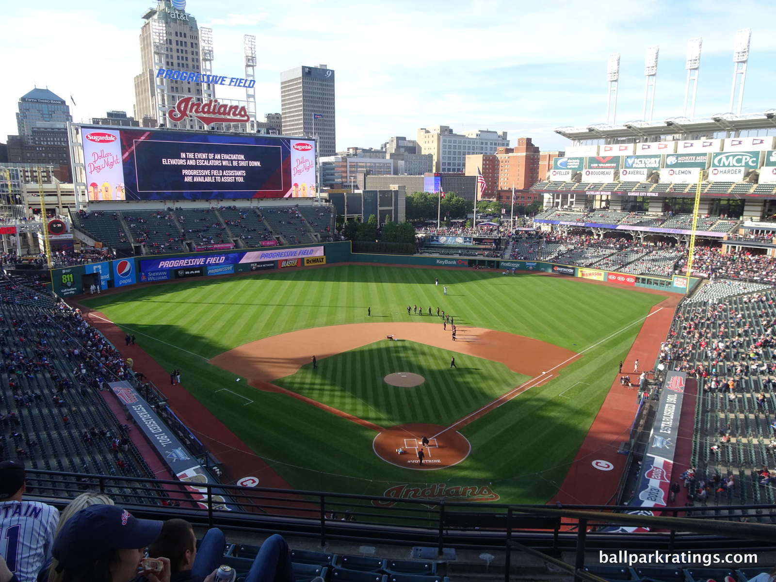
Progressive Field authentically fits together unlike any other. Not having one single element, contextual or otherwise, to connect it all together actually strengthens the design’s merits. Everything is assembled in perfect congruence.
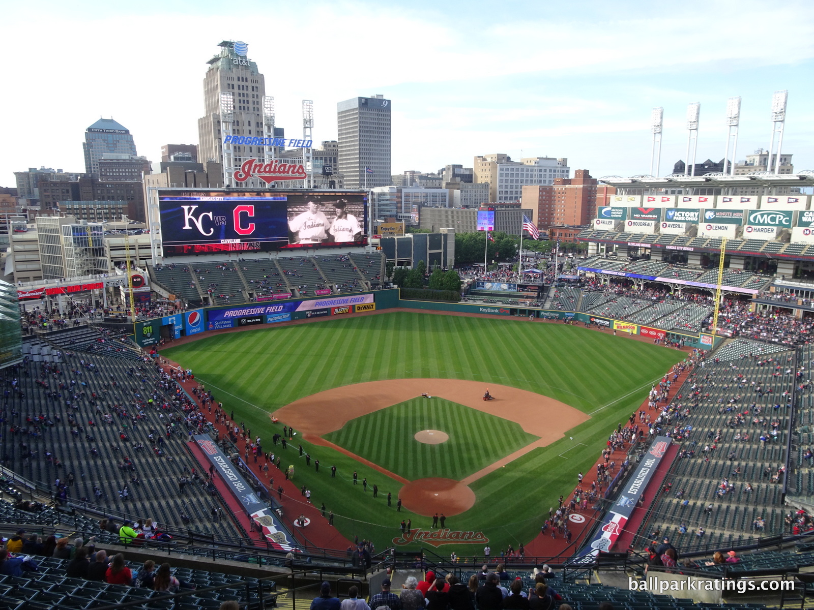
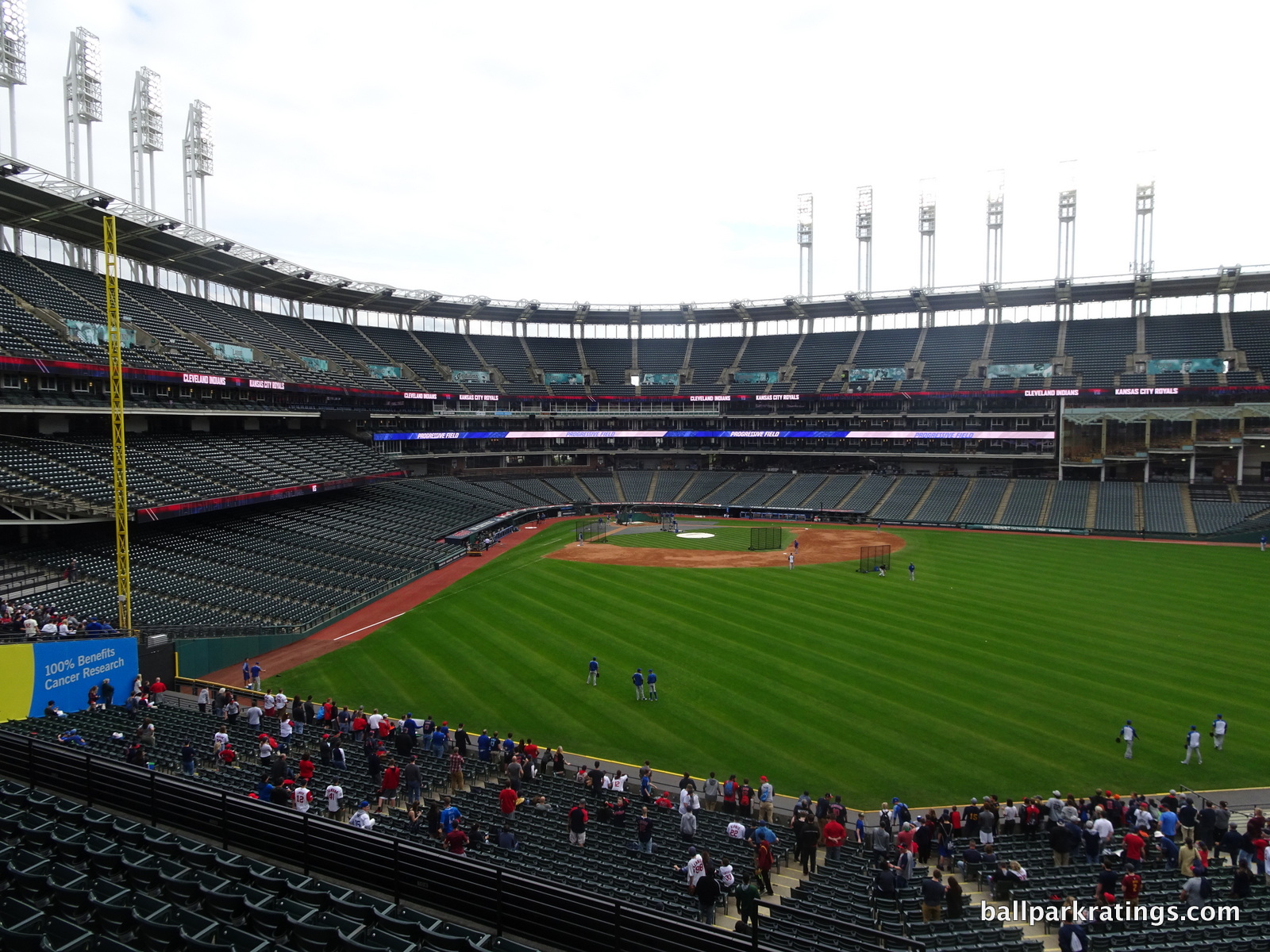
One thing that impressed me is that it manages to visually connect with its city, despite the imposing seating structure. If I just looked at a blueprint, Progressive Field has the kind of interior design that I usually scoff at: upper deck outfield seats on one side and a large imposing bleacher section/scoreboard on the other. But this one feels right, perhaps because it’s organic and not too enclosed.
AT&T Park, PNC Park, and Comerica Park (Detroit), for example, benefit from having no upper deck in the outfield, so the surroundings can take over. That’s an easy A. Well, Progressive Field does the best job I’ve seen in maintaining an open feel, despite lots of outfield seating. Unlike Coors (Denver), Turner (Atlanta), or Safeco (Seattle), I don’t feel like the seating consumes the entire structure. And that takes unique skill.
In other words, it feels remarkably open and responsive to the cityscape, not by default but by a conscious dexterity.
They maintained an open feel in center and accentuated the left field porch. I think they even tapered the right field upper deck outward a bit to provide better views in center field. Like Camden Yards, no ballpark has worked as hard to capture that essential physical connection to its context quite like Progressive Field. Progressive Field follows the first rule for ballpark interior aesthetics: when in doubt, let your context take over.
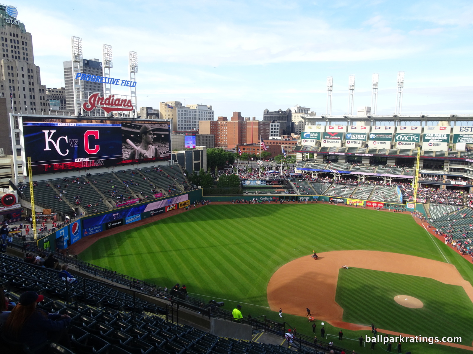
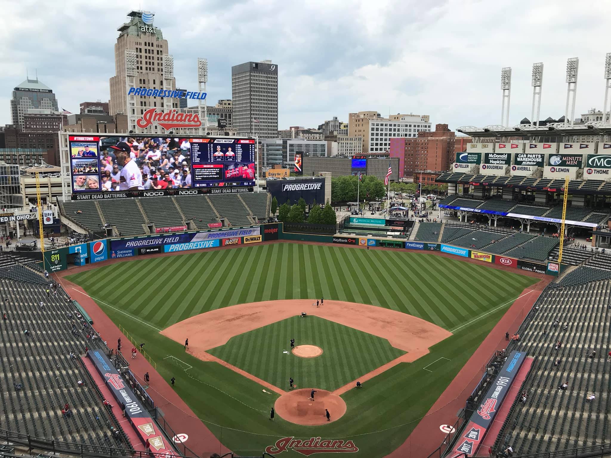
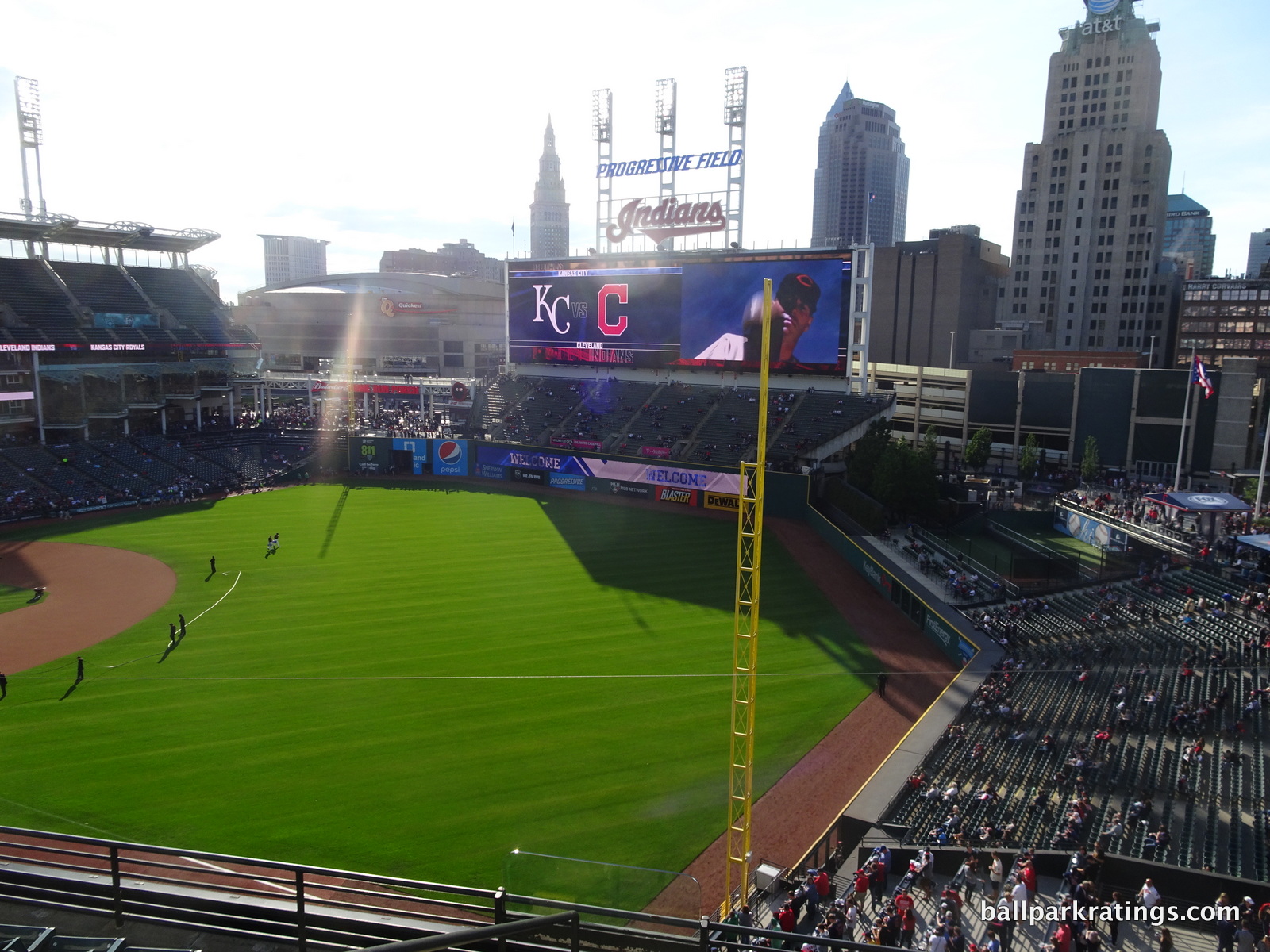
A great outfield interior design is about knowing how and where to add features/seats and how that design works with its environment beyond the outfield. Progressive Field has this dynamic perfect, despite the imposing scoreboard blocking the skyline.
Perhaps it’s because center field feels so open to its environment, something that certainly distinguishes it from its peers. Note the white steelwork beyond the center field wall, matching the ethos of the exterior design. Also note how the batters’ eye is in unison with the rest of the design, not a plastic wall that sticks out like a sore thumb. The use of trees as the batters eye enhance the center field picnic atmosphere and are far better than the large plastic walls you see in other ballparks. Great use of space.
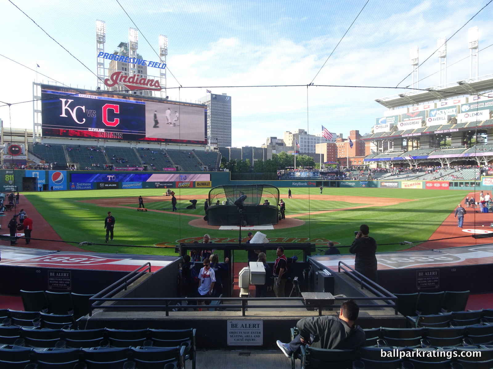
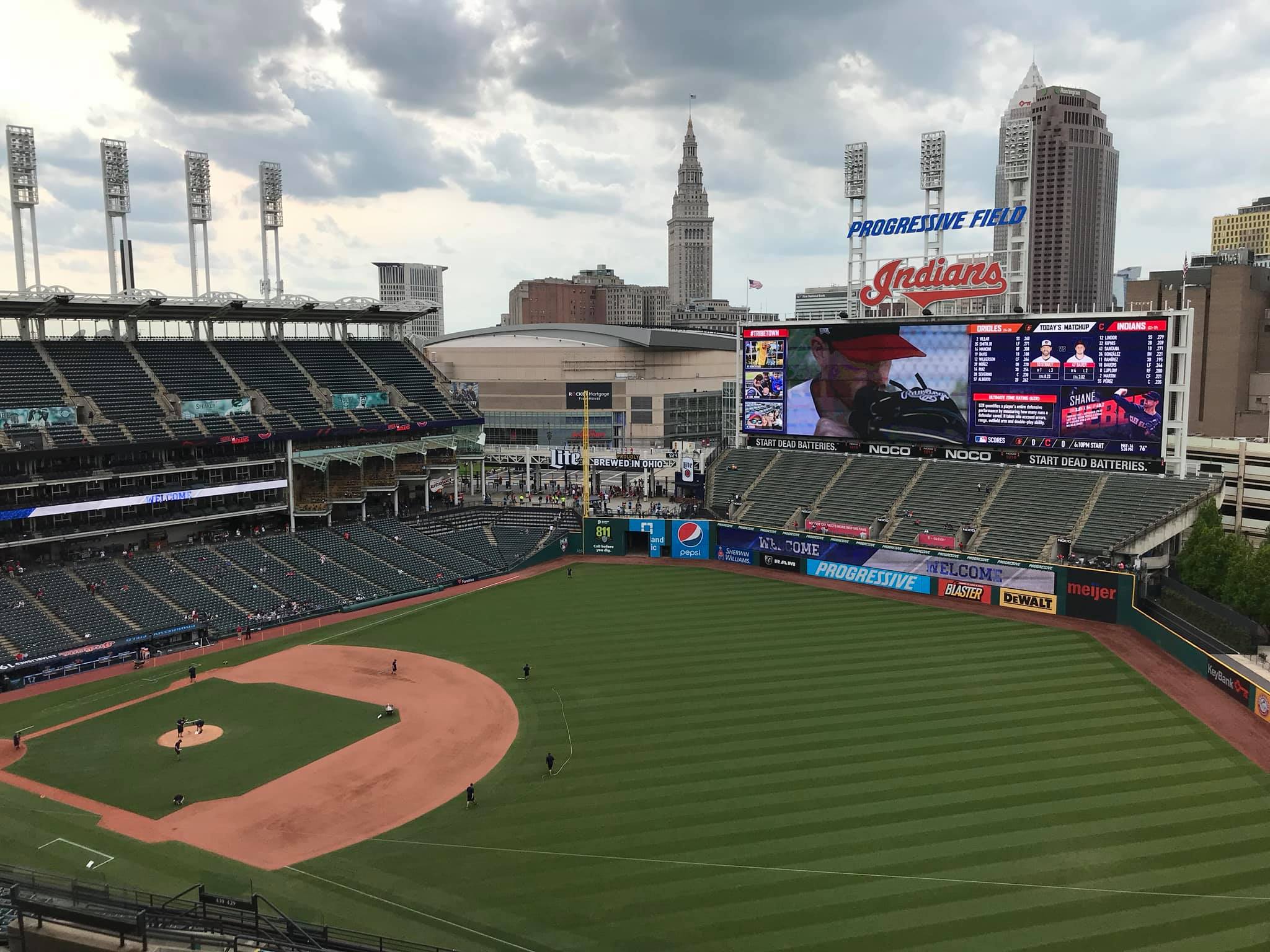
The oversized left field bleachers and scoreboard serve as the de facto “dominant image” of the structure, providing a visual illusion of coziness while still maintaining a connection to the rest of the park. It’s authentically juxtaposed with the open spaces to both the left and right of it. The Home Run porch standing room area takes Baltimore’s right field area to a higher level.
I love the visual placement of the standing room only area next to the bleachers, especially how it allows Quicken Loans Arena into the ballpark. The integration of the arena into the ballpark down the left field line is authentically equal to Camden Yards’ warehouse. On the surface, the latter may be more aesthetically pleasing, but both elements are still unequaled in major league ballpark.
People have wondered if the bleachers and the scoreboard should have been downsized a bit, allowing for a better view of downtown Cleveland, but they are perfect in size and scope. It gives the park a nice balance. And the elongated mini monster in left field feels unexpectedly unassuming and authentic, as it ties all of the elements together well.
Even the seating structure behind the infield is unlike any other park in the majors.
The unique grandstand design, characterized by a single mezzanine on the first base side, meshes well opposite the home run porch. Even the lack of mezzanine seating on the third base side is nicely juxtaposed with the upper deck mezzanine seating in right field.
The cross sectional stands down the lines sport a sleek, modern look, despite the much-maligned three levels of suites, which is a nice change of pace visually. Note the V down the right field line. Even the left field restaurant looks nice. It’s a distinctively sharp look that provides an interestingly eclectic mix in design, unlike any other. So much of Progressive Field could be construed as quite modern looking, not “retro,” and I love that.
Conceptually, the conspicuous presence of the three tiers of luxury suites do have an isolating effect for a ballpark meant to connect with the city, but I don’t see it that way in practice. They fit with the urban skyscrapers and serve to differentiate the cross section from a crowded array of formulaic ballpark grandstands across the country.
Some of the supplementary elements like the toothbrush light towers are wonderful as well. Emphasized by authentic structural elements, everything works together to provide a distinctive, timeless look without being too loud. You could argue the Indians’ park is the only outstanding interior that acts solely on its own merits, not just capitalizing on superficial features.
Not derived from some external kitschy treatment or an overused template, the interior is an authentic beauty. As simple as it is, the design is surprisingly original. No heavy-handed elements here; just perfect balance of the essentials with superior integration. It has clean and confident architectural lines and provides a distinctive look without overloading the senses with something loud. It is not uninspired or boring either, despite a lack of distinguishing features. And that’s the hardest thing to do in ballpark interior design.
Both Camden Yards and Progressive Field remain the gold standard for neoclassical ballpark interior aesthetics. The park formerly known as Jacobs Field remains the more underrated of the two, as the public generally deemed Camden Yards more aesthetically pleasing and distinctive. In some ways, I give Progressive Field the slight edge, because it does more with less.
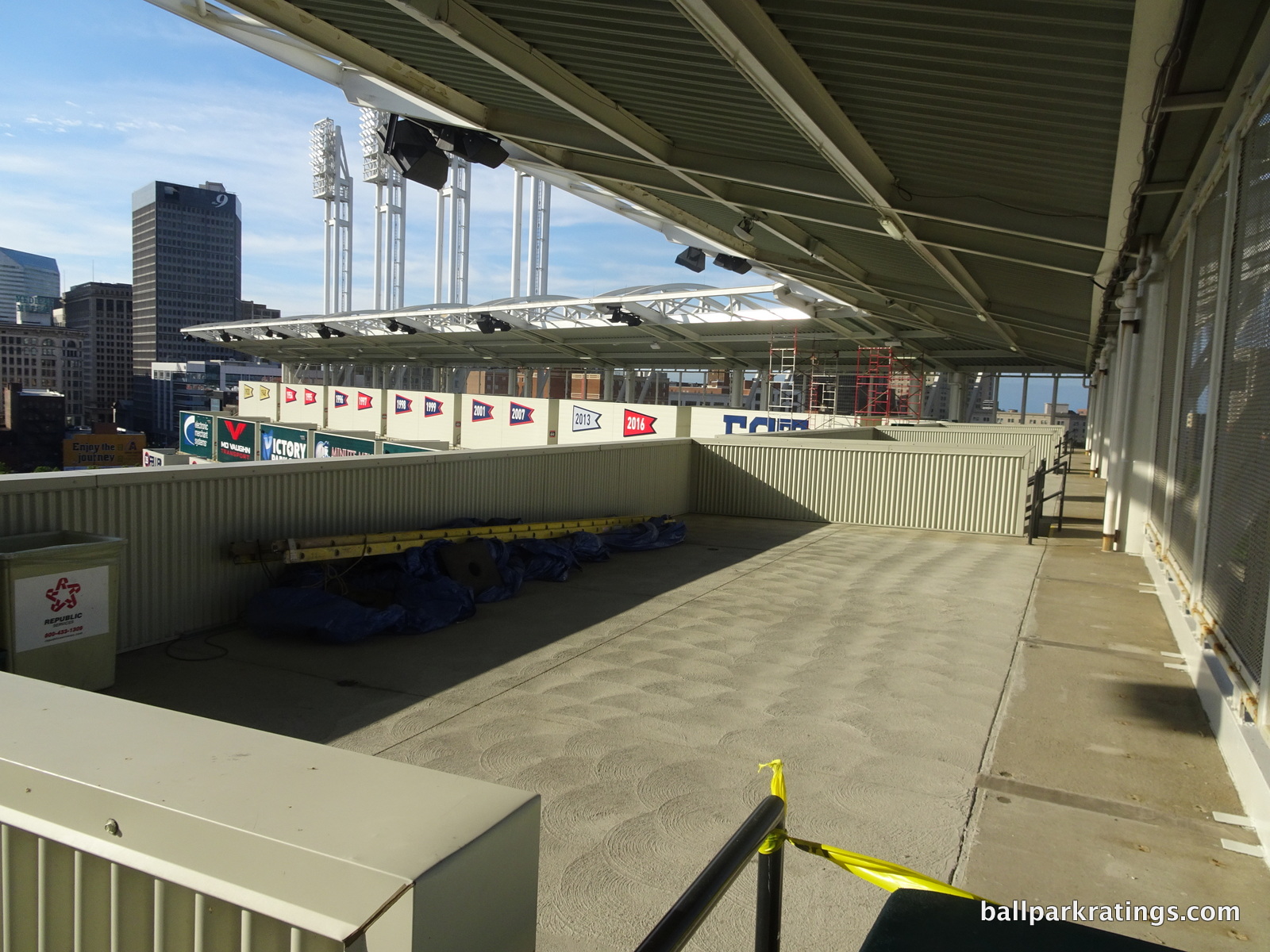
The ugly white shipping containers in the right field upper deck certainly neutralize some of the aesthetic appeal, resulting in slight demerits in score. But it isn’t as visually austere and jarring in person. So almost all of what I’ve written above (in 2011) still rings true. The white facades don’t “ruin” the park as some have said, although that has happened before somewhere else. But Progressive Field didn’t already have a design muddled with ads, gimmicks, and distractions, while the formerly lovely (and formerly underrated) Minute Maid Park was already headed in that direction before that monstrosity seen in the link above was added in 2012.
Score: 13.5/15
Panoramic View/Backdrop:
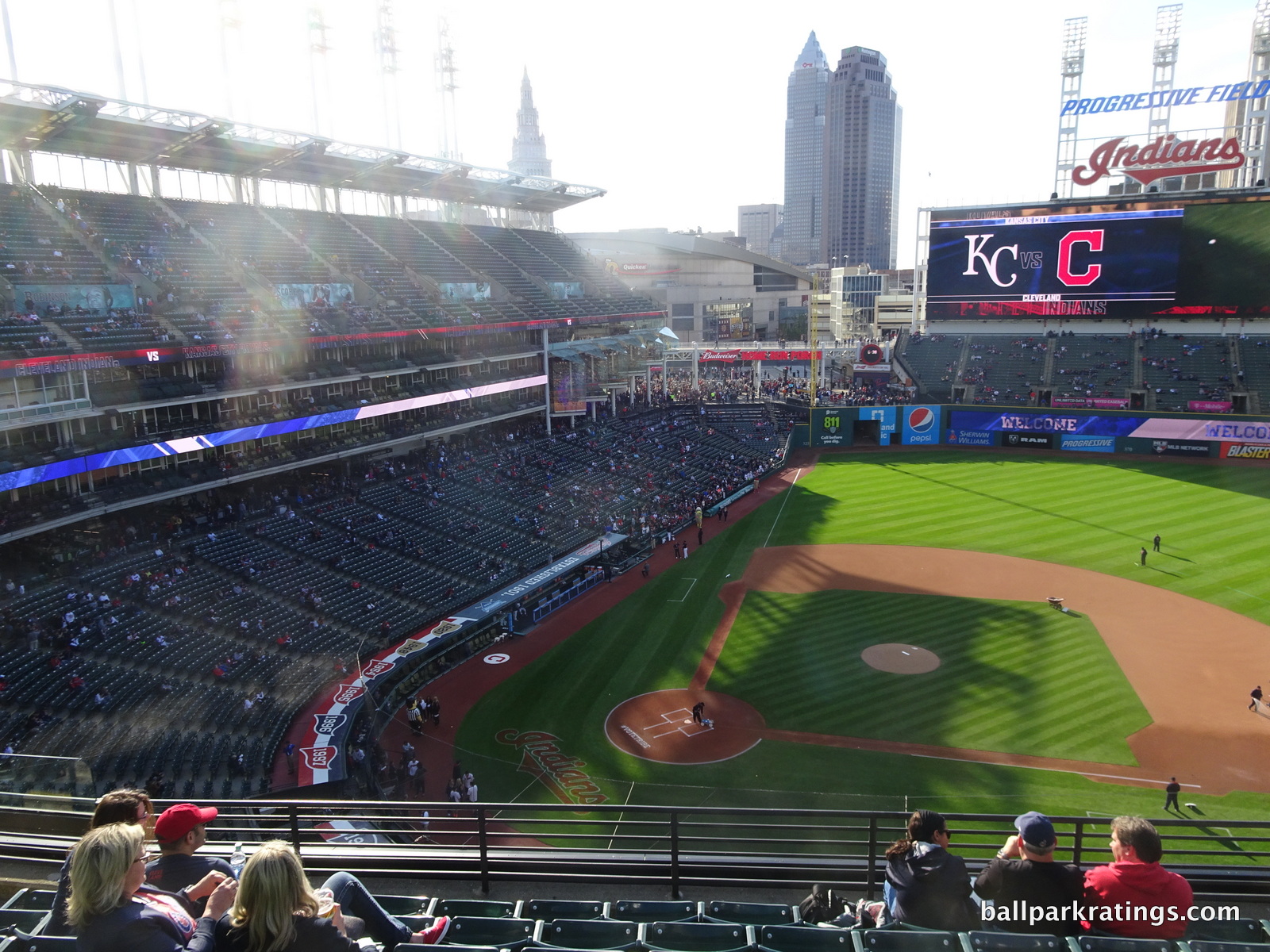
Sure we can all agree they could have stressed the backdrop of downtown Cleveland better, but I still wouldn’t change a thing. Imagine moving the scoreboard to center or right field, in order to open up the skyline: that would disrupt the perfect balance accomplished here. I rationalize that, like the rest of the park, it looks genuine, not “perfect,” like PNC Park for example.
The ballpark doesn’t look like it took its panoramic view into account but it certainly took its context into account, as the left field design is in unison with the surrounding streets and the arena. It allows the arena to seep in perfectly. The older ballparks would do the same, giving me a sense of timelessness. Progressive Field looks like it’s been here forever. It looks real. And the center field view is as nice as any.
Score: 4.5/5
Concourses:
Today, the concourse aesthetics are more defined by its merits than the past remnants of an early 90’s mall, although some remain in the upper deck. Much of the main concourse is open to the surrounding streets around home plate, which is part of the “guts” design and creates an attentively open feel. Historical banners are frequently on display. New concession signage is tasteful, and the exposed white beams contribute to the ballpark’s industrial sensibility.
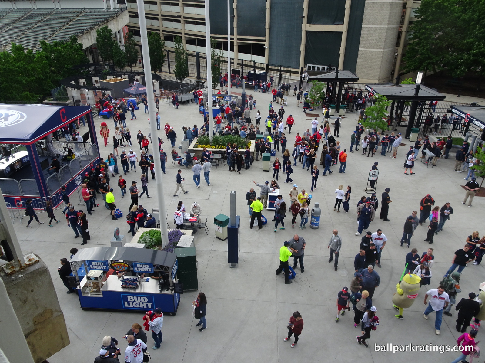
The new Heritage Plaza in center field is particularly attractive, with tables, trees, and flower beds.
Before the mid 2010s, Progressive Field had some of the ugliest concourses I had ever seen. Think goofy pictures of food, brown, yellow, and slime green tiles (wtf?), and a general 90s mall-like feel. While not a substantial component in our ratings, the improvement to the concourse aesthetics is perhaps the most welcome enhancement of all.
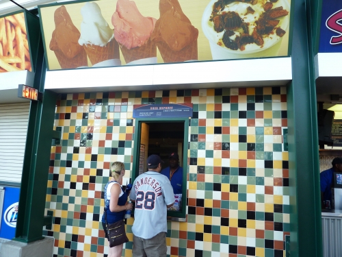
Score: 2.5/3
Total: 28/33
Functionality & Essentials
Sightlines:
Out of all the post-1991 ballparks, Progressive Field has some of the worst sightlines, at least looking at the grandstand structurally. Many of these poorly angled seats were eliminated with the addition of the white facades in 2015, so other parks, particularly Camden Yards (early retro parks had these functional flaws), may now have more bad seats cumulatively.
Bottom line: There are far too many seats down the lines that are poorly oriented. They tried to conform the stands to the surrounding streets, meaning that the seating structure itself is not angled in the right places, especially down the right field line. That’s good contextual design, but not good for functionality.
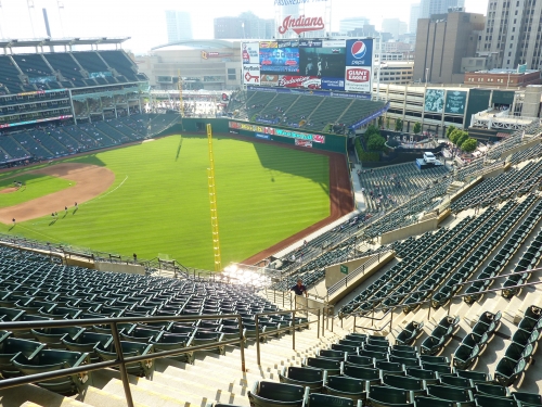
The design of the seating structure down the line is different than most. The stands curve around home plate then run straight out to the foul poles, instead of running parallel back toward home plate just past first/third base. The architects failed to compensate for this by not sharply angling the seats further down the lines. All seats are slightly angled at the same uniform degree (so they could say they have “angled seating”) past a certain point, meaning about half the seats down the line are not adequately angled.
While some of the seats down the left field line are poor, the seats down the right field line are downright awful, especially in the upper deck. Many seats are pointing to deep center field, with one section actually oriented past center field. I have a feeling that this contributes to the cavernous feel of the ballpark, as the right field upper deck extends way too far down the line, when the whole structure should have been reoriented about five sections earlier. The seats farthest down the right field line in the upper deck are the farthest from home plate in baseball.
For the 2015 season, many of these seats were eliminated in sections 525-520. But some of the worst seats in baseball remain in 426-420.
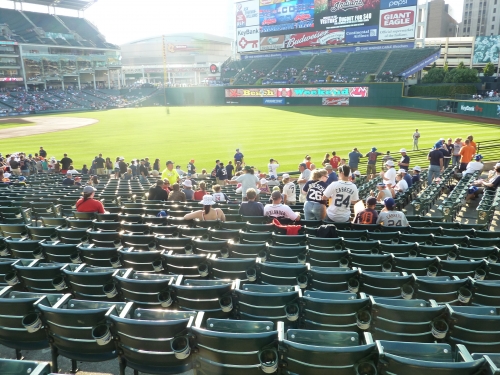
I am happy to report that the height of the upper deck has been greatly exaggerated. Yes, the upper deck is pretty high, but the three tiers of luxury boxes are a bit of a mirage. If you’ll look closely, you’ll note that the suites take up less space than some of the newer parks built in the 2000s with the club/suite formula.
The first level of suites starts very low, because the lower concourse is (now only partially) closed to the playing field. The upper deck is not cantilevered enough like many parks, but not anymore than usual for the era. So not good field proximity, but not out of the ordinary like many claim.
I’m giving a slight uptick in score here though. Kudos to the Indians for removing many of those seats. I wouldn’t wish that on any baseball fan.
Score: 7/10
Seat Comfort:
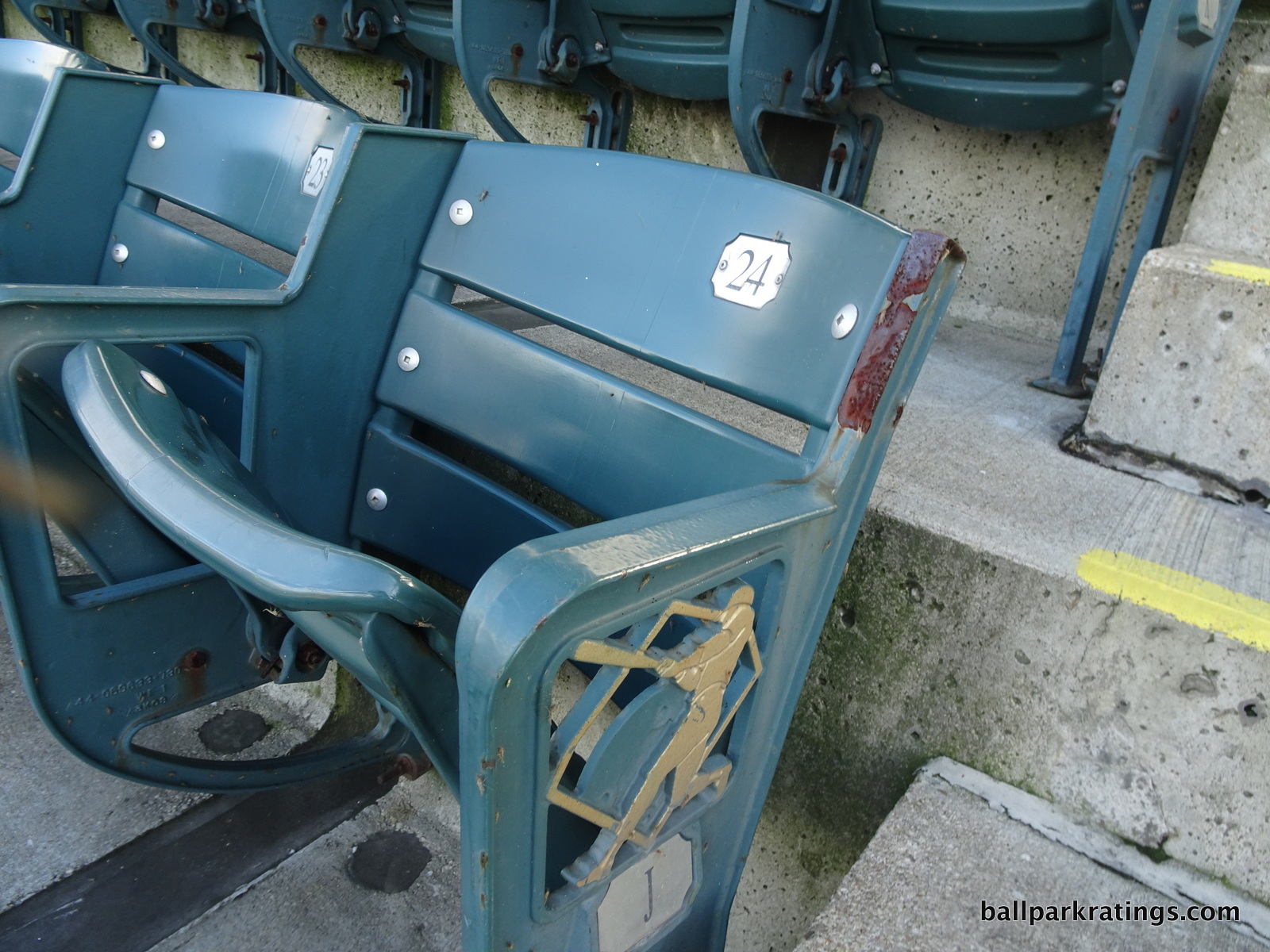
The seats throughout the lower bowl appear to be at least on par with the other ballparks built in the 90’s, while being below historical standards. But many of the upper deck seats are far too tight and all upper deck seats lack cup holders. Club seats are thinly padded.
Most importantly though, they are now too old. As of 2019, Progressive Field’s seats may be some of the worst in baseball. Camden Yards (1992), Globe Life Park in Arlington (1994), and Coors Field (1995) replaced their old seats a few years ago. In Cleveland, screws are missing, bolts are gone, a rust is growing on many seats in the upper deck.
With millions poured into other parts of the ballpark, why wasn’t this addressed?
Score: 2.5/5
Concourses:
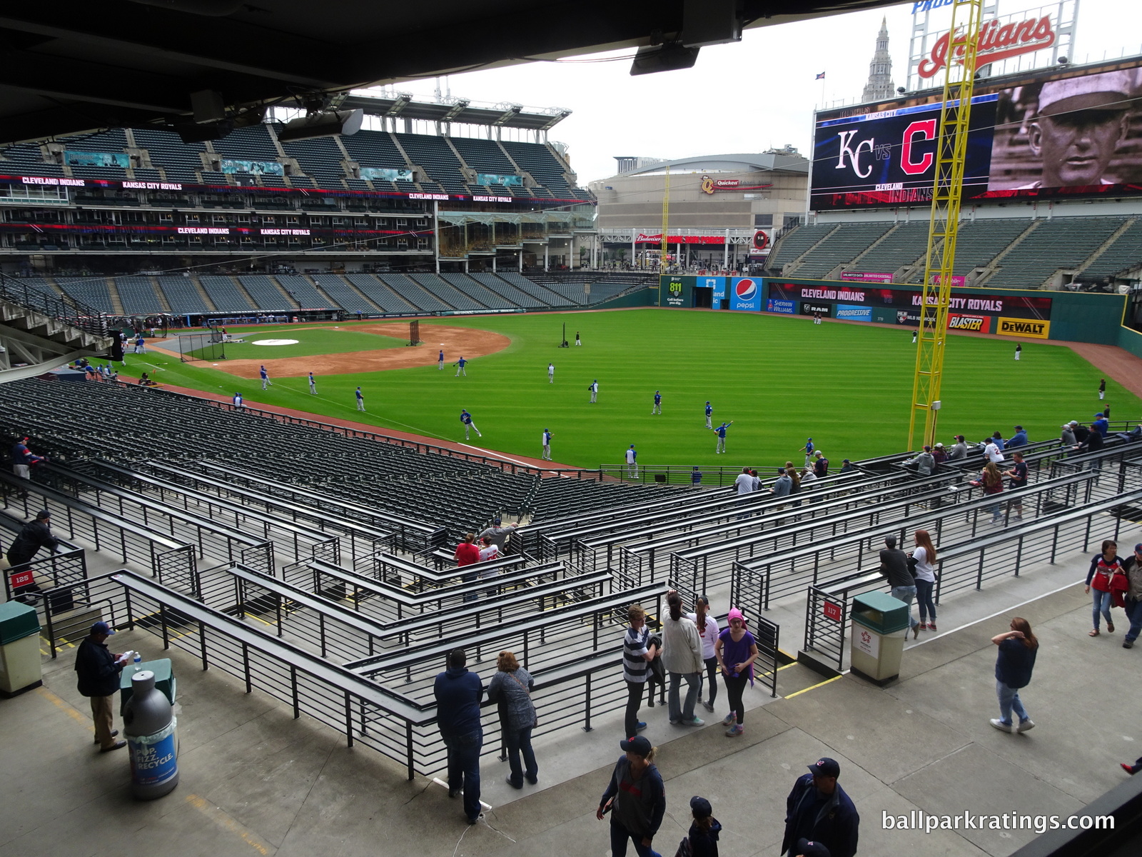
Progressive Field has made many substantial improvements in their concourse system from 2015-2016, but it still isn’t a true open concourse system like team officials claim. The Indians now divide different areas of the concourse into three different “districts,” which is a nice touch intended to give the park a neighborhood feel.
Like other parks of the early retro era, most of the concourse was originally closed to the field of play. Considering the layout, there was little reason for this, other than to provide views of the city on the other side. I have to admit it was (and still is) pretty nice, as much of the main concourse is open to the surrounding streets, which is part of the “guts” design.
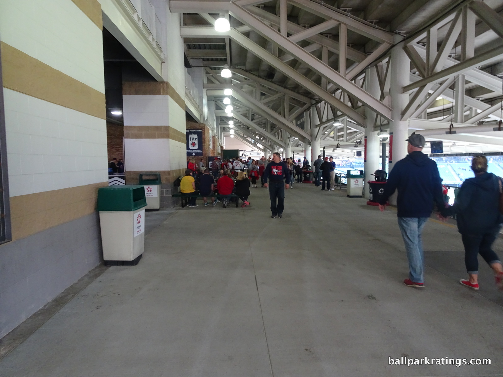
Structurally, the Indians’ only viable solution during the renovations was to create something like what they already had on the first base side: a dual concourse system with one side open to the field, and the other side closed to the field divided by concessions, but with huge portals in between the concessions allowing for occasional views from the outer side.
I generally didn’t like this approach at the time, but it’s better than a completely closed system like in Baltimore or St. Louis. Underneath the club seating on the first base side, we have a roughly 25-foot concourse, which is more like a picnic area, open to the playing field, separated from the main concourse by a souvenir stand. It appears this has remained mostly unchanged. The main concourse behind home plate is still blocked, but now by the Home Plate Club.
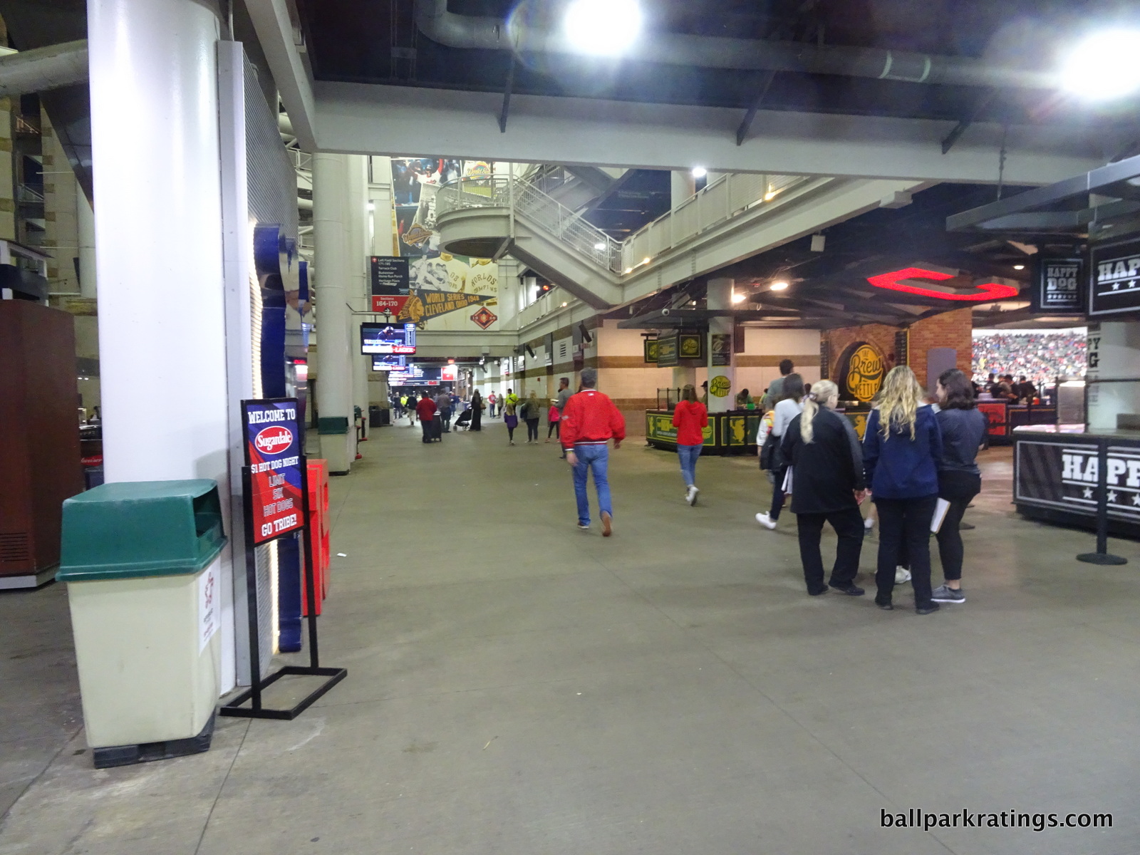
On the third base side, the Indians tried to replicate the same idea, with mixed results. The open side of the dual concourse is even more narrow than the similar one on the first base side, in what is really just an aisle or a standing room area above the seats. What is nice is that the portals between concessions stands are much wider, meaning those walking around on the outer concourse can frequently see the game. Most of this discussed in this and the previous paragraphs are in the “Infield District.”
This idea of opening the concourse works at its very best throughout the right field concourse, or what the Indians call the “Right Field District,” which extends both down the right field line and into Heritage Plaza discussed below. The hallways are wide on both sides of the concession stands, and portals between concessions stands are huge as well, allowing for great visibility of the field. This is the kind of design that properly encourages circulation around the ballpark.
Walking further around, Heritage Plaza in center field (not to be confused with the Heritage Park plaque area) is a wonderful addition. In an area formerly occupied by a cramped food court, this expansive plaza area makes Progressive Field a true destination before a game. The Indians can now claim to have one of those pre-game “outfield experiences” that has been so popular throughout the millennium.
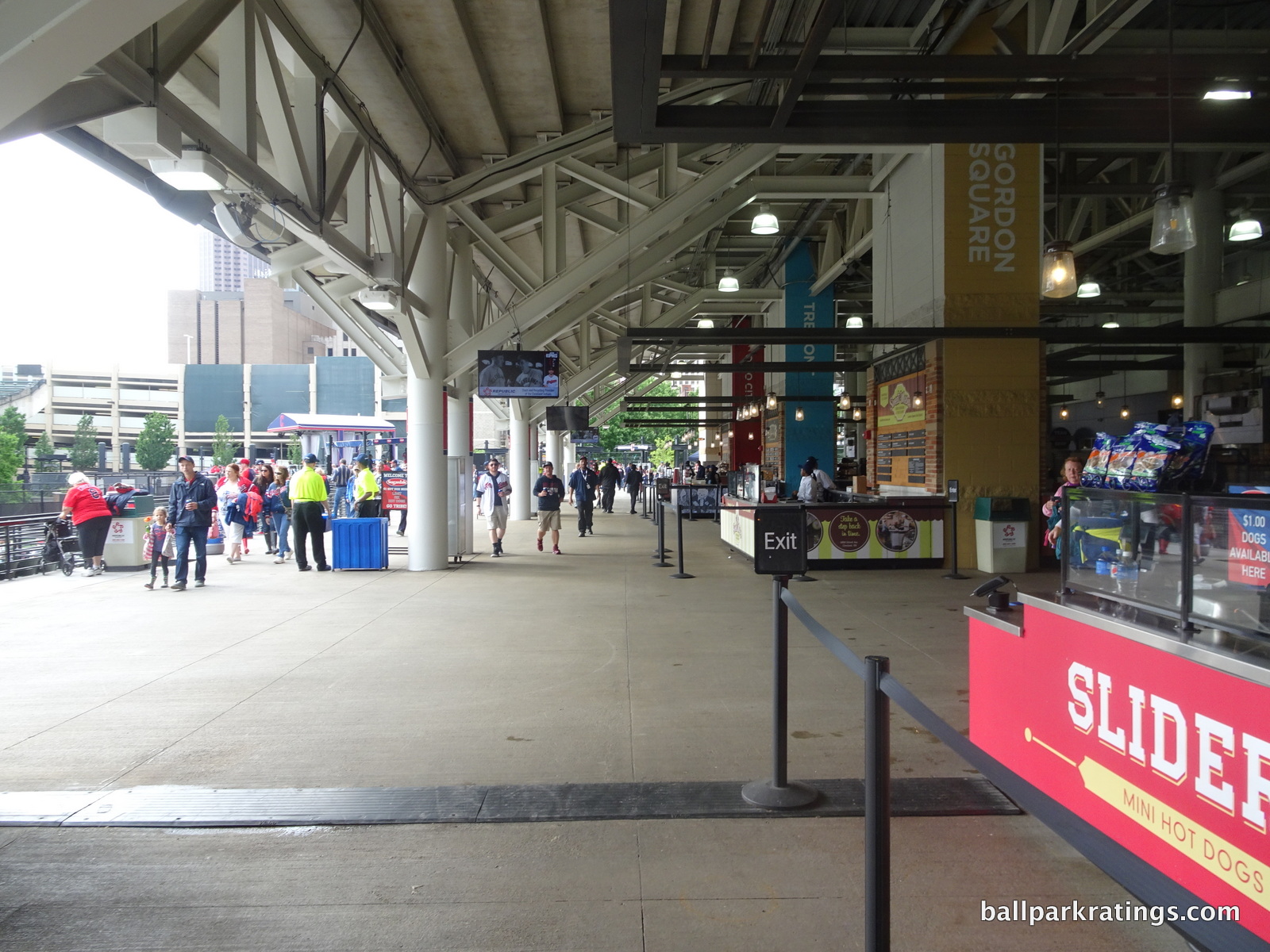
The “Left Field District” isn’t as strong, as the concourse behind the left field bleachers is far too narrow. In addition, the concourse in the left field corner is completely closed, lacking the dual system or open portals described above. There isn’t much going on here.
Finally, the Indians have prioritized offering a bevy of standing-room only areas in the outfield, in what are some of the most fan-friendly spaces in baseball. This warrants a bonus point, as any one category doesn’t quite capture this (it’s something in between concourses and social spaces). In addition to the left field home run porch, which was one of the first standing room only areas in baseball, Cleveland added standing spaces with drink rails in front of the Corner Bar in right field in the seating bowl. They also added these down the left field line. In areas formerly occupied by seats with bad sightlines, these spaces have captured much attention among Indians fans. Ushers cycle fans in and out every couple innings so other fans can enjoy these drink rail spaces.
Overall, we have some improvement in this category. Progressive Field is now much more “walkable,” so to speak. While its concourse functionality doesn’t compete with most of the ballparks that opened this century, this is an obvious upgrade, and compares well to other early to mid 90s peers.
Score: 4/7
Scoreboard System:
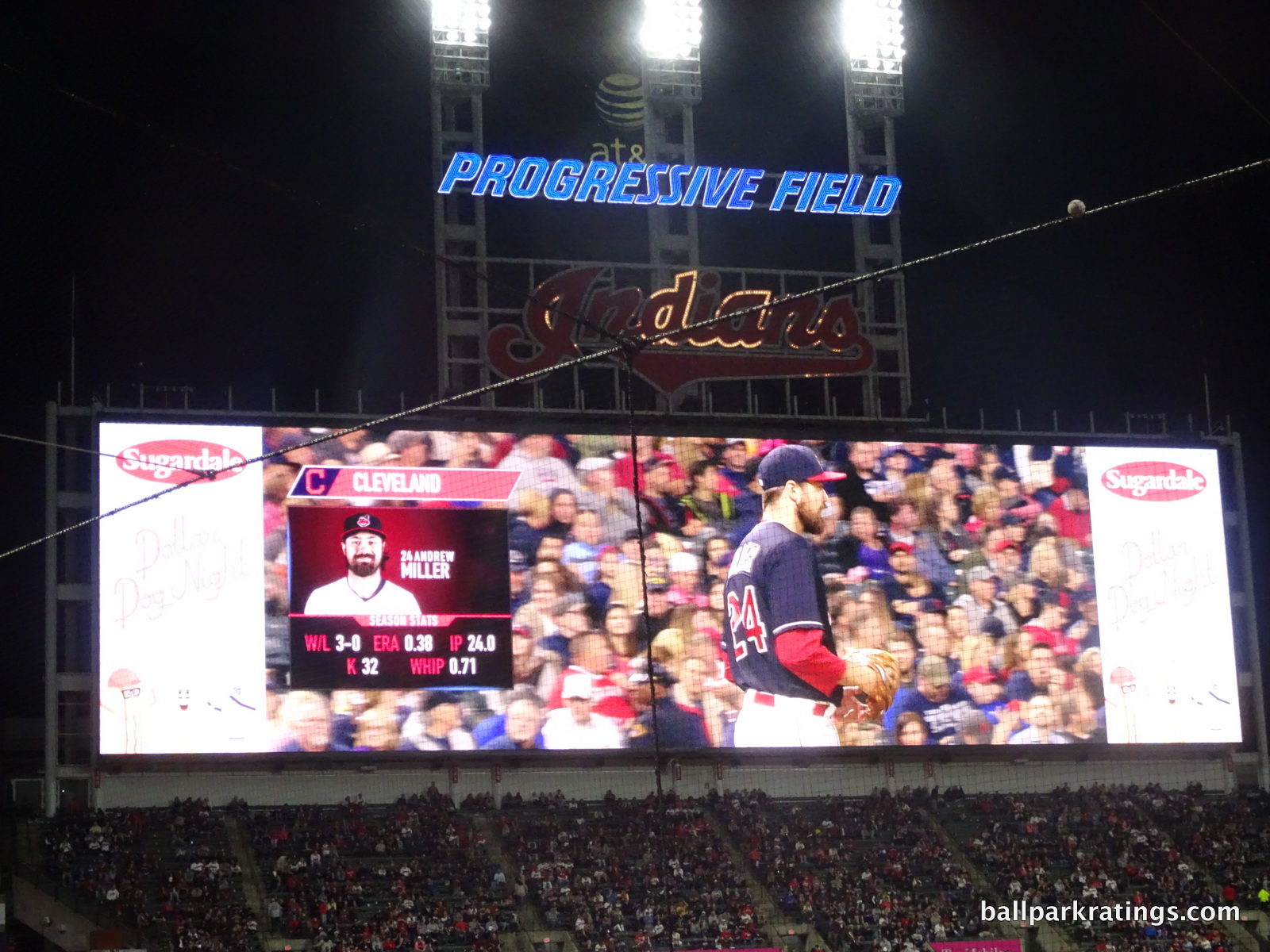
Despite upgrading to the world’s largest videoboard in 2004, Progressive Field’s old videoboard left a lot to be desired because of its cluttered look. Of course, it was also quickly surpassed in size. So the Indians added baseball’s largest videoboard a second time in 2016!
The board measures at 221-feet wide and 59-feet tall, surpassing the scoreboard in Seattle as the biggest in baseball.

When Progressive Field opened, they bragged that Cleveland had the “biggest scoreboard,” but that really doesn’t mean much when you consider it’s all plastic ads. Well now, it’s all screen. Ballparks have been in a videoboard arms-race for the last 15 years, but we may now have reached the peak. There simply isn’t anymore physical space to grow, unless we see some sort of trend of ringed videoboards like in the NFL, but I don’t see how that’s feasible for most ballparks.
So Progressive Field just might not be outdone here this time.
Score: 3/3
Total: 16.5/25
Amenities & Features
Quality and Selection of Concessions:
While Progressive Field has undergone many impactful changes in its amenities detailed below, perhaps none is more dramatic than the revolution in concession quality and variety. In its early day, the Indians offered items like sushi, paninis, and their famous pierogies in the center field market pavilion. But by 2009, Cleveland had significantly scaled back the variety of concessions offered in favor of value oriented options. Characterized by Subway and an unusual number of fried food stations, it was one of the worst places to eat and drink in baseball.
Now we have a ballpark that is quintessentially 2010s, filled with almost exclusively high quality fare provided by local restaurants and eateries, along with a bevy of craft beer. I’m so impressed with how this trend has accelerated during this decade, and Cleveland’s food and drink renaissance is the poster child. While it doesn’t have the variety of somewhere like New York or San Francisco, that’s okay. Do what your market dictates.
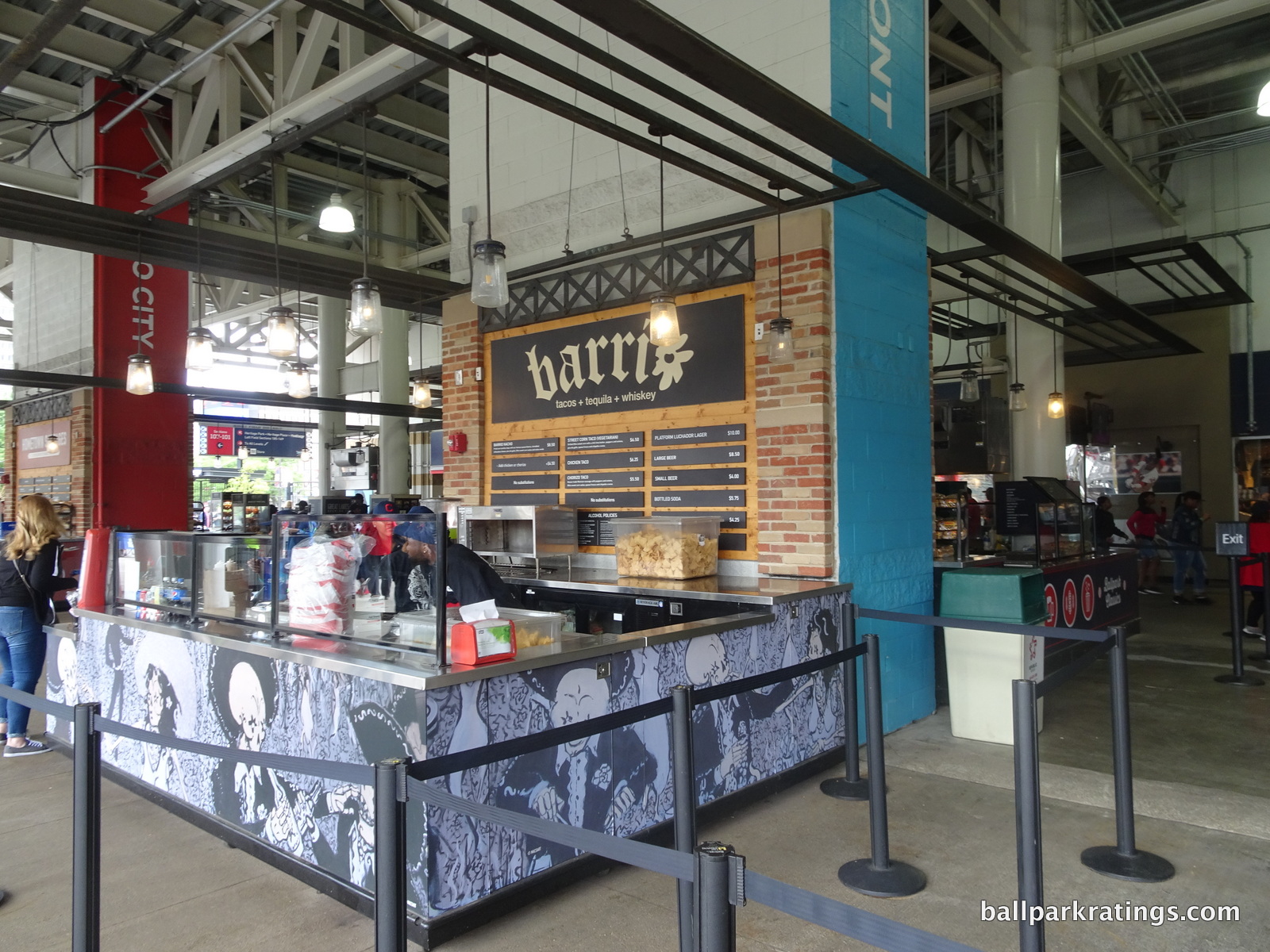
What Progressive Field lacks in breadth, is has in depth, particularly in the local Mexican fare. Barrio is so local you’ll find it downtown outside the ballpark, serving high quality build-your-own-tacos and nachos. Ohio City Burrito brings Mexican flavor with a variety of burritos, burrito bowls, nachos, and house-made guacamole and salsas. The “Silver Bullet” Burrito is the showstopper.
Yet another Mexican eatery is Momocho, also known for it’s house-made guacamoles and salsa. Unique margaritas, quesadillas, slow cooked meats, and cream queso fundido (!) is served. And that’s before even getting to the Mexican served at the regular concession stands. Gone are the days of the processed school bus yellow nacho cheese. I can’t think of another ballpark with such depth in this category, and in Cleveland of all places!
Throwin’ Smoke BBQ serves the obligatory southern cooked meats at the ballpark. Brisket, pulled pork, and pulled chicken sandwiches are available. “The Heater” is probably the signature item, which features your choice of meat topped with habanero sauce, fresh jalapeno peppers, pepper jack cheese, and coleslaw served with chips.
Tired of stale Papa John’s Pizza at the ballpark? Look no further than Progressive Field. Dante’s Inferno is a craft pizza concept featuring Italian inspired handmade pizza, headlined by the spaghetti and meatball pizza.
Progressive Field has a great selection of unique local sandwiches. This is another area with great depth.
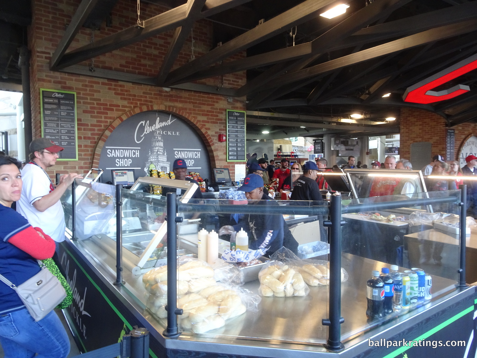
Cleveland Pickle is a local favorite, another one you might see on your walk to the ballpark. Sandwiches feature truly inventive combinations with turkey, bacon, ham, salami, chihuahua cheese, white cheddar, provolone, pickles, tomatoes, garlic, and prosciutto. The “Cardiac Kid” might be the most notable item, consisting of peanut butter, banana, honey, and Nutella! Fat Heads also serves unique sandwiches, highlighted by the “The Southside Slopes,” a grilled kielbasa topped with pierogi, onions, American cheese, and horseradish sauce. It never ends!
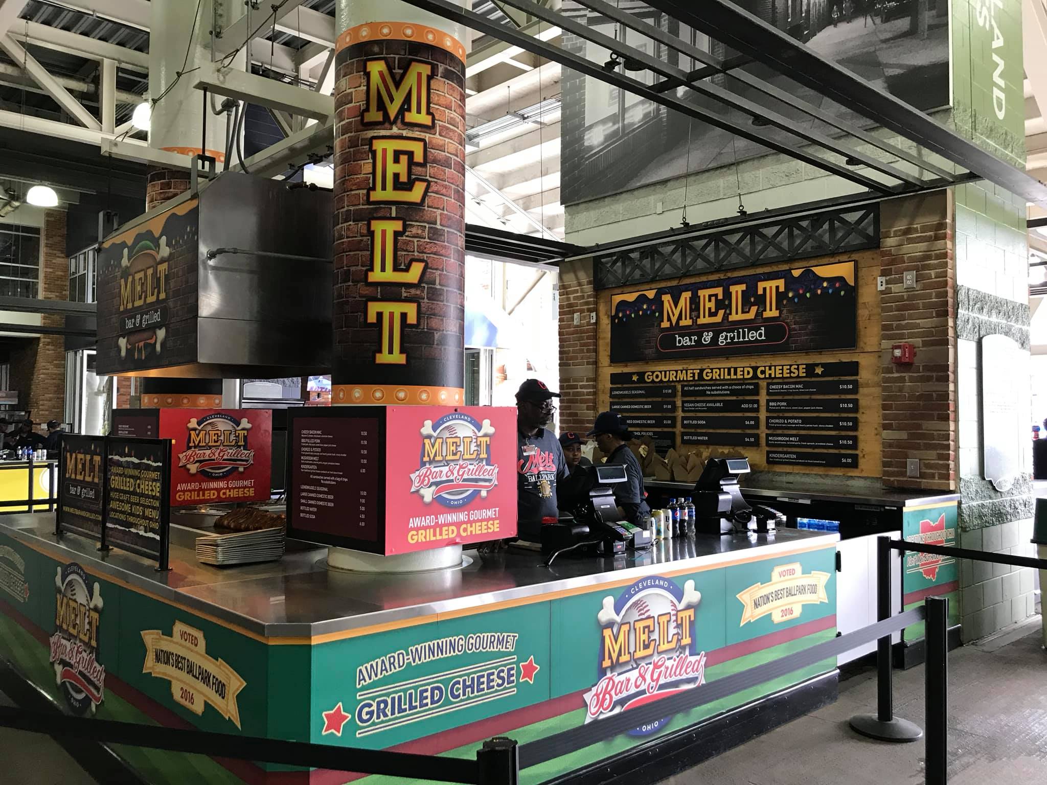
Dynomite Burgers serves a number of scrumptious handmade burgers and milkshakes, with names like “L’Albatros Burger.” Melt might be the best restaurant of all, which I’ll save for the signature food section below. Throughout the 2010s, these categories are getting more blurred because everything’s local!
Cleveland’s also jumped on the craft beer trend sweeping the nation. The Brew Kettle and Great Lakes Brewing Co. serve great local craft beer at the ballpark. Most parks are now constantly accelerating their quality and selection of craft beers, so I’ll strongly note it when a ballpark fails to do so in these revised concession sections. Cleveland is another place that gets an A.
Yes, Progressive Field doesn’t check all the boxes like Safeco Field (Seattle) or AT&T Park (San Francisco), lacking any international cuisine, Asian food, seafood, etc. But perhaps how broad the selection is isn’t as important, as the depth of the sandwiches, burgers, and Mexican foods is so impressive.
Score: 4.5/5
Regional/Signature Concession(s):
“Bertman’s Original Ballpark Mustard” has always given Cleveland sports venues a local flare, but it’s overshadowed by all the local food at Progressive Field.
I counted a dozen different local restaurants from local neighborhoods, which is frankly outstanding. It should be noted that these restaurants are only found in the Right Field District and the Infield District, as the Left Field District is kind of dead. But the latter “district” isn’t that large anyway.
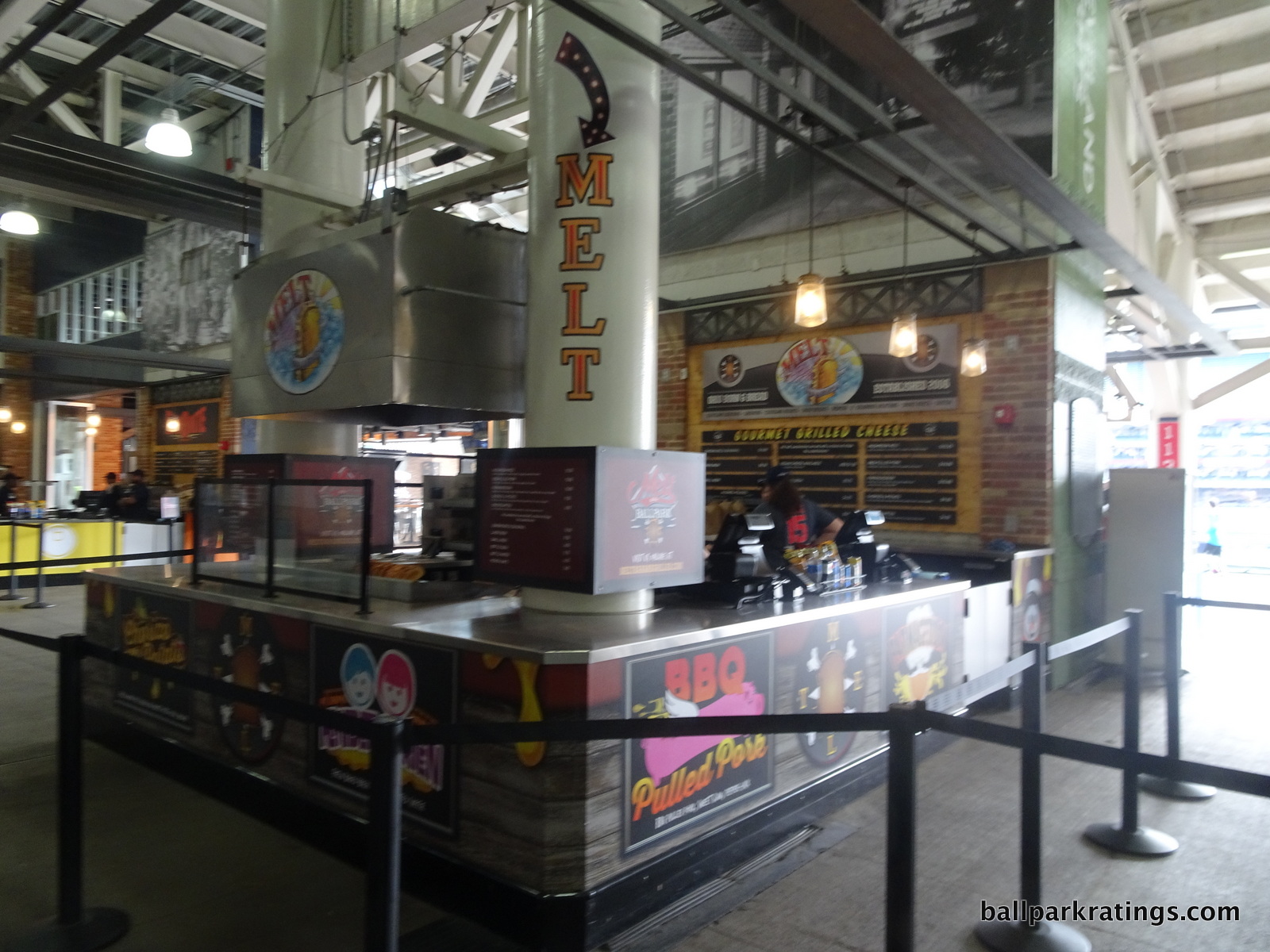
One eatery I didn’t discuss above is Happy Dog, which started as a neighborhood corner bar. All kind of varieties of hot dogs are served here. The one that has probably gained the most notoriety is the “Slider Dog,” topped with fruit loops, pimento mac and cheese, and ketchup.
But let’s save the best for last. If you asked most Indians fans, I think Melt would be on the top of their list. The restaurant serves both varied and classic grilled cheese sandwiches, including the chorizo and potato melt, the mushroom melt, the BBQ pulled pork melt (which I had, fantastic), the parmageddon melt, and the kindergarden melt, which is just your standard grilled cheese.
Score: 2/2
Accessible Restaurants/Bars/Sitting Areas/Social Areas:
Before the renovations, the Indians didn’t do a very good job in providing the average fan many places to grab a bite or sit down. With the Terrace Club a members-only restaurant, fans were left eating hot dogs and cracker jacks in their seats. The best the Indians had was a makeshift bar in center field surrounded by a picnic area.
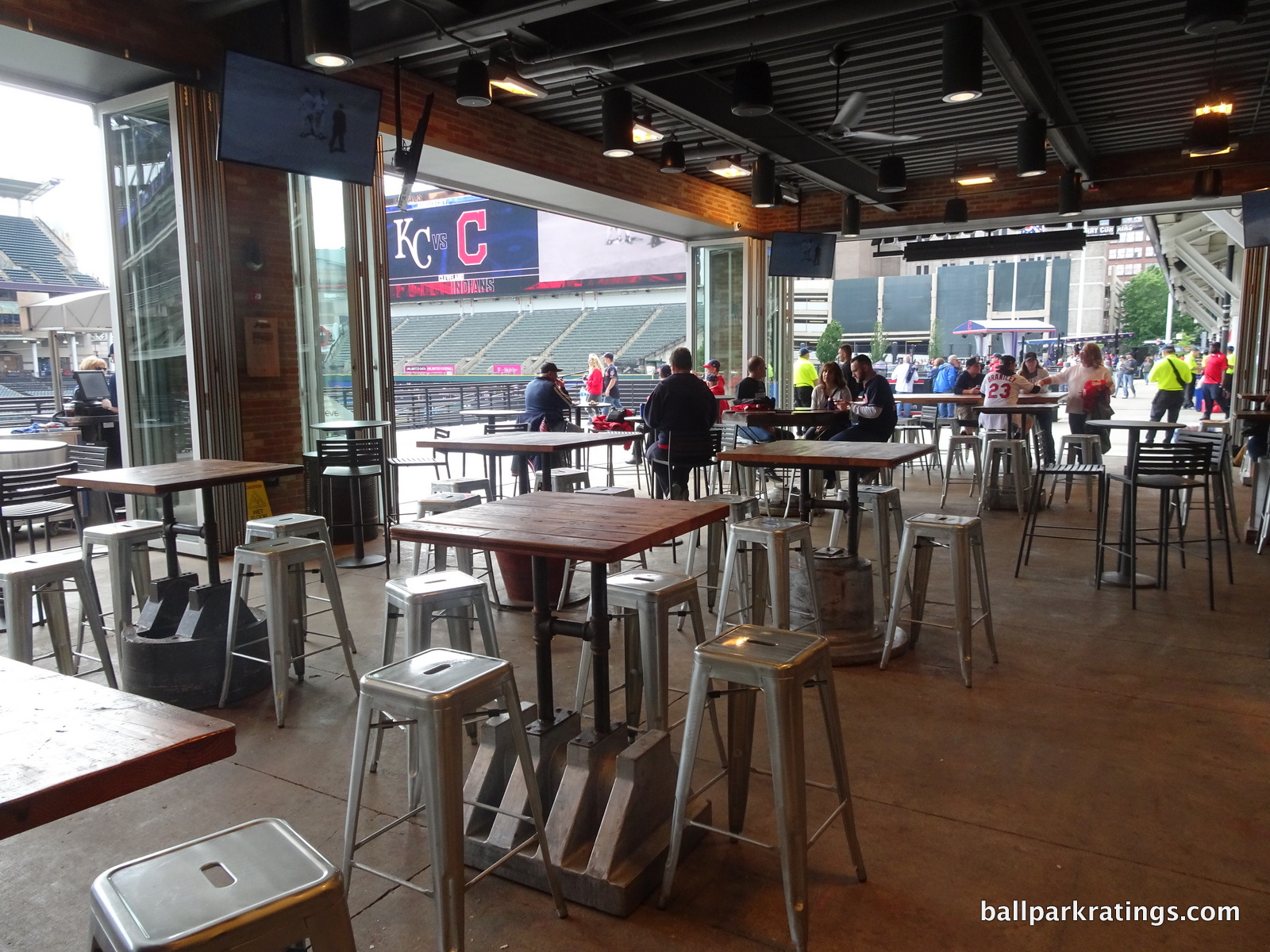
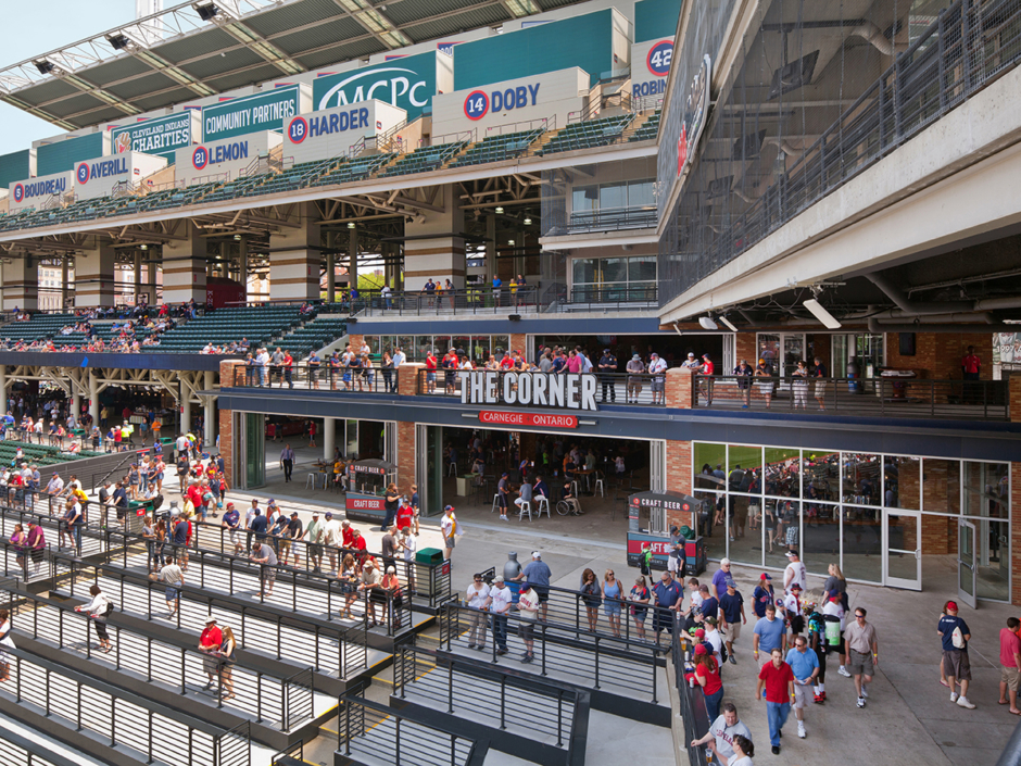
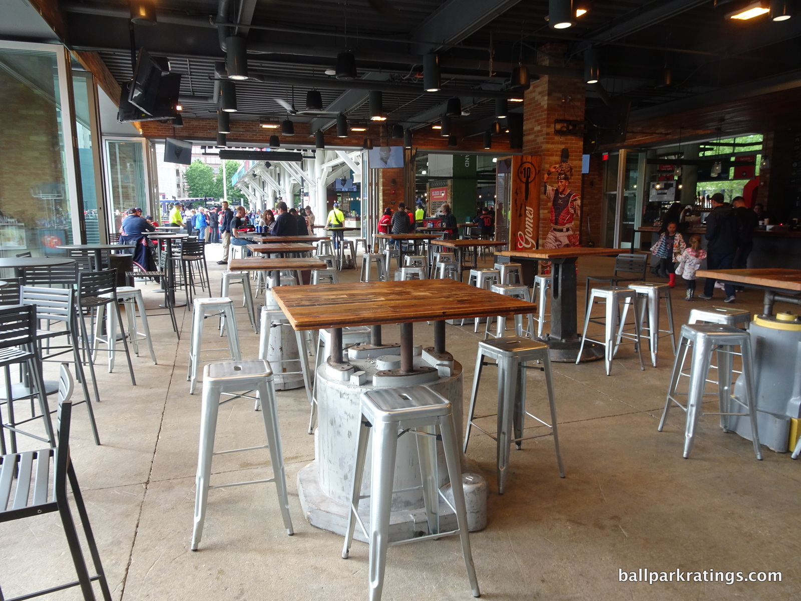
While it doesn’t reach the level of the rooftop at Coors Field, the Indians first course of action was to add a legitimate social space to Progressive Field: The Corner Bar in the Right Field District. Featuring waves of energy before and during the game, this bi-level bar features tabled seating, lounge areas, and multiple bars. The second floor features an open-air fire pit with couches, while the lower floor can be climate controlled with retractable walls. With nearly 40 beers on tap, this is the place to be. A beer wall on the second floor allows you to pour your own beer!
On the second floor, you’ll note the signage indicating parts of Cleveland were used to construct the bars. Wood and steel were reclaimed from a local bridge. Also note the larger bar signage indicating “Carnegie and Ontario,” a clear effort to make this a “neighborhood” bar. Standing room only tickets are available here, and your first drink is included!
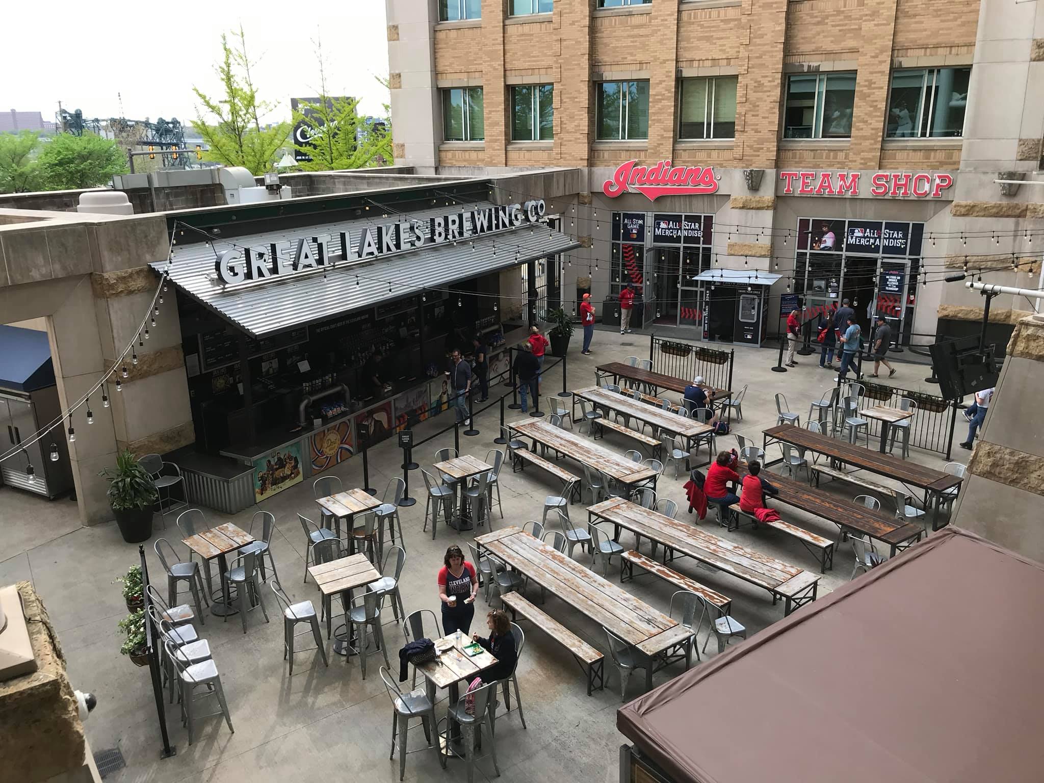
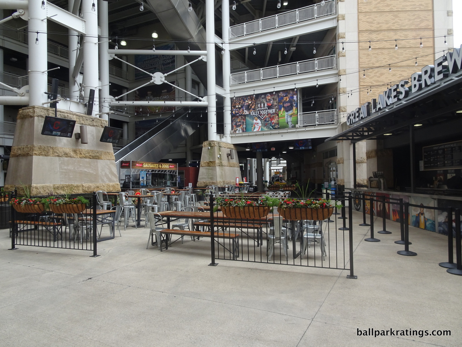
Progressive Field also features some bars and casual sitting areas throughout the Infield District. Behind the right field concourse, there are tables and chairs with cornhole games. Behind home plate toward the third base side, the Great Lake Brewing Co. beer garden features picnic tables with 8-10 beers on tap.
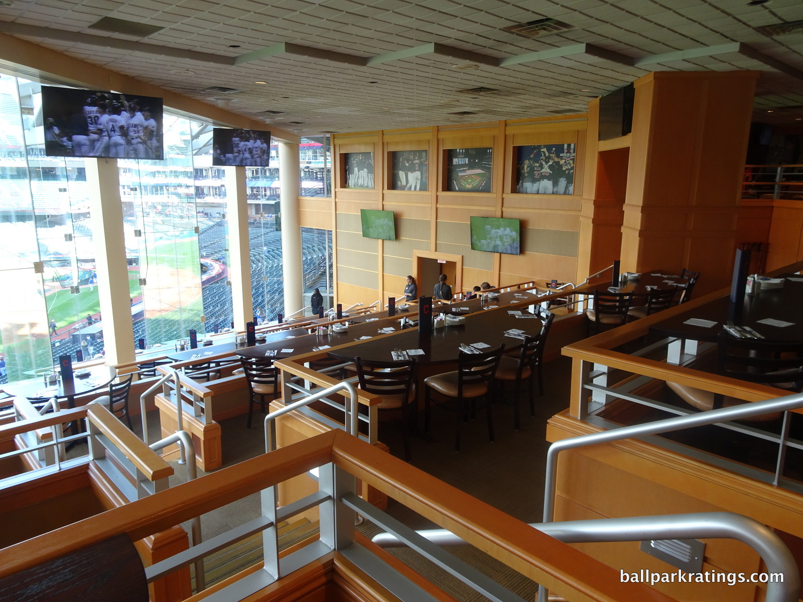
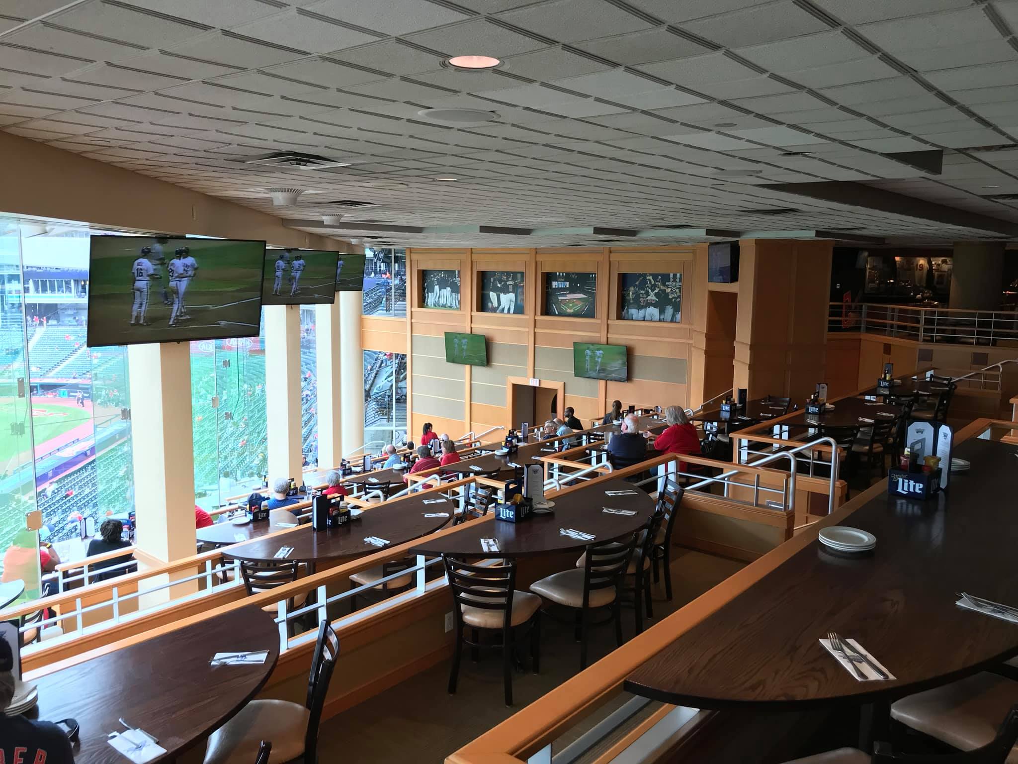
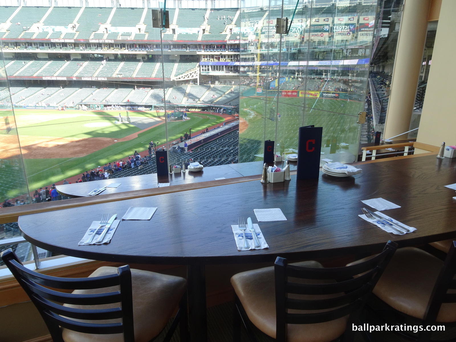
Finally, the Indians have wisely opened the Terrace Club to all fans. It is a former “Stadium Club” restaurant, so it’s rather formal. In my opinion, it is one of the most expansive and upscale ballpark restaurants in the majors. But its design steals the show. Many glassed-in ballpark restaurants feature tiered seating, but the tables in the Terrace Club are also angled toward the field down the line (unlike the actual seating below, ironically). It’s not only visually attractive, but functionally the best restaurant in baseball. If you include the upstairs bar (although that is now often a group area), it’s one of the largest ballpark restaurants in baseball as well. The menu is perfectly respectable, despite not rivaling the high end buffet restaurants at some other parks. Reservations are recommended on Opentable to guarantee a field view.
While Progressive Field doesn’t have a bar or formal sit down area in the upper deck, there are an unusual amount of picnic tables throughout the concourse. Overall, the renovations in this department were satisfactory.
Score: 4.5/5
Premium Seating/Clubs:
Showcasing perhaps the most polarizing look in baseball, the three tiers of luxury suites at Progressive Field dominate the seating structure, as widely publicized. The ballpark formerly known as Jacobs Field certainly gets points off for not designing its luxurious amenities in a tasteful manner, instead sharply dividing the ballpark along hierarchical lines. Most importantly, their original premium seating model of suites isn’t viable today.
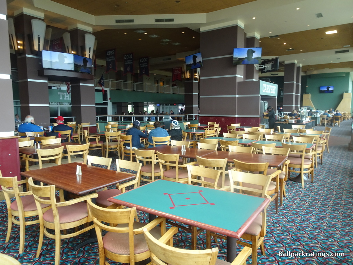
In the early days, the average fan was confined to the upper deck or outfield seating. You either shell out for the lower box season tickets or sit with the proletariat. Luxury suites and club seating were not accessible to anyone. Of course that’s changed somewhat today with a transparent secondary market, facilitated by the Internet, and a lack of demand. Progressive is still more physically divided than newer, revenue milking modern ballparks, such as Yankee Stadium. That being said, it was all necessary to secure the ballpark in the first place.
What’s ironic is that the premium seating structure is poorly conducive to the corporate tastes of today. It’s really a shame, because most of all, this may make Progressive Field less timeless than others of the era. The Indians have begun undertaking “massive amounts of research“ to determine how to remodel their premium product mix, as luxury boxes no longer satisfy the corporate appetite.
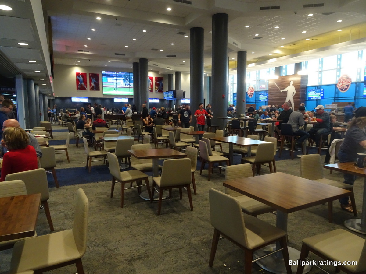
There is a new trend toward multiple sections of club seats, not luxury suites. Note that Progressive Field had more than twice as many luxury suites (originally 124) as new Yankee Stadium (56). This has continued to accelerate throughout the 2010s, with the opulent SunTrust Park only having 32.
In 2010, we sat in the all-inclusive club section on the mezzanine level by first base, which was nice enough and extremely close to the action. However, the general design highlights how seating designs have changed in the last 15 years. Despite having the potential for field views, the club did not stress an open view of the field, as a small walkway spans the top of the bowl in front of the club. There were no tables against the glass for viewing the field, because it isn’t very visible. The club also lacked the historical memorabilia and other charms of most other ballpark club levels. It could have been an American Airlines’ Admirals club in an airport.
Cleveland addressed the aging club level through a top-to-bottom renovation in 2019. Branded as the Discount Drug Mart Club, the new lounge is positively sublime, in what has to be one of the better mezzanine club spaces in baseball. The light and airy space is a breath of fresh air.
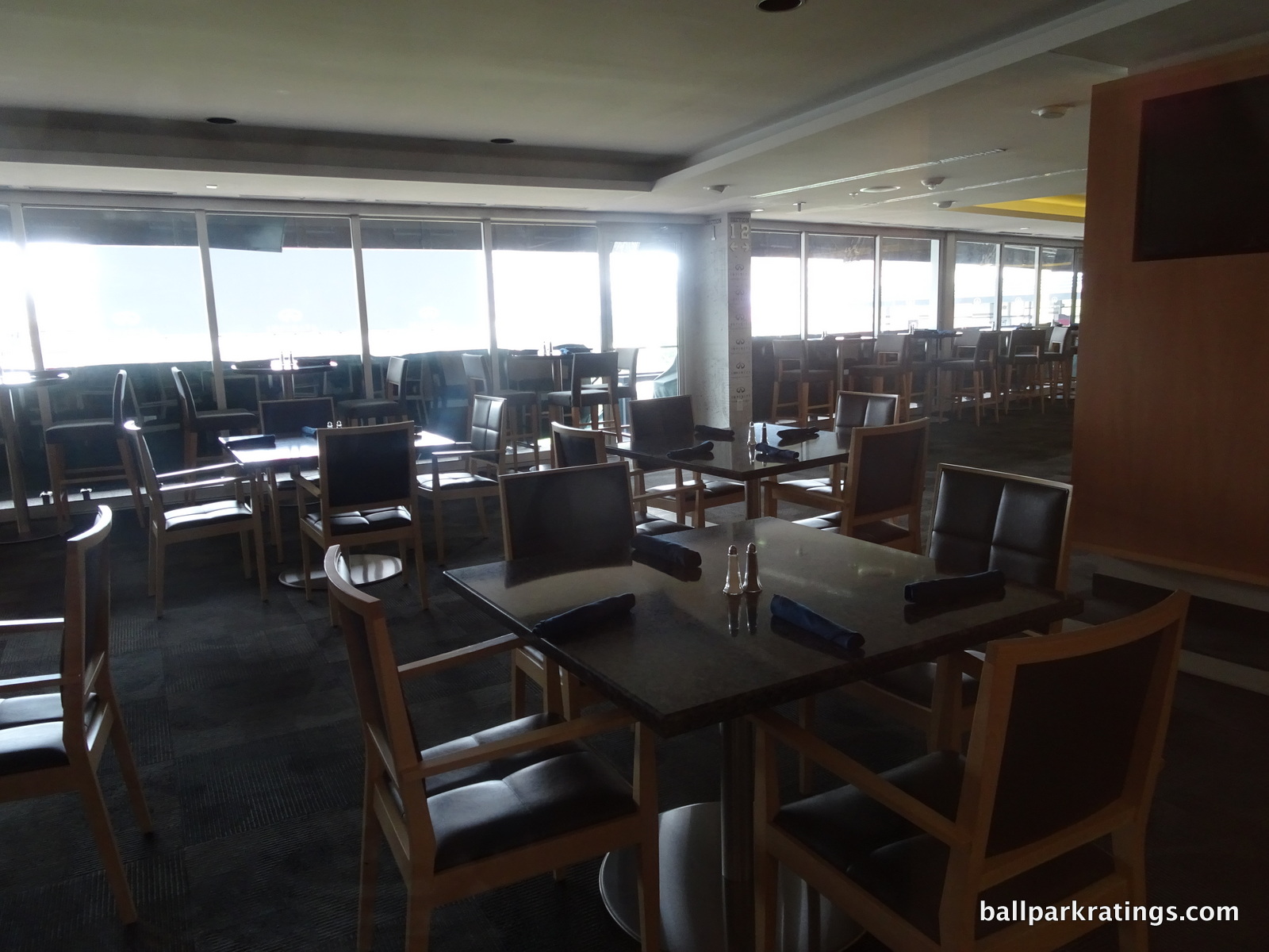
As I eventually expected, the Indians took a step in altering their ridiculous glut of unmarketable luxury suites in 2013. Cultivating their long held desire to put their tiers of luxury suites to better use, they constructed a premium club on the second deck above the club level on the first base side. The 5000-square-foot Infiniti Club features high-back leather chairs, all-inclusive food, beer, and wine, and most importantly, a climate controlled lounge that provides views of the playing field. As I alluded to above, the current club level doesn’t feature views of the playing field. This will knock out 10 more luxury suites. It’s a true ultra-premium space too, serving a rotating menu with foods like panzanella salad, chicken saltimbocca, crusted salmon, and pad thai.
With the addition of this club, the fan cave, the Kids Clubhouse, other amenities, and even a teen suite, the exorbitant number of 120 luxury suites has been significantly reduced over the years.
Finally in 2016, the Indians constructed a “Home Plate Club” on the main concourse, but don’t think of anything like the Legends Suite at Yankee Stadium or the Diamond Clubs across the majors. It’s not luxurious; it’s more of a bar and casual lounge area for premium ticket holders to enjoy before, during, and after the game. The food offered is just regular ballpark food, to the point where ushers advise you to go to a local eatery outside the club. This is something Cleveland is going to work on in the coming years; you never want a premium space where the food is so obviously better outside. The club also lacks bathrooms, as you have to use the ones on the main concourse.
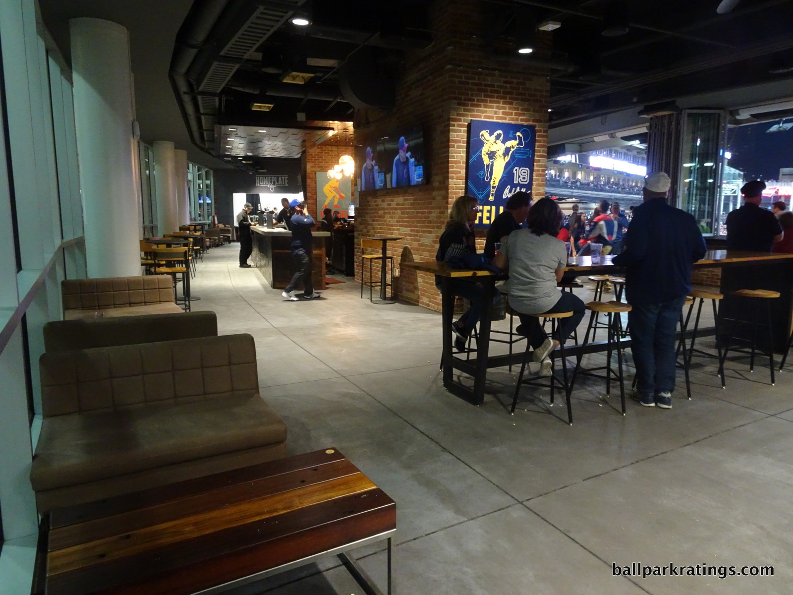
The big selling point of this place is the climate controlled atmosphere and the great view of the field. The club is located at the top of the aisle behind sections 152-156, and the ushers do a great job of keeping that aisle clear, so many people choose to watch the game in here. There is no direct seating access from the club, as the entrances and exits are on the side. Another perk is access to private drink rail seating on top of sections 152-156 outside the club. Many fans seem to not know they have access to this, as it’s a great option for eating instead of going back to your seat only a few rows below.
At the risk of being too exhaustive here, access is a bit interesting for the Home Plate Club. All Diamond Box and Field Box Front season ticket holders can get in here, which doesn’t work for a lot of people in theory. Not to worry though; almost all of these are sold as season tickets in the first place, so if you are buying these on the secondary market or if someone is giving them to you, you probably have access. But it’s always wise to check the comments and disclosures on Stubhub too if you’re looking for Home Plate Club access. Finally, if your ticket doesn’t say “Home Plate Club access” don’t be alarmed (as I was). Ushers will simply scan your ticket a second time and give you a wrist band regardless.
Anyway, Progressive Field is taking baby steps in this category, which is actually more than Camden Yards or Globe Life Park can say. I think the Indians would be smart to build an ultra-exclusive bunker club in place of the dugout suites, like the Dodgers did (see before and after).
Another remnant of the suite heavy era, these dugout suites are located too far below the playing surface to afford views justifying the cost. There’s a reason only one other team built these dugout suites (Angels in 1998), while all others built exclusive dugout clubs.
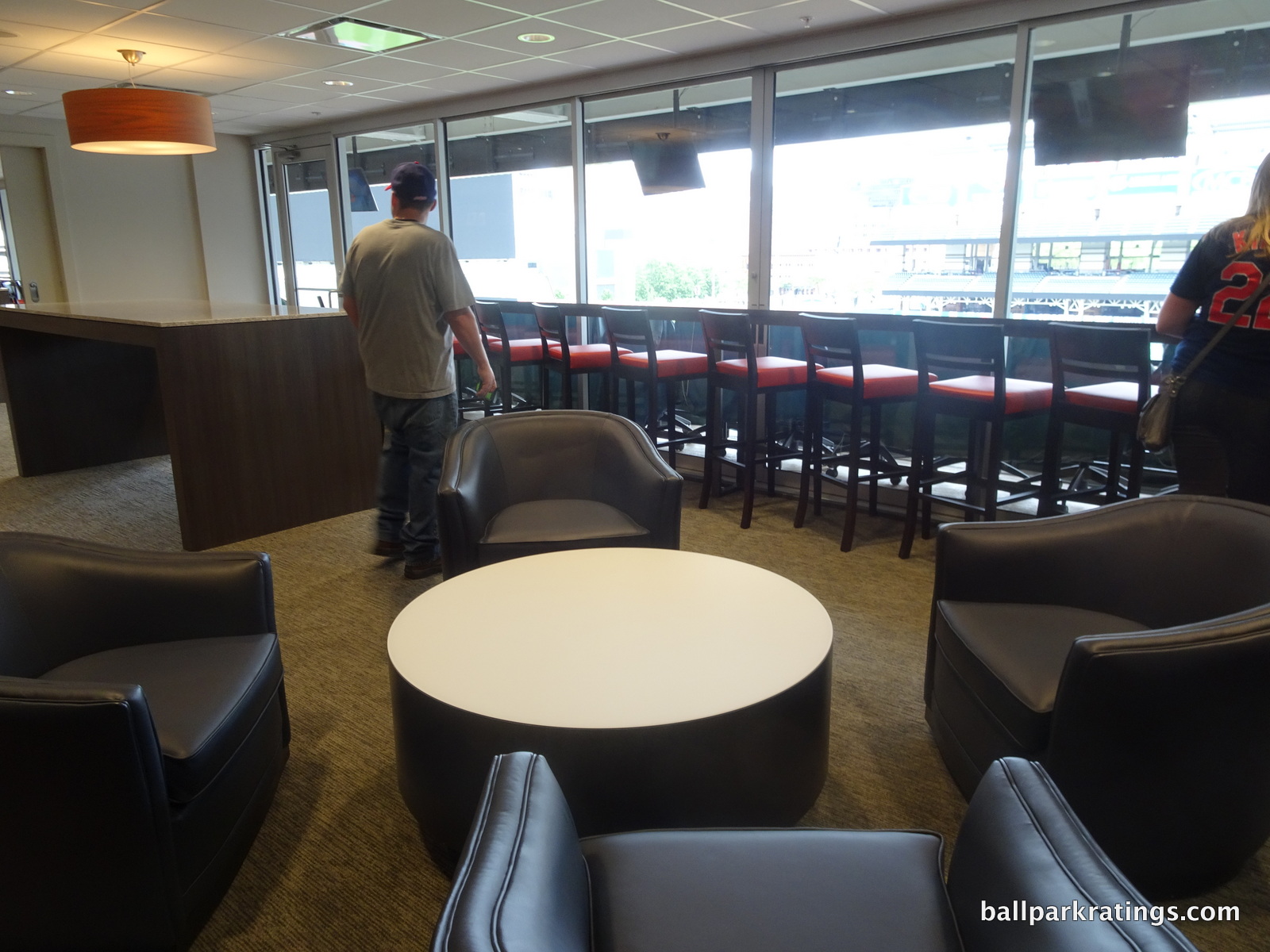
Score: 3.5/5
General or Artistic References to Baseball or Team History/Museums:
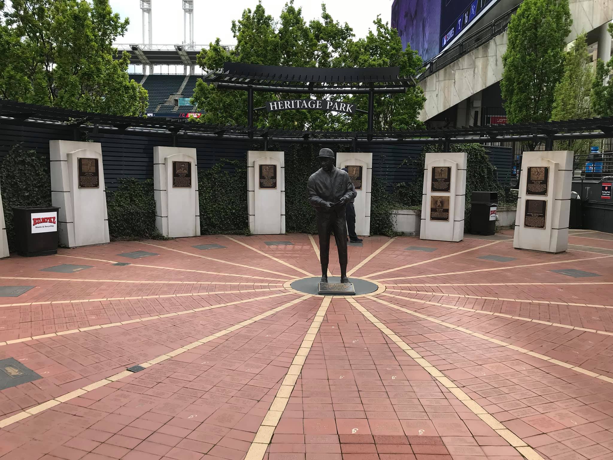
With the addition of Heritage Park in 2007, the Indians do a very good job of honoring team history.
The multi-tiered plaque area in center field has an intimate set up and is easily visible to all fans, separating it from some other team museums across baseball that may have obscure locations. The top level celebrates Indians who are inducted into Cooperstown with monuments reminiscent of Yankee Stadium’s Monument Park, while the bottom level features plaques and smaller monuments of team greats. In 2017, Cleveland added a statue of Frank Robinson to anchor the top level of Heritage Park.
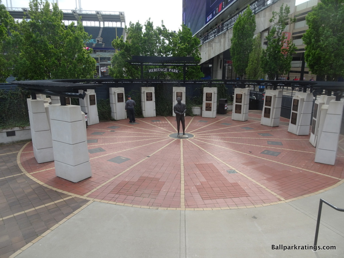
The renovations in the mid-2010s improved Progressive Field’s references to team history through additions outside the center field entrance. New statues of Larry Doby and Jim Thome were added to a scene formerly just featuring Bob Feller. The entry plaza is littered with tasteful retired number plaques, championship monuments, and other references to the greatest moments in Indians history.
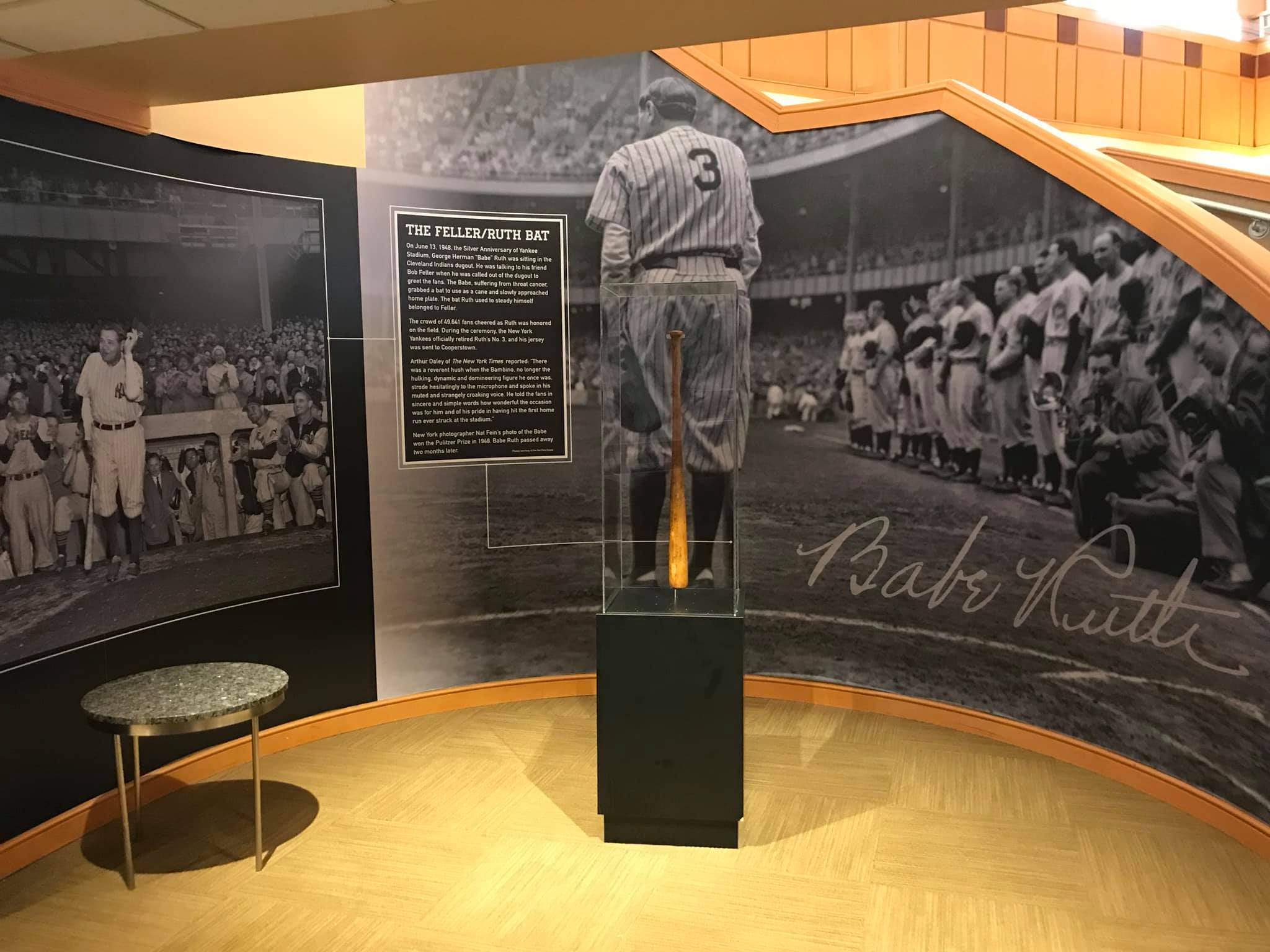
Finally, the Indians have done a better job of incorporating historical references on the concourses and club areas than in the past. The Terrace Club features a Bob Feller exhibit, the Home Plate Club bar has subtle references to team greats, and the main concourse displays historical posters.
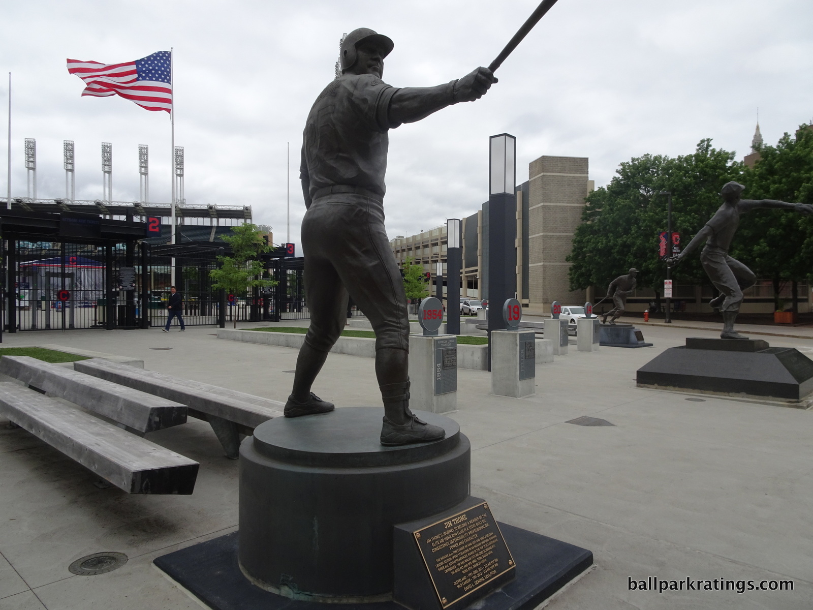
Score: 4.5/5
Entertainment/Kids Activities/Other Amenities:
As with most of the early retro ballparks, the kids oriented activities were originally not too extensive. The ever so creative “KidsLand” was a small, hard to find, play area in right field. In 2012, Progressive Field opened the Indians Kids Clubhouse, which is nothing short of the most extensive, fun filled kids oriented area in the majors. It occupies an area formerly used by 7 unmarketable luxury suites. The area appeals to families with kids of all ages and is loaded with interactive features. First of all, they have something called the Rookie Suite (a bit of a misnomer; you never think of a suite as open to all), which is designed for kids 6 and under. Over 4,000 square feet of indoor play area provides children plenty of space to romp around, including an playground, an arts & crafts center, a climbing wall, and an area to interact with the mascot, Slider.
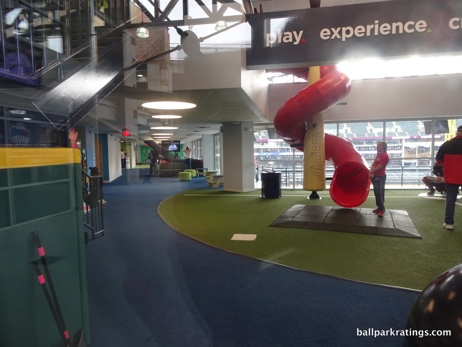
Secondly, the Kids Clubhouse features a more traditional baseball-oriented entertainment area called Slugger’s Sandlot, geared towards kids aged 7 and up. Activities include an outdoor playground featuring a wiffle ball field, a batting cage, speed pitch, and a video game area. The works. Many ballparks have either one or the other: an area for little kids (i.e. a playground) or an area for big kids (i.e. a wiffle ball field or video games). We have both here. Cleveland is now perhaps only second to Kansas City in family-oriented activities.
Finally, Progressive Field has entertainment for adults too. Pre-game “block parties” in the Right Field District feature live bands. There is also foosball in the Corner Bar and cornhole in right field.
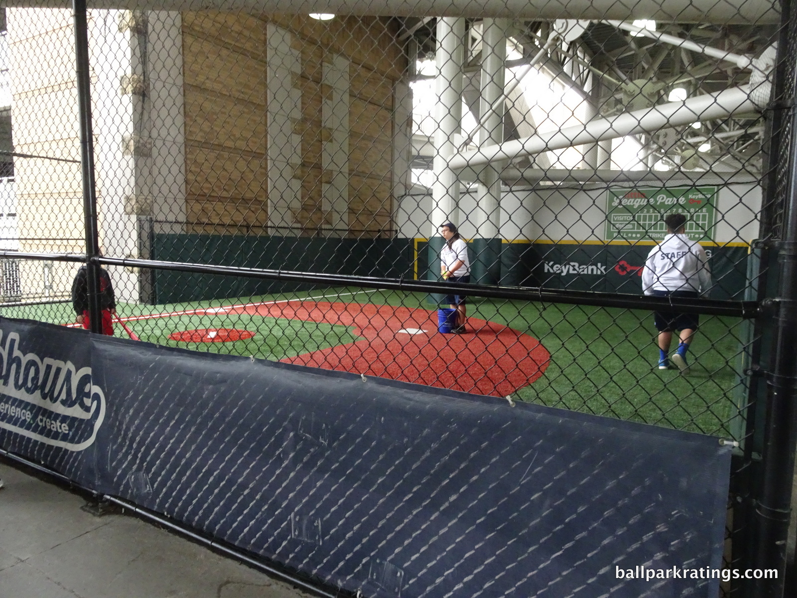
My position on these kid gaming areas is well documented: these types of amenities are necessary for any viable 21st century ballpark, because of the leisurely nature of baseball coupled with the familial affinity for an outing at the ballpark compared to other sports. This is an especially important addition for the Indians due to their attendance issues. Kids areas only become problematic when the kids activities encroach on the baseball experience for the average fan (I’m looking at you Miller Park, with your pinball machines/claw crain games at every corner of the concourses and kids playgrounds in the middle of both the main and upper deck concourse). It must remain tasteful, and if these features are integrated into the normal ballpark experience, they must double as something that attempts to provide some aesthetic value (see AT&T Park’s coke bottle slide). The latter is rare, so most ballparks due a decent job of isolating these playground areas, and Cleveland’s is completely out of sight in the right field mezzanine.
Like most ballparks, it’s all free too, unlike the Rangers’ new playground, which I was hoping wouldn’t be a new trend. Two thumbs up to the Cleveland organization for this addition.
Score: 3/3
Total: 22/25
Atmosphere, Vibe, & Policies
Atmosphere/Fan Support:
Throughout the majority of its livelihood, the atmosphere is what made “the Jake” a premier ballpark.
With 455 consecutive sellouts since its opening, Cleveland fans were considered among the best in baseball. As many have acknowledged, the ballpark formerly known as Jacobs Field was an event, more so than any other ballpark in the majors. The festivities and the raucous atmosphere in and around “the Jake” gave it a distinctive feel.
Cleveland is working hard to rewrite that legacy. It took them only 10 years to go from first to the cellar in American League attendance numbers, culminating in a measly 17,000 in 2010. And the drop was not necessarily correlated with poor team performance: the near 2007 America League champions only drew 28,000. Like in many cities, the thirst for baseball has waned since the novelty of the new ballpark wore off. But the drop off in Cleveland was particularly horrendous. Even in 2013 as they were leading their division, they were near the bottom in all of baseball.
Now, we’re in 2017, and fresh off a World Series appearance, the Indians are still in the cellar at 22,000, coming off 19,650 during 2016. I don’t get this. Is Cleveland that much worse off than other small to mid-market midwestern cities? Do the fans regard the Dolans that poorly? I know baseball fan bases react slowly to team rebounds, but Cleveland has been good for a while, and even if you won’t concede that (you should), we should’ve seen a bounce by now from the World Series appearance. Kansas City did. Detroit did. Both very quickly. Even Cincinnati and Pittsburgh did, and their success was short lived without a World Series appearance. What’s Cleveland’s excuse? Why is Cleveland so special? Contrary to popular belief, I think the attendance numbers are starker than ever: 20,000-25,000 with a great team is far scarier than 15,000-20,000 with a bad team. I’ve heard some excuses about northeastern Ohio’s geography and the proliferation of minor league teams in the area as well. I’m not really buying any of this. I don’t see a reasonable explanation here.
Score: 2.5/5
Ballpark Policies/Customer Service:
I had heard somewhere that the ushers were lacking, but I found everyone at Progressive Field to be great. It’s very easy to move around the ballpark and the ushers are not too vigilant about tickets. And that’s all you can really ask for. From the club level, I easily snuck around the Terrace Club to take some pictures and no one bothered me, and this is when it was a membership-only area (in 2010). At the same time, I was impressed with how vigilant the ushers were in controlling the aisles in front of the Home Plate Club in order to preserve views of the field.
Score: 2/2
Bonus:
For building a ballpark that distinctly reflects the region’s local roots and for not being a retro clone, during a time when it was so easy to be one +2
For having one of the most authentic and attractive, yet understated, interior designs in the majors, not accentuated by one distinctive feature, but based on perfect visual balance and perfect connection to its context +1
For the great renovations to the concourses, enlivening them with the “district” concept filled with distinct bars and concessions +1
For the unique drink rail standing-room only areas, one of the most fan friendly features in any ballpark +1
For some of the the best local concessions in baseball and the best improvement in food I’ve ever seen at a ballpark, adding to the already fantastic and well oriented Terrace Club restaurant +1
For having some of the best and most tasteful kid entertainment areas in baseball, perhaps second only to the over the top Kauffman Stadium in Kansas City (with putt-putt golf and the like), but it is executed even better here +1
Score: 7
Total: 11.5
Conclusion
In case you haven’t noticed, I really like Progressive Field, subjectively (i.e in Architecture and Aesthetics). I would kindly like to point out not all subjectivity is created equal, as my subjective interpretation of Progressive Field’s architecture and aesthetics has been extremely well thought out. It does mean something to apply an objective methodology to something subjective, versus just liking or disliking something subjective on a whim. Nevertheless, I do think most agree with the fundamentals of what I am saying, though they probably wouldn’t give it such a high interior design score.
But now, Progressive Field has many things going for it objectively.
While the Indians were late to the party in enhancements compared to Globe Life Park in Arlington and Camden Yards, these renovations were more extensive than the enhancements at the other two ballparks. In fact, Camden Yards will probably look here during any second round of renovations. The Indians revamped the concessions, added new restaurants/bars/social areas, added new premium spaces, added terrific and tasteful kids areas, and improved the concourses both functionally and aesthetically. And the setting is objectively one of the better ones in baseball. Only underlying flaws from the early retro era, like the poor sightlines, prevent Progressive Field from being one of the best parks in baseball overall.
It’s a park that generally hasn’t gotten much praise in the 21st century. This shouldn’t be the case. Baseball fans have finally caught up with some other severely underrated parks in the last 10 years, particularly Comerica Park, so perhaps it’s time to formally deem Progressive Field the most underrated ballpark in baseball.
FINAL SCORE: 85.5
RANKING: #14/30
Summary
TL;DR? Here’s the long-form piece in a nutshell:
While the artist formerly known as Jacobs Field received rave reviews in the 1990s, it doesn’t get a lot of love from baseball writers and ballpark enthusiasts today, making it one of the more underrated ballparks in my book.
Opening on the heels of Camden Yards, Progressive Field’s architects understood that the Camden philosophy was about constructing something contextual that connected to the city, not red bricks or silly old-fashioned gimmicks. Progressive Field nails that, in what is a symbolic representation of Cleveland.
The exterior architecture utilizes limestone and white steel evoking Cleveland’s industrial sensibility. Progressive Field’s authentic urban interior aesthetics are lovely, eschewing any semblance of gimmickry and adroitly responding to the contextual forces of the city. Those toothbrush light towers represent the town’s smokestacks.
Much needed enhancements in the 2010s greatly improved the fan experience. Dividing the main concourse into “districts,” Cleveland’s park now has a) baseball’s largest videoboard, b) some of baseball’s best local food and craft beer, c) the outstanding right field Corner Bar, d) new clubs and renovated lounges, and e) one of baseball’s largest children’s areas, among other things.
Progressive Field doesn’t have many flaws, but its few flaws are pretty significant. Seating geometry down the lines is poor, three tiers of luxury suites isolate the upper deck, and the mezzanine is for all-inclusive premium club seats only. The combination of these three factors means there aren’t that many good seats for the average fan! In addition, the hideous, temporary-looking white boxes in right field resembling shipping containers mar an otherwise pristine interior.
But overall, underrated aesthetics and some of baseball’s best amenities put Progressive Field close to the top 10. The new round of extensive 2024-2025 renovations should solidify Cleveland’s park as state of the art.
Defining Features
Design Elements that Symbolically Represent Cleveland
Biggest Hit
Local Food
Biggest Miss
Three Tiers of Luxury Suites
Other Hits
Authentic Interior Aesthetics Eschew Gimmicks and Respond To The Cityscape By Conscious Dexterity
Exterior Architecture Reflects Cleveland's Industrial Ethos
Uses of Trees and Shrubbery for Batter's Eye
Toothbrush Light Towers
"District" Concept Throughout the Main Concourse
Centerfield Plaza With Statues
Heritage Park
Largest Videoboard in Baseball
Top-10 Ballpark For Craft Beer
The Corner Bar
Fan-Friendly Standing-Room Only Drink Rails
Bob Feller Exhibit With Babe Ruth Bat In Accessible Terrace Club Restaurant
Renovated Mezzanine Club Lounge is Sublime
Kids Clubhouse
Local Scene In Gateway District and Downtown
Other Misses
Unattractive, Temporary-Looking White Boxes in Right Field Upper Deck Resembling Shipping Containers
Old, Worn Seats Date Back to 1994
Progressive’s early to mid 90s contemporaries replaced their original seats long ago. Progressive has not. Many are in poor condition.
Poor Seating Geometry
Upper Deck Seats Lack Cupholders
Terrible Attendance
For Of It's Strengths, Progressive Field Lacks A "Wow Factor"
Best of
Best Neighborhood Restaurant/Bar: The Butcher and the Brewer
Best Seats: Diamond Box “Front Row”
Favorite Seats: Mezzanine Club Seats, all on first base side
This is a tough one. On one hand, these club seats are inclusive of food. I sometimes go for premium all inclusive, but I don’t think it’s the right call in Cleveland, considering it encourages you to bypass the delegable regular concessions here. You shouldn’t miss the regular food. Also, it’s just all-inclusive food, not alcohol, and I never like how that incentivizes my guests to try to “eat their ticket price,” whereas totally all-inclusive balances things out, if that makes sense. On the other hand, I like to sit slightly elevated. With the upper deck being rather high here and backed by an aging frills-free concourse, that’s out. So, these club seats are where I’d want to be for actually watching the game. And that’s what counts! Plus, (1) these seats’ positioning on the first base side provides for a great view of downtown and baseball’s largest videoboard, and (2) the new lounge itself is sweet and has a great selection of craft beer.