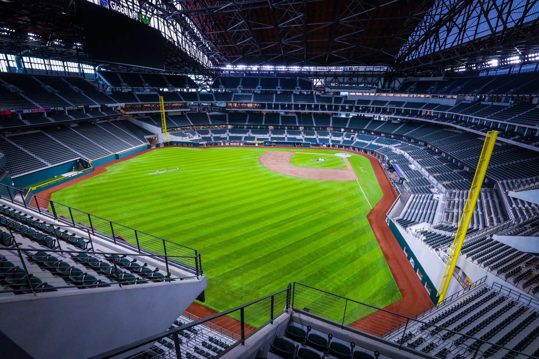
Globe Life Field
Texas Rangers
Major League
TL;DR? Here’s the long-form piece in a nutshell:
Let’s get one thing out of the way: I love all ballparks. I did not create this site to hate. I’ve already had great times at Globe Life Field, and it has some redeeming qualities.
But it is the most disappointing new MLB ballpark since New Comiskey in 1991, combining many of the worst trends in stadium design.
First of all, GLF follows the Truist Park (Atlanta) mallpark model of building an almost offensively generic stadium and attaching it to manufactured mixed-use development. Prioritizing utility over charm, dubbed “more Events Center than Ballpark,” GLF has no design goal beyond generating revenue and fabricating experiential aesthetics, with little attention paid to timeless visual aesthetics.
The much-maligned exterior façade ranges from ugly to pedestrian, lacking any distinctive design cues. Think warehouse attached to a suburban office park. Even in its best spots, this could be an expansion team’s ballpark in “Anywhere, USA.”
The interior is totally nondescript, bereft of any signature elements, interesting views, or overarching aesthetic vision. Compared to retractable roof ballparks in Houston or Seattle that sport skyline views when open, or the much more innovative new retractable roof concepts out there, GLF falls short. Zero personality. The sole bright spot are the archways on the left field concourse, but crucially, they not visible from the seating bowl.
The salience of GLF’s lack of aesthetic character and charm is heightened because it replaced the beautiful Ballpark in Arlington, which had curb appeal rivaling any ballpark in baseball outside and a distinctive white steel backdrop inside.
Even for an aesthetically uninspired mallpark, GLF isn’t even a fun mallpark for the average fan, because most of the amenities are concentrated toward premium. That stings.
While improved for 2022, the food options are terrible; the craft beer is below average; the park mostly lacks destination social spaces throughout the concourses; there are no in-park, non-premium restaurants; the team historical tributes aren’t extensive; and the kids’ area is one of MLB’s most rudimentary. I want to emphasize that this was all planned before COVID-19. The Rangers point to Texas Live! outside the park, but there needs to be more within GLF’s confines.
Compare this Atlanta’s Truist Park, where the fan-friendly features inside the park are so elaborate that they offset the pedestrian mallpark structure.
Perhaps most importantly, GLF has the most fan-unfriendly seating bowl design in baseball, where fans cannot access the entirety of the lower bowl and lower bowl concourse in between the foul poles without an appropriate premium ticket! That’s even worse than Yankee Stadium, which has been much-maligned on this point.
On the plus side, GLF is functional, and I don’t mean that as an insult. Climate control. Excellent sightlines. Wide seats. Not one, but two wide 360-degree concourses open to the field. Top-of-the-line tech. And some other bright spots listed in the “hits” column below.
In sum, GLF is defined by 1) its mallpark philosophy, 2) unremarkable aesthetics inside and out, 3) poor amenities for regular fans, and 4) a fan-unfriendly seating structure designed to exclude regular fans from the lower bowl unlike ever before.
Sure, fans are now out of the heat, but at what cost? $1.2 billion, actually! That’s a lot of money for air conditioning and a structure that has less character and is less fan-friendly than its predecessor!
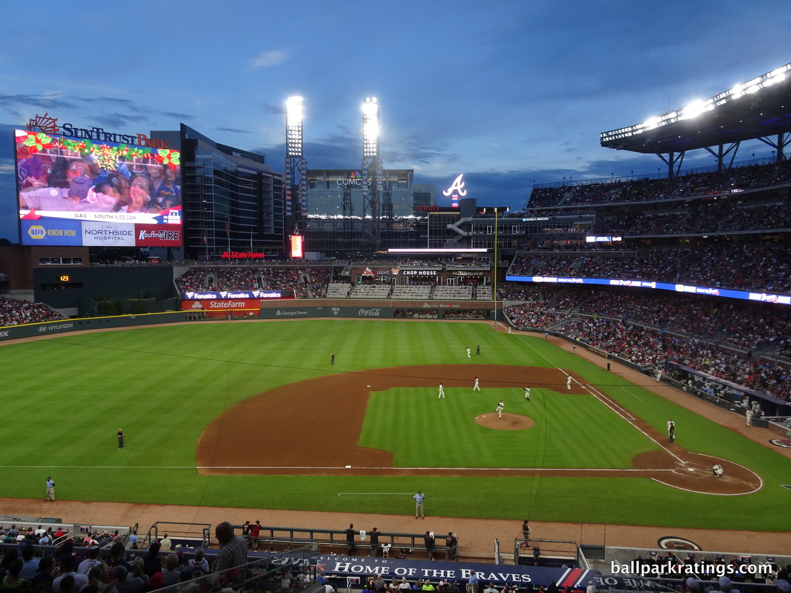
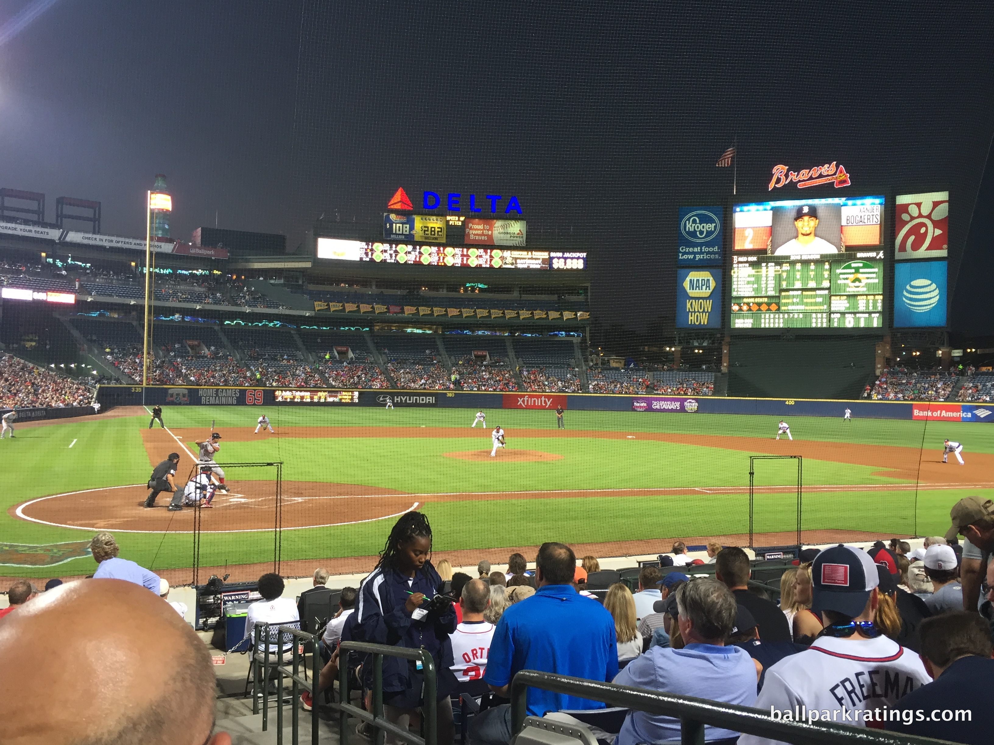
Truist Park
Atlanta Braves
Major League
TL;DR? Here’s the long-form piece in a nutshell:
Truist Park has garnered a huge diversity of opinions in its infant years. Some see Truist as the bland suburban mallpark epitomized, while others view its mixed-use development and fan-friendly amenities as the model for future MLB ballparks.
For me, it’s both. I have a strong love/hate relationship with this place, one intensified by the fact that this was my “home park” for three years in the late 2010s.
On one hand, Truist Park is baseball’s ultimate mallpark, where almost everything is all about creating “experiences” and generating revenue, not about crafting attractive aesthetics. Called a “watershed moment” by MLB officials, Truist Park is largely defined by The Battery Atlanta, a privately-controlled pseudo-city in suburbia trying to manufacture the organic sensibility of an urban neighborhood.
Even for red brick, Truist’s exterior architecture is generic, lacking any distinctive design cues or regional accents. The interior is so lacking in any describable aesthetic it might as well have been taken from a videogame’s expansion team ballpark starter kit. Inside and out, it looks like the Braves picked Truist Park out of a box that said “baseball stadium.” No visual sense of place. Lame views. Little character. Little charm. Mallpark, a term that’s been overused in the past, fits here perfectly.
On the other hand, that’s all academic once you’re there, as it’s hard to deny Truist Park is both functional and incredibly fun. The “fan experience” at Truist Park, separate from any misgivings about the aesthetic design or general artificiality of the ballpark concept, may be the very best in Major League Baseball.
In terms of food, drinks, social spaces, interesting seating options, historical tributes, and entertainment features, we are seeing novel concepts entering uncharted territory. There’s something for everyone at Truist Park in every conceivable way. Monument Garden is undoubtably Truist Park’s standout feature inside, and for all my philosophical objections, The Battery is a blast outside.
In the end, the fan-friendly amenities are sufficiently elaborate to offset the almost offensively pedestrian structure.
If you’re a casual fan, you’ll love Truist Park. If you’re a serious fan, it’s a pretty good place to actually watch the game. But the structure itself, though by no means ugly, is perhaps the most formulaic and derivative in all of baseball. And unfortunately for Cobb County, it’s the latter that usually indicates how well a ballpark will age.
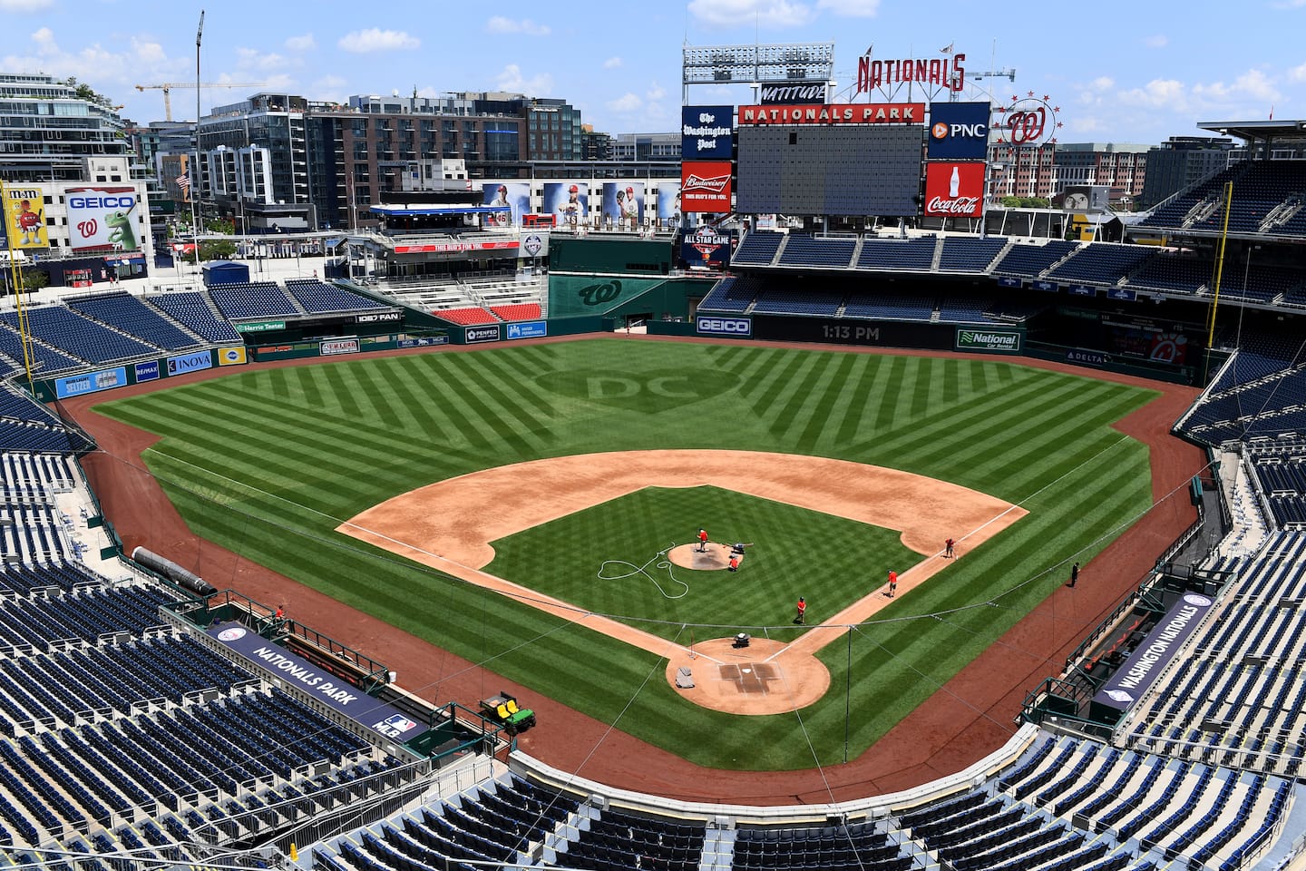
Nationals Park
Washington Nationals
Major League
TL;DR? Here’s the long-form piece in a nutshell:
In the face of high expectations to deliver an iconic ballpark fitting for America’s pastime in the nation’s capital, Nationals Park has received mixed reviews for its lack of distinguishing features, not to mention its lack of visuals that reflect Washington D.C..
Critics say, what’s the first thing you think of when you think of Nationals Park? True, that’s tough! The red seats in center field? The distant view of D.C. landmarks, which are increasingly obstructed by development? The left field cherry blossoms planted as an afterthought that only bloom for a week in early April?
Regardless, I still view Nationals Park more positively. It may lack much to separate it from the pack of other MLB venues, but Nationals Park is very well rounded, with only a couple of significant flaws, and that matters.
Nationals Park’s architecture may be a mixed bag, but it fits into the D.C. landscape, which is the goal. Its interior may lack distinctiveness, but I love how open the park feels to the urban context on the left side, with new development and rooftops overlooking the field. It excels functionally, with solid sightlines, good seats, and wide, navigable, and open concourses. It’s equipped with plenty of fan-friendly amenities, namely a criminally underrated culinary scene, vibrant social spaces, and amazing premium club seats that have always been relatively affordable on Stubhub. It even possesses a few charming local traditions, namely the now iconic President’s Race and nods to D.C. baseball history.
Most importantly, the burgeoning Navy Yard next door is now one of baseball’s best local scenes, and location is crucial in my ballpark ratings.
Yes, a ballpark is more than the sum of its parts—Nationals Park lacks that “wow factor” that limits its “repeat value” for out-of-towners—but the sum of its parts is really damn good here. It all adds up to something better than its reputation as a middling to bottom-10 ballpark in my book, even if nothing is particularly memorable or outstanding.
Rogers Centre
Toronto Blue Jays
Major League
Globe Life Park in Arlington
Texas Rangers
Major League
Tropicana Field
Tampa Bay Rays
Major League
Busch Stadium
St. Louis Cardinals
Major League
TL;DR? Here’s the long-form piece in a nutshell:
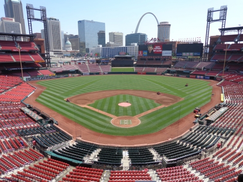
Busch Stadium is one of the more difficult ballparks to assess, because nearly all of its assets are derived from factors independent of the actual building that was heavily value engineered.
While baseball’s 2nd best skyline views, a now-completed Ballpark Village, and the Cardinals fanbase bolster the overall Busch Stadium experience, there aren’t many frills to elevate a merely passable structure.
1) Independent of the postcard views, Busch Stadium is one of the most generic parks of its era, perhaps epitomizing the peak “retro cookie cutter.” While other parks with skyline views seem more organically interwoven with their urban context, Busch Stadium feels kind of dropped from the sky into Downtown St. Louis, with a boring outfield seating design that could be mistaken for a renovated multipurpose facility. The interior feels like a template, a generic starting point without any distinction in its own right.
Recalling the local area, the exterior facade is admittedly beautiful, but it comes across as a bit too formulaic and derivative for 2006, and I don’t think retro red brick was the right design choice for the city. Yes, it’s gorgeous, but architecturally, a very safe and unoriginal design.
2) Independent of Ballpark Village outside of the park, the amenities inside of the park are completely unimpressive, with a main concourse closed to the field, poor to pedestrian food and craft beer quality, and a notable lack of destination social spaces within the footprint. The Cardinals Hall of Fame in Ballpark Village is outstanding, but there’s aren’t many historical tributes that scream Cardinals baseball within Busch’s confines.
Busch Stadium is all about the view, the fans, and the features outside in Ballpark Village, without much creative thinking applied to the structure itself and to the neglect of adding fan-friendly amenities inside the park.
Those assets alone are outstanding enough to get Busch Stadium in my half top, but it should have been better.
T-Mobile Park
Seattle Mariners
Major League
TL;DR? Here’s the long-form piece in a nutshell:
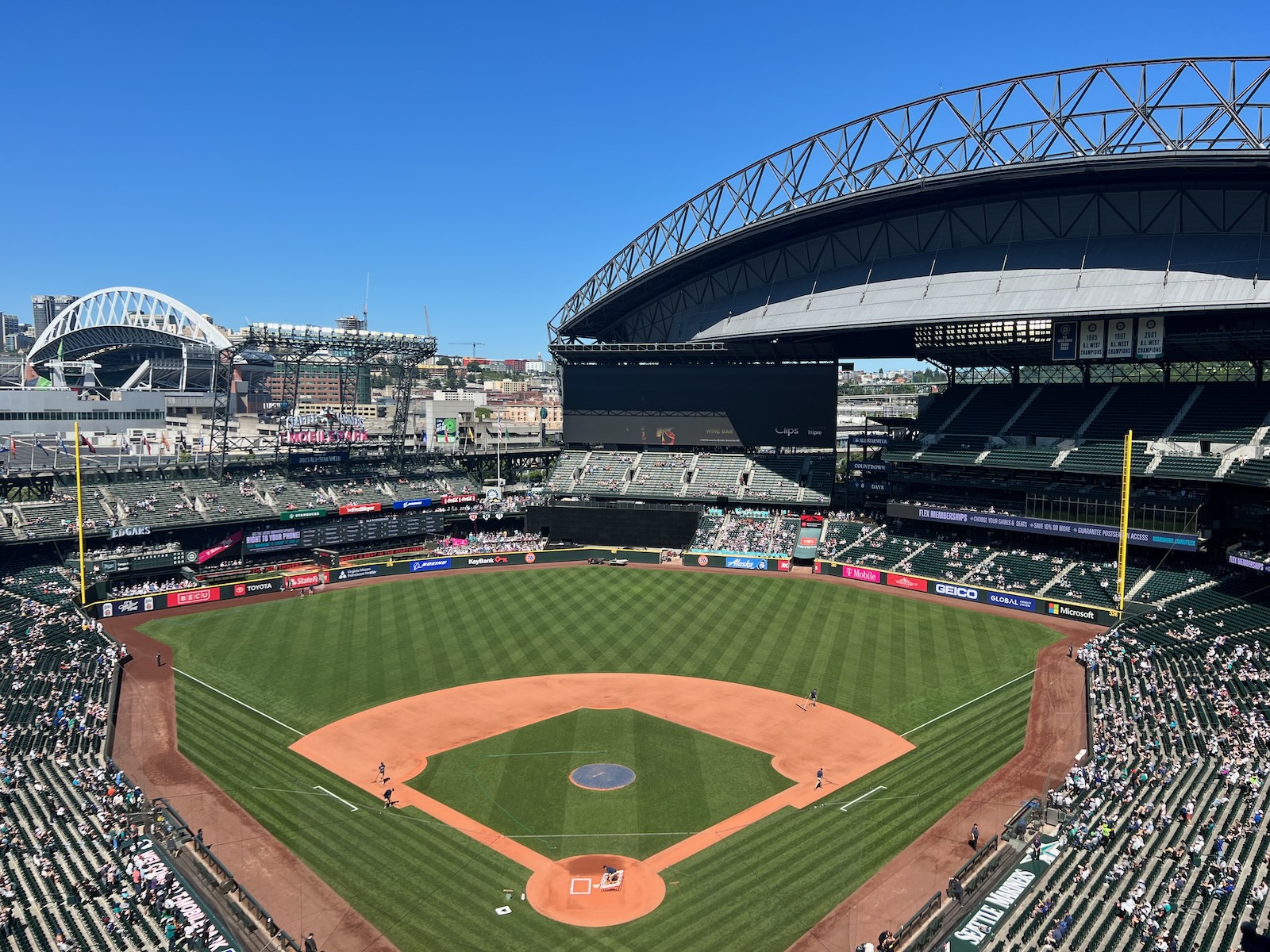
Heralded for saving baseball in Seattle, T-Mobile Park has historically been considered one of the best parks in baseball, receiving rave reviews upon opening for its “umbrella”-style retractable roof that doesn’t enclose the park and unparalleled array of modern amenities. With a $500+ million price tag, an exorbitant amount for the late 1990s, almost no expense was spared.
Today, it seems like T-Mobile Park has faded from the limelight as a “must see” baseball cathedral—perhaps largely because of the Mariners now decades-long irrelevance coupled with geographic isolation.
Controversially, I’ve always been critical of the stadium’s architectural design. The exterior is utterly disjointed, with the third base side wrapped in red brick and the first base side exposed in unadorned steel. While some parts of the upper deck sport good views, T-Mobile’s interior visuals lack a defining focal point other than that bulbous roof, with poor attention to the urban context and haphazardly placed outfield grandstands. No sense of place from the lower bowl.
However, there’s no denying the fan-friendliness of the Mariners home. The gameday experience has aged well despite few ballpark enhancements other the years, because T-Mobile was way ahead of its time in offering those extra frills.
The food and craft beer are among the very best in baseball. The Pen is baseball’s prototypical social space. The main concourse is open to the field without interruption, and the concourses have so many cool SRO areas. The videoboard is one of baseball’s largest. The Mariners Hall of Fame and Museum, while a bit dated, is still a must-see attraction. And the “Art in the Park,” headlined by the chandelier of 1,000 translucent bats in the rotunda, remains the showstopper.
In sum, I think T-Mobile Park’s structure and aesthetics are overrated, but the rest of the fan experience remains top notch. Look for future renovations to further enhance the latter and improve T-Mobile’s standing.
Oracle Park
San Francisco Giants
Major League
TL;DR? Here’s the long-form piece in a nutshell:
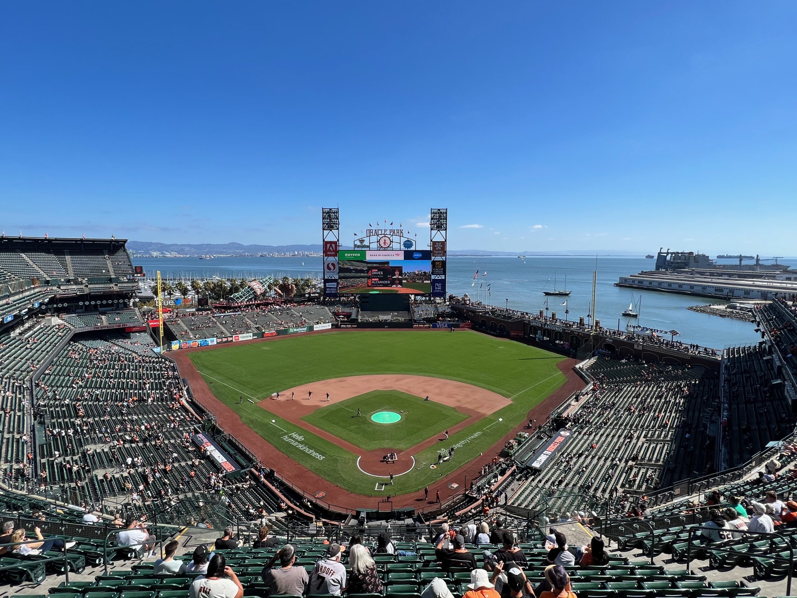
Largely by virtue of its bayside location, splashdown home runs, and postcard views, Oracle Park is widely considered one of the two best ballparks of the post-1990 building boom, alongside its contemporary in Pittsburgh. But Oracle Park is more than a ballpark with water views.
It’s a fantastic park even not considering the view, which is fortunate because unlike in Pittsburgh, the water and city landmarks aren’t visible from the lower bowl seating. Oracle Park’s amenities are just as good as its famous aesthetics and location.
Consider all that makes the Giants’ park outstanding independent of its locale: (a) some of baseball’s most delectable food and craft beer, (b) unique social spaces like The Garden, (c) one-of-a-kind premium spaces like the Gotham Club, (d) historical tributes like The Vault, (e) family-friendly features like the Fan Lot, and (f) baseball’s third largest videoboard.
Just as importantly, San Francisco’s privately financed palace could be construed as the most successful ballpark of the era, generating the most enduring attendance boost of any ballpark in modern history.
Stemming from its tight footprint, a handful of fairly serious logistical shortcomings prevent me from ever ranking Oracle #1, namely the unacceptably narrow concourses and quirky seating geometry affecting 7,000+ seats down the left field line.
But Oracle Park will continue to be one of America’s most magnificent ballparks for years to come.
Petco Park
San Diego Padres
Major League
TL;DR? Here’s the long-form piece in a nutshell:
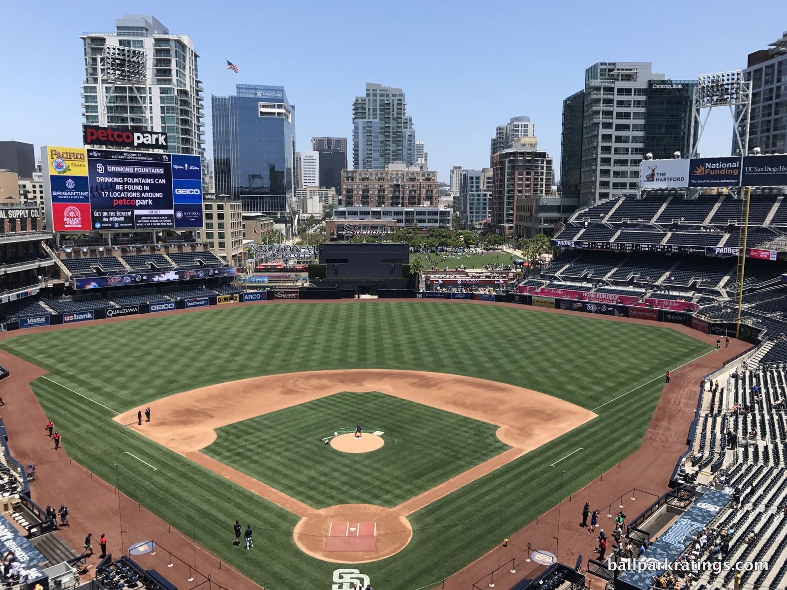
Even considering the “landmark ballparks” in Chicago and Boston, Petco Park is comfortably my favorite MLB venue.
PNC in Pittsburgh and Oracle in San Francisco may get more attention by virtue of their postcard views, but San Diego’s pad has sufficiently beautiful outfield visuals, while being filled with superlatives in all other categories and mostly lacking major flaws.
Petco Park’s exterior architecture is truly outstanding. The adaptive reuse of the left field warehouse and innovative concourse design exposed to the sky are brilliant. Aggressive cantilevers push the upper levels closer to the action than just about any MLB park, and the seating geometry is perfect.
The bevy of fan-friendly amenities—think baseball’s #1 concession stand food and craft beer, the numerous destination eateries, bars, and social spaces throughout the concourses, the Padres Museum, the fun in The Park in the Park, etc.—are cumulatively tied for #1 in baseball.
Combine all of that with its location in perhaps baseball’s premier neighborhood, the Gaslamp Quarter, and Petco Park almost hits the trifecta of perfection: 1) best ballpark to watch the game (sightlines), 2) best ballpark to not watch the game (amenities), and 3) top-5 ballpark for aesthetics.
It all adds up to the finest fan experience in the Majors by a relatively significant margin in my book.
PNC Park
Pittsburgh Pirates
Major League
TL;DR? Here’s the long-form piece in a nutshell:
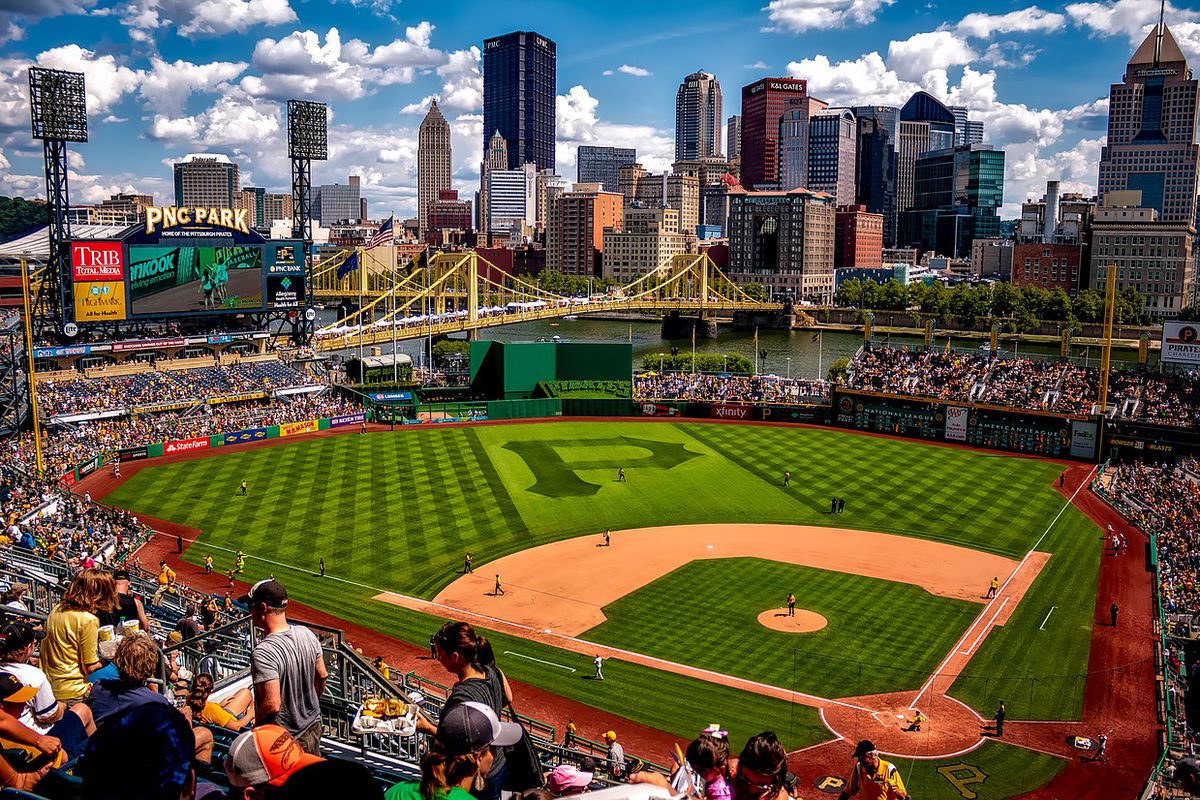
Ballpark aficionados and traveling baseball fans seemed to have settled on a consensus top two among the “modern-day” post-1990 venues: Oracle Park in San Francisco and PNC Park. The appeal is obvious: stunning views.
Indeed, I’ve grown to see PNC Park as the most beautiful ballpark in baseball inside and out, and it isn’t particularly close. Instead of views of just water, a bridge, or a skyline, you get all three. Instead of views only from the upper levels, PNC’s landmarks seem omnipresent throughout the lower bowl.
Moving outside, PNC utilizes a refreshing assemblage of limestone and blue steel in keeping with the riverfront context, not the played out red brick. And the concourses match too. And that approach from the Clemente Bridge. It’s all just perfect.
Beauty aside, PNC’s intimacy also sets it apart. In an era of ballparks with sprawling towers of luxury suites and 3+ levels, PNC famously utilizes a “double deck” design that just feels cozier (although, it’s virtues for horizontal field proximity are misunderstood, which I discuss).
PNC Park doesn’t have any major flaws, but it’s true that it doesn’t have the amenities of most of its contemporaries. There are also quite a few little things (listed below) that could have been done better or don’t compare well to the other top-tier parks. The cumulative effect puts it a notch below Petco Park in competing for the #1 spot. Hey, if you’re self-advertising as “The Best Ballpark in America,” nitpicks are fair game!
Citizens Bank Park
Philadelphia Phillies
Major League
TL;DR? Here’s the long-form piece in a nutshell:
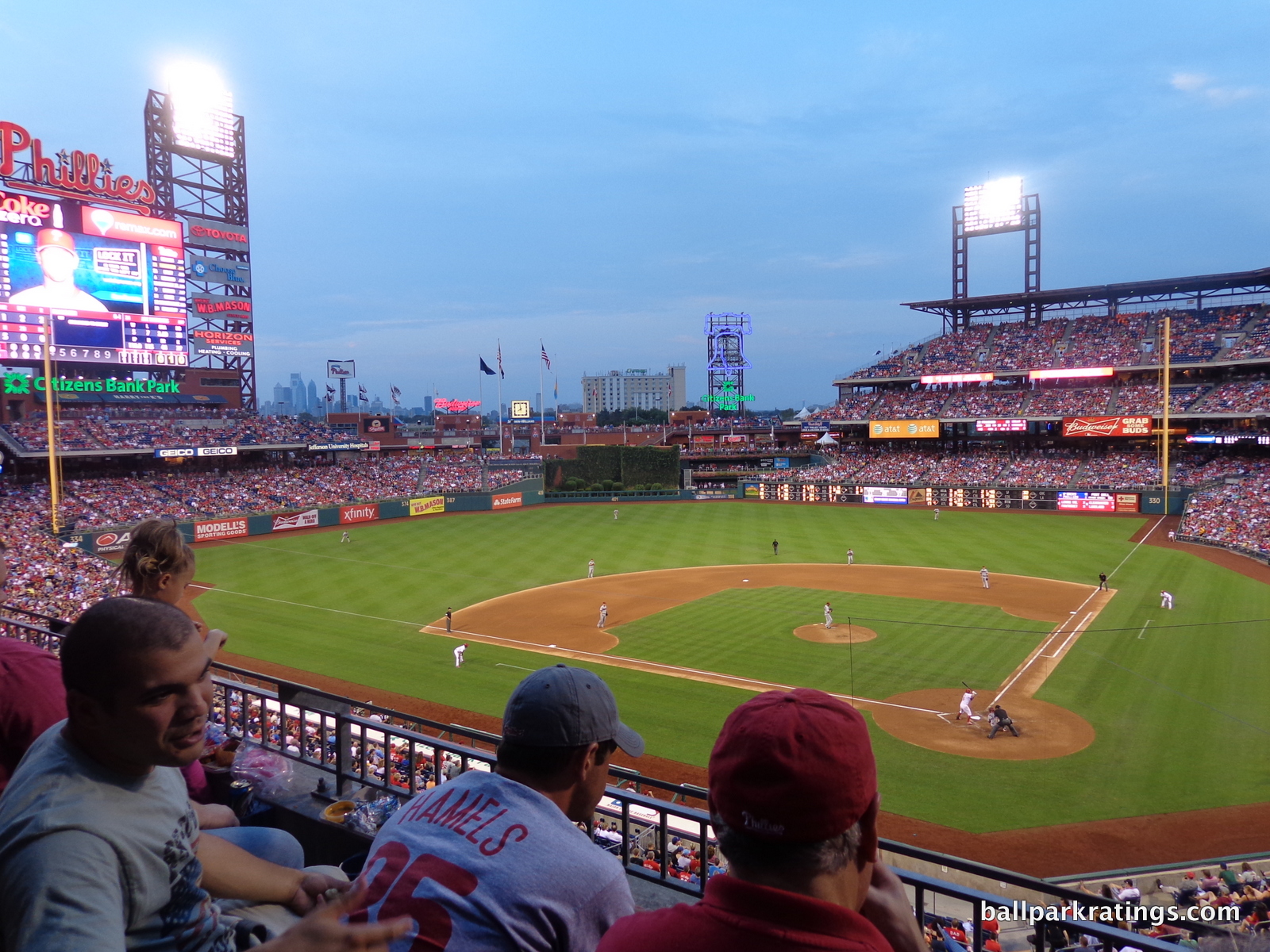
For something as subjective as ballpark rankings, with all their variations based on roots and loyalties, there’s a rare consensus here: fantastic park, less-than-ideal setting.
Philly fans will tout the infrastructure efficiencies, but Citizens Bank Park is almost defined by its South Philadelphia Sports Complex location, because any shortcomings are a function of that location. Drag the park 4 miles north and witness the closer skyline views, much-needed sense of place, and vibrant local scene, and you would have a top-5 park.
Location and views are huge in my book, but CBP does almost everything else right. Leaving the classic Dodger Stadium out of the equation which is a different animal, this is my highest ranked “parking lot stadium.”
Aesthetically, the interior sports clean lines, an engaging color scheme, a unique angular grandstand design, and one of baseball’s most beautiful batter’s eyes. Functionally, CBP’s sightlines are excellent, and the concourse design may be baseball’s very best. The concourses open to the field on all three levels, with no interruptions in visibility throughout the main concourse, numerous fan-friendly SRO areas, and Ashburn Alley.
Elevated by recent renovations, CBP’s amenities are some of the best in baseball. Local culinary staples like Tony Luke’s, Campo’s, and Federal Donuts remain scrumptious. Recent enhancements added (a) a wonderful sports bar with an open-air beer garden, (b) a redesigned historical exhibit in left field, and (c) one of baseball’s premier kids’ areas, among other things. Then throw in the passionate Philly fans, and you’re looking at a memorable experience.
But Citizens Bank Park still feels like a missed opportunity for what it lacks—that all-so-important sense of place provided by a downtown location—given that it’s otherwise so fan-friendly.
Oakland–Alameda County Coliseum
Oakland Athletics
Major League
Yankee Stadium
New York Yankees
Major League
Citi Field
New York Mets
Major League
Target Field
Minnesota Twins
Major League
TL;DR? Here’s the long-form piece in a nutshell:
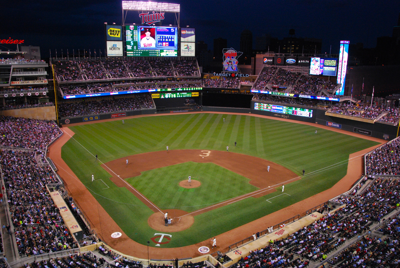
While a handful of downtown ballparks may have more captivating views, Target Field has the most creative and impressive urban design in ballpark history, with plazas, concourses, and outfield seating bowls constructed above roads to expand the footprint.
Given its responsiveness to its urban surroundings, Target Field represents a return to the best “retro” ballpark principle of adhering to contextual design, while ironically being one of the least retro parks. With a clean outfield aesthetic free from gimmicks and an abundance limestone inside and out, Target Field screams authentic Minnesota baseball.
Target Field also benefits (1) from being extremely well rounded, as it excels in almost all respects, and (2) from the fact that the Twins have displayed an admirable dedication to continually upgrading the facility despite its young age. As of 2022, it still looks brand new.
While a few other ballparks may be more outstanding in some respects, Target Field does it all: (a) downtown locale with vibrant local scene, (b) regionally-inspired architecture, (c) contextually-based interior design, (d) adroitly-integrated downtown views, (e) wide, open concourses, (f) choice local food and craft beer options, (g) a fabulous array of climate-controlled spaces and bars, and (h) generally phenomenal amenities. This was the single most difficult park to choose a “biggest dislike.”
At the end of the day, the Twins pad both checks all of the boxes and brings an unmistakable sense of place via notable aesthetic flourishes and locally-inspired amenities.
American Family Field
Milwaukee Brewers
Major League
TL;DR? Here’s the long-form piece in a nutshell:
Notable for its fan-shaped retractable roof, there’s a striking divergence of opinion on Miller Park between locals and ballpark enthusiasts. Brewers fans have perhaps the strongest bond to their home park of any fanbase outside of Chicago and Boston, while stadium aficionados generally rank Miller Park toward bottom of the middle, often bottom 10.
I’ve always been particularly harsh on Miller Park, which is curious given how much fun I usually have here. So much of the intangibles of a Brewers game—the awesome fans, the Milwaukee vibe, the unique ballpark traditions like the Sausage Race—are delightful. But Miller Park falls short in virtually all other facets.
The tailgating experience is fantastic, but Miller Park is a classic “parking lot stadium,” and I’m always on team downtown baseball. I don’t like the exterior’s gargantuan profile that screams “small town trying to be prime time” or its red brick facade, out of place for the non-urban setting, city, and roof technology. Strong Elroy Jetson’s hat/Queen Victoria’s dress vibes! I don’t know, there’s a certain structural elegance to it, and the roof has some subtle design elements compatible with the brick below, but it screams Steampunk.
Inside, the park feels dramatically overscaled. Even when the roof is open, the park feels drab and enclosed. When the roof is closed, outfield panels let in no natural light. Compared to retractable roof parks in Seattle and Houston, there is no visual sense of place here whatsoever, and it particularly lacks intimacy for only 42,000 seats. Overall, the architecture inside and out does not reflect the city, independent of its unwieldy aesthetics.
Miller Park isn’t a particularly functional building for watching baseball. All modern-day ballparks have upper decks too high and pushed back, but Miller Park is the worst offender, with four decks and little overhang. The seating geometry can be problematic. Seats in the upper deck lack cupholders, a rarity. The main concourse is difficult to navigate with many confusing diversions and horizontal discontinuities. The outfield concourse is barren and narrow.
There are some bright spots—a massive craft beer wall, the new left field brewery, and a (*checks notes*) new virtual golf zone—but even the amenities aren’t great.
This is a comparative exercise—all modern-day baseball-only venues are fine, including Miller Park—but I just don’t see how Miller Park compares well objectively speaking. I love the atmosphere, but it scores dead last among post-Camden (post-1992) MLB ballparks not due for comprehensive renovations or replacement.
loanDepot park
Miami Marlins
Major League
TL;DR? Here’s the long-form piece in a nutshell:
Despite receiving positive reviews upon opening, Marlins Park is generally considered a bottom 5-10 ballpark for issues that have little to do with the actual ballpark.
Bitterness surrounding unrelated issues—like the stadium’s dodgy financing scheme and the Marlins organization’s ineptness—translated to antipathy toward the ballpark itself. They conflate the Marlins franchise with Marlins Park. That makes no sense.
However, I’ve downgraded Marlins Park’s rating as of late for two reasons.
1) Attendance issues are sufficiently dire to affect the essentials of the ballpark experience, with the stadium operations routinely at 1/3rd capacity. Think a closed upper deck, closed concession stands in prime areas, and dormant signature spaces.
2) The Jeter-era no-fun alterations took a flawed “addition by subtraction” approach, removing amenities like the Clevelander pool nightclub and the cool fish tanks behind home plate, but without adding anything of interest in their place! Sure, there’s now a new lounge in the spot formerly occupied by the pool, and it’s admittedly pretty nice, but nearly all ballparks have trendy lounges. So what? And the home run sculpture now sits outside. Marlins Park can’t really afford to be boring given the product on the field.
Replacing the home run sculpture with a generic party deck, the pool nightclub with an overpriced lounge, and the fish tank with ads represents the new homogeneity of ballparks to a tee.
Regardless, I still think the building itself is architecturally underrated, even if it doesn’t fit in the Little Havana neighborhood. Design-wise, Marlins Park stands alone in baseball history as the only contemporary MLB ballpark in the 21st century sense of the word.
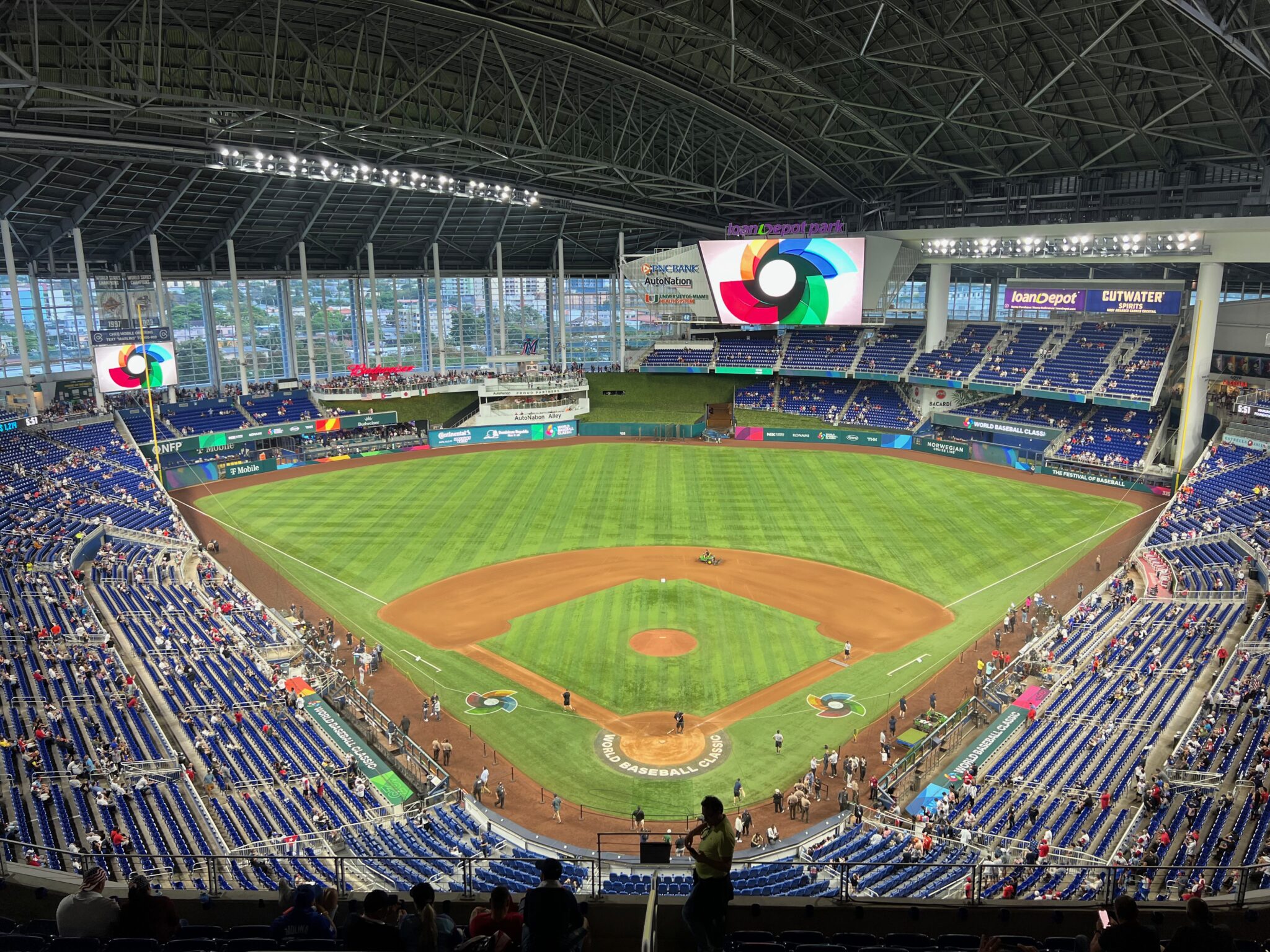
On the outside, Marlins Park conceptually captures sea merging with land, with an amalgam of deep blue glass, white stucco and steel, unadulterated concrete, and sparkling silver aluminum. With graceful fluidity in form, it’s an abstract expression of Miami.
The refreshed interior feels modern yet subdued, highlighted by the sleek white facade and attractive greenery. The retractable left field panels reveal surprisingly beautiful views of Brickell/Downtown Miami. I also adore the contemporary baseball-related artwork sprinkled throughout the concourses.
Marlins Park is particularly functional, with a wide, open main concourse without interruptions in field visibility and excellent sightlines for a post-1990 ballpark. The park’s amenities aren’t as fan-friendly as they should be—sparse crowds are partly to blame—but scrumptious Latin food options, a new beer hall, the Bobblehead Museum, and one of baseball’s best home plate clubs (relatively affordable on Stubhub!) are highlights.
In sum, Marlins Park is a bottom-10 ballpark experience, mostly because a ballpark this empty just isn’t a fun one. Attendance this poor has operational effects beyond a listless atmosphere. But Marlins Park’s dazzling contemporary architecture and aesthetics make it worth a visit.
Dodger Stadium
Los Angeles Dodgers
Major League
Angel Stadium of Anaheim
Los Angeles Angels
Major League
TL;DR? Here’s the long-form piece in a nutshell:
After being enclosed to accommodate football and converted into a multiuse facility the early 1980s, Angel Stadium was the only multipurpose MLB stadium to be renovated instead of replaced during the post-1990 ballpark-building boom.
However, 1) those 1997-98 renovations that transformed Angel Stadium back to baseball-only status didn’t go far enough, with remnants of the stadium’s multipurpose existence still apparent inside and out, and 2) Angel Stadium hasn’t been properly maintained in the 20+ years since those renovations.
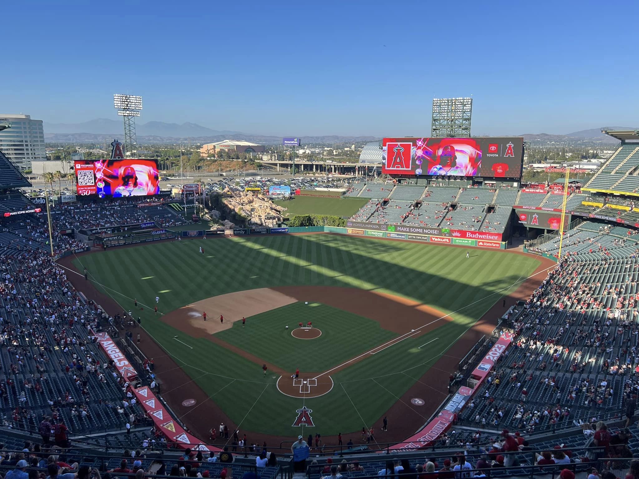
Angel Stadium is a quintessential suburban parking lot stadium, and that’s always cause for demerits. Outside, while new parks of the era got tasteful retro treatment, Angel Stadium got paint on concrete. The new grand entrance is more of a touched-up version of the old façade plastered with gimmicks. Inside, you can still see the shell of the multipurpose grandstand, characterized by tired, disconnected outfield stands with a poorly integrated faux rock geyser.
Aesthetically, it ranges from generic to tacky. That’s a pretty unfortunate duality.
Objectively, Angel Stadium falls short across the board compared to the post-1990 parks. The sightlines have plenty of awkward viewing angles and overhang obstructions. The concourses are generally too narrow, among other issues. The seats are quite worn. From the food and drinks to the social spaces and clubs, the amenities are poor across the board. Even compared to a Tropicana Field, Angel Stadium doesn’t have any extra frills.
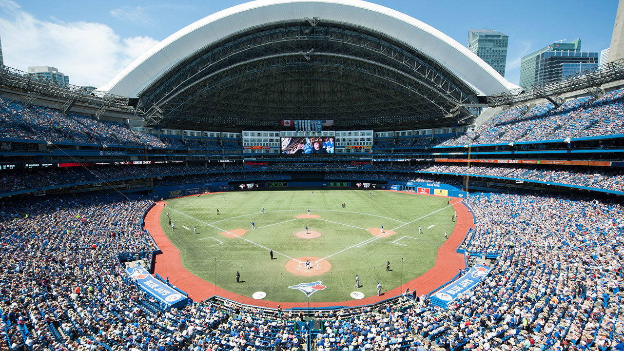
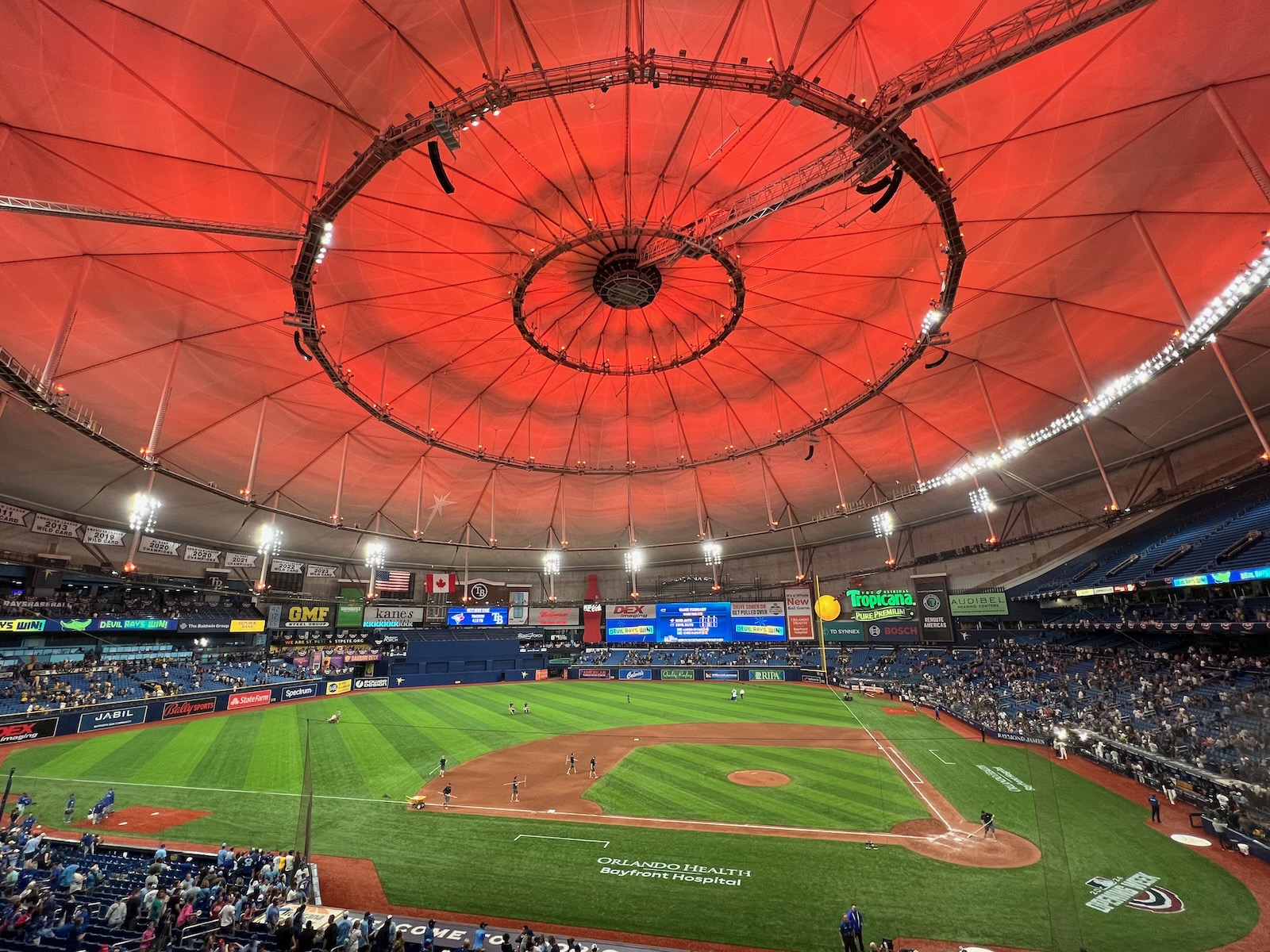
It all adds up to a wholly unmemorable stadium experience that’s below average in almost every facet, even if there’s nothing startlingly inadequate like at the parks in Oakland, Tampa, and Toronto.
A dramatic mixed-use development plan has been proposed for the site, and Angel Stadium will either be renovated (again) or replaced in the not-so-distant future.
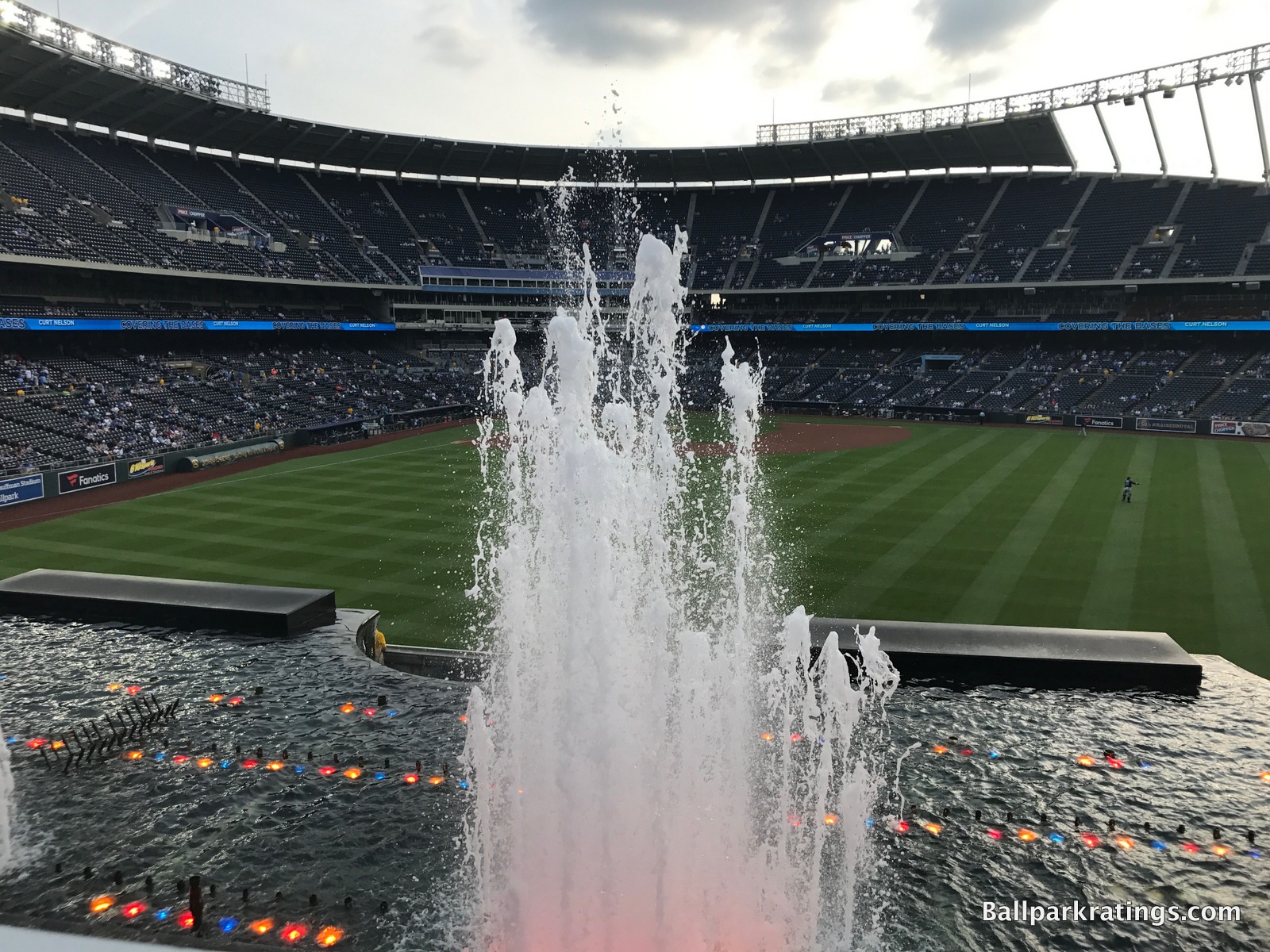
Kauffman Stadium
Kansas City Royals
Major League
TL;DR? Here’s the long-form piece in a nutshell:
Praised as a 20th century classic for its clean, modernist lines and outfield fountains, my take on Kauffman Stadium is one of the site’s more controversial ones, as longtime ballpark enthusiasts generally place The K in the top 10.
My rationale is twofold: 1) I didn’t like the aesthetic changes made to the outfield scene during the sweeping 2008-08 renovations, and 2) I still can’t get past the suburban setting.
1) The central appeal of old Kauffman was not only the fountains, but the gorgeous, flowing simplicity of the grass embankments in the outfield. It’s an aesthetic travesty that modern-day economics forced the Royals to convolute the timeless uncluttered greenery with seating, ads, playgrounds, and putt-putt courses, because the greenery allowed the fountains to stand out. I find the outfield appearance too muddled and busy now.
2) Kauffman Stadium is the ultimate suburban “parking lot ballpark,” with one of the lowest walkability scores in baseball. My enduring persuasion is against venues not integrated with the city center or a neighborhood. America’s venerated ballparks resonated with fans because they were part of a community, and suburban baseball can never replicate that appeal.
Kauffman has a few other flaws—the lack of a locally-operated BBQ joint in the stadium representing America’s BBQ capital is confounding, for example—but there’s still plenty to like here.
The fountains are still there. The interior lines are still sharp. The sightlines are good. The videoboard topped with a crown is iconic. And other than the food, a big caveat, the amenities are spectacular: Kauffman has (a) some of baseball’s best craft beer, (b) wonderful social spaces like Craft & Draft and Rivals Bar, (c) the Royals Hall of Fame, and (d) the Outfield Experience offering baseball’s #1 family-friendly kids’ areas.
But the superb “classic K” is greatly missed. Wrigley, Fenway, and Dodger managed to incorporate 21st century amenities without taking away so much aesthetic appeal.
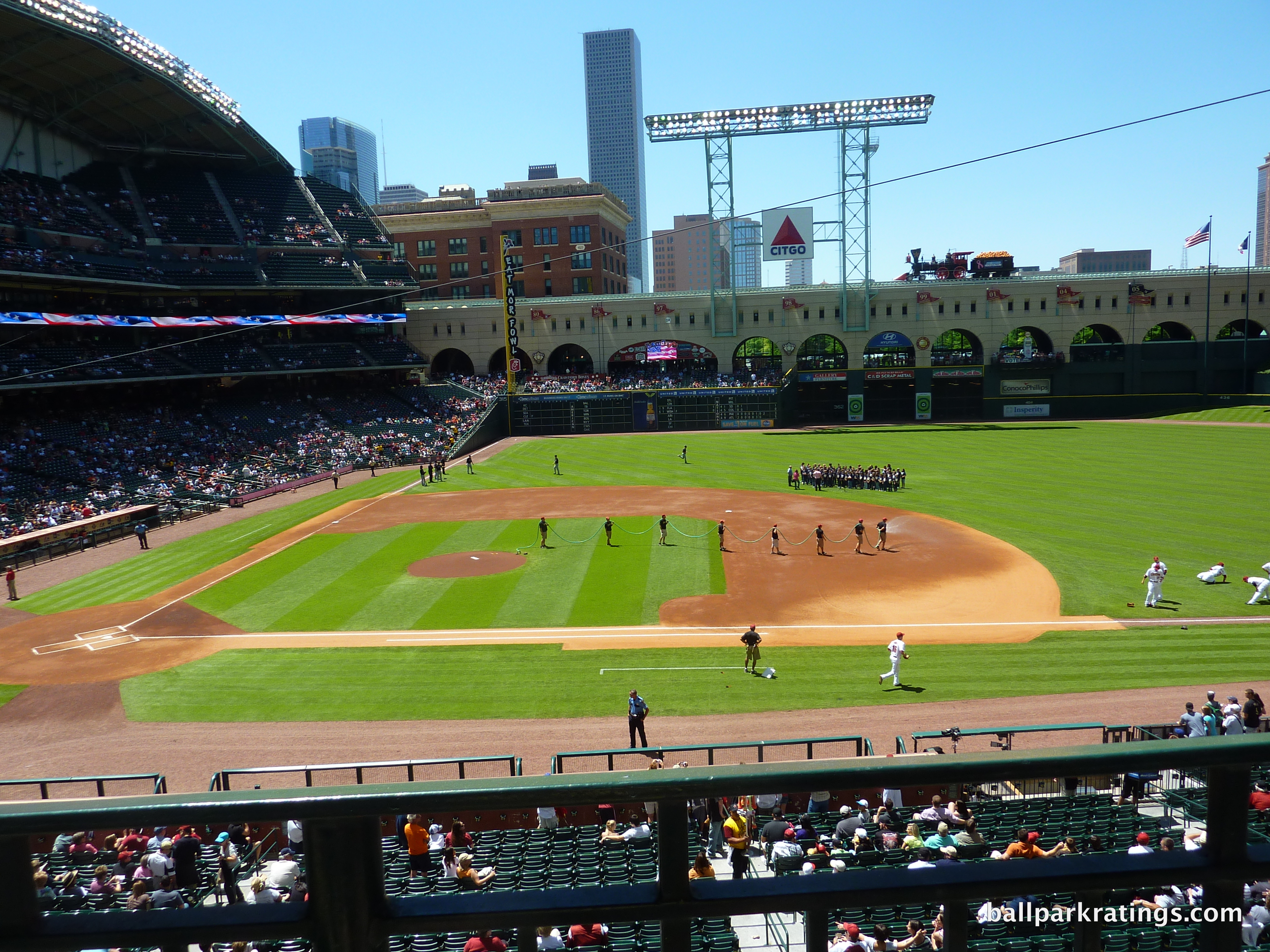
Minute Maid Park
Houston Astros
Major League
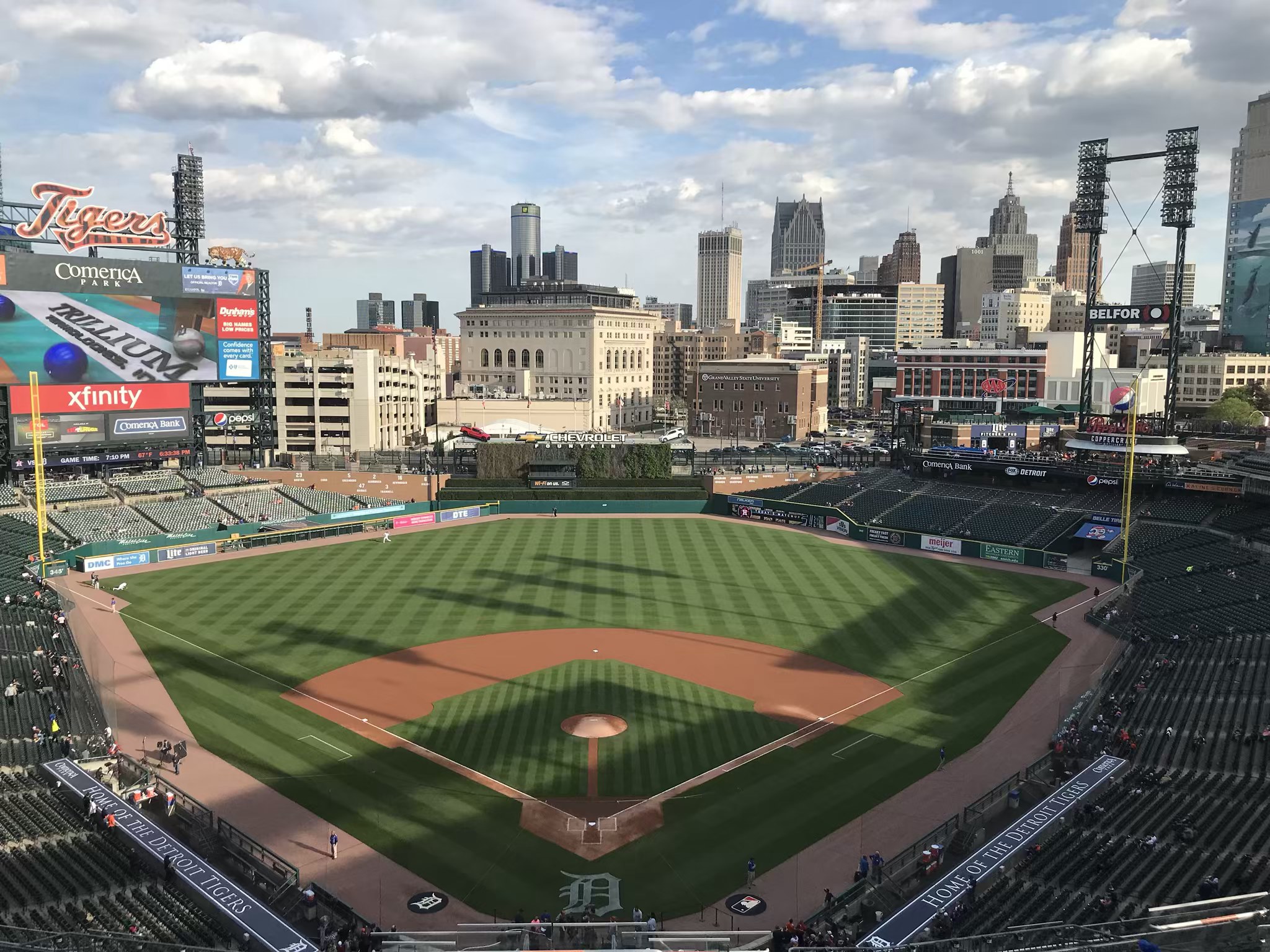
Comerica Park
Detroit Tigers
Major League
TL;DR? Here’s the long-form piece in a nutshell:
My take on Detroit’s ballpark is the site’s most controversial (in its prime, I had it as high as #3), one of the few times where I sharply deviate from the consensus.
Suffering by comparison to the venerated Tiger Stadium, Comerica Park generally hasn’t received the praise of other 21st century ballparks. Comerica is also hindered by its association with the poverty of Downtown Detroit and sightline complaints, both of which are misunderstood or overblown. Most ballpark aficionados rank Comerica in the middle of the pack.
Assessing Comerica on its own merits in the context of its post-1990 peers and not to the all-time great Tiger Stadium, I think it’s by far the most underrated active ballpark in MLB. It could shoot up to top-5 status again with some, admittedly, much needed renovations.
A downtown locale with surrounding bars and restaurants? Check. Marvelously expansive exterior monuments? Check. Understated interior aesthetics with the best ballpark skyline views outside of Pittsburgh and St. Louis? Check. The lowest upper deck of the newer parks outside of Pittsburgh? Check. Wide, open concourses with a panoply of accessible destination restaurants, taprooms, beer halls, and lounges? Check and Check. Historical memorabilia and statues adeptly interwoven throughout the concourses, but with frivolous kids-friendly attractions like the Ferris Wheel and Carousel relegated to the outskirts. Check and Check.
1) Decent downtown locale, 2) Gorgeous aesthetics inside and out, 3) Supremely functional, and 4) Filled with fan-friendly amenities. Very well rounded.
Of course, a ballpark is more than the sum of its parts, and the through line creating that necessary “wow factor” is just how elaborately Comerica represents its tenant.
Tiger sculptures, gargoyles, and claw marks outside. View of Downtown Detroit and the Wall of Fame from anywhere inside. A team “walking museum” and player statues throughout the concourses. Tigers embroidered on the doors; Tiger sculptures above the bars. Close your eyes, step almost anywhere in or outside the ballpark, open them, and you’ll see something that screams “Detroit!” or “Detroit Tigers!”
Strong sense of place here, as everything shrewdly incorporates elements of the city and the franchise.
Comerica Park is not flawless, of course. The concession stand food needs improvement. The incline of the lower bowl is too gentle, but that’s a common problem of ballparks of this era, making it odd to see Comerica always singled out in this respect. Many of the interior spaces badly need a renovation, and renovations are needed in general, hence my downgrade. It is beginning to really show its age. And day games are no fun in certain spots with the blinding sun, a function of Comerica’s south-ish orientation.
But overall, it still seems like fans who are inclined to opine on their Comerica Park experiences downplay its many assets and exaggerate its few shortcomings. They probably just miss Tiger Stadium. Fair enough!
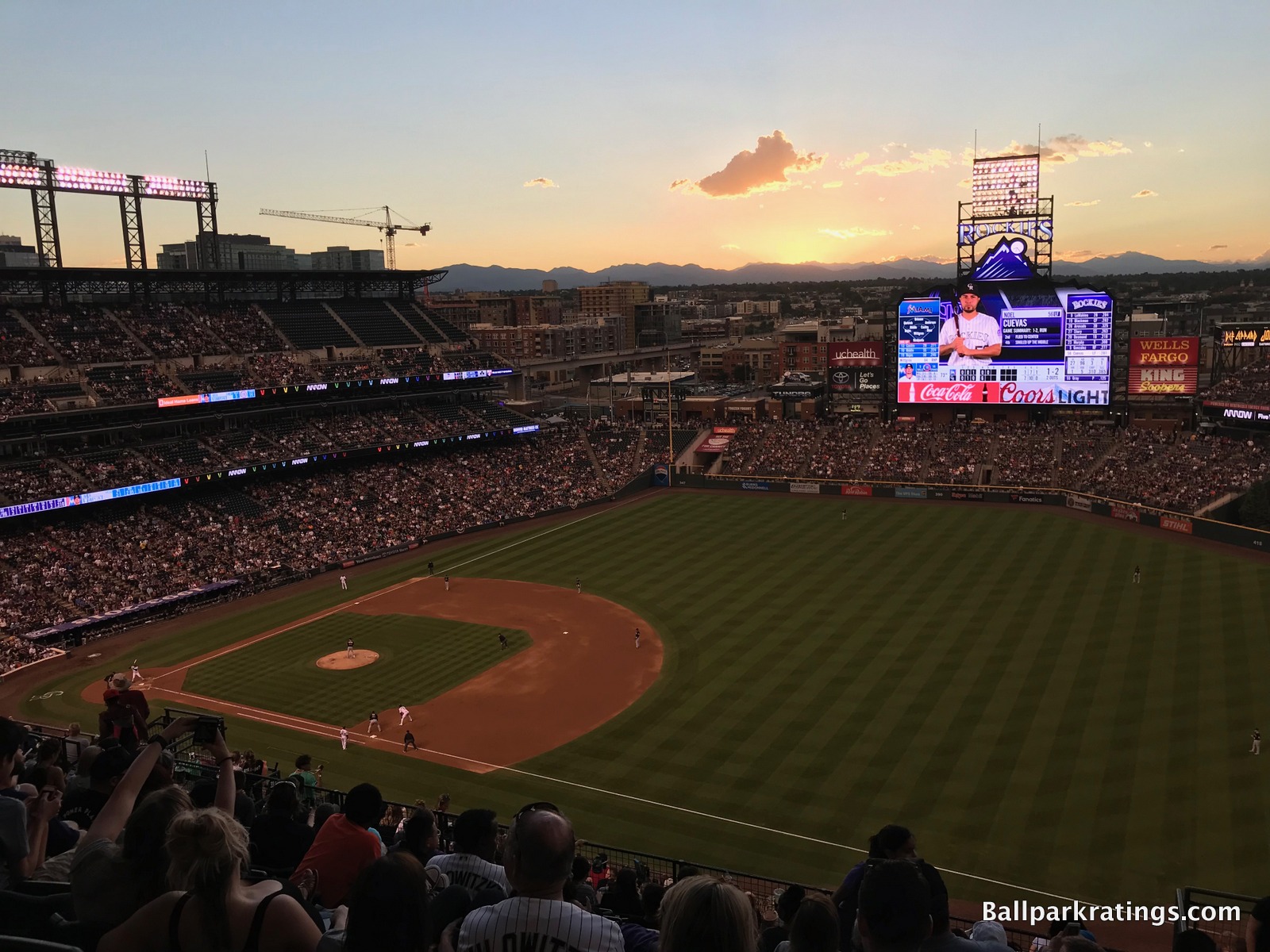
Coors Field
Colorado Rockies
Major League
TL;DR? Here’s the long-form piece in a nutshell:
Now amazingly the 3rd oldest ballpark in the National League behind classics Wrigley and Dodger, Coors Field has aged remarkably well. Opening on the heels of the revolutionary Camden Yards (1992) and the well-received Progressive Field (1994), Coors Field created the template for the modern-day retro ballpark in 1995.
With its open concourses and good sightlines, Coors Field fixed many of the functional flaws seen in those two predecessors, while perfecting the Camden philosophy of crafting a contextually-inspired ballpark free from contrivances or gimmicks.
Coors Field’s famous mountain views may be overrated—the sweeping vistas are only visible from some upper sections and only at ideal times; the park’s interior visuals are underwhelming overall—but Denver’s park does just about everything else right.
LoDo makes for one of baseball’s very best neighborhoods. Coors Field features my favorite ballpark exterior design, taking retro red brick to “capital-A” architecture territory and fitting in with LoDo like a glove. Coors Field holds up well from a functional standpoint. The in-park brewery is fun. And 2010s enhancements added the outstanding Rooftop party deck and the videoboard shaped like a mountain.
Overall, Coors Field very well-rounded, checking most of the boxes, while possessing a few exceptional features and timeless architecture. You may not instinctively think of Coors Field when pondering which ballparks are likely to withstand the test of time into the mid-21st century, but Denver’s ballpark has the core ingredients to do so.
Progressive Field
Cleveland Guardians
Major League
TL;DR? Here’s the long-form piece in a nutshell:
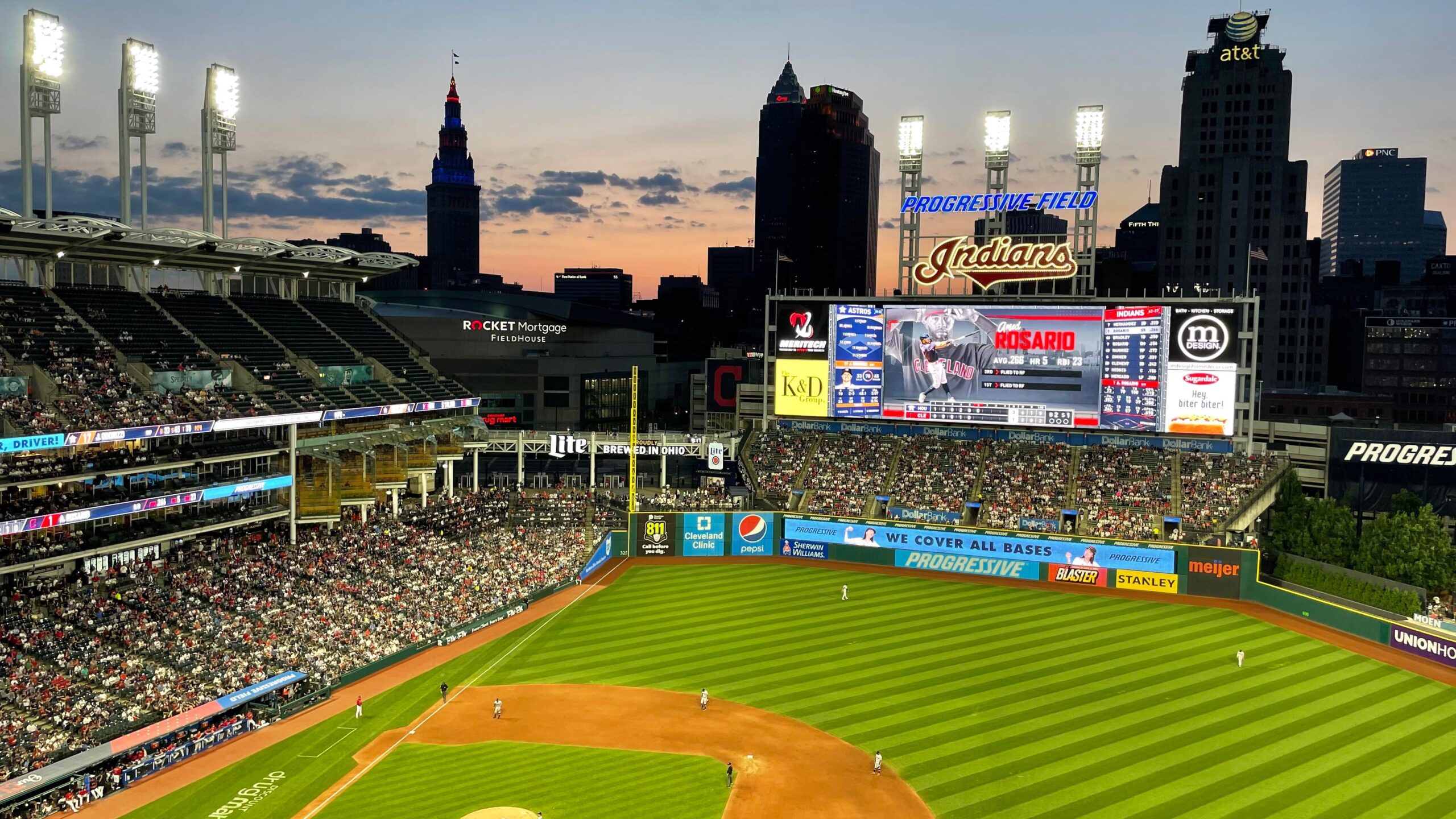
While the artist formerly known as Jacobs Field received rave reviews in the 1990s, it doesn’t get a lot of love from baseball writers and ballpark enthusiasts today, making it one of the more underrated ballparks in my book.
Opening on the heels of Camden Yards, Progressive Field’s architects understood that the Camden philosophy was about constructing something contextual that connected to the city, not red bricks or silly old-fashioned gimmicks. Progressive Field nails that, in what is a symbolic representation of Cleveland.
The exterior architecture utilizes limestone and white steel evoking Cleveland’s industrial sensibility. Progressive Field’s authentic urban interior aesthetics are lovely, eschewing any semblance of gimmickry and adroitly responding to the contextual forces of the city. Those toothbrush light towers represent the town’s smokestacks.
Much needed enhancements in the 2010s greatly improved the fan experience. Dividing the main concourse into “districts,” Cleveland’s park now has a) baseball’s largest videoboard, b) some of baseball’s best local food and craft beer, c) the outstanding right field Corner Bar, d) new clubs and renovated lounges, and e) one of baseball’s largest children’s areas, among other things.
Progressive Field doesn’t have many flaws, but its few flaws are pretty significant. Seating geometry down the lines is poor, three tiers of luxury suites isolate the upper deck, and the mezzanine is for all-inclusive premium club seats only. The combination of these three factors means there aren’t that many good seats for the average fan! In addition, the hideous, temporary-looking white boxes in right field resembling shipping containers mar an otherwise pristine interior.
But overall, underrated aesthetics and some of baseball’s best amenities put Progressive Field close to the top 10. The new round of extensive 2024-2025 renovations should solidify Cleveland’s park as state of the art.
Great American Ball Park
Cincinnati Reds
Major League
TL;DR? Here’s the long-form piece in a nutshell:
While Great American Ball Park has plenty to offer, it has received mixed reviews for a 21st century ballpark, generally landing in the lower-mid tier to bottom 10 of most ballpark rankings.
Equipped with a downtown riverfront setting, GABP represents the single biggest ballpark missed opportunity of our generation, because the architects totally botched the execution.
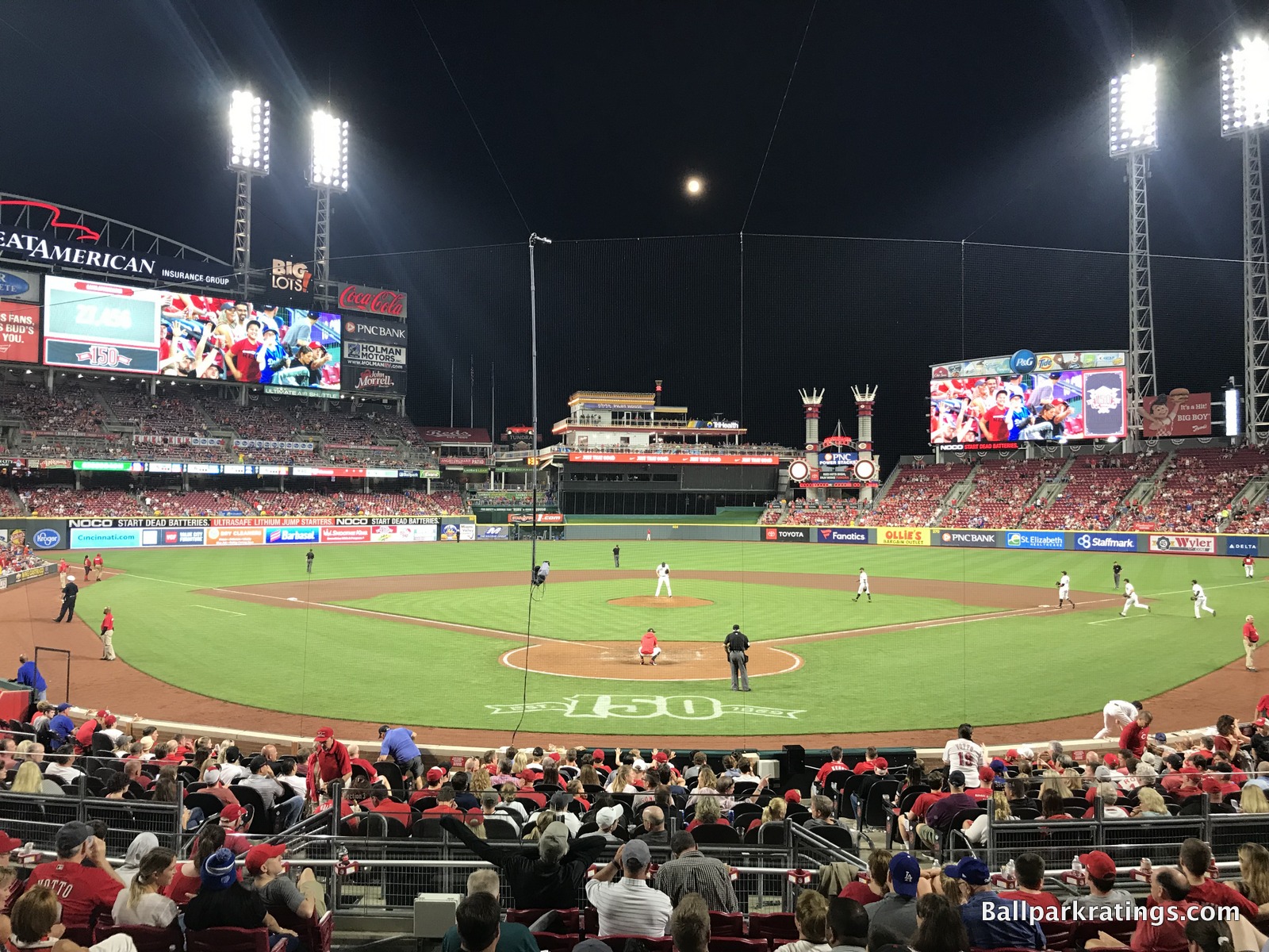
GABP has my least favorite interior aesthetics for a ballpark without a roof. How do you have the riverfront and the skyline, yet have good views of neither?
The underlying design is disjointed and fragmented. In the outfield, riverfront views are blocked by oversized seating, clumsy signage, a new superfluous videoboard, the tackiest gimmicks in baseball, and an ugly black batter’s eye, leaving the park with little sense of place. In the infield, “The Gap” behind home plate is well-intentioned but silly, giving GABP a real “split personality.” It’s all just awful, with so much junk and kitschy stuff thrown in that distracts from the original concept of integrating the riverfront scenery/urban context.
The interior design and visuals are obviously going to comprise the bulk of any analysis, but if you’re willing to look past that, GABP has a lot of things going for it.
The surrounding downtown local scene of bars and restaurants has greatly improved. Crosley Terrace with statues of Reds legends in action behind home plate is awesome. The seating geometry is excellent. While not perfect, some of the amenities are superb: (a) local food, (b) top-10 ballpark for craft beer, (c) the Kroger Fan Zone is one of the best ballpark hangout spots for fans of all ages, and most importantly, (d) the Reds Museum and Hall of Fame connected to the park is the very best of its kind.
But purely design-wise, GABP is probably Populous’s biggest miss.
Guaranteed Rate Field
Chicago White Sox
Major League
TL;DR? Here’s the long-form piece in a nutshell:
Just barely missing the retro-classic trend ushered in by Camden Yards (1992), the White Sox stadium (1991) usually falls near the very bottom of ballpark rankings. But as any ballpark enthusiast will tell you, Chicago’s South Side ballpark has gotten so much better after over 20 years of periodic renovations.
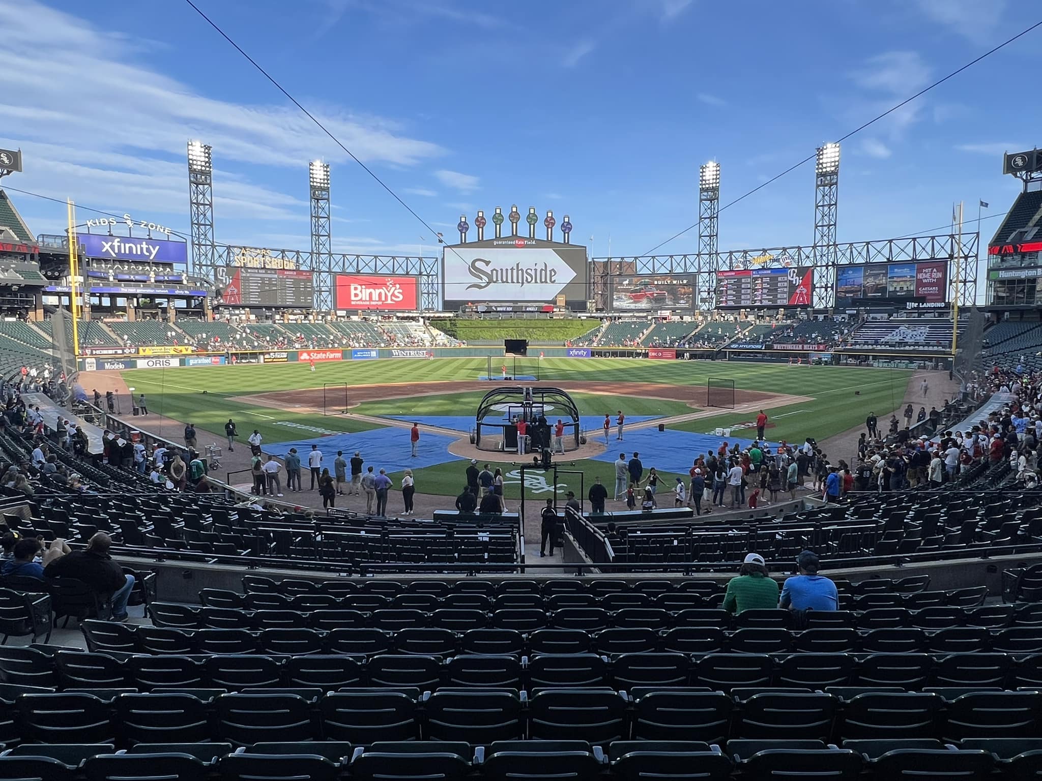
Yes, inside and out, little about GRF makes any pretense of being aesthetically attractive. With an enclosed, ad-plastered outfield facing away from Chicago’s skyline, GRF has little character and absolutely no visual sense of place. But compared to some busy, disjointed, gimmicky retro parks, there is a certain coherence and simplicity about its pleasing, symmetrical interior lines that just rubs me the right way.
GTF’s amenities and fan-friendly features compare pretty well: (a) good food, (b) top-5 ballpark for craft beer, (c) The Craft Kave, one of the best social spaces in baseball, (d) multiple lounges and bars littered around the main concourse, (e) statues adorn the outfield concourse, and (f) a kids’ area focused on baseball activities. And don’t forget the exploding scoreboard, now equipped with state-of-the-art tech to match its reputation.
However, GRF is still rife with flaws beyond the nondescript aesthetics, because there are plenty of structural issues that can’t be fixed. The upper deck is still high, steep, and far from the action. Cumbersome ramps are still required for vertical circulation; exploring the park is a chore. And it’s still a “parking lot stadium.”
Finally, while inconsistently enforced, the policy restricting upper deck ticket holders to that level, meaning they can’t access the amenities on the main concourse, is deplorable. And it was back in full force for 2021. There are ways to circumvent this rule, but it’s baseball’s single most fan-unfriendly policy.
But GTF doesn’t deserve to be associated with the two “bad” stadiums in Oakland and Tampa, which I see far too often. Compared to other fans’ ballpark rankings, #25 is a pretty solid showing for GRF.
Wrigley Field
Chicago Cubs
Major League
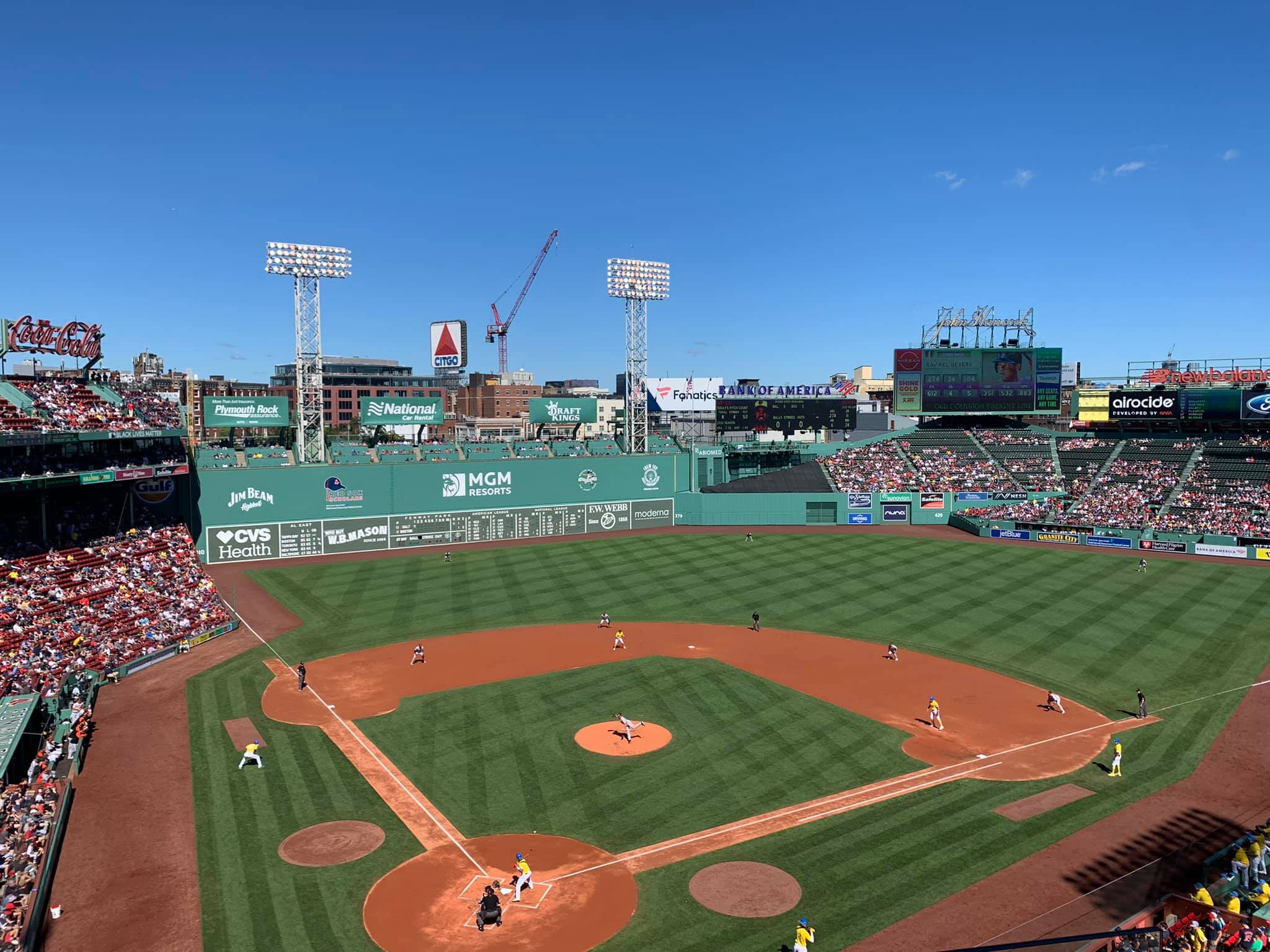
Fenway Park
Boston Red Sox
Major League
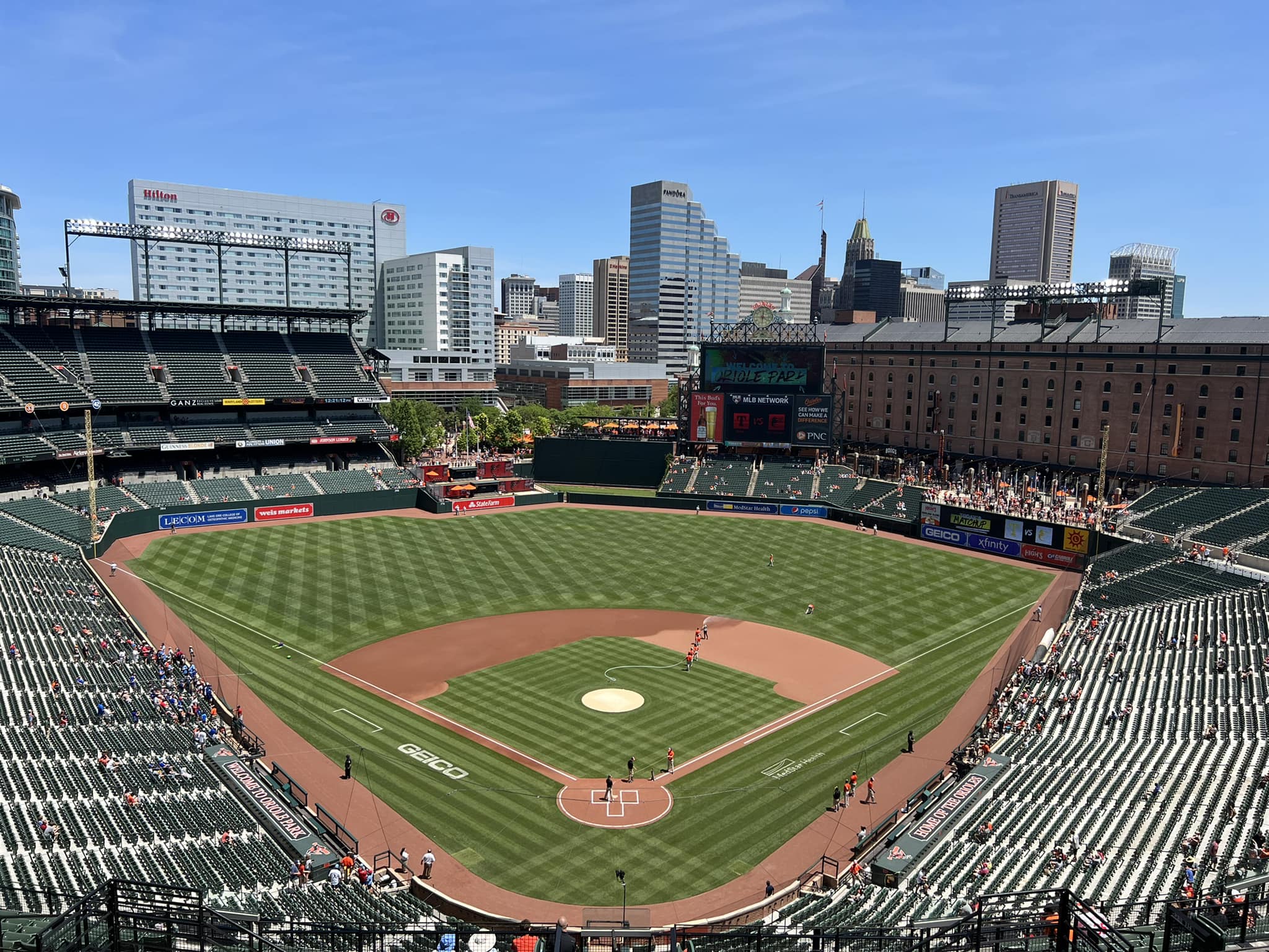
Oriole Park at Camden Yards
Baltimore Orioles
Major League
TL;DR? Here’s the long-form piece in a nutshell:
Camden Yards, aptly said to be of equal significance in baseball history to the breaking of the color barrier and the development of free agency, inspired decades of “old-fashioned ballparks with modern amenities.” The venerable sensibilities associated with generations of “retro” ballparks—the asymmetrical dimensions, warm brick facades with exposed steel, green seats, and various historical nods—were born here.
However, the importance of Oriole Park transcends conversations about its superficial stylistic treatment. Not only did it pioneer many subtle design elements that are commonplace today, but it ushered in a broader trend of American urban rival, reinvigorating the country’s downtown cores.
Camden Yards’ brilliance lies not with its old-fashioned design, but with its philosophy that ballparks can be made better by abandoning templates and constructing something contextual. Camden’s retro architectural treatment was authentically inspired by its urban surroundings, not conceived of in a vacuum like some of its retro cookie cutter successors, and therein lies its ingenuity. The building is in perfect harmony with Baltimore.
Successor ballparks that “got it” by crafting something contextual, red brick or not, have been most well-received. Others that oh-so-ironically used Camden as a template without urban contextual appreciation have not.
Despite receiving few significant enhancements in its 30-year history, Camden Yards still holds up well today inside and out. Surrounding views may happen to be better at parks in Pittsburgh and San Francisco, but one could argue Camden’s interior aesthetics have never been eclipsed.
With the B&O Warehouse serving as a landmark on par with Wrigley’s ivy or Boston’s Green Monster, Camden’s interior design is simple, coherent, authentic, and attractive, lacking the busy distractions of the newer ballparks, while also having that organic, uncontrived “signature feature.” The authenticity of the warehouse remains unmatched.
A charmingly simple red brick façade, skyline views, local grub, Legends Park statues, Eutaw Street, and brass baseball designating every home run to land on Eutaw Street also define the park.
Significance doesn’t equal perfection, and Camden falls short of the newer parks in a number of respects, hence its placement at #8. Just in terms of essentials, the main concourse is dark and almost entirely closed from the field, the seating geometry down the lines can be terrible, upper deck seats lack cupholders, and the videoboard is the smallest and among the most outdated in MLB. Camden’s food and beverage department is okay, but it’s also generally lacking the amenities of newer parks or renovated contemporaries.
Be on the lookout for Camden Yards to receive renovations similar to other 1990s ballparks in Cleveland and Colorado, perhaps opening up the concourses, adding more social spaces, upgrading the tech, etc. Just make some tweaks, and there’s no reason Camden couldn’t catapult to the top again, because the underlying aesthetic is timeless.
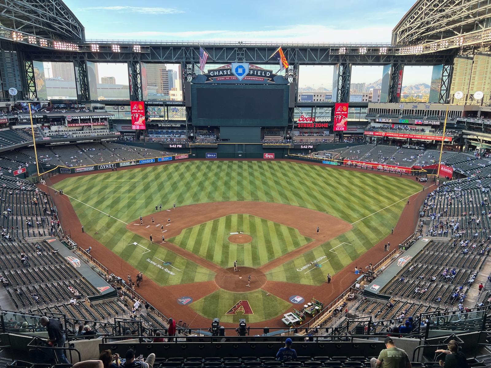
Chase Field
Arizona Diamondbacks
Major League
TL;DR? Here’s the long-form piece in a nutshell:
As the first baseball-only stadium with a retractable roof, Chase Field is all function over form, geared toward pumping in air conditioning to make baseball work in the desert. Often likened to an airplane hangar, it’s the least aesthetically attractive MLB ballpark of the post-1990 building boom, lacking any architectural intrigue. It often lands in the bottom 5 of ballpark rankings.
Chase Field’s big and boxy exterior profile features terribly clashing architecture, typifying an era where inevitably modern retractable roof parks tried to be “retro.” Inside, Chase Field feels like watching baseball in a giant gym. When the roof is closed, almost no natural light is emitted into the building. When the roof is open, Chase Field’s aesthetic sensibility is much better — panels fold up throughout the entirety of the outfield — but it still feels like watching baseball in a box. And the cavernous upper deck screams outdated empty stadium.
With a dearth of significant enhancements over the years, Chase Field’s amenities have not aged well. Think mall-like concessions, pedestrian food quality, a poor craft beer selection, minimal social gathering areas, two aging outfield restaurants (although, at least decent burger joint now occupies one of them), tired premium spaces at field level, and a worn club level.
That’s before getting into the behind-the-scenes technical issues fans don’t always see. The roof can only be opened or closed when the stadium is empty due to a broken pulley (fan safety issue). The roof leaks, as seen during the 2023 World Baseball Classic. It’s made the local news rounds for grease fires in the kitchens, burst pipes, faulty scoreboard lights, and other issues.
Chase Field has some bright spots. It’s a downtown ballpark. There’s the pool. I love the murals in the rotunda celebrating natural Arizona landmarks. It’s still a pretty functional building for watching baseball despite all the behind-the-scenes issues, with superb seating geometry and an open main concourse without interruptions in field visibility.
Bottom 5 is right, but it doesn’t deserve to be grouped with the “bad” ballparks in Tampa, Oakland, and to a lesser extent, Toronto. It’s safely in that #25-#27 range. The Diamondbacks desire a new ballpark or a top-to-bottom renovation to Chase Field.
